Out of the Blue

Design by Lindsey Black Interiors | Story by Terri Glazer | Photography by Sélavie Photography

With a unique, cocktail lounge vibe, this retro chic pool house is ready for fun.

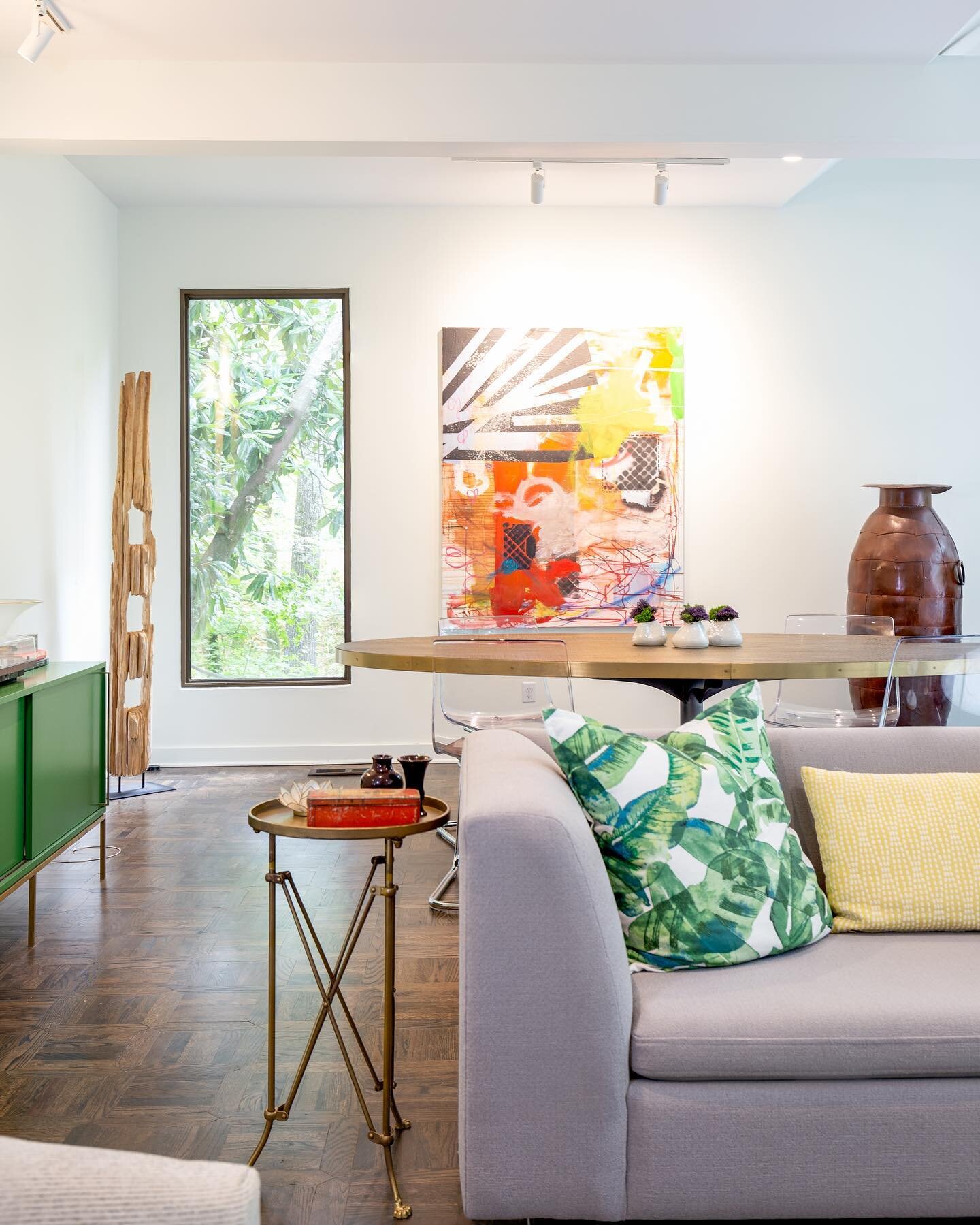
The phrase “pool house” might not usually evoke images of a space described as “lounge-y” or “cool,” but those words kept popping up on a recent visit to this East Memphis pool/guest house. Renovated by Lindsey Black of Lindsey Black Interiors, the structure has a style that’s a bit unexpected, but a perfect fit for the homeowners and their young teenage children.

The owners renovated the main residence when they moved in a few years ago, but they had yet to give the pool house the same attention. They brought Black on board in early 2020 to put their stamp on the space. Before she and her team started the creative work, she met with the couple, as she does with every client at the outset of one of the large-scale projects in which her firm specializes, to get to know them and understand their needs. During the session she learned a few things. The wife wanted to use the pool house for year-round entertaining and for overnight guests. She wanted it to be a spot where kids could hang out, and one that adults could also enjoy. And it had to be cool, with a cocktail lounge vibe.

.

The designer recalls that the initial meeting happened just before one of her semi-annual buying trips; fortunate timing because it allowed her to select items at market specifically with the pool house in mind. Every project starts with a jumping off point. For this one, Black says, it was the large color photograph of a swimming tiger that now hangs in the living area. “The water tied into the pool nicely,” she says, and the animal’s deep orange color influenced other design choices. Next came the fabric for pillows on the sofa and the dining banquette. The retro print in bold colors has just the right degree of old Havana flair.

Pillow fabric might seem a minor detail in a full-scale redesign project, but Black says each feature is important to making a room, and a whole house, come together with a cohesive look. “We really do put thought into every little detail we choose in a room and how it all works together,” she says. “Even though a pillow is a small element, it inspired most of the color choices in the room.”

And, thanks to the introduction of a wealth of new high-performance textiles and fabric treatments, Black had plenty of choices when selecting upholstery. Gone are the days when pool houses had to be furnished in vinyl and hard plastic. Today’s advanced materials come in a myriad of options and can stand up to catastrophes from wet swimsuits to spilled drinks, no worse for the wear. Everything from the clean-lined living area sofa to the dramatic tete-a-tete chaise by Ray Booth for Hickory Chair to the stunning blue/green velvet banquette is covered in fabric that is as durable as it is beautiful.

In the dining area Black removed a large round dining table at the homeowners’ request. The family tends to entertain more informally, however, if a larger group wants to gather, the new game table, with an extra leaf installed, can accommodate. 

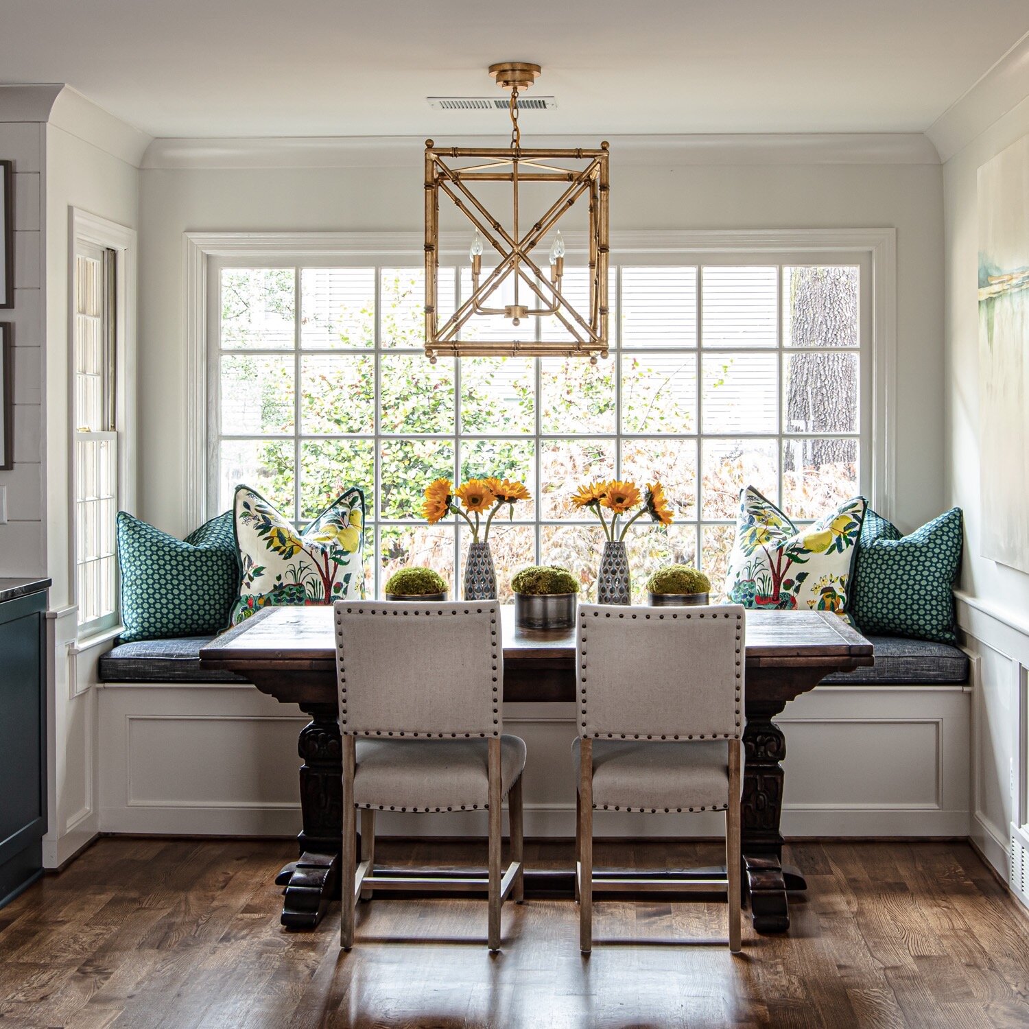
Nestled under a handsome work by West African artist Kader Boly, the banquette, paired with a trio of small round cocktail tables and wood/woven leather chairs makes a perfect spot for a group conversation, an intimate drink—or for kids’ post-swim snacks and sodas.

Black enlisted Greg Hampton of Hampton Fine Finishes to paint the kitchen cabinets in the same saturated gray/green as the living area. The existing copper vent hood is perfectly warm, juxtaposed against the cool-toned cabinetry. Poster-sized photos of iconic Memphis neon signs jazz up the kitchen and provide a funky home-town touch when the space is used as a guest house for out-of-town visitors. “It’s fun to put things like that in here that you might not place in the main house,” says Black.

It’s a toss-up as to who loves the new game room more, the teenagers or their father. During the initial conversation, Black learned that the man of the house is a huge Marvel Comics fan, so she turned to local artist Daniel Tacker to create a custom multimedia work featuring the superheroes. The art seems to fly off the wall, with Wolverine, dad’s favorite character, leading the way. The designer commissioned the painting and chose all the art for the project with deliberate care and with local talent in mind. A figure painting by Memphis artist Heather Howle hangs in the dining area.

The pool house has a lot of wall space, so Black was tasked with finding multiple pieces. She explains, “You have to be careful about how you mix artwork. I think it can make or break a space so you have to consider the style of the art, who the artist is, color versus black and white, media, but also scale is so important. These are all statement pieces. They stand on their own, but they complement instead of competing with one another.”

It’s clear that Black loves the way her concept came to completion for these clients, but she stresses that it’s not all about appearances. “As important as it is that a space looks good, for me it is critical that it works for the client, that it meets all their needs and it checks all the boxes they give us.” This chic backyard cocktail lounge/teen hangout with the unexpected ambiance checks those boxes perfectly for the homeowners, their children and their guests.

Live at the Garden

Celebrating 22 Years of Music, Live at the Garden

Text by Sherry May, Co-Director, Live at the Garden & Radians Amphitheater | Photos by Steve Roberts and Bob Furnis

June 15, 2001. That was the date of the very first concert at the Memphis Botanic Garden. And who better than Memphis’ own Isaac Hayes to kick -off a new outdoor summer concert series that would become known as Live at the Garden. I will always remember that night and seeing the vision that so many had worked on become a reality. Over 3,000 people purchased tickets. I knew we were on to something good!

Live at the Garden was special from the start.  Renowned artists performing outdoors under the stars.  A place where you could bring your own picnic, sit at a table or on a blanket on the lush lawn that the Garden offered.   No matter where you sat, you were part of a Memphis garden party.  A place to see old and new friends and listen to great live music, no matter what the genre.  That was always the vision.  
Picnicking, fashion, and tablescapes took on lives of their own.  People planned their menus weeks in advance for each concert.  You would see wine glasses, centerpieces, candelabras and bedazzled coolers everywhere. Live at the Garden had officially become an annual event, and people had to plan their outfits accordingly.  Stylish, cool and comfortable attire was a must!

In those first few years, we didn’t have a permanent stage but what we did have was 96 acres of beautiful landscape at the Memphis Botanic Garden.  Our first stage was a fabric domed shell and in addition to Hayes, in those early years we attracted such artists as Lyle Lovett, Harry Connick, Jr., Ray Charles, Chris Isaac and Wynonna just to name a few.  

With each passing year, Live at the Garden grew bigger and better with more and more season table and lawn pass holders supporting the 5-show series.  By 2005, we felt that we had outgrown the makeshift dome stage so we moved our location east, down the hill, to another open area within the Garden that would accommodate larger audiences.  We brought in a larger stage from Louisiana that would load in before the first concert in June and leave us after the last show in September.  On that stage, we saw performances by legends such as Rev. Al Green, Joe Cocker, Diana Ross, Tony Bennett and Donna Summer.  We saw the up-and-comers such as Michael Buble and Sugarland.  We saw fan favorites like Chicago, Earth, Wind & Fire, Huey Lewis & the News, and ZZ Top.

In 2013, we dreamed big.  We felt like we could take Live at the Garden to the next level, but that would require a permanent stage and backstage area that could accommodate larger touring acts.  We kicked off a capital campaign, raised 6.5 million dollars from foundations, companies, and fans and broke ground.  As the final sod was still being laid, we opened the 2014 series with country supergroup Little Big Town on a world-class stage with the proper infrastructure in place for us to be able to handle most any artist in front of over 7,400 people.

Although Covid cancelled what would have been our 20th season in 2020, we celebrated the milestone by constructing a Can’t Stop The Music Donor Wall, which is permanently located on the west side of the stage.  It is filled with Live at the Garden sponsors and fans and their sentiments regarding the long-running series. We were able to come back with the series in June 2021 and celebrated our 100th concert with Brad Paisley and Jimmie Allen. 

I often have to pinch myself when I go back in my mind to the beginning and recall of all of the amazing memories of performers that have entertained us and made music lovers of all ages want to get up and dance in the Garden!

Our next season is upon us and this year’s lineup is sure not to disappoint!  First-time artists to perform at Live at the Garden Steely Dan and Lady A, alumni artists Darius Rucker, Chicago and the Doobie Brothers with Michael McDonald comprise the 5-show concert series for 2022.  

So, start planning those menus, dust off the candles and get out your dancing shoes.  We are ready to rock.  See you this summer at the Garden!

A Perfect Blend

Interior Design by Cindy McCord Design | Story by Terri Glazer | Photography by Ross Group Creative

When they built their family’s dream home in East Memphis 19 years ago, this couple loved everything in the house. Fast forward to early 2020, and the same family, a married couple with three now-grown children, still lived in the home and still loved a lot about the brick Tudor. However, they were ready to refresh the decor. 

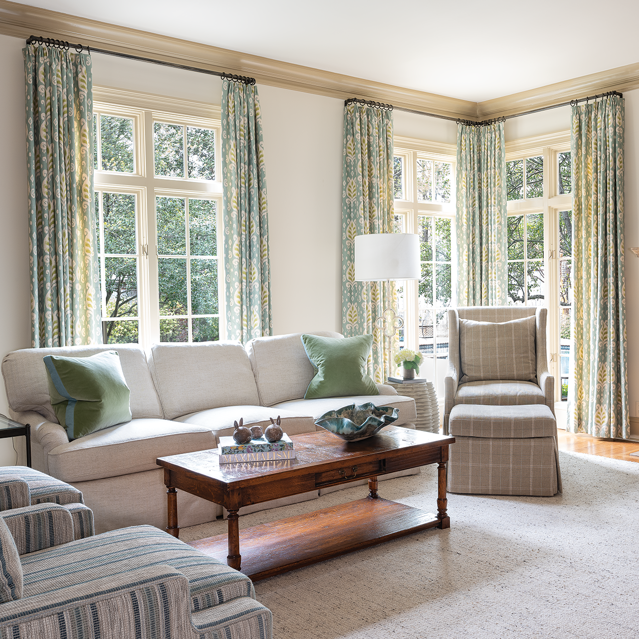
Enter designer Cindy McCord, owner of Cindy McCord Design in Collierville, who gave the home a look that is fresh and new—but not entirely new. McCord’s vision resulted in a design plan that kept many of the homeowners’ most loved pieces, some left as is and some rethought, mixed with new finishes and pieces.

Thanks to the original architecture conceived by Charles Shipp, the renovation was almost entirely cosmetic. “It was just a facelift, because the bones were so good,” says McCord.

Ditto with the design elements. Rather than reimagining the decor from floor to ceiling, McCord’s work highlighted many of the original features.

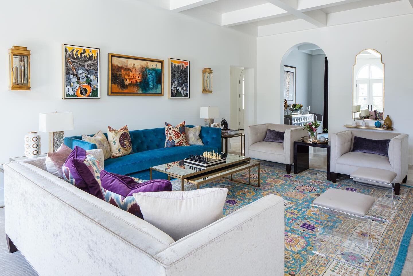
Color was the main focus for the homeowner. She says, “The whole house was kind of a creamy yellow, and I’d had yellow in my previous home too, so it had been around much longer than 19 years. I was tired of yellow! I wanted to lighten things up a lot and I told Cindy I like blues.” McCord brought the new palette to life by bathing the walls in a coat of white that is fresh yet not stark, the perfect counterpart to the home’s original dark khaki painted trim, which she opted to leave intact in many rooms.


Once the lighter backdrop was established, the designer turned to the business of making everything else feel new—without necessarily having to be new. The family room is a perfect example. New drapes, sofa, chairs and tables blend seamlessly with the original fireplace and hardwood floors, as well as the homeowner’s treasured pieces, including an antique armoire. A favorite chair from her former office as a buyer for Helen of Memphis, now restuffed and reupholstered, holds place of pride.

The living room is decidedly newer, but still anchored by the family’s much-loved grand piano. McCord added a new sofa and easy chair plus accent tables in metal, glass and marble, to bring an “of-the-moment” touch to beautiful Martha Washington chairs and dark wood pieces from the previous decor. A portrait of the couple’s three children gives the room the most personal feel.

Shipp’s traditional plan still shines in the kitchen. The natural brown tones of original stone floors that the homeowner has always loved blend perfectly with the stained wood exposed beams and trim around the eye-catching plaster vent hood. The existing layout, appliances, tile backsplash, even the cabinet hardware, are still in place, proving that a kitchen refresh doesn’t always have to involve a to-the-studs gutting. Newly painted white cabinets, topped with gracefully patterned quartz countertops, give the space an all-new feel.

The adjacent breakfast room is still home to the family’s original table, chairs and plate rack. Also remaining in place is the light fixture sourced from the now-closed Frankum Antiques in Germantown. When the home was under construction the couple purchased the piece, along with the dining room chandelier, from Linda Frankum, who imported antiques from Europe. A watercolor and graphite pencil work by local artist Hailey Roaten reflects both the black of the iron chandelier and the blue tones of the home’s new color palette. Bold wallpaper gives the adjacent butler’s pantry a punch of excitement, the perfect marriage of the existing khaki trim color, newly painted cabinets and countertops in the same stone as in the kitchen.     

In the formal dining room, McCord’s work retained the timeless elegance while continuing the keep/replace/repurpose theme she carried throughout the home. Gone are the dark, heavy drapes with elaborate valances. The designer instead opted for lighter panels that are still functional, but allow more light in through the full-length windows. The furniture is the same, perked up with new upholstery on the dining chairs. The salmon-toned oriental rug remains, as well, and looks as though it were always meant to be in the newly imagined room. The same can be said for a painting formerly hung elsewhere in the home. It now sets off the dining room decor thanks to its new placement and a new frame made by Chris Garner of Garner Framing Co.

A pair of lamps once in the dining room now provide light in the primary bedroom. Reshading them created a new look style for the freshened space. “It’s amazing how different they look with new shades,” says the homeowner. “We reshaded several lamps and it was fun to use them again.” Those renewed lamps sit atop new nightstands that flank the owners’ bed, a holdover from the previous decor. New bedding, drapes and rug give the room a fresh feel. McCord continued the spruce up into the attached bath, where botanical wallpaper, light fixtures and goldtone hardware lend a warm, modern touch to the original cabinets, counters and flooring.

The project, originally conceived as a single bedroom renovation, extended into a downstairs guest bedroom and bath in addition to the home’s office, powder room and cheerful laundry room, where McCord painted the pine cabinets and added wallpaper and a cute cafe curtain. “I love coming in here,” the homeowner says, adding that the room is also a favorite for the family’s cats. “That’s where their food is,” she admits with a laugh. 

From dark wood, yellow walls, rust tones and elaborate drapes to lightened paints, cool-toned accents and cleaner lines, McCord has blended a family’s cherished treasures with the perfect amount of today’s best looks to create a design that will serve the home and family well through the next 19 years and beyond.

A Cook’s Kitchen

Written by Terri Glazer | Photography by Darren Lykes Photography

At Home’s culinary guru shares the making of his dream workspace

WEB_DSC_8285.jpg

To say that Jim Norton’s kitchen has come a long way would be a massive understatement. The original portion of the historic Oakmont estate in Jackson, TN, was built in 1860 as a log cabin. Even 15 years ago, when Norton and his partner Robert Walden purchased the much-expanded home, it didn’t have a fully functioning kitchen.

He recalls, “The lady who lived in the home previously didn’t cook. She really didn’t have a kitchen. It was like a caterer’s kitchen; there was no stove. The only stove was in the master bedroom behind two folding doors. There was a 1950s-era unit with a tiny cooktop, a very small oven and a sink.”

.

.

Out of necessity, the homeowners created a galley-style kitchen with an adjacent eat-in area. It served its purpose, but they soon realized it could be better. Norton and Walden love to entertain and have parties often, from intimate get-togethers for close friends to the annual Patrons Party for the West Tennessee Healthcare Foundation, a soiree for 250 they’ve hosted for the last decade. Norton realized that large gatherings always seem to produce a bottleneck around the kitchen, so when they were having some other home-improvement projects done, it seemed the perfect time to reimagine the kitchen and remedy the situation.

“To expand the kitchen we knocked out a couple of walls from an adjacent bedroom. We got rid of the bedroom and made it part of the kitchen. Now there are four ways in and out of the kitchen,” says Norton. “This year was the first Patrons Party we’ve had with the new kitchen, and it made all the difference.”

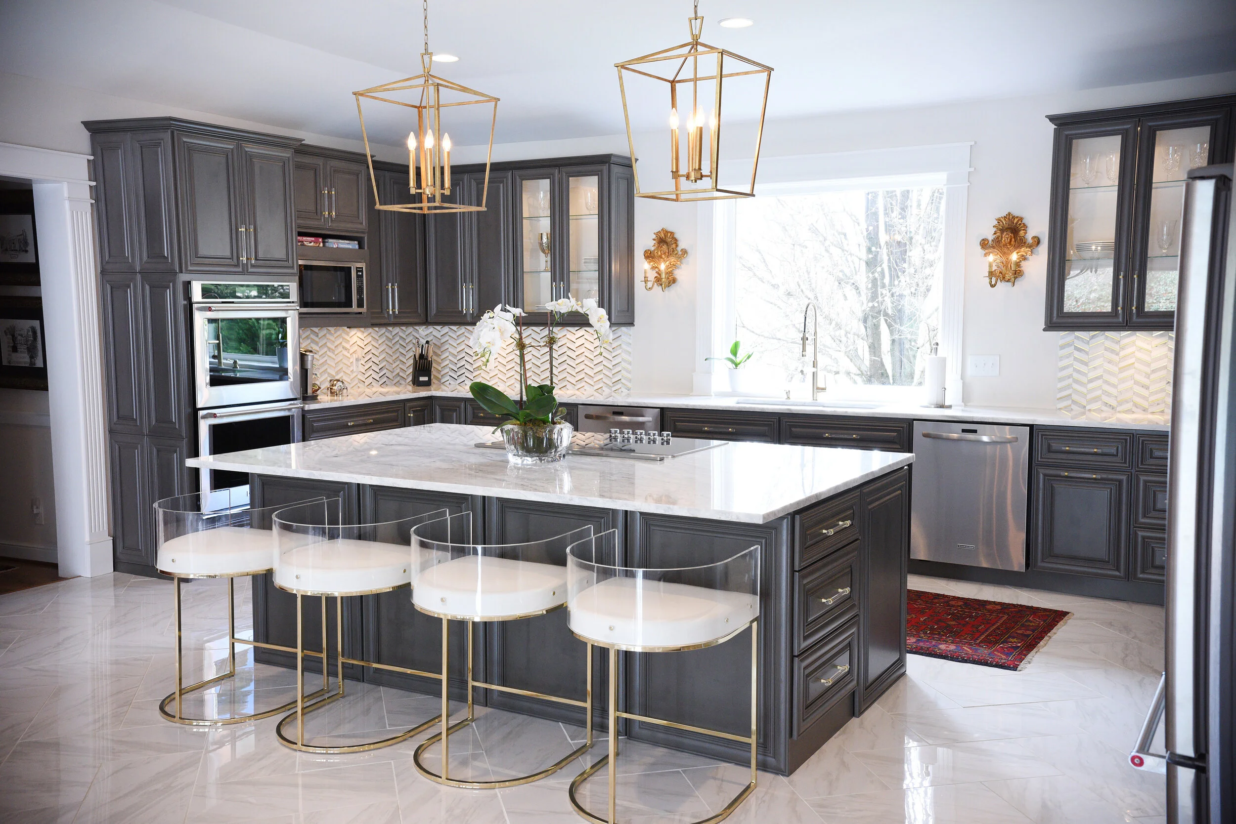
Norton masterminded the extensive kitchen redo, using his combined talents for a stunning finished product. In addition to being a renowned master of entertaining who has hosted celebrities and appeared on national TV cooking programs, Norton is an interior decorator by trade. Three major elements drove his design process. The new kitchen had to be large enough to accommodate crowds and the layout had to facilitate conversations. “When we have dinner parties everyone always wants to come in the kitchen and talk to me and watch while I’m cooking. The old kitchen wasn’t conducive to that at all. So I wanted a nice large island where people could sit on the other side. My cooktop is in the island so I can cook and have people sitting at the barstools and we can look eye to eye.”

The overall aesthetic was also important. Norton explains, “I wanted something that was fresh, that was current, but it also had to match and flow with the rest of the house, which is very traditional. We tried to bring in elements like the cabinet color, which is very current, but the actual cabinets are traditional with raised panels. The countertops are carrara marble, which is timeless to me. But to make it a little more edgy, we did the backsplash in a herringbone pattern with gold accent bars running through it. That gave it more of a contemporary vibe. That kind of goes with our house. We’ll have a piece of 18th-century furniture with a very contemporary abstract painting hanging above it. So I wanted the kitchen to reflect that, as well—the new blending well with the old.” 

WEB_DSC_8228.jpg

One of the room’s most notable features is the large built-in refrigerator. It’s the product of one of Norton’s favorite tricks of the kitchen design trade, a gem he graciously shares with At Home readers. “You can get a large refrigerator without spending $12,000 or more. We purchased two single-door refrigerators; one is a right open and one a left open. We put them together and built the cabinets around it. It ends up looking like a massive commercial refrigerator at a fraction of the cost. The trick is the trim kit that you put around the two refrigerators. You can purchase the Subzero trim kit for around $300. It adds six to seven inches in height so it gives not only the large appearance, but also the tall appearance that Subzeros have.” 

From marginally functional to a cook’s dream, Oakmont’s new kitchen is a masterpiece only a true expert could envision.

WEB_DSC_8284.jpg
WEB_DSC_8267.jpg

Hello, spring!

Event Design and Written by Ginni Jones | Photography by Annabella Charles Photography

After what seems like quite the long winter sheltered indoors, spring is finally here! And there’s no better way to celebrate than to invite all your loved ones over for a fun spring brunch. 

WEB_spring2020-13.jpg

Set the Table

    It was about time to bring some bright colors to the table, so as always, I turned to my favorite ladies at Social to get the most beautiful pieces in order to create the perfect tablescape for this brunch. I already owned a few pieces I wanted to mix in with my new goodies from Social. I love the blue wine glasses, hand blown in Poland, from Estelle Colored Glass. Estelle has every color imaginable and they are the perfect “gems” for a festive table. I found the white oblong platters on a recent trip to Nashville. They reminded me of Easter eggs, perfect to display appetizers.

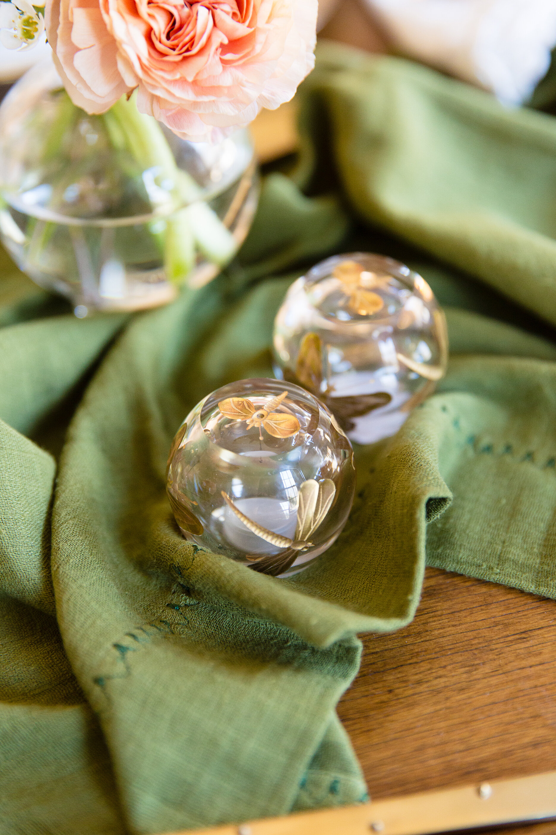
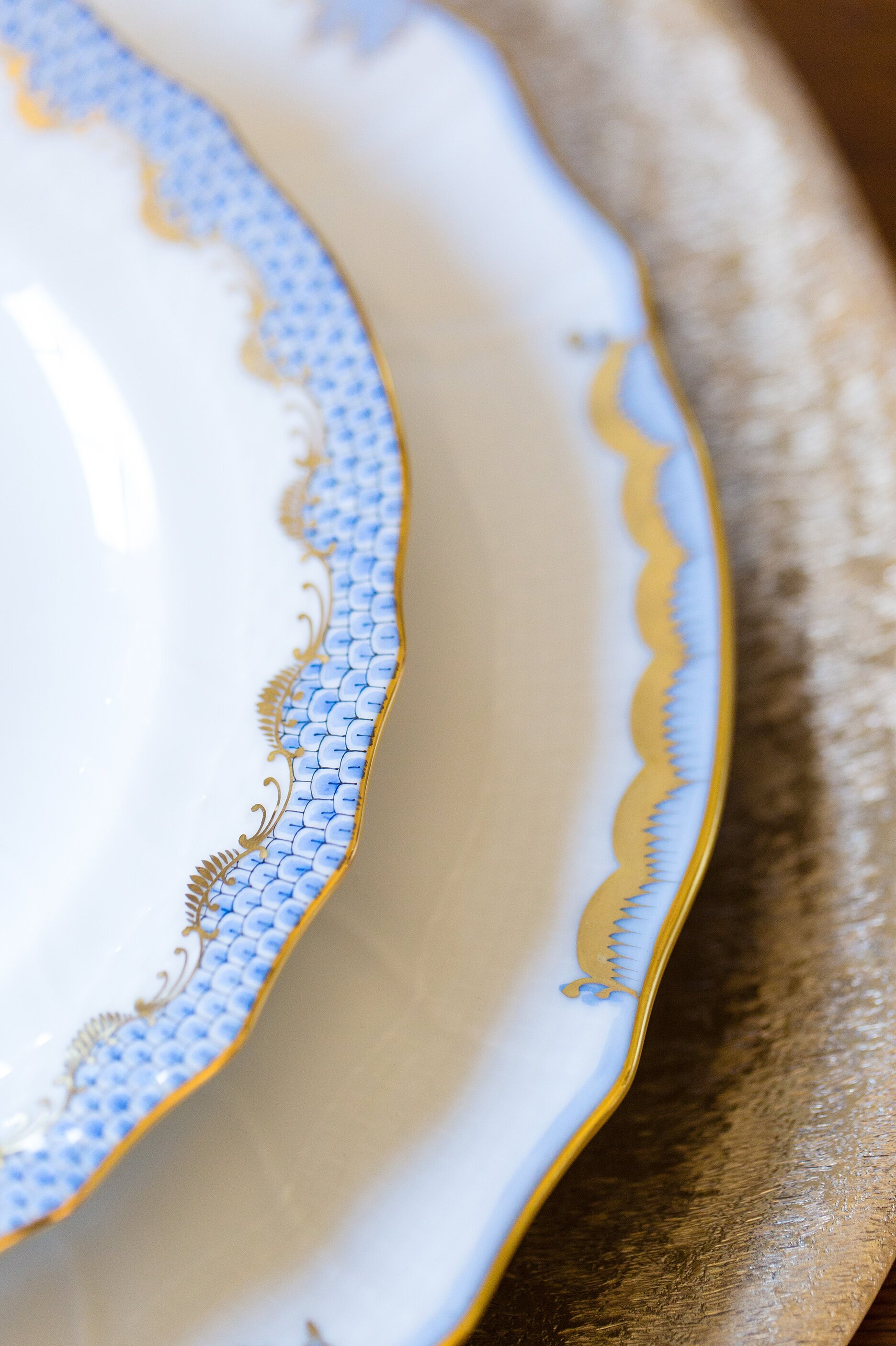
For china, I picked out some gorgeous pieces from the vast Herend collection available at Social. We paired the Princess Victoria dinner plate with the Fishscale salad plate in light blue and the combination turned out stunning. Layered below was a textured bronze charger also from Social. For napkins, we kept it simple with a white linen fabric piped with a scallop edged. And lastly, I couldn't leave without these exquisite glass and gold dragonfly salt and pepper shakers. Yes, they are probably the smallest detail, but they are the perfect mix of modern and vintage that I was looking for as inspiration for this spring tablescape! 

WEB_spring2020-41.jpg

What’s for Brunch?

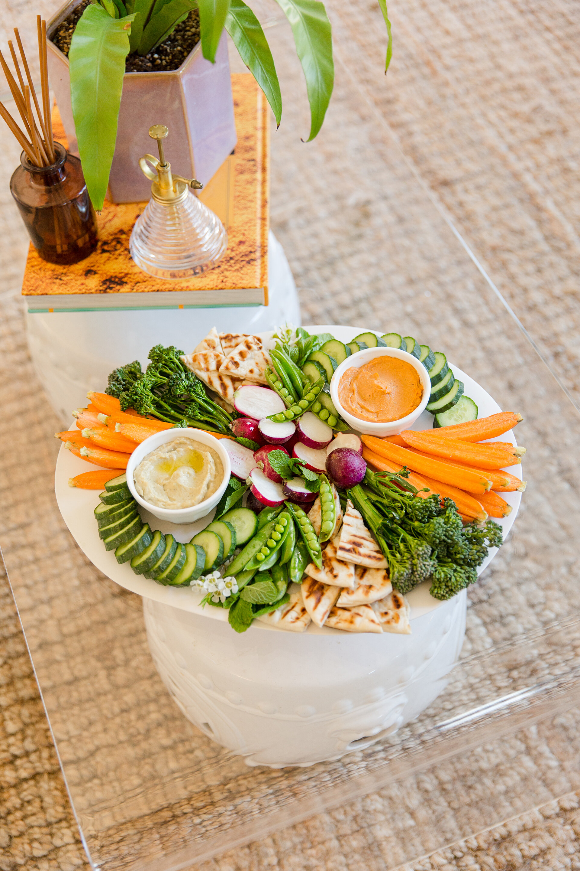
    Picking out the menu is always one of my favorite parts of hosting. I really wanted to highlight the season, so I tried to incorporate as much spring produce as possible. Also, since the menu featured brunch, I wanted to keep the food light and fresh. I love mixing mini bite snacks and platters, so I made two crostinis and a colorful crudite platter. The spring pea crostini, perfectly toasted bread layered with pea and basil pesto, fresh burrata cheese and prosciutto, was definitely a crowd favorite. The second crostini was an edamame and radish version, made with an edamame, mint and ricotta cheese—so fun and easy to create! Simply chop up fresh veggies like carrots, cucumbers, broccolini, spring peas and radishes and layer them around dips. Here I used a spicy avocado hummus and a tomato basil hummus. Don’t forget to add fresh pita slices (they’re even better toasted). 

WEB_spring2020-44.jpg

The Flowers

You can’t welcome spring without fresh flowers! Coral and orange ranunculus paired together are always stunning. Add a bit of wax flower and tuck them into glass mini globe vases, and they add the perfect pop of color scattered around the table.

WEB_spring2020-59.jpg

Create Your Own

 I can’t take all the credit for creating this fun and seasonal tablescape; I will be the first to admit I learned everything from my mom! She has been entertaining ever since I can remember. Whether it was a simple birthday dinner with our immediate family or our annual Christmas Eve Soups & Sips party for a crowd, she hosts every holiday with style and grace.

Here's what I have picked up from Lili Jones over the years: 

First, keep it simple. Don’t try to make something extravagant and then get frustrated when something doesn’t turn out exactly the way you wanted it. It’s important to not stress yourself out; you want to be present at your gathering and enjoy the time with your loved ones! 

Two, never forget to add something fresh! Whether it’s fresh flowers on the table or greenery from the yard placed in a vase—or even springs of herbs tucked under food on a platter—you always need a fresh element. 

Thirdly, my mom is always reminding me to use what I have. I am constantly looking for new decor, but I’ve learned to mix with what I have before I buy new. If you do buy more, shop locally.

And lastly, don’t forget the music. For our family, it is most likely Dave Matthews playing (quite loudly) over the speakers around the house. And we can’t forget how when we all gather in the kitchen and grab hands to pray; without fail, every time she sings “The more we are together, together, together…”. Whatever you prefer, just don’t forget the music! 

WEB_spring2020-62.jpg

Staying Power

Interior Design by Robin Selberg | Written by Terri Glazer | Photography by Ross Group Creative

Interior designer Robin Selberg reinvents her Germantown home to keep pace with her family’s needs.

03-Mike-Murphy-Selberg-1O6A8787 b-web.jpg

Robin and David Selberg have lived at the same Germantown address for almost 20 years, but the space they call home now is quite different from the one they moved into back in 2001. Over the course of three renovations the couple has transformed the house into the perfect home base for them and their three young adult children.

The house flows so perfectly, though, that you’d never guess it has had three facelifts; and that’s the real beauty of it. Michael Murphy, Jr., of Mike Murphy Builders, who was at the helm of the latest project, says that’s a feat not easily accomplished. “Part of the challenge is when you walk in, not to be able to tell what happened when. Anybody can knock down a wall or add an island, but to have it not be obvious that it was three separate remodels is a different story.”

07-Mike-Murphy-Selberg-1O6A9453-web.jpg

The Selbergs’ love affair with the house started shortly after they attended an open house there. The two older children had just started school at St. George’s and a few friends had moved into the neighborhood, but Robin and David weren’t necessarily looking for a new home. That status changed quickly when they toured the house and were wowed by the acre-sized lot on which it sits. They bought the place and right away replaced carpet with hardwood floors, installed new front doors and made a few other changes.

Four years later, their family had grown to include three children and it was time to remodel to accommodate their new set of needs. This second project included a sunroom, a new laundry room, a master suite and a friends’ entry. 

By 2018, Robin was ready to embark on yet another renovation, this time focusing on the kitchen. “It still had the original cabinets and tile floors from when it was built in 1978,” she recalls, “and we just knew it could be better.”

Robin had big dreams, but wasn’t sure they were achievable until Murphy came into the picture. She wanted to open up the kitchen area and convert a small, seldom-used dining room into a pantry, but she didn’t know if a redo on that scale was possible. “Once Michael drew it all out, I saw it and I knew we had to do it. That was a big turning point for us,” Robin says.

“I love a new house, but there really is something about remodeling and how the house feels afterwards. There’s always something surprising.” —Robin Selberg

After a structural engineer confirmed that a large wooden beam entirely in the attic space would support the new open floor plan, it was full speed ahead. “The house has eight-foot ceilings so you don’t want beams sticking down,” explains Murphy. “We knew we weren’t changing the ceiling height, so the challenge was how to make it as big and open as possible without anything showing.”  

Soon the beam went up, the walls came down, the space originally meant to be a formal living room became a larger, more useful dining room, and a deluxe walk-in pantry took the place of the old dining room. 

28-Mike-Murphy-Selberg-1O6A9489-web.jpg

As a professional designer, Robin had definite ideas about what she wanted. “We knew we wanted to have an island in the kitchen and once we found out we could open it up I kept asking Michael how big he thought we could go with it. Once Michael laid it out and I saw how it maximized our space I knew it was perfect,” she says.

She also knew she wanted it to have an open and airy feel, and what it would take to create that feel in a space with relatively low ceilings. “There couldn’t be a lot of upper cabinets. We went back and forth with Burton Crawford of Crawford’s Fine Cabinetry. Even though you see a lot of kitchens without wall cabinets in magazines, you don’t see that done around here very much. My husband even doubted, but I was adamant.”

08-Mike-Murphy-Selberg-1O6A8824-web.jpg

The kitchen plan included floating shelves in place of cabinets on one wall, but even those were vetoed at the last minute. “We had them made and the workmen were about to drill the holes to install them when I said, ‘No, don’t put them up.’ I’m so glad I stopped them because I really like the clean look,” says Robin.

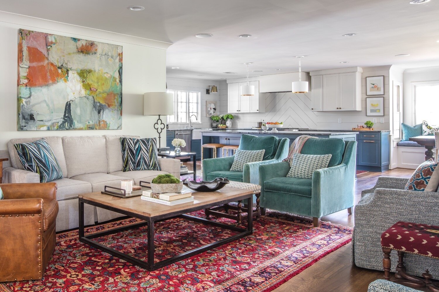
Her list of kitchen must-haves also included wide shiplap walls. David, however, was in favor of tile for the backsplash behind the range, for ease of cleaning. Robin searched and searched for the perfect tile, but never found one she loved. A photo of shiplap in a chevron pattern did catch her eye, though, and now the unique treatment makes a striking statement. 

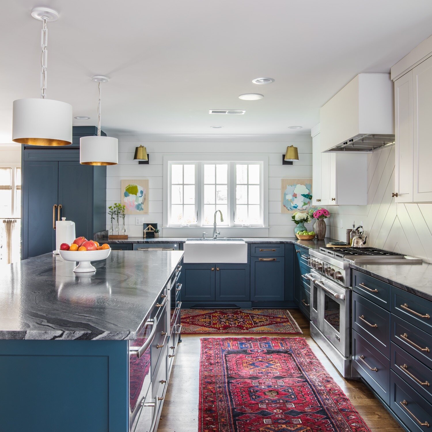
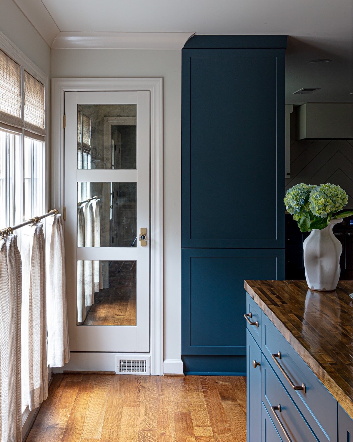
Decked out in blue with fancy black marble countertops, the cabinets make the biggest visual impact in the kitchen. Robin admits that she is bucking current trends, but she’s confident in her choices. “My style is eclectic; I like what I like. The trend right now isn’t a lot of color, but I’ve always liked color. I had red cabinets before.”

Since her new cabinets were custom made, the color options were limitless. “I had about three different colors that I was going between for the cabinets; one was a little more green and one was more blue. I ended up going to Memphis Paints to look at the Farrow & Ball paints. I walked in and they had a new display, and there was Hague Blue. I knew it as soon as I saw it!” On the one wall that has upper cabinets, the cabinets, the trim, the walls and the ceilings are all painted the same crisp white. The continuity of color is a trick of the design trade that makes the room feel larger.

23-Mike-Murphy-Selberg-1O6A9478 b-web.jpg

While she likes her vibrant kitchen, it may be the new pantry that Robin loves the most. It features plenty of storage, along with counter space and electrical outlets—the perfect spot to keep the coffee maker, blender and other small appliances handy yet out of plain view. “I tell all my clients who are remodeling a pantry to be sure they have power available and a countertop in it. Without a countertop it’s not as user friendly.”

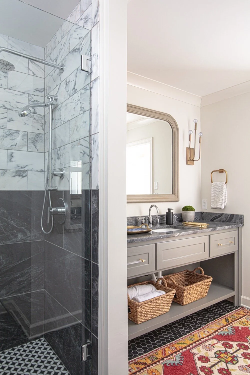
The most recent renovation didn’t stop with the kitchen. A downstairs bathroom received a dramatic redo from top to bottom. The original tub area is now a spa-like oversized shower with black and white marble subway tile. Black hex tiles on the floor give the room timeless appeal. A custom vanity designed by Robin and topped with the same dark marble used in the kitchen completes the look. While the final product is a stunner, Murphy admits he wasn’t certain about Robin’s countertop choice at first. Undeterred, Robin knew it would be perfect; she loved the matte finish and knew the dark color would be the most practical option for the way her family lives. 

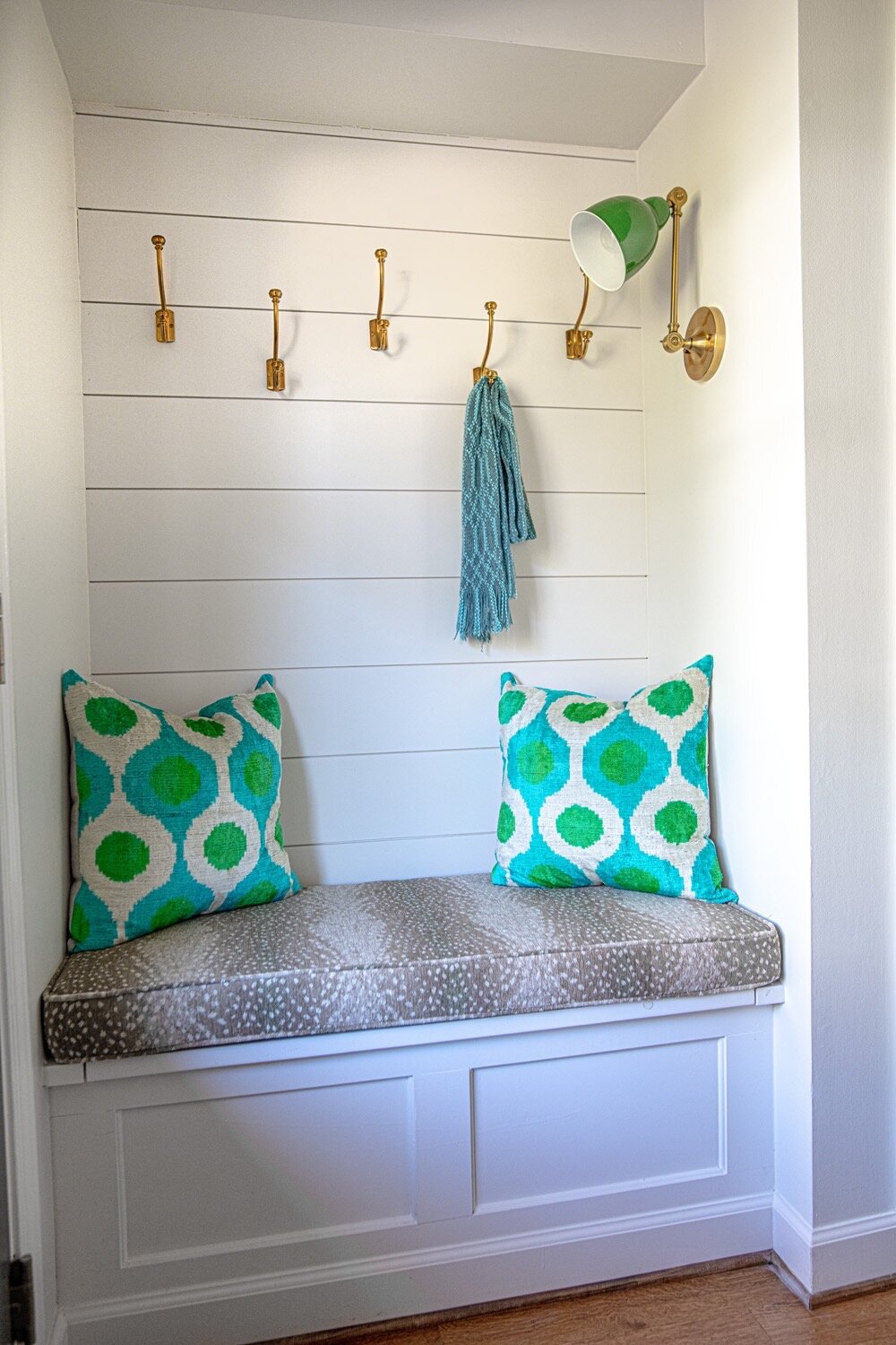
The project also included a few tweaks of earlier remodels. As part of the 2005 renovation Robin had a built-in desk installed near the home’s rear entrance, but she never used it as she thought she might. Now, in its place there is a handy bench with storage underneath and coat hooks above. 

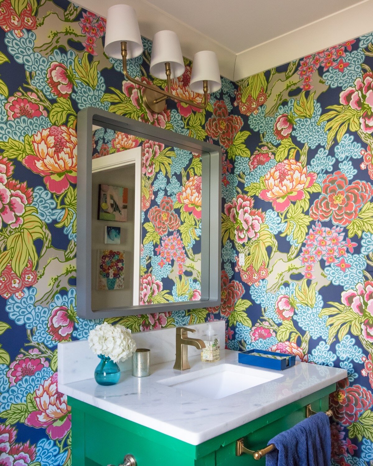
Murphy describes the powder room as “night-and-day different” from the way it used to look, despite the fact that the floor plan for the space remained the same. The half bath is a knockout with bold floral wallpaper and a unique vanity. Says Robin, “It was a table that I had bought for $50 on an online marketplace.” After a few modifications and a coat of paint in her favorite shade of green, the piece has a new purpose adding flair to the design.

22-Mike-Murphy-Selberg-1O6A9364-web.jpg

The Selbergs have put their personal stamp on each part of the house over the years, truly making it their home, and they intend to stay put and enjoy it for the long haul. “Michael’s sister is a realtor, and when we finished this project she said, ‘You know, I could sell this house in a minute.’ I’m not planning on going anywhere!” Robin laughs. 

“Germantown is getting built out. There’s not a lot of spots for new houses to go up,” says Robin. “We love living in Germantown; it’s convenient. We didn’t want to move from Germantown, but we needed our space to be different. I think that’s the way of the future in Germantown. I’m all for remodeling to get what you want.”

And Murphy is in full agreement. “You’ve adjusted the house with your family’s needs. You keep making the space you have so much more usable and efficient.” 

After two decades and three major projects, it would seem that the Selbergs might be done with home remodeling. When asked if that’s the case, Robin says without hesitation that a new separate garage is next up on the agenda. Life changes, floor plans and designs change, but it’s a safe bet that the Selberg family’s address will remain the same for years to come.