A Gem in the Heart of Germantown
/Interior Design by Warehouse 67 Design | Story by Terri Glazer | Photography by Annabella Charles
“A home is just like a painting; you have some elements that play the background and some that are focal points. It’s knowing how to layer those so that the end result is harmonious and you get that beautiful, cohesive, finished look that’s indescribable. You don’t know why you like it, but you like it.”
Interior designer Kim Loudenbeck uses this artistic analogy to describe a renovation project she recently completed. The collaboration between Loudenbeck, home builder John Duke and Elizabeth Wilson Duke, realtor, was a labor of love.
“We’ve been pouring our hearts into it because we love that it’s such a gem,” says Loudenbeck. The beauty of the house is that it is a sizable home on a sizable lot, and in the heart of Germantown. “You don’t see these properties in Germantown very much. With the space limitations now the lots are getting smaller but there are still people who want more land, and those lots are few and far between,” the designer adds.
When the house went on the market Elizabeth recognized a golden opportunity. She bought the property and convinced her husband, who usually builds new-construction homes, to tackle a large-scale renovation. Rounding out the team were architect Jeff Bramlett and Loudenbeck.
The designer says that for this reno, as with every project she takes on, the vision of the ultimate personality of the home was key from day one. “Laying that out and having a clear definition of where you’re going is so important,” she emphasizes. However, a renovation always involves twists and turns. “There are so many things that come about in the process. You don’t know what’s behind the walls; you don’t know what you’re going to run into,” she cautions. Loudenbeck’s goal was to keep the project focused amid the changes that inevitably came. “It can be like a roller coaster with a reno, and you just have to be prepared that there are going to be changes. As long as you know where you’re going, it’s easy to stay on track. People often get stuck in the weeds; they get overwhelmed with renovations. It’s so important to have the right team or someone to partner with to keep you focused on getting what you want out of the home.”
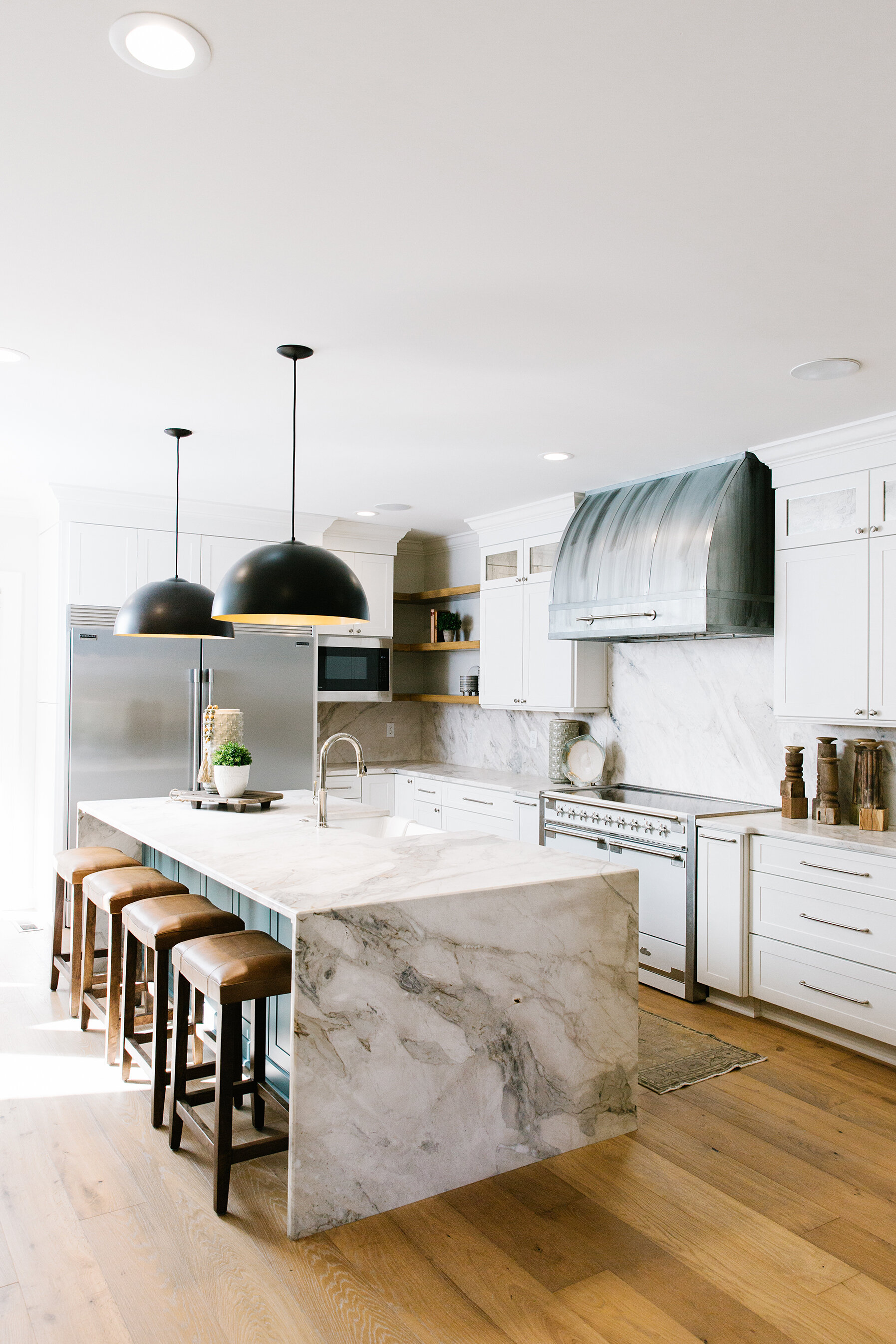
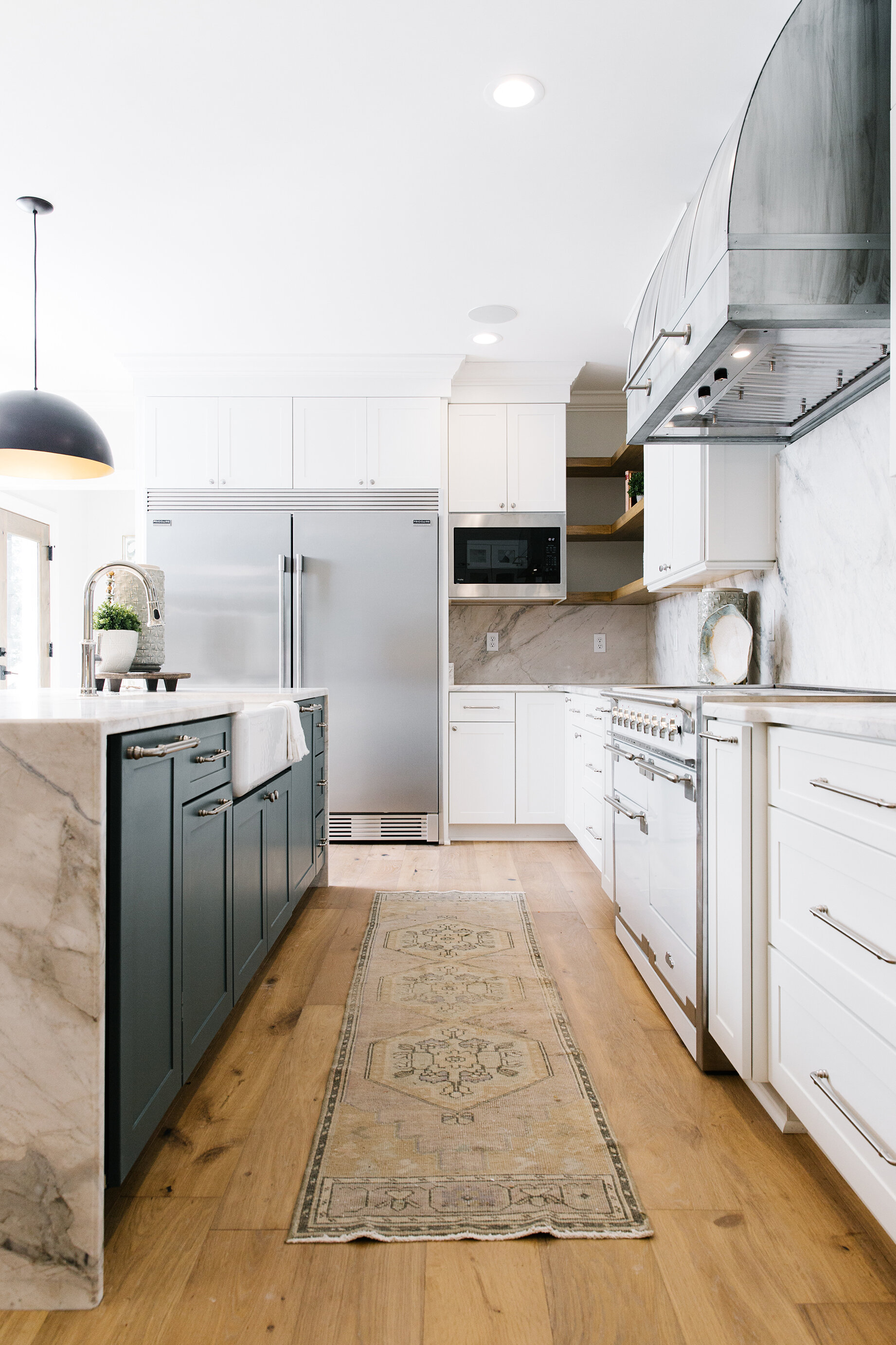
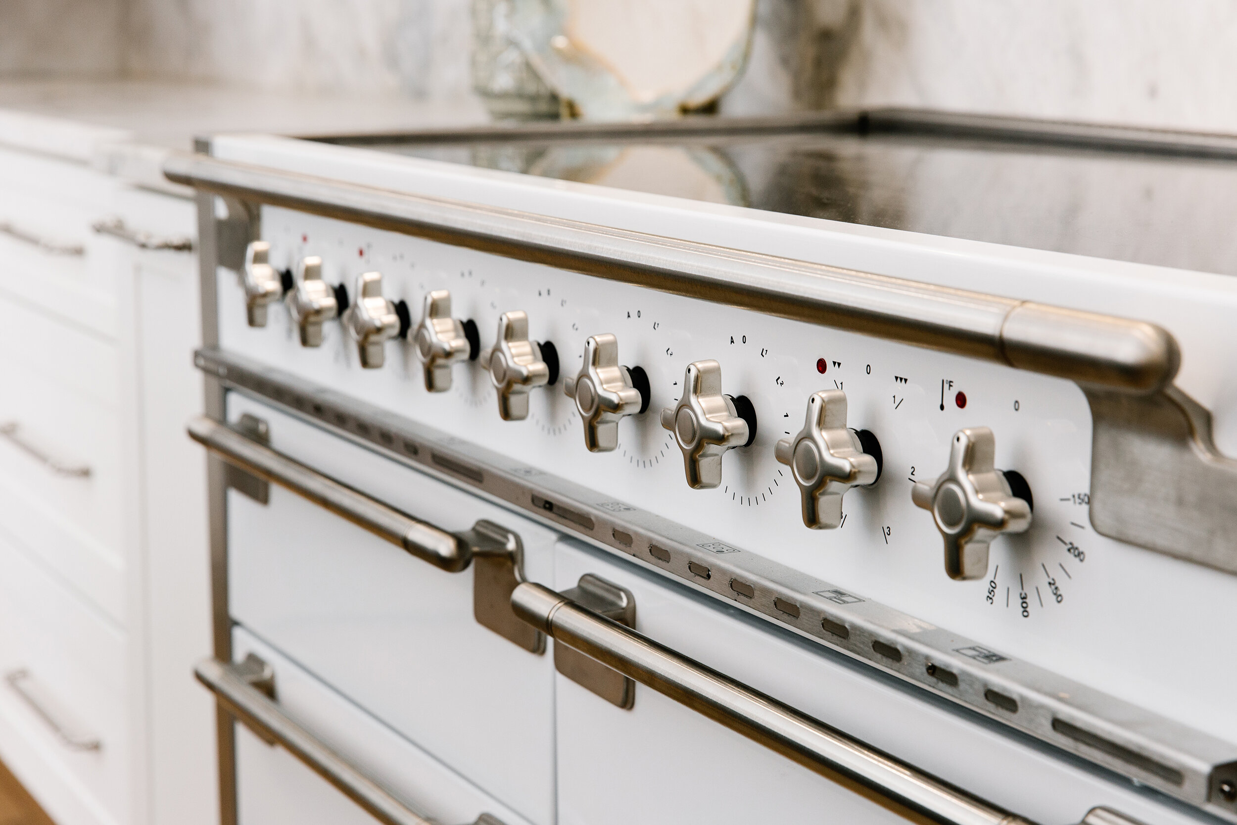
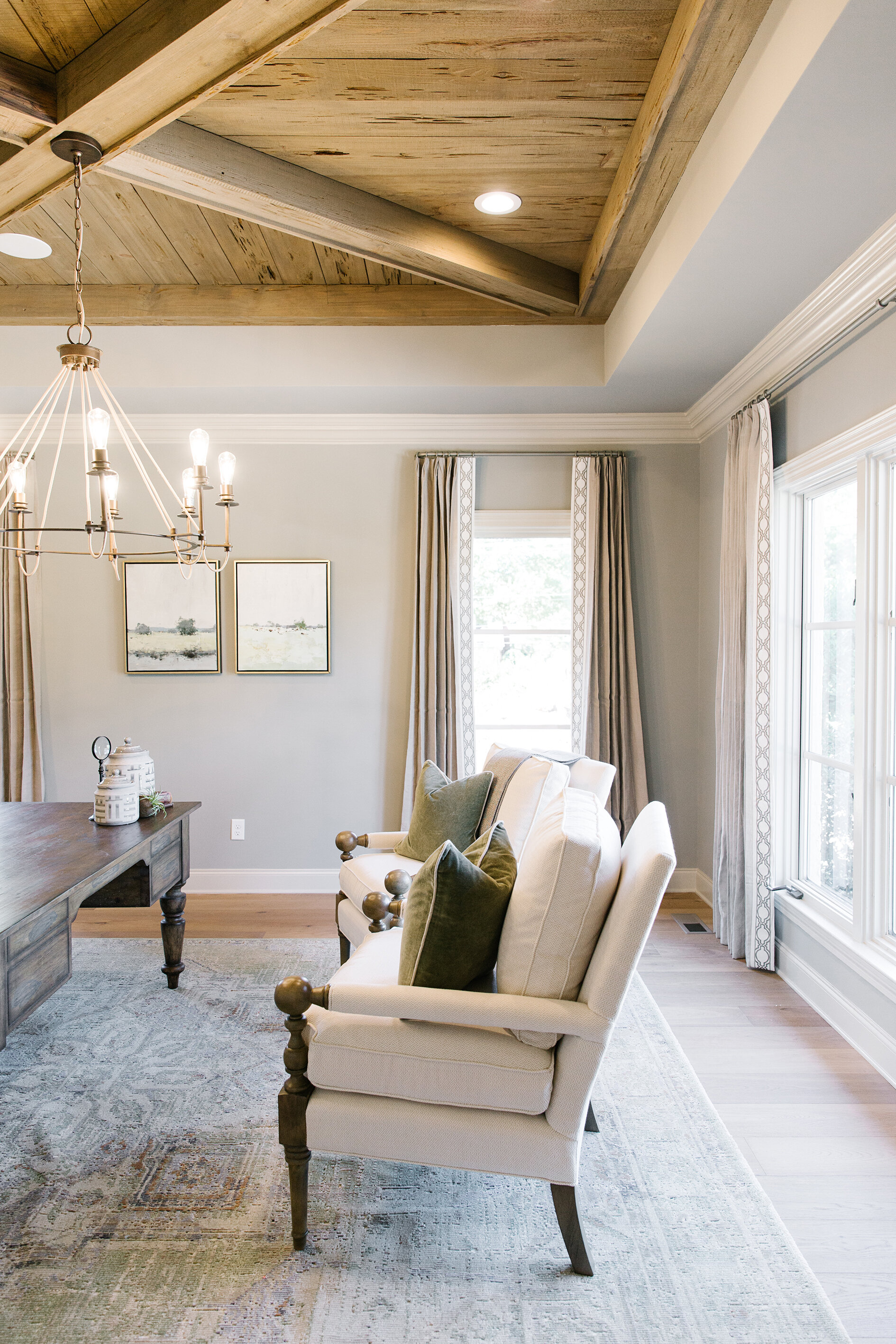
Although the Dukes bought it with the intention to remodel for resale the term “flip” seems an inadequate description of this jewel of a house. “It’s the features that really set this home apart. The attention to detail is phenomenal, says Loudenbeck. The master bath has a heated floor, the kitchen has an Aga Elise induction range and a custom vent hood. The original kitchen was transformed into a large, fully equipped scullery for entertaining, and the study has an eye-catching wood-paneled ceiling.
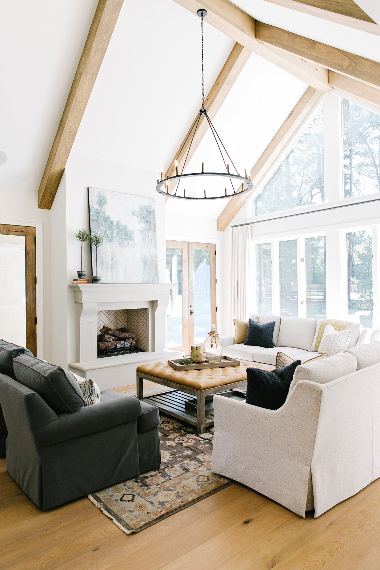
That focus on detail sometimes led to more work, but the results justify the effort. Loudenbeck says, “We didn’t really stick with what was easy; we made choices based on what was best. In the office we used pecky cypress on the ceiling as a decorative element. The front and back doors are solid alder. We used smooth cypress on the beams. It was a lot of using the right elements in the right place, but when it came to paint and stain, we had to use a different combination of stain on each of these to make sure that it all looks the same in the end. Every wood stains differently. So many details and to get the end result that you want you have to focus on each and every one of them. The end result will be affected if you don’t take everything seriously.”
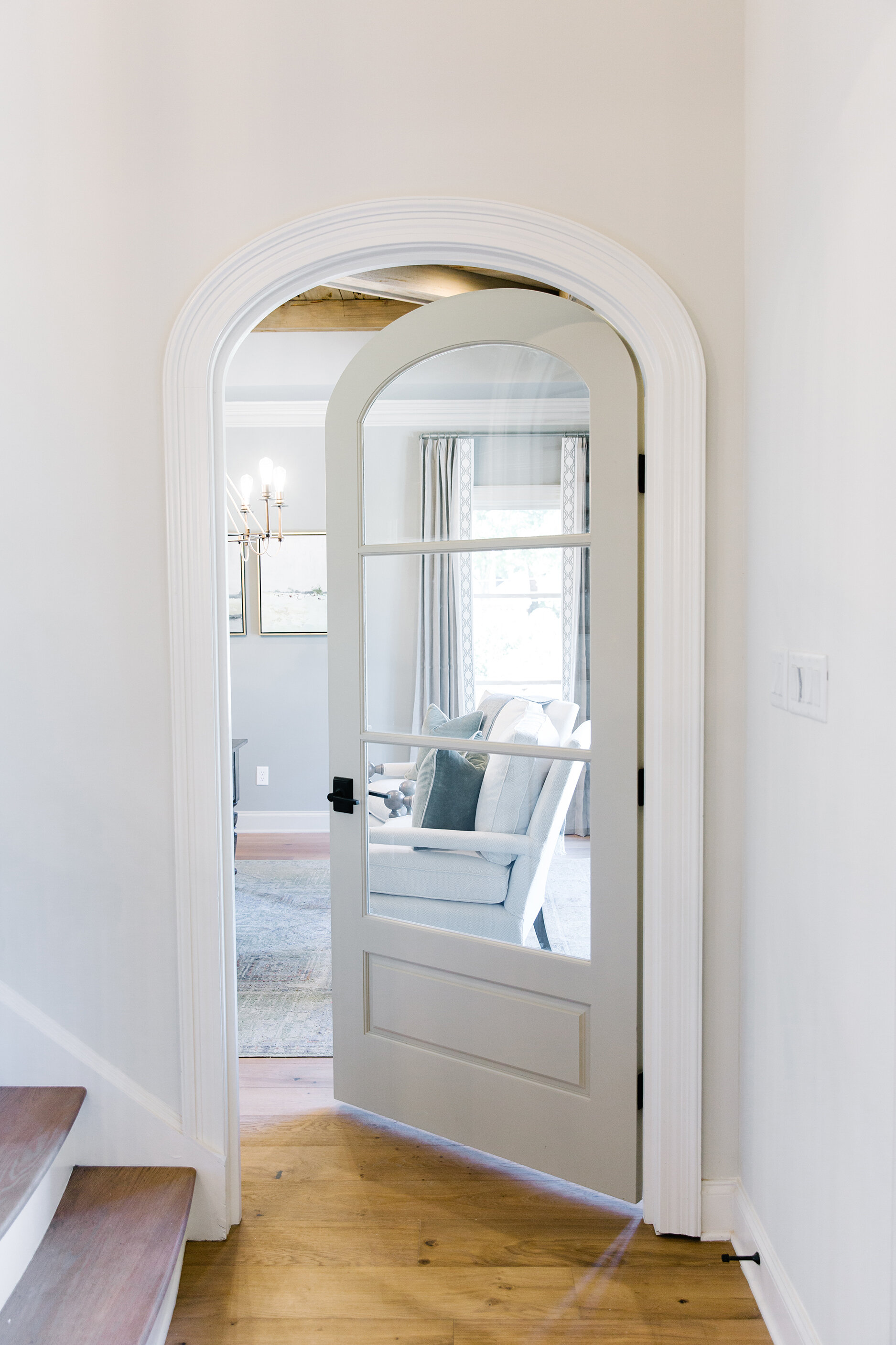
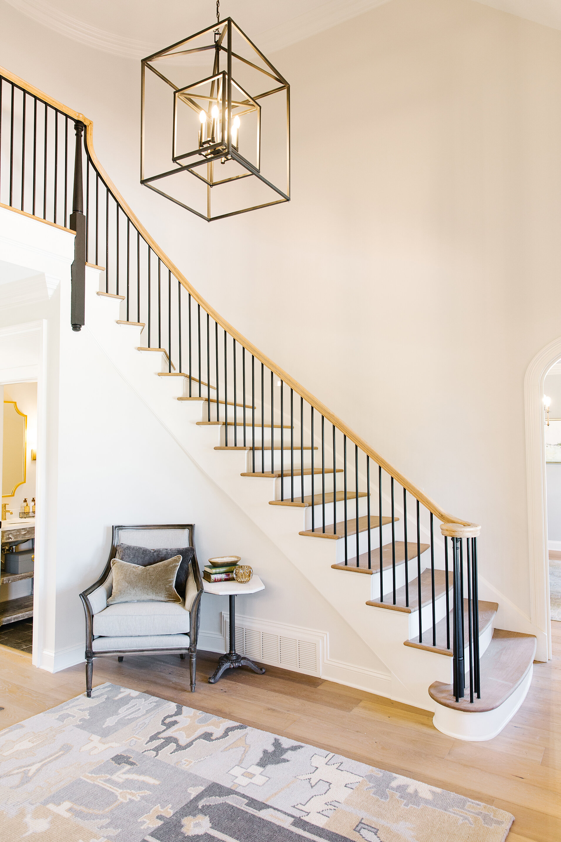
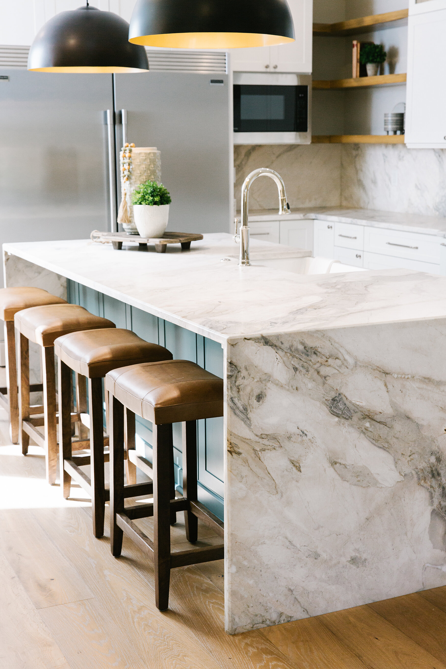
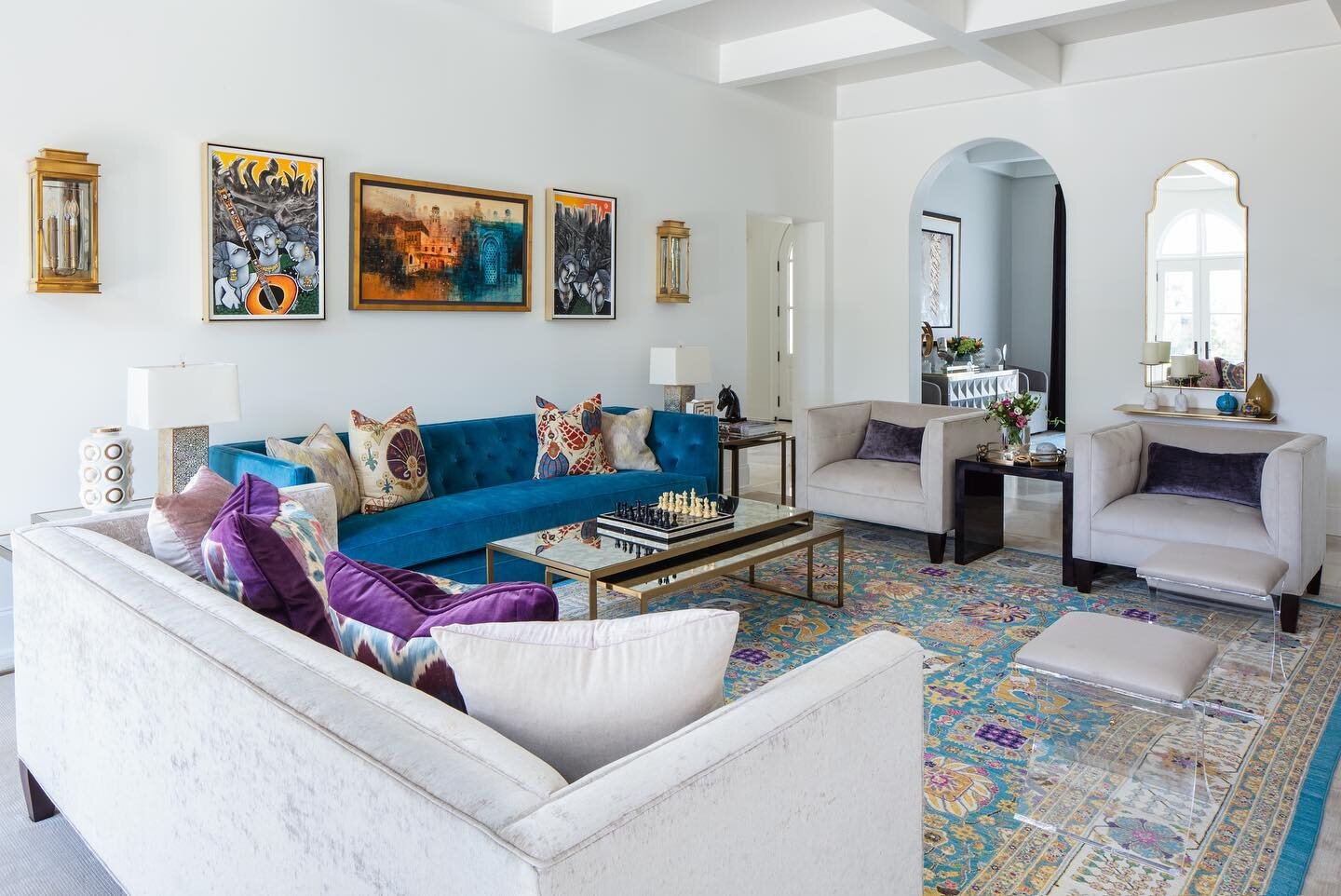
Loudenbeck’s vision for the design was to retain the character of the original home while pushing the envelope to take the design from traditional more toward transitional. While she had Duke keep what she calls “little jewels” from the original construction like arched openings and a curved staircase, she admits she went a little edgier on the lighting selections, the finishes and the modern waterfall island in the kitchen. “Adding unique and different elements that are more transitional creates a great balance between what was here and what was done. It’s a beautiful marriage of the two,” she says.
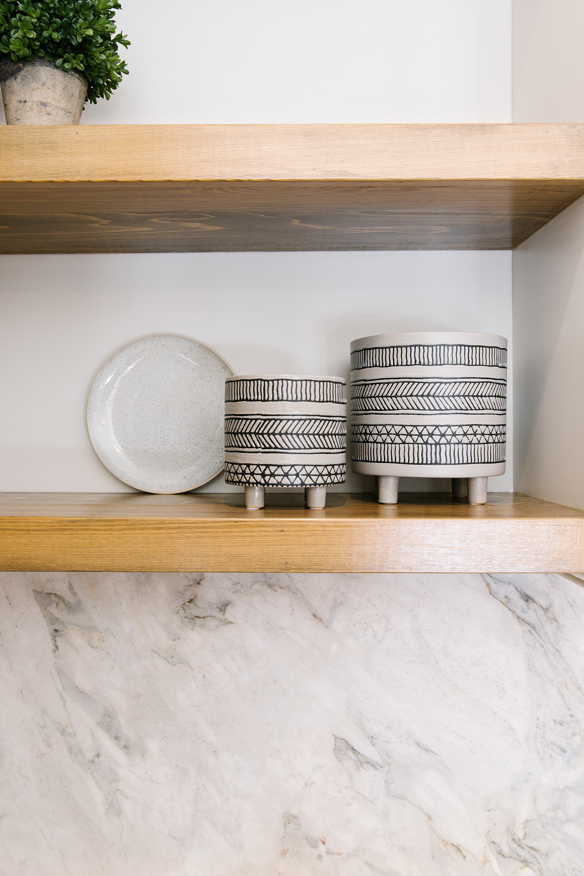
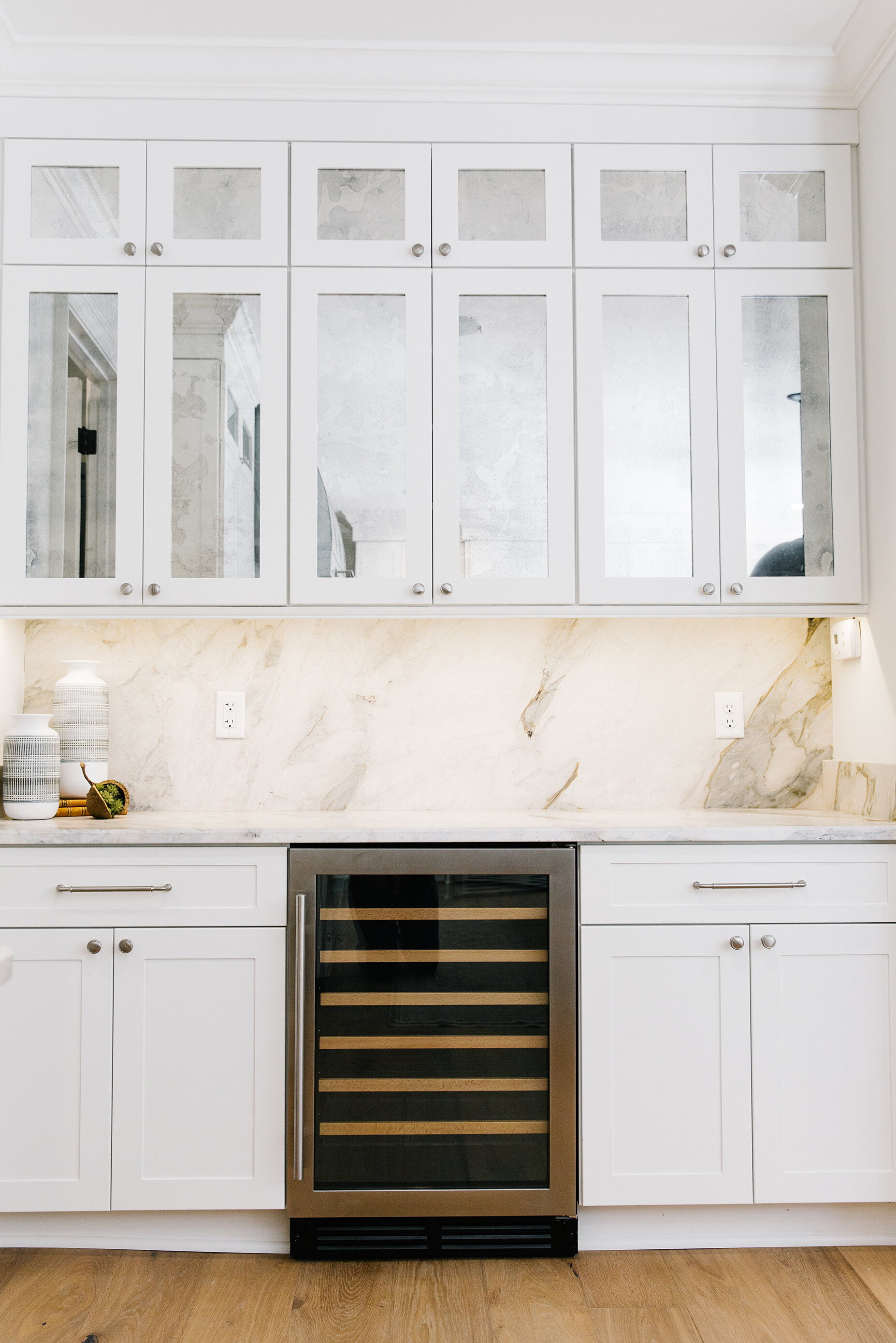
Two of the areas that received full do-overs were the home’s bathrooms and kitchen—rooms Loudenbeck says a discerning buyer would most definitely want to see equipped with up-to-the-moment features. Along with the show-stopping range, vent hood from Lipford Sheet Metal and waterfall counter in quartzite with just the right blend of warm and cool tones, the kitchen boasts a large commercial-style refrigerator/freezer and a bar area embellished with antique mirror-front doors. Open, natural wood shelving in both the kitchen and the scullery bring an earthy element that Loudenbeck loves to incorporate in all her designs and pair with stone and mixed metals. “I feel like it creates a real sense of warmth, especially when the walls are lighter,” she says.
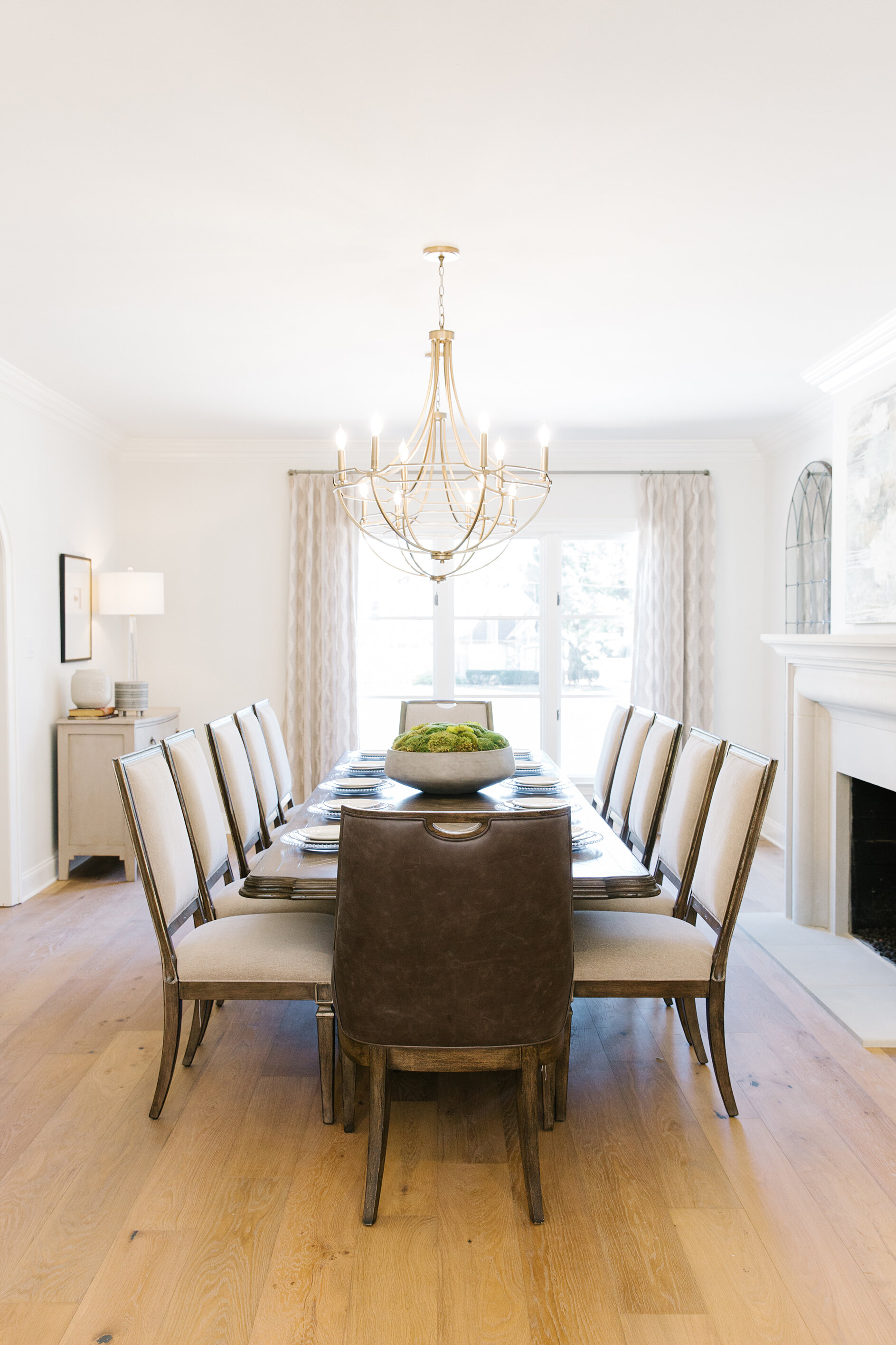
While Bramlett was able to work with the rooms in the front of the house, the ones on the back weren’t compatible with a modern, open floor plan, so they had to be completely redone. You’d never know it, though. “In a renovation, the ultimate goal is that you don’t want it to feel like the newly done part is disjointed from the rest of the home,” says Loudenbeck. The renovation team achieved that goal perfectly. The floor plan flows seamlessly from the front entry with its majestic, yet clean-lined curved stair, to the large dining room, to the newly built family room and kitchen. “We took the traditional elements and gave them a little different spin—a bit cleaner, different finishes to make it look new and fresh versus feeling like we had to go back with what was expected.”
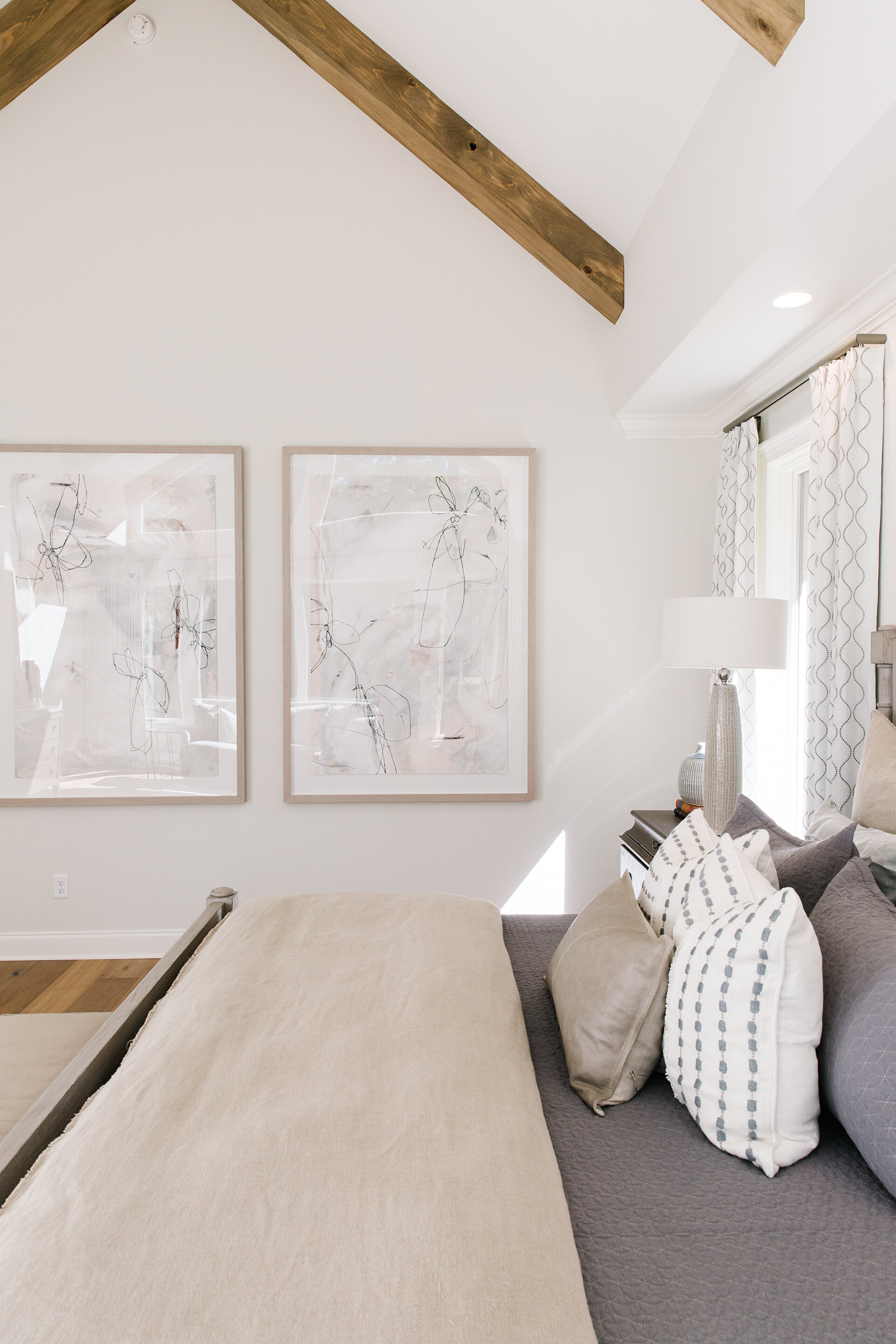
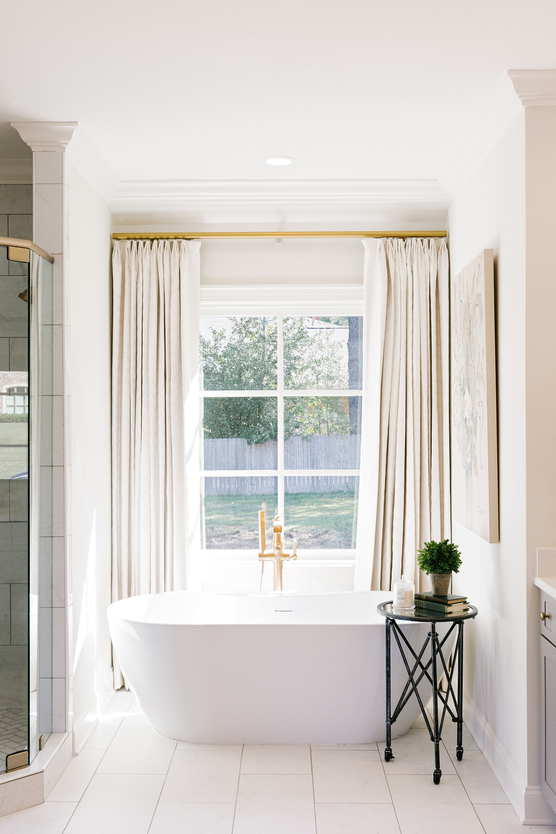
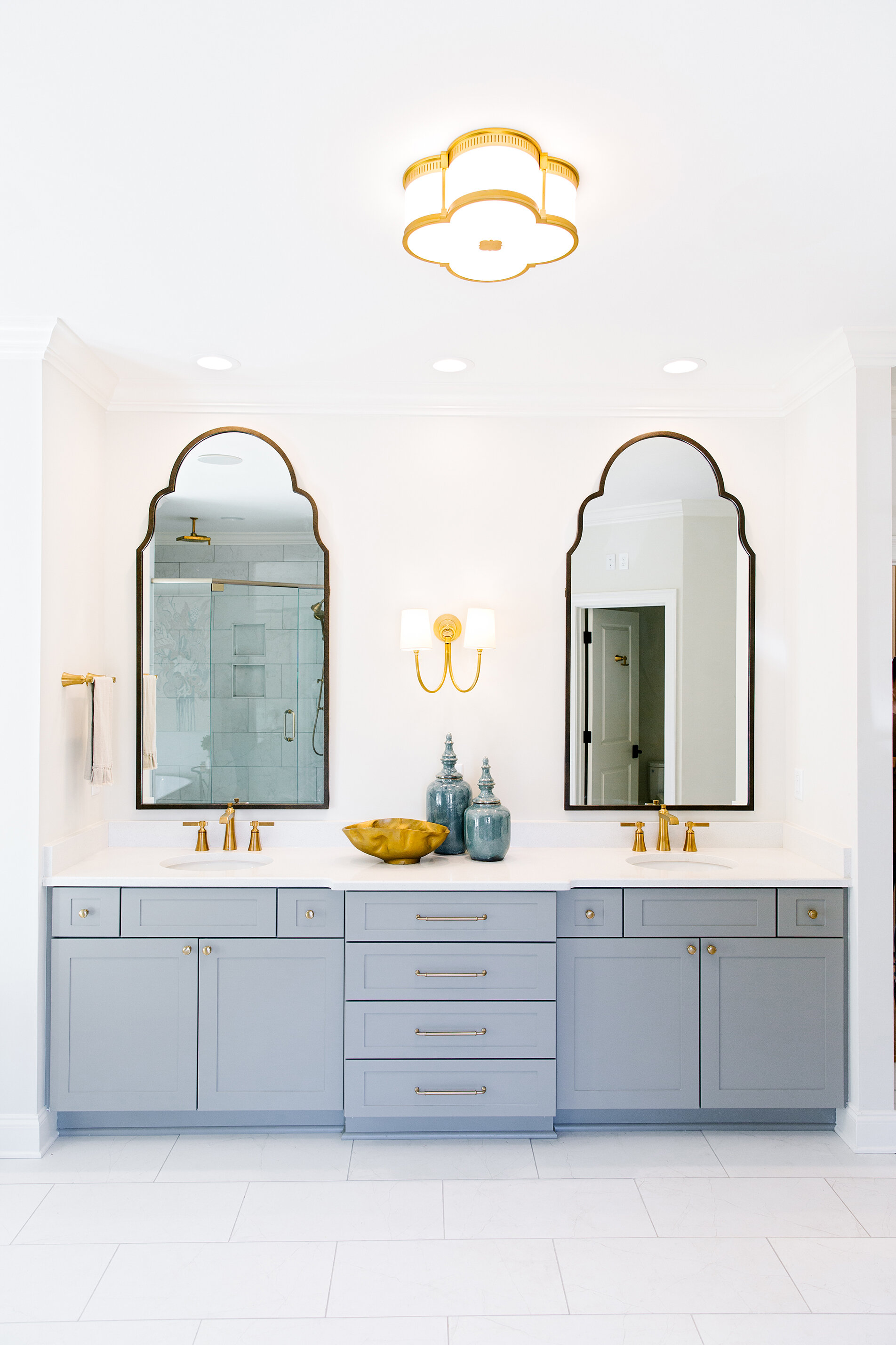
The master suite was created with relaxation and luxury in mind. While it feels private and secluded, the bedroom is also soaked in natural light. The vaulted ceiling repeats the natural element of wooden beams found in the family room. The bath is full of all the latest bells and whistles, from the heated floor to the freestanding soaking tub to the his-and-hers vanities to the deluxe shower with multiple sprays. “We knew that someone in this home on this land in the heart of Germantown would want a really special home. When you have a chance to put all the fun stuff in, why not?” laughs Loudenbeck.
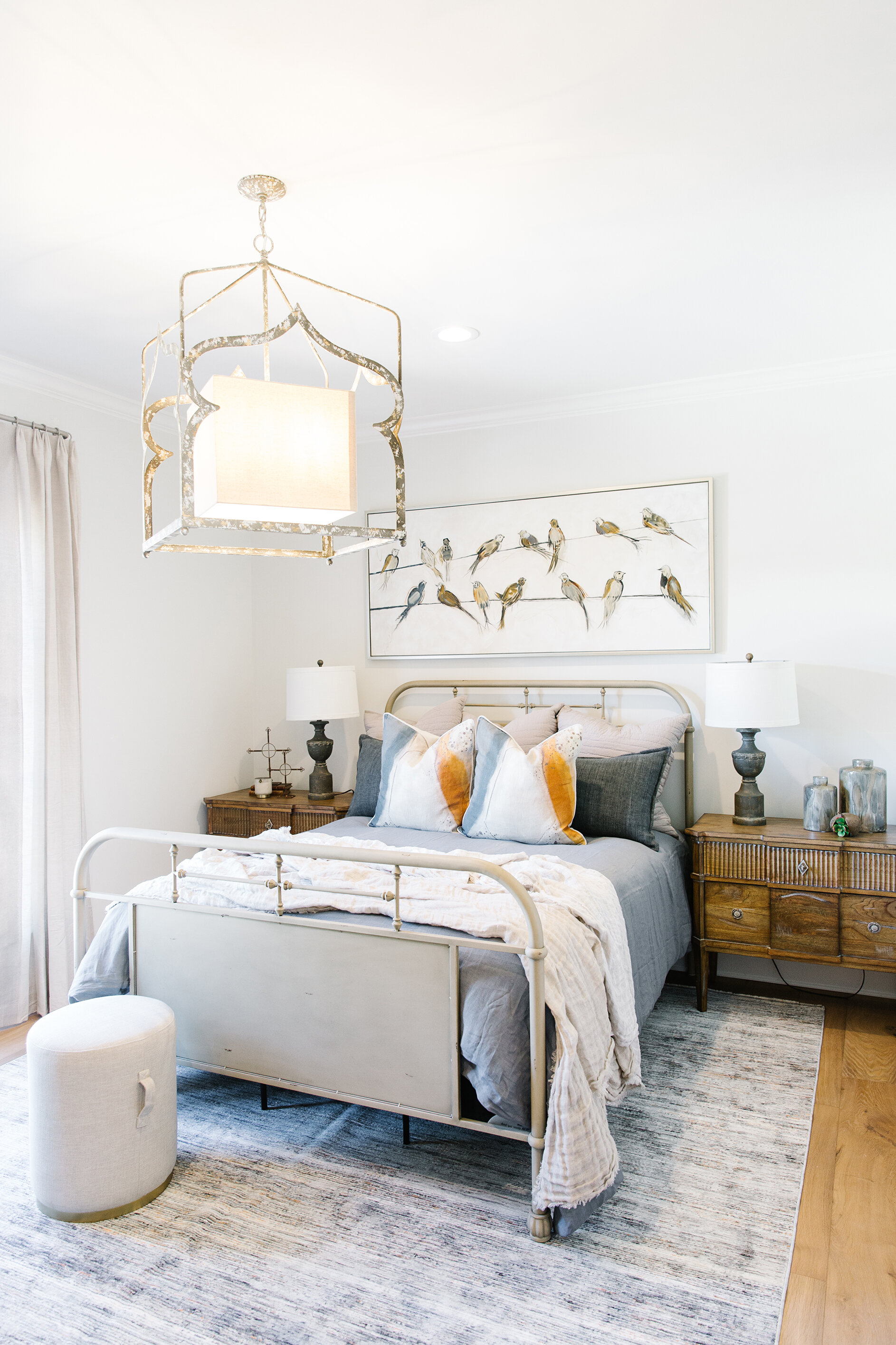
Asked about the effort she and her Warehouse 67 team put into fully staging the home Loudenbeck had this to say. “In our area, homes don’t usually sell furnished, but in other parts of the country that’s more typical. We are seeing that change a little, though. We’ve furnished it tastefully and so that it blends perfectly with the house. A buyer might like the fact that they could walk right in and only need to bring sentimental pieces that they want with them.”
In addition, the team felt that with the scope of this renovation, it was only fitting to dress the revitalized home in style. “We wanted to show the sentence finished, with the exclamation mark. What the potential of this house could be,” the designer says.
It’s clear from Loudenbeck’s enthusiasm that the architect, builder and designer achieved the full potential on this collaboration. “I think it’s fun to sit back and take in the beautiful vignettes created in the home,” she says. “When you’re walking through the house it reads well. There’s something pretty in every view and at every different angle.”


