An Enlightened Home
/Written by Terri Glazer | Photography by Annabella Charles
Years of planning result in a light-filled home in which beauty and practicality mesh seamlessly.
The owner of this East Memphis home says she has always been inspired by natural light. “It’s just uplifting,” she explains. That love played heavily into the plan when the couple turned to David Anderson, a Memphis architect who specializes in custom homes, to create the house where they are raising their family.
Lots of light was at the top of the must-haves they gave Anderson—a long list compiled over time and with much thought. “There was an existing home here that my husband had originally lived in, and we were living next door. We planned for probably seven years, just kind of dreaming and planning and sketching out ideas and making wish lists,” the homeowner recalls. “Then finally, we decided to take the plunge. We bulldozed the house that was here. [Construction] took about a year and a half to complete, start to finish.” Lockwood Griffin of Griffin Homes was the builder.
“We wanted so many windows in the home. David has this knack for windows,” says the homeowner. “He really delivered on just where to put the windows so light would filter in but we’d still have privacy.”


“We’re living in this house. We want it to be nice and neat and have a charm to it without the pressure of perfection.”
— Home Owner
Nowhere is the emphasis on windows more evident than in the home’s dining area. Situated at the front of the house, adjacent to the open kitchen, a double-height set of windows backs a banquette that spans the entire length of the space. The windows continue around the corner to the room’s west wall, allowing even more light to flood in.
Every aspect of the dining room, from its size and scale to the furnishings, is the product of careful consideration. “When we built the house we knew we didn’t want an enormous footprint on everything so we tried to consolidate and work with David on making the most of a space without it being so grand. Palladio built the long bench and we decided that since we were having a banquette, it would be easier when we’re having multiple guests over, as they’re sitting on the banquette, to have a table that would split for the ease of getting in and out.
That “light-filled-and-not-enormous” aesthetic continues into the adjacent kitchen. Explains the homeowner, “With the floor plan being so open, the area kind of turns into one big living space. I didn’t want it to read so much as kitchen.” To that end, she decided to forego wall cabinets and selected a refrigerator that didn’t require a front vent. Even the barstools that border the kitchen island are upholstered, for a “softer look,” she says. Although the white fabric on the seats looks refined, it’s also easy to clean, a must with seven-year-old twin sons in the family.
Despite the absence of upper cabinets, this kitchen offers plenty of storage, from drawers in the oversized island, to the sizeable pantry just behind it, a feature the homeowner describes as a happy coincidence. “When we were working with David on revisions, we were, again, trying to keep the footprint from being so large. We had to make a change in the powder room and it ended up enlarging my pantry. I was so glad because I went from a little broom closet to this pantry that has storage, a nook for keeping track of lists and even a little dog food spot.” The clever addition of barn doors allows the owners to close off the pantry when entertaining, transforming the area from a utilitarian necessity to a passthrough leading guests to the powder room. “We wanted to have seating enough for friends and family,” says the homeowner, “but we also knew this room would be lived in. The kids are going to have their pillow fights in here so it’s all furniture we can use.” Pieces range from a coffee table the family had in their previous residence and a well-loved leather chair to a new sofa, chairs and accessories selected specifically for the room.
Along with an abundance of light, a sense of tranquility permeates the house, thanks in part to the neutral color palette that runs throughout. The oak floors are finished with a simple classic gray stain, the walls are washed in a soft white, and the furnishings range from light-toned woods to soothing beiges, grays and taupes. “I like a calm in my life. I didn’t want to have too much going on everywhere and I wanted things to flow nicely,” says the homeowner. “We’re living in this house. We want it to be nice and neat and have a charm to it without the pressure of perfection.”
The downstairs master suite is a serene retreat. A tall ceiling in the bedroom creates a roomy feel which the homeowner loves, although she admits her favorite touch is out of plain sight. Flanking the room’s window alcove, full-length drapes hide a wall-mounted TV when it’s not in use. The curtains can open to let in the natural light the couple so loves or close completely for privacy. Elegant, yet completely livable, the master bath exudes a spa-like feel with a free-standing soaking tub and clean white fixtures dressed up with gold accents.
A generous guest suite completes the home’s first floor, but upstairs is the domain of the children. At the top of the staircase a rec room holds all the toys two busy boys could need, plus a TV and a cozy window seat—the perfect spot to read a book. Originally conceived as attic space, the room came to be as part of the effort to minimize wasted space. “Basically all the hallways. That’s why we have this little area outside the boys’ bedrooms,” says the homeowner.
Brilliantly designed with twins in mind, the two children’s bedrooms are almost identical and each has its own bath. The wall that separates them is more aperture than barrier, a large cased opening with barn doors. Says their mother, “With twin boys, we didn’t know. Right now they love sharing a bedroom, but maybe one day they’ll want separate bedrooms, but would still want that feeling of being together. Or if they had sleepovers, it’s an area that could have the feel of a suite. They can close the barn doors for privacy, or if we have extra family come in it can serve as a second guest room.”
Just outside the boys’ bedrooms and open to the downstairs, a study loft holds two desks for homework, topped by built-in bookcases laden with family treasures. “Things that were my husband’s parents’. Things that were his. It’s sweet to have a little spot where you can put those mementoes.” And, spoken like a true mom, she adds, “With it being in the loft area I can still kind of hear what’s going on. I can take a peek up and make sure they’re at their desks.”
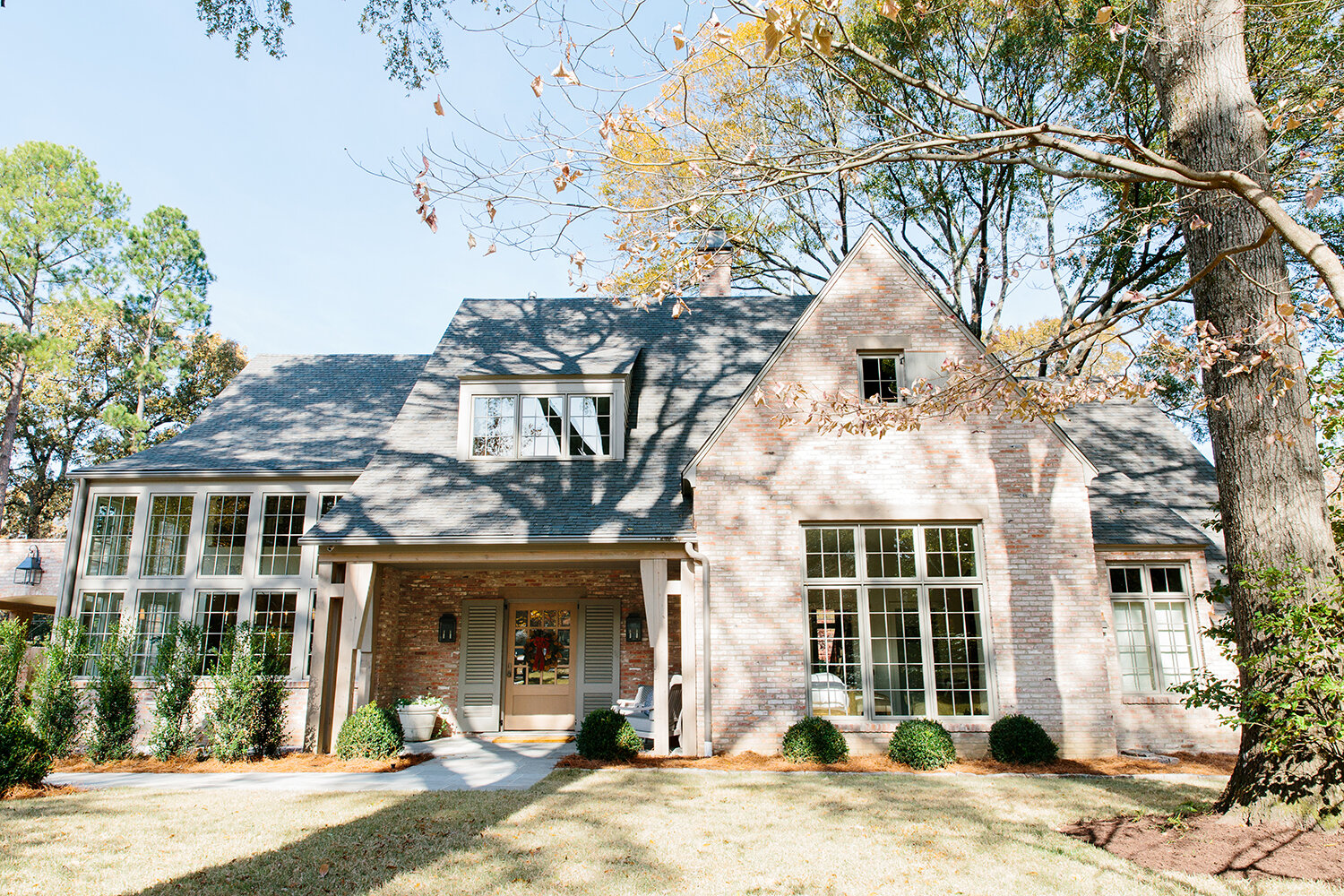
When it came to their home’s exterior and outdoor living, the owners applied the same detailed thought process that went into the inside spaces. “With a new construction home, we didn’t want it to look brand new; that’s why we chose reclaimed brick. We debated on every single detail about it...how far apart we spaced the bricks to the color of the mortar. We put samples up and looked at new brick that was supposed to look like old brick. We were lucky to find this old, old brick that helped give the house that instant patina and charm.”
Even the fence was the subject of careful planning. “We didn’t want it to feel like a barrier, but just something to help contain two little boys and a dog. We wanted it to feel homey.”
Out back, a cozy covered porch and an inviting pool promise sun-filled days and family memories waiting to be made. Like the rest of the home, the T-shaped pool design was intentional, with children and their safety in mind. “I really wanted a shallow end that the kids could play in,” says the homeowner. “I always pictured a basketball or volleyball game going on in the shallow end.”
Even the detached garage is well thought out and useful for the entire family. In addition to room for two cars, the garage has plenty of storage and even a “kids’ garage” for the boys’ bikes and gear. Above, a studio space provides room for the homeowner to create art, a passion she put on the back burner while her children were younger. And, of course, it has great natural crosslight, she admits. “It has windows on the front and back walls, so it’s a great space.”
With a degree in graphic design and a love for fine art in general, it’s no wonder that the homeowner fell in love with the design process—”the options and the studying and research and building a layout of just want you want.” Through deliberate planning and with expert professionals carrying out that plan, she created an inspired and light-filled nest where her family can thrive.

