Chosen With Love
/Interior Design by Selena McAdams of Spruce Shop | Story by Terri Glazer | Photos by Stefanie Rawlinson
As an interior designer, Selena McAdams’ job is all about making choices. Her daily work involves making decisions for her clients’ homes and choosing what to put on the shelves at Spruce, the East Memphis retail shop she owns.
The same is true for the home she shares with her husband Patrick and their two daughters, Taylor and Charlotte. Selena chose the house itself, and every piece in it, using careful thought combined with instinct. “I’ve done this [design] for so long that when I see something I love, I know that’s it,” she says.
The journey to making the 1940s era place her family home began about three years ago. She and Patrick had just finished flipping the house next door to their previous residence when this one came on the market, and they were looking to do another renovation for resale. “One family had lived here the whole time and had raised four sons here prior to us purchasing it,” says McAdams. “They had entertained a lot of offers on it, but the fact that we weren’t going to tear it down and we were going to redo it was appealing to them.”
About halfway through what started as a “really awesome project” Selena says something clicked. She realized this wasn’t just a house, it was her house. In fact, she felt so at home there, she decided to throw Patrick a surprise birthday party in the yard while the house was still under renovation.
The couple worked with local architect David Anderson to reimagine the home to suit their family’s needs, and Selena gives his practical design philosophy high marks. “What he is so good about is usable space. He’s so practical—he really has family in mind when he’s making space. He made it to where we live in all the rooms every day, which is great. I’m not a person who wants to have rooms that we’re not using.”
Although much “shifting” of the home had to be done, the architect and designer tried to keep as much of the original structure as possible. Builder Frank Gusmus and his crew from Gusmus Construction made the plan a reality and the homeowners couldn’t be happier with his work.
“I’m a big believer in making your space work for you. If your square footage doesn’t seem like it’s functional, change it.”
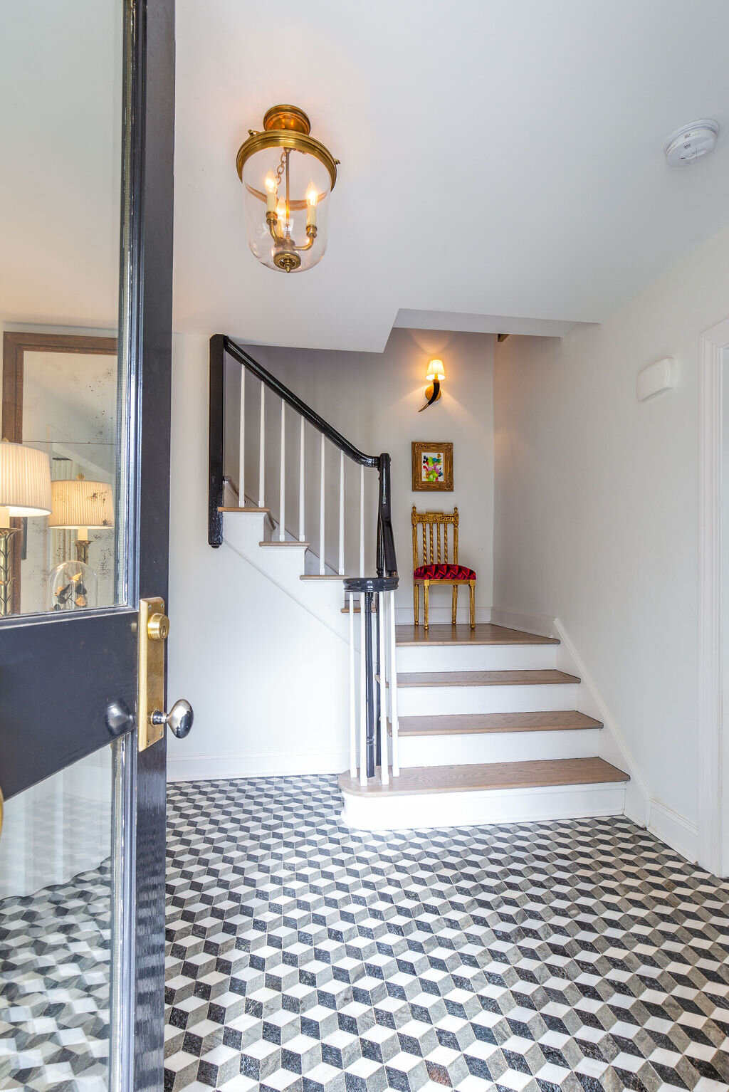
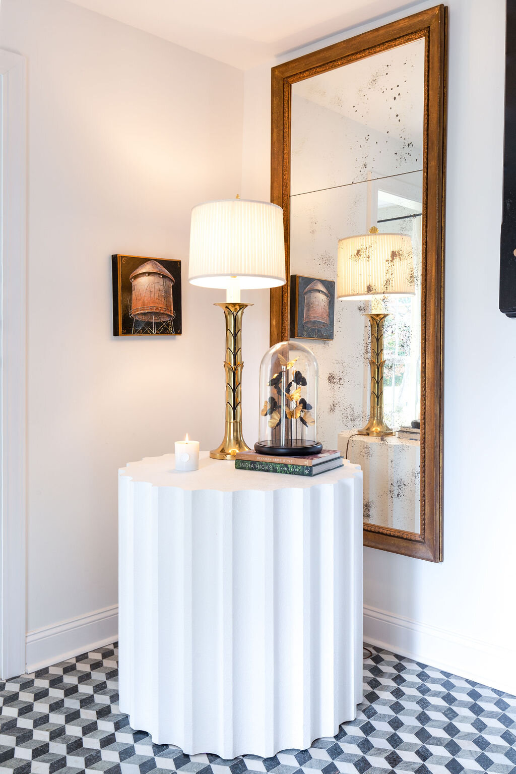
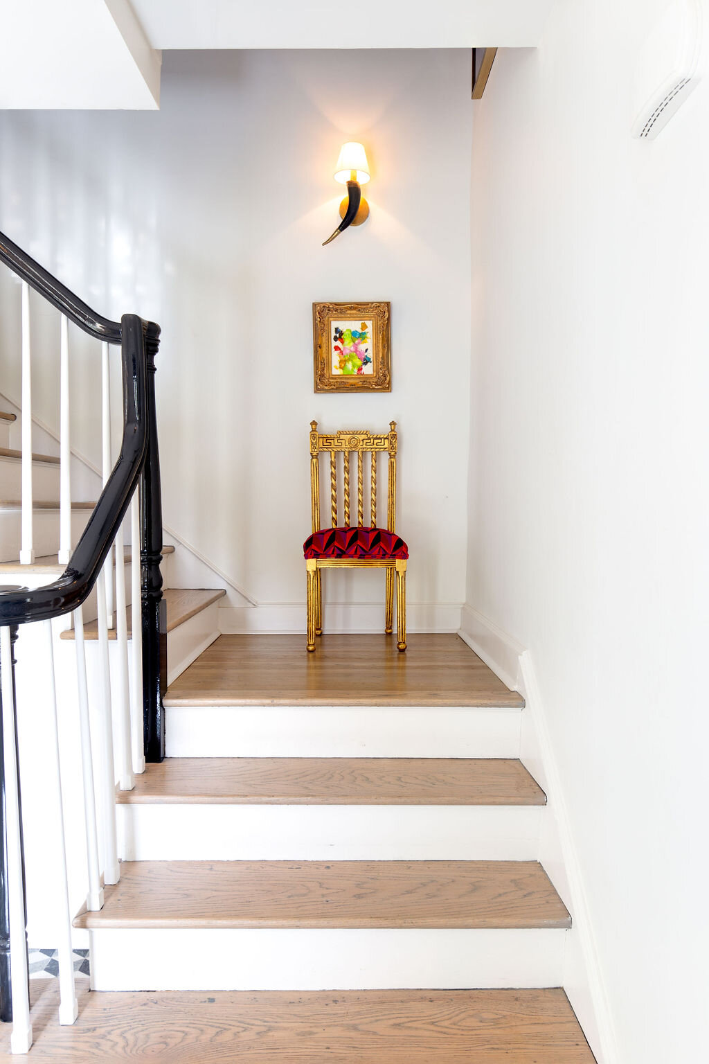
Where using the home’s original materials wasn't feasible, Selena was careful to make choices that were in keeping with the character of the house. Case in point is the entryway, where the new tile floor, hardwood stair risers and black lacquered handrail speak to the era in which the home was constructed.
Just off the entry is a sunny office area that Selena calls the “hub” of the home. On the large sofa or at the computer atop a pretty curved writing desk the girls can do school work in a cheerful space that’s not too far removed from the watchful eyes of their parents.
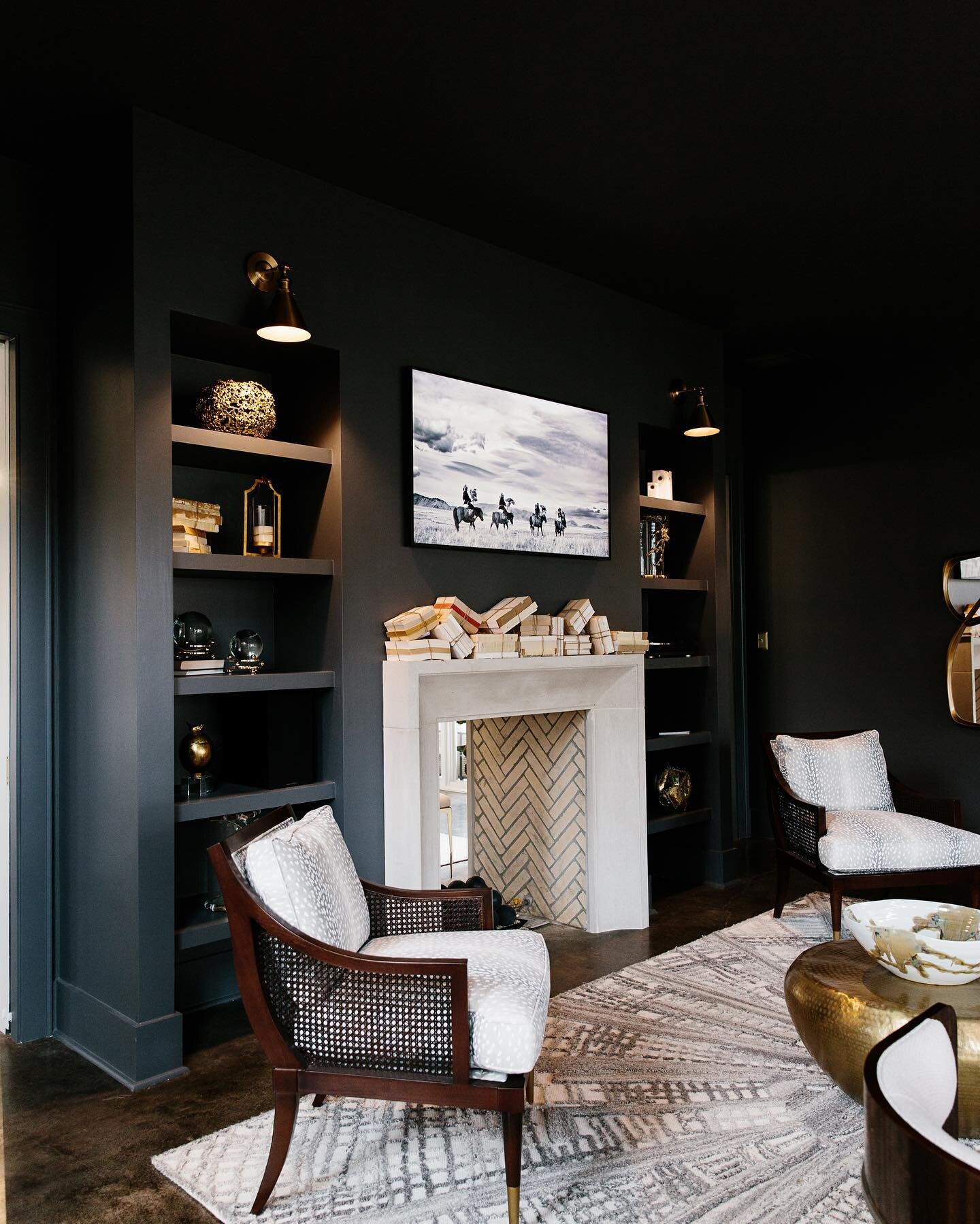
Perhaps the most drastic architectural shift was in the home’s former den, now a sleek and stylish master bedroom. The original design included a red brick fireplace, now plaster washed, and dark beams on the ceiling, which the McAdamses had removed. Hunt Simonton of HS Carpentry constructed the full wall of built-ins in the master. The handsome unit provides storage, a laundry hamper for each family member and a segue into the home’s laundry room.
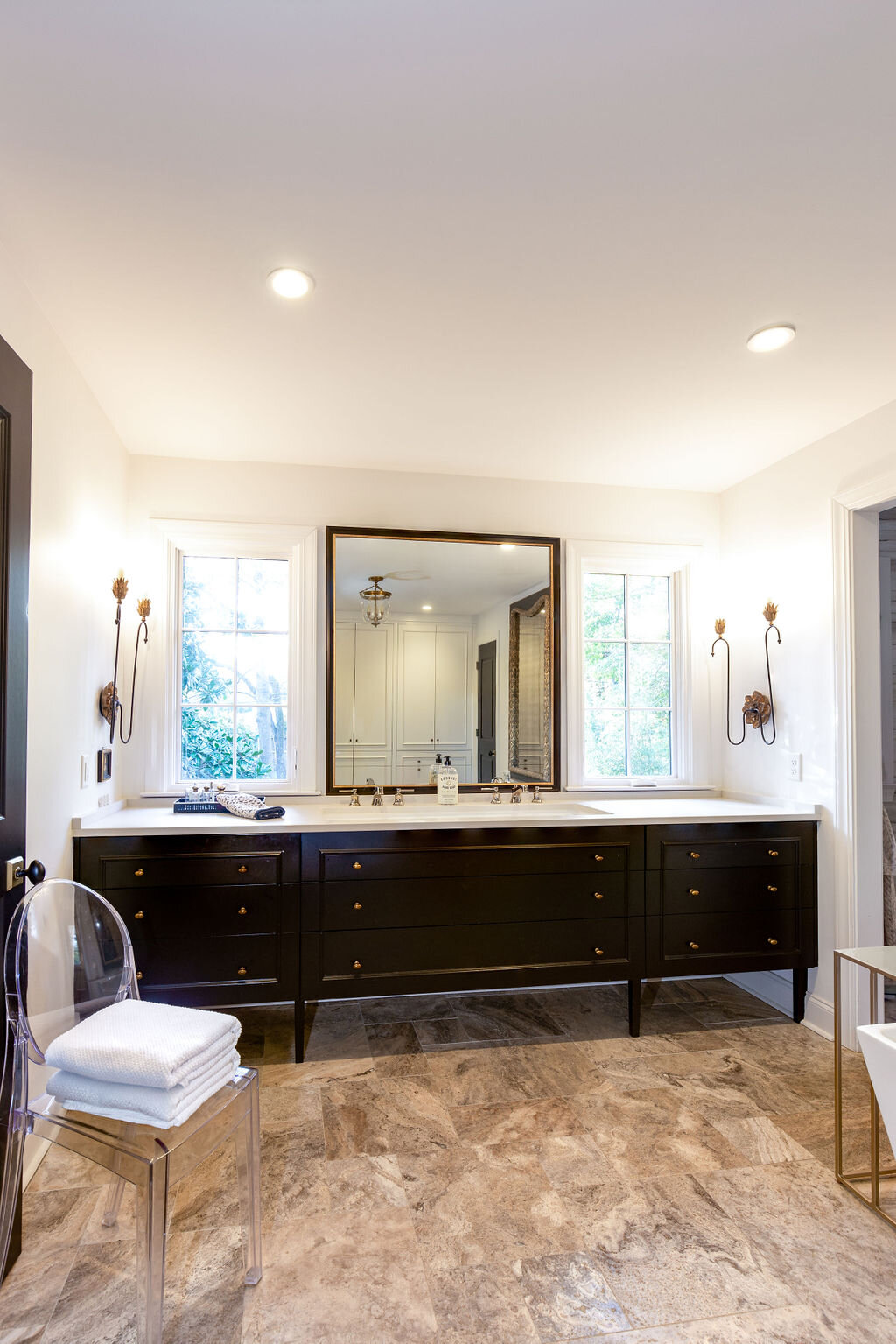
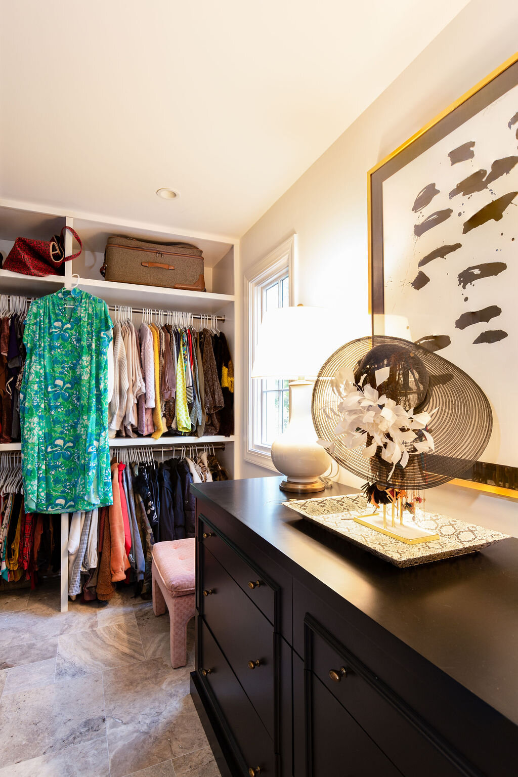
Noting that even though both her daughters have their own bathrooms upstairs, “everyone is always in our space,” Selena says with a laugh. With that in mind, she asked Anderson to design a master bath and closet add-on inspired by a luxury lodging she had visited in Asheville, NC. “The bathroom was almost like a locker room and I told David that was what I wanted. I didn’t want doors; I just wanted everything to be in one space; one big room,” she recalls.
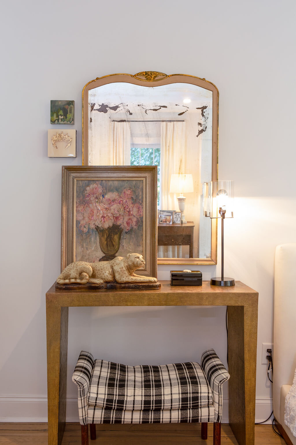
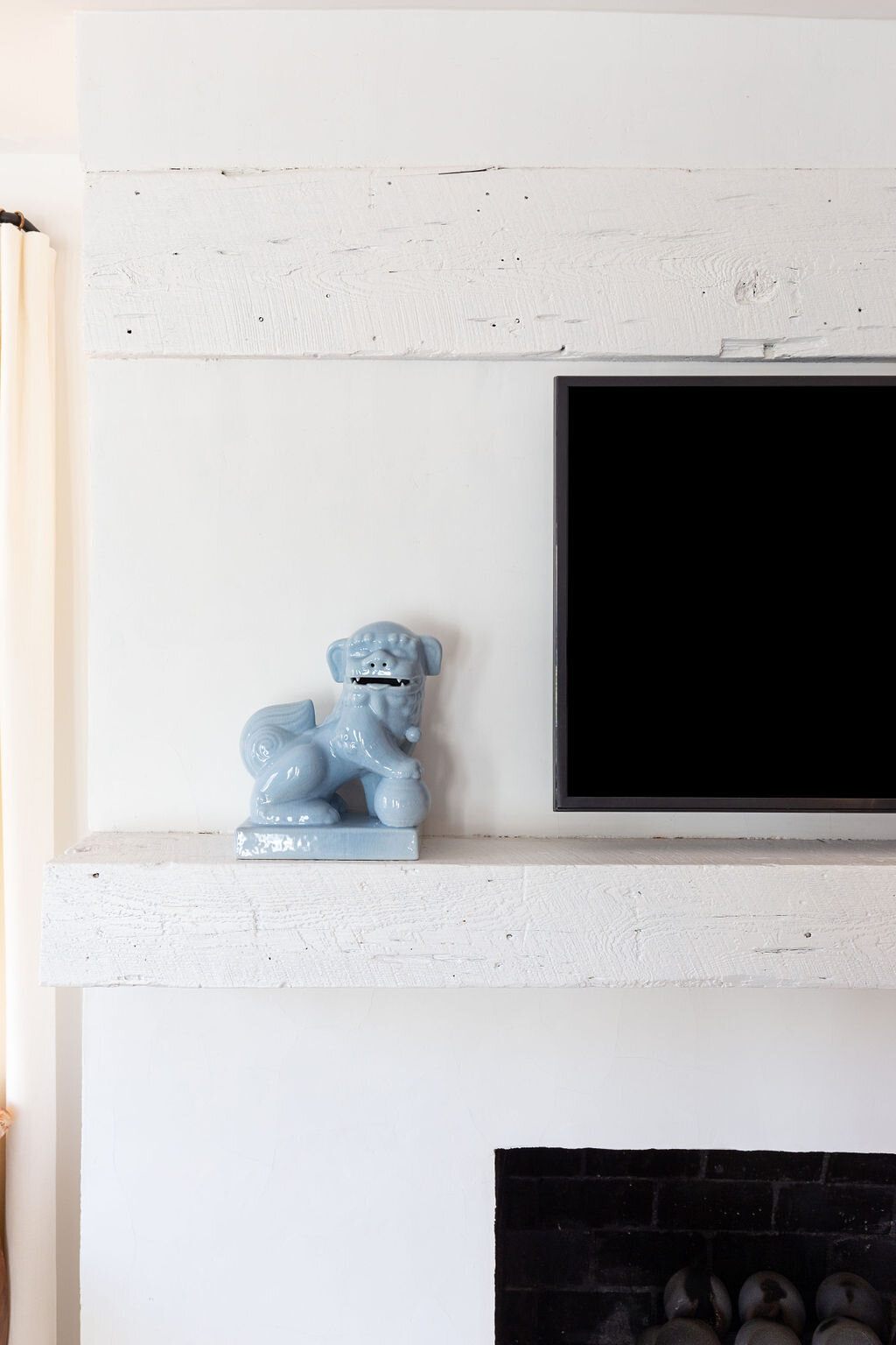
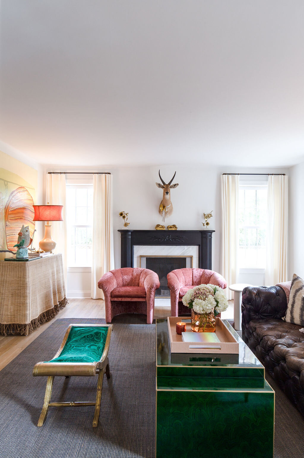
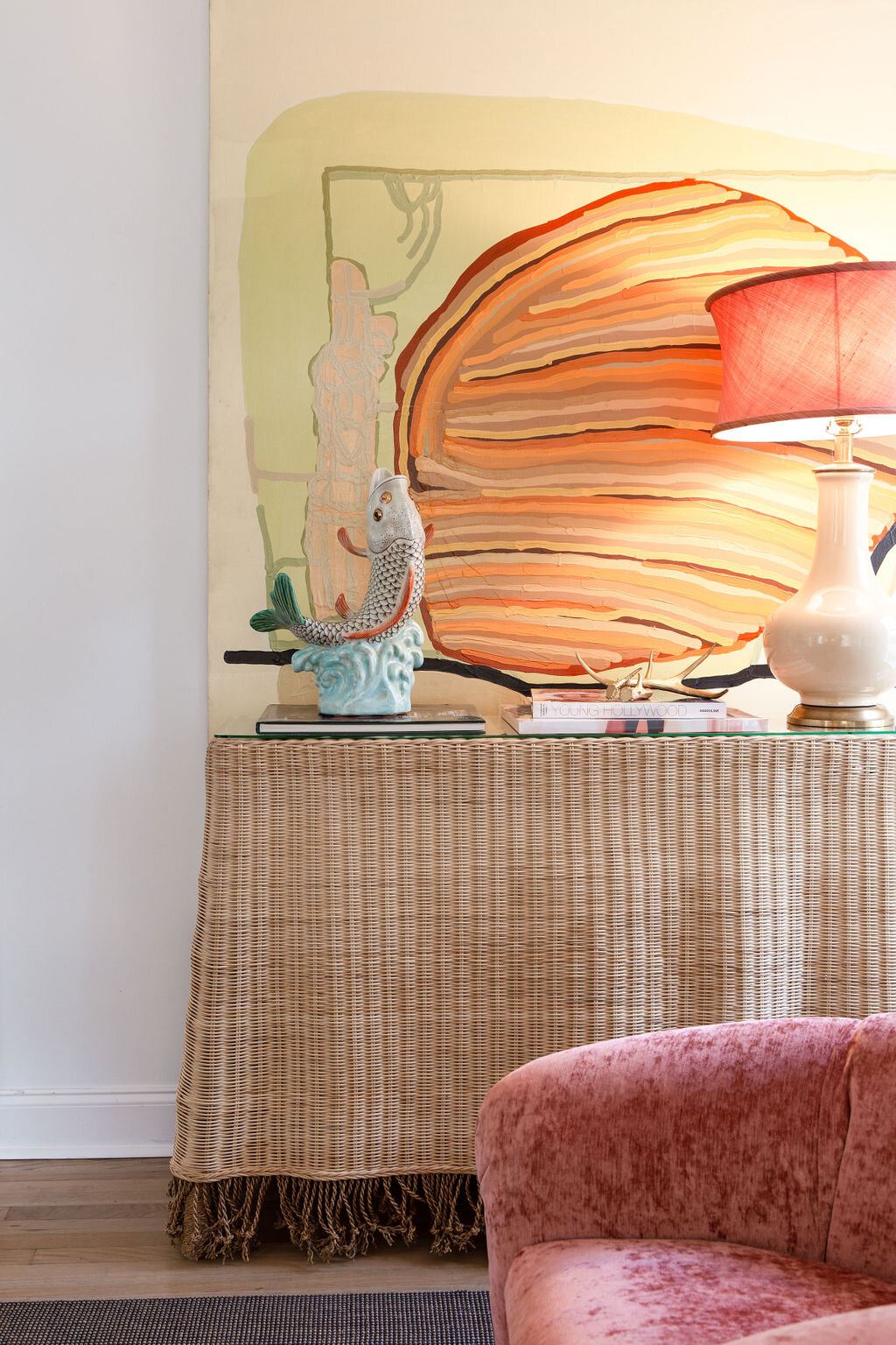
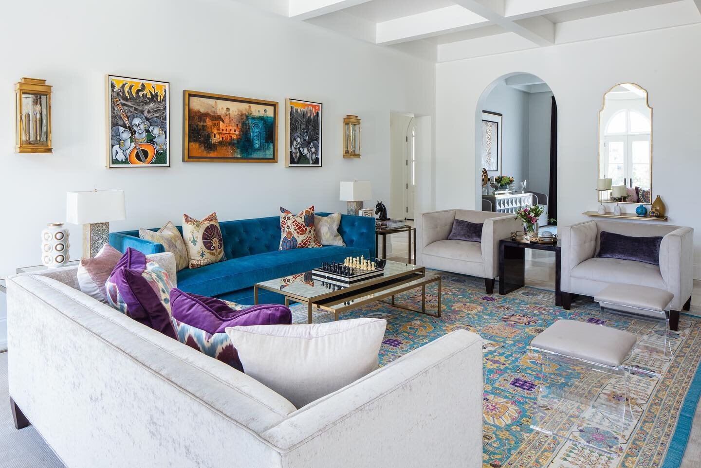
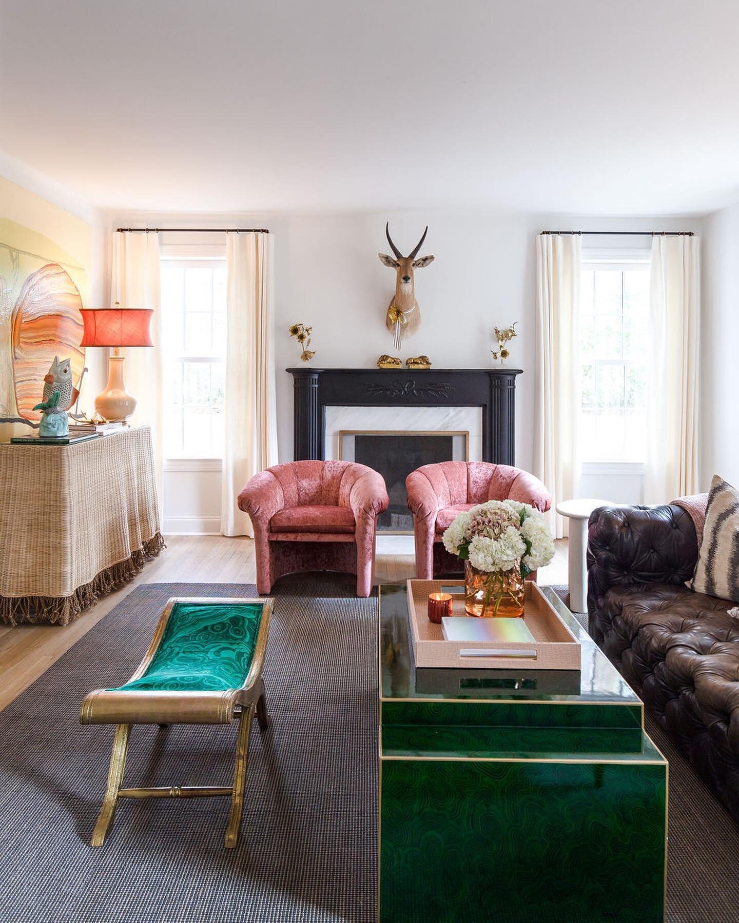
While the master suite underwent the most extensive change, the living room is the most untouched part of the house. The stately fireplace is original, as well as the hardwood floors. Its furnishings are an eclectic blend of pieces Selena loves, having collected and used them in various ways over the years. The pair of rose velvet chairs were in a bedroom in her previous home, and the empire-style bench with a stunning malachite upholstered seat is a treasure she acquired solely because she loved it. “When I got that piece I didn’t have a stitch of green anywhere in my house. It was just one of those things where I loved the fabric so much that I said, ‘I’m doing it. It will all make sense one day! I’m a big believer in that.”
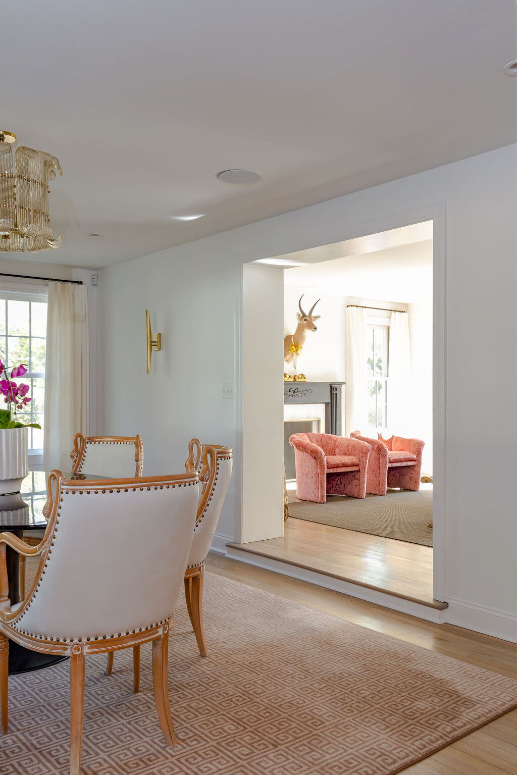
Through a large cased opening from the living room is the current dining room; ”current” because Selena originally imagined the space as another sitting area where Patrick could watch a game on TV while she and the girls enjoyed a show more to their liking nearby. Even though the space is now used for family meals, a TV hidden inside the antique French armoire still lets the man of the house keep up with his favorite teams.
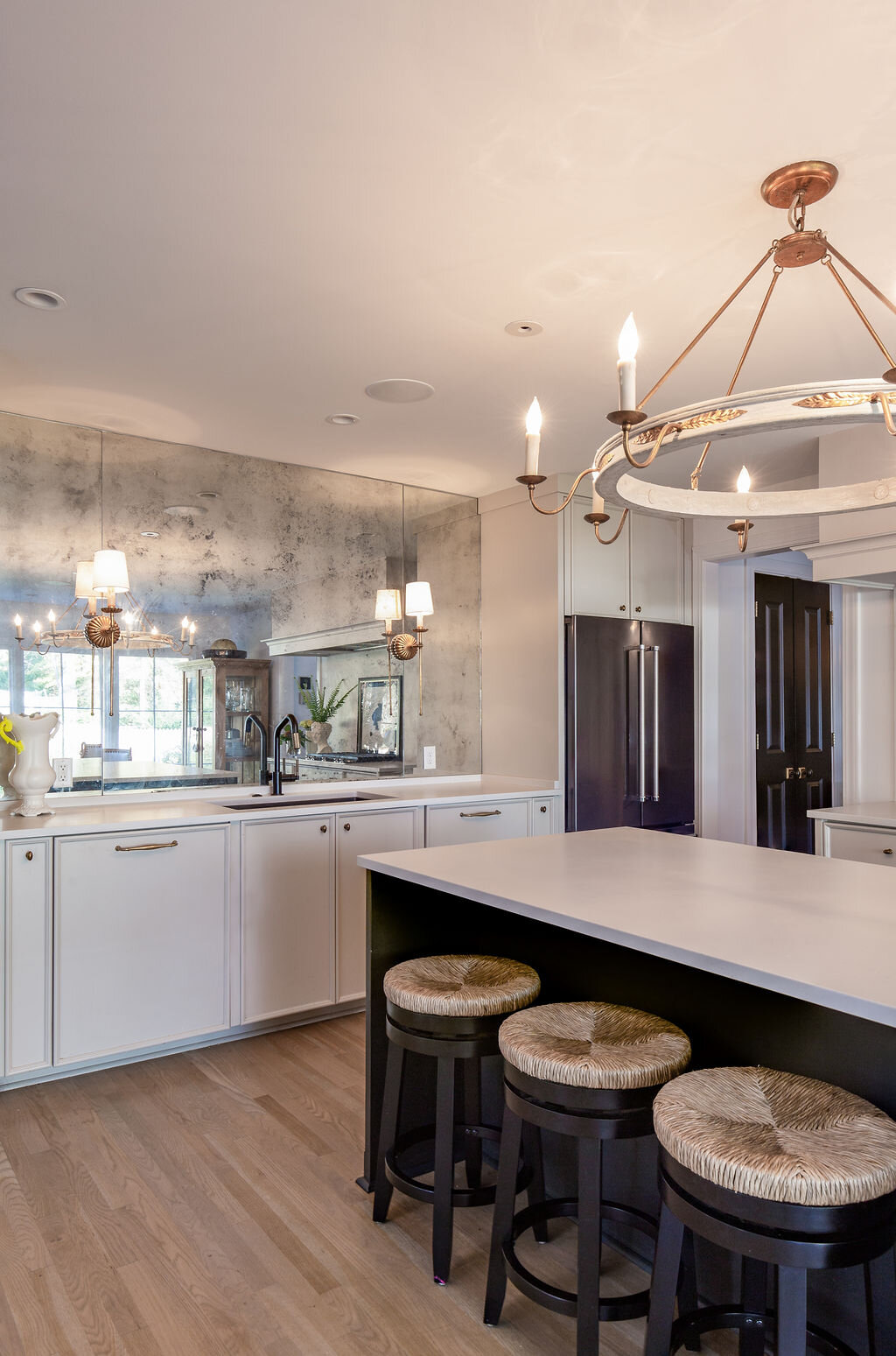
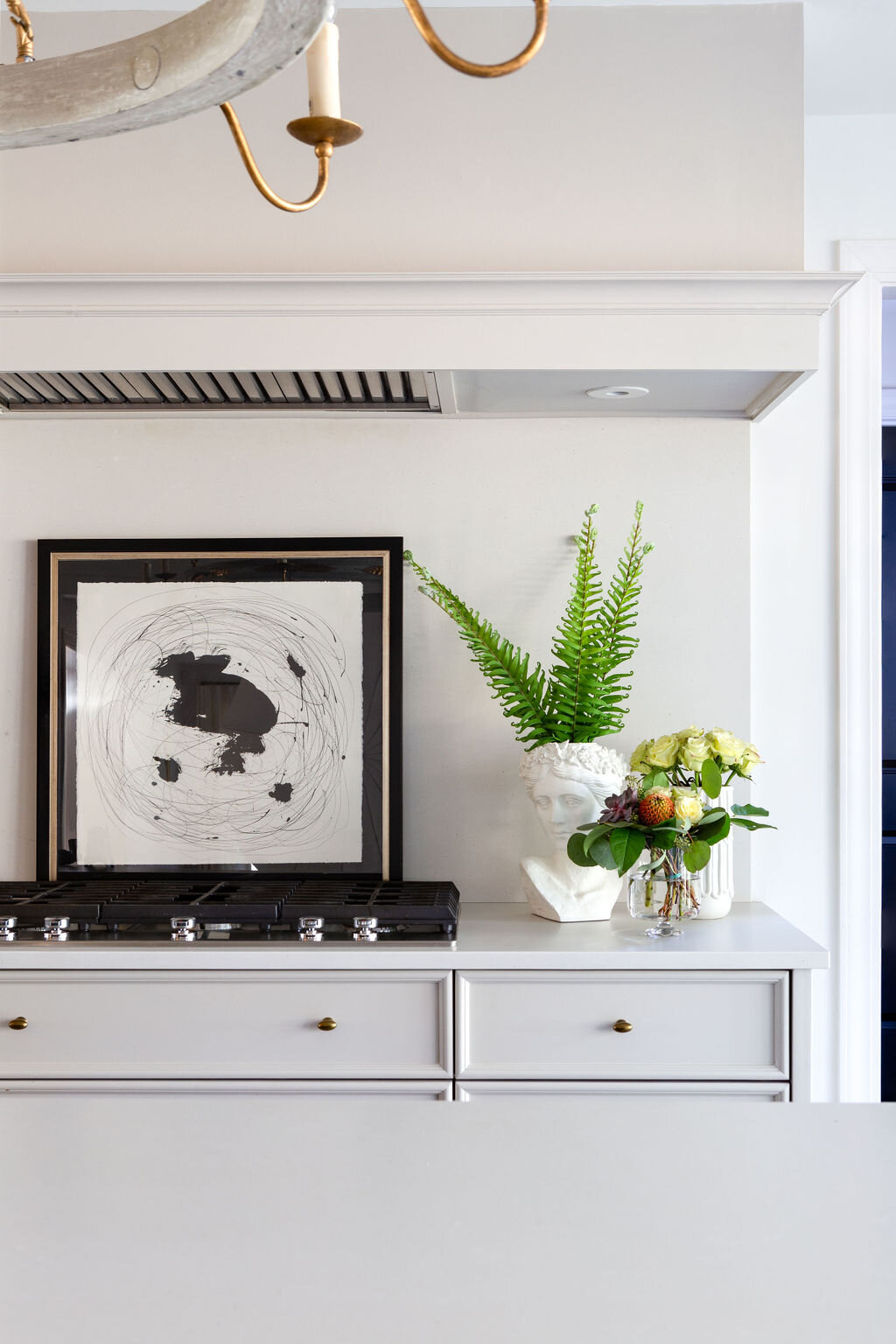
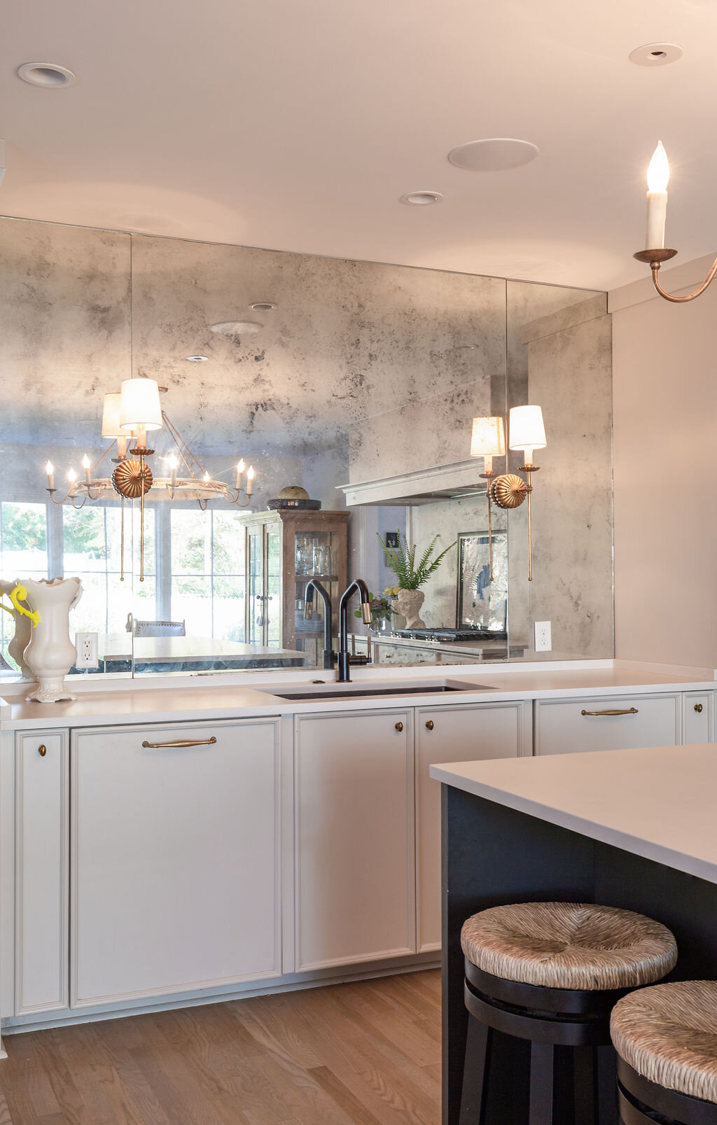
The dining room opens into the kitchen, an area that exudes sophistication. The room is more than a pretty face, though, every detail created with practicality in mind. The striking antiqued glass mirror wall is easily cleanable. Selena says it was a must in this house, as it also reflects the beauty of the backyard through the facing windows. “It gets more of that gardenly love inside,” she says. “The light bounces back and forth and we get a lot of green from the yard.”
In her professional life, Selena encourages her clients to make functional design choices so they can use and enjoy their homes without worry, Her own kitchen is a testament to that concept. She opted for a dark paint color on the island to mask scuff marks when her children sit there and decided to forgo upper cabinets because they can be hard to reach. Instead she included drawers in varying sizes and depths in the cabinet design, even a homework drawer to keep the countertops clutter free.
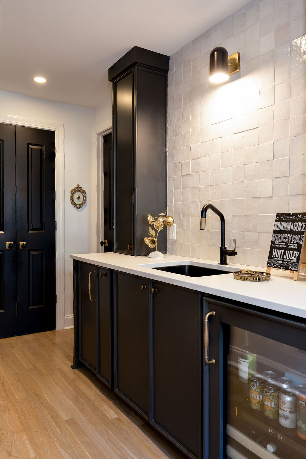
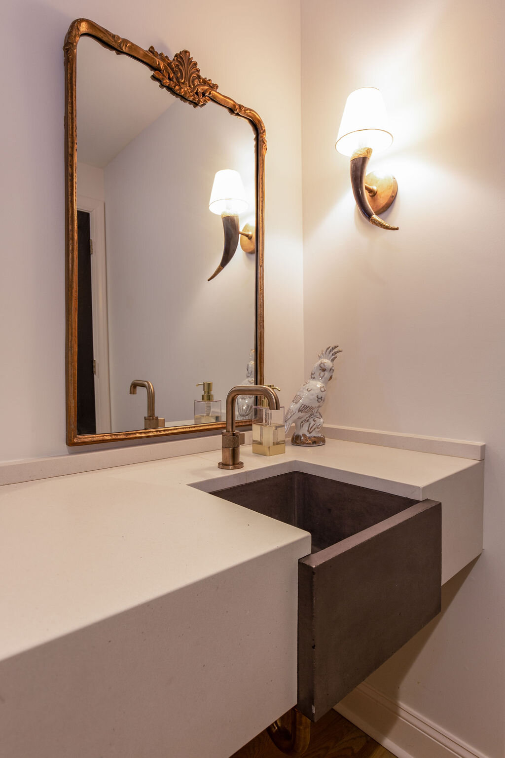
Behind the kitchen, the home’s reworked floor plan includes a powder room, pantry and a back kitchen—one of Selena’s favorite features. “When we’re outside grilling, when we have parties, all the drinks are in here,” she says. “Glasses, cups, ice, liquor, coolers...all the drink action. It works really well.”
Working well is a phrase that applies to every aspect of this house and its furnishings. Using her design expertise, Selena has blended function and beauty, traditional with unexpected, incorporating her treasures, to create a family home that will stand the test of time.


