Colors, Textures, Layers
/Design by LaQuita Tate | Story by Terri Glazer | Photography by Annabella Charles
Designer and influencer LaQuita Tate incorporated all her decor go-to’s and transformed her home—without a major remodel.
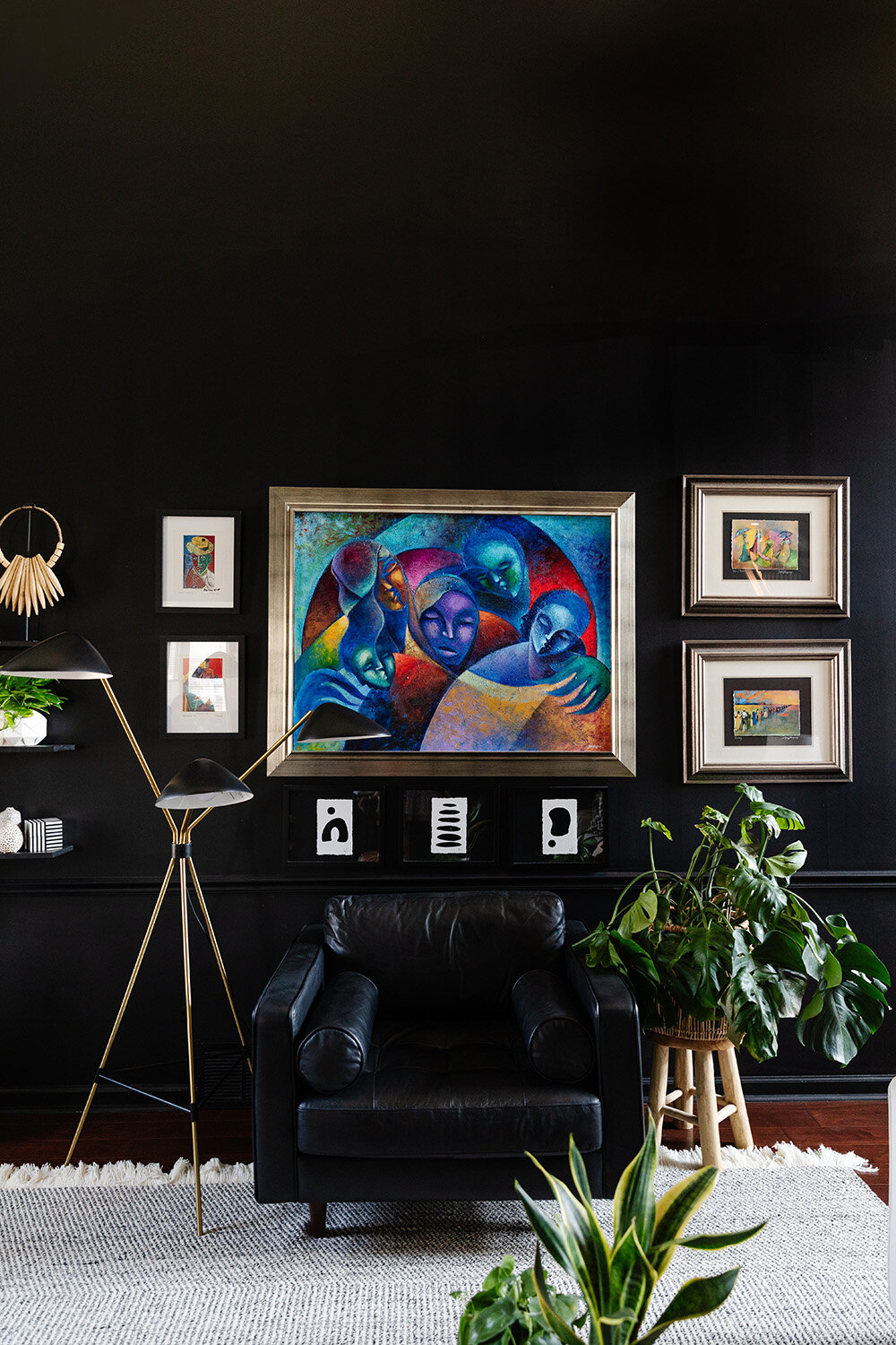
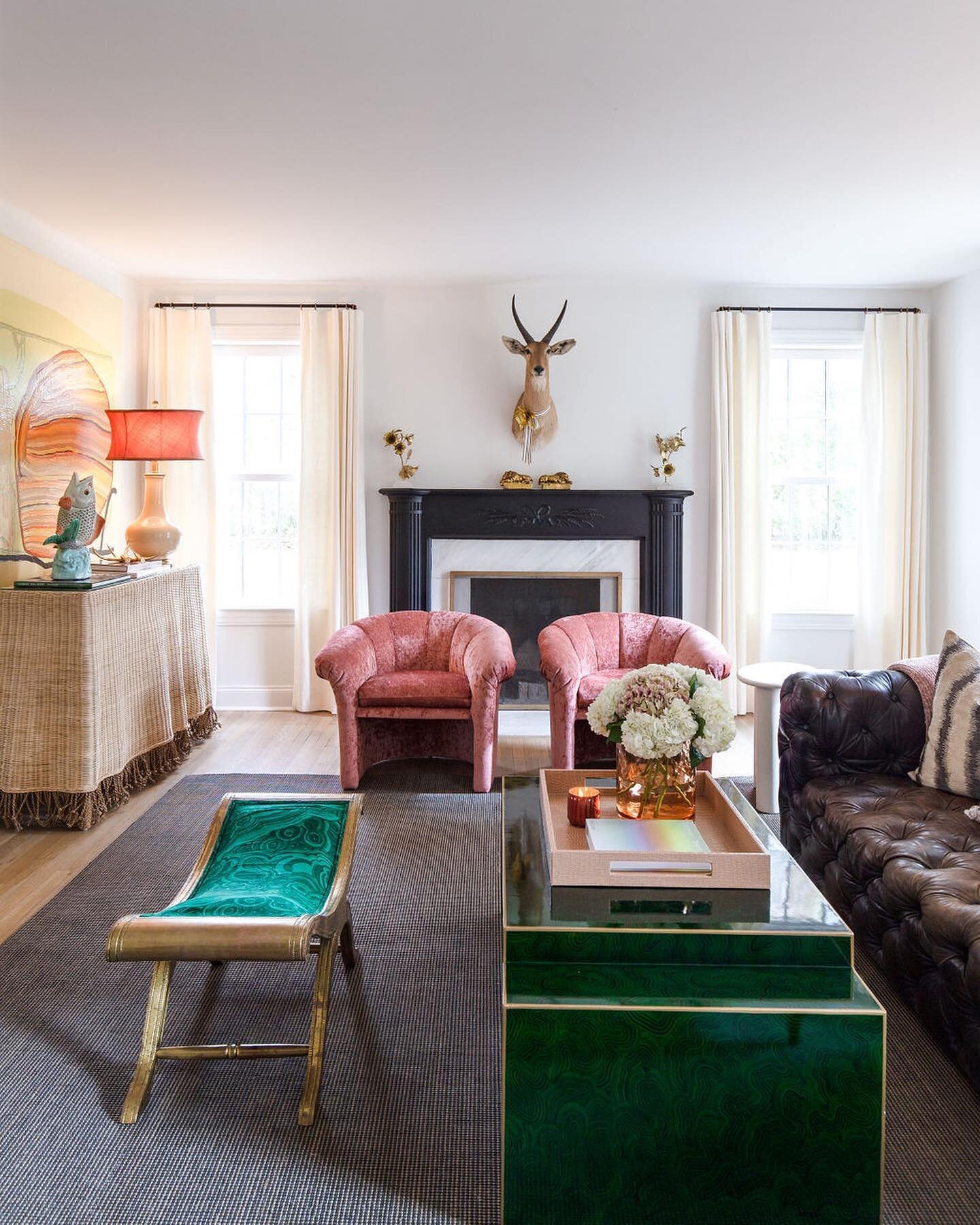
“Must have art. Must have greenery, texture and layers,” says LaQuita Tate, owner of LaQuita Tate Interior Styling and Design. She has incorporated her mantra into her own home of over 15 years, taking the house from “all beige and boring” to a bold showplace for the items and looks she loves.
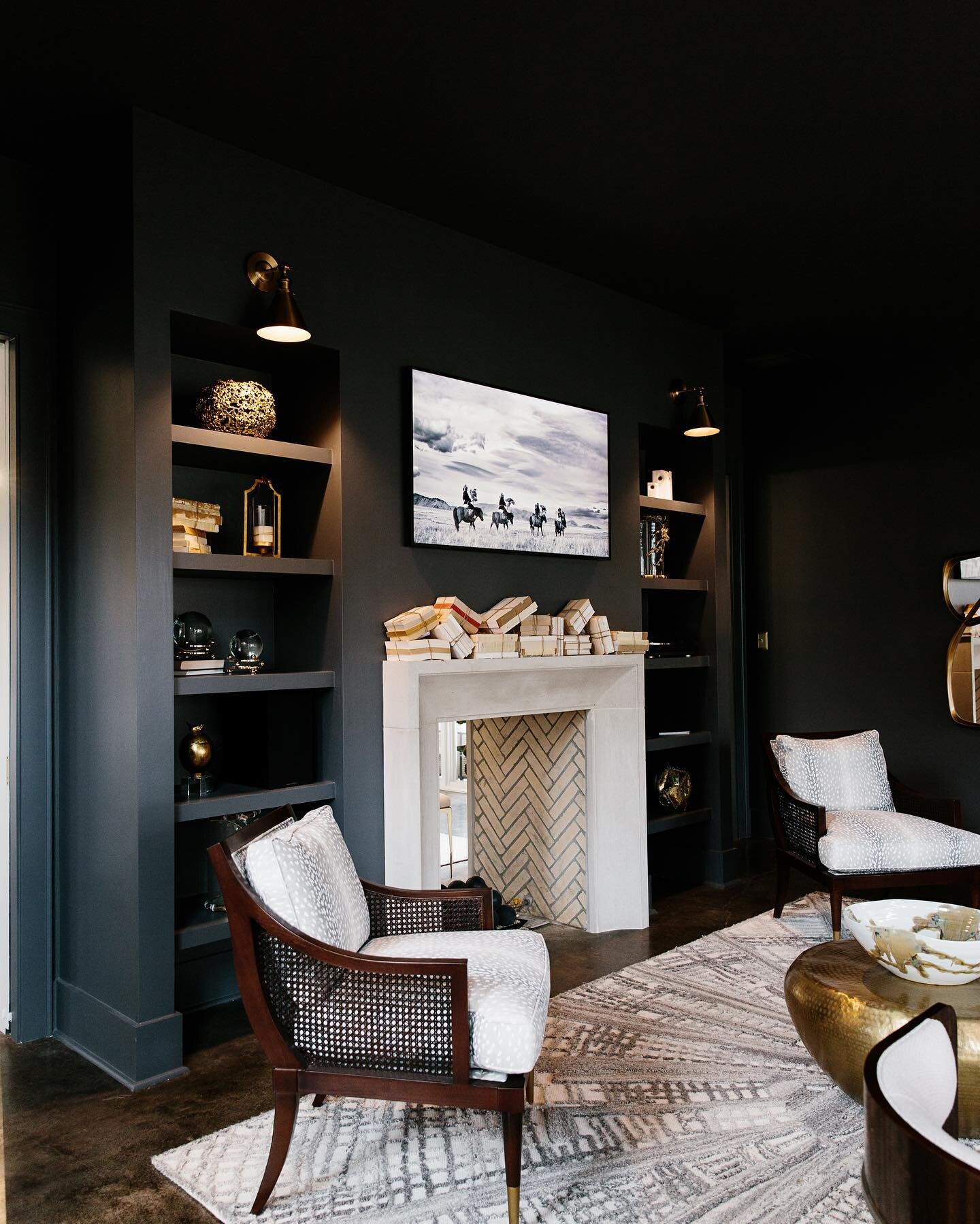
Tate’s signature style is evident from the first step inside the front door. In fact, the door itself foreshadows the home’s interior; it’s painted Sherwin Williams Tricorn Black, Tate’s favorite bold hue. The color appears throughout the house on walls, trim, even a floor, and sets the stage beautifully. The designer says she considers black a neutral, albeit a strong one. “It makes everything you put against it stand out. You can’t go wrong with black,” she explains.
The numerous houseplants Tate nurtures, her large collection of modern art, and the plethora of colorful accessories she has curated all pop against the dramatic yet monochromatic background. Wall shelves seem to disappear, allowing items placed on them to take center stage.
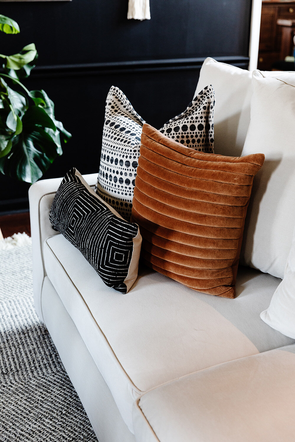
Tate recalls that when she initially took the plunge to paint the room black, she had the painters leave the trim white for contrast. It didn’t take long for her to realize, however, that the look would make a much stronger impact carried throughout. Back came the painters to add Tricorn Black to the woodwork and the fireplace. Contrast now comes through the room’s white sofa, light rug and blonde wood cane chairs.
She carried the theme into the home’s primary bedroom just off the living room with precisely the right amount of black. An accent wall behind the bed is the perfect backdrop for an original painting by Quelly Rue, and a wide strip highlighting the room’s tray ceiling draws the eye up and creates the illusion of height. To finish off the room Tate created several vignettes layering art, plants, coffee table books and even jewelry. She says she loves the original pieces local designer David Quarles, a personal friend, made for her too much to hide them away in a box. “Even when I’m not wearing them, I can still enjoy his beautiful artwork.”
The adjoining bathroom’s bold beauty came to be last year during the COVID lockdown. She took on the redo in June 2020 as part of the popular online series One Room Challenge. Stunning black wallpaper with prowling leopards and jungle flora makes a definitive statement, punctuated by a mid-century style chandelier from West Elm. Tate went out on a limb and painted the bathroom floor, tile and grout alike, with her beloved Tricorn Black. She recalls, “At the time it was going to just be too much to take the tile out, so I thought I’d try paint. I just took a chance; I love it and it’s held up so well!”
The real jewel of the bathroom renovation is the water closet. Tate enlisted the help of her friend and design mentor Carmeon Hamilton to embellish the tiny space, and Hamilton, recent winner of HGTV’s Design Star: Next Gen, hit the mark painting black-on-white geometric patterns from floor to ceiling.
Tate’s kitchen remodel also supports the notion that a space can gain a whole new life without being torn out and replaced. The floorplan stayed the same, the cabinets got a fresh coat of white paint and new hardware, and Tate brought in a natural element with the addition of butcher block countertops in dark walnut. “I love how the wood warms up the white in this space and adds texture,” she says.
Gray and white hex tiles on the backsplash bring artistic flair to the room, and the new deep, black sink from Elkay is one of Tate’s favorite additions. The open plan leads to a breakfast area that also received a pop of color recently, but here the designer/homeowner veered away from the black that graces so much of her home. The nook’s ceiling is encircled by a unique round molding that she fell in love with the moment she toured the house as a potential homebuyer years ago. That molding now stands out in a bright green tone that mirrors the green of the backyard view out the windows that line the nook’s rear wall.
Tate, who holds a Ph.D. in education and serves as an elementary school principal, makes time for her design business in the early mornings, evenings and on weekends. What started as an interest in beautifying her own space has blossomed into a growing phenomenon with a sizable client list and over 11,000 social media followers who look forward to her frequent posts, including Field Trip Sundays, during which she introduces fans to local design oases like Stock&Belle, Mbabazi, City & State and others.


