Envisioned
/Story by Terri Glazer | Design by Warehouse 67 | Photos by Annabella Charles
“There are certain projects that end up being your favorites,” says designer Kim Loudenbeck, referring to the home she and builder John Duke created for the recent Vesta Home Show.
“I think the reason that this one is so near and dear to my heart is because it does check a lot of the boxes.” Loudenbeck admits that the home’s mid-range size appealed to her, particularly its efficient layout. “This house has every element you need, and nothing you don’t,” she says. “Whether you have a family, whether you’re an empty nester, this house will accommodate your needs, and I think that is something that is very rare.”
She credits the home’s appeal to the fact that builder and designer were able to collaborate from the very beginning. “From day one, we met and had meetings where we talked about what we wanted the floor plan to be. When you have a vision for a house from the inside out—how people are going to live in the space, how they’re going to use the rooms—and narrow that process down, what you get is a home with great bones like this one.”
Duke had had the basic house plan for a while, says Loudenbeck, but hadn’t built it. Inspired by the similarly laid out St. Jude Dream Home she decorated last year, she encouraged him to bring the blueprint to life for Vesta. Both the St. Jude house and this one have the porch on the side versus in the back, a feature the designer has come to really appreciate.
Says Loudenbeck, “Typically, you have to look through the porch to get your view or the light is limited in your living space because the porch covers a lot of the natural light. By having it off to the side, it brings beautiful light into the main living space. This floorplan also has porch access from both the dining and living rooms. All of this together creates a really good sense of space.”
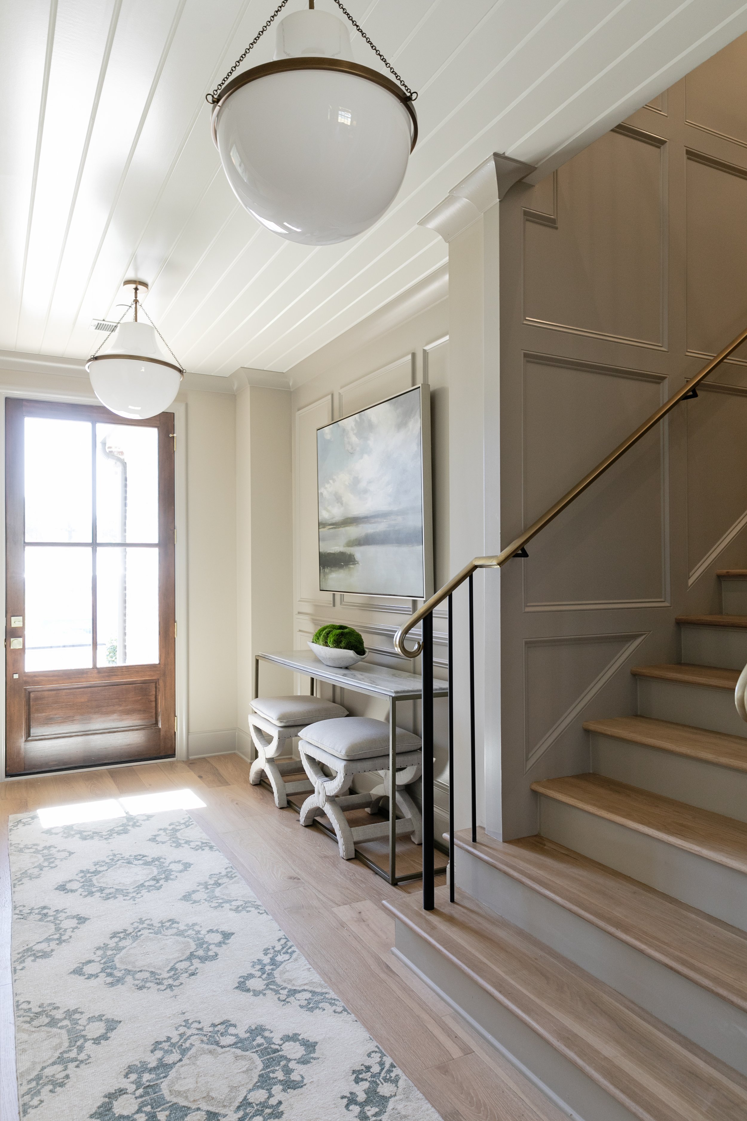
The same level of planning went into each area of the home. The entryway’s somewhat narrow footprint could have presented a challenge designwise, however Loudenbeck’s involvement with the project from the start allowed her to address that and ultimately create an elegant and inviting foyer. She suggested a recessed niche be drawn into the plans to accommodate a piece of furniture that wouldn’t interfere with traffic flow, and also added hard-wired picture lights to accent artwork she had in mind for the space.
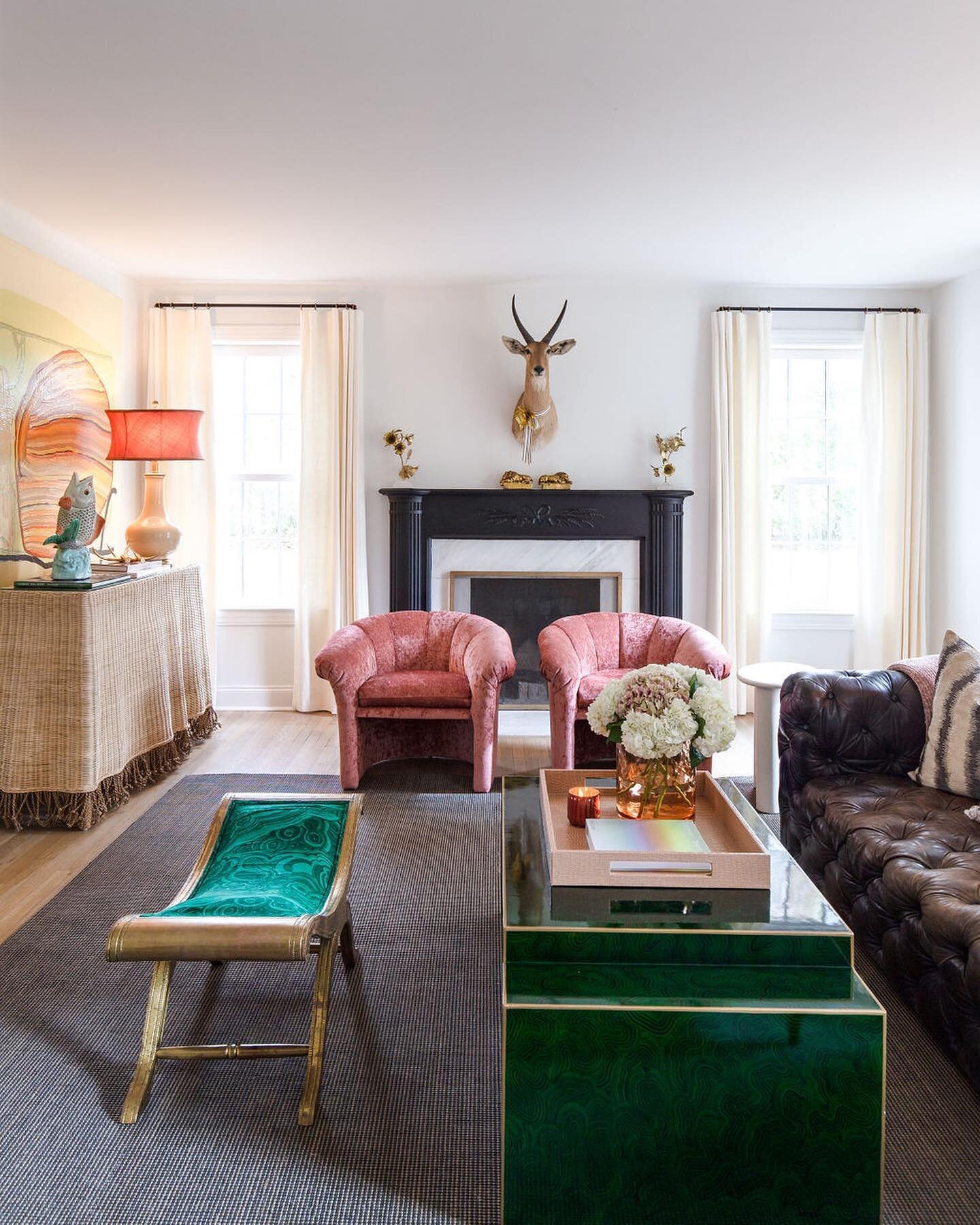
The entryway leads to the open kitchen/living room, where the feel is classic, but with a fresh feel. “Our end goal and vision for this project was to keep traditional styling but executed in a modern way so that it will still feel comfortable and inviting. The elements aren’t overly done; it’s simplified enough that you feel a sense of peace in the space,” Loudenbeck says.
A limited paint palette kept the home’s look clean and simple. Loudenbeck and her team from Warehouse 67 selected only a few colors, but used them in different ways. One of those hues, a warm greige, appears on the kitchen cabinets and trim. Set off by a stunning backsplash of herringbone marble with a touch of mother or pearl for shimmer, the color is the perfect neutral. The large island and perimeter cabinets are topped with quartzite countertops, and the designer is a fan. “I think a lot of times people feel like engineered countertops don’t necessarily look as beautiful as a natural material. That was the challenge here. Challenge accepted. I knew we could find something that would. The pattern in this selection has a lot of movement and variety. It definitely emulates natural stone, but you get the functionality of it being quartzite.”
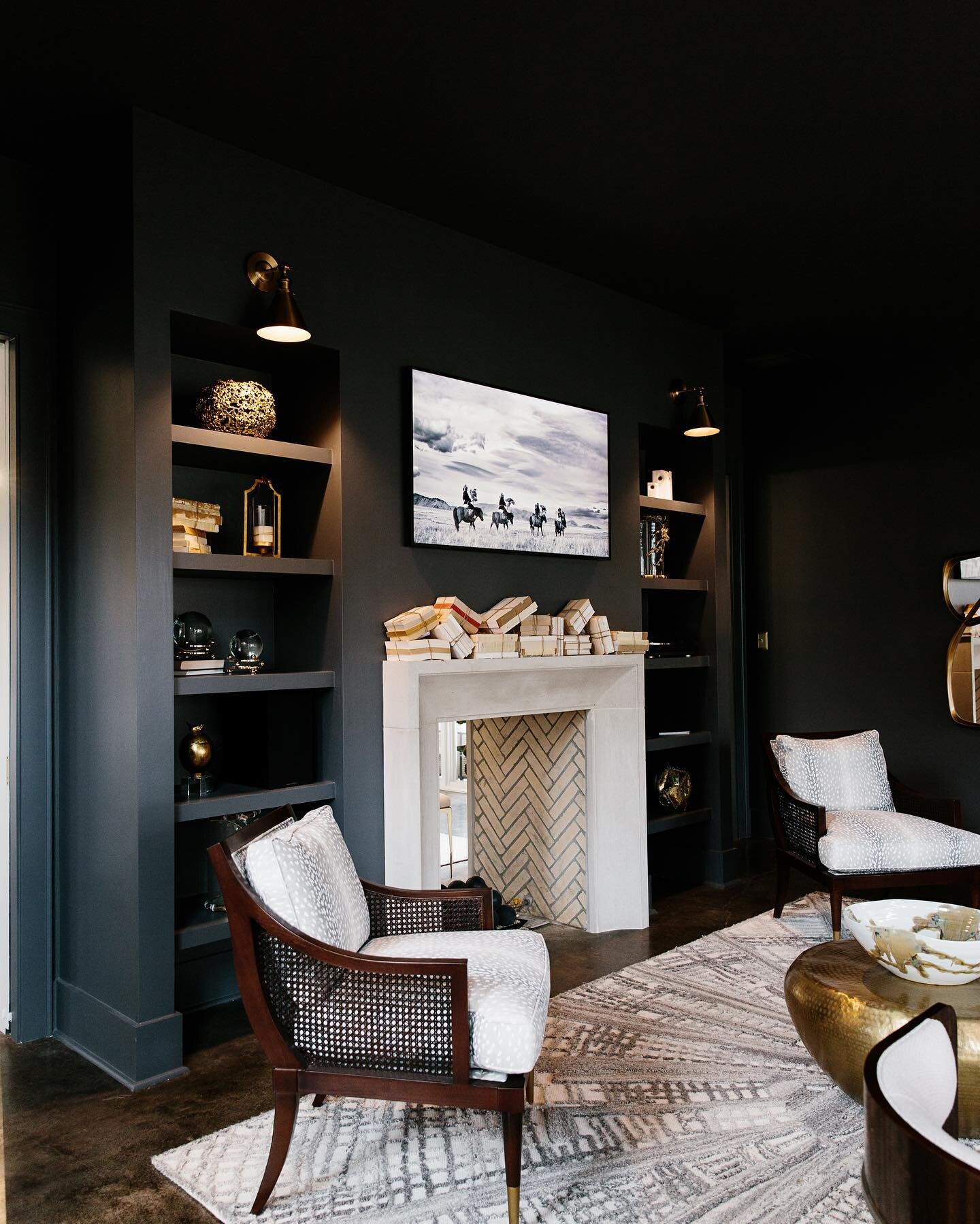
Moving from the kitchen to the living room, the ceiling height rises from nine to 12 feet, an ingenious use of architecture to amplify the room’s open quality. The showstopper is the limestone and pecky cypress fireplace. Loudenbeck is quick to credit her collaborator, millwork carpenter Daniel Sparks, for his talent and passion in creating the masterpiece. The warm, dramatic grain of the cypress plays perfectly off the cool limestone of the Christie Cut Stone mantel. Keeping simple elegance in mind, the designer opted against built-in bookshelves, instead flanking the fireplace with twin consoles under coordinating pieces of art.
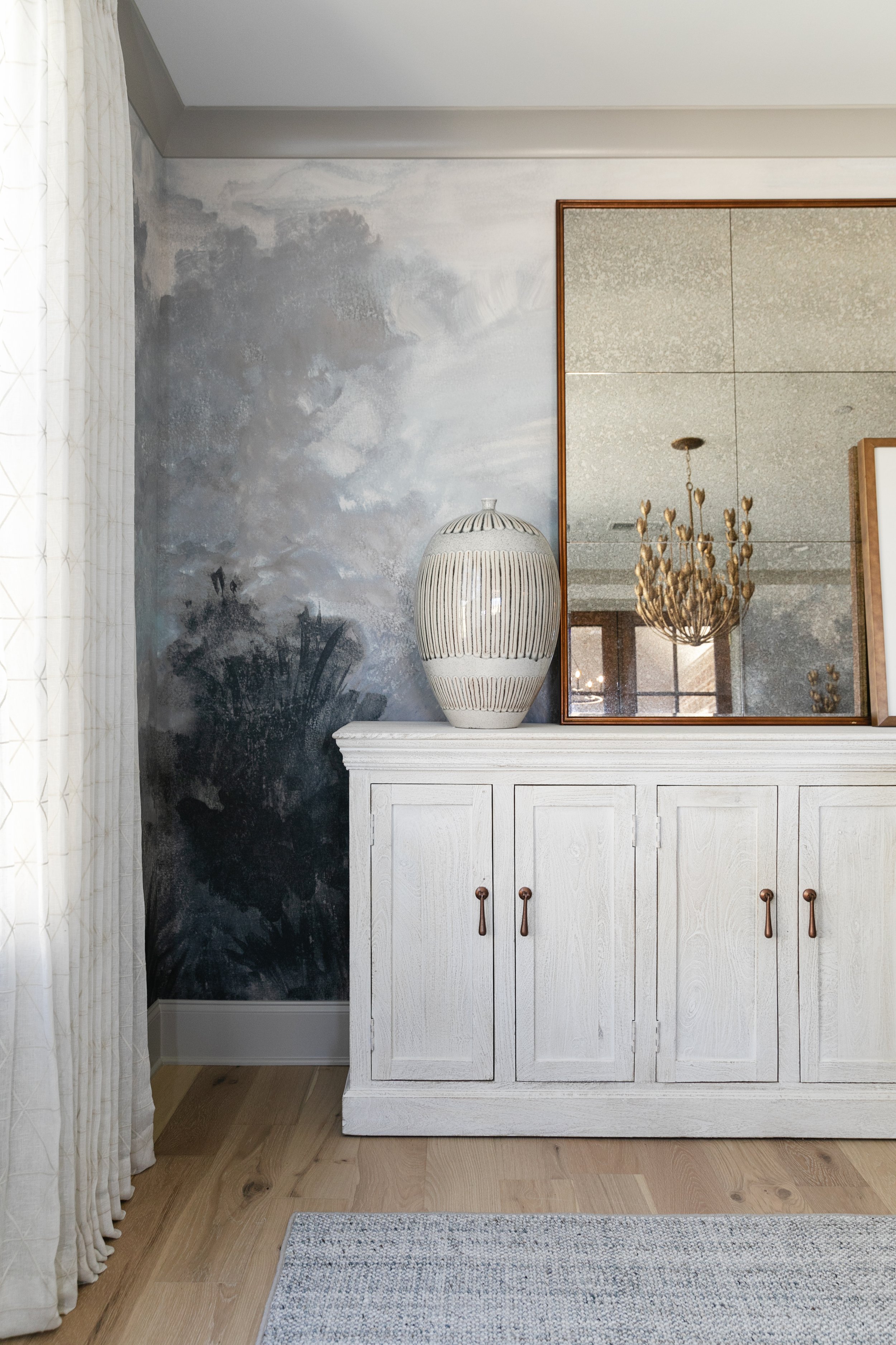
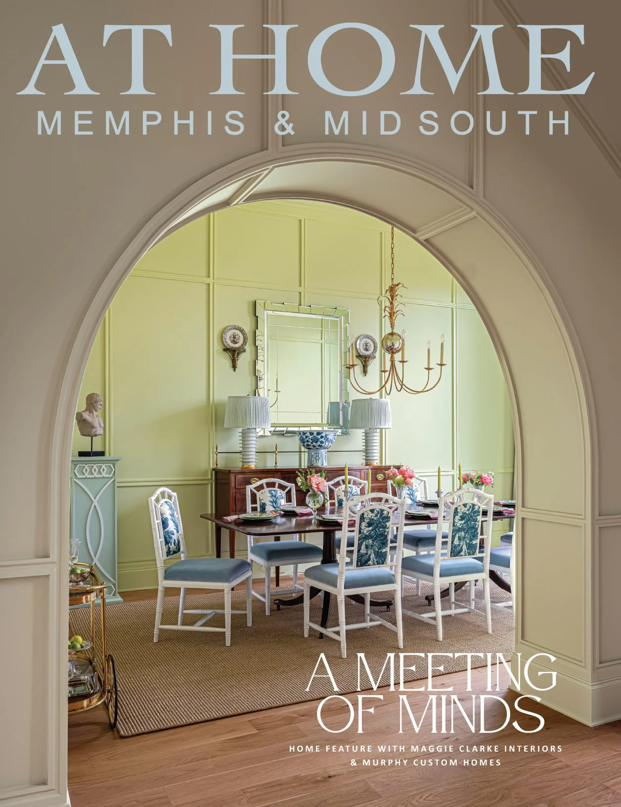
“From day one, I knew we had to make the dining room a focal point,” says Loudenbeck. “Because it is tucked away, if we didn’t do something a little bit bolder, it might just fall by the wayside.” That bold treatment came in the form of moody, mural wallpaper and unique light fixtures. The room has more than just good looks, however. Functionality is the name of the game here. The area is versatile enough to be used as a more formal dining room or a casual spot for breakfast. And, because it can be closed off by rolling doors, it could easily serve as a home office if the eventual owners desire.
The covered porch is Loudenbeck’s idea of perfection. “Not too big, not too small. Just enough for you to enjoy a great evening,” she says. Impact comes courtesy of the vaulted ceiling and natural stone floor, paired with outdoor furniture and a rug elegant enough for any room but tough enough to handle the elements al fresco.
It may be the smallest room in the house, but the powder room makes a substantial statement. Bold, picturesque wallpaper and saturated blue paint combine with marble mosaic flooring to create a design gem. A stained wood vanity with handsome reeded detailing brings a natural element into the picture.
Set away from the home’s public areas, the downstairs primary bedroom is created for comfort, again, with a contemporary take on traditional. Duke’s plan spruced up the tray ceiling with wood beams stained and paint washed to mirror the tones of the hardwood flooring. Loudenbeck’s decor mostly follows the home’s neutral palette, with a pop of rich color on the nightstands.
“Who wouldn’t want to have a bathroom like this?” asks the designer, entering the primary bath. “I didn’t want this house to give up any of the elements that make a larger home appealing. I love the oversized tiles that are trending right now. Here we chose two-by-four-foot floor tiles and I think that adds so much drama. Typically you only see those in commercial spaces. Bringing them into the home gives you less grout and larger scale of pattern.”
Conveniently placed between the friends entrance and the primary suite, the laundry room provides cabinets, countertop workspace and a second refrigerator, as well as a dedicated “landing spot” for homeowners to leave keys or a purse. A locker area decked out in custom millwork, a nook perfect for a desk, and a walk-in pantry are further proof that the floor plan was envisioned with careful consideration of how its future owners would live in the home.
“Just because it’s the second floor doesn’t mean it was second in design,” says Loudenbeck. “Everything that we spent time and energy on down below, we did the same for upstairs.” That fact is evident starting with the staircase leading to the home’s upper level. “This is another area where we worked with the millwork carpenter. I envisioned beautiful paneling for a classic look to elevate a functional space.”
At the top of the stairway sits an unexpected library nook, created from what would otherwise have been unused space. With stately built-ins and leather barrel chairs, the alcove is a cozy spot for reading and relaxing.
Its masculine air is the perfect introduction to the room into which it leads. Loudenbeck describes the space over garages as “an opportunity a lot of people pass up because they don’t know what to do with it.” Clearly, the designer made the most of this chance to create an attractive and useful area with a family in mind. “We knew right away if they had kids or grandkids, the built-in bunks would be a great addition to the space.”
Bathed in Sherwin-Williams Illusive Green from the ceiling down and accented with traditional wainscoting and other decorative millwork, the spot is elevated far beyond the often-dismissed upstairs playroom.
Two roomy and cheerful upstairs bedrooms, along with one on the first floor, provide room for family members or occasional guests. Each has a generously sized closet and two of the three have attached bathrooms.
The home’s unified, cohesive design is a product of the fact that the builder, the subcontractors, the designer and her team worked with a singular goal throughout the process, says Loudenbeck. “You have to start with a vision of where you’re going from the time you’re looking at the floorplans, and just continue to check back and have that same goal with every decision you make along the way. It’s definitely a process and it takes time, but the end result is absolutely beautiful.”


