First Class Second Home
/Design by HillCo Construction | Story by Terri Glazer | Photography by Ross Group Creative
“We knew we needed three bedrooms and two baths. It didn’t need to be anything extravagant, just simple and cozy. Someplace comfortable and with enough room if the owners and their grown children are all there together. And it didn’t need to be a million dollar house.”
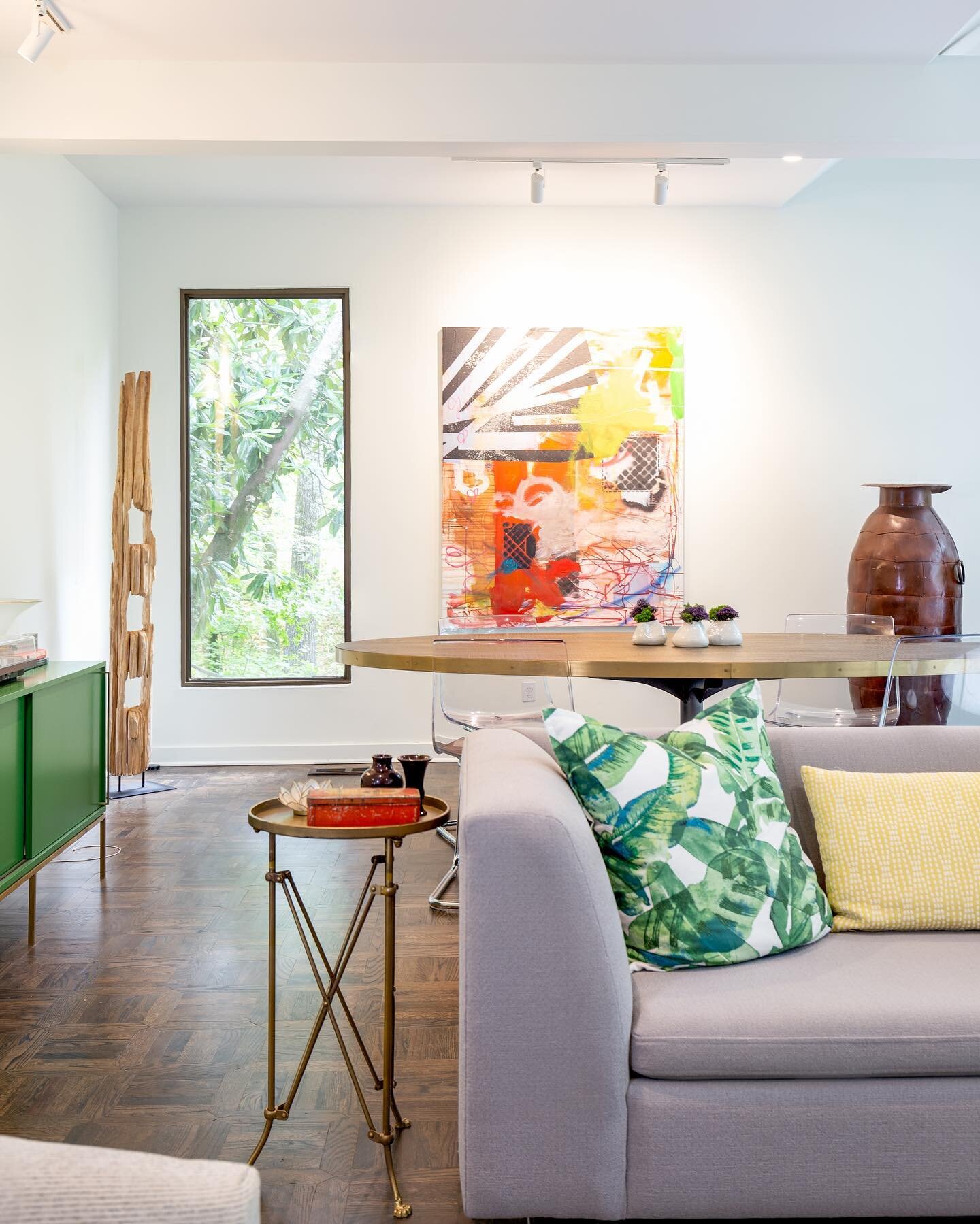
Those were the marching orders Tracy and Bill Hill, owners of HillCo Construction, used as the jumping off point for the turnkey home project they recently finished on a large parcel of land in the southern part of Collierville. Their clients, a California couple, added one more must-have. Says Tracy, “The client said she wanted color. She likes very bright colors.”
Past that, the owners let their contractors run with the project. From demolishing a rundown house on the property and preparing the lot, to finding and modifying the plans, to building the home, even designing and furnishing the interior, HillCo took care of every phase of the process. “That’s a pretty big level of trust on [the homeowners’] part,” Tracy says. Although they maintained constant contact, sending photos and information regularly for approval, the owners didn’t see the house in person until construction was about 75 percent finished.
No doubt they were pleased, though. The Hills hit the design nail squarely on the head, creating a reasonably sized home that is loaded with style and filled with the kind of thoughtful and unique touches that Bill says go into every HillCo project.
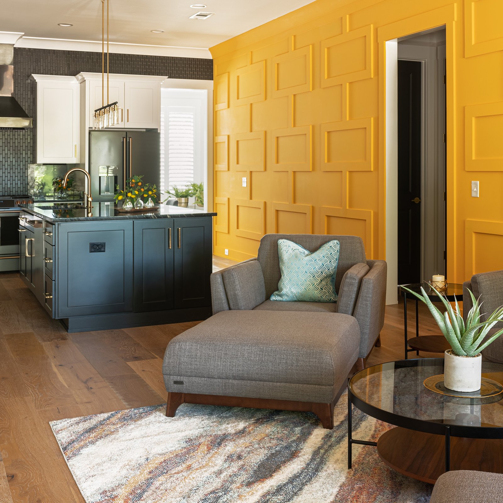
The “wow factor” is evident from the first step inside the front door—an open living area and kitchen highlighted by a bright yellow feature wall. Tracy says the wall’s geometric trim accents came about through “a meeting of the minds” between her, Bill and Micah McCauley, Hillco’s senior project manager. “I originally wanted a circular pattern on the wall. Bill is very symmetrical, though, so we compromised. He and Micah built the trim and installed it themselves.”
They took the angular theme a step further by using right-angled lattice molding in place of quarter round or shoe molding. Explains McCauley, “All the door trim, all the baseboard, everything’s got a square look to it. It didn’t make sense to insert quarter round up against it.”
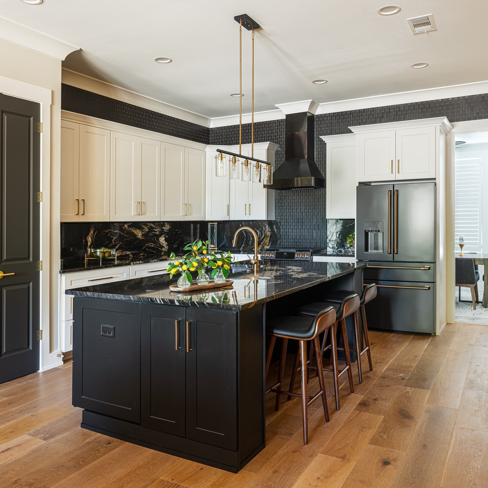
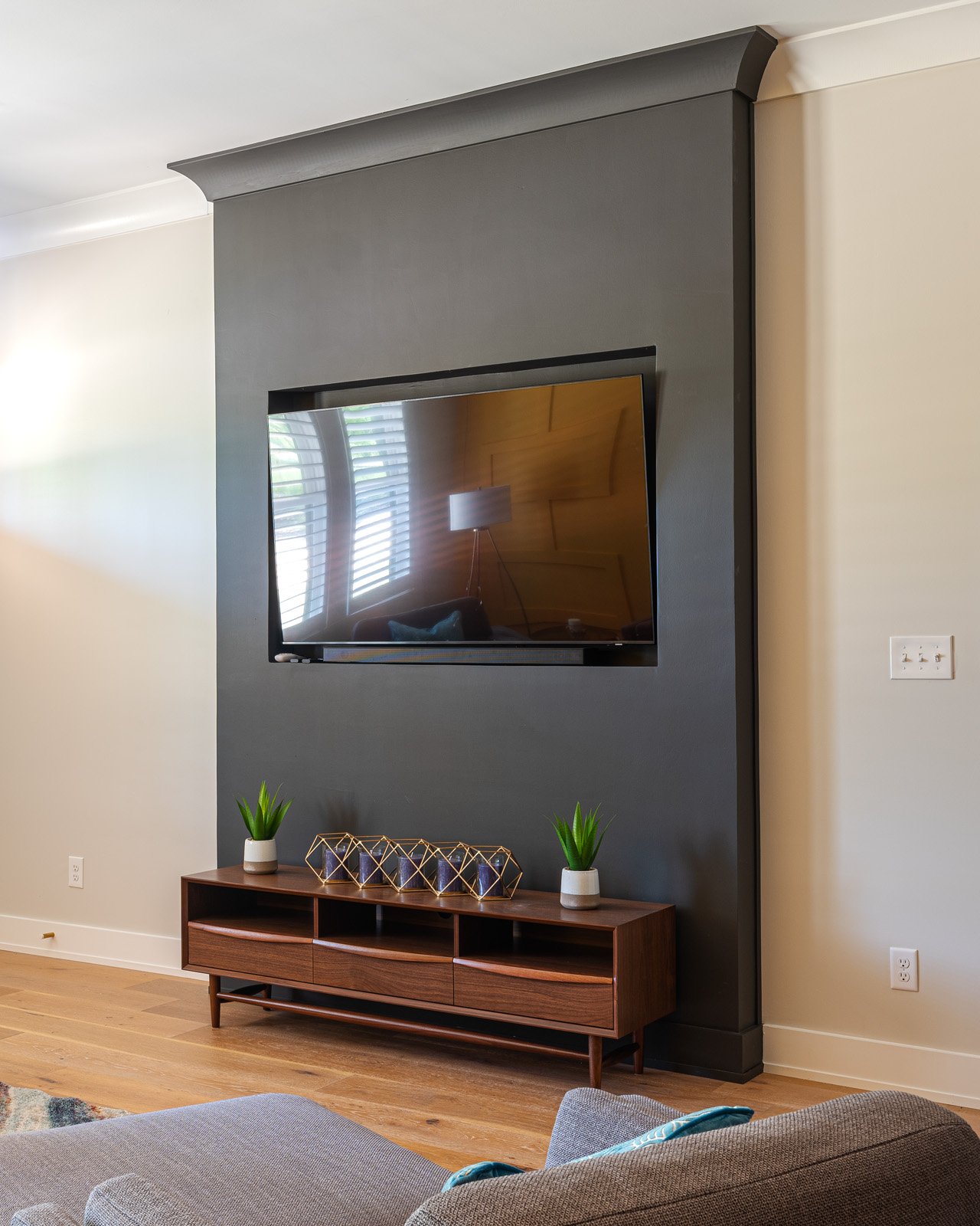
The bold yellow of the wall sets the stage for the dark and dramatic feel of the kitchen, where Tracy paired fresh white cabinets with Cosmic Black quartzite countertops and backsplashes. She reprised the dark blue/black paint color from the living room TV enclosure on the kitchen island and dressed up everything, including the GE Cafe appliances, with French gold hardware.
The stunning black-on-black tile wall behind the range is a showstopper, but Bill says future HillCo customers need not aspire to have it in their homes. “We try not to do anything twice in a house,” he says. “We did this custom kitchen just for this house and it wouldn’t be fair to these clients if we took the same thing and put it in someone else’s house,” adds Tracy.
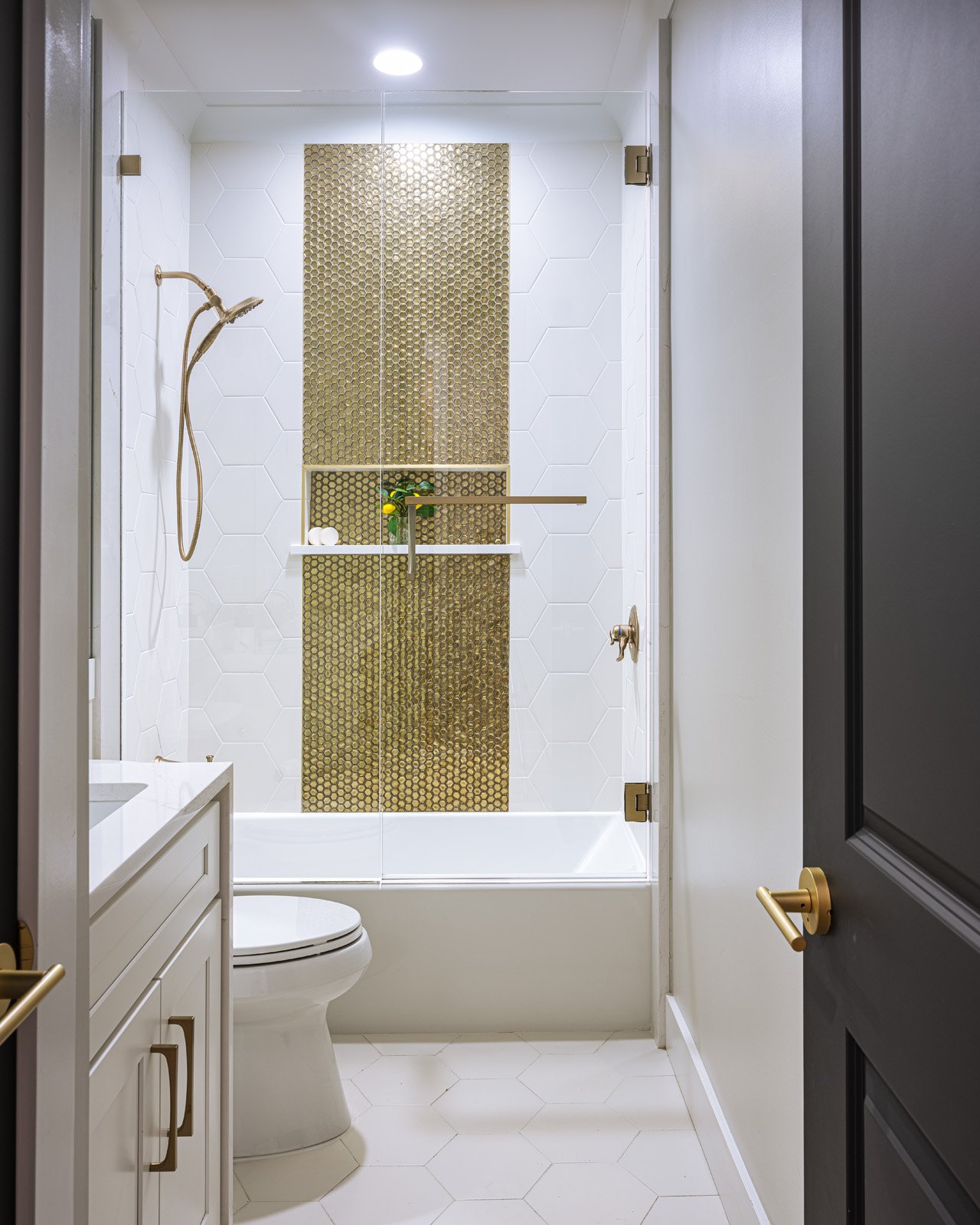
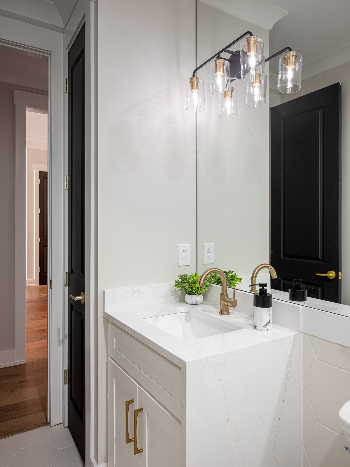
Careful planning and attention to detail allowed this home to have an array of special features not always found in a moderately priced new construction project. The hall bathroom is a prime example. Its deep soaking tub is a step up from the more shallow builder-grade steel variety that’s often used. The placement of the tub and shower controls on the opposite wall from the faucet and sprayer head didn’t happen by chance: McCauley modified the original plans. “It keeps you from getting wet when you’re turning the water on, and you don’t have to reach over the toilet,” he explains. Thanks to a white quartz waterfall counter, a full glass door and more goldtone in the fixtures and accent tile, this bath has an elevated style that proves a small space can make a big impact.
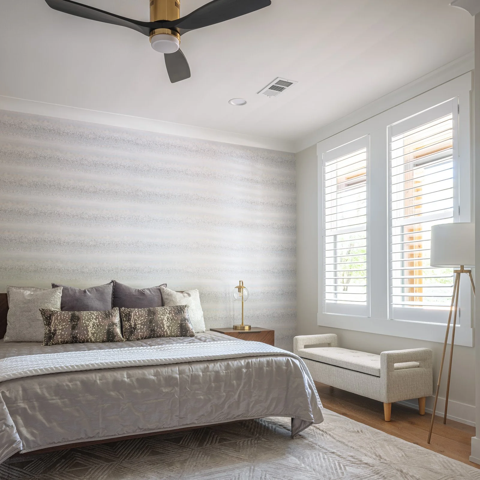
In the primary suite, Tracy designed a bedroom with a quiet, neutral palette, starting with textured wallpaper in shades of white and gray that lines one wall. It makes a perfect backdrop for a simple king-sized bed she decked out in solids of varying textures with a touch of sparkle and pattern on the accent pillows. She sourced the bed, nightstands and bench, along with almost all of the home’s furniture, from article.com, an online retailer of contemporary and mid-century furnishings.
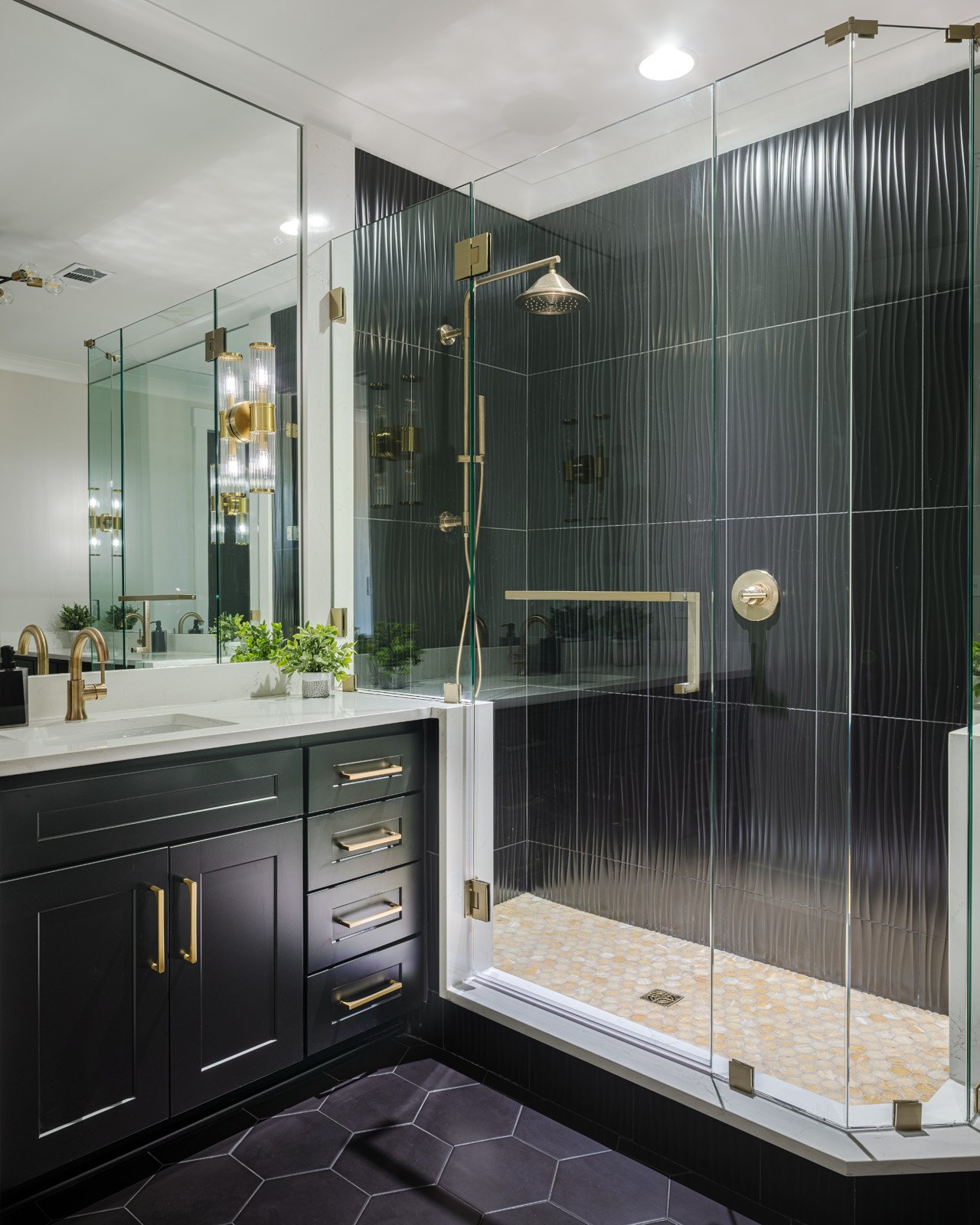
In the adjoining bathroom, black, white and gold combine to produce a modern and elegant feel. Here again, McCauley tweaked the blueprints to improve the room’s layout, removing a window on the front wall to create room for a sizeable second vanity.
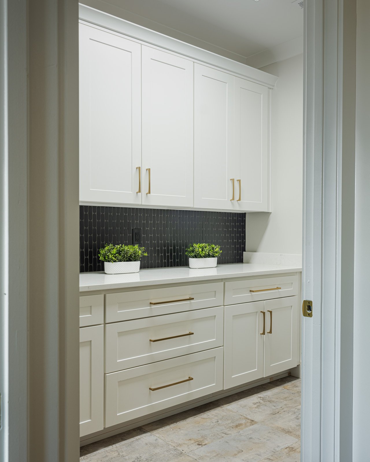
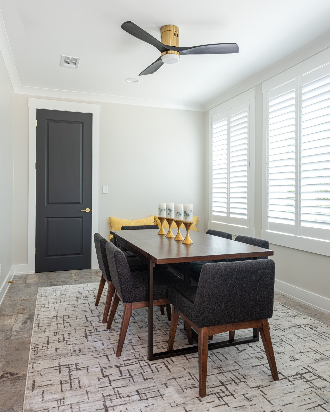
With a separate laundry room, a two-car garage, a cozy dining area and a back porch that takes full advantage of the 11-acre property’s pastoral views, the house is the complete package, a stylish, comfortable place to make the most of family visits.

