Oxford Oasis
/Interior Design by Tara Felice Interiors | Story by Terri Glazer | Photos by Sélavie Photography
“Every room should have something exciting in it.”
These words form one of Tara Engelberg’s interior design mantras; a tenet that rings true in every room of the Oxford, MS, home she recently completed for a family of five.
Engelberg, owner and creative director of Tara Felice Interiors, set out to update the classic residence right off the town’s square while respecting its traditional architecture and cottage-like vibe. She points to the project to illustrate the fact that a home doesn’t have to be large to be well appointed. “I loved working with a house with character and great bones. I think it goes to show that you don’t need to have a massive house to have an amazing, warm and inviting space. In a smaller home, the decorating budget can go further, making it possible to have more quality pieces, since you need fewer of them. It allows me to focus on furnishing the house really well and to really hone in on the details.”
Previous owners had remodeled the home a number of years ago, but the drab colors and Tuscan-style materials didn’t keep in the character of the house or seem appropriate for a vibrant family with three school-age children. “The house has amazing windows and was getting beautiful light, but between the heavy curtains and the paint colors, you couldn’t see it,” says Engelberg. “When someone tried to ‘modernize’ the house before, what they did just didn’t add anything.”
The transformation starts from the front door. Engelberg convinced the new homeowners to rearrange the living room’s layout to make up for the lack of an entryway. “The old layout wasn’t bad, but I wanted to create some definition because the front door opens straight into the living room. I like having a little foyer feel, so I wanted to put the sofa facing the fireplace. I like it when you come in and you have a moment to feel like you’re in the entrance to the home,” she says.
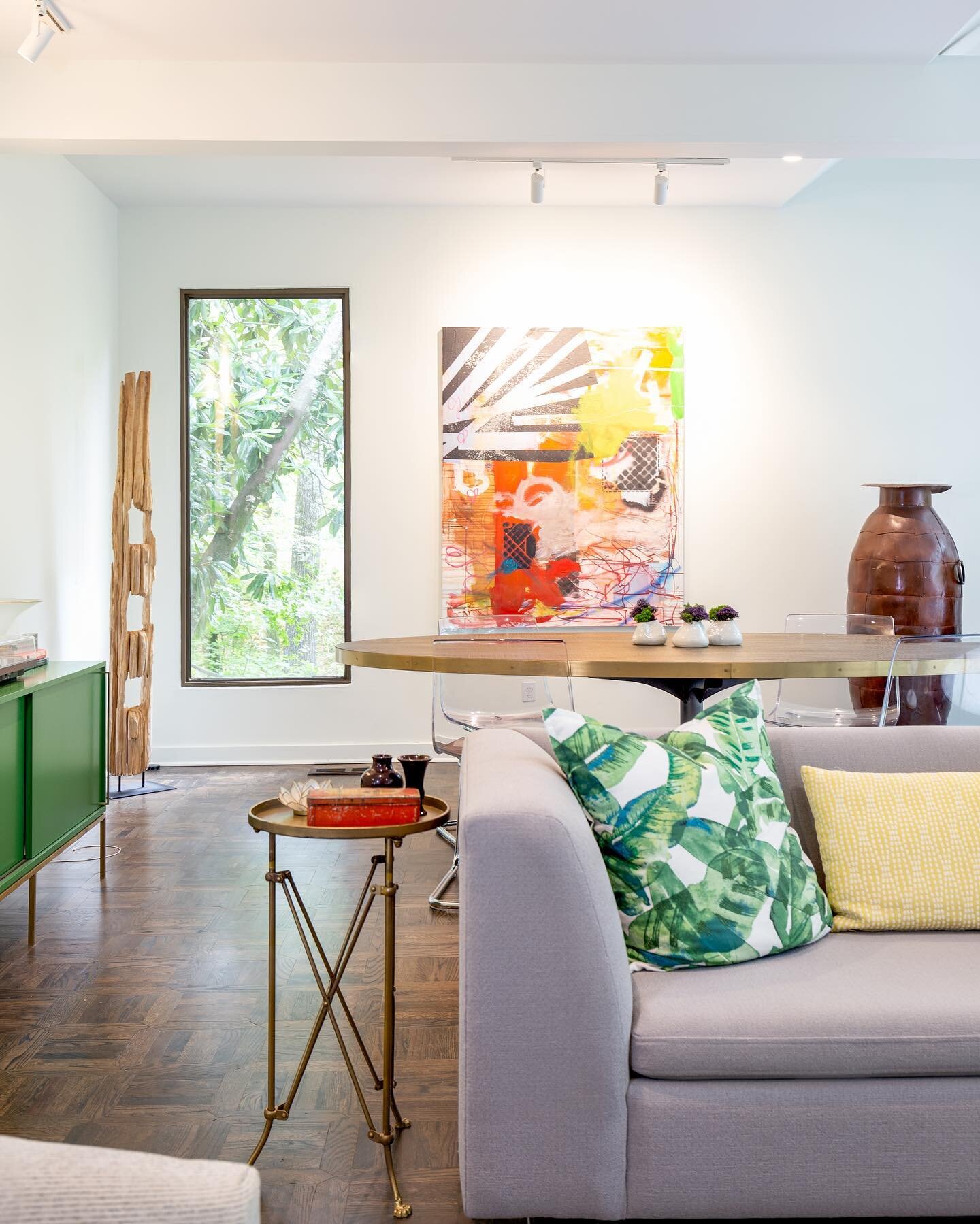
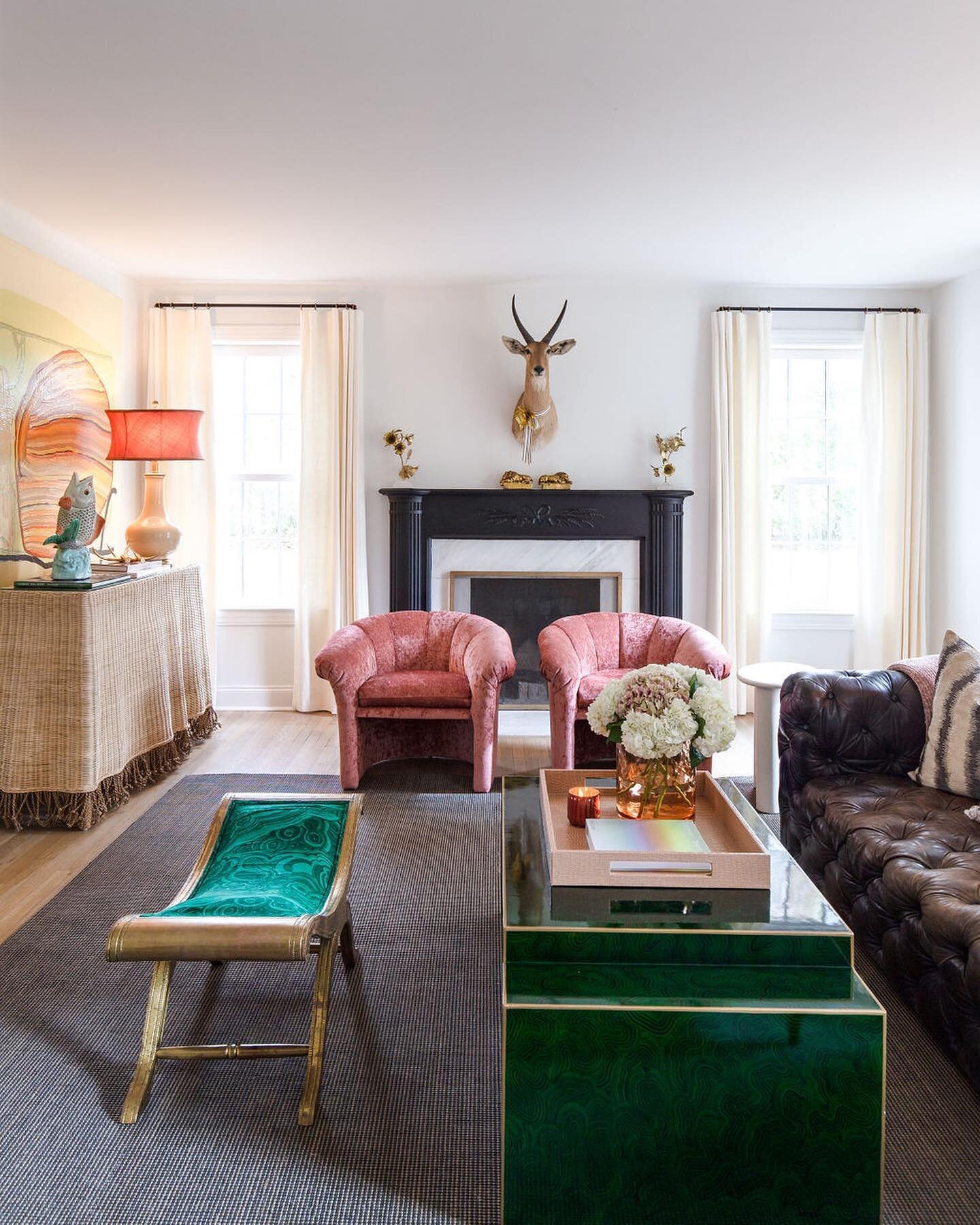
She freshened up the fireplace by painting its dark wood white and replacing travertine with tumbled marble. Then came the aforementioned excitement: black-and-white resin nesting coffee tables, a colorful Michael Barringer original painting from L Ross Gallery, and a chrome armchair upholstered in a cheerful orange that echoes the tones in the art.
The pop of orange in the living room is but a foreshadowing of what’s in store in the adjacent dining room. Formerly painted blue and nondescript, the walls now sport a vibrant orange grasscloth wallpaper, set off by bright white trim. Asked if the bold color was a hard sell to her clients, Engelberg says they happily agreed to her suggestion. “They were into it!,” she recalls. “They gave me a lot of creative freedom and listened to my ideas and reasoning, and they love the room.” The bright grasscloth wallpaper was a perfect option, she adds, because it provides both warm color and texture.
While every room should have excitement, not everything in the room can be a focal point, Engelberg explains. There needs to be balance. “Whenever I do bright colors, I try to temper it, like in cooking when you mix eggs into hot ingredients slowly so they don’t ruin. Most everything else should be calm. The dining room rug is solid white wool and the chairs have a very simple ticking stripe that looks like vintage French napkins.”
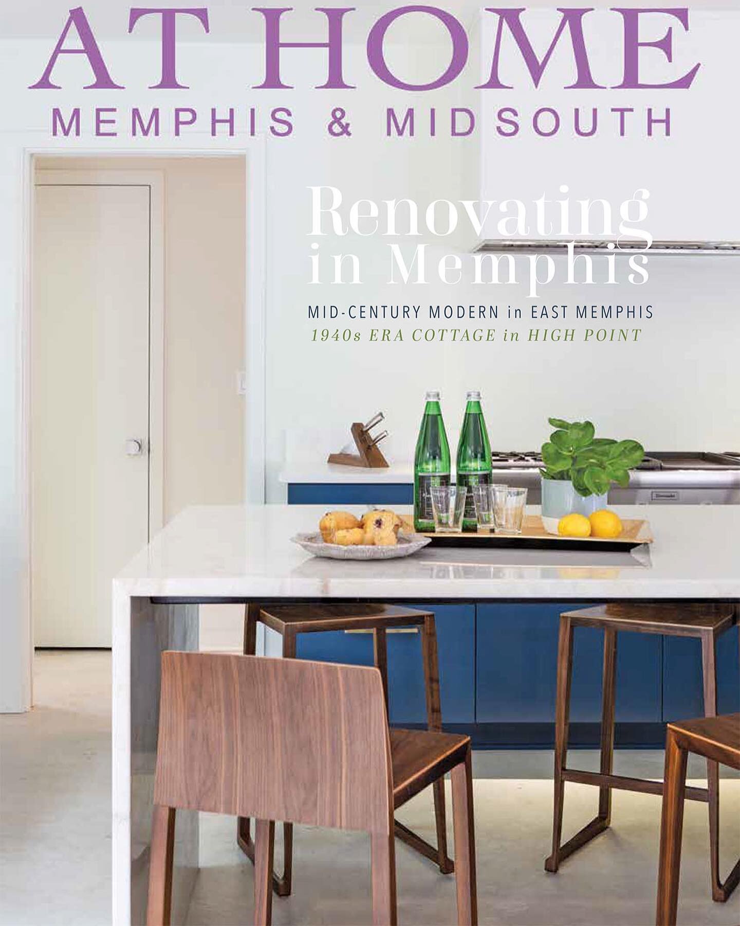
In the kitchen, Engelberg decided to take the wall color in the opposite direction. Previously painted dark blue, the now-white walls set a clean, bright backdrop for the reimagined room. The homeowners opted to paint the existing wall and base cabinets white, but the designer urged them to tear out the existing kitchen island in favor of a larger one that would provide storage as well as a seating area large enough to accommodate the whole family. Bathed in blue with a butcher block countertop, it’s the perfect spot for a quick breakfast before school or work. The kitchen’s new flooring, oversized black and white hex tiles, provides vintage character, and the open baker’s rack is an attractive storage solution. An abstract painting by Melissa Dunn, also from L Ross Gallery, is a true standout against the crisp white of the wall.
Engelberg says the master bedroom underwent one of the biggest transformations of any space in the home. She took the wall color from dreary to inviting and rethought the window treatments to bring more light in and improve the view. “This room has an amazing view and beautiful trees and greenery, so we took out plantation shutters to open it up,” she says, explaining that she prefers simpler window coverings to the often-used shutters. “[Shutters] look busy for no reason.” Her designs tend to feature simpler window treatments like panels and Roman shades in neutral colors. “I love their casual, relaxed feel,” she adds.
Because the room isn’t perfectly symmetrical, Engelberg decided not to pair nightstands by the bed. Instead, she opted for a different low chest on either side, a choice that provided needed storage in the older home with limited closet space. The fact that both chests are similar in height allowed the pair of angular bedside lamps placed on them to work beautifully.
The room’s overall feel is serene, thanks to the simple white bedding and neutral rug. Pops of color come from the lamps as well as accent pillows in a geometric print, orange and blue. “I’m obsessed with blue right now,” Engelberg admits. “I think it’s a great neutral that goes with just about anything.”
And then there’s the art. Two pieces grace the room: a Lisa Weiss painting hangs over the bed, and a large, square work by Nashville native Kit Reuther graces the opposing wall. According to Engelberg, the Reuther work from David Lusk Gallery was a must-have. “I told the homeowner, ‘If you only buy one piece of art for your home, it has to be this one. It is so beyond perfect in the bedroom—the shape, the colors, the serenity.”
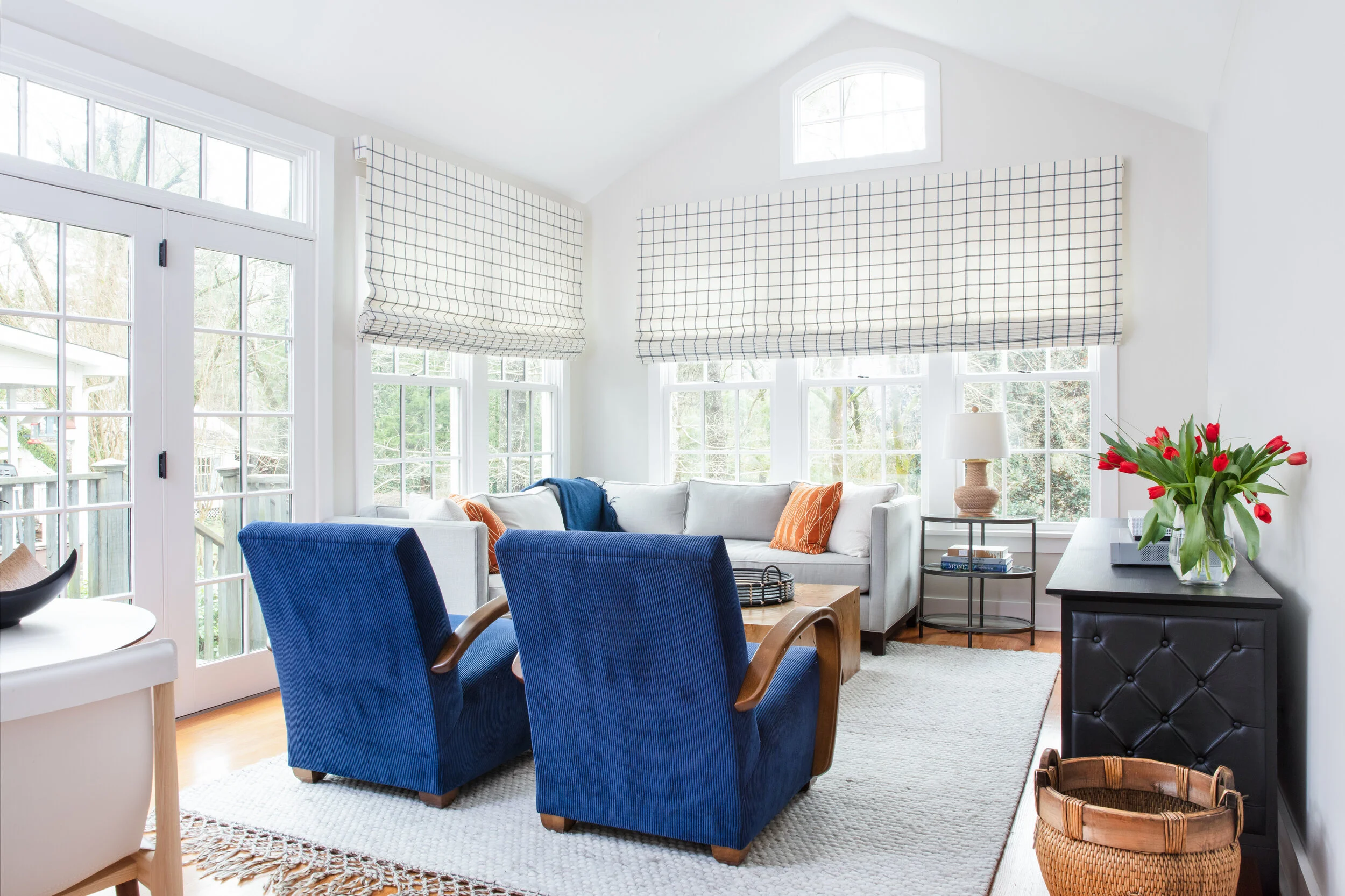
Next to the master suite is the den, the family’s hangout area. Here, Engelberg again removed blinds to open up the view of the home’s treed yard and repeated the blue, orange and white color theme. She equipped the space with a game table so the kids have a place to do homework or work a puzzle. The family can relax in deep armchairs covered in soft corduroy or on the comfortable sectional.
It’s that kind of comfort that drives Engelberg’s design. Having battled and beaten cancer a few years ago, she says she now knows the true importance of environment. “Where you live, what your space looks like, feels like, completely impacts your mental health, your physical health, your relationships with people around you. There’s such a strong connection. So I always look at that when I’m looking at someone’s house. It’s not just that we have to make it look pretty; it’s how can we make it live well for you...The rooms you spend the most time in have to feel good.”
Tara’s Tips | More thoughts from designer Tara Engelberg
On light fixtures: “I love lighting. Lighting, to me, is like the jewelry of the room. You can get bold with it. You can get creative with it. You can get delicate with it because chances are, kids and dogs aren’t going to knock it over.”
On window treatments: “I don’t like big, fussy window treatments. I don’t think they should be the focal point; the window and the view and the furniture in the room should be the focal points.”
On accessories: “I love going to estate sales and the one thing I always look for at estate sales is brass candlesticks. You can have a super modern room with everything new and you add a little patina in a brass candlestick and it changes the feel of a room instantly. Most of my design is for families, so I feel like adding a little touch of vintage or antique because it gives a comfortable feel.”
On mixing vs. matching: “My favorite way to create a personal space with layers and depth is by mixing textures and elements. A room shouldn’t look like you purchased everything from a page of a catalog, or from the same store even.”


