Past and Present Perfect
/Interior Design by First Fruit Collection | Written by Terri Glazer | Photography by Sélavie Photography
On a recent tour of the 2019 Vesta Home Show’s Kelmscott Manor with designers Ashley Toney and Patty Michaelis, words like “airy,” “dressy” and “pretty” peppered the conversation. The opinion is echoed by thousands—literally. The majority of the over 18,000 people who attended the show last October voted for the house as their favorite, making it the People’s Choice winner.
Toney, owner of First Fruit Collection on the Collierville square, and Michaelis, her design partner and manager of the store, teamed with builder Dave Moore in a year-long labor of love to bring the house from concept to completion.
Moore describes the home, located on Chapel Woods Cove in Germantown, as traditional English country in style, but packed with every amenity a modern family could need. The exterior is a handsome blend of stone and brick. A formal garden to the right of the front entrance, highlighted by a traditional fountain, lends a decidedly dressed-up air. An arched covered entry welcomes visitors through double front doors painted an eye-catching cornflower blue in a foreshadowing of the interior color palette.
Just inside, the entryway, which Michaelis describes as a “showstopper,” opens to a two-story stair hall that draws the eye immediately upward. The floors, however, are worthy of equal attention; stately in a stunning diamond pattern. Created by Danny Benard of Mid South Flooring, the light-stained oak runs throughout the downstairs, an elegant foundation for the decor.
Impressive paneling furthers the English country manor feel of the entry. “We loved the idea of having some paneling,” recalls Toney. “Our trim carpenter from Navarro Brothers Finish Carpentry did even more than we imagined!” An important aspect of First Fruit’s design strategy is to let artists be artists, she explains. “That’s kind of our thing. We like to figure out what we want and then let the experts go with it. When you give them too many constraints they’ll do the work, but it ends up being something less than it could have been.” That strategy paid off in spades again when it came to the “jewelry” of the entryway, the stair railing, created by Willie Kelley of Absolute Iron. “We showed him a picture of something a lot simpler,” remembers Toney, “and he came up with this and we loved it! The matte finish actually has a little shimmer to it.”


“We took traditional and updated it, modernized it.”
-Kelmscott Manor designer Ashley Toney of First Fruit Collection
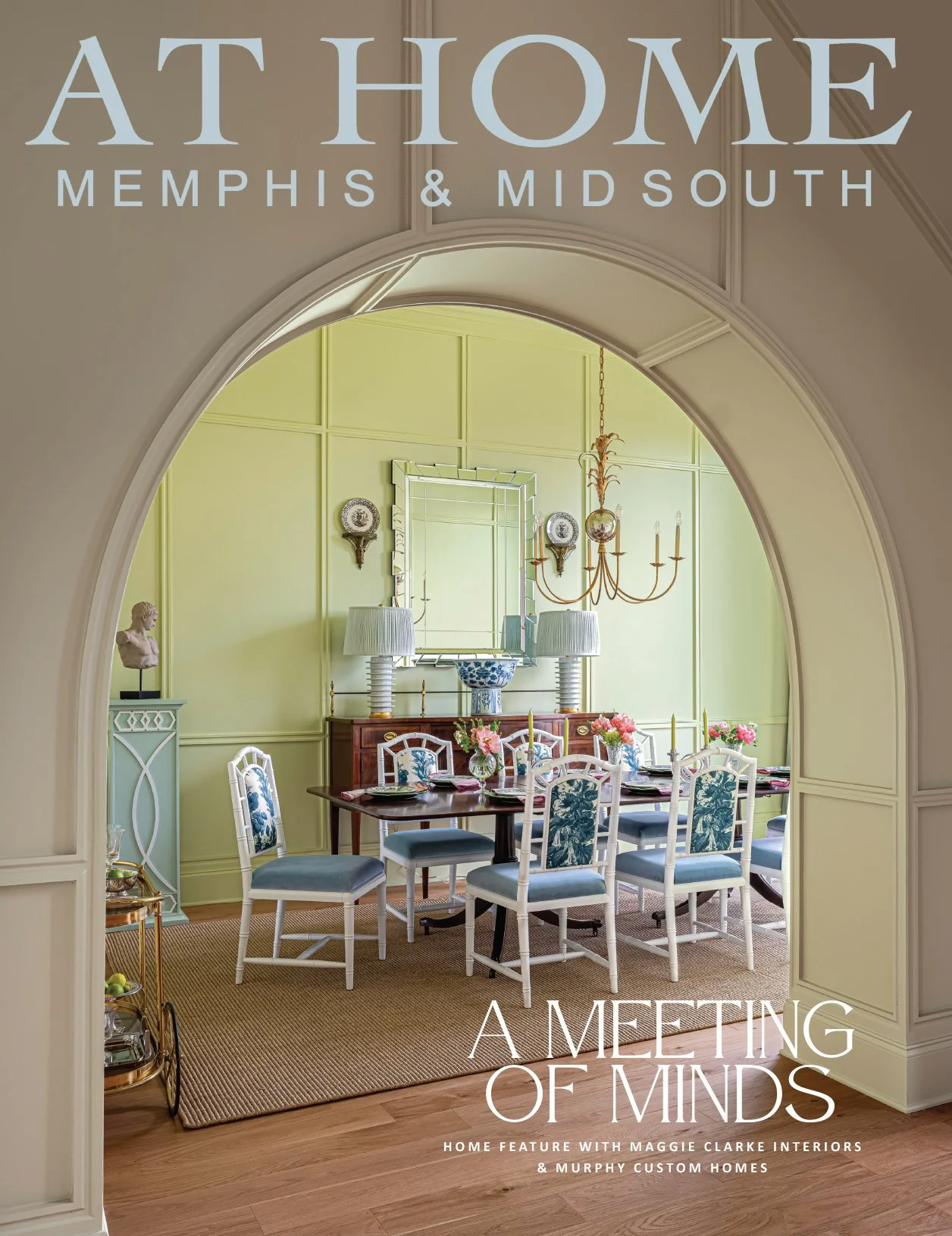
The dining room’s uncomplicated, open layout offers minimal wall space on which to place furniture, but the one piece Toney selected for the niche alongside the table and chairs came to be a foundational choice for the home’s overall design scheme. “We found the sideboard at market and kind of based the room around it. We knew we wanted a blue palette for this house and that sideboard, which is a replica of an antique, is a great anchor for the room,” she says.
Coffered ceilings, subtle chinoiserie-patterned curtains and a distressed wood chandelier make the dining room feel formal, yet not fussy.
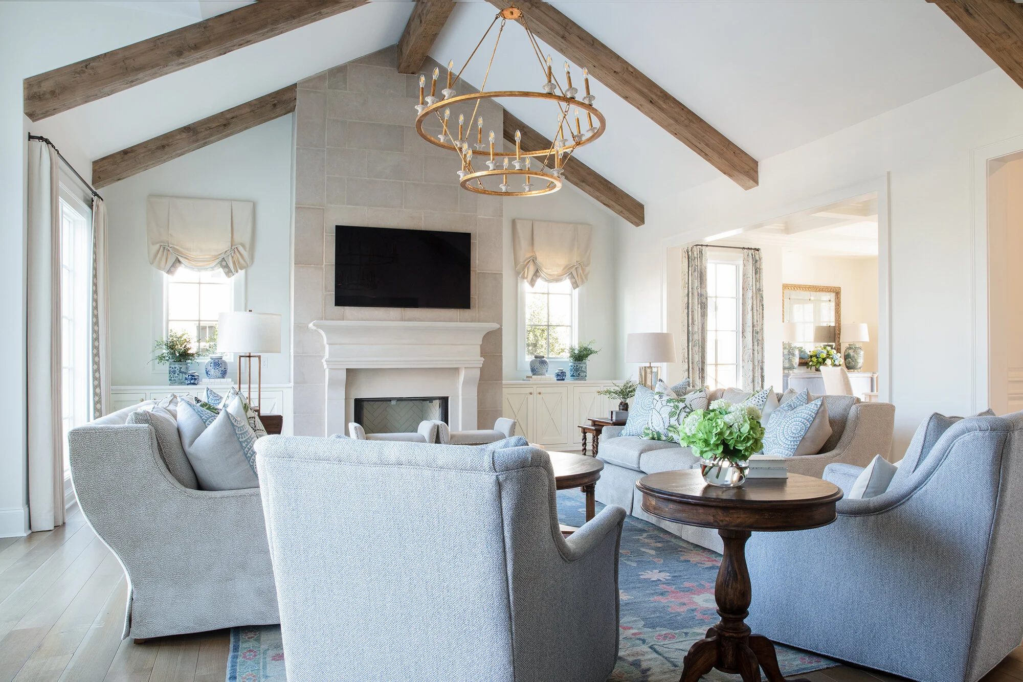
“This is probably our favorite den we’ve ever done,” admits Toney. “We love the open windows, the symmetry of the room.” That symmetry comes most noticeably in a pair of built-in cabinets under matching windows flanking the fireplace. The trim on the cabinet doors replays the diamond pattern of the entry floor, while the stone tops add a chic accent that keeps the room’s decor on the transitional side of casual.
Adds Michaelis, “We definitely wanted it to be a little dressy, but still feel lived in. We don’t want anyone to feel like they can’t sit on the sofa. We’ve had guys coming in here sitting in these chairs and saying they are the most comfortable chairs ever.
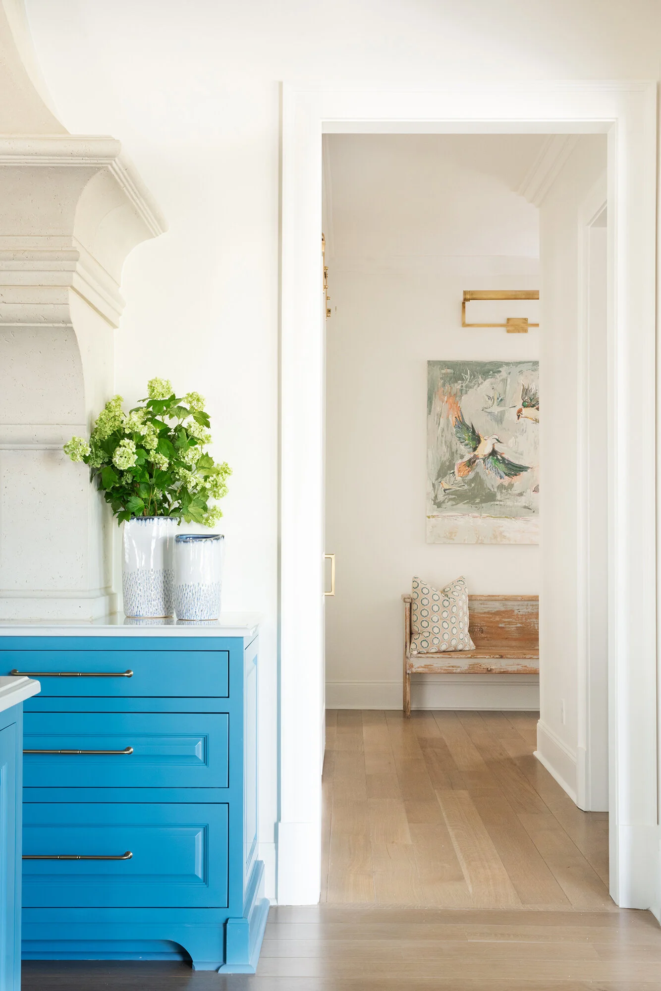
The den opens to a gourmet kitchen in which each feature outshines the one before. The cornflower blue first introduced in the front doors and the dining room sideboard makes a bold comeback in the cabinets. “It’s pretty, but unexpected,” says Toney. “In a design palette that’s otherwise simple, this is the pop of color.”
Traditional pecan-colored wood on the barstools and in custom ceiling beams from Burrus Co. brings warmth to balance the cool blues, and the vent hood created by Christie Cut Stone is a statement piece. Gold-tone faucets and hardware here and throughout the home are at once of-the-moment and timeless. No conversation about the Kelmscott’s kitchen is complete, however, without a mention of the adjacent wine room. The glass-encased alcove is the perfect home for a connoisseur’s collection, temperature- and humidity-controlled, and centrally located. Vesta attendees clearly agreed, voting the room their favorite feature from among all the innovations in the show’s six spectacular homes.
Nearby, the laundry area is a study in practicality plus beauty. White cabinets with Silestone tops pair with wooden open shelving created by Navarro Brothers. Several new shades of blue appear, from sky blue paint on the walls to navy decorative accessories. Lockers and baskets provide a place for each member of the home’s future family to organize, and there’s even a special spot for man’s best friend—a glass-enclosed dog bath, complete with a feeding station built in underneath. Don’t limit the space to canine use, though, suggests Michaelis. “It would also be great if you had to hose something off… maybe a muddy child!” she laughs.


The design team couldn’t be happier with the way the master suite turned out. Just as with the den, Toney describes the bedroom as luxurious, but liveable. Furnished in serene tones, the restful bedroom retreat leads into a classic white bath, with an unexpected touch. Burrus’s birch ceiling beams soften the tone without detracting from the spa-like feel. Through the bathroom, the huge master closet does double duty. Cleverly dressed up with the custom trim work that is one of the home’s hallmarks, a solid steel door marks the space as a certified safe room/storm shelter.
Along with three more bedrooms and baths, the Kelmscott’s second story features a media room, but the light-filled space is a far cry from the home theaters that first appeared in houses 20 or so years ago. White walls, multiple windows and light carpet create a sunlit ambiance. When it’s movie time, though, the space transforms into the ideal setting for viewing. Custom shades block out all light for ultimate enjoyment of the built-in projection TV system.
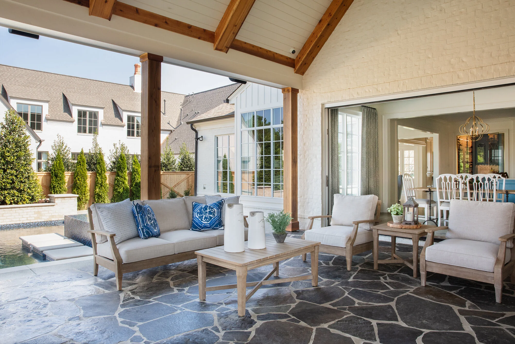
Although the 5,000-square-foot home is a showplace, its builder admits that his favorite part of it is outside its walls. “I’m an outdoor person, so I love the outdoor room and the backyard,” Moore explains. It’s easy to see why: an inviting pool and hot tub await, next to an inviting outdoor living room, complete with bluestone flooring, a vaulted and beamed ceiling, a stone fireplace and two TVs, one of which is visible from within the hot tub. “No one will ever have to miss a play,” says Toney.
The Vesta Home Show website describes the Kelmscott as a combination of the best of the past with the best of the present time. Thanks to the efforts of the team that created, constructed and furnished it, this house will surely provide the best of the future, as well, for the family that soon calls it home.


