Remaking A Classic
/Story by Terri Glazer | Design by Maggie Clarke Interiors | Photos by Ross Group Creative
This Midtown home had all the beauty and elegance of a true Southern belle. She needed some work, however, to bring her up to date. Not too much work, though. The project would need just the right person at the helm; someone who would respect the house’s character yet liven it up for the young couple who were the new owners.
When working with a house built in 1914, it’s hard to tell which features might be original and which might have been added along the way. Designer Maggie Clarke says that even though she might not have known the date of each detail, she was careful to preserve the ones that accentuate the Spanish Revival style architecture. She knew that would be a priority from the moment she set foot on the property. While waiting on the front porch to meet homeowner Rachel Reedy for their first consultation, Clarke and project manager Amanda Montgomery fell in love with the antique brass door knocker. It was a good omen that led to an ongoing professional relationship with Reedy.
Once inside the home, one of the first things the designer noticed was the floor in the entryway. It seemed natural to emphasize the uniqueness of the antique cement decorative tiles, so Clarke leaned into their vibrant color palette. “We brought up the orange tones in the tile with a custom Charles Stewart bench in a Kravet paprika velvet, then the yellows on the binding for the stair runner from Kiser’s [Floor Fashions]. That is my new favorite thing to do anytime I want to bring out a certain color,” she says.
The star of the space is the large pop art portrait of Elvis by local painter Frances Barry Moreno. Clarke placed several nods to “The King” throughout the home just for Rachel, who is a big fan. The mood is almost ethereal on the facing wall thanks to a custom dimensional art installation by AC Ceramic Atelier. White porcelain flowers float through the space, seeming to lead the way into the rest of the house.
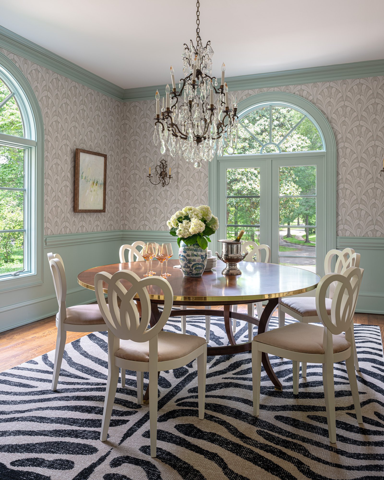
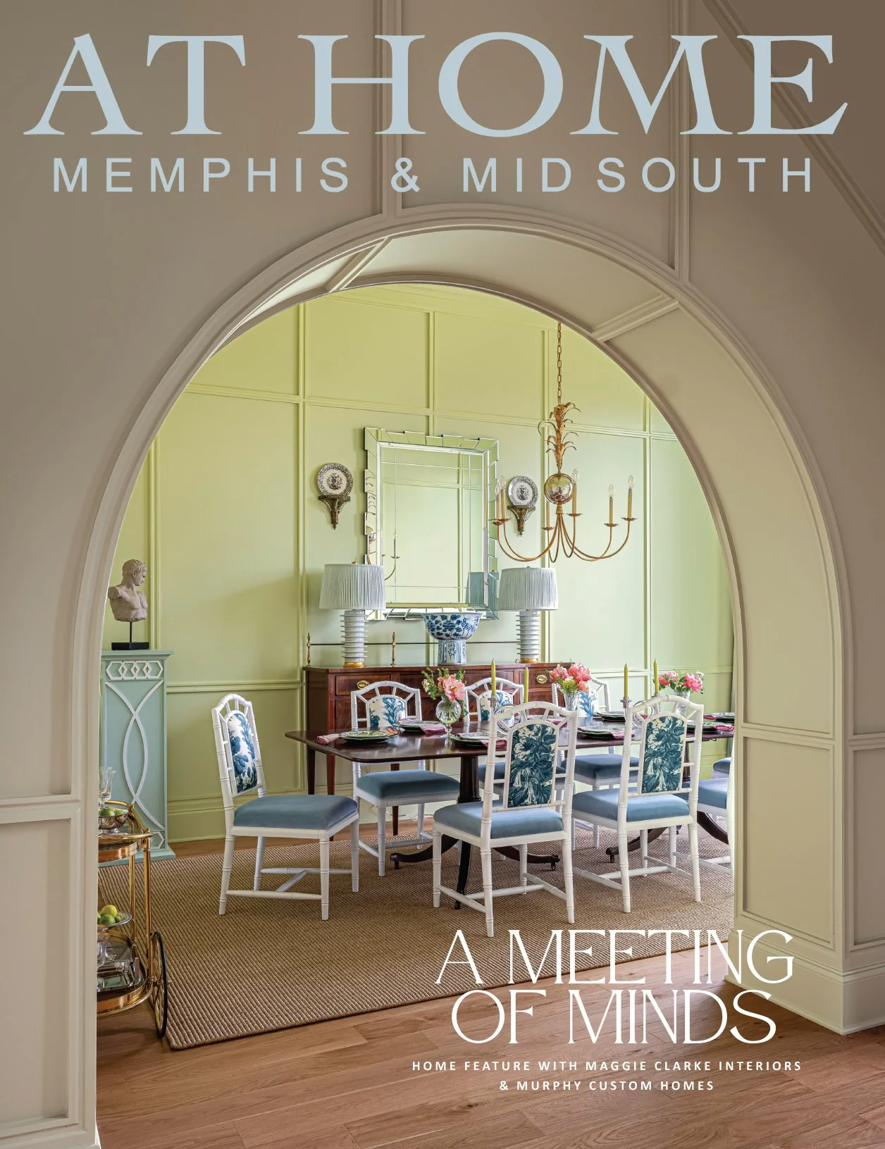
Clarke uses the term “juxtaposition” often; it’s a concept she seeks to bring into each of her projects. The dining room in this home is a case study in this concept. The space was a jewel to begin with, boasting an ornate chandelier and wall sconces. Arched windows and stately millwork added to the formal feel. Clarke played along, adding botanical wallpaper that echoes the arched theme, then went just far enough outside the box with a Modern History round table and playfully modern shield-back chairs. A zebra rug from Schumacher completes the perfect melange.
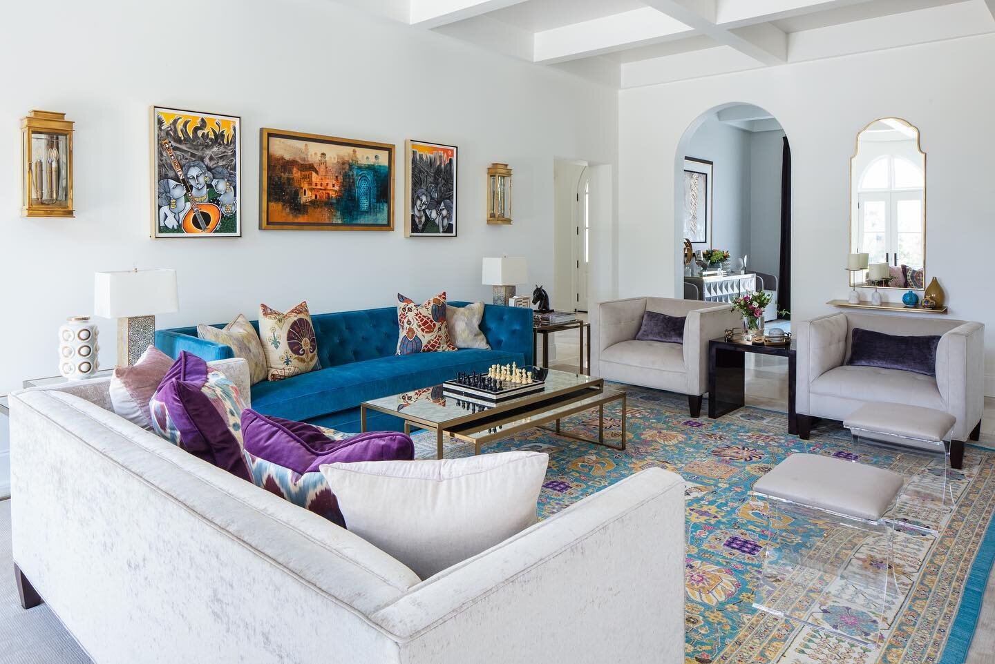
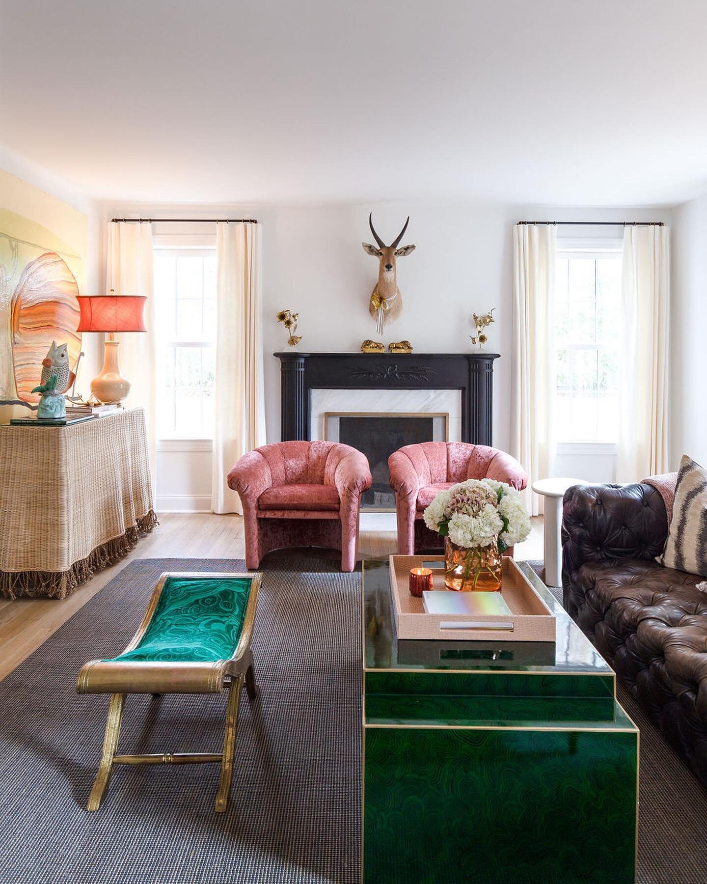
The designer admits that the thought of a 40-foot-long living room initially gave her pause, but she faced the challenge using the “divide-and-conquer” tactic. “We divided it into three spaces to make it feel a little bit cozier,” she explains. “Two living spaces and a game area.” To fill the room’s full back wall of windows Clarke ingeniously placed two Rowe oak desks side by side to form a stunning modern credenza. Massively scaled Gabby table lamps topped with custom lavender shades by Sorella Glenn look right at home. Matching vintage bamboo wing chairs complete the tableau: their cushions upholstered in a hue also found on a pair of poufs and the nearby sofa. “We love chartreuse and we try to use it in every project,” the designer says.
Old meets new again across the room, where Rachel’s grandmother’s dining table now anchors a game area. The table is one of a number of inherited pieces in the home. “[Rachel] was really big on using her antiques,” recalls Clarke. “Her family is important to her and so she wanted those heirlooms to live on.” The designer accomplished that mission with the help of local furniture repair whiz Blake Soule, who restored the table, as well as other family treasures. Grandma’s chairs sit alongside two Coley Home Lulu chairs with pointed backs and velvet slipcovers that add a note of fun. A series of duck sketches by local artist Nate Renner keeps the mood casual.
The nursery is another spot where time-honored elements coexist with fresh twists. Clarke helped Reedy prepare for her first child, a boy, starting with a handsome striped wallpaper from Schumacher. Farrow and Ball Parma Gray, a subtle blue/gray hue, on the trim is ideal for a young gentleman. Above the antique-style metal crib hangs a set of vintage hot-air balloon prints tinted by hand to reflect the room’s color palette. The whimsical mood continues via a Gabby chandelier overhead that brings the look of a circus tent to mind. The room stays true to Maggie Clarke style, however: modern stands juxtaposed with nostalgic. An eclectic corner vignette includes a navy lacquered grasscloth dresser, a skirted chair and ottoman upholstered in Michael Smith fabric with a decidedly throw-back vibe, and a large abstract print.
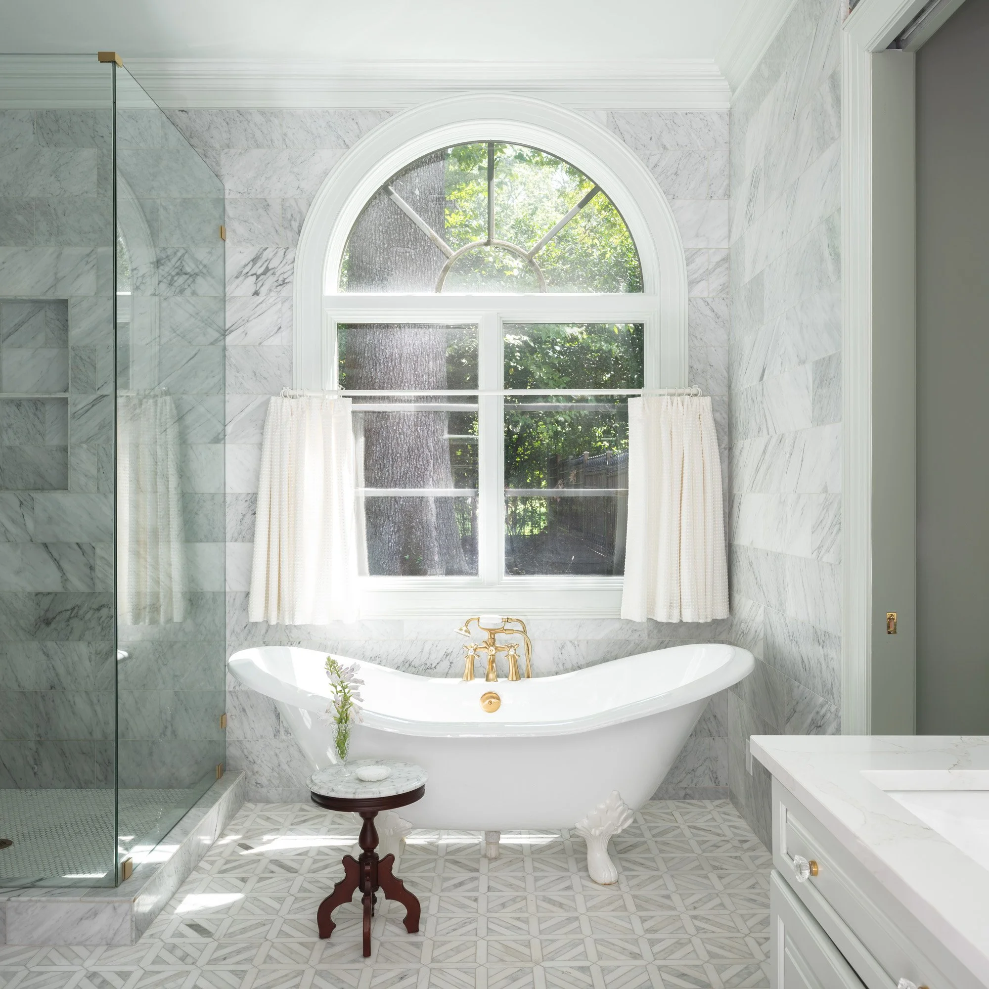
Clarke describes the work she and her firm did on this home as “light renovations,” with one exception. The primary bathroom was almost a complete gut job. Just about everything from the dark brown tile floor up came out to make way for a clean, fresh redo. New marble mosaic floors set the stage. A stylized clawfoot tub sits beneath a graceful arched window that was formerly covered with shutters. One of Clarke’s favorite hacks for a bathroom window, a lined cafe curtain, now allows light in and affords privacy when needed. Indulging Rachel’s love for all things pink, Anna French floral wallpaper in pinkish lavender and coral brightens the space.
The home’s backyard has the feel of an Old Hollywood mansion. A large covered patio stretches across the back of the house, providing plenty of room for the entertaining the owners enjoy frequently. Clarke chose Summer Classics outdoor furniture for the porch, blending teak, wrought aluminum, wrought iron and glass pieces to furnish a living area and two distinct dining spaces. She repeated the sophisticated look on the adjoining pool deck, where a row of chaise lounges creates a spa-like atmosphere. Completing the look are cushions, accent pillows and scalloped umbrellas in crisp black and white. The designer says the light-and-dark combination is her go-to choice. “I love using black and white outside for contrast with all the green in the summertime from nature and the blue of the pool.”
Excited to work with Reedy again, Clarke is set to adapt the nursery a bit for a baby girl coming soon and to transform a parlor into a TV lounge. As with the work she’s already completed on this Southern belle, she says it will be done with a light hand, beautiful but not over designed.


