The Right Place for the Right Family
/Design by M. Cate Interiors | Story by Terri Glazer | Photography by Stefanie Rawlinson
When the right family finds the right place and the right designer, everything comes together perfectly to create a true dream home. Designer Jessie Cate’s Germantown clients and their new-to-them house are proof.
The family’s previous residence was great—a brand-new build with all the latest bells and whistles. While it had all the trendiest details, it didn’t have enough bedrooms to accommodate their five children or a yard large enough for the young siblings. The couple knew they needed to move, and realized they’d probably need to buy an existing home to get the large lot they wanted, but busy schedules wouldn’t allow them to take on a total redo.
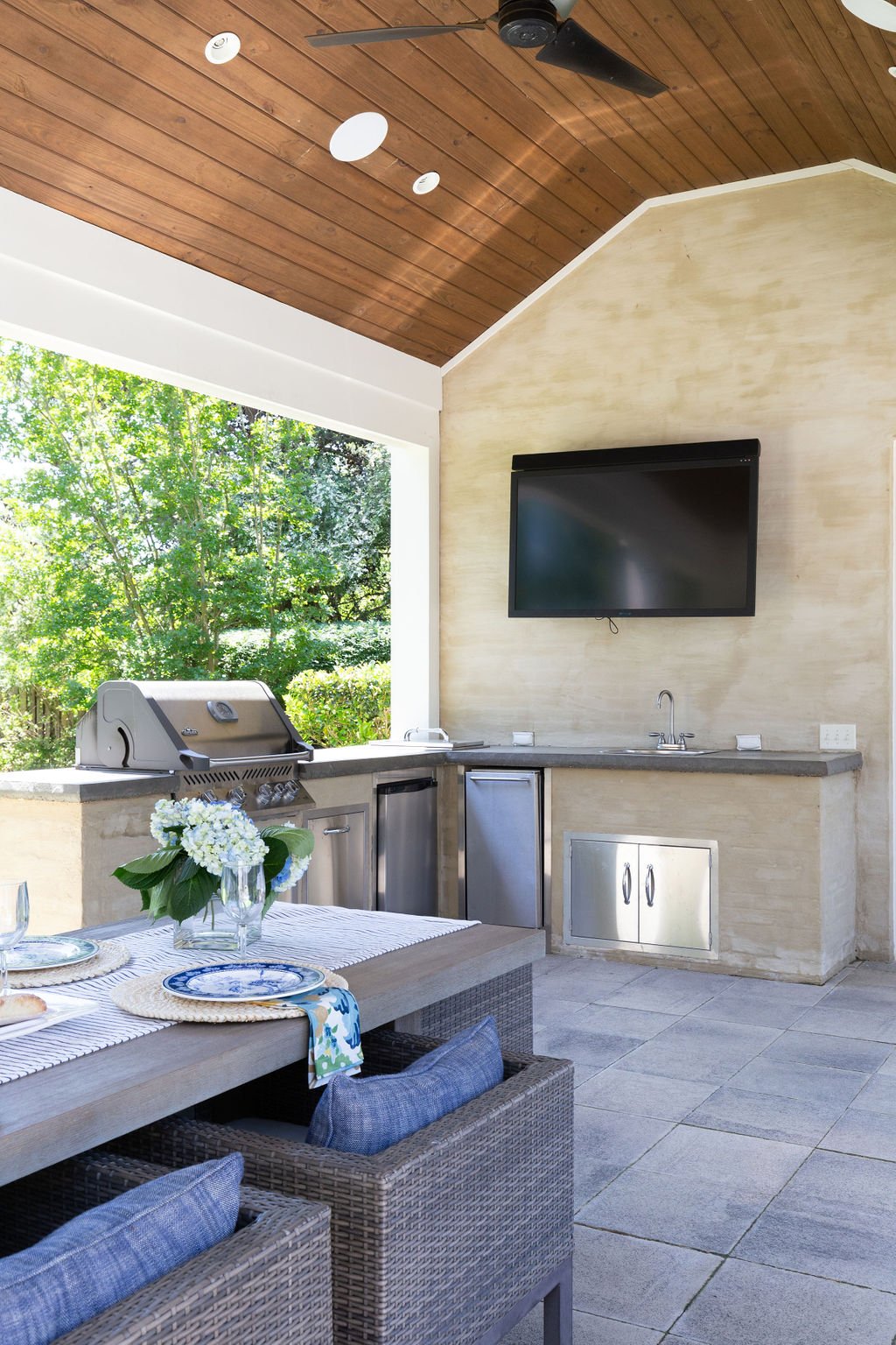
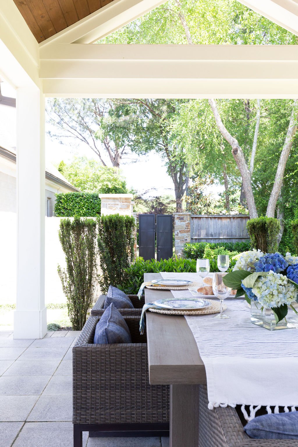
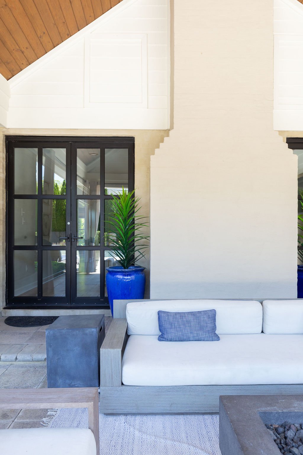
When they found the place they now call home, it was just what they were looking for; a “unicorn” as Cate describes it. Built in 1991, the house was in great condition and had already received a major facelift from Salvaggio Group, thanks to the previous owners. In fact, it was the gorgeous backyard with outdoor living room, kitchen, lounge area and resort-style pool, as well as plenty of green space, that drew them to make the purchase.
The couple called on Cate in May 2020 to help make this great house their home. She recalls having discussions to make sure their expectations would be realistic for a 30-year-old home, since they were coming from a tricked-out new house. When they shared that they had hardly even used some of the luxury features of their previous place, she knew they were on board.
“There was a bit of a disconnect between the exterior and the interior of this house. It felt a little dark and heavy inside with stone accents and dark floors,” the designer recalls. “My clients love the beach; it’s their happy place. I wanted to give them that same feel of relaxed comfort so I played on blue shades and the feel of the exterior rooms and tried to keep it with the traditional fit of the architecture.”
Cate goes on to explain that for this project, as she does with all her clients at M. Cate Interiors, she adopted a save/splurge policy that involves prioritizing the areas most important to the homeowners, then saving in other aspects of the plan.
To that end, she decided that instead of replacing the existing hardwood flooring throughout the home, it would stay, stripped of its ebony finish. Now covered in clear-coat, the floors show only remnants of their former color, left intentionally to evoke a casual, coastal feel.
My goal is to give clients the best version of them in their house so that they love coming home. They love having friends over because of their house; they’re happy to invite people into their space. I want their friends to come in and say, “Oh, this feels so you” and to feel comfortable. It’s not about my look, it’s about the clients and what the clients want.
—Designer Jessie Cate
Interior walls that were once a variety of colors including dark navy and gray now wear the same shade of white, a Sherwin Williams stock color. Cate says, “It changes with the lighting, so even though it's all the same paint color, you don't necessarily feel it. It’ll keep their touch ups easier as they need to; they won’t have to try to remember which color paint went where.” She also updated lighting throughout the house, sourcing many of them from Gabby, a line with a variety of related fixtures to provide continuity of style from room to room.
The home’s two-story entry is compact yet impressive. A striking floral arrangement by John Mark Sharpe draws the focus upward to the staircase landing, where a custom commissioned beach scene by local artist Whitney Winkler speaks to the family’s love of the ocean.
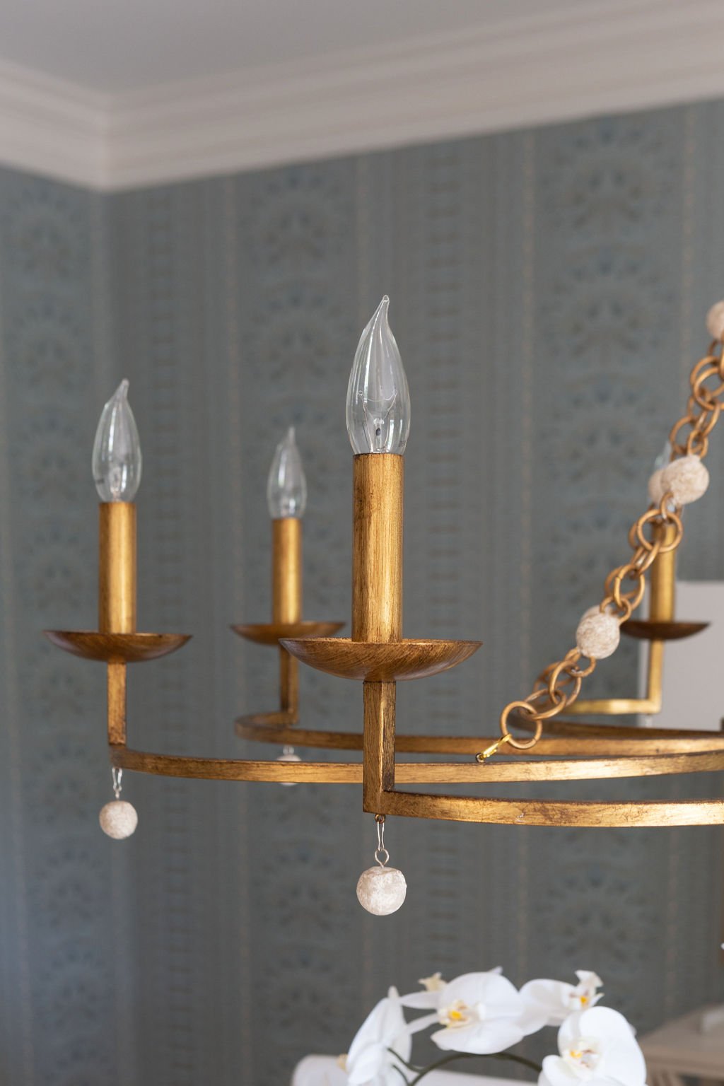
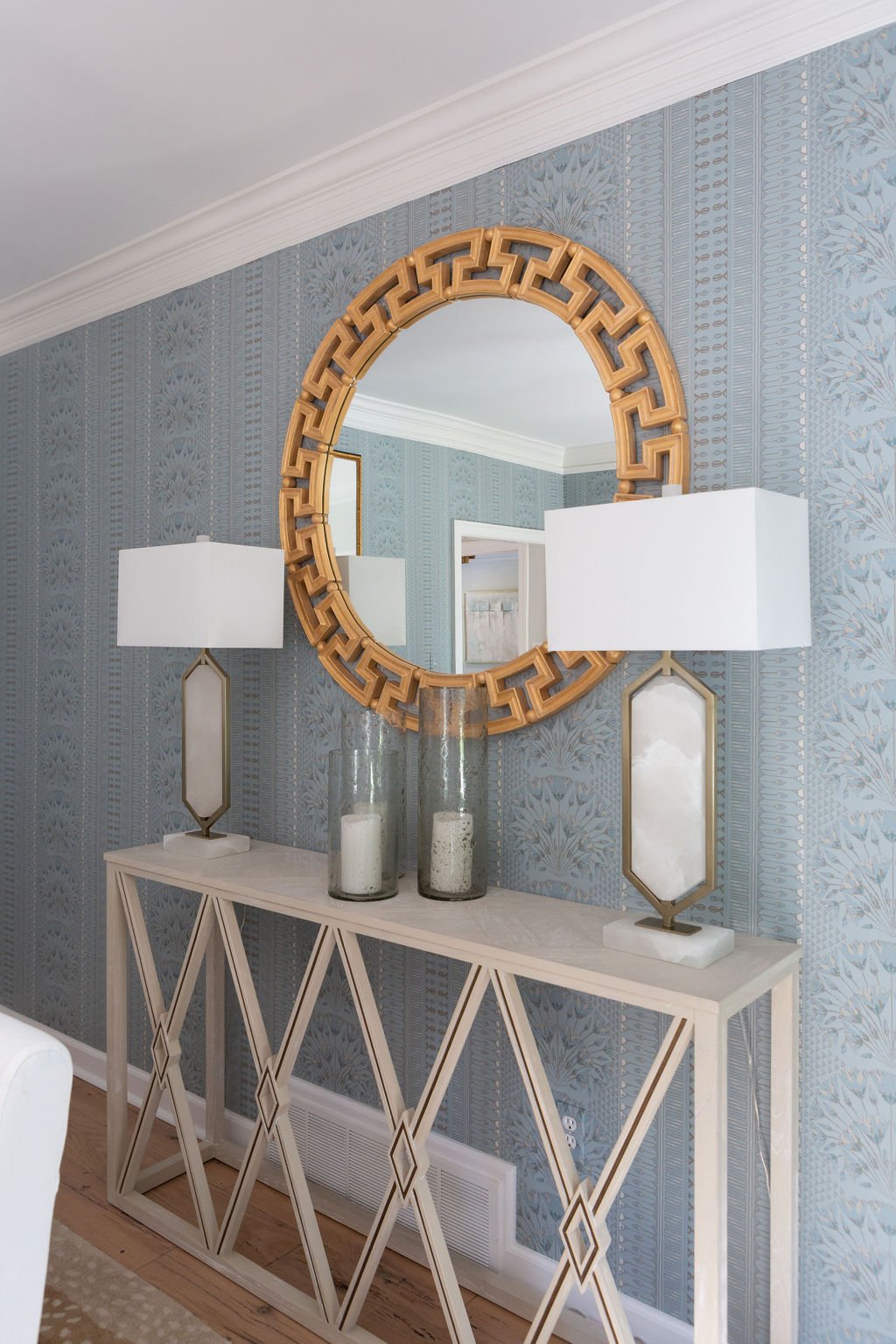
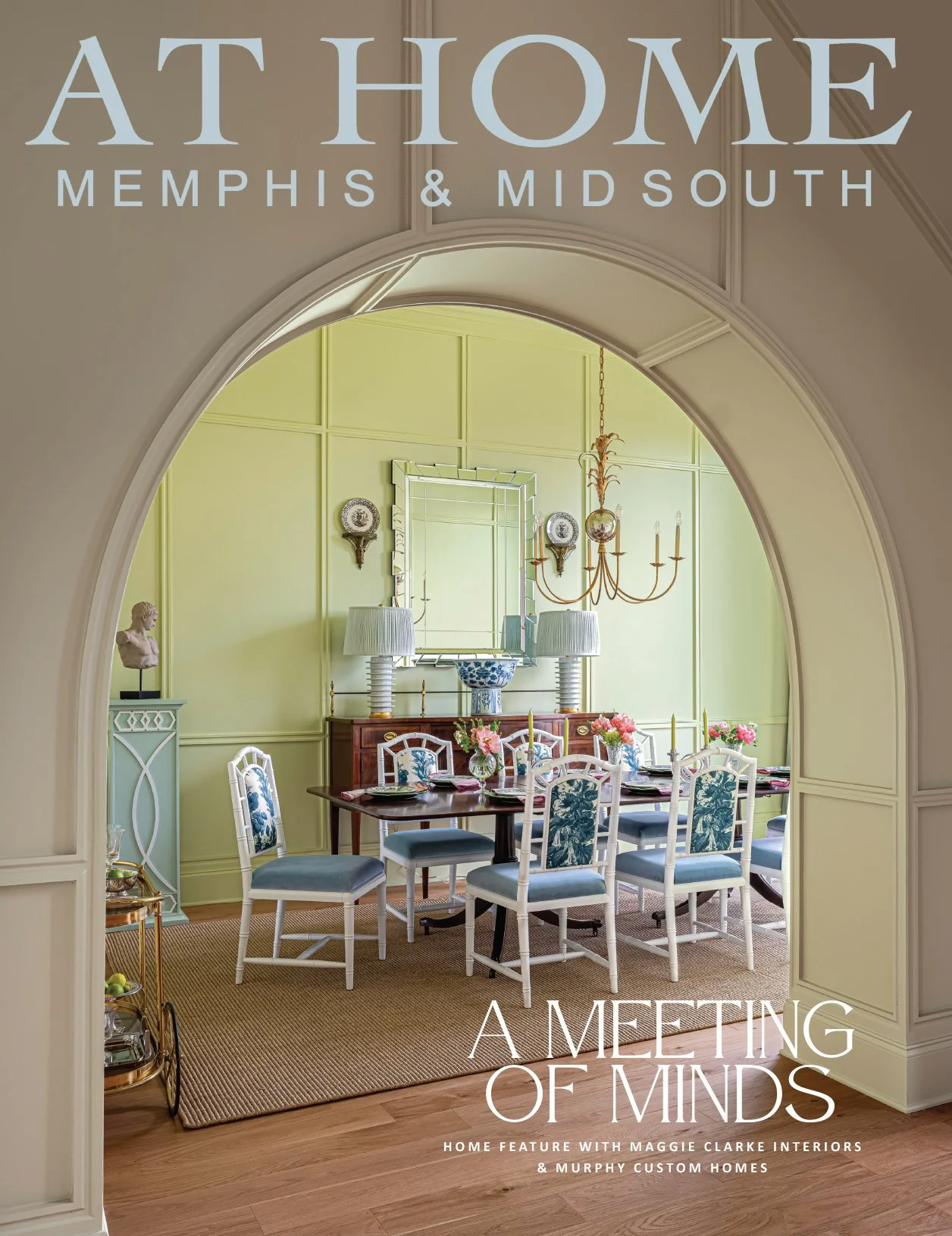
Elegant Thibaut wallpaper and custom drapes with a subtle herringbone pattern give the dining room a grand and elegant aura, while washed linen slipcovers on the dining chairs keep the mood from going too fancy. A simple gold chandelier and Greek key mirror add to the timeless feel.
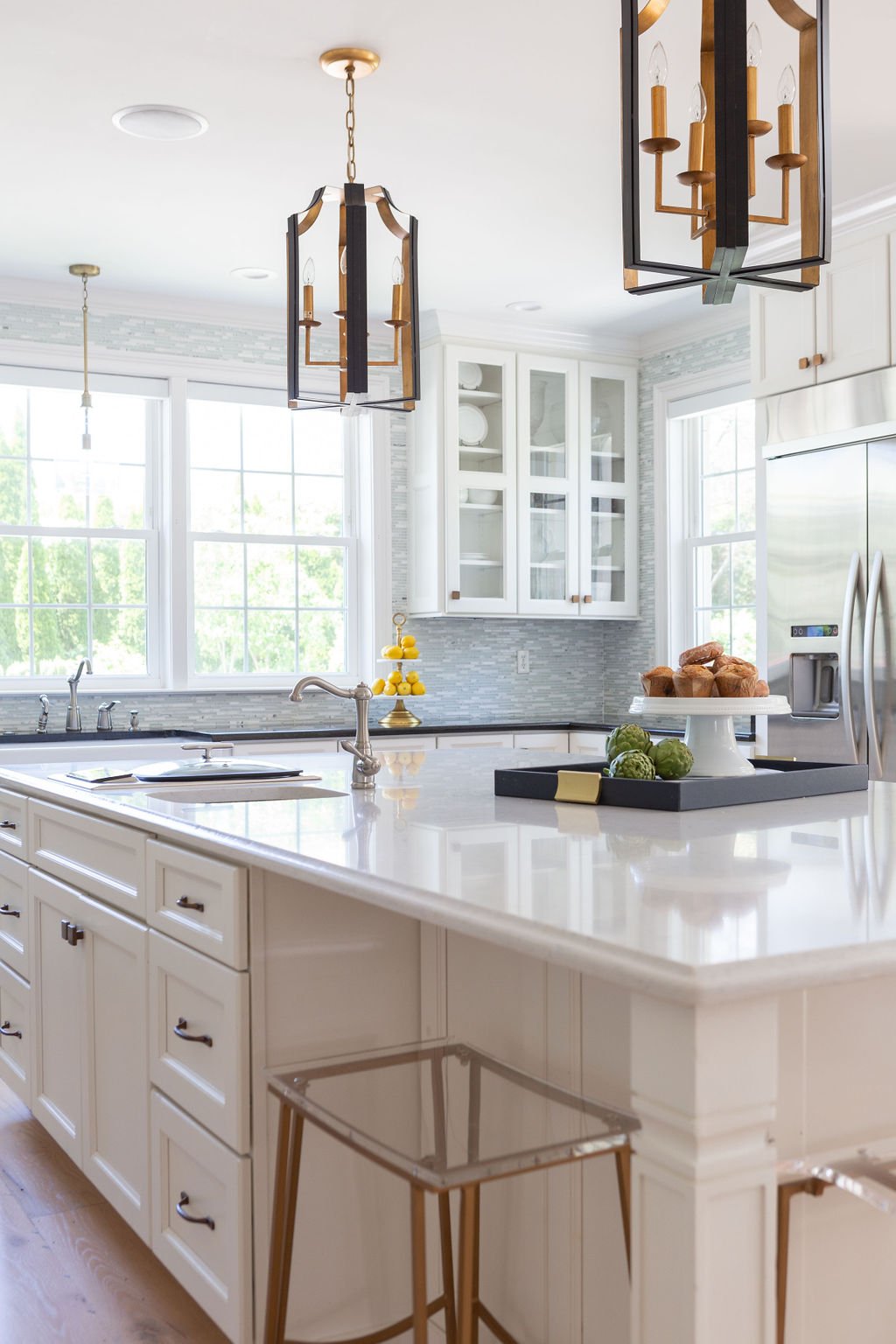
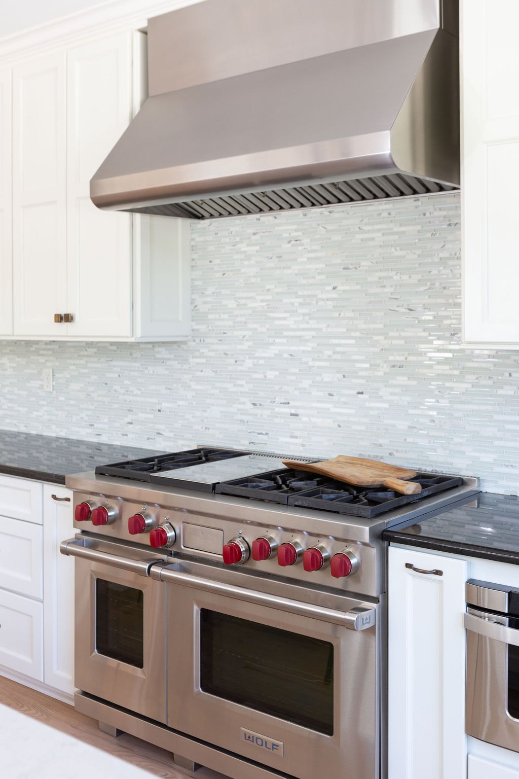
The gem of a kitchen was already in place, thanks to the previous renovation. Generous proportions give the room and the light-filled breakfast area adjacent to it a gracious feel. Cate only had to paint the walls, change the lighting and update the cabinet hardware. Handsome Ashley Norton pulls and knobs were a splurge item important to the homeowner and the designer wholeheartedly agrees with the choice. “Nothing else was going to complement the flow of the rest of the house,” she says, noting that the client’s ability to come to decisions easily made her a dream collaborator. “She knew what she did and didn’t want to splurge on and she made choices quickly to keep the project rolling.”
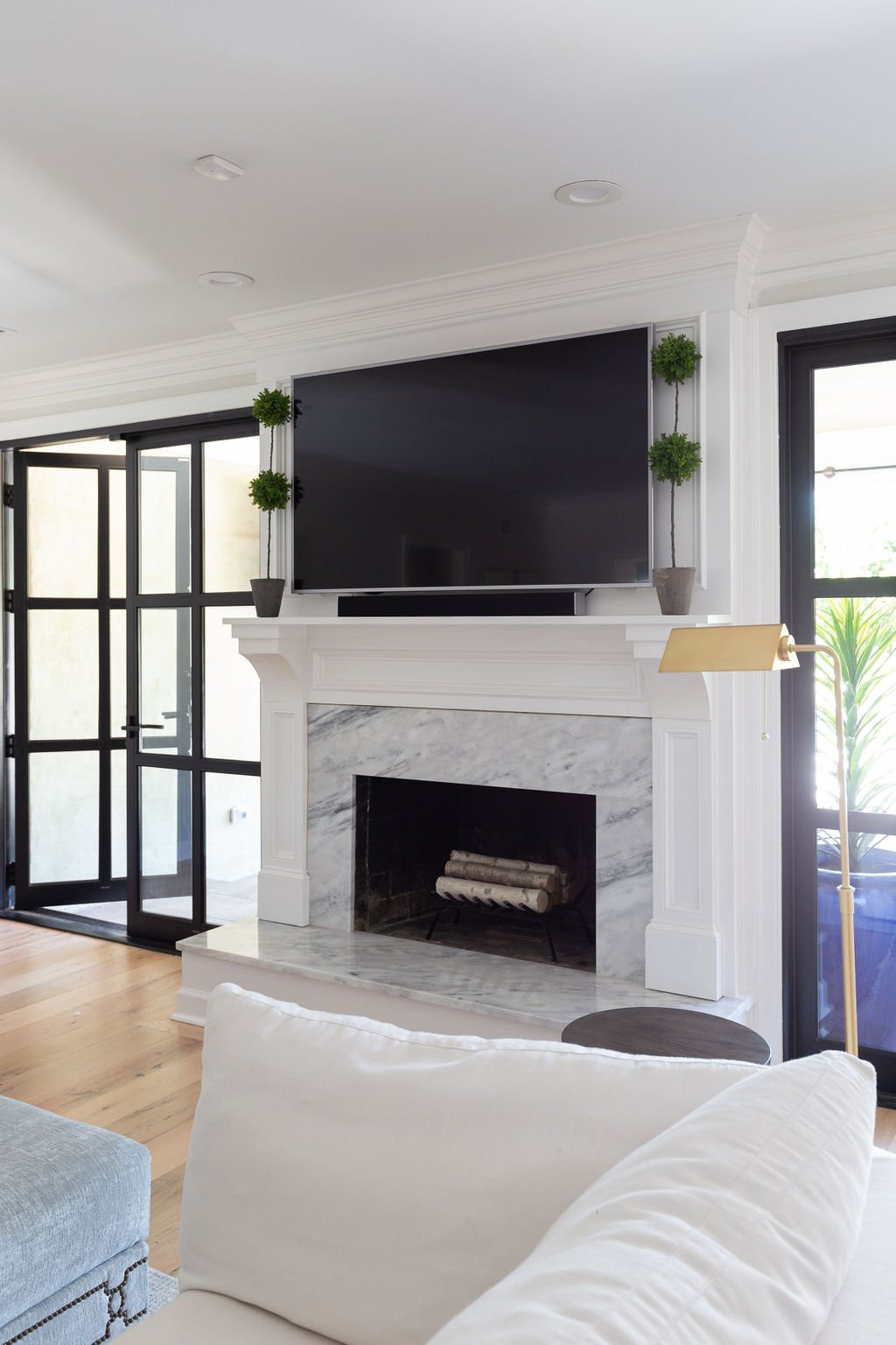
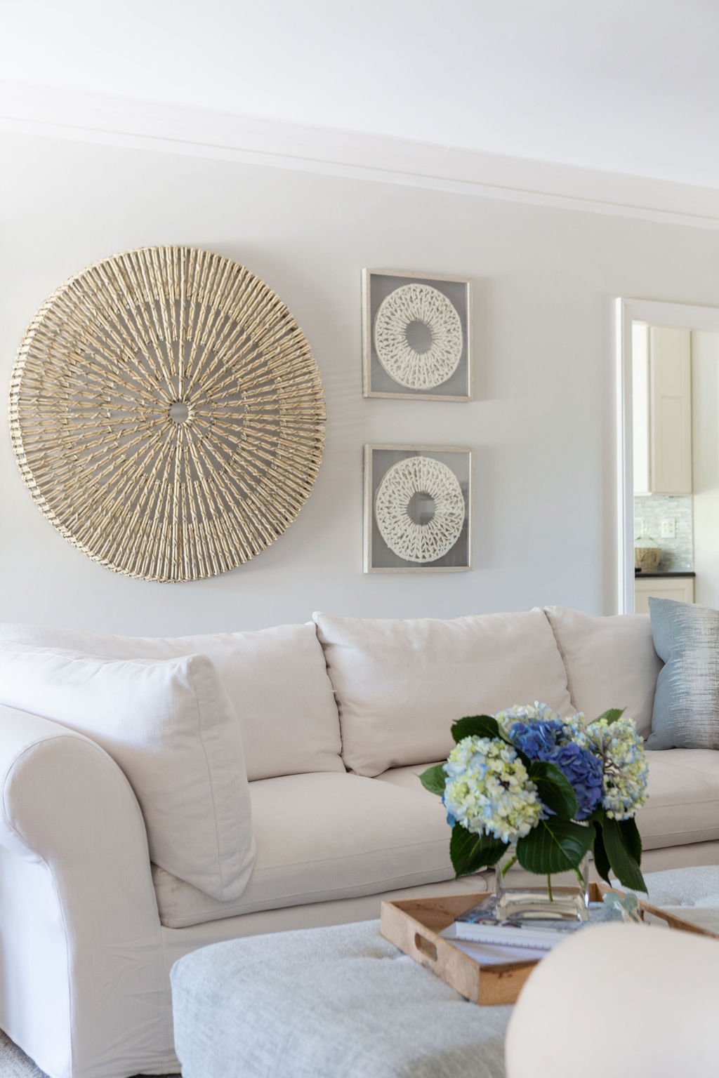
The centerpiece of the den is a comfy sectional big enough for the whole gang. It encases an equally inviting oversized ottoman upholstered in cloud blue chenille. Nailhead trim gives a nod to formality in this family-friendly space. The room’s fireplace received a complete makeover, Once covered in dark, heavy fieldstone, it now has a fresh and traditional look with classic marble and clean, white trim. Pairs of stately iron-and-glass doors flank the fireplace, providing full-length views of the beautiful outdoor oasis.
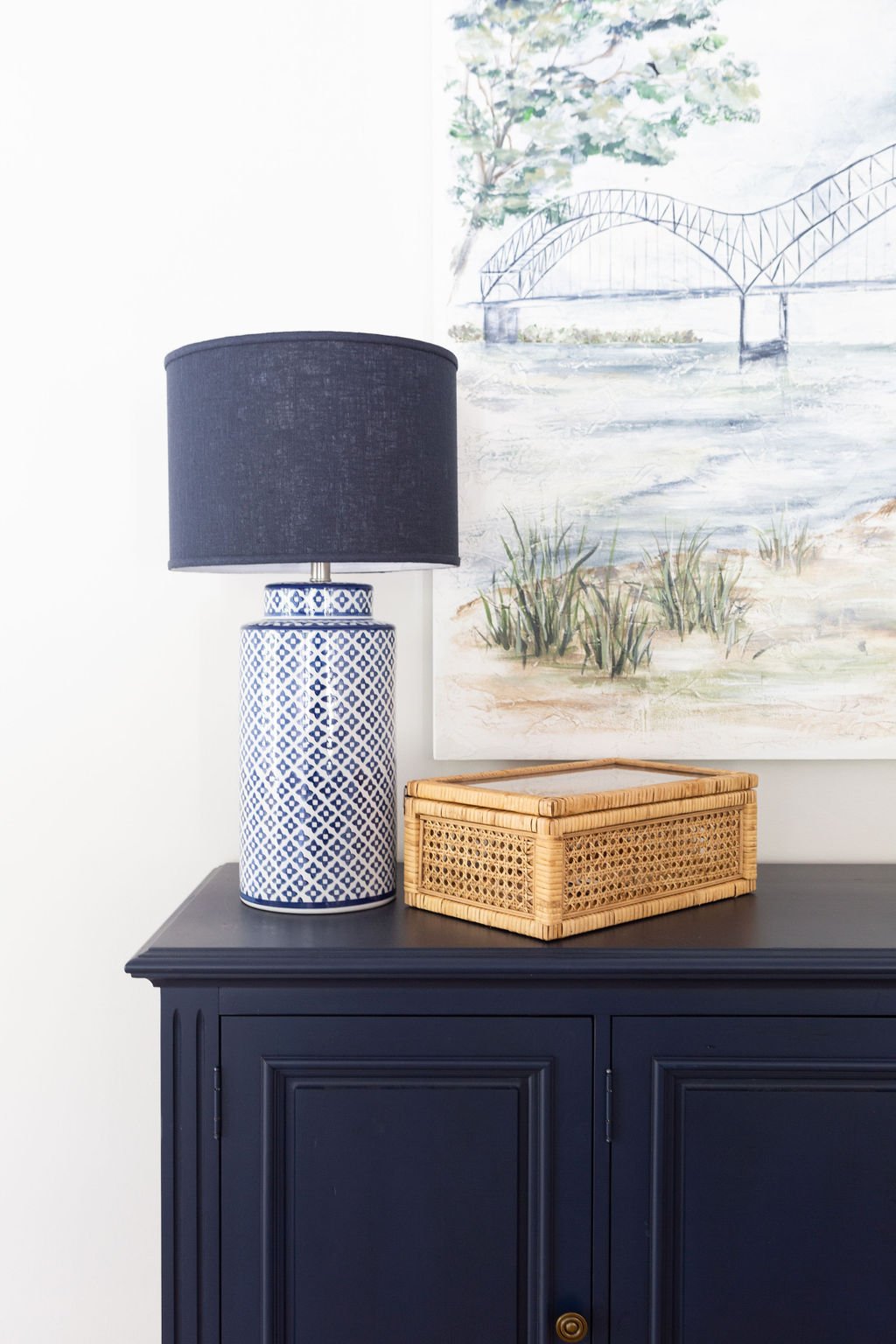
On the den’s rear wall a rich navy blue chest creates a smart focal point. Hanging above it, an original painting by local artist Georgia Jane of the iconic M bridge is a testament to the couple’s love of their adopted home town.
The primary bedroom was another area Cate was able to transform while staying on the “save” side of the save/splurge mentality. She used the clients’ existing bedroom furniture, fluffed up with new linens, and filled in with a new reading chair, simple art and black-and-white photo portraits of the children. “This is a place where Mom can come and have a moment of quiet to relax or work,” says the designer.
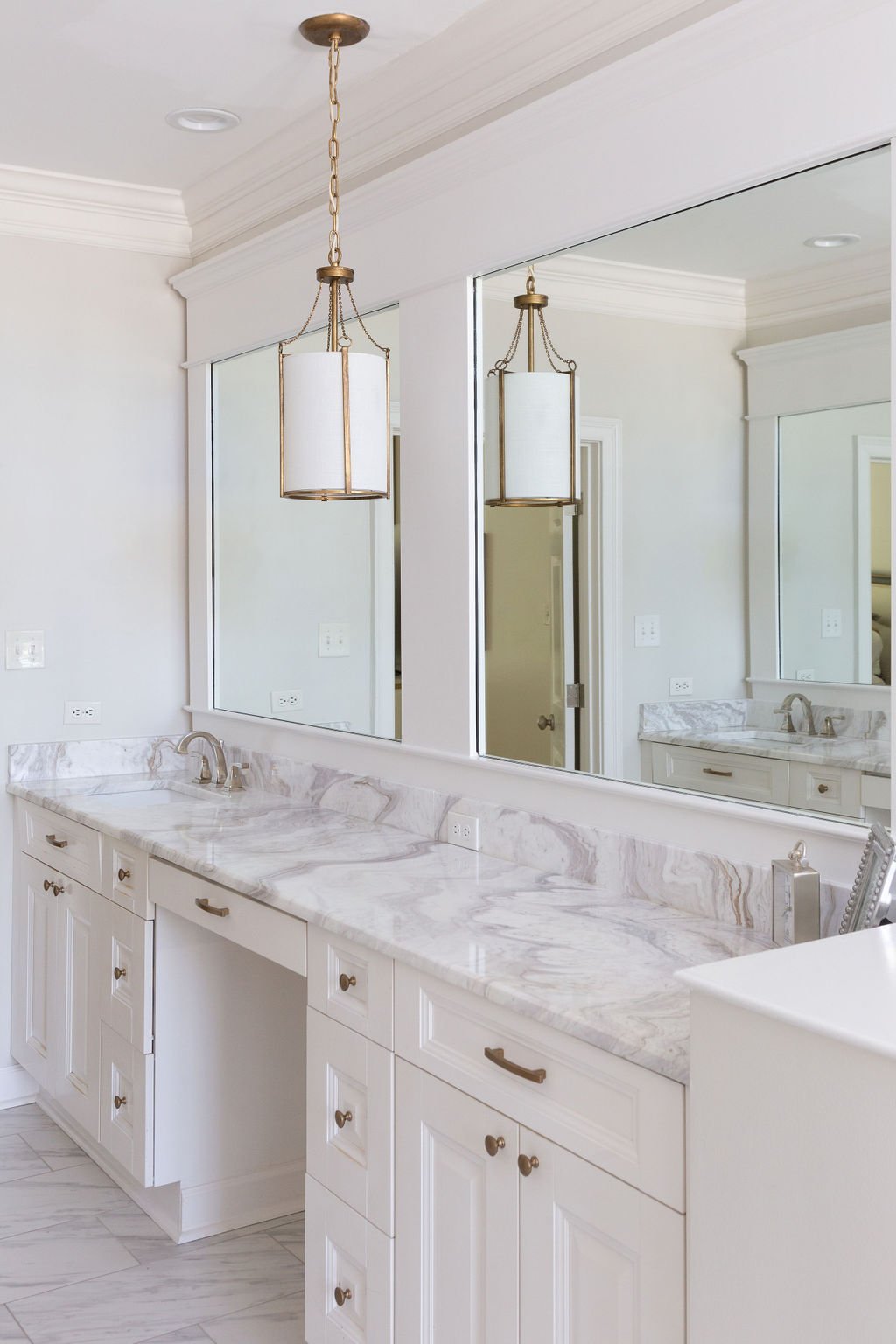
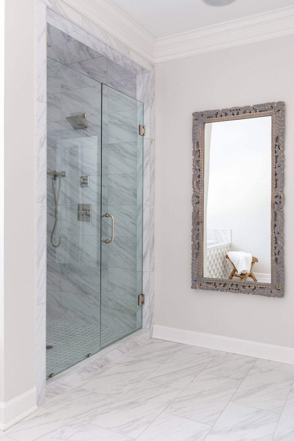
If the bedroom is the homeowner’s retreat, the adjoining bathroom is nothing short of a resort-style spa. Wide vanities with white cabinetry topped in Onda Bianco marble line both walls. The countertops were a must-have for Cate. She explains, “I try to give my clients the best version of them and there are very few things that I say we have to have, but this countertop was one of them. When I saw it I sent the client a picture and I said, ‘We are doing this.’ She loved it too without even having seen it in person. It’s like dreamy clouds.”
The brown and gray tones in the stone reflect perfectly the colors in the dramatic marble and gold accented mosaic on the tub surround. That tile was a definite splurge, but delivers plenty of bang for the buck as it makes a big impact in a small space. Savings in the room came from keeping a traditional soaking tub with decking rather than opting for a freestanding model and from forgoing extra features such as body sprays in the shower. The homeowners felt that a spacious shower stall with one spray head and a handheld would suit their needs fine. Cate’s design also called for budget friendly marble-look tile on the bathroom floor. The large-scale porcelain blends seamlessly both with the countertops and the marble on the shower floor.
New lighting in the bathroom includes a graceful gold chandelier above the tub and matching pendants over the counters. Cate opted for the pendants in the place of cans to layer the lighting without the hassle or expense of tearing out mirrors and walls to install sconces.
General Contractor Kenny Cook oversaw the renovations throughout the home, including the transformation of an upstairs foyer area that once led to the home’s playroom into the extra bedroom the clients needed to give each of the children his or her own space. Now, the homeowner says the family is staying for the long haul. The designer says, “She told me she feels like she can see them here longer; this was more their home than it was when they had the previous brand-new house. When you get to incorporate your own thoughts and ideas you create something more cozy and welcoming. It’s just homey.”


