Timeless with a Twist
/Staging & Redesign by House of Chic | Story by Terri Glazer | Photography by Annabella Charles
East Memphis newlyweds tackle a total renovation to combine their lives and their favorite furnishings in perfect harmony.
Jennifer Jones Landrum says that when she and her now-husband Mike Landrum were introduced a year and a half ago, they were “instant soulmates.” They married within a year of meeting, and why not? They knew they were meant to be together.
Eager to find a new home to start their life as a married couple, the pair purchased a 30+-year-old house in an East Memphis gated community in January 2020. Jennifer wasted no time in coming up with a total renovation plan to wake up the property she describes as “sleepy, but with great bones.” Despite delays brought on when the COVID pandemic hit two months later, the Landrums moved into their home in November, and they couldn’t be happier. Jennifer’s design aesthetic produced a fresh setting, the ideal backdrop for all things newly married. She and Mike both brought favorite furniture, art and accessories into their combined home, completed by a few special pieces they acquired together to make the place truly theirs.
Having been somewhat neglected for the past few years, the house needed a head-to-toe update, and no one was better prepared to take on a project of that scale. The owner of Staging & Redesign by House of Chic, Jennifer is an Accredited Staging Professional and a member of the International Association of Home Staging Professionals. “I always tell my clients ‘fresh is in,’” she says, and she heeded her own advice in her personal project. To revitalize the facade, she reworked the front porch, changed the front door, and painted the brick. All new landscaping completed the transformation.
The interior, once dark and multi-colored, has new life thanks to fresh white paint throughout. Says Jennifer, “I wanted an all-white house because we have quite a bit of art, and white really makes artwork pop.” To achieve a more open feel, the reno plan also included raising every door header to 10 feet high, and replacing all the light fixtures.
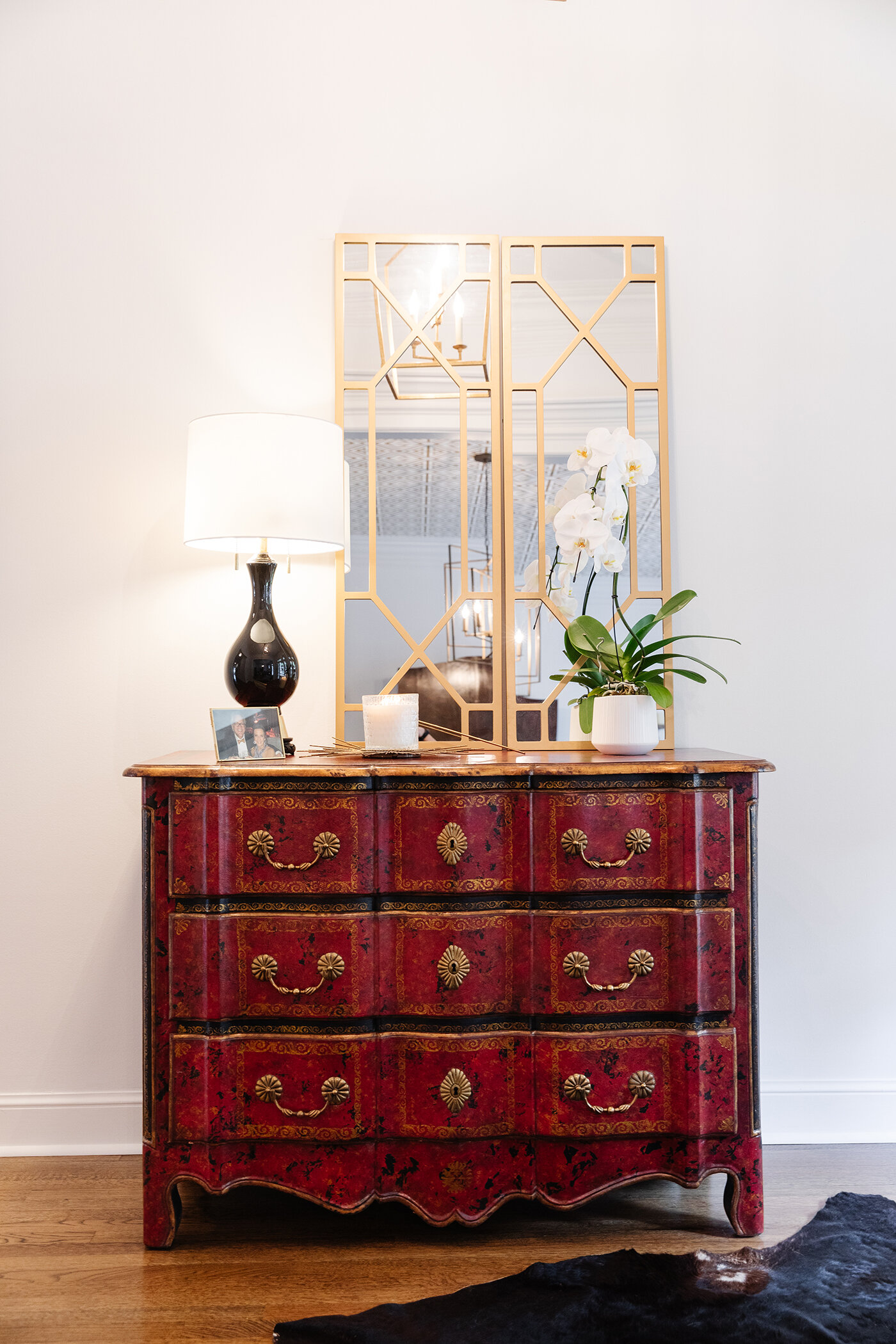
Taking furnishings from two mature people who have spent years acquiring their own pieces and meshing those into one cohesive design could present a real challenge, but Jennifer says that was not the case when it came to marrying her things with Mike’s. She points out pieces in the home’s entryway as a perfect example. “The chest was his, but the mirrors above it were mine,” she says, adding that the ease with which their items blended affirms that fact that they were meant to be together.
Expert Tip: Jennifer’s rule of thumb when working with an all-white paint palette is to use the same color, in different finishes, on the walls and the trim. “White oxidizes over time, so if you choose different colors the trim and the walls will eventually change differently. For a clean, sleek look I use one color so everything oxidizes the same.” She chose Decorator’s White by Benjamin Moore for her home.
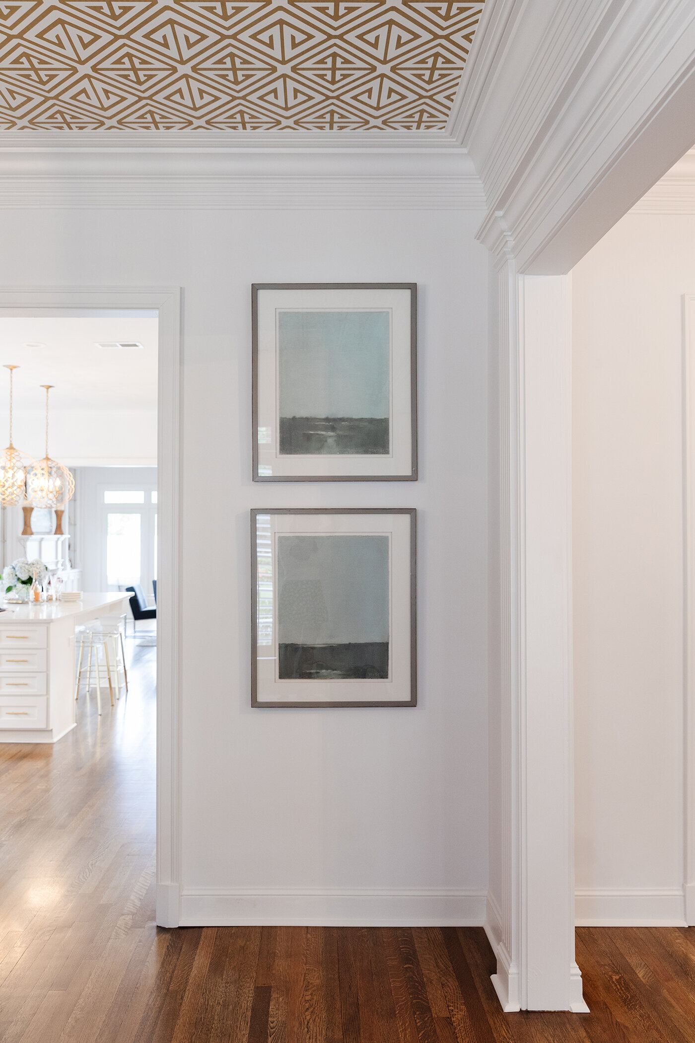
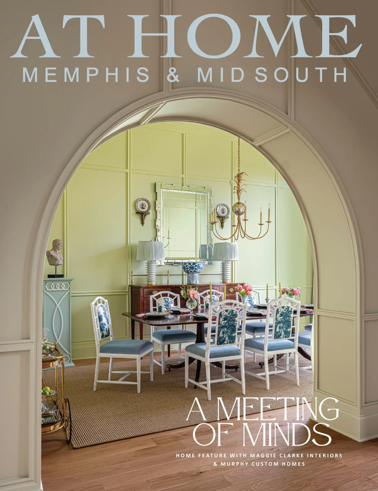
The dining table is new, purchased from The Back Room by Bella Vita to fit their current lifestyle. “Our whole key with this house and this time in our lives was to make everything user friendly. We use this dining room all the time for everything from parties to pizza night,” Jennifer says. Much-loved upright hutches from the couple’s previous homes play well with the pedestal table’s washed finish. The room gets a punch of pizzazz from the ceiling, papered in a metallic geometric pattern from Thibaut. She explains, “I love accent walls. I often suggest them for my clients, so I decided this ceiling was the perfect place for some interest.”
The kitchen that was dark and closed in is now light-filled and inviting. New white cabinets, a massive white quartz island and a couple of show-stopping light pendants in champagne gold are the stars of the show. The island’s acrylic barstools are the perfect perches for morning coffee thanks to their placement across from a large picture window. Once closed off by shutters, the window now opens to a lovely garden vignette.
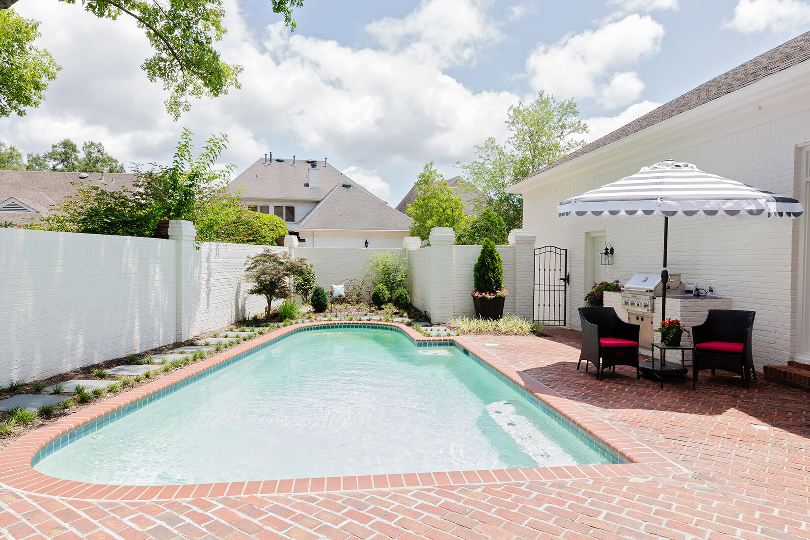
Jennifer designed the keeping room adjacent to the kitchen with a rather unconventional furniture layout, but she says it’s a big hit. She grouped an assortment of swivel chairs in what she calls a “conversation circle” so family and guests seated there can easily turn to face one another, focus toward the kitchen, or view the pool and the new open-air porch outside the room’s back window. Jennifer designed the cozy veranda, repurposing plantation shutters removed from the kitchen to provide privacy.
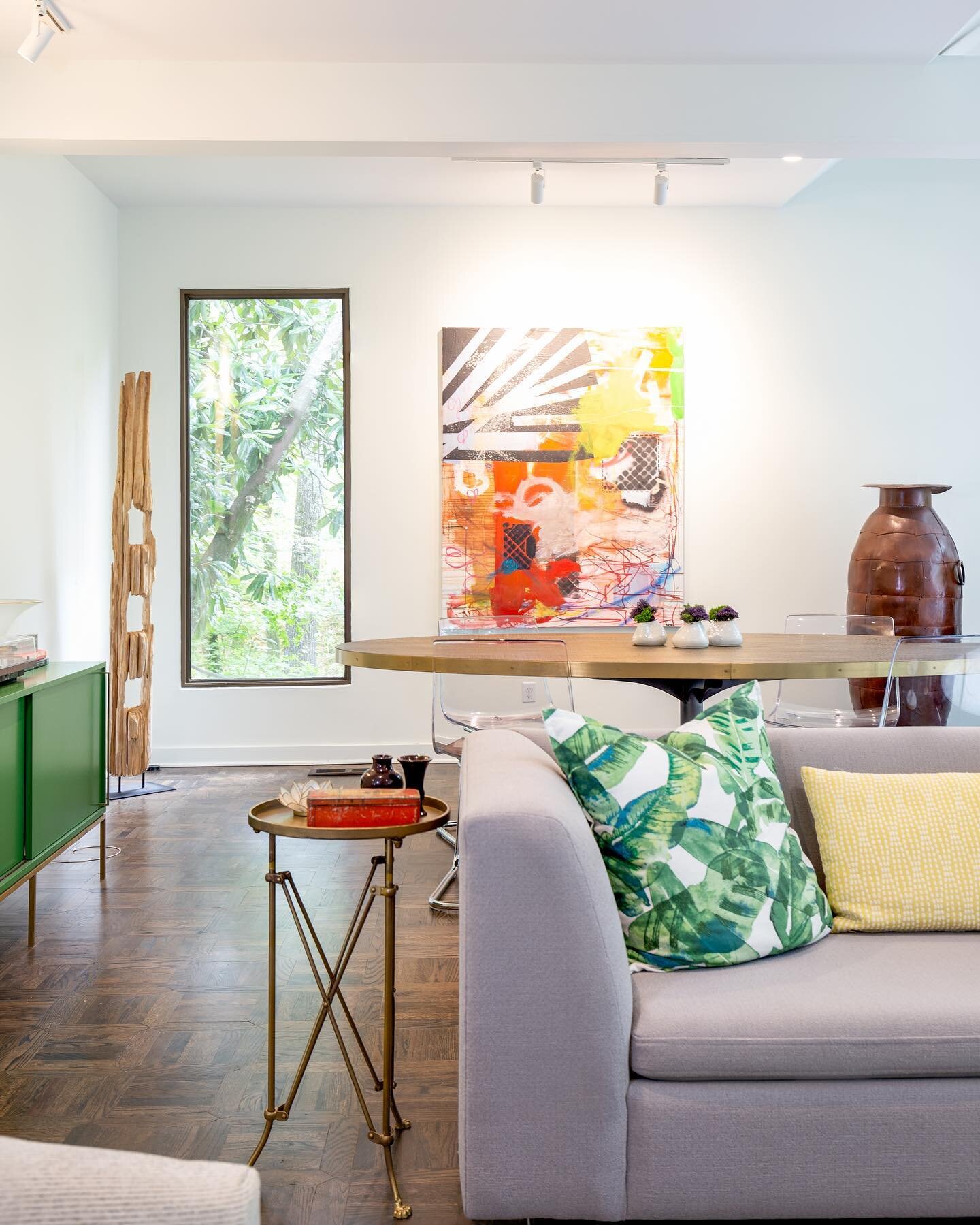
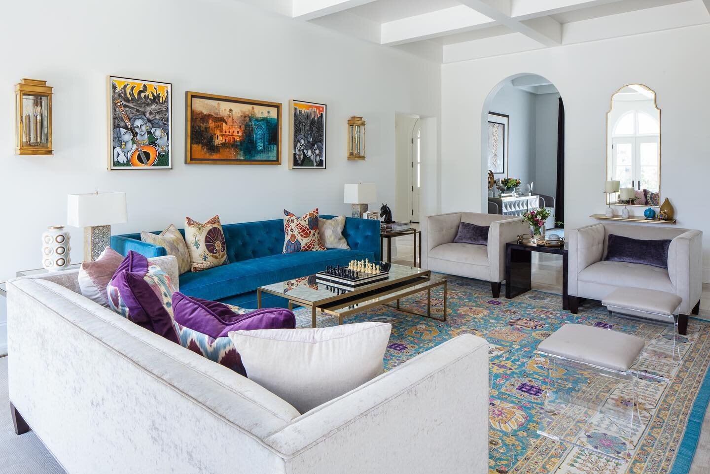
.Past the keeping room sits the home’s comfortable family room, a large space with an inviting sectional sofa, a hammered-steel top dining table that Mike brought, and an original diptych by local painter Katie Toombs. “It’s of Shelby Farms,” Jennifer says, “Mike and I love to walk out there so it was fun to find those two paintings.”
“Marrying” the two gathering areas is a wine bar area Jennifer conceived to provide a segue as well as easy beverage access from the pool. The granite countertop came as a happy surprise, a perfect fit repurposed from the master bathroom vanity, and the wallpapered panel on the wall gives the spot depth and dimension.
The downstairs master bedroom is a tranquil retreat, but the adjoining bathroom is the part of the home which underwent perhaps the most major transformation. Its unusual “his and hers” layout and long, narrow configuration had turned away previous would-be buyers, but Jennifer, aided by architect S Berry Jones, reimagined the area and created a luxurious spot that suits her needs and Mike’s to a T. Gone are the two tiny shower stalls and two separate water closets. A stunning oversized shower area and a soaker tub across from it now anchor the room. Jennifer repeated marble rectangles accented with coordinating penny tile trim to create visual flow between the fixtures. To-the-ceiling mirrors with lighting embedded over two vanity areas give the room a soaring feel. And Jennifer says separate vanities, as well as closets, are a godsend, given her and her husband’s opposite organizational styles. “He’s neat. Everything is perfect in his area. The first time I saw Mike’s closet [in his previous home] I laughed and said ‘If we ever get together, we’re going to need separate bathrooms.’ Fast forward and here we are!”
As a seasoned home stager, Jennifer knows well that taking things that have been in separate places for years and throwing them together could result in a design disaster, so she called on all her professional skills to create a cohesive look in her own house. “We both agreed to take our best things, our favorite things, blend them, and still try to get a fresh look.” Asked if it was hard for either of them to let go of anything, she replies, “Both of us were in a place where we were ready and we really wanted this to be our home.” Art is important to the Landrums and holds a place of pride in their house. In addition to the paintings by Katie Toombs, their collection includes pieces by artist Rana Rochat and others. In the home’s main hall a large commissioned work by Florida collage master Debo Groover is yet another example of the effort the couple made to knit their decor together. Through countless photos and multiple Zoom meetings, Groover was able to incorporate the exact colors of beloved pieces in their home into the work.
It’s clear that Jennifer loves her house and the happy new phase of life it represents for her and Mike. “This is our story. The way I look at it is, it’s timeless with a twist. It was fun to take it through renovation to what it could be,” she says. “It had great bones; it just had to be rediscovered and given a fresh feel.”


