Trusting the Vision
/Design by Lindsey Black Interiors | Story by Terri Glazer | Photography by Sélavie Photography
When Kayla and Nick Arcuri bought their Jackson, TN, home they knew they’d need to do some major decorating. Being cultured, educated people, they set out to find the perfect furnishings for their new abode on their own.
After a series of missteps and a lot of stress, the couple found themselves completely frustrated. “I was having difficulty picking things that made sense,” Kayla recalls. “We brought home several items and none of them worked for the house. It was driving us up the wall!” With a baby, a toddler and two careers, the busy couple decided it was time to call in a professional.
So they started their search for help using social media, a resource that might seem a bit unconventional to some. But, as interior designer Lindsey Black puts it, “I’m not your mother’s decorator.” The owner of Memphis-based Lindsey Black Interiors says many of her clients find her through her Instagram, Pinterest and Facebook posts.
Once the clients and designer connected, plans began to make the home beautiful and functional and to customize it to fit the Arcuris’ unique needs. Built in the mid 90s, the brick Georgian received a major modernization from its previous owners. The result is an open-concept living area that includes the entryway, living room, dining room and kitchen. Black says her task was to bring color and interest into the wide-open spaces and make them feel polished yet still homey and practical for a family with children and dogs. She describes her design aesthetic for the project as “modern mix.”
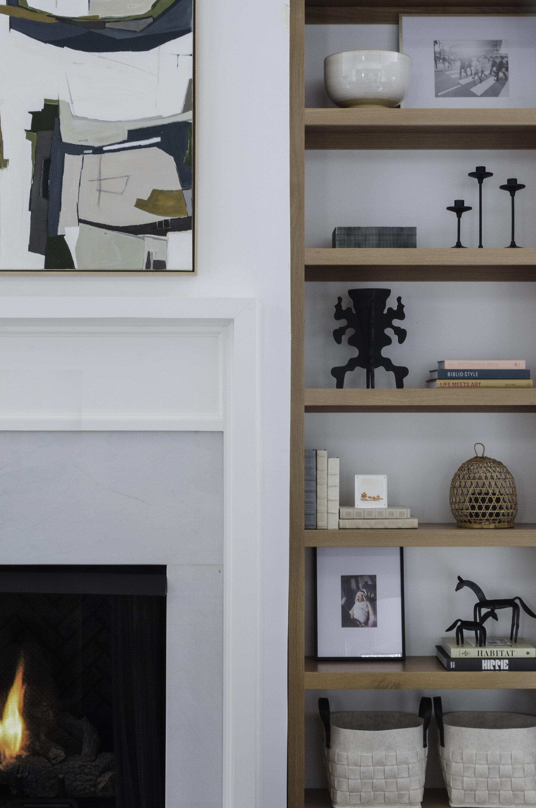
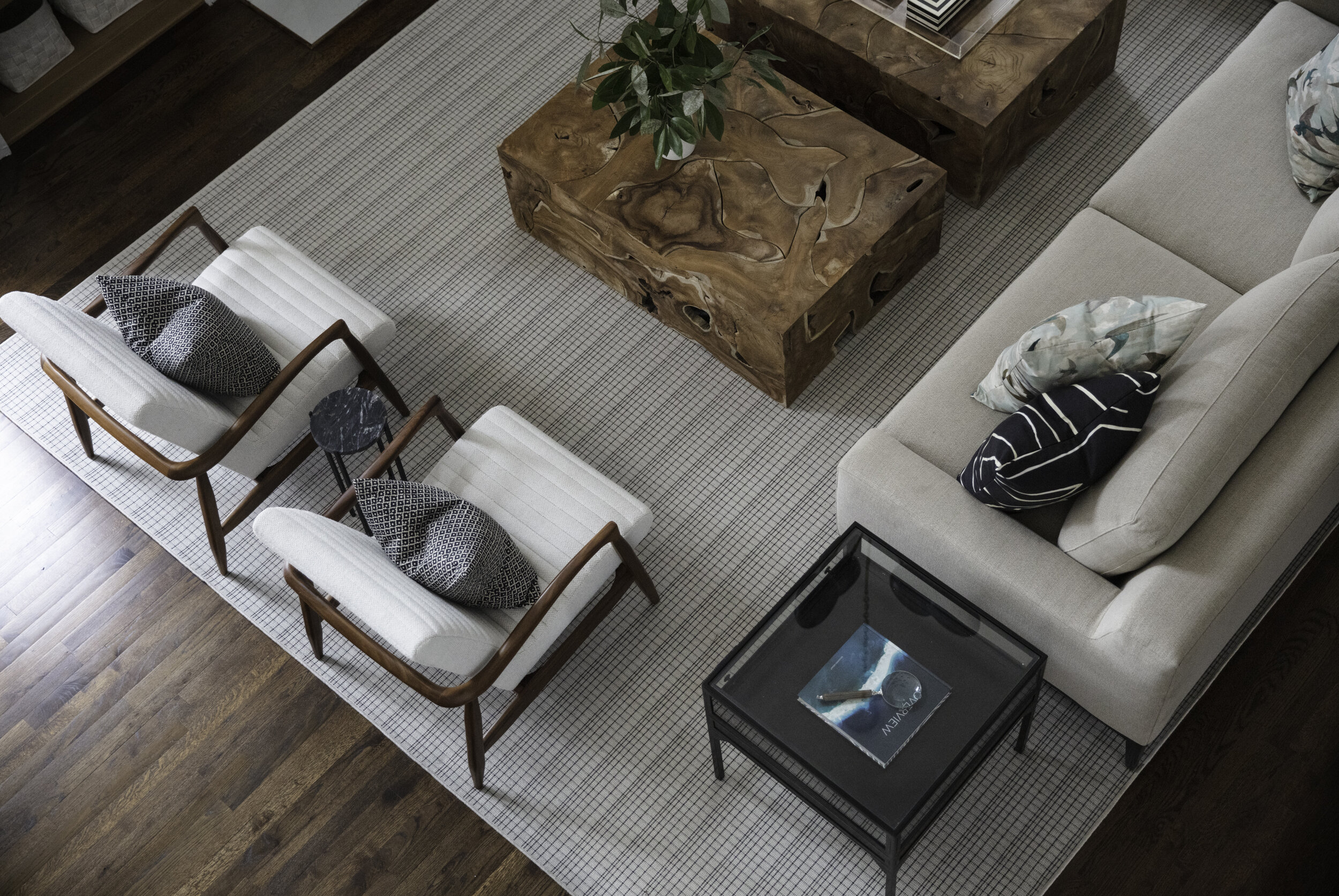
To achieve the look Black started in the living room, a cavernous area with soaring ceilings with clerestory windows flanking a fireplace. She cozied up the space by removing oversized white built-in cabinets, the kind used to house large stereo equipment in the era in which the home was built, and adding scaled-down natural wood shelves in their place. A custom painting by New Orleans artist Sarah Ella Cole tops the mantel, helping to define boundaries. After visually reducing the area to a more manageable size, Black filled it with comfortable upholstered pieces in neutral tones. Performance fabrics prevent worries over spills and other child-related mishaps. A pair of armchairs brought from the Arcuris’ previous home blends in seamlessly and two Noir Furniture coffee tables echo the natural wood look of the shelves. “Because the room is so big, I wanted to use two coffee tables. That way every seat in the room has access to a spot,” she explains. Their separated placement keeps the tables from looking too heavy and their natural construction makes them match, but not match,” she explains.
Two nondescript ceiling fans that formerly hung in the living room didn’t do the space justice. In their place Black chose a Visual Comfort modern chandelier that is part light fixture, part work of art. Says the designer, “I knew that whatever we put there had to be large in scale—that’s a huge vertical space—and really unique and impactful. I love how sculptural it is and also that it’s uplighting so it’s not harsh when it’s turned on.
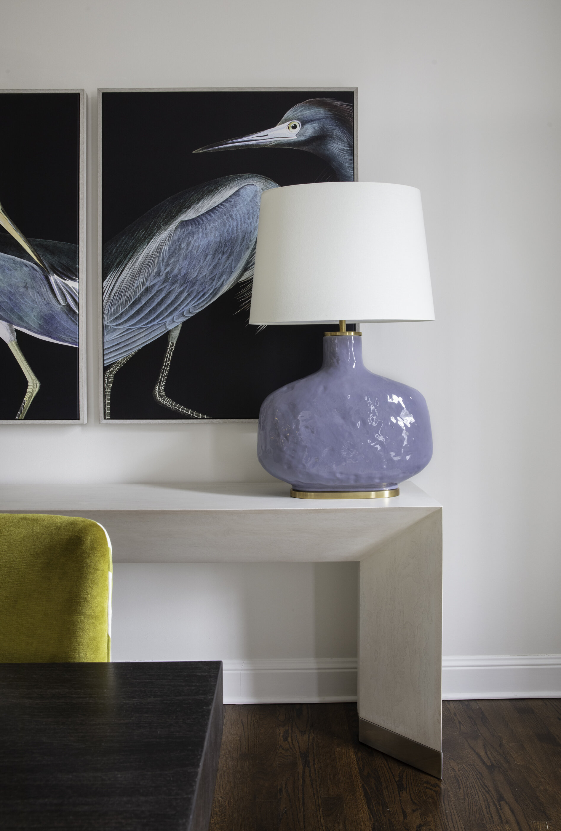
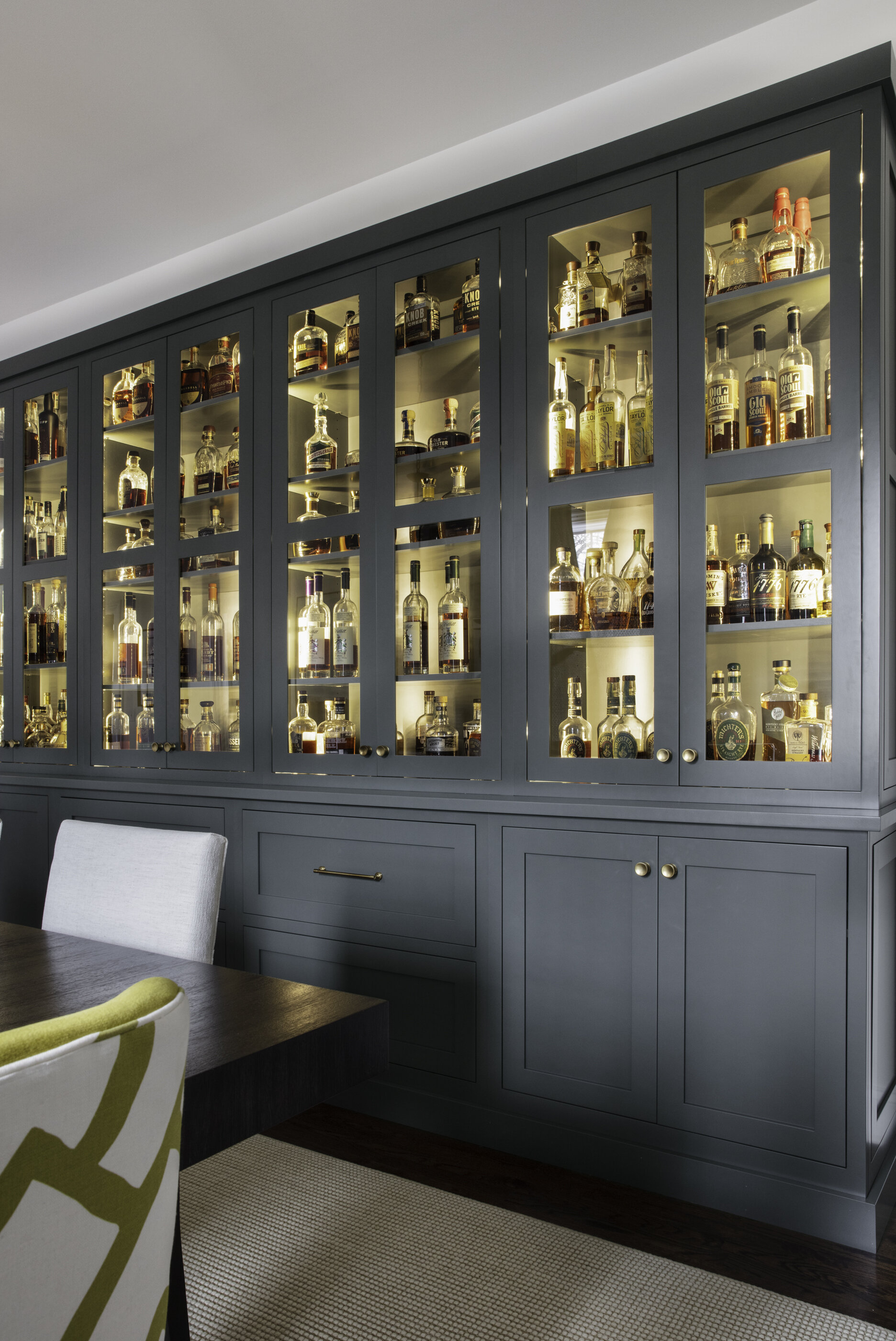
The adjacent dining room also packs a visual punch thanks to one starring piece and several supporting design elements curated by Black. A huge custom cabinet built by Byler Craft in Whiteville, TN, lines one wall, anchoring the space beautifully and providing a worthy home for Nick’s extensive bourbon collection. Coordinating heron prints on the room’s back wall bring a dramatic element. Black and her project manager Mary Katherine Harris sourced the prints from market in High Point, NC, on one of their semi-annual buying trips. The art was so striking they knew they’d find the perfect spot for it in a client’s home eventually, and the Arcuris are the happy recipients. Kayla says they are among her favorite parts of Black’s design. “They just fill me with joy when I look at them.”
Entertaining will be a priority for the homeowners in the post-pandemic era, so they told Black they wanted a dining table that would comfortably seat 10. She delivered with a simple double-pedestal design surrounded by eight neutral side chairs and a pair of end chairs upholstered in fabrics that add interest and a nod to mid-century modern. To provide ample lighting over the expansive table Black chose two black and white chandeliers. They fit the bill perfectly, shedding plenty of light without overpowering the room’s other features.
“Our big three must-haves were function—something we could live in—a nice dining room we could entertain in, and a place for the bourbon to live and be celebrated.”
—Homeowner Kayla Arcuri
The Arcuris were happy with the clean, white-on-white look of their kitchen, but a seemingly small design element Black added makes a big splash. The large kitchen window looked a bit bare so the designer brought in a Roman shade in a John Derian Designers Guild fabric that adds a pop of color to the kitchen. The textile also inspired Black’s accessory choices for the living room. She repeated the stunning bird print on throw pillows and pulled from its tones for other accents.
“Function is very important to me. I try to weigh form and function equally. If you put enough thought into it, you can always find something that checks both those boxes.”
—Designer Lindsey Black
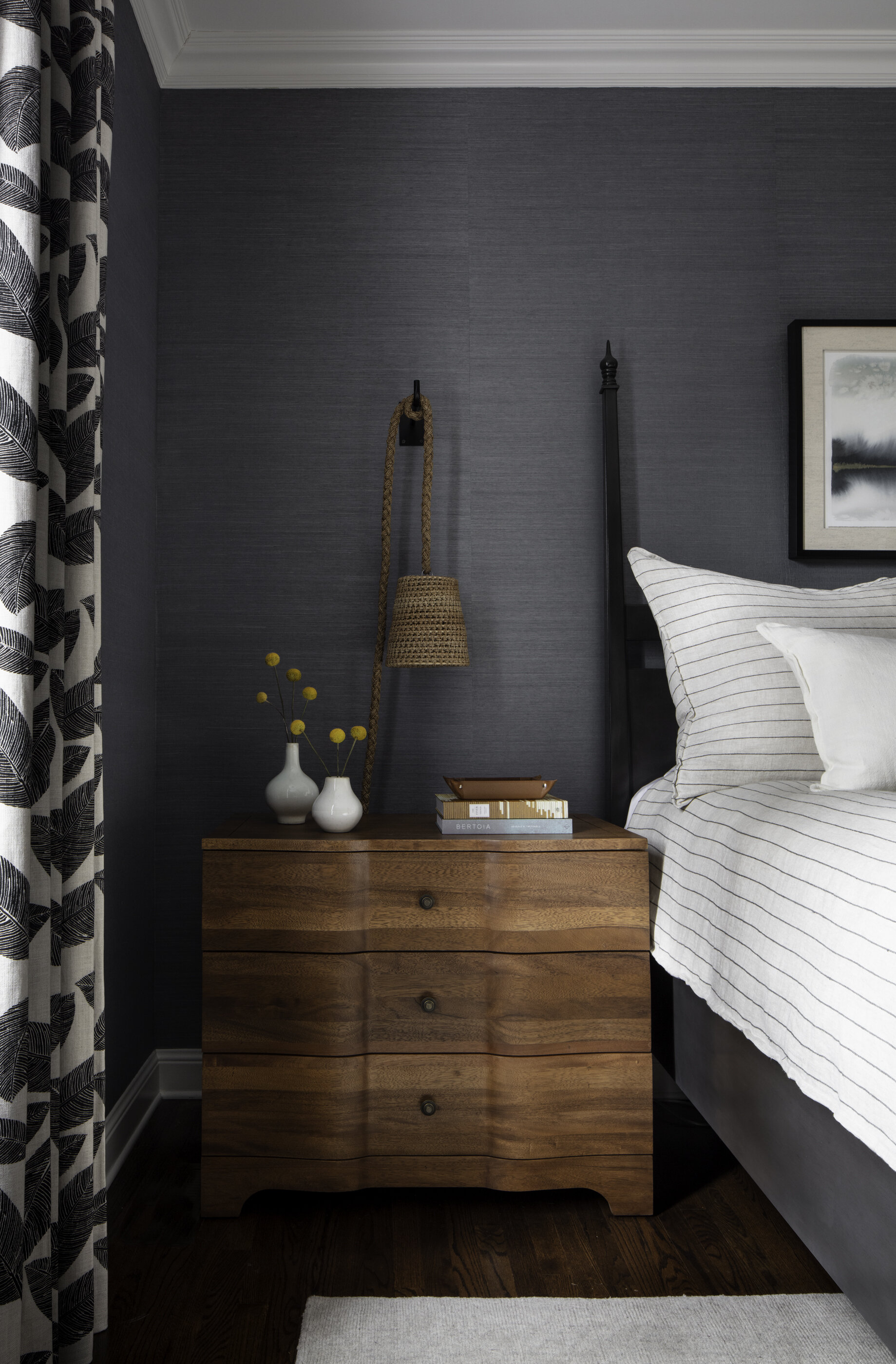
While bright white walls make the rest of the house feel light and airy, the master bedroom is a soothing cocoon of saturated color. Black selected grasscloth wallpaper in a deep slate blue to bring texture and tone to the space. “The clients like color, but because every other room is essentially connected and was white, the bedroom was the logical spot to bring it in, to have a really bold moment on the walls,” she explains.
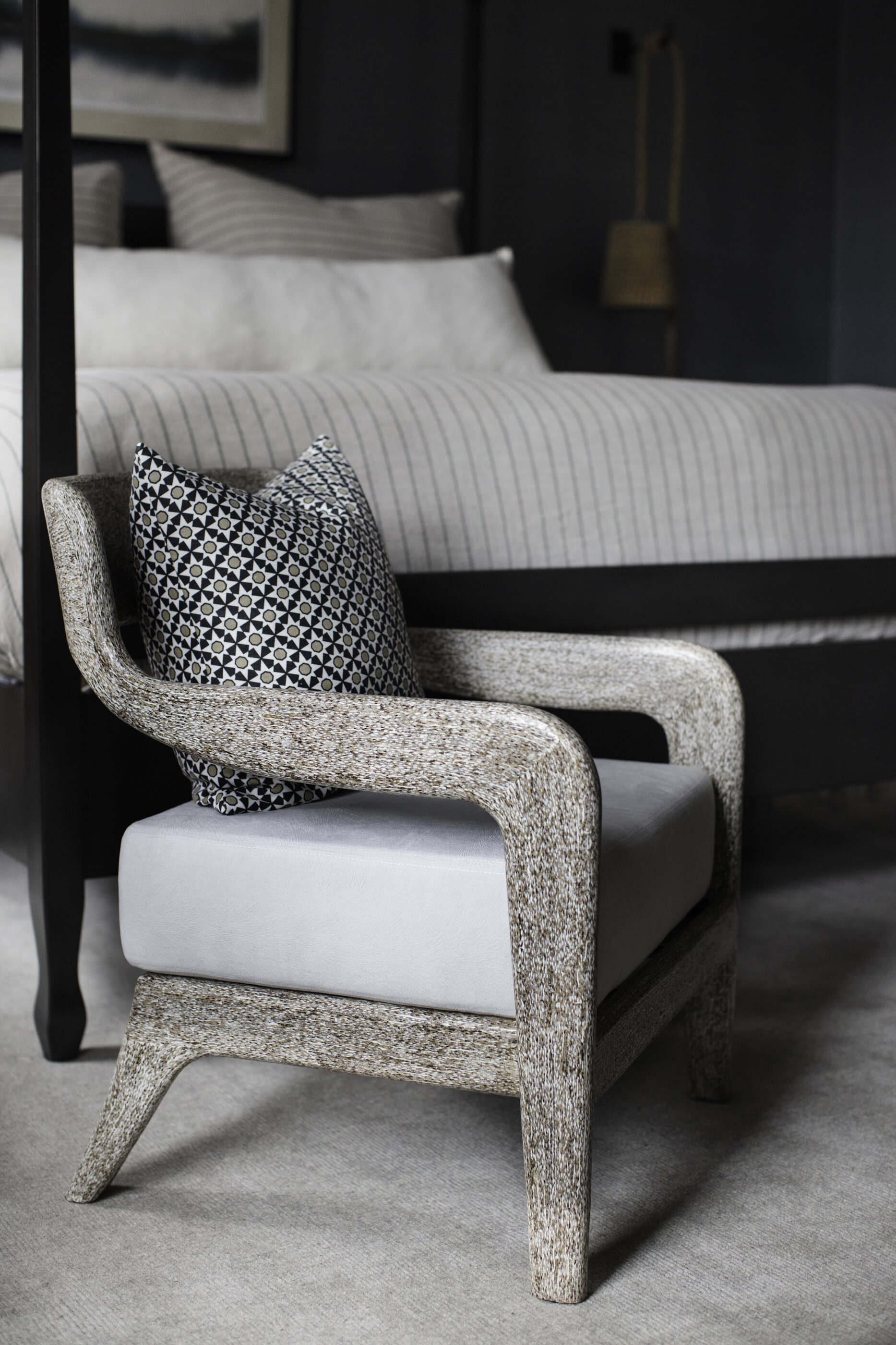
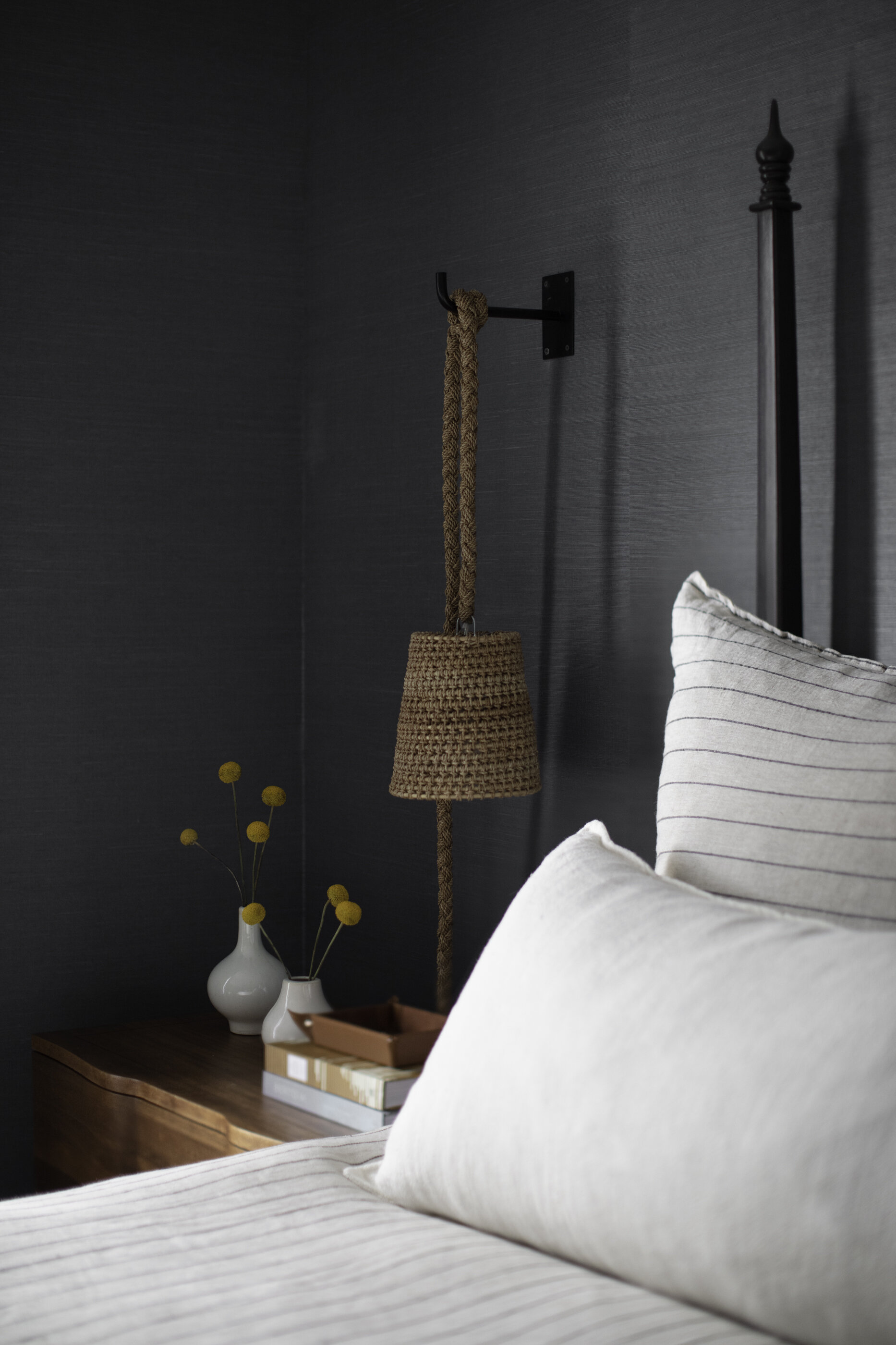
Custom drapes in a Thibaut leaf print set a light/dark palette that’s repeated in the furniture, bedding and rug. Palacek rattan and rope sconces, another treasure sourced from High Point, bring an additional natural material into play. Black says she’s a big fan of the lights for more than just their good looks: not only do the wall-mounted sconces free up space on nightstands, their height is infinitely adjustable thanks to the knotted rope design.
“I love a moody master bedroom. Given a choice I’m always going to go darker.”
—Designer Lindsey Black
Kayla couldn’t be happier with the dramatic tone of her master bedroom. “I feel like when I get into bed at night I am so cozy and relaxed. It’s just such a nice place to be.”
As much as she loves the bedroom, the homeowner is also thrilled with the way the whole project turned out. Black agrees that the project was a rousing success and attributes that to the fact that the clients were willing to totally hand the design reins over to a professional. She says, “They really trusted my vision. Even when they were initially a little on the fence about something they made the decision to trust me. I think the projects that turn out the best are always the ones where the client isn’t over analyzing every little detail. They have to remember that’s why they hired me, to know how it’s going to work together, and trust that the end result is going to be amazing. They did an excellent job of that.”


