Becoming Home
/Design by Parker Design Studio | Story by Terri Glazer | Photography by Annabella Charles
When a well-known local blogger and her husband moved from a compact downtown condo to a spacious East Memphis residence, they teamed up with designer Ann Parker to “course out” their new home’s renovation. The young couple wanted to turn the house into a home for their growing family a room at a time.
Potential design options were limitless, as they brought only a few pieces with them in the move. “It was a really fun opportunity to start fresh; we could be intentional about it,” says homeowner Cara Greenstein. With Parker’s help, Greenstein and her husband Alex Shindler made a plan for the entire house and prioritized the order in which they’d focus on each space.
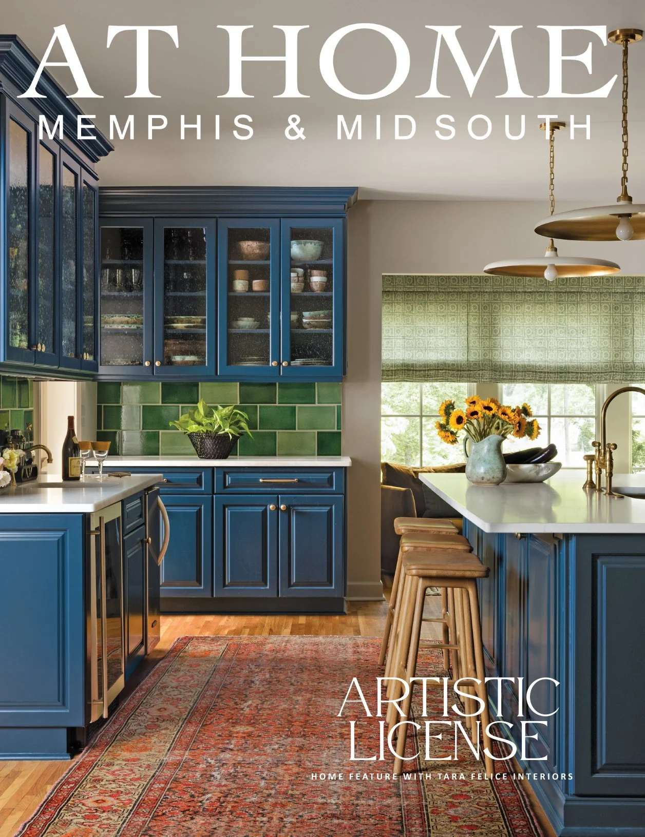
First on the redo menu was the kitchen, naturally. More than just a place to prepare family meals, the space is essential to the operation of “Caramelized,” the award-winning food and lifestyle blog Greenstein began about a decade ago. Plans for the kitchen remodel were finalized as soon as the house went under contract and work was completed before the couple moved in just before Thanksgiving 2021.
With the kitchen checked off the list, Greenstein and Parker turned their attention to the areas of next highest priority, the living room and dining room. And since the couple’s first baby was on the way, a nursery came into the picture, as well.
Asked about the initial design vision she shared with Parker, Greenstein says, “I tend to go for a clean, somewhat minimalist palette. My townhome was very neutral. Ann pushed me to think bigger.”
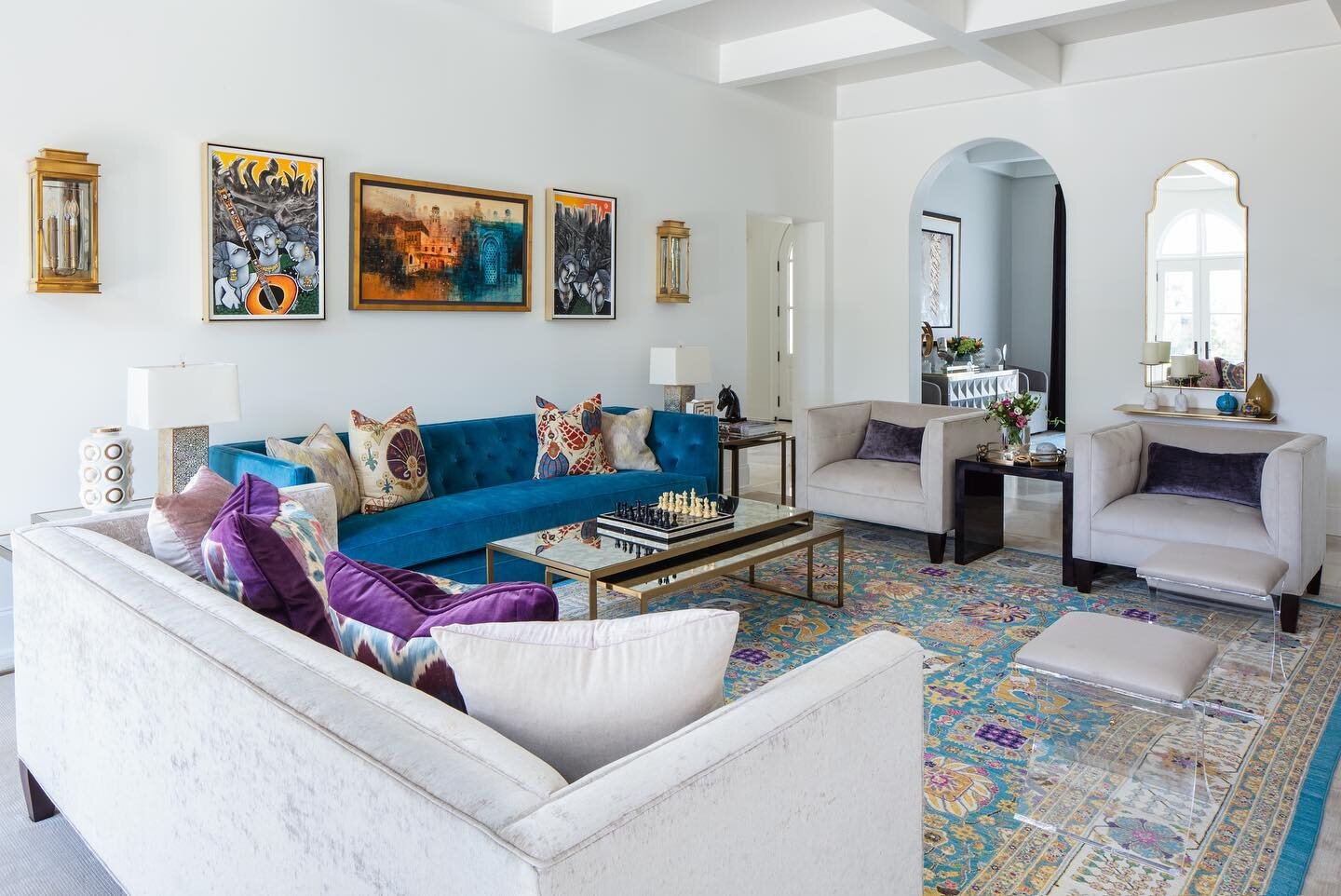
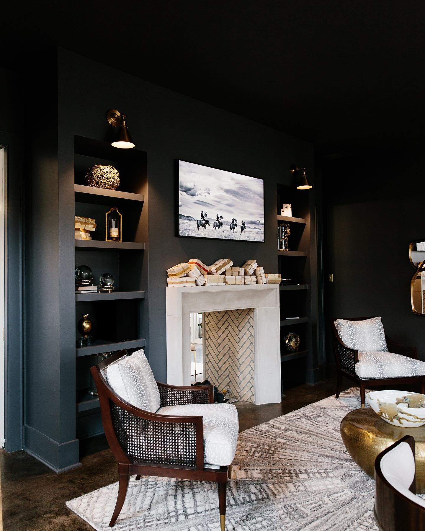
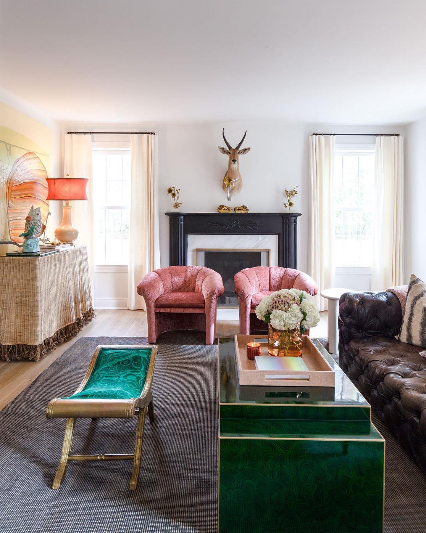
Parker started nudging her client a bit past her comfort zone with the first items they selected for the living room, a pair of modern chairs in a deep merlot velvet. Although she loves them, Greenstein admits that, left to her own devices, she would have opted for neutral upholstery.
“The two chairs were our catapult in the living room design,” Parker adds. “Then pieces evolved, like the rug. We worked through what would look good—it's very collected. We didn’t just sit down and figure it out all at once, it was over a period of time.”
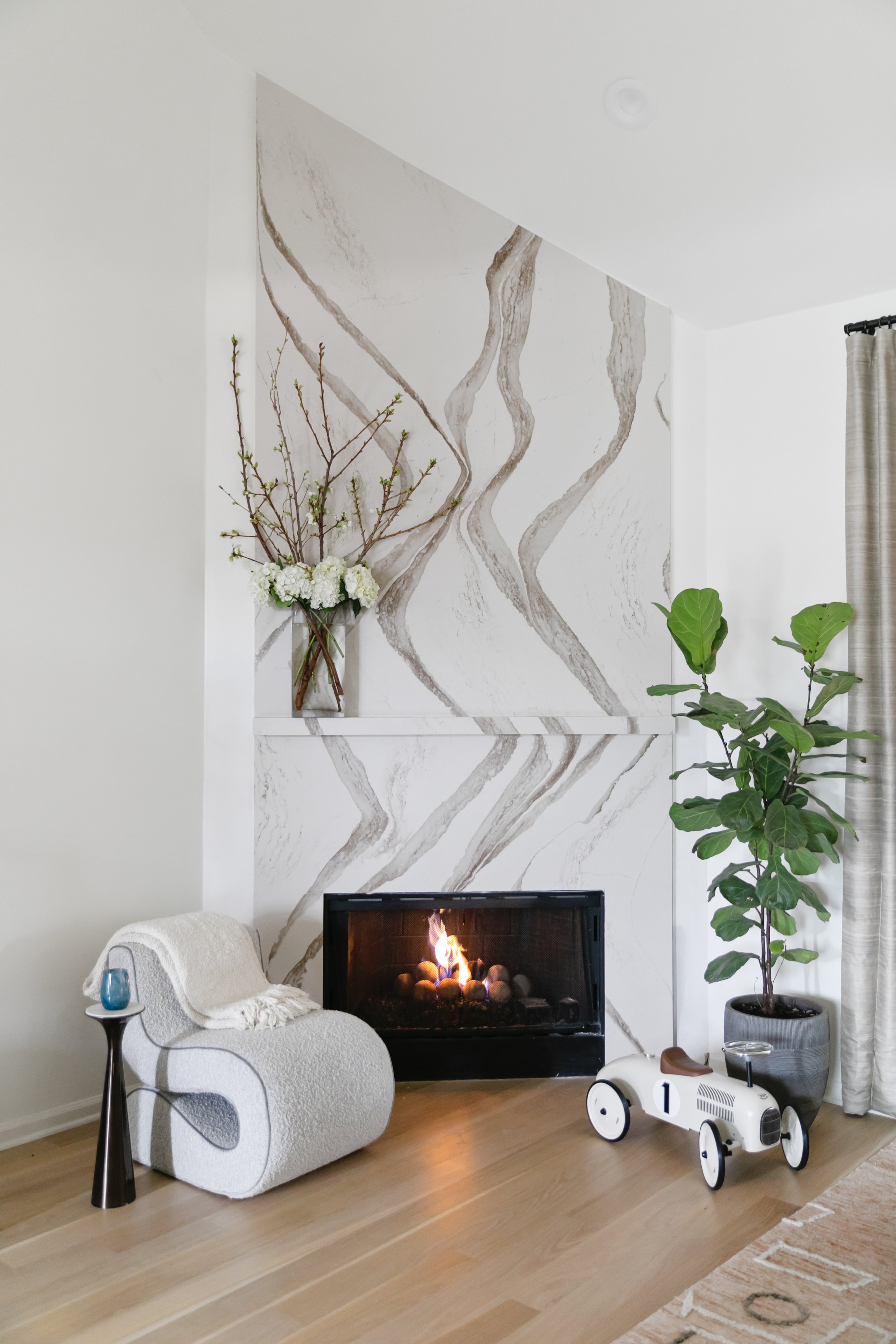
Greenstein was excited to have a fireplace in her new living room, and Parker viewed its redesign as “an opportunity to have some dramatic moments but still in Cara’s DNA.” She opted for a Cambria stone treatment from floor to ceiling. The bold veining in the stone makes a statement, and the subtle matching ledge mantel blends without breaking up the movement.
Situated in the center of the home, the living room has few windows, so a large mirror on the wall opposite the fireplace was the logical choice to add luminosity. But not just any mirror. Leading her client to something out of the ordinary, Parker enlisted Chris Garner of Garner Framing Co. to create a piece that’s more work of art than looking glass. “It really just evolved with Chris and his skill and his thought process,” says Parker. Garner’s creation, a series of wide antiqued glass strips in varying tones, creates impact with its clean lines.
Visual interest in the dining room comes from striking navy blue wallpaper with gold accents that covers the walls and the ceiling. “That’s something I would have never done on my own, but I just love these subtle examples that really make a difference,” says Greenstein.
The room is a prime illustration of the collected ambiance the homeowners and designer sought. The new dining table is surrounded by eight vintage chairs sourced from online consigner New to Me TN. An original oil painting dated 1965 that graces the wall came from the home of Greenstein’s grandparents.
“It's such a mood in here. I love it with the gold accents. I've hosted some dinner parties so far and I'm really excited to do it more often. It's exciting to have really dedicated spaces for doing what I love.”
—Homeowner Cara Greenstein
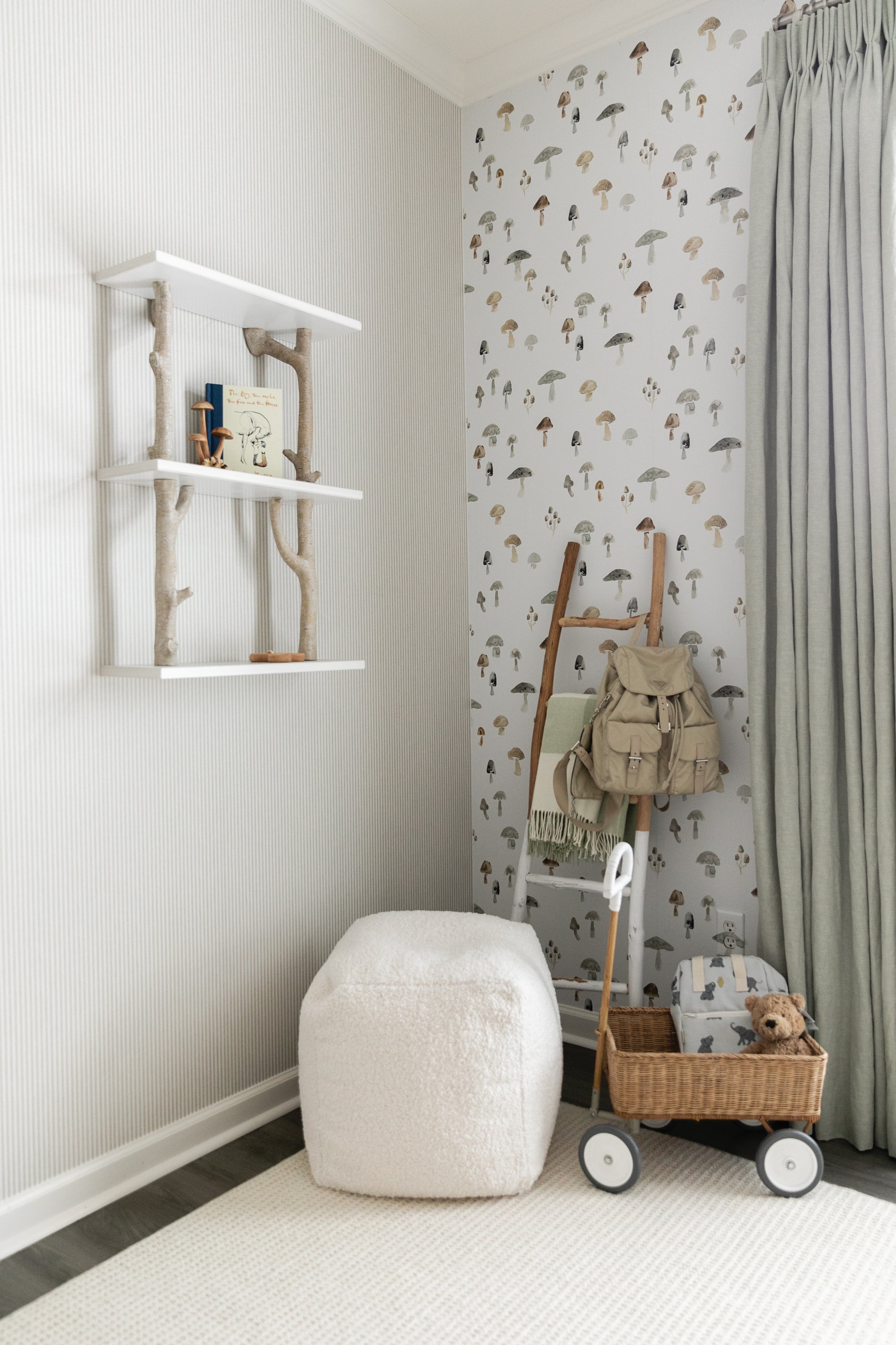
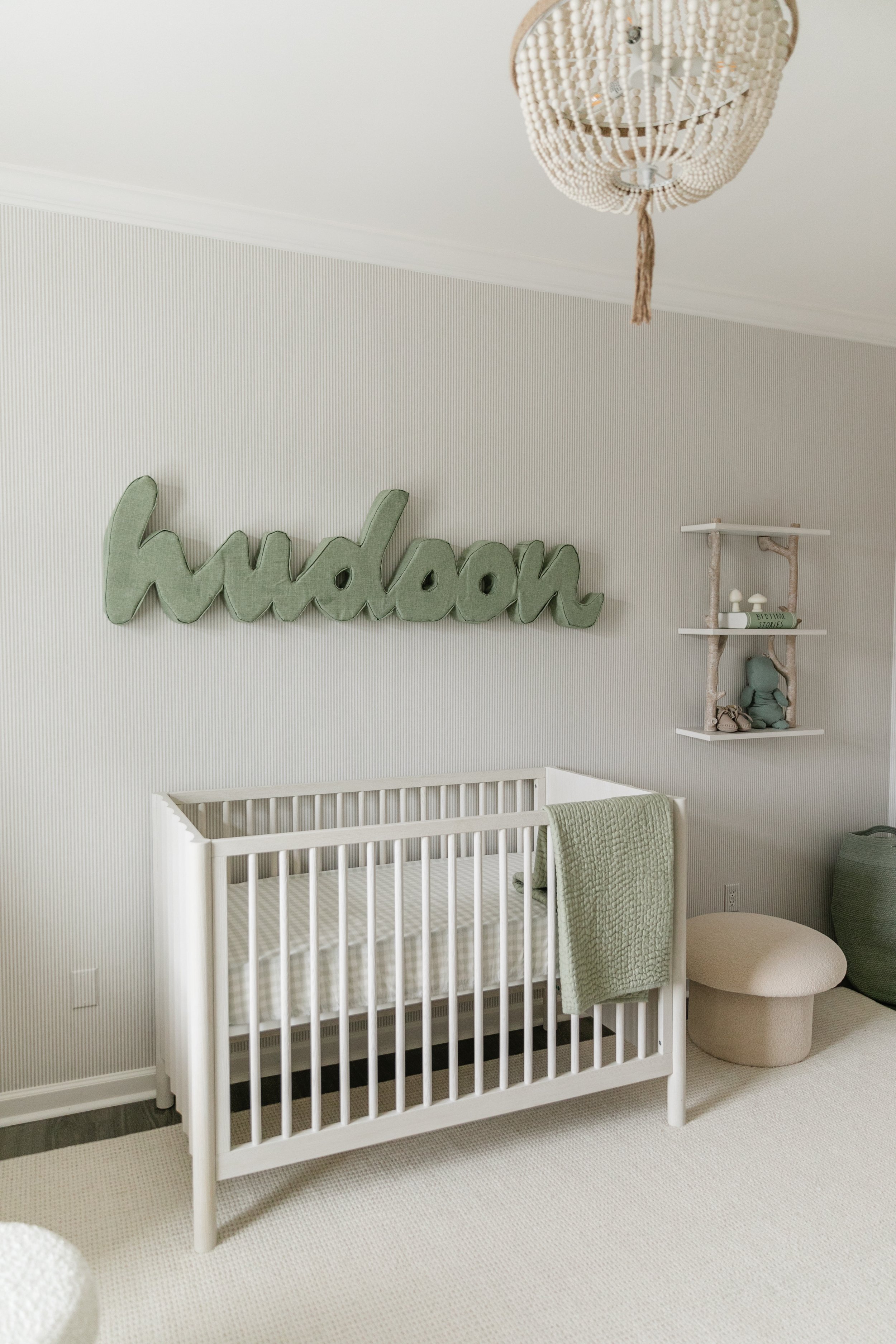
“This is one of the rooms where Cara was definitely the design leader,” says Parker of the nursery. “I was her touch base.” Incorporating her love of all things edible into every aspect of her life, Greenstein chose mushrooms as the inspiration for her new baby boy’s room. “They’re one of my favorite foods!” she admits.
Adorable mushroom wallpaper found on Etsy lines one wall; Parker chose a coordinating stripe for the other three. With a nod to a woodland theme, the room’s palette leans to neutrals with sage and eucalyptus accents. Washed woods keep the look light and airy, and a white boucle glider and ottoman make a comfy spot for quality time with baby Hudson. Faux taxidermy heads of a longhorn and a razorback are a clever and cute nod to the alma maters of Greenstein and Shindler.
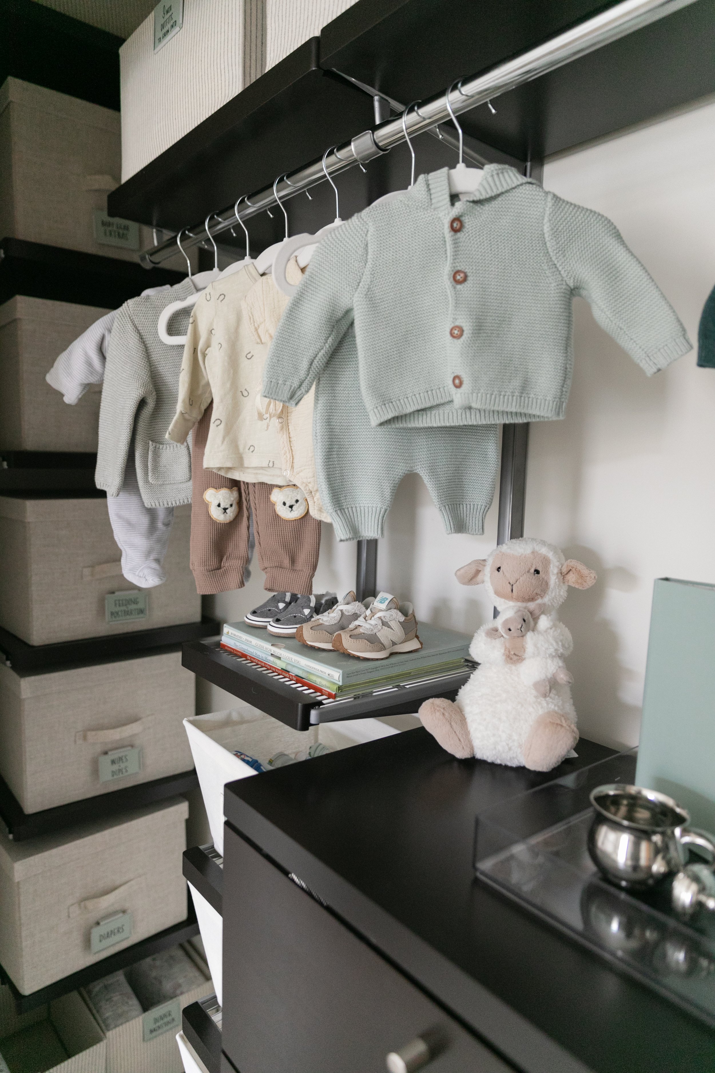
The new mom gushes over the nursery closet remake, done by local organization firm Trazo Design in collaboration with The Container Store. The pros at Trazo transformed every inch of the long, shallow closet into practical and accessible storage space with plenty of small containers just right for tiny baby items.
Greenstein says it’s been a pleasure working with Parker on the master plan, and that she and Shindler are looking forward to adding their style to every part of the house. Parker echoes those sentiments, saying she enjoys helping the young family establish their home. That is the icing on the cake.


