New Color for a New Season
/Design by Elizabeth Malmo Interior Design | Story by Terri Glazer | Photography by Sélavie Photography
“Coming from Atlanta in 2020, where the trend was still very much the neutrals, I wanted this house to be an explosion of colors—my favorite colors. And I wanted it to reflect how we live in retirement now.”
Those two principles guided the reshaping of a classic ‘60s-era home in an established East Memphis neighborhood.
Designer Elizabeth Malmo oversaw the project with RKA Construction as the contractor. Says Malmo “Everything just needed to be touched. We didn’t knock down a lot of walls, though. The layout as you see it is almost as it was originally.” Short of taking out walls, however, the home’s renovation was all-encompassing. “There’s not a hinge, not a doorknob, not a light fixture that hasn’t been changed,” says the homeowner.
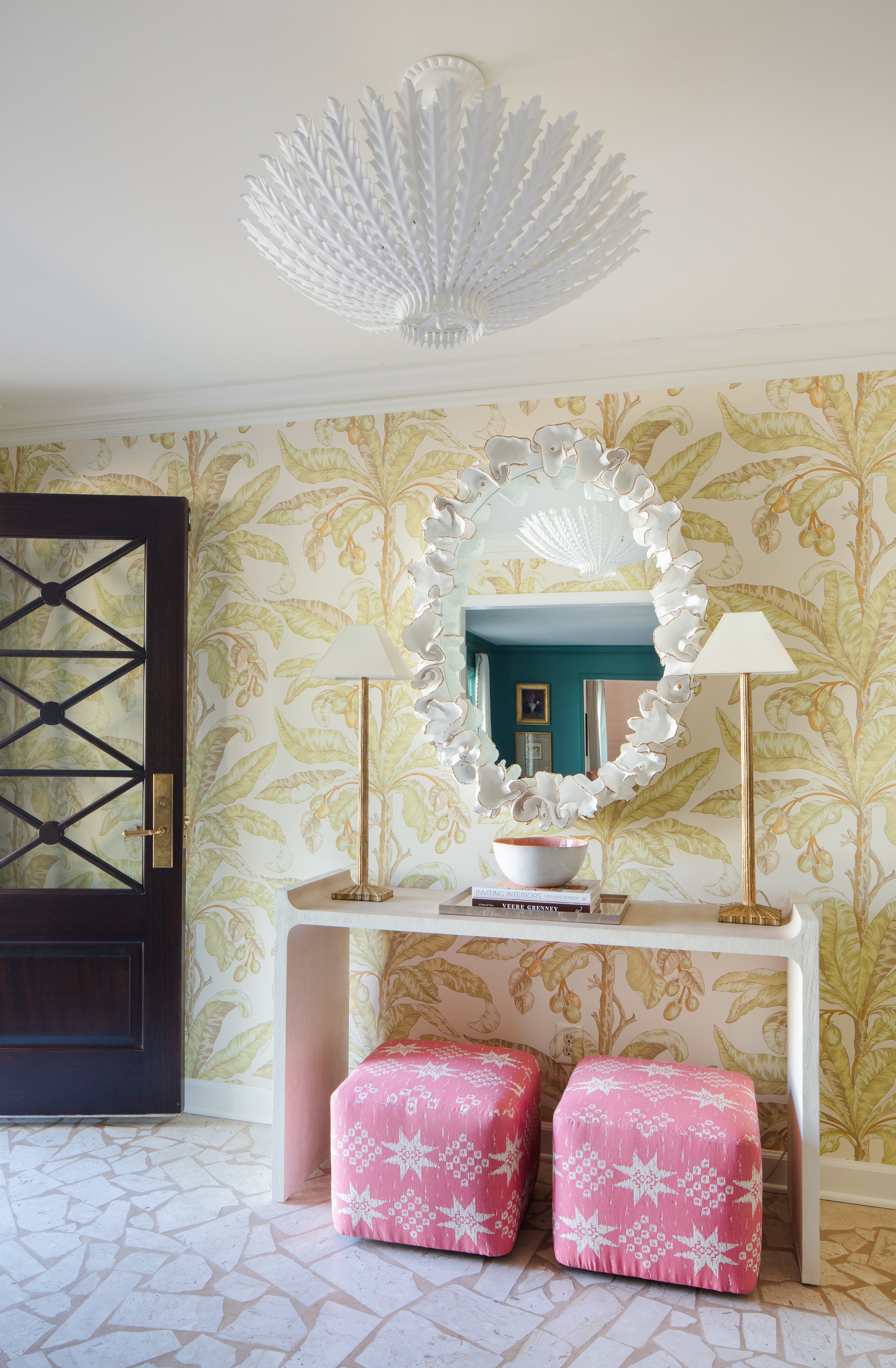
Malmo, owner and lead designer of Elizabeth Malmo Interior Design, says she wanted the entryway to have a big impact and “why not have fun,” she adds, referring to the statement wallpaper and crisp white light fixture. Twin poufs under a console table give a hint of the coral hues that reappear throughout the home. The only surface in the area that remains as it was is the floor. Malmo and the homeowners agreed that the white marble terrazzo is classic and should remain as a nod to the home’s heritage.
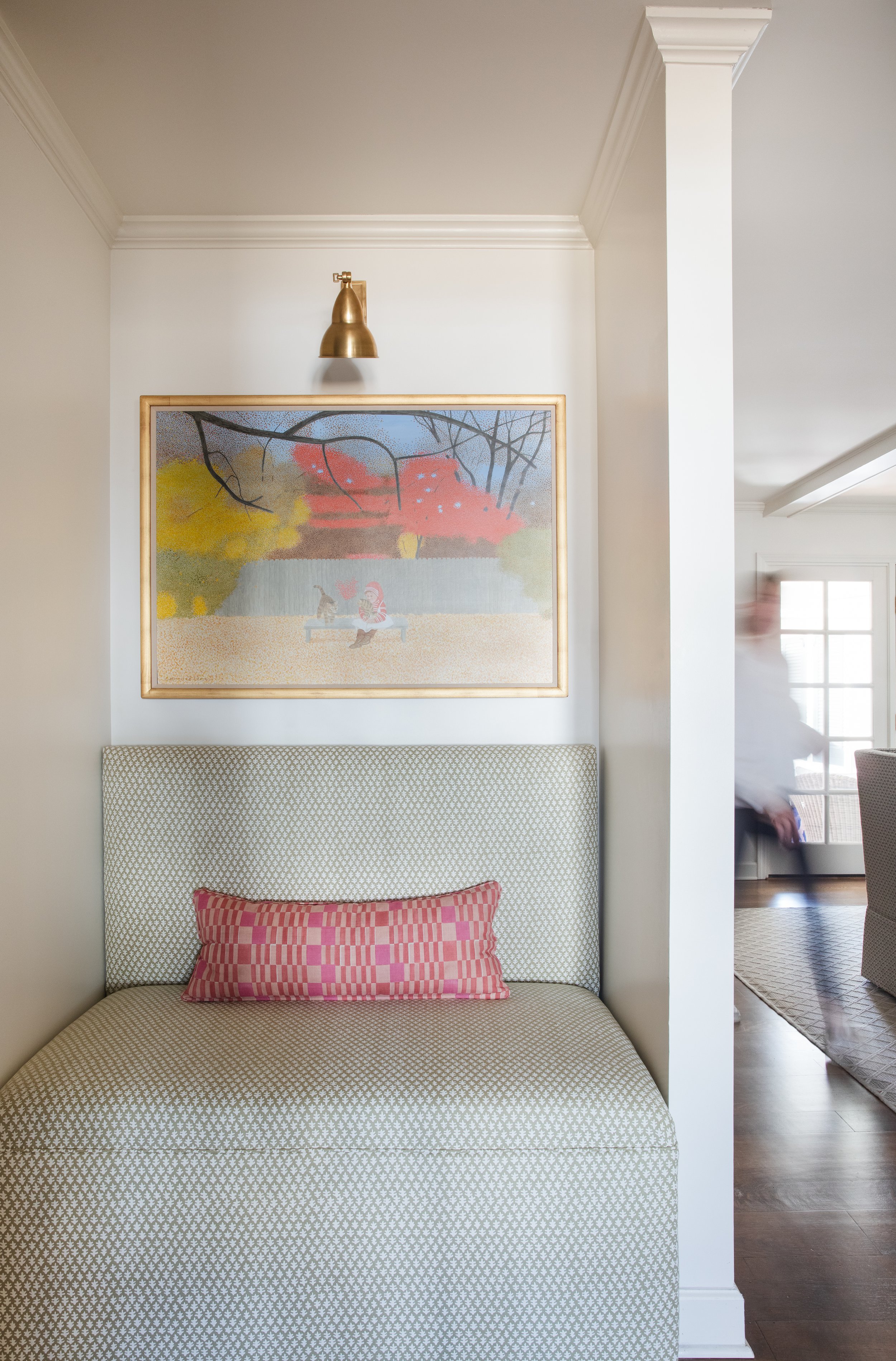
Just through the foyer is a little niche that the owner calls “pure Elizabeth.” A former coat closet now is home to a charming banquette, over which hangs a vintage Carroll Cloar painting. The couple’s art collection is large and varied, from paintings created by family members to works by local and regional artists.
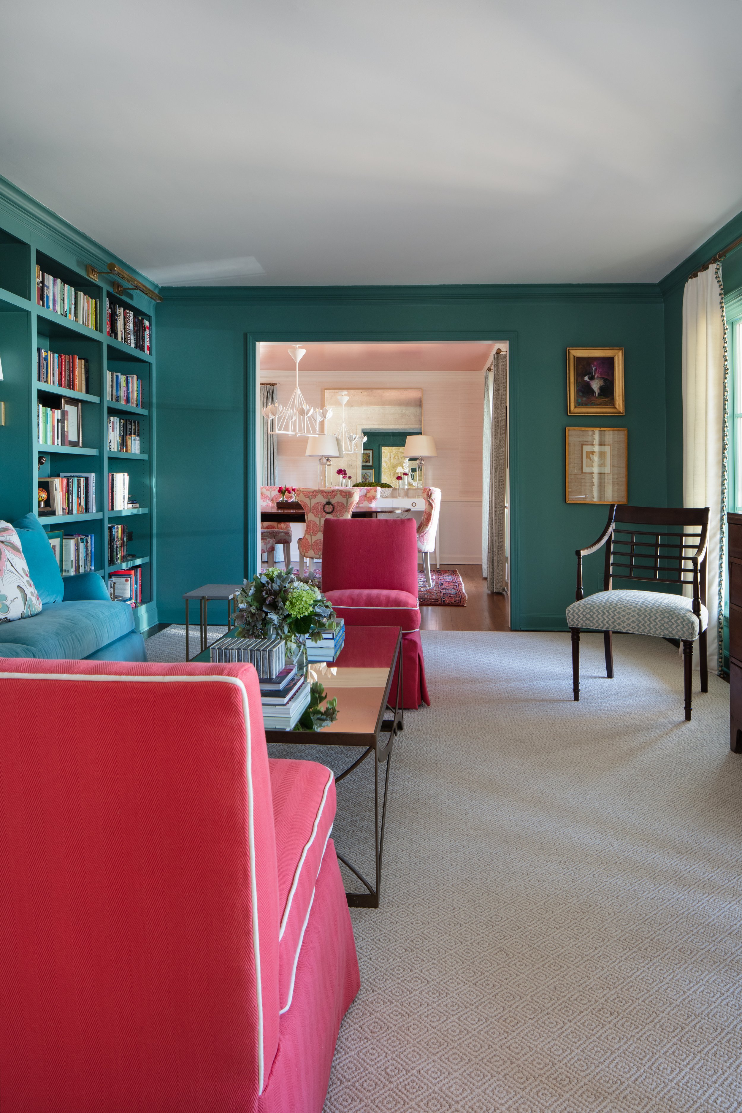
“Having the walls and the sofa the same color gives you a story throughout the space. You have this rich color in the living room and then it’s a little bit lighter beyond. It makes you wonder, ‘What’s back here?”
—Designer Elizabeth Malmo
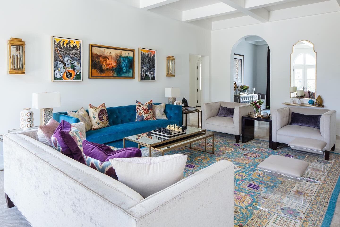
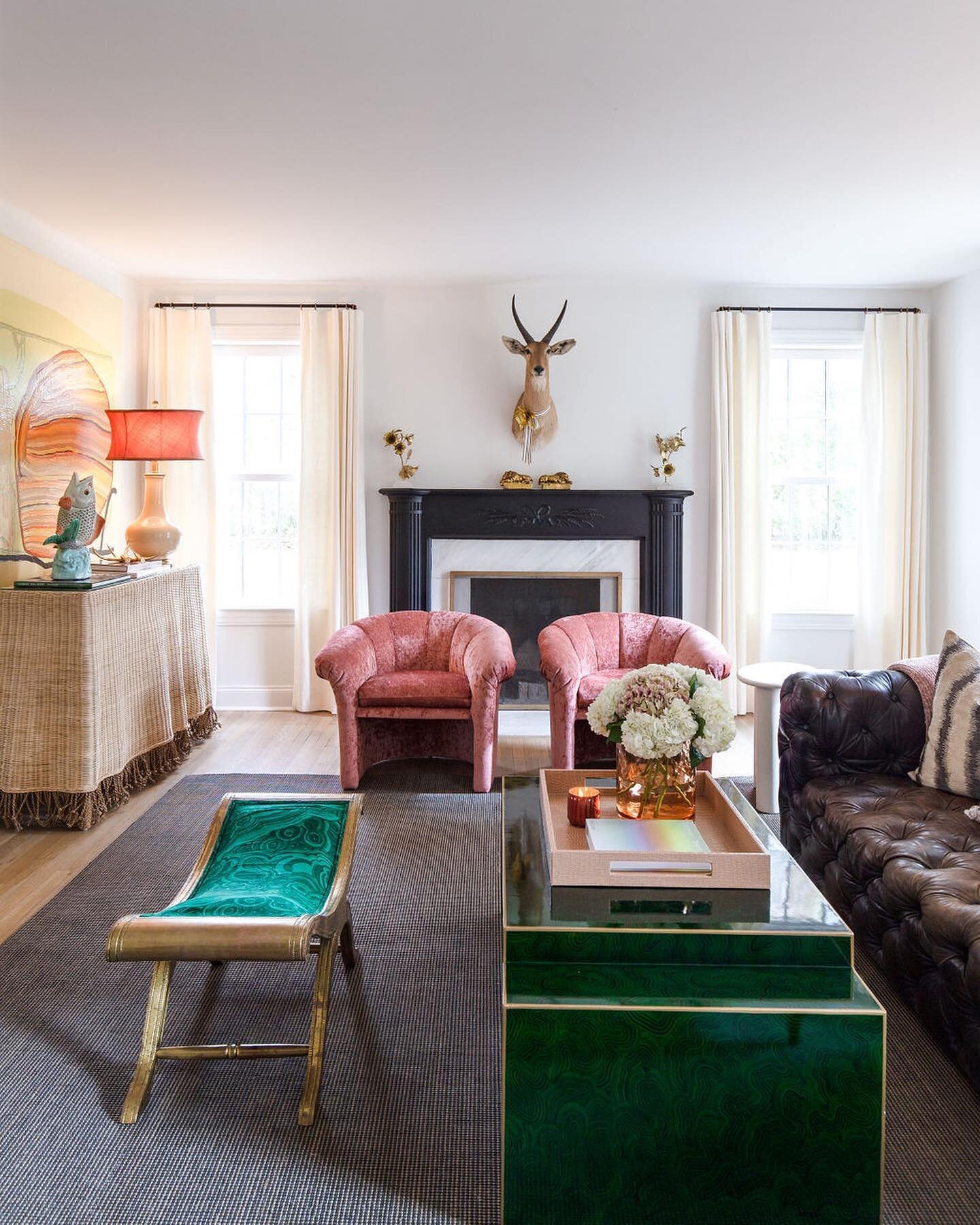
In the living room Malmo incorporated the homeowner’s request for “a teal velvet couch inset into bookshelves,” then took the concept to a more intense level by painting the shelves, the walls and all the trim in Benjamin Moore Woodbury Green, a supersaturated teal. She added a pair of slipper chairs in a mouth-watering shade of coral. The punchy colors blend perfectly with traditional and antique pieces the family brought from their previous home in Atlanta.
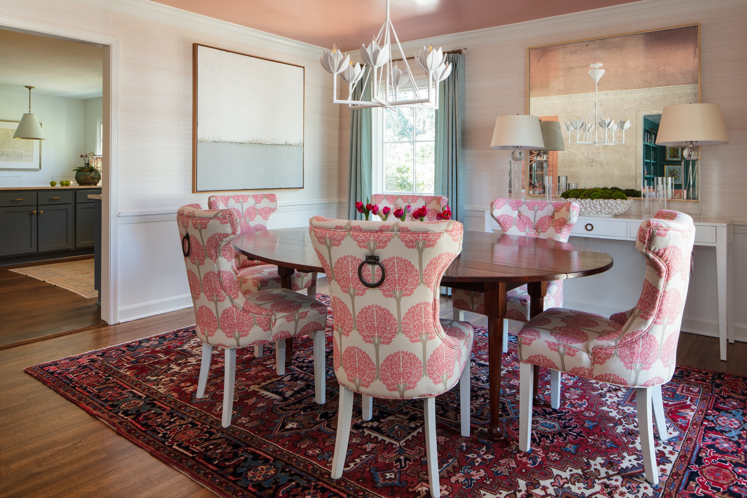
Just past the living room, the dining room almost seems to glow, thanks to another design feature requested by the homeowner. “I knew I wanted a coral, lacquered ceiling in that room,” she says. Paired with subtle white grasscloth on the walls, a vintage Oushak rug in traditional reds and blues, an antique oval table and freshly reupholstered chairs, the effect is stunning.
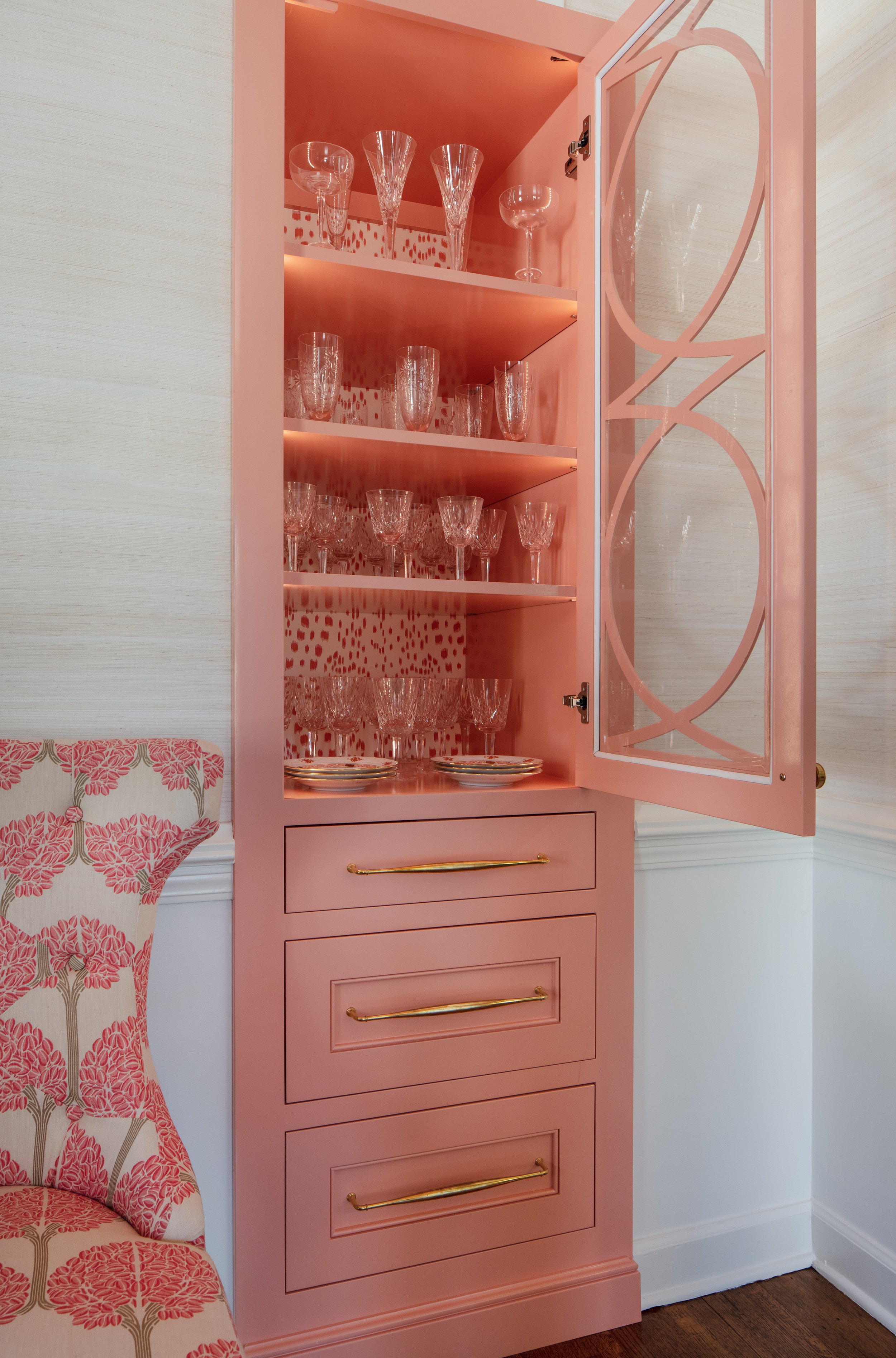
Perhaps the most unique feature of the space is the creative reimagining of a former closet. “We had the idea to make it into a china cabinet. It was narrow and deep before and we both thought it could be something better,” explains the designer. Better indeed is the eye-catching little built-in covered in coral paint and accented with the cutest Brunschwig and Fils dotted wallpaper lining its back face. “RKA did an exceptional job of taking our vision and creating this little moment,” she adds.
The kitchen’s original layout made sense and the appliances had been updated recently, so a complete redo was unnecessary. Malmo freshened up the cabinet hardware and fixtures, added new window treatments and replaced the countertops with quartzite in a subtle pattern. The homeowner loves the stone, but the details that Malmo paid attention to have her singing the designer’s praises. “When they were measuring for the backsplash she said ‘Wait a minute.’ She got out a piece of paper, drew the shape out and asked them, ‘Can you make it like this?’ The result is a combination of right angles and curves that adds a graceful touch to not only the kitchen, but is repeated in several of the bathroom stone treatments.
Malmo freshened up the laundry area and powder bath behind the kitchen with more of the homeowner’s beloved teal in both the paint and the wallpaper, glammed up with shiny gold accents. Classic penny tile on the floor will withstand the wear and tear that’s inevitable in a rear entry area. RKA hit another home run with the custom vanity in the half bath, proving that even a small space can exude elegance.
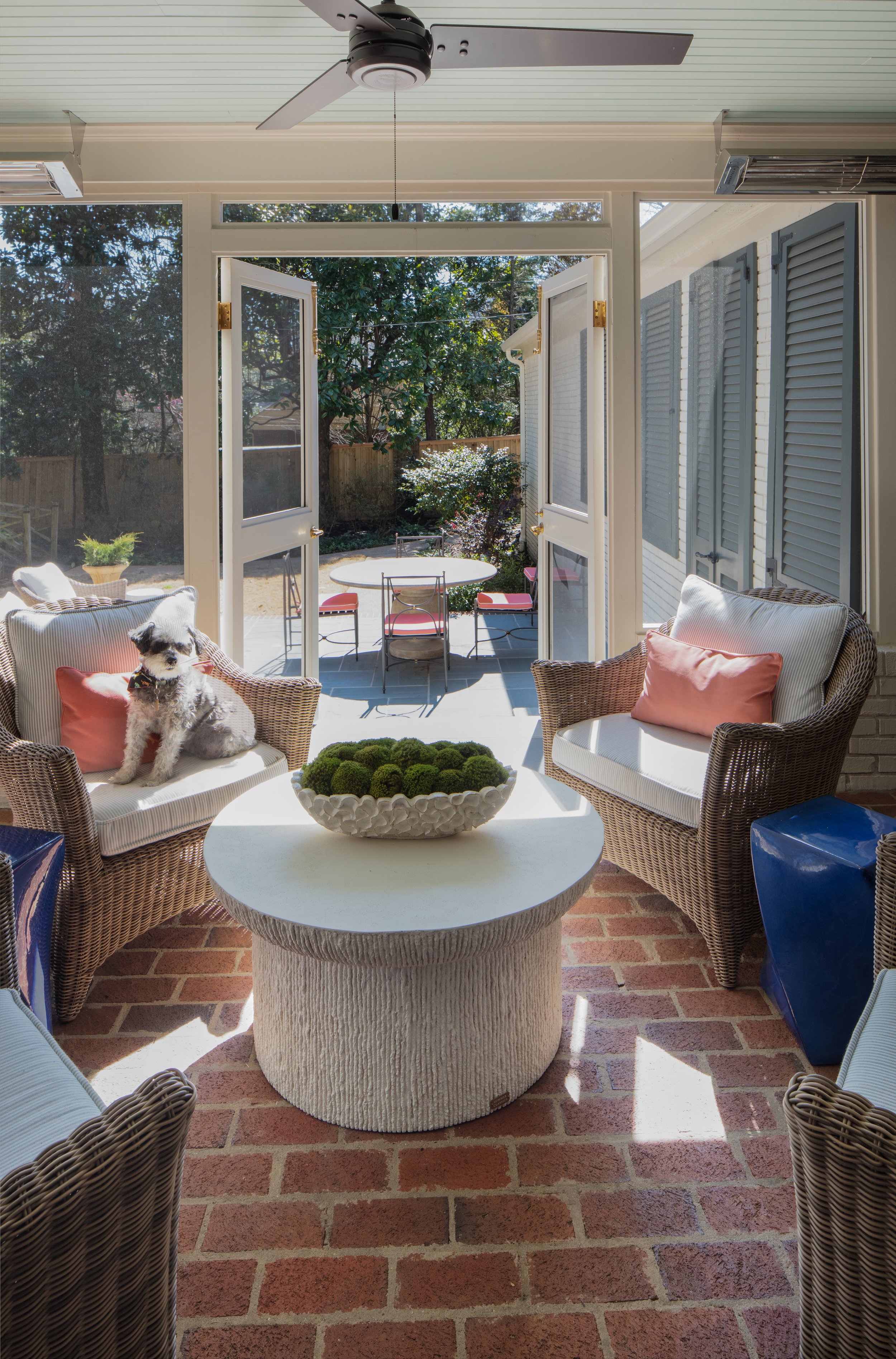
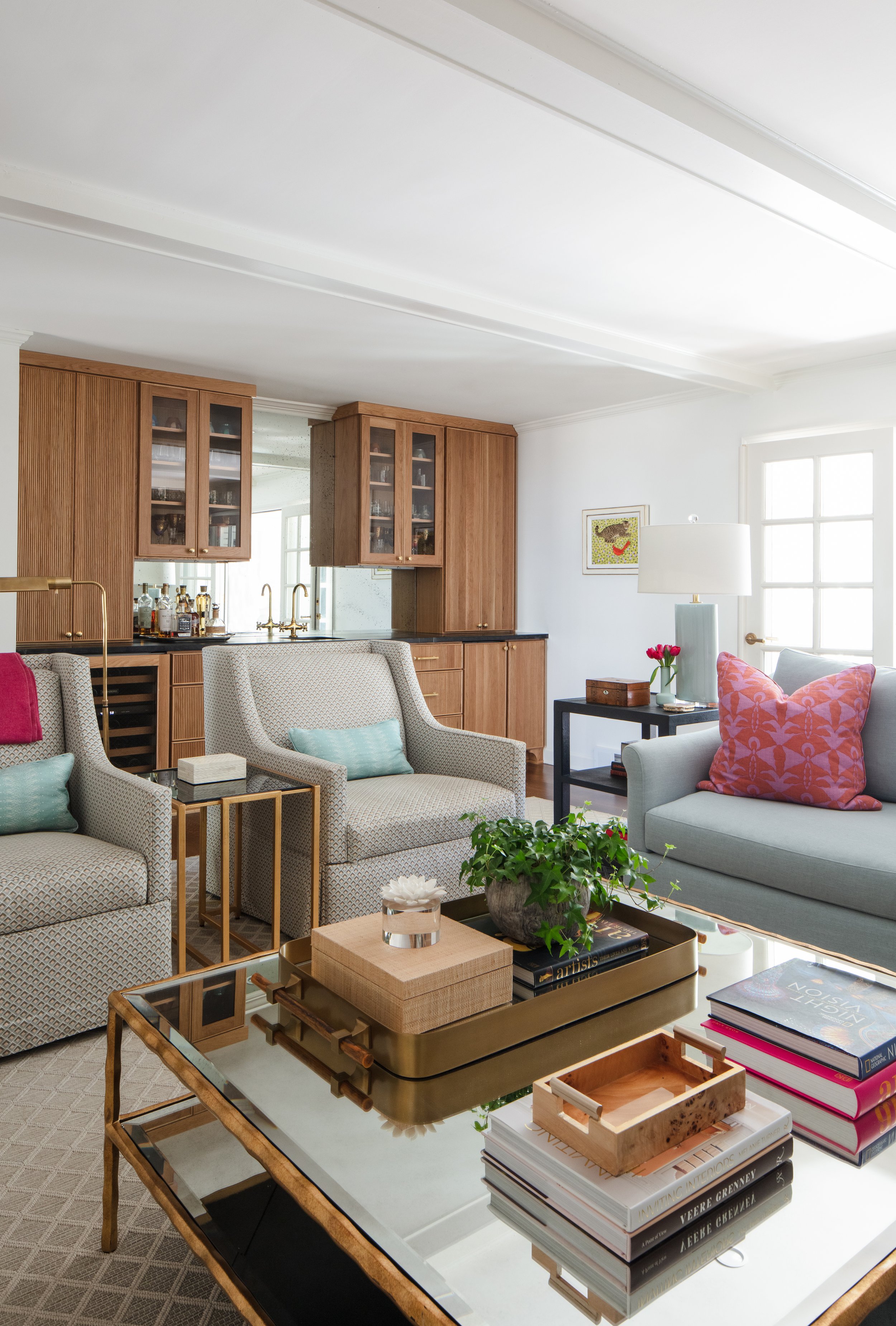
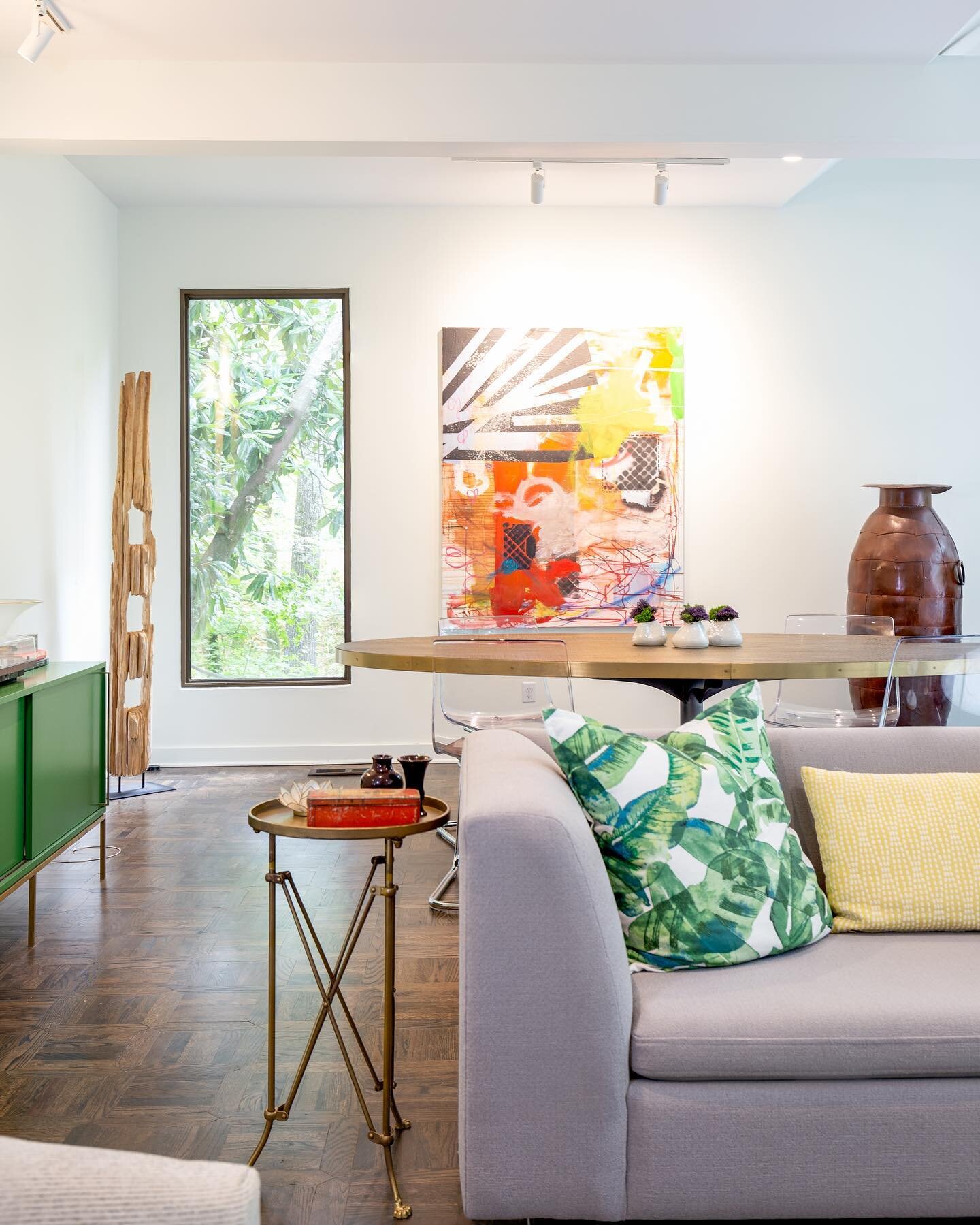
The spacious family room overlooks the home’s scenic backyard. Off to the side, the garage was originally open and could be seen from the den. Now it’s buttoned up handsomely with louvered shutter panels painted in a time-honored Charleston green, thanks to Malmo’s creative suggestion to improve the view from the spot where the couple often spends time relaxing and watching TV.
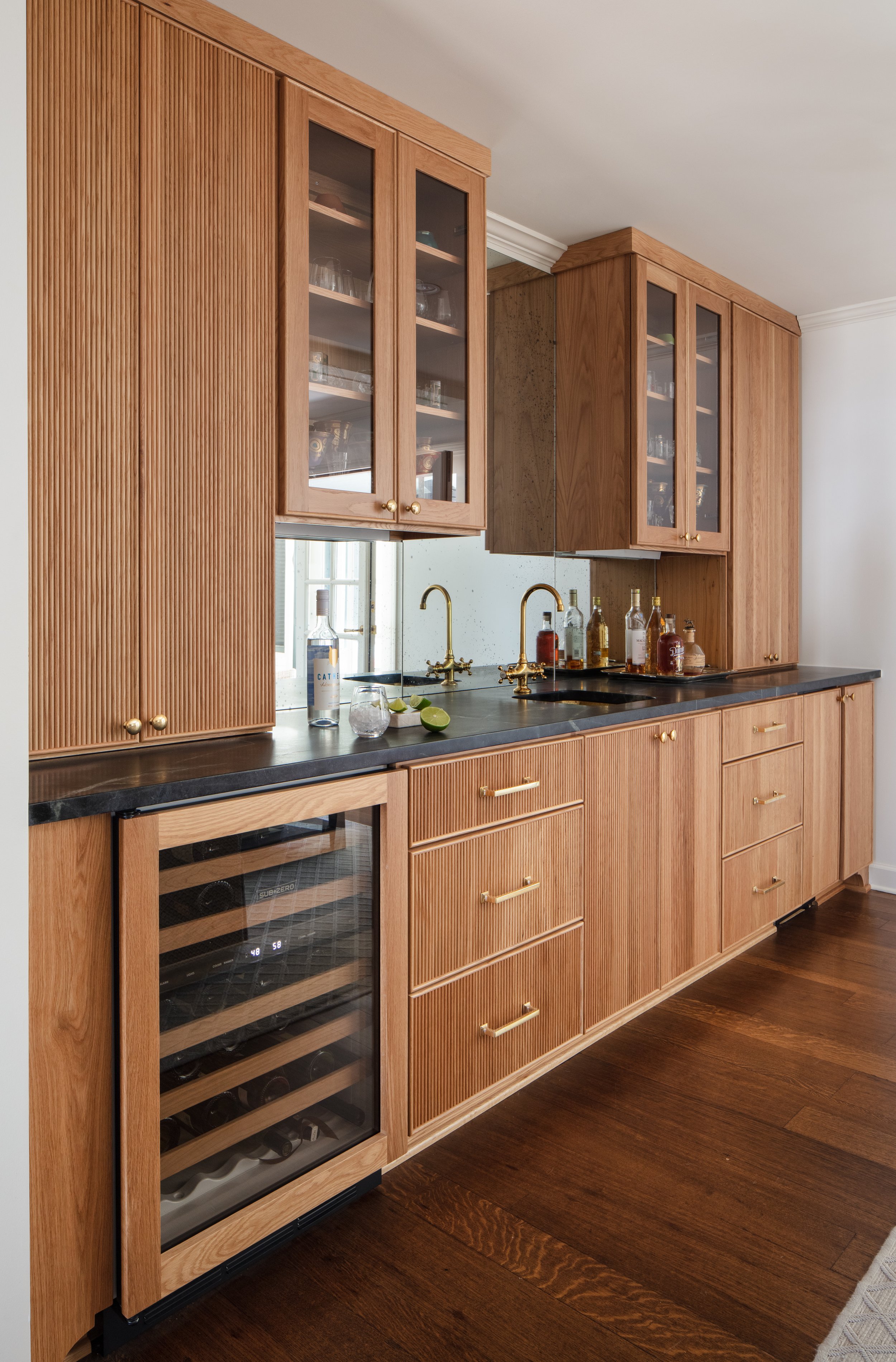
The room’s focal point is a custom wet bar, another must have for the homeowners. Reeded wood cabinet fronts in a beautiful honey-colored finish, black countertops and brass accents define the generously sized space. By design, there’s plenty of room for the hosts to entertain, and they frequently do.
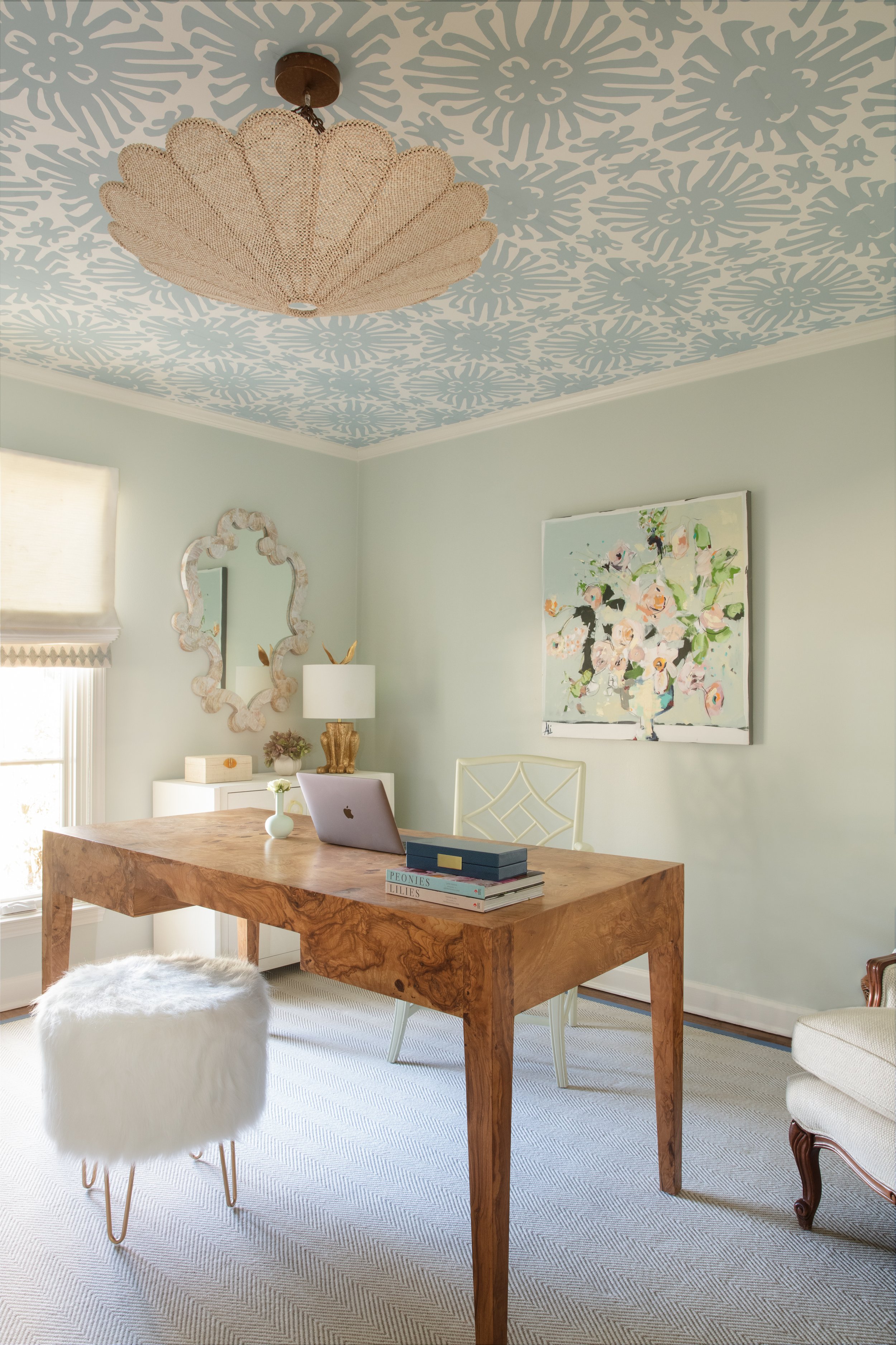
Along with the primary suite, the home’s main floor includes two extra bedrooms, set up as personal spaces for the couple; an office for him and a “retreat” for her. The office is handsome and masculine with walls bathed in a deep blue and covered with mementoes of a successful career. All work and no play would not do, though so keepsakes from his long-held hobby of golf are also on display. Her retreat is the perfect blend of glamor and whimsy with a burl wood desk, a white fun fur footstool and a fanciful Quadrille wallpaper on the ceiling.
The upstairs is dedicated to making guests feel at home, an important concept since the homeowners have out-of-town friends and family over often. Two comfortable bedrooms give visitors privacy. Malmo redesigned the upstairs bath intelligently, taking out two unneeded closets and replacing them with a freestanding vanity and stool. She also raised the height of the original cabinets to a more comfortable 35 inches, and replaced the countertops, floors and lighting.
Also upstairs is a small room, too large to be a closet, but not really a full-sized bedroom. After discussing several possible uses for the space, Malmo and the homeowner settled on making it multi-purpose. It’s furnished beautifully, with an inviting loveseat that makes a cozy spot for guests to relax with a morning cup of coffee. The loveseat is a sleeper, though, allowing the nook to function as a private sleeping space when needed. “Our oldest granddaughter is 14 and she loves it. Of course, this is where she sleeps when she comes to visit,” says the homeowner.
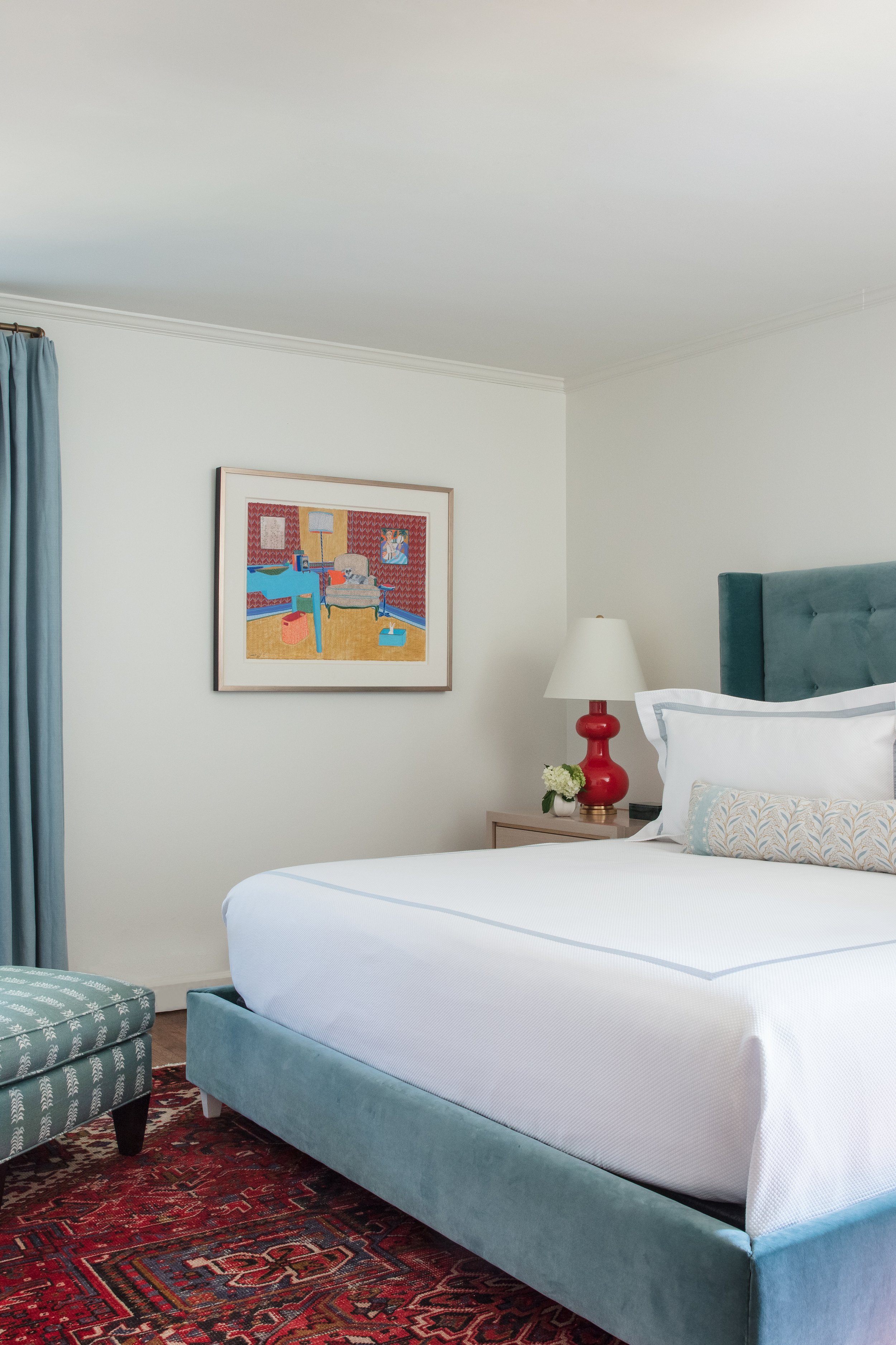
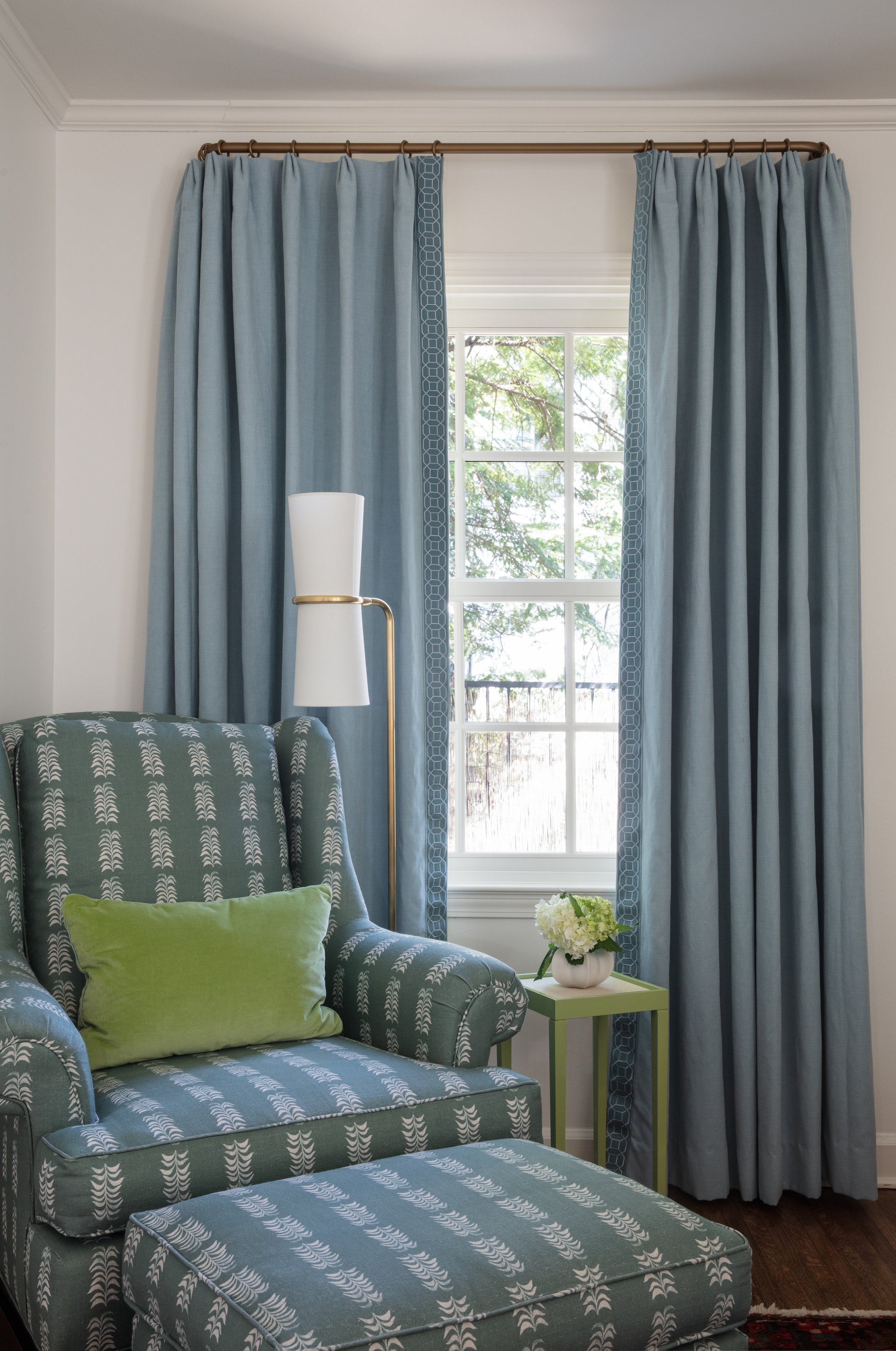
The renovated home now suits its owners to a tee, tastefully decked out in their ideal color palette, their treasured art and furniture blended seamlessly with thoughtfully chosen new pieces and perfectly suited to the way they live in retirement.


