Evolving With the Family
/Design by Tara Felice Interiors | Story by Terri Glazer | Photography by Sélavie Photography
As most homeowners would agree, the term “finished project” hardly ever applies when it comes to a house. This East Memphis residence is a shining example of that concept.
When the current owners bought the house about six years ago, they knew a major renovation was in its immediate future. Not only was the red brick exterior, embellished with New Orleans-style wrought iron, not to their taste, the interior bore the scars of its past several residents: a hoarder, some squatters and thousands of honey bees that were found in the walls. Despite the place’s sad state, the young couple envisioned that it could be salvaged. They also loved the location and the large backyard, perfect for their growing family.
With the help of a long-established architectural expert and an interior designer whose company was just getting off the ground, the family transformed the home from top to bottom, inside and out. Architectural designer Tom Sullivan drew the new plans, which involved a drastic change in the floor plan to accommodate the family, which included two children at the time. Tara Engelberg was friendly with the couple, as her husband and the homeowner are related. As she was just starting to test the waters with her newly formed design firm, Tara Felice Interiors, she reached out to them and they soon became clients.
“They may as well have taken it down to the ground basically and started from scratch,” Engelberg says. “It has a completely different facade. On the interior they took down walls and really opened everything up. This looks nothing at all like what it looked like before.”
As extensive as the project was, however, it was not the final product. The ensuing years saw the addition of two more children, along with the need to expand and repurpose parts of the house to better suit a family of six. Completed in late 2021, phase II of the home’s evolution added a new living area, an outdoor patio, a bedroom and a couple of bathrooms, and reimagined a former keeping room off the kitchen. Engelberg was at the design helm again, this time with Tim DiSalvo & Co leading the construction effort.
The two additions blend seamlessly, as all good renovations should, resulting in a showplace of a home that is hip, sophisticated but casual, and above all, able to withstand the wear and tear inevitable in a household with four kids and a very large dog.
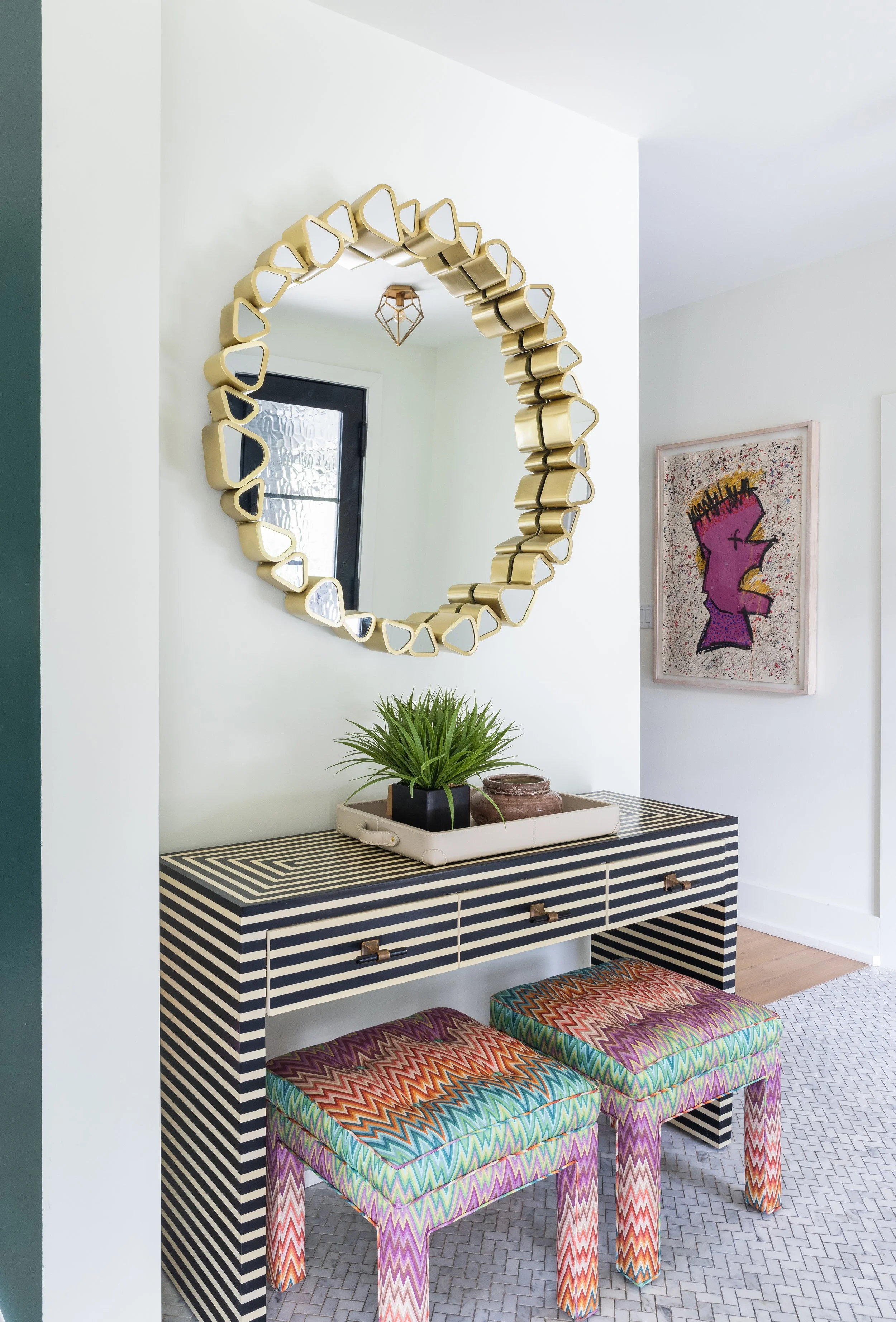
The home’s visual appeal begins with its new exterior, white wood with black trim. “The white is just so crisp and appealing and the black beams are refreshing,” says Engelberg. She extended the black and white contrast into the entryway, where an ebony- and ivory-toned parquet console greets guests. Above it, a round mirror embellished with stylized triangles breaks up the straight lines, as do twin vintage stools tucked underneath. The designer found the stools at one of the estate sales she loves to frequent, always on the hunt for vintage treasures to add an eclectic touch to a room. Now covered in a fabulous Missoni flame stitch fabric, they bring color and another geometric shape to the vignette. The herringbone pattern of the marble tile floor repeats the pattern. “I always love to use different flooring in a foyer to set it apart from what you’re about to enter in the rest of the home,” explains Engelberg.
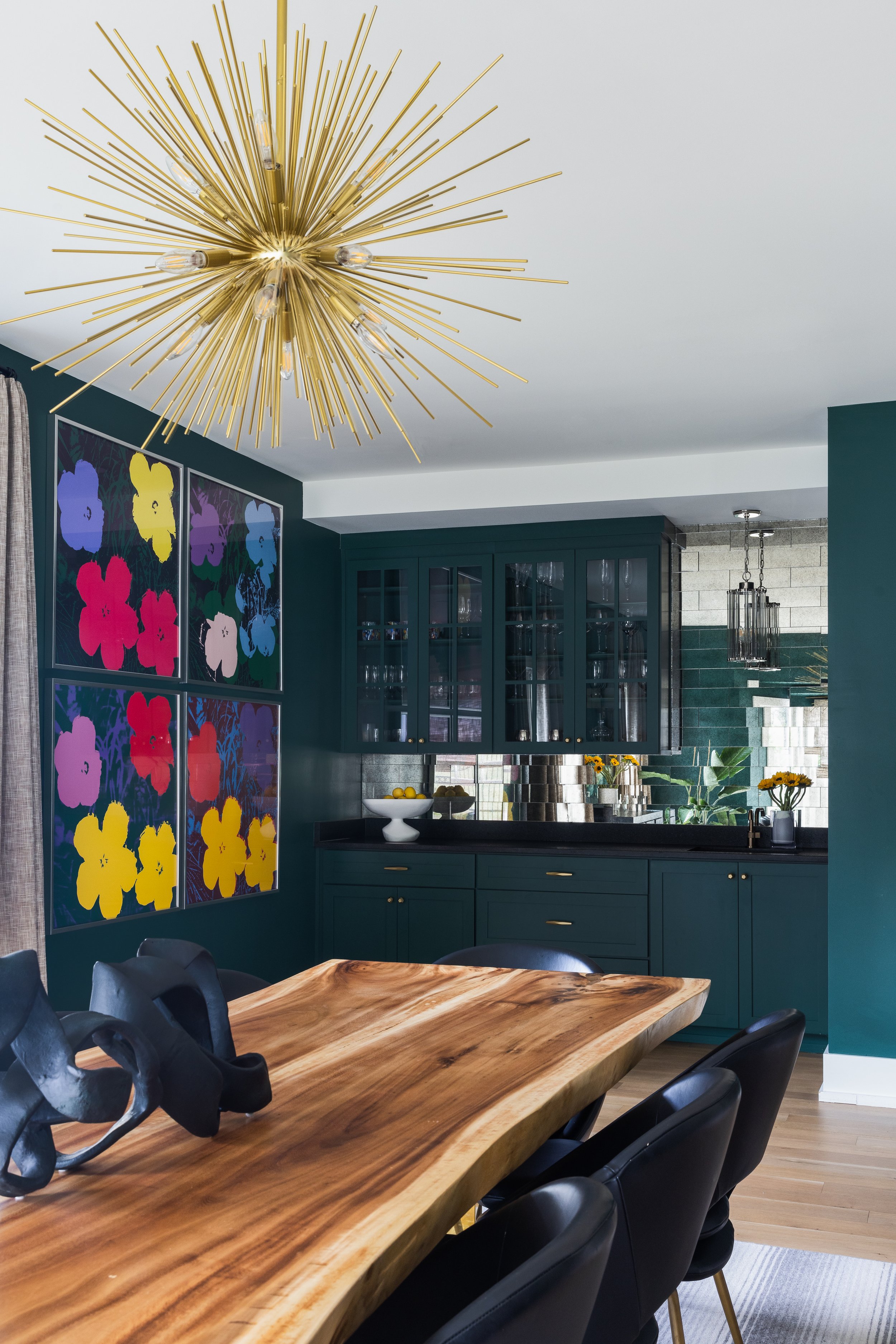
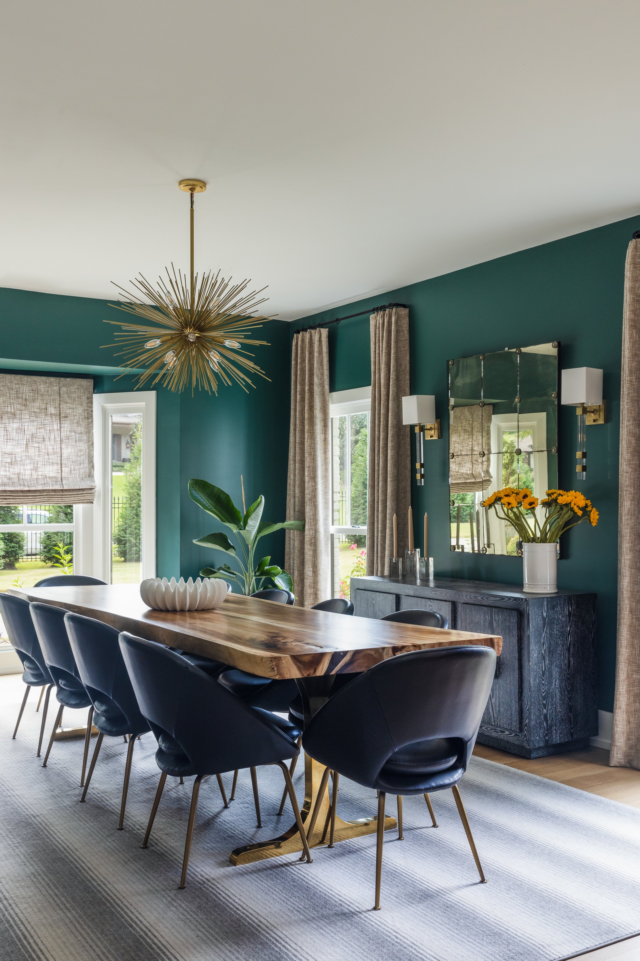
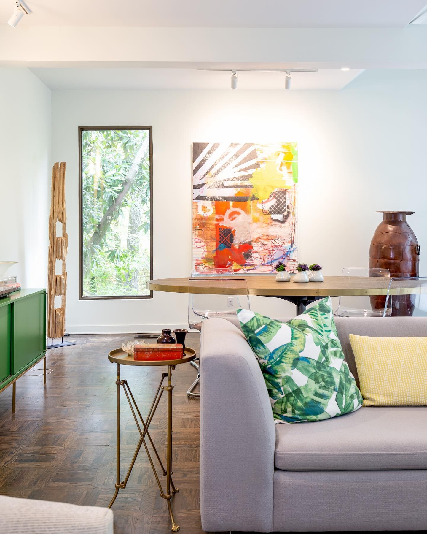
“Bold and eclectic” sum up the vibe in the dining room. Inspired by the colors in the artwork the couple selected for the space, the designer chose a deep, moody green for the walls. A bright white ceiling and trim, along with a mirrored backsplash in the built-in bar area, keep the look from going gloomy. The room’s centerpiece, a spectacular live-edge dining table that seats 10, is perfect for entertaining large groups.
Overhead, a gold burst chandelier gives a glam nod to mid-century style. Dramatic lighting accents most rooms in the home, as it does in many Tara Felice projects. Engelberg feels that statement light fixtures are a worthy place to splurge, as they are unlikely to endure wear or damage during daily living. “Lighting is like the jewelry in a room to me,” she says.
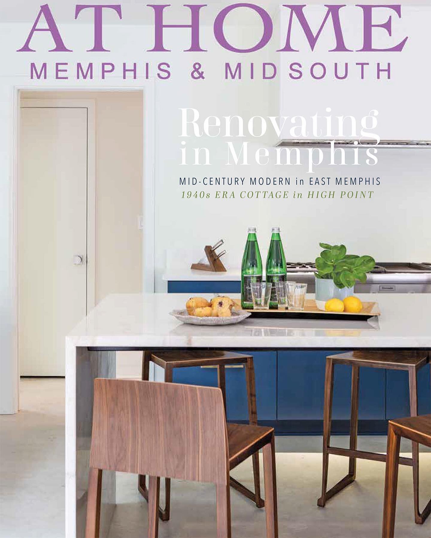
Just off the dining room sits the airy and bright kitchen. Although the basic concept from the initial renovation remains, the most recent work included a few tweaks here. The large center island received a second sink, a new wrap-around maple butcher block, and additional cabinets underneath.
The kitchen opens into a space that was totally reworked in phase II. Set up as a combination breakfast and keeping room in the first remodel, the area is now dedicated to casual dining. The large natural wood table has plenty of room for the couple and their extended family, and the woven leather seats and backs on the chairs exude a rugged beauty that will stand the test of time and children. New built-in cabinets on the far wall combine beauty with practicality, too. A large family can never have too much storage.
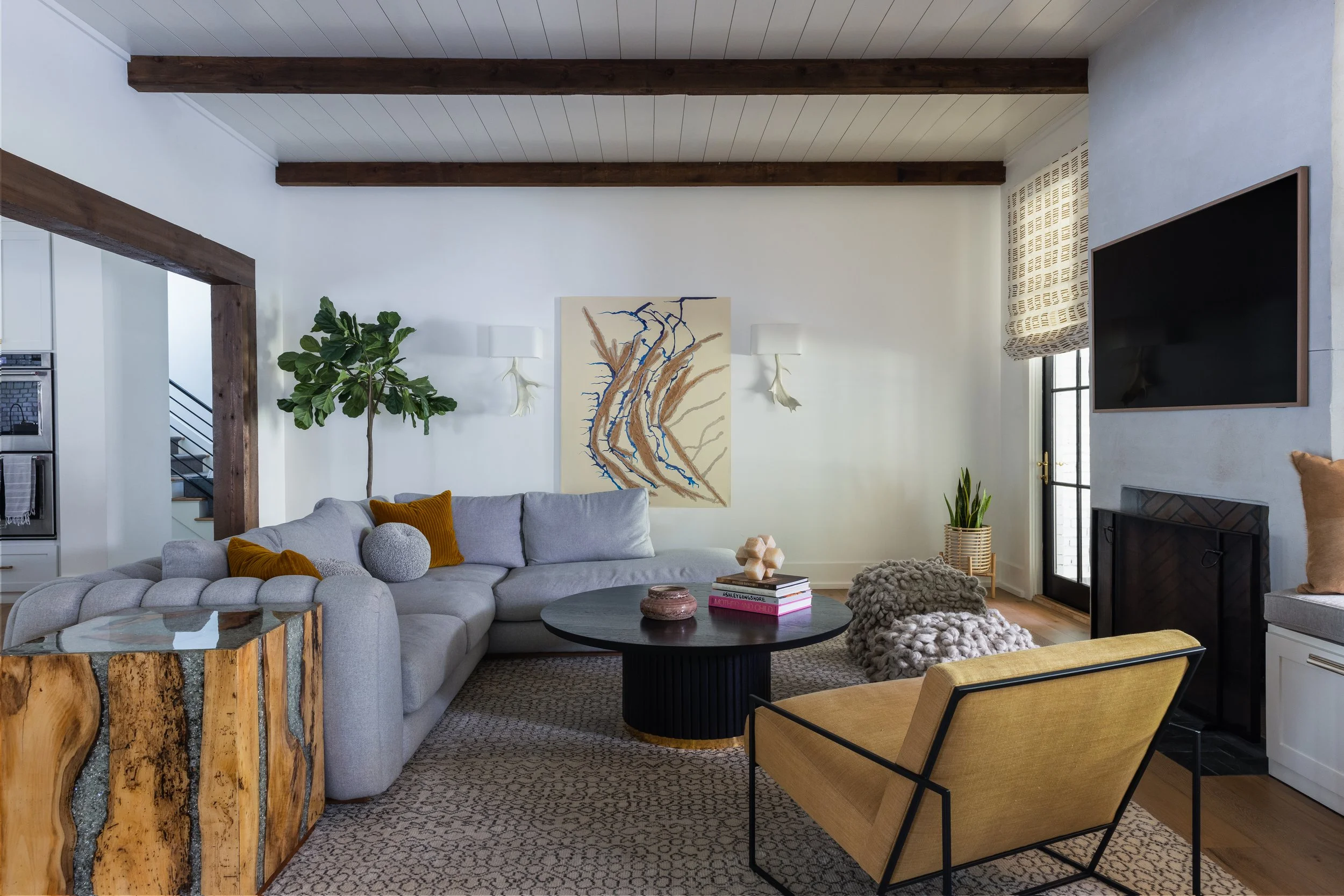
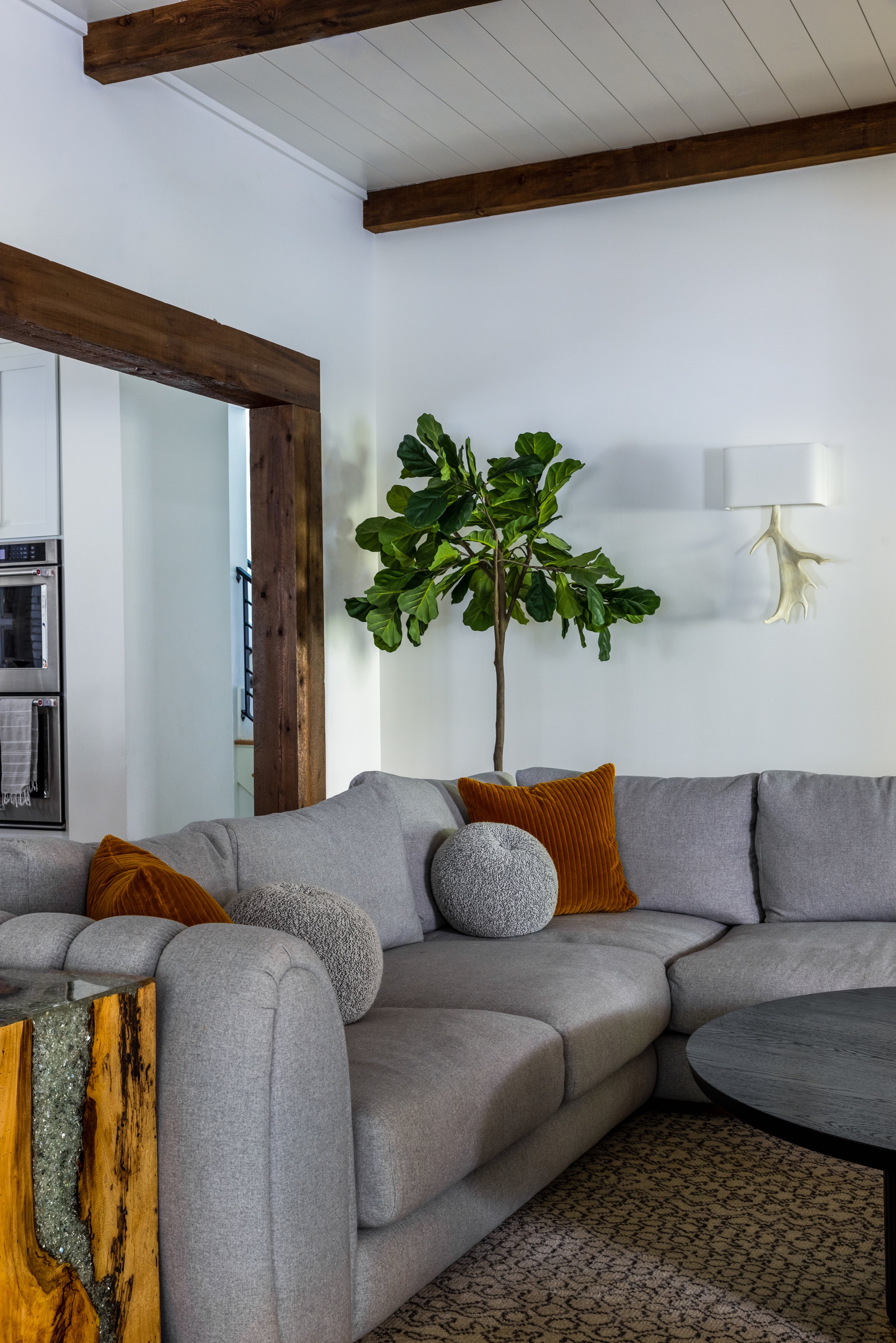
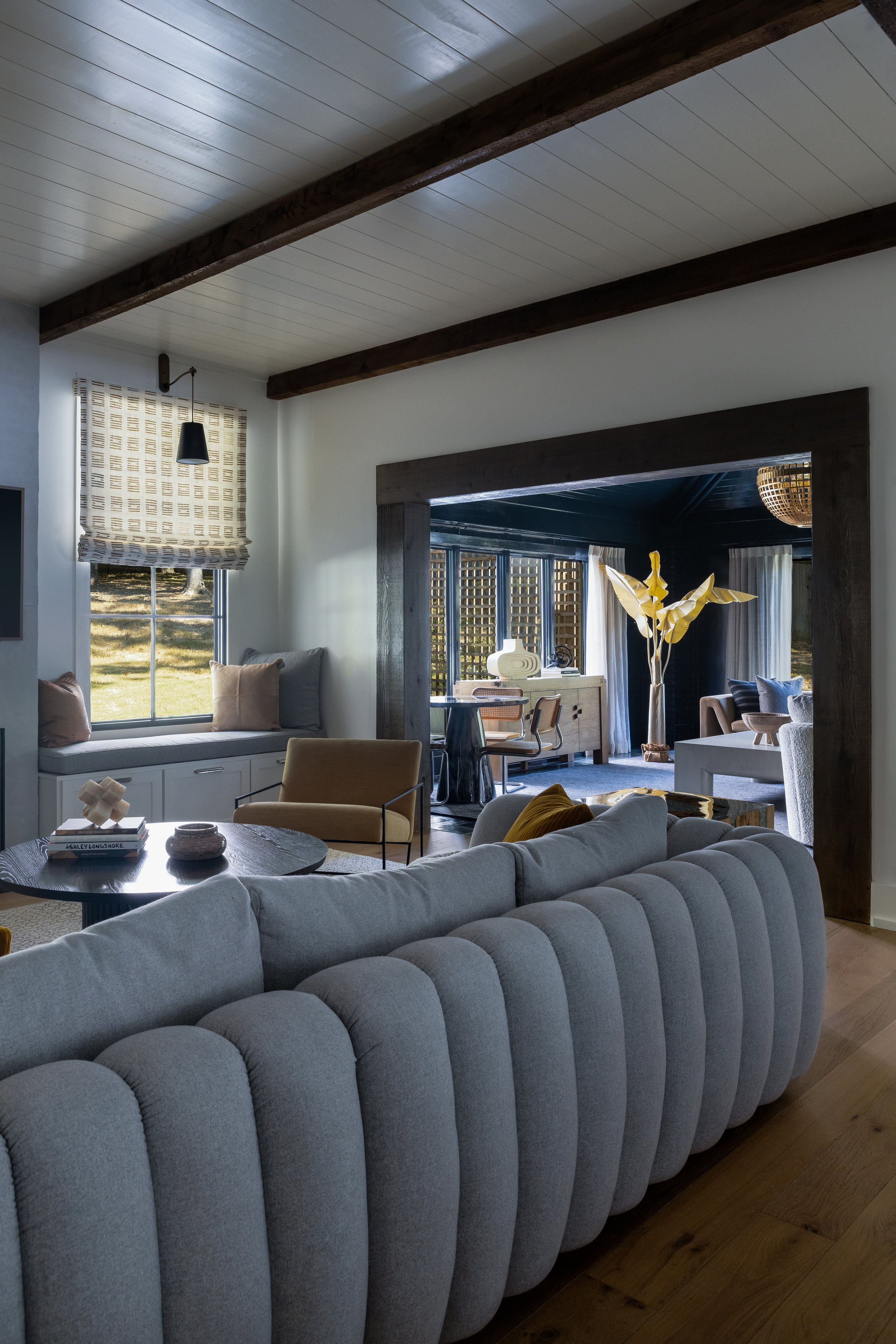
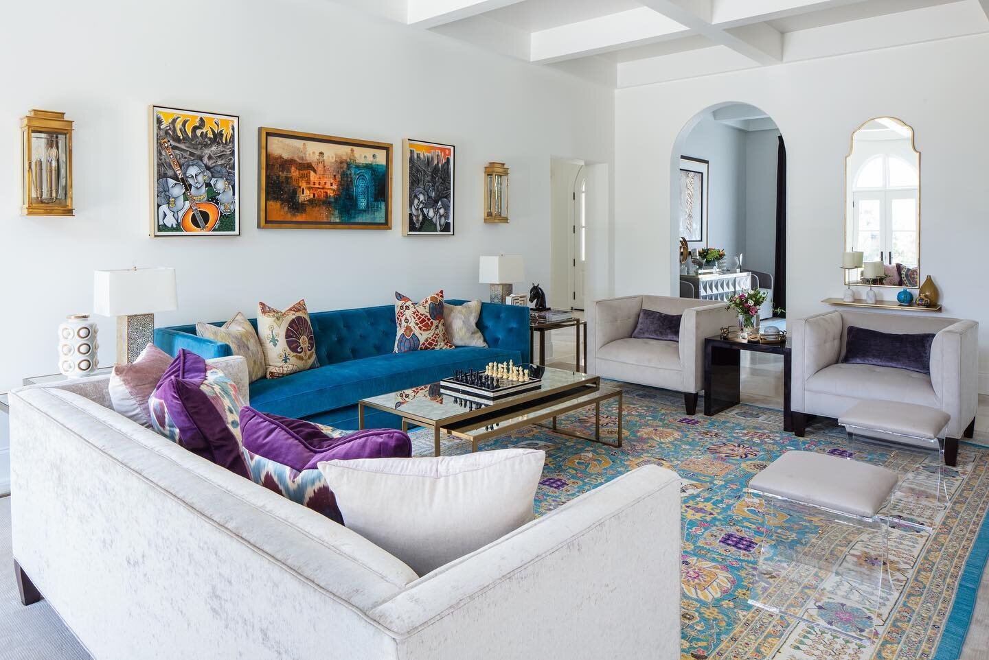
A major component in the latest round of work was the creation of two new indoor living areas. To accomplish this, the homeowners transformed a former sun porch into a den and added a TV room on the rear of the house. The two spaces sit next to one another, and although each has its own distinctive mood, they coexist perfectly.
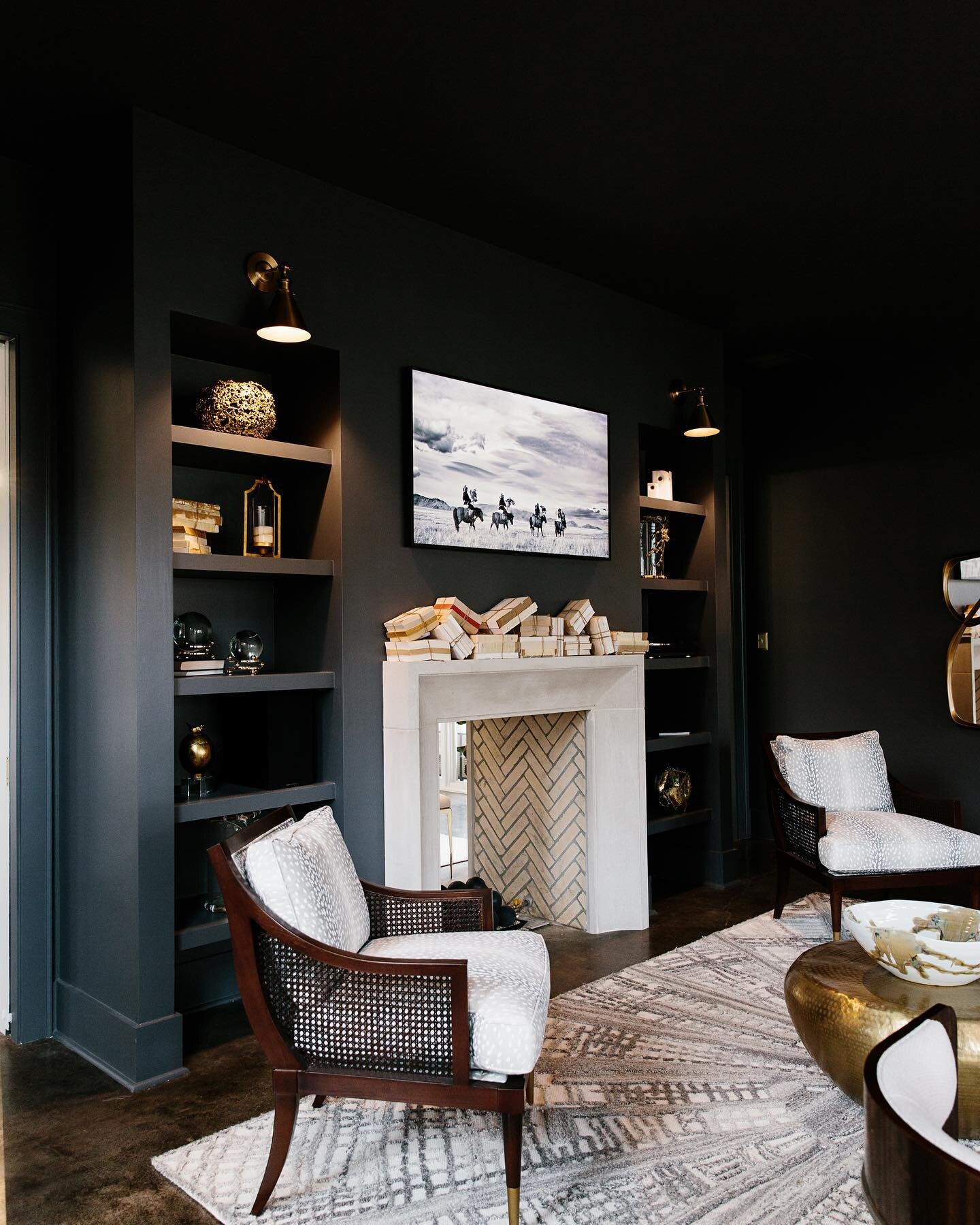
Drama makes a reprise in the new den, where glossy black paint covers the walls, trim and tongue-and-groove vaulted ceiling. Comfortable furnishings in lighter tones and natural woods pop off the striking backdrop. Engelberg again paid attention to geometry in this space, balancing the straight lines of the paneling and the oversized square coffee table with the curves of the globe-shaped light fixture, the white boucle barrel chairs and the eye-catching round stone game table.
“We knew we were going to have to do something amazing in here,” says Engelberg of the new TV room. “Because you can see the back of the sofa we wanted something that was a show stopper.” Mission accomplished. The channeled-back sectional is both a statement piece and the perfect spot to binge watch favorite shows.
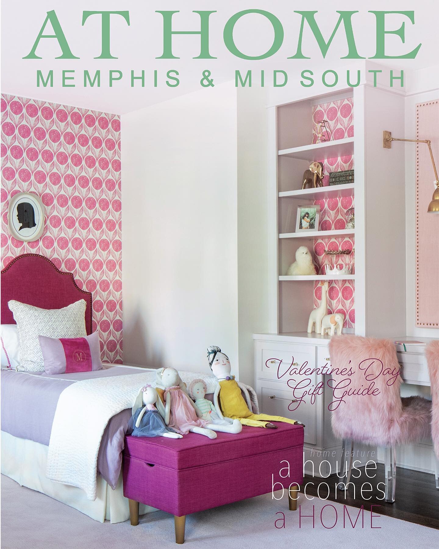
Also part of phase II is a new upstairs bedroom and bath for one of the daughters. Since the space was new construction, essentially a blank slate for Engelberg, she used the colorful floral wallpaper as a jumping-off point for the design. Here again, she combined traditional, vintage and modern elements, topped off with a big scoop of whimsy from the feather globe light fixture, to create a room that will grow with its occupant. Small details like the flower knobs on the attached bathroom’s vanity, lotus sconces in the bedroom and bath, and fancy lucite legs on the custom upholstered bed add to the charm.
During the most recent renovation the homeowners had a bathroom built attached to the downstairs nursery. Engelberg’s design delivered a serene, California-inspired ambiance that the family will love long after all the babies are grown. “I wanted it to have a super organic feel,” she says. The fusion of slim vertical tiles with the look of natural wood, a black floating vanity, bold geometric tile floor and, of course, extraordinary light fixtures produces a classic West Coast vibe.
After two extensive projects, the home’s transformation continues to evolve. Plans are in the works to redo the primary bedroom, add art in several rooms, etc. There’s always an “etc.” when it comes to design, and Engelberg can’t wait to see what’s next.

