Traditionally Contemporary
/Design by Maggie Clarke Interiors | Story by Terri Glazer | Photography by Ross Group Creative
“I love color. I know a lot of people are into whites, but I love the colors,” homeowner Julie Upchurch told Maggie Clarke very early on in the process of redesigning the East Memphis home Upchurch and her family had just purchased in late 2021.
Clarke, owner of a self-named local design firm, paired that idea with another concept she discovered early on in her professional relationship with her new client. “I always ask my clients to send me photos of their Pinterest boards or their Instagram saves. Looking at them I noticed Julie loves traditional spaces but with pops of contemporary, like through lighting and pieces of accent furniture. So that's really what we did here.”
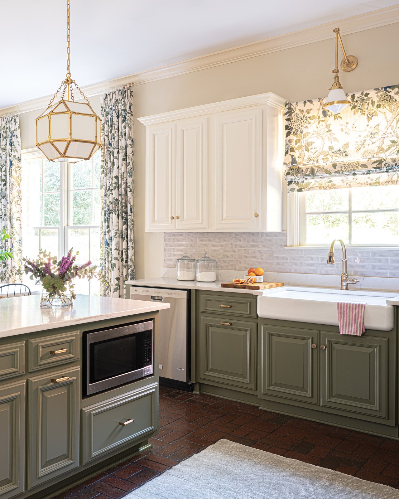
The result breathed new life into the house, built in 2005, and gave it a personality that more closely reflects the young family that lives there. First on the agenda was a major kitchen refresh. Not a total gut job, but a rework of the original room. “I think people underestimate the power of paint, says Clarke, referring to the dramatic new look she achieved by painting the existing cabinets. She chose a bold green for the base cabinets and the island, offset by fresh white on the upper cabinets. A porcelain apron sink and a new backsplash of dimensional subway tile glazed in soft white, and new gold-tone hardware and fixtures provide a fresh take on traditional kitchen design elements.
The original lighting scheme in the kitchen included only recessed can lights. Clarke replaced some of those utilitarian fixtures with pretty pendant lights over the sink and island to dress up the space and provide warmth as well as illumination.
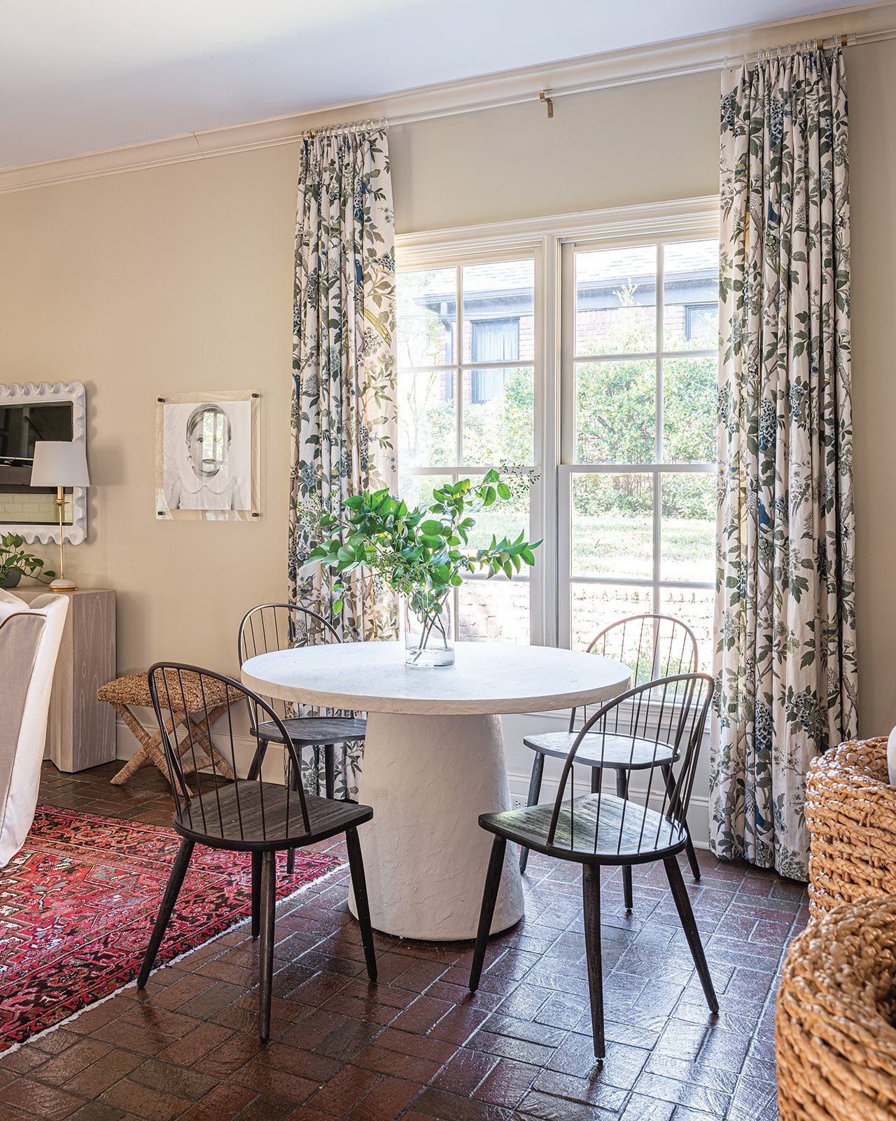
While the lighting and hardware can be considered the “jewelry” of the room, the window treatments may just steal the show here. The flora-and-fauna pattern fabric by Lee Jofa incorporates the saturated green of the cabinets along with a stunning peacock blue on a light background. It appears in a Roman shade covering the window over the main sink as well as on full-length panels flanking a double window.
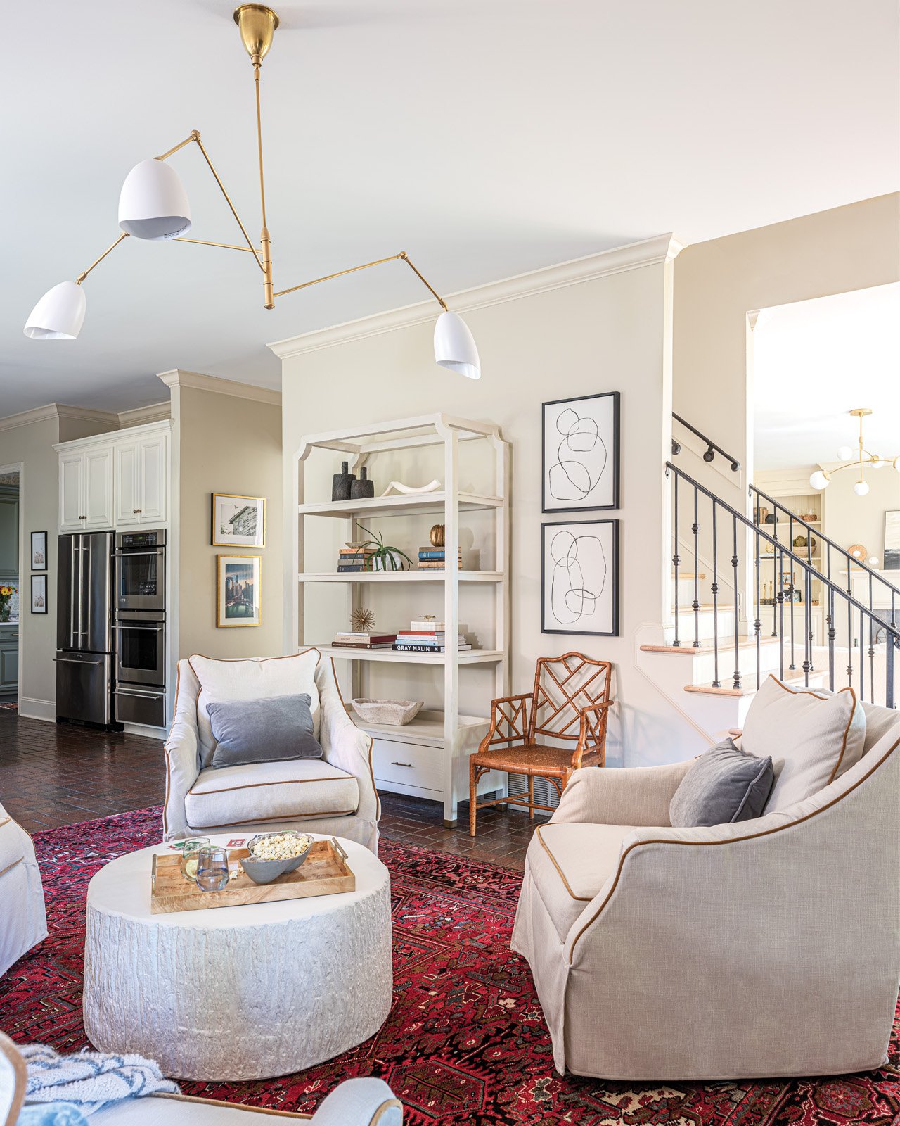
The flooring in the kitchen and the adjacent keeping room proves that not every element has to be replaced for a project to be successful. The dark brick tile has a classic, tried-and-true feel and adds warmth to the space. It also provides the perfect backdrop for the traditional Oushak rug that anchors the room’s design. Handed down from her grandmother, the rug was a must-have for her new home, Upchurch says.
The rug may be antique, but there isn’t a trace of stodginess in the room, thanks to the furnishings Clarke selected to pair with it. Four swivel chairs from Rowe Fine Furniture create an easy, relaxed vibe. She says, “Julie wanted this setup and I think it's great. It's so conversational. It's great for when you have the girls over for a glass of wine, but it's also good for family time and games.” To make sure the seating was comfortable and practical Clarke chose Rowe’s down fill option and performance upholstery.
The chairs center around a round Noir Furniture coffee table—decidedly contemporary in its style and bright white color. It plays perfectly off the plaster look of the breakfast table the Upchurches already had, now nestled near a large window and surrounded by four simple Windsor-style chairs.
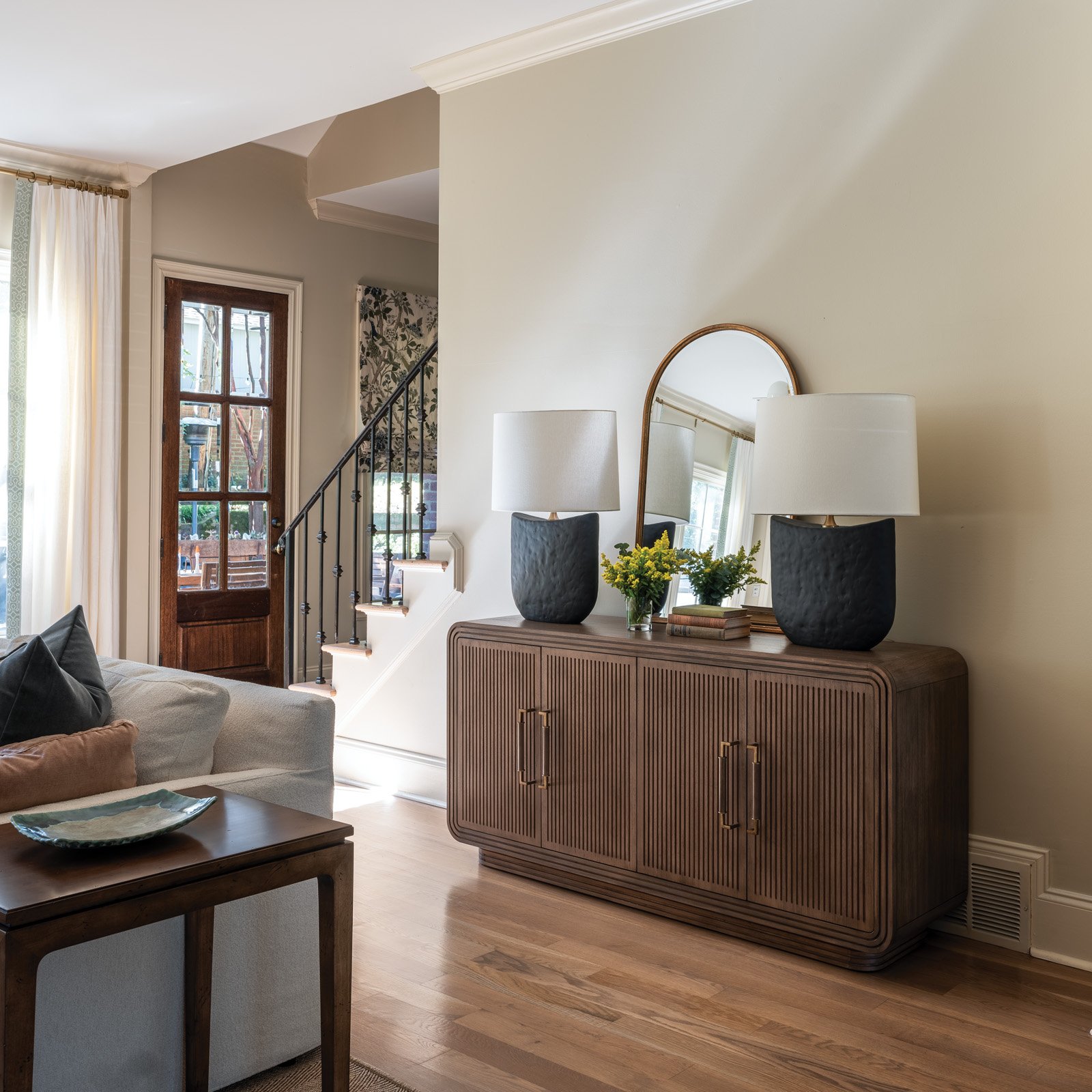
Casual portraits of the family’s two children grace the single full wall in the area. Upchurch says local photographer Rachel Scoggin perfectly captured each child’s personality in the black-and-white works. Clarke placed the photos on the wall on either side of a striking console from Gabby Home, topped by a scalloped Carvers’ Guild mirror. The wall still has plenty of open space, though, intentionally left in the design plan. “I like to leave space in a room for things that are yet to be collected. If Julie wants to find two stools or antique chairs to add, that would be awesome. I think that’s what creates a curated feel. I don’t want to pick out every single thing; this provides them with an opportunity to put the finishing touches on,” Clarke explains.
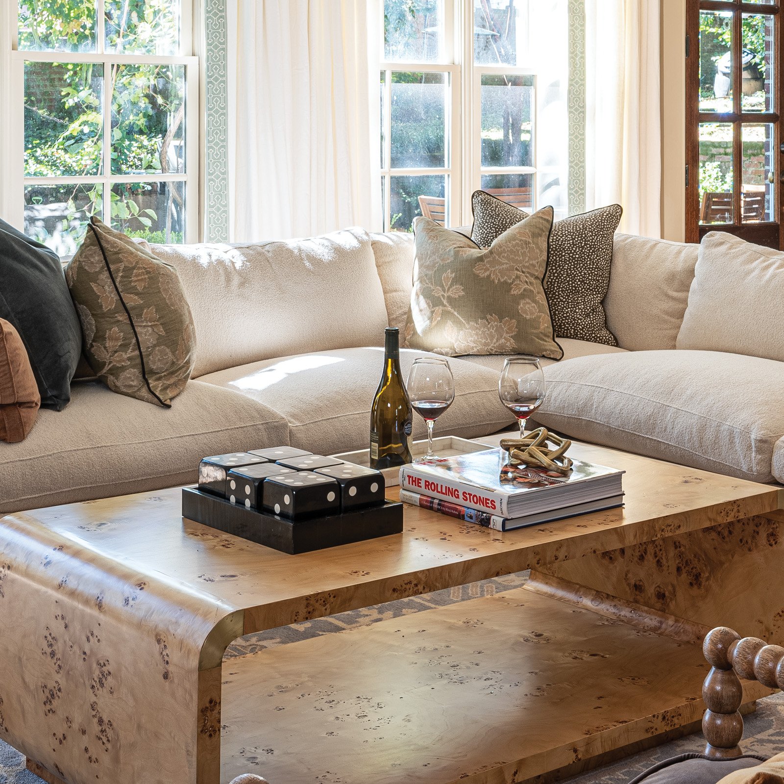
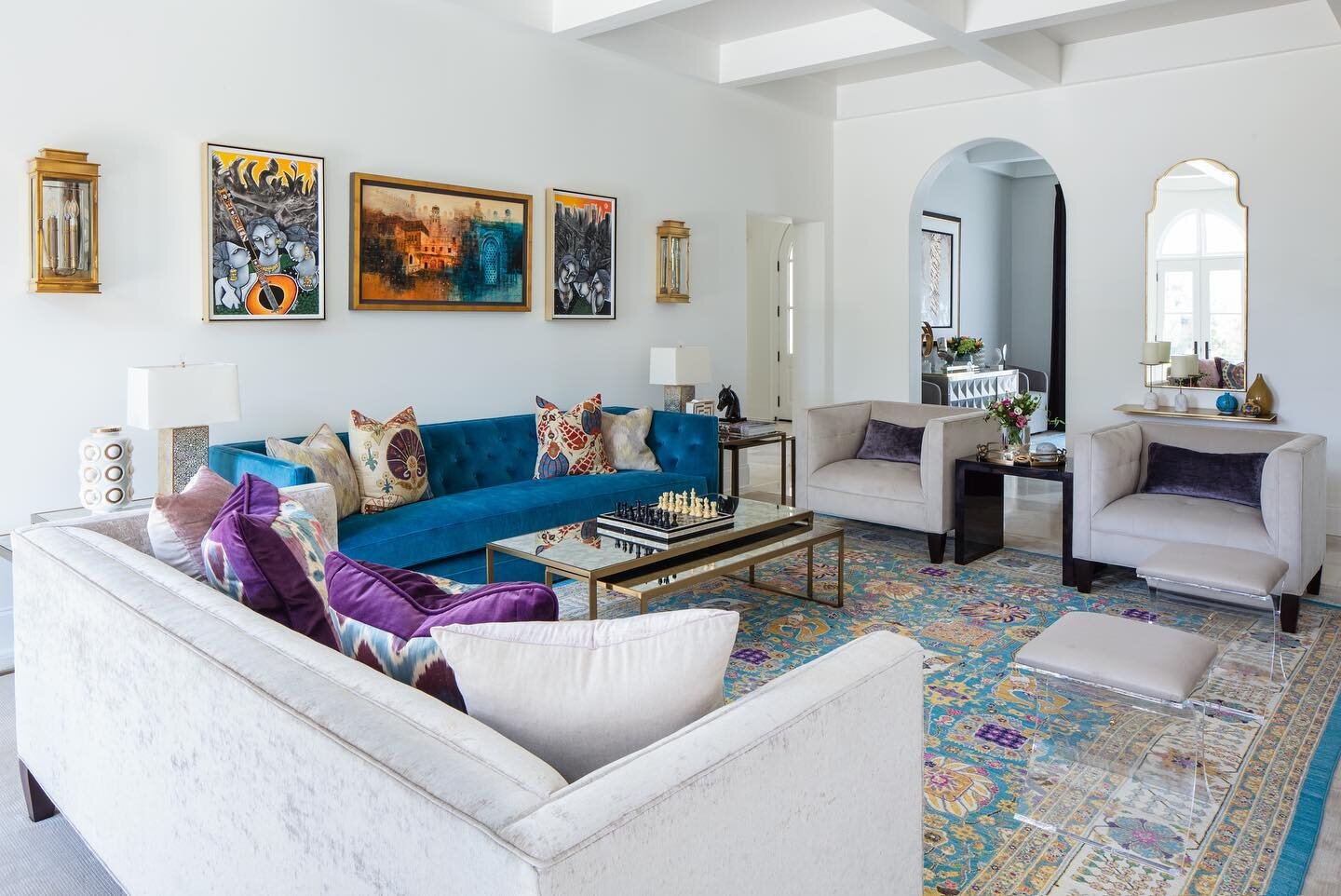
The living room also received major attention in the process. Unlike similar areas in many other homes, the Upchurches spend a lot of time in their living room, so it had to be comfortable and kid friendly. Mission accomplished with an inviting Rowe sectional covered in a white, almost boucle fabric that no one would ever guess is performance rated. Even the Schumacher velvet throw pillows are wear- and stain-resistant. A pair of spindle chairs in handsome charcoal complete the living room seating, along with a couple of stools from Serena & Lily. “I love stools in front of a fireplace,” says Clarke. “It feels so cozy, plus they’re extra seating when you need it.”
Another of the client’s oriental rugs had the right look for the living room, but not the right size. Clarke solved the dilemma by layering it over a jute rug, custom cut to size locally by Kiser’s Floor Fashions. Another design challenge came in the form of 20 linear feet of full-length windows in the living room. To dress them up without breaking the bank, Clarke sourced fabric from Tonic Living for custom drapes and had each panel’s leading edge embellished with beautiful Schumacher trim.
Although Clarke and Upchurch, a local realtor with McWaters & Associates, were acquainted before this project, they hadn’t ever worked together. The process went so well, though, that the two plan to collaborate again on other areas of the home. Says Clarke, “People like Julie are my target clientele. Working moms with full-time jobs and kids. They know they have good taste, they just don’t have time to pull it all together.”


