Designed to be Durable
/Design by M. Cate Interiors | Story by Terri Glazer | Photography by Stefanie Rawlinson
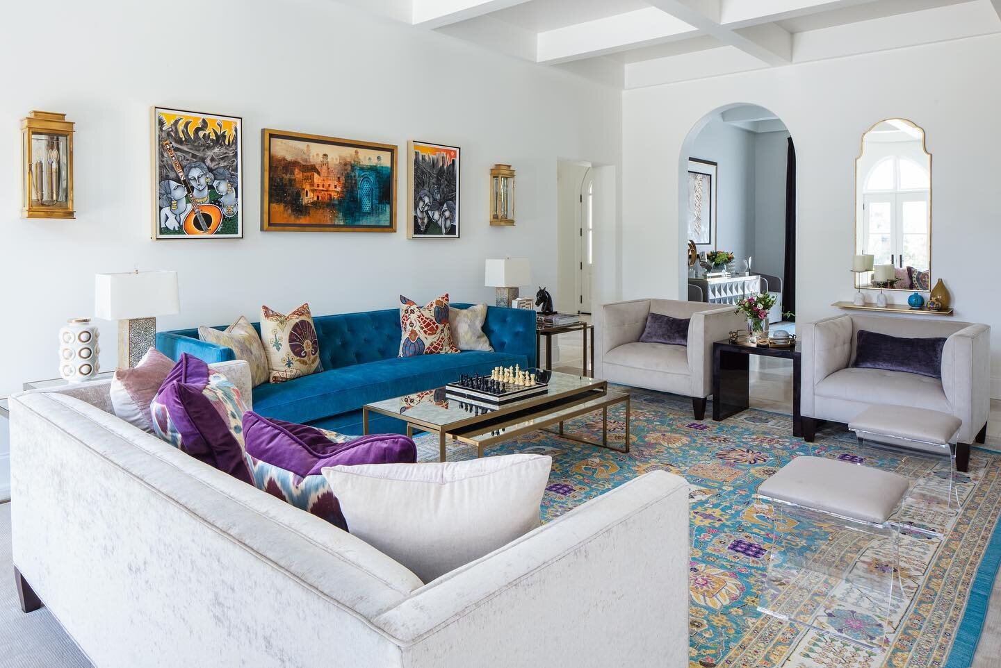
There was a time when a home could either be beautiful or kid friendly, but not both at once. That time is in the past. The home Jessie Cate, owner of M. Cate Interiors, has created for her own family proves that elevated design and durability can now go hand-in-hand.
Nestled into a wooded, lakefront lot in a quiet Eads neighborhood, the exterior has the feel of an upscale vacation property. Cate and her husband Joey purchased the home almost five years ago after having sold the Germantown house they had completely renovated. “After that one sold faster than we anticipated we kind of stumbled across this home. We knew we wanted space and we didn’t want to go through another flip. We also wanted a pool. That’s how we ended up here,” she recalls.
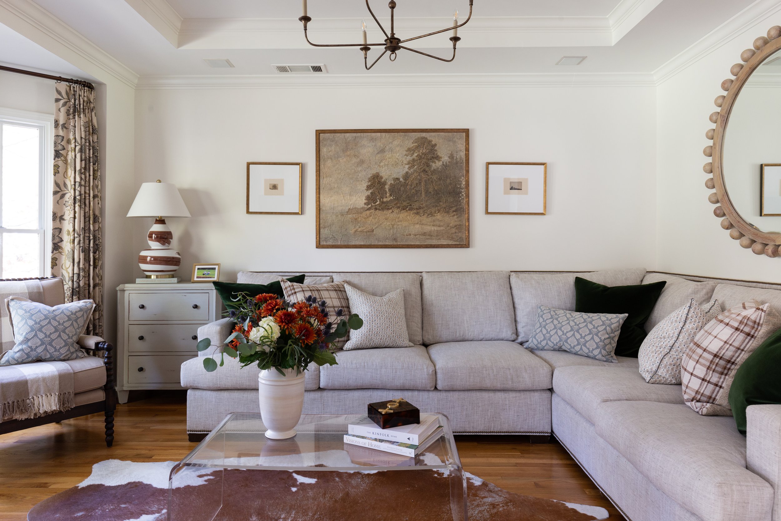
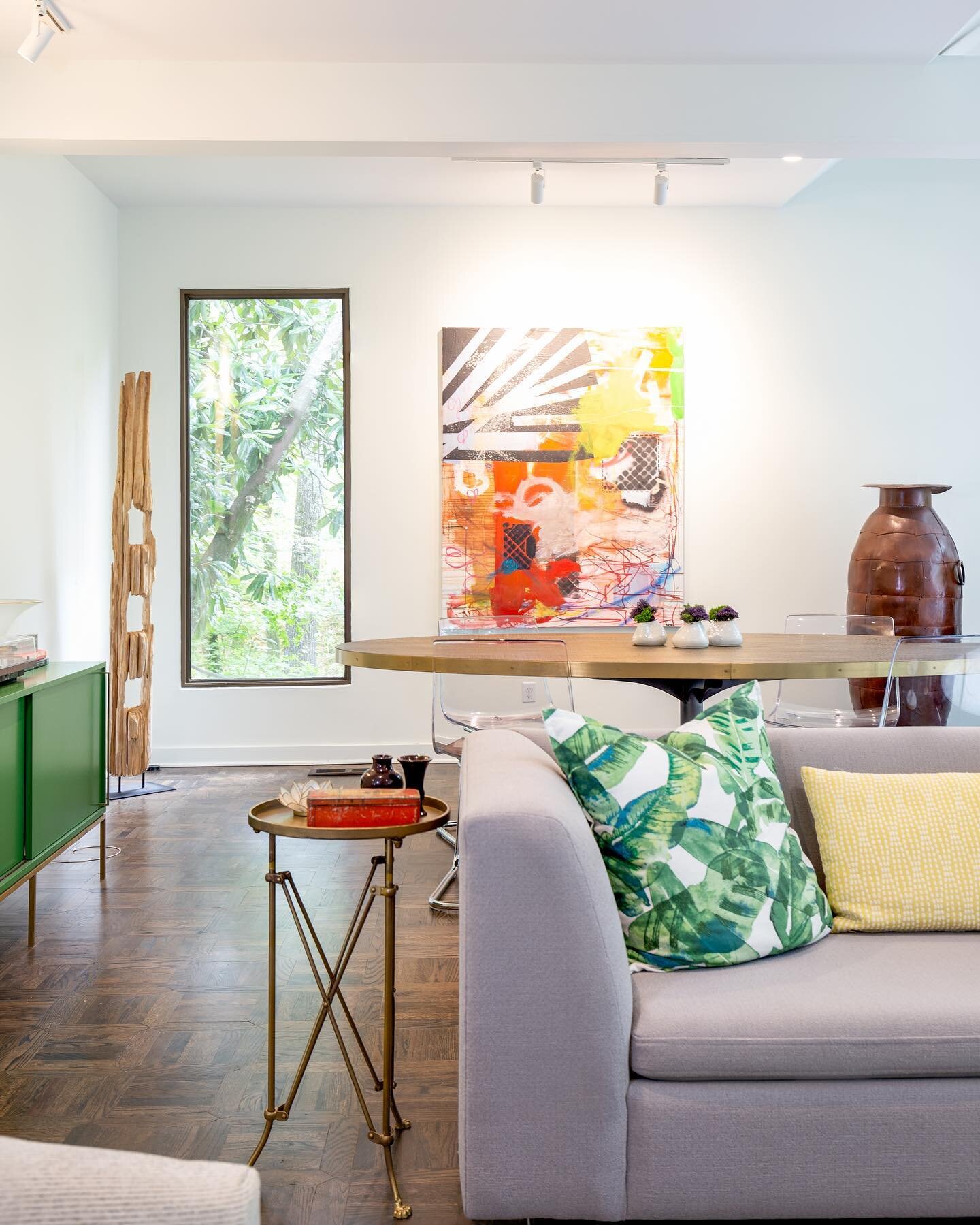
While a complete redo wasn’t called for, Cate set about putting her personal stamp on the house right away, with an emphasis on beauty and practicality in every space. The front room is filled with light thanks to a graceful bay window. The coffered ceiling draws the eye up to the simple six-arm chandelier Cate added—replacing light fixtures was a key part of her overall plan to refresh the entire house. The crisp appearance of the Wesley Hall sectional belies the facts that it has been in the room several years and that two young children jump on it regularly. Their clever mother attributes that to the piece’s sturdy construction. “With to-the-trade or higher-end furniture you get longevity that comes from good craftsmanship,” she says. Down-wrapped cushions and down pillows are a must, Cate adds. Just a quick fluff and they look good as new.
Cate selected performance fabrics for the sectional’s upholstery as well as the throw pillow covers. Today’s wear- and stain-resistant textiles come in a myriad of patterns and textures, making them a perfect choice for worry-free living. “Visually, the acrylic coffee table doesn’t impede on the space,” she points out. And as a bonus, it’s indestructible (Cate says the kids sit on it) and aesthetically pleasing. Ditto for the cowhide rug. “[The children] can spill on it. It doesn’t matter. It’s easy to clean.”
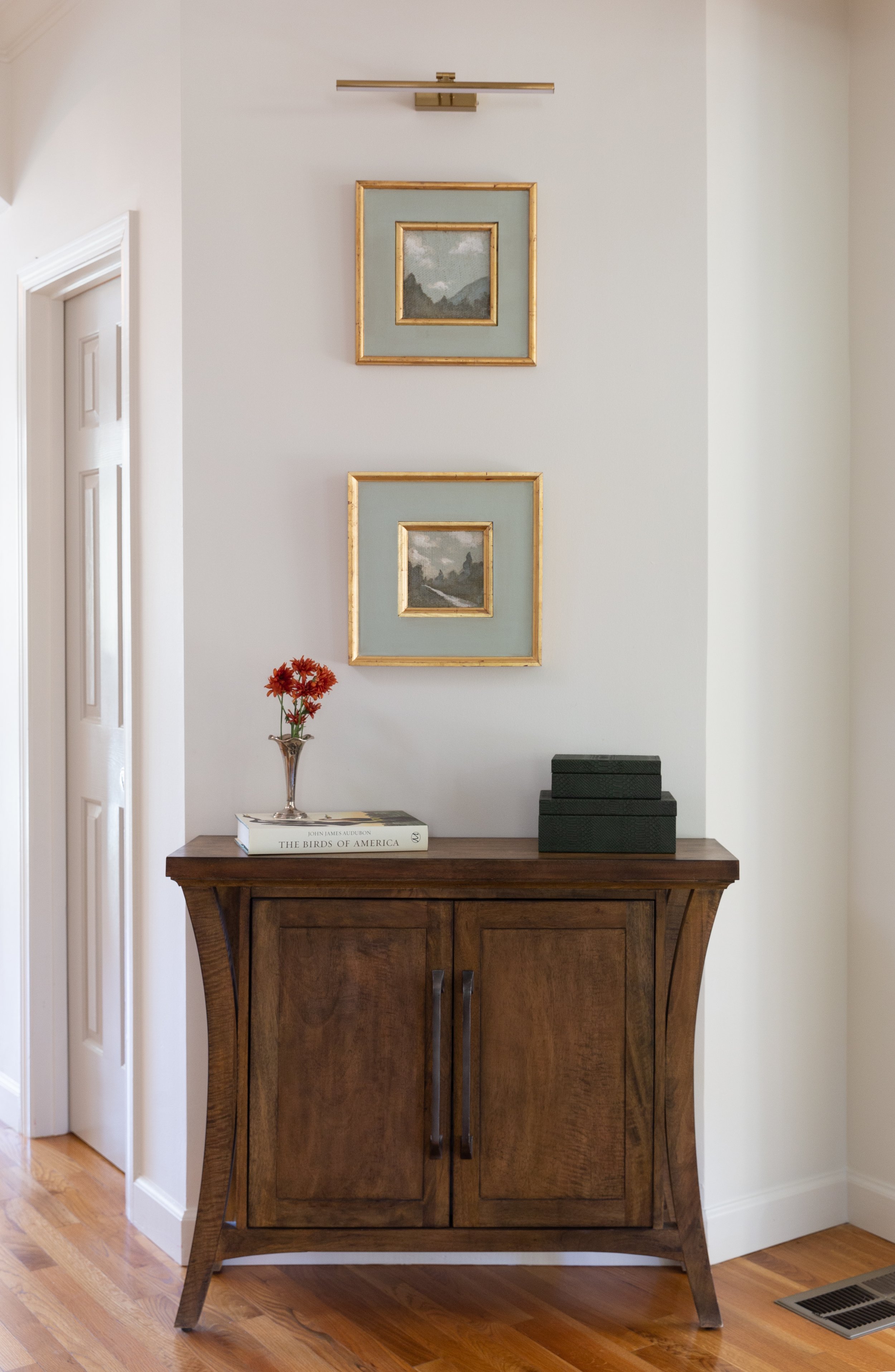
Just as she curates for her clients, Cate selected a lovely variety of works by local and regional artists for her own residence. Over the living room sofa she placed a pair of drawings by Memphian Chelsea Fly alongside a landscape with a bit of an unusual origin. “It was actually part of a wallpaper mural that I loved so much I had it custom framed,” says Cate. Two small landscapes by Atlanta artist Fred Cox make a big impact over a console in the entry area attached to the living room.
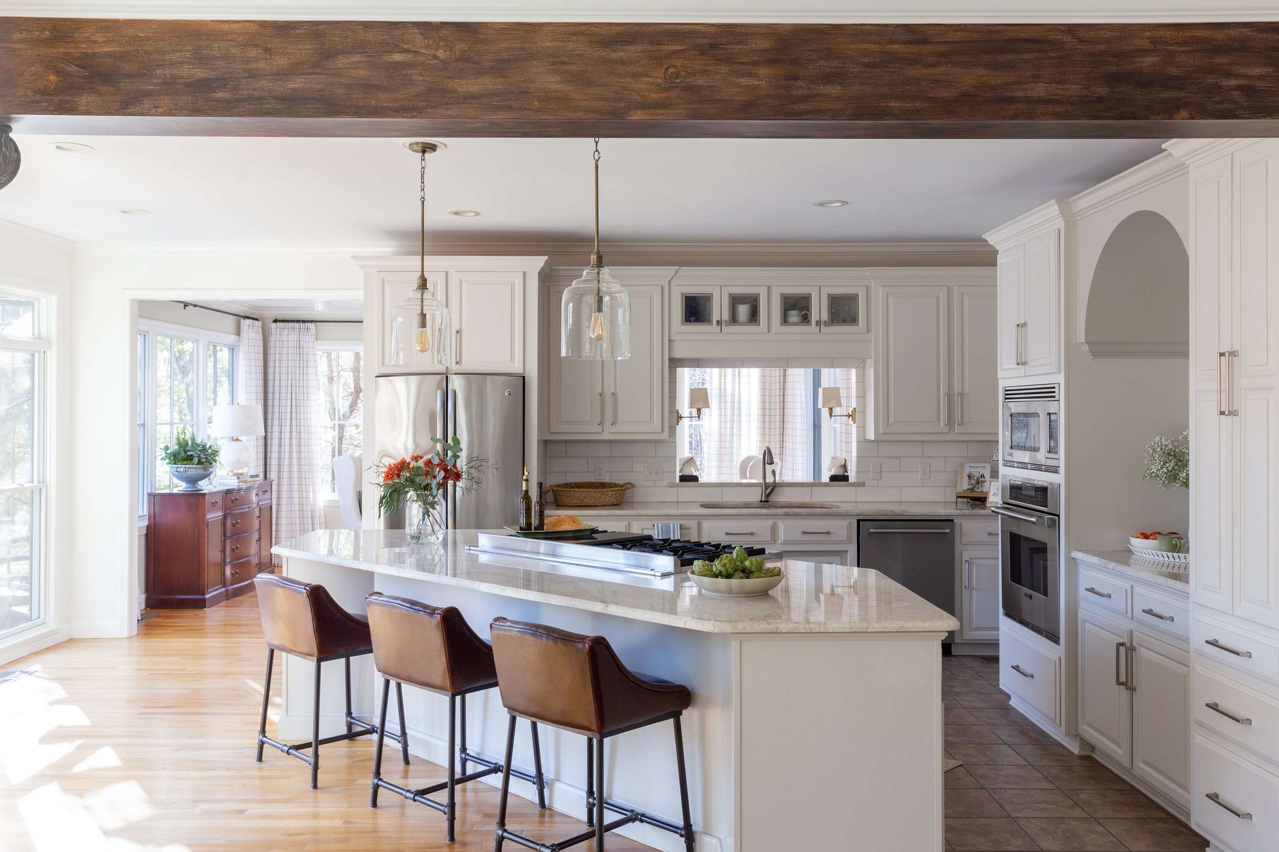
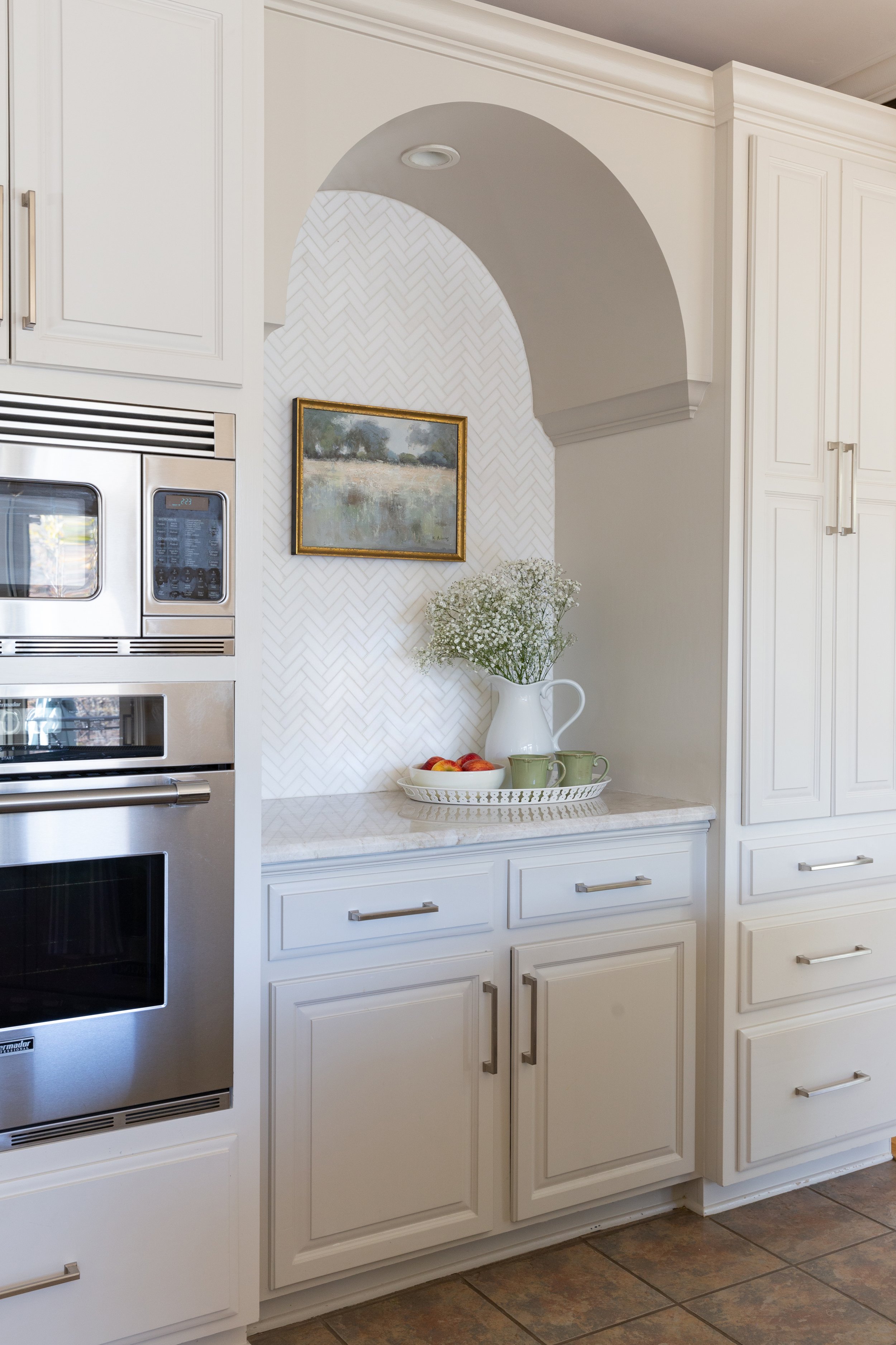
Without changing the footprint, Cate transformed the kitchen, giving it a sophisticated look that will stand the test of time. The scope of the work included painting the existing cabinets in Pale Oak by Benjamin Moore, a soft, creamy white, and updating the hardware. To add subtle depth, she chose a slightly darker paint color, Benjamin Moore Revere Pewter, to go on the kitchen island and on a pretty arch feature on one wall. In place of the original stainless steel backsplash she installed oversized marble subway tiles. The Taj Mahal quartzite Cate selected for her countertops is not only beautiful, it can stand up to anything her two little ones dish out, including Sharpie marks. Her secret to keeping its off-the-showroom-floor looks? “You have to maintain it. We seal it once a year. It’s not a big deal.”
And, of course, she changed the kitchen light fixtures. Cate recalls with a laugh that when they were looking at homes her husband told their realtor, “It doesn’t matter what the lighting looks like or the paint color. We’ll be changing all of that!” And they did. Her choices for the kitchen: clear glass jug-style pendants that add substance without obstructing the backyard view, and a pair of shaded brass sconces that up the classic style factor of the pass through above the kitchen sink.
That classic style carries into the keeping room, a space with a feel that’s a bit dressier, but still totally livable and family friendly. The fact that the upholstery is Sunbrella erases all the worry that might come along with having a light-colored sofa in a home with two- and six-year-old children. While Cate stayed with a mostly blue and green color palette in this room and throughout the home to mirror the lush landscape and the beauty of the backyard swimming pool and lake, she brings in snippets of other hues through throw pillows that she changes seasonally. The art pieces over the sofa, two vintage Audubon bird prints partnered with a pair of small landscapes, blend beautifully and speak to the home’s natural surroundings.
It’s no surprise that the light-filled dining room originally functioned as a solarium. With three full walls of large windows it is a charming spot for a casual meal or a family gathering. Privacy is possible, however, via functional full-length drapes in a cheerful window-pane check.
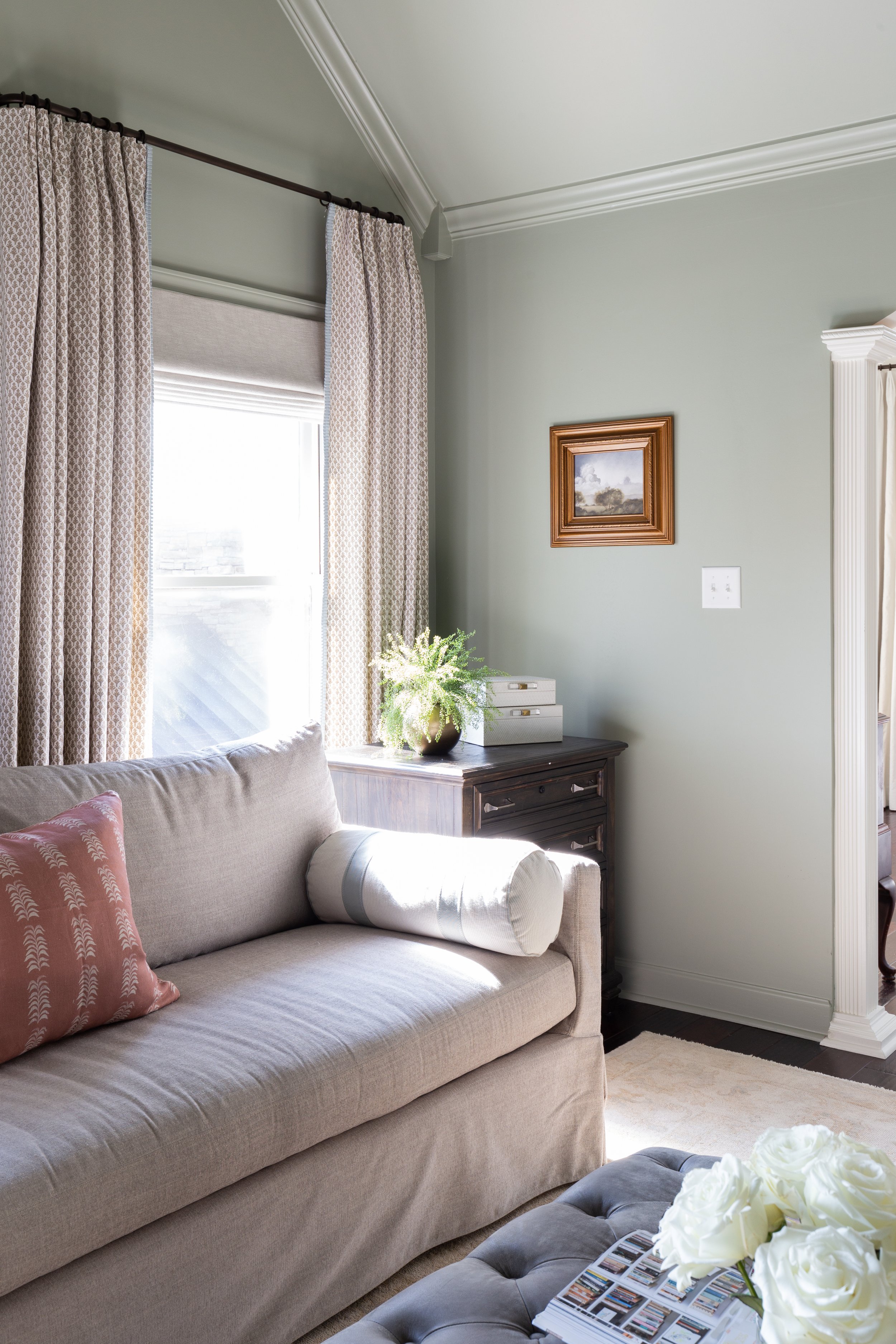
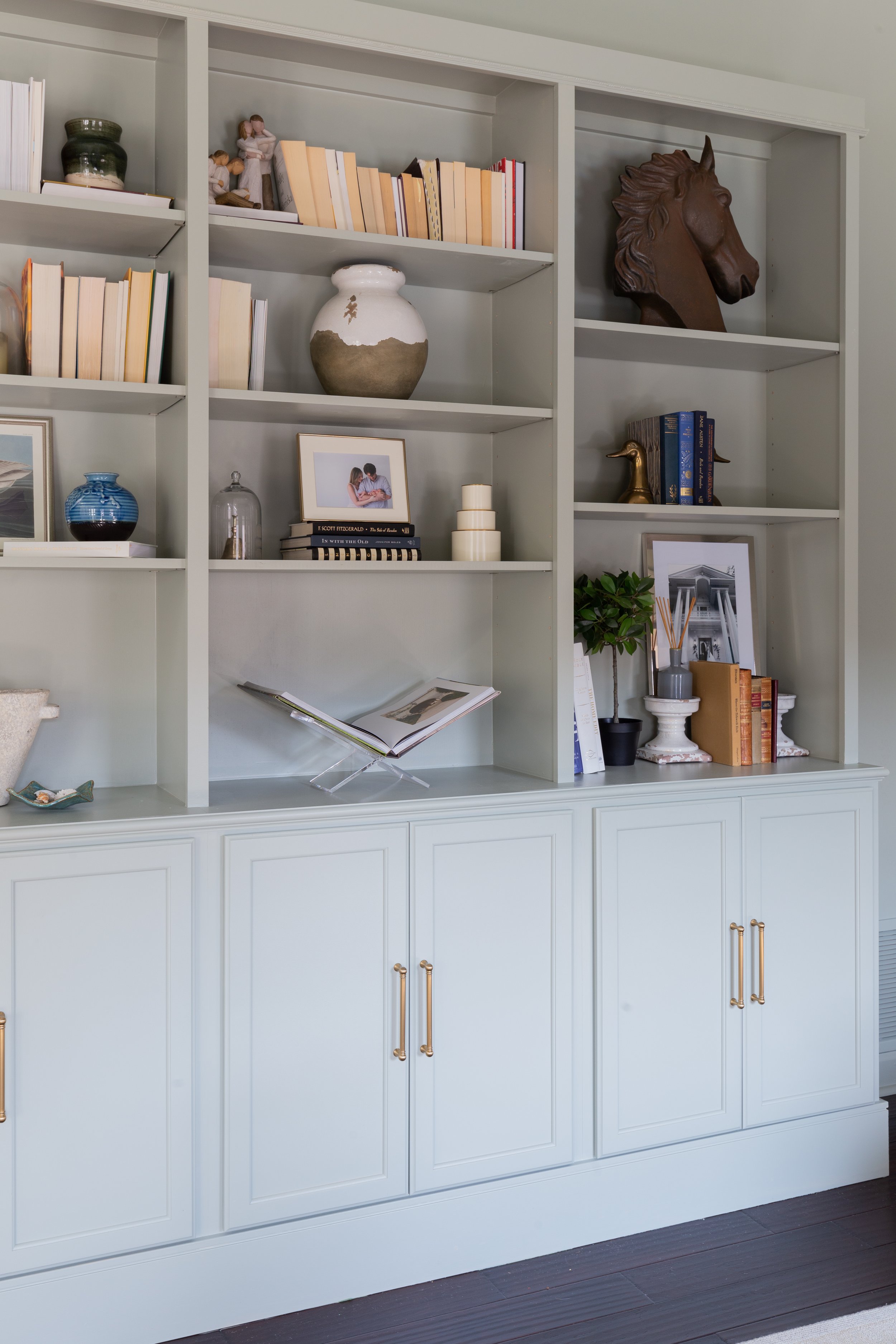
The upstairs primary suite includes a sitting room that’s an ideal locale for everything from late-night reading to family workouts. The vaulted ceiling makes the space seem ethereal and the soft green paint color, Blue Grey by Farrow and Ball, adds to the feel. Says Cate, “It is a chameleon color; it changes with the light. It can look really green and then sometimes it has blue to it. In rooms like this that have odd angles, I like to paint everything the same color. That way the odd angles are softened and then you can highlight what you want to highlight.” A built-in bookcase/cabinet unit built by Joey anchors the room and provides extra storage for the toys that always seem to end up there.
“I knew I wanted a more cozy feeling even though the room has high ceilings and great light, but then I didn't want everything to feel dark,” says Cate. “So we kept the bedroom area, the sleeping area, lighter, because that has a really tall vaulted ceiling with upper windows.” A whitewashed wood and gold chandelier hangs from the apex of the ceiling like a crown over the room, accenting the simple elegance of its furnishings. Chic details like embellished drapes and pleated fabric lampshades evidence the homeowner’s professional touch.
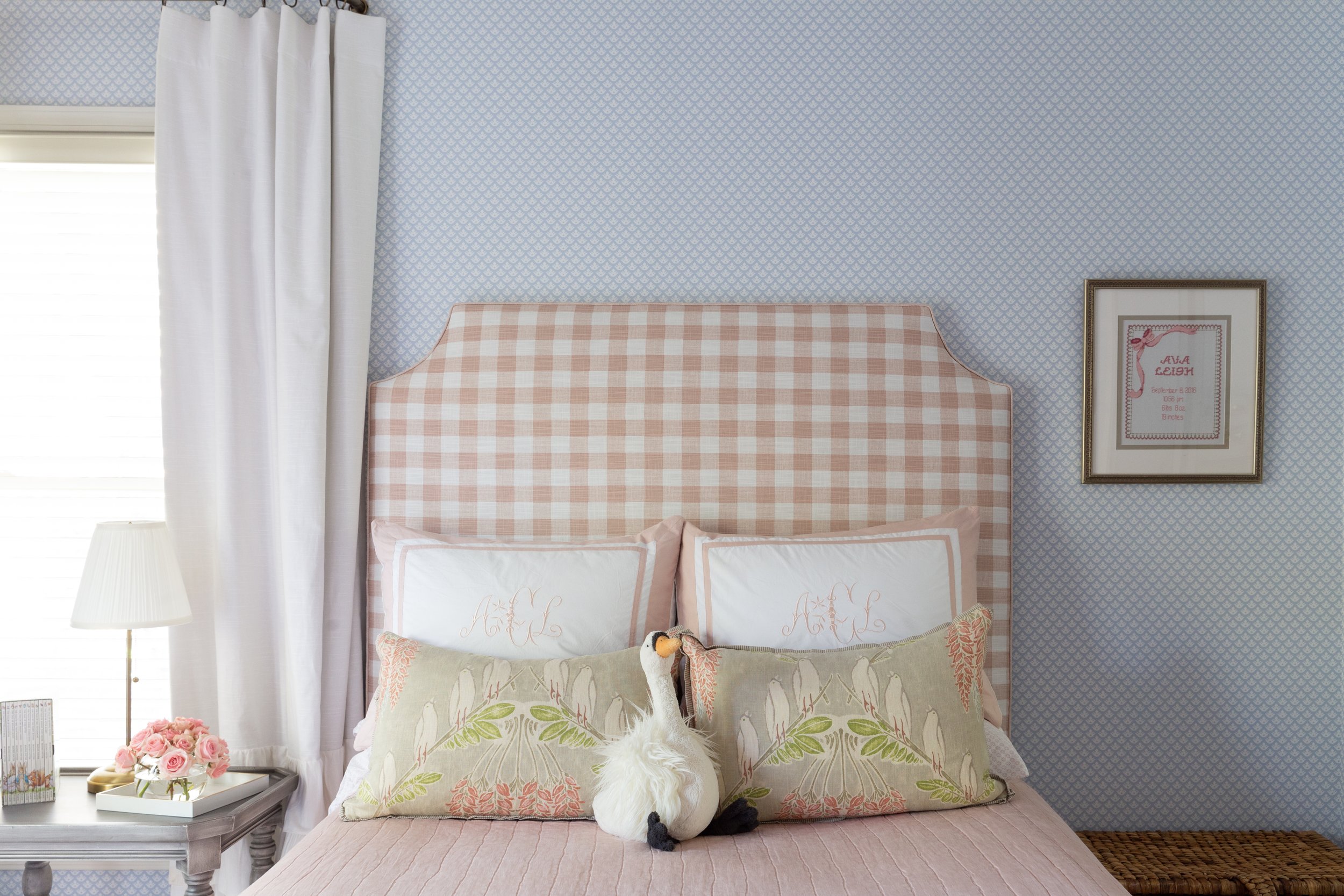
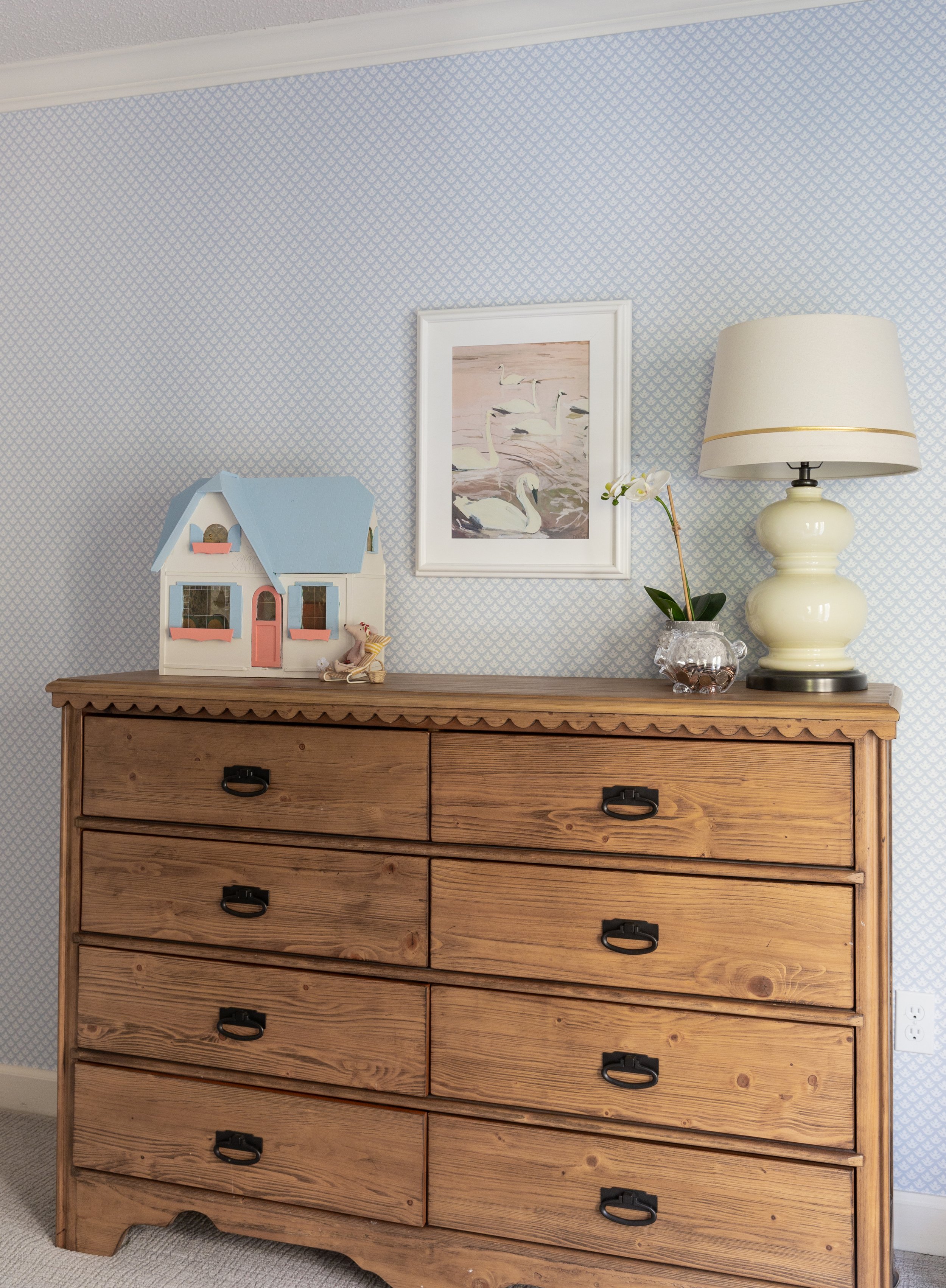
Cate says she loved designing her daughter’s room, allowing her to be involved in a few decisions and then surprising her with the finished product. The result is a sweet, but not babyish, space that will grow with its occupant through the years. The soft pink bedding, timeless blue wallpaper and white ruffled curtains create a cozy spot for sleep and play.
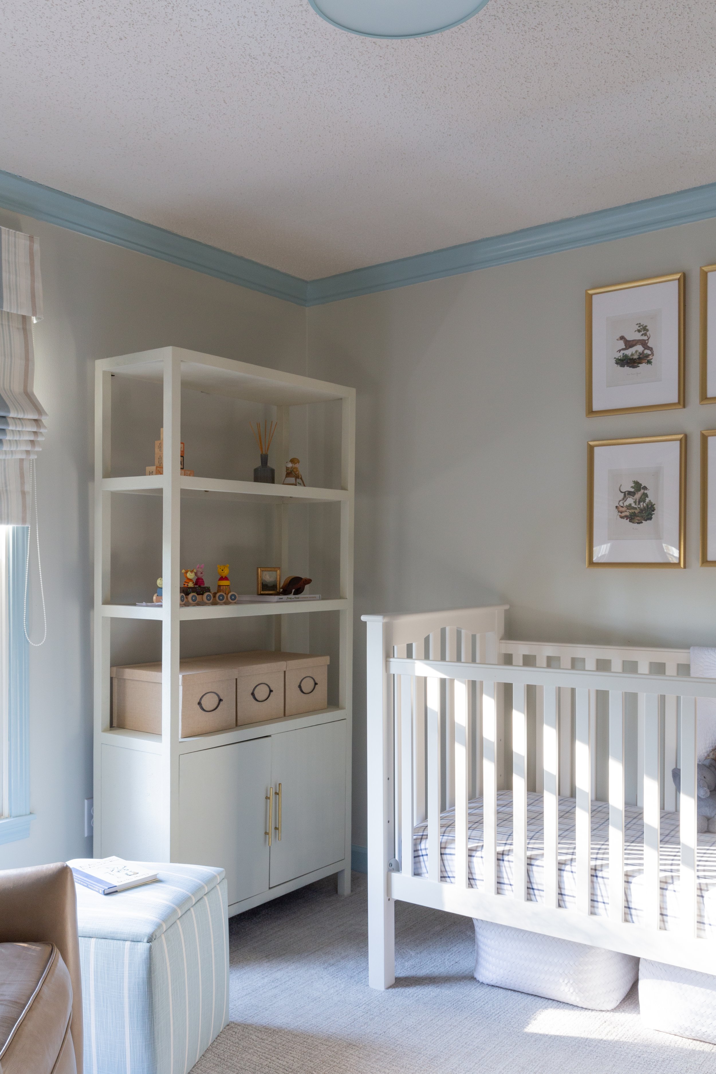
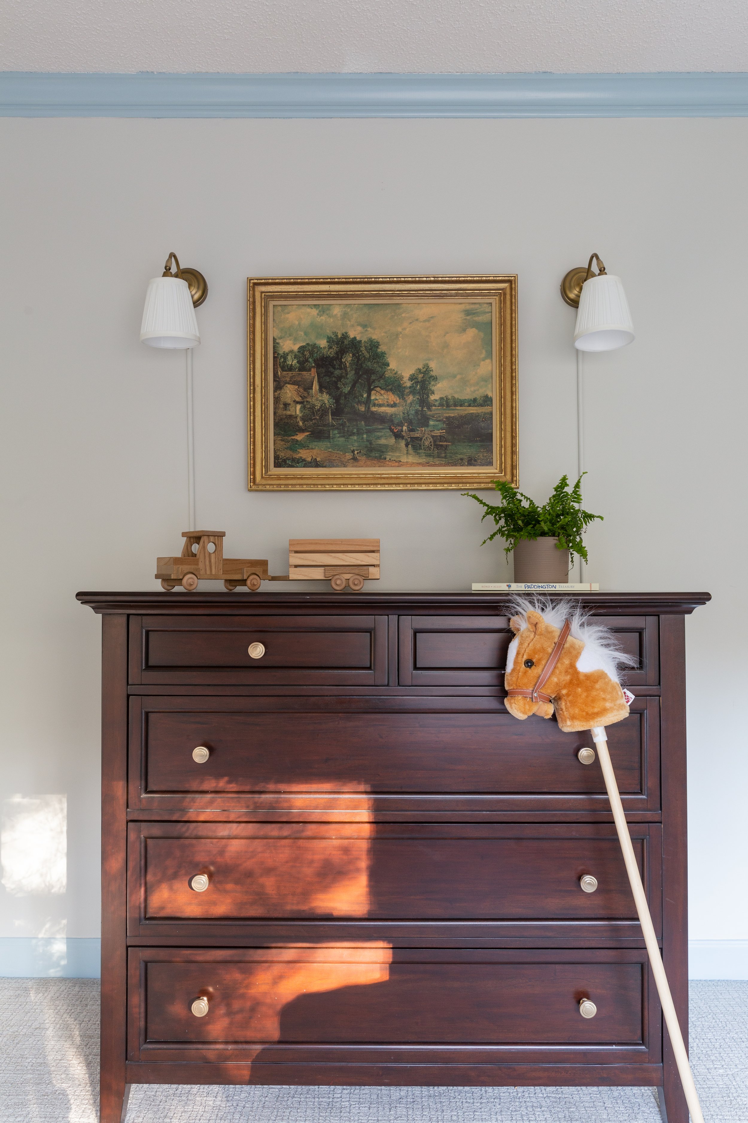
Her son’s nursery “came together in a really sweet way,” says Cate. Neutral walls and blue trim set the stage and allow the white crib and faux shagreen shelving unit to pop. Always thinking of safety, Cate framed four vintage dog prints sourced from Etsy in simple frames with no glass, then double secured them to the wall above the crib with 3M Command strips. She also opted for a Roman shade to cover the window rather than long curtain panels. His handsome dresser was once part of his parents’ bedroom suite, now updated with new drawer knobs, and the antique print that hangs above it came from his great grandmother’s home.
The entire project speaks to Cate’s talent and to her dedication to the concept that it is possible to combine custom design and practicality. “I’ve had people tell me, ‘I’d love to work with you, but I have to wait for my children to get older,’” she says. “I just want people to know that you can have pretty things and kids at the same time.”

