British Empire in East Memphis
/Story by Terri Glazer | Design by M. Lavender Interiors | Photos by Annabella Charles
“I think we’re home now. It’s ours, 100 percent.” Designer Mark Lavender recently made that declaration about the East Memphis home he and his partner bought in August of last year. Getting to that point required making plenty of changes to the home, keeping some elements as they were, adding new pieces and reusing treasured favorites, all while dealing with the client Lavender jokingly refers to as his “most difficult”—himself.
Lavender spent the previous 23 years in Chicago building his reputation as a designer, first in the commercial realm and more recently at the helm of his own firm. Spurred by the brutal midwest weather in the winter of 2021, Lavender and his partner Guy pulled up stakes and headed south, eager to get back to their roots and a friendlier climate. They settled in Memphis and set about making a home here and establishing a new, locally based design firm.
In just over a year, Lavender has transformed his residence into a handsome and personal showplace, inspired by his extensive global travels and anchored in a style that’s at once English cottage and masculine. “British Empire is our overall theme, our guiding principle throughout the house,” he explains.
Lavender credits his training as an architect for his expert sense of scale. “Everything is properly proportioned for the house,” he explains. Properly proportioned, however, does not mean everything is the same size. Lavender deftly blends stand-out pieces with equally interesting background elements. He says, “There are supporting players and there are rock stars, but everything has a part to play.”
From showstoppers on down, Lavender’s home is filled with an eclectic mix of pieces that hold personal meaning. He strives to incorporate that principle into his professional work as well as in his own space. “We feel that every home has and should have a story, and we really want to create a design that tells our clients’ stories in their homes,” he says. “One of the first things we do when we take on a new project is come in and inventory all the clients' things. We want to know which pieces are special and then we work to incorporate them into the new design for the home.”
photo by mark lavender
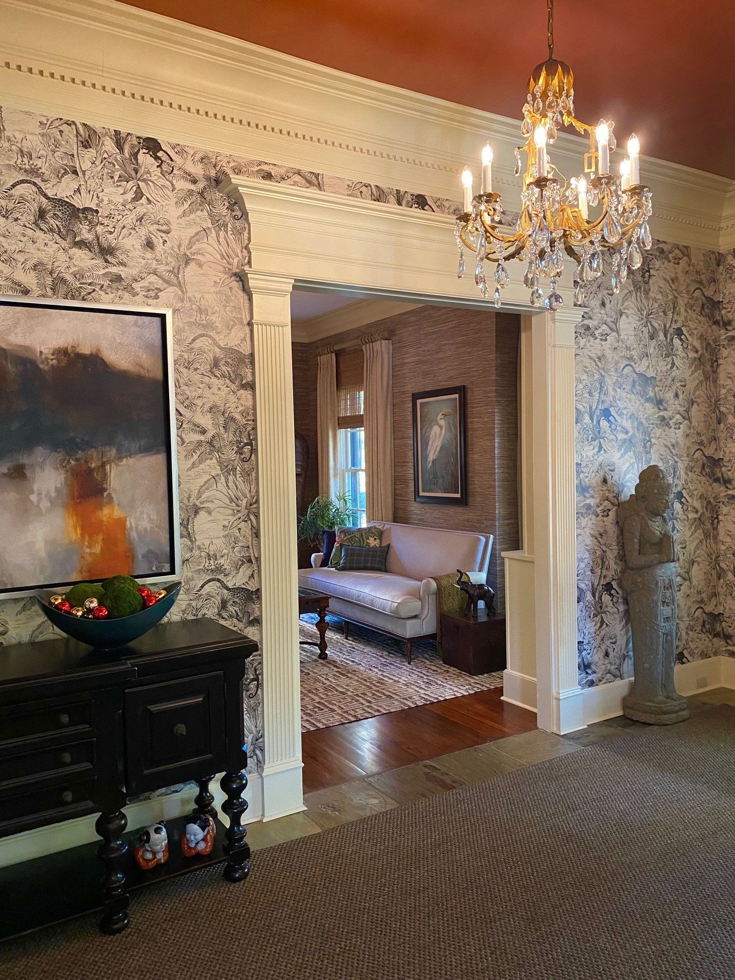
Stepping in the front door, the designer’s love for the Asian aesthetic is evident. Lavender created the foyer’s look around a jungle-themed Manuel Canovas paper he found on the wall of the sample room at Chicago’s Cowtan & Tout designer showroom. A statue of an Indonesian goddess welcomes guests while locally sourced pieces—a chandelier from Graham’s Lighting along with a settee found at a Poplar Avenue antique store and freshly recovered in a Clarence House fabric—help complete the look.
The striking burnt orange hue on the ceiling foreshadows a theme. “I love orange! I wanted to paint the ceiling in this space for drama and thought, ‘Why not a burnt orange.’ We have orange wallpaper in the back of the house and there are shades of orange on various pieces of furniture and artwork throughout the house,” says Lavender.
The foyer extends deep into the main floor of the home, creating a strong central spine. Lavender established a waypoint in the back of the space using a framed panel of mural wallpaper behind a table and a graceful chair from Latin American furniture maker Alfonso Marina. “It pulls you in once you come in the front door,” says Lavender. “The idea was to create this point of interest towards the internal area of the home to lead you into the rest of the house.”
Photo by mark lavender
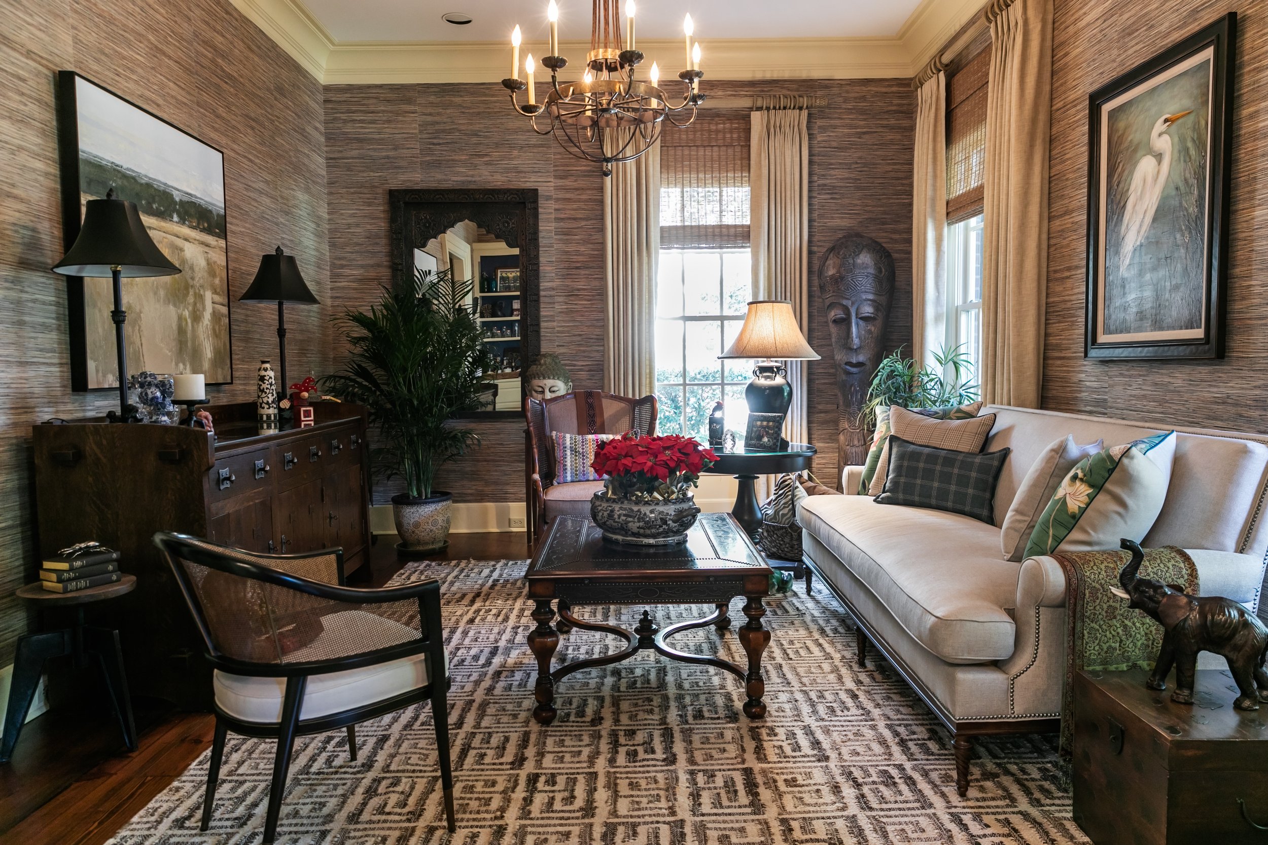
The home’s two front rooms, a formal sitting room and a slightly more casual space with a fireplace, have distinct personalities. The sitting room was one of the first projects Lavender tackled upon moving into the home, replacing marbleized wallpaper with a classic Philip Jeffries grasscloth. Faux alligator wallpaper in rich blue lines the backs of bookshelves filled with mementoes of travels in Thailand, Morocco and Argentina. “We wanted this room to have an exotic feel; like a trophy room from an old English home,” he says. A Lillian August for Hickory White sofa, scaled perfectly for the intimate space, provides a comfortable spot to sit and read or enjoy a bourbon from the bar set up on the built-in cabinets, a nod to the homeowner’s Kentucky heritage.
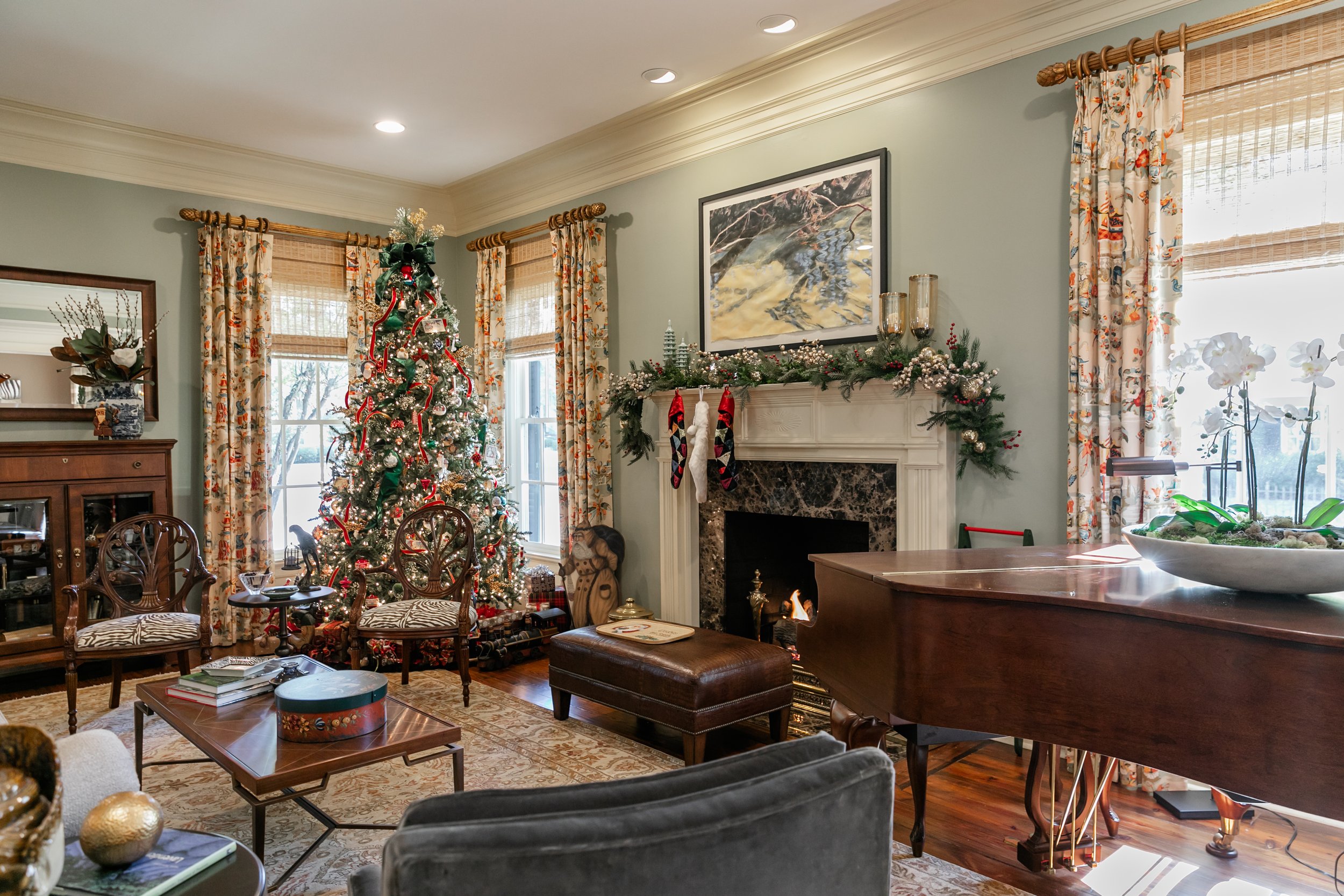
“When we looked at this house, the first thing I noticed was the living room curtain fabric. It’s one of my favorite classic patterns,” Lavender says, recalling that he took it as a sign that this would soon be his home. “It’s called Xian Linen from fabric house Brunschwig & Fils. It’s a fabric that we use a lot in our practice and it was already here!” No matter where they’ve lived, the couple’s living room has always been a variation of seafoam green, and this house is no exception. Benjamin Moore Nature Lover covers the walls and sets the backdrop for a melange of long-held favorite pieces and new acquisitions including a Lee Jofa sofa, a Tomlinson lounge chair and a Ralph Lauren bench in front of the fireplace. Although larger in scale than the sitting room, the space has a cozy vibe that makes it the perfect setting for a beautiful Christmas tree and a crackling fire. Lavender achieved his goal of creating an inviting room—comfortable, yet with a bit of a formal feel.
“I love a good chocolate brown paint color. This color, Deer Trail by Benjamin Moore, was already in the dining room, so we stayed with it,” says Lavender, noting another tidbit of serendipity. The custom dining table the couple had made a few years ago has a rustic, “been-here-forever” ambiance that blends seamlessly with a Stickley buffet they have owned for years and a Chinoiserie secretary that they found at a recent estate sale. The room’s artwork is an eclectic mix that includes a 150-year-old portrait, a bright depiction of zebras and a still-life original painted by Guy’s mother. The grouping proves that meaningful pieces collected over a lifetime will always bring interest and a personal touch to a home.
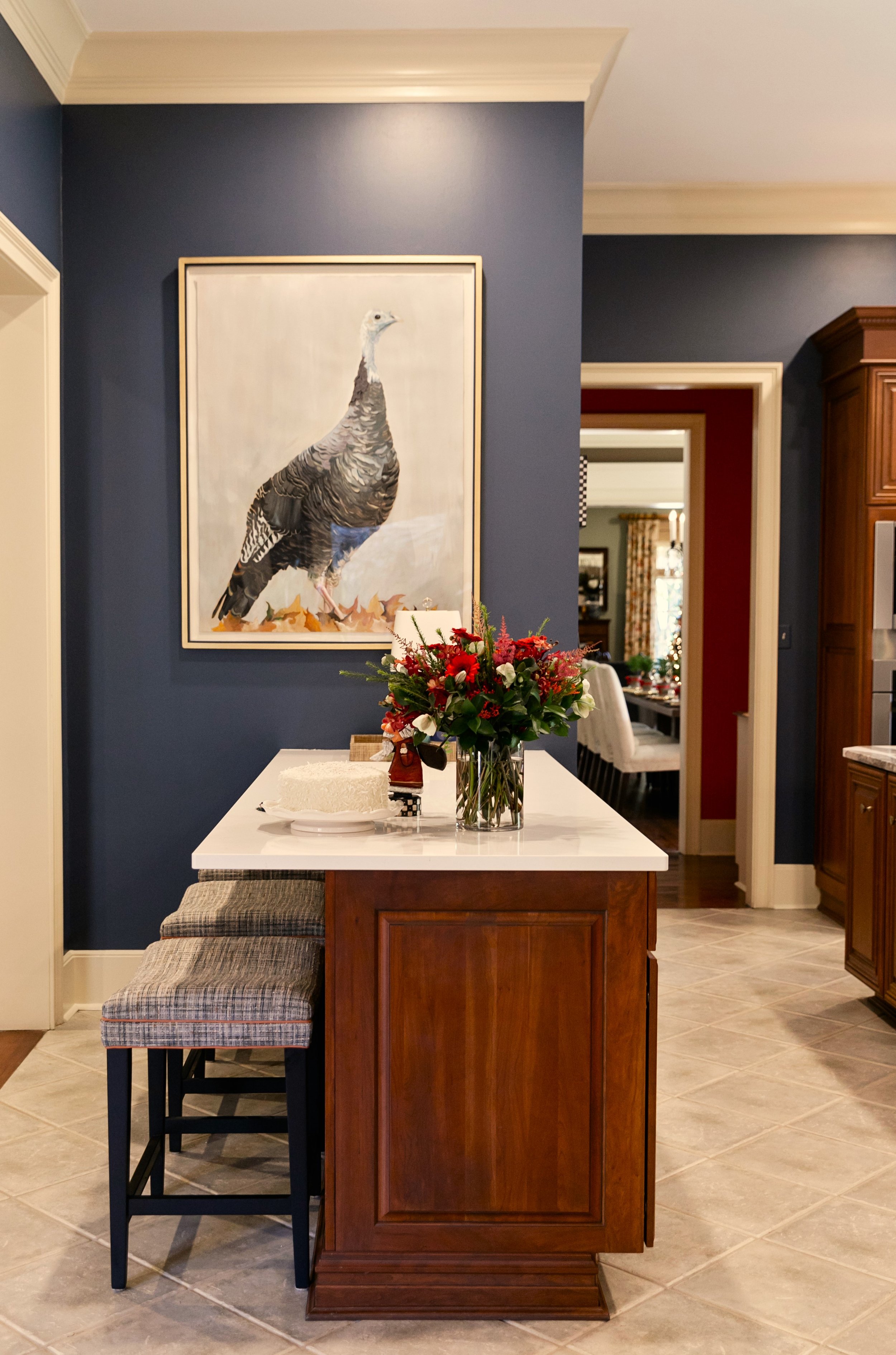
Rather than a complete remodel, a less drastic renovation achieved the English look Lavender sought for the kitchen. After some debate, the homeowners opted not to paint the cabinets, allowing the rich wood to set the tone. The new green tile backsplash and Rohl bridge faucet bring to mind Mrs. Patmore’s Downton Abbey kitchen. Deep blue walls and white countertops feel crisp and buttoned-up, while Noelle Holler’s original turkey hen painting sourced from Goetze Art and Design adds an element of whimsy. Says Lavender, “There’s something kind of regal about her that just says, ‘You were saying?’”
Adjacent to the kitchen, the family room has a grand scale that comes as much from its tall ceilings as the square footage. Playing off its proportions, weighty design elements are right at home. From the substantial Ralph Lauren chandelier to the massive live-edge coffee table to the sturdy antique fireplace accessories, large-scale pieces make a major impact. Even the television had to be big. A Samsung Frame TV that displays art on the screen when not in use was the ideal choice. Handsome British khaki on the Verellen sofa creates a clean backdrop for an assortment of interesting throw pillows. Lavender first assembled the collection for the 2022 Christmas vignette he created for Serena & Lily’s suburban Chicago showroom. A pair of Cisco Home swivel arm chairs decked out in clean-cut plaid upholstery from Romo Fabrics completes the look.
After more than a year transforming the house Lavender felt he was meant to have into his own, it’s no wonder he smiles when he says he thinks he’s 100 percent “at home” now. As the old saying goes, and as he will surely agree, there’s no place like home for the holidays.

