Classic Combination
/Kitchen Design by Kitchens Unlimited | Story by Terri Glazer | Photos by Annabella Charles
The look of this recently renovated Collierville kitchen suggests a collection of found furniture pieces, but the effort it took to achieve the final result was anything but hodgepodge. Careful planning with a talented professional produced the flawless blend of beauty and practicality. Since the homeowners bought the house in 2002, little had been done to update the original 1996 kitchen. Its Formica countertops, Mexican tile floors and pickled cabinets were past their prime and its layout was cramped.
After a false start with an unreliable contractor in September of 2019, the couple connected with Jacquelyn Cummins, a kitchen and bath designer at Kitchens Unlimited. They were frustrated, but ready to trust Cummins to make their dream kitchen a reality. They were also prepared. “I had been collecting pictures of kitchens that I loved, and I took them with me when I met with Jacquelyn for the first time,” recalls the homeowner. “One of the pictures had cabinets that had more of a furniture-style look, with the covered refrigerator. It looked so pretty.”
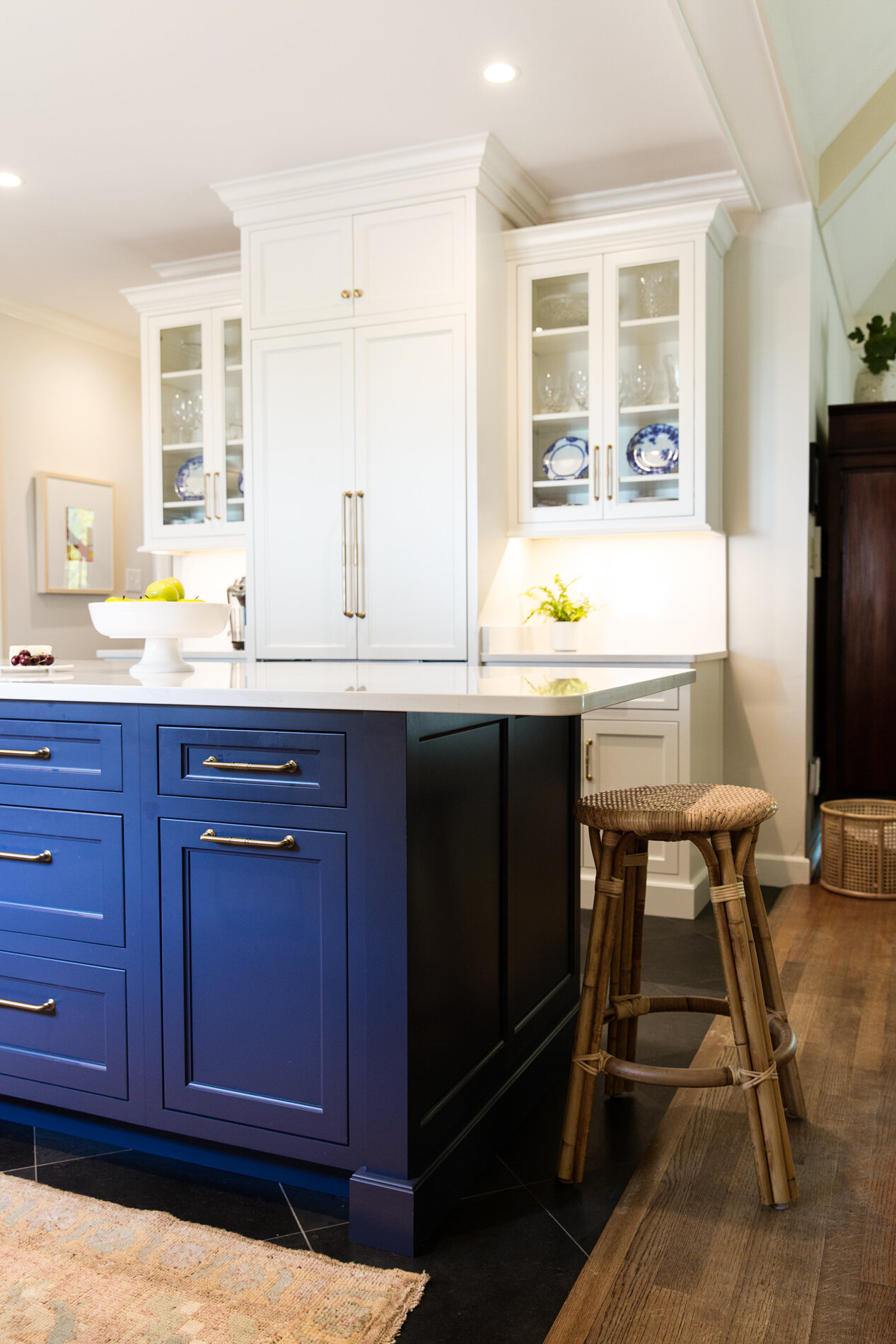
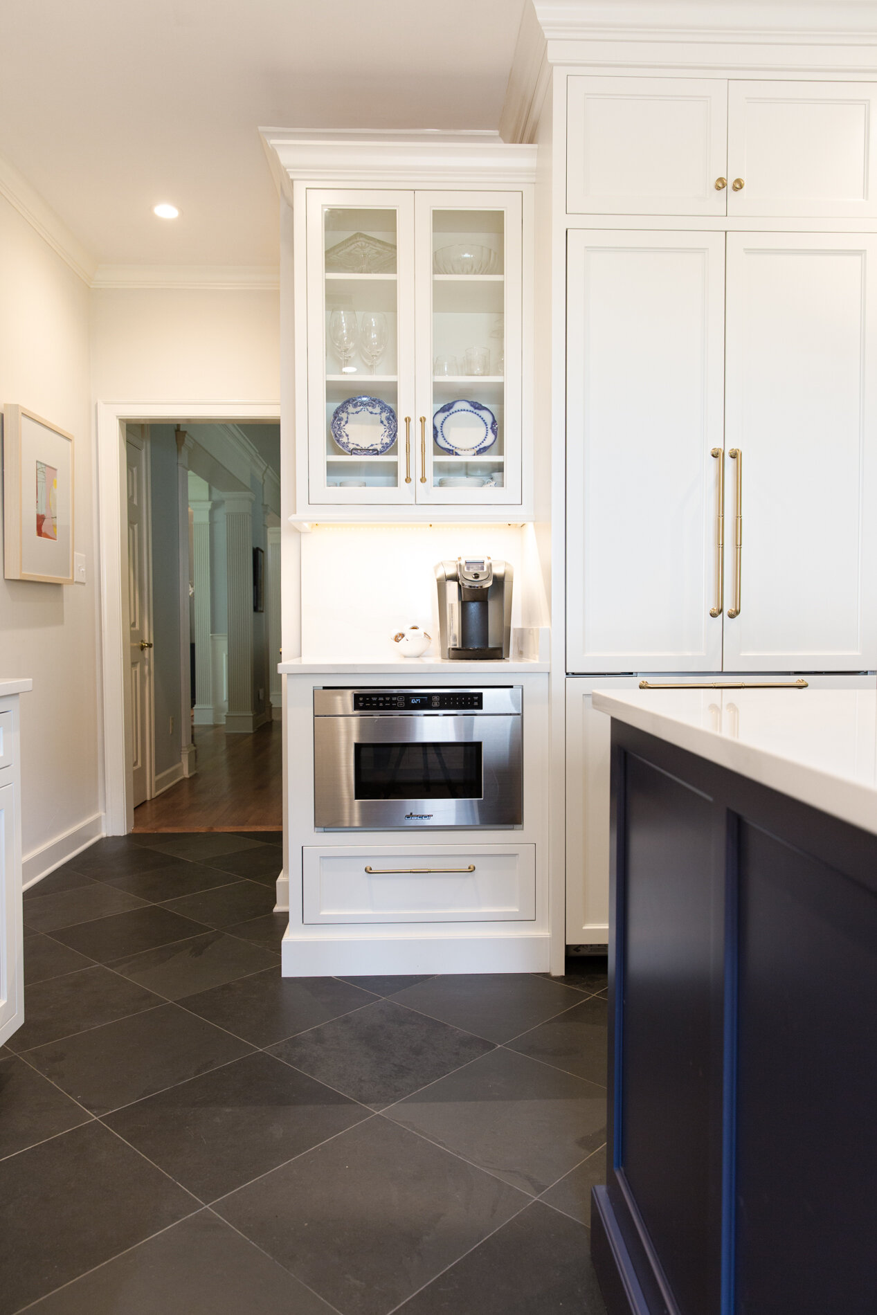
The homeowners knew they wanted to remove a peninsula that cut the kitchen off from the adjacent keeping room. Cummins concurred, and went a step further to improve the flow. “There was only one way through the [old] kitchen. Originally, their refrigerator was all the way at the end and it stuck out. There were cabinets on the other wall, so the passthrough was really crowded,” says Cummins. “The goal was to open the space up and allow for people to move around more easily. Centering the refrigerator on the wall helped get rid of the bottleneck and allowed me to play with the cabinetry and make it look like a piece of furniture the client could use to display her china. Also, with that wall being the first thing that you see when you come in the back friends entrance, it was important to make it really pretty and not just have a big refrigerator there.”
In fact, Cummins’ entire design focused on highlighting aesthetic details and drawing the eye away from the more utilitarian elements necessary in any kitchen. The same wall that holds the refrigerator also has an undercounter drawer microwave. The designer says she purposely placed it below counter level, out of the line of sight, so it appears integrated and fades from focus, allowing the more graceful features to shine. Glass-front cabinets on either side of the new cabinet-depth covered refrigerator display the homeowner’s collection of flow blue china.
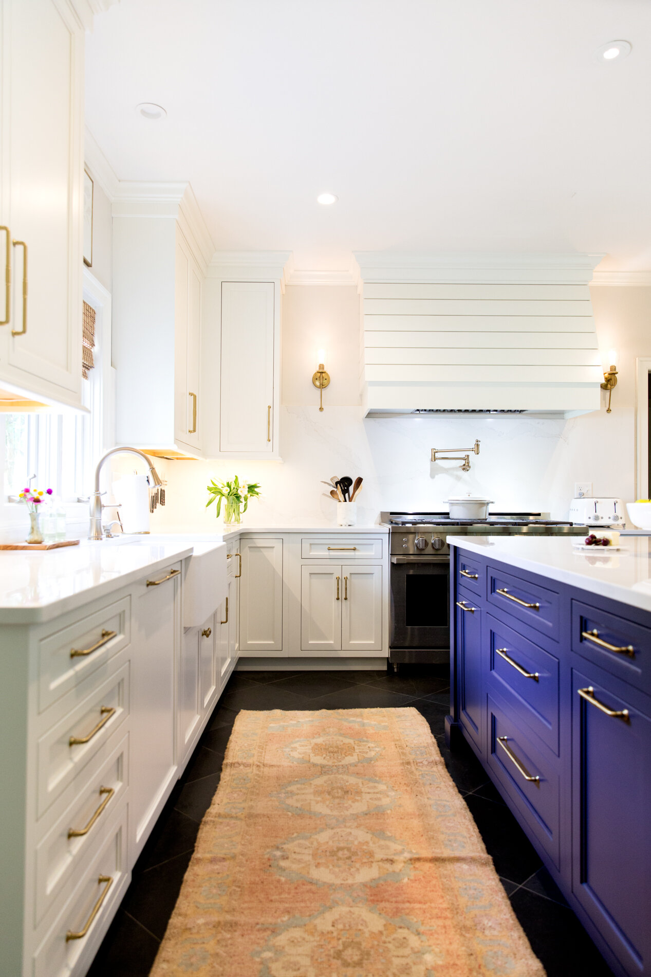
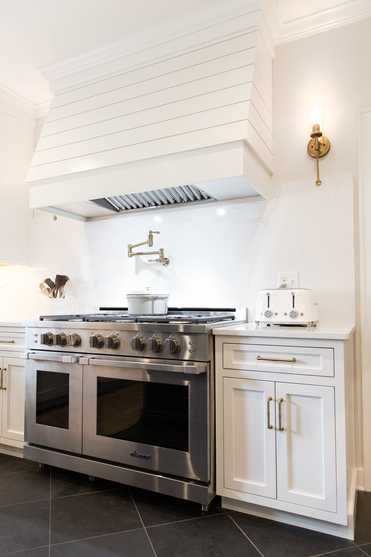
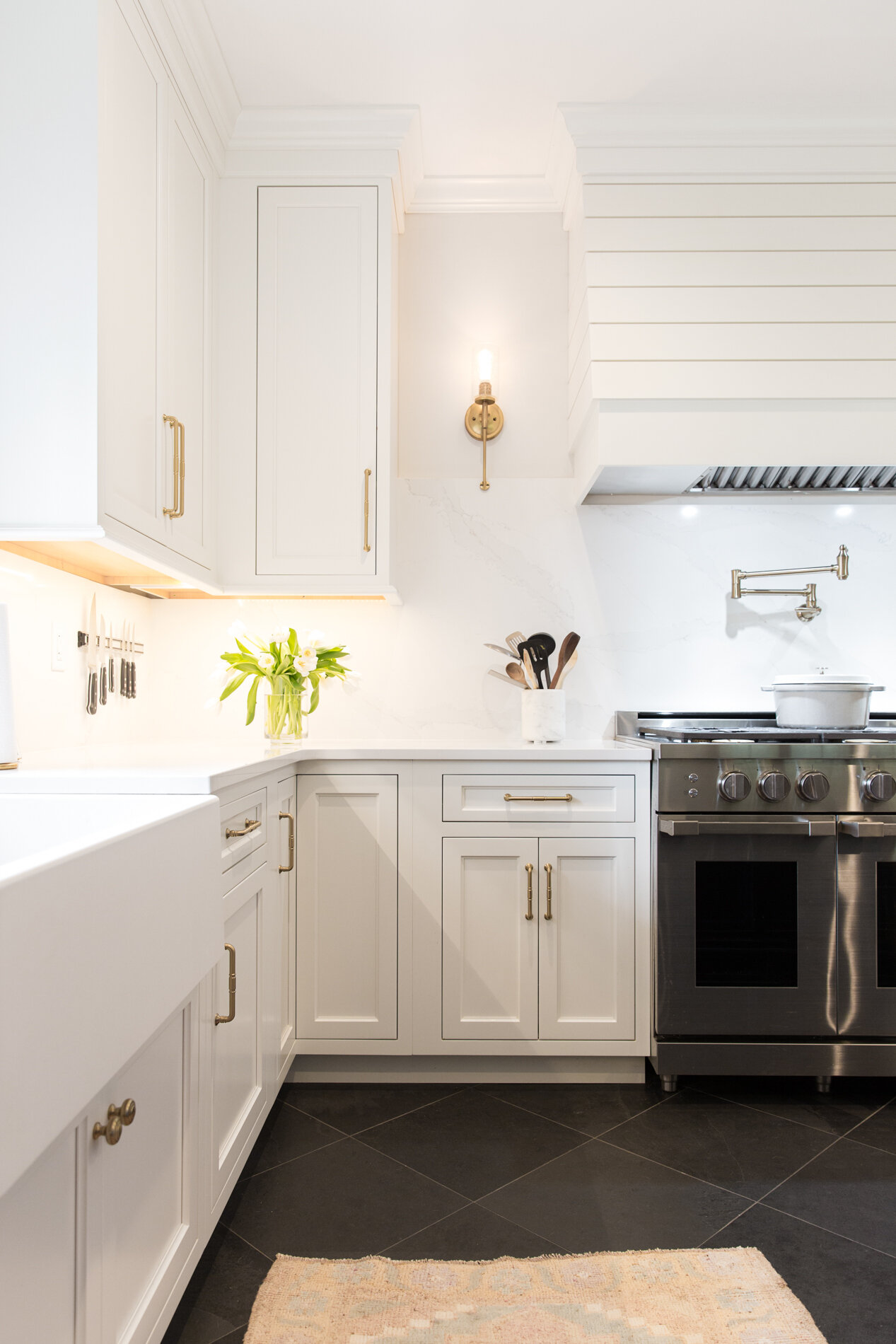
Cummins created a secondary focal point with the placement of a custom hood on the range wall. Styled in shiplap wood and painted the same linen white as the surrounding cabinetry, the hood’s design is fresh and timeless. “We didn’t do any of the ornate details that you often see in big, grand hoods like that, but it needed to be big enough to capture all the heat and smoke from the 48-inch gas range below it. It has a really nice presence on that wall,” she says.
The only ornamental lighting in the kitchen, Hinkley sconces on either side of the hood add a touch of warmth through their brass finish and the soft light they emit. According to Cummins, the decision to forgo lighting over the island goes against the trend in a lot of new homes, but she omitted the feature for a good reason. “I felt like it might take away from the back wall,” she explains. “This was a different approach to adding decorative lighting, and I think it turned out really nicely.”
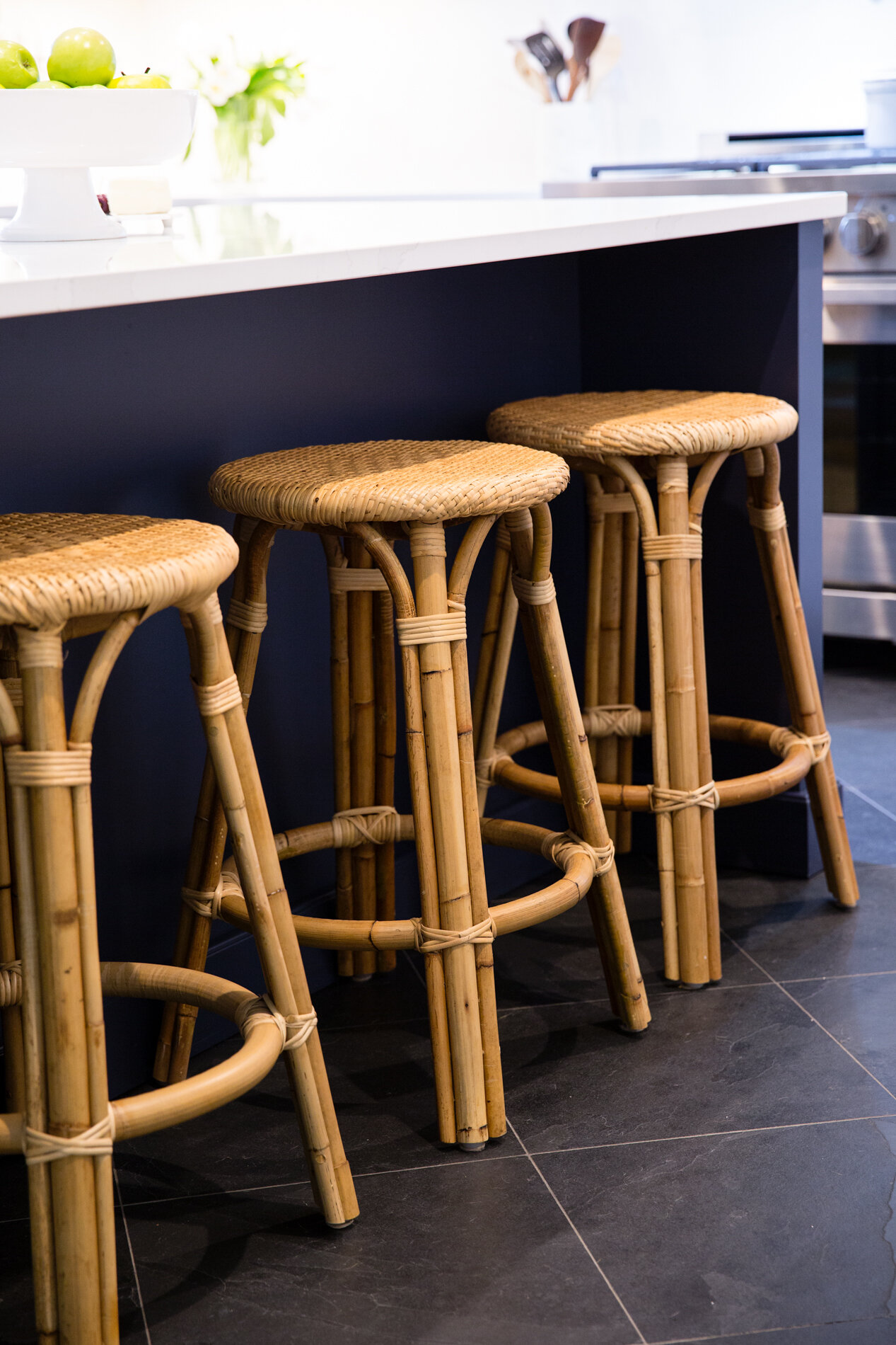
The homeowner wanted color somewhere in her new kitchen, and Cummins knew just which shade to pick and where to put it. She chose indigo blue, playing off the classic color combination in her client’s china collection. “The island was the perfect place to introduce that color,” she says, adding that the contrasting shade gives the impression that the island is “a furniture piece that we happened to find.”
Color also comes in the dark hues of the natural slate floors. Oversized 18-inch square tiles set on the diagonal anchor Cummins’s clean and classic overall design aesthetic.
Silestone quartz in Eternal Calacatta Gold tops the base cabinets and the island and also serves as the full-height backsplash behind the range. The homeowner couldn’t be happier with the material, sourced from American Granite and Marble in Oakland, TN. She loves that it’s durable and easy to clean, perfect for a kitchen which gets constant use. “My husband is the cook in the family, and I am the cleaner,” she laughs.
Having enjoyed cooking since his college days, the homeowner couldn’t be happier with his new gourmet kitchen, filled with Dacor Heritage collection appliances. One of his favorite features, and one that came as a happy surprise he discovered after the refrigerator was installed, is that its freezer makes two different types of ice—large cubes perfect for use in cocktails as well as standard sized crescent cubes.
The family chef’s other favorite feature is the new pot filler faucet installed over the range. His wife recalls that he wasn’t sure he needed the “splurge item” during the planning stage, but she convinced him that they should include it in their kitchen redo. “I knew he would love it and I’m so glad he got it,” she says.
Cummins often urges clients not to pass on optional additions when remodeling. “My advice would be to think about how many times you have thought to yourself that it would be really nice to have something like a pot filler. Since you’re taking the time to improve your kitchen and make it more functional for your needs, choosing something that you think might be an extra really will make a huge difference to you once the project is complete.”
Now that her dream renovation has received its finishing touches, the homeowner refers to the project, started in early February, as the quarantine kitchen. “We were home so we were here every step of the way and we really got to see it come together. I took pictures of every phase. It’s everything we wanted and we love it!”
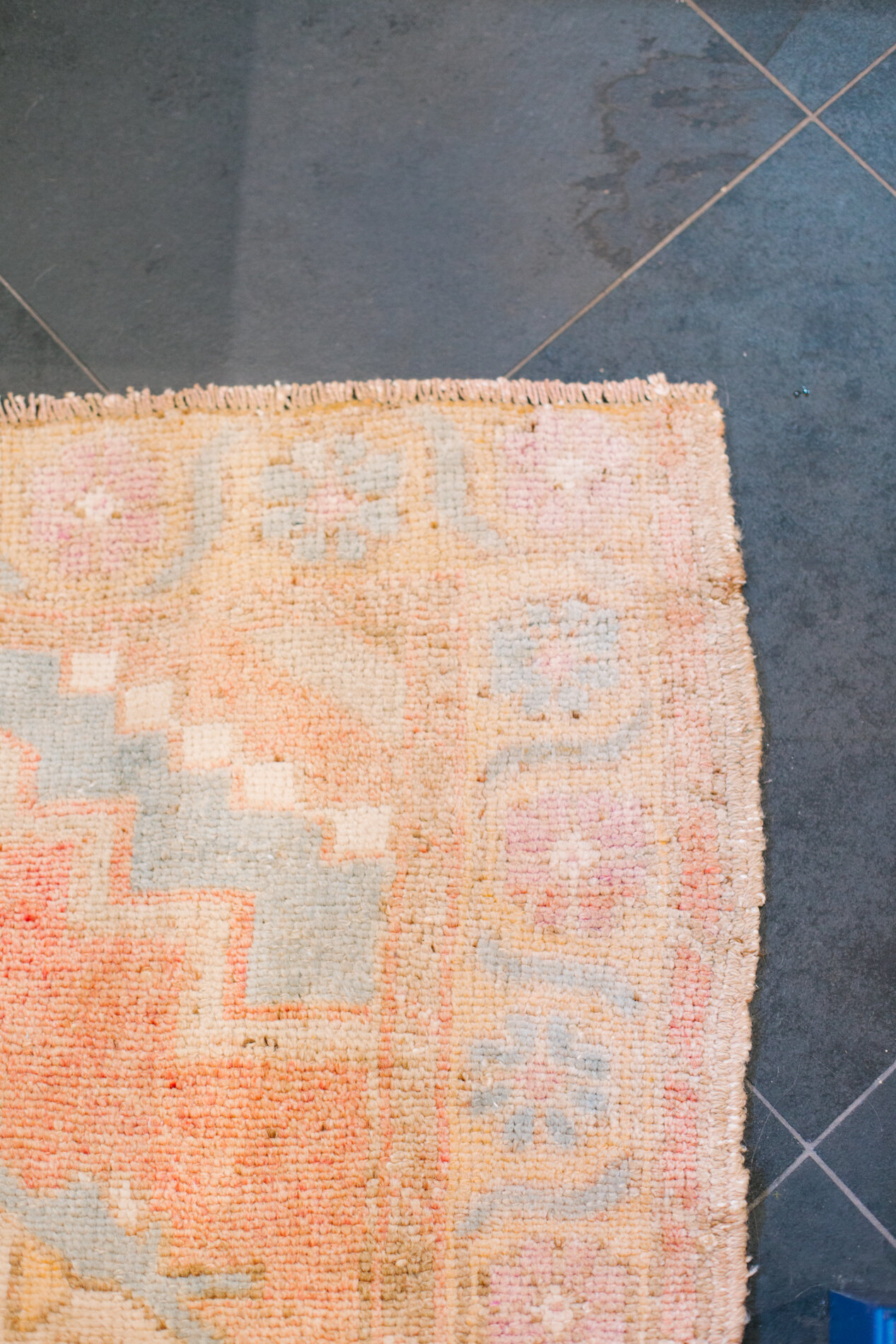
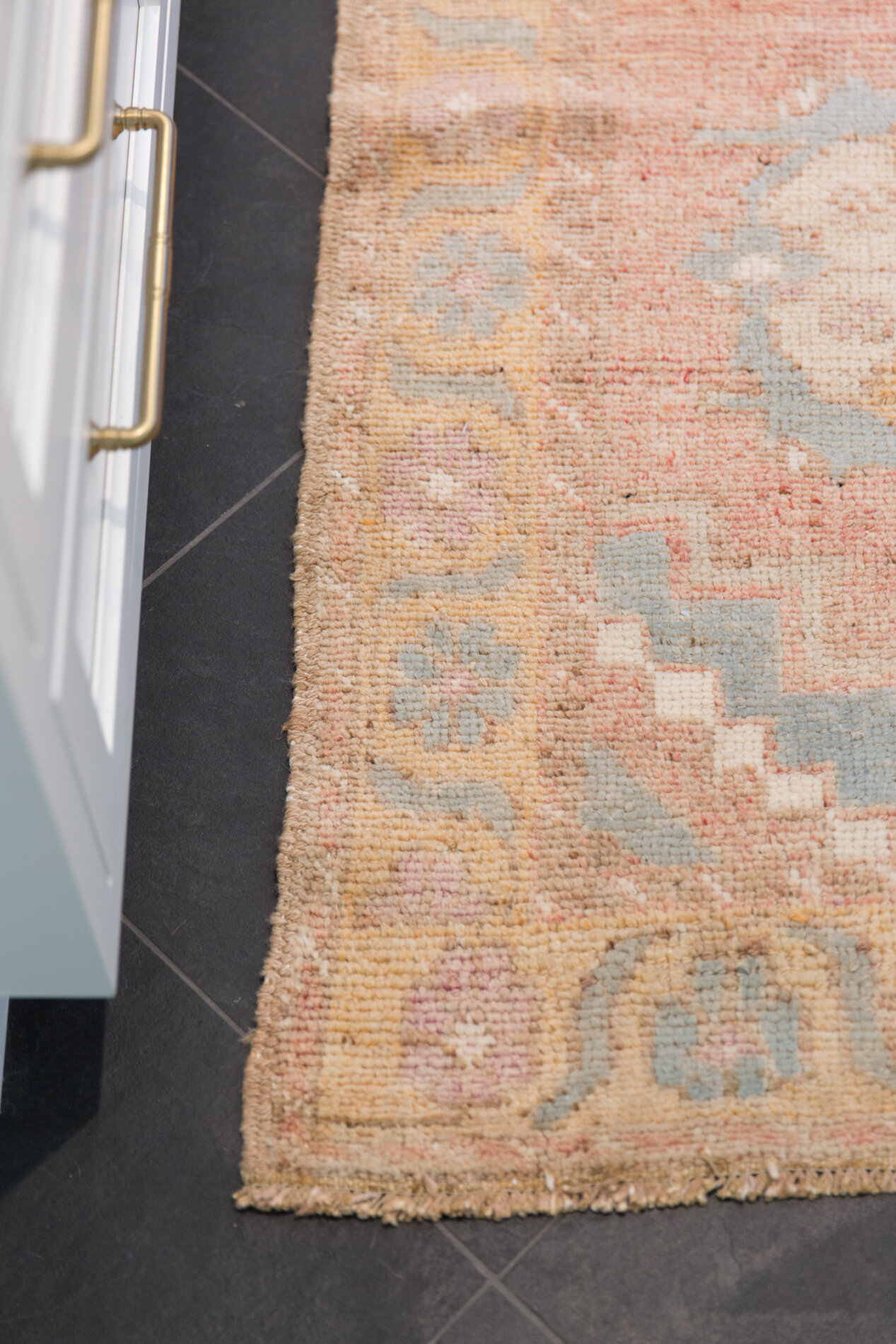
A hand-woven Turkish runner from local dealer Elle Woven adds texture and color to the kitchen floor. Elle owner Julie Reardon personally selects each textile in the collection with beauty and individuality in mind.
Sources:
Cabinets – Mouser Cabinetry, inset construction, perimeter in “Linen” paint and island in “Indigo” paint
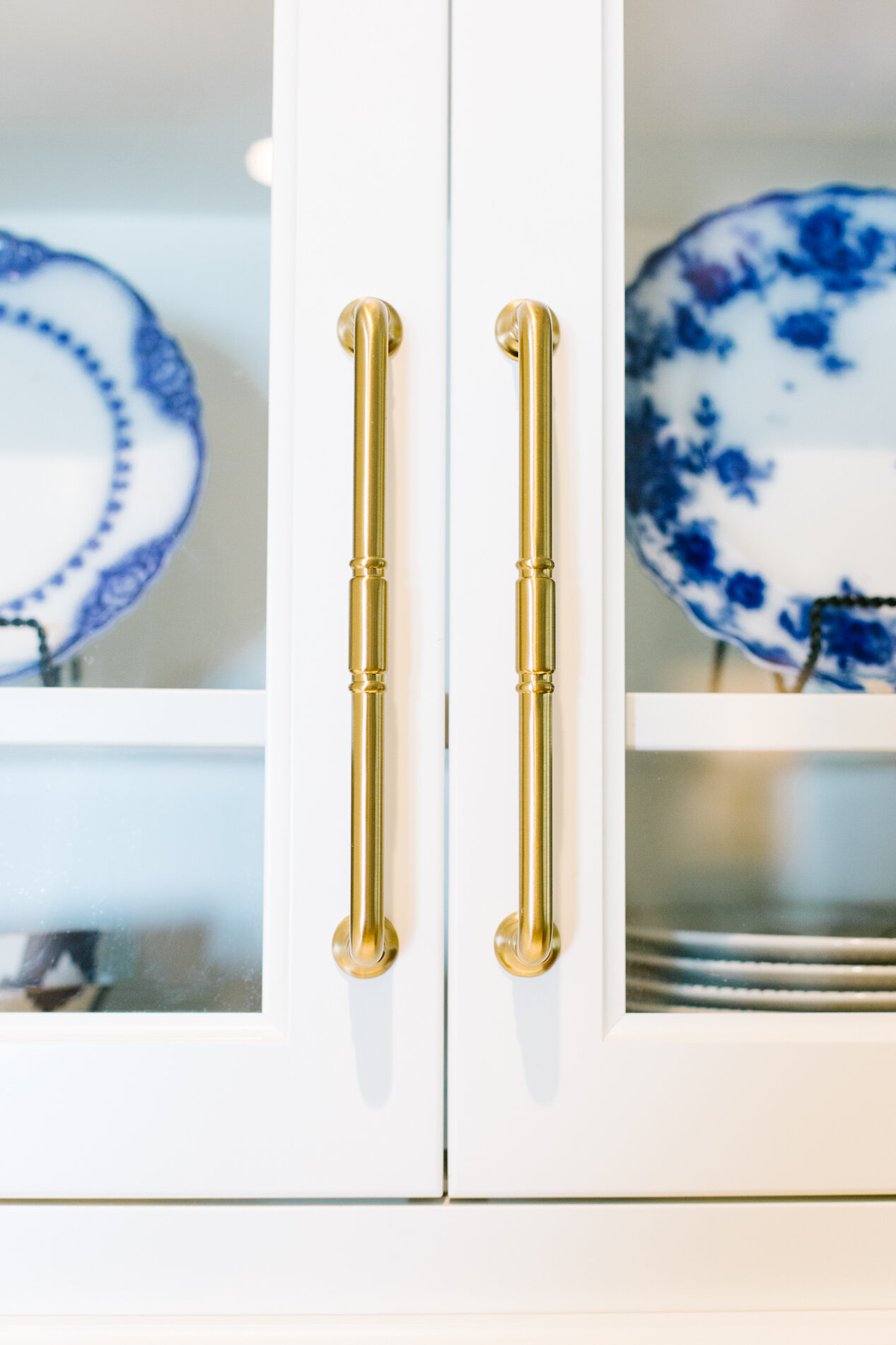
Hardware – Top Knobs Grace collection in Honey Bronze finish
Countertops & splash – Silestone “Eternal Calacatta Gold” quartz
Plumbing Fixtures – Delta Cassidy collection in Champagne Bronze
Floor – 16” x 16” Black Blizzard Slate
Appliances – Dacor Heritage collection

