Creating a Classic
/Interior Design by M.Steffens Interiors | Story by Terri Glazer | Photography by Ross Group Creative
When a couple sold their house in Germantown in 2016 they weren’t planning to build a new house. In fact, the wish list for their new home was quite the opposite. The two neighborhoods they had their eyes on were both long established.
They purchased a house in Belle Meade, an East Memphis area known for its stately older homes on tree-lined streets, with the intention of remodeling it. As plans progressed, however, they realized a redo wouldn’t be feasible. The only option that made sense was to start from scratch.
Disappointed but undeterred, the pair brought in experts to create a new-construction home with an older, classic ambiance. “I wanted it to feel like a home that belonged here and had been a part of the neighborhood for some time. In terms of interior features and finishes, we wanted pieces that would be timeless and lasting,” the homeowner recalls. Missy Steffens, owner of M. Steffens Interiors, was on board from the beginning, along with architect Doug Enoch. “That was a great thing to be able to have the architect and designer sit down with us at the same table when we were walking through how we wanted the house to feel.”
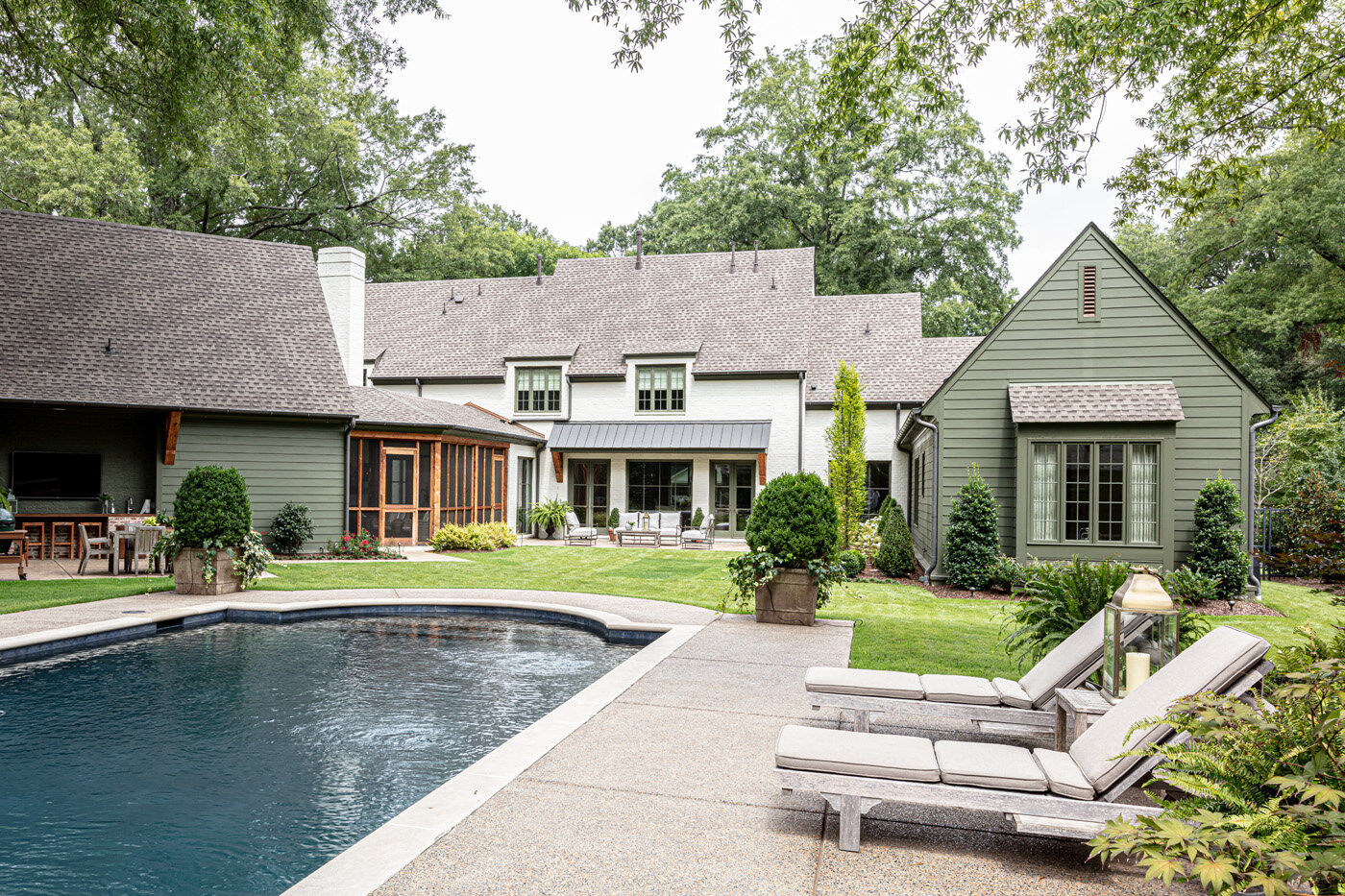
The finished product, built by Walker Uhlhorn and Uhlhorn Brothers Construction, is an updated classic designed in a courtyard style to maximize views of the parklike backyard. The peaceful vista includes large trees, lush green spaces created by landscape designer Harry Schuh, and the home’s original pool, with a fresh structural and cosmetic facelift.
In keeping with the owners’ desire to respect and fit in to the neighborhood, Enoch set the structure as far back from the street as possible. In addition to the goal of not overbuilding the lot, the owners again emphasized the desire for the home to feel as if it had been on the street for years. “So many homes in the neighborhood have grown and expanded over the years with tasteful additions. Doug provided a design that gave the far left and right wings a different treatment which subtly felt as if they had been additions to the original house,” says the homeowner.
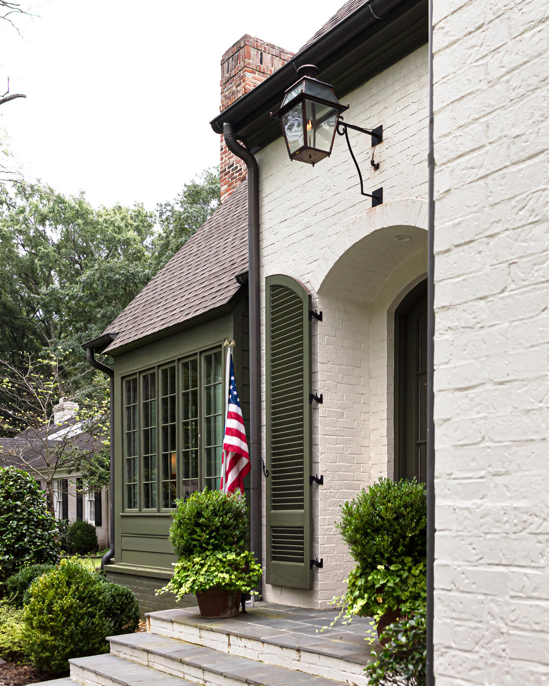
The exterior’s green and white color scheme is the end result of a collaboration between Steffens and the homeowner. “We thought we wanted antique brick, and that’s what we did the chimney and the outdoor space in. Missy and I spent hours driving around town looking at houses, and we think we landed on the right look.”
Adds Steffens, “The green creates that cozy, cottagey look, but it blends in well and makes you focus more on the rest of the home.” As for the white painted brick that covers most of the house, the designer says that also had to be precisely the right shade. “We wanted it to be white, but really soft.”
Moving to the interior plans, the clients asked the architect to keep in mind their family’s casual lifestyle. “We wanted a lot of open space that would be nice but comfortable,” says the homeowner. The parents to a blended family of three older children knew they would be empty nesters before long, so they envisioned their new house as one that would meet their needs long-term.
Enoch came through with a floor plan that has all the kids’ bedrooms upstairs; the downstairs and outdoor area are a custom fit for the couple. “We love being outside so the pool and the outdoor area and the porch...especially in fall and spring, that’s where we are,” says the homeowner. “We have my husband’s den and then our bedroom and bathroom downstairs. We really enjoy it in the evenings. He likes to stay up and watch sports and I like to go to bed, so we tried to make it space that we could enjoy, just the two of us.”
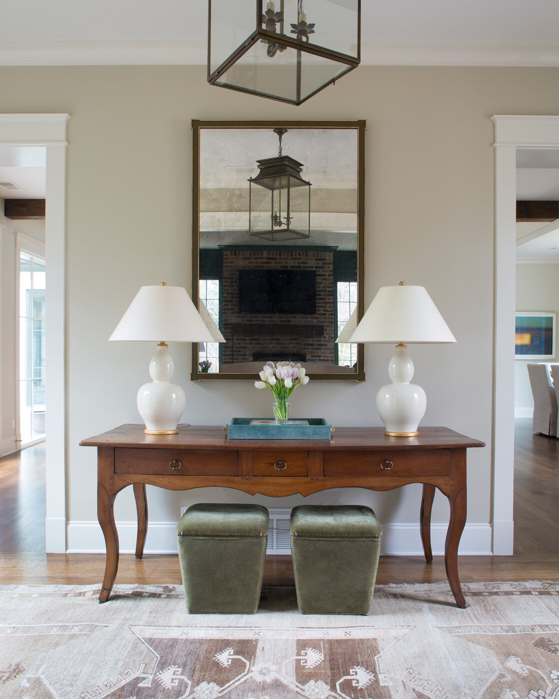
From the first step into the bright, welcoming entryway, it’s clear that green is an overarching theme in the home’s design, evidenced in the showcased views of the verdant outdoor space. The rear of the foyer was originally intended to be an art wall, but, at the homeowners’ request, Enoch inserted an oversized floor-to-ceiling window that floods the area with light and shows off the beauty of the backyard.
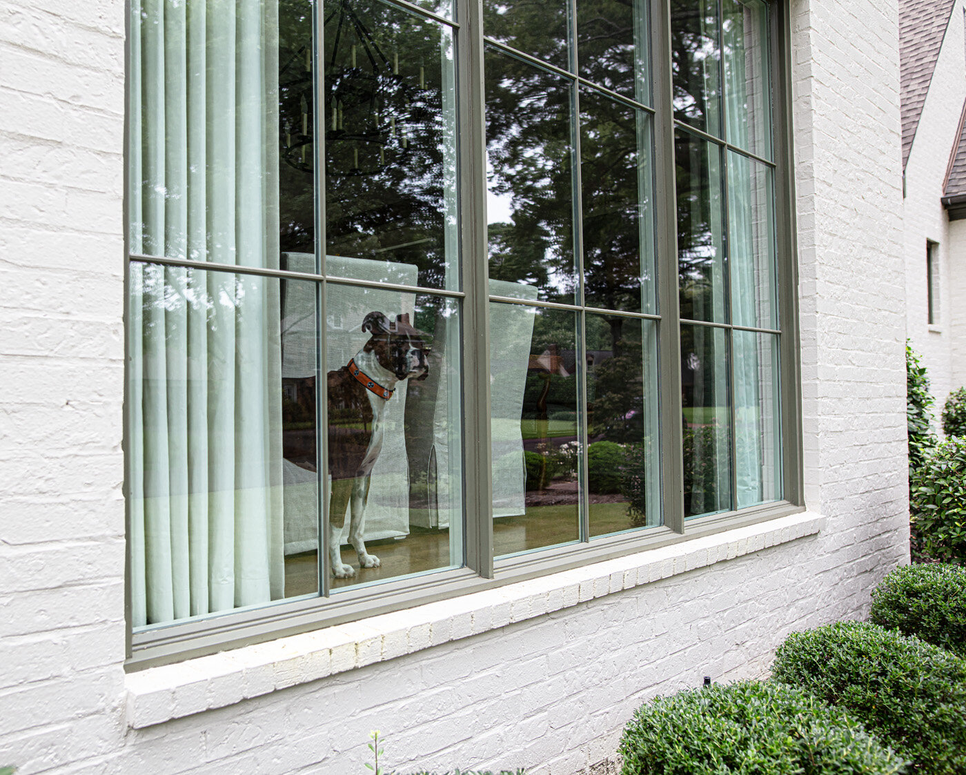
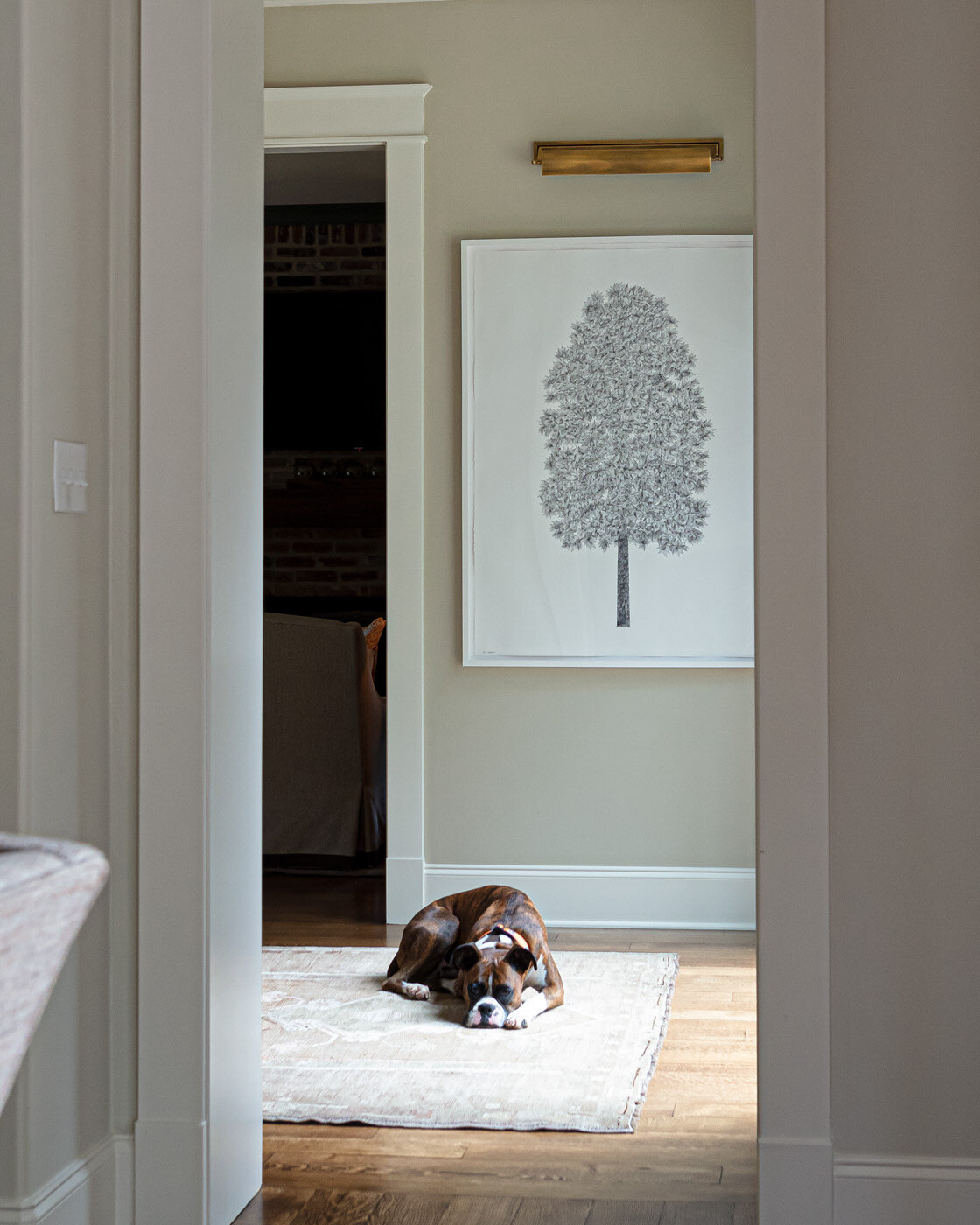
The wall of windows continues in the open combined family room and dining area, and although the couple is thrilled with the expansive views they enjoy, they admit it took a bit of getting used to when they moved in. “We felt like we lived in a fishbowl for a while,” she says with a laugh, “but I think we’ve adjusted. It’s funny how much I love the openness now.” Even the family pet is a fan of the large windows. Otis the boxer “posts up” daily at the front window and watches the world go by from his favorite vantage point.
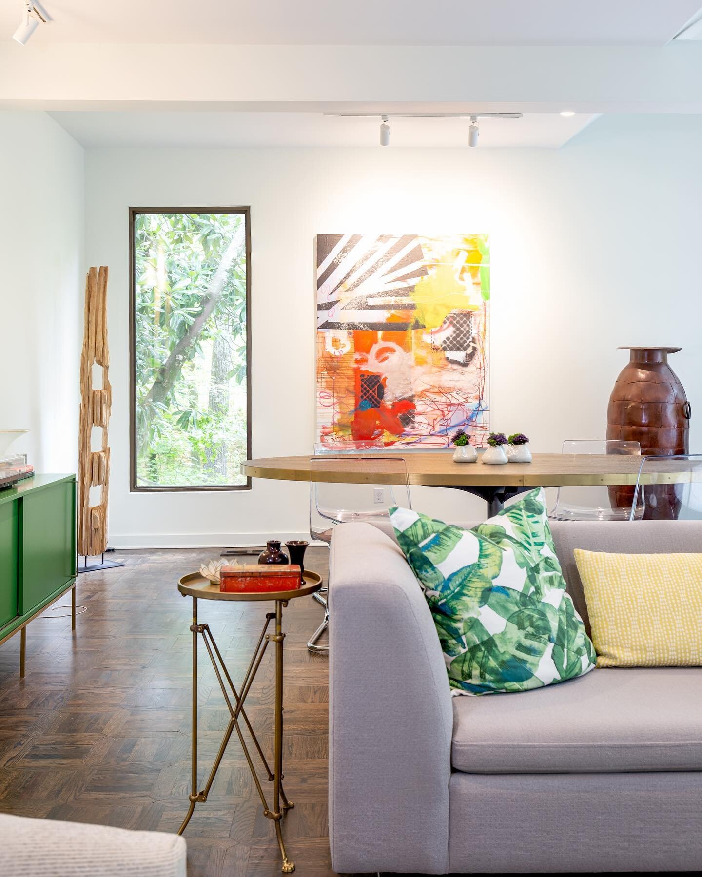
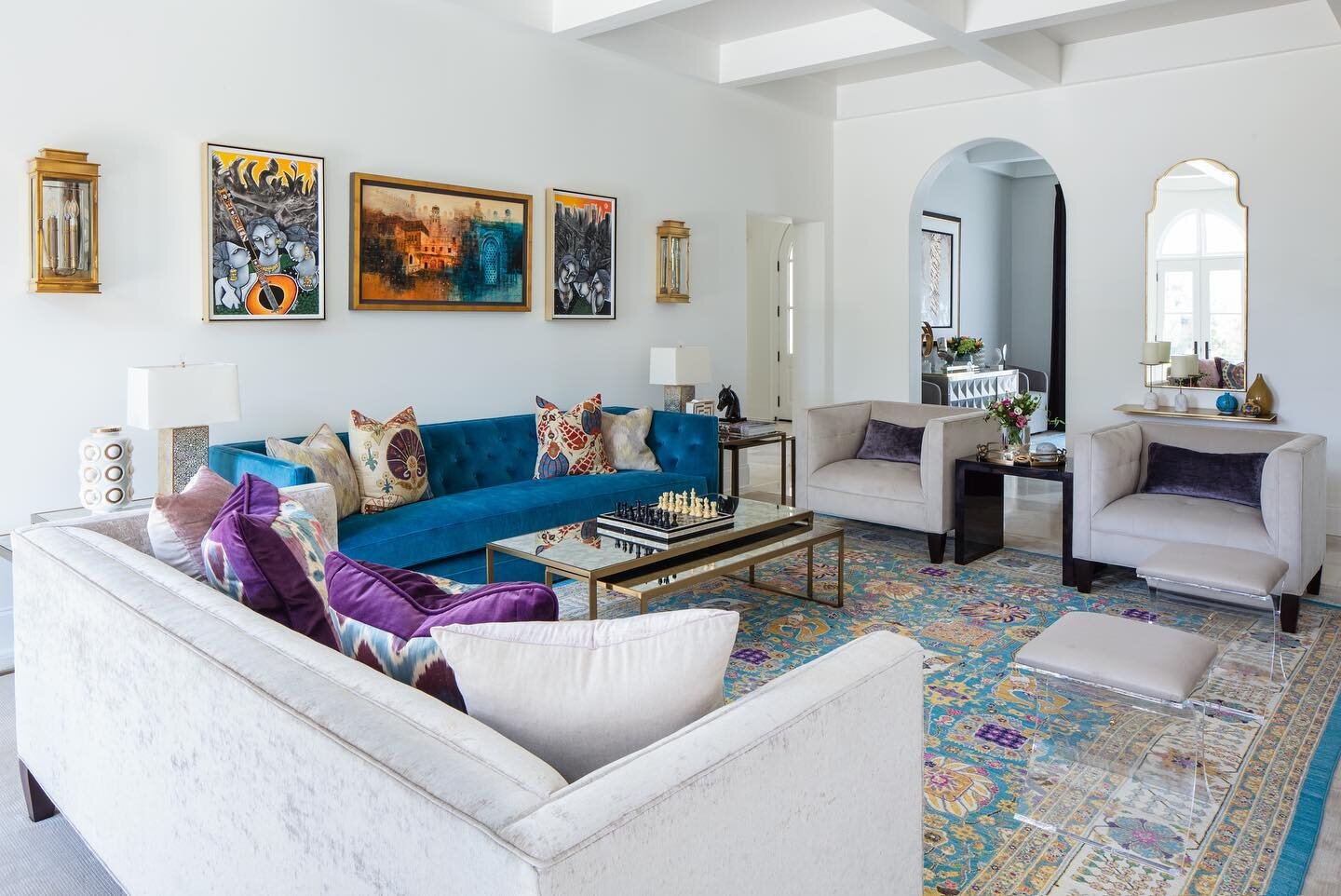
The family room’s furnishings reflect Steffens’ signature design style. “I love something old in each room. But I like to keep things fresh, so we also introduce current materials. I like to try to mix, and different textures are always interesting,” she explains. The room features comfortable seating for the whole family, but is missing an item often included in a home’s main gathering area—a TV.
The omission was a request from the homeowner, and one she says garnered plenty of questions. “Everybody asked me when we did that, ‘Are you sure you don’t want a TV?’” She couldn’t be happier with the result, though. “What I’ve really enjoyed about it is when our kids are over for dinner we all end up sitting in here after we’ve eaten and we actually talk. We have conversations and we share things about the week. Maybe we turn music on. We laugh. So I have loved not having a TV in here.”
Over the mantel Steffens placed an original piece by Oxford, MS, artist Carlyle Wolfe Lee, who paints en plein air then finishes her works with a stencil layering process. The homeowner says she loves the way its green hues bring the outside in. “The view through all the windows, and the beautiful green siding...it just enhances!”
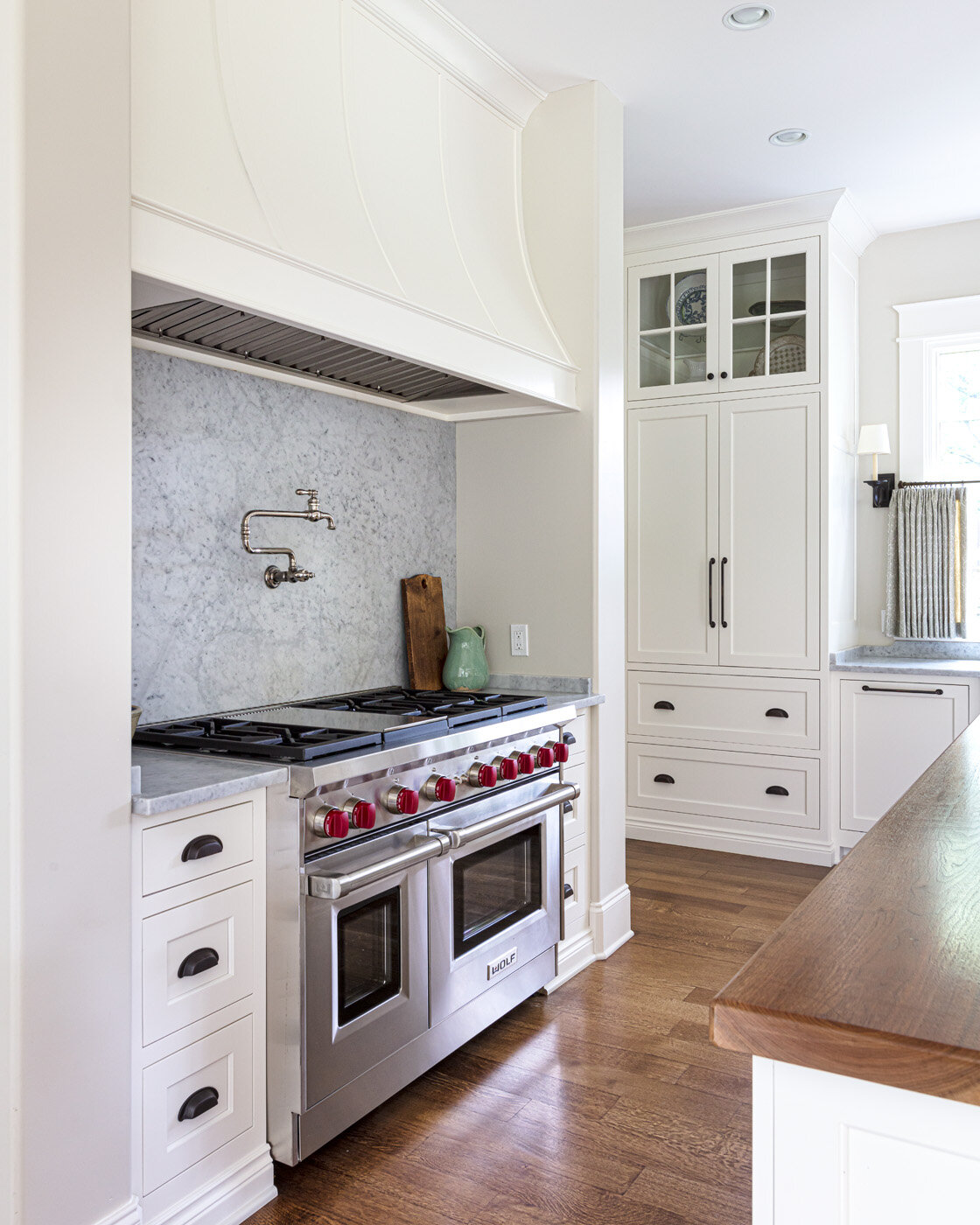
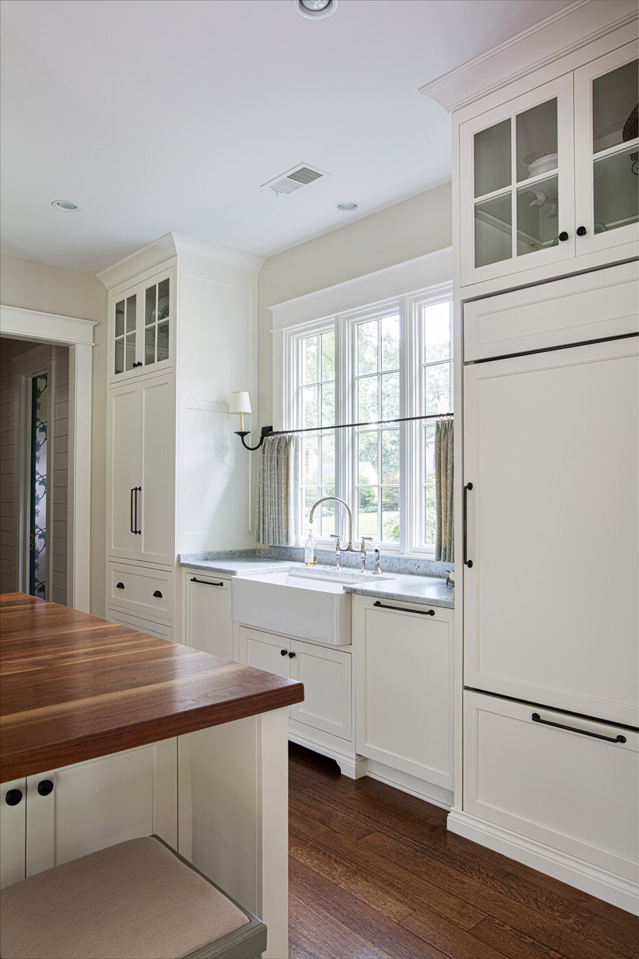
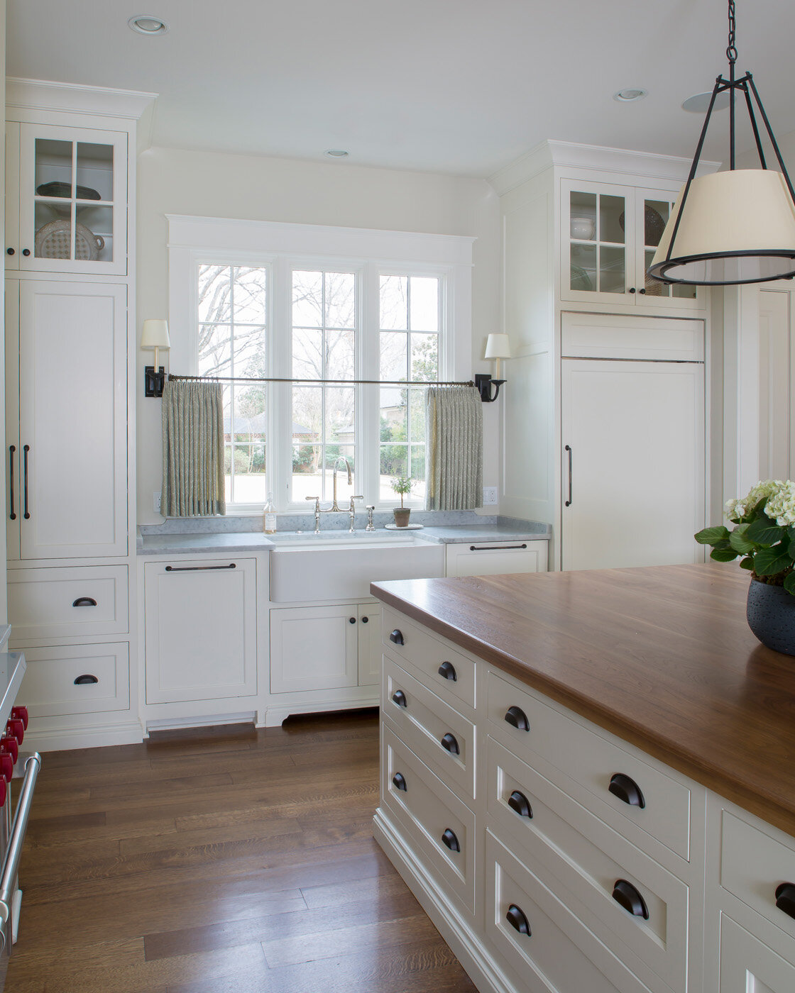
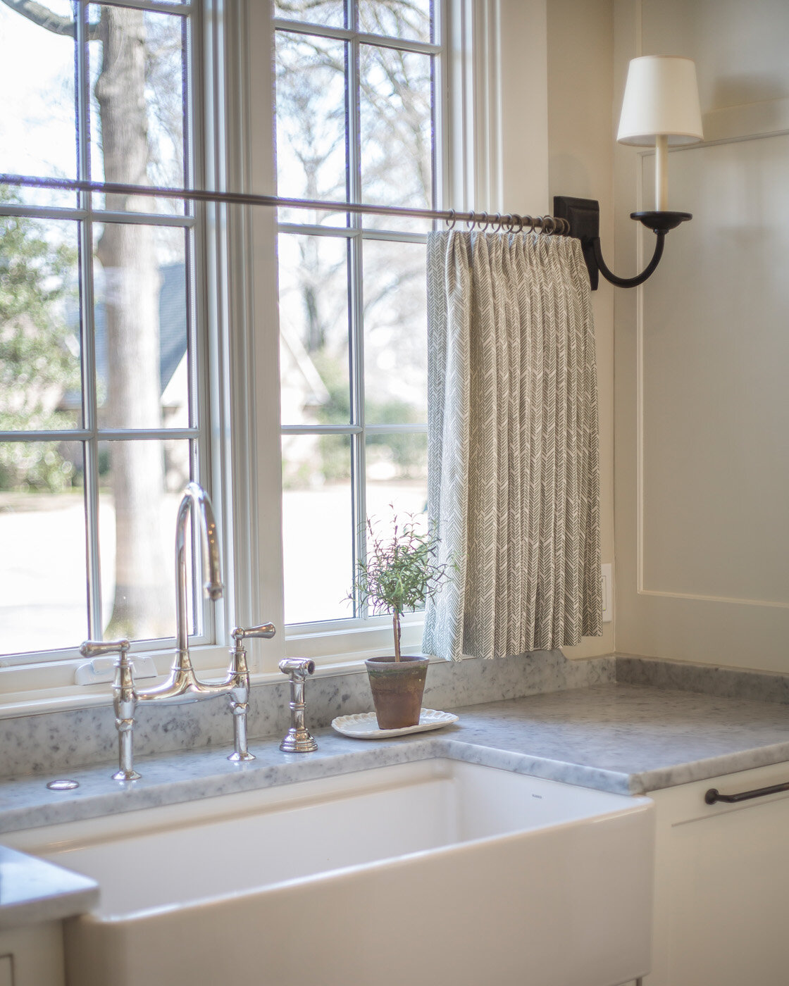
The open kitchen’s simple design reflects casual elegance. Classic white cabinets in a symmetrical layout are topped with Carrera marble in a honed finish for a softer look. Steffens repeated the same marble on the full-height backsplash behind the range in the name of design simplicity. She likes the idea of having only a few different materials in a kitchen, and the large island opposite the range has a walnut countertop.
The island anchors the space as well as giving guests a gathering spot. “I wanted a big island because we entertain a good bit. We have friends over and this is where everybody ends up,” says the homeowner.
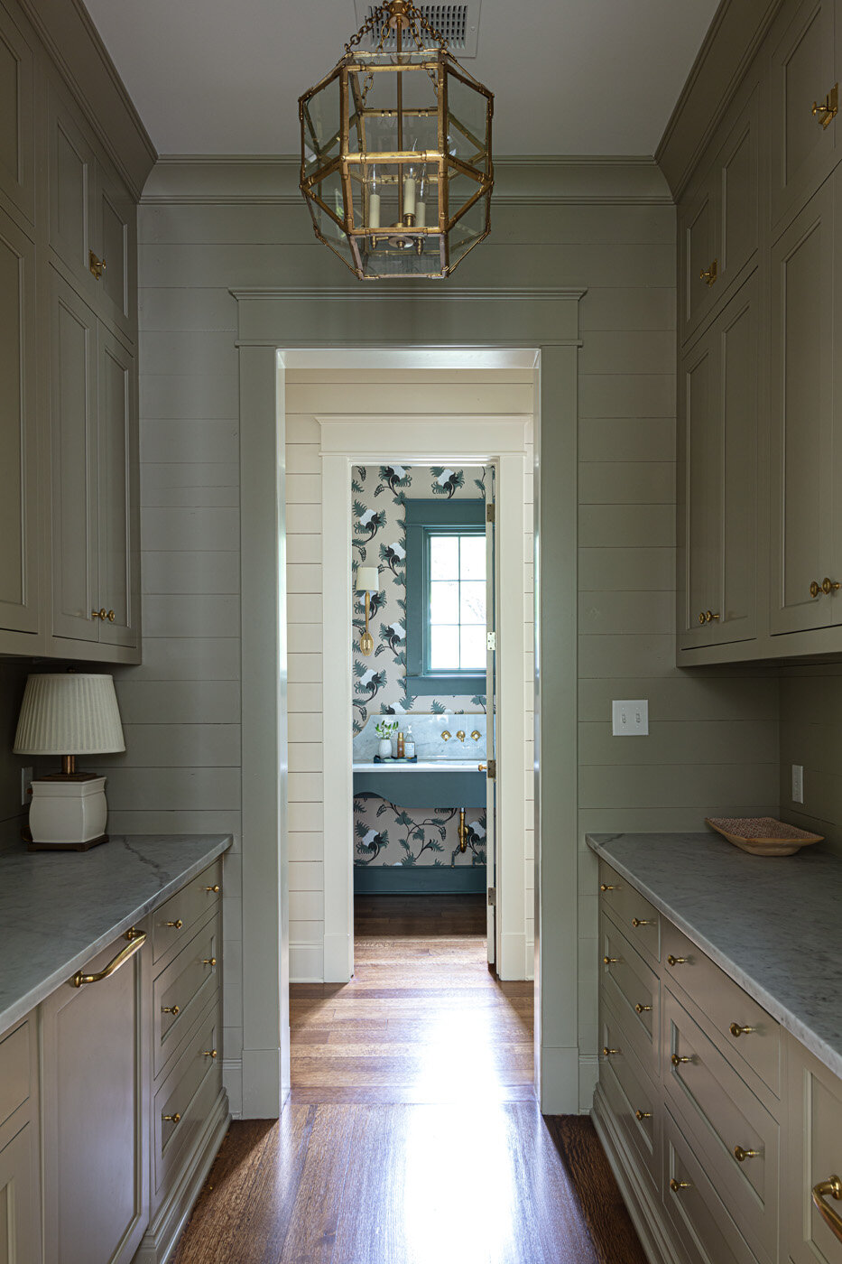
Behind the range wall lies the scullery, a feature that the family loves having and uses constantly. From the abundance of storage space in its cabinets to the extra dishwasher and sink to the pair of refrigerator drawers, everything about it gets high marks from the homeowner.
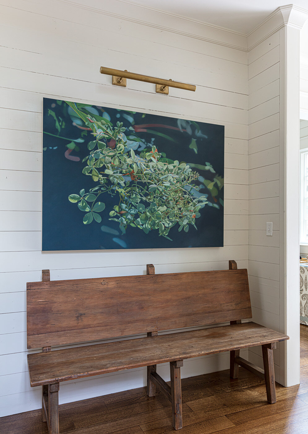
Near the rear entrance, a pantry and utility closet disappear into a shiplap wall, giving convenient room for even more storage as well as small appliances like a coffee maker and a microwave. Steffens calls the area the clients’ “grown-up mudroom.” In place of lockers or cubbies needed for a family with young children, she designed the spot to hold a treasured bench and a painting by local artist Beth Edwards that the homeowner says is her favorite one in the house. “As much as I love the outdoors, when Missy sent me this piece of art I knew it was the one.”
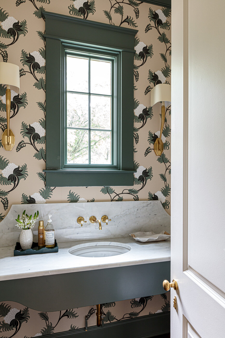
Bathed in stunning floral wallpaper from British designer Neisha Crosland, the powder room is a showstopper. Steffens is pleased with the way the paper fits into the home’s overall design. “I love the movement in it and the range of greens that flow through the house. The deep, deep greens of the leaves and the bright white background. This just really worked with the whole house. The house flows through different saturations of green—some are more blue green and some are more yellow green.” The room’s only window is high on the wall, so Steffens didn’t have to cover it to allow for privacy. She did, however, have to come up with a way to fill the space between the vanity and the window. A tall backsplash and wall faucets provide the perfect balance, and do so with loads of panache.
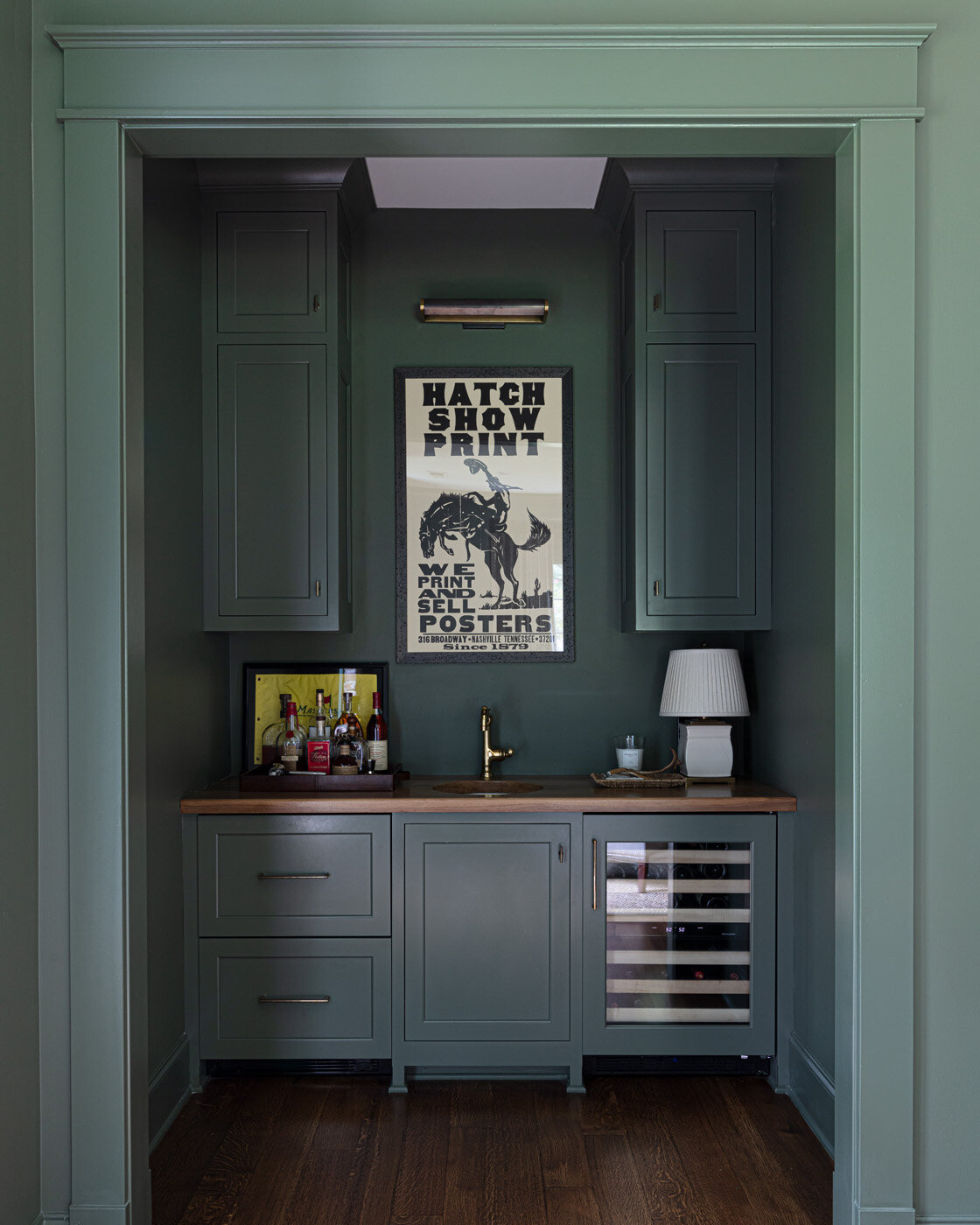
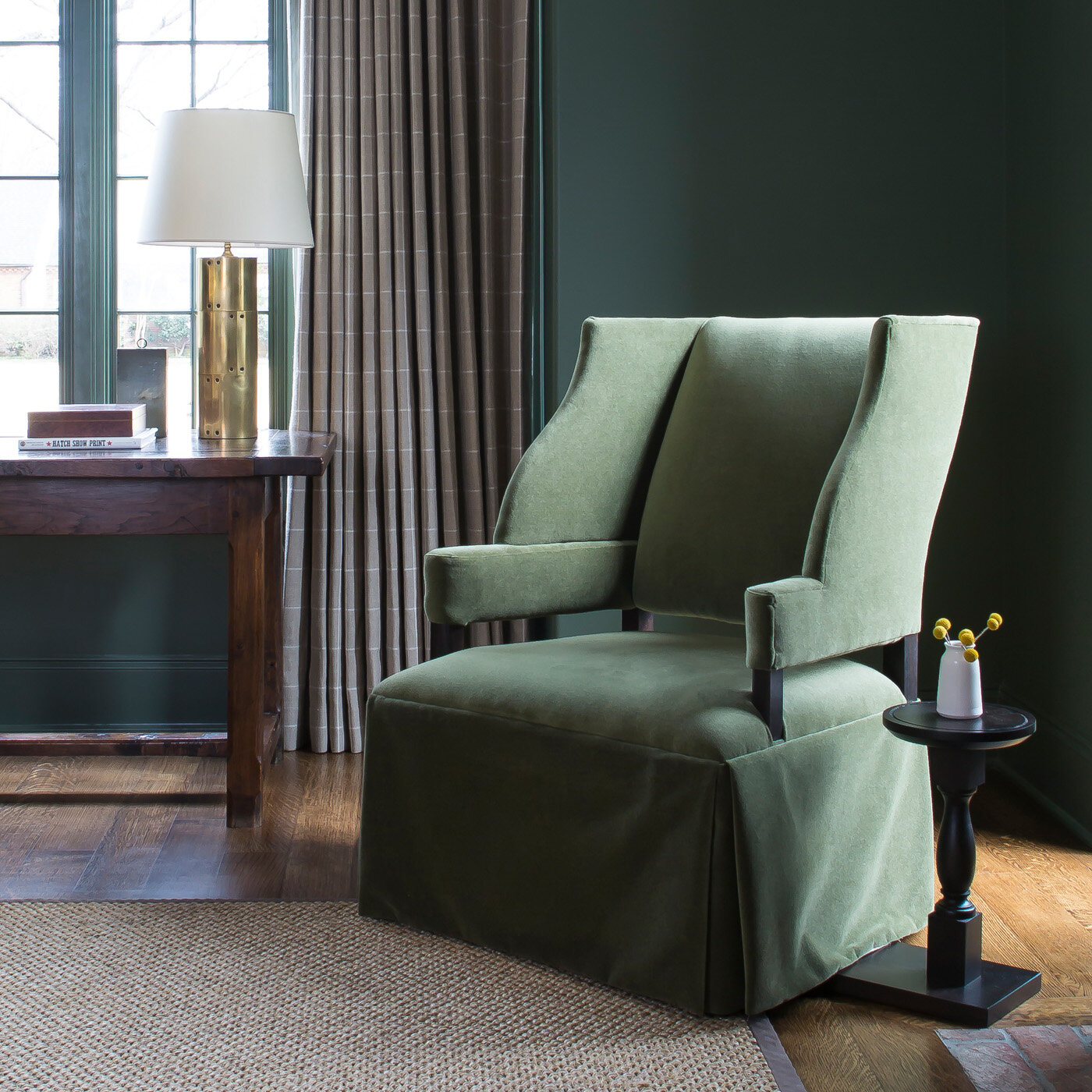
The saturation of green color reaches a peak in the office, where the walls and all the trim sport the same deep, lush shade. Steffens says going all in when using a bold color creates a refined look. “If this room had white trim or even white mullions on the windows it wouldn’t quite have the same sophistication. But it’s a commitment and it can be scary for people.”
An antique brick fireplace not only gives the room a cozy feel, it also gets regular use in all but the hottest months of the year. “My husband loves a fire, so sometimes when I get home from work he will have one burning in here and in the fireplace on the porch,” says the homeowner.
If the office is a man cave, albeit a sophisticated one, the master suite has a decidedly feminine flair. The bedroom is simple and roomy, but not grandiose. The homeowner instructed Steffens to design the space with minimal furniture and no television. She says, “I wanted it to be a place where we can rest.” The sanctuary feel comes from a custom upholstered Hickory Chair bed with simple bedding and an original Catherine Erb work of art. All Erb’s creations have a different moodiness to them, says Steffens, who chose the depiction of sky and clouds for its serene nature.
The artwork is dreamy, but the homeowner says the view out the large window opposite the bed is the most picturesque scene in the room. “I love that I can see our home out this window, especially at night when the porch is all lit up out back with a fire in the fireplace. Doug said more people should be able to see their home from inside their home and we agree.”
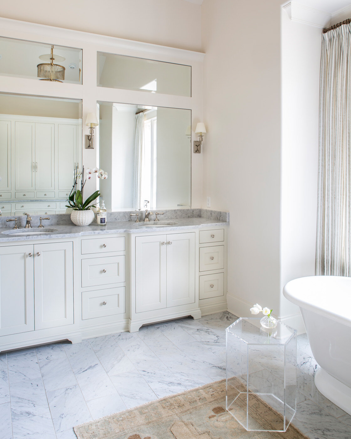
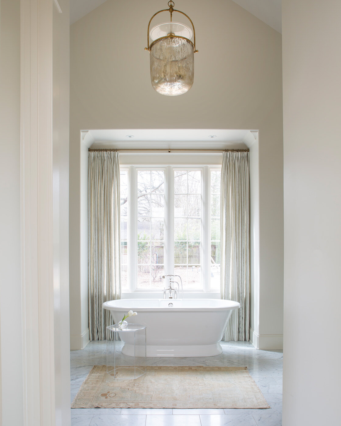
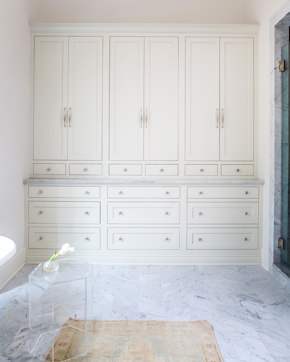
The elegant master bath gets an ethereal feel from natural light spilling in through a window above the large soaking tub and from the soaring vaulted ceiling. A full wall of built-in cabinets and drawers eliminates the need for a lot of furniture and keeps the space clean and simple. “Simple is calming to me,” says the homeowner. “Running a business can be stressful, and to come home and have things simple and pretty and comfortable...it makes a big difference in your life.”
Even though it has been over two years since they moved in, the homeowner admits that the house is still a bit of a work in progress. Steffens has no problem with the extended nature of the project. She says, “That never bothers me because once you’re in a space you can really think through how the family lives and provide an even a stronger design. It takes more time in some ways but at the end, the product’s always fantastic.”
Adds the homeowner, “We’re still working on layering those last items. I didn’t want to rush out and buy things just to fill the house. I want it to take time and have meaning. To nest over years.”
Turning a house into a home. Nesting over years with time and meaning...carefully creating a sense of place and belonging.


