Functional and Fabulous
/Story by Terri Glazer | Photography by Ross Group Creative
The “before” kitchen wasn’t bad. In fact, the homeowners used it as it was for several years after they bought their East Memphis home. Its layout, however, didn’t make the best use of the space, and it certainly didn’t reflect the lifestyle of the family of five. They wanted a functional and beautiful place where they could all gather for food preparation and cooking. A previous renovation by former owners had created a large dining area at one end of the kitchen, with the appliances and work space cramped on the other end of the room.
Enter Karen Kassen, owner and principal designer of Kitchens Unlimited, and a long-time friend of the homeowners. Her vision blended form and function in stunning fashion to transform the space to meet the wants and needs of her clients.
The original floor plan had a wall with a standard-sized door between the family room and the kitchen, typical architecture for 1960s-era homes. Kassen removed a large portion of the wall, opening the kitchen to the light-filled den, and providing a more contemporary feel and better flow between the spaces. She also rearranged the entire footprint of the kitchen to make the most practical use of every part of the roomy space.
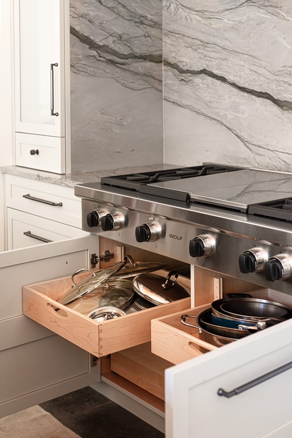
Out came a built-in cabinet/shelf unit next to the dining area on the south side of the kitchen. In its place now are the main work spaces. The east wall is dressed up with cabinets in a very light blue gray. Kassen explains that their luxe look is due to the fact that they have a subtle glaze applied on top of the paint. The extra step adds depth to the finish. The alcove that houses the range top is the room’s most elegant focal point, thanks to several elements. The homeowner describes the stunning quartzite backsplash as her favorite choice from the renovation. The designer adds, “Because she loved it so much I wanted to use it more, but I felt like if we used it in other places it wouldn't be quite so spectacular. So I decided to take it up and wrap it around the sides.” The show-stopper custom vent hood cover was fabricated locally from antiqued zinc with brass edging. The large Wolf range top was a special request from the husband, who enjoys cooking and grilling. Kassen chose textured glass inserts for the cabinet doors on either side of the alcove. Not only does the back-painted glass add a touch of sparkle, it ensures easy clean up. A pair of wall ovens and additional cabinetry complete the wall.
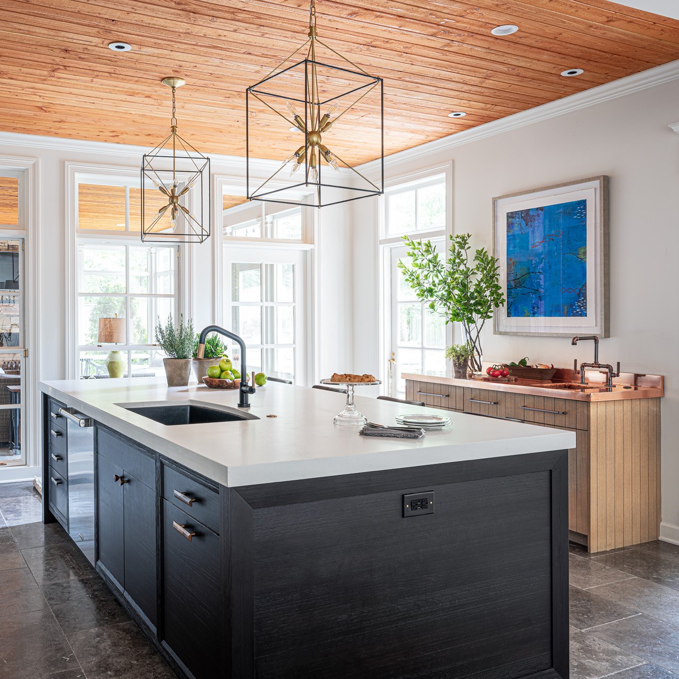
Across the room, a dedicated grilling station is an homage to the man of the house. Its position by the back door makes it the most logical storage spot for the utensils he uses while grilling on the patio. The copper countertop speaks to his profession as an executive for a copper plumbing and fittings manufacturer and the custom faucet makes the perfect accompaniment. Its industrial feel and materials are another nod to his occupation.
Anchoring the room’s center, the striking island made of wire-brushed alder wood has seating for four and plenty of storage. Kassen’s plan cleverly placed storage space beneath the seating ledge of the countertop, the ideal spot for items that are necessary but not used on a daily basis. The island also holds a dishwasher and the main sink. For the faucet and the pair of pendant lights that hang above, the designer chose mixed metals—matte black and brass.
On the other side of the room, previously the cramped location of the ovens, microwave, refrigerator and pantry, a cozy corner is now the home’s “beverage central.” Whether family members are thirsty for a canned drink from one of the two refrigerator drawers, craving an espresso from the built-in machine, or ready to choose a bottle from the full-height wine cooler, it’s all right at their fingertips. Metal mesh front wall cabinets with interior lighting show off elegant glassware.
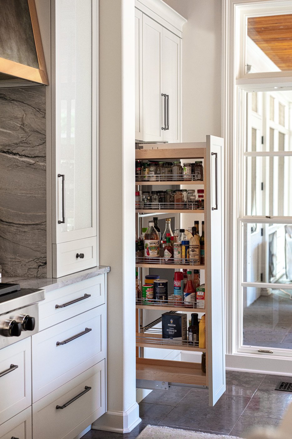
Across the room Kassen placed a wall completely dedicated to food storage. Having the refrigerator, freezer and a lighted pantry cabinet all together makes sense and simplifies the chore of putting away groceries. The appliances and pantry are concealed beautifully with cabinet panels, giving the space an elegant flow. The family’s round breakfast table and upholstered Parsons chairs occupy the center of the area. A graceful chandelier overhead repeats the brass and black motif from the faucet and pendants.
To appreciate two of the project’s most stunning features it’s necessary to look up and down. Overhead, tongue-and-groove slats in warm wood bring a natural element into the design and mirror the ceiling in the screen porch just off the kitchen. As the rooms are separated only by a wall of windows, the look creates a sense of continuity.
Underfoot, tiles of tumbled blue limestone with an antiqued finish line the floor. More practical than hardwood in a kitchen that sees daily use, the flooring also provides a segue to the bluestone patio just outside the door. “The movement in the natural stone flooring is a beautiful foundation for every area of the kitchen. It’s also forgiving for any dirt that could be tracked in from the patio and for the family’s two large dogs who love to hang out there,” says Kassen.
The project was completed late in 2021, so the homeowner has had plenty of time to reflect on her new kitchen. She still gives it two solid thumbs up thanks to the expertise of designer Kassen and general contractor Jimmy Wittenberg. She says, “Even after a year I wouldn’t change a thing!”


