A Home Transformed
/Design by Selena McAdams of Spruce | Story by Terri Glazer | Photography by Stefanie Rawlinson
The term “home renovation” can be relative. It can cover a spectrum of projects, from freshening paint to adding new furniture to reworking the floor plan. The job designer Selena McAdams took on recently, however, reached much farther. Her clients tasked McAdams with transforming a 1980s-era Germantown house to give it the cool minimalist ambience they love.
It wasn’t just that the couple liked the idea of mid-century design. They wanted to replicate the feel of the home they’d moved from—a mid-century-style house in Eads with a wall of windows and a streamlined design that suited their aesthetic to a tee.
They loved everything about it, except the rural location. With two elementary-age children, the family sought to simplify their lifestyle by moving a little farther “in,” closer to activities and extended family. They landed in a quiet cove in Germantown where the kids now walk or ride bikes to school, accompanied by a group of neighborhood friends.
Shortly before moving in, the homeowners decided to update the small primary bathroom. It wasn’t long before the plan had grown to include a kitchen renovation. Once the scope of the project had grown that large it made sense to go ahead and rework the entire downstairs of the 1.5-story house at once. That plan gave McAdams, who had also collaborated with the couple on their previous home, the ideal opportunity to create a design that flows effortlessly throughout the entire space.
She came on board early in the process, along with architect David Anderson, who transformed the downstairs floor plan, opening up walls here and adding walls there to better suit the family’s lifestyle.
One of the homeowners’ favorite features of the house’s layout was that the front door didn’t open directly to a stairway, as is the style of many suburban houses from the same era. Anderson took the idea a step further, adding a textured wall to the entryway that blocks the line of sight into the rest of the home and provides an element of privacy. McAdams styled the space with a striking contemporary portrait by local artist Leslie Barron hanging over a sleek and simple black lucite console. An ottoman upholstered in green geometric velvet adds texture and verve.
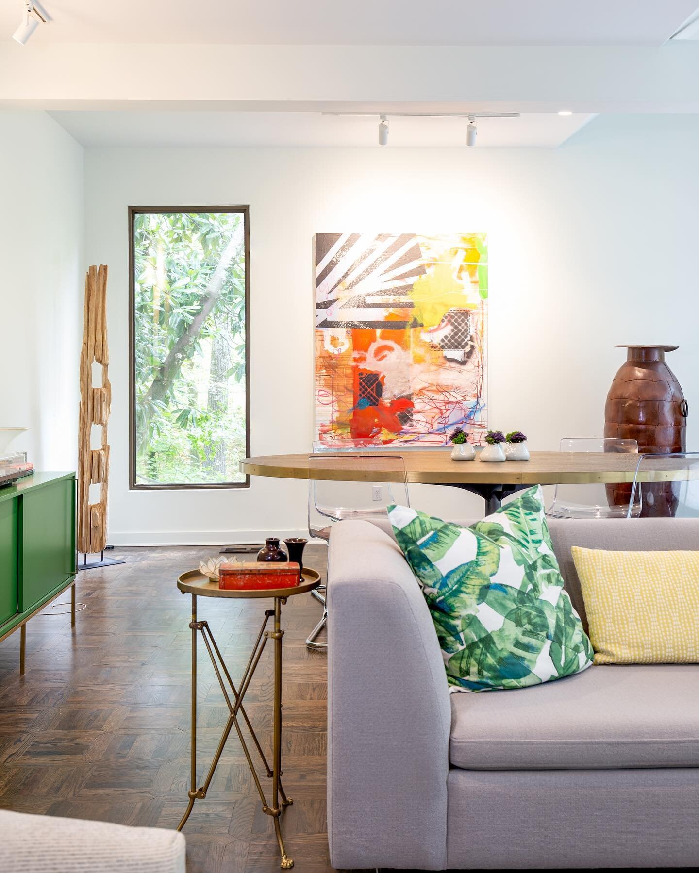
Just alongside, the home’s original living room is now a convenient homework/reading spot for the children. Well lit thanks to a full-length window as well as the striking Suzanne Kasler light fixture, the space holds the essentials: a round pedestal table and a pair of curved leather armchairs with a mod silhouette.
McAdams continued the curved lines in her choices for the adjacent dining room, where she paired an oval table with a set of Danish modern Panton-style chairs in vibrant orange. She credits her long-standing relationship with the clients for helping them agree to her bold seating idea. “I had to ask them, ‘Will you trust me on this?’ And they did.” Completing the dining room design is a striking deer painting by Oxford, MS, artist Bradley Gordon.
The juxtaposition of styles is a design concept McAdams says she loves to incorporate in her work. “That’s where I like to have the most fun: playing with traditional versus contemporary and masculine versus feminine elements in a space. That intentional play can really pull a room together and make it a space that everyone loves”.
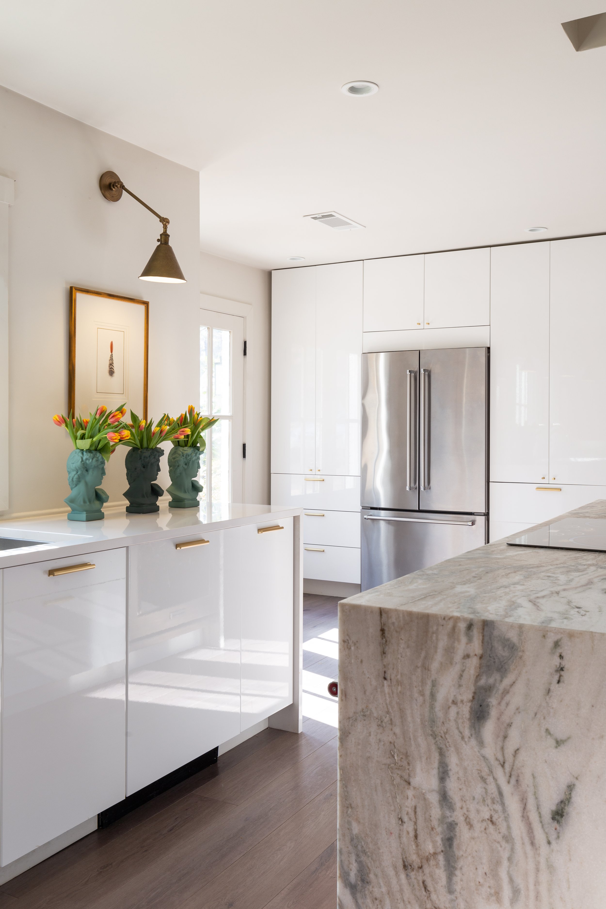
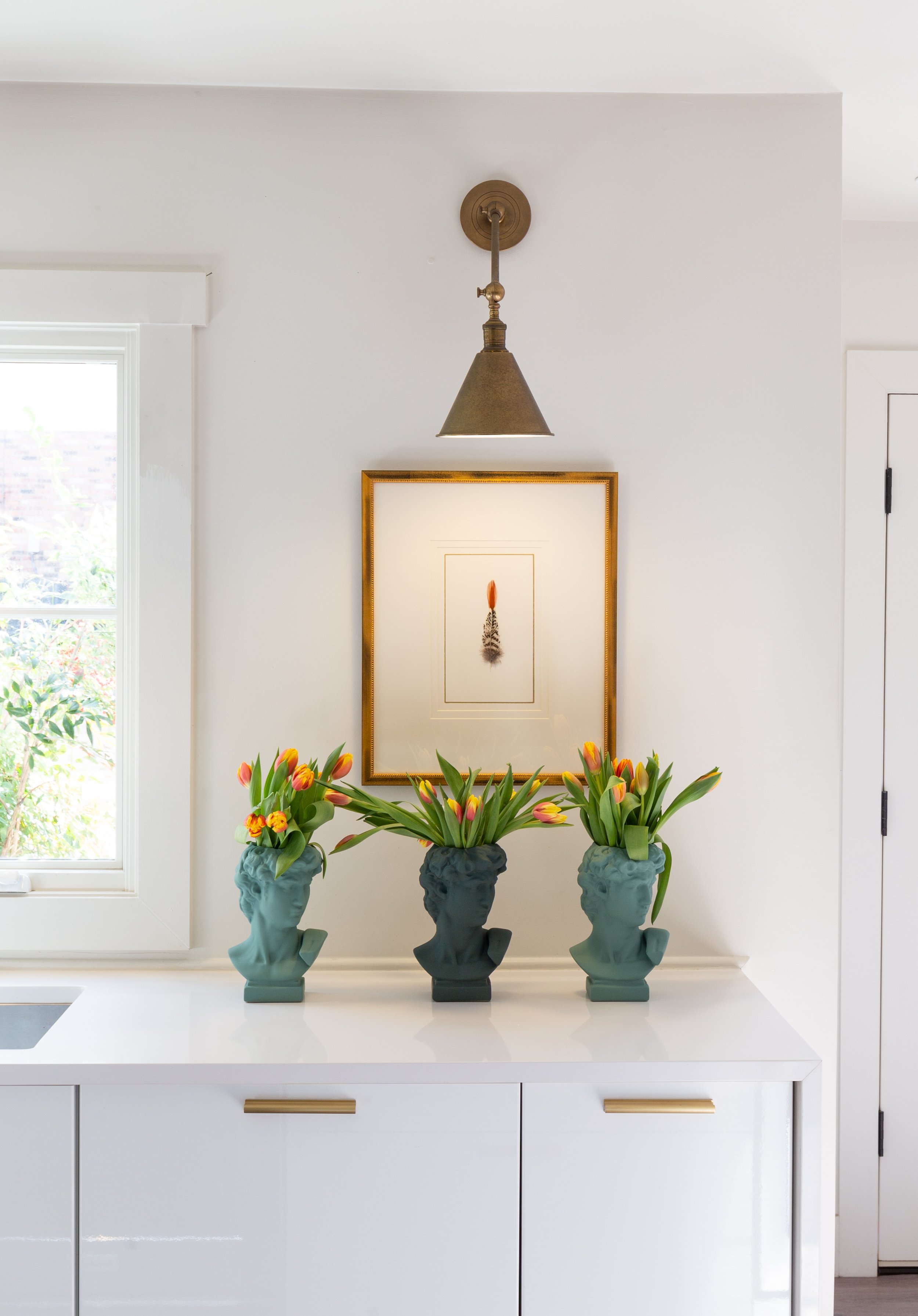
The kitchen’s sleek nature proves that modern elegance doesn’t preclude practicality. Anderson provided a roomy, open footprint as the blank slate for McAdams to work. High-gloss white IKEA base cabinets line one wall, topped with simple white quartz countertops. The designer encouraged the client to forgo upper cabinets and the result is stunning. Brass sconces illuminate the wall, highlighting framed art. A nearby wall of floor-to-ceiling cabinets provides plenty of storage. The large island is a show stopper with its waterfall-edge in leathered fantasy brown marble. To keep the look streamlined, the homeowner opted for a smooth induction cooktop and a pair of single ovens nestled in the island.
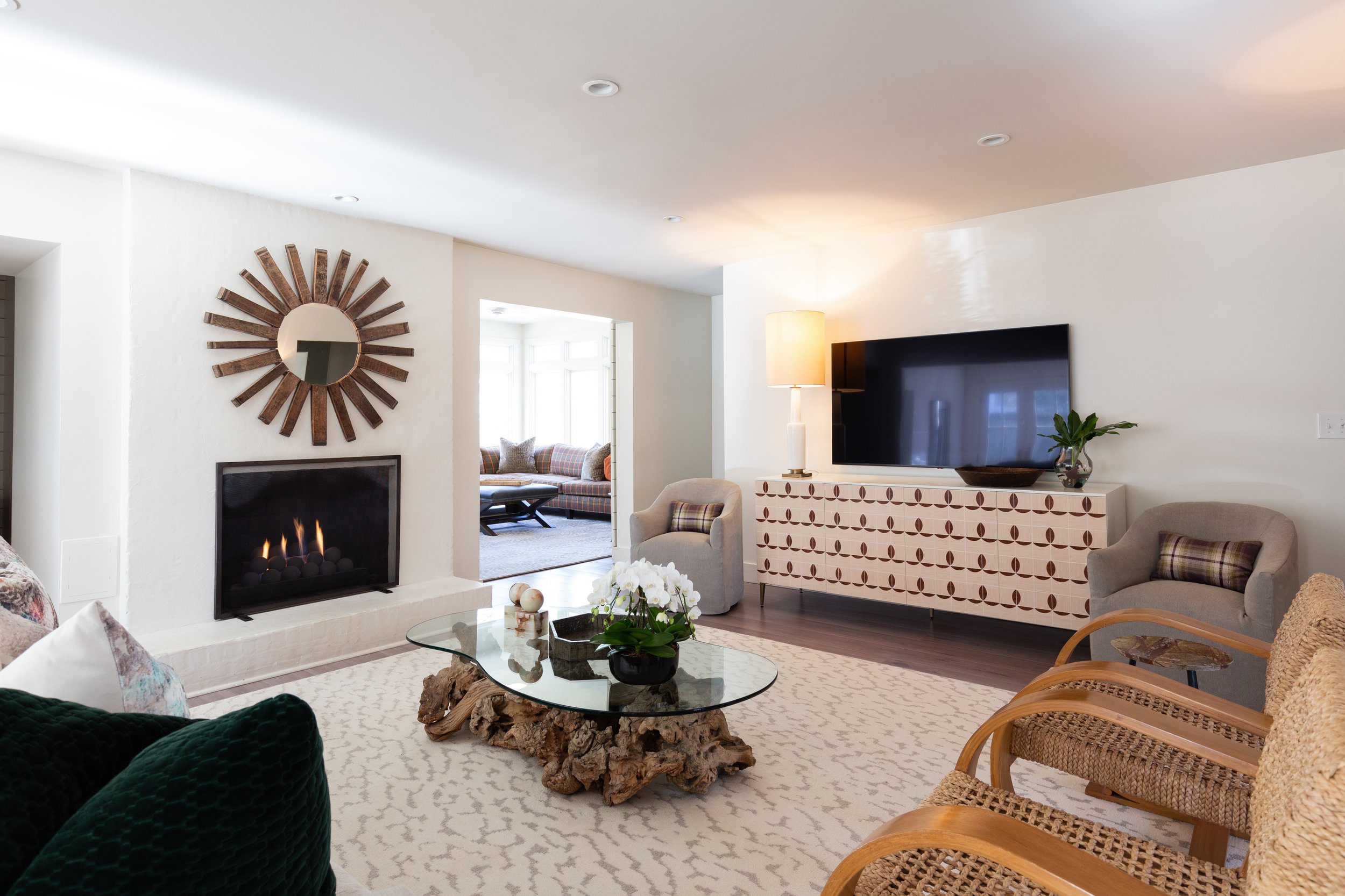
The kitchen opens to the family room, another area where Anderson worked renovation magic to transform the look and feel. Says the homeowner, “When you’re looking at what you see now, if there was a wall, there’s not a wall. If there’s not a wall, there used to be one.” While Anderson’s plan opened substantially the flow into the room, it also added a wall over the formerly exposed staircase. The alteration served two purposes, according to McAdams: to hide the stairs, creating a cleaner design, and to establish a media wall. The family brought the root-and-glass coffee table and the pair of woven chairs from their previous home, while the rest of the furnishings were sourced from spruce, McAdams’s East Memphis shop.
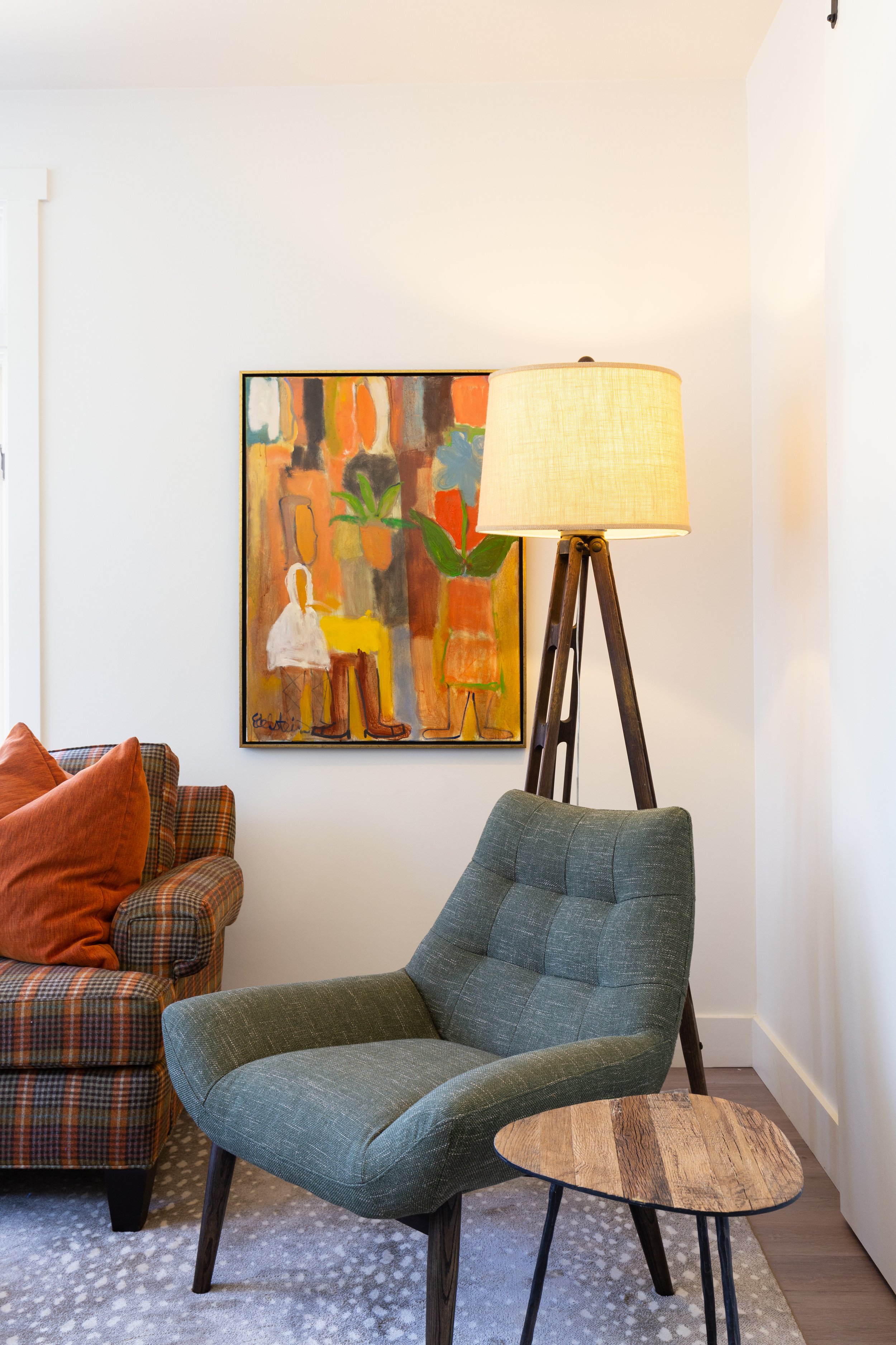
A sliding door can close to allow the solarium behind the living room to become a cozy and private haven. The comfy sectional decked out in plaid wool and the padded leather ottoman give the space a manly aesthetic, punched up by the mid-century influenced wooden floor lamp and chair. The designer added her signature contrast in an understated antelope print rug and an olive upholstered chair that gives a stylistic nod to the iconic mid-century Eames lounger.
The owners’ suite, a guest bedroom and a hall bath complete the downstairs, and McAdams says she was thrilled to design all those areas in addition to the public spaces of the home. “They did everything at once which was so fantastic from a design standpoint. We were able to layer all the rooms’ design concepts in relation to each other and make the design connect in one moment versus over years. Ultimately, the finish line was extremely rewarding.”
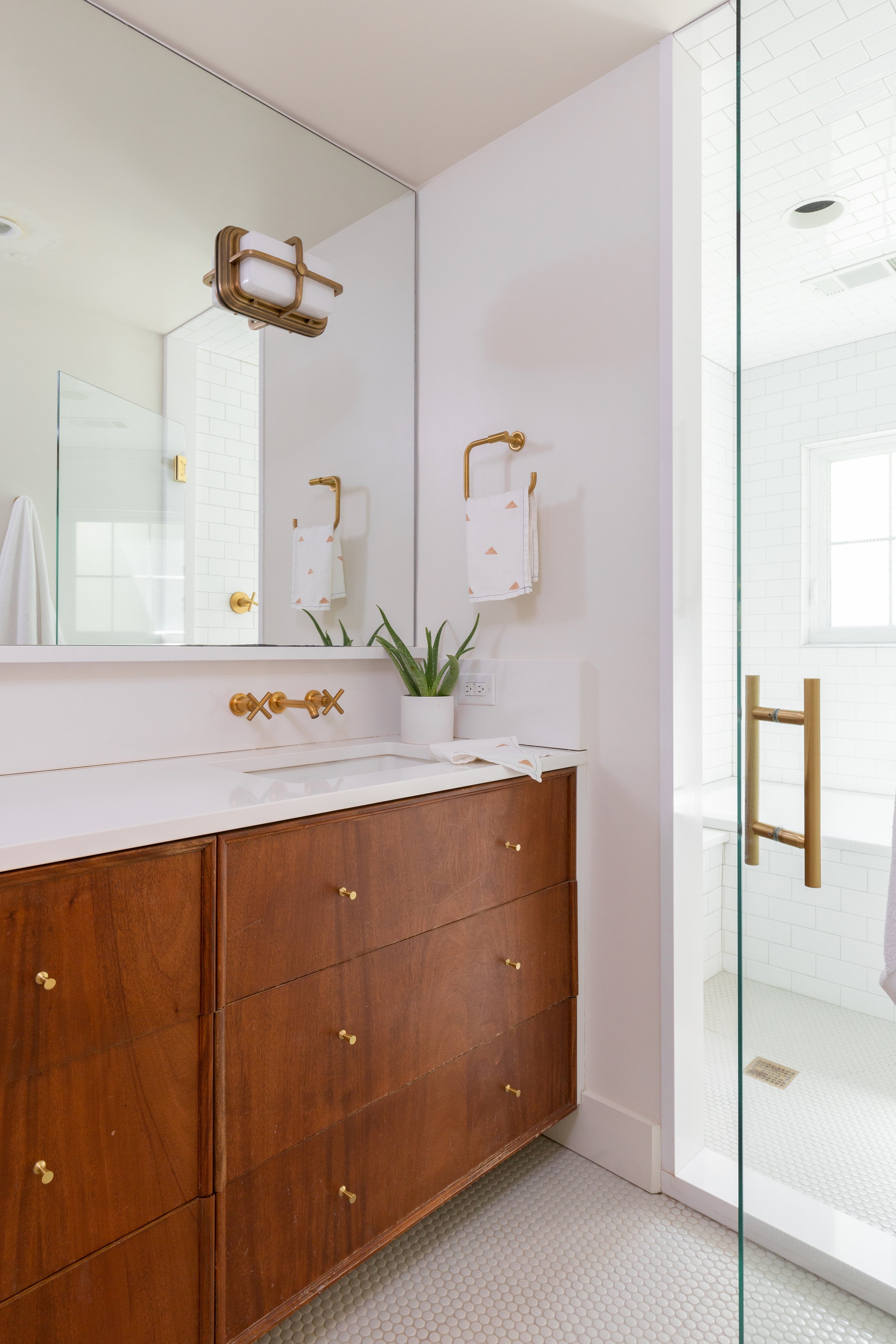
In the interest of design continuity and simplicity, both bathrooms are fairly similar, with custom walnut vanities, classic white tile and unlacquered brass hardware. The primary bedroom exudes the glamor of old Hollywood. “It all started with the bed,” says McAdams, and while its style is pure sophistication, the process of acquiring it was anything but smooth. The company that manufactured the upholstered frame was bought out. “I think this was the last order they took,” she recalls with a laugh. When the bed arrived, there were the headboard and footboard, but the matching side rails were missing. “We had to go back to a company that had been bought out and ask them to find the rails in their warehouse. They had been produced, they just hadn’t shipped them.” The stray pieces finally came, and the finished product now forms the base for the room’s luxe vibe. Classic symmetry makes an appearance in the matching bedside chests, crystal lamps and round mirrors. A low sofa in dusty pink completes the design and gives the couple a soft and stylish spot to watch TV, read or relax.
“We just wanted to have fun with the guest room,” says McAdams. She and her client were able to finalize the choices for the room in a single, quick meeting, thanks to their great working relationship. “Besides the wall covering in the dining room we hadn’t done wallpaper anywhere. This Kelly Wearstler pattern was a perfect starting point. And I knew we had to do this large lumbar pillow as an accent. I love how it feels organic, a little edgy and still retains a mid century feel.”
Now that the transformation is complete, McAdams says the relationship she and these clients have developed over time made all the difference. “Having worked with them before, they’ve trusted the whole process. I’m very lucky to have clients who trust me with a vision and allow me the flexibility of taking them down that design path.”

