A Southern Classic
/Design by M. Steffens Interiors | Story by Terri Glazer | Photography by Stefanie Rawlinson Photography
“Lale always wanted to live in this neighborhood, so we bought the house on the corner at the end of the street by the railroad tracks.” So begins the story Oscar Adams tells about the East Memphis home he and his wife, Dr. Lale Adams, purchased in 2005.
Oscar also had a goal in mind—to instill in their children an appreciation for their surroundings and for tradition, beauty and Southern culture. He recalls of his childhood in Mississippi, “In some parts of the Delta, it didn’t matter whether people were wealthy or not, their home would be so pretty. Done in such good taste. I wanted my children to grow up in a house that they could learn to appreciate and one day pass that love down. I think most people have an appreciation for what we like in homes that begins further into our youth than we realize, and I didn’t want that fact to be overlooked.”
Despite having been told they would be crazy to renovate the house and hearing suggestions that they should just move instead, the Adamses loved the location and the acre lot. So they stayed, remodeled and added on. The finished product is an homage to classic Southern architecture and design.
A family member in Greenville, MS, owned a home designed by A. Hays Town, the famed 20th century Louisiana architect. Oscar says he was always drawn to the classic elements embodied in Town’s work, like Bevolo lamps, heart pine flooring and reclaimed brick. He and Lale shared their vision with Memphis architect Wilson Hunt, who understood immediately. Hunt’s family history included a home in the historic Gamwyn Park neighborhood, an early 20th century planned community in Greenville, MS, known for charming homes, so he was on board when Oscar requested features like board and batten walls and natural brick.
Designer Missy Steffens collaborated from the start, working in tandem with Hunt. Builder Rick Collins came on board to handle the construction and round out the “dream team” Oscar says he trusted implicitly. “When you’re building a house, there’s a decision around every corner. Hire the right people and then let them do their job.”
Hunt’s plan included changing the front of the home from south- to east-facing, removing the garage, and adding a large, two-story section. The architect reimagined the exterior of the remaining original structure, revamping the former front porch with brick and wooden beams. The reclaimed brick chimney rising above it gives the outside of the original part of the house the feel of an old Southern smokehouse, a look intentionally worked into the plan, says Oscar.
Selecting paint colors for a home’s exterior can be a daunting task—one which, in this case, led the homeowners and the designer down an unexpected path, but one with a perfect ending. Oscar recalls that as the brick in the new section of the home was being prepped, the painters had applied a primer. “We painted swaths of all these different shades of white and out of all of them, we liked the primer the best, so we just went with that.” As it turns out, primer white made the ideal base to show off the home’s creamy trim, green shutters and garage doors, and the antique front door sourced from Front Street Antiques in Downtown Memphis.
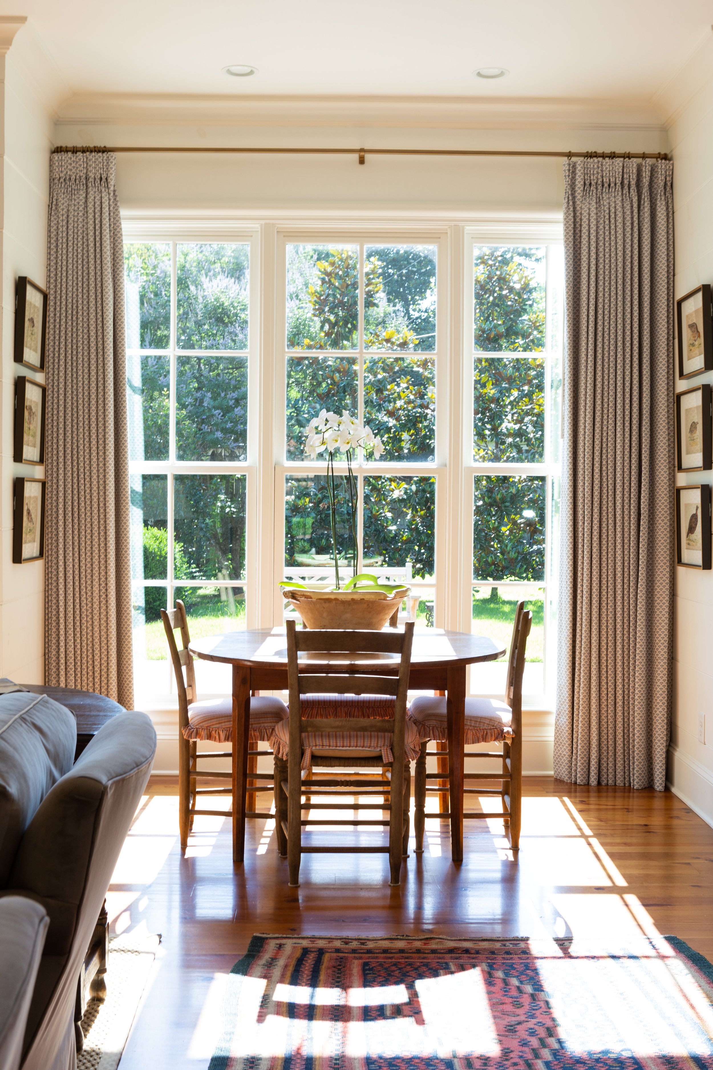
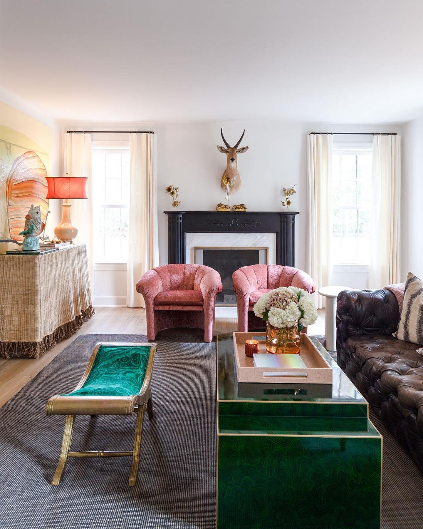
As construction progressed, Steffens turned her efforts toward design-related decisions, guided by the clients’ preferences. “Lale likes brighter colors, but she also wanted a clean backdrop,” she explains. The juxtaposition of white and bright begins in the home’s front entry, where Quadrille climbing hydrangea wallpaper in salmon shades dresses up the white-trimmed walls. The pattern is a time-honored Southern favorite—a similar style appears in the home of Scarlett and Rhett in Gone with the Wind. Antique brick floors provide the quintessential Delta home feel the couple sought.
Steffens carried the bright white of the entry millwork on the walls through most of the house, interspersing color sparingly, but effectively. In the kitchen, it comes in the mellow blue-gray shade on the cabinetry. “It made for a great mix of soft and clear colors,” she explains.
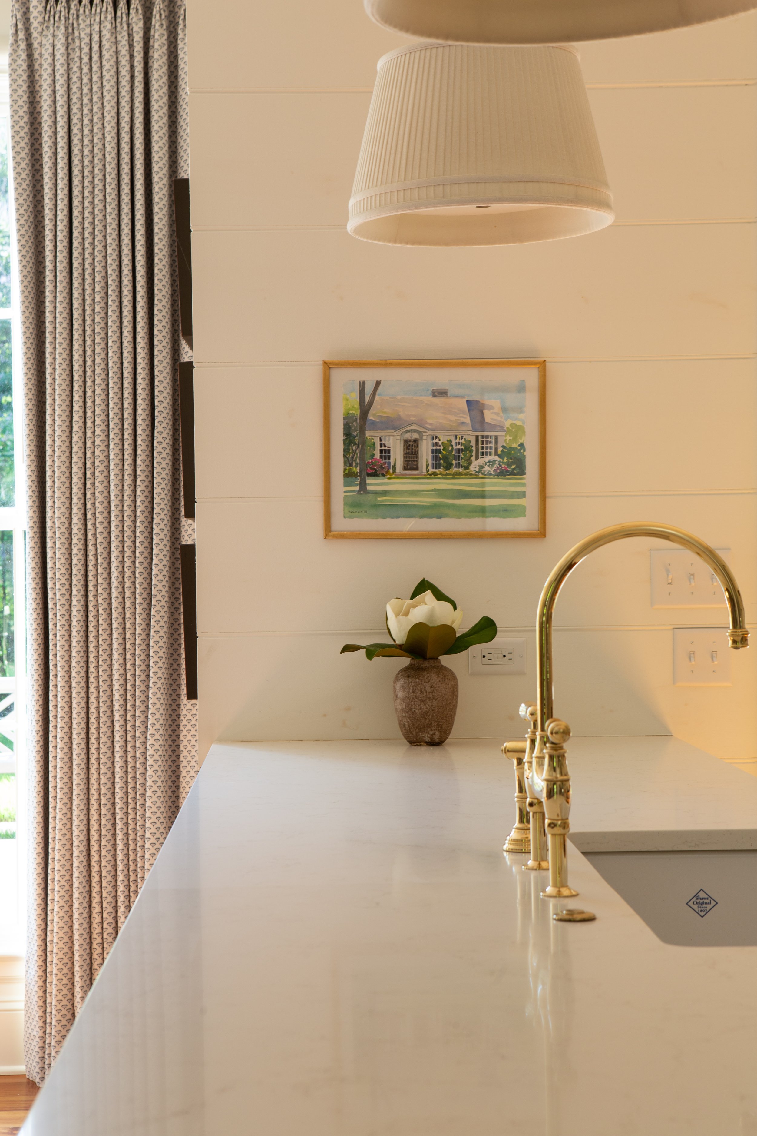
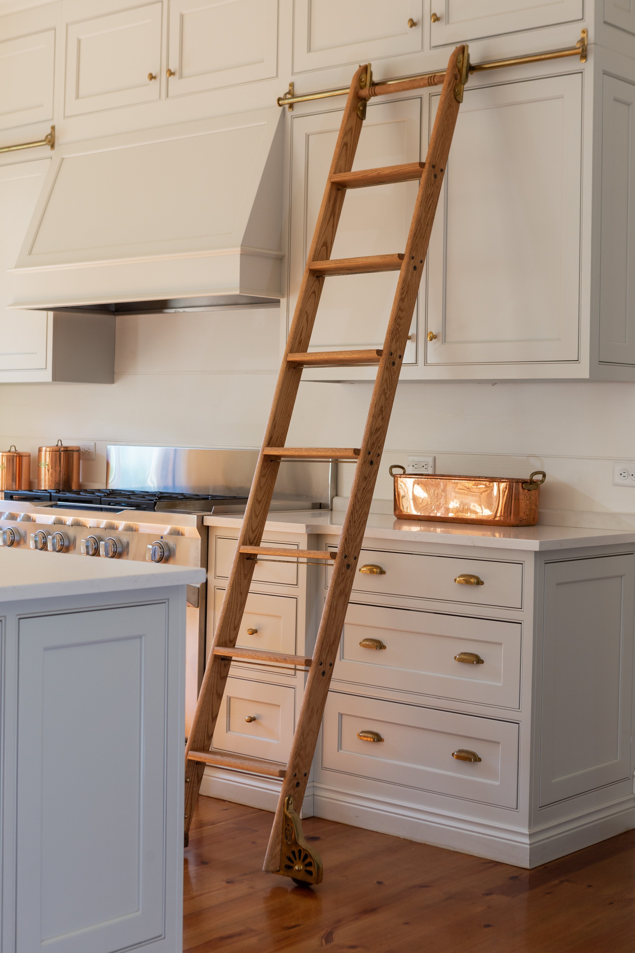
Those custom cabinets extend to the ceiling for maximum storage. A handsome brass and wood rolling ladder system from Putnam Ladders facilitates access to the upper cabinets and adds extra sophistication to the space. Steffens chose unlacquered brass in the cabinet hardware, and says she is pleased with the way its finish has aged to a soft patina over time. She is particularly fond of the Perrin and Rowe faucet on the kitchen sink. “I love seeing it there. Especially when it’s on an island, I like to think of the faucet like a piece of jewelry,” she says. Beadboard walls, inset cabinet doors and drawers, white quartz countertops and simple, shaded pendant lights selected by Steffens complete the kitchen’s elegant ambiance.
One of the benefits of building a custom home is the ability to make changes during the construction process, notes Oscar as he points to the kitchen door. Although the blueprints called for a window in the spot, an on-the-fly decision substituted a door. The homeowner couldn’t be happier with the alteration; he says it’s now the most-used door in the house.
The remodel afforded a generous amount of space for a bar and it has become a favorite gathering spot when the Adamses host friends and family. Glass-front cabinets show off a sizable collection of barware. Steffens chose a saturated green for the walls, trim and cabinets. The stained wood countertop was another adjustment made during construction. Says Oscar, “We were going to put quartz countertops in here, but we ran out of time and so they took the same wood as the flooring and put it there. It has held up great.” The room’s decidedly masculine vibe makes the perfect backdrop for the many family photos and documents that grace the walls.
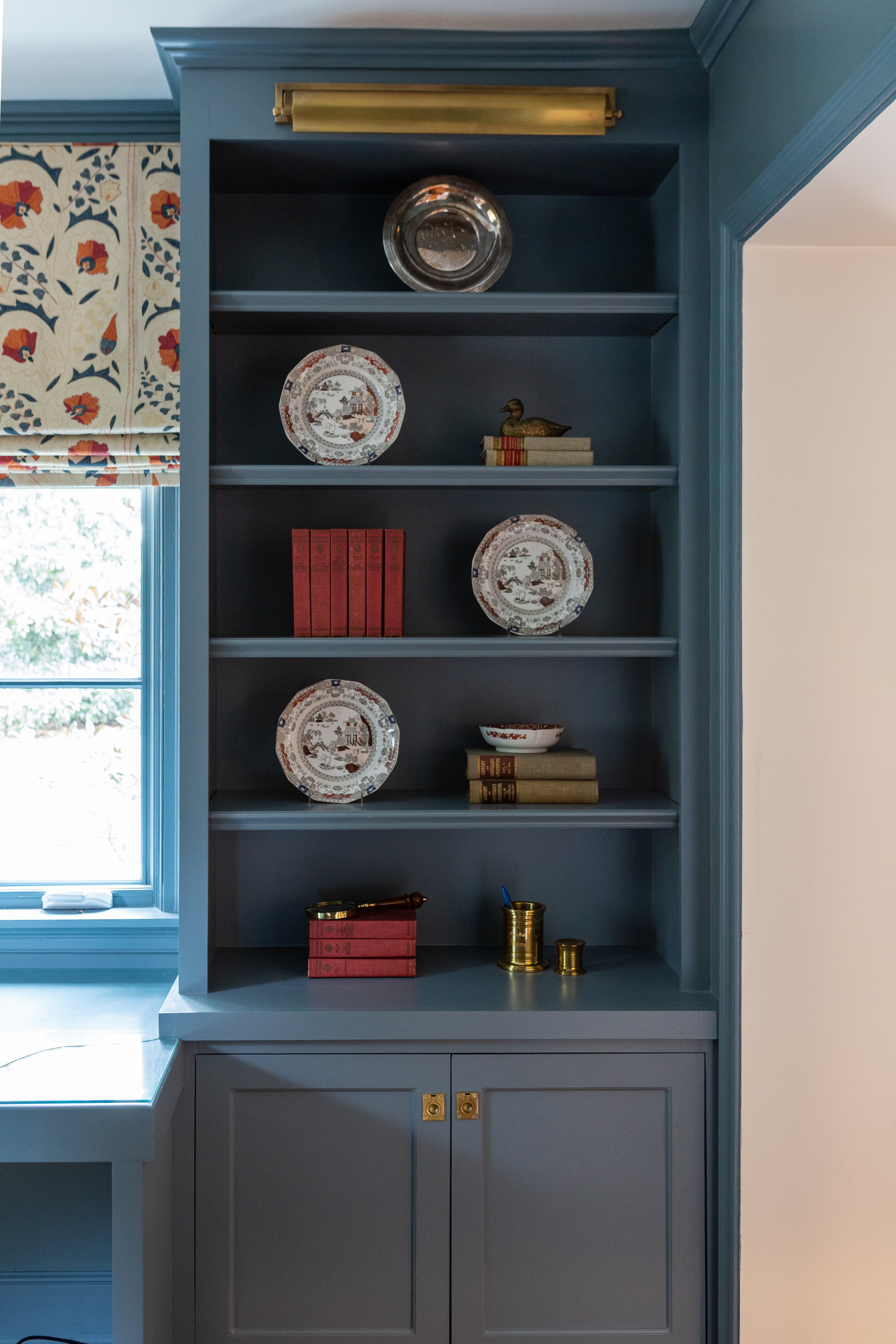
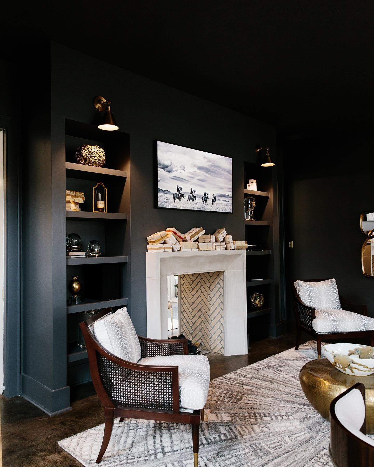
The gentlemanly feel carries into Oscar’s home office, a space he and Steffens designed collaboratively and one that he says is the perfect spot for working from home. The room is filled with built-ins, including a desk area, well lit thanks to a large window above it. An oval window on an adjacent wall brings more light into the green/gray painted room, along with an element of architectural interest. A simple wooden desk doubles the amount of workspace in the room, while plenty of cabinets and shelves accommodate the homeowner’s collection of books and mementos.
The oval window motif is reprised in the laundry room. Although it’s one of the smaller rooms in the house, the laundry is jam packed with appeal, starting with its door. The charming half door allows the window all the visibility it deserves. Steffens repeated the same cabinetry and counters as in the kitchen here, highlighted by a porcelain farm sink that blends form and function. White shiplap walls and the reclaimed brick floor in a herringbone pattern complete the classic Southern setting.
The home’s primary bedroom and bath remain in the original portion of the structure. While the bedroom and closet had been modernized in a previous renovation, Steffens set out to bring the bathroom up to date and make the most of every square inch of the area’s somewhat narrow footprint. Using her expertise and a few tricks of the trade like slightly decreasing the depth of the double vanity, she created a space that is tidy, practical and beautiful.
While the majority of the renovation is finished, Steffens is still collaborating with the Adamses on small details and additions to help complete the home’s metamorphosis.
What started as a post-war, three-bedroom, single-bath, starter house with a small living room and kitchen has transformed into a shining example of Deep South style, one that has given the family that lives there a place to cherish and to pass down the love for its beauty for generations to come.


