Old Neighborhood, New Vibe
/Design by Maggie Clarke Interiors | Story by Terri Glazer | Photography by Stefanie Rawlinson
The heart of Cooper Young, a Memphis neighborhood known for its classic cottages and bungalows, might not seem like the expected setting for a new subdivision, but this home in developer Griffin Elkington’s Cooper Station proves that old and new, traditional and contemporary can coexist beautifully.
As with all 15 homes built by Elkington on the former industrial site, architect David Anderson designed the house’s exterior elevation to include traditional features fans of quintessential Midtown architecture love—clean lines, large windows, a welcoming front entry. The inside, however, takes a much more modern tone, thanks to the work of designer Maggie Clarke, owner of Maggie Clarke Interiors.
Dr. Chenobia Webster-Hill hired Clarke to guide the decor in December 2020, while the home she shares with husband Corey Hill and their two young children was still under construction. Clarke attributes much of the finished product to ideas the homeowners brought to the table.
“Chenobia and Corey did a wonderful job!” says Clarke. “They picked out all the paint colors, all the tile for the kitchen and bathrooms, and the woodwork in the entryway was her idea. I came in just for furnishing and styling, so that was interesting because usually on new builds I do everything. On this project the clients gave me a springboard.”
Clarke asked the couple to send her inspiration pictures. In them she found a definite trend toward contemporary spaces in neutral tones, punched up with pops of bold color. She carried that aesthetic throughout the home, starting from the first step inside the front door. Accented with custom woodwork in a stylized chevron pattern designed by the homeowners and painted a tranquil gray/green, the entry wall is the perfect home for a pair of vibrant Jean-Michel Basquiat art prints. Webster-Hill selected them, along with all the art in her home. Clarke explains that although she occasionally makes broad suggestions, it’s her policy to have clients choose their own works of art. “It’s such a personal thing. Art has to speak to you.”
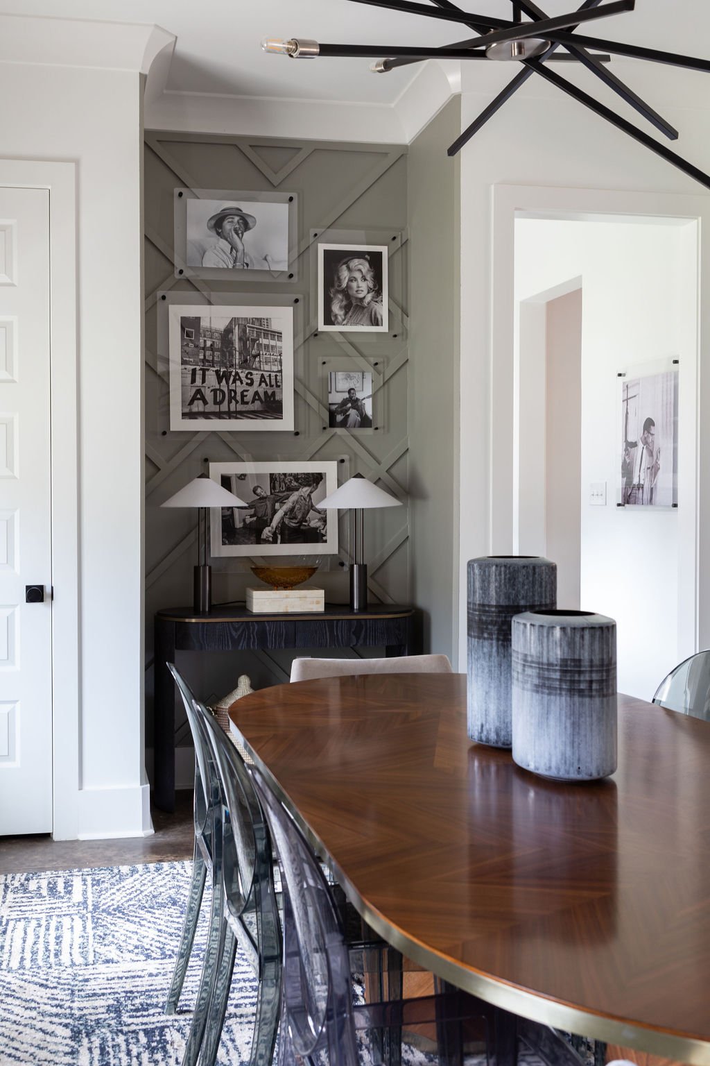
That said, she is thrilled with the Basquiat pieces in the foyer. “They set the tone and foreshadow what’s to happen in the rest of the house.” In the dining room a gallery wall features the same distinctive woodwork, topped by equally striking black and white photography.
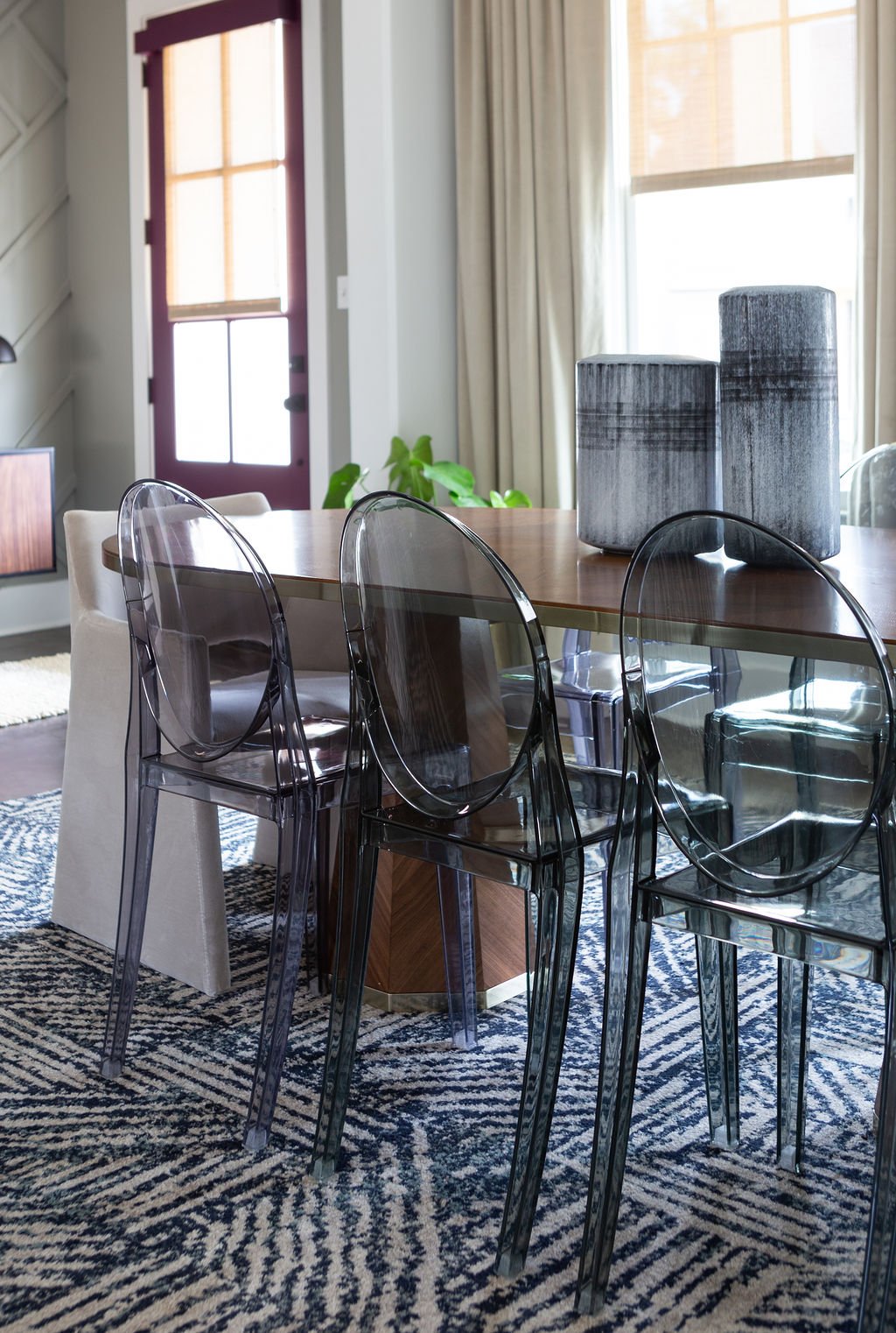
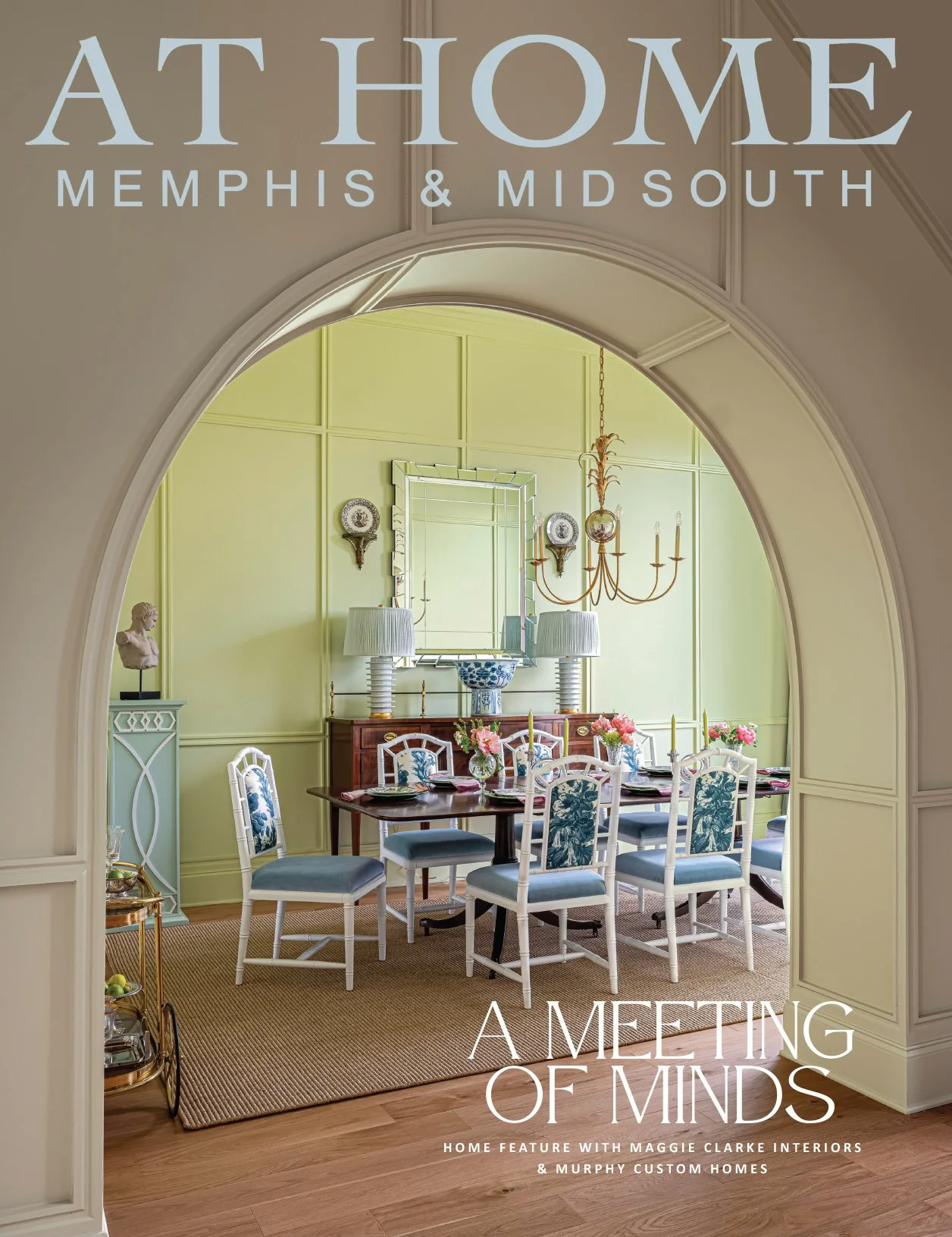
The ultra modern dining table from Four Hands is surrounded by smoky lucite side chairs. A pair of eye-catching end chairs upholstered in creamy velvet creates the perfect juxtaposition of hard and soft.
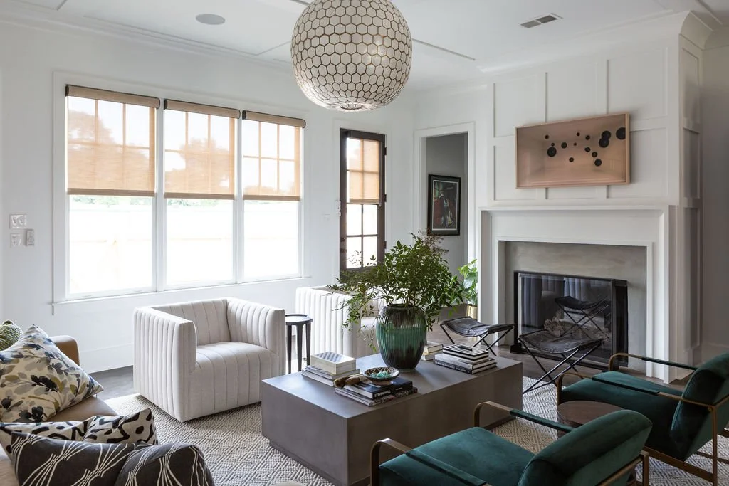
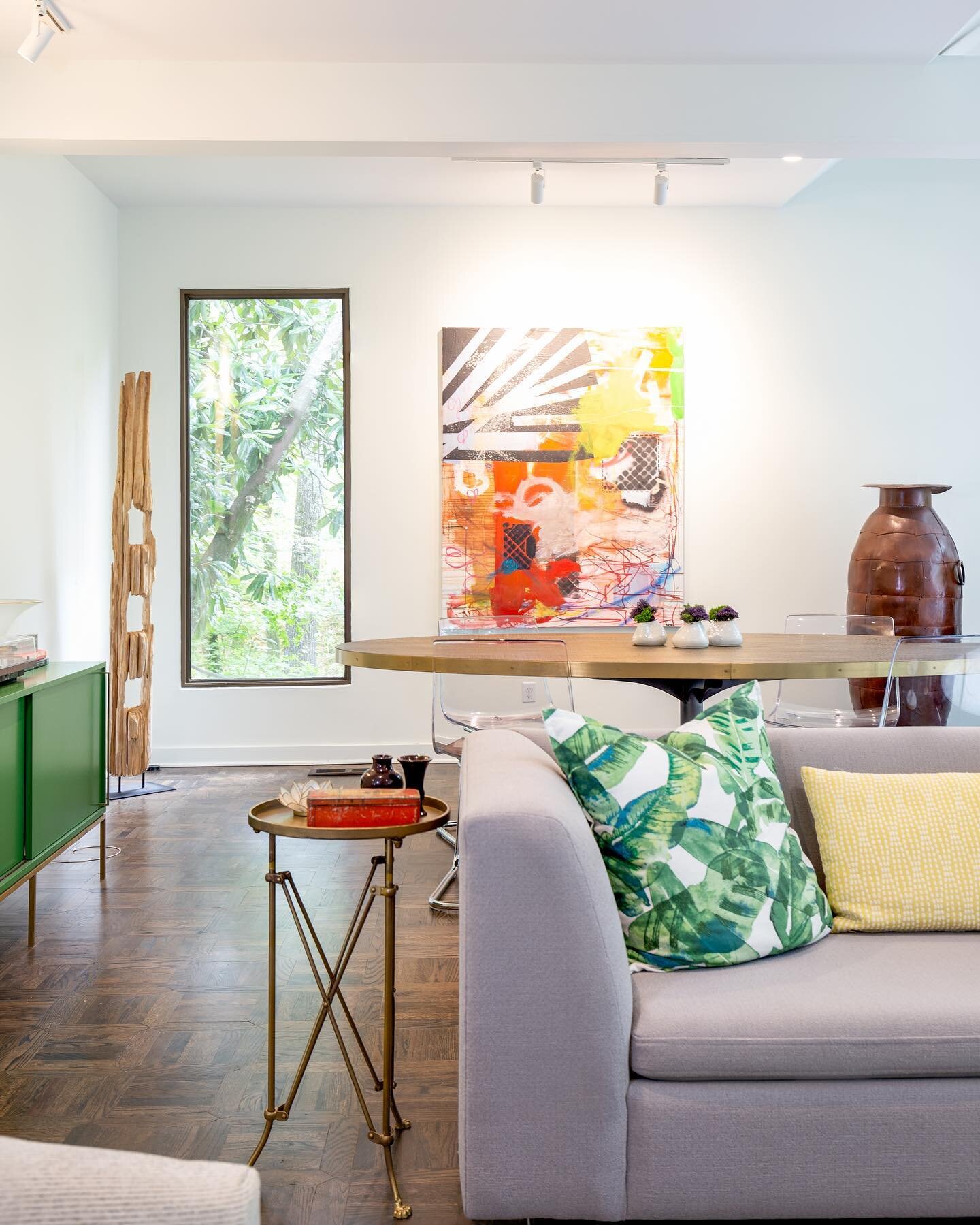
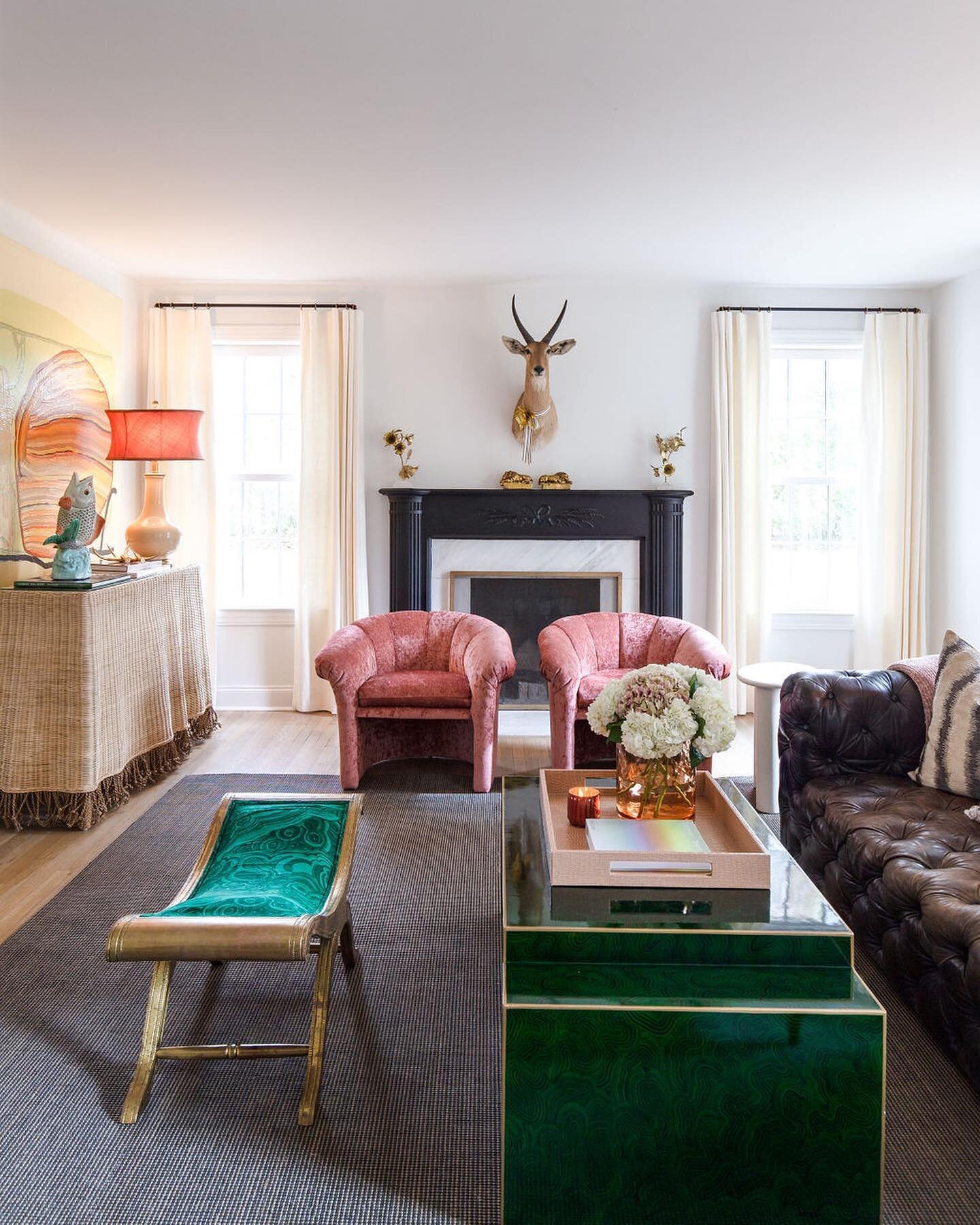
The adjacent living room exudes modern sophistication through an eclectic blend of lush fabrics, dark wood accents and natural elements, all set against the backdrop of crisp white walls and dramatic stained concrete floors. A globe-shaped light pendant from Serena & Lily is like the cherry on top of the space, says Clarke. “I love the scale of it; it’s like a focal point. I love a capiz light fixture! The softness of capiz adds balance and a little feminine touch to the lines of the room.”
The showstopper sofa is a perfect example of the synergy between client and designer that produced such a successful end result. “She called me and said, ‘I have a sofa for you.’ And I said, ‘Oh really, because I have a sofa I want you to see. Exactly the same sofa,” recalls Webster-Hill. The CB2 piece sets the room’s cocktail lounge vibe, while the rest of the furnishings, from a pair of swanky white swivel chairs to Chairish cocktail stools, beckons guests to sit and relax.
Due to the home’s open floor plan the kitchen and the living room are technically one space, but the kitchen has a personality all its own. Vivid green paint chosen by the homeowners with Clarke’s stamp of approval, wooden light pendants, white cabinets and carrara quartz countertops play out the neutral-with-bold theme here, and Webster-Hill couldn’t be happier with the heart of her home. “This is my favorite spot in the house,” she says, standing at the kitchen island. I love to stand right here and eat. I love the view.”
And who wouldn’t love that vista? From her kitchen island vantage spot, she can look out not only at her sophisticated living room—large windows across the home’s back wall provide a view of the spot the homeowner calls her family’s outside oasis. The back courtyard proves that a small space can make a large impact. Brandon Malone of Malone Construction Enterprise built a compact yet elegant pool that packs a big punch, complete with a waterfall feature and lighting. The patio also has a cozy nook where the man of the house can enjoy a good cigar in style and comfort.
The downstairs powder room makes a nod to the neighborhood’s classic history. Clarke recalls, “When she hired me, Chenobia said, ‘I want this to look like a speakeasy.’ So we went really dramatic, from the wallpaper to the art. There’s even a black potty!”
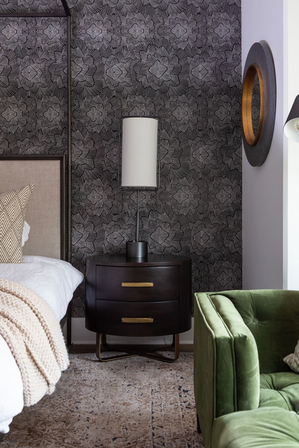
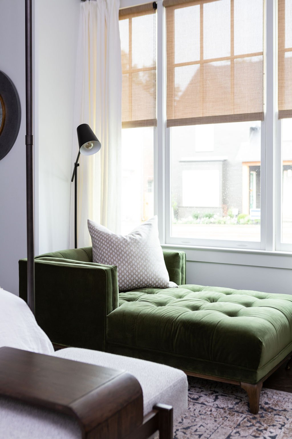
An accent wall bathed in bold black-and-white wallpaper makes a standout feature in the primary bedroom. The room still has a quiet feel, despite the party on the wall behind the bed, however, thanks to a clean-lined canopy bed, neutral bedding and a simple wood console. The green velvet chaise next to the window is a favorite reading spot for the children. A tall, lanky Regina Andrew lamp stands alone on each of the nightstands, providing simplicity and drama at once.
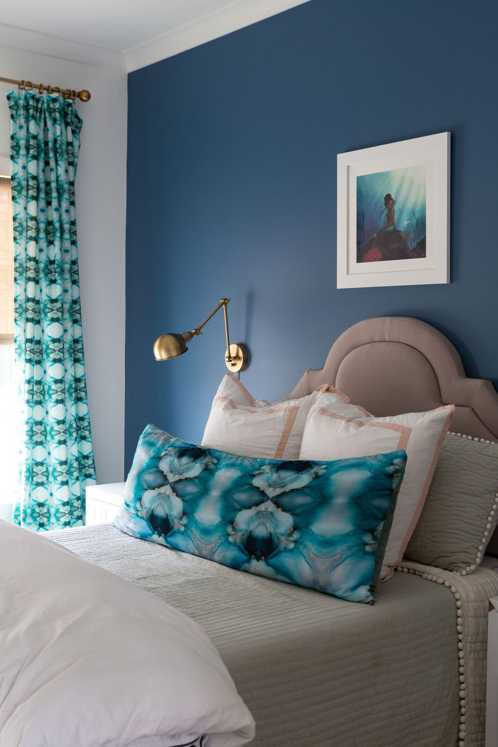
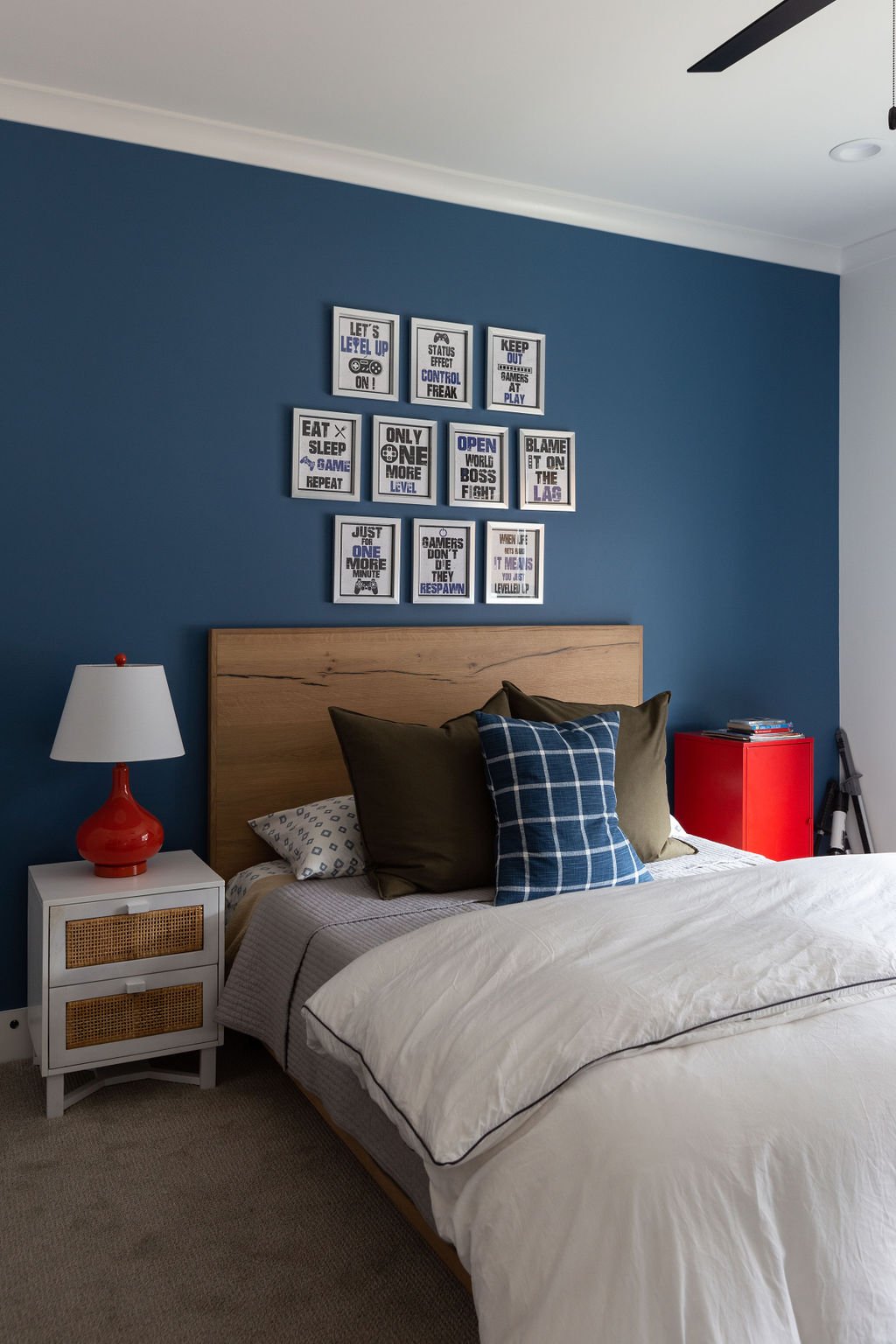
Upstairs, Clarke’s clever design will allow the two children’s bedrooms to grow with them as they transition to teenage years. She called on local artist and personal friend Whitney Winkler to design aquatic-themed textiles for the mermaid-loving daughter’s room, while the boy’s abode is handsome in deep blue and white, completed in natural wood with red accents.
The second-floor TV lounge is a study in comfort with a cushy sofa in serene blue velvet, a pair of inviting chairs, and a button-tufted leather ottoman large enough for the whole group to prop feet up. The undisputed star of this room, though, is Corey’s prized collection of vintage album covers displayed as wall art. Grouped tightly in three rows, the vinyl jackets make a stunning visual impression and call to mind memories of the giants of soul, R&B and funk.
Although they’ve only lived in their Cooper Station home for a few months, Webster-Hill says her family has found that the new development has quickly come to have the front-yard hospitality for which older neighborhoods are known. “It’s been a great experience. The people are friendly and welcoming,” she says.
A great neighborhood and a great house, she adds, thanks to a great designer. “We built a house. She created a home.”

