A Story To Tell
/Design by Warehouse 67 Design | Builder John Duke Homes | Story by Terri Glazer | Photography by Annabella Charles | Christmas Decor by John Mark Enterprises
That description is perfectly fitting for a classic English manor. One with timeless style, distinctive details and a sense of warmth. While it might be an unexpected characterization for a brand-new Vesta showhouse, it depicts perfectly the ambiance of this home, and it’s exactly what the designer had in mind from day one of the project.
“We always love English. It never goes out of style; it’s a classic design and architectural style that feels warm and inviting,” says Kim Loudenbeck, owner of Warehouse 67 and designer of the home. Along with builders John and Elizabeth Duke, Loudenbeck set out to create a modern English manner that would feel warm and cozy, “as if it has a personality and a heart”, traits that sometimes elude large homes. To achieve that goal she paid careful attention to detail in every design element. Her focus paid off—the result is a seamless blend of timeless beauty, updated clean lines and features for the way families live today.
With its decorative brick work, timber accents and stone chimney, the exterior is vintage British. Modern flair appears in the iron and glass front door. The designer says the departure from a more traditional wooden door allows natural light to flood the entryway and also creates a sight line all the way through the house to the stunning pool area out back.
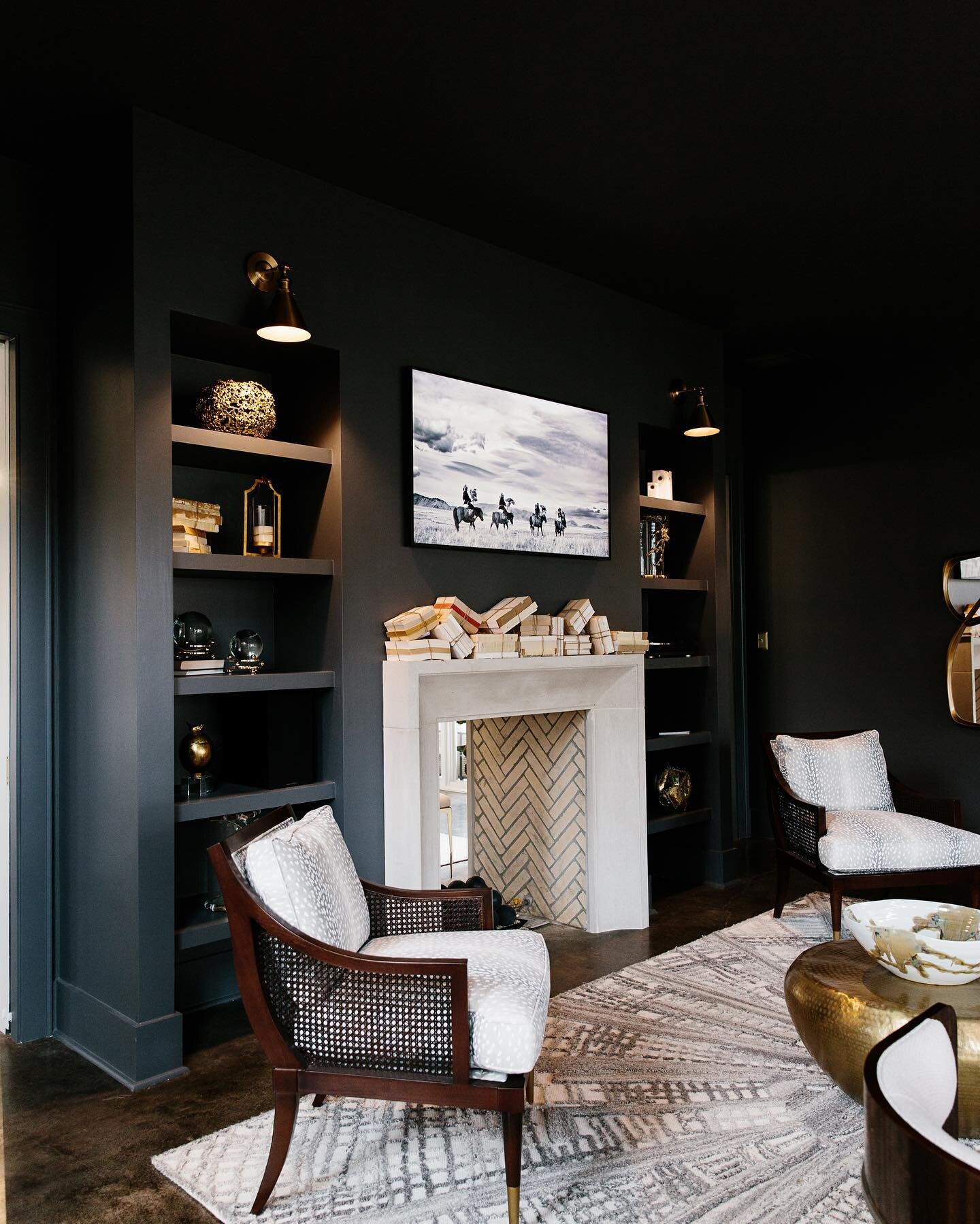
Loudenbeck says one of her favorite aspects of the house is the way the spaces flow from grand and open to cozy and intimate. The study off the foyer is decidedly one of the more tucked up spots. The limestone fireplace and coffered ceiling set the mood, which the designer further played up by painting all the trim in an atmospheric gray/green.
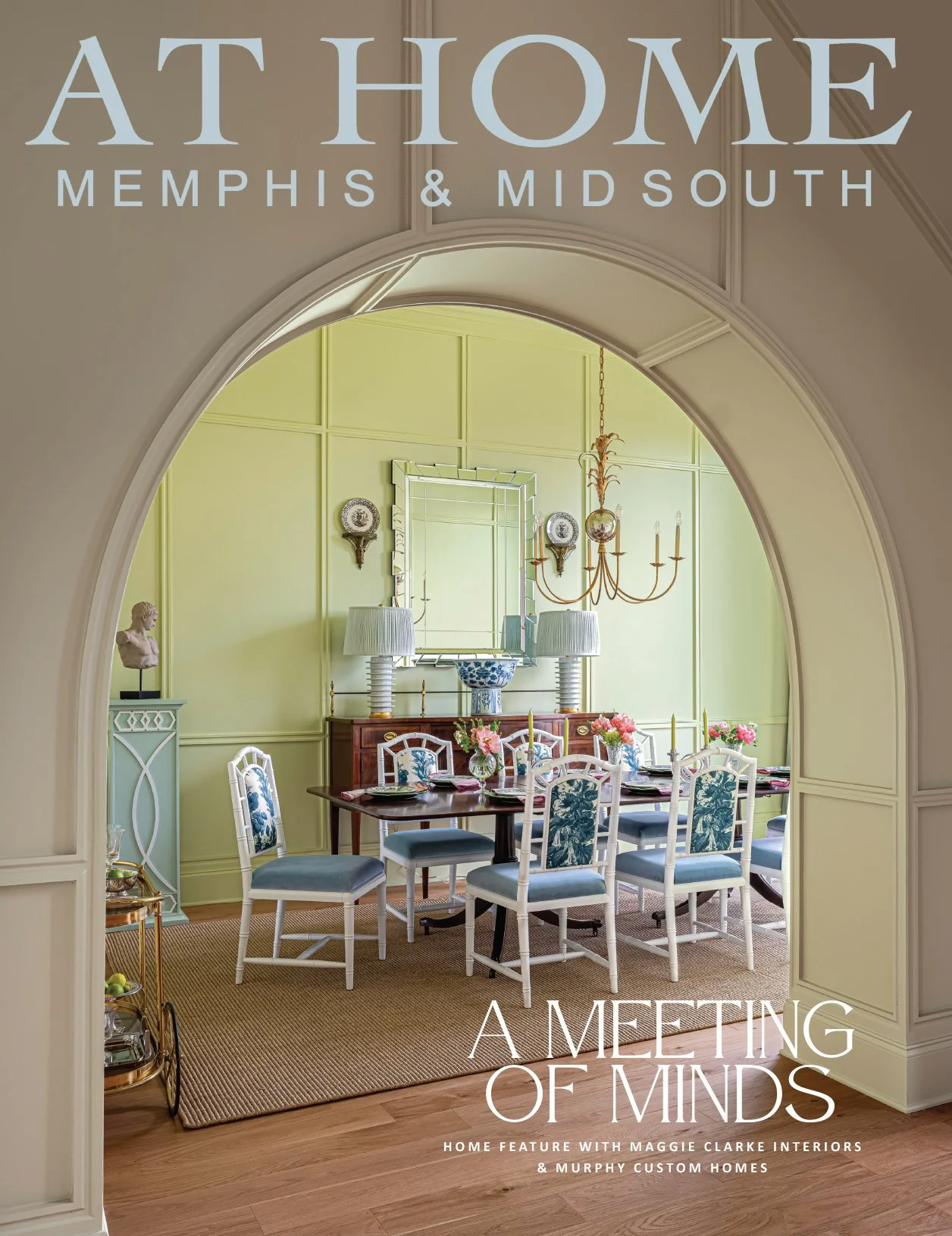
Across the entry, the formal dining room is light-filled, thanks to a large window. Tall wainscoting topped by wallpaper harkens back to a different time without being fussy. As Loudenbeck explains, “The architectural elements we created are tied to the historical, but the way we’ve done it is with clean lines and the colors give it more of today’s styling.”
The family room leans to the grand and gorgeous side. Its vaulted ceiling draws the eye up to handsome wood beams, the handiwork of local craftsman Wade Burrus. “In a historical home you would have post-and-beam construction with beautiful beams and timbers,” says Loudenbeck. “And the hearth in an English home is what the whole room centers around. We did a classic limestone fireplace and added custom paneling on the wall, but we chose a color that would make it dramatic.” On the back wall three large sliding doors allow traffic to flow effortlessly onto the bluestone patio, through an inviting outdoor room, to the pool with a trio of waterfall features and landscaping that brings an orderly English garden to mind.
The adjacent kitchen is a study in understated beauty. Loudenbeck partnered with Lisa Russell of LM.Designs to create a unique and functional space in the heart of the home. “Sometimes less is more and this is one of those kitchens where the elements in it are done so well that it doesn’t need a lot of fluff,” says the Loudenbeck. Those elements include more timber accents from Burrus, paired with an of-the-moment waterfall quartzite countertop. They do not, however, include wall cabinets on the range wall. Loudenbeck instead opted for a pair of floating shelves and room to display artwork. “Negative space can be really good. It lets you focus on the areas that you want to be the focal points and highlight the pretty spots,” she says.
Nestled behind the kitchen is the scullery, an area fast becoming a must-have in well appointed new homes. With more cabinet space, a coffee bar and a second set of appliances, the room is all about function. To that end, the design includes a built-in “hub,” a desk area from which family schedules, meal planning and more can be easily managed.
“Half baths are fun to design because you can kind of be moody,” Loudenbeck says, and the main floor powder room in this home is a perfect example. Loaded with millwork and painted dark, the walls are topped off with a wallpaper that is historical and current at the same time. “Classic traditional, but in an updated way, is trending right now. We are seeing a lot of the high-end design companies doing throwbacks on fabrics and wallpapers. I think people like having cleaner and more modern elements but there is something comforting about remembering the past,” Loudenbeck says.
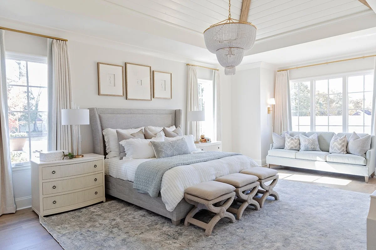
The designer’s philosophy on primary bedroom design is simple: because homeowners spend more time there than any other place in the house, it should be especially beautiful and comfortable. “When you wake up surrounded by things you love, it sets a good tone for the day,” she believes. This home’s primary suite is a beautiful example of that theory. Under a vaulted ceiling embellished with timber beams, a fabulous gold and beaded chandelier lights up the spacious bedroom. A bay window adds architectural interest and makes a perfect spot to relax with a good book.
The window treatments in the primary bedroom and throughout the house are functional curtains that can close for privacy and open to maximize natural light. Loudenbeck says she intentionally shied away from using interior shutters or other treatments that would permanently cover the windows. “The lines of the house are so pretty that to cover up those windows would be a shame,” she says. “We wanted to accentuate them and frame them out instead of taking away from them.”
The primary bath design hinged on the room’s centerpiece, a double cast iron tub in relaxing blue hues. A pair of freestanding vanities in natural wood tones topped with quartz countertops hold their own due to thoughtful details like high backsplashes and gold tone fixtures, while still allowing the star of the show to shine.
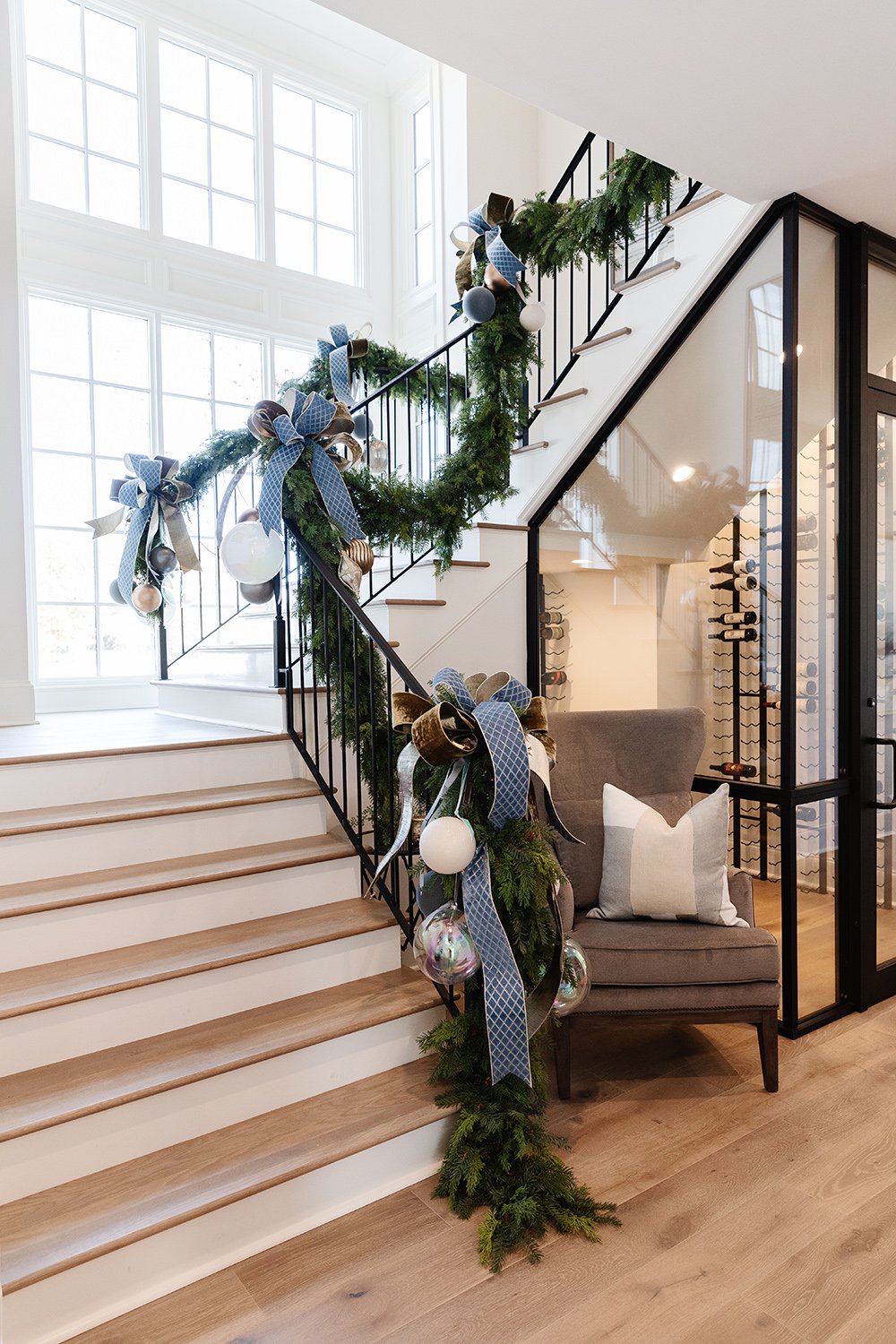
The home’s main staircase, illuminated by tall windows, was inspired by Thomas Jefferson’s design philosophy, which Loudenbeck learned as a college student. “Jefferson thought a grand staircase was a grand waste of space,” she recalls. “So our challenge was to create the grandeur but also make it usable.” Compact and beautiful, the space is definitely not wasted. Even the space under the staircase was put to use. It holds a 200-bottle climate-controlled wine room fit for a connoisseur.
Atop the stairs a pretty vestibule, framed by more of the molding that gives the house so much character, leads to the spacious game room. Furnished with an inviting sectional sofa, leather chairs and large ottomans, the room exudes comfort and relaxation. Loudenbeck describes the distinctive brass and glass chandelier as the room’s “jewelry,” emphasizing that even a home with the essence of English style can accommodate modern accents successfully.
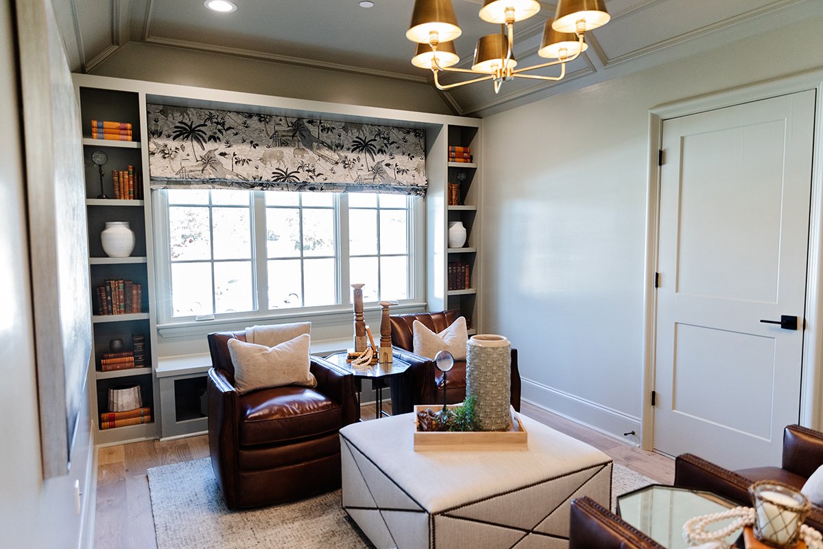
Three additional bedrooms and baths, along with a charming wood paneled flex space that could serve as a nursery as easily as a home office, round out the second floor.
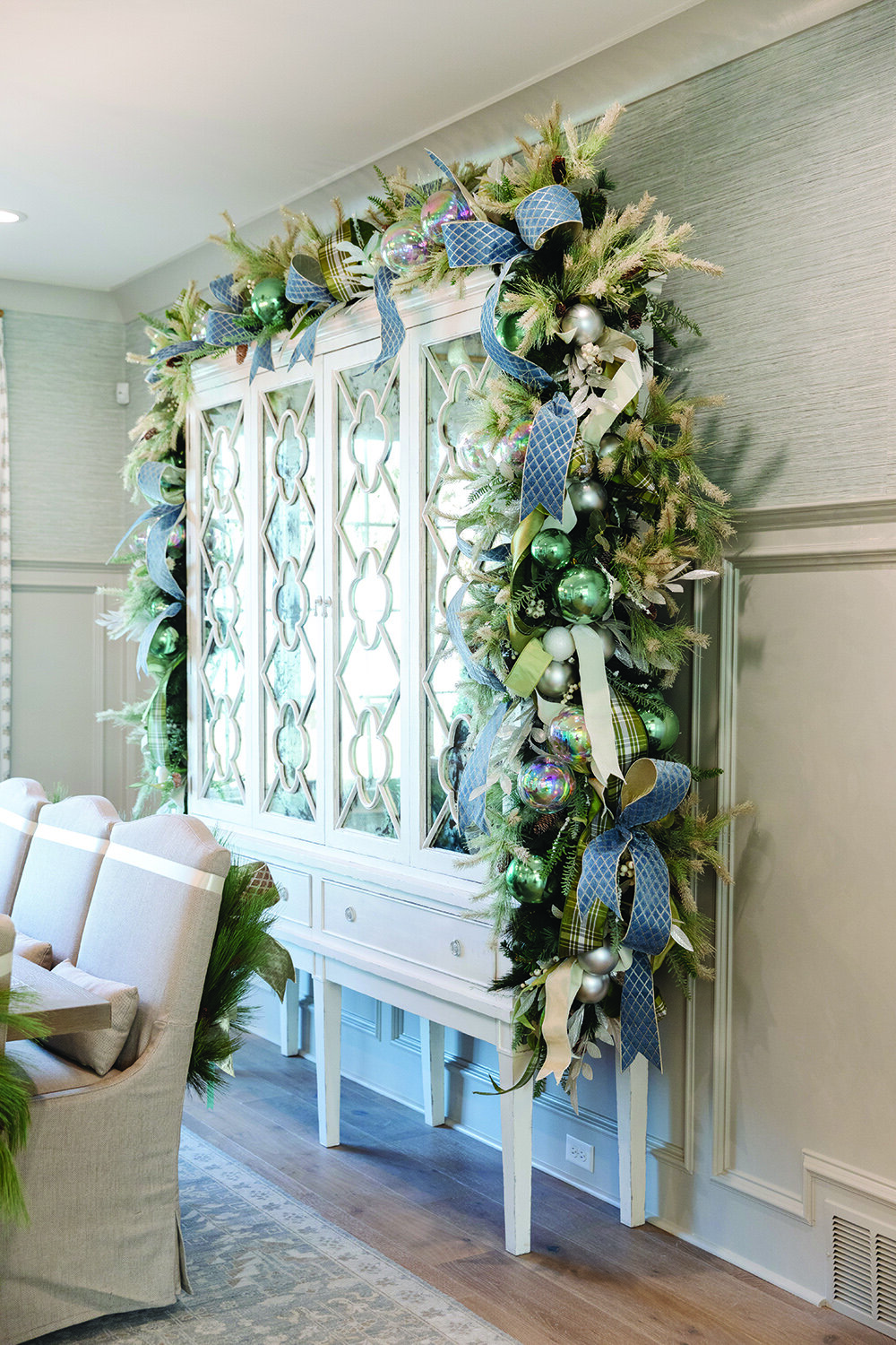
Building a strong team from day one, John Duke was able to masterfully execute the vision of timeless beauty. With a stunning palette as a backdrop, the team of designers at Warehouse 67 created a comfortable yet elegant space that harmonizes with the home’s architecture. Custom furnishings and designer details from Warehouse 67 were planned early in the process to enhance the home’s character and charm. And just in time for Christmas, floral designer John Mark Sharpe added the final touches to this picture-perfect holiday home.
Loudenbeck summed up her affection for the home during a walkthrough on the eve of the Vesta Homeshow’s opening. “This is what we wanted—when you walk through the space you can connect to it and it almost speaks to you. This house already has a story to tell.”


