Patience Pays Off
/Design by Spruce | Story by Terri Glazer | Photography by Stefanie Rawlinson
To say that it took a while to bring this home to completion would be an understatement. Designer Selena McAdams began working with the owners shortly after they moved into the Midtown Foursquare in 2007. The fact that not one item she selected for them has been discarded in almost 15 years is a testament to her guiding philosophy. “You have to have an end game you are always working towards,” she says. “You can always be true to being classic and not have to get rid of anything along the way. I think that’s probably the biggest thing.”
The owners knew they wanted to make the 1912 classic home in the Evergreen Historic district their own, while staying true to the house’s original character. McAdams laughs when she recalls that their initial meetings, in the “pre-Pinterest era,” centered around the client's binder full of pictures cut from magazines. Those clippings inspired a series of smaller design collaborations over the years, and when the couple prepared for the home’s recent major redo, out came the binder again. Says McAdams, “Design elements that she and I liked 15 years ago were still some of the inspiration now that they were finally doing everything.”
She attributes that fact to the timelessness of the owners’ taste. “I think this is an example of how a home can feel updated and honor the true classic elements of its architecture without being trendy.”
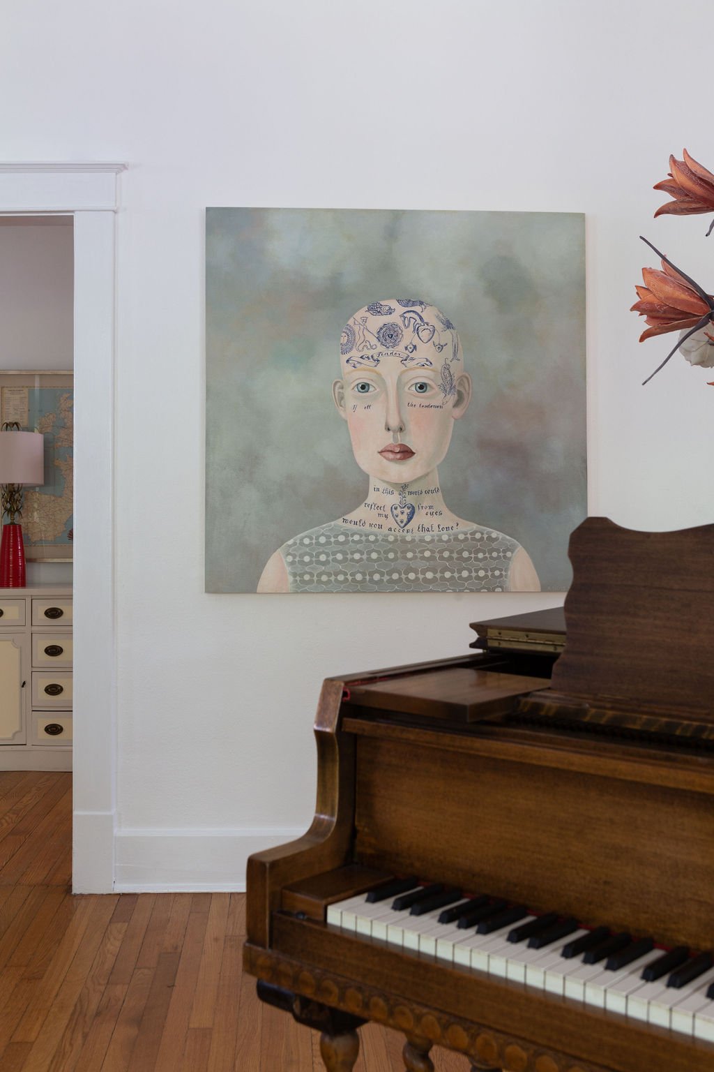
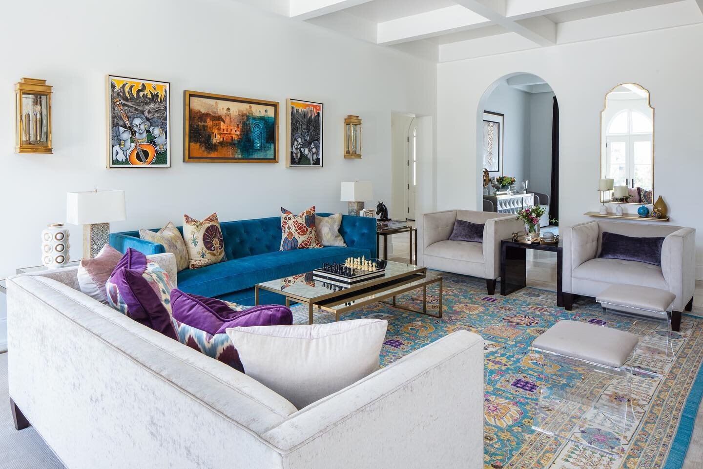
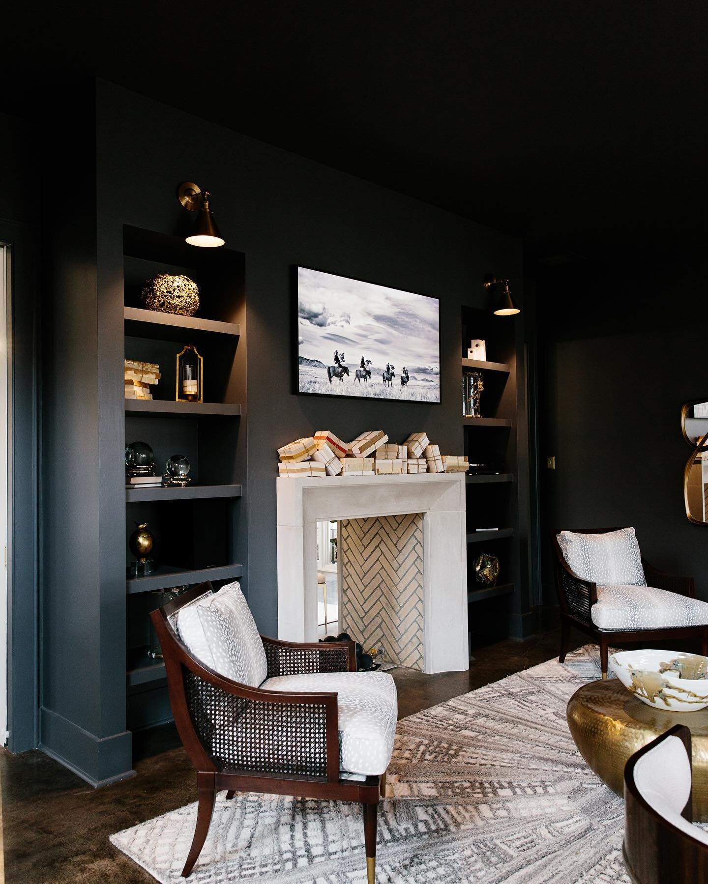
Classic, yes, but with bold statements that reflect the personalities of the people who live there. In the front room a baby grand piano and a large acrylic painting on panel, “Tender” by Seattle artist Anne Siems, share center stage. Overhead, the home’s original chandelier has a new life, thanks to the client, who polished a century of tarnish off it and added oversized modern bulbs to bring it into the 21st century. The room is home to two of the first pieces McAdams selected for this family in 2007: a dramatic black vase on the piano and a set of resin antlers over the fireplace worked then and continue to wow today.
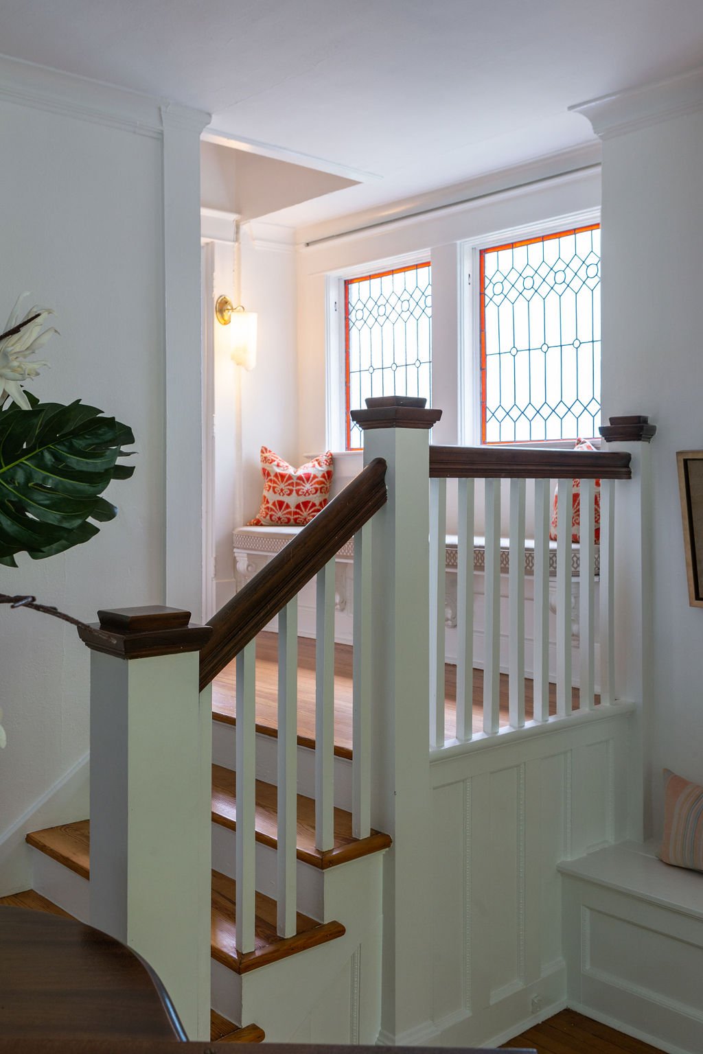
The homeowners commissioned local artist Suzy Hendrix to create a pair of stained glass windows that would bring a bright, fresh approach to the design element often seen in architecture of the period. Hendrix delivered leaded glass beauties with a pop of a tomato red hue that reappears elsewhere in the home.
The family loves to entertain, and their newly completed dining room is the perfect place for a dinner party. McAdams says the homeowners wanted a wall of built-ins with a formal, fancy feel. Finished in deep green lacquered paint and topped with neutral-toned quartzite, the Bylercraft custom cabinets showcase a collection of china, silver and glassware. A Megan Hurdle painting, commissioned by the homeowners from a personal photo depicting a sunset in Rosh Hanikra, Israel, fits beautifully under a small, high window, but the “jewelry” of the room is a custom Wunderwurks chandelier.
The dining room is a shining example of how select high-end elements can pair with more modest items to create a stunning final product. The banquet-sized dining table came from a friend of the owners, a home stager who found the piece too large to be practical in her work. Refinished, it anchors the decor perfectly. The dining chairs were early acquisitions from Pottery Barn and Pier One. McAdams worked her redo magic on them, covering them with practical yet handsome leather-look vinyl dressed up with contrasting piping.
“Working with Selena consistently was so helpful because I didn’t feel like I was throwing away money left and right on small, quick fixes and making decisions with no eye as to what would come next. With Selena’s eye on the big picture, we just kept building on what was there,” says the client.
The family room’s loungey, sunroom vibe is a product of a masterful mix of factors. The original pie rail, coupled with faux wainscoting that cleverly mimics an expected historic detail, is painted fresh white and topped with wallpaper that calls to mind the iconic Beverly Hills Hotel palms pattern in a fresh iteration. Says the client, “I had been looking at the Beverly Hills palms and a lot of different patterns, but I felt like I’d been looking at it for 10 years. I’d seen it in so many magazines and it felt like I was about to do something I’d been waiting so long to do and that I’d get it on my walls and be tired of it already—it wouldn’t feel new to me.”
McAdams echoes her client’s opinion. “I’m hesitant to lead people down those paths, because they are so iconic. And I think that because you see them so frequently, you tend to tire of them more quickly. I was so on board with this pattern because yes, it’s a palm, but it’s also more understated, less likely to be seen over and over. I think that the motion of this palm is energetic; it sets the mood for this family’s main living area.”
Vintage lamps and accessories provide a subtle mid-century chic mood, while a console in geometric wood parquetry and a sleek aquarium bring in natural elements. Vibrant color comes from a rust ottoman, a pair of navy velvet chairs, and family favorite pillows McAdams sourced years ago that have been used in various rooms over time.
While McAdams steered the homeowners away from a vintage wallpaper pattern in the family room, she fully embraced the idea in the nearby powder room. The client loved the Josef Frank Citrus Garden pattern from Schumacher so much that she had upholstered a bench in the fabric. Created in 1947 and recently reissued, the vibrant pattern is familiar, but not overexposed, says the designer. Tomato red trim ups the wow factor, along with a period-appropriate wall sink and an artistic light fixture.
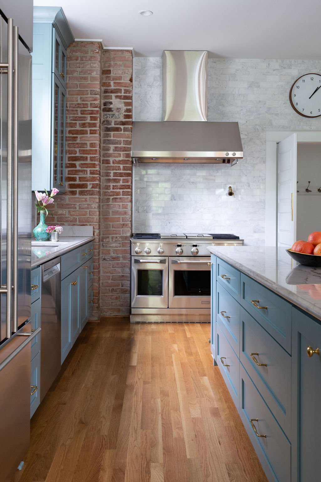
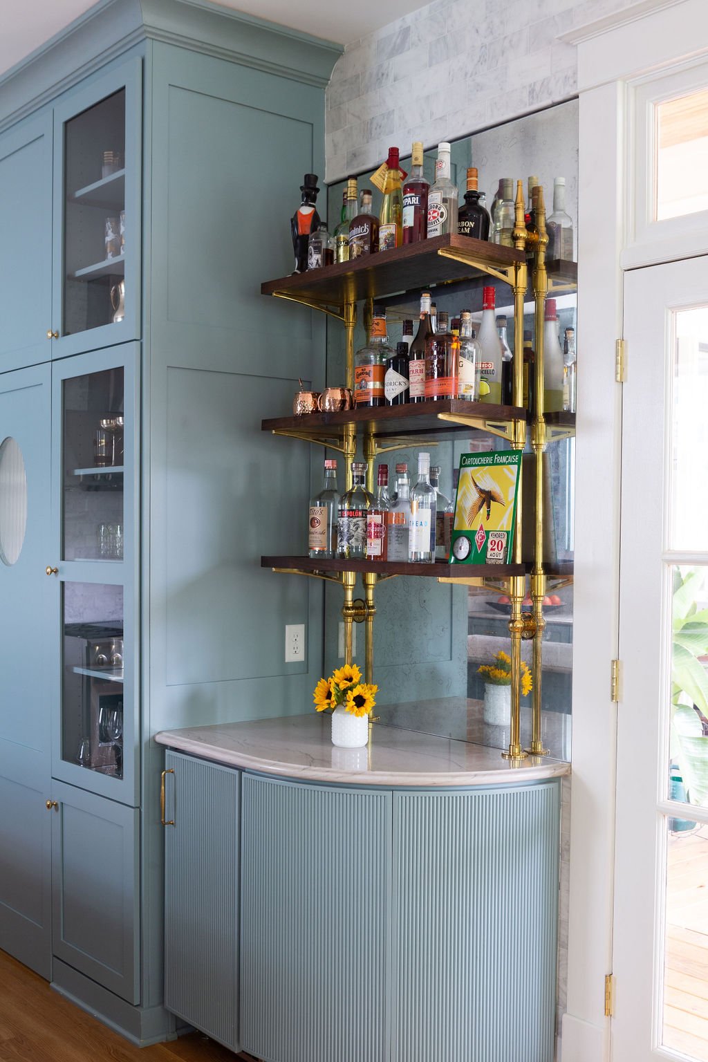
Stepping into the kitchen is like taking a trip to a super stylish Parisian cafe, so fitting for this family, who are local restaurant owners. The Bylercraft cabinetry is painted in Benjamin Moore Atmospheric, a saturated blue green off which neutral quartzite countertops play perfectly. Marble subway tiles line the walls. Although the room has a narrow footprint, the homeowners wanted to make sure there was room for an island. The result is fabulous, complete with mini tile accents, a brass footrail and French bistro style barstools. The traditional brass and graceful curve of the island are mimicked in the reeded cabinet bar area on the opposite wall. By its side, full height, glass-front cabinets flank the swinging door that leads into the hidden pantry.
At the kitchen’s rear a casual dining area features a banquette, an idea that came from the client’s folder of clippings. McAdams encouraged its bold yellow, faux leather upholstery to warm up the space, and despite some initial nervousness, the homeowner trusted the designer’s choice and couldn’t be happier with its look or its kid-friendly durability. A pair of cheetah king pillows from Spruce, McAdams’s Memphis design shop, and a vintage overhead light fixture give the breakfast nook an extra helping of verve.
McAdams supported her client’s ambitious ideas, and multiple affairs with paint colors, by giving her room to dream and plan, and then stepping in when the rubber met the road and significant purchases had to be made. The result is a favorite space that incorporates the client’s vision polished with the sophistication of a professional designer.
Compromise is often the name of the game in old home renovation and this house was no exception. The project, overseen by Tom Hamilton of Hamilton Builders, included demolition of an earlier kitchen addition, a large-scale expansion of the upper levels and the rear of the house. The client initially wanted to add a mudroom for her busy family, but once she realized that changing the footprint wouldn’t be practical, a compromise came. Hamilton constructed a six-foot extension at the rear of the kitchen with a bank of cubbies so each family member has a place to stow their things upon entering the house.
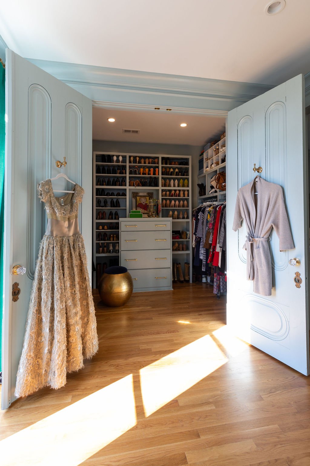
The dimensions of the new primary bedroom made closet design a challenge. McAdams remedied that situation by building in separate closets for husband and wife. The result looks like a smart fix to the common dilemma of old-house living and creates a space that appears original to the home, rather than a new addition popped onto the back. Covering the “hers” closet is a pair of elaborately carved wooden doors. “I found these in a shop downtown. I initially didn’t know how we’d incorporate them, but I called the homeowners and said, ‘These feel like you,’” recalls McAdams. “They were on board, though, and now they’re beautiful on her closet.”
While the design in the rest of the house went on for an extended period, the choices for the bedroom were made in a matter of a few minutes—a fact the client attributes solely to the relationship built over time with a trusted designer. “She knew where I wanted to go. She knew the colors I liked. I was tired of making decisions by that point. The bedroom was really important, but I was just getting to an overwhelmed stage.” McAdams hit the mark with a custom, locally made bed and new nightstands, as well as pillows and luxury bedding from Spruce.
An important advantage of this long-standing designer/client relationship was the husband’s recognition and appreciation of McAdams’s taste and guidance. Her professional seal of approval on design decisions reduced the stress that a large renovation can create and allowed the clients to realize years of home design dreams.
Through many years of getting to know their style and taste, from starting small and working up to a total home renovation, McAdams says these clients absolutely love living in their home. “They’re giddy about it because they were patient and waited to fully execute their home renovation dreams, just the way they wanted it.”


