A Renovation of Style
/Story by Terri Glazer | Design by Warehouse 67 Design | Photography by Annabella Charles Photography
Even more than a complete remodel, this renovation project involved defining a whole new style for the homeowners.
“Three years ago we went to the Vesta Home Show. We thought our house looked fine before we got there,” recalls the homeowner. “[It] had gold walls and orange yellow floors, ornate iron, a very Tuscan feel. After seeing the Vesta, we decided it was time to change.”
Their trip to the annual home show prompted the couple to consider moving, but ultimately they decided to stay put and broaden the scope of a small renovation project they’d planned. “It started because I wanted a bigger closet. Then we added the bathroom, our bedroom, and eventually we decided we were just going to make it exactly what we wanted, because we didn’t want to lose our backyard.
Who could blame the family for not wanting to leave behind their property? Their Eads home sits on a picturesque, perfectly manicured four-acre plot that feels more like a high-end resort than a backyard. From the lovely covered patio to the newly installed pool, complete with spa and swim-up bar area, to the outdoor kitchen, open green space, pond, gazebo and immaculate landscaping, the pair have made their surroundings into a personal paradise.
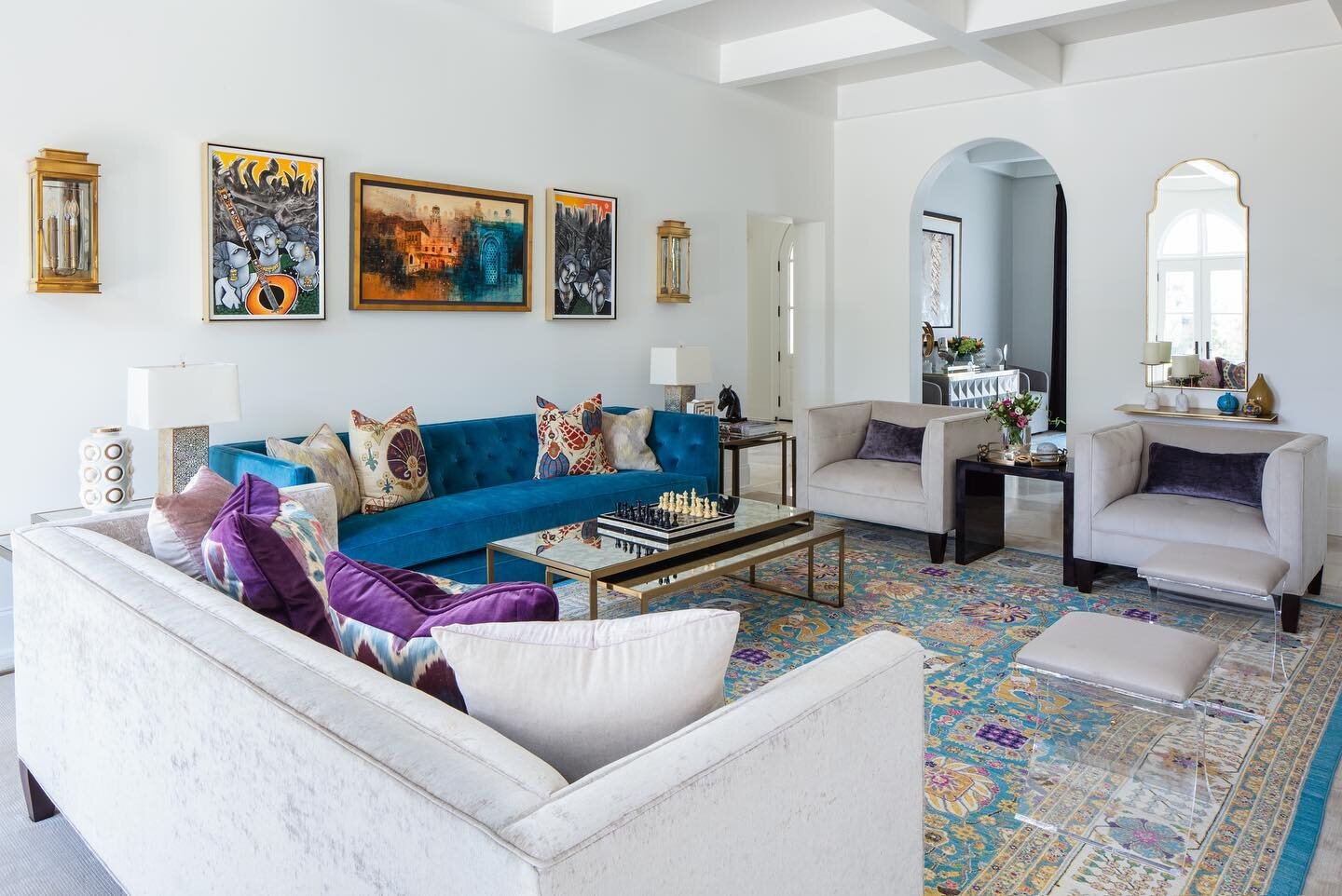
Once the owners decided to make the place they’ve called home since 2005 into their “new” dream home, they brought in interior designer Kim Loudenbeck, owner of Warehouse 67 in Germantown. First on the agenda was defining exactly the style to perfectly reflect the residents’ taste. After a process in which the homeowner and Loudenbeck explored a plethora of options, they zeroed in on a glamorous, monochromatic theme with plenty of sparkle. The look is inspired by the style prevalent in Las Vegas, where the couple own a second home.
Loudenbeck gives her client credit for being willing to go a bit off the Mid South’s beaten design path to achieve a style that is unique and completely personal. “She was open to doing something different. The best projects are the ones where you can collaborate with the homeowner, really get a sense of who they are and come up with ideas and suggestions,” she says.
The renovation was complete, from floors to ceilings. Tuscan arches and columns, wooden mantels, several walls, a kitchen pantry and a butler’s pantry came out. Room layouts were reworked. All the furniture, rugs, window treatments and fixtures were replaced. The result is sleek, up-to-date and yet welcoming, proving that a modern aesthetic doesn’t have to be cold and austere. Loudenbeck explains, “We thought about each item we placed in this house almost as a piece of artwork. We balanced all the shiny finishes by adding in wood tones and texture. We did a lot of pattern play, since we weren’t going to have a lot of color. I love how all the velvets, the linen, all of the materials just create such an inviting space.”
Along with the owners’ collection of fine art, the lighting fixtures constitute another artistic element in the home. The designer explains that, due to the home’s high ceilings and grand scale, basic fixtures would have lacked the size and interest she and the homeowner envisioned. “We used lighting to create personality in each room.”
Nowhere is that more evident than in the foyer, where an eight-foot waterfall chandelier makes an elegant statement. Loudenbeck and her assistant Cassie Hunt assembled each of the hundreds of hand-blown crystals on site, bringing the work of art to life. The homeowner says of all the unique light fixtures in the home, and there are several showstoppers, it is her favorite.
Knowing her client is a fan of faux finishes, Loudenbeck devised a way to incorporate a similar design element into the redone dining room. In the spaces between the beams of the newly coffered ceiling, she placed textured wallpaper. Its subtle metallic accents provide a bit of sparkle when the circular chandelier over the dining table is lit.
Between the dining room and kitchen is the new wine room, a glass-enclosed, temperature controlled masterpiece conceived by Loudenbeck and executed by an intrepid group of subcontractors who were willing to step outside the box. “Wine rooms just are not done very often in this area,” says Loudenbeck. “It was hard for us to source and find people to work with who understood the requirements, people who were willing to try things that they’d never done and take risks with us.”
The stunning room is now a focal point with a solid granite wall treatment and floor-to ceiling wine racks. Its walk-through layout allows seamless flow between the dining room and the kitchen.
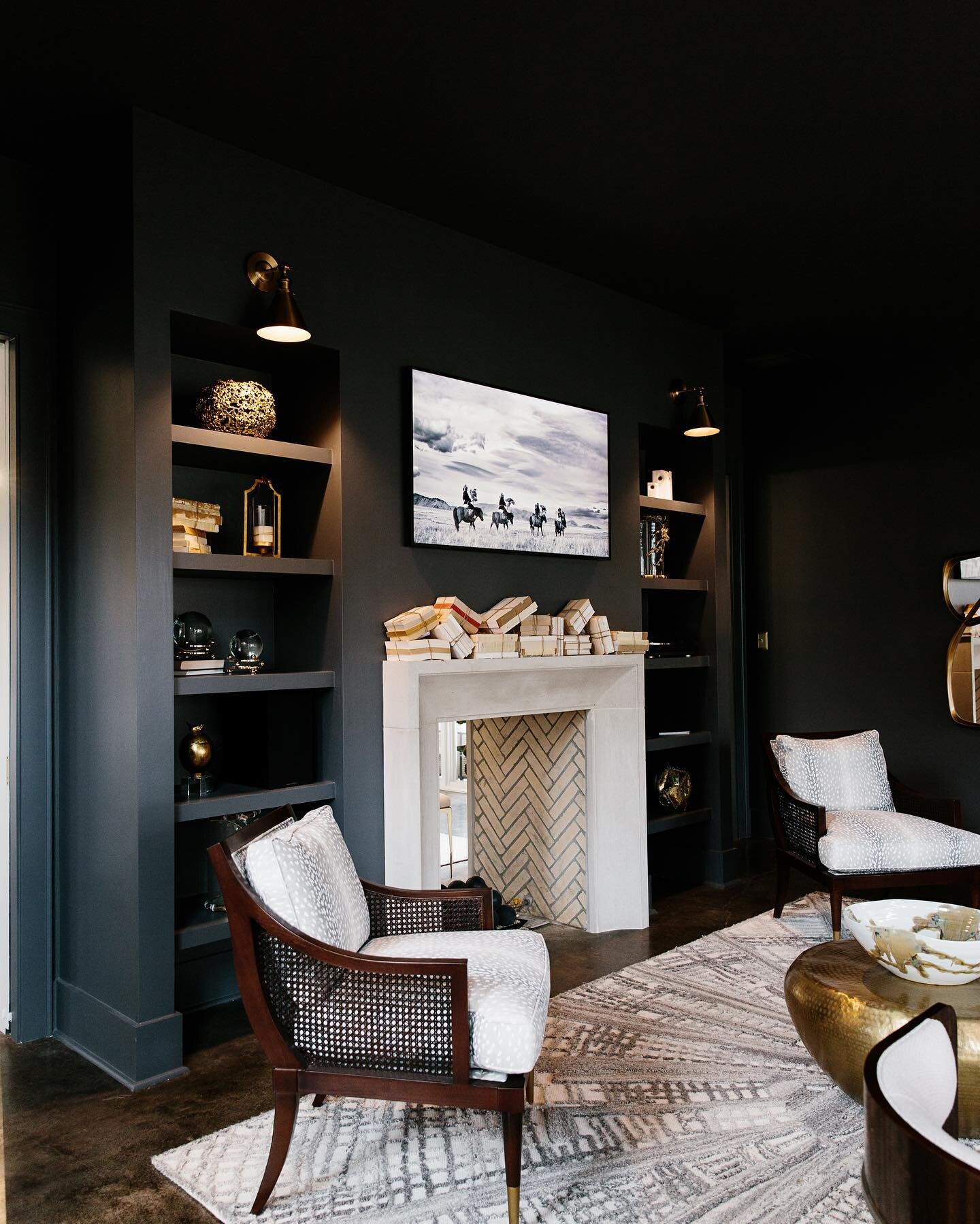
The homeowner knew she wanted her new kitchen to include as large an island as possible. She and Loudenbeck collaborated during construction to ensure the final product fits the scale of the now open design that marries the kitchen with the spacious family room. The ten-foot ceilings soar and a wall of windows floods the area with light. The renovation included fresh wainscoting bathed in a charcoal hue that creates a focal point around the new limestone hearth, the addition of full-length sheer curtain panels on the windows, and of course, more dazzling light fixtures.
Major alterations took place in the downstairs owner’s suite to create a luxurious, modern and clean-lined retreat. “We changed the layout of where the bed was located, but I think the biggest change here was the fireplace,” Loudenbeck says. “With the more modern style, the traditional wooden mantel did not work. So again, this was one of those times when the granite fabricator said, ‘I’ve never done anything like that, but I'm willing to try.’” The designer’s creativity and the workman’s expertise resulted in an extraordinary design element that continues the modern aesthetic of the suite and the entire home.
The primary bath underwent one of the more dramatic changes. The new layout allows the eye to flow through the area, and provides sight lines to the beauty of the backyard through windows on the back wall. To achieve the improved floor plan Loudenbeck created a seamless, curbless glass shower surround and coupled it with an oversized, oval soaking tub. The double vanity provides space for husband and wife, but she also has a bonus area any fashionista would envy. “I love the idea of bringing back a dressing area,” says the designer of the spot, complete with sofa, TV and even a beverage refrigerator cleverly hidden in a console. “It’s a place where she can sit just to put her shoes on or to decompress at the end of the day.”
Just as in the home’s main rooms, Loudenbeck also brought panache and drama into the smaller areas. In the downstairs hall bath she kept the monochromatic theme, but punched it up with a full-height mirror, extra lighting and marble surfaces. “It needed that glam feel because the other areas have such big personalities. We couldn’t do just a ‘normal’ renovation; we had to have a bit of sparkle here, as well,” she says. Even the more utilitarian areas near the rear entrance have special details—an accent wall of herringbone marble tiles paired with hand-painted grasscloth wallpaper in the half bath, and custom open shelves to display accessories in the laundry room.
Now that the almost three-year project has come to completion, Loudenbeck looks back on it with satisfaction as a one-of-a-kind undertaking. “We had to do a lot of exploring because this was a unique property and a unique process. It was a search for their new look. As a designer, I love that they were willing to take that journey with me and trust me to help guide them to something that reflects their personal style.”
The homeowner sums up quickly and completely how pleased she and her husband are with the end result of their style and renovation journey. “It doesn’t feel like we renovated. It feels like a new home to us.”


