A Touch of Whimsy
/Story by Terri Glazer | Design by Selena McAdams of spruce | Photography by Stefanie Rawlinson
The house itself was a jewel—tucked away on a quiet and picturesque street in East Memphis with classic architecture, a beautiful setting and a just-right floor plan. So much so that the young couple who lived next door had their eye on it for some time. When it came up for sale they couldn’t resist. They made the short move in early 2021 and began the process of making it into the perfect home for their growing family.
The pair enlisted the help of designer Selena McAdams, who recognized immediately that the new place’s traditional decor needed a youthful makeover with a pinch of whimsy to accurately reflect its new residents. The job entailed repurposing and repositioning much of the couple’s existing furniture and rugs, adding along the way to complete the look.
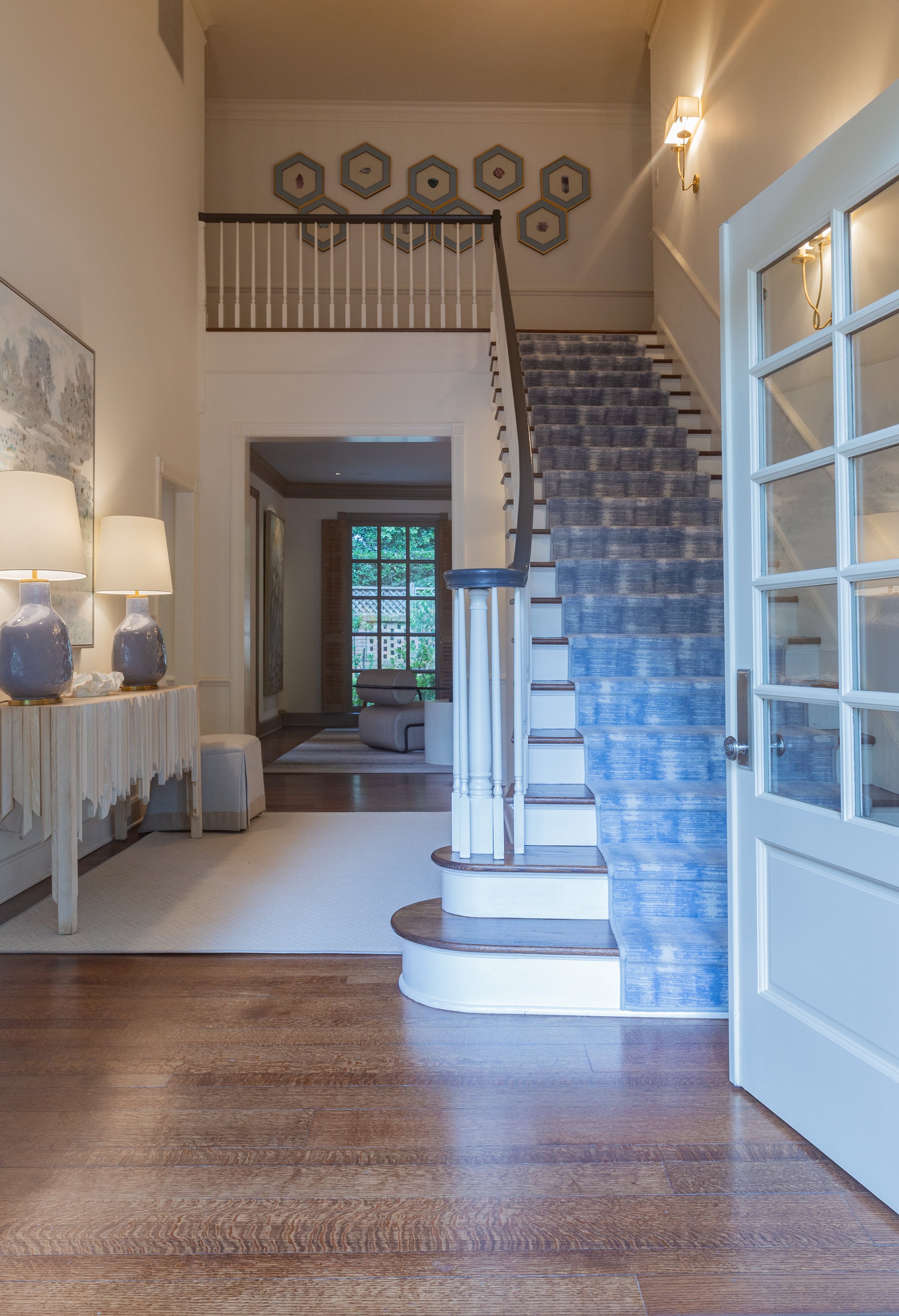
Changes have come in order of need, says the homeowner, pointing out the new runner on the entryway staircase. The carpet took top priority, as the old rug’s rough texture was prickly to her two little daughters’ bare feet. “They had to walk on the wooden edges of the treads to get up to their bedrooms,” she recalls. McAdams suggested a blue and white patterned runner with a soft feel and look.
“I think the runner sets the tone,” says the designer. Its periwinkle blue, a favorite of the homeowners, appears throughout the new design. "We have a note of that [color] in each room to connect everything. The house was so traditional before, with lots of darker neutrals. Now it feels brighter, a little more transitional and full of energy.”
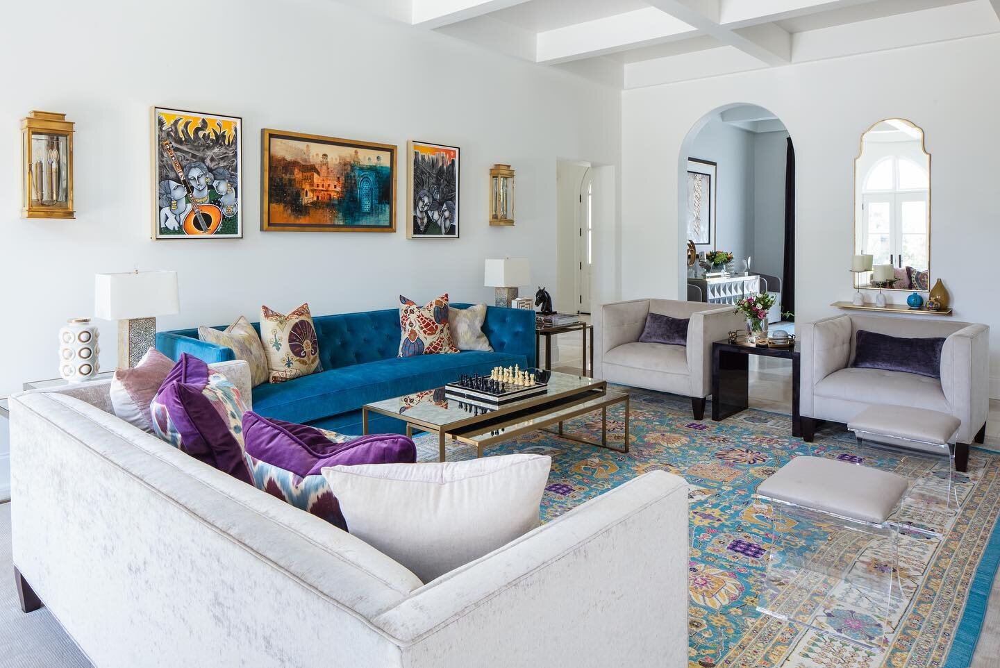
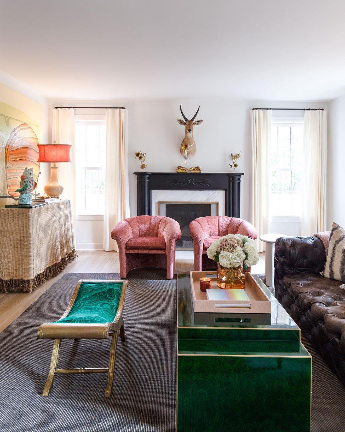
The living room is a prime example of McAdams’s masterful ability to create liveable rooms with a nod to formality. Comfortable seating and a cowhide coffee table, all sourced from Spruce, give the family a gathering spot that’s cozy yet on the dressy side. Two pairs of large art panels brought from the owners’ previous home give the room an elegant feel. The designer juxtaposed the Impressionist-inspired paintings with a bold wall art piece by Angela Chrusciaki Blehm and black and white accent pillows on the sofa below it. A sputnik-style overhead fixture draws the eye up to the newly painted light blue ceiling. The color McAdams chose was only slightly different from the existing gray, says the homeowner, but the effect is substantial. “It’s much more ‘us,’” she says.
The blue extends into the adjacent dining room’s walls, punched up by crisp white trim and wainscoting. The light-filled space is scaled as generously as the living room, making it the perfect setting for the custom dining table. McAdams recalls how the piece came to be. “When the homeowners and I were looking at countertops for the kitchen we ran across this slab of quartzite and we all three stopped to look because it was so beautiful. The idea of creating their dining room table out of that one slab just so they could have it in their home came about.” At 120 inches long, the ogee-edge slab needed three supports for its weight. McAdams chose a trio of gold-toned, geometric bases and surrounded the table with neutral rattan chairs in keeping with the project’s dressy/comfortable theme. The homeowner couldn’t be happier. “Our main idea was that we didn’t want the dining room to be a stuffy room that no one ever went in. This is a little more casual, more family friendly. The girls can sit in here and do a project,” she says.
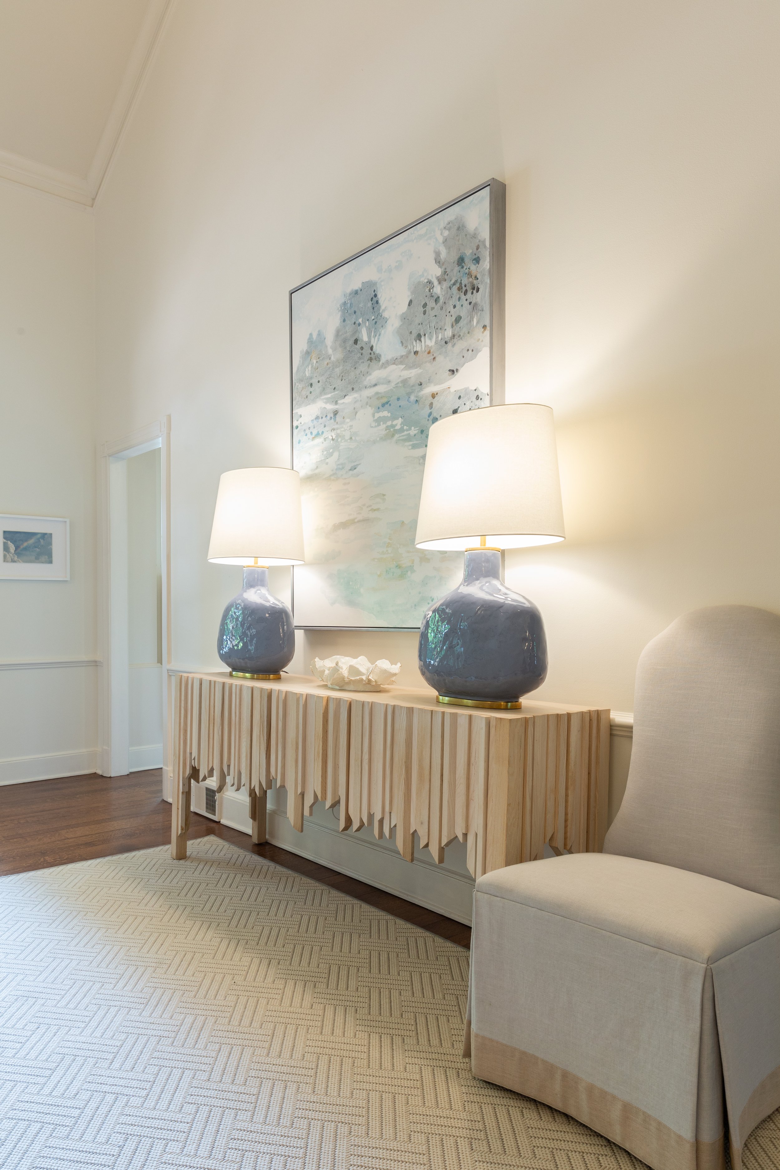
The room’s existing iron chandelier received a fresh gold-leaf treatment; the metallic finish is reprised in the shades of the two contemporary lights on the buffet. Those lamps illuminate a series of paintings brought from the clients’ former home, but hung in a new grouping; one horizontal row for maximum impact on the large expanse of wall. “It’s great that Selena repurposed pieces that we loved,” says the homeowner. “I would never have thought to hang those that way.”
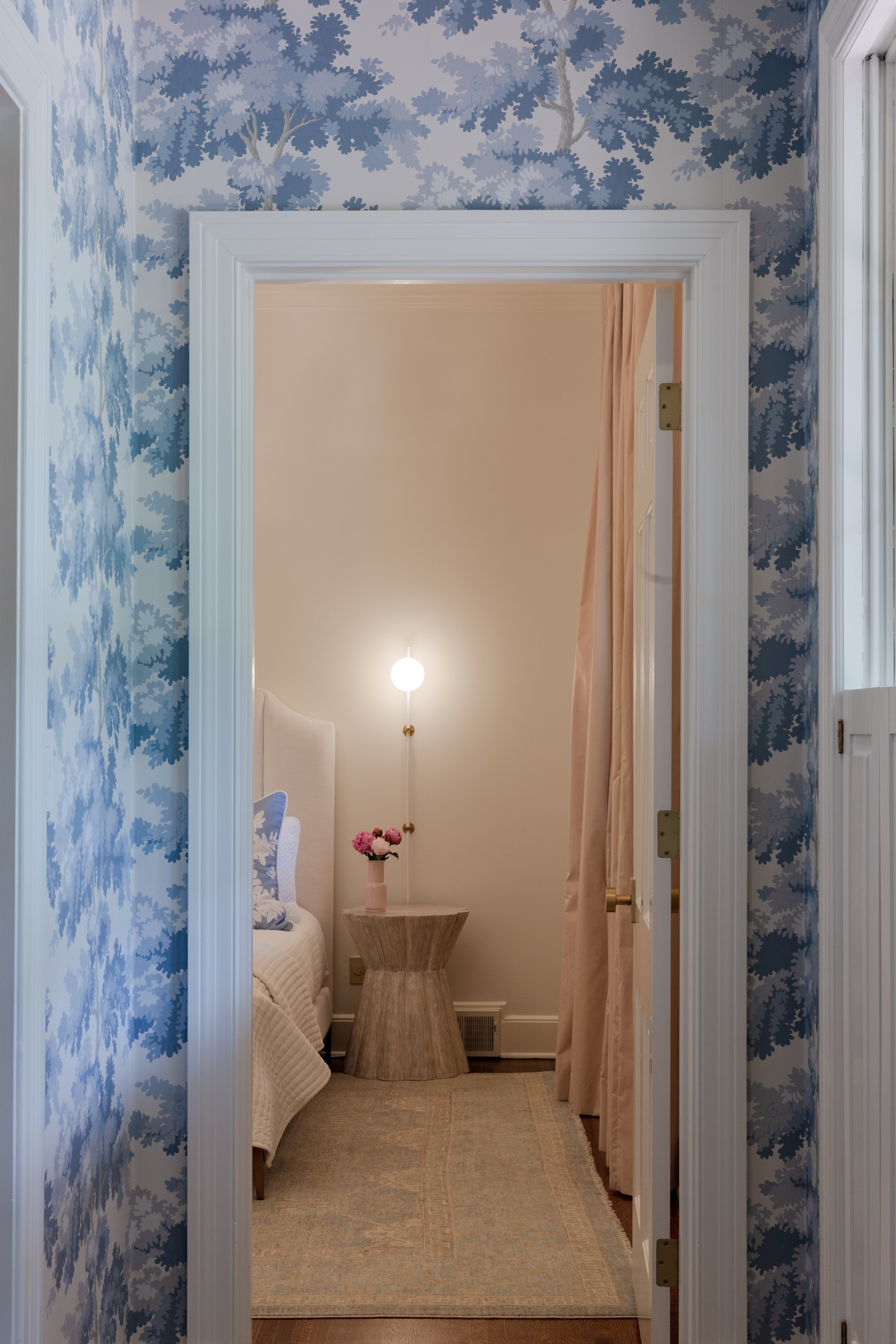
A small passthrough between the dining room and the sitting room received a big style change with a new wine cooler, white cabinet and counter, and pretty wallpaper in shades of periwinkle. McAdams repeated the wall treatment in the hall area outside the downstairs guest room.
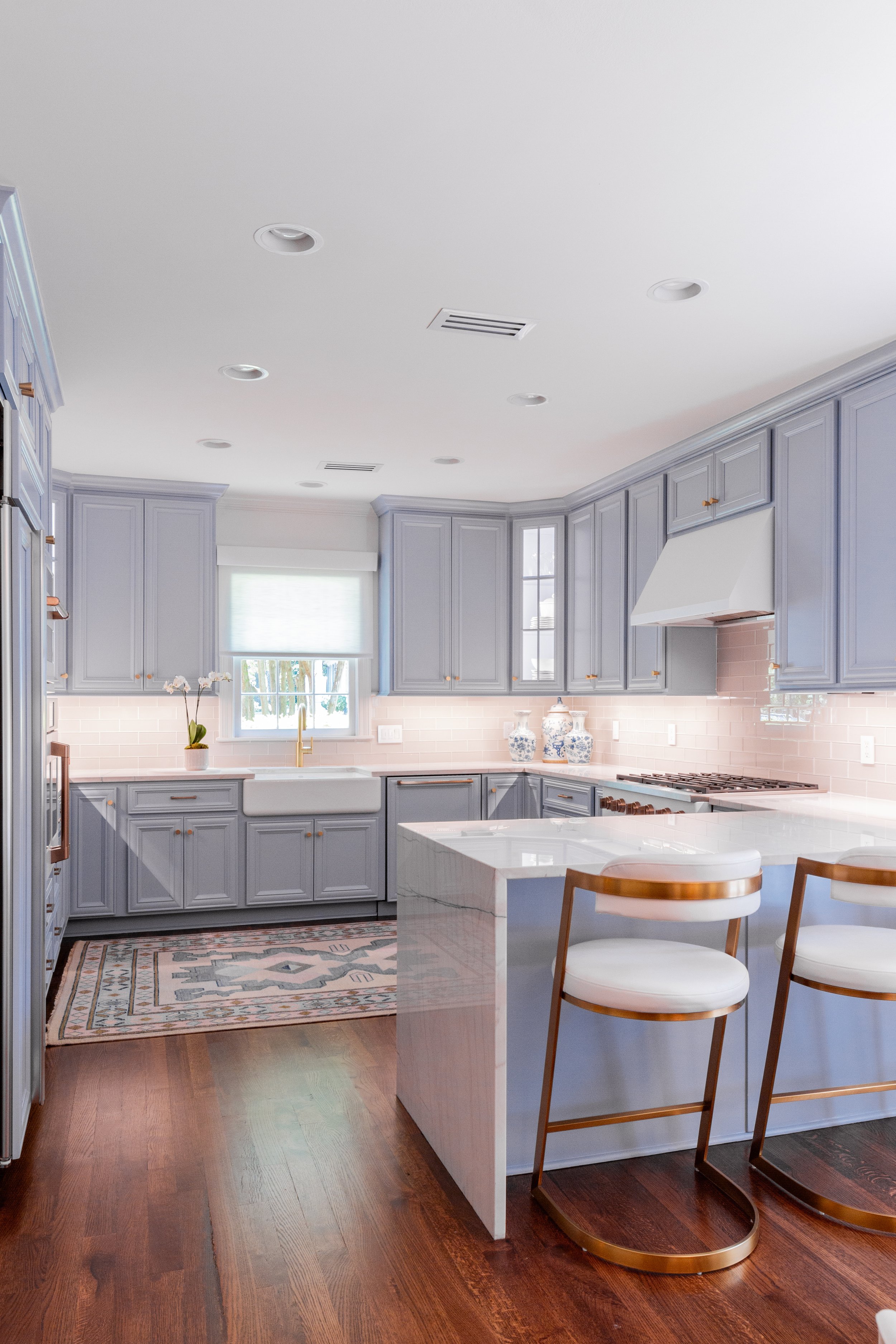
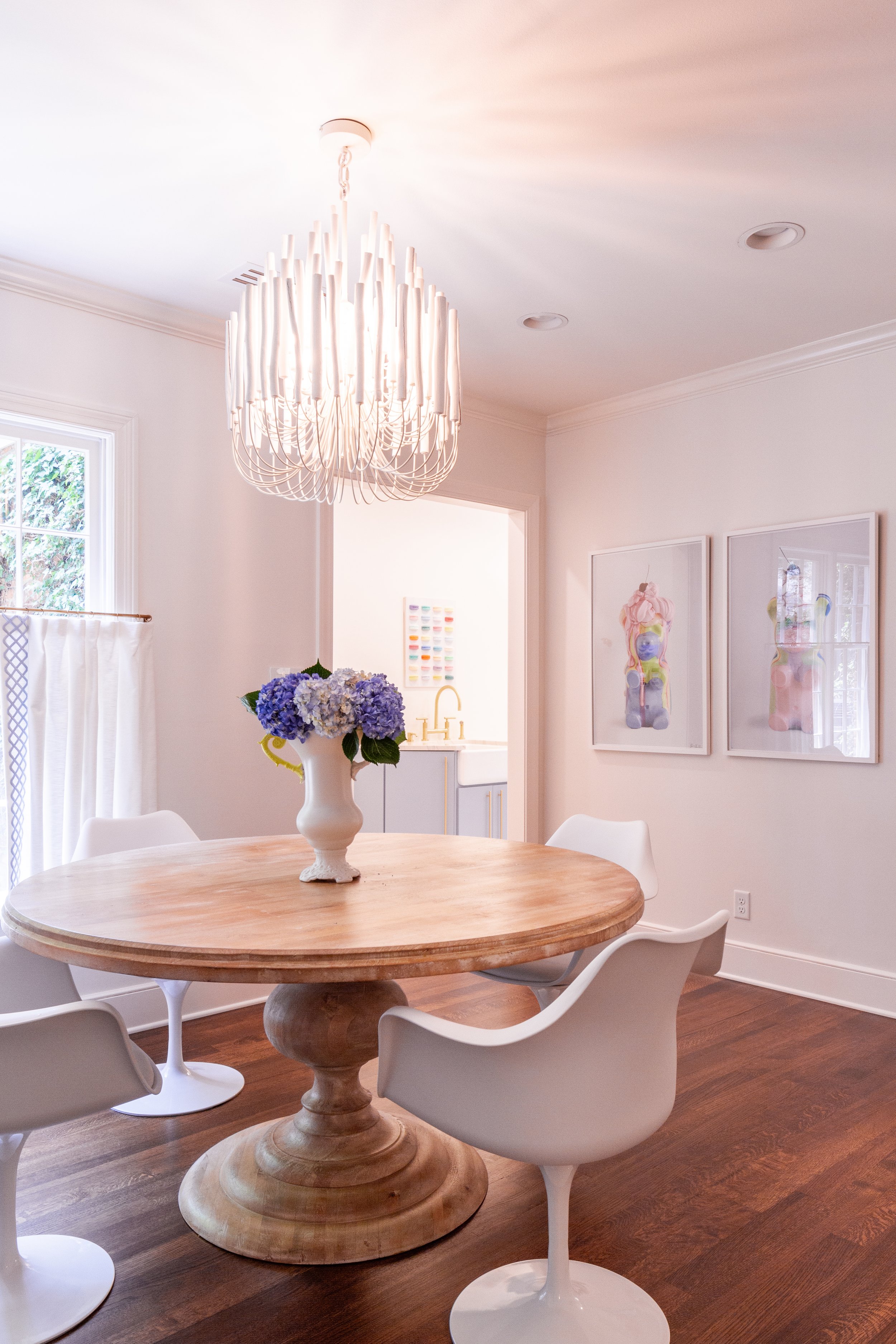
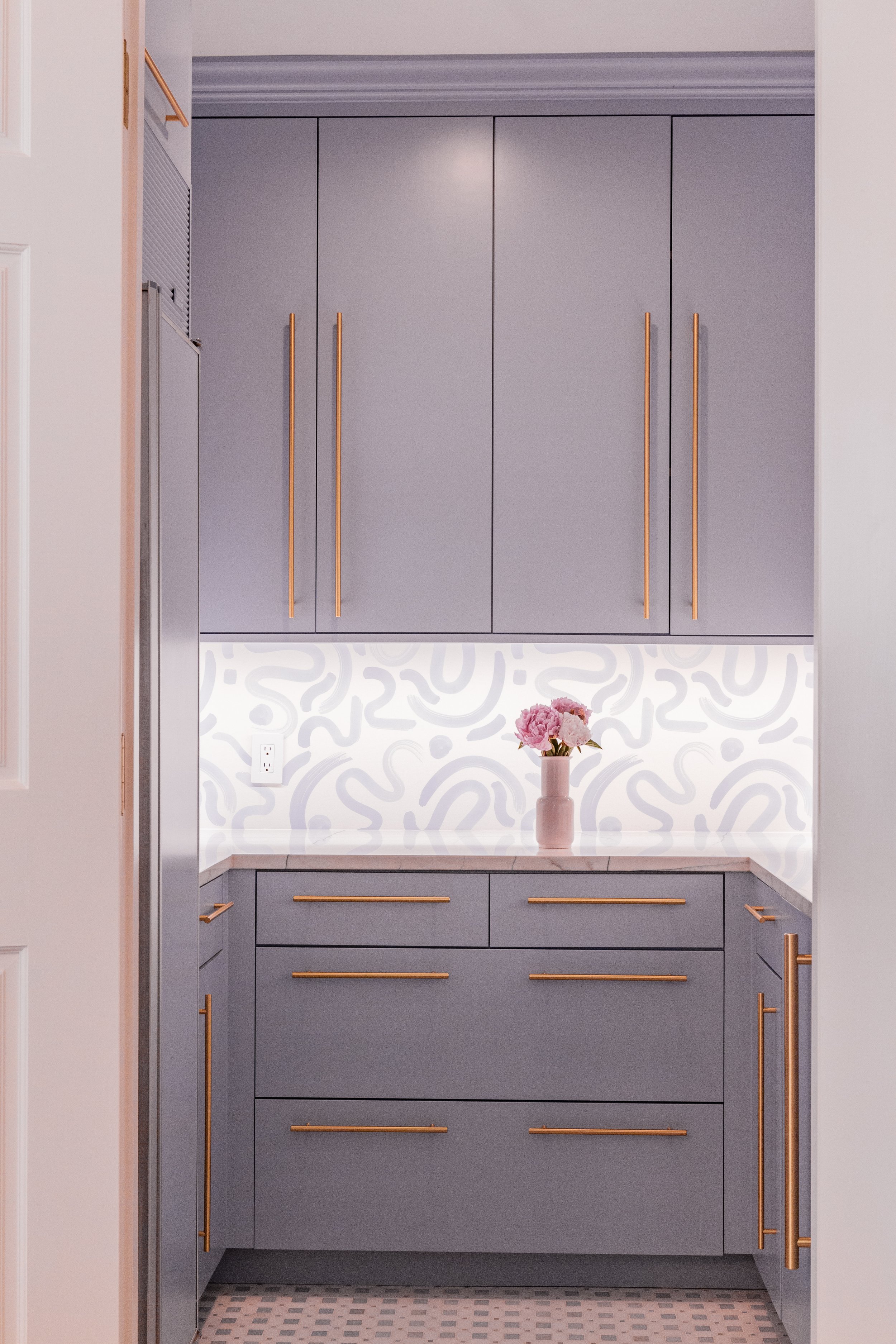
The home’s signature color is showcased in the kitchen, where lavender-blue cabinets play perfectly off clean white appliances, counters and backsplash. Of course, the design combines modern and traditional elements: sleek brass and white vinyl barstools stand at the peninsula’s eating area, while mid-century tulip chairs surround a classic wooden table. McAdams took the opportunity to play up the whimsy in the kitchen rug and artwork with colorful choices that have become the young family’s favorite parts of the room.
The area behind the kitchen received the most extensive renovation of any part of the home. McAdams reconfigured the home’s hub, the rear entry, laundry room and butler’s pantry, to alleviate the bottleneck that occurred when all four family members entered the house at once. The new layout provides room for everyone and lots of storage areas that are as attractive as they are practical.
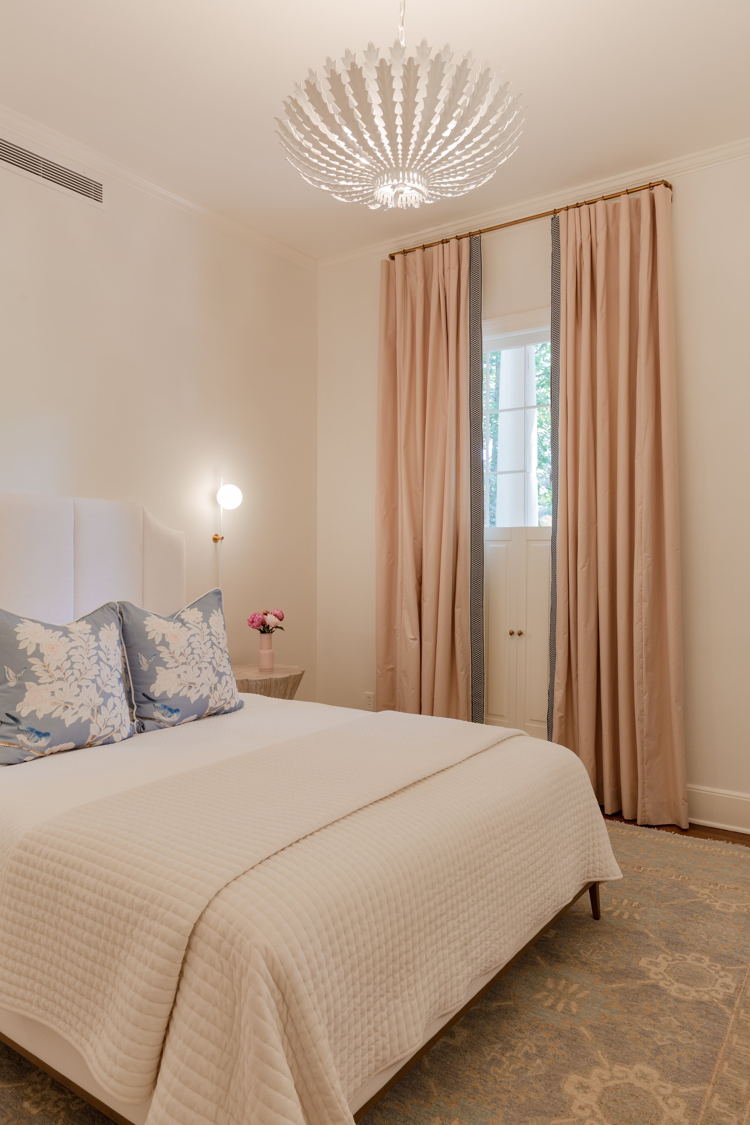
A guest suite as well as the primary bedroom and bath complete the layout of the downstairs. The designer created a serene aura in the guest room, again combining existing items with new; time-honored with current. The blue appears here in botanical-print linen pillows, and blush joins the palette in the full-length drapes. Further interest comes from the lighting, a Visual Comfort chandelier and minimalist bedside sconces.
In the primary bedroom the designer emphasized the “really great pieces” the homeowners brought along in the move. “We repurposed, filtered in, filled in,” she says. The room’s colors are serene neutral tones; a quiet palette, but still with plenty of interest. In keeping with the tranquil feel, McAdams styled the room’s built-in bookshelves in all white items. Rosy blush makes an appearance in this bedroom too, this time in a coverlet and accent pillows.
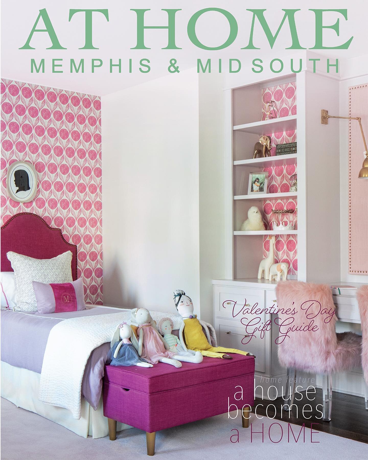
The upstairs of the home is the domain of the two young daughters, and their bedrooms are the sweetest nods to girlhood. In the older sister’s room soft blue walls set the tone. The “big girl bed” from her room in the previous house is a perfect fit. It features a headboard upholstered in soft lavender velvet, a simple white coverlet and a bedskirt with sophisticated purple Greek key trim. A dusty violet bolster adds an elegant touch to the room’s timeless design, achieved, again, by blending existing pieces with just the right new additions.
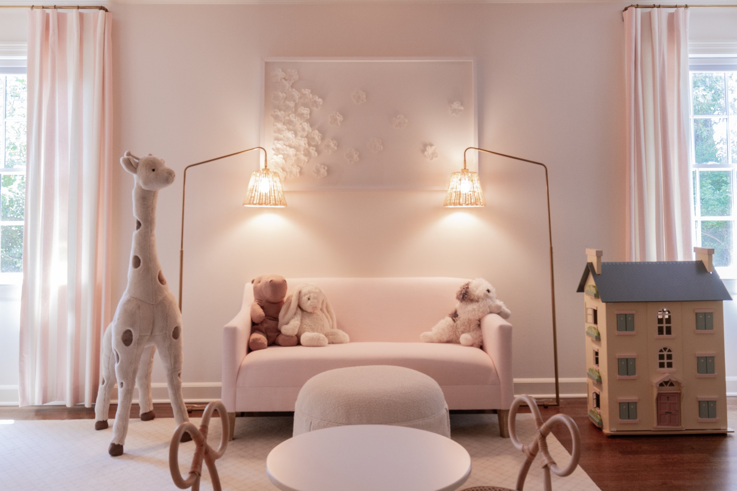
The younger daughter’s room is dreamy, with a traditional trundle bed, a tiny table and chairs, plenty of open space to play and tons of toy storage. There’s even a sitting area, complete with a little-girl-sized pink sofa, a pair of floor lamps and a chenille tuffet that would be the envy of Miss Muffet herself.
The home is still a work in progress, and McAdams will be thrilled to once again be at the design helm as the bathrooms and other spaces receive a new look that reflects the family’s style, with just a bit of whimsy. She says, “They’re so open to design with fun moments, and that is really exciting!”


