The Evolution of a Home
/Design by Parker Design Studio | Story by Terri Glazer | Photography by Annabella Charles
Designer Ann Parker helps an Eads couple adapt their beloved family home to suit their new stage of life.
When Beth and David Skudder built their home in Eads in 2003, they customized it to perfectly fill the needs of a family with three school-age children. The Skudders loved to entertain, and they had plenty of room for large-scale events. Beth recalls, “I had luaus, I had prom parties, I had homecoming parties. I had game dinners. I had school functions. It was great—lots of life in the house.” As the years went by, the children grew up and flew the nest, leaving their parents to figure out how the two of them could best use the house on their own.
David recently suggested that master bath needed an update, and Beth jumped right on the idea. She enlisted the help of Ann Parker, owner of Parker Design Studio, to brighten up the space.
And, as is so often the case with home renovations, a small project snowballed into a redo that encompassed almost every room in the home, along with a screened porch. The Skudders had worked with Parker on several previous design projects, so Beth trusted her implicitly. “There were two things I wanted in this house from the beginning and again in the renovation. Every space had to be useful and the design had to be timeless. Ann helped me so much with that. There’s not one room in the house we don’t use. And I feel like the design will definitely hold up over time
Parker says one of the main goals of the renovation was to freshen the home while still respecting its original design. “It was really important to stay true to the architecture of the house and not turn it into an alien just to update it,” she recalls. “It was about being very sensitive to what was already here while adding updated features.”
What was already there was a houseful of custom features with materials and furnishings both made by local artisans and brought in from far and wide. The original design team, architect Carson Looney of LRK and designer Julie Nicholson, helped the Skudders source distinctive elements including salvaged barn wood from Canada, antique light fixtures from New Orleans, French antique furnishings and large steel windows. Memphis metal sculptor Brian Russell created a stair rail that features balusters shaped like stalks of wheat and a stunning bronze head of wheat for a newel post, a nod to David’s career as a commodities trader.
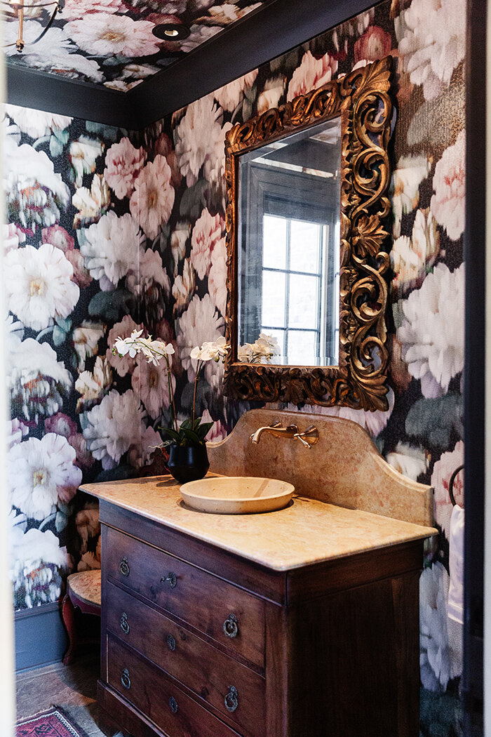
Parker embraced the opportunity to incorporate some of the Skudders’ existing pieces into her redesign. She says, “We reassembled the details without going too far.” She and Beth went from room to room assessing which of the pieces Beth most loved. Those favorites stayed, often with new upholstery or in a different location. The designer notes that often all it takes to revitalize a space is a new light fixture, a fresh coat of paint, a little wallpaper or some cabinet hardware. A small “tweak” can make a big difference.
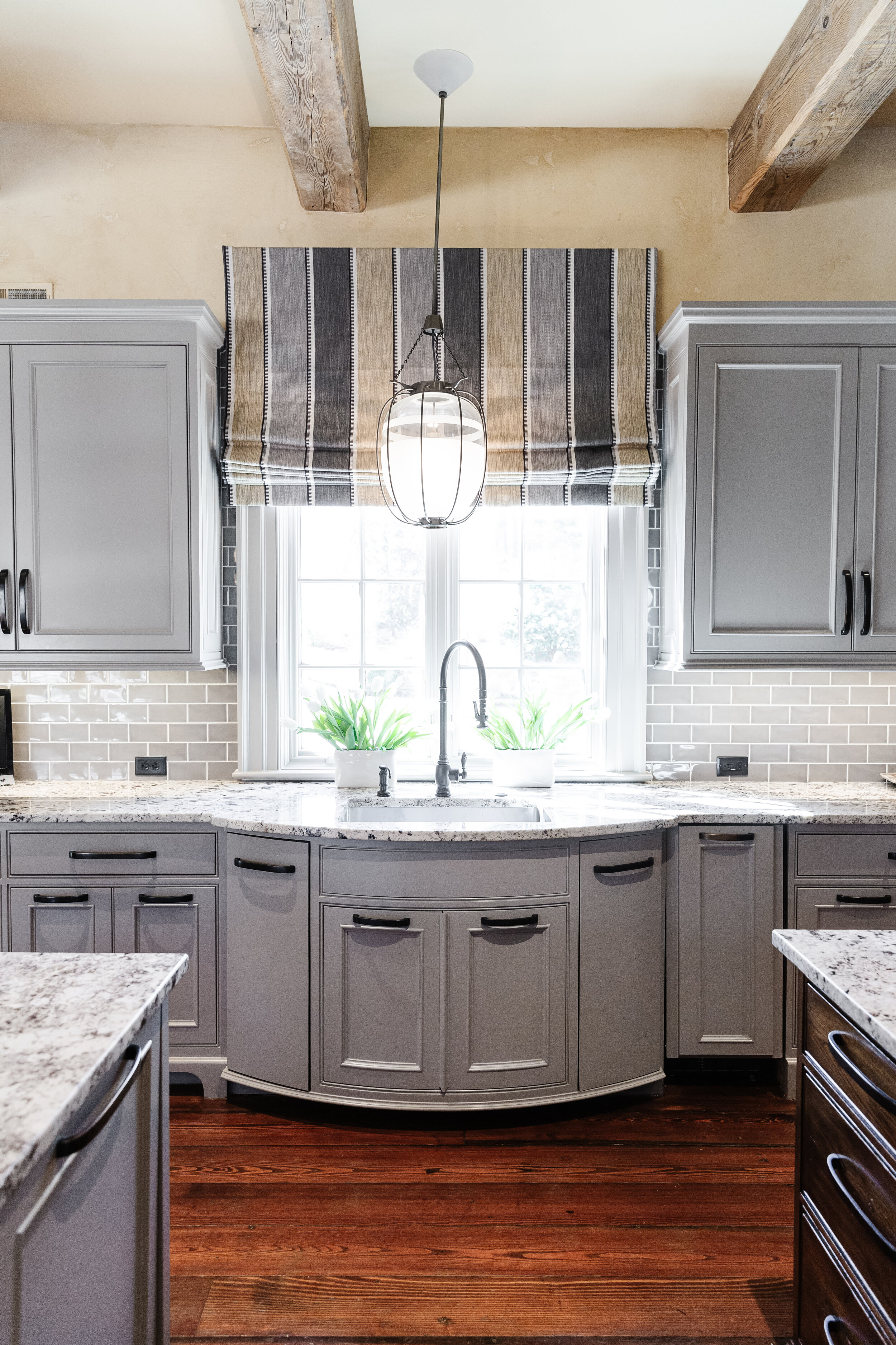
Beth was ready for a change in her kitchen. She loves to cook and was happy with the flow of the space, but wanted to update the original green furniture-style cabinets and rework the island. She wasn’t interested in buying into the popular trend of having white walls, cabinets and countertops, however. “This house has been too custom from the beginning to all of the sudden make the kitchen generic,” she says. Parker agreed. The new look seamlessly blends the kitchen’s brick wall and wood beams with a handsome island, painted cabinets that are sleek and sophisticated, and pendant-style lantern lights with a decidedly modern flair.
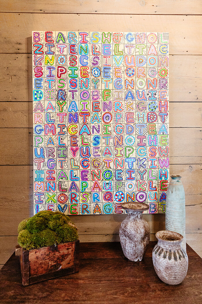
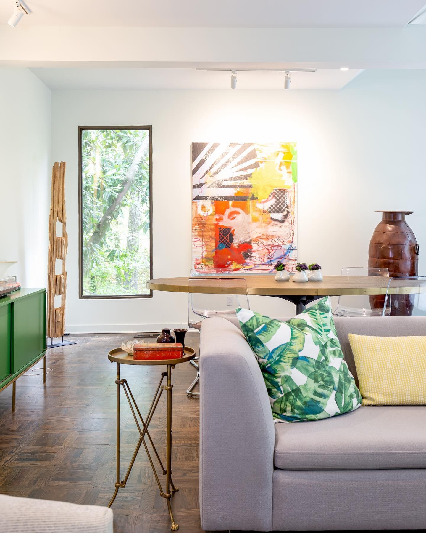
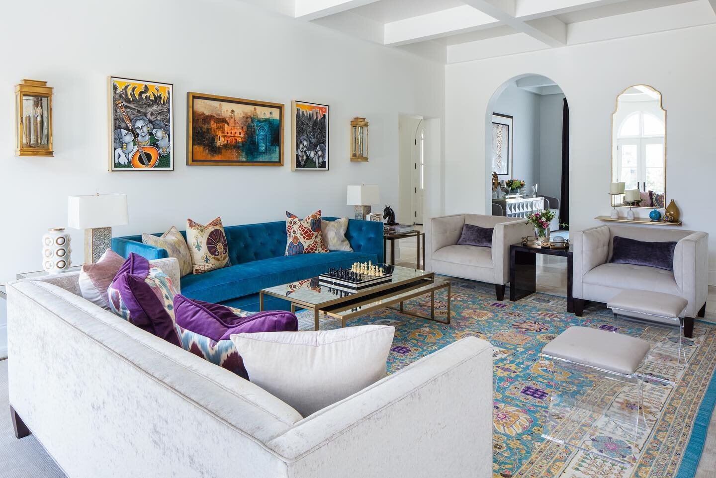
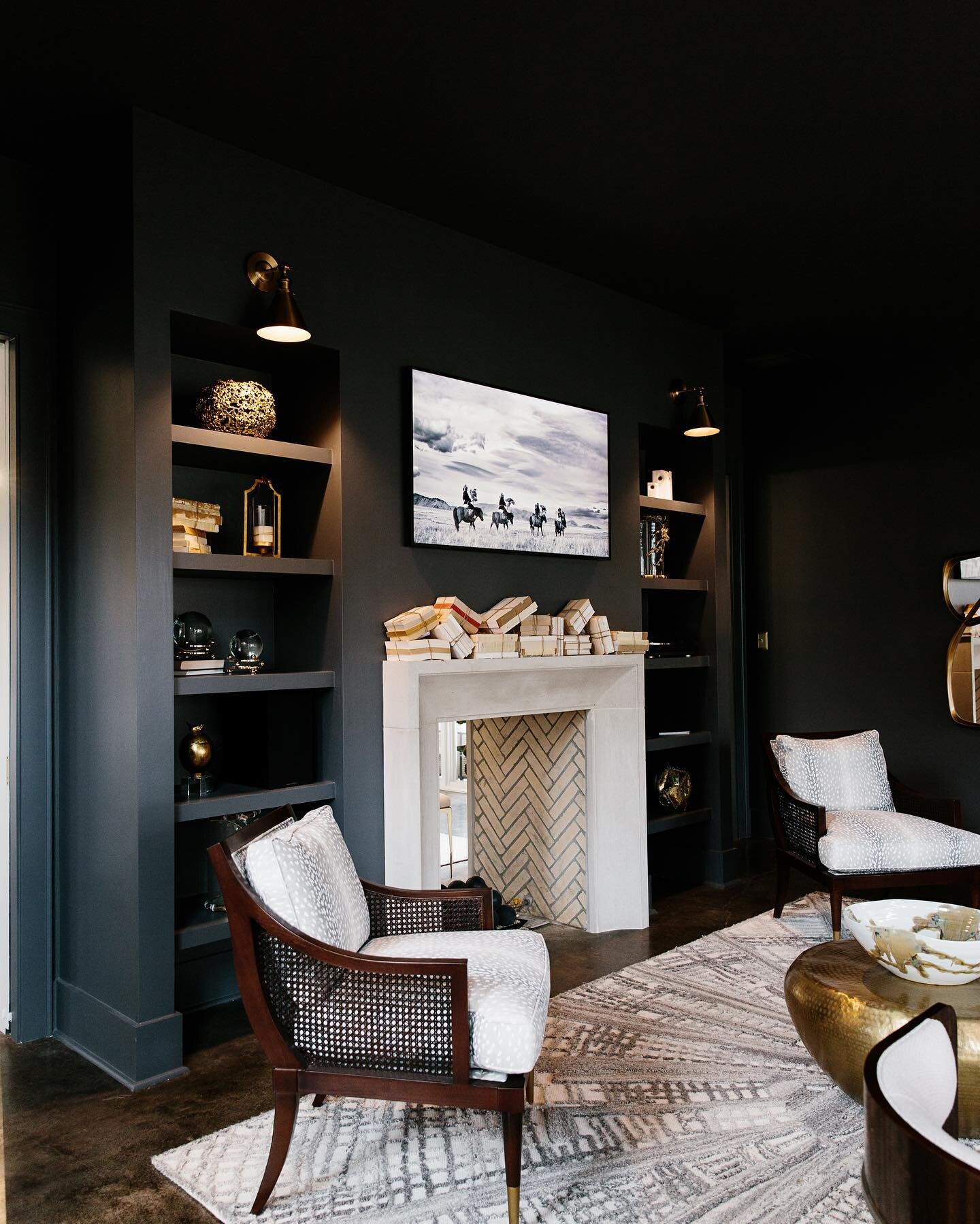
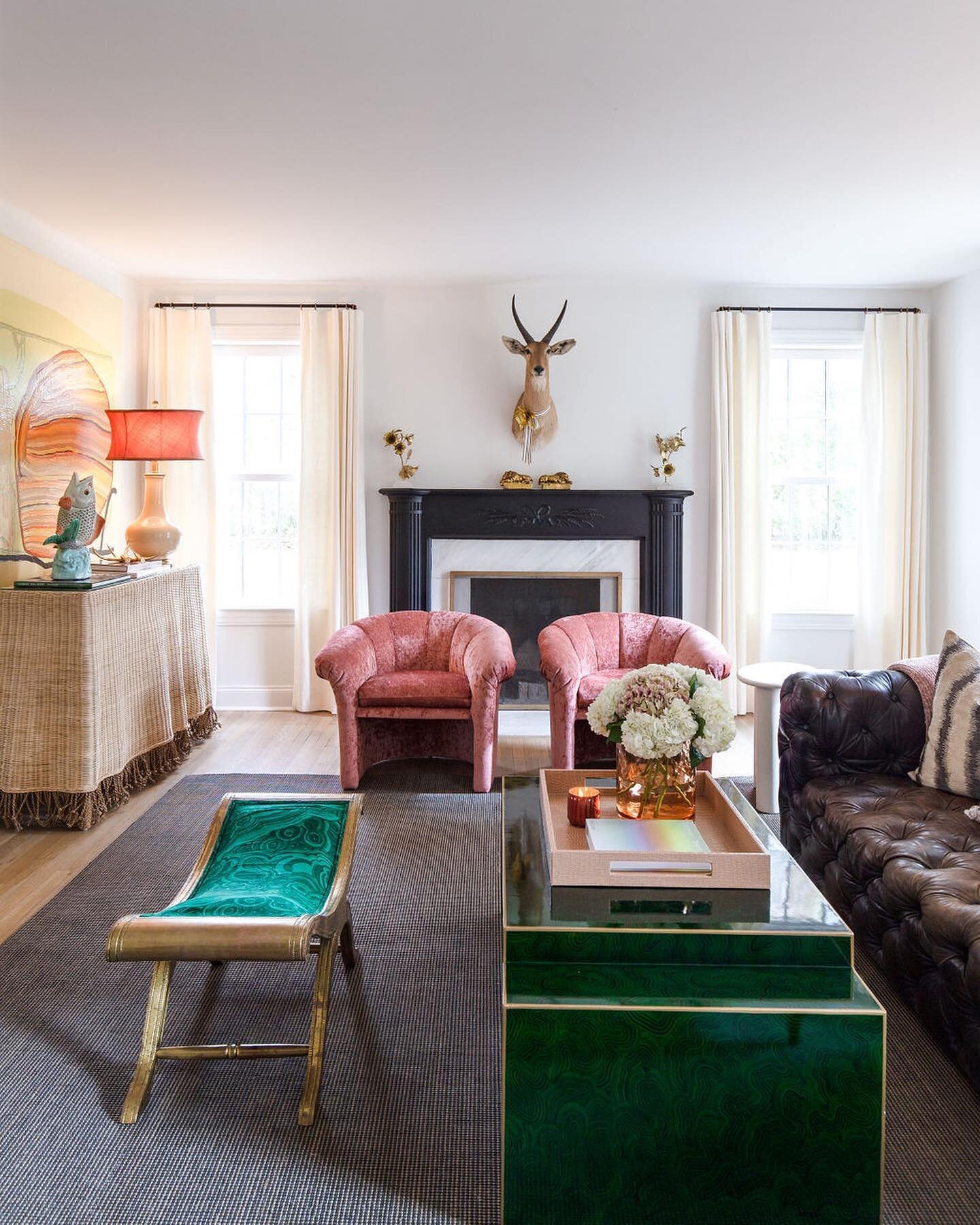
The adjacent family room went from European traditional, completely furnished in antiques, to a more contemporary blend of classic pieces with new additions and reworked favorites. Parker continued with that aesthetic into the home’s central hall, where a pair of antique needlepoint chairs flank a modern painting by local artist Hamlett Dobbins. The Skudders added several pieces from David Lusk Gallery to their art collection as part of the renovation, including a commission by Tad Lauritzen Wright. The artful anagram contains 29 words related to commodities.
Parker brought in art consultant Anna Wunderlich to maximize the impact of the family’s art collection. Beth remembers, “We literally took every piece of art off the walls and repurposed every single piece throughout the house. It gave everything a new life. I felt like I had new art because it was all in new places.”
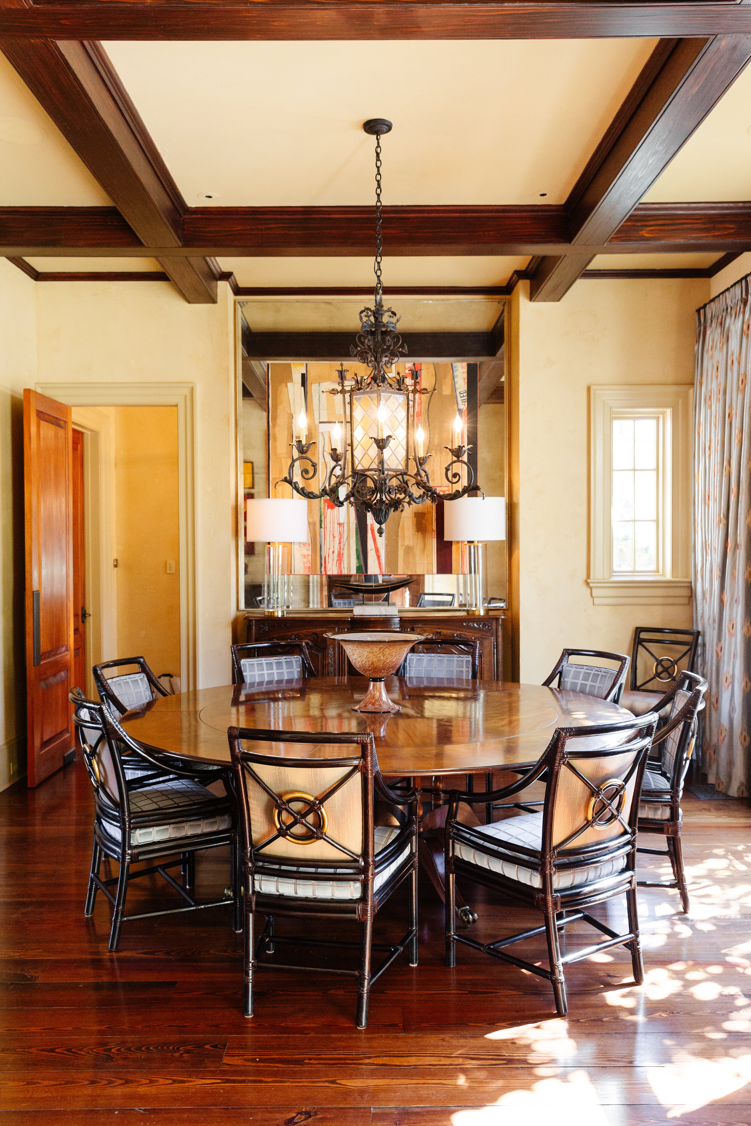
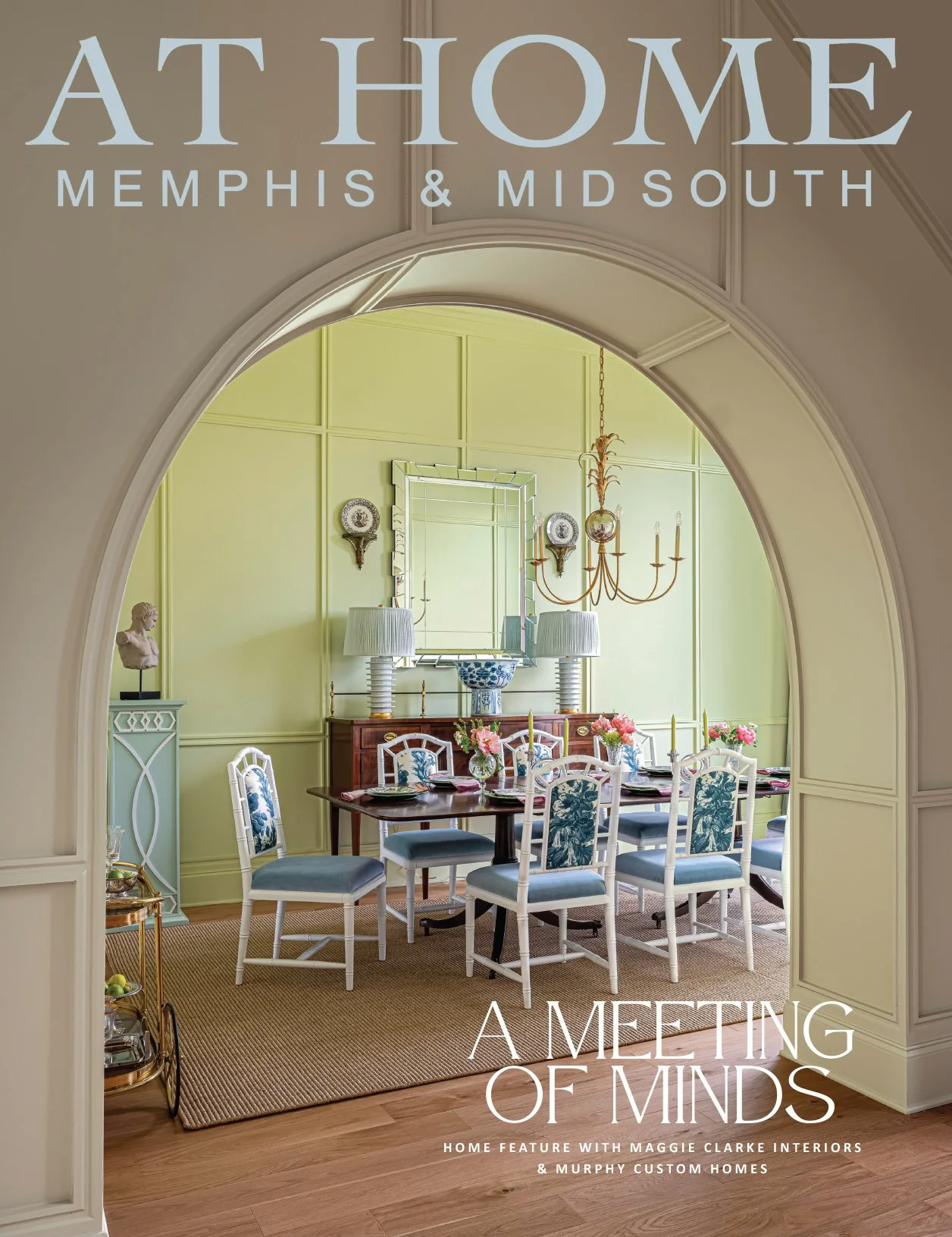
The designer’s “keep-what-you-love, change-the-rest” plan applied to the dining room, as well. The homeowners have always enjoyed entertaining around the large round table in their square-shaped dining room. They no longer loved the gold-leafed ceiling or the upholstery on the dining chairs, though. Parker had the ceiling painted in a quieter tone, reupholstered the chairs, brought in an oversized mirror antiqued by local framer Chris Garner, placed art over the mirror for drama, and added gorgeous silk drapes to give the room a feel that’s altogether different from before, but still in keeping with the home’s character.
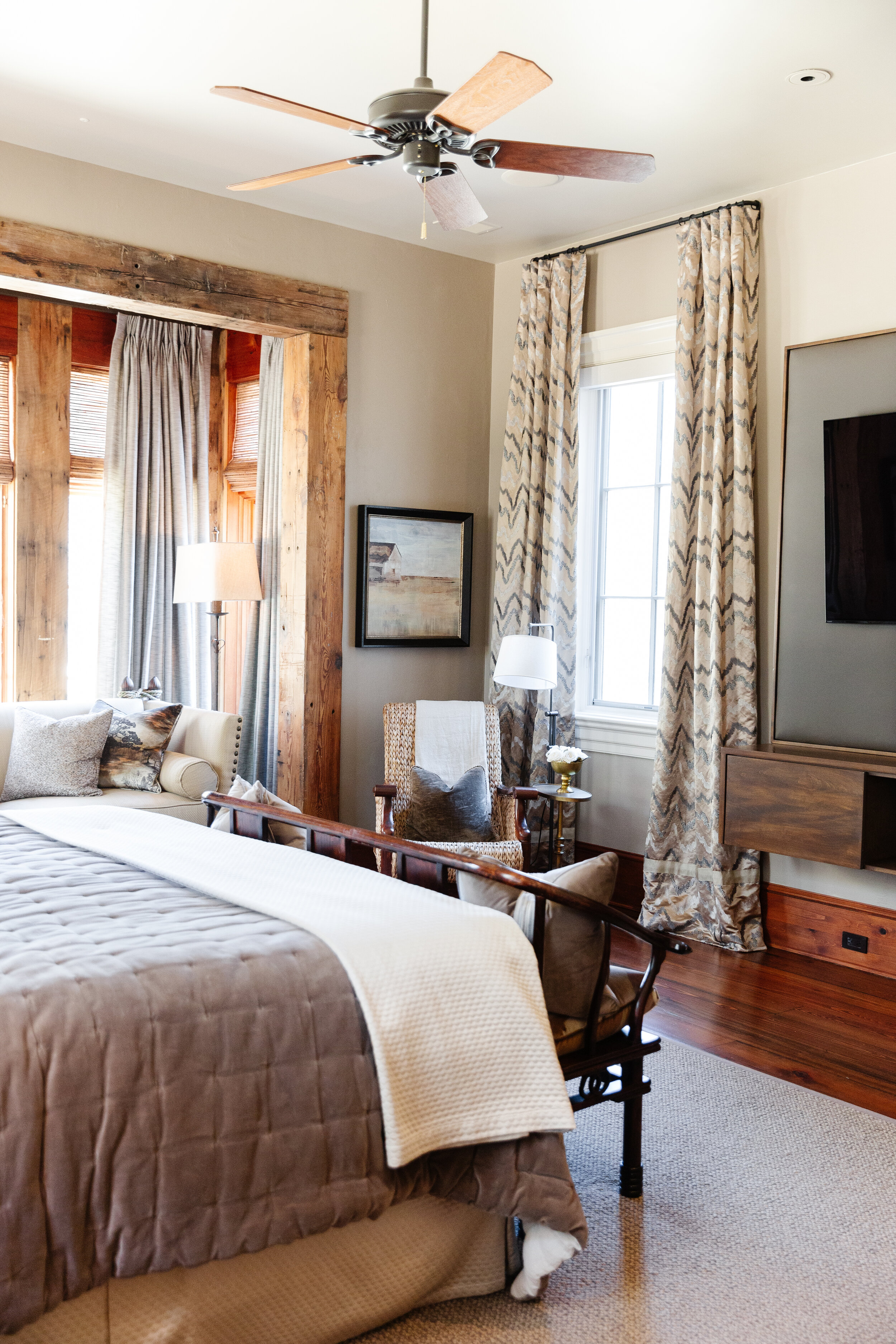
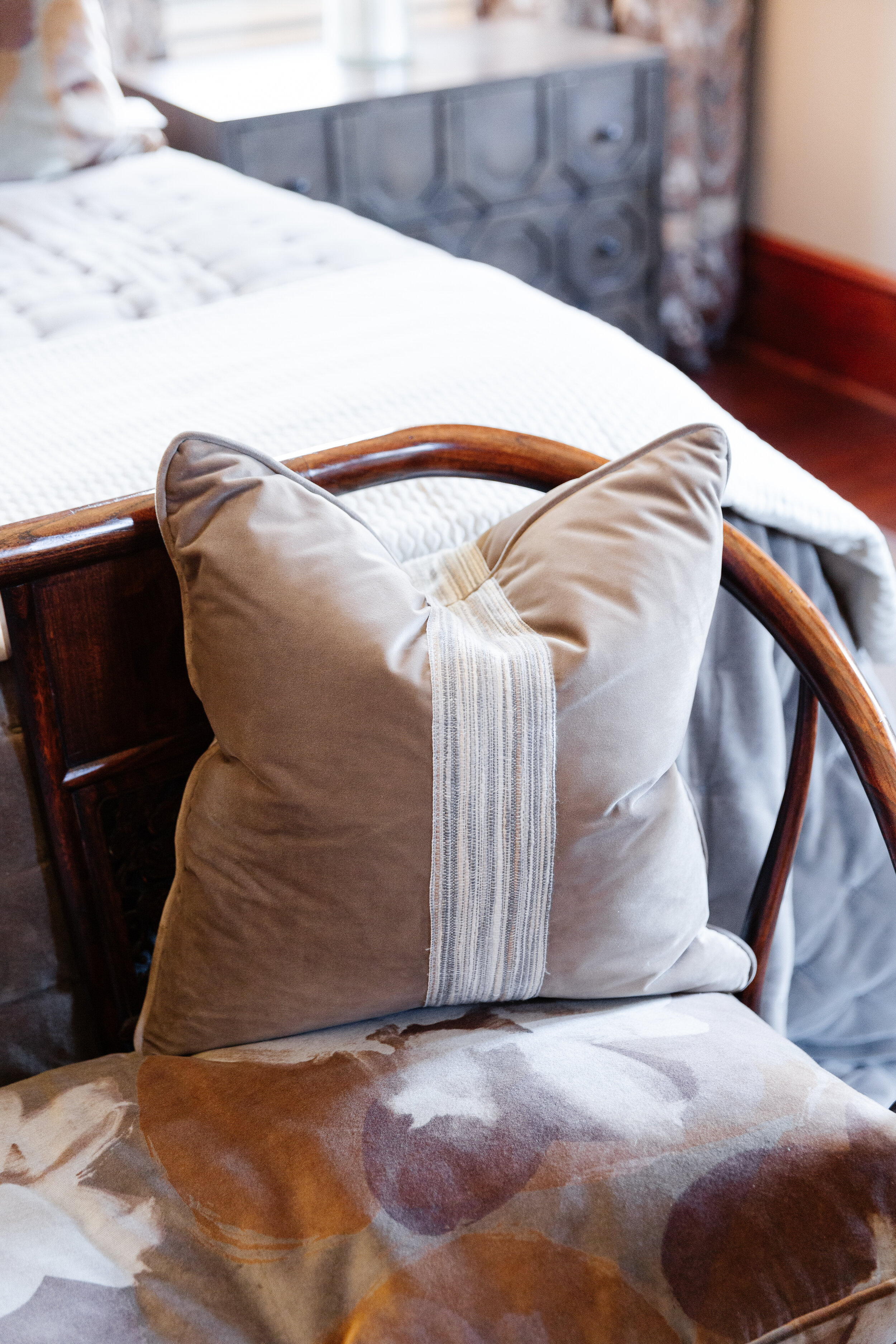
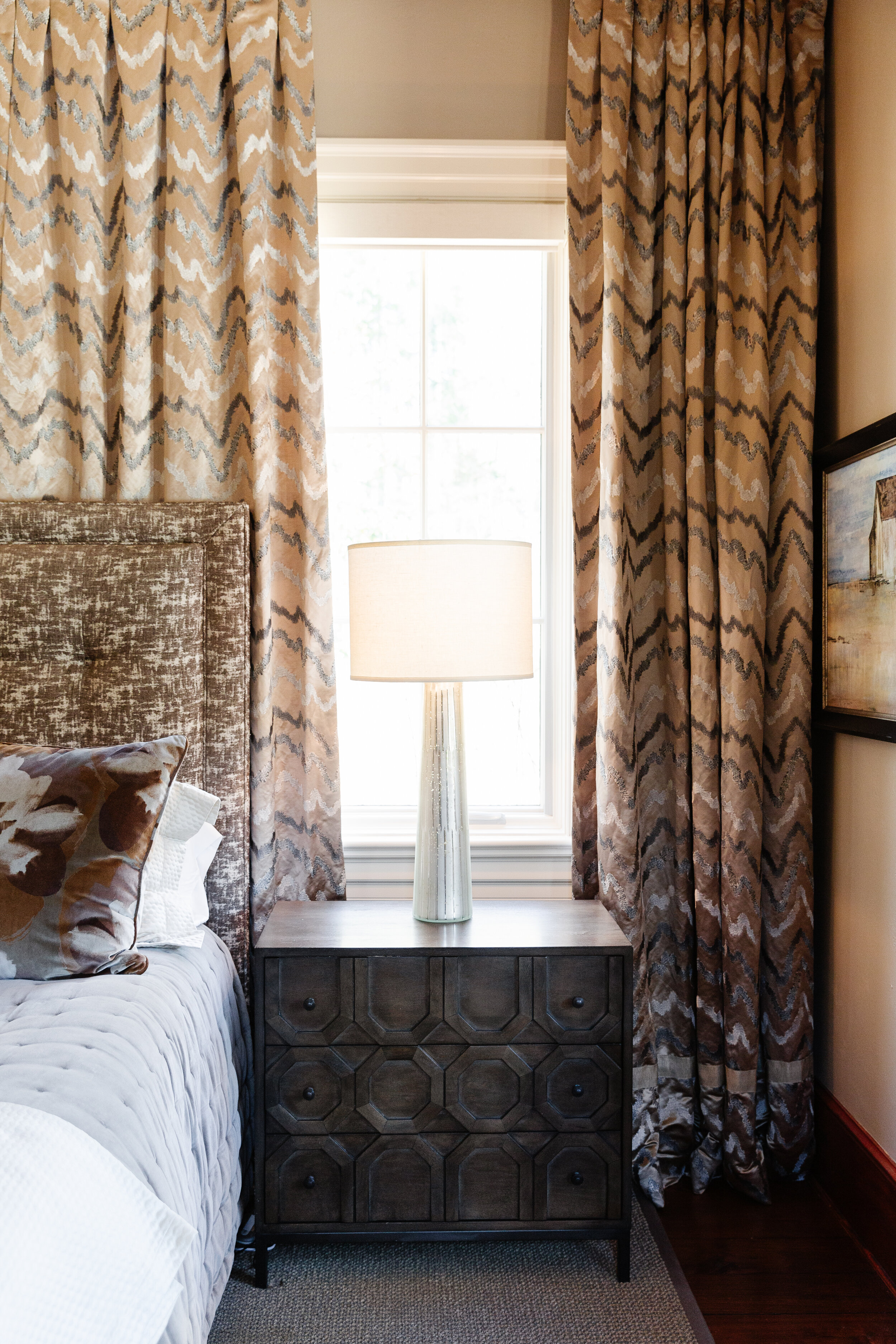
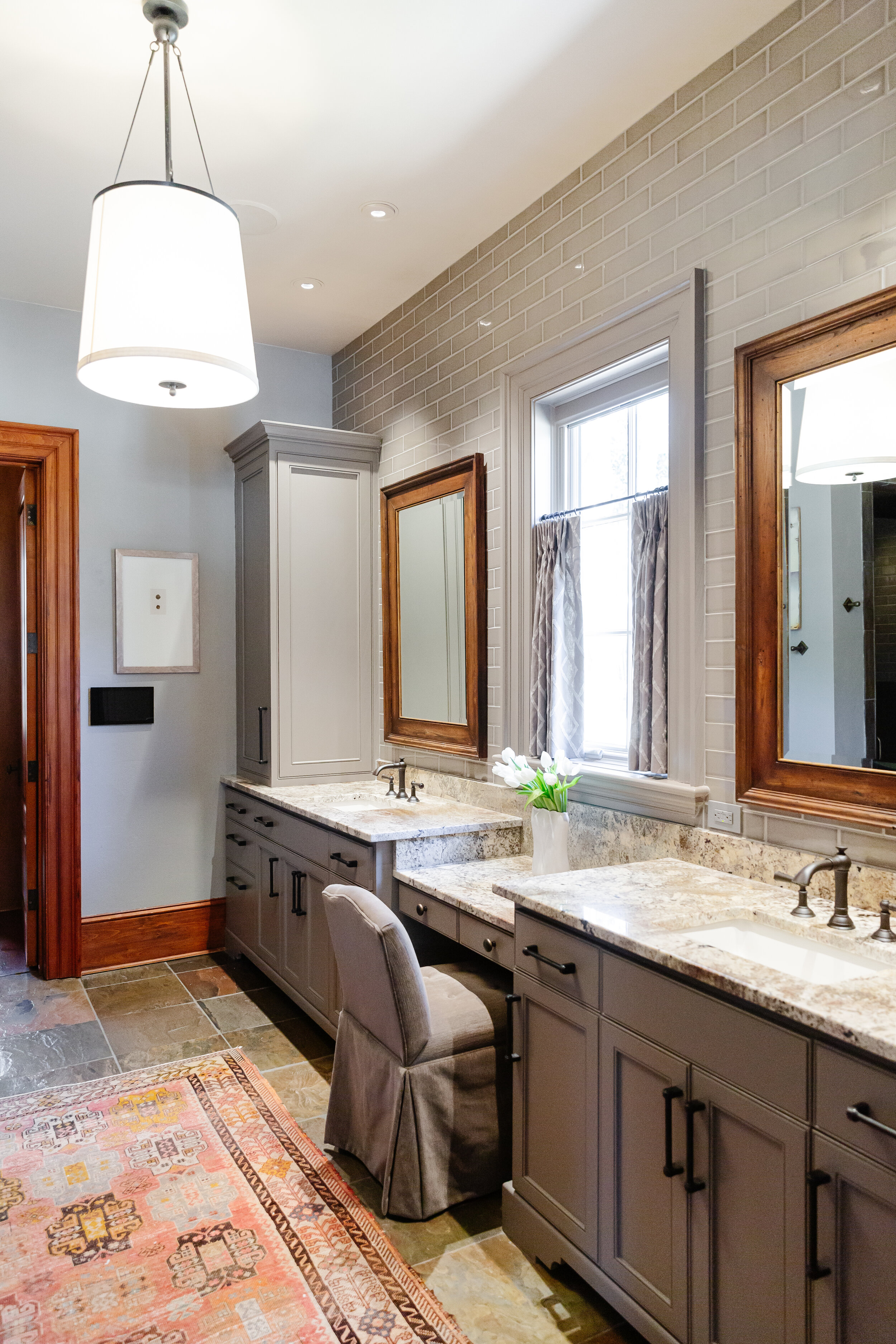
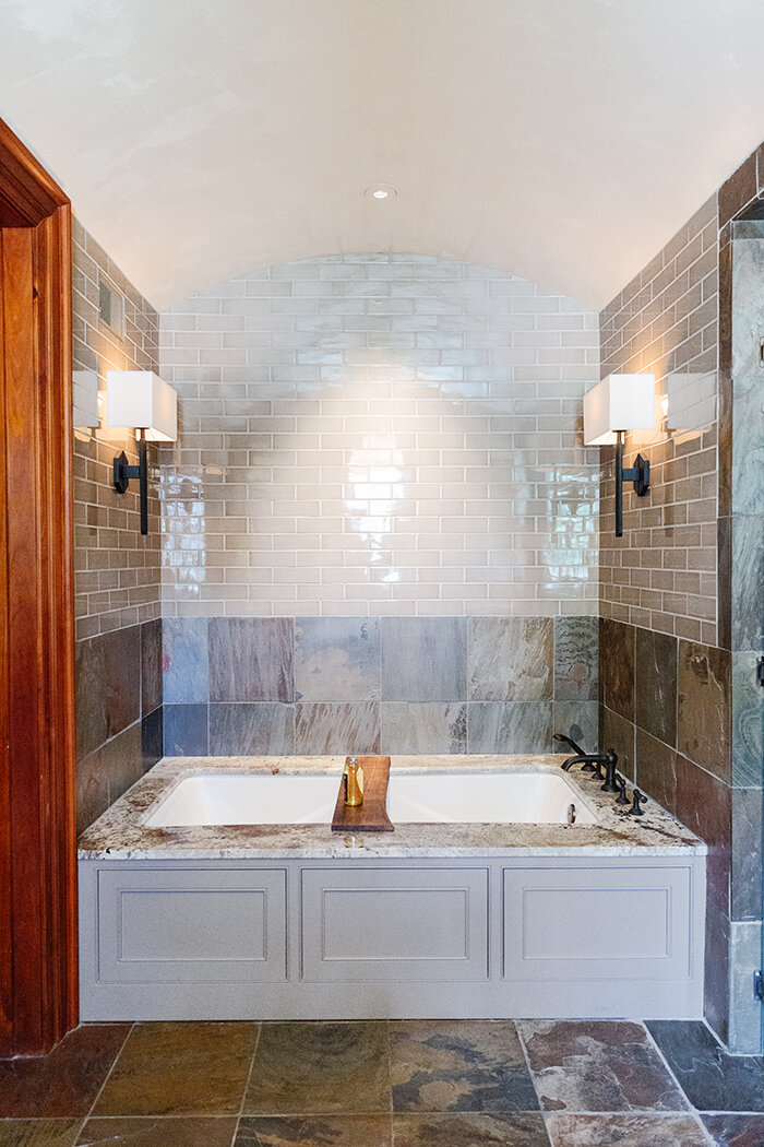
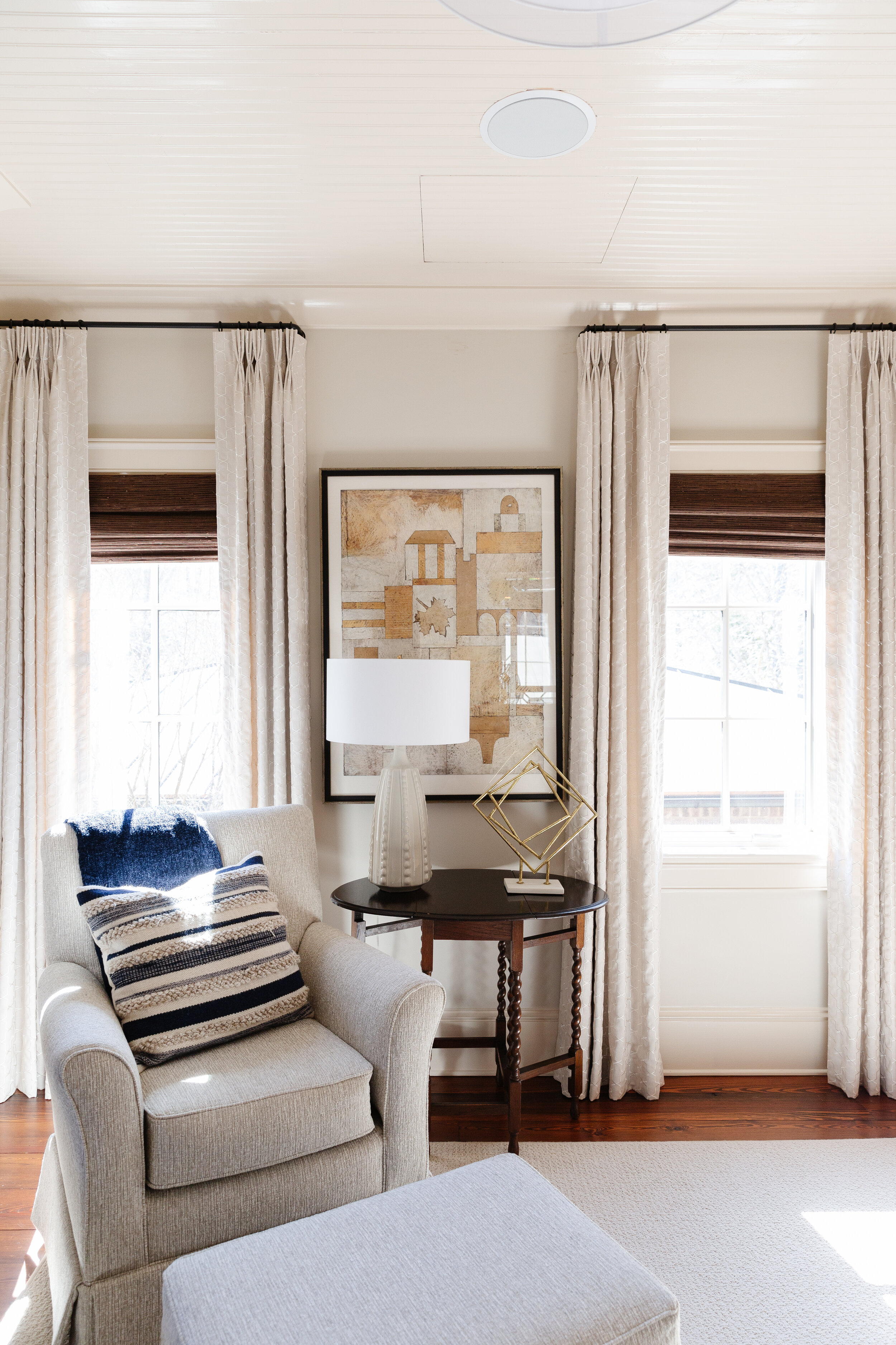
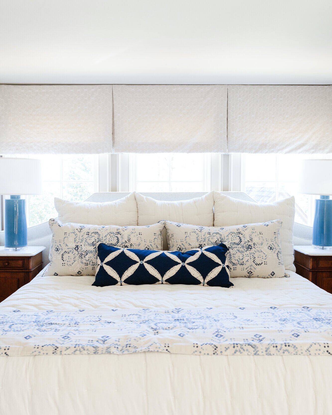
The master bedroom’s original faux finished walls received a new look thanks to several coats of paint. Parker freshened up the decor in the room with a new upholstered headboard, bedside tables, window treatments and art, giving it perhaps the most major facelift of any area of the home. In the master bath, “where it all started,” according to Beth, there’s the new shower tile David suggested, along with newly painted cabinets, new hardware, countertops, sinks and faucets. The family eschewed trends here, too: Beth had a freestanding tub, so popular in bathroom remodels at the moment, removed. “It just wasn’t functional,” she explains. In its place Parker installed a built-in tub with a granite deck.
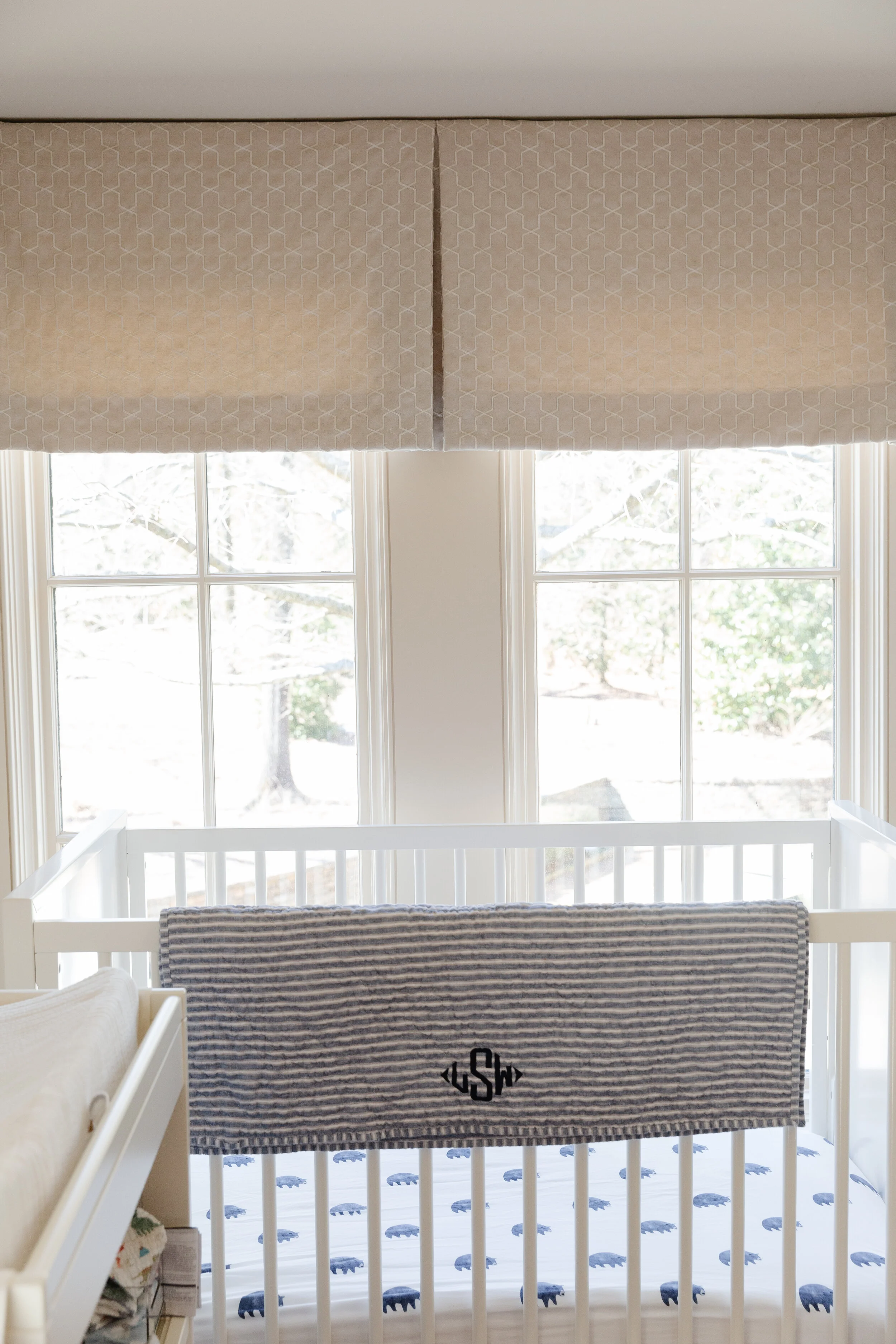
With Parker’s help, the Skudders now have a home that’s evolved to fit their current needs—the upstairs renovations even included reworking part of the guest room into a nursery nook for their year-old grandson. But even though the house is now much more suited to the couple’s current lifestyle, their relationship with the designer isn’t winding down. “We love a project,” Beth says. “We truly enjoy the whole process and I’m looking forward to working on more projects with Ann in the future.”


