Fresh for the Family

Story by Terri Glazer | Interior Design by First Fruit Collection | Photography by Annabella Charles

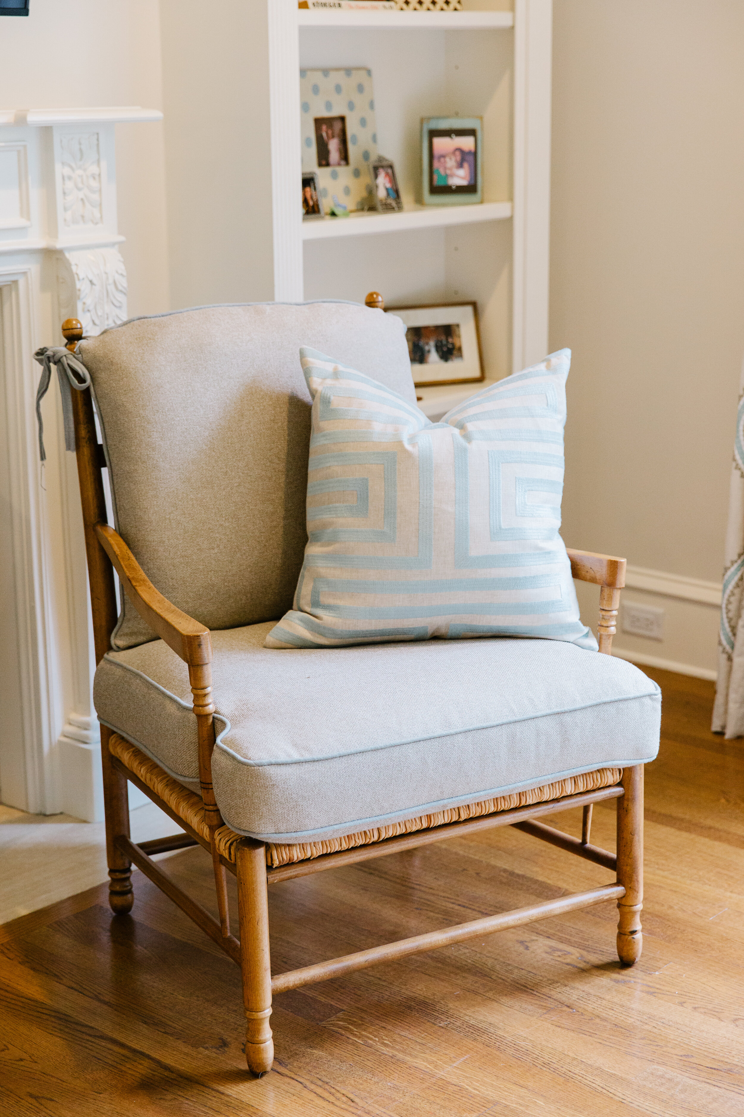
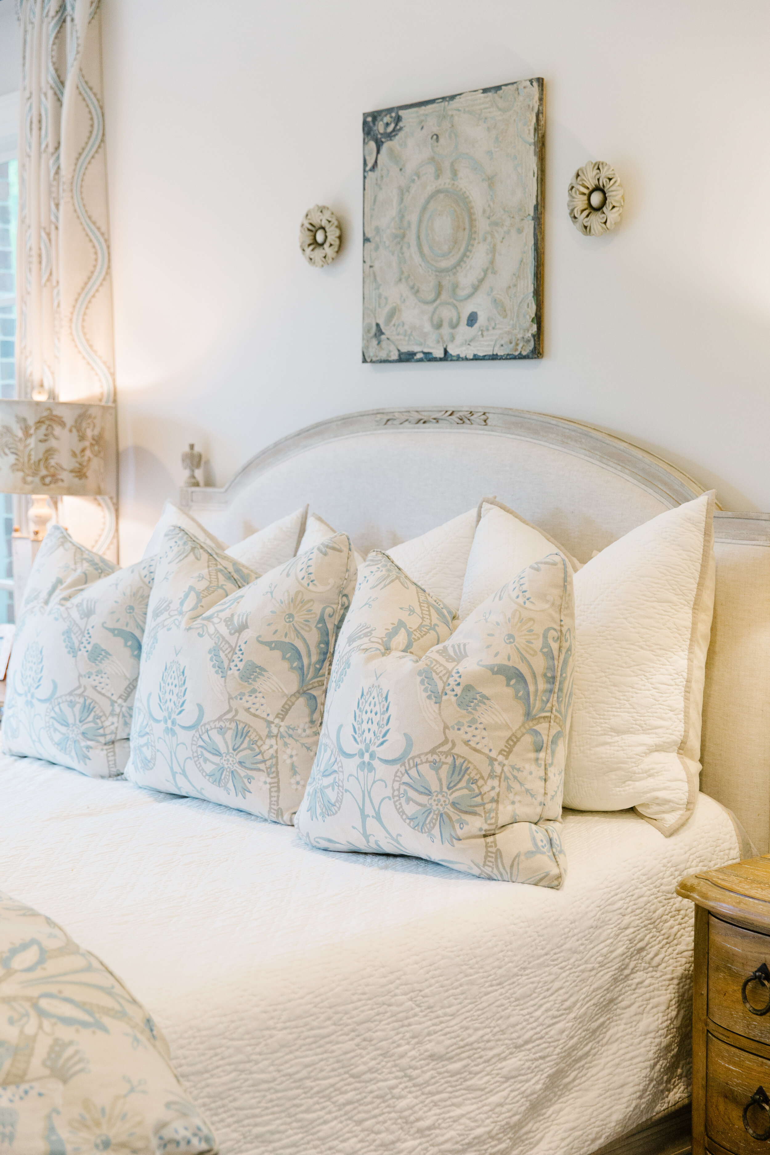
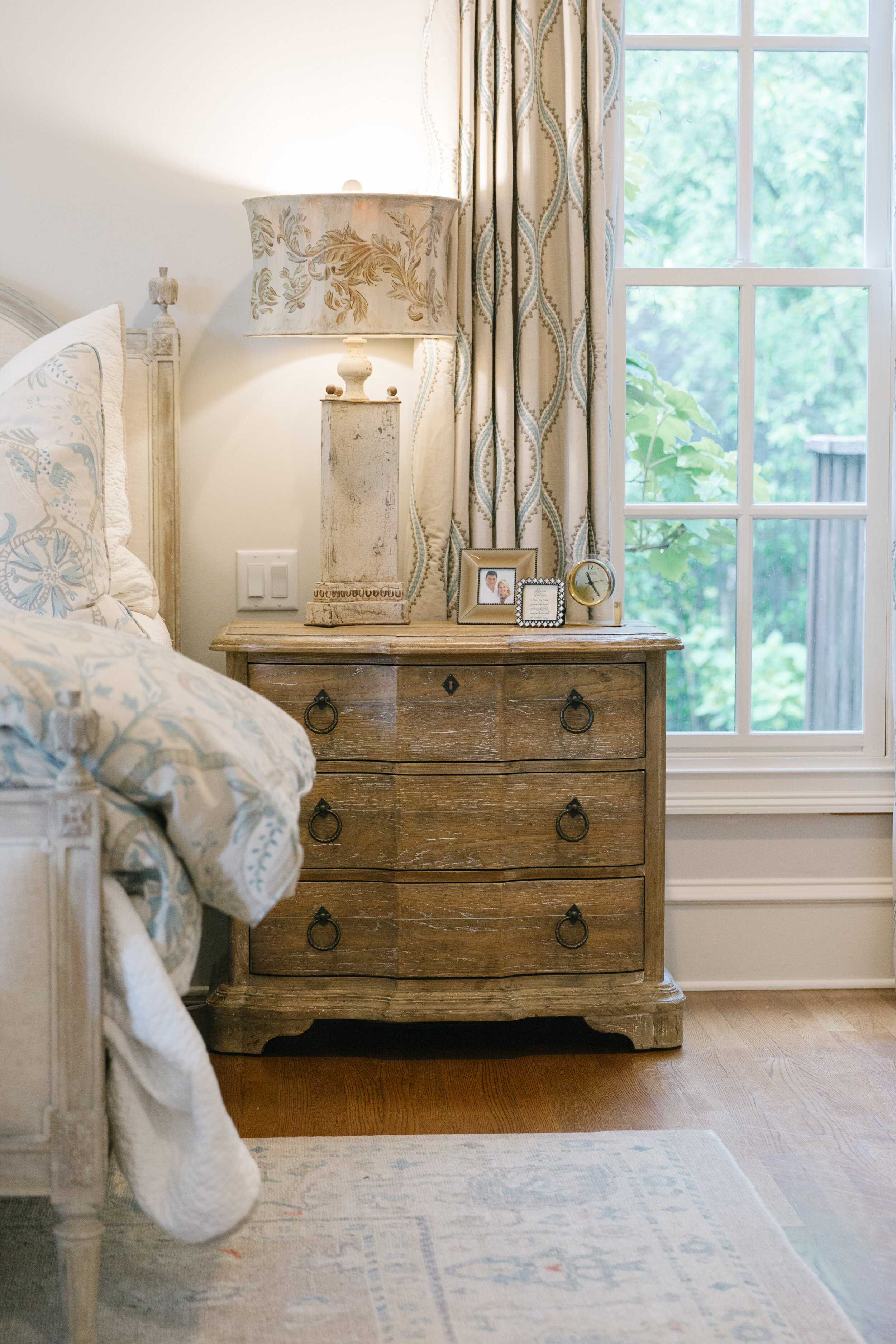
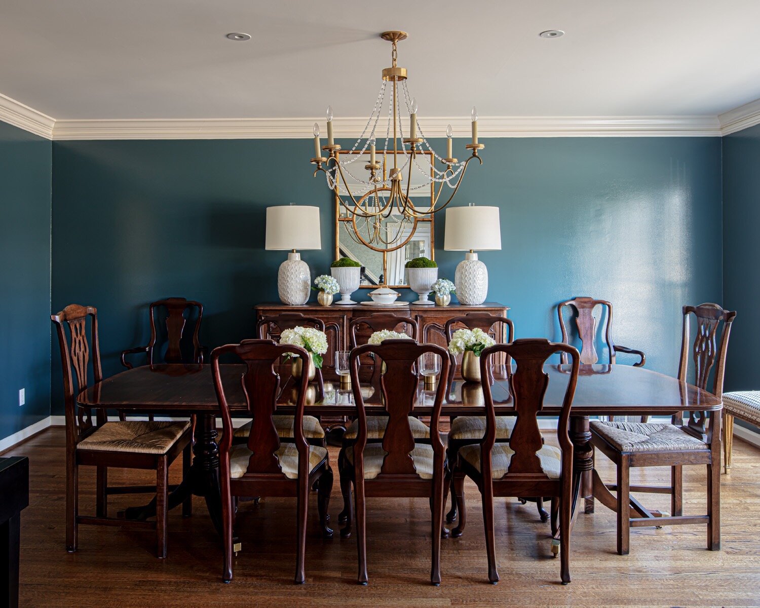
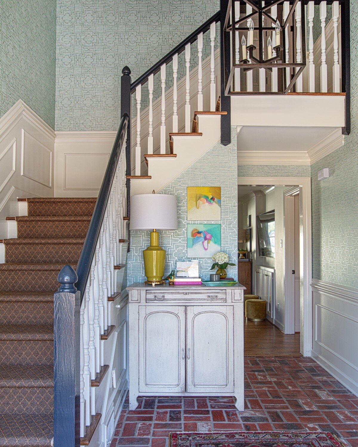
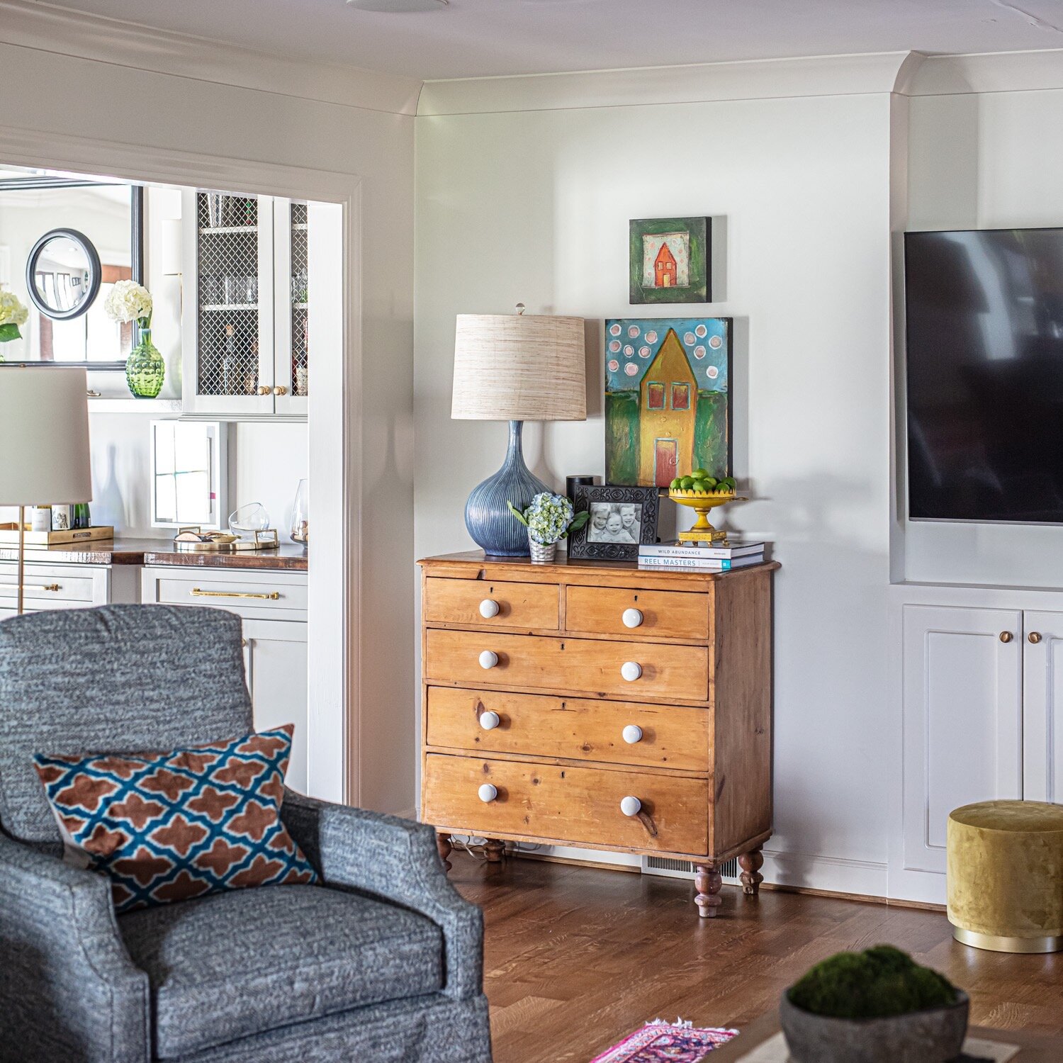
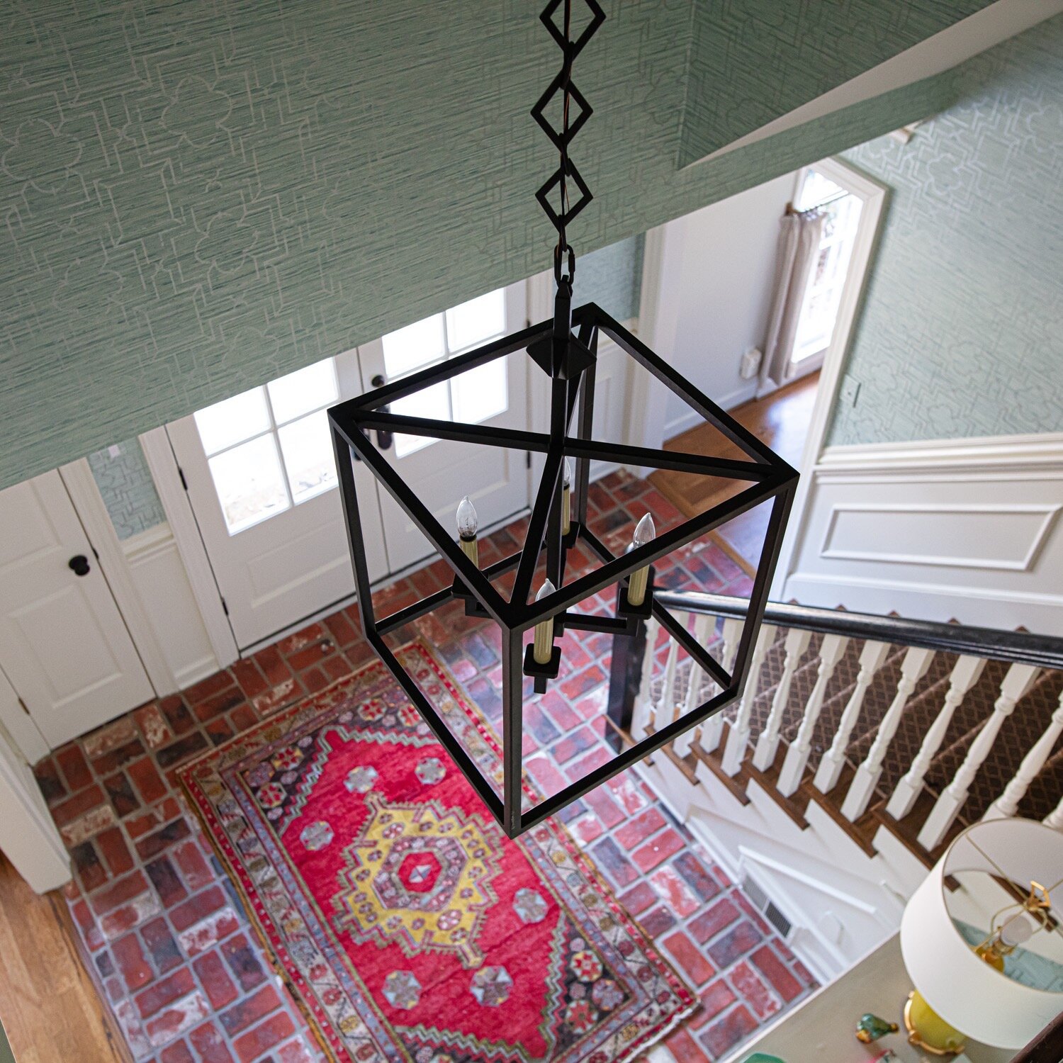
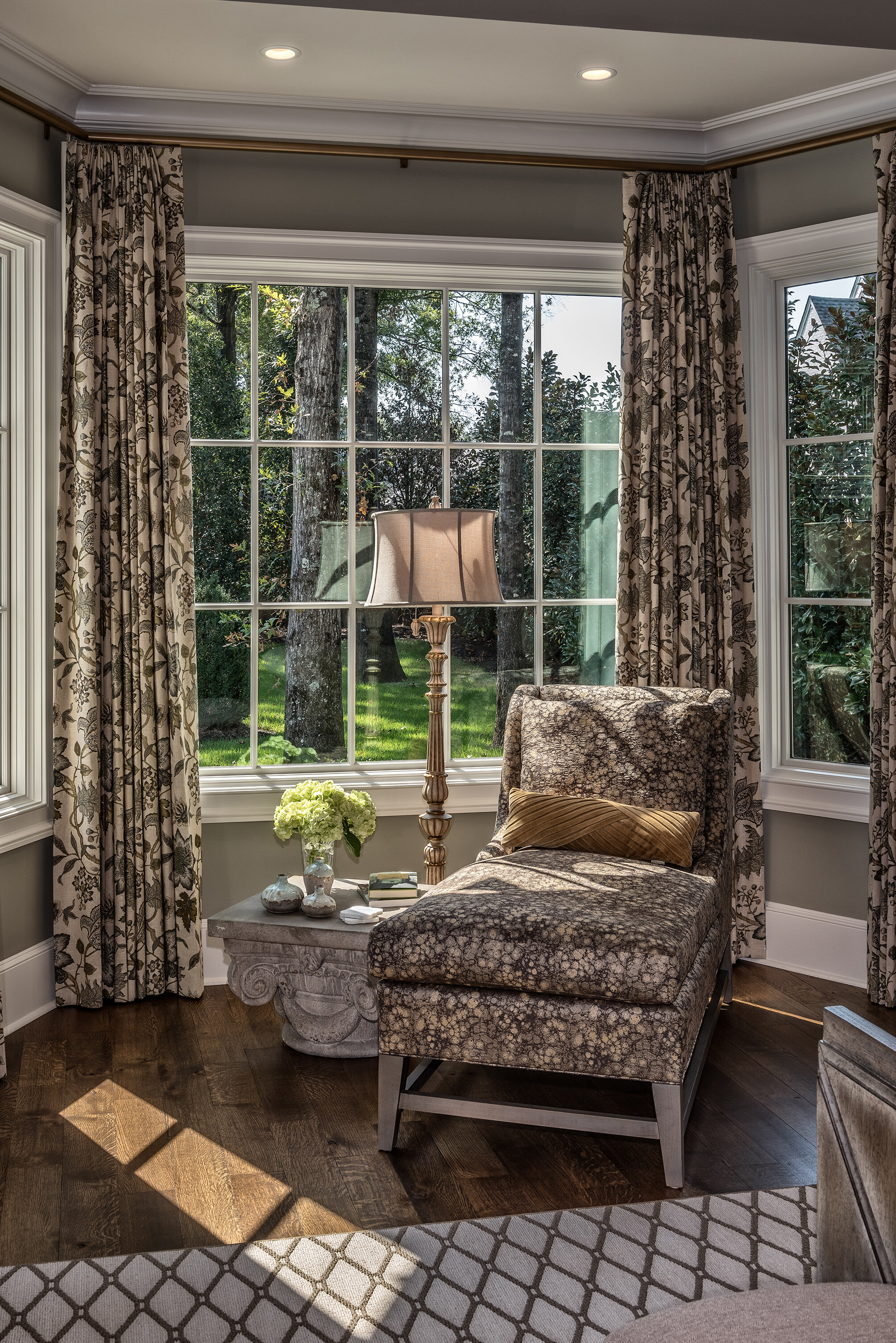
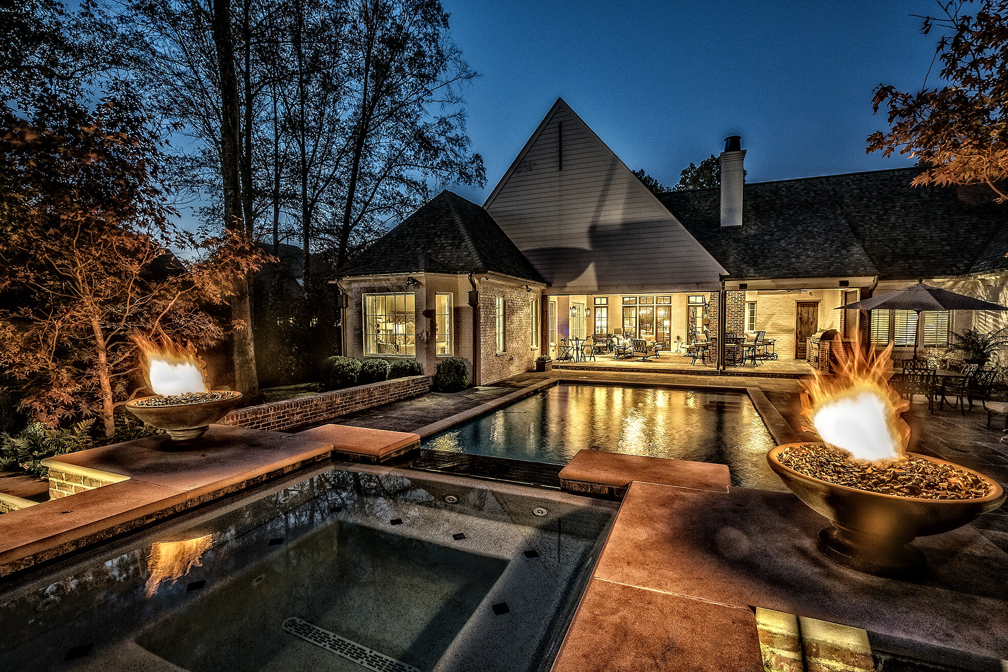
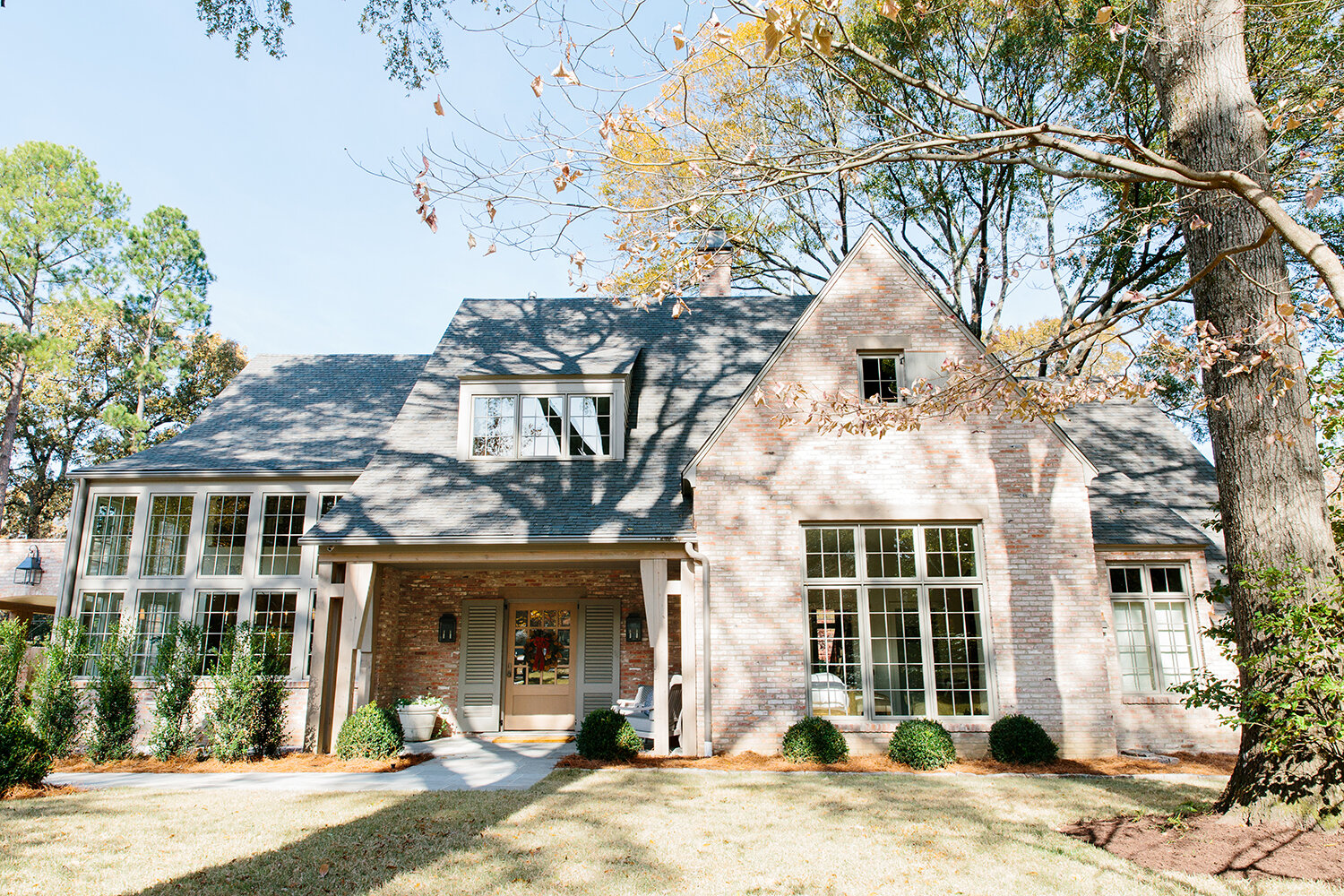
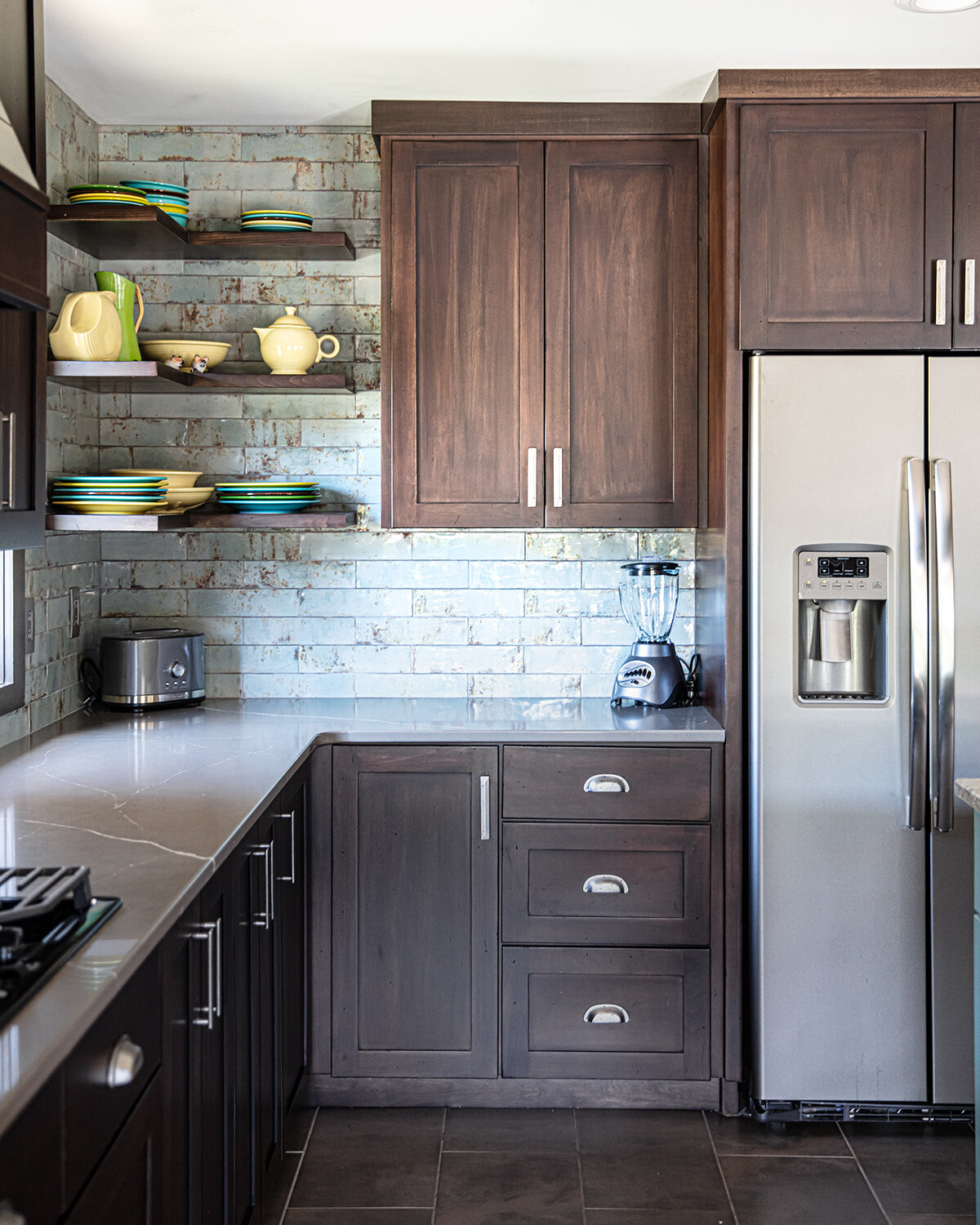
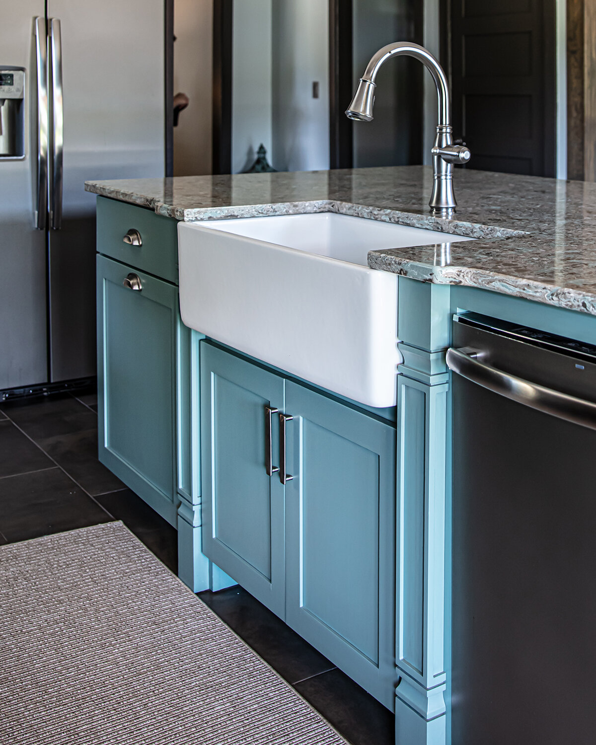
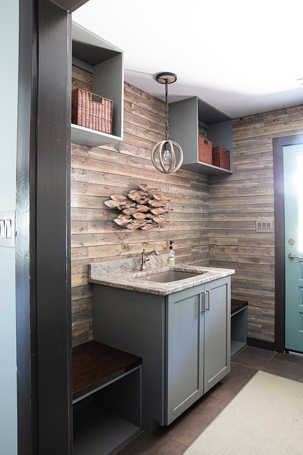
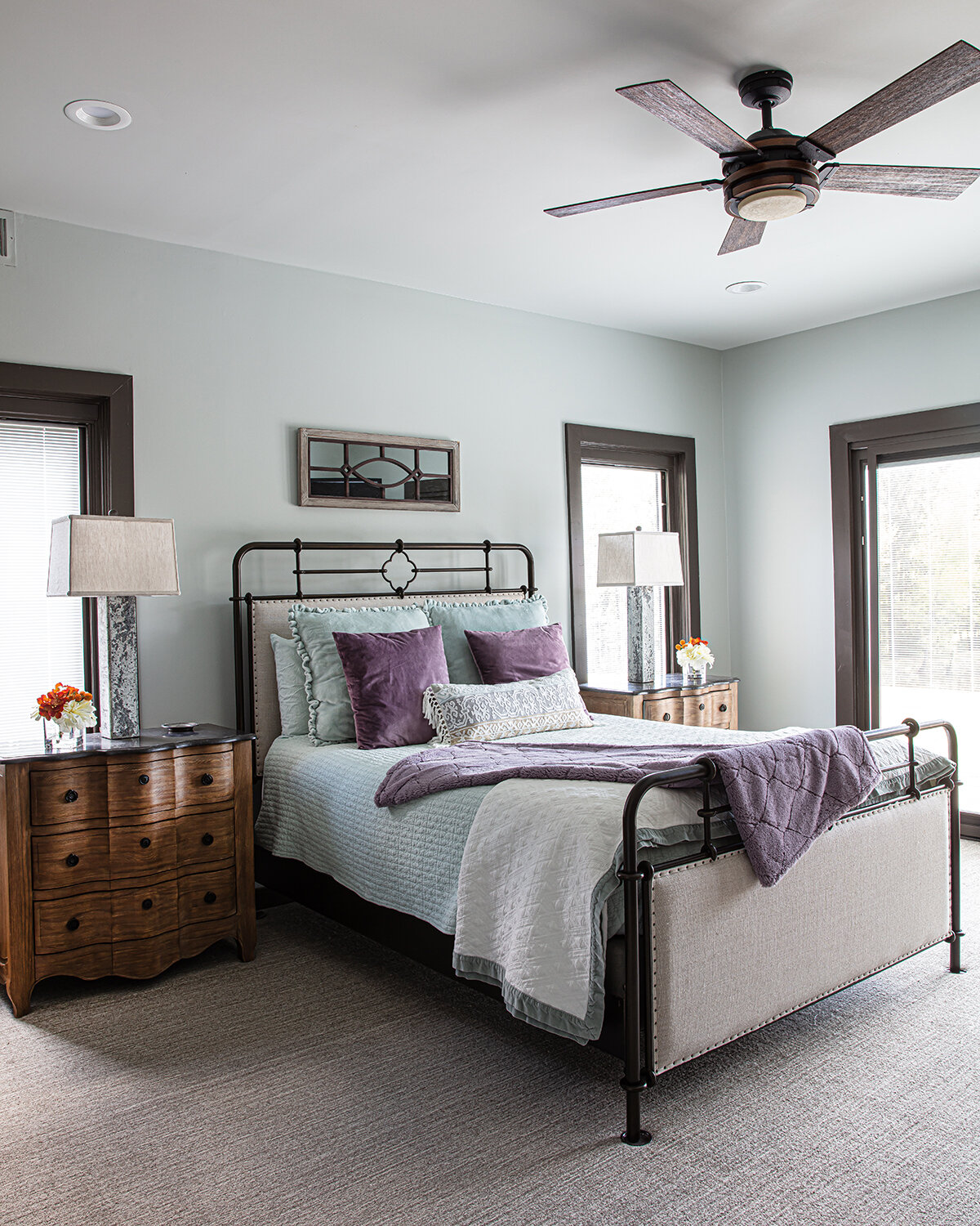
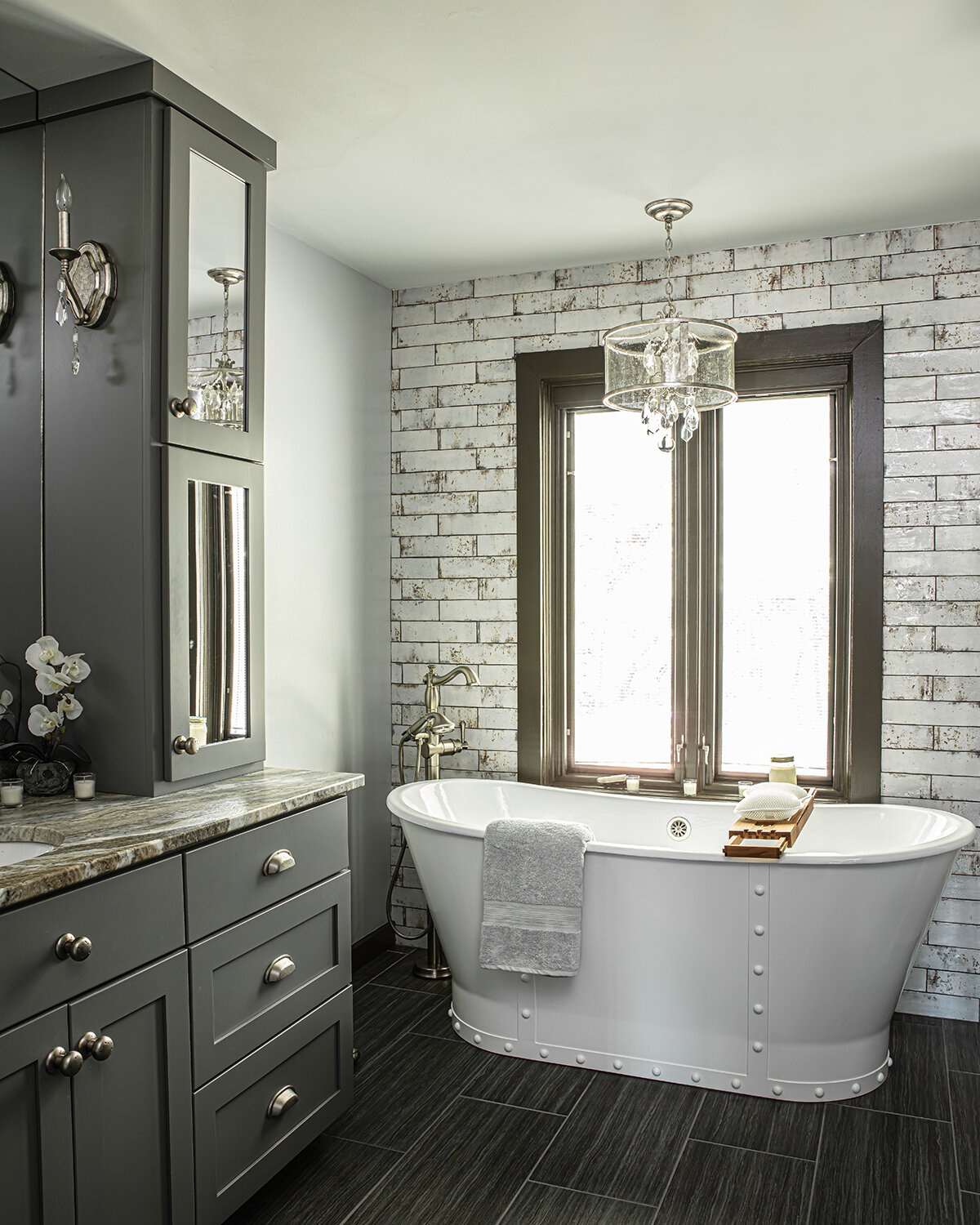
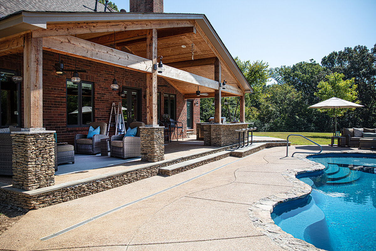
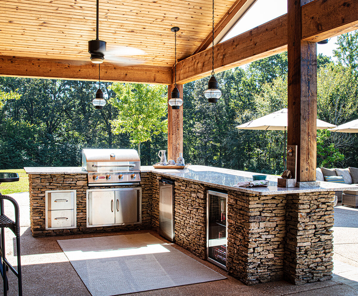
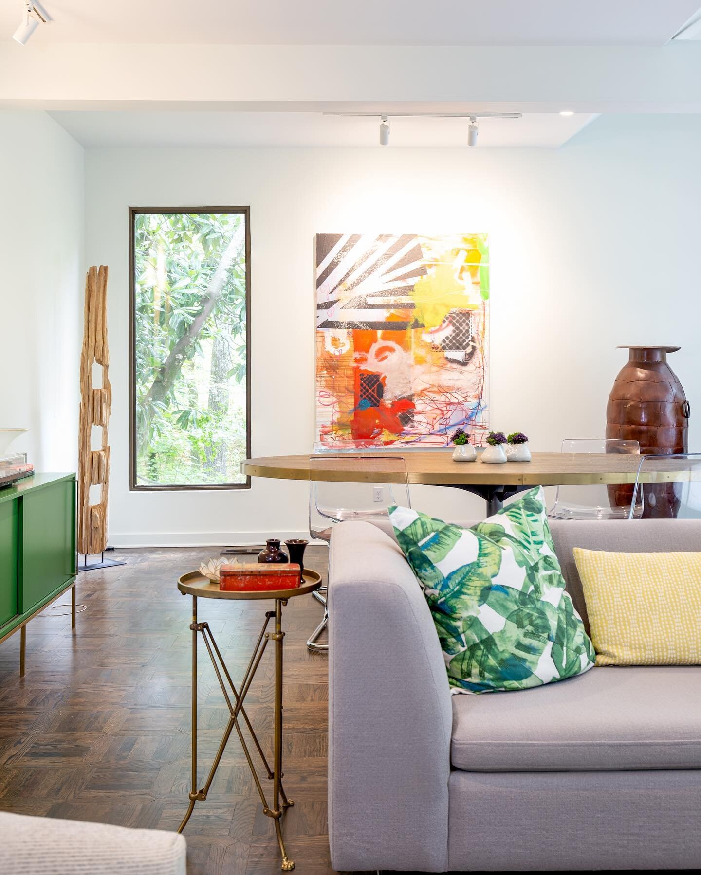
The stately Georgian architecture of Brooke and Brian Sparks’ Germantown house might give the impression that the interior would have a stuffy, formal feel. Not so. Thanks to Brooke’s vision and daughter Ashley Toney’s professional expertise, the home is the perfect blend of beauty and comfort.

May-2.jpg

That’s a good thing, because the house is often filled with the couple’s family: three daughters, two sons-in-law and four young grandchildren, all under the age of four, who live in the area. 

When the Sparkses bought the home about a year and a half ago, the original 1993 decor was in need of an update. Ashley recalls, “My mom’s friends wondered why she wanted to move into this house. Her previous house was brand new and, of course, updated.”

May-10.jpg

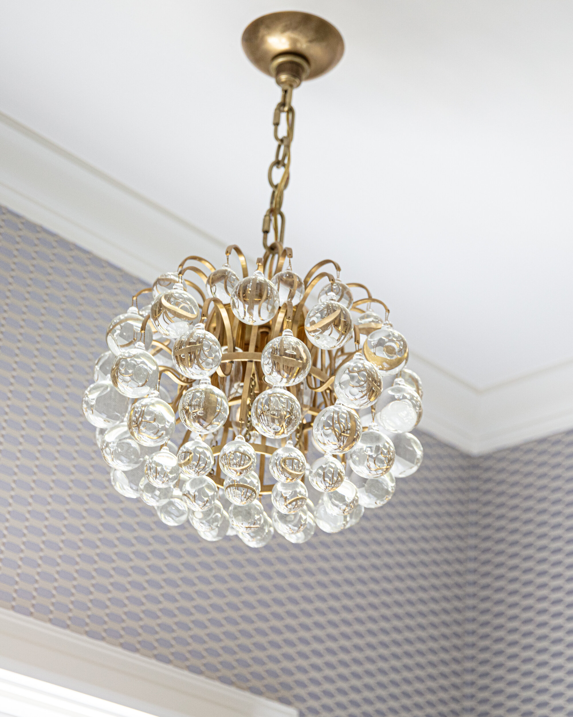
Toney, an interior designer and owner of First Fruit Collection in Collierville, could see past the tired decor to the home’s true potential. “The thing about this house that’s really great is that you take this house that you thought was super dated, you redo the bathrooms and the kitchen, add new paint, new light fixtures, and it’s amazing how different it is,” she says. 

Patty Michaelis, First Fruit store manager and designer, echoes Toney’s formula for bringing any home from past to present. “You can make your house look fabulous; it doesn’t matter how old it is!” she says. “We didn’t even have to replace the floors or the cabinets in this house. A lot of people would have come in here and thought they had to rip out everything.”

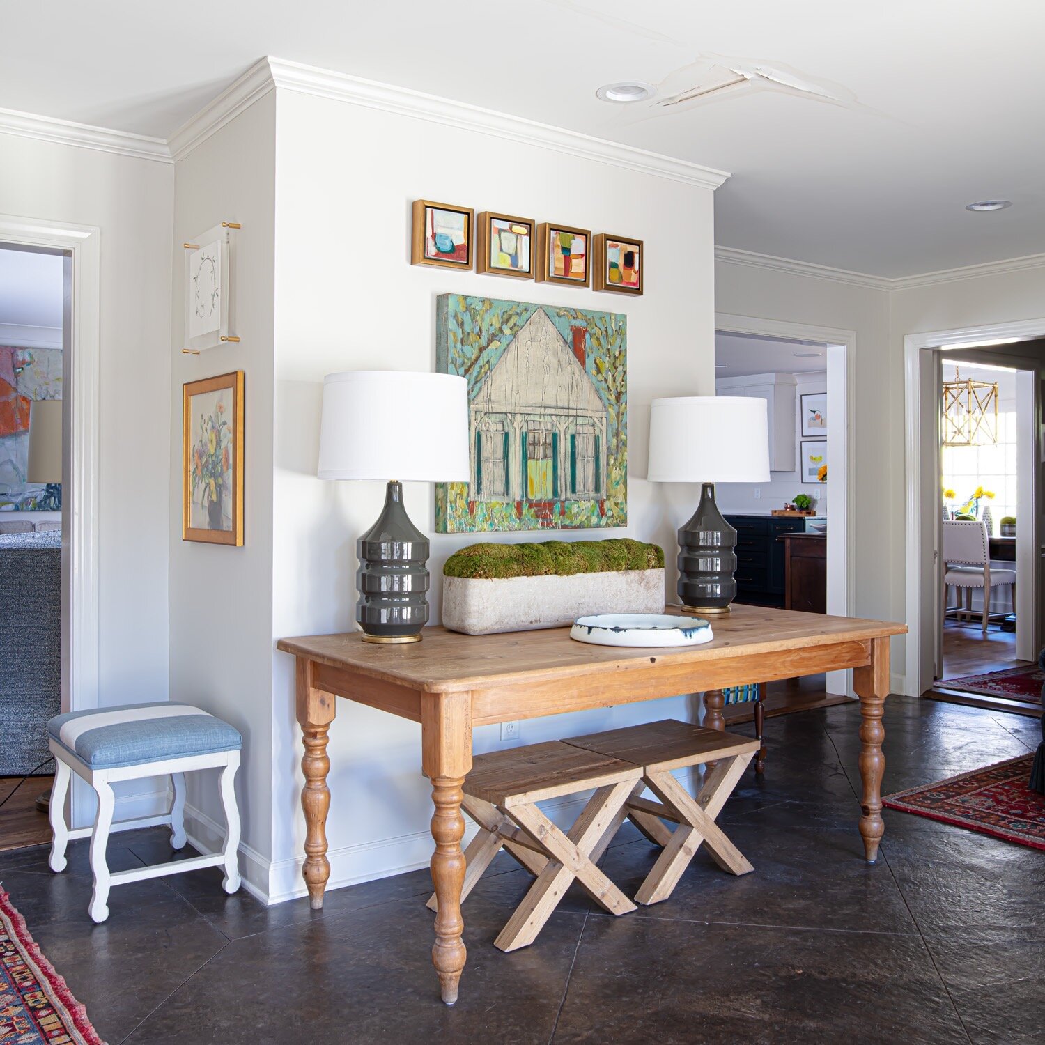
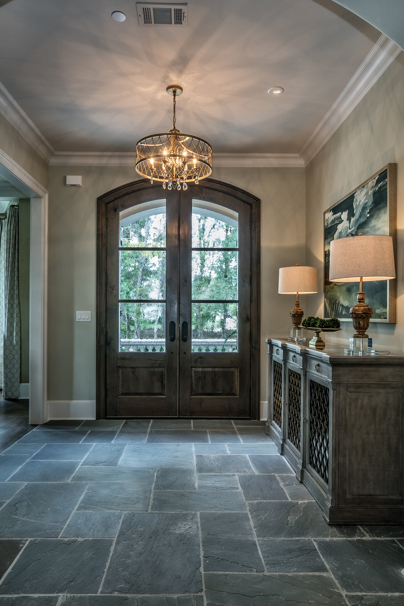
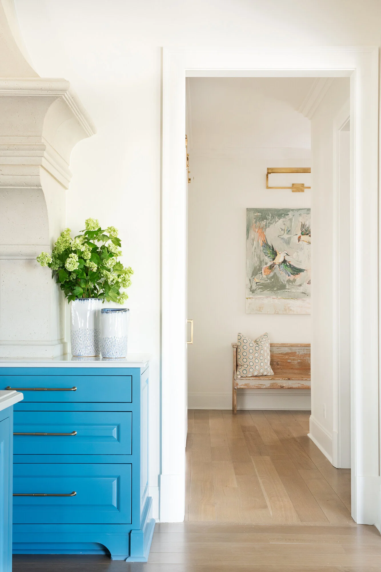
The freshen-up began in the light-filled front entry with new custom doors, furniture and drapes. Weathered benches under arched windows in alcoves on either side of the front door, and a pair of antique sideboards with blue paint in just the right degree of chippiness set the relaxed mood for the entire house.

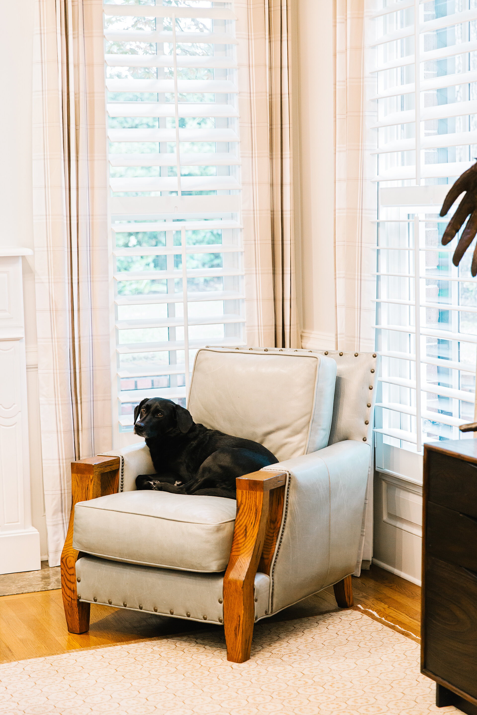
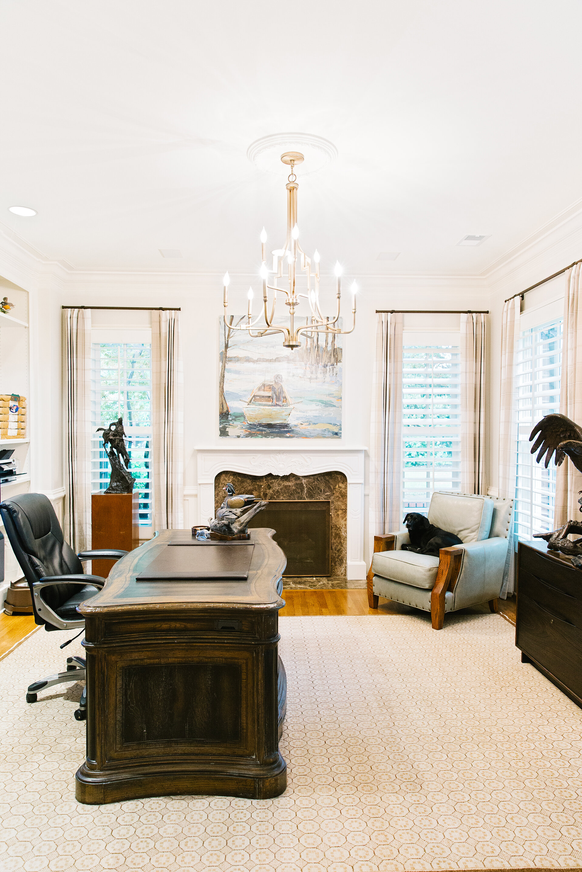
Adjacent to the foyer is the office, the perfect workspace for Brian and his constant canine companion, Gunner, who usually makes himself right at home in a comfy leather mission-style chair. Over the room’s fireplace hangs a custom painting by Nashville artist Lauren Dunn depicting Gunner perched in Brian’s rowboat, ready for a duck hunt.

May-19.jpg

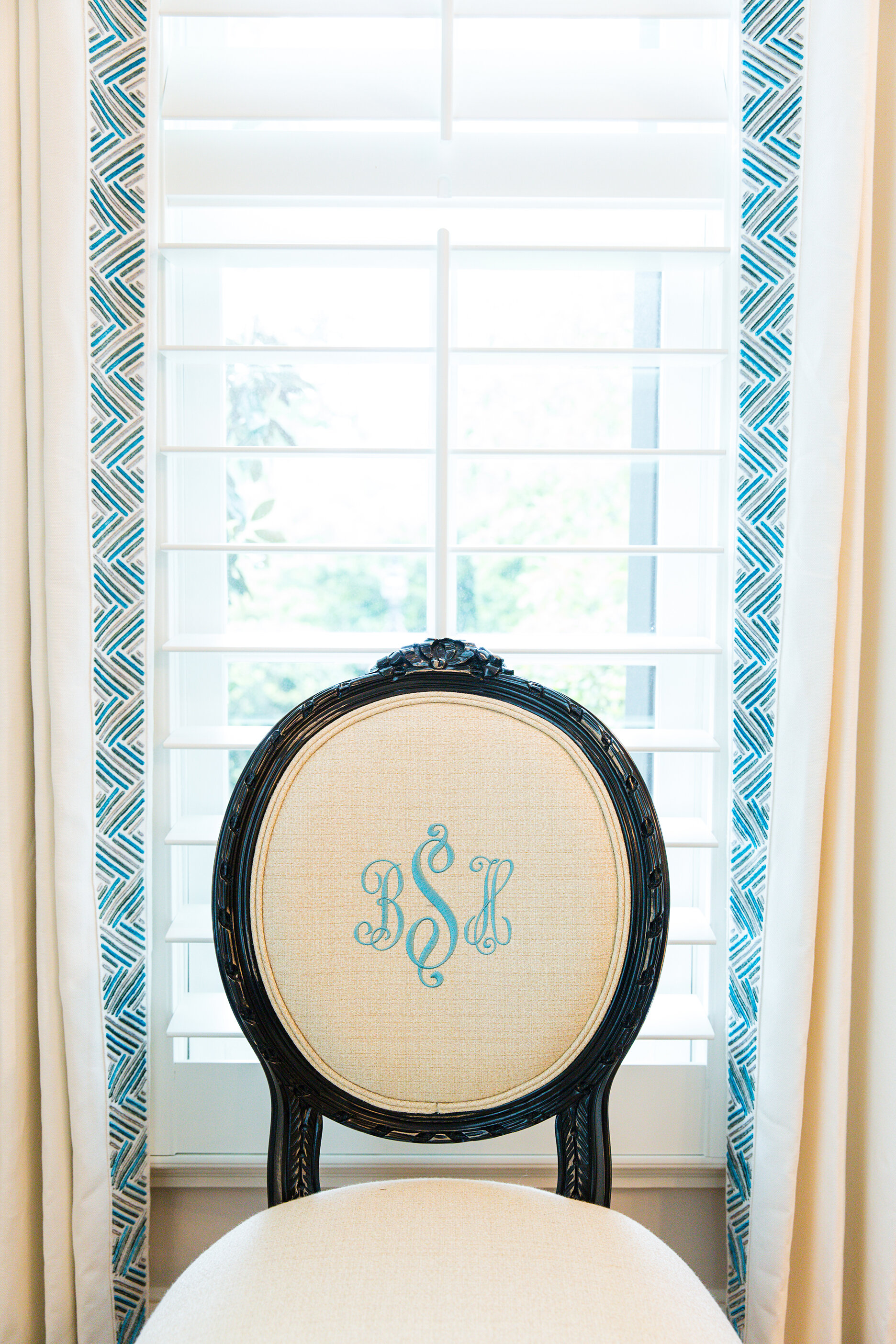
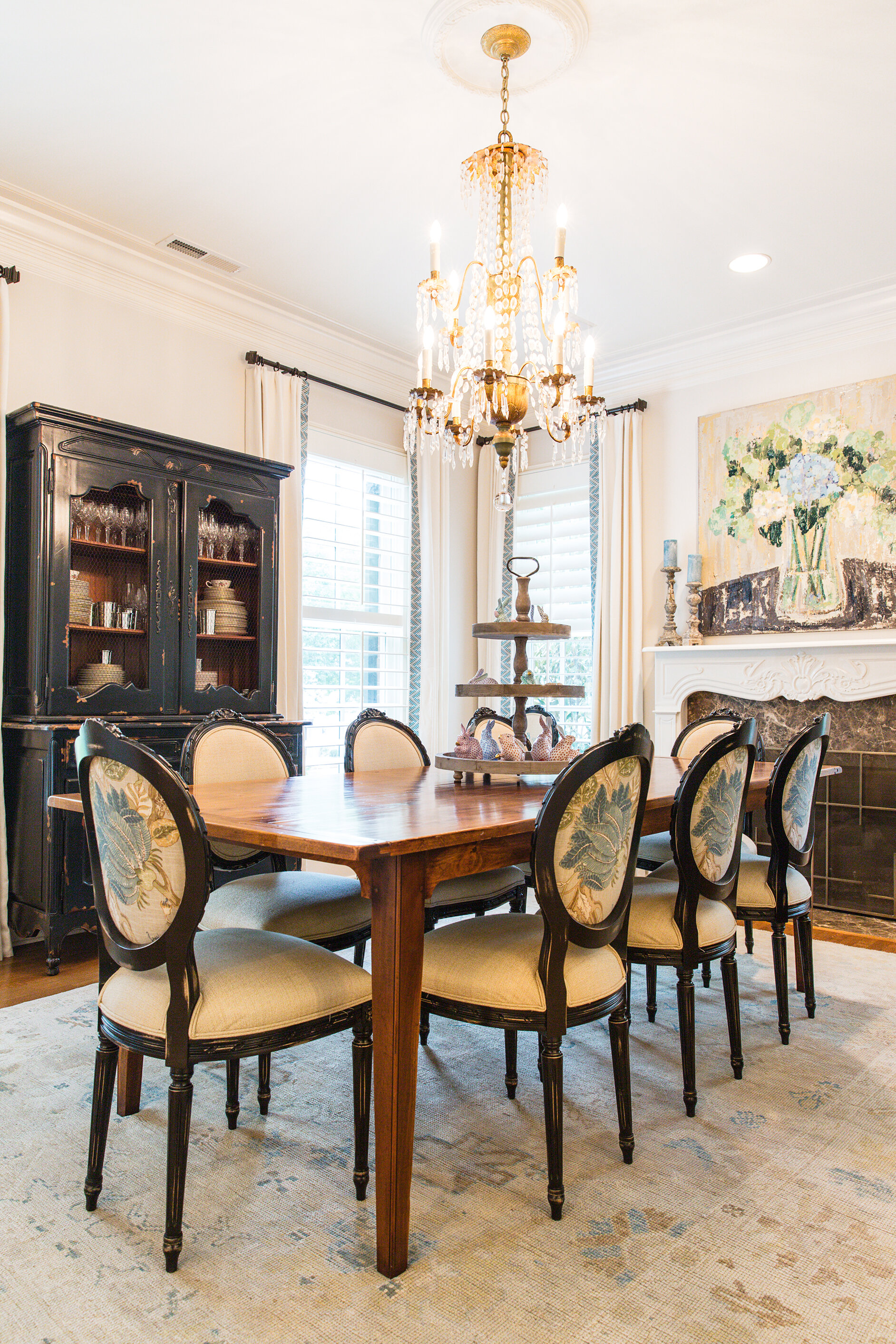
Just across the foyer, the dining room is a mirror image of the office architecturally with a matching fireplace and the same floor-to-ceiling windows. There’s plenty of room for the family Brooke loves so much to gather for a meal around the primitive farm table. Louis XVI chairs with monogrammed backs and a stunning chandelier lend a dressy touch.

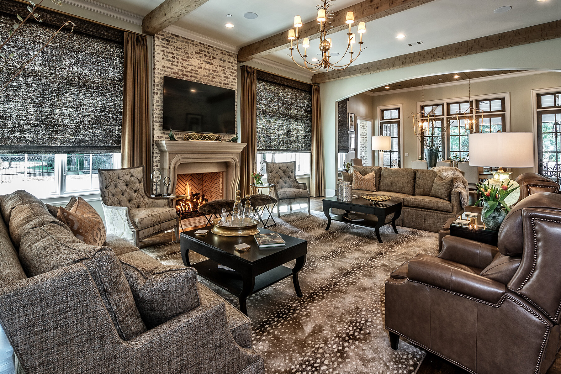
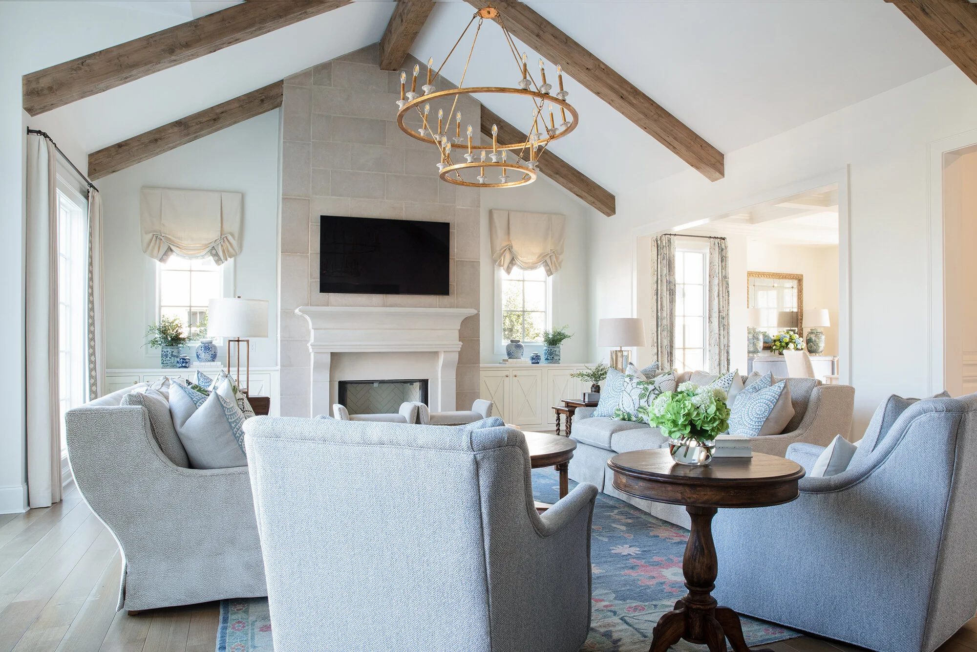
With a grand piano and showcased collection of Herend animals, many living rooms would be off limits to children, but in the Sparks house the design choices were made with the youngest family members in mind. All the furniture is upholstered in performance fabrics so stains are never an issue. “We can sit on all the furniture; it’s very liveable,” says Toney.

May-63.jpg
May-41.jpg

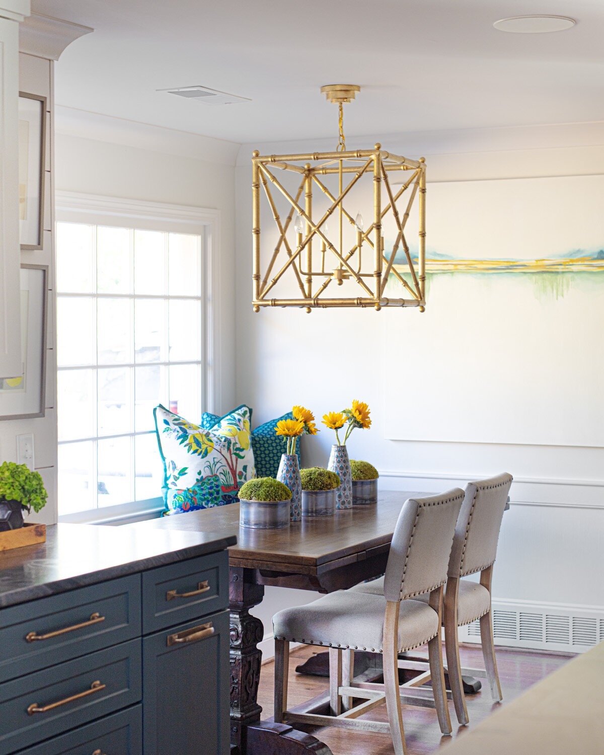
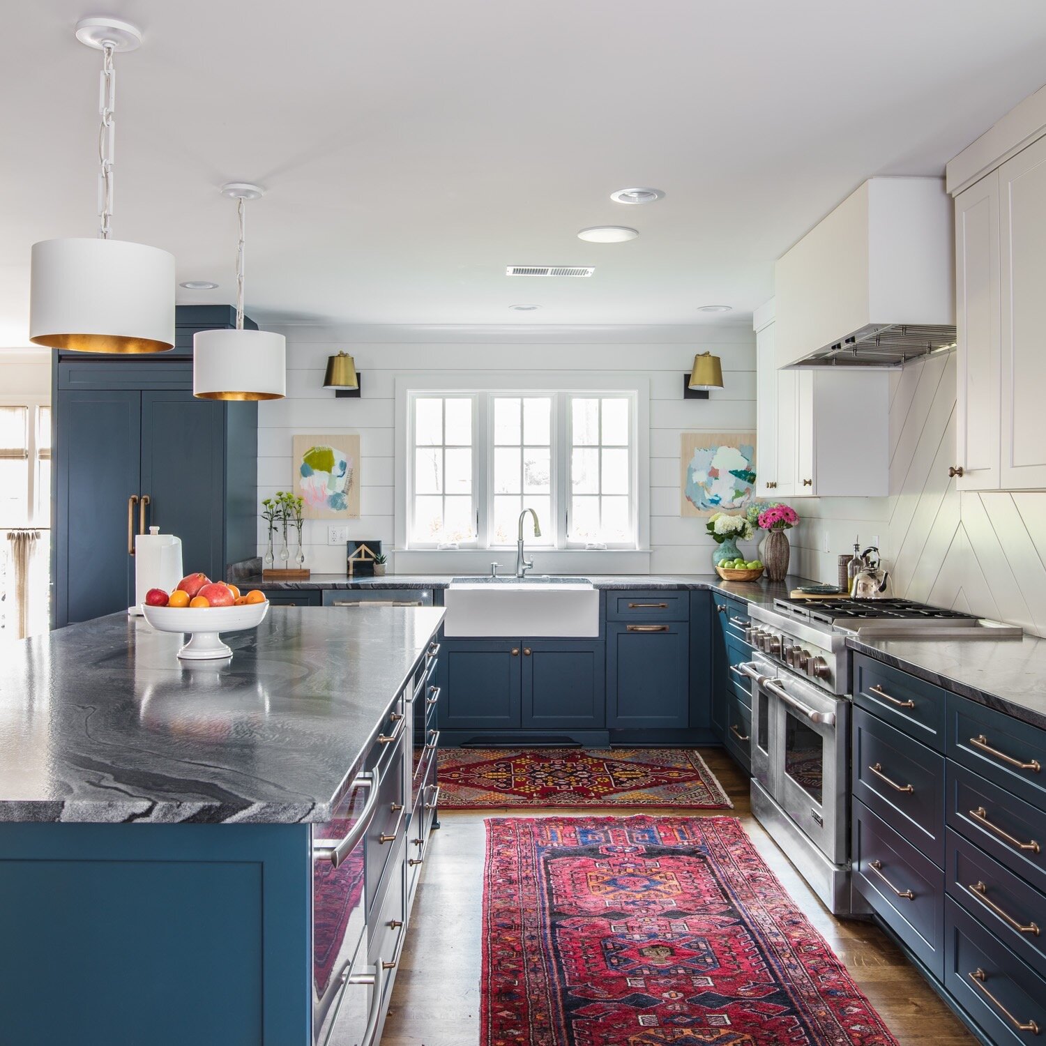
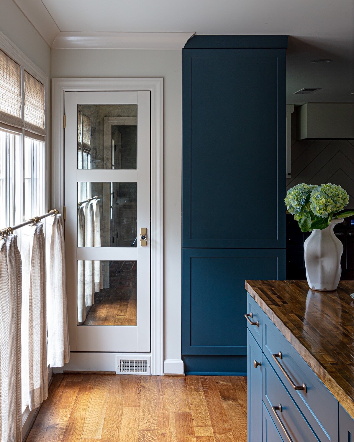
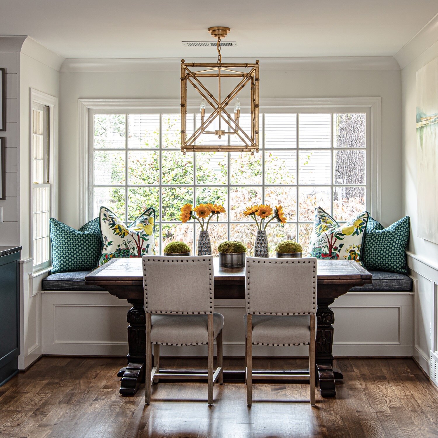
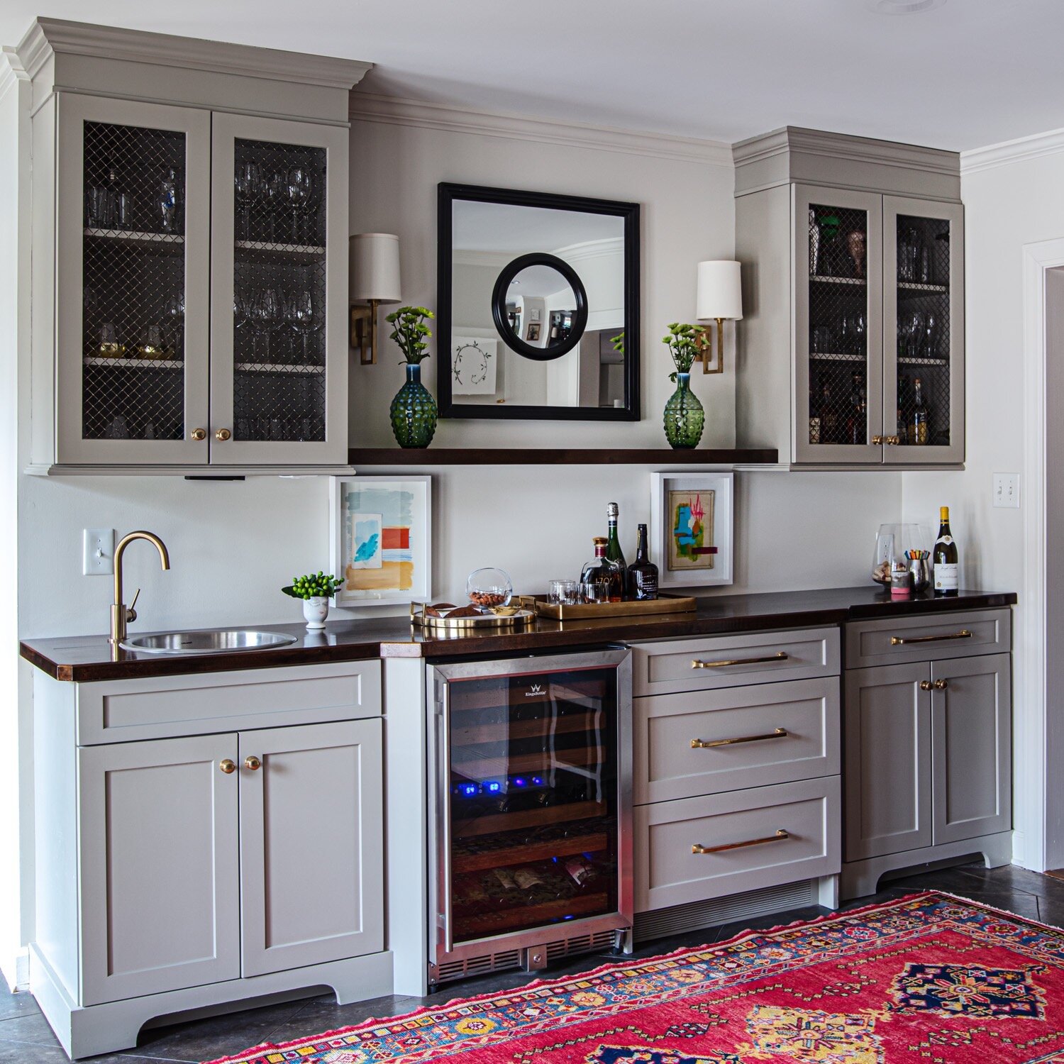
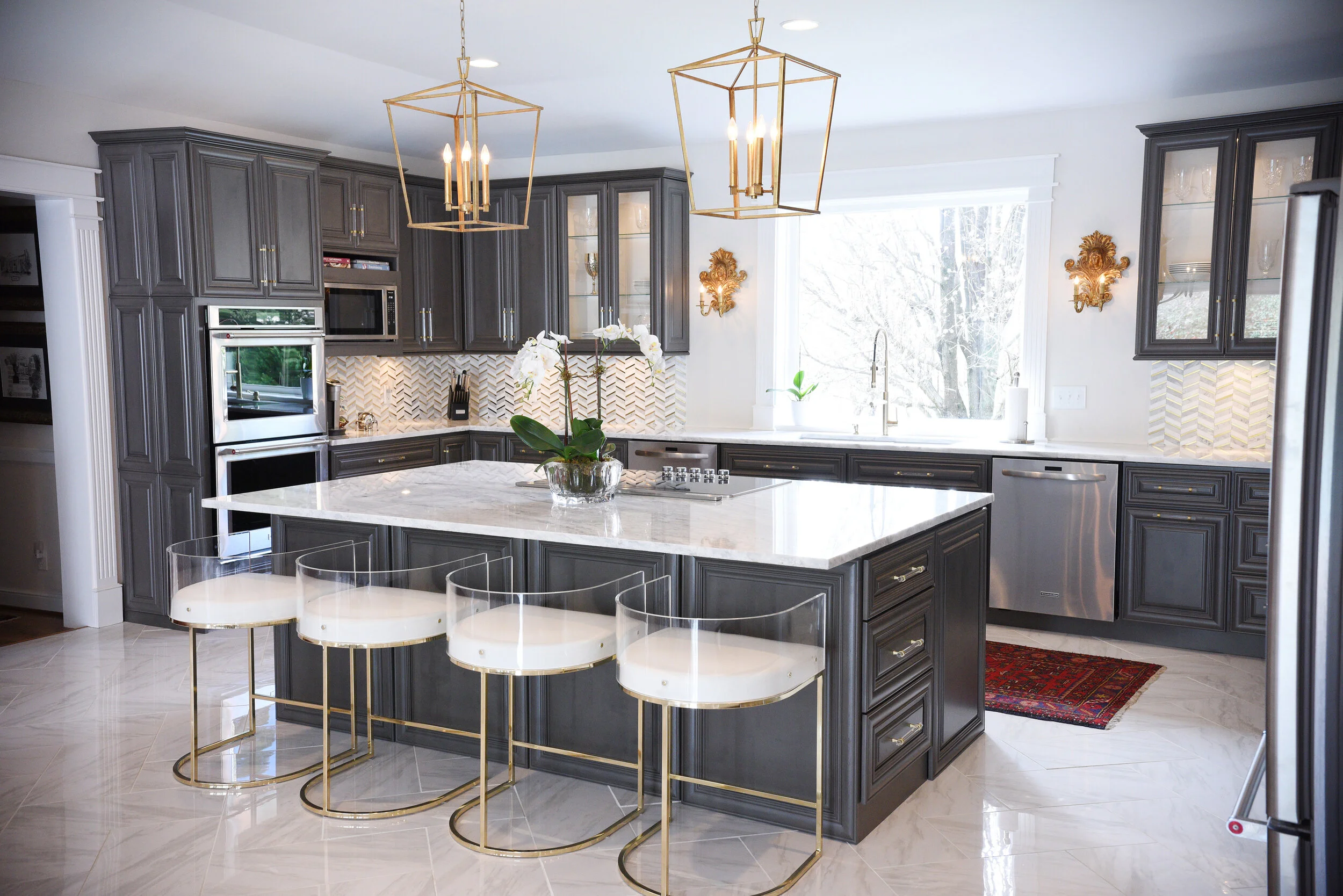
While the kitchen received a major facelift, the work didn’t involve changing the room’s footprint. As Michaelis pointed out, the “bones” of the room were fine—no gut job necessary. It was design magic rather than revised architecture that brought this room from dated to dazzling. “We painted all the cabinets, redid the backsplash, put in new countertops and added new hardware,” Toney says. The soft gray/green color she chose for the cabinets, paired with classic white marble counters and subway tile backsplash gives the kitchen an almost seaside quality. Gold-tone hardware warms the look up and adds a hint of elegance. In the connected breakfast area, the beachy theme continues, from the painting of sailboats on the water, another Lauren Dunn original, to the table and chairs in the colors of driftwood.

The custom drapes in the breakfast nook, and throughout the home, reflect a trend Toney says is becoming quite popular of late: they have pattern. Whether the fabric is a floral print or the interest comes in the form of trim, today’s drapes are more of a focal point in design than in the recent past.

“People are definitely going for more color,” she says. “It’s great that people are wanting more than just white. We’re still doing neutrals on the walls—this house is painted all the same color—but you have pops of color with the rugs, pillows, fabrics and wallpaper.”

Yes, wallpaper is making a comeback, but it’s not your grandmother’s chintz roses and borders. Michaelis admits that it’s not always easy to talk customers into it, though. “Sometimes it’s hard to get people to agree to wallpaper because they’re afraid of it after growing up with it. It was everywhere!” 

May-43.jpg

Adds Toney, proving the old adage that the design apple doesn’t fall far from the tree. “We love wallpaper in bathrooms and we love it in laundry rooms and in bookcases. It’s great because Mom loves wallpaper, too.”

Brooke and Brian’s master bathroom wallpaper proves that point. Subtle and understated, the pattern doesn’t scream out its presence at first glance, only revealing itself as wallpaper on closer inspection. Its impact in the room is major, however, in the quiet beauty it gives. 

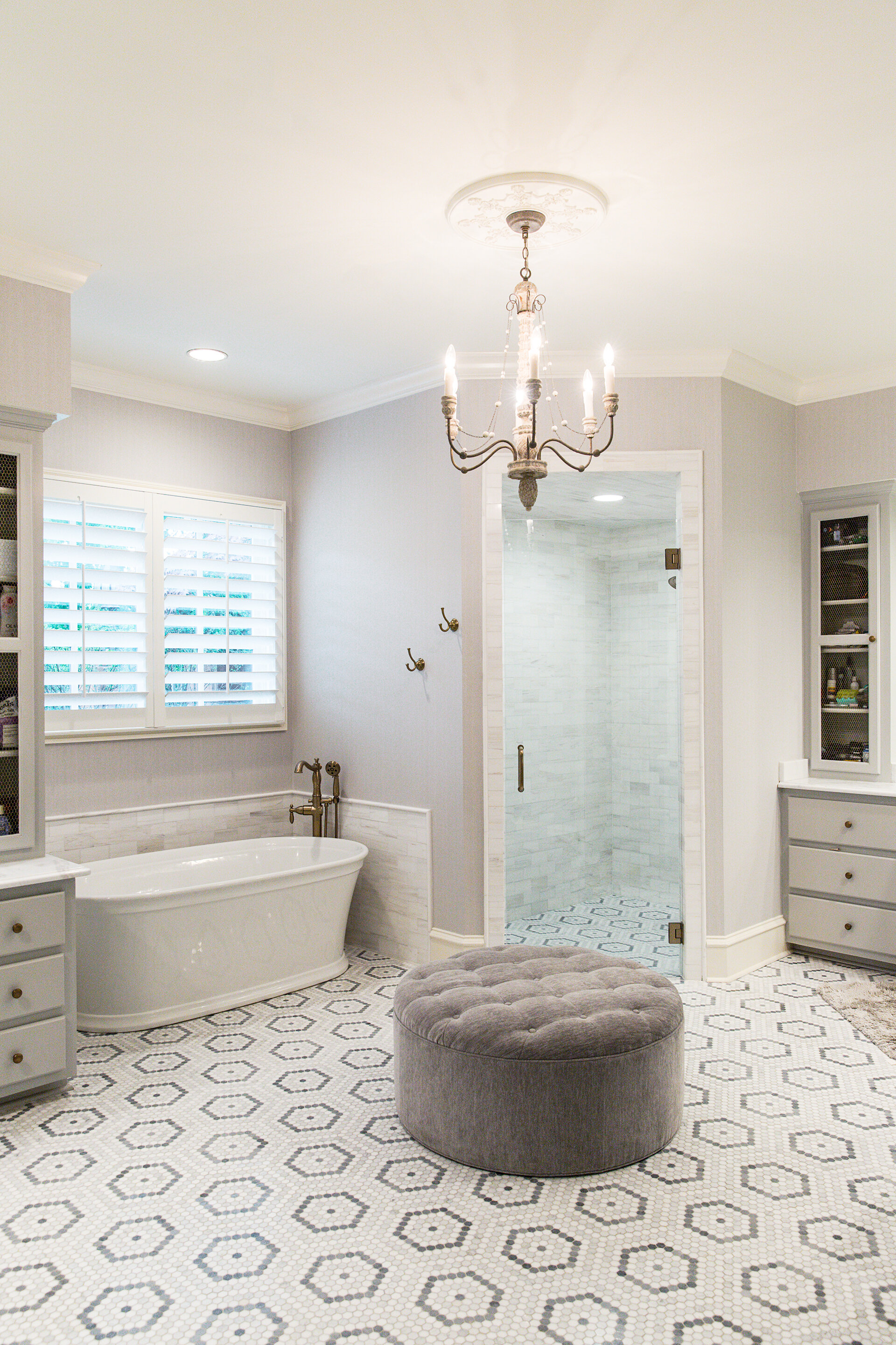
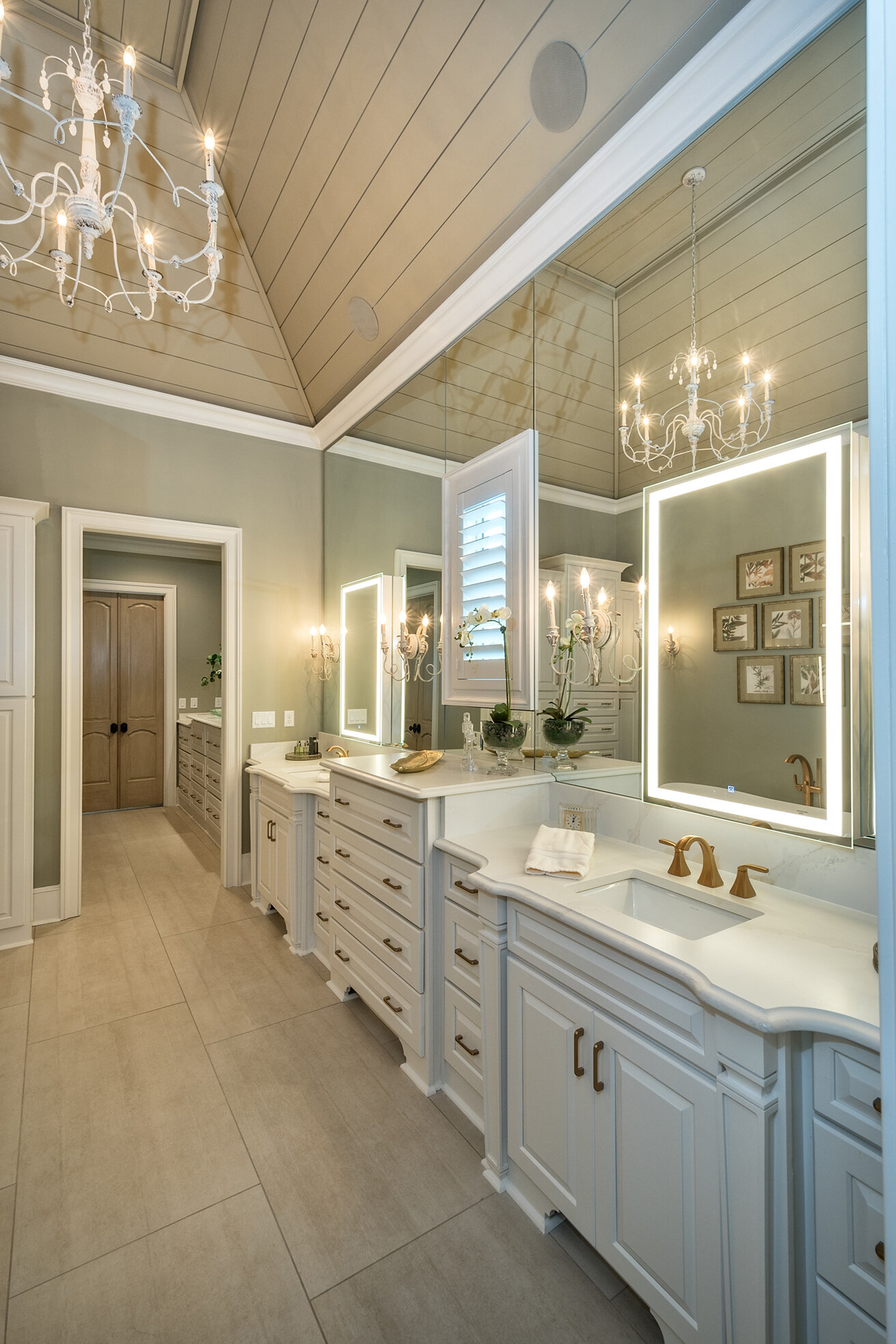
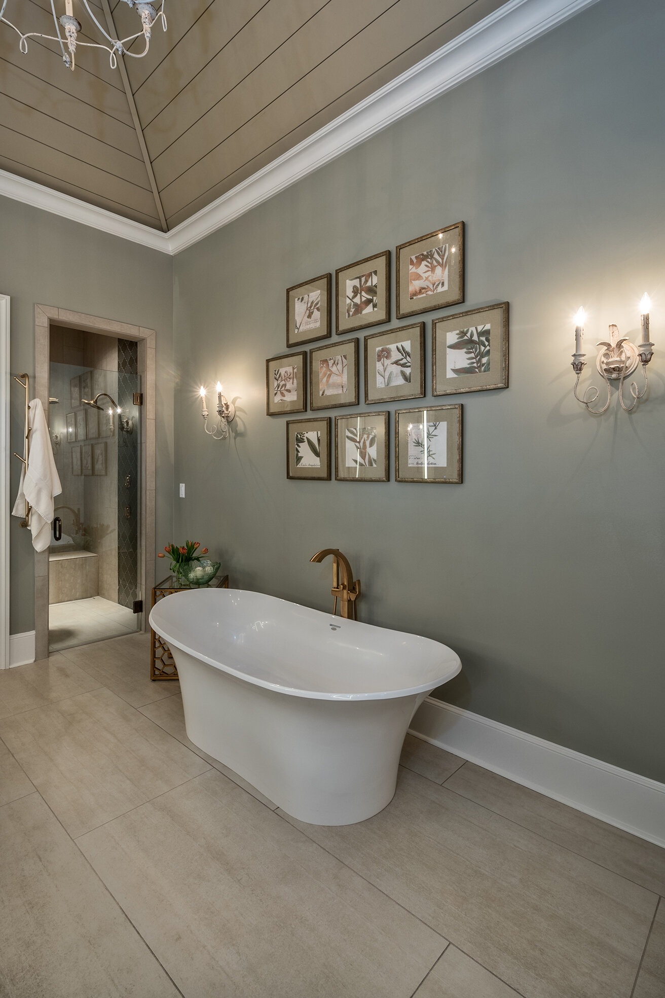
The wallpaper was only part of the head-to-toe makeover in the master bath, which Michaelis says is her favorite room in the house. With new tile in a show-stopping hexagon pattern, newly painted cabinets, fresh marble countertops, a new soaking tub and a reworked zero-entry shower, the space is all-new and all luxurious.

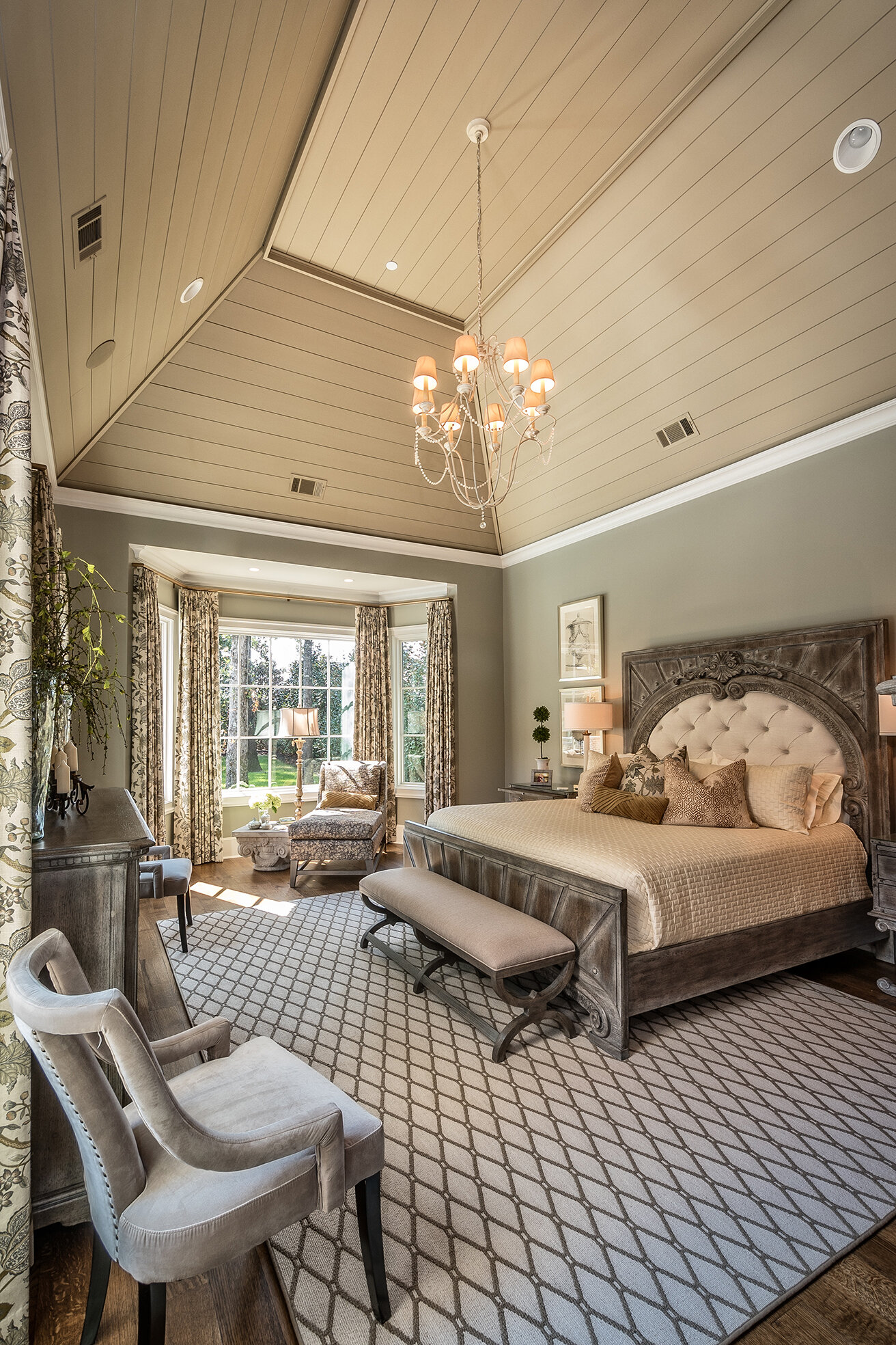
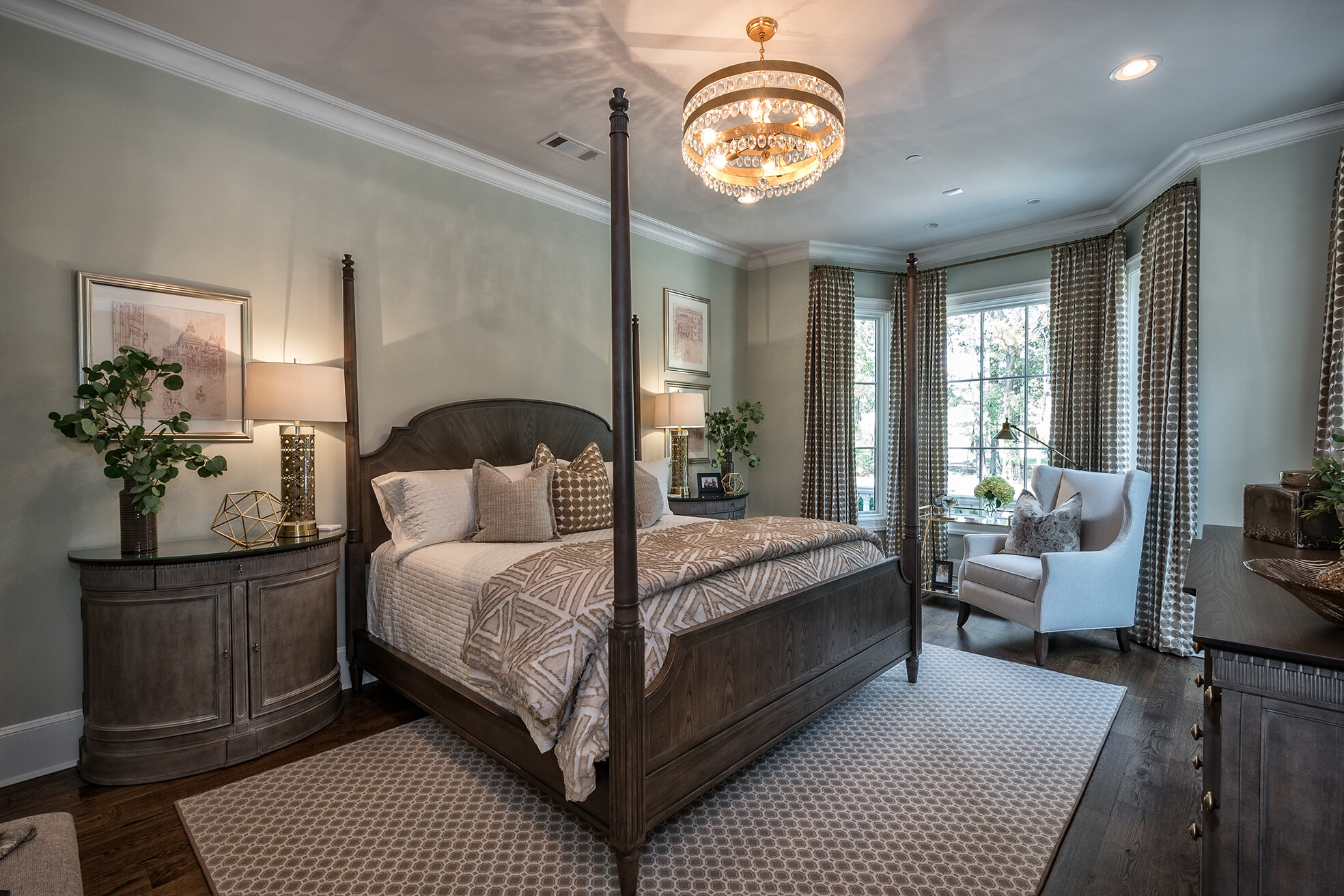
The master bedroom, bathed in calming cool tones, is a quiet retreat. A wall of windows affords views of the home’s exquisite backyard and pool area.

May-88.jpg

The home’s upstairs is clearly the domain of the grandchildren Brooke loves so much. Bedrooms feature design elements including twin iron beds adorned with bunnies and a table and chairs with a tea party set, just waiting for invitees. 

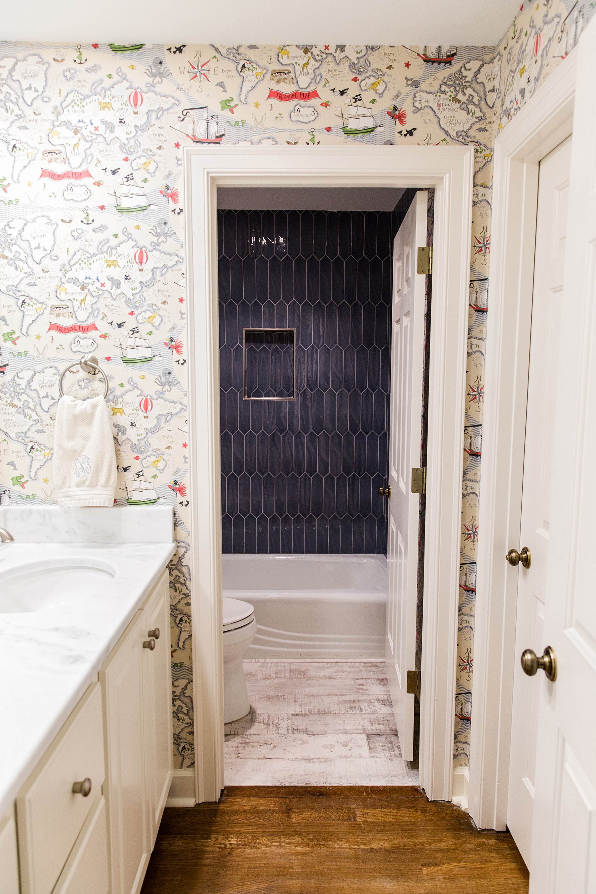
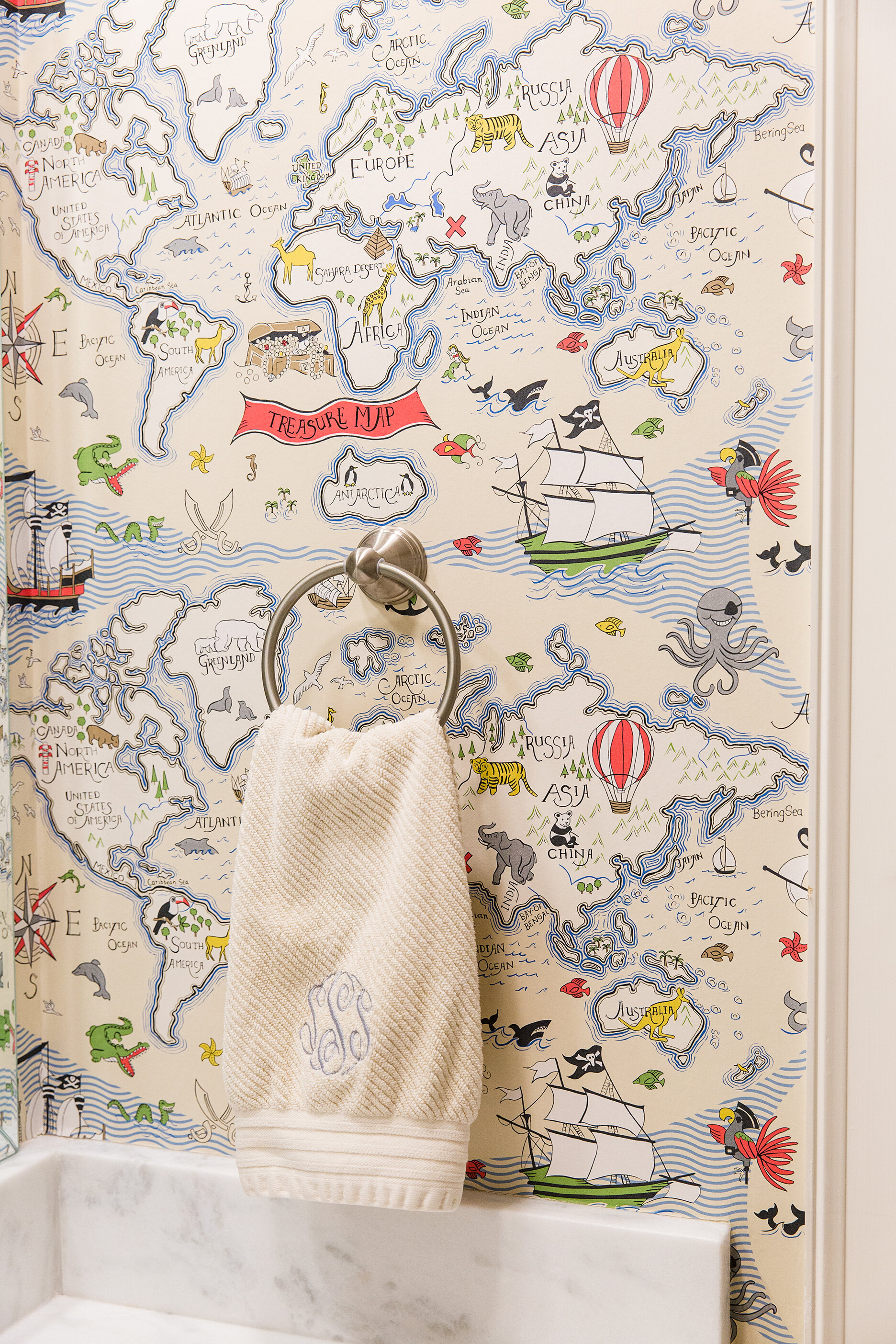
The upstairs bathroom features wallpaper, but this time it’s on the more vibrant end of the spectrum. A whimsical treasure map scattered with pirate ships and animals galore lines the walls, making hand washing and bath time a thrilling adventure.

Also designed with little ones in mind was the upstairs bonus room, now transformed into a spacious playroom with toys, books and games to keep the grandchildren endlessly entertained. 

Toney says that the friends who were initially naysayers about the house are wowed by its transformation, and her mother is also thrilled with her daughter’s work on her new home. “Mom says she thinks her house is beautiful, but warm and inviting and liveable, since her grandkids are constantly in it. Her home shows that she loves and lives for Jesus and her family, especially the grandkids—she’s all about them!”

Five- Star Redo

Interior Design by Ann Prince Interiors | Story by Terri Glazer | Photography by Ross Group Creative

Memphis designer Ann Prince gives clients the luxury of a fine hotel at home.

Ann-Prince-Lombardy-RossGroupCreative-04-003A3857 copy 2-2500x2500px.jpg

“This couple travels all the time; it’s their favorite thing to do. They love to stay in fine hotels and so they decided it was time for their own master suite to feel like one of those hotels. They wanted it to be something that is timeless and unique,” recalls local interior designer Ann Prince. 

Once Prince had her marching orders, she went about planning a complete redo of the master bedroom and bath in the Chickasaw Gardens home. The suite had been redecorated about a decade ago and was beginning to look dated and tired. Prince set out to give the spaces a look that would better stand the test of time. It’s a concept she feels should be the bedrock of any remodeling project. She shares, “My number one tip is that a bathroom should be timeless and classic. Kitchens and bathrooms are what sell a house, but they can also date a house. Choose the hard elements, the tile and fixtures, that will translate through anything else you do in the room.”

L1080590 cropped.jpg

The time-honored beauty of Prince’s design is a testament to this idea. The master suite, with its elegant lines, seems on one hand as though it could have been original to the 1950s-era home, however, it’s just as fresh and relevant today as it would have been then.

“It’s really easy to get into the tile store when you’ve been looking at magazines and you want to pick that latest, greatest thing. I say, proceed with caution! Choose something that’s pretty and will stand the test of time,” she advises, noting that a bathroom redo is a major undertaking that most homeowners aren’t likely to do more than once. Getting it right the first time is crucial.

That’s not to say a look can’t be revised in the future. “You can change the wallpaper and art, but it’s still going to have that classic foundation,” says Prince. In fact, she admits to being a big fan of wallpaper. “It’s instant gratification; it can transform a space in a day!”

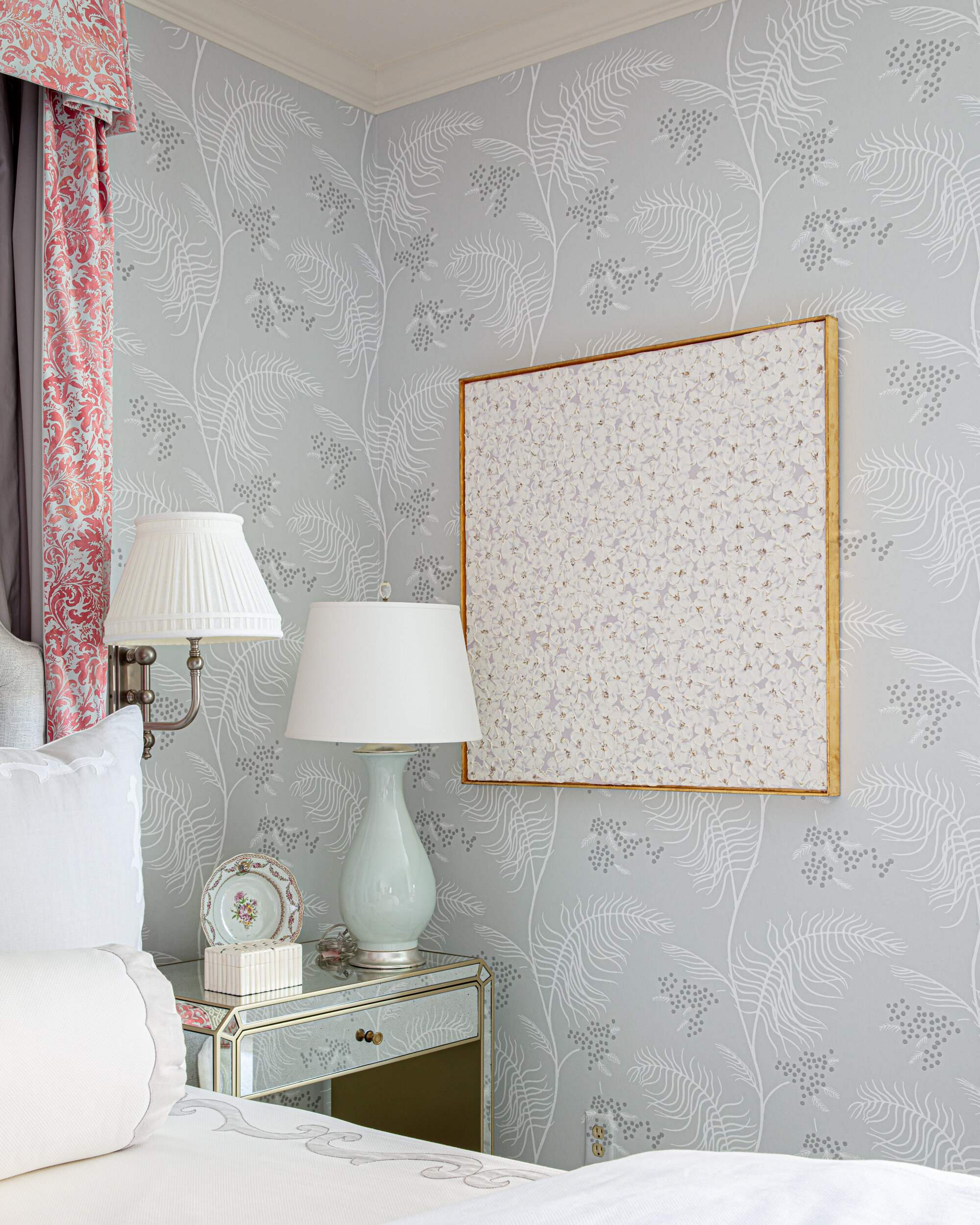
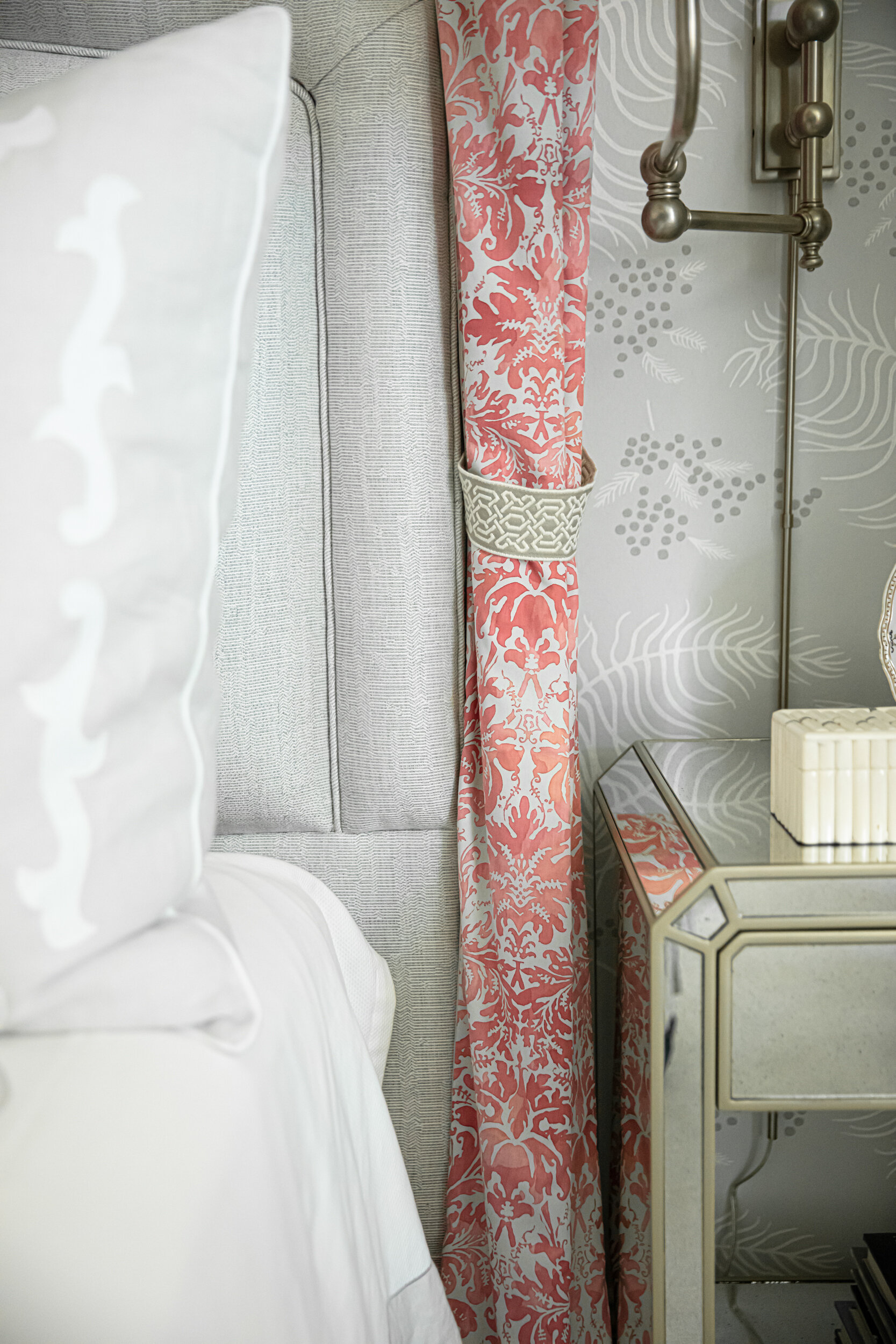
This project shows just how transformative wallpaper can be. The large master bedroom, formerly painted yellow, was somewhat nondescript, according to Prince. She and the client fell in love with an elegant gray-patterned wallpaper from Cole and Son. They chose it and paired it with coral tones found in the artwork used as inspiration in the room. The paper gives the room depth, while a bed hanging placed behind the upholstered headboard create structure, a focal point on a blank wall to anchor the bed. 

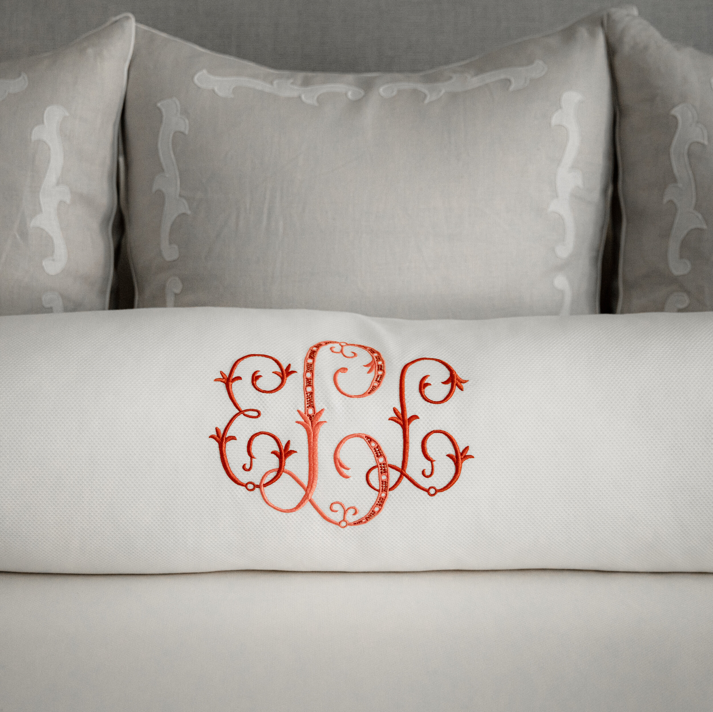
Prince turned to Leontine Linens in New Orleans for luxurious bedding to rival that in any world-class hotel. “This company only does full custom bedding, so you work with one of their representatives and you select all the material, all the threading, the specific colors, the monogram style–everything is custom,” she explains. The soft gray and white palette of the walls and linens get a bright accent from cheerful coral tones in bedside drapes and the monogrammed bolster pillow.

Ann-Prince-Lombardy-RossGroupCreative-03-003A3857-2500x2500px.jpg

The clients wanted to be able to read in bed, so Prince chose a pair of swing-arm lamps. She completed the bedside lighting with a graceful table lamp on each nightstand, though, because the scale of the room called for something more substantial. The tall ceramic lamps provide a warm glow to the room, while the swing-arms are more task oriented. 

A window-front nook gives the homeowners another cozy spot for reading or relaxing. A pair of wing chairs, a pedestal table and a skirted ottoman fill the alcove. The chairs prove the point that even a total redo doesn't have to mean everything has to be purchased new. “The client had those chairs; they were inherited from a family member,” says the designer. “We had local decorative artist Jeniffer Church paint the wood and we reupholstered them with a fabulous velvet from Galbraith and Paul.” The upholstered headboard was also an existing piece Prince had redone. 

Ann-Prince-Lombardy-RossGroupCreative-10-003A3865 copy-2500x2500px.jpg
Ann-Prince-Lombardy-RossGroupCreative-17-003A3885-2500x2500px.jpg

Adjacent to the bedroom, the master bath retains its original L-shaped layout. “The clients loved the footprint of the bathroom. They didn’t feel like they needed to add on or reconfigure it in any way, so we truly just took everything down to the studs and then put new finishes on,” says Prince. 

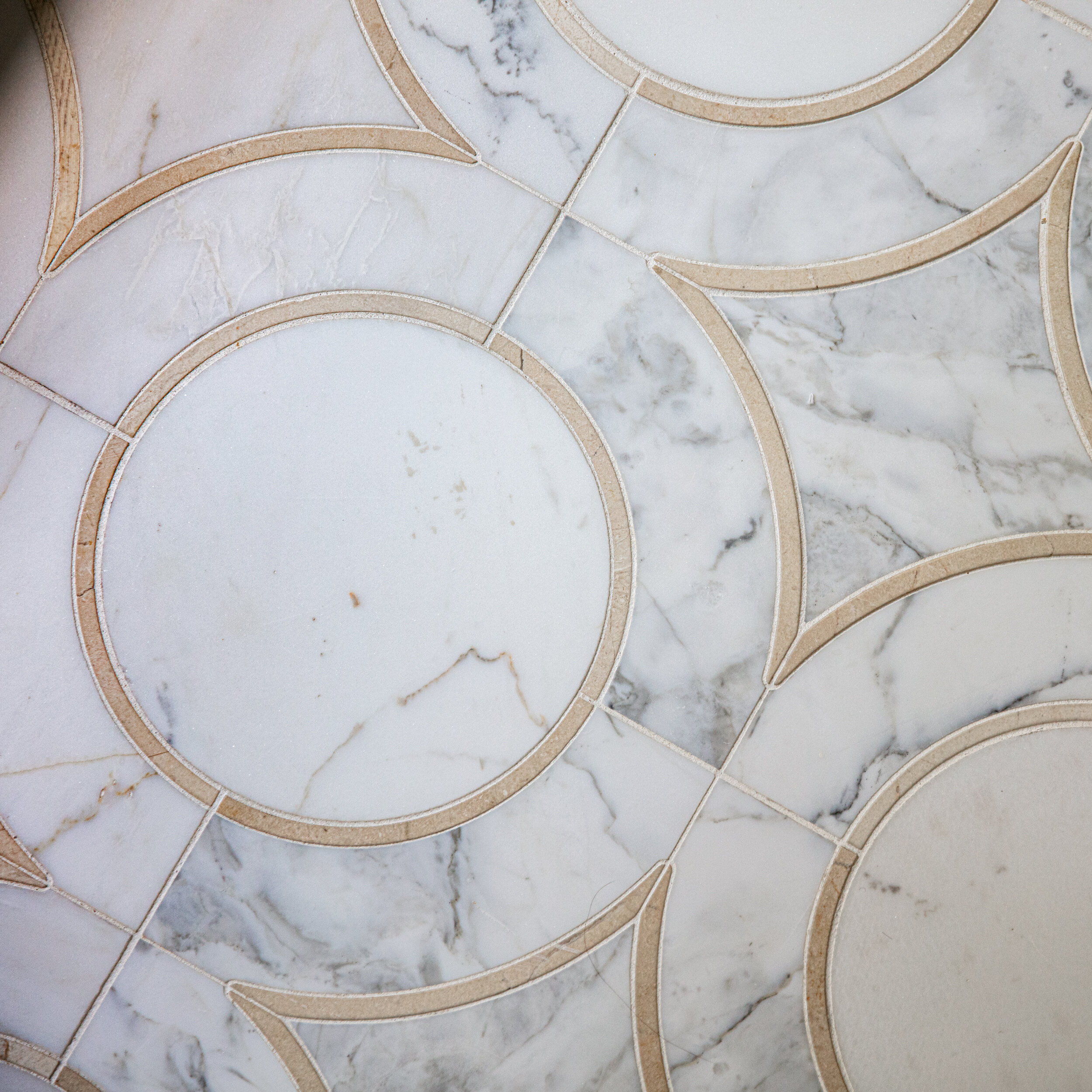
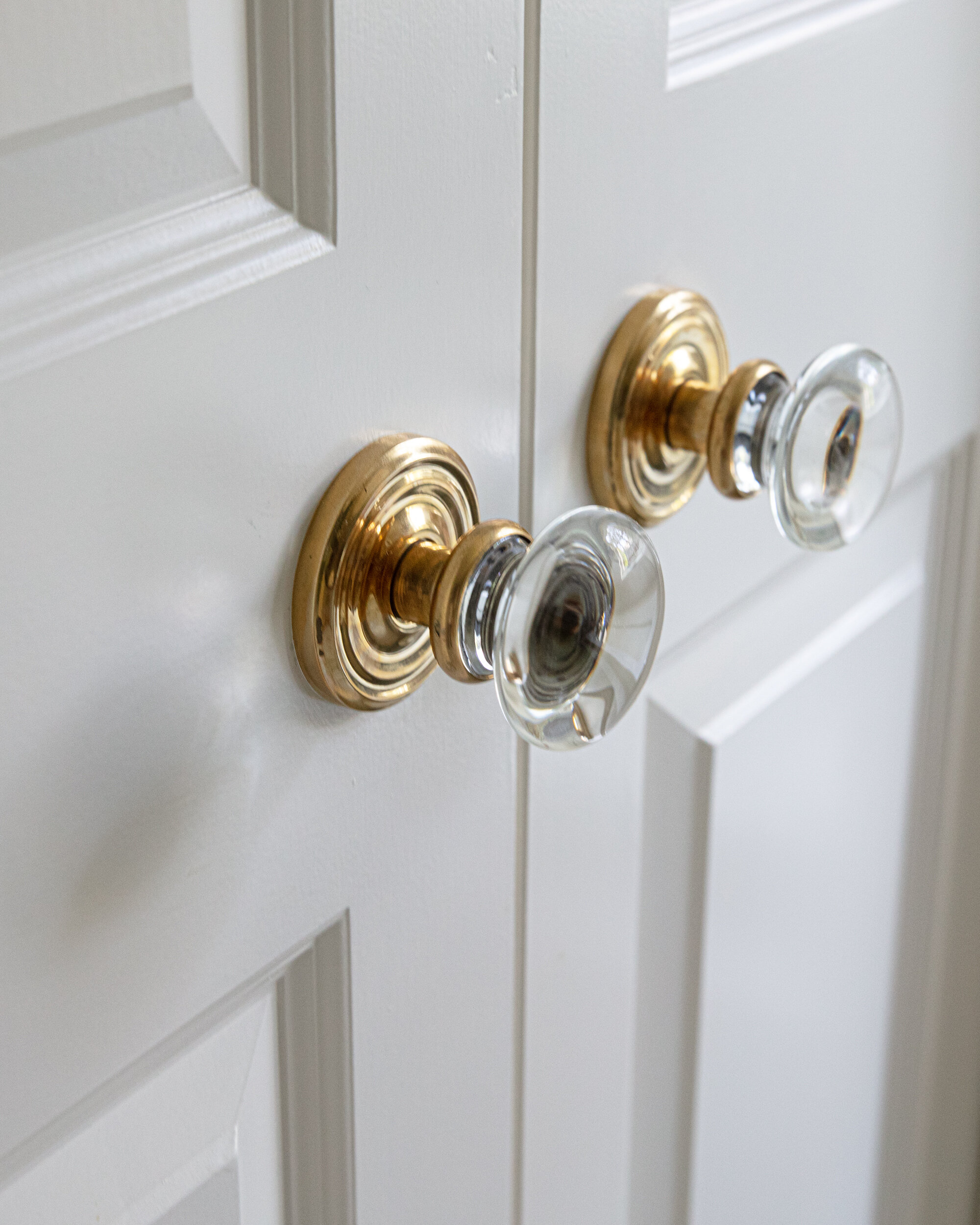
Here, it was the sophisticated marble floor tile that inspired the rest of the design choices. Primarily carrara marble, the crema marfil accents influenced Prince’s selection of hardware in brassy tones. Even small details like doorknobs and cabinet handles received thoughtful attention; styled in glass and brass, the accents add a little sparkle to the room’s refined air. 

Prince used wallpaper again in the master bath, and the results are stunning. With a lavender background and gold flecks, the pattern adds instant interest and a bit of reflectivity. 

The room features his-and-hers vanities; “his” is topped with a round mirror that repeats the circle pattern of the floor tile. “The clients already had that mirror—it was stored in a closet so we resurrected it,” Prince says. “It was a happy find!” 
Next to “her” vanity Prince created an elegant dressing table. “We couldn’t find a table the size that we wanted so we had one built and Jeniffer Church also painted it, playing off the mirrored finish of the bedside tables in the master bedroom,” she says. A freestanding mirror mounted close to the tabletop gives the illusion that the two pieces are one, while a cute stool reprises the bedroom’s colors with its cheery coral fabric. “The client sits there every day and puts on her makeup, so it’s a nice place for her to be able to have a moment,” Prince says.
Thanks to the vision of a talented designer, these homeowners who love to travel no longer need to board a plane to experience the five-star luxury of a top hotel. Prince’s inspired work ensures there’s no place like home for the comfort and beauty they so love. 

St. Jude Dream Home®

Story by Terri Glazer | Photos courtesy of ScenaVR | More information about the 2020 Memphis St. Jude Dream Home® Giveaway

Although the ancient Greek philosopher Heraclitus wrote “the only thing constant is change” around 500 BC, it rings truer today than ever—just ask the organizers of the Memphis St. Jude Dream Home® Giveaway!

Not everything has changed, however. For the 21st year in a row, a lucky winner will be awarded the keys to a brand-new luxury home here in the Mid South at the end of the month. Like in past years, a $100 ticket reservation buys the chance to win the house, valued at an estimated $500,000, and other prizes including a new car from Wolfchase Nissan or Wolfchase Honda. And, as always, the $1.5 million raised through the St. Jude Dream Home® Giveaway will benefit the life-saving work of St. Jude, the world’s premier pediatric cancer research center.

What is different this year, is that out of an abundance of care, the open house for the St. Jude Dream Home® in Lakeland’s Kensington Manor neighborhood has been postponed until further notice for patrons’ personal safety and well-being. 

That fact hasn’t stopped Southern Serenity Homes and the other trade partners from their labor of love, building a gem of a house, though. The traditional-style two-story residence features a low-maintenance brick exterior highlighted by a gracious covered front porch. With approximately 4,000 square feet, there will be plenty of room for the future homeowners to entertain in comfort. Four bedrooms and baths will easily accommodate a growing family.

“Dream Home” is a fitting name for the house—it includes highly sought-after amenities like Brizo fixtures, Shaw flooring, Trane HVAC systems and high-end Bosch appliances as well as unique features like an expansive laundry room with a dog washing station. The outdoor living area, complete with a full kitchen, sits ready for memories to be made.

Another fact that hasn’t changed is that the number of tickets available is limited. This year, just 15,000 tickets will be sold. Just as in the past, a sell-out is expected before the live drawing, set for Sun., June 28 on WMC Action News 5. 

Since sponsors Ashley Homestore® and Stash Home won’t be able to work their magic staging this year’s edition, we thought we’d throw it back to last year, and reminisce about one of our all-time favorites among the 500+ St. Jude Dream Homes that have been built nationwide over the years, raising over $420 million for the hospital’s fight to end childhood cancer. 

2019-Nashville-St-Jude-Dream-Home-Giveaway-06142019_160809.jpg

The 2019 Nashville St. Jude Dream Home® was a true showstopper. Located in the Jackson Hills community in Mt. Juliet, the four-bedroom, three-bath home fulfilled the top three requirements for real estate: “location, location, location.” Says ALSAC/St. Jude spokesperson Mare Rote, “The rear porch overlooked the brand-new community sports field, a wiffle ball field that has become the favorite gathering spot for Jackson Hills residents.”

Vaulted ceilings accented with wood beams gave the open first floor an expansive feel. A fieldstone fireplace anchored the living area, while the adjacent kitchen projected a sophisticated feel thanks to a massive island. Base cabinets in almost-black paired with white wall cabinets topped by glass-paned display doors to add interest, while a classic white farm sink and subway tile backsplash lent a timeless feel. The custom vent hood and classic lantern light fixtures took the kitchen’s elegance factor to the next level.

WEB_2019-Nashville-St-Jude-Dream-Home-Giveaway-06142019_155033.jpg
WEB_2019-Nashville-St-Jude-Dream-Home-Giveaway-06142019_155220.jpg

Staff designers for Signature Homes, the firm that has built the last seven Nashville St. Jude Dream Home® Giveaway homes, hit a home run with an unexpected feature in the laundry room, often an afterthought when it comes to decor. Moroccan-style tile in black and white covers the floor and an entire wall for an extra punch of pattern. Juxtaposed against clean white shiplap, the treatment took this laundry room far past utilitarian.

The ultimate design highlight of the home was the master suite, an area that truly had star power. Michael Moloney, featured decorator on Extreme Makeover: Home Edition, who served as the celebrity design ambassador for the home, focused his talents on the master bedroom and bath, and the results were stunning. Moloney’s creation featured handsome dark wainscoting on the bedroom walls, the perfect backdrop for the rugged poster bed. In the master bath, he combined rustic (the stained wood floating vanity), dramatic (the black herringbone wall tile) and elegant (the luxe gold fixtures) in perfect harmony. Just past the deep soaking tub and huge open shower, the master closet’s gourmet coffee maker and built-in dresser would make morning routines a breeze.

WEB_2019-Nashville-St-Jude-Dream-Home-Giveaway-06142019_155401.jpg
WEB_2019-Nashville-St-Jude-Dream-Home-Giveaway-Bathroom.jpg

“Last year’s lucky [Nashville] winner purchased just one ticket for $100,” recalls Rote, emphasizing the fact that the limited number of tickets available increases the odds for winning the home or one of the other prizes. For a list of the additional prizes this year’s Memphis ticket holders are eligible to win, go to dreamhome.org. 

In this time of so much change and uncertainty, the most important fact that has not changed is that St. Jude is one of Memphis’ greatest assets, leading the way the world understands, treats and defeats childhood cancer and other life-threatening diseases. Treatments invented at the hospital have helped push the overall childhood cancer survival rate from 20 percent to 80 percent since the doors opened over 50 years ago. St. Jude freely shares discoveries it makes and never bills patients’ families for treatment, travel, housing or food. 

WEB_2019-Nashville-St-Jude-Dream-Home-Giveaway-06142019_155334.jpg
WEB_2019-Nashville-St-Jude-Dream-Home-Giveaway-06142019_155923.jpg

A Fresh Start

Interior Design by Cindy McCord | Written by Terri Glazer | Photography by Ross Group Creative

Their nest was empty and their home was new—it seemed like the perfect time for a complete redo. Interior designer Cindy McCord recalls that the owners wanted their recently constructed Germantown home to have a totally new environment. “They didn’t bring any furniture with them from their previous place; they started fresh. She wanted a light, simple, airy and timeless feel.”

L1080316.jpg

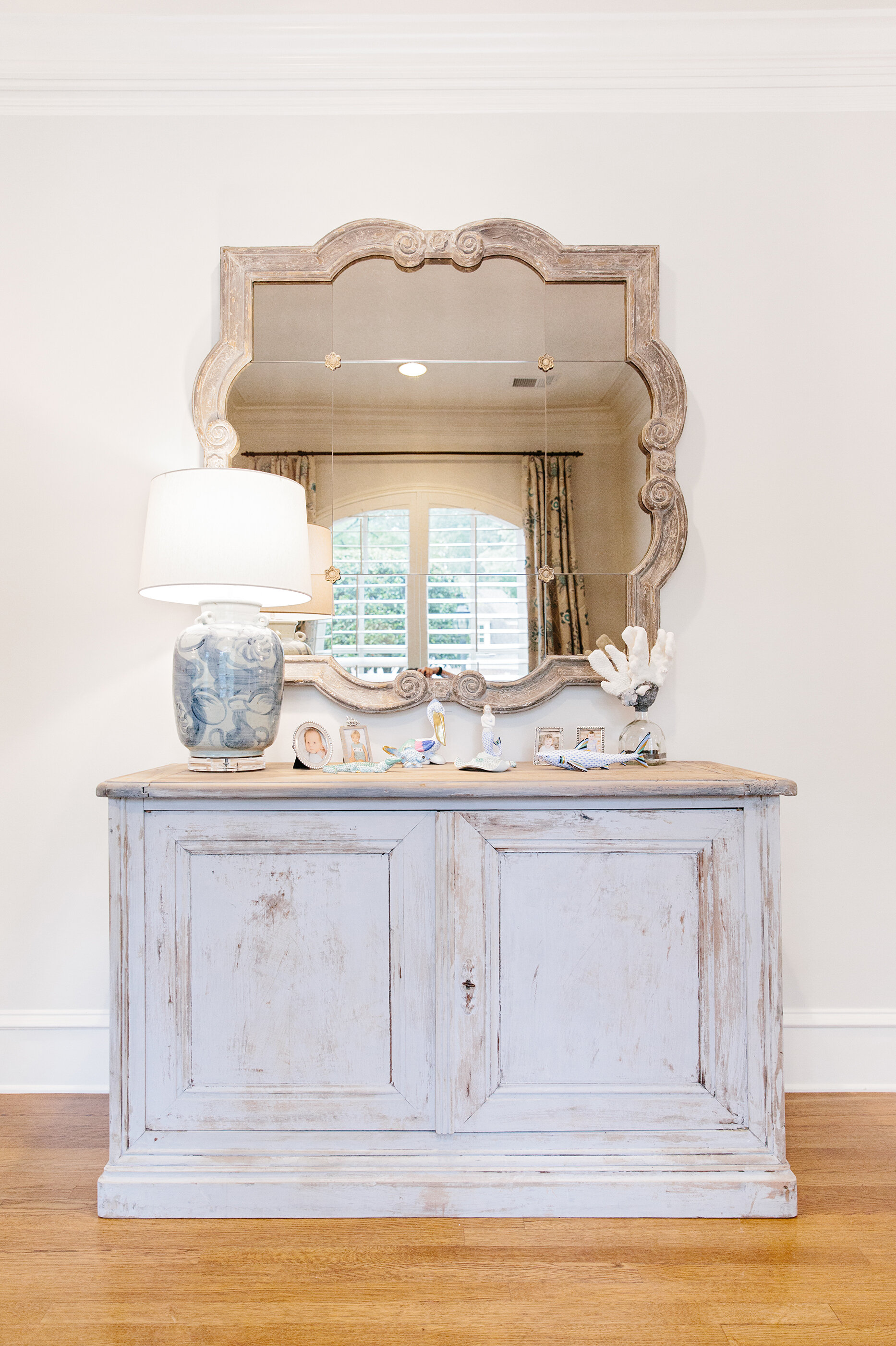
Built by Tayloe Company, the transitional-style residence has plenty of curb appeal thanks to its painted brick exterior. From the first step into the entryway, the design tone is set, a look McCord calls “coastal casual elegance,” that flows throughout the house. Crisp white walls play off handsome hardwood floors in a perfectly medium stain; not so dark as to be imposing, but dark enough to anchor an otherwise cool palette. A traditional style chest in an updated finish—distressed blue/gray—sits beneath a subtly antiqued mirror to form the focal point. A large original painting of a tranquil landscape by Atlanta artist Thomasa Seymour greets guests as they enter the home. McCord says she chose the entryway’s Dash & Albert rug with both durability and simplicity of style in mind. Its relaxed striae pattern features flecks of neutral colors and precisely the right amount of blue. 

L1080590 cropped.jpg

Just off the entryway, the dining room is one of McCord’s favorite parts of the house. “I love the dining room; it’s so pretty and simple,” she says. The table is dressed-up farm style with graceful curved pedestals and a soft oak finish. It offers ample seating for eight in distressed, antique-white chairs. The table and chairs are the true stars here. In keeping with the simplicity of the overall design plan, McCord put no other furniture in the space. The pared-down furniture placement and simple sisal rug allow the room’s “jewelry” to shine. The chandelier blends classic crystal features with metal in a fashionable bronzy gold finish for a look that is formal without being fussy. A grouping of six framed intaglios adds an elegant touch, while full-length custom drapes frame the room’s large arched window.

L1080301.jpg
L1080511.jpg

The family room gives the homeowners and their guests plenty of room to relax. A pair of handsome sofas with exposed legs and English rolled arms face each other, separated by an oversized custom ottoman upholstered in blue fabric with Greek key tack accents. Design symmetry is important here, from the twin reclining armchairs to the pairs of blue velvet throw pillows on both sofas, to the charming garden stools McCord selected in place of standard end tables. Built-in bookcases that adjoin the fireplace are backed in grasscloth in tones that echo the rich linen of the sofas.

L1080362 edit blend.jpg

The space opens into the kitchen, where elegance abounds. To-the-ceiling cabinets and a curved range hood draw the eye up while a pair of tall windows allow light to flood the room. Classic features like white Shaker cabinets, subway tile and quartzite countertops add to the appeal, but the kitchen is more than a pretty face. A spacious island does triple duty, holding the kitchen sink and dishwasher, providing work and seating space, and giving the homeowners sought-after storage that’s even accessible from the side and under the counter ledge that serves as a casual dining or conversation spot. 

L1080434.jpg
L1080103.jpg

The sunny breakfast room adjacent to the kitchen is the perfect place for morning coffee or a casual lunch. For a more private feel, the homeowners can close the cleverly-placed cafe curtains on the room’s large windows.

After a busy day, the master bedroom is the ideal relaxing retreat. Simplicity and serenity were foremost in the design, McCord remembers. A light-filled nook off to the side of the room that holds a pair of chairs and an ottoman seems meant for a book and a cup of tea. Mother Nature provides a stunning view out the windows. “The house backs up to an area with lots of beautiful trees, so that nook is well used,” the designer says.

L1080013.jpg
L1080195.jpg

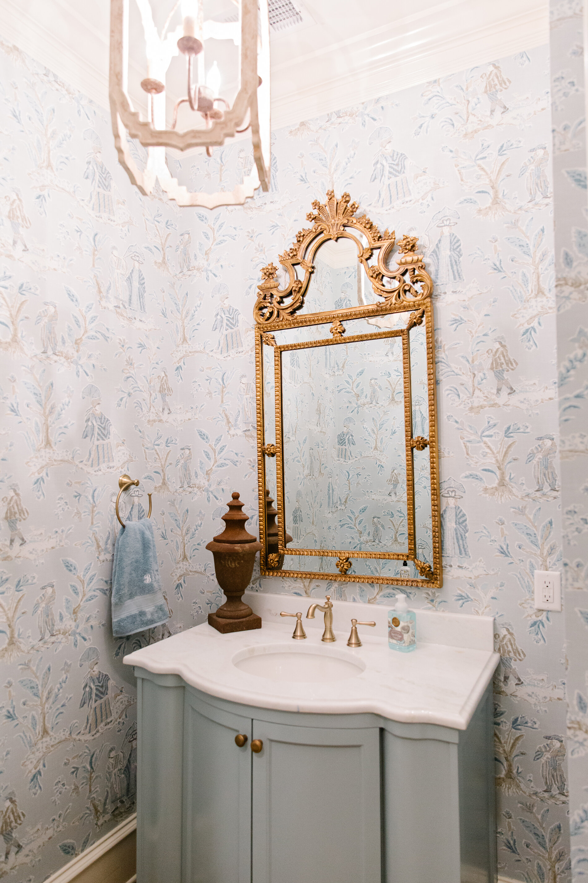
It may be one of the smaller spaces in the house, but the powder room is not to be overlooked. In fact, a picture of the half bath that McCord posted on her social media had her followers buzzing. “That room has gotten over 1,000 likes on my Instagram,” she exclaims. This is the spot in the home where she made the boldest design choices. From the custom vanity in a deep blue to the moire watermark wallpaper to the rich gold accents to the pops of orange, the room is a true showstopper.

Although it has been a year and a half since she completed the project, McCord looks back on the job fondly. “[The homeowner] approached me to help after the project had started. I was super busy at the time, but I am so glad I took it on! She was a great client and I loved working with her. We worked closely together—she trusted me and it worked out well!”

Hello, spring!

Event Design and Written by Ginni Jones | Photography by Annabella Charles Photography

After what seems like quite the long winter sheltered indoors, spring is finally here! And there’s no better way to celebrate than to invite all your loved ones over for a fun spring brunch. 

WEB_spring2020-13.jpg

Set the Table

    It was about time to bring some bright colors to the table, so as always, I turned to my favorite ladies at Social to get the most beautiful pieces in order to create the perfect tablescape for this brunch. I already owned a few pieces I wanted to mix in with my new goodies from Social. I love the blue wine glasses, hand blown in Poland, from Estelle Colored Glass. Estelle has every color imaginable and they are the perfect “gems” for a festive table. I found the white oblong platters on a recent trip to Nashville. They reminded me of Easter eggs, perfect to display appetizers.

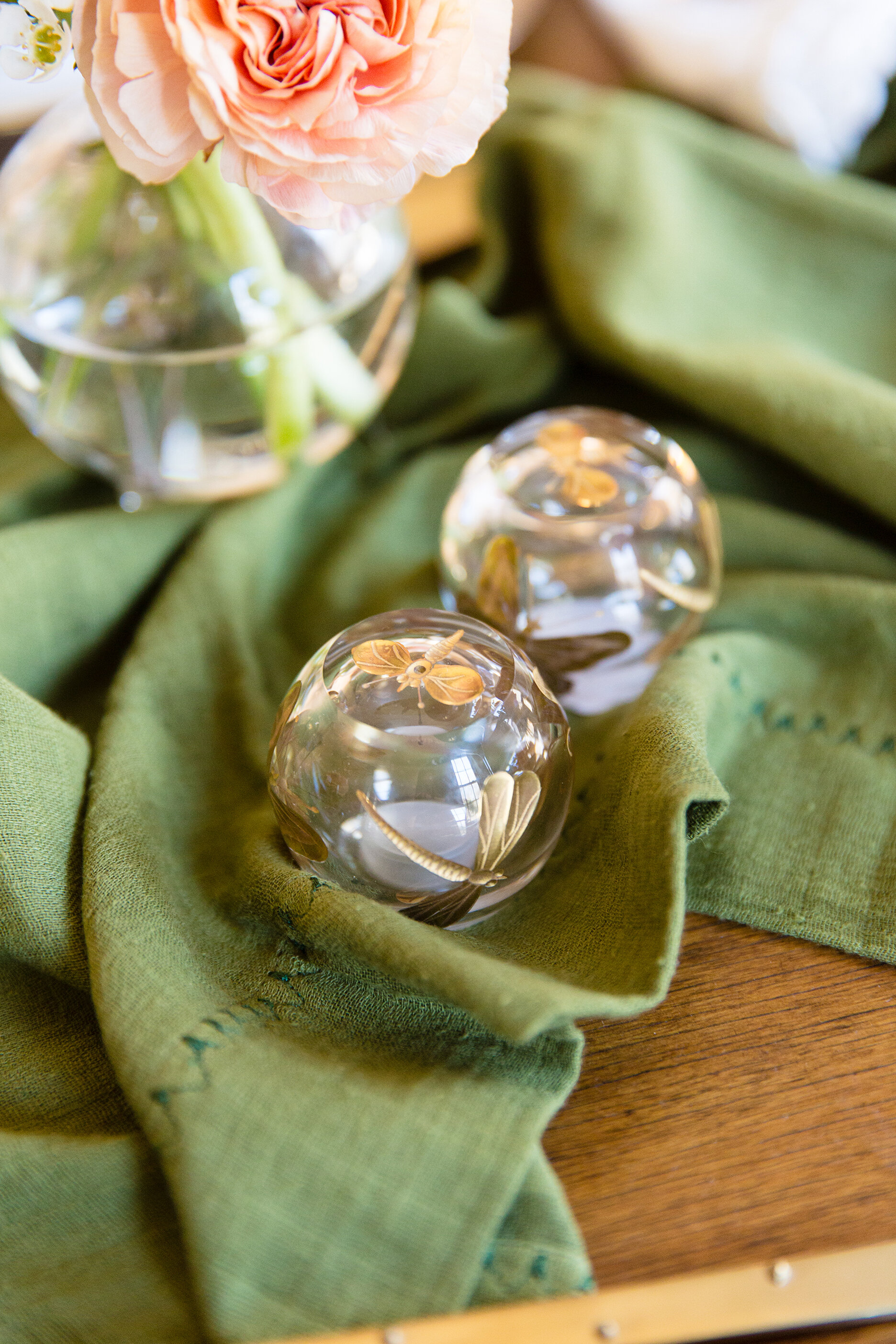
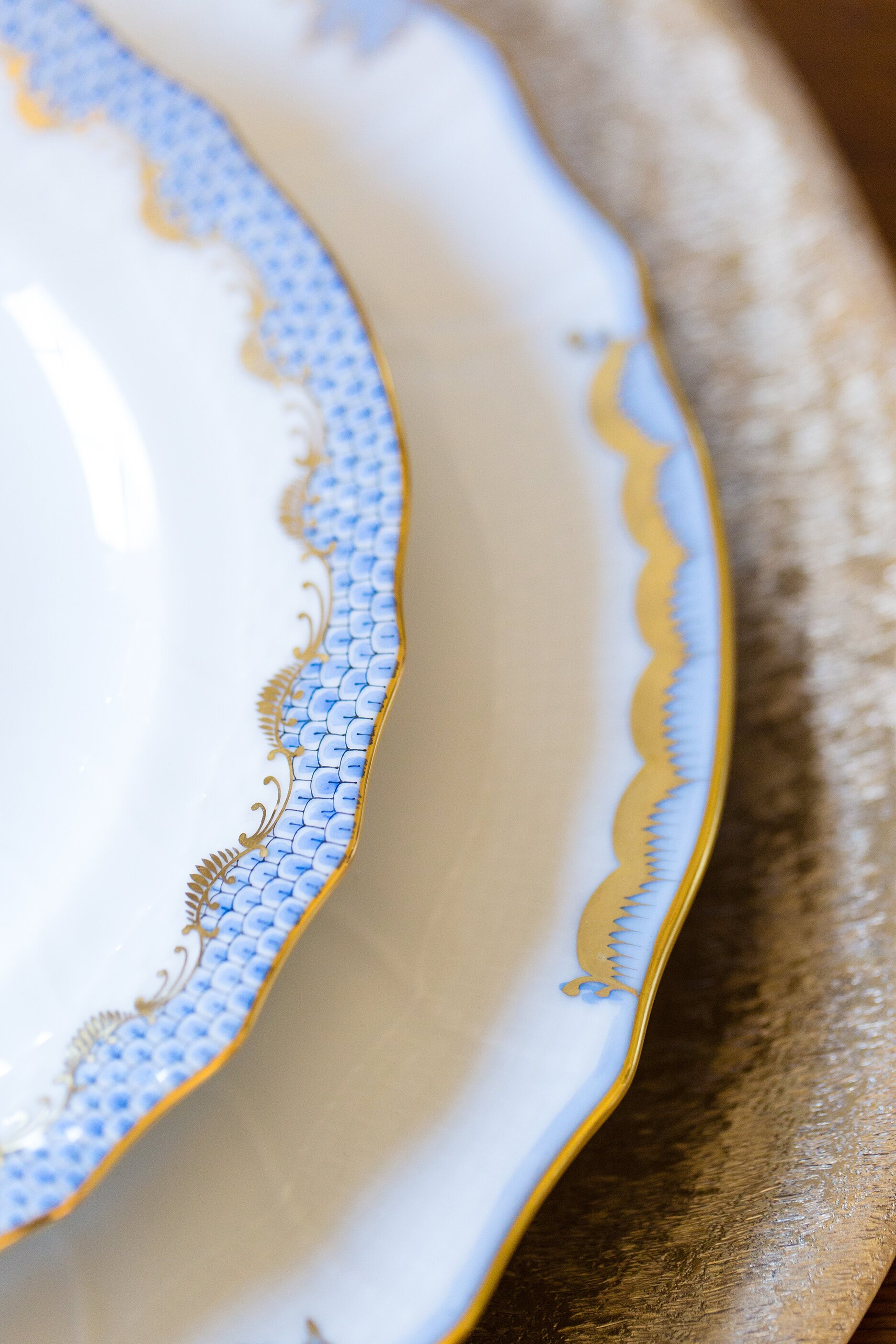
For china, I picked out some gorgeous pieces from the vast Herend collection available at Social. We paired the Princess Victoria dinner plate with the Fishscale salad plate in light blue and the combination turned out stunning. Layered below was a textured bronze charger also from Social. For napkins, we kept it simple with a white linen fabric piped with a scallop edged. And lastly, I couldn't leave without these exquisite glass and gold dragonfly salt and pepper shakers. Yes, they are probably the smallest detail, but they are the perfect mix of modern and vintage that I was looking for as inspiration for this spring tablescape! 

WEB_spring2020-41.jpg

What’s for Brunch?

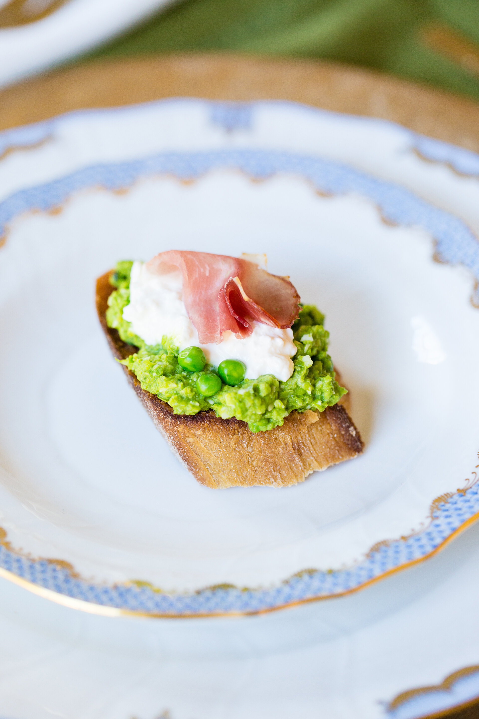
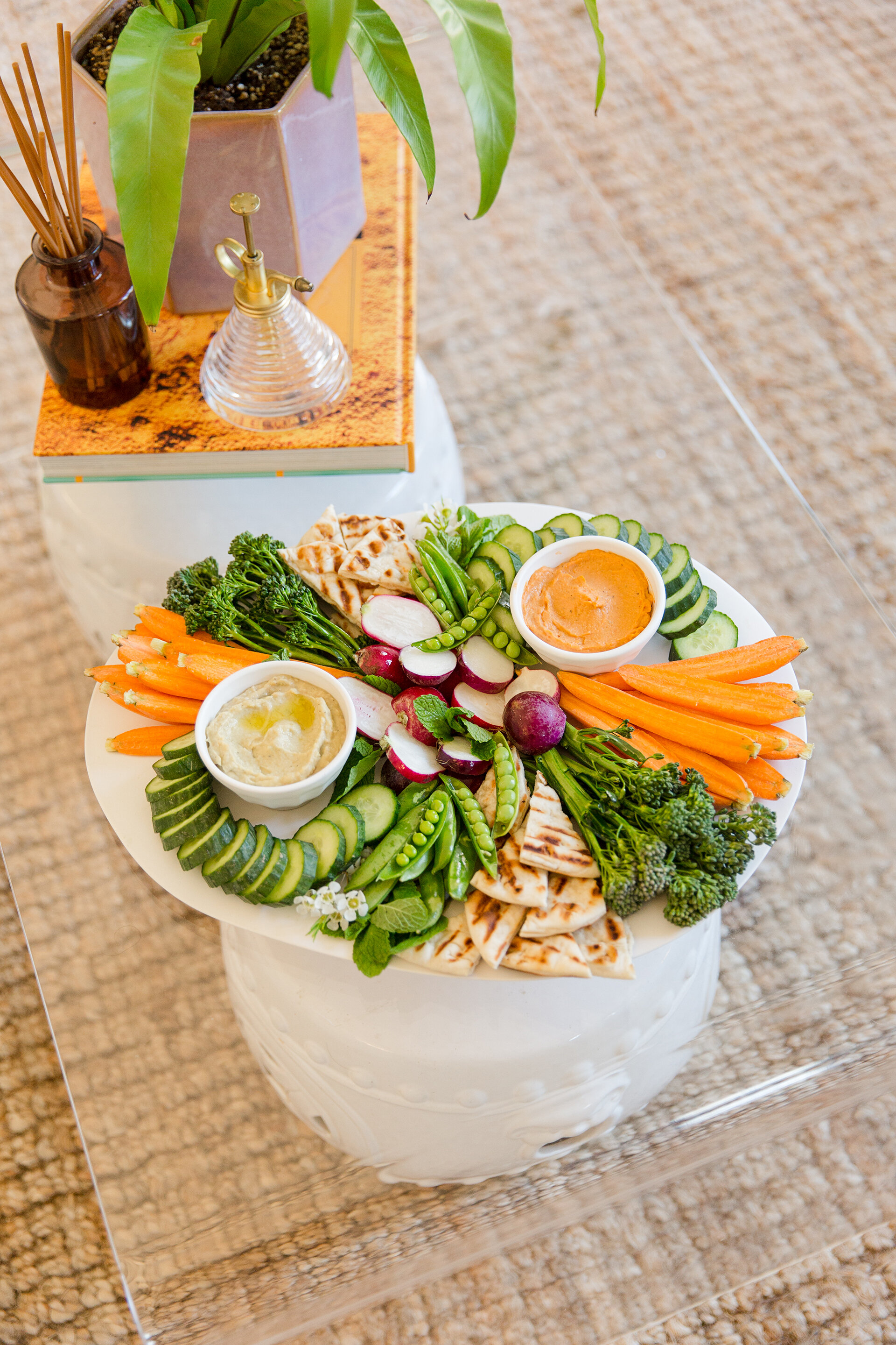
    Picking out the menu is always one of my favorite parts of hosting. I really wanted to highlight the season, so I tried to incorporate as much spring produce as possible. Also, since the menu featured brunch, I wanted to keep the food light and fresh. I love mixing mini bite snacks and platters, so I made two crostinis and a colorful crudite platter. The spring pea crostini, perfectly toasted bread layered with pea and basil pesto, fresh burrata cheese and prosciutto, was definitely a crowd favorite. The second crostini was an edamame and radish version, made with an edamame, mint and ricotta cheese—so fun and easy to create! Simply chop up fresh veggies like carrots, cucumbers, broccolini, spring peas and radishes and layer them around dips. Here I used a spicy avocado hummus and a tomato basil hummus. Don’t forget to add fresh pita slices (they’re even better toasted). 

WEB_spring2020-44.jpg

The Flowers

You can’t welcome spring without fresh flowers! Coral and orange ranunculus paired together are always stunning. Add a bit of wax flower and tuck them into glass mini globe vases, and they add the perfect pop of color scattered around the table.

WEB_spring2020-59.jpg

Create Your Own

 I can’t take all the credit for creating this fun and seasonal tablescape; I will be the first to admit I learned everything from my mom! She has been entertaining ever since I can remember. Whether it was a simple birthday dinner with our immediate family or our annual Christmas Eve Soups & Sips party for a crowd, she hosts every holiday with style and grace.

Here's what I have picked up from Lili Jones over the years: 

First, keep it simple. Don’t try to make something extravagant and then get frustrated when something doesn’t turn out exactly the way you wanted it. It’s important to not stress yourself out; you want to be present at your gathering and enjoy the time with your loved ones! 

Two, never forget to add something fresh! Whether it’s fresh flowers on the table or greenery from the yard placed in a vase—or even springs of herbs tucked under food on a platter—you always need a fresh element. 

Thirdly, my mom is always reminding me to use what I have. I am constantly looking for new decor, but I’ve learned to mix with what I have before I buy new. If you do buy more, shop locally.

And lastly, don’t forget the music. For our family, it is most likely Dave Matthews playing (quite loudly) over the speakers around the house. And we can’t forget how when we all gather in the kitchen and grab hands to pray; without fail, every time she sings “The more we are together, together, together…”. Whatever you prefer, just don’t forget the music! 

WEB_spring2020-62.jpg

Staying Power

Interior Design by Robin Selberg | Written by Terri Glazer | Photography by Ross Group Creative

Interior designer Robin Selberg reinvents her Germantown home to keep pace with her family’s needs.

03-Mike-Murphy-Selberg-1O6A8787 b-web.jpg

Robin and David Selberg have lived at the same Germantown address for almost 20 years, but the space they call home now is quite different from the one they moved into back in 2001. Over the course of three renovations the couple has transformed the house into the perfect home base for them and their three young adult children.

The house flows so perfectly, though, that you’d never guess it has had three facelifts; and that’s the real beauty of it. Michael Murphy, Jr., of Mike Murphy Builders, who was at the helm of the latest project, says that’s a feat not easily accomplished. “Part of the challenge is when you walk in, not to be able to tell what happened when. Anybody can knock down a wall or add an island, but to have it not be obvious that it was three separate remodels is a different story.”

07-Mike-Murphy-Selberg-1O6A9453-web.jpg

The Selbergs’ love affair with the house started shortly after they attended an open house there. The two older children had just started school at St. George’s and a few friends had moved into the neighborhood, but Robin and David weren’t necessarily looking for a new home. That status changed quickly when they toured the house and were wowed by the acre-sized lot on which it sits. They bought the place and right away replaced carpet with hardwood floors, installed new front doors and made a few other changes.

Four years later, their family had grown to include three children and it was time to remodel to accommodate their new set of needs. This second project included a sunroom, a new laundry room, a master suite and a friends’ entry. 

By 2018, Robin was ready to embark on yet another renovation, this time focusing on the kitchen. “It still had the original cabinets and tile floors from when it was built in 1978,” she recalls, “and we just knew it could be better.”

Robin had big dreams, but wasn’t sure they were achievable until Murphy came into the picture. She wanted to open up the kitchen area and convert a small, seldom-used dining room into a pantry, but she didn’t know if a redo on that scale was possible. “Once Michael drew it all out, I saw it and I knew we had to do it. That was a big turning point for us,” Robin says.

“I love a new house, but there really is something about remodeling and how the house feels afterwards. There’s always something surprising.” —Robin Selberg

After a structural engineer confirmed that a large wooden beam entirely in the attic space would support the new open floor plan, it was full speed ahead. “The house has eight-foot ceilings so you don’t want beams sticking down,” explains Murphy. “We knew we weren’t changing the ceiling height, so the challenge was how to make it as big and open as possible without anything showing.”  

Soon the beam went up, the walls came down, the space originally meant to be a formal living room became a larger, more useful dining room, and a deluxe walk-in pantry took the place of the old dining room. 

28-Mike-Murphy-Selberg-1O6A9489-web.jpg

As a professional designer, Robin had definite ideas about what she wanted. “We knew we wanted to have an island in the kitchen and once we found out we could open it up I kept asking Michael how big he thought we could go with it. Once Michael laid it out and I saw how it maximized our space I knew it was perfect,” she says.

She also knew she wanted it to have an open and airy feel, and what it would take to create that feel in a space with relatively low ceilings. “There couldn’t be a lot of upper cabinets. We went back and forth with Burton Crawford of Crawford’s Fine Cabinetry. Even though you see a lot of kitchens without wall cabinets in magazines, you don’t see that done around here very much. My husband even doubted, but I was adamant.”

08-Mike-Murphy-Selberg-1O6A8824-web.jpg

The kitchen plan included floating shelves in place of cabinets on one wall, but even those were vetoed at the last minute. “We had them made and the workmen were about to drill the holes to install them when I said, ‘No, don’t put them up.’ I’m so glad I stopped them because I really like the clean look,” says Robin.

Her list of kitchen must-haves also included wide shiplap walls. David, however, was in favor of tile for the backsplash behind the range, for ease of cleaning. Robin searched and searched for the perfect tile, but never found one she loved. A photo of shiplap in a chevron pattern did catch her eye, though, and now the unique treatment makes a striking statement. 

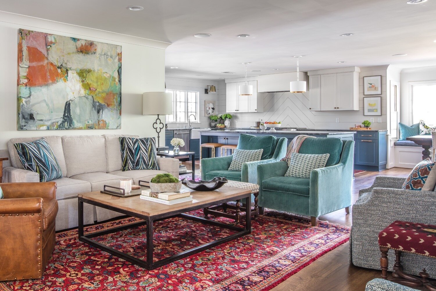
Decked out in blue with fancy black marble countertops, the cabinets make the biggest visual impact in the kitchen. Robin admits that she is bucking current trends, but she’s confident in her choices. “My style is eclectic; I like what I like. The trend right now isn’t a lot of color, but I’ve always liked color. I had red cabinets before.”

Since her new cabinets were custom made, the color options were limitless. “I had about three different colors that I was going between for the cabinets; one was a little more green and one was more blue. I ended up going to Memphis Paints to look at the Farrow & Ball paints. I walked in and they had a new display, and there was Hague Blue. I knew it as soon as I saw it!” On the one wall that has upper cabinets, the cabinets, the trim, the walls and the ceilings are all painted the same crisp white. The continuity of color is a trick of the design trade that makes the room feel larger. The colorful art on each sides of the windows are by Emory Art.

23-Mike-Murphy-Selberg-1O6A9478 b-web.jpg

While she likes her vibrant kitchen, it may be the new pantry that Robin loves the most. It features plenty of storage, along with counter space and electrical outlets—the perfect spot to keep the coffee maker, blender and other small appliances handy yet out of plain view. “I tell all my clients who are remodeling a pantry to be sure they have power available and a countertop in it. Without a countertop it’s not as user friendly.”

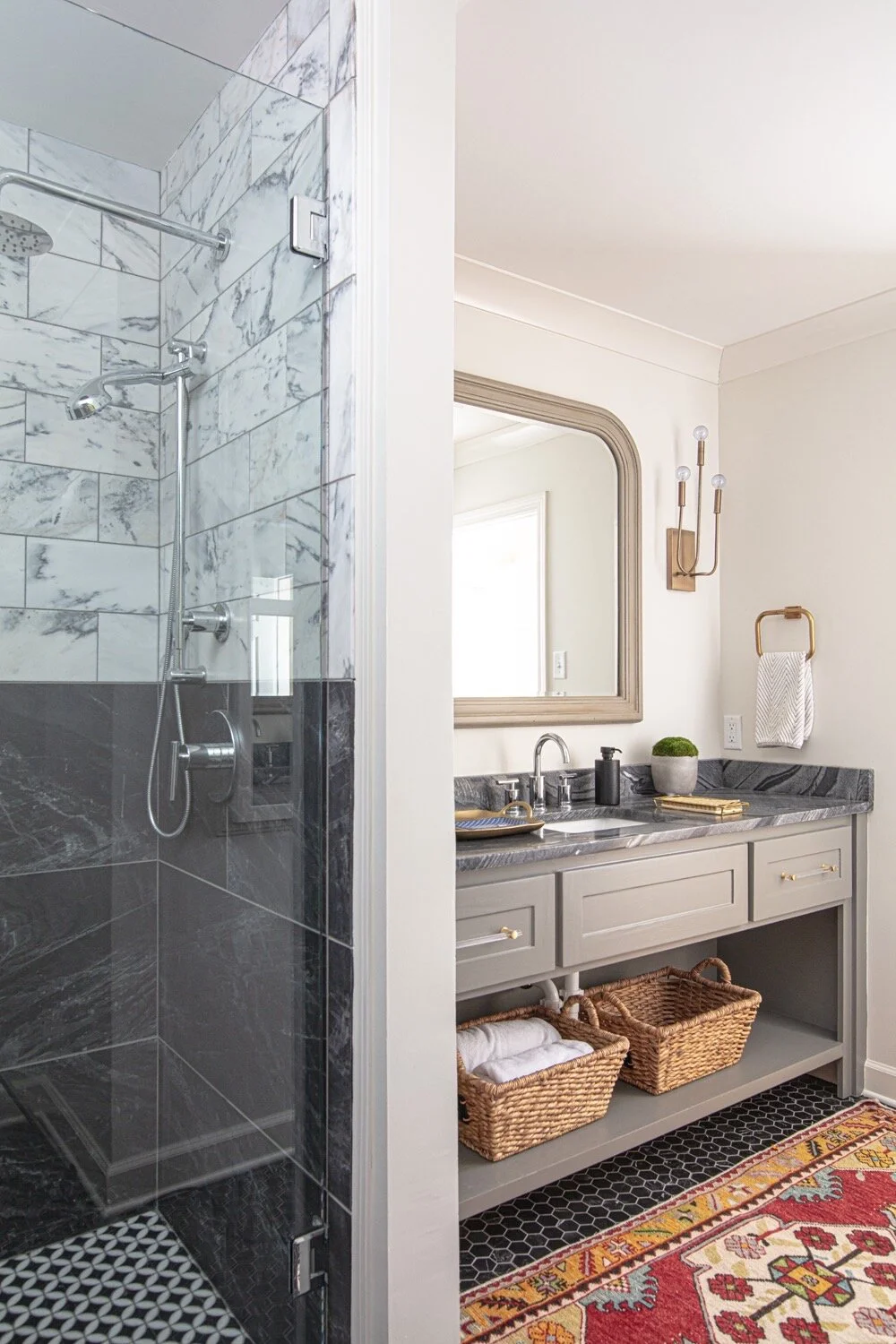
The most recent renovation didn’t stop with the kitchen. A downstairs bathroom received a dramatic redo from top to bottom. The original tub area is now a spa-like oversized shower with black and white marble subway tile. Black hex tiles on the floor give the room timeless appeal. A custom vanity designed by Robin and topped with the same dark marble used in the kitchen completes the look. While the final product is a stunner, Murphy admits he wasn’t certain about Robin’s countertop choice at first. Undeterred, Robin knew it would be perfect; she loved the matte finish and knew the dark color would be the most practical option for the way her family lives. 

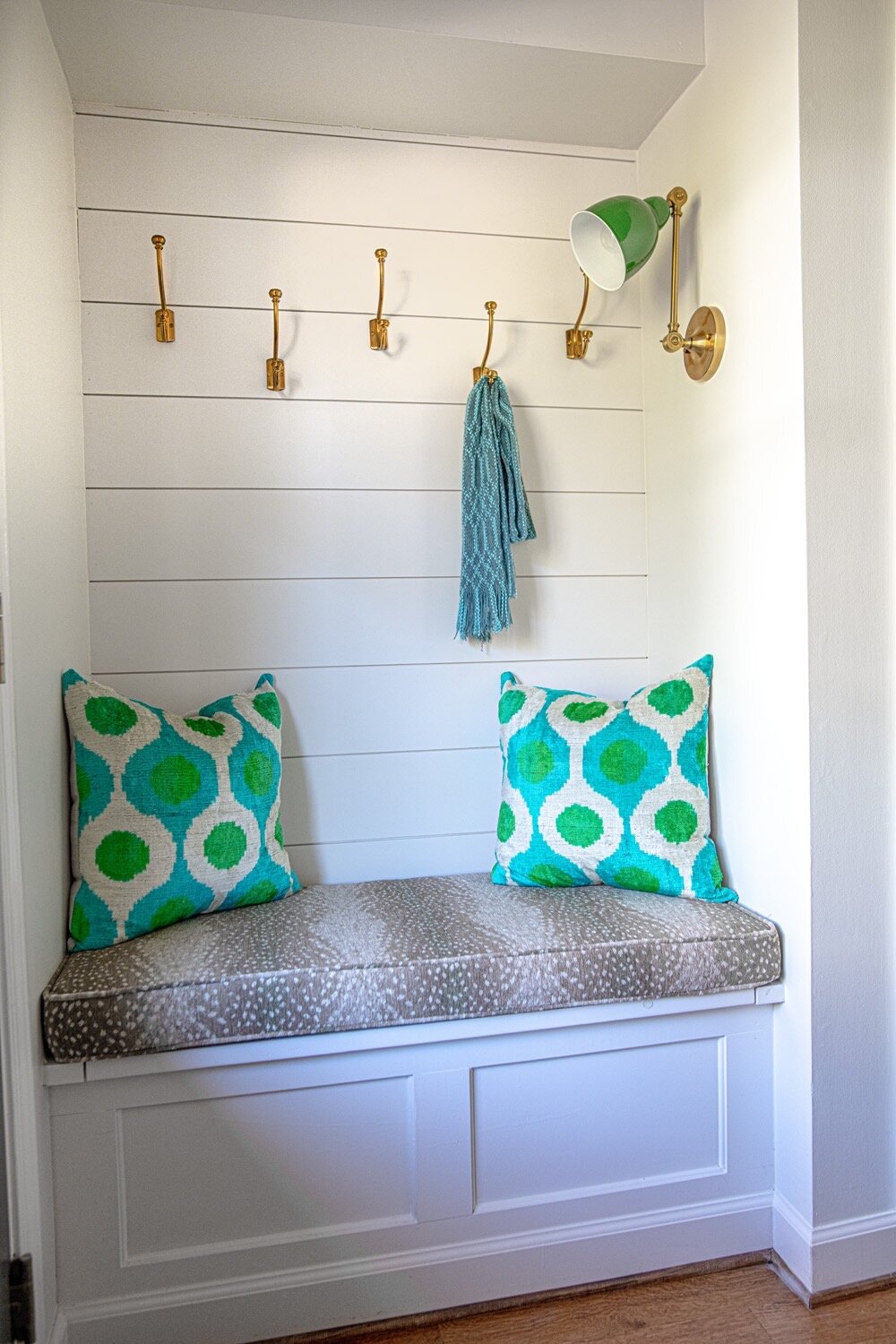
The project also included a few tweaks of earlier remodels. As part of the 2005 renovation Robin had a built-in desk installed near the home’s rear entrance, but she never used it as she thought she might. Now, in its place there is a handy bench with storage underneath and coat hooks above. 

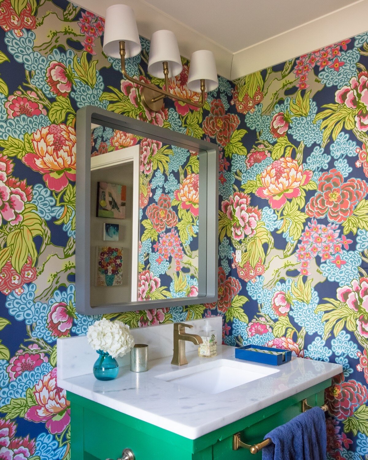
Murphy describes the powder room as “night-and-day different” from the way it used to look, despite the fact that the floor plan for the space remained the same. The half bath is a knockout with bold floral wallpaper and a unique vanity. Says Robin, “It was a table that I had bought for $50 on an online marketplace.” After a few modifications and a coat of paint in her favorite shade of green, the piece has a new purpose adding flair to the design.

22-Mike-Murphy-Selberg-1O6A9364-web.jpg

The Selbergs have put their personal stamp on each part of the house over the years, truly making it their home, and they intend to stay put and enjoy it for the long haul. “Michael’s sister is a realtor, and when we finished this project she said, ‘You know, I could sell this house in a minute.’ I’m not planning on going anywhere!” Robin laughs. 

“Germantown is getting built out. There’s not a lot of spots for new houses to go up,” says Robin. “We love living in Germantown; it’s convenient. We didn’t want to move from Germantown, but we needed our space to be different. I think that’s the way of the future in Germantown. I’m all for remodeling to get what you want.”

And Murphy is in full agreement. “You’ve adjusted the house with your family’s needs. You keep making the space you have so much more usable and efficient.” 

After two decades and three major projects, it would seem that the Selbergs might be done with home remodeling. When asked if that’s the case, Robin says without hesitation that a new separate garage is next up on the agenda. Life changes, floor plans and designs change, but it’s a safe bet that the Selberg family’s address will remain the same for years to come.

A Cook’s Kitchen

Written by Terri Glazer | Photography by Darren Lykes Photography

At Home’s culinary guru shares the making of his dream workspace

WEB_DSC_8285.jpg

To say that Jim Norton’s kitchen has come a long way would be a massive understatement. The original portion of the historic Oakmont estate in Jackson, TN, was built in 1860 as a log cabin. Even 15 years ago, when Norton and his partner Robert Walden purchased the much-expanded home, it didn’t have a fully functioning kitchen.

He recalls, “The lady who lived in the home previously didn’t cook. She really didn’t have a kitchen. It was like a caterer’s kitchen; there was no stove. The only stove was in the master bedroom behind two folding doors. There was a 1950s-era unit with a tiny cooktop, a very small oven and a sink.”

.

.

Out of necessity, the homeowners created a galley-style kitchen with an adjacent eat-in area. It served its purpose, but they soon realized it could be better. Norton and Walden love to entertain and have parties often, from intimate get-togethers for close friends to the annual Patrons Party for the West Tennessee Healthcare Foundation, a soiree for 250 they’ve hosted for the last decade. Norton realized that large gatherings always seem to produce a bottleneck around the kitchen, so when they were having some other home-improvement projects done, it seemed the perfect time to reimagine the kitchen and remedy the situation.

“To expand the kitchen we knocked out a couple of walls from an adjacent bedroom. We got rid of the bedroom and made it part of the kitchen. Now there are four ways in and out of the kitchen,” says Norton. “This year was the first Patrons Party we’ve had with the new kitchen, and it made all the difference.”

Norton masterminded the extensive kitchen redo, using his combined talents for a stunning finished product. In addition to being a renowned master of entertaining who has hosted celebrities and appeared on national TV cooking programs, Norton is an interior decorator by trade. Three major elements drove his design process. The new kitchen had to be large enough to accommodate crowds and the layout had to facilitate conversations. “When we have dinner parties everyone always wants to come in the kitchen and talk to me and watch while I’m cooking. The old kitchen wasn’t conducive to that at all. So I wanted a nice large island where people could sit on the other side. My cooktop is in the island so I can cook and have people sitting at the barstools and we can look eye to eye.”

The overall aesthetic was also important. Norton explains, “I wanted something that was fresh, that was current, but it also had to match and flow with the rest of the house, which is very traditional. We tried to bring in elements like the cabinet color, which is very current, but the actual cabinets are traditional with raised panels. The countertops are carrara marble, which is timeless to me. But to make it a little more edgy, we did the backsplash in a herringbone pattern with gold accent bars running through it. That gave it more of a contemporary vibe. That kind of goes with our house. We’ll have a piece of 18th-century furniture with a very contemporary abstract painting hanging above it. So I wanted the kitchen to reflect that, as well—the new blending well with the old.” 

WEB_DSC_8228.jpg

One of the room’s most notable features is the large built-in refrigerator. It’s the product of one of Norton’s favorite tricks of the kitchen design trade, a gem he graciously shares with At Home readers. “You can get a large refrigerator without spending $12,000 or more. We purchased two single-door refrigerators; one is a right open and one a left open. We put them together and built the cabinets around it. It ends up looking like a massive commercial refrigerator at a fraction of the cost. The trick is the trim kit that you put around the two refrigerators. You can purchase the Subzero trim kit for around $300. It adds six to seven inches in height so it gives not only the large appearance, but also the tall appearance that Subzeros have.” 

From marginally functional to a cook’s dream, Oakmont’s new kitchen is a masterpiece only a true expert could envision.

WEB_DSC_8284.jpg
WEB_DSC_8267.jpg

Enchanted Garden Party

Event Design and Written by Angela Mazanti | Photography by Sélavie Photography

WEB_Chloe-Tea-Party-SelaviePhotography-2.jpg

For my granddaughter Chloe’s ninth birthday and I knew the celebration had to be something girly, sparkly and magical. Even at nine years old, Chloe has a love for charming settings, vintage decor and Jane Austin movies, like her grandmother. We set up on the grounds of Annesdale Mansion by our favorite old tree. There couldn't have been a more perfect location.

The young guests were transported to an enchanted atmosphere from the moment they arrived. 

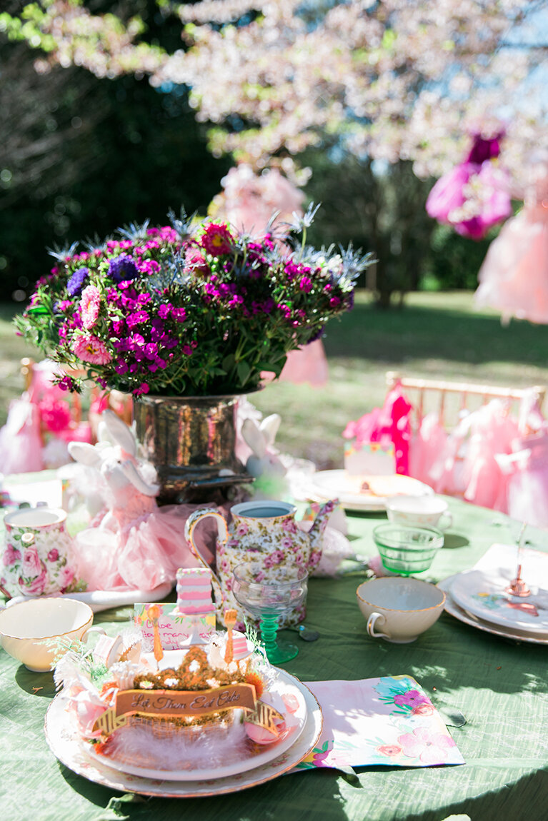
As soon as the guests arrived they were wowed by Disney princess dress-up ball gowns hanging from the tree. Each girl got to pick the one she wanted to wear for the party, along with matching jewelry. Chloe, the guest of honor, wore a “Let Them Eat Cake” birthday crown.

We set a beautiful table for a garden tea party with a forest green linen cloth covered in green fabric petals. Each place setting had a pink fabric bag filled with party favors. We kept it simple but colorful with flowers in a vintage silver container. Everyone got a vintage tea cup, saucer and animal plate. The table was decorated with teapots and Chloe’s collection of bunnies. 

The girls played Pin the Top on the Teapot and Guess How Many Jellybeans Are in the Teapot, and they decorated butterfly sugar cookies.

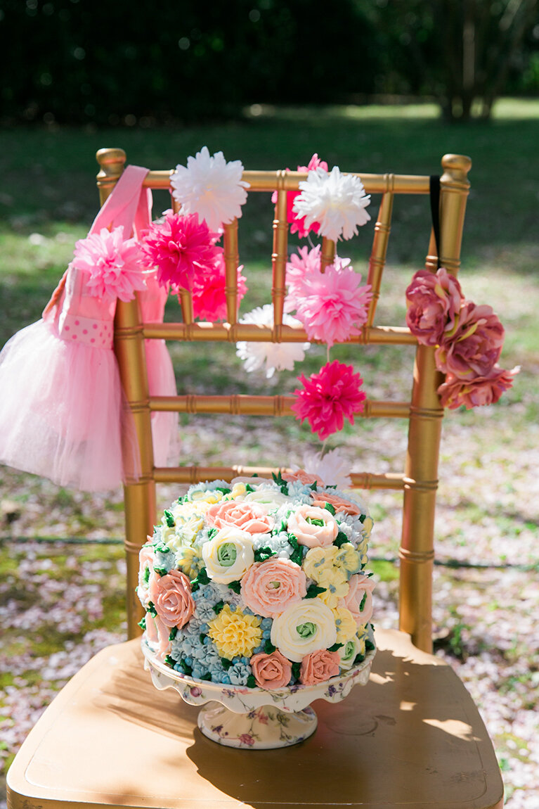
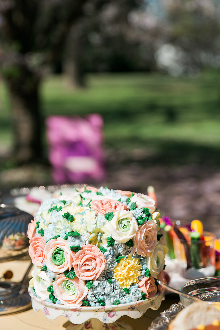
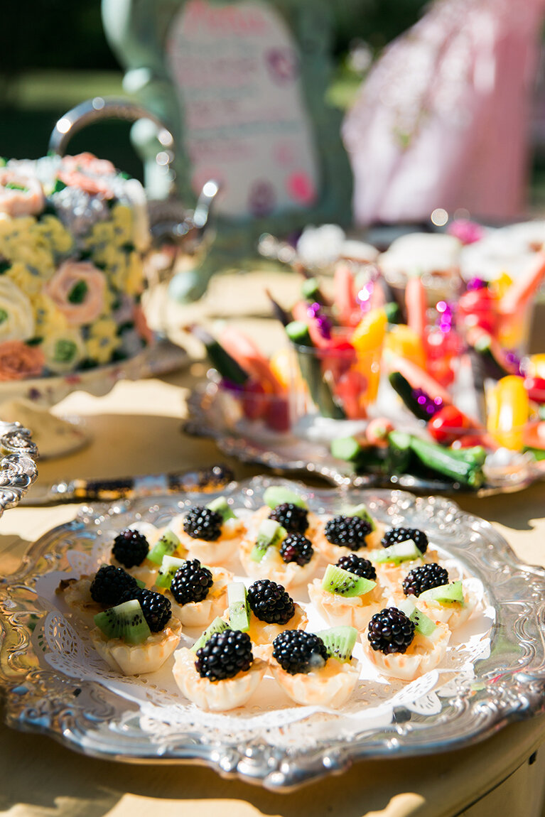
In true garden party fashion, the menu included scones with lemon curd. Other refreshments included flower-shaped peanut butter and jelly tea sandwiches, mini hot dogs, fruit cups, veggie cups, apple juice, fruit tea and a beautiful floral birthday cake expertly decorated by The Flour Garden.

A Triple-Double

Interior Design by Betsey Mosby Interior Design | Written by Terri Glazer | Photography by B. Flint Photography

The home of Ole Miss basketball coach Kermit Davis and his family scores big on beauty and durability.

WEB_IMG_5342.jpg

When you lead the busy life of a head coach at a major university, it’s important to come home to a peaceful haven. It’s also important to entertain, so your house has to be show-stopping, yet durable enough to withstand consistent wear and tear. That’s the triple challenge Ole Miss basketball coach Kermit Davis and his wife Betty presented to designer Betsey Mosby when they teamed up with her to complete their Oxford home.

WEB_IMG_5375.jpg

Mosby describes the design aesthetic she envisioned for the project as “livable.” She adds, “We tried to make it an easy design that would be great for entertaining. Betty may have the whole basketball team over one night and then a fundraiser for the university the next! She needed items that would be easy to clean and a layout that would comfortably seat the masses. We focused on clean lines and minimal accents to keep the rooms fresh, beautiful and easy for party prep. Obviously, with Kermit’s busy schedule, particularly throughout the season, we also wanted to create a calming and relaxing environment that they could enjoy as a family together.” 

The house had been partially renovated when the Davises bought it, but because it was a work in progress, they were able to customize all the finishes. Although most of the furnishings are new, the family asked Mosby to include some special pieces they had acquired throughout their years of marriage. “We incorporated their children’s portraits in the living room and other special accents throughout, and also collected some beautiful pieces that they can love for years,” she explains.


“We hung the intaglios offset on top of the moldings to add interest. I think it balances the antique mirror beautifully and also adds a sense of imperfection that is very important in any space.”

—Designer Betsey Mosby


“Betty loves blue and so we were able to incorporate that throughout the house,” says Mosby, a Jackson, MS, based designer who also has an office in Oxford. She worked in pops of color to give dimension to her design, but chose tones that didn’t disturb the tranquil overall ambiance—peach art in the foyer, blush in the living room and soft green in the master bath.

The gracious entryway sets the tone for the whole house. Filled with light courtesy of double front doors the Davises selected, the foyer welcomes guests in a warm, yet tranquil manner. Gleaming hardwood floors anchor the room, while crisp, white walls and a soaring ceiling give the space a lofty feel. For the custom ironwork, Mosby teamed up with the homeowners to create a design she calls “minimal with a twist.”

In the adjacent living room, white walls accented with classic picture-frame moldings pair with seating in light neutrals and accents in several shades of blue. While white furniture and basketball players may seem an unlikely mix, Mosby used a secret weapon that helps the light-colored sofas and chairs stand up to whatever might come their way: outdoor fabrics. The Sunbrella textiles she selected are durable and easily cleaned—they can even be bleached if need be.

The dining room is a study in the art of combining traditional with current. Mosby sourced all the furniture and art, along with a graceful chandelier in rubbed gold tones with understated crystal accents to play off the room’s large windows. She chose a large landscape painting for the space. “It lends a traditional aesthetic to what is typically the most formal room in a home,” she says, adding, “The updated chair shape and abstract art flanking the buffet make the traditional feel current, too.”

At-Home-Memphis-RossGroupCreative-Loudenbeck-UNTITLED2 COPY.jpg

The updated classic theme continues in the elegant kitchen and keeping room. Natural light pours in through oversized windows that also provide a view of the beautiful property. A cozy fireplace is topped by a large TV, and, of course, there’s plenty of seating, from dressed-up bar stools to inviting chairs and a velvet sofa to a pair of poufs upholstered in a whimsical blue and white print—room for the whole team to watch a game. A large island and ample counter space in the kitchen facilitate party prep and quartz countertops allow easy cleanup, whether Betty is cooking dinner for the couple, their daughters Ally and Claire, or caterers working a party. Mosby repurposed an unused space in the house that now comes in handy for the family and their frequent guests. She recalls, “The coat closet under the stairs was really not needed and I had the idea of turning it into a hidden bar that they could easily access and also close off when they didn’t need it. Behind a pair of bi-fold doors is the happiest little spot, complete with a perfect dry bar. Having this easy spot makes entertaining a breeze for them whether it’s a large function or just happy hour for two after a long work week.”

Another small area that makes a big impression is the powder room, decked out in a striking blue and white geometric wallpaper. “We wanted a little jewel box of a space and absolutely love this one,” says Mosby. “Betty and I were both very drawn to this paper and we selected the blue hue for the cabinet to add impact.” Clear lucite light sconces let more of the bold pattern shine through.

WEB_IMG_5564.jpg

At the back of the house a study with a masculine, yet still elegant, feel makes an easy, informal gathering place for guests or a quiet spot for Kermit to formulate game strategy. A large abstract painting above the sofa/chaise combo plays off exposed wooden beams to produce just the right degree of contemporary style without wandering too far from the updated refinement of the rest of the home.

The Davises’ master bedroom is a familiar retreat for the couple, filled with pieces they have acquired and kept from their previous homes. Mosby added new side tables and lamps, drapes with custom trim and a custom bolster pillow to create a new look without a complete redo of the treasures they already loved. 

Likewise, the master bath has a replay of a design feature Betty prized in a former residence. “She had previously had the same floor tile in a bathroom and loved it,” says Mosby. The designer suggested painting the cabinets a pale gray/green to complement the lovely basketweave tile in carrara and black marble. Timeless green silk roman shades on the windows add to the bathroom’s peaceful aura. 

Beauty and durability don’t stop at the back door of the Davis home. The couple recently added a swimming pool that sees use most of the year, thanks to Mississippi’s climate, and they called on Mosby again to provide the design. “The back porch serves as a souped-up living area and we incorporated interesting materials like outdoor velvet to help it feel luxe and like an extension of their house, but also to ensure, of course, that it was very easy to clean.

From front door to backyard, Betty and Kermit Davis, with some expert coaching from a master designer, have created the ultimate triple-double: a home with perfect stats in tranquility, beauty and durability.

WEB_IMG_5507.jpg

Worth the Wait

Written by Terri Glazer | Photography by Steve Roberts | Interior Design by Nabers Interiors

Karen Garner’s dream home was a long time coming. Although she’s been making her Magnolia Homes customers’ residential dreams come true since 1987, she built her own “forever” home only about a year ago.

Garner, the founder and president of Magnolia Homes, lived in her previous residence for 17 years. That fact makes her somewhat of an anomaly in the construction world, as home builders usually move regularly. In the process of raising two children and building over 1,000 Magnolia Homes around the Mid South, Garner’s own new home kept moving farther and farther down on her “to-do” list.

The eye-catching hues blend seamlessly with an overall design aesthetic Nabers describes as “eased elegance.” He says, “It’s classic European; elegant, but very livable.” Garner says that her own home checks all the boxes of her “four Ts”—the design…

The eye-catching hues blend seamlessly with an overall design aesthetic Nabers describes as “eased elegance.” He says, “It’s classic European; elegant, but very livable.” Garner says that her own home checks all the boxes of her “four Ts”—the design elements she seeks in every home Magnolia builds.

It was only after Garner’s husband, Steve Davitt, recovered from a major health scare that the couple decided to make a new home a priority. Garner called on architect Jeff Bramlett to design a floor plan with her large, blended family in mind. Bramlett delivered a layout that flows gracefully to accommodate crowds, whether the couple is entertaining relatives or hosting one of the frequent parties Garner loves to throw. 

She turned to a long-time friend and business associate, Steve Nabers of Nabers Interiors, to come up with the perfect interior furnishings to complete the design of the home. The two have worked together to stage Magnolia homes for years. “I love selecting everything, but he has my taste. I told him I wanted to start at the very beginning of the home working with him so that we could make everything work together,” Garner says.

No ordinary client, Garner is well-versed in design and has definite ideas about what she wants. “Steve (Nabers) and I worked together and he let me use some bold colors because he knows that’s my personality. I had to push him a little to get that!” she recalls with a laugh. In fact, Garner brought a peacock feather with her to the initial design meeting with Nabers and told him she wanted its colors for her new home’s palette. The designer indulged his client; vibrant blues appear throughout the home, from cabinets to wall colors to accent pieces.

It has to be Timeless, Traditional, Transitional and withstand the Test of Time.
— Karen Garner

One of the first design decisions Garner and Nabers made was to use cut bluestone in both interior and exterior spaces. “It’s definitely a peacock color,” she says. Paired with handsome hardwood beams and floors, slurried brick accent walls, decorative iron work and a custom limestone mantel and vent hood, the details create an Old World feel.

WEB_SR1_9438.jpg
WEB_SR1_9360.jpg

The sophisticated dining room design evolved from drapes Garner noticed on a visit to the Gray Canary in downtown Memphis. Nabers found similar fabric for the drapes and used the gold trellis theme to inspire the rest of the room. Local artist Judy Vandergrift gave the walls and light fixture a custom finish to complete the ambiance. Garner commissioned local artist Jesse Nabers Alston, who also happens to be Nabers’ daughter and a member of his design team, to create original artwork. The abstracted impressionist-style works feature the peacock tones the homeowner so loves.

The Nabers team also includes Mickie Nabers, who is Steve’s wife and Jesse’s mother. She recalls Garner’s wish for her dream home’s master suite. “She wanted anybody who saw her bedroom to say, ‘Wow!’” It’s clear that the designers delivered on her request. Multiple windows give easy views of the home’s parklike backyard. Sumptuous furnishings, anchored by an ornate bed, are showstopping.

In the master bath, elegance combines with technological innovation to create indulgence. Inside the spacious shower stall, a Moen U Smart Shower unit replaces valves; over the two sinks, sleek mirrors with built-in LEDs provide task lighting that’s often hard to arrange below vaulted ceilings.

WEB_SR1_9419.jpg

Nabers guided Garner in choosing all new furniture and accessories for the new home she’d waited so long to complete, but he also incorporated meaningful pieces from her mother, who lived with her for 22 years before she passed away. Lighting up the bar area is a neon “Sue’s Bakery” sign. “My parents opened a bakery on Beale Street about the time I was born,” Garner explains. “My middle name is Sue, and they named it after me.” The sign brings back memories of Garner’s childhood growing up in the business, especially of one frequent customer who loved Sue’s jelly donuts and later went on to become the King of Rock and Roll.

After years of dreaming, eight months of planning and a year of construction, Garner is thrilled with the home that she so often back-burnered to tend to Magnolia customers’ needs. With her experience in the industry, she assembled an all-star cast of professionals to design and construct the home and it shows. She says, “I think that’s really what this home is all about—all of this talent brought together.”

Connecting People with Art : Amanda Goetze of Goetze Art & Design

Written by Terri Glazer | Photography by Ross Group Creative

Amanda Headshot 1.jpg

“My mother jokes that I sell art out of the back of my car, but I’m really a gallery on the go,” says Amanda Goetze of her business, Goetze Art and Design. “I don’t have a brick-and-mortar situation; I will have a pop-up show or an open house occasionally, but generally I work with individuals.”

Her clients, most of whom become repeat customers, value the concierge service she provides. “Someone might approach me and say, ‘Come over to my house and let me see what you think might work.’ We talk, because art can be really intimidating to people. We look at the space and we look at their price point. Then we get a feel of what they’re interested in, what they connect with, and we go from there. I really love the matchmaking. I love that ‘aha’ when it comes together.”

New Orleans-based artist Ida Floreak is fascinated with specimens of plants and insects. The remarkable realism in her work has the ability to bring nature indoors. Her work refers to a centuries-old tradition of botanical and animal illustration bu…

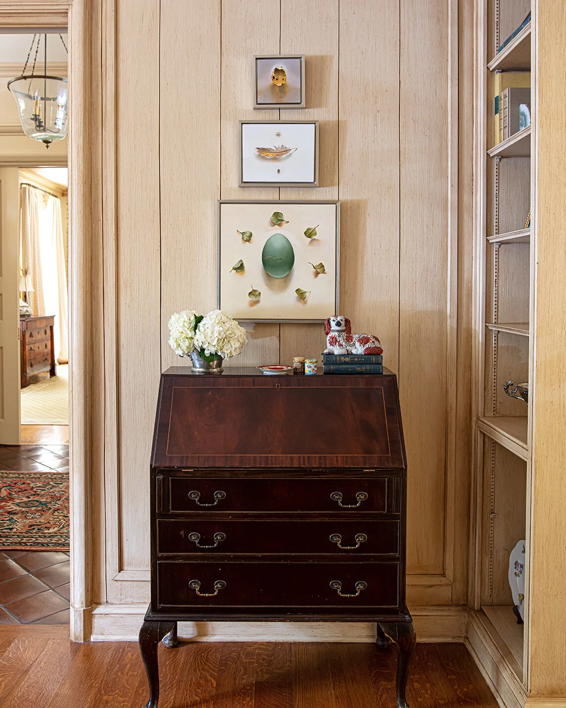
New Orleans-based artist Ida Floreak is fascinated with specimens of plants and insects. The remarkable realism in her work has the ability to bring nature indoors. Her work refers to a centuries-old tradition of botanical and animal illustration but is thoroughly modern in feel. While at home in this beautiful traditional interior, her paintings add a modern touch, and the arrangement of these paintings in a graduated pyramid adds to this contemporary feel.

Goetze currently represents a variety of artists both domestic and international. She keeps a few works from each artist in her home as examples so potential clients can see their styles. If customers don’t find a connection, she goes beyond her represented artists to find the perfect match. “I really enjoy the hunt—finding an emerging talent,” she says.

Access to artists nowadays is virtually limitless, thanks to the internet, says Goetze, “The social media world has changed how artists work. They can sell directly to the consumer, but a lot of them don’t have the time to do it or the know-how to do it, so that’s what I try to do. I try to connect people with the art.”

"I really pride myself on being able to work within my clients price point. Art should be accessible; finding a piece that speaks to you doesn't need to cost a million dollars” says Goetze. Goetze started her own collection at a young age (“At my house we bought art before we bought furniture!”) and encourages others to do the same. “I love the idea of being able to tell the story of a painting as part of a family’s lore: ‘I bought that for myself when I got my first promotion.’ or ‘We found that in Charleston in a little place.’” 

This piece, The Exhibitionist, created by modern naturalist Adam Batchelor seems made for the space. It’s an incredible triptych that fits beautifully over the side board.The wallpaper is an important feature in this dining room, and the client was …

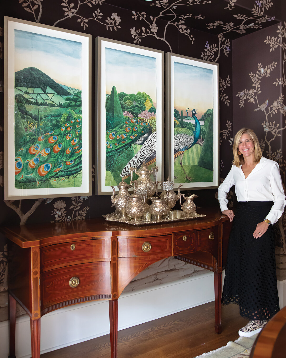
This piece, The Exhibitionist, created by modern naturalist Adam Batchelor seems made for the space. It’s an incredible triptych that fits beautifully over the side board.

The wallpaper is an important feature in this dining room, and the client was reluctant to hide or detract from it. So it was crucial that the chosen artwork complemented rather than competed with the space. Batchelor’s work was a perfect choice.

This client’s home is filled with beautiful antiques and traditional spaces. This Adam Batchelor piece, Le Petit Jaune Mobil, is right at home with its traditional techniques and subject matter, but I also love Batchelor’s addition of modern element…

This client’s home is filled with beautiful antiques and traditional spaces. This Adam Batchelor piece, Le Petit Jaune Mobil, is right at home with its traditional techniques and subject matter, but I also love Batchelor’s addition of modern elements, such as the abstract shape of the red string and the unusual posture of the bird itself. We framed it simply, letting the movement of the bird take center show.

This bedroom features a tall ceiling and is both soft and light-filled. The task was to source artwork to occupy a difficult space above the bed. The color and subject matter of this commissioned series by John Matthew Moore echoes the softness the …

This bedroom features a tall ceiling and is both soft and light-filled. The task was to source artwork to occupy a difficult space above the bed. The color and subject matter of this commissioned series by John Matthew Moore echoes the softness the room and provides a serene focal point of interest. By floating the work in the frame, the art appears almost suspended in the space.

Goetze’s personal story as an art lover started before she can even remember. Her mother was part of a group of artist friends who had a studio in Midtown and both her parents were avid art collectors who instilled the love in their daughter. “As a child, I was fortunate to get to enjoy art. I went to classes at the Memphis Academy of Art and I loved mixing colors. My mother used to put pictures of famous paintings on the refrigerator down at my level for me to enjoy.”


As a new college graduate, Goetze wanted to put her freshly minted art history degree from the University of Richmond to use in a Washington, DC, gallery. “I lived on someone’s couch, literally, and pounded the pavement trying to find a job,” she recalls. Eventually she left a resume in Sen. Bill Frist’s office, which led to a job offer. “I got a call later that day and they said, ‘We’ve got a great job for you operating the elevator in the US Capitol. My father said, ‘You better take that job!’ so I did.”

Amanda Headshot 2.jpg

A chance conversation in that elevator with then-senator from Mississippi Thad Cochran led Goetze to a job in the government relations office of the Smithsonian Institution, where Cochran was a regent.

The lifelong aficionado was in heaven in a work environment where there was so much art that it couldn’t all be displayed—”There was art hanging over the copier!” she recalls. “It was the ultimate job for a 23-year-old.”

It was here that Goetze’s penchant for matching the right piece with the right person got its start. “The Smithsonian would work with officials at Capitol building to place art in congressional offices, so it could be seen by people. I would coordinate with congressional members to help them select artwork for their offices, which was really neat,” she remembers. For example, Goetze assisted a Missouri member of congress in borrowing peace pipes that were indigenous to his congressional district.

Once she moved back to Memphis, word of her “matchmaking” expertise got around. “Just on the side, people would come to my house and say, ‘I wish you’d help me find this or that,’ so I did,” Goetze says, and her business was born. In addition to helping clients select new works, she also sells art on consignment. "If you have a piece of art that you inherited or that no longer speaks to you, I try to find it a new home.  It's a great way to pass art along and turn it into someone else's heirloom."

We commissioned Charleston-based artist Katherine Dunlap to paint this work, which is inspired by a family photo (see right on shelf). The acrylic on board painting is an absolute fit, bringing personality and joy to the space.

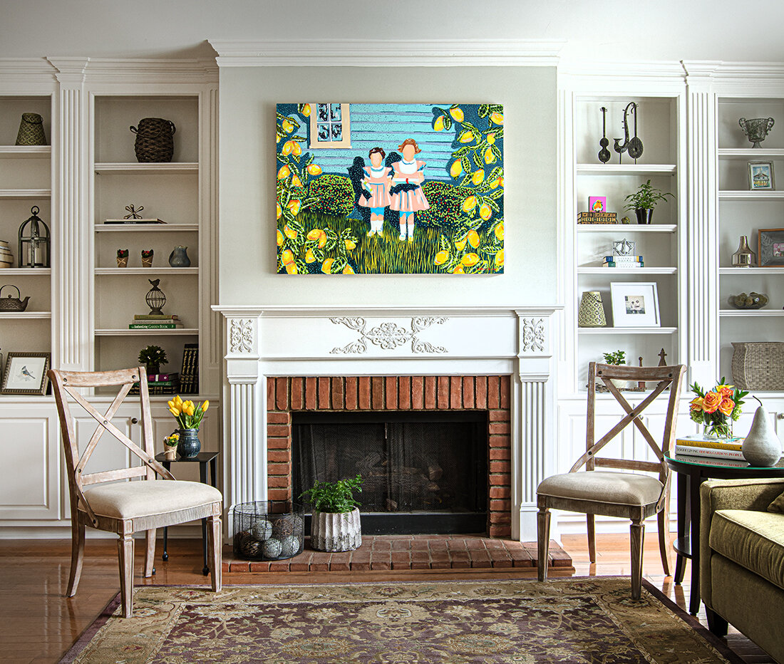
We commissioned Charleston-based artist Katherine Dunlap to paint this work, which is inspired by a family photo (see right on shelf). The acrylic on board painting is an absolute fit, bringing personality and joy to the space.

She encourages clients to consider more than just the aesthetic value of artworks they purchase. “It’s important to think of art as an investment. Tastes change. A piece of art doesn’t have to be the heirloom forever. Of course, you want to love it, but it is truly an investment you enjoy, as well.”

An Enlightened Home

Written by Terri Glazer | Photography by Annabella Charles

Years of planning result in a light-filled home in which beauty and practicality mesh seamlessly.

smith-3a.jpg
smith-67.jpg

The owner of this East Memphis home says she has always been inspired by natural light. “It’s just uplifting,” she explains. That love played heavily into the plan when the couple turned to David Anderson, a Memphis architect who specializes in custom homes, to create the house where they are raising their family.

Lots of light was at the top of the must-haves they gave Anderson—a long list compiled over time and with much thought. “There was an existing home here that my husband had originally lived in, and we were living next door. We planned for probably seven years, just kind of dreaming and planning and sketching out ideas and making wish lists,” the homeowner recalls. “Then finally, we decided to take the plunge. We bulldozed the house that was here. [Construction] took about a year and a half to complete, start to finish.” Lockwood Griffin of Griffin Homes was the builder. 

 “We wanted so many windows in the home. David has this knack for windows,” says the homeowner. “He really delivered on just where to put the windows so light would filter in but we’d still have privacy.”


“We’re living in this house. We want it to be nice and neat and have a charm to it without the pressure of perfection.” 

— Home Owner


Nowhere is the emphasis on windows more evident than in the home’s dining area. Situated at the front of the house, adjacent to the open kitchen, a double-height set of windows backs a banquette that spans the entire length of the space. The windows continue around the corner to the room’s west wall, allowing even more light to flood in. 

Every aspect of the dining room, from its size and scale to the furnishings, is the product of careful consideration. “When we built the house we knew we didn’t want an enormous footprint on everything so we tried to consolidate and work with David on making the most of a space without it being so grand. Palladio built the long bench and we decided that since we were having a banquette, it would be easier when we’re having multiple guests over, as they’re sitting on the banquette, to have a table that would split for the ease of getting in and out. 

That “light-filled-and-not-enormous” aesthetic continues into the adjacent kitchen. Explains the homeowner, “With the floor plan being so open, the area kind of turns into one big living space. I didn’t want it to read so much as kitchen.” To that end, she decided to forego wall cabinets and  selected a refrigerator that didn’t require a front vent. Even the barstools that border the kitchen island are upholstered, for a “softer look,” she says. Although the white fabric on the seats looks refined, it’s also easy to clean, a must with seven-year-old twin sons in the family.

smith-103.jpg

Despite the absence of upper cabinets, this kitchen offers plenty of storage, from drawers in the oversized island, to the sizeable pantry just behind it, a feature the homeowner describes as a happy coincidence. “When we were working with David on revisions, we were, again, trying to keep the footprint from being so large. We had to make a change in the powder room and it ended up enlarging my pantry. I was so glad because I went from a little broom closet to this pantry that has storage, a nook for keeping track of lists and even a little dog food spot.” The clever addition of barn doors allows the owners to close off the pantry when entertaining, transforming the area from a utilitarian necessity to a passthrough leading guests to the powder room. “We wanted to have seating enough for friends and family,” says the homeowner, “but we also knew this room would be lived in. The kids are going to have their pillow fights in here so it’s all furniture we can use.” Pieces range from a coffee table the family had in their previous residence and a well-loved leather chair to a new sofa, chairs and accessories selected specifically for the room. 

Along with an abundance of light, a sense of tranquility permeates the house, thanks in part to the neutral color palette that runs throughout. The oak floors are finished with a simple classic gray stain, the walls are washed in a soft white, and the furnishings range from light-toned woods to soothing beiges, grays and taupes. “I like a calm in my life. I didn’t want to have too much going on everywhere and I wanted things to flow nicely,” says the homeowner. “We’re living in this house. We want it to be nice and neat and have a charm to it without the pressure of perfection.” 

The downstairs master suite is a serene retreat. A tall ceiling in the bedroom creates a roomy feel which the homeowner loves, although she admits her favorite touch is out of plain sight. Flanking the room’s window alcove, full-length drapes hide a wall-mounted TV when it’s not in use. The curtains can open to let in the natural light the couple so loves or close completely for privacy. Elegant, yet completely livable, the master bath exudes a spa-like feel with a free-standing soaking tub and clean white fixtures dressed up with gold accents. 

A generous guest suite completes the home’s first floor, but upstairs is the domain of the children. At the top of the staircase a rec room holds all the toys two busy boys could need, plus a TV and a cozy window seat—the perfect spot to read a book. Originally conceived as attic space, the room came to be as part of the effort to minimize wasted space. “Basically all the hallways. That’s why we have this little area outside the boys’ bedrooms,” says the homeowner.

Brilliantly designed with twins in mind, the two children’s bedrooms are almost identical and each has its own bath. The wall that separates them is more aperture than barrier, a large cased opening with barn doors. Says their mother, “With twin boys, we didn’t know. Right now they love sharing a bedroom, but maybe one day they’ll want separate bedrooms, but would still want that feeling of being together. Or if they had sleepovers, it’s an area that could have the feel of a suite. They can close the barn doors for privacy, or if we have extra family come in it can serve as a second guest room.”

Just outside the boys’ bedrooms and open to the downstairs, a study loft holds two desks for homework, topped by built-in bookcases laden with family treasures. “Things that were my husband’s parents’. Things that were his. It’s sweet to have a little spot where you can put those mementoes.” And, spoken like a true mom, she adds, “With it being in the loft area I can still kind of hear what’s going on. I can take a peek up and make sure they’re at their desks.”


smith-182.jpg

When it came to their home’s exterior and outdoor living, the owners applied the same detailed thought process that went into the inside spaces. “With a new construction home, we didn’t want it to look brand new; that’s why we chose reclaimed brick. We debated on every single detail about it...how far apart we spaced the bricks to the color of the mortar. We put samples up and looked at new brick that was supposed to look like old brick. We were lucky to find this old, old brick that helped give the house that instant patina and charm.”

Even the fence was the subject of careful planning. “We didn’t want it to feel like a barrier, but just something to help contain two little boys and a dog. We wanted it to feel homey.”

Out back, a cozy covered porch and an inviting pool promise sun-filled days and family memories waiting to be made. Like the rest of the home, the T-shaped pool design was intentional, with children and their safety in mind. “I really wanted a shallow end that the kids could play in,” says the homeowner. “I always pictured a basketball or volleyball game going on in the shallow end.”

Even the detached garage is well thought out and useful for the entire family. In addition to room for two cars, the garage has plenty of storage and even a “kids’ garage” for the boys’ bikes and gear. Above, a studio space provides room for the homeowner to create art, a passion she put on the back burner while her children were younger. And, of course, it has great natural crosslight, she admits. “It has windows on the front and back walls, so it’s a great space.”

With a degree in graphic design and a love for fine art in general, it’s no wonder that the homeowner fell in love with the design process—”the options and the studying and research and building a layout of just want you want.” Through deliberate planning and with expert professionals carrying out that plan, she created an inspired and light-filled nest where her family can thrive.


Winter Wonderland Party

Written by and Photographys courtesy of Jim Norton

IMG_2619.jpg

What could be better than a beautiful birthday dinner for a beautiful friend with a pretty table and delicious food? Not much if you ask me! Recently, I hosted one of these dinners for our sweet friend, Singer/Songwriter Kelly Lang. From my table to the food I wanted everything to be perfect and that included the guest list! Laughter flowed all evening with stories from Kelly’s husband, Country Music Legend TG Sheppard, along with Priscilla Presley, Jack and Leighanne Soden, Pat Kerr Trigrett, Dr. Jonathan Ellichman and his wife Nicole, Dianne Norton, and Robert Walden.  

_mg_4444.jpg

Guests arrived around 7:00pm and were escorted back to the bar to start the party off with cocktails and hors d’oeuvres.  About an hour into the party I asked guests to follow me to the dining room to be seated for dinner! With it being winter and pretty chill here in Tennessee I wanted my table to reflect that. I decided on a Winter Wonderland themed table with tall crystal trees, flocked evergreen, and touches of soft purples to bring in a little color. One of my favorite touches of the evening were the menu cards I made for each guest. Easy to make and definitely beautiful, I purchased the glitter card stock at a local craft store and cut it to the desired size. I printed the menu on a pearlized paper, cut it a tad smaller that the glittered piece and glue it on top. To finish, I attached elegant snowflake stickers to add color and depth. Time consuming? A little. But well worth it as every lady at the table asked if they could take theirs home. 

IMG_2627.jpg

To start the evening I served a guest favorite, my Filet of Halibut atop Cream Cheese Grits with Country Ham topped with Wild Mushroom Marsala Broth. One of the guests, who has eaten at restaurants around the world, said he had never had a better halibut course. Next, I served a delicious Mixed Greens Salad with Granny Smith Apples, Dried Cranberries, Red Onion, Candied Pecans, and Goat Cheese topped with my homemade Sweet Blush Vinaigrette. For the entree I made Prosciutto and Sage Wrapped Pork Tenderlion with Buttered Shallots, Creamy Mushroom Risotto, and Roasted Brussels Sprouts with Applewood Smoked Bacon. Needless to say, I don’t like for my guests to go home hungry! 

_mg_4494.jpg

Dessert was the showstopper for me! For the birthday girl I didn’t want to do anything expected. So, instead of a traditional birthday cake I had a little fun! I made each guest a hollow white chocolate ball, about four inches in diameter, and embellished it with edible flowers I dusted in pink and yellow edible dusting powder. To top them off I used melted white chocolate as glue and attached beautiful dragonflies made of edible wafer paper...the birthday girl loves dragonflies. Hidden under each embellished ball I placed a tower of decadent carrot cake with cream cheese icing. Once a dessert had been placed in front of each guest I circled the table with my hot butterscotch glaze, pouring a liberal amount over each ball causing them to melt and reveal the hidden dessert beneath. 

IMG_2625.jpg

We finished the evening with a delicious port to accompany the dessert as Kelly opened her birthday gifts. It was the perfect evening and I think everyone had a wonderful time. Especially me as I love nothing more than having guests around my dining table. 

Past and Present Perfect

Interior Design by First Fruit Collection | Written by Terri Glazer | Photography by Sélavie Photography

WEB_AtHomeMag-Vesta2019-SelaviePhoto-2.jpg

On a recent tour of the 2019 Vesta Home Show’s Kelmscott Manor with designers Ashley Toney and Patty Michaelis, words like “airy,” “dressy” and “pretty” peppered the conversation. The opinion is echoed by thousands—literally. The majority of the over 18,000 people who attended the show last October voted for the house as their favorite, making it the People’s Choice winner. 

Toney, owner of First Fruit Collection on the Collierville square, and Michaelis, her design partner and manager of the store, teamed with builder Dave Moore in a year-long labor of love to bring the house from concept to completion.

WEB_AtHomeMag-Vesta2019-SelaviePhoto-8.jpg

Moore describes the home, located on Chapel Woods Cove in Germantown, as traditional English country in style, but packed with every amenity a modern family could need. The exterior is a handsome blend of stone and brick. A formal garden to the right of the front entrance, highlighted by a traditional fountain, lends a decidedly dressed-up air. An arched covered entry welcomes visitors through double front doors painted an eye-catching cornflower blue in a foreshadowing of the interior color palette.

Just inside, the entryway, which Michaelis describes as a “showstopper,” opens to a two-story stair hall that draws the eye immediately upward. The floors, however, are worthy of equal attention; stately in a stunning diamond pattern. Created by Danny Benard of Mid South Flooring, the light-stained oak runs throughout the downstairs, an elegant foundation for the decor. 

Impressive paneling furthers the English country manor feel of the entry. “We loved the idea of having some paneling,” recalls Toney. “Our trim carpenter from Navarro Brothers Finish Carpentry did even more than we imagined!” An important aspect of First Fruit’s design strategy is to let artists be artists, she explains. “That’s kind of our thing. We like to figure out what we want and then let the experts go with it. When you give them too many constraints they’ll do the work, but it ends up being something less than it could have been.” That strategy paid off in spades again when it came to the “jewelry” of the entryway, the stair railing, created by Willie Kelley of Absolute Iron. “We showed him a picture of something a lot simpler,” remembers Toney, “and he came up with this and we loved it! The matte finish actually has a little shimmer to it.”  


“We took traditional and updated it, modernized it.”

-Kelmscott Manor designer Ashley Toney of First Fruit Collection


The dining room’s uncomplicated, open layout offers minimal wall space on which to place furniture, but the one piece Toney selected for the niche alongside the table and chairs came to be a foundational choice for the home’s overall design scheme. “We found the sideboard at market and kind of based the room around it. We knew we wanted a blue palette for this house and that sideboard, which is a replica of an antique, is a great anchor for the room,” she says. 

Coffered ceilings, subtle chinoiserie-patterned curtains and a distressed wood chandelier make the dining room feel formal, yet not fussy.

“This is probably our favorite den we’ve ever done,” admits Toney. “We love the open windows, the symmetry of the room.” That symmetry comes most noticeably in a pair of built-in cabinets under matching windows flanking the fireplace. The trim on the cabinet doors replays the diamond pattern of the entry floor, while the stone tops add a chic accent that keeps the room’s decor on the transitional side of casual. 

WEB_AtHomeMag-Vesta2019-SelaviePhoto-3.jpg

Adds Michaelis, “We definitely wanted it to be a little dressy, but still feel lived in. We don’t want anyone to feel like they can’t sit on the sofa. We’ve had guys coming in here sitting in these chairs and saying they are the most comfortable chairs ever.

The den opens to a gourmet kitchen in which each feature outshines the one before. The cornflower blue first introduced in the front doors and the dining room sideboard makes a bold comeback in the cabinets. “It’s pretty, but unexpected,” says Toney. “In a design palette that’s otherwise simple, this is the pop of color.”

WEB_AtHomeMag-Vesta2019-SelaviePhoto-10.jpg

Traditional pecan-colored wood on the barstools and in custom ceiling beams from Burrus Co. brings warmth to balance the cool blues, and the vent hood created by Christie Cut Stone is a statement piece. Gold-tone faucets and hardware here and throughout the home are at once of-the-moment and timeless. No conversation about the Kelmscott’s kitchen is complete, however, without a mention of the adjacent wine room. The glass-encased alcove is the perfect home for a connoisseur’s collection, temperature- and humidity-controlled, and centrally located. Vesta attendees clearly agreed, voting the room their favorite feature from among all the innovations in the show’s six spectacular homes. 

Nearby, the laundry area is a study in practicality plus beauty. White cabinets with Silestone tops pair with wooden open shelving created by Navarro Brothers. Several new shades of blue appear, from sky blue paint on the walls to navy decorative accessories. Lockers and baskets provide a place for each member of the home’s future family to organize, and there’s even a special spot for man’s best friend—a glass-enclosed dog bath, complete with a feeding station built in underneath. Don’t limit the space to canine use, though, suggests Michaelis. “It would also be great if you had to hose something off… maybe a muddy child!” she laughs.

The design team couldn’t be happier with the way the master suite turned out. Just as with the den, Toney describes the bedroom as luxurious, but liveable. Furnished in serene tones, the restful bedroom retreat leads into a classic white bath, with an unexpected touch. Burrus’s birch ceiling beams soften the tone without detracting from the spa-like feel. Through the bathroom, the huge master closet does double duty. Cleverly dressed up with the custom trim work that is one of the home’s hallmarks, a solid steel door marks the space as a certified safe room/storm shelter. 

Along with three more bedrooms and baths, the Kelmscott’s second story features a media room, but the light-filled space is a far cry from the home theaters that first appeared in houses 20 or so years ago. White walls, multiple windows and light carpet create a sunlit ambiance. When it’s movie time, though, the space transforms into the ideal setting for viewing. Custom shades block out all light for ultimate enjoyment of the built-in projection TV system.

Although the 5,000-square-foot home is a showplace, its builder admits that his favorite part of it is outside its walls. “I’m an outdoor person, so I love the outdoor room and the backyard,” Moore explains. It’s easy to see why: an inviting pool and hot tub await, next to an inviting outdoor living room, complete with bluestone flooring, a vaulted and beamed ceiling, a stone fireplace and two TVs, one of which is visible from within the hot tub. “No one will ever have to miss a play,” says Toney. 

The Vesta Home Show website describes the Kelmscott as a combination of the best of the past with the best of the present time. Thanks to the efforts of the team that created, constructed and furnished it, this house will surely provide the best of the future, as well, for the family that soon calls it home.

WEB_AtHomeMag-Vesta2019-SelaviePhoto-17.jpg

50 & Fabulous Soiree

Written by Angela Mazanti | Photography by Jamie Sue Johnston

Opening Spread.jpg

Jennifer's husband, Frank, contacted me to plan a surprise birthday party for her 50th. He decided early in the planning process that he was going to need her input on some things and let her in on the secret, but wanted to leave as many details as possible as a surprise. 

Set the stage. 

The setting for the party was at their beautiful, historic home. Jennifer recently took her daughter on a graduation trip to France, and I was inspired by that, as well as the English Tudor-style home. She has a love of antiques, beautiful French colors and patterns. I used those things as inspiration for the decor that included watercolor linens in greens, blues and yellows that mimicked the tones in a Monet painting. 

43.jpg

The Decor:

The flowers looked as though they were hand gathered from an English garden. Jennifer’s favorite color is yellow, so I incorporated it with French blue for the flowers, cake, linens, invitations, etc. I enlisted the help of Lindsey Cross at Mrs. Post Stationery to help pull together the perfect invitation. 

42 bottom.jpg

The Menu:

The cake was designed by The Flour Garden and was a mixture of chocolate and yellow butter cake with toasted Pecan Bavarian filling. The menu was artfully presented by Wade & Company Catering. It consisted of a fresh fruit and cheese display, bacon-wrapped artichokes with parmesan parsley dust, honey smoked salmon with candied citrus zest and sun dried fruit, Mediterranean chicken salad baguettes, beef tenderloin sliders, asparagus and peppers with lemon aioli, warm New Orleans crab dip, summer orzo salad and apricot-glazed chicken kabobs.

44a.jpg

Special Details:

Jennifer and her guests enjoyed dancing under the stars to the Memphis Allstars Band. In lieu of gifts, she requested that donations be made to Southern Reins in honor of a special friend. 

46.jpg

Host Your Own:

If you want to throw your own party for someone special, whether you go for a surprise or not, try to make sure all of the details are inspired by the guest of honor. Use their favorite colors, flowers, food and music to create an atmosphere that truly reflects who they are and your guests will leave feeling like they were at an experience that was unique and inspired. 

Starting Point

Written by Terri Glazer | Photography by Ross Group Creative | Interior Design by Kimberly Bacon Interiors

Jeri and Pat Winters purchased their 40 acres of pastureland in Coldwater, Mississippi over 25 years ago. While residing in a temporary home on the property, the Winters constructed a home themselves from a Southern Living House Plan. 

Since children and grandchildren live nearby, it was time to undertake a major renovation. They contacted Kimberly Bacon Interiors and the chemistry between Jeri, Pat and Kimberly was instant. “Listening to Jeri and Pat’s objectives was extremely important to make this project a reality. Jeri loved color and Pat wanted every aspect of the renovation to flow together,” says Bacon. This was the beginning of an amazing relationship. Pat gave Jeri and Bacon free rein to select the elements for the home.

WEB_Kimberly-Bacon-Coldwater-20-003A5200 b.jpg

One of the objectives was to not only update the look of the house, but also to improve the flow. “We have a front door, but no one ever uses it,” laughs Pat. The main entry is a side door, which originally opened into a laundry room. Bacon relocated the laundry room to a more central location in the house. She then reimagined the space as a stylish mudroom with rustic shiplap walls, custom sink and ample storage for Jeri, a master organizer.

Once inside, a gracious family room awaits to the left. Maximum seating was important for large family gatherings. Bacon paired two large sofas with an existing sofa which was reupholstered. She designed a custom 5 foot square antique oak coffee table for the space. A pair of poufs nestled under the table provide extra seating.

The newly designed kitchen stands to the right of the entry. Every design project needs a “starting point,” an initial element that sets the tone for the entire venture. No matter the scope of the undertaking, there must be an initial decision that drives all the subsequent choices. “Jeri fell in love with a Cambria quartz with turquoise accents that would become the main focus in the kitchen and dictate the direction of the design,” recalls Bacon. The existing pantry was relocated under the stairs allowing for the reconfiguring of the island which provides additional seating. Jeri’s love of color is reflected in the island custom paint color which is paired with stained cabinets. All flooring was removed and replaced with tile for durability and ease of cleaning.

For the Winters project, Bacon designed a large custom coffee table fabricated by a local architect. During a visit to the workshop, she spotted a wooden piece perfect for the table centerpiece. She had it fitted with antique mirror as the base. Whe…

For the Winters project, Bacon designed a large custom coffee table fabricated by a local architect. During a visit to the workshop, she spotted a wooden piece perfect for the table centerpiece. She had it fitted with antique mirror as the base. When she presented the piece to her client, she was surprised that Pat knew exactly what it was. “I had no idea there was a story behind it,” recalls Bacon. “That came off a dredge boat, and it turns out that the dredge captain and I have crossed river paths numerous times over the years.” says Pat, whose work with Thompson Caterpillar often involves powering the watercraft on the Mississippi River.

WEB_Kimberly-Bacon-Coldwater-10-003A5128 b.jpg

The kitchen opens to the dining room, where the soaring ceiling and a wall of windows provide abundant light to the space. The room is a tribute to the family and its Mississippi roots from the much-loved farm table and ladderback chairs, to the McCarty pottery and cotton boll accents on the shelves, to the commissioned painting by Charles Guess. “My grandparents on both sides were sharecroppers, so that painting reminds me of them,” says Pat. The room has a 20 foot vaulted ceiling providing the backdrop for the staircase to be a focal point in the room. The original structure was removed, and solid cedar posts were installed creating an open feel. The structure itself features custom iron and millwork designed by Bacon. The fireplace feature was updated with the outside bluestone and rustic boards above a new cedar mantle.

Past the dining room, the newly positioned laundry room is out of the flow of traffic and adjacent to the master suite. Bacon updated the bedroom with new furniture and bedding. The master bath received a substantial facelift. A barn door now separates the two areas with less obstruction. Two closets flank the entrance with new custom cabinets, tile floors, distressed subway wall tiles, river rock accents and granite countertops. A freestanding cast iron soaker tub, chandelier and sconces add a feminine touch to the room.

The project continued outside. With no original steps out the back door or the master bedroom door, the plans for a covered porch were a must. A large covered patio, outdoor kitchen, and seating area were added. The feature of the area is a swimming pool which is a favorite of the grandchildren.

 “This is Jeri’s house and I wanted her to get what she wanted,” Pat says. “It fits us well.”