Back in the Family
/Story by Terri Glazer | Design by Selena McAdams | Photography by Stefanie Rawlinson
Built by Christian Meyer of Meyer Construction LLC | Architecture by David Anderson
“I was living downtown in a condo on the river, loving life. My oldest daughter called one day in 2019 and said, ‘Dad, our house doesn’t have room for a swimming pool, so we need you to buy a house with a swimming pool or one that can have a pool added.’ I never say no, but I was really kind of like, okay, whatever, maybe,” recalls Gordon Wynn. He never expected what would happen very soon afterwards.
Three days later, she called again and asked her dad what the address of his grandparents’ home in East Memphis was. “I told her and she said, ‘It went on the market today, and we think you should buy it.’”
Wynn’s grandfather built the ranch-style house on a large lot in 1948. Although it sold outside the family in the 1990s after his grandparents passed away, he had treasured memories of the home. “I had to do whatever it took to get it back, and I did,” he says. After urging from his family, he placed an after-hours call to the realtor that same night to assure her he’d be the home’s new owner, no matter what.
Once he achieved the goal of bringing his “G Daddy’s” place back into the family, Wynn wasted no time restoring it. He knew he could trust Selena McAdams to lovingly modernize the house, while respecting its history and heritage. The experienced designer and owner of local interior shop and firm Spruce had worked with the Wynns for years, creating homes for Gordon, for his children, and the office for the family business.
“The house hadn’t been updated very much and wasn’t really livable,” Wynn says. That fact didn’t deter him from moving in, living almost exclusively in the primary bedroom while the rest of the home was under construction.


Architect David Anderson drew the plans for the reimagined mid-century modern layout. “We weren’t in a hurry; there was no deadline,” says Wynn, “so we took our time and did everything right.” McAdams credits contractor Christian Meyer of Meyer Construction LLC and the craftsmen at Old City Millwork for expertly bringing her and Anderson’s visions to completion on the project.
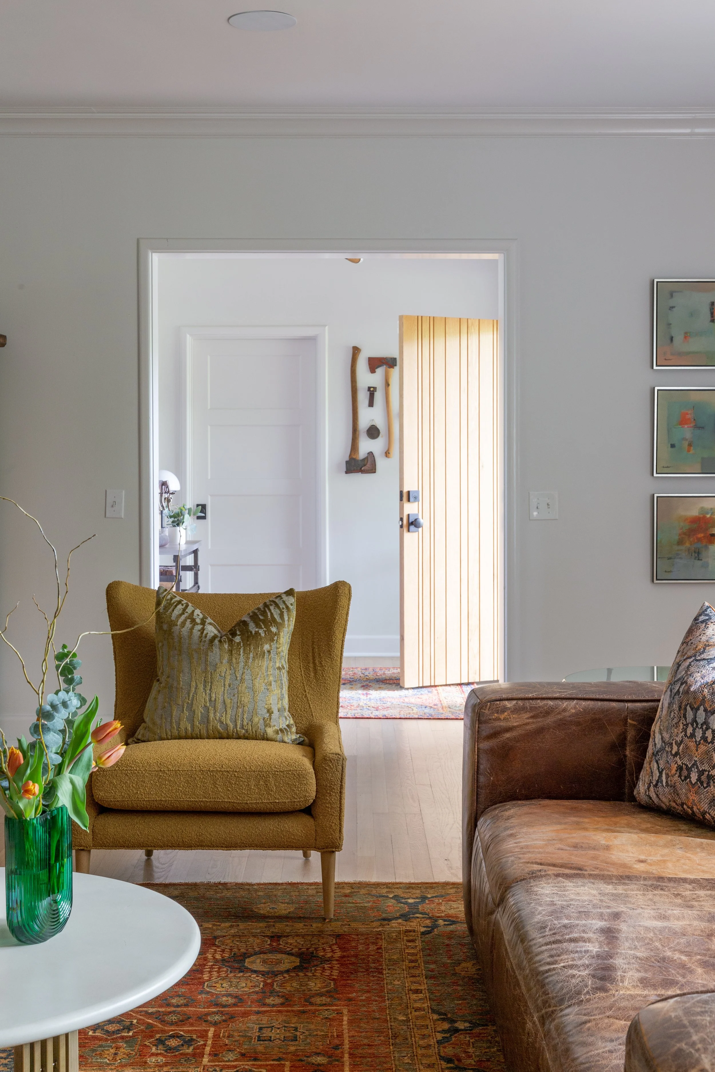
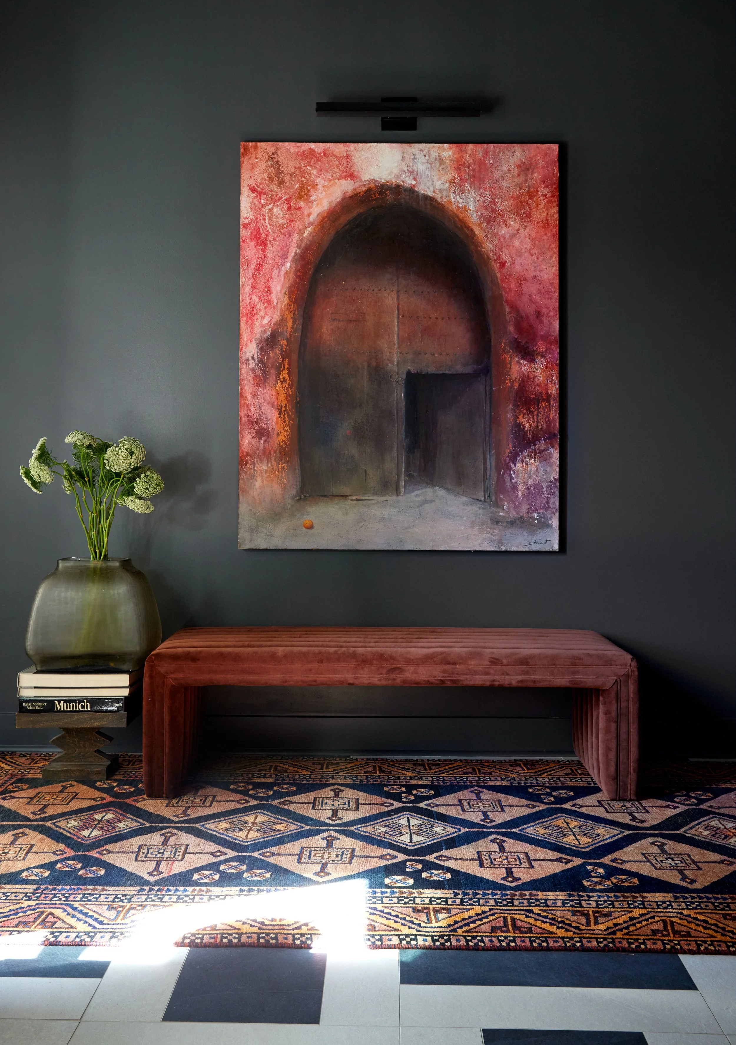
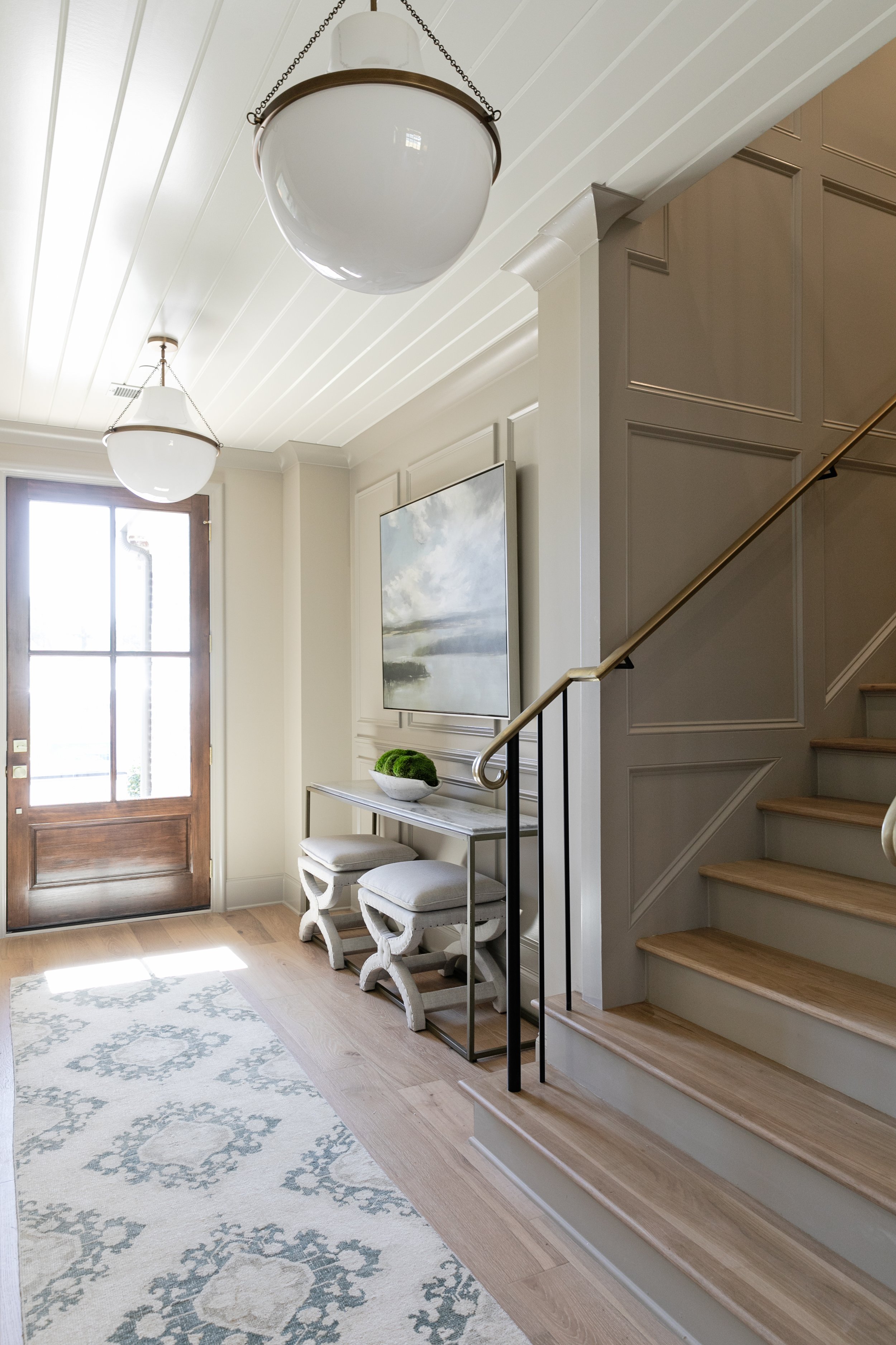
The front entry and foyer space set the tone for the home’s distinct style. McAdams explains, “We decided to keep the original ribbed glass in the sidelights, but we had a new front door custom made. We wanted it to be really unique, and we were also trying to give the ribbed glass new life.” Stepping inside, clean white walls and trim create a light-filled mood, a vivid contrast to the deep gray the designer chose for the exterior. A bare-bulb pendant fixture overhead gives a subtle nod to iconic space-age Sputnik chandeliers. Its bronze and wood construction pairs perfectly with a unique collection displayed on a nearby wall. “Gordon had these really cool axes he’d been collecting. It was challenging and fun to install them in an artistic way,” the designer says.
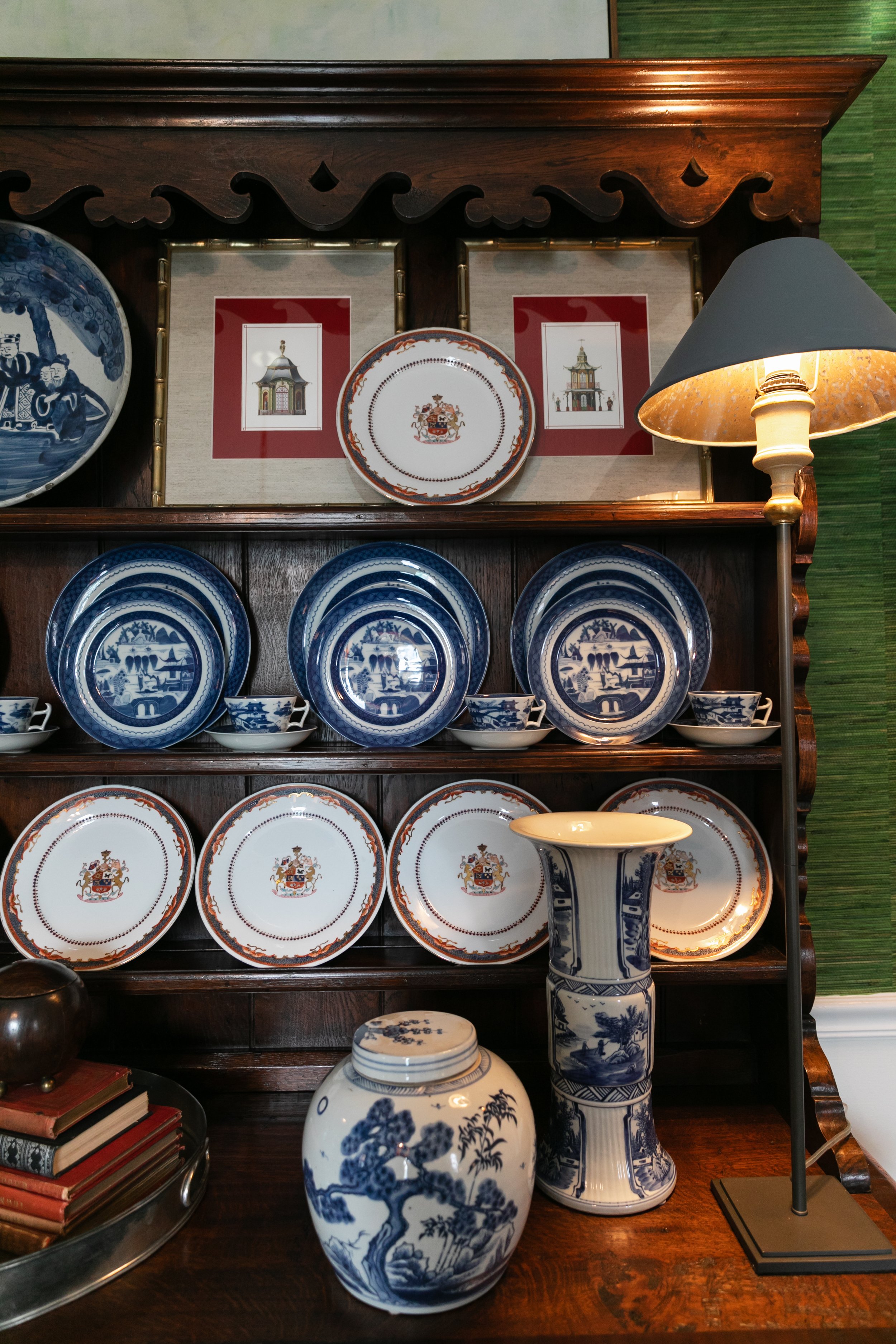
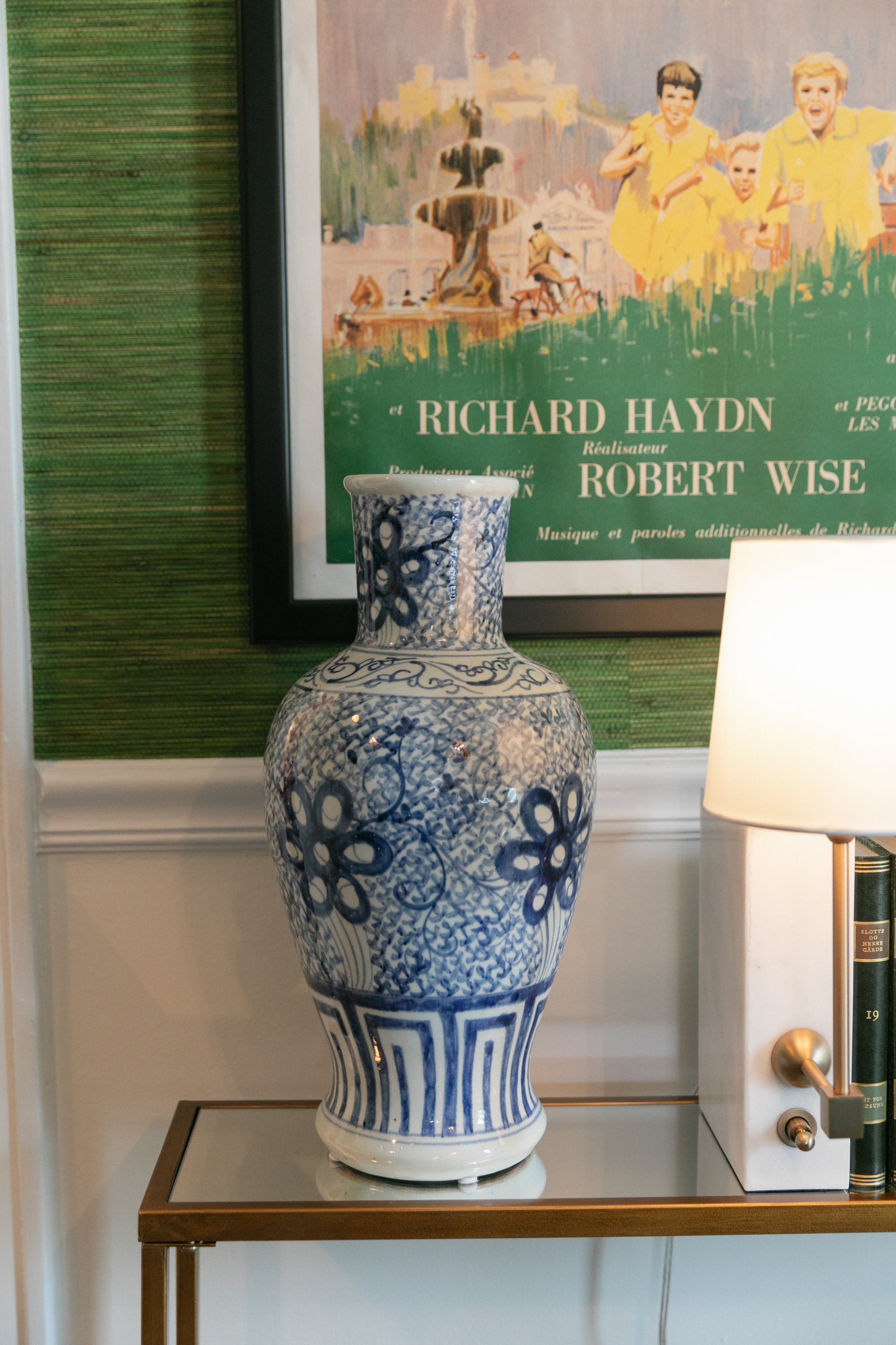
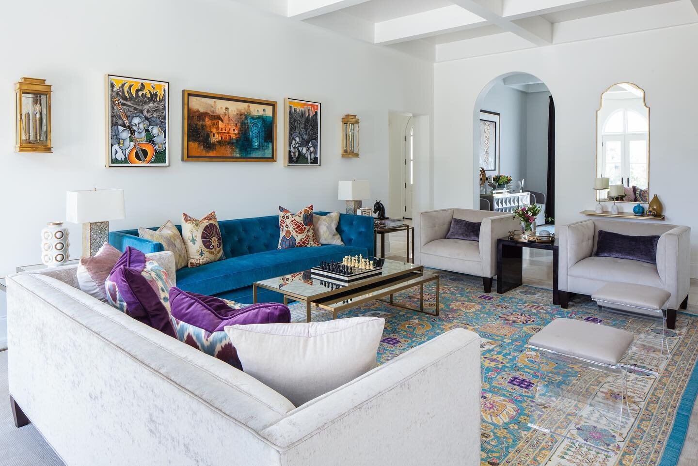
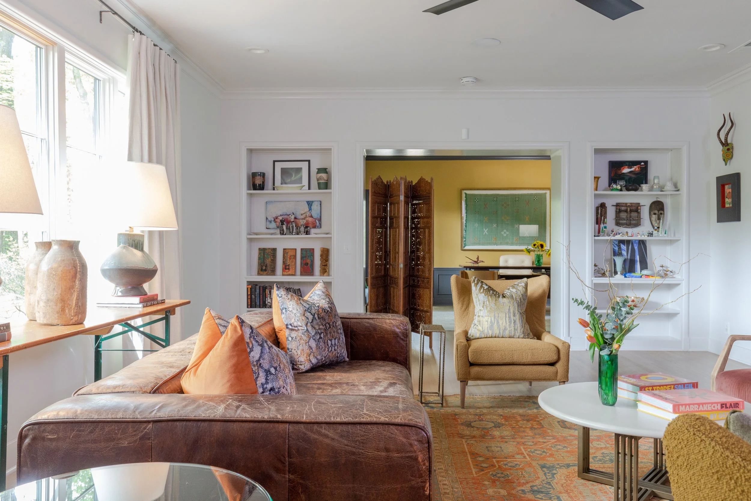
Wynn loves to travel and has amassed varied works of art from destinations around the world and close to home. McAdams incorporated his treasures into the home, and continues to place new acquisitions as his collection grows. She also worked furniture Wynn already owned into the newly renovated house. “I like to incorporate items that a client has had. Moving doesn’t mean you have to get rid of everything and start all over,” the designer says.
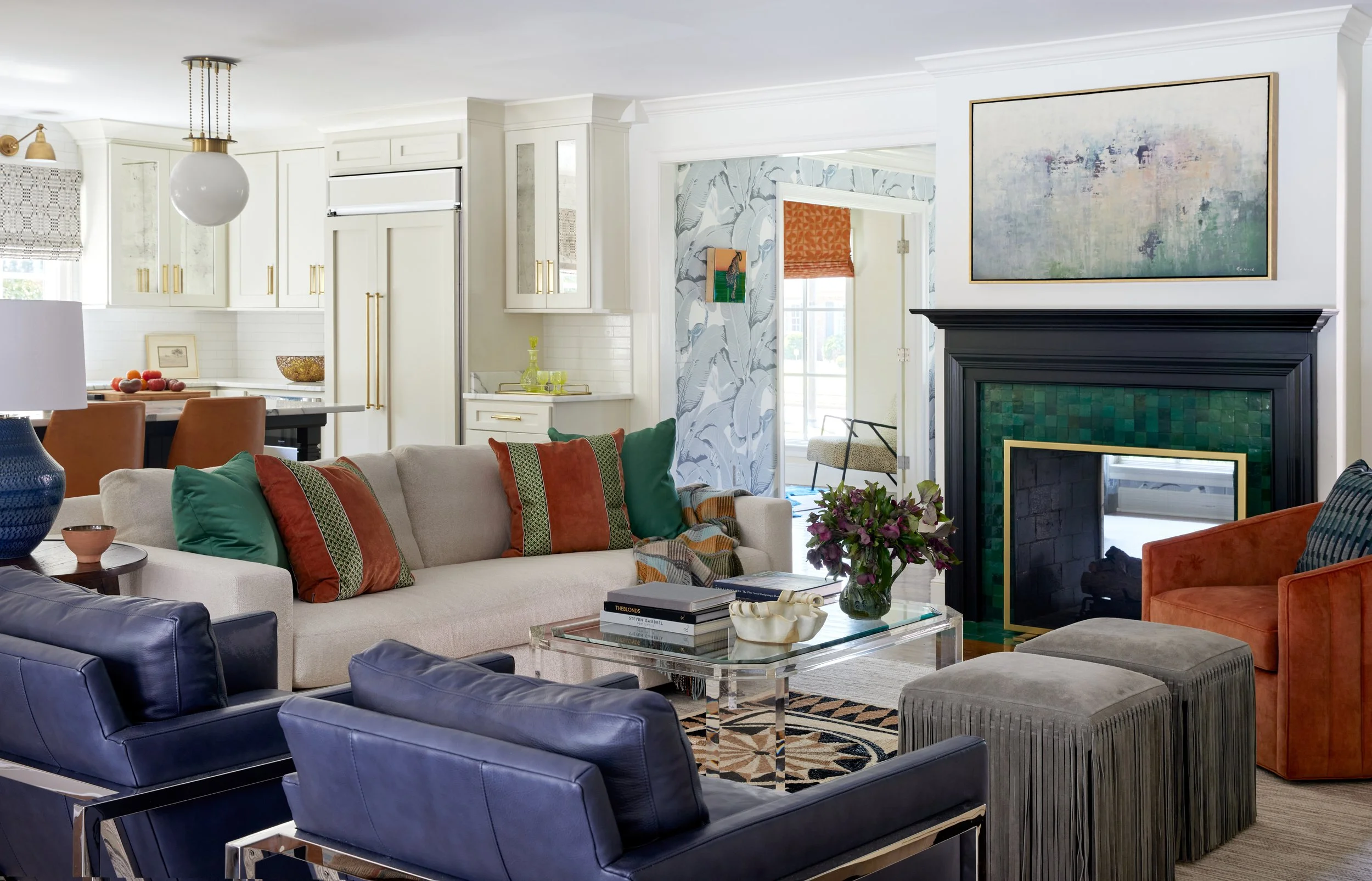
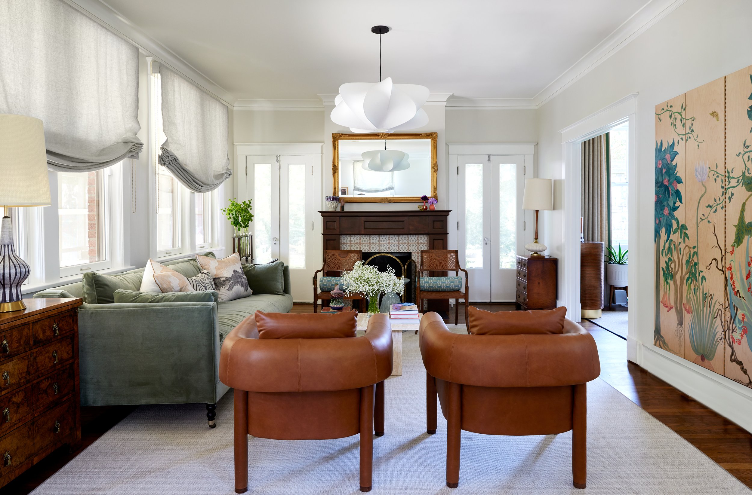
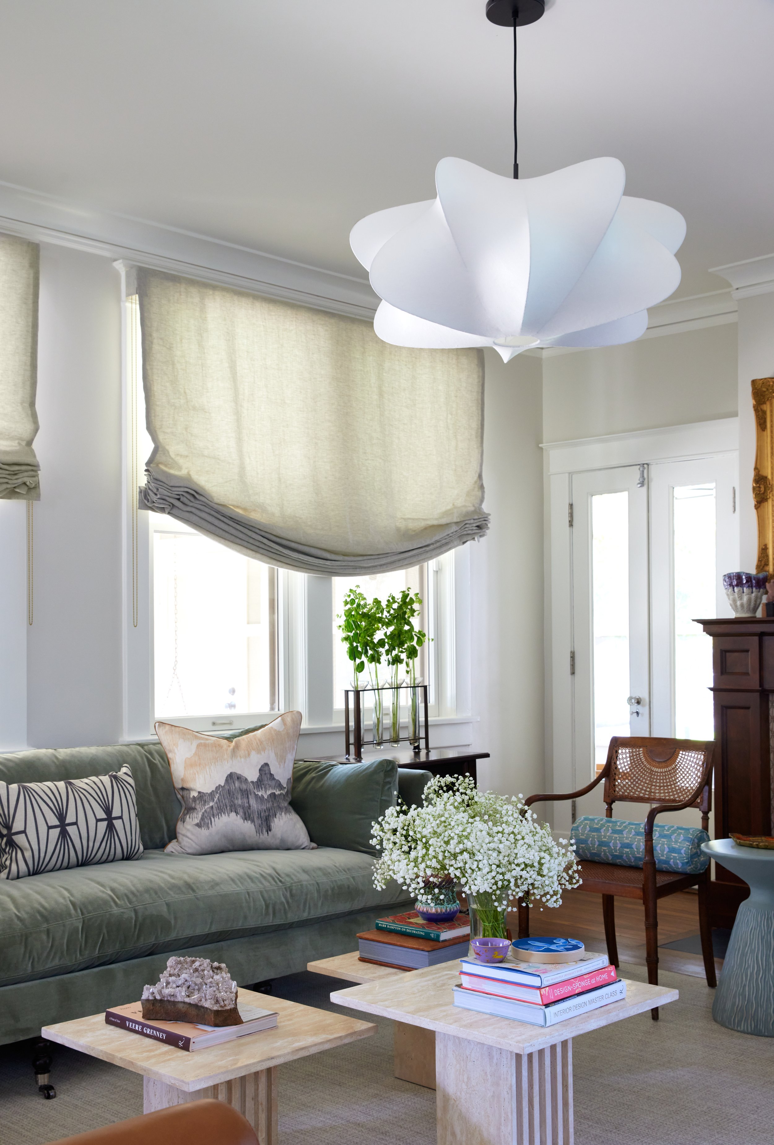
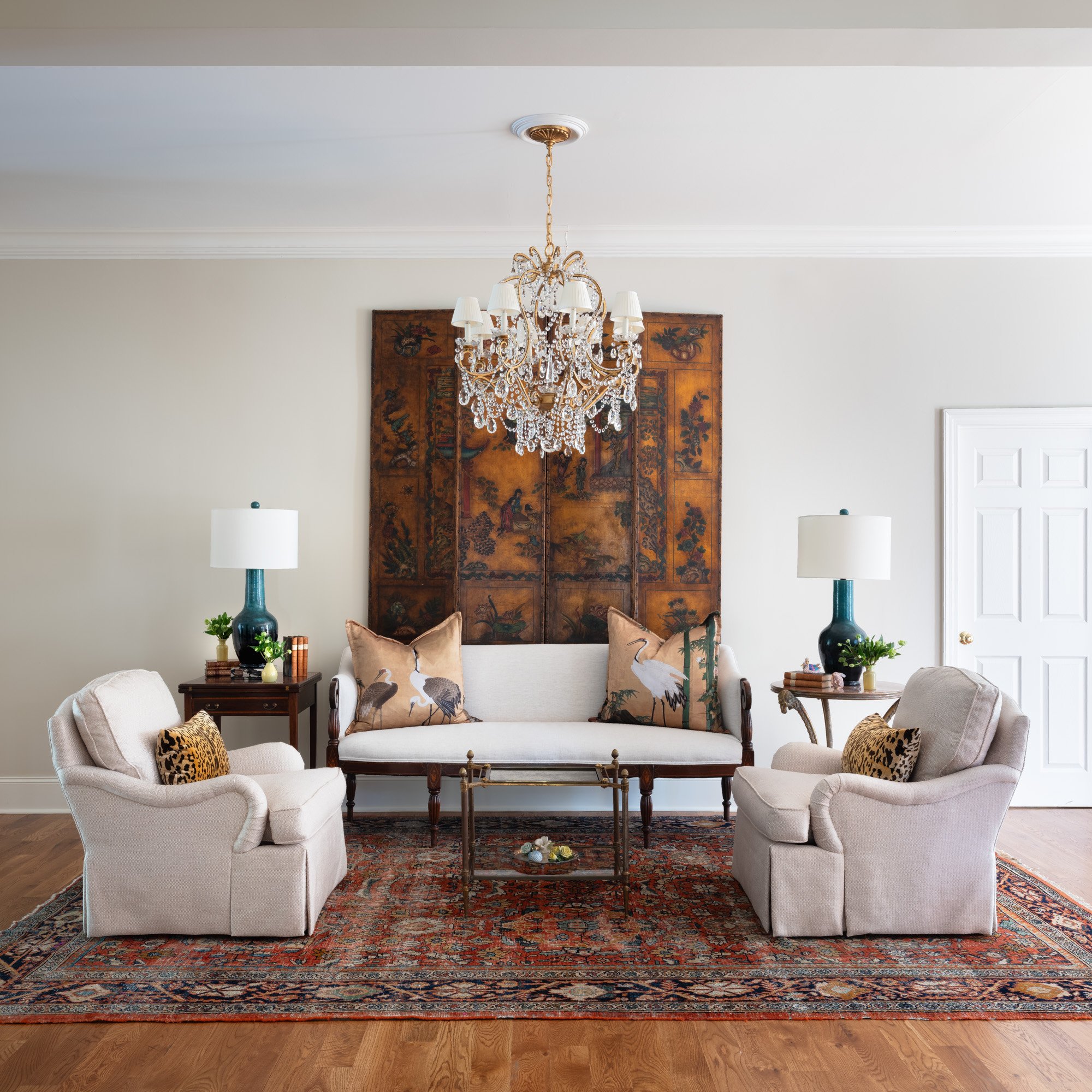
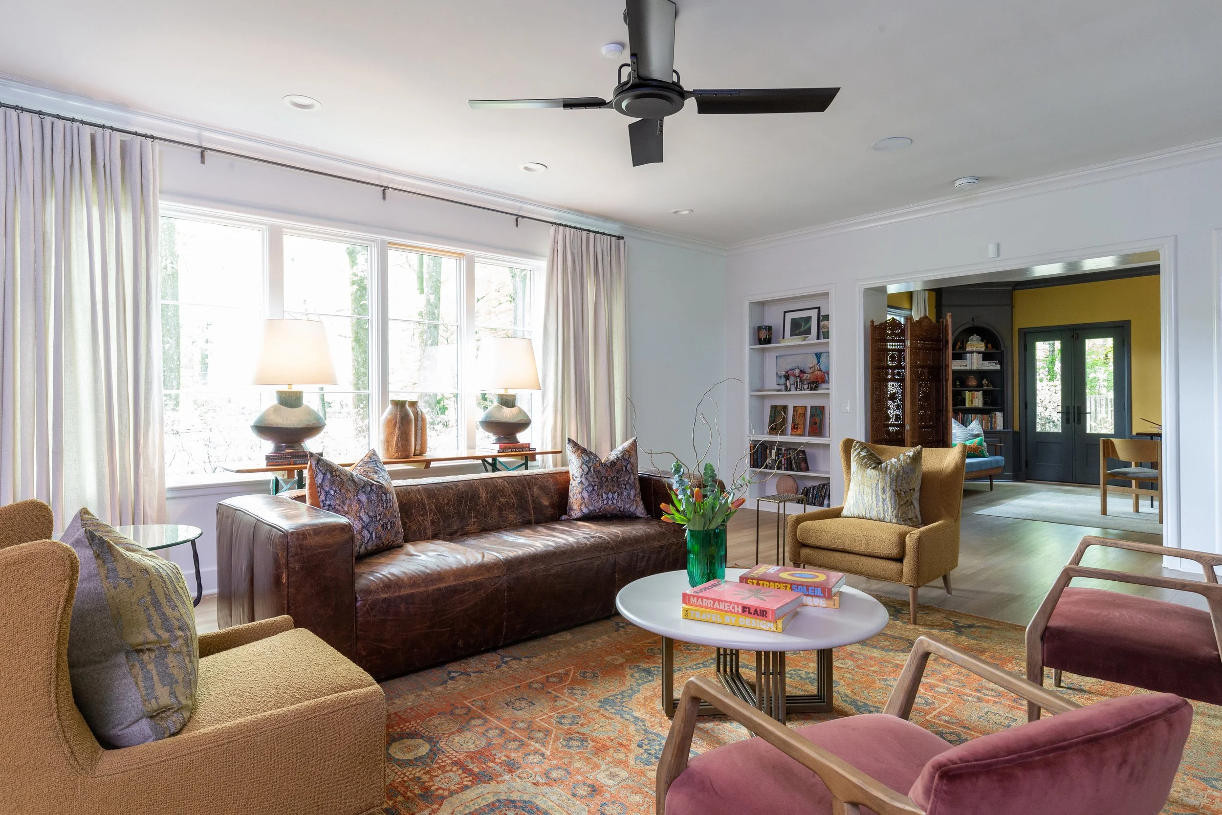
Just such a piece, a weathered brown leather sofa, anchors the home’s living room. McAdams added more seating in the generously sized space—a pair of Four Hands armchairs upholstered in soft aubergine velvet and twin stylized wingback chairs in olive boucle—along with a round marble-top coffee table.
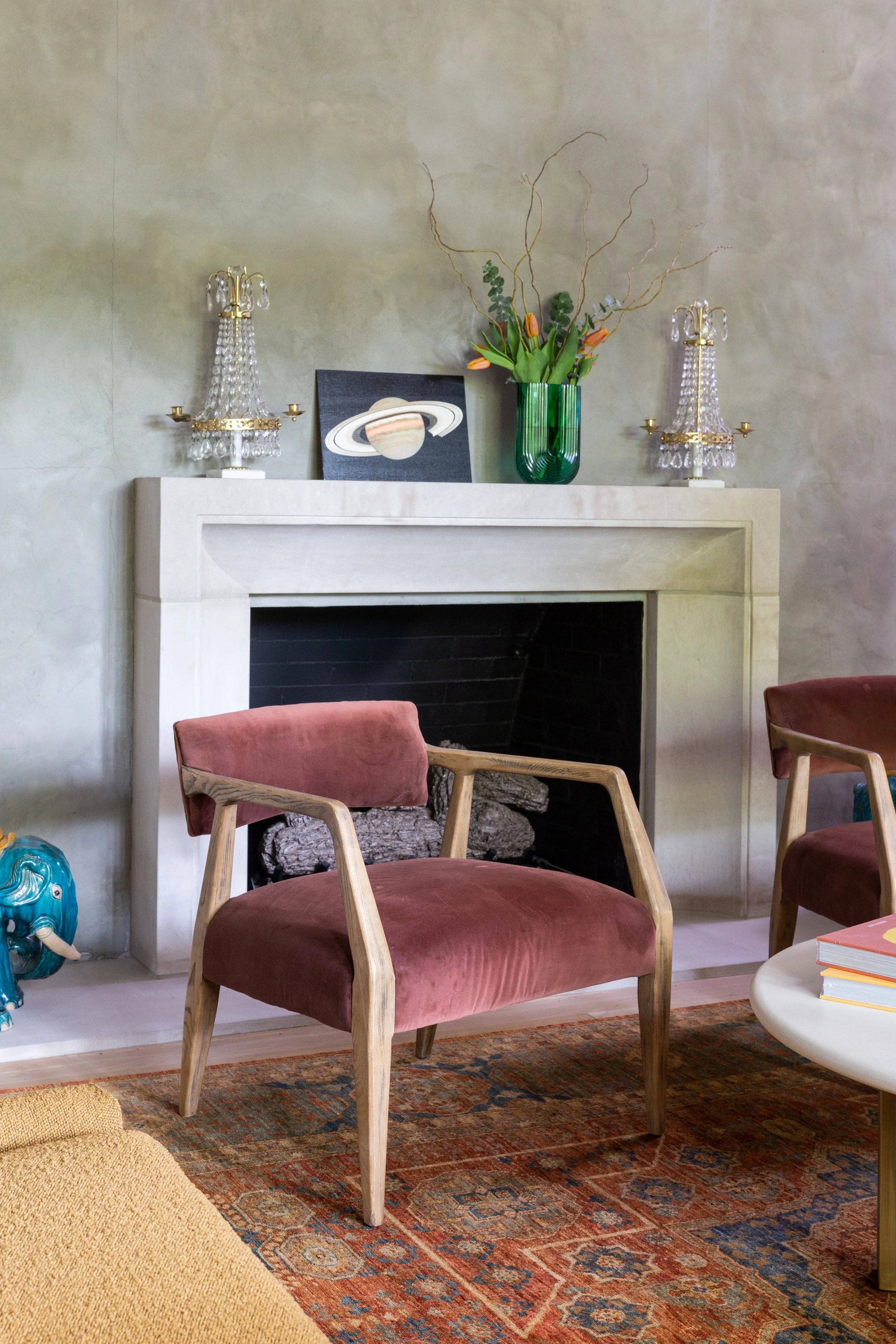
The living room’s fireplace received a total redo, replacing a stacked stone hearth and wooden mantle with a stunning plaster wall punctuated by a clean-lined limestone surround. Anderson’s plans included new cased openings flanking the fireplace to create better flow from the front rooms to the back of the house..
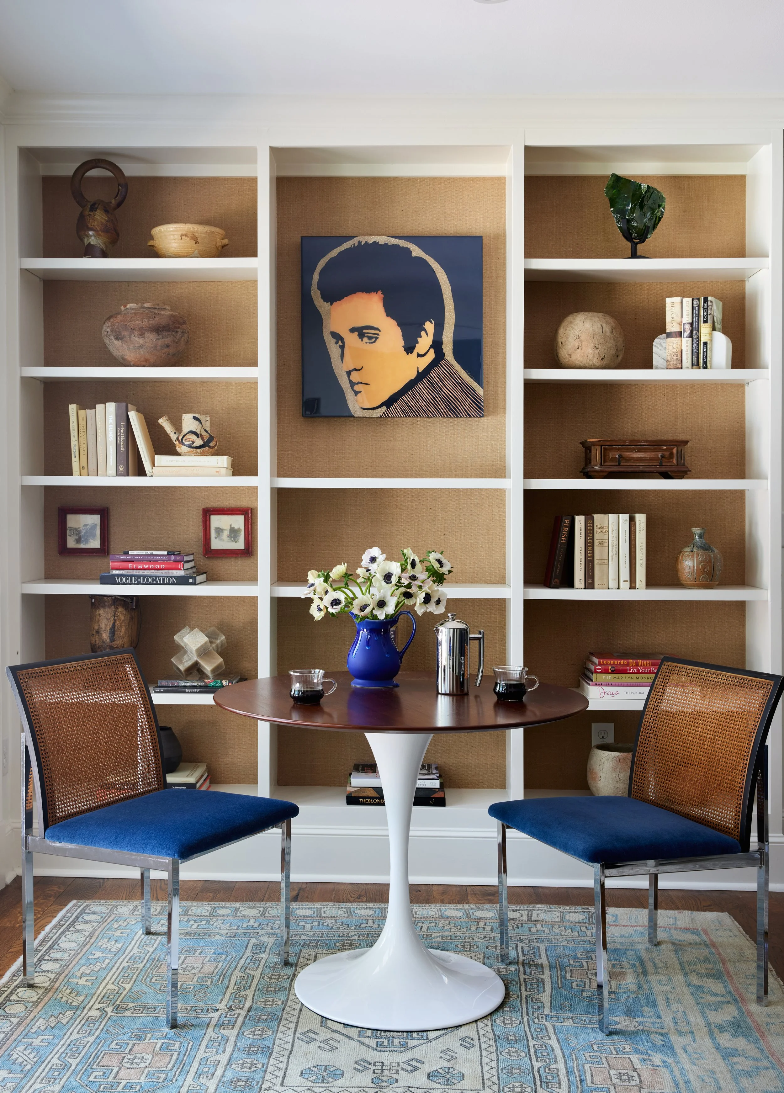
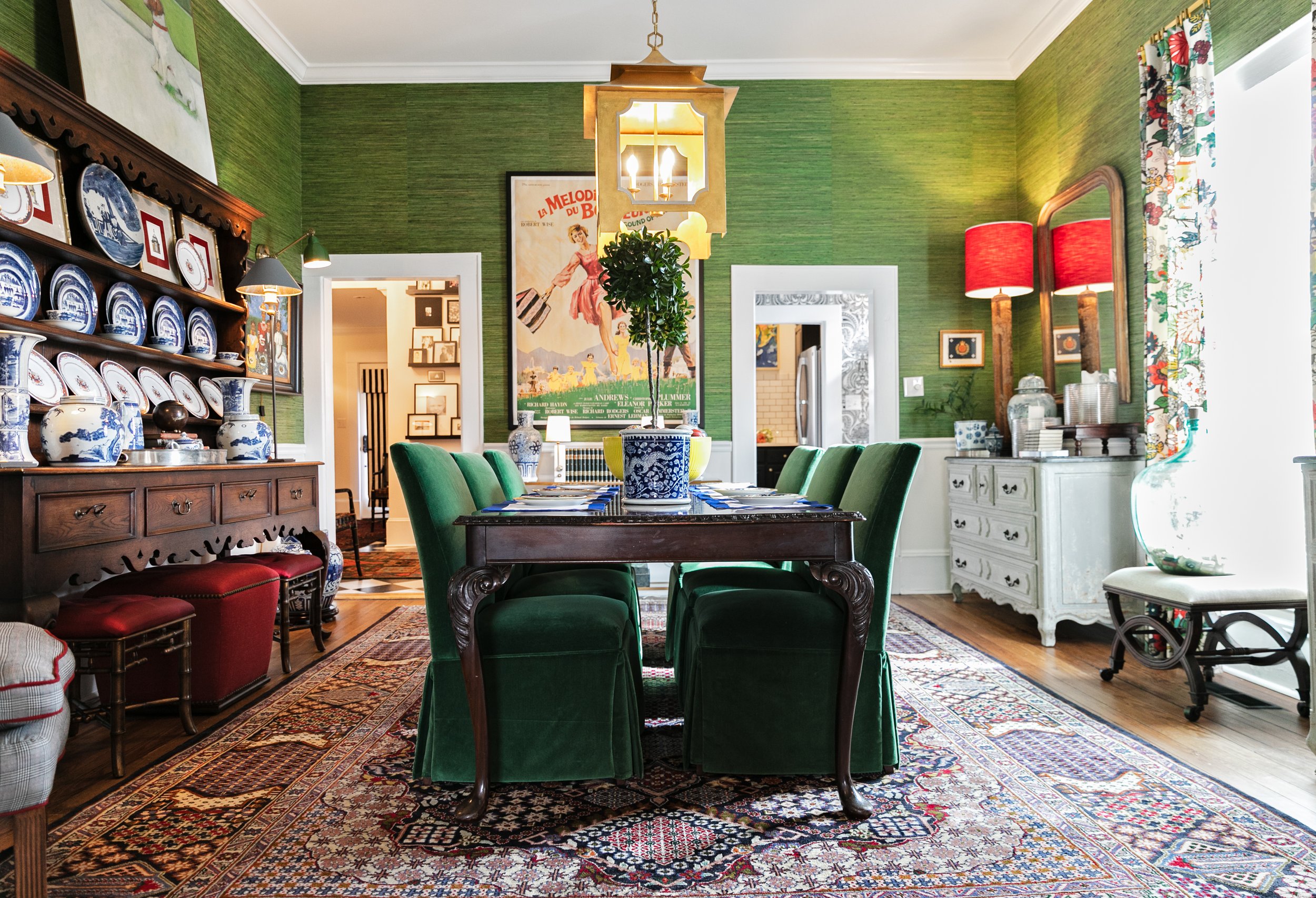
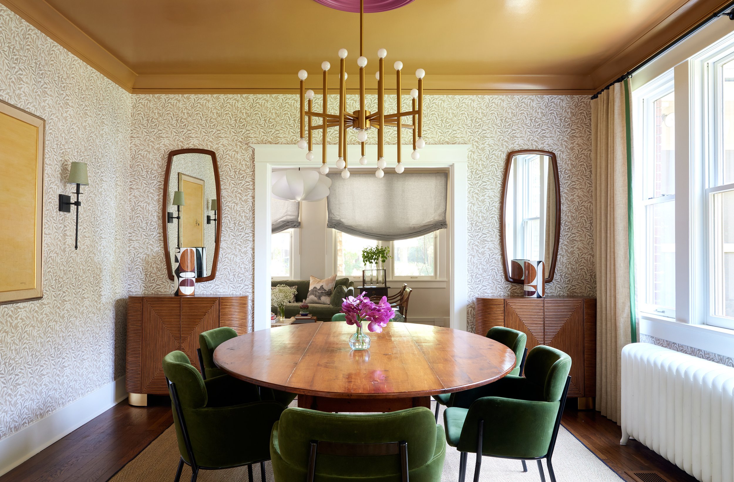
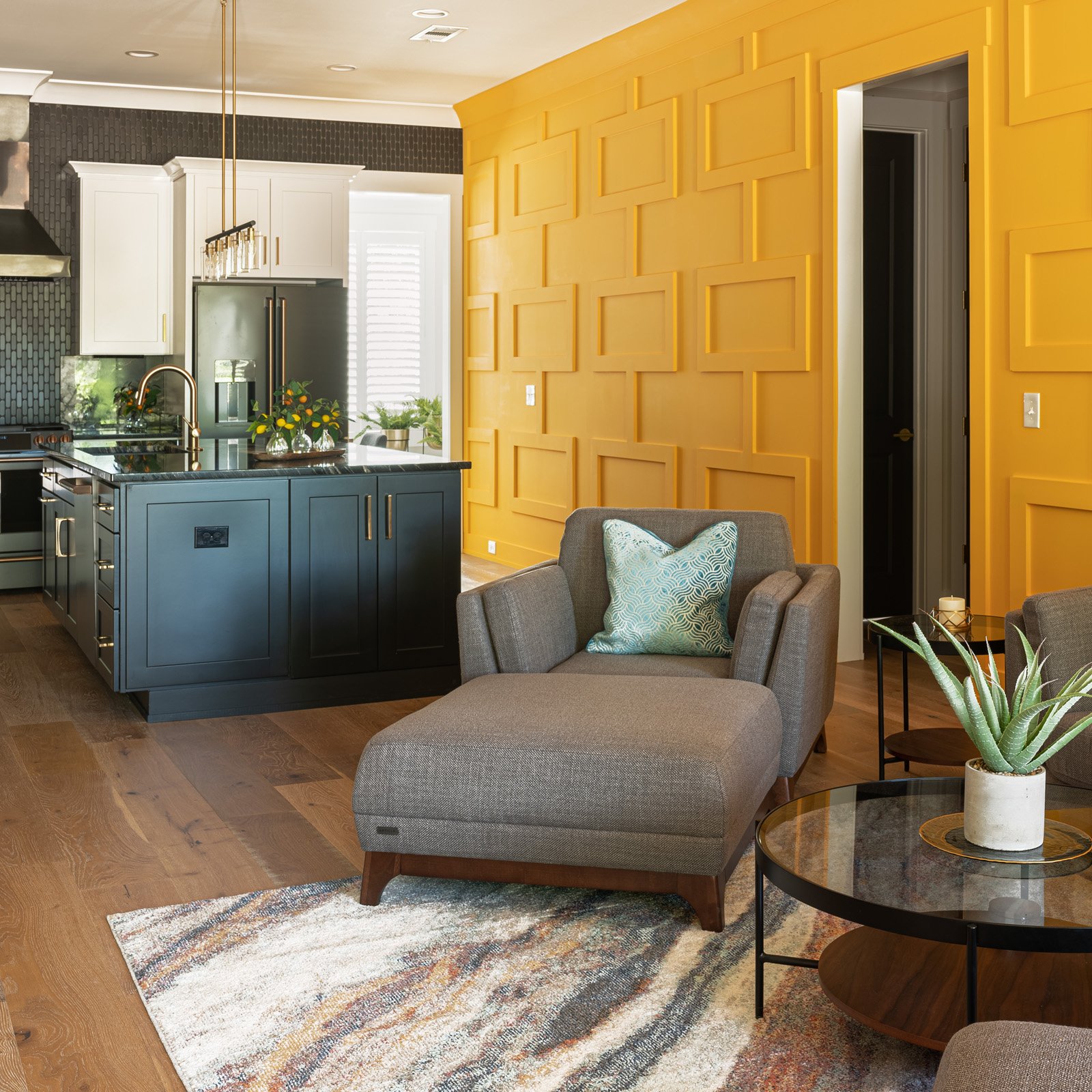
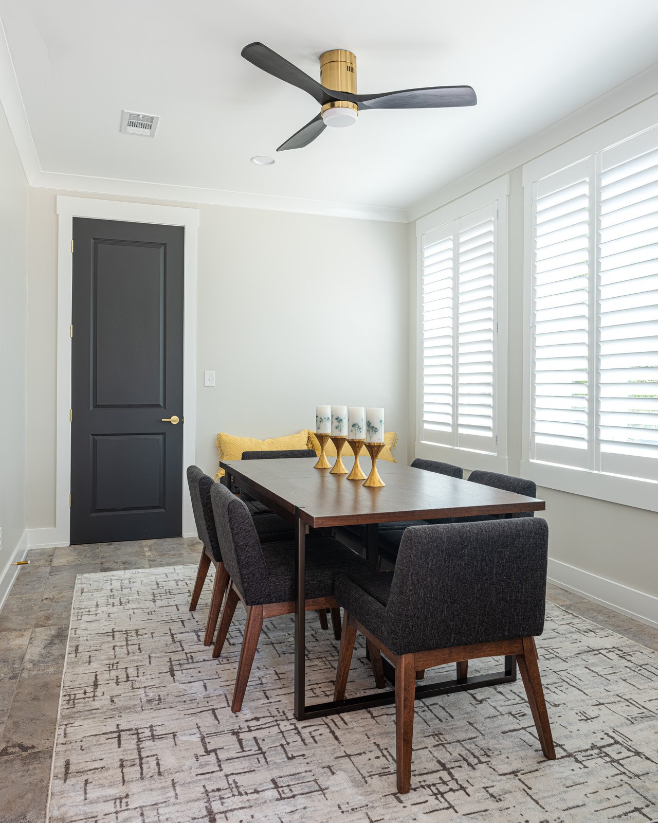
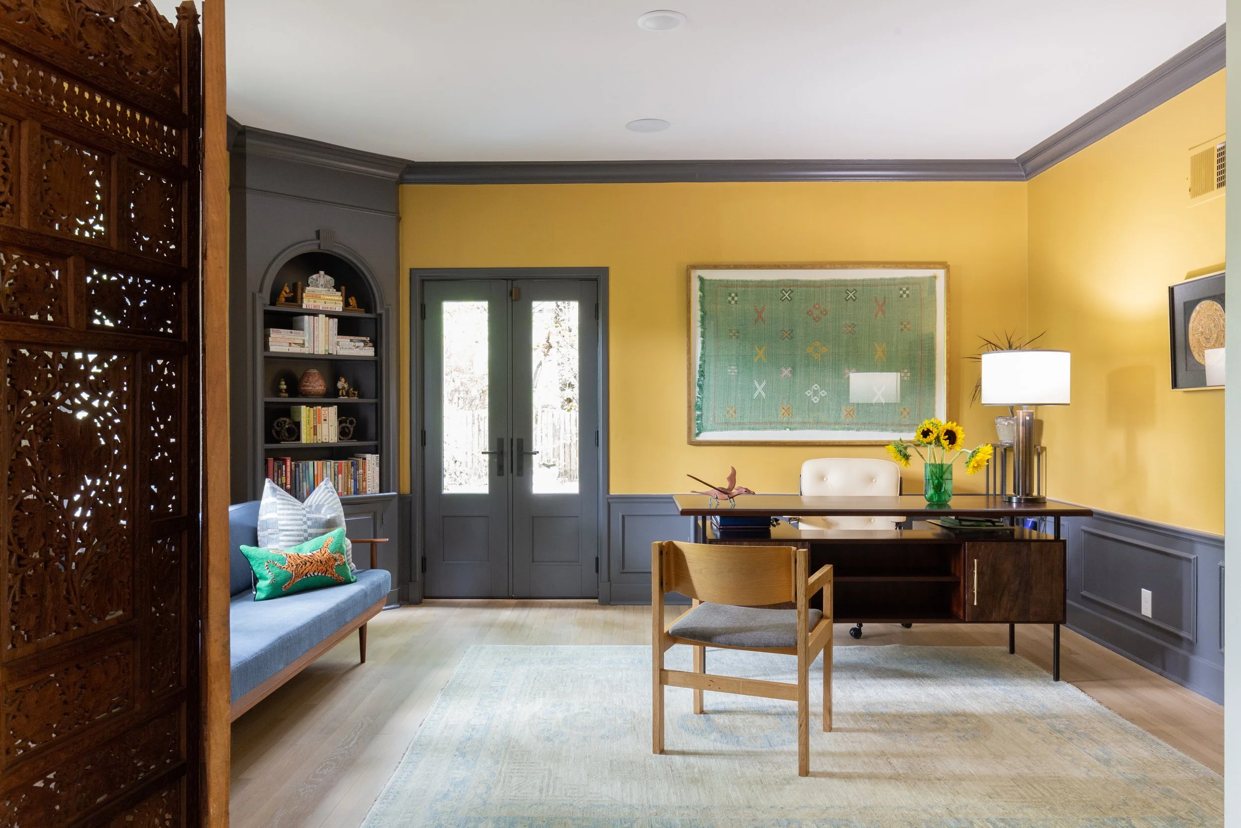
Just off the living room, the home’s original dining room has been repurposed into Wynn’s home office. The homeowner requested color in the space, and McAdams delivered, choosing a warm golden yellow for the walls, accented by a saturated charcoal hue on the wainscoting, mouldings and two built-in corner cabinets, features of the home’s original architecture. A low-backed mid-century Danish sofa with exposed wood frame and legs, and a vintage desk look right at home alongside Wynn’s many books and eclectic art.
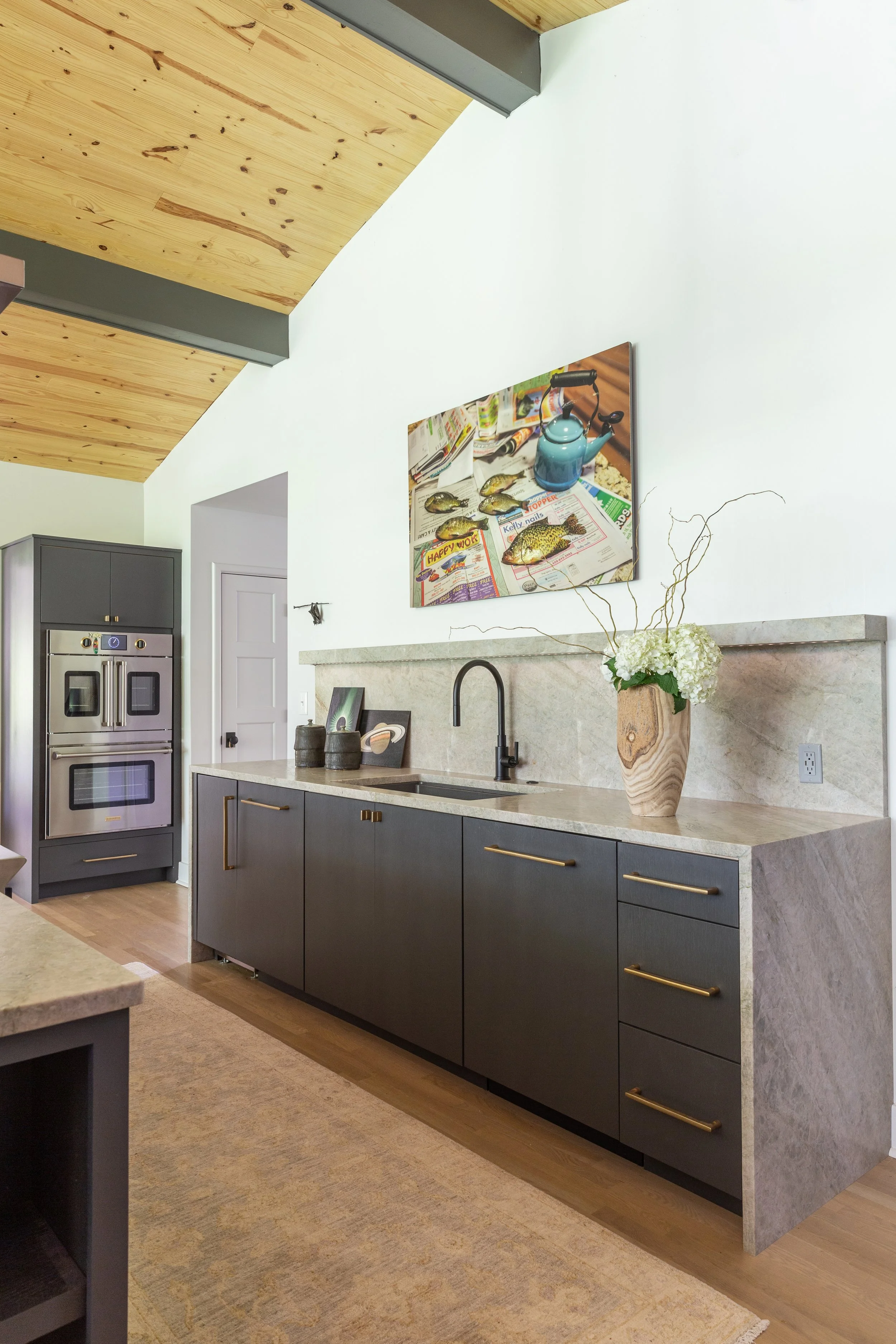
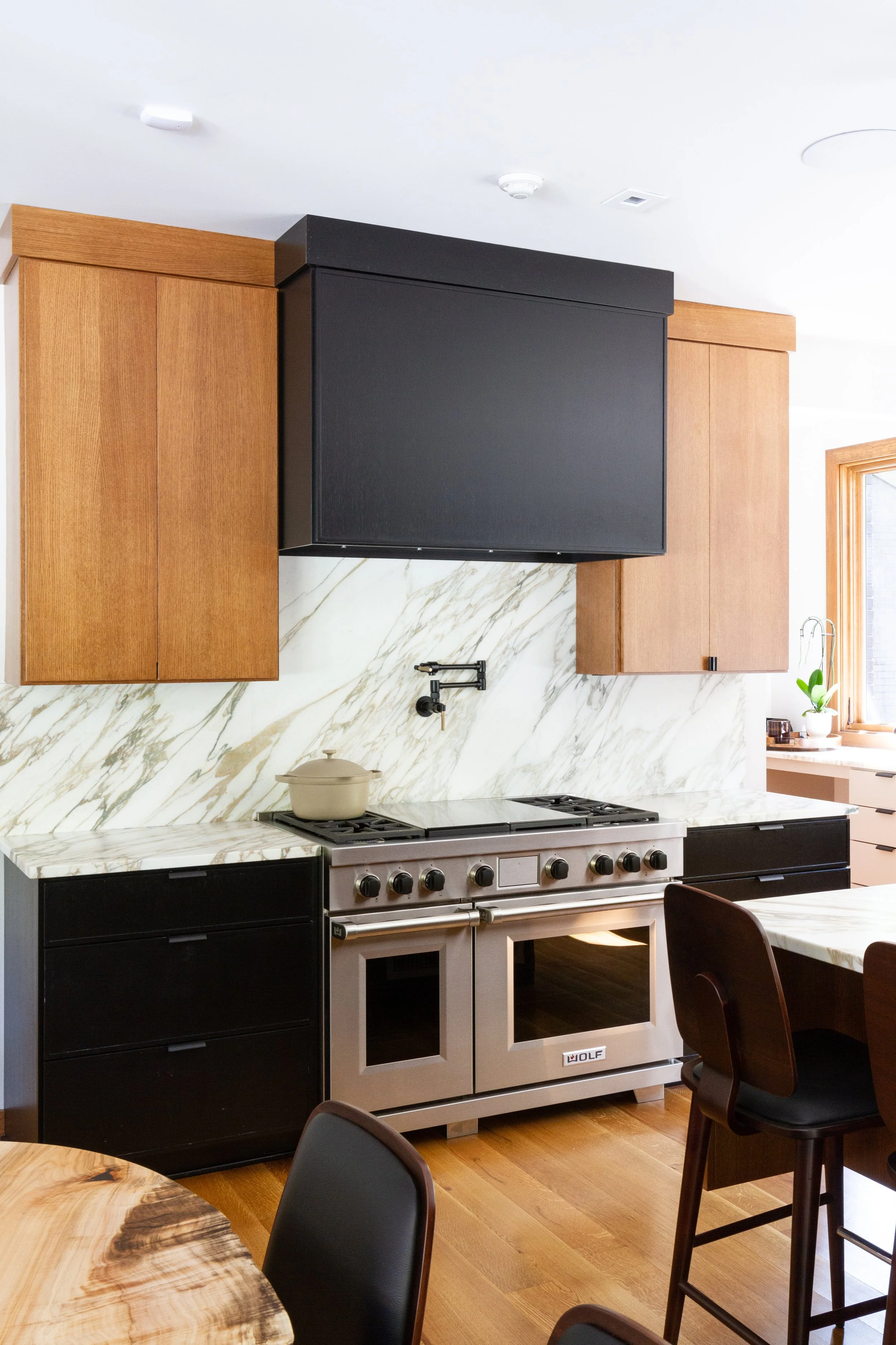
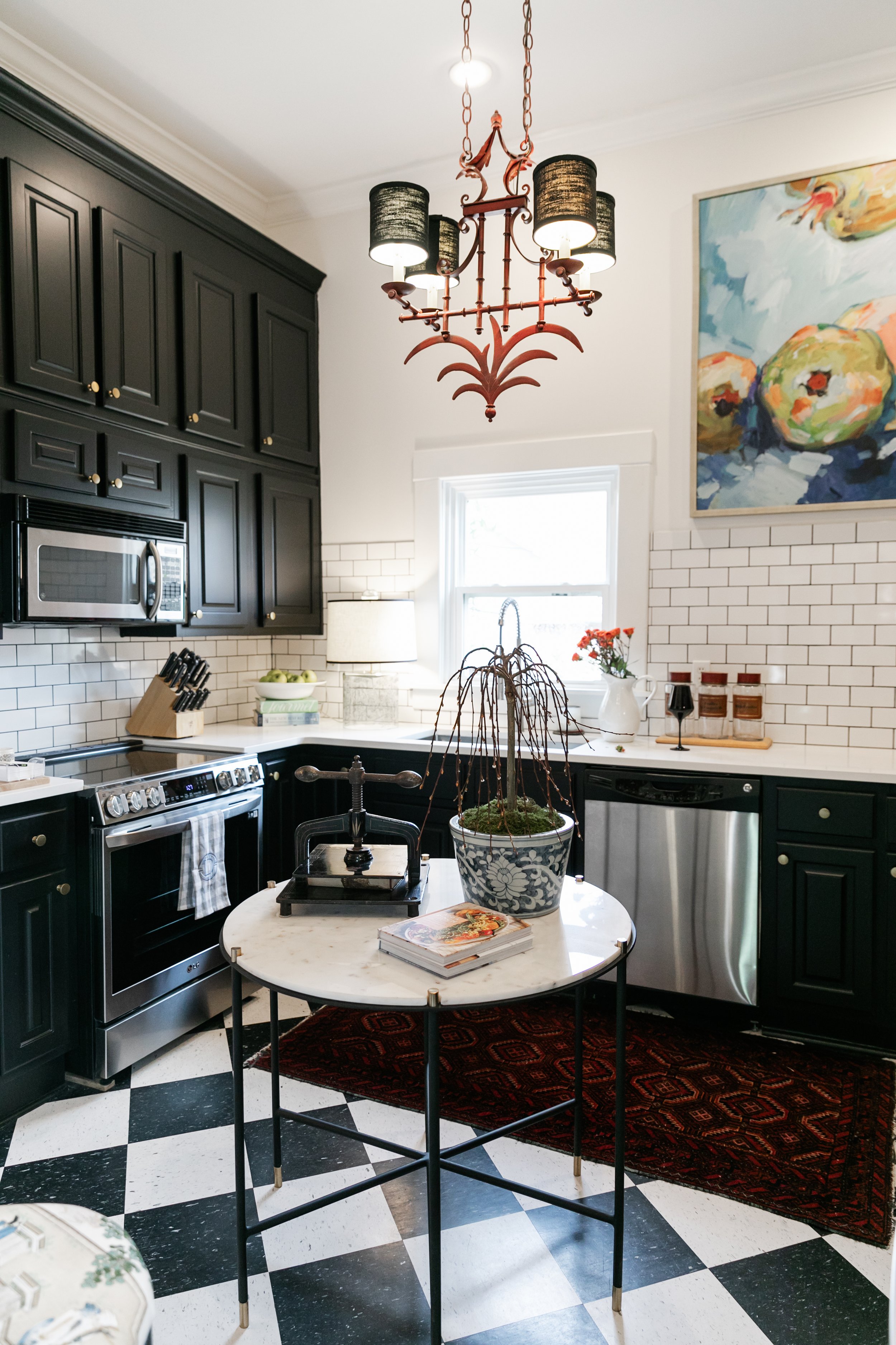
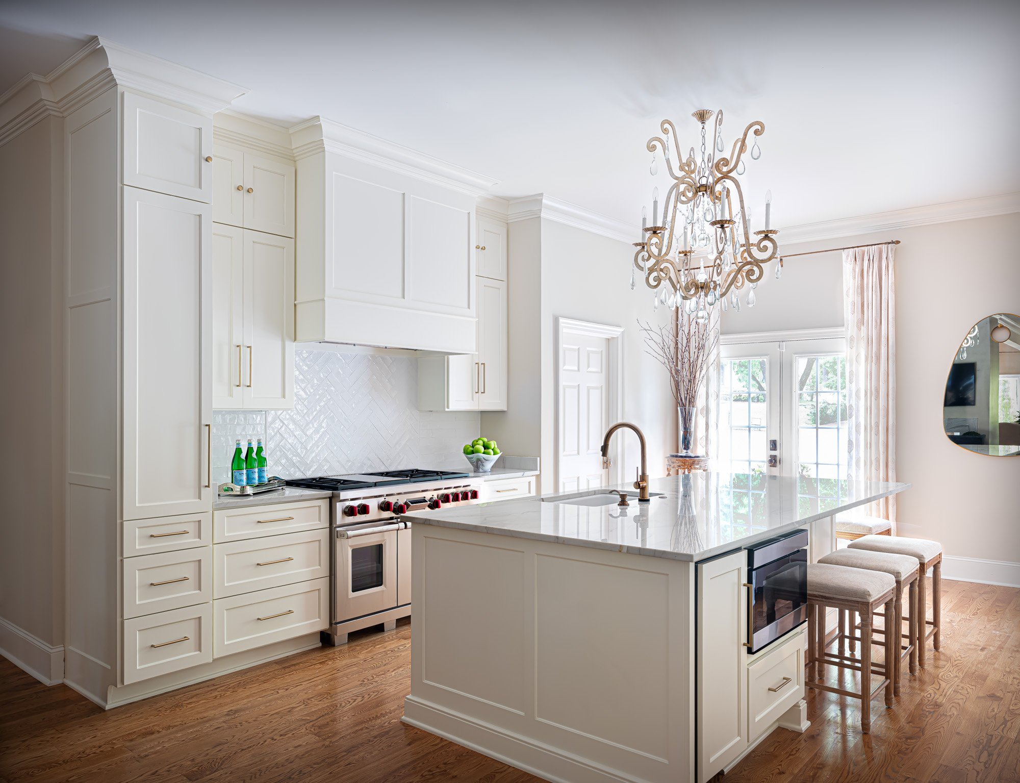
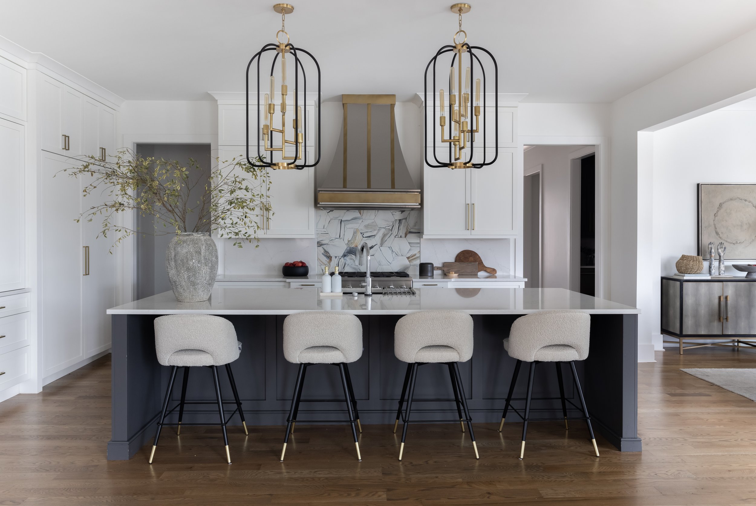
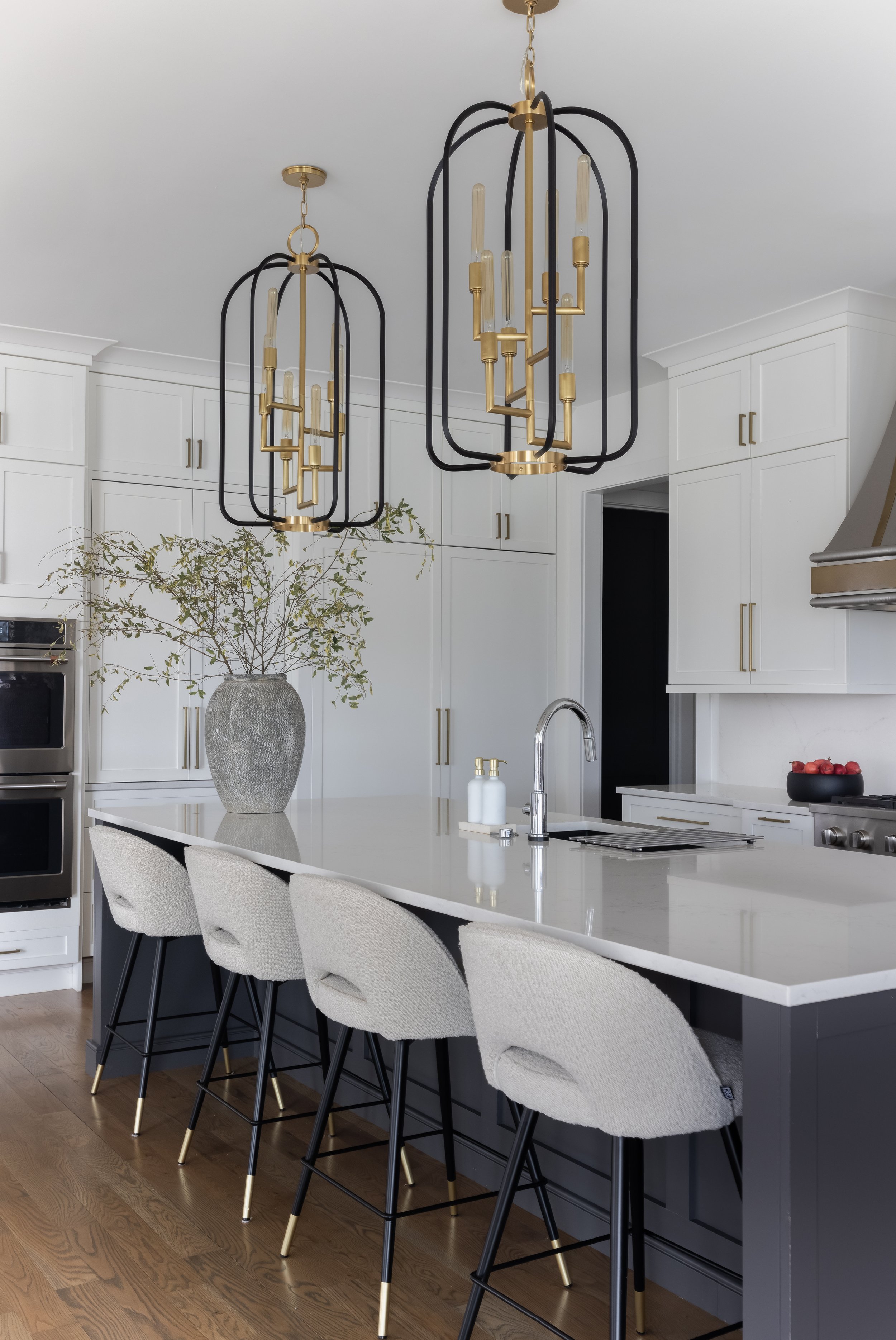
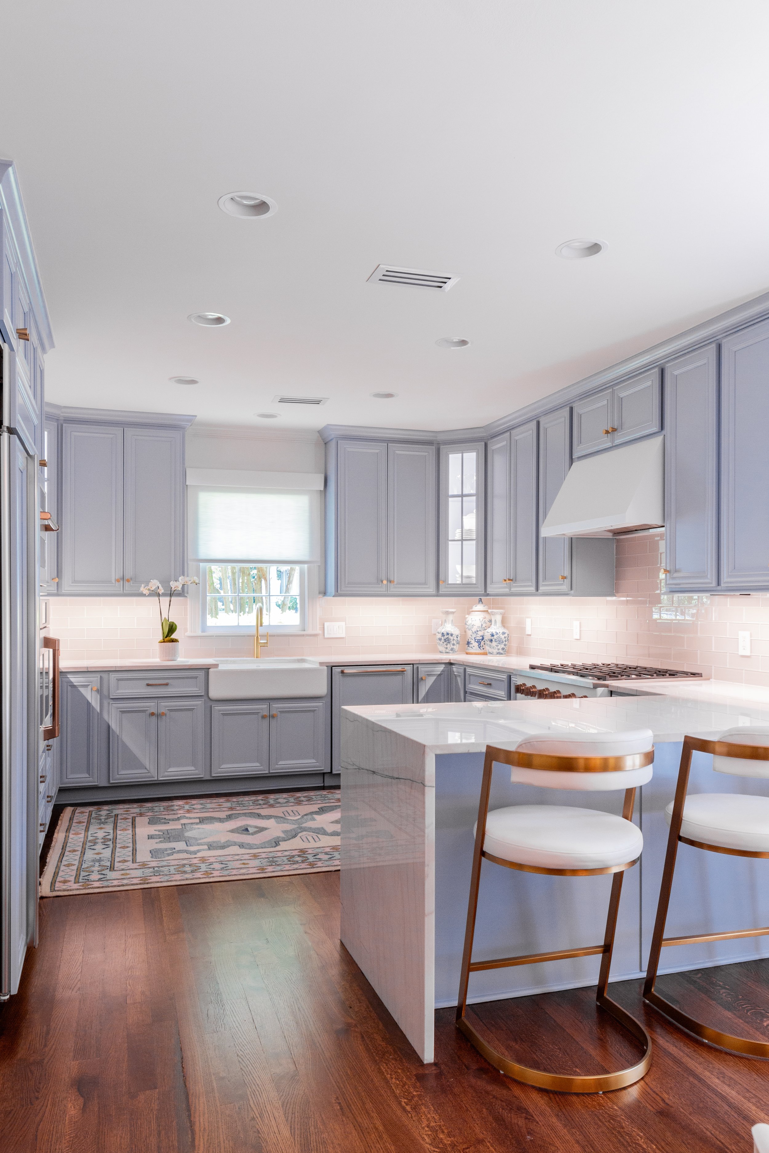
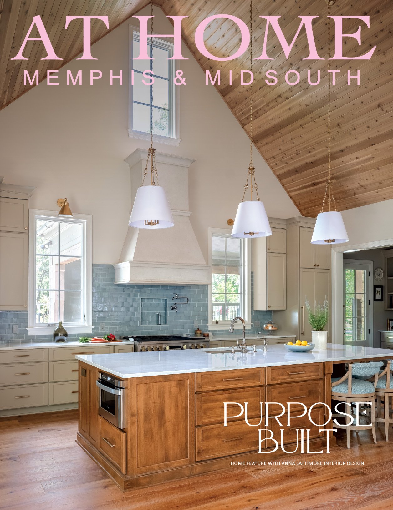
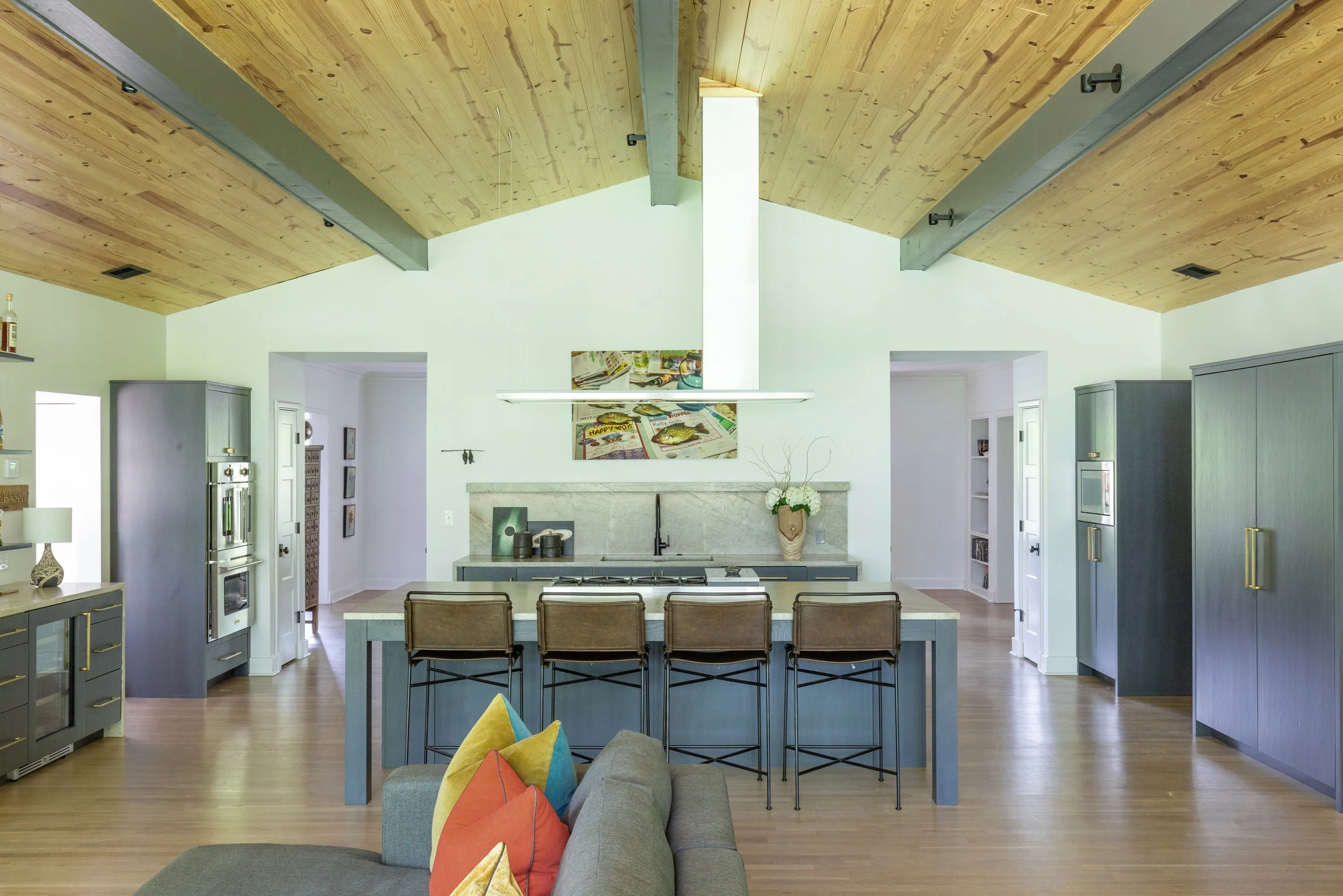
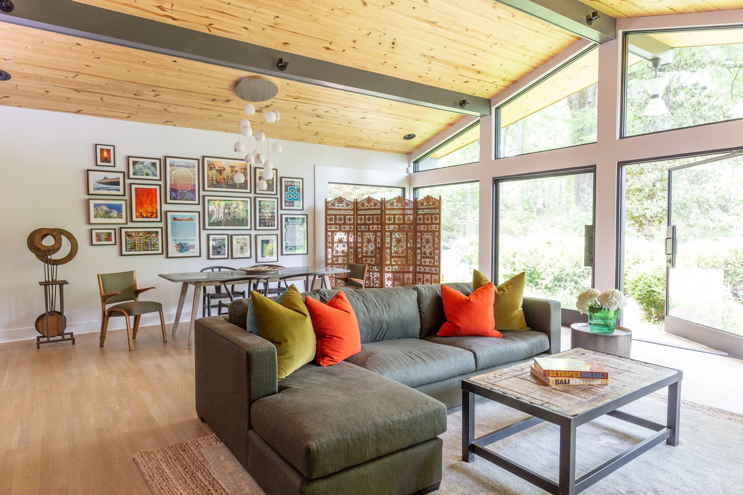
Wynn was adamant about replacing the home’s tiny, galley-style kitchen with one that better suited his lifestyle. All of his children and grandchildren live locally and his place is frequently full of family members. The new addition is the hub of the home, kitchen/dining area/casual living space all in one, with plenty of room for all the relatives. A vaulted ceiling in stained tongue-and-groove wood with exposed beams ties the large area together.
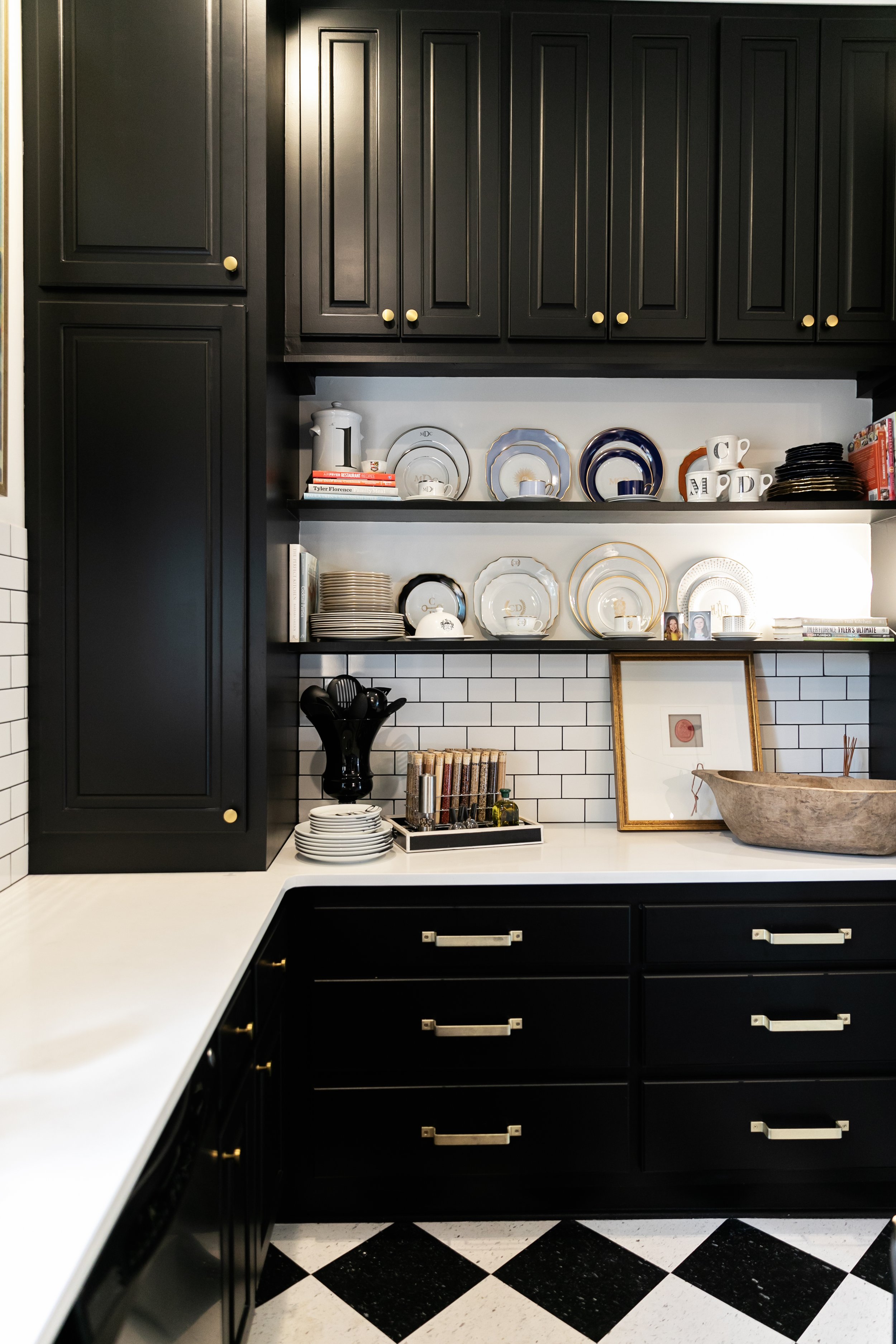
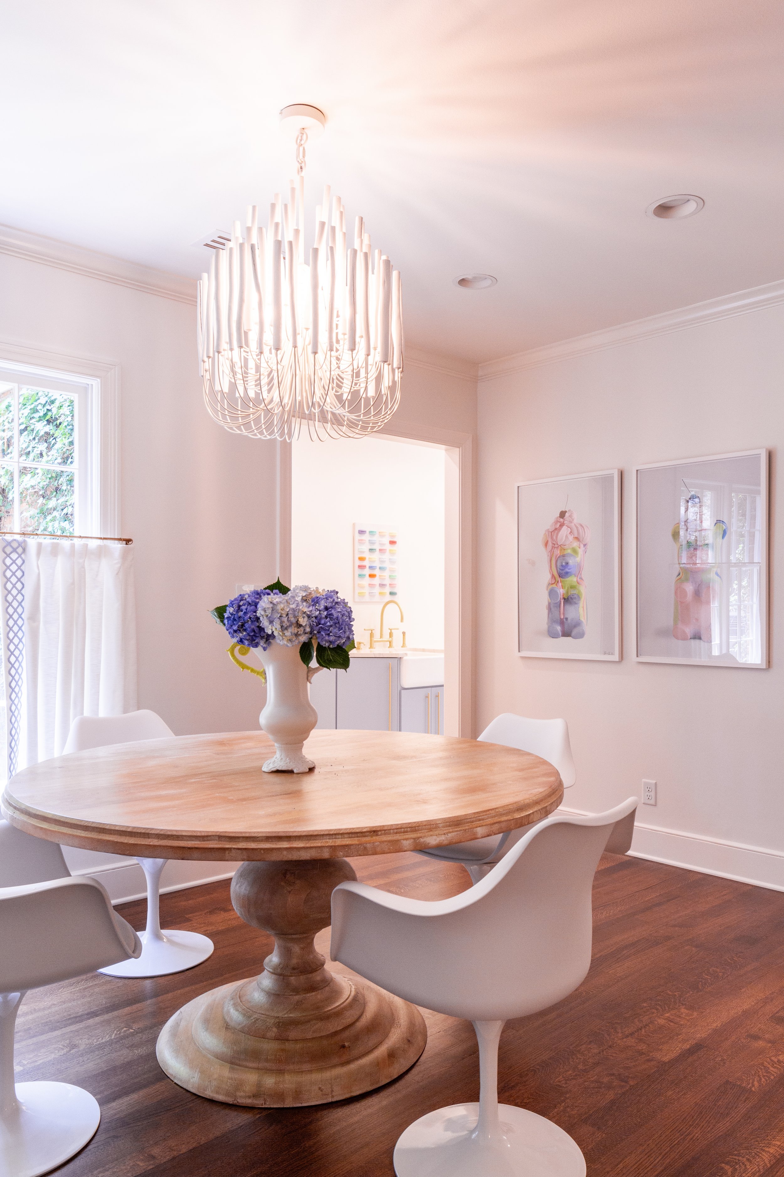
The open kitchen has an elegant yet masculine feel: dark cabinetry with waterfall-style leathered mother of pearl quartzite countertops, counter seating on metal and leather barstools, and a swanky bar area. A colorful photo by Wynn’s son, a hobby photographer, hangs over the kitchen sink as a funky focal point. Above the island cooktop, a minimalist floating vent hood allows sightlines to remain unimpeded. It does double duty, also adding asymmetrical flair, as does the light fixture over the dining table. “Because it’s the only light fixture in this room, I wanted it to have extra impact. This one has organic movement, not static like a typical chandelier,” McAdams says of the freeform piece. When lit, its alabaster pendants create a warm glow.
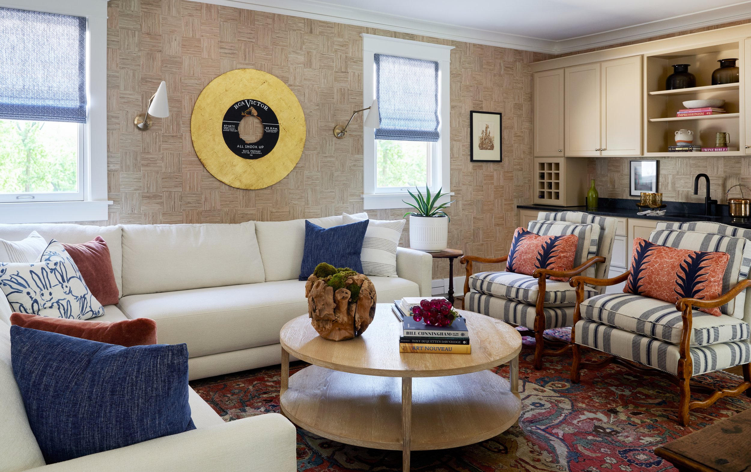
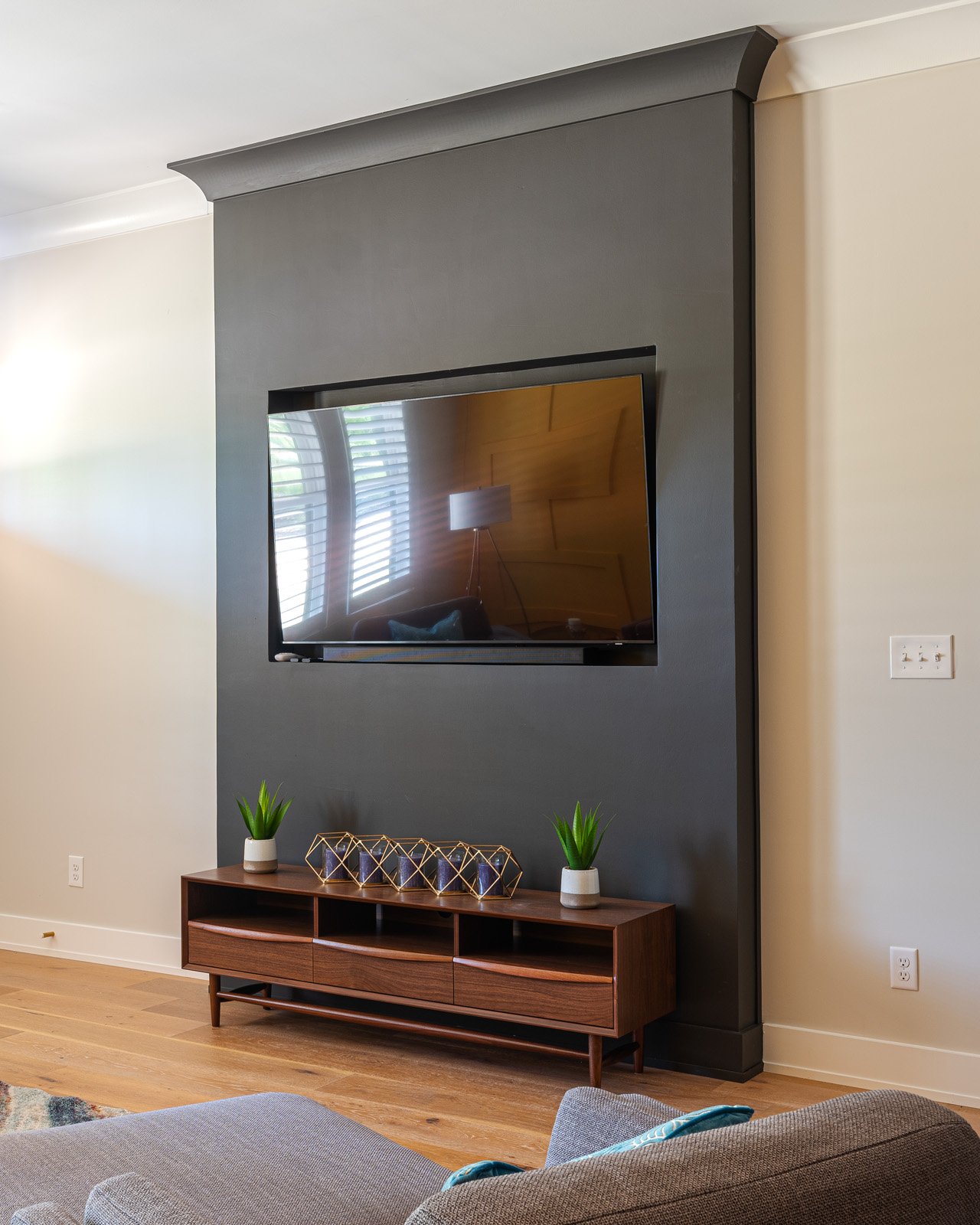
The designer chose a handsome custom olive green and orange pinstripe for the casual living area’s combination sofa/chaise sectional and punched up the look with colorful pillows. A local metalworker custom fabricated the fireplace front, giving the room a substantial centerpiece with modern interest.


Through a pair of oversized glass doors that pivot to open completely, the space connects to the large backyard. Complete with the pool Wynn’s family requested (the same one he remembers swimming in as a kid), the lot stretches back seemingly forever. An original poolhouse also received a major facelift during the renovation, with new floors, a new fireplace and a vaulted ceiling to mirror the architecture of the main structure. The existing kitchen was replaced by a smaller yet efficient version in order to make room for an area to store Wynn’s scuba equipment. Although McAdams admits she’d never before designed a space customized especially for air tanks and wet suits, she delivered beautifully, even adding an oversized double shower perfect for cleaning gear after a diving trip.
From front door to backyard, this project was about so much more than a home renovation or a new place for Wynn to live. It was both a labor of love for his children and extended family and a tribute to his grandparents. McAdams says its success is due in part to her longstanding relationship with the Wynns. “We gel so well together. There’s major trust, and it’s great.” The homeowner agrees, “It was an ugly old ranch house, let’s be honest. And I think we made it beautiful. I've not found anything after the fact that I’d change.”