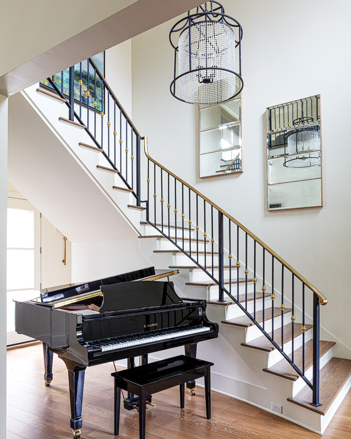
Old House, New Life

Remodeling by RKA Construction | Story by Terri Glazer | Photos by Stefanie Rawlinson

Memphis artist Hank Gray and his wife breathe new life into a neglected mid-century modern.

The distinctive modern-style house sat uninhabited on a quiet East Memphis cove for years. Someone had purchased the property, had even had renovation plans drawn, but never did the work and never lived in the home.

The future didn’t seem bright for the Bauhaus-inspired structure, designed in the early 1970s by Bill Nixon, now partner emeritus at ANF Architects. That is, until the right buyers came along. Artist Hank Gray, his wife Katherine and their two young daughters had just moved home to Memphis after a stint in Dallas, and were on the search for their next home. 

Sweetbriar-RKA-StefanieRawlinsonPhoto-27.jpg


“We've always been drawn to mid-century modern architecture,” says Katherine, “but this renovation was going to be a huge project.” The fact that the original architect, Nixon, is a friend of the family tipped the scales in the house’s favor, though. “It made us feel like it was meant to be,” says Hank.

The Grays received the previous owners’ renovation drawings as part of the house purchase, but soon decided to move the renovation in a different direction in the interest of preserving as much of Nixon’s minimalist creation as possible. “They were really going to modernize it, kind of, to the point where it just didn't feel like the same house. They were going to raise the roof, but it just wasn't going to be feasible. This is how the home was built,” Katherine explains.

Once the Grays decided to create their own version of the remodel plan, they brought RKA Construction on board to make it a reality. RKA project manager Hunter Cooper oversaw the work. Demolition started in August 2018 and the family moved in about 10 months later.

Nestled into a hillside, the house sits back from the street. Nixon’s original drawings called for a bridge over a low-lying section of the front yard leading to the front door. Although the bridge has yet to be built in the home’s half-century history, the Grays love the idea and hope to find a way to work it into the landscape eventually.

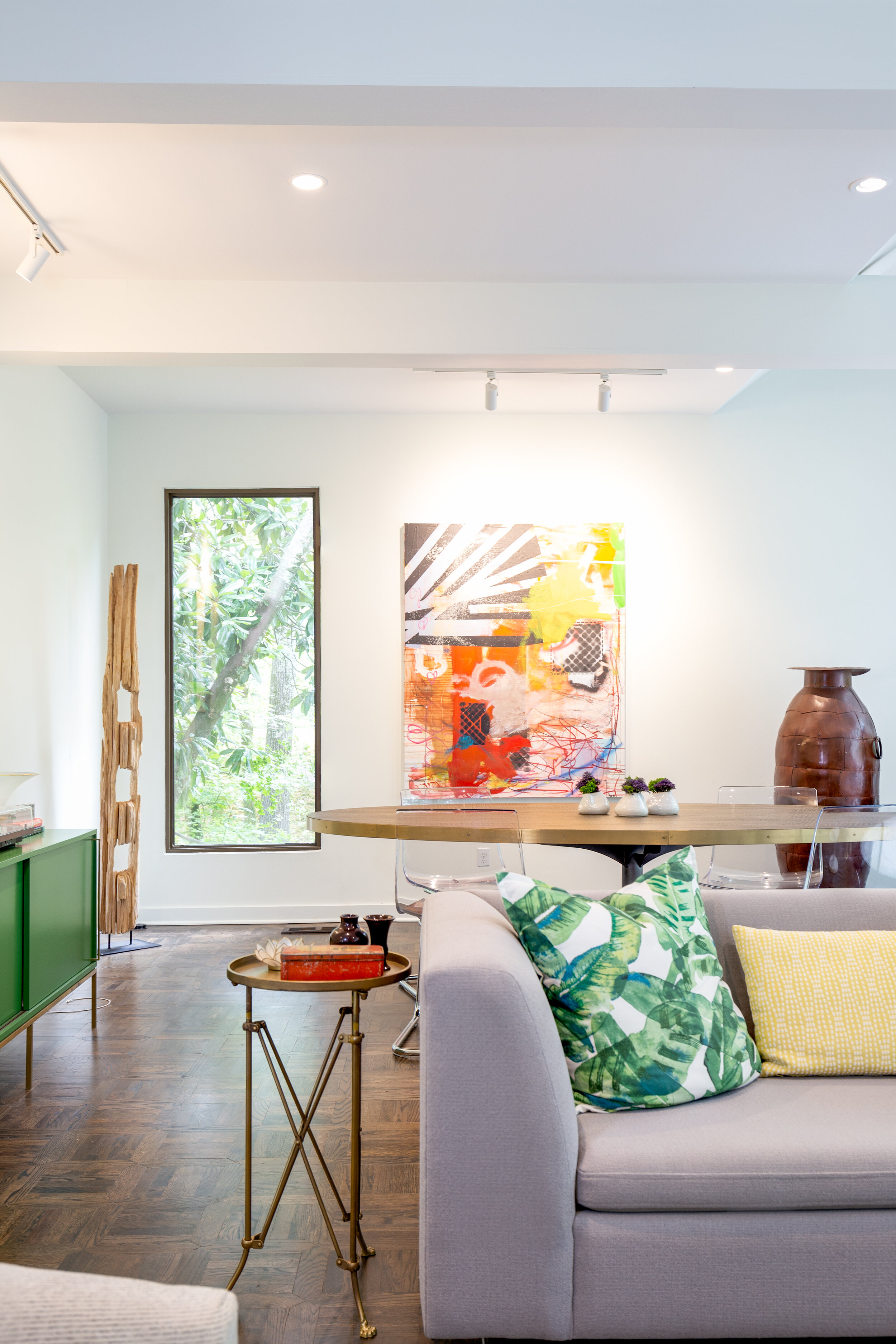
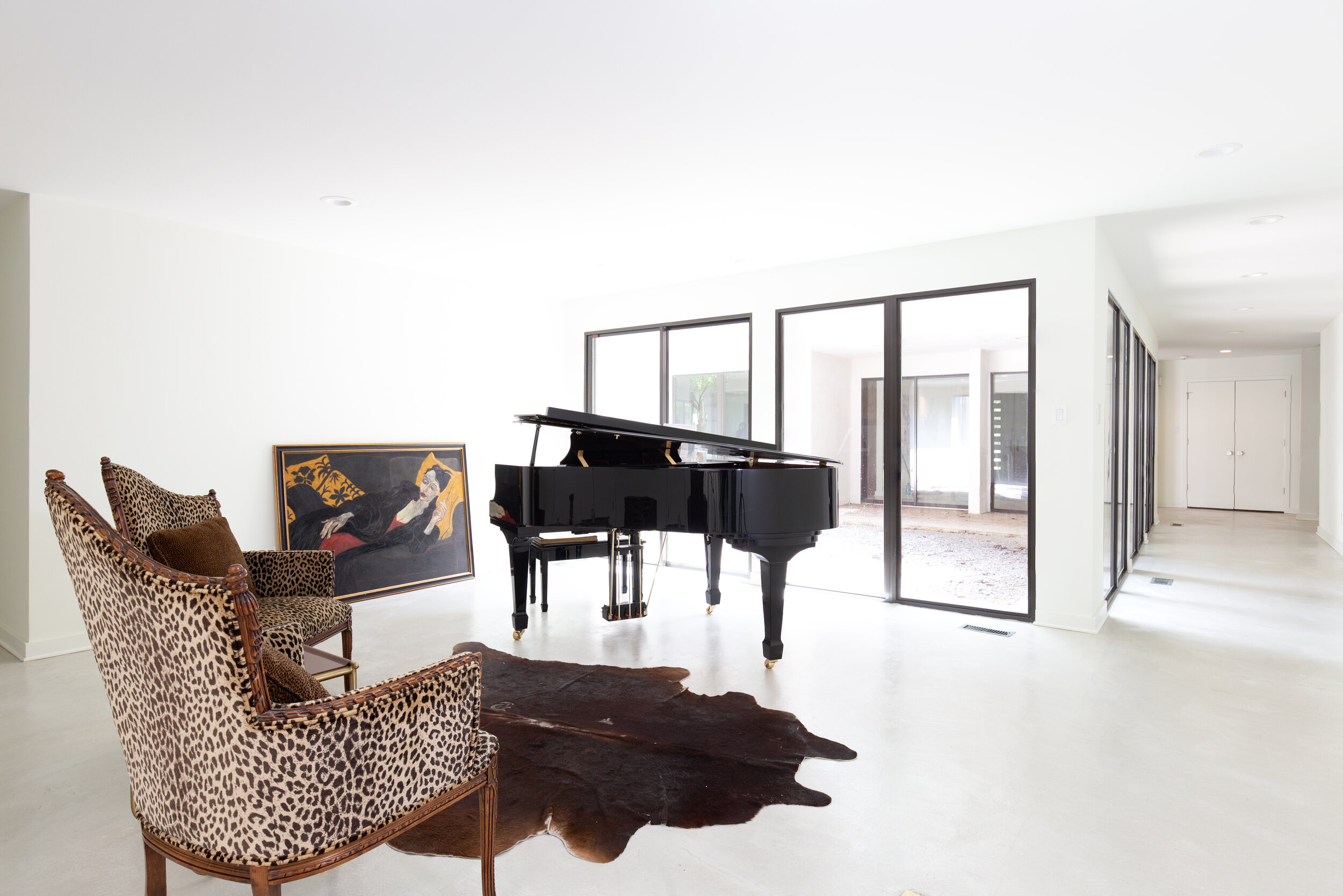
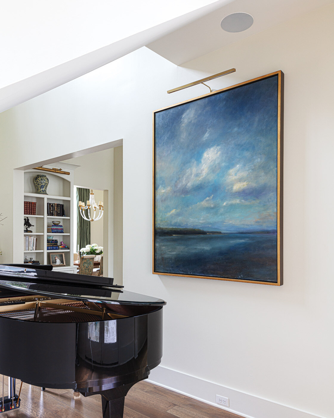
Just inside the front door is a roomy and bright entryway that showcases one of Hank’s large abstract paintings perfectly. The foyer leads to the home’s heart—the combination family room and kitchen. The Grays’ renovation plan included removing walls replacing existing windows with the largest ones possible. The new floor-to-ceiling panes allow light to fill the room, even on a gloomy day, and provide views of the home’s distinctive courtyard and pool area.

Sweetbriar-RKA-StefanieRawlinsonPhoto-17.jpg
Sweetbriar-RKA-StefanieRawlinsonPhoto-1.jpg

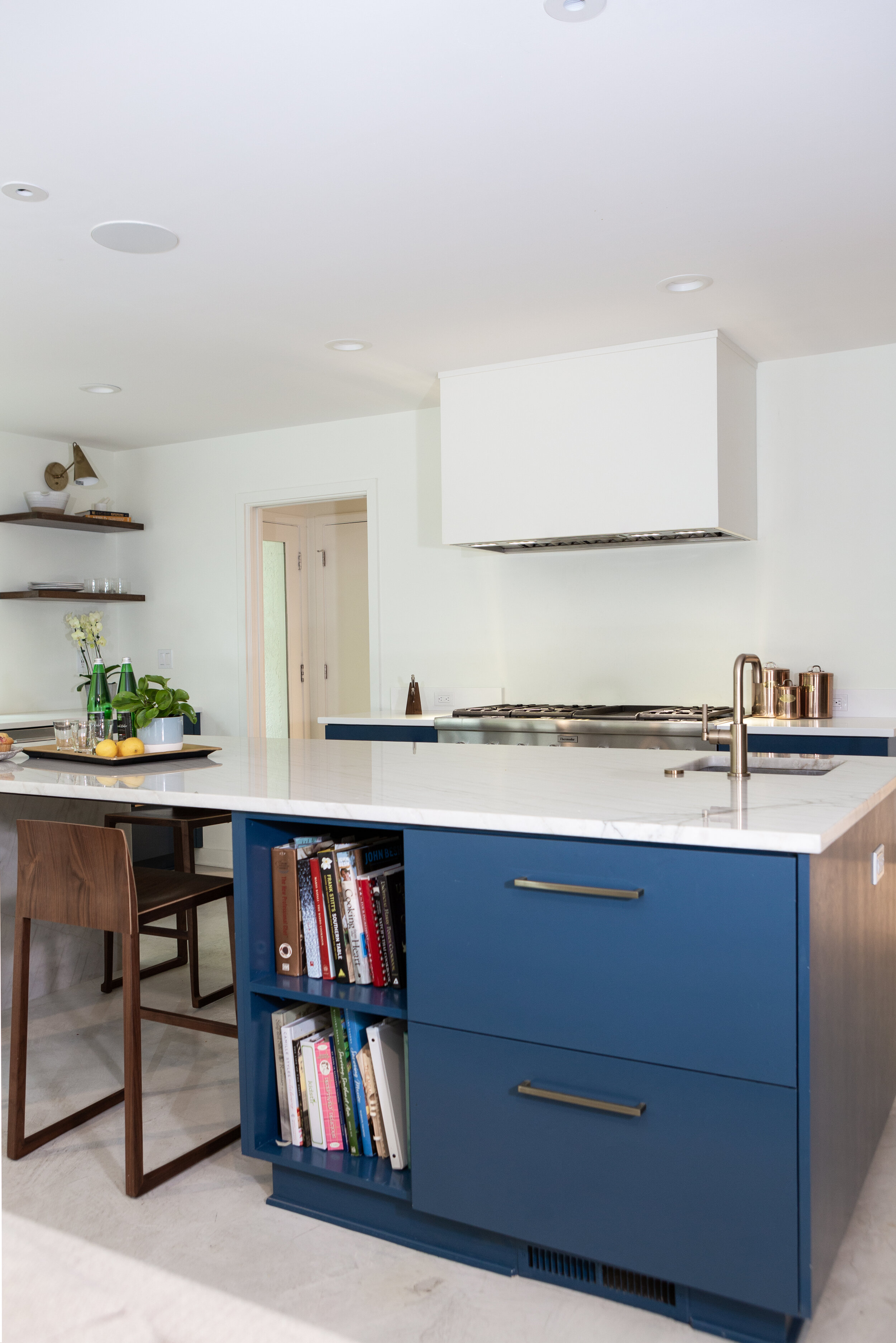
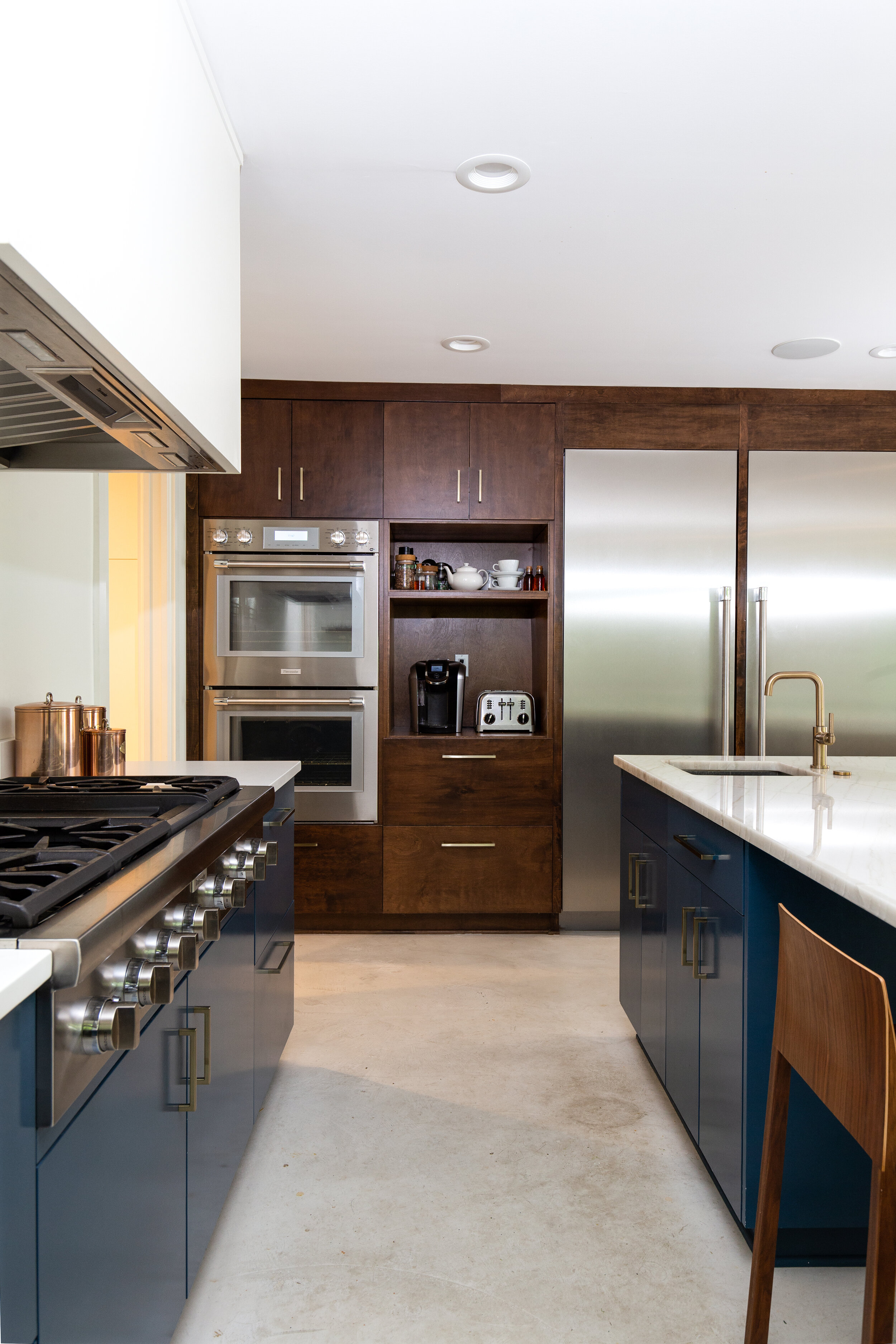
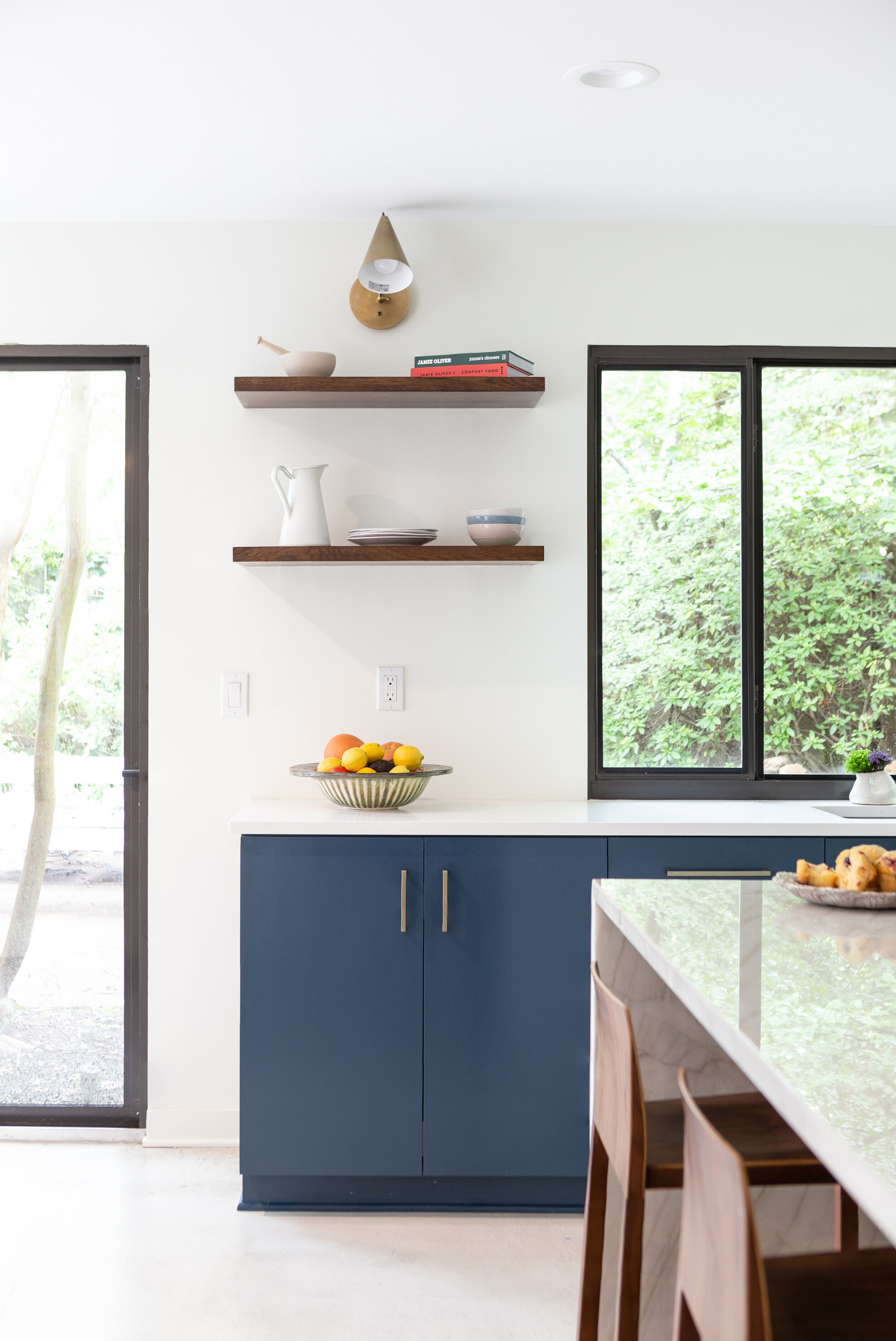
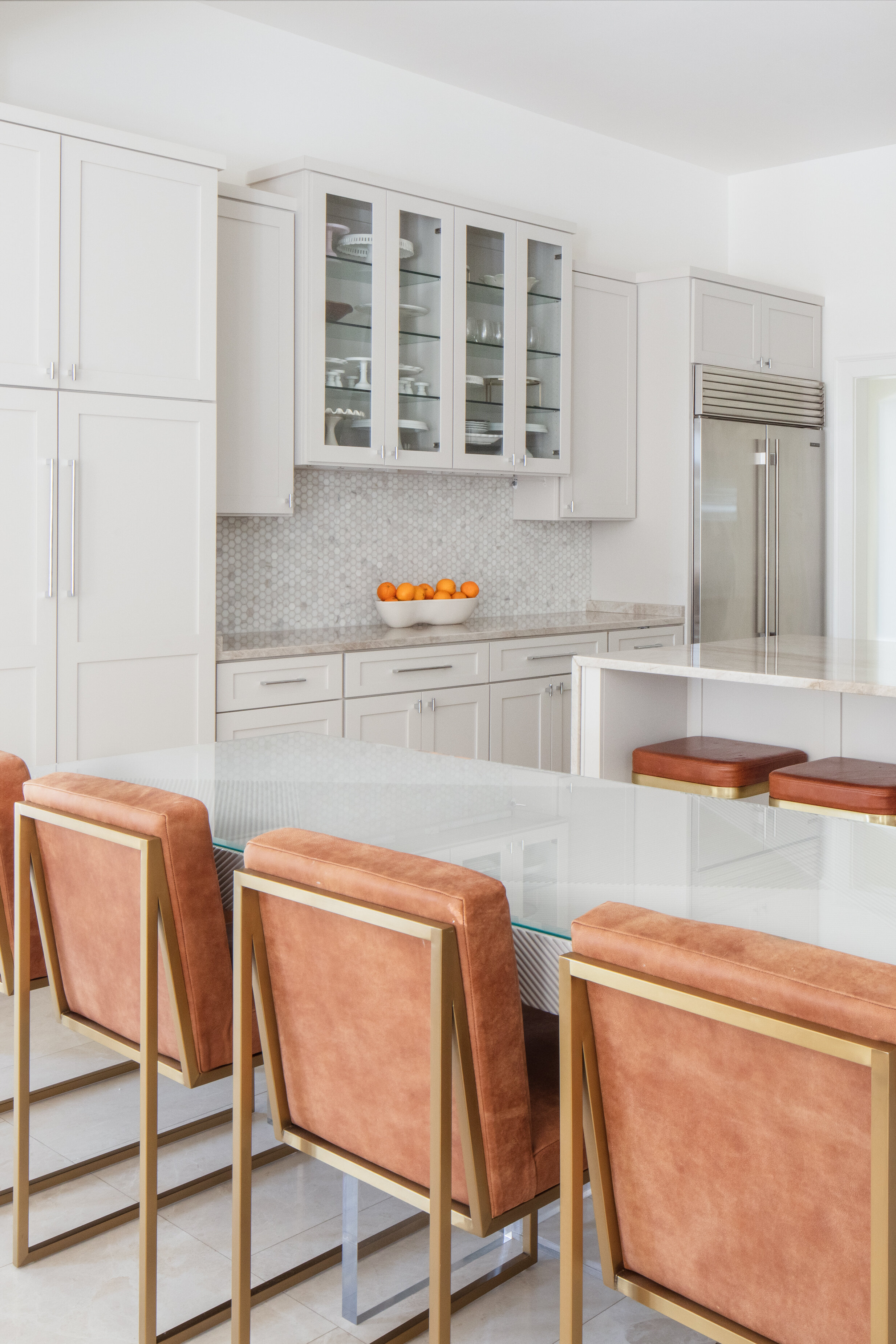
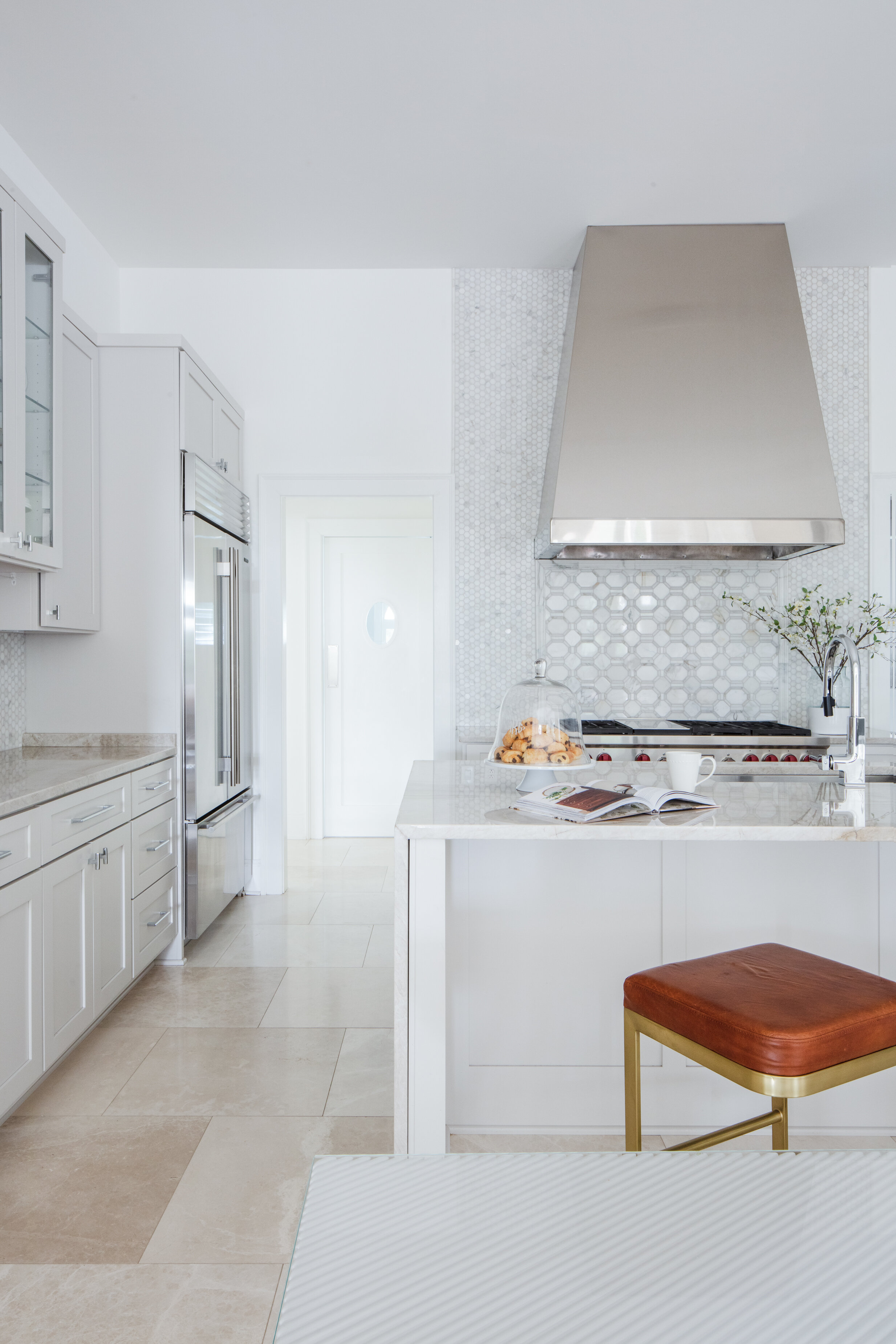
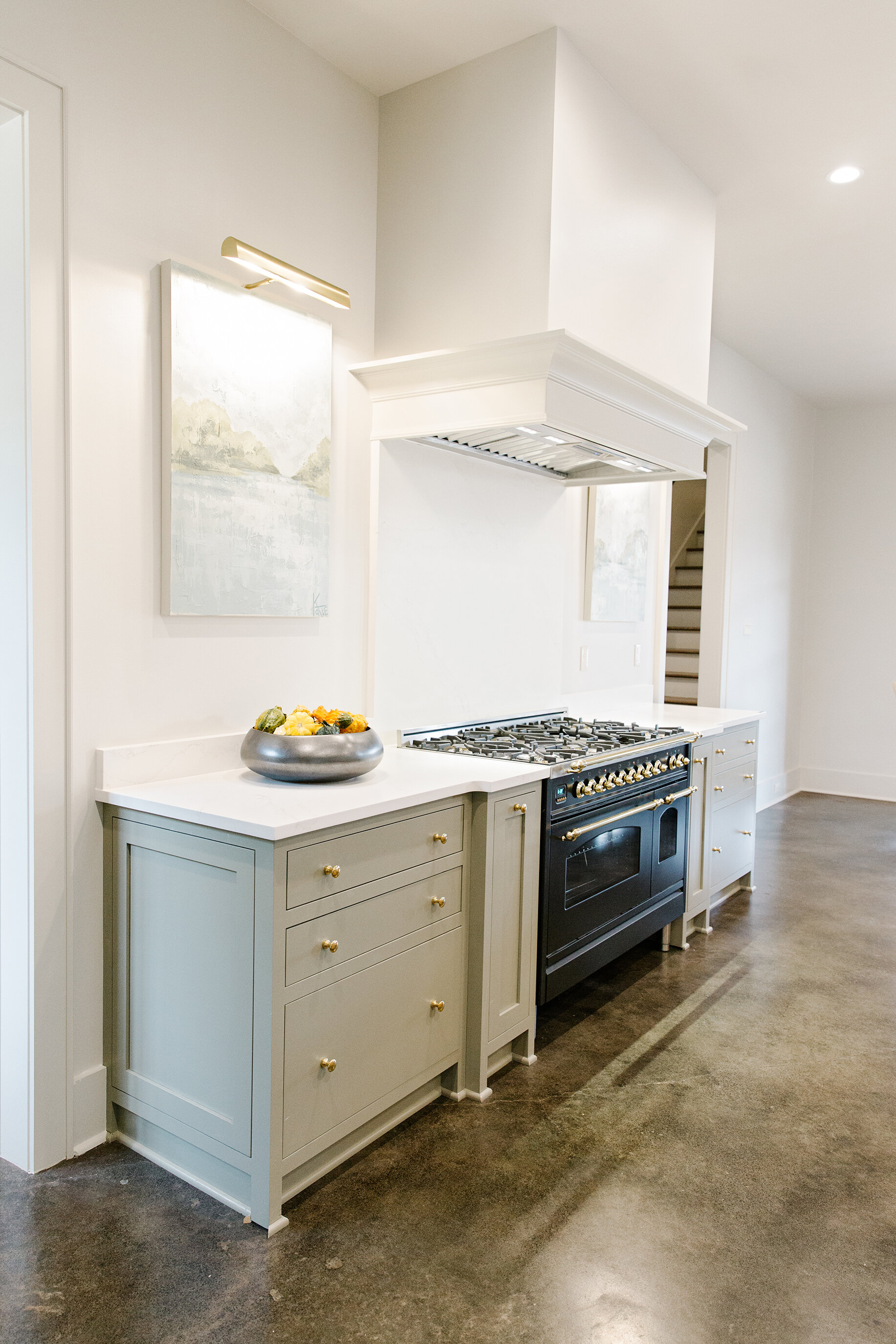
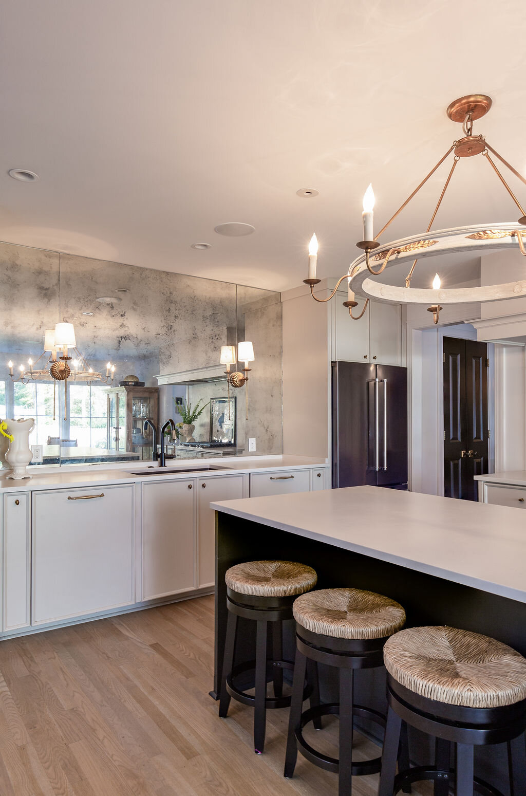
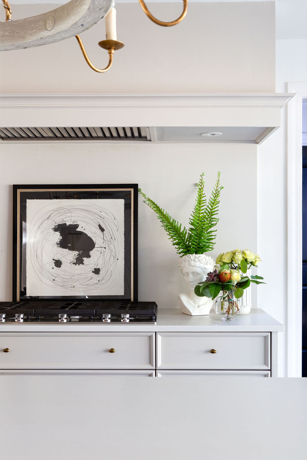
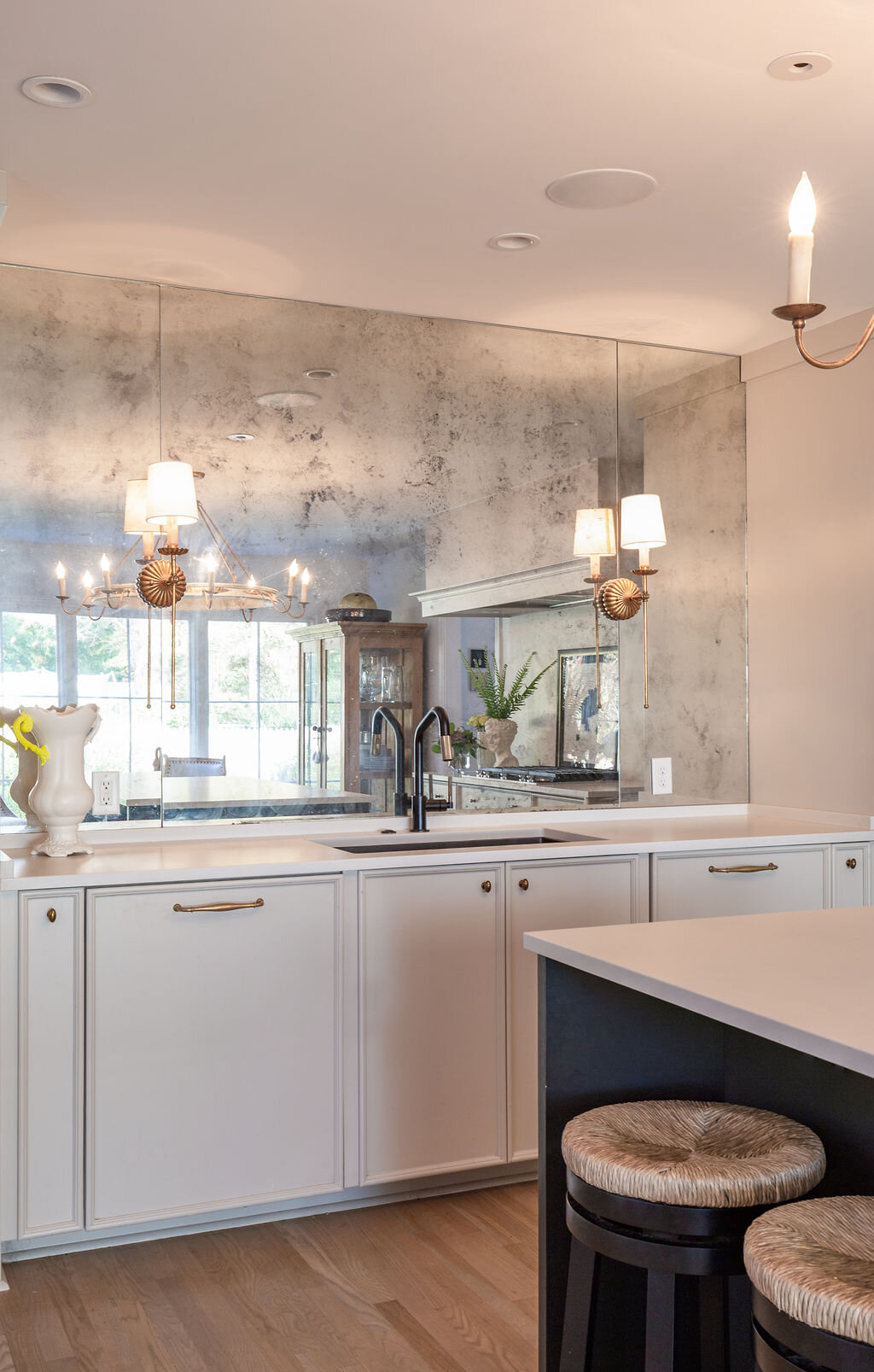
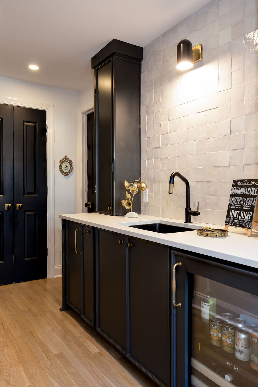
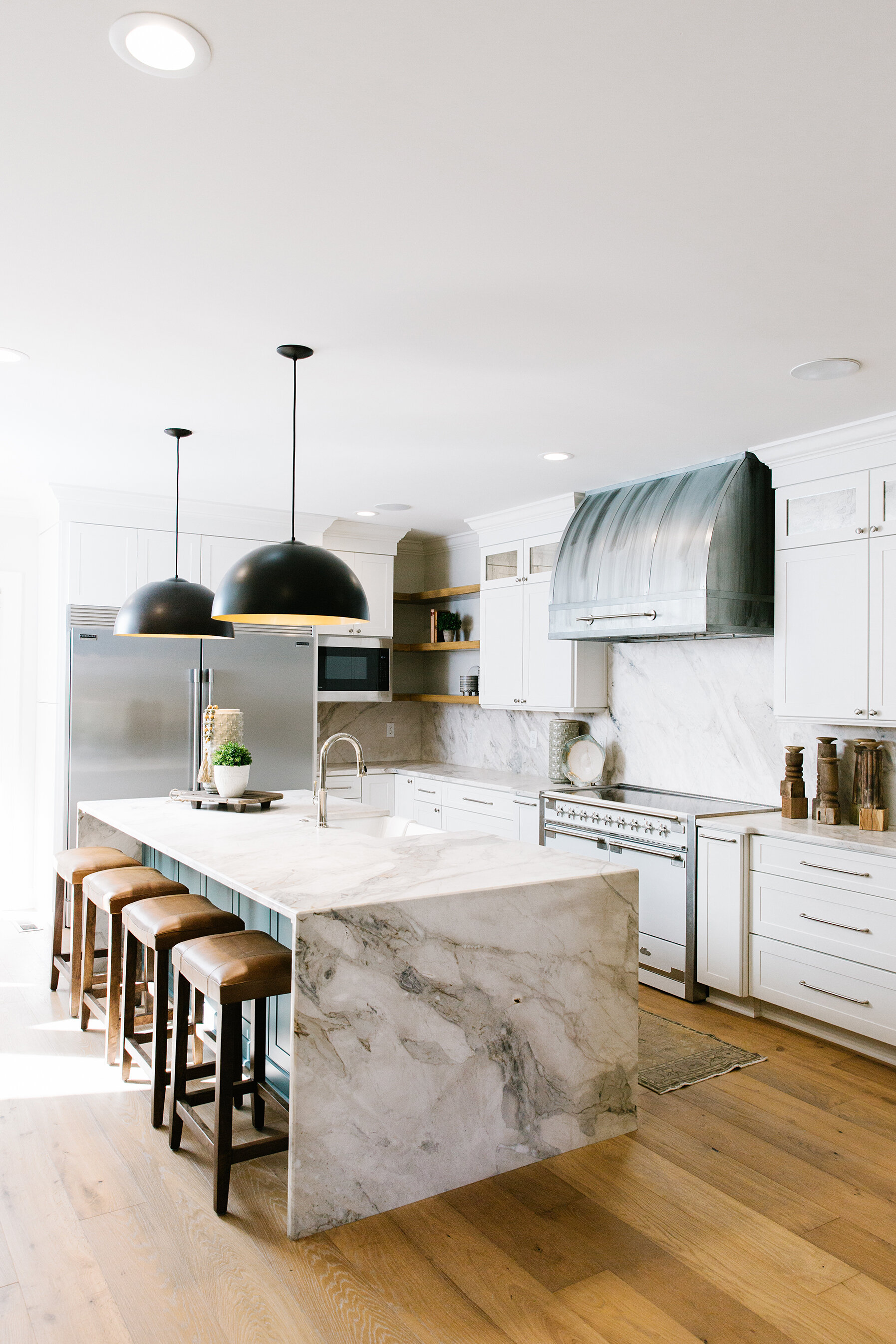
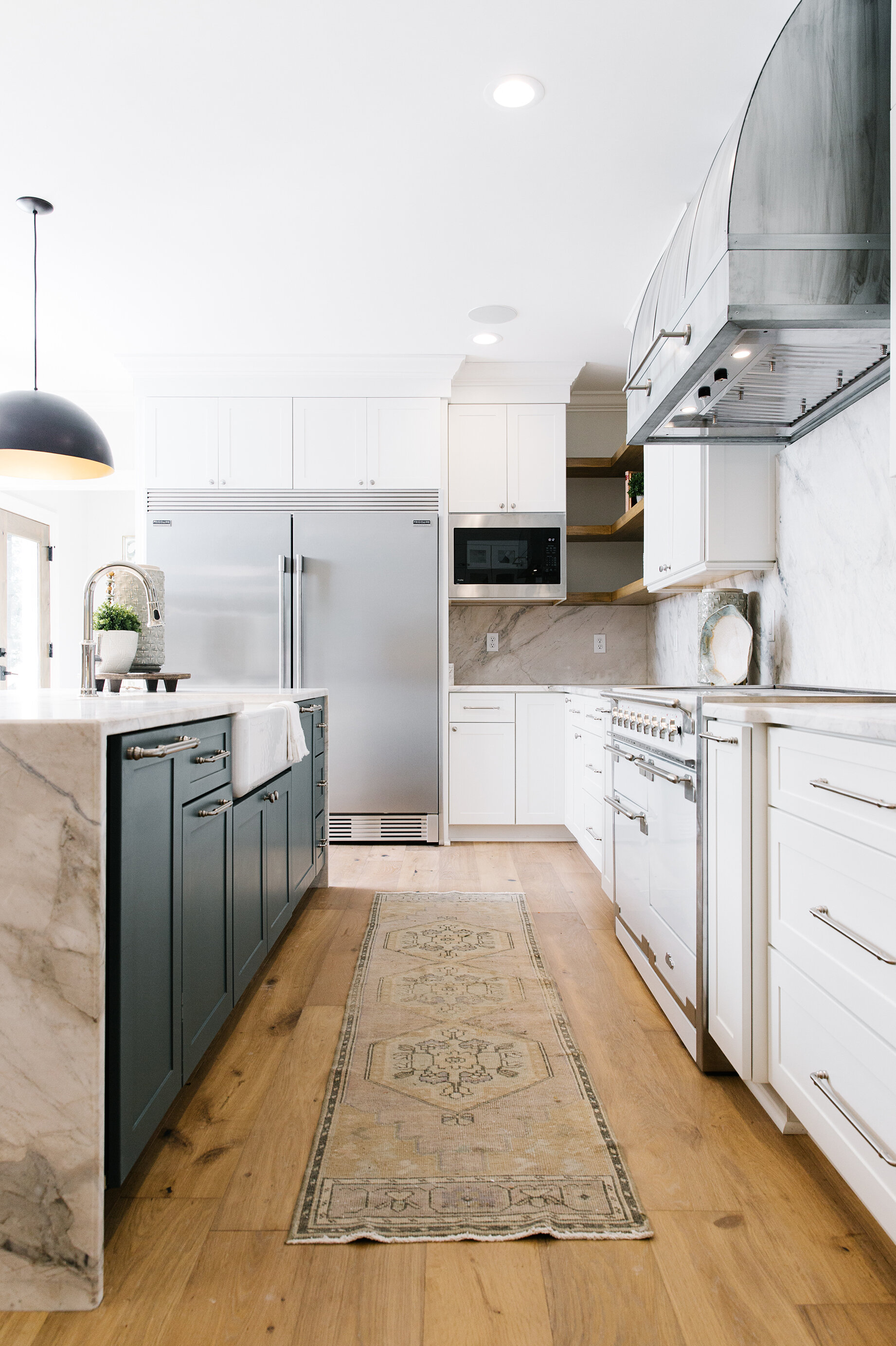
Renovations in the kitchen were extensive and included expanding it, taking in the former laundry room and creating a scullery area behind the range wall. Flooring was a challenge the homeowners and Cooper overcame with a solution that is both practical and aesthetically pleasing. When the Grays bought the house the kitchen floor was slate squares. Once those were removed workers found brick underneath. Removing the brick was cost prohibitive, and installing tile over the top would have made the floors too high. The answer? Cover the brick with a thin layer of concrete. Katherine says she couldn’t be happier with its looks, durability and ease of cleaning.

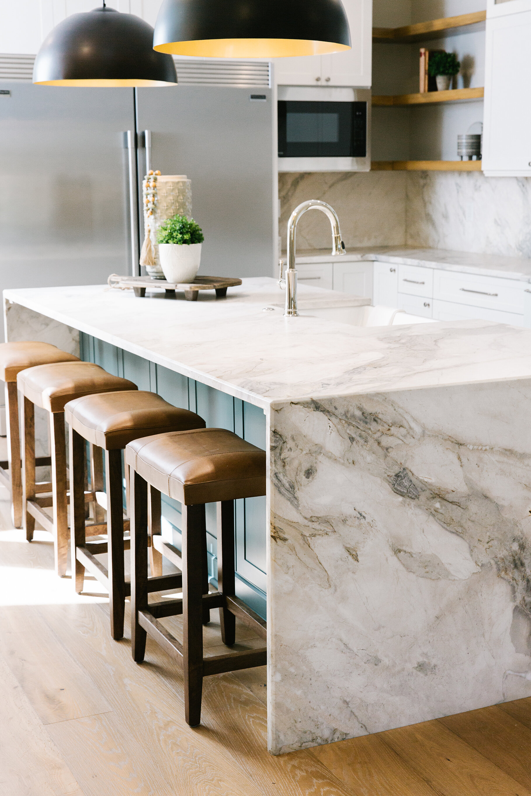
The lack of a space to put a kitchen table presented another quandary. The Grays opted instead for an extension to the kitchen island with a stunning waterfall effect and plenty of room for their family of four to enjoy a meal together.

Both Katherine and Hank enjoy cooking, and their gourmet kitchen suits them perfectly. A large refrigerator and freezer, commercial grade cooktop, double ovens and generous amount of pantry space in the scullery allow them to whip up their specialities, including Hank’s duck enchiladas, with ease. 


Sweetbriar-RKA-StefanieRawlinsonPhoto-22.jpg

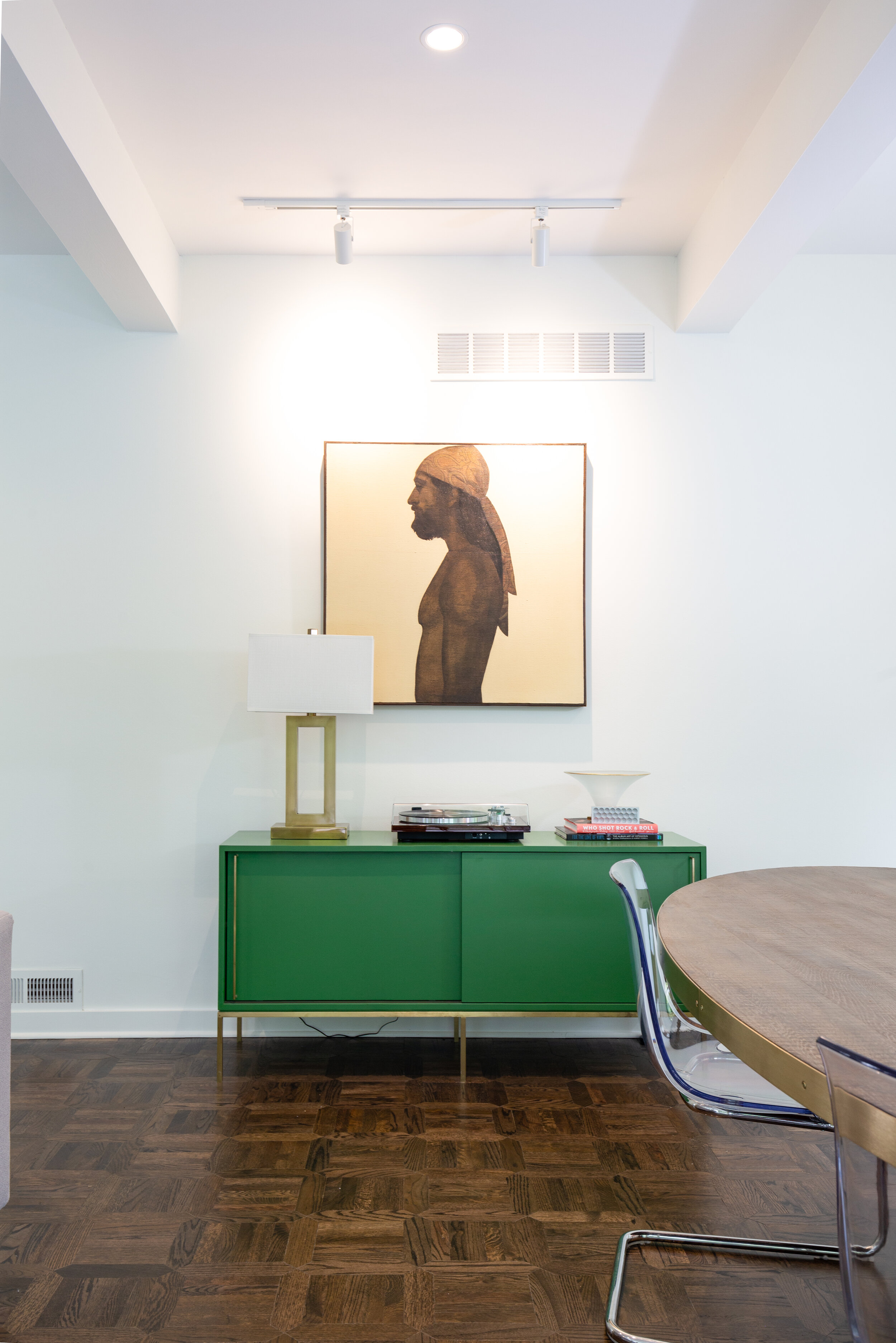
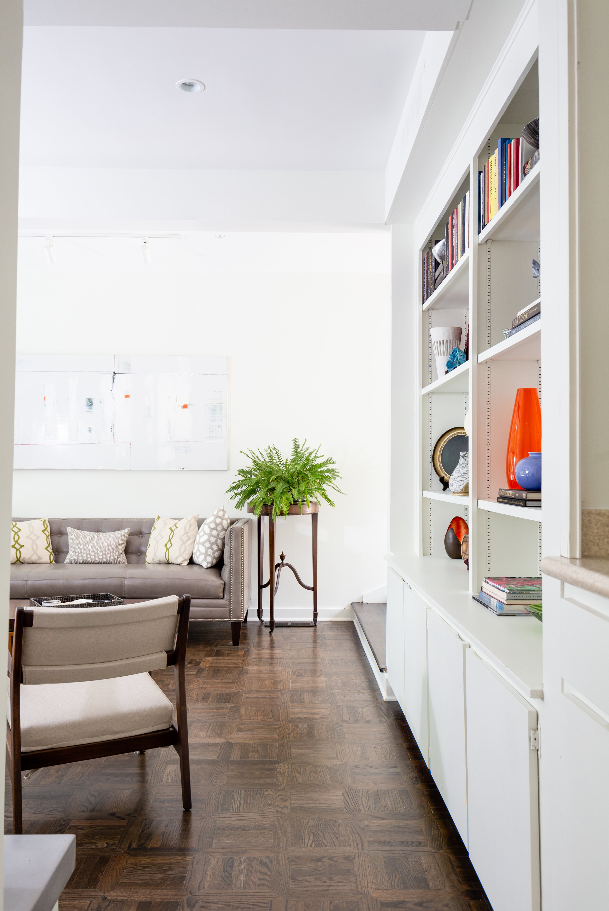
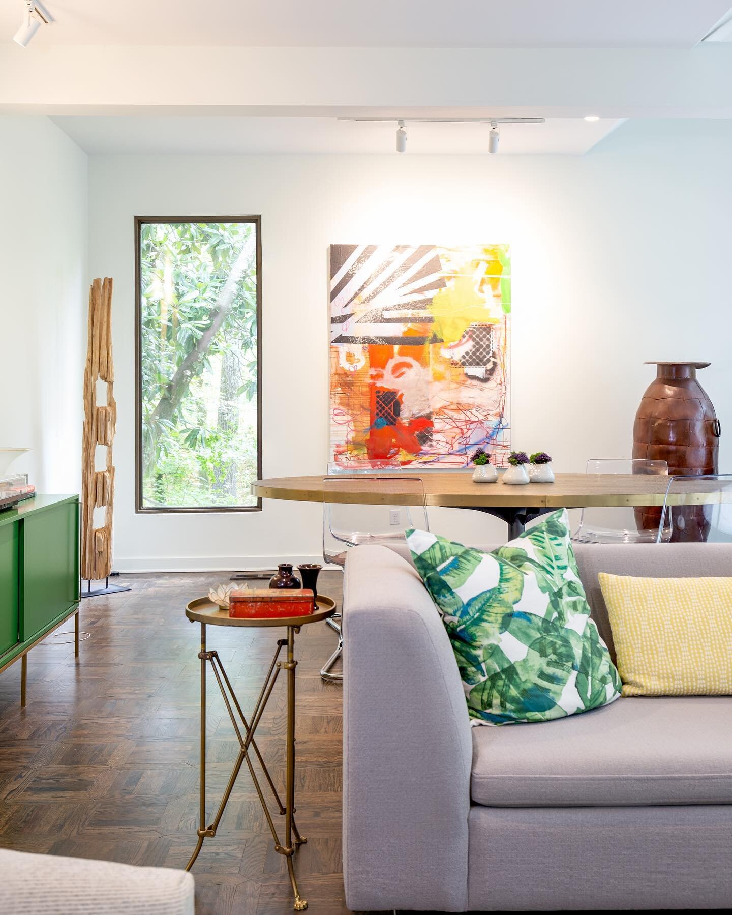
The home’s living areas underwent major renovations, as well. The Grays loved the original two-sided fireplace that separates the large den/dining room from a smaller, more formal space, but not the fieldstone treatment that covered it. Now finished in sleek white, the fireplace gives the room a much more sophisticated vibe, the perfect backdrop for the couple’s large collection of contemporary art. Along with Hank’s originals, works by Jeri Ledbetter, Mary Sims, Adam Geary and Ted Faiers grace the walls.

The floors were a happy surprise found during renovation. Existing pine flooring was warped and unusable, but underneath was original solid wood parquet in an intricate geometric pattern. Katherine loved the same floor that was in another room in the house and still remembers her excitement when Cooper texted her a photo of the unique flooring when workers discovered it in the living room.

Full-height windows across an entire wall of the area provide views of the tree-filled side yard, a sight Katherine particularly loves in the spring and fall when the colors of nature are at their finest. 

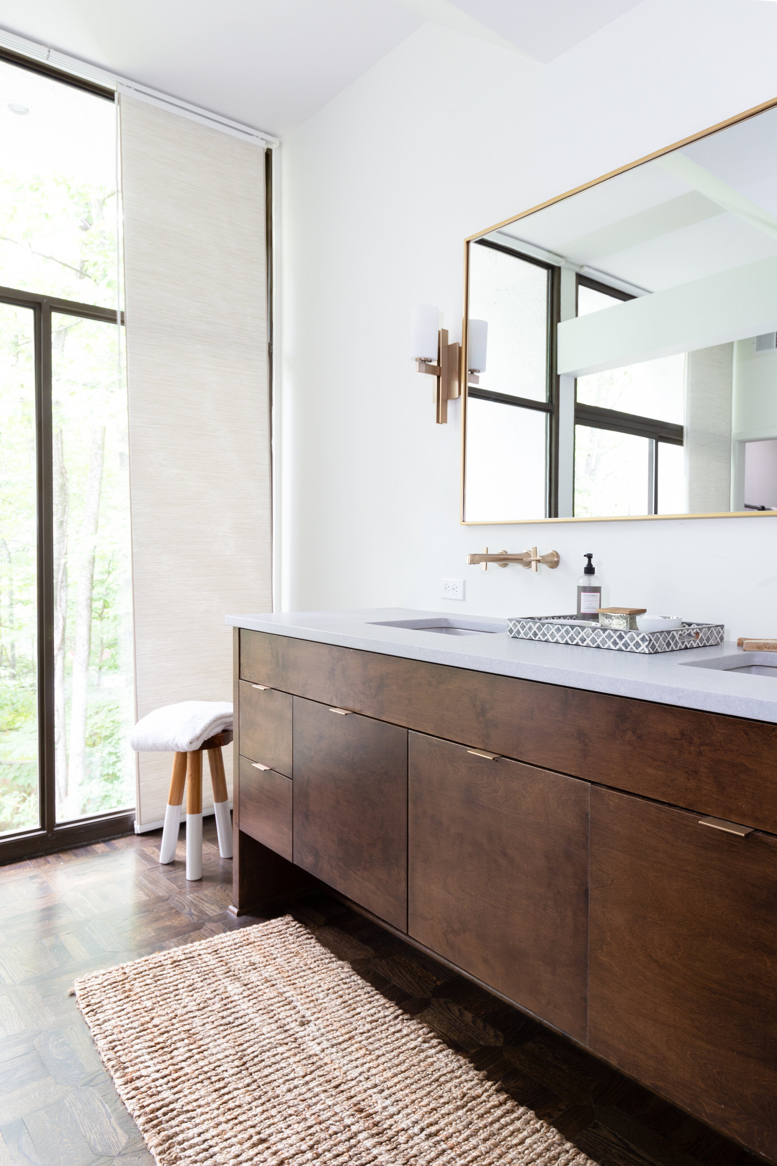
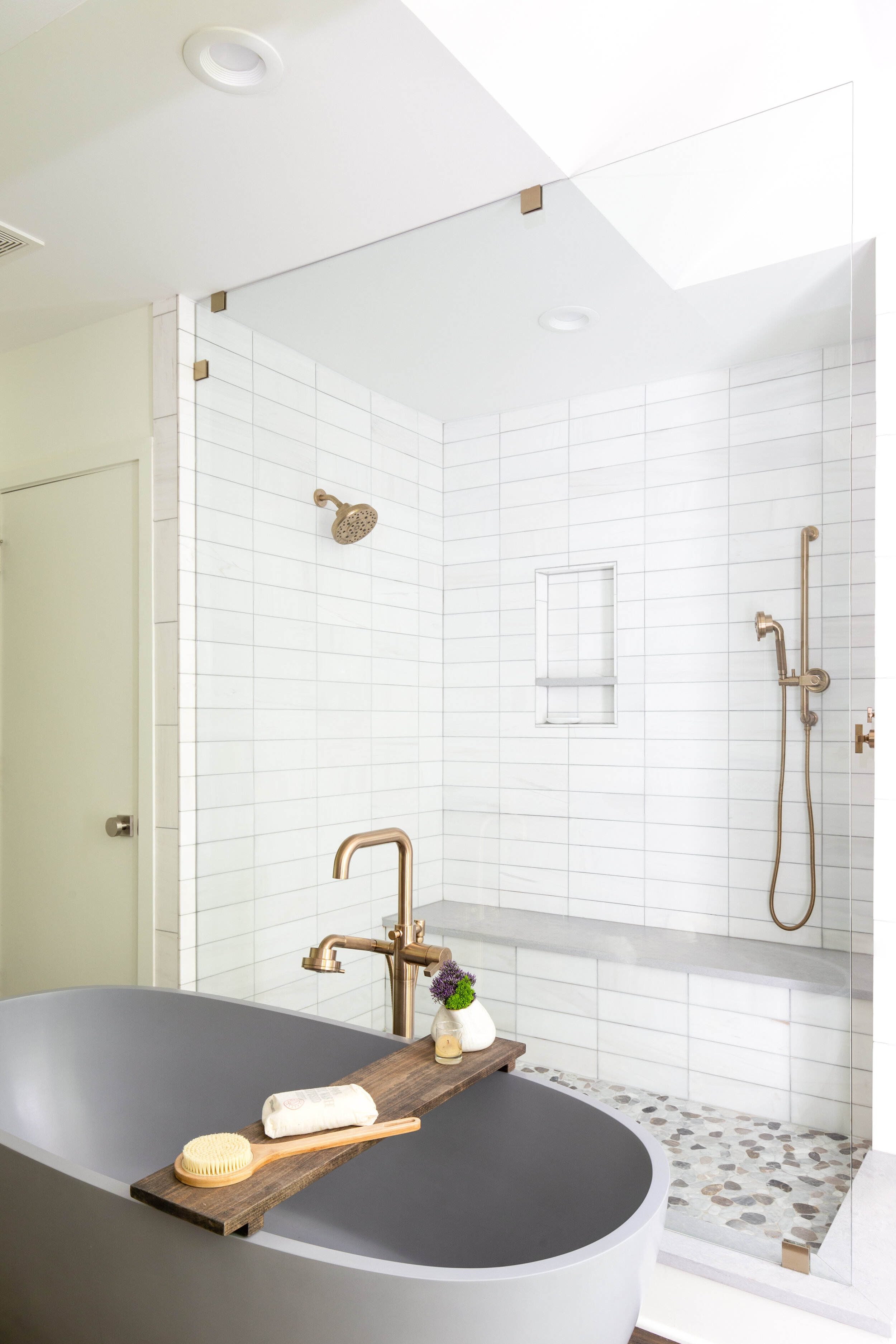
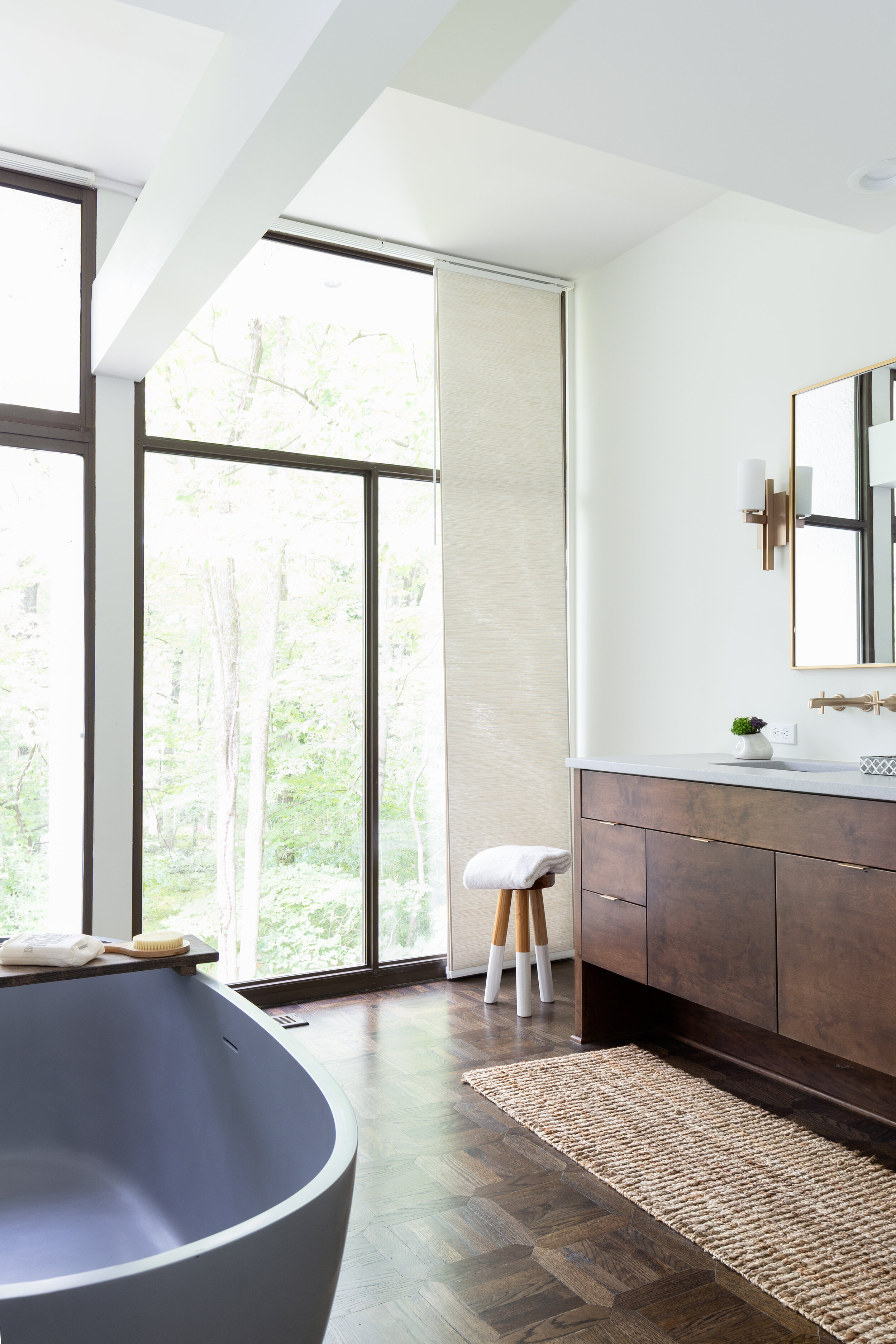
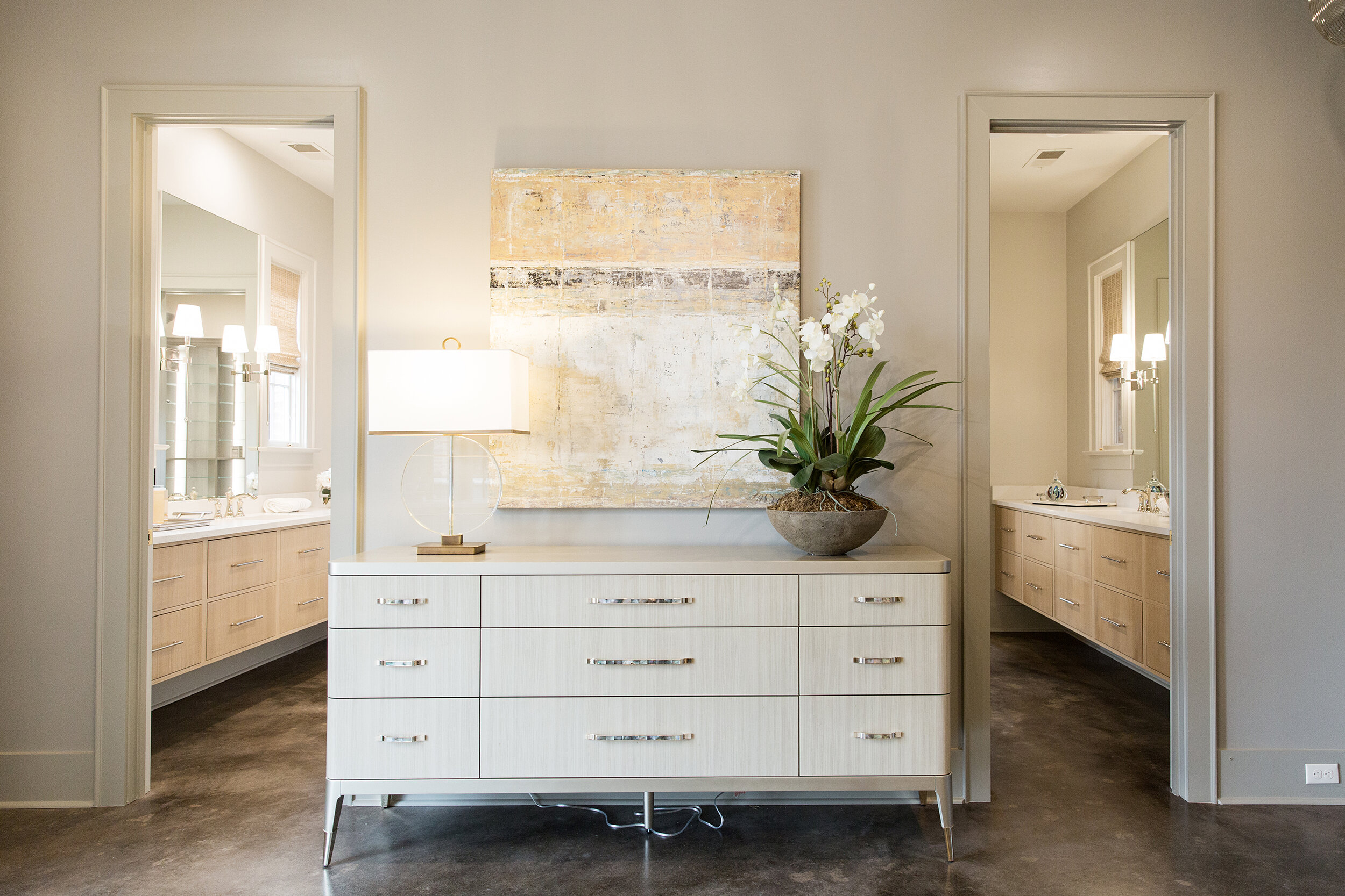
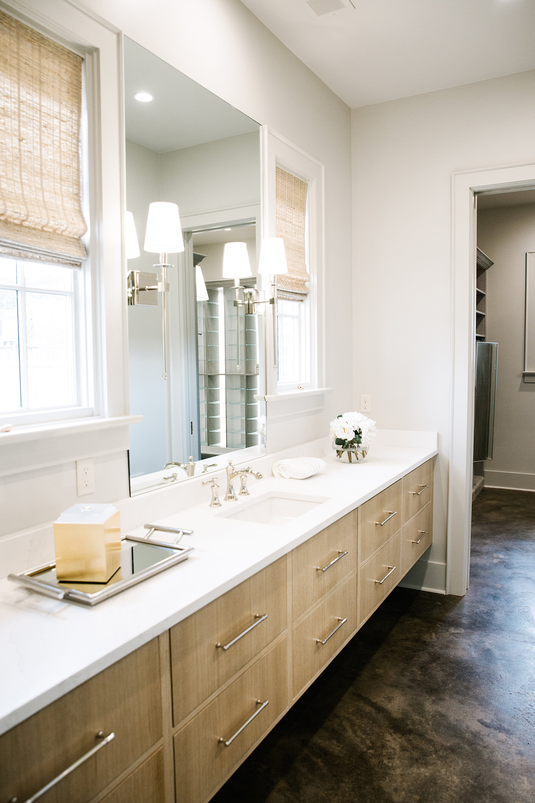
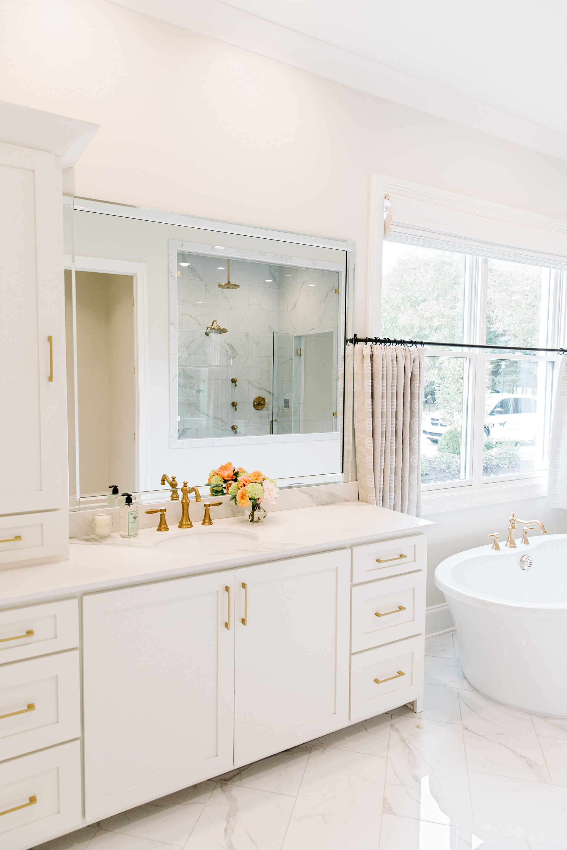
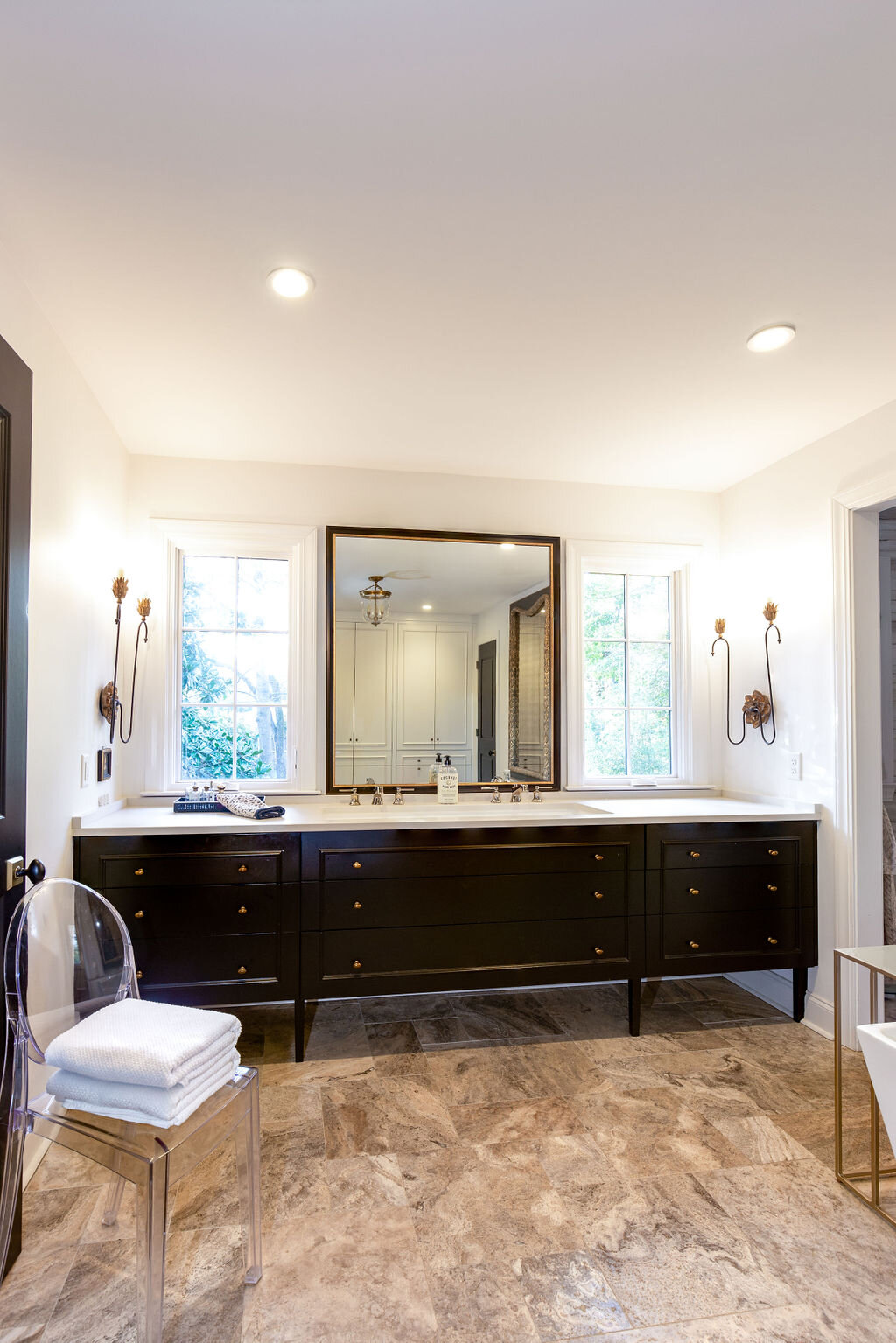
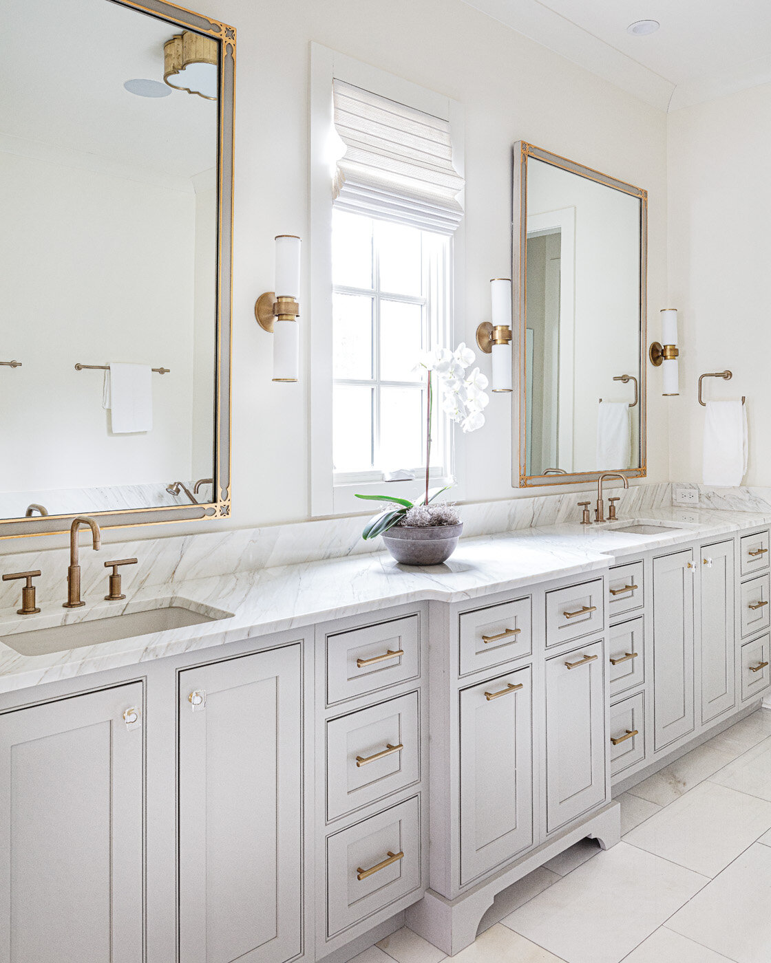
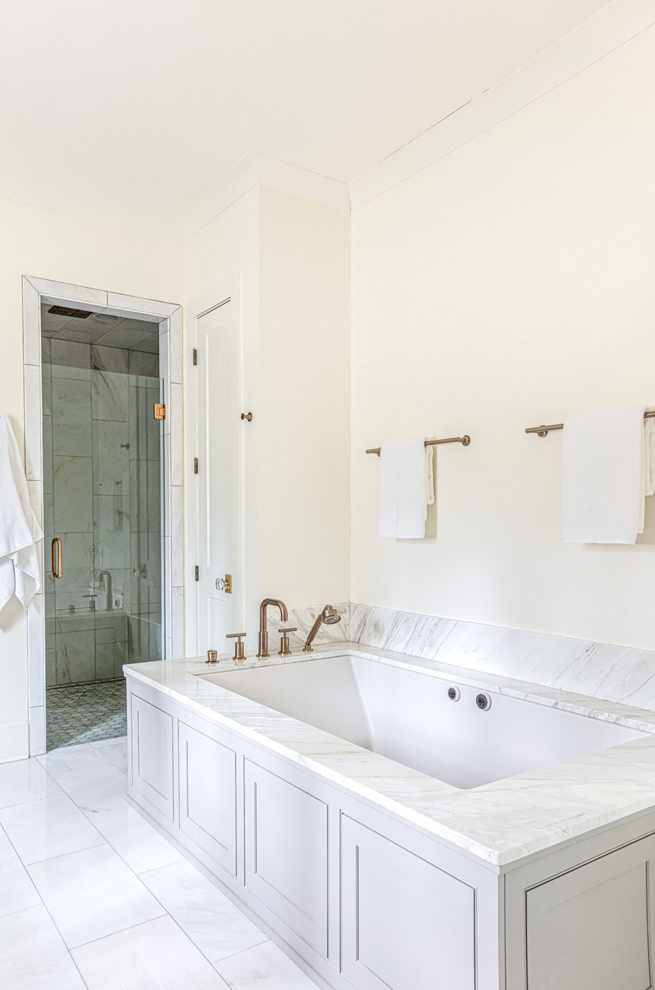
The master suite received a total overhaul, especially the master bath. Its design, featuring clean lines, rich woods and muted gold accents, evokes a peaceful vibe, but the installation induced more than a little stress for Katherine. An oversized glass panel separates the shower from the rest of the room. So oversized, in fact, that the installer told the Grays it was the largest single piece of glass he’d ever worked with. So oversized that the plumbing fixtures for the free-standing tub nearby had to be removed to put it in place.

Sweetbriar-RKA-StefanieRawlinsonPhoto-30.jpg

Being built into a hill, the home has a large downstairs level, which also underwent extensive renovation to suit the needs of an artist and his family. The only square footage added to the residence in the project is a studio for Hank. It sits adjacent to the Gray girls’ playroom, largely the domain of the younger sister. The nine-year-old has inherited her father’s creative penchant and turned the space into a workroom where she loves to sew; hats and dog blankets are her specialty.

Sweetbriar-RKA-StefanieRawlinsonPhoto-18.jpg

Bringing the long-empty house back to being not only an architectural and design showplace, but also a comfortable family home, was a labor of love for Katherine, who made all the design decisions for the project while also serving as a senior vice president at Independent Bank. She also had to spend time convincing her husband that the project was not only doable, but that it was right for them. A self-admitted doubter at the onset, Hank says he eventually came on board. “I'm glad we did it,” he says. “I love the architecture itself. I love the style of the home and I love that it was done by a Memphis architect.”

Galentine's Day with 17 Berkshire

Styling and Story by Nuha Abuduhair of 17 Berkshire | Photography by Annabella Charles

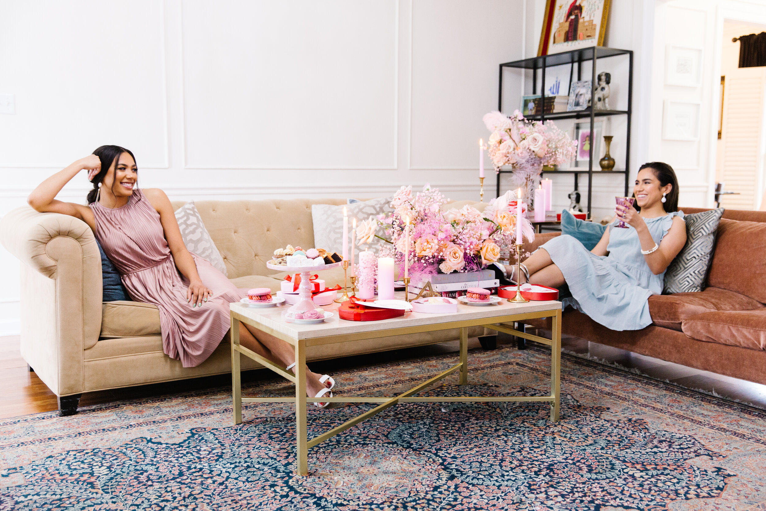
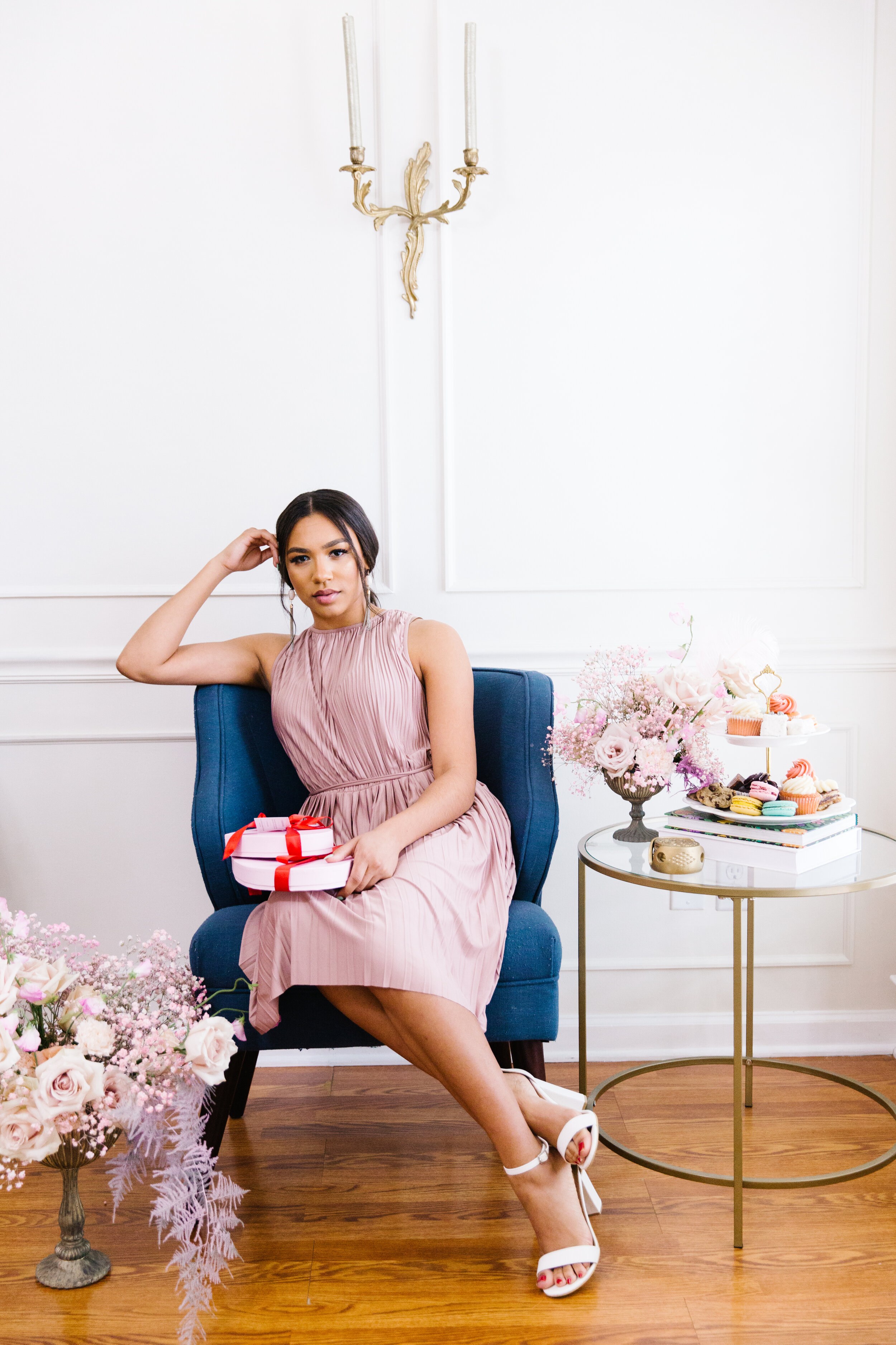
Like so many other women, I have always adored the over-the-top, Marie Antoinette approach to get togethers. While pandemic safety precautions are in place, I think it's even more important to enjoy the little things. Valentine’s Day is coming up, but I think I speak for a large number of people when I say the true fun is on Galentine’s Day. 

Valentine-22.jpg

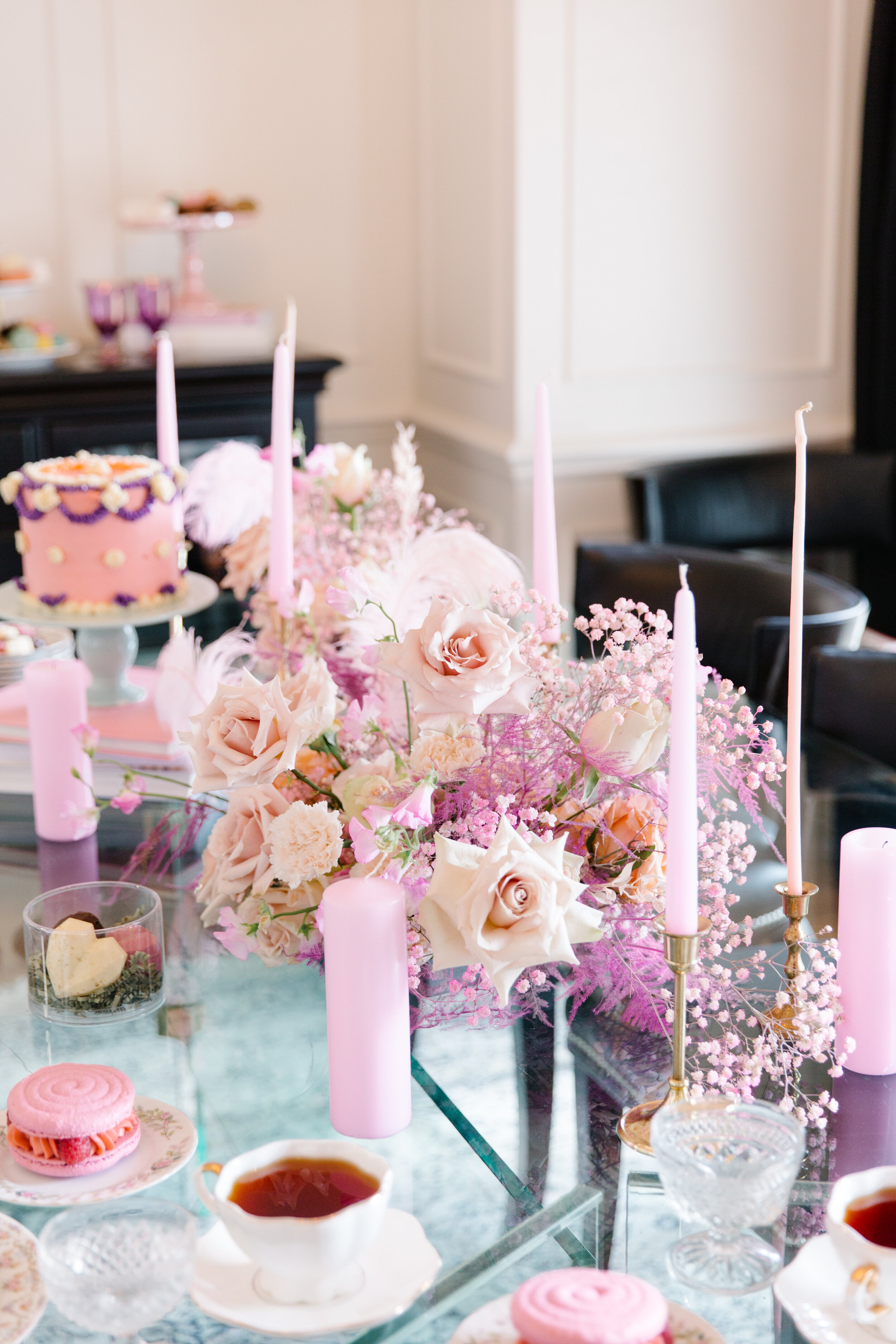
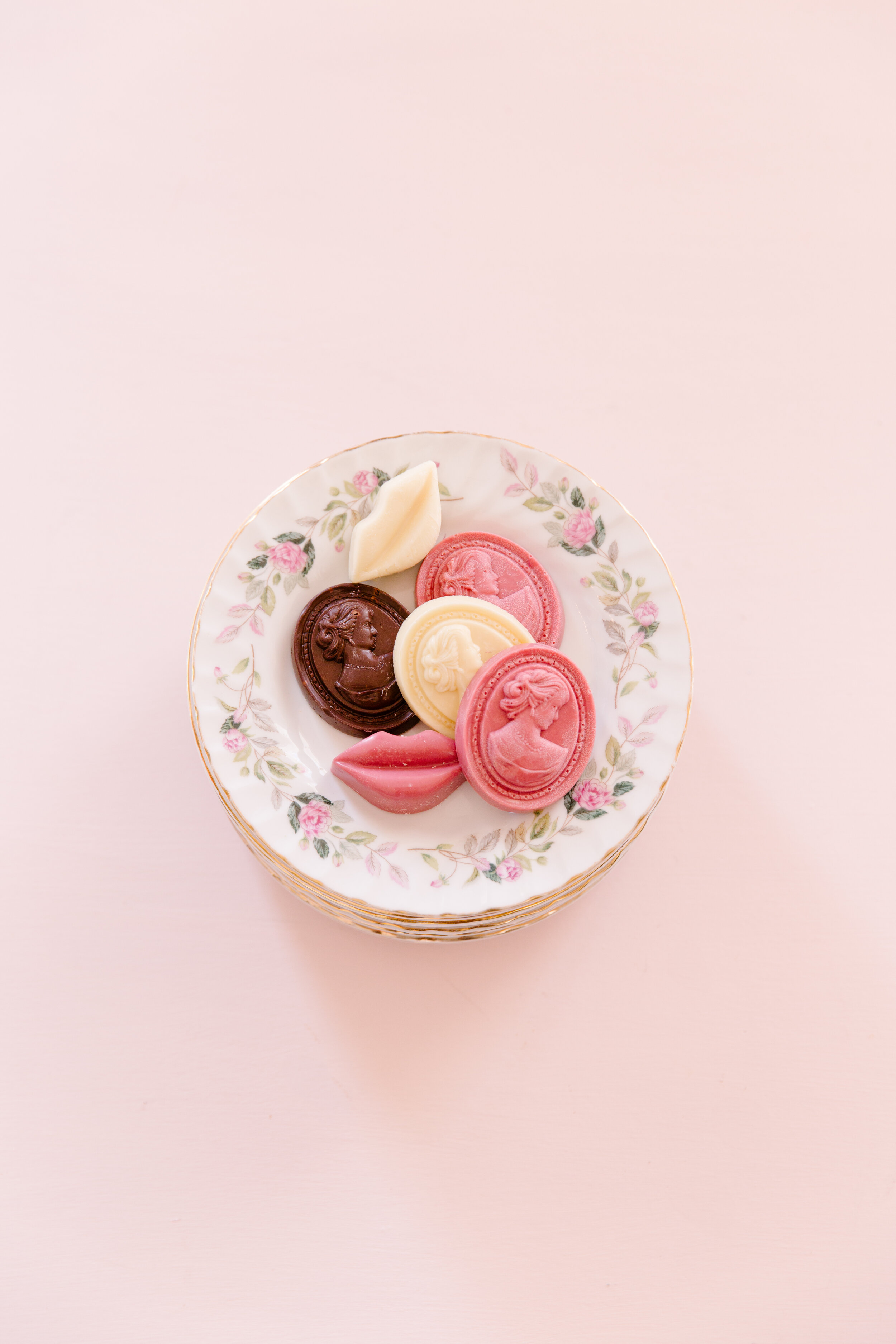
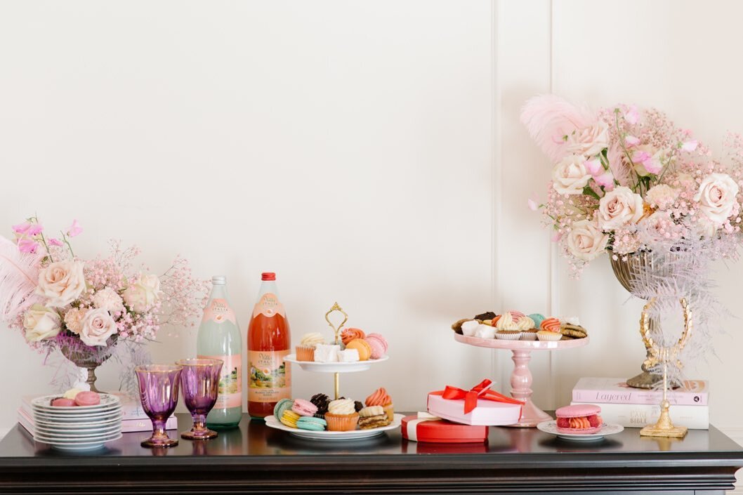
What do you get when you and your squad pod have been socially distancing and are up for some fun? An over-the-top Galentine’s Day fête. Treat yourself and your “ride or dies” to an assortment of macarons, chocolates, teas and more this Galentine’s Day.

Don’t miss 17 Berkshire's annual Galentine’s Day celebration, set for Sat., Feb. 6. The shop’s staff will be taking precautions to keep it Covid-safe. The Valentine's Day menu will be available to pre-order/purchase online or in-store.  

Pastries: 17 Berkshire, @17berkshire

Wardrobe: Shelby Jewel, @shopshelbyjewel

Stationery: Ellywise Studios, @ellywisestudios

Florals: Pampas & Floral @pampasnfloral

Model: Yamile Iskeif, @yamiiskeif

Model:Caitlin McGill, @caitlinmcgill

Menu

Love Platter: Assortment of macarons, cookies, marshmallows and more

Heart Box of Chocolates

Assorted Cupcakes

Jumbo Macarons

“All the Frills” Cake

Assorted pastries and teas

17 Berkshire | 2094 Trimble Place Memphis, TN 38104 | 901.729.7916 | 17berkshire.com | Instagram @17berkshire 

A House Becomes A Home

Interior Design by Leigh Dill Interiors | Story by Terri Glazer | Photos by Sélavie Photography

If a house becomes a home when it is a reflection of the people who live in it, then the house where Drs. Amna Khattak and Haris Zafarullah and their two daughters live is a home in the truest sense. With help from local interior designer Leigh Dill, the couple filled their residence with things that tell their story and reflect their culture. Dill says the project is a testament to the concept that when you collect things you love, they will eventually all work together to create a complete look.

LeighDill-Amna-SelaviePhotography-18.jpg


A Memphis resident since 2005, Khattak has amassed quite a collection of artwork, textiles and rugs from her native Pakistan, along with pieces acquired during many vacations abroad with her husband. 

The couple decided to move from their Harbor Town home a few years ago to be closer to their children’s school and activities. After much searching they found nothing to perfectly suit their needs, so they purchased a lot in an East Memphis neighborhood and set about building their dream home.

Khattak’s vision for her house was that of a transitional style Mediterranean with a terracotta roof, stucco walls, arched entryways and a courtyard. The interior of the house had to have a calming effect. Also on her list of must-haves was a floor plan that was family friendly, but conducive to entertaining, as well. Architect Doug Enoch delivered a design that checked all the boxes, and contractor Eddie Kircher brought Enoch’s creation to reality. Dill came on board partway through the process, about the time the house was framed, in time to help with the finishing pieces like paint colors, flooring and furnishings.

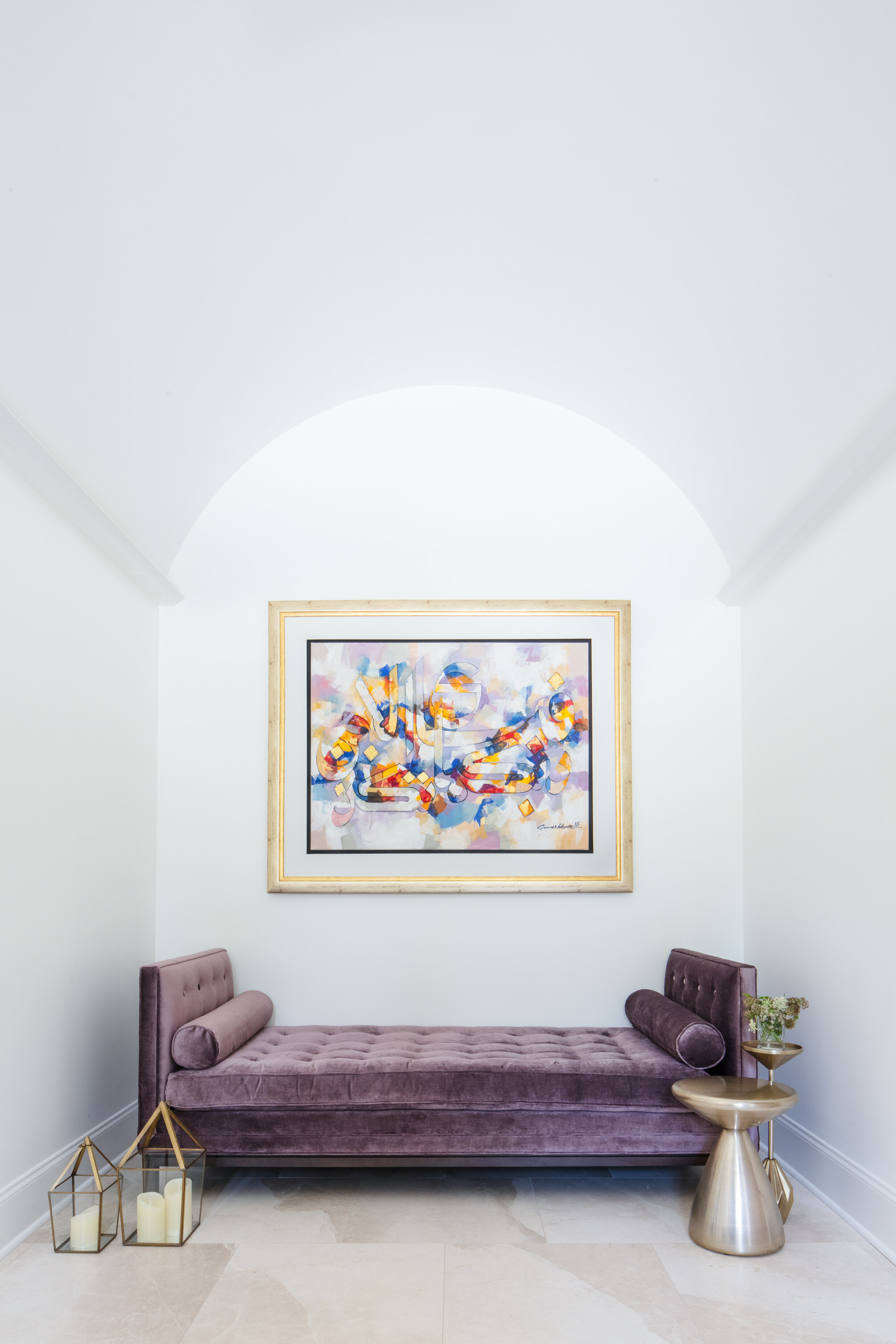
Khattak credits Dill with masterminding the tranquil vibe she sought by blending her colorful treasures with a simple palette of whites and neutrals. That pairing of color and calm is evident from the first step through the front door. Crowned by a high barrel ceiling, the foyer features a large abstract painting placed thoughtfully over a dramatic divan in purple velvet.

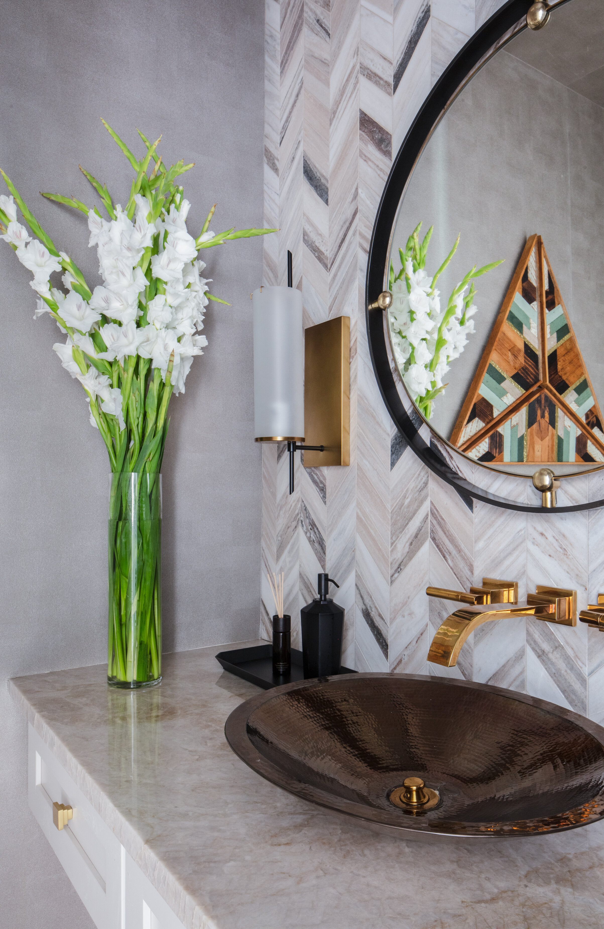
Just off the foyer a powder room brings all the drama. Variegated marble tiles in a striking chevron pattern extend across the floor right up to the ceiling, punctuated by a floating vanity that holds a vessel sink. Pewter-toned metallic wallpaper ups the glam factor another notch in this small but unforgettable space.

LeighDill-Amna-SelaviePhotography-5.jpg
LeighDill-Amna-SelaviePhotography-12.jpg

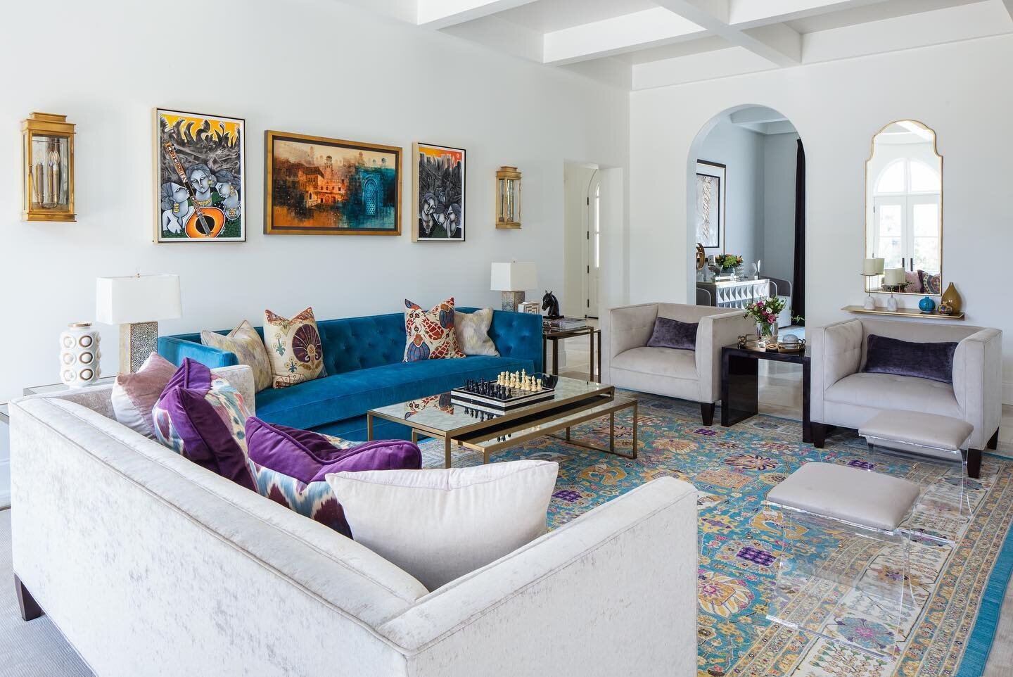
A pair of arched openings separate the large living room from the formal dining room. Khattak says the dining room is one of her favorites places in the home, in part due to the artwork that adorns its walls. She recalls, “Leigh was very particular about what kind of art we were going to put in this room. She said, ‘This is an elegant room; we don't need too much going on.’” The pieces Khattak and Dill ultimately chose for the dining room walls are particular favorites of the homeowner: an original calligraphy work that artistically displays verses written in Arabic, and a pair of tall paintings in black and white that depict the Old City of Lahore in Pakistan. 

Khattak says her native country has a very rich culture and a lot of history, especially in its ancient Mughal cities. “I love these paintings because they remind me of back home and all the hustle and bustle of the markets,” she adds. 

An elegant light fixture, a Restoration Hardware dining table and chairs, custom curtains made from Pakistani fabric, and a brilliant blue rug, also imported from Khattak’s homeland, complete the dining room decor. 

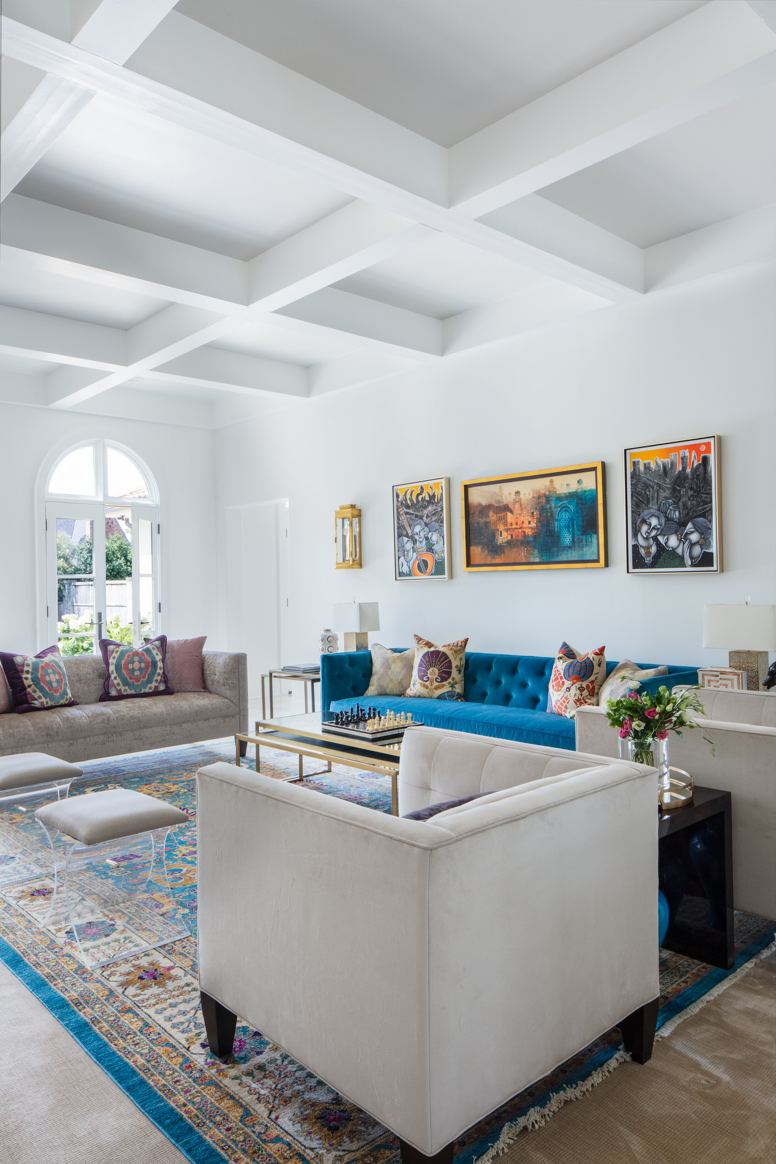
That same vibrant blue appears in the adjacent living room’s sofa, rug and art, playing off the crisp white walls and marble tile floors found throughout the home’s main floor. The quiet foundation allows the brilliant accents to get the attention they deserve to clearly tell the story of this family.

LeighDill-Amna-SelaviePhotography-17.jpg

White and neutral don’t have to equal boring, however, and that fact is beautifully illustrated in the home’s spacious kitchen. Dill guided the homeowners in selecting finishes that give the room a light, airy feel, from the stunning marble tile backsplash to the Taj Mahal quartzite counters to the cabinets in a tone that nods to white, but with a bit more color and depth.

Clever swinging doors separate the kitchen from the scullery, a feature Enoch is known for including in his residential architecture. Khattak says she loves the convenience of having extra work area and appliances out of plain view in the bonus kitchen.

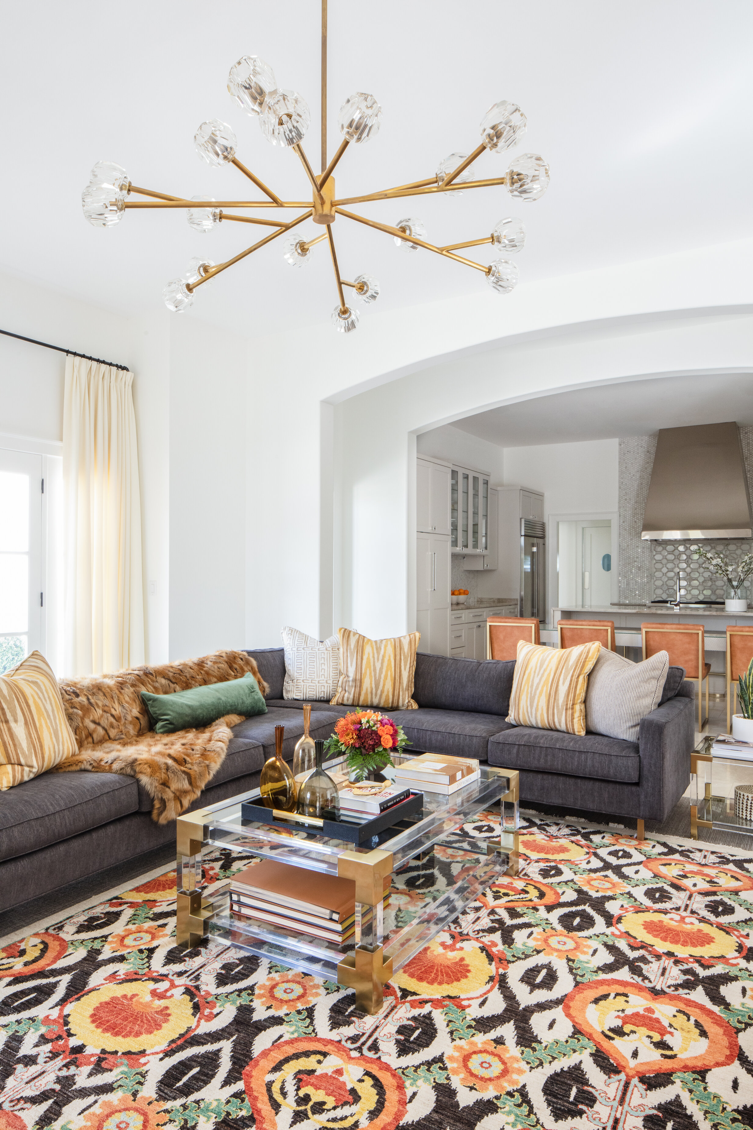
Flowing from the kitchen is the family room, perhaps the heart of the home, which Khattak describes as the house’s “wow factor.” Warm oranges and deep blues stand out as the predominant design colors, repeated in the oversized sectional sofa and a pair of Mitchell Gold + Bob Williams barrel chairs, in addition to the room’s true statement piece—the rug. Its Pakistani designer has been featured in Harper’s Bazaar, noted for his juxtaposition of traditional patterns with contemporary colors.  

The master bedroom continues to tell the story of the couple’s extensive travel history. Art from Amsterdam, textiles from Mexico and a rug and drapes from Pakistan merge flawlessly, punched up by a dramatic blue upholstered bed and a modern light fixture that adds an element of fun to the design. 

The upstairs playroom tells the story of the family’s two daughters, Menaal and Aaleen, aged 11 and nine. The two girls are both avid readers, so it’s only natural that their hangout space is literally wallpapered with books. A brightly colored pattern, a collage of front covers of iconic paperbacks from the famous Penguin publishing house, not only hints at the sisters’ favorite pastime, it also sets the saturated color palette for the room. A comfy sofa with twin chaises gives the girls an ideal spot to curl up with their favorite read, as does a pair of window seats set with plenty of pillows.

LeighDill-Amna-SelaviePhotography-36.jpg

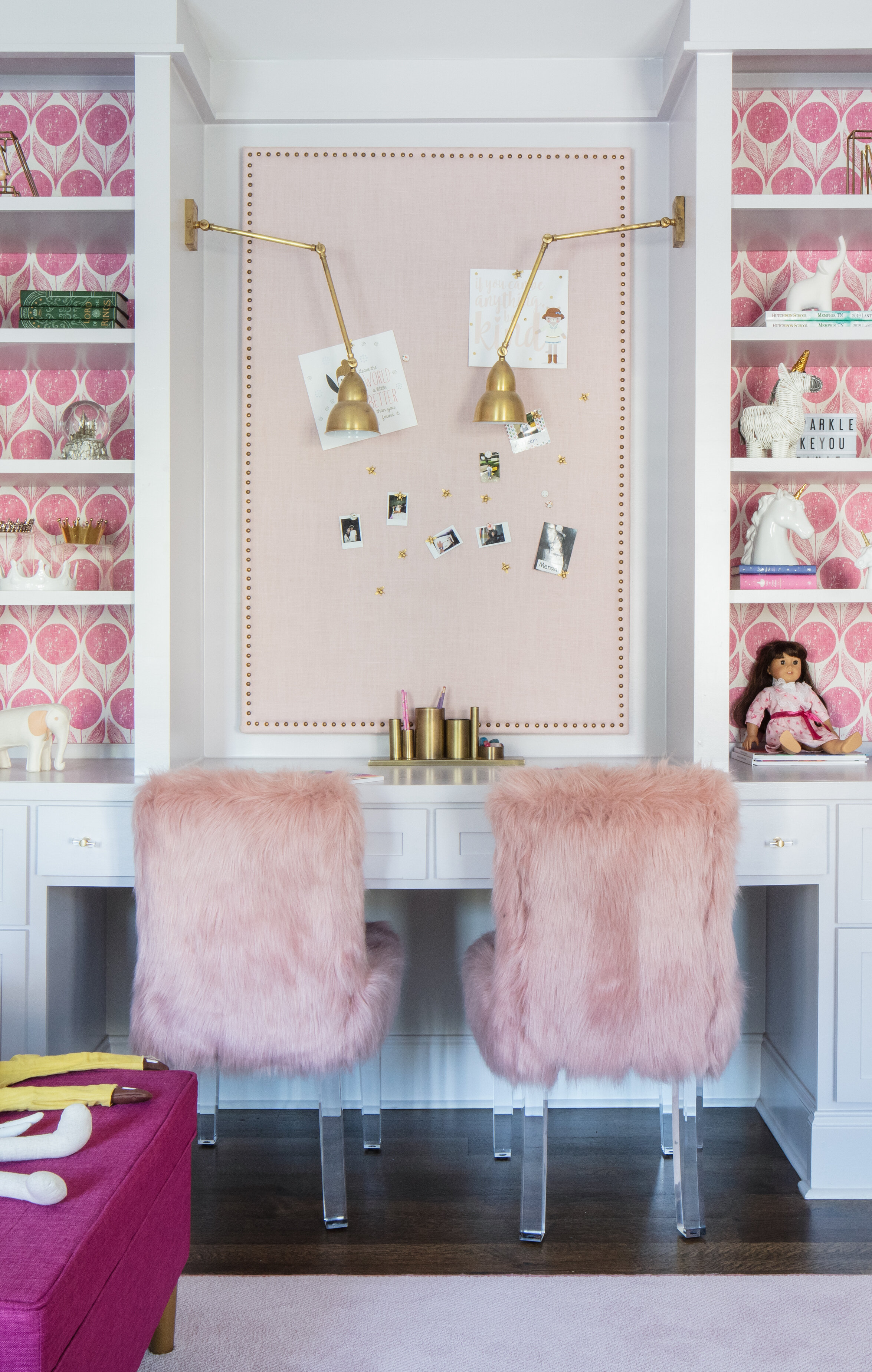
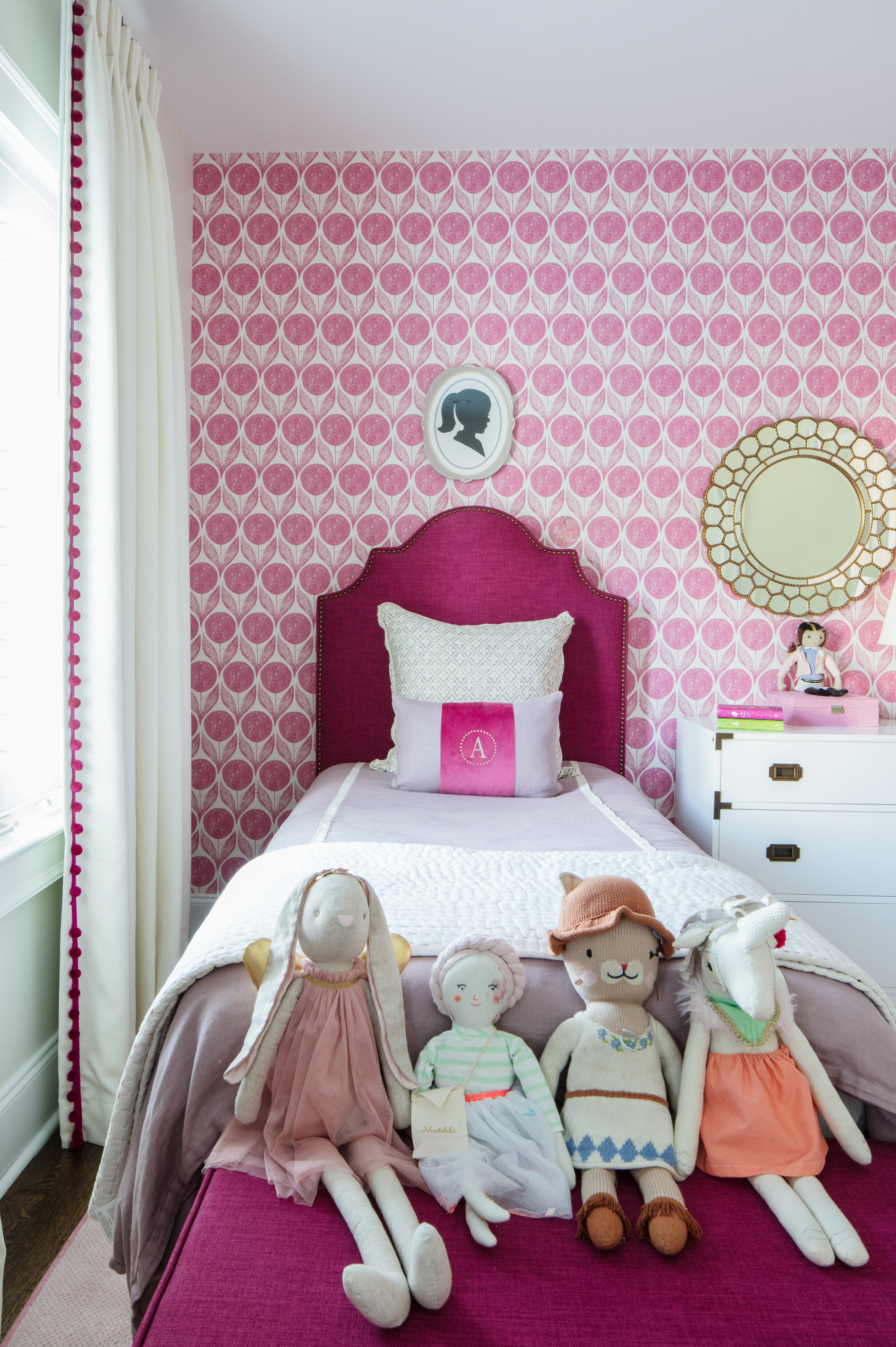
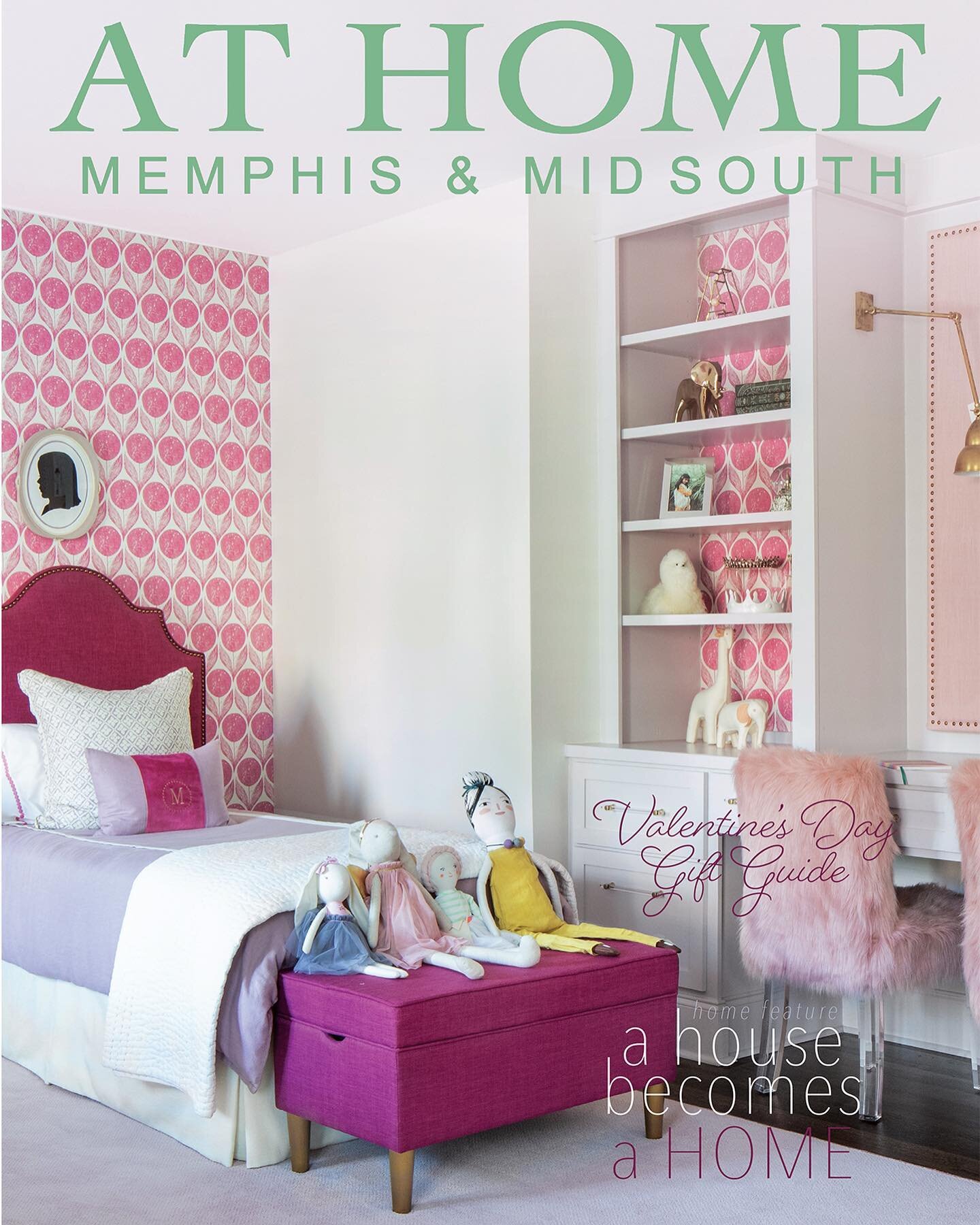
Past the playroom is the bedroom Menaal and Aaleen share, and it is every girl’s dream. Khattak says it was important to her and her husband that their daughters have a fully furnished spot of their own as soon as they moved into the house, so she gave Dill free rein with the design. The designer didn’t hold back, choosing bright pink and white wallpaper for one wall and to back the shelves in built-in bookcases, magenta upholstered bed frames with matching treasure chests at the foot, lavender and white bedding, and a built-in double desk with two pink furry chairs. A framed silhouette hangs over each girl’s bed—a must for any stylish young lady!

Although the house has been her family’s home for three years, Khattak says there are still a few chapters left before its story is complete. She and Dill continue to work on finishing touches in the guest bedrooms and there are plans to add an outdoor kitchen on the back patio. She also says she likes having her home as a bit of a work in progress; in fact she so enjoys collaborating with Dill that she’s in no hurry to turn the last page on the process of making the house a home that tells the story of her culture and her family. 

LeighDill-Amna-SelaviePhotography-32.jpg

New Year, New Looks

Design by First Fruit Collection, Sensational Sofas and Kim Williams Interiors | Story by Terri Glazer | Photography by Annabella Charles

THE PENNINGTON

THE PENNINGTON

There’s nothing like turning the calendar page to a new year to spark the urge to update with the latest and greatest in home design trends. And there’s nowhere better to view up-to-the-moment ideas on display than the annual Vesta Home Show. 

We sat down with the creative minds behind two of the stunning residences from the latest installment of the Vesta to talk about the show homes and the newest ideas in architecture and design. We’re sure to see more of these trends in new construction and remodels in 2021 and beyond.

Ashley Toney, owner of First Fruit Collection in Collierville, along with her lead designer, Patty Michaelis, masterminded the design and decor of the Mandeville, built by the Dave Moore Companies. Toney describes the home as a “modern farmhouse” that appealed to show attendees due to its warm and inviting feel. “It flows well and it’s very liveable,” she says.

The Pennington was constructed by Griffin Elkington. Alexandra Quinn, owner of Sensational Sofas & Interiors, and staff designer Steven Ennis created the interior design and furnished the home. “When designing the custom furnishings for the Pennington, we thought of comfort, style and trend. We wanted to give it a fresh, updated feel,” says Quinn. Kim Williams, owner of KSW Interiors, provided design assistance for the homeowners.

The highlights of these two custom homes include features and looks that are fast becoming must haves in Mid South construction and design. 

THE PENNINGTON

THE PENNINGTON

THE PENNINGTON

THE PENNINGTON

BOLD COLOR

Gone are the days when everything in the house had to be light and neutral. Today’s home designers and owners aren’t afraid to make a dramatic statement with color. As Ennis says, “We love using neutrals, but pops of color really make a statement. Color always adds personality and a distinct mood to a space.”


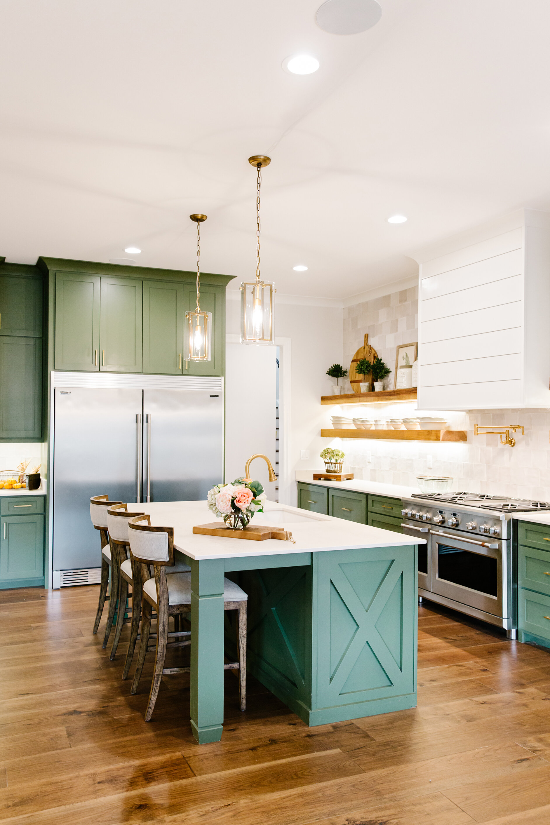
The Mandeville’s kitchen features cabinets painted in Sherwin Williams Oak Moss, a bold green. The hue might be unexpected, but it works perfectly in the house, playing well with gold and brass hardware and fixtures. Setting off the colorful cabinets, a backsplash that extends to the ceiling (another current design trend) features square tiles in four slightly varied neutral shades, installed in a random pattern. 

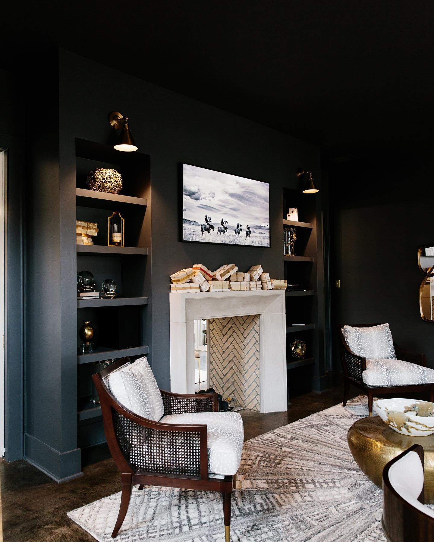
The sitting room off the master bedroom in the Pennington is decked out in saturated color literally from head to toe. Its ceiling, walls and trim are all painted in a handsome charcoal that adds a wow factor, especially when paired with the room’s limestone fireplace. Williams notes that despite such a deep, rich color, the room doesn’t seem dark. “It gets plenty of natural light, so it works,” she explains.

THE MANDEVILLE


BONUS KITCHENS

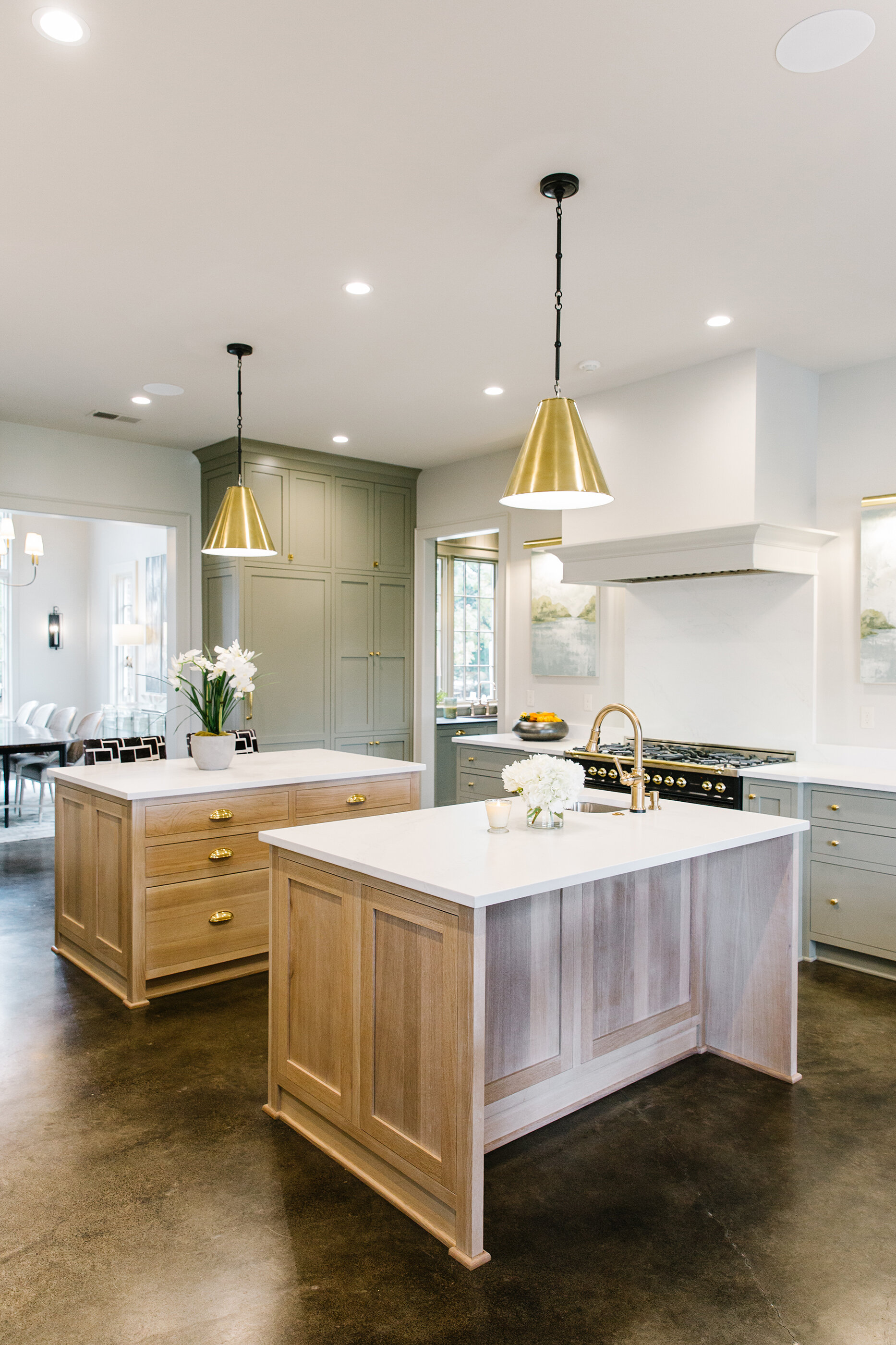
Whether they’re known as butler’s pantries or sculleries, extra rooms off the kitchen are all the rage, and both these Vesta homes have shining examples. It’s no wonder homeowners are clamoring for the bonus spaces—they offer extra storage, room for appliances, a prep spot that can be closed off from view when entertaining, and perhaps most importantly, a way to keep counters in the main kitchen clear and uncluttered. In fact, the family that now calls the Pennington home uses the scullery as the primary kitchen; the dishwasher and the main sink are located there. Thanks to that, the kitchen has an elegant, almost gallery-like feel. Art, rather than cabinets, graces the walls that flank the range, and the twin islands seem more like tables in a fine-dining restaurant.

In the Mandeville’s butler’s pantry, to-the-ceiling cabinets provide storage galore, while under-cabinet lighting illuminates extra countertop workspace any chef would envy. 


THE PENNINGTON

THE PENNINGTON

GOURMET APPLIANCES

The pandemic and quarantine turned many a homeowner into a would-be culinary star, whether by desire or necessity, and kitchen trends are reflecting that. These custom kitchens feature more than the standard range-refrigerator-sink triangle. The centerpiece of the Pennington is a stunning Hallman Professional Range. The perfect marriage of elegant design and cooking performance, Hallman’s feature brass burners and accents and come in an array of colors.

A restaurant-style pizza oven and a built-in coffee station are the stars of the kitchen show in the Mandeville. Such features make staying in for the evening appealing and eliminate the need for drive-through caffeine on the morning commute.

KIDS LOUNGES

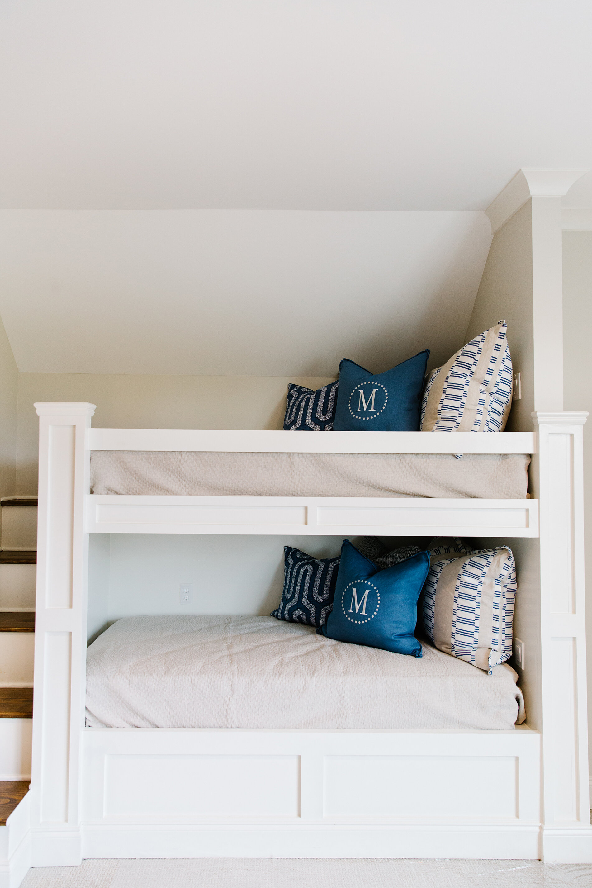
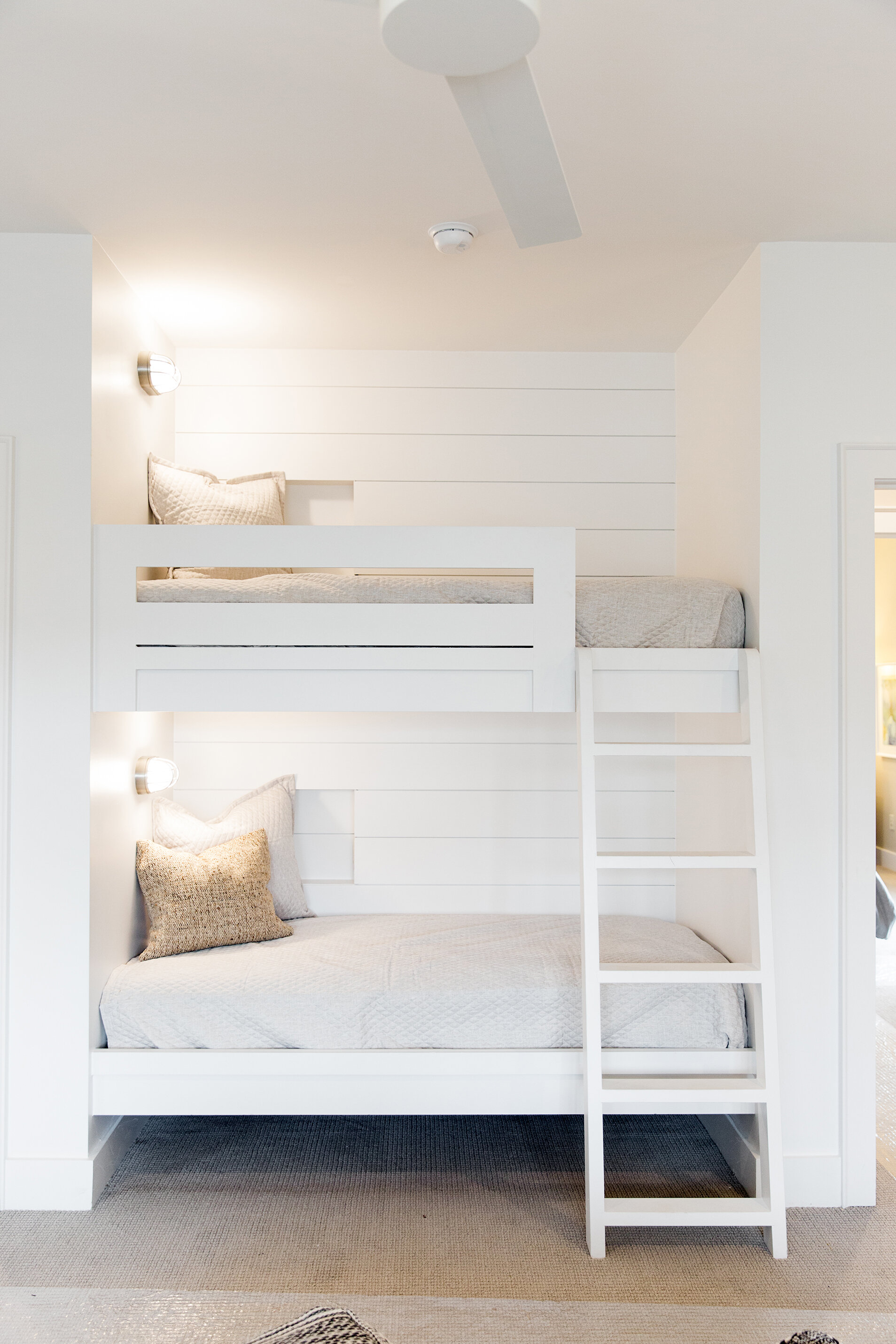
Both these homes have upstairs areas dedicated to the younger set that go above and beyond the rec rooms of years gone by. Built-in bunk beds in play areas or media rooms are the ideal setting for sleep-overs. Williams points out that these clever additions continue to deliver even after the days of Friday night slumber parties are past. “This is such a fun trend that can also be a great spot when grandchildren come to visit. The Pennington has a guest room downstairs, but if the family has a lot of company, they could put the kids up there.”

THE PENNINGTON

THE PENNINGTON

Other leading-edge home design ideas include simpler vent hoods in kitchens. The Mandeville’s is clean white shiplap and the Pennington’s blends with the surrounding white walls. “We’re not seeing a lot of scrolling and detail like we used to, and that goes for cabinet style, too,” Toney says. Mixing metals throughout the home is quite popular for 2021, as well. Michaelis says some clients are hesitant to use a variety of finishes, but it definitely “pops” in design. “We think stainless steel and gold are great together. Everything doesn’t have to match.” 

Ditto for warm and cool tones in paint colors and furnishings. The Mandeville’s palette doesn’t tend as heavily to gray as that of some homes on which Toney and Michaelis have collaborated. Warm tones are experiencing a comeback, blending with cooler grays and whites for a varied look.

In keeping with that, wood elements are making appearances all over home design. These two homes are no exception. The Pennington features pecky cedar ceilings in the dining room and the stair hallway, while the Mandeville’s kitchen has open wooden shelving in place of wall cabinets and handsome beams in a warm honey finish in the family room.

Floating bathroom vanities and a wet room, a glass-enclosed area that holds the shower and bathtub, reflect current trends and make the Pennington’s master bath a luxurious retreat that would rival any spa.

THE PENNINGTON

THE PENNINGTON

For 2021, outdoor living areas continue to be in demand, while pools with extra features are more popular than ever. The Pennington’s pool is embellished with a series of fountain streams meeting in the center, as well as a pair of fire features that bring all the drama. At the Mandeville, a fieldstone combination waterfall and hot tub adds a focal point to the pool and the entire back yard. 

THE MANDEVILLE

THE MANDEVILLE

Welcoming a New Season of Entertaining

Styling & Story by Ginni Jones | Photography by Annabella Charles Photography

Smaller & more intimate, fresh & outdoor gatherings... 

It's become our new norm. With a new year's arrival, it's time to welcome the new era of entertaining.

We were forced into it, but we've grown to love it and will never take it for granted.

Holiday-138.jpg
Holiday-145.jpg

Set the Table

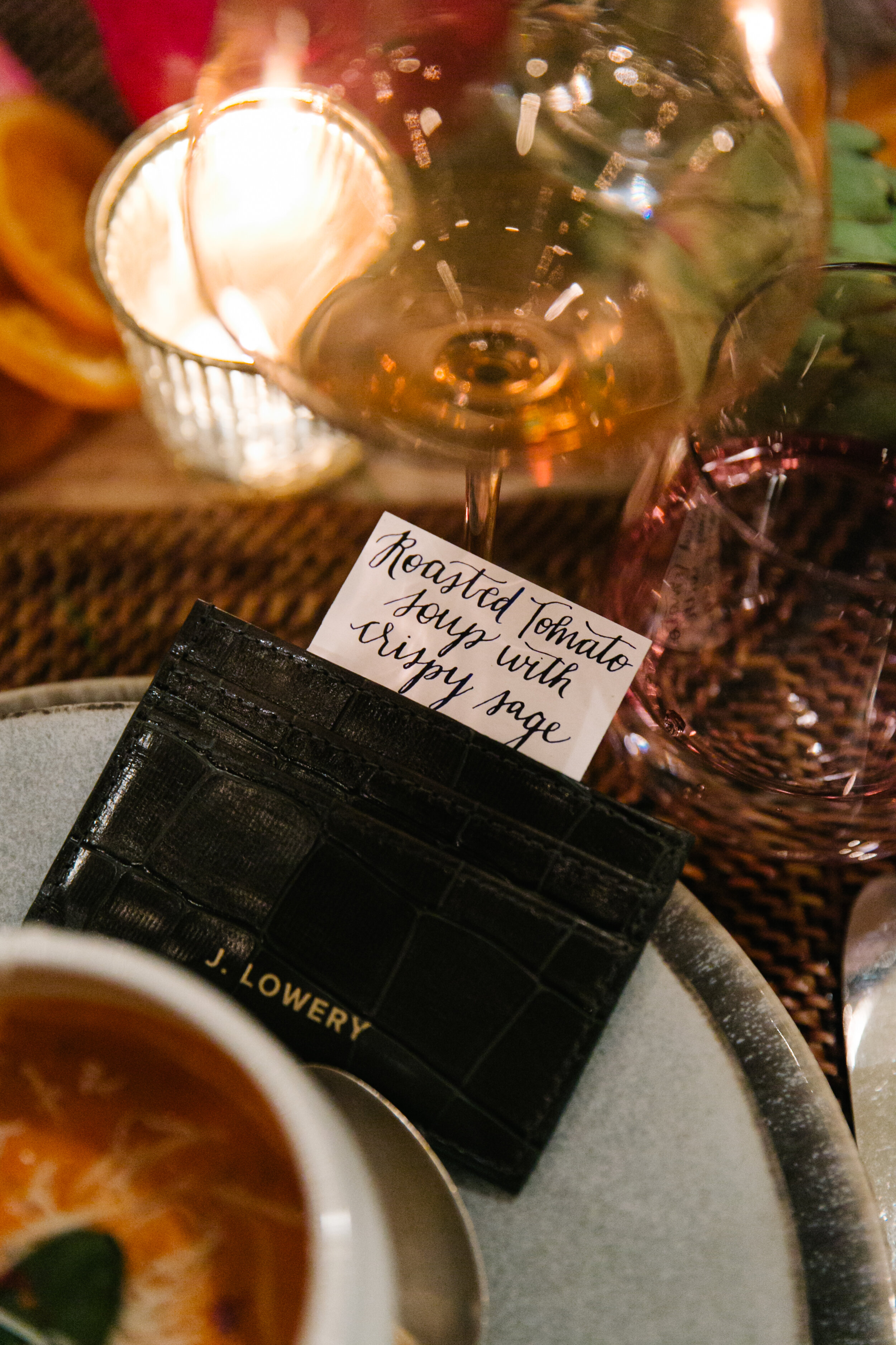
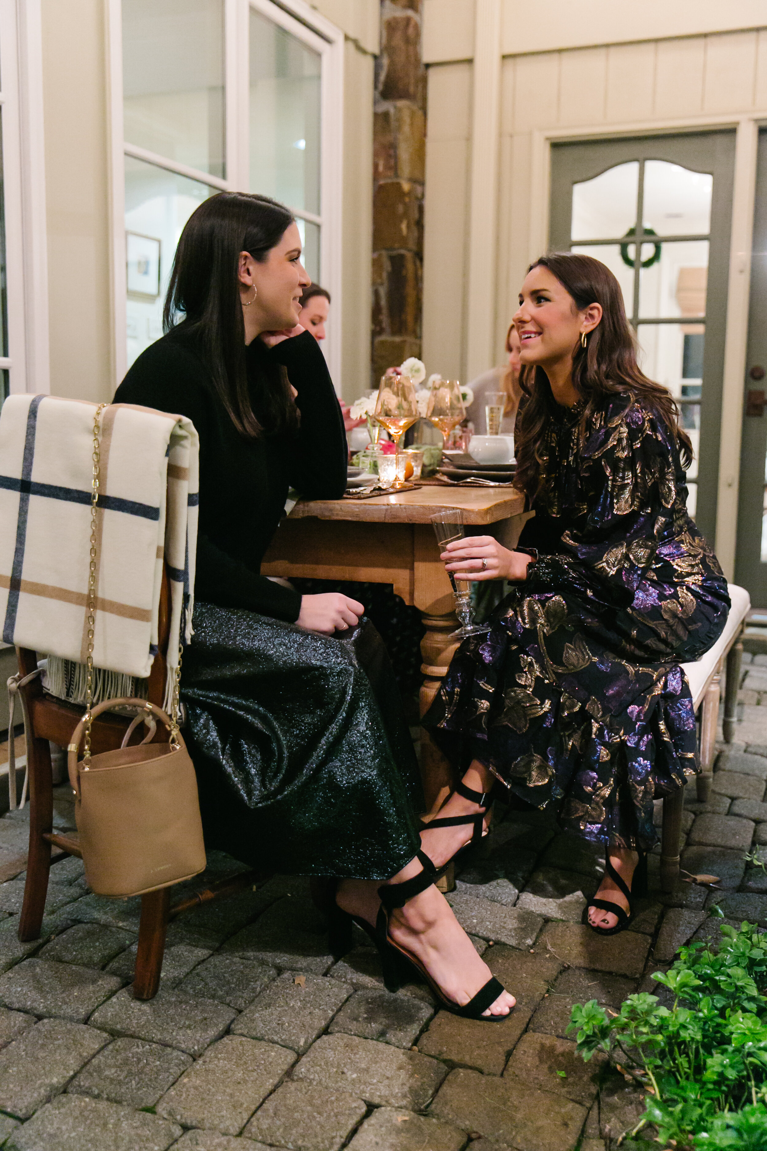
  The dinner party is back! Small, more intimate gatherings that were once our only option have become a new trend we have grown to love. This winter we dined to celebrate our dear friends behind the brand J. LOWERY, and the launch of their new card case collection! 

The Details

REACTIVE GLAZE DINNERWARE WILLIAMS SONOMA | LEVI STONEWARE PLATES ANTHROPOLOGIE | GLASS BUD VASES LISA MALLORY INTERIOR DESIGN | ESTELLE COLORED GLASS LISA MALLORY INTERIOR DESIGN | CLOTHING OAK HALL 

Set the Table

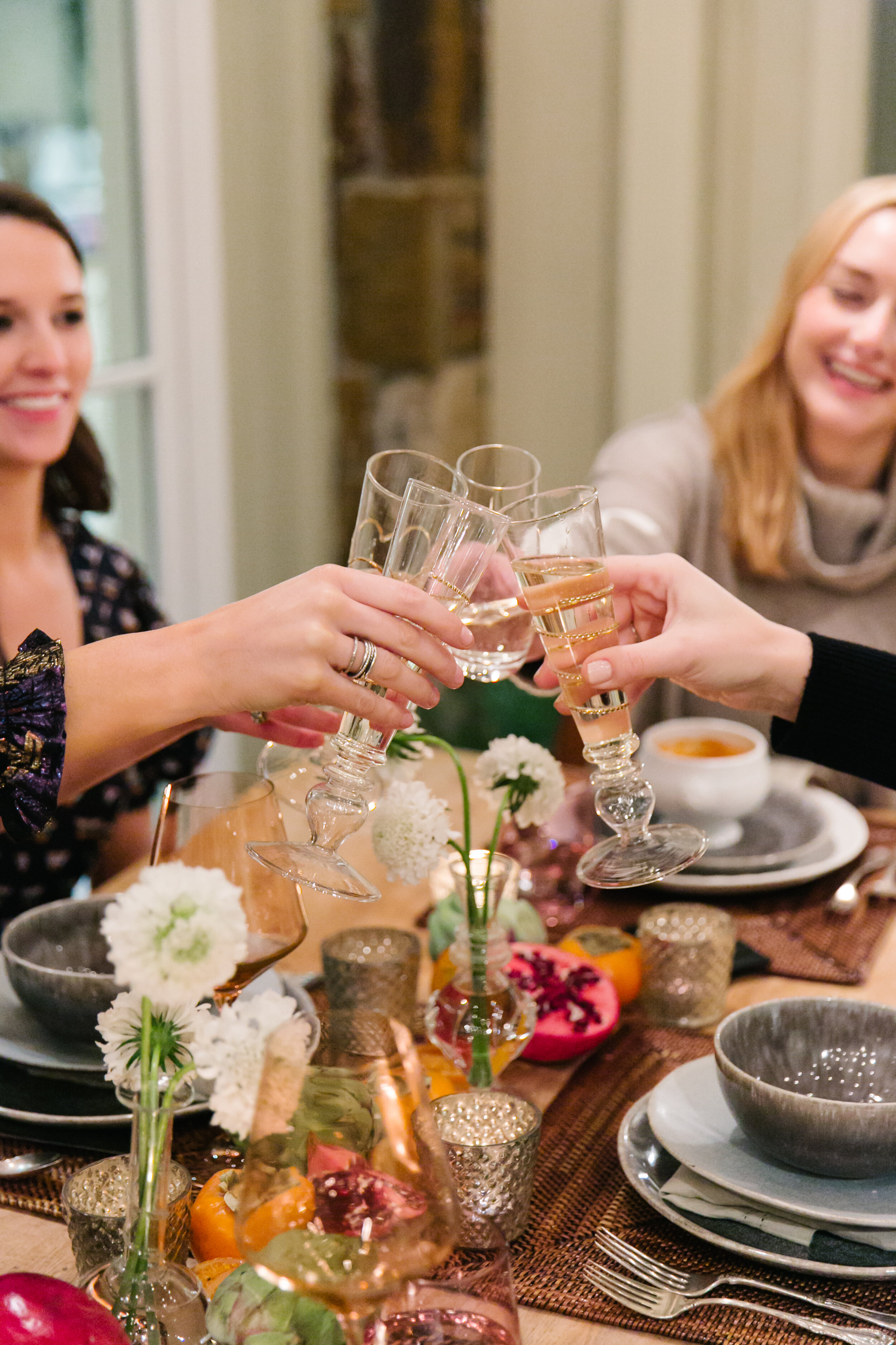
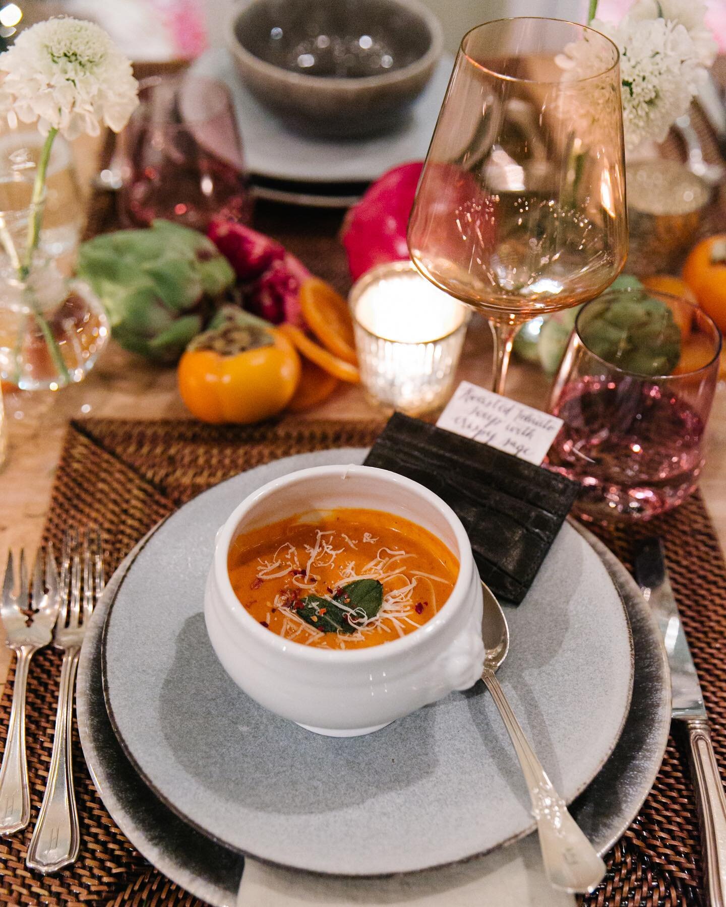
Dinner was set al fresco in the courtyard. For the table I kept it simple, which was a nice change of pace from all the Christmas decor. I paired muted sage glazed dinner plates with light blue stoneware salad plates and glossy white French soup bowls. For pops of color, I used all the produce of the winter season: pomegranates, artichokes, persimmons and dried orange slices scattered down the table with delicate clear glass vases of fresh white scabiosa flowers. To top it off and complete the table, I chose my favorite "gems," Estelle Colored Glass wine glasses, as well as glass and gold champagne flutes, because we have lots to celebrate this new year!

Holiday-59.jpg

J. LOWERY

the brand

Jamey and Margaret are lifelong best friends turned business partners and the co-owners of J.LOWERY. Together they design beautiful, quality pieces that fit seamlessly into today's lifestyle and personal aesthetic. For them, it's all about the everyday influencer. 

.................................

"We're a brand that celebrates who you are and what you like to wear. We strive to help people see in themselves what their peers see in them, hence our belief that each customer is an everyday influencer.

By building on a culture rather than building solely on a product, our brand’s core is not about the bags themselves, but the women who carry them.  

Wear your bag in a way that makes you feel confident and comfortable and we will feel like we’ve accomplished what we’ve set out to do."

Chosen With Love

Interior Design by Selena McAdams of Spruce Shop | Story by Terri Glazer | Photos by Stefanie Rawlinson

As an interior designer, Selena McAdams’ job is all about making choices. Her daily work involves making decisions for her clients’ homes and choosing what to put on the shelves at Spruce, the East Memphis retail shop she owns.

AtHomeMagazineSpring2021-8.jpg


The same is true for the home she shares with her husband Patrick and their two daughters, Taylor and Charlotte. Selena chose the house itself, and every piece in it, using careful thought combined with instinct. “I’ve done this [design] for so long that when I see something I love, I know that’s it,” she says.

AtHomeMagazineSpring2021-10.jpg

The journey to making the 1940s era place her family home began about three years ago. She and Patrick had just finished flipping the house next door to their previous residence when this one came on the market, and they were looking to do another renovation for resale. “One family had lived here the whole time and had raised four sons here prior to us purchasing it,” says McAdams. “They had entertained a lot of offers on it, but the fact that we weren’t going to tear it down and we were going to redo it was appealing to them.”

About halfway through what started as a “really awesome project” Selena says something clicked. She realized this wasn’t just a house, it was her house. In fact, she felt so at home there, she decided to throw Patrick a surprise birthday party in the yard while the house was still under renovation.

The couple worked with local architect David Anderson to reimagine the home to suit their family’s needs, and Selena gives his practical design philosophy high marks. “What he is so good about is usable space. He’s so practical—he really has family in mind when he’s making space. He made it to where we live in all the rooms every day, which is great. I’m not a person who wants to have rooms that we’re not using.”

Although much “shifting” of the home had to be done, the architect and designer tried to keep as much of the original structure as possible. Builder Frank Gusmus and his crew from Gusmus Construction made the plan a reality and the homeowners couldn’t be happier with his work.

AtHomeMagazineSpring2021-29.jpg

“I’m a big believer in making your space work for you. If your square footage doesn’t seem like it’s functional, change it.”

AtHomeMagazineSpring2021-26.jpg

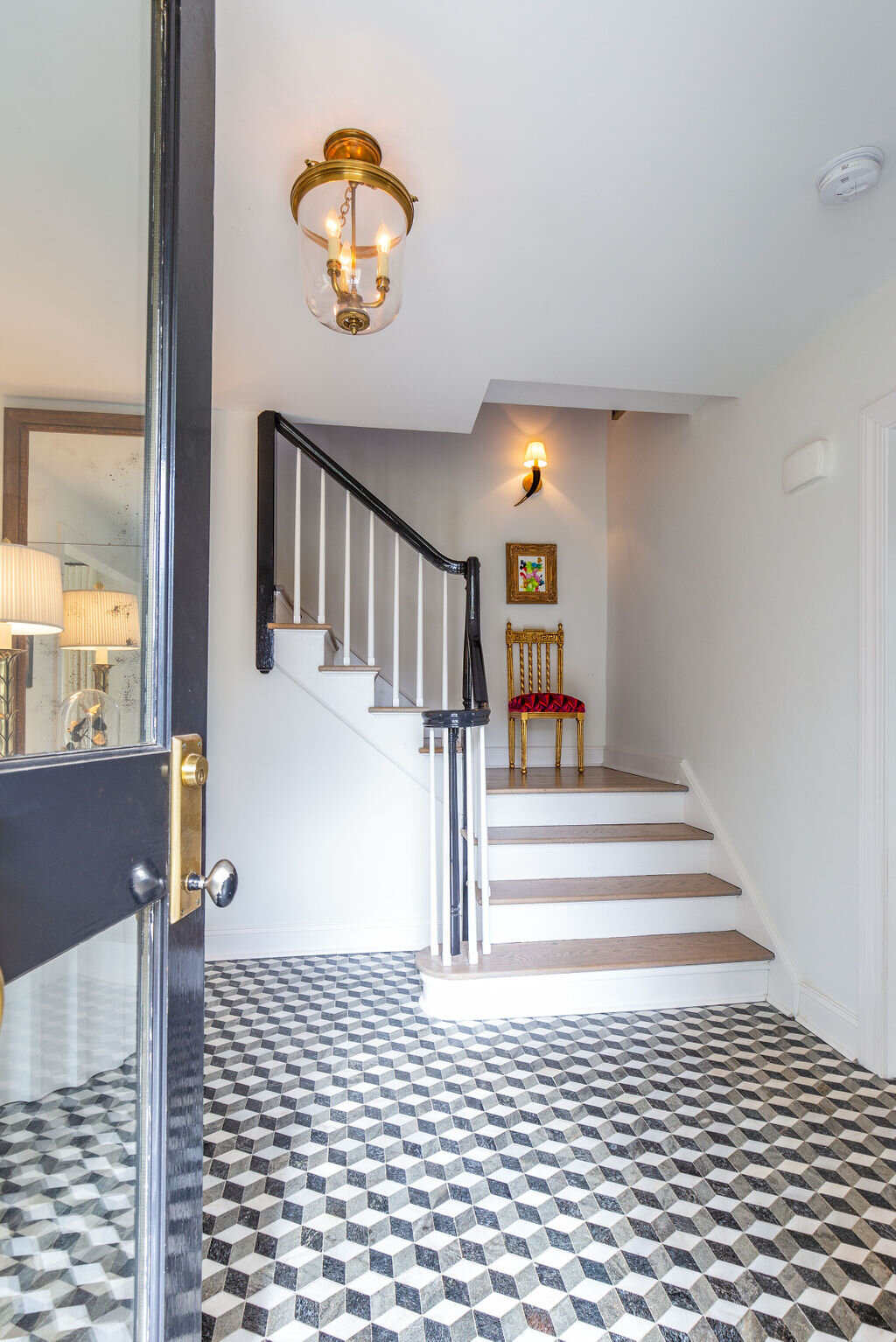
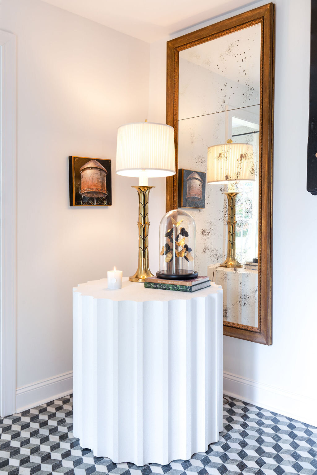
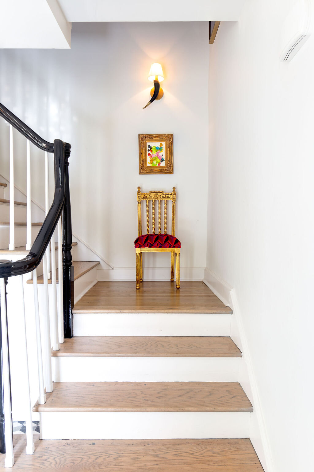
Where using the home’s original materials wasn't feasible, Selena was careful to make choices that were in keeping with the character of the house. Case in point is the entryway, where the new tile floor, hardwood stair risers and black lacquered handrail speak to the era in which the home was constructed.

Just off the entry is a sunny office area that Selena calls the “hub” of the home. On the large sofa or at the computer atop a pretty curved writing desk the girls can do school work in a cheerful space that’s not too far removed from the watchful eyes of their parents.

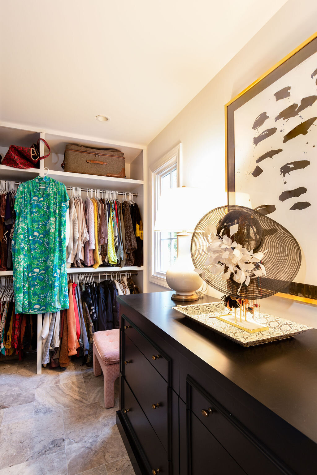
Perhaps the most drastic architectural shift was in the home’s former den, now a sleek and stylish master bedroom. The original design included a red brick fireplace, now plaster washed, and dark beams on the ceiling, which the McAdamses had removed. Hunt Simonton of HS Carpentry constructed the full wall of built-ins in the master. The handsome unit provides storage, a laundry hamper for each family member and a segue into the home’s laundry room.

Noting that even though both her daughters have their own bathrooms upstairs, “everyone is always in our space,” Selena says with a laugh. With that in mind, she asked Anderson to design a master bath and closet add-on inspired by a luxury lodging she had visited in Asheville, NC. “The bathroom was almost like a locker room and I told David that was what I wanted. I didn’t want doors; I just wanted everything to be in one space; one big room,” she recalls. 

AtHomeMagazineSpring2021-35.jpg

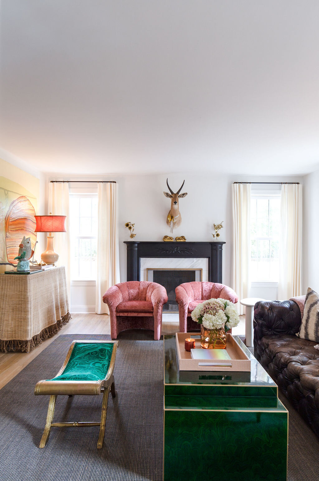
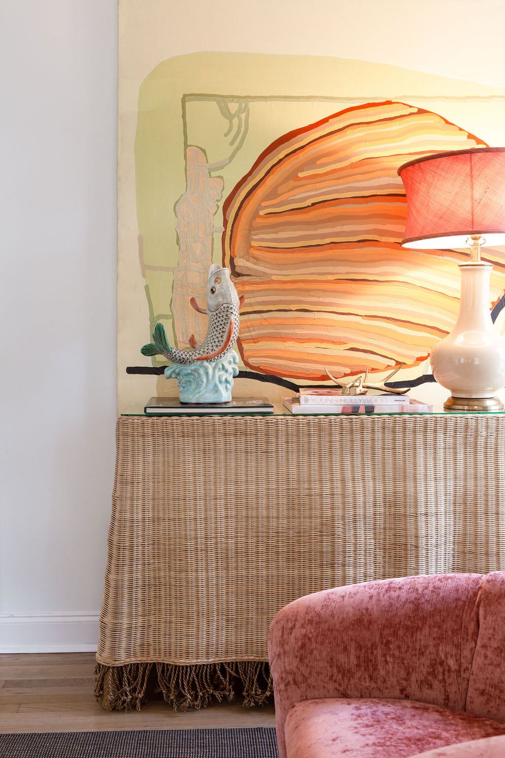
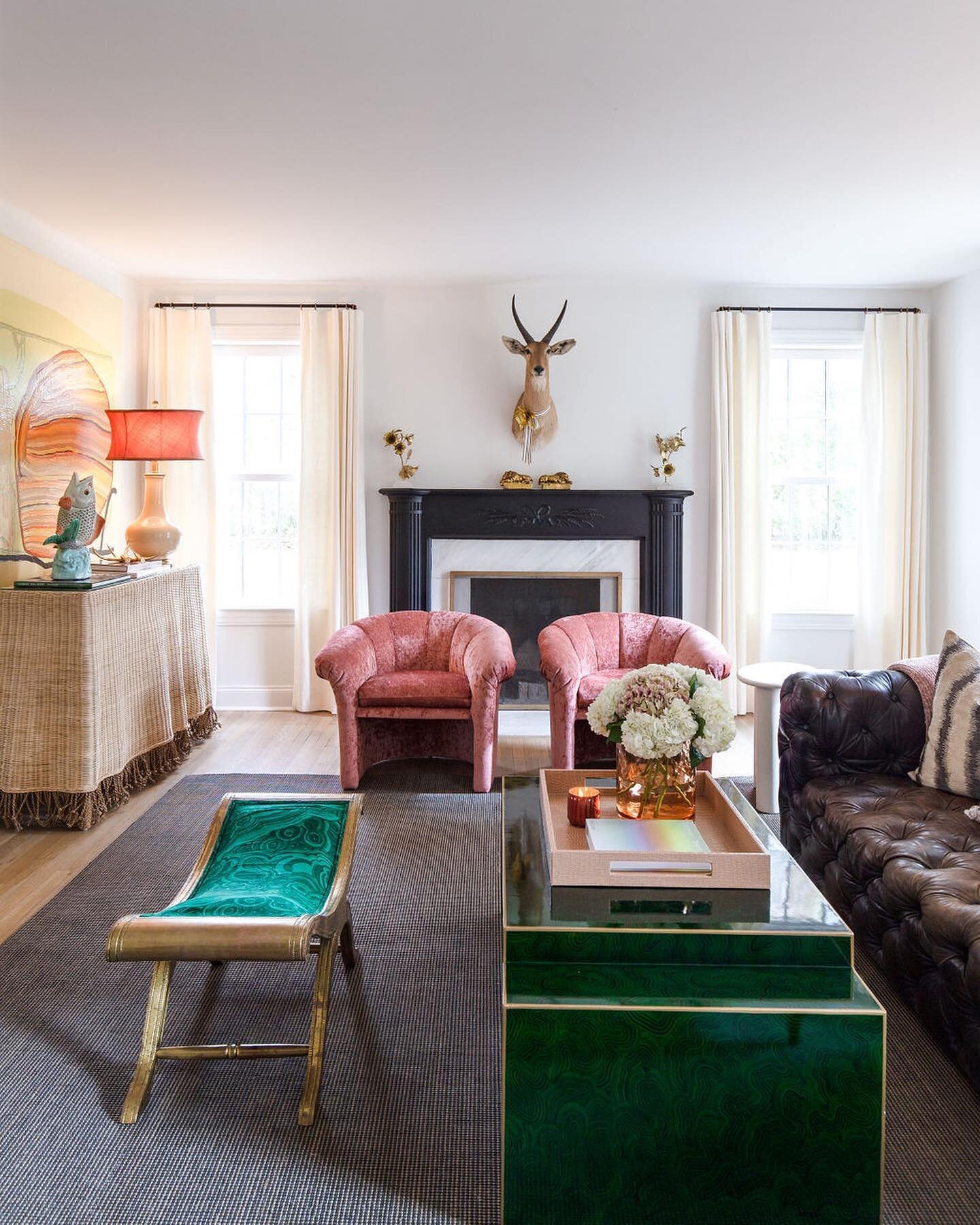
While the master suite underwent the most extensive change, the living room is the most untouched part of the house. The stately fireplace is original, as well as the hardwood floors. Its furnishings are an eclectic blend of pieces Selena loves, having collected and used them in various ways over the years. The pair of rose velvet chairs were in a bedroom in her previous home, and the empire-style bench with a stunning malachite upholstered seat is a treasure she acquired solely because she loved it. “When I got that piece I didn’t have a stitch of green anywhere in my house. It was just one of those things where I loved the fabric so much that I said, ‘I’m doing it. It will all make sense one day! I’m a big believer in that.”
AtHomeMagazineSpring2021-13.jpg

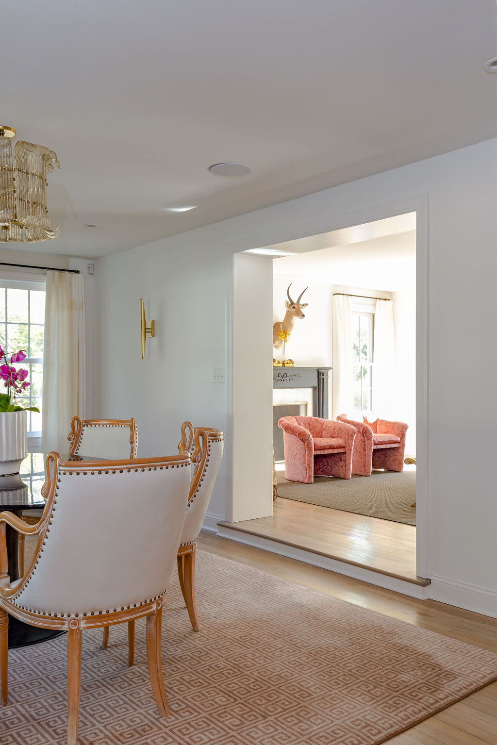
Through a large cased opening from the living room is the current dining room; ”current” because Selena originally imagined the space as another sitting area where Patrick could watch a game on TV while she and the girls enjoyed a show more to their liking nearby. Even though the space is now used for family meals, a TV hidden inside the antique French armoire still lets the man of the house keep up with his favorite teams. 
The dining room opens into the kitchen, an area that exudes sophistication. The room is more than a pretty face, though, every detail created with practicality in mind. The striking antiqued glass mirror wall is easily cleanable. Selena says it was a must in this house, as it also reflects the beauty of the backyard through the facing windows. “It gets more of that gardenly love inside,” she says. “The light bounces back and forth and we get a lot of green from the yard.”

In her professional life, Selena encourages her clients to make functional design choices so they can use and enjoy their homes without worry, Her own kitchen is a testament to that concept. She opted for a dark paint color on the island to mask scuff marks when her children sit there and decided to forgo upper cabinets because they can be hard to reach. Instead she included drawers in varying sizes and depths in the cabinet design, even a homework drawer to keep the countertops clutter free.

AtHomeMagazineSpring2021-19.jpg

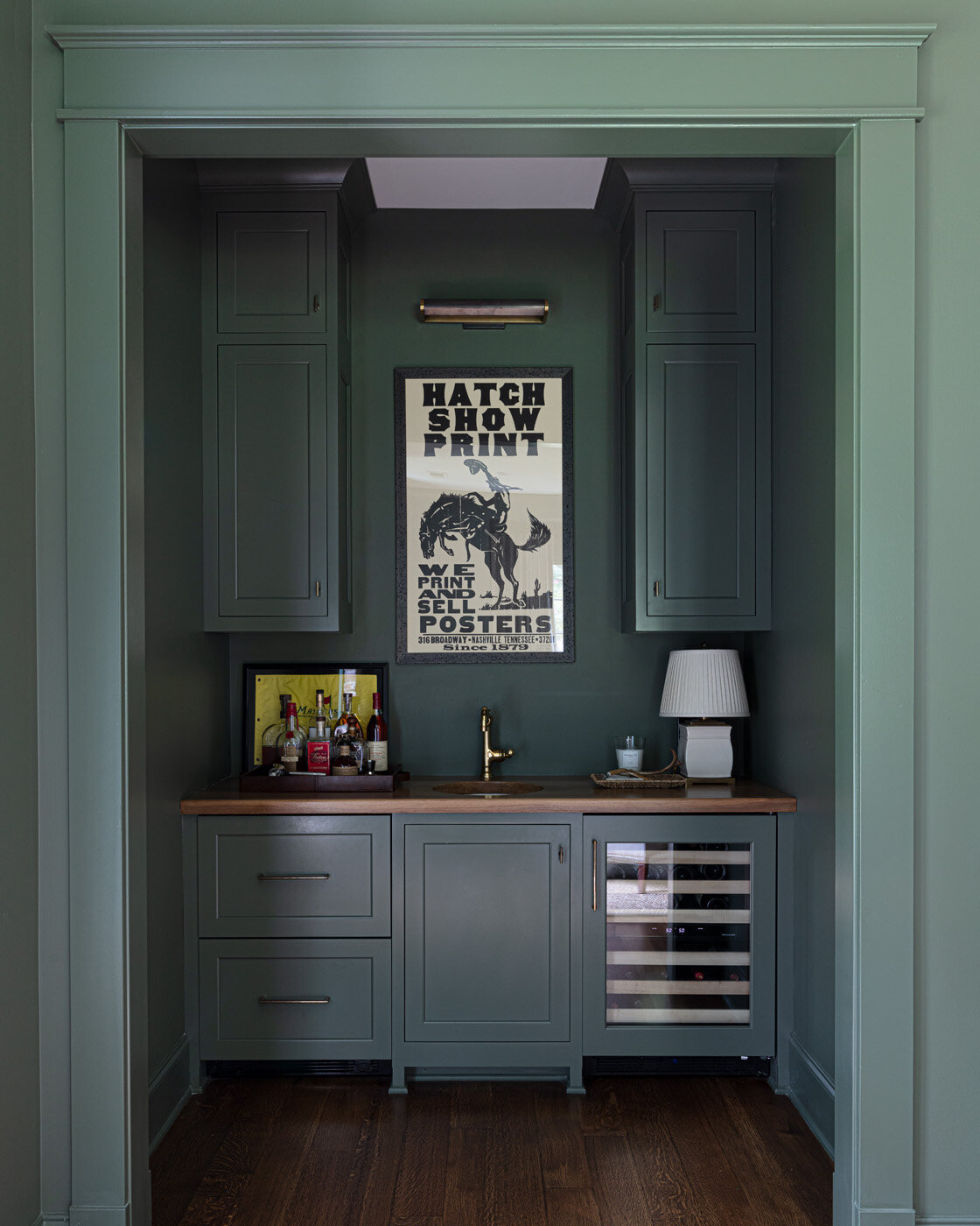
Behind the kitchen, the home’s reworked floor plan includes a powder room, pantry and a back kitchen—one of Selena’s favorite features. “When we’re outside grilling, when we have parties, all the drinks are in here,” she says. “Glasses, cups, ice, liquor, coolers...all the drink action. It works really well.”

Working well is a phrase that applies to every aspect of this house and its furnishings. Using her design expertise, Selena has blended function and beauty, traditional with unexpected, incorporating her treasures, to create a family home that will stand the test of time. 

Holiday Entryways

Styling by Lindley Martens | Story by Terri Glazer | Photography by Ross Group Creative

Three different styles, each sure to make big impact

Our holiday gatherings may be a bit smaller and more subdued in 2020, but there’s no reason they can’t look merry. Lindley Martens, owner of Lindley Martens Design and Laurel Rd. Antiques and Modern, created three seasonal entryway vignettes exclusively for At Home. Whether your style is traditional, minimalist or glam, they will inspire you to create a warm welcome for guests from the moment they walk through the front door.

1O6A2561 edit crop 4x5-web.jpg

Modern Elegance

Festive yet understated

A Korean secretary chest provides the base for this minimalist look. Martens paired a mid-century lamp and a green Empoli glass vase filled with magnolia branches from the yard to anchor the piece, accented by more vintage classics: a pair of banana peel candle holders and a brass sculpture. “This handsome guy could live there all year round and don a bow at Christmas time to make him more festive,” she says. A Paul Schneider Ceramics geode glazed tray adds to the cool factor.

“Fragrance adds another memorable layer to your home, whether it’s fresh pine from your yard or spicy, clove-pierced oranges.”

cindy-mccord-design-1o6a1860b-web.jpg


Time-Honored Classic

Traditional with a little spunk

Here Martens paired tried-and-true Christmas decor elements with the unexpected for an unforgettable look. The Empire-style chest with bronze ormolu details sports a colorful topper doing double duty. “That’s actually a scarf that I wear,” Martens says. “I love using scarves to add an extra layer of color and texture. Walking in the door to this color would be so festive!” The opaline glass and bronze lamps are from the estate of 80s design superstar Mario Buatta. Martens added Indian ikat fabric shades for an unexpected touch of drama. The white compote filled with pine cones is a simple way to add height to any tableau.

“The new faux greenery, like this wreath, looks incredible. I added some holly from a bush in the yard and lots of loppy ribbon is really cheerful.”

1O6A2572 edit crop 4x5-web.jpg


Masterful Mingling

Glamor meets holiday

What a stately look this Empire-style chest would bring to an entryway. Topped by a grand antique directoire mirror embellished with pine garland, it is decked out for the holidays. Martens brought together a diverse group of pieces to create the look, including a pair of glossy lamps and two original works of art by Haley

“Put a collection of antique Christmas tree ornaments in a bright, mid-century bowl. This is a great and easy way to add a shiny touch.”

Laurel Rd. Antiques & Modern, located at 680 S. Perkins Rd., is open Monday through Friday, 10:30 a.m. to 4:30 p.m. Call 901.581.2000 to set up an evening or weekend appointment during December. Visit lindleymartens.com to join the mailing list and stay up to date with all things Lindley Martens including her new online shop.

1O6A2583 edit square-web.jpg

Setting the Table for the Holidays!

Styling & Story by Ginni Jones | Photography by Annabella Charles

'Tis the season to set the table! This holiday season we have realized it's more important than ever to spend time with our loved ones. For my family, that means gathering around the table for a lovely meal. 

Christmas-38.jpg
Christmas-24.jpg

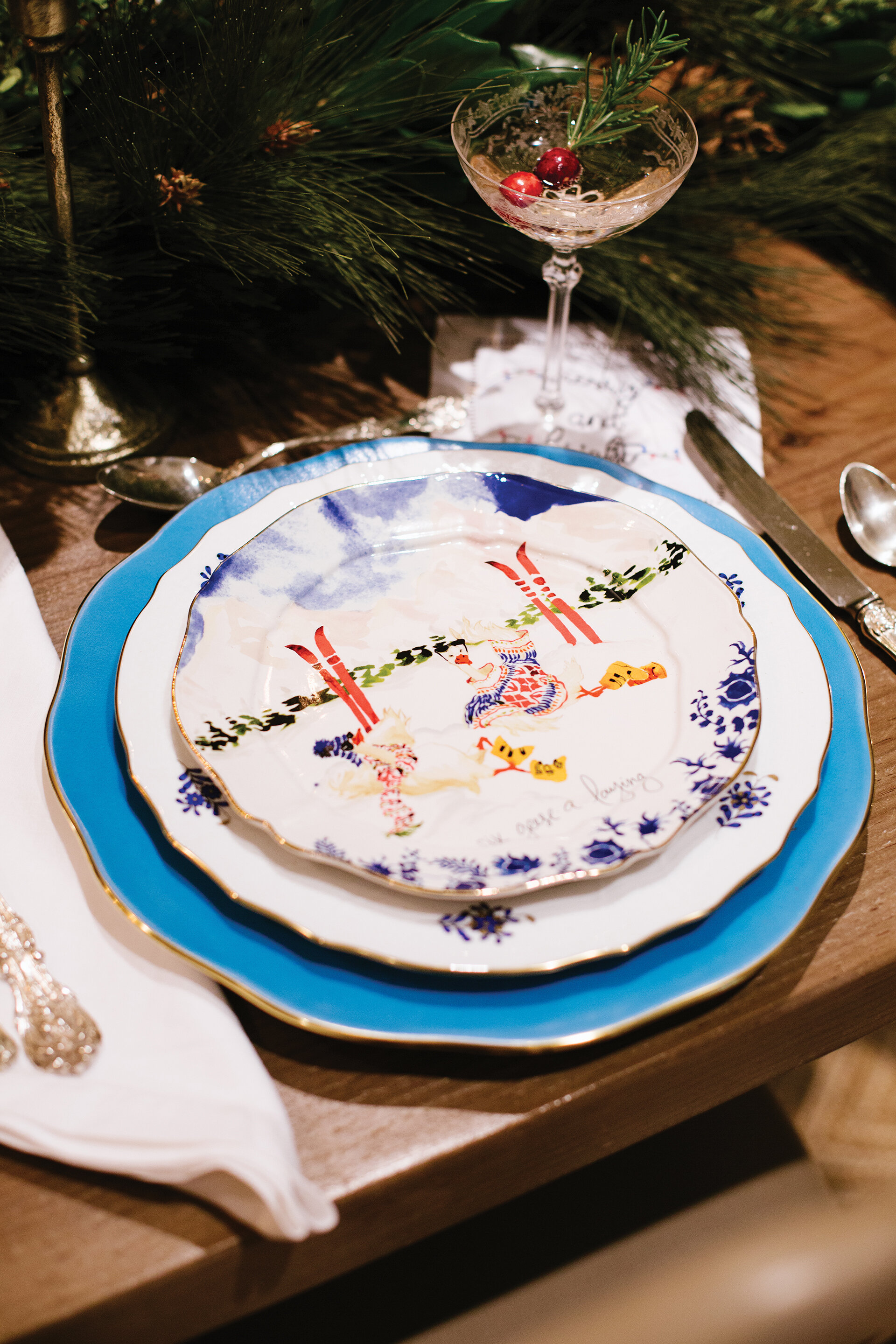
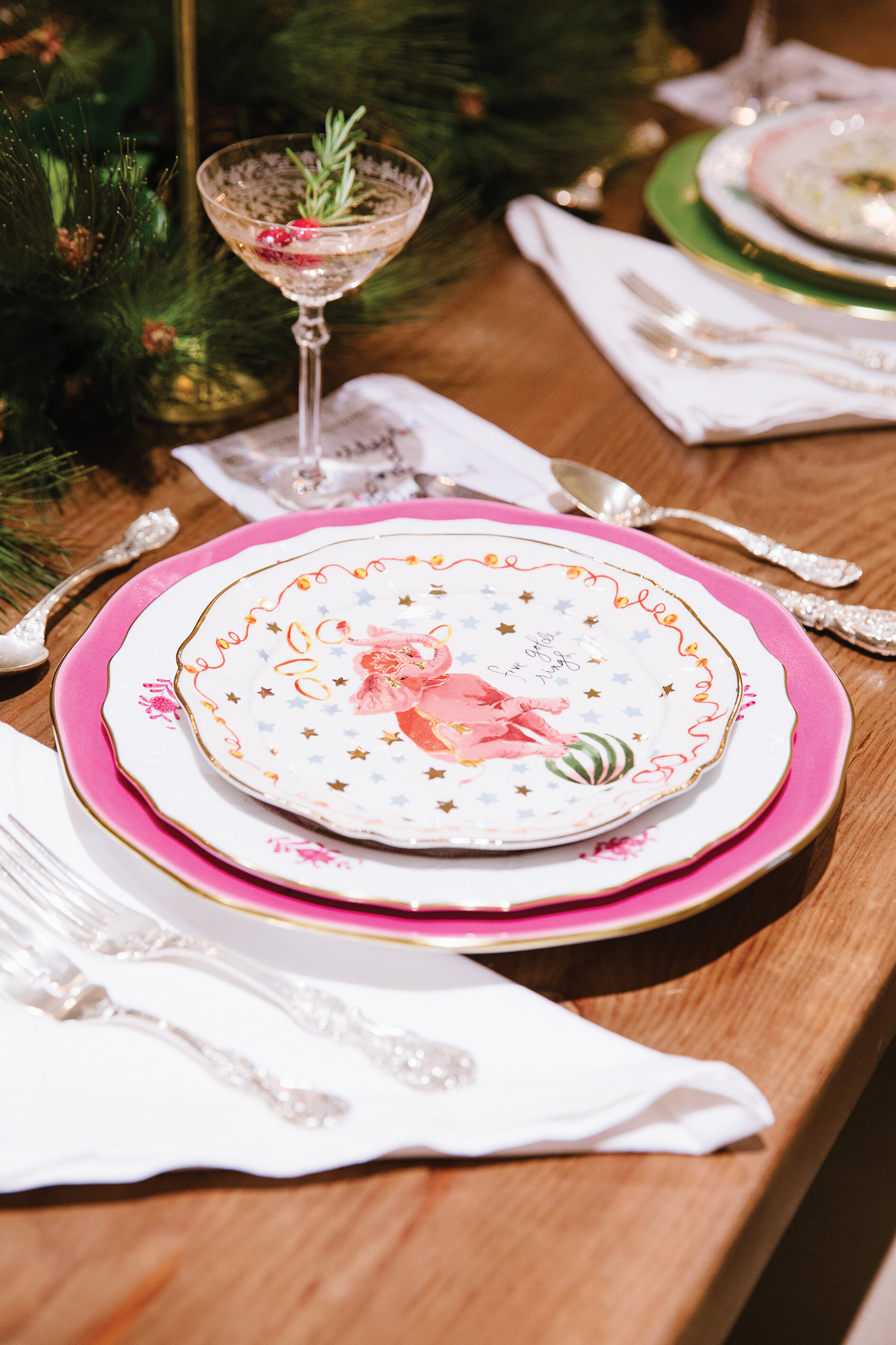
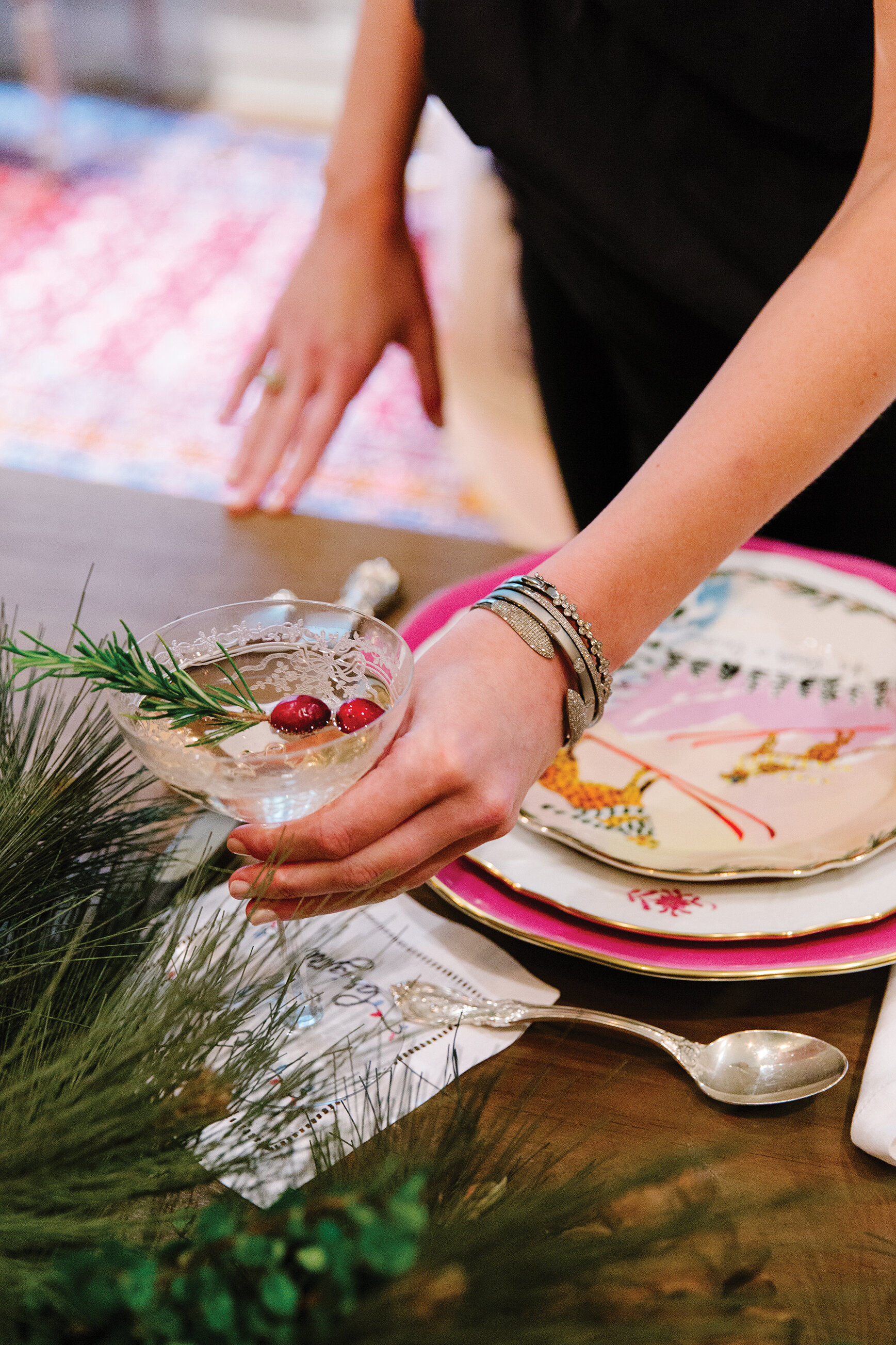
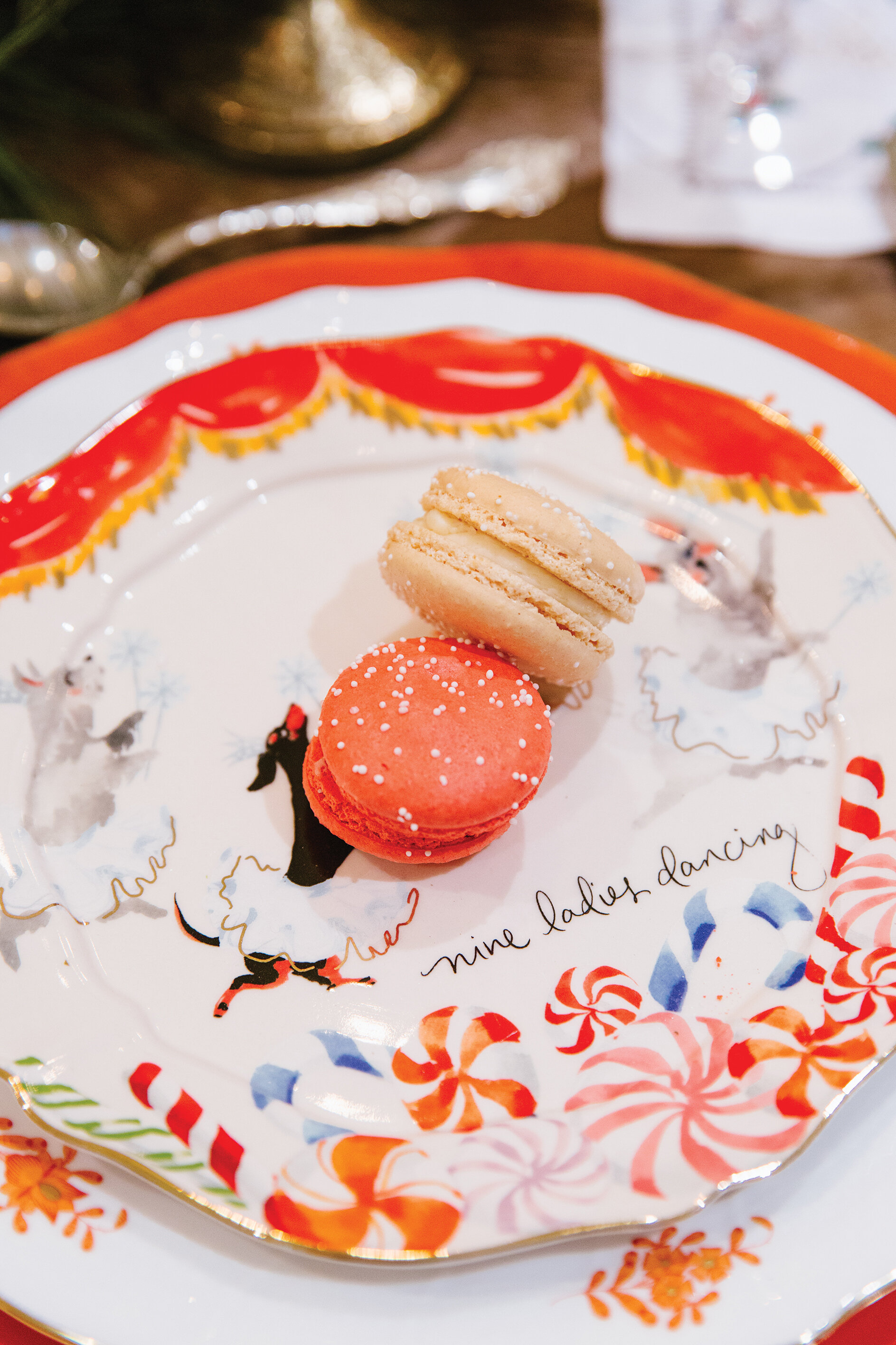
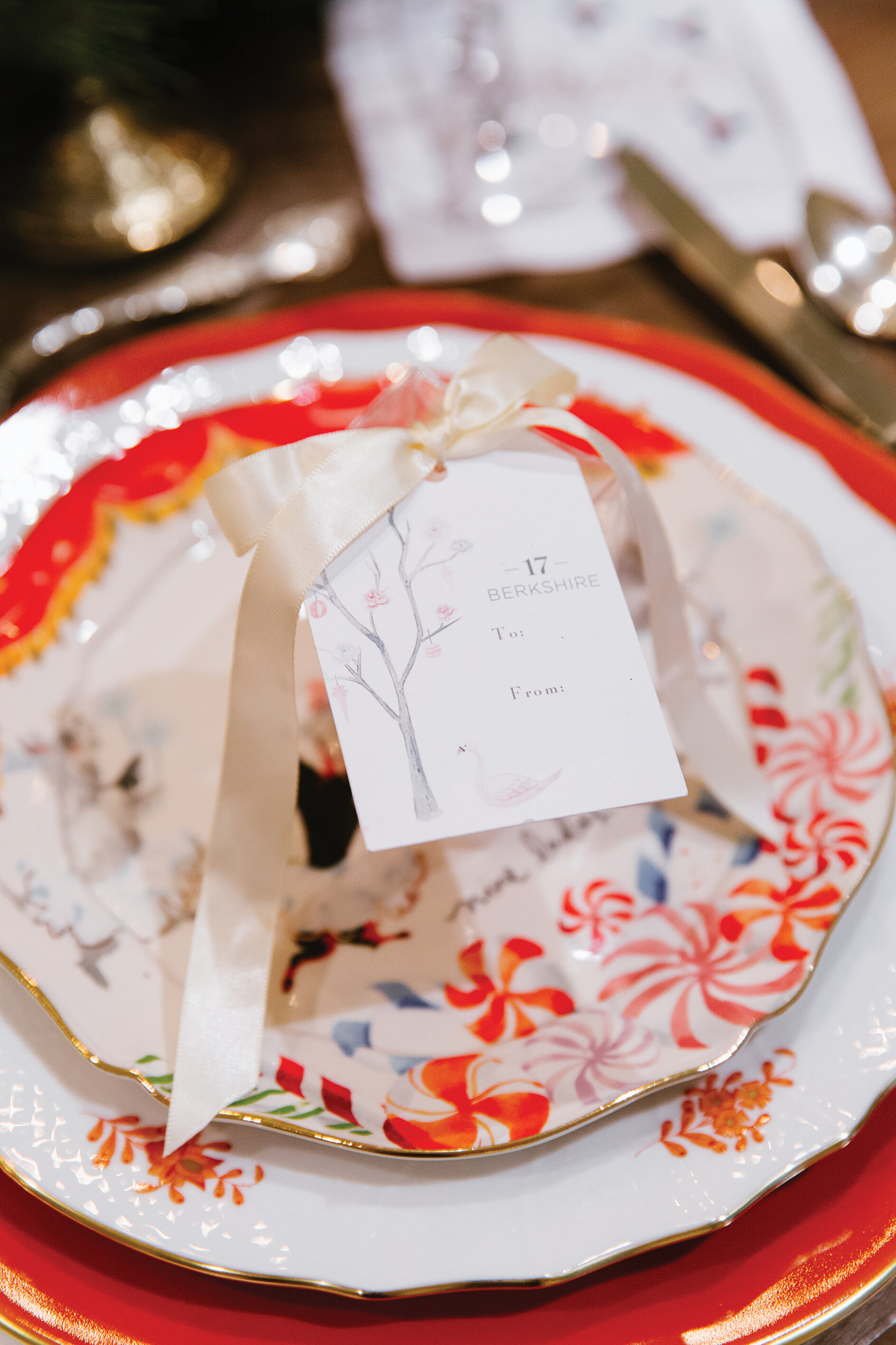
Keeping with the theme of "nothing being normal" this year, I decided to create a colorful and bright tablescape rather than the traditional red and green holiday setting. My inspiration was sparked by these "Twelve Days of Christmas" dessert plates from Anthropologie. For many years I have loved the work of watercolor artist Inslee Fariss. I found her, of course, on Instagram, and have been following her right from the beginning. When she posted these plates as a part of her collaboration with Anthropologie back in the summer, I knew I wanted to plan my whole Christmas tablescape around them. They are the cutest plates—a new take on the traditional twelve days of Christmas—complete with six geese a-laying, apres ski style, and more. When the plates arrived in the mail, I found they were even better in person. The plates are scalloped with a hand-painted gold edge, perfectly matching the scalloped gold edges of Herend china.

So I was off to Social, our local Herend distributors, to pick out the color palette that would accompany my adorable new plates. We went with rust, raspberry, fern and turquoise to best accent the plates. My final decision was to use the "Silk Ribbon" chargers with the corresponding "Chinese Bouquet" dinner plates. 

Since I had a bright color palette going with raspberry, turquoise, fern and rust, I called my sweet friend at Spyglass Lane for some custom cocktail napkins. We selected a classic "cheers" as well as "merry & bright" with Christmas lights in the four bright hues from the color palette. 

For the rest of the table, I kept it simple. Beautiful white hemstitched linen napkins, antique silver flatware, and my great grandmother's champagne coupes, only used for special occasions (aka 2020)!  

WEBAugust-29.jpg

Decking the halls

was super simple this year thanks to my favorite floral shop, Garden District. In addition to creating stunning floral arrangements year round, they are masters at decorating for the holidays. 

Our table is long; 10 feet long, to be exact, so I fastened two strands of artificial pinecone garland from Garden District together to create the perfect centerpiece.    (TIP: I always add a few springs of fresh greens to the artificial garland to make it look even more realistic!) I tucked in gold candlesticks and the table was set. 

On the sideboard, I love to mix and match clusters of bottle brush trees. Also sourced from Garden District, the silver trees paired nicely with the antique silver flatware on the table and the bright green trees, which also light up, were the perfect bright take on traditional Christmas green. 


Christmas-107.jpg

Shop Local

If ever there was a time to shop locally, 2020 is it. We know this year has been rough for everyone, especially small business owners. This Christmas, even though it will be a small family get-together, we are still dressing as if we were having a big Christmas Eve party. I'll be cocktail party (I wish) ready in this Tish Cox navy taffeta Sheridan top from Oak Hall. And to complete the outfit, I’ll be sporting my favorite stack of Oak Hall Collection oxidized sterling silver and diamond bracelets.

Plan

your menu ahead of time. This year, make it a priority to outsource some items from local restaurants. In our house, we will be ordering the sweets from 17 Berkshire Bakery. 

Nuha Abuduhair, the owner and baker at 17 Berkshire, plans the most creative holiday menus when it comes to the dessert department. For tarts, cakes, macarons, cupcakes and more, I highly suggest visiting her in Overton Square for your holiday treats. 

wishing

you and your loved ones a very Merry Christmas! May you fill this time with happy, healthy and wonderful memories as you spend the season with your quarantine crew. And may you finish 2020 on one special note!

see y'all next year!   xoxo, ginni jones

Christmas-69.jpg


Old- World Opulence

Design by Angela Mazanti | Story by Terri Glazer | Photography by Sélavie Photography

AngelaMazanti-Grandview-Selaviephoto-38.jpg

Step inside the East Memphis home of Kim and Johnny Pitts and be transported to a lavish Christmas in a French chateau.

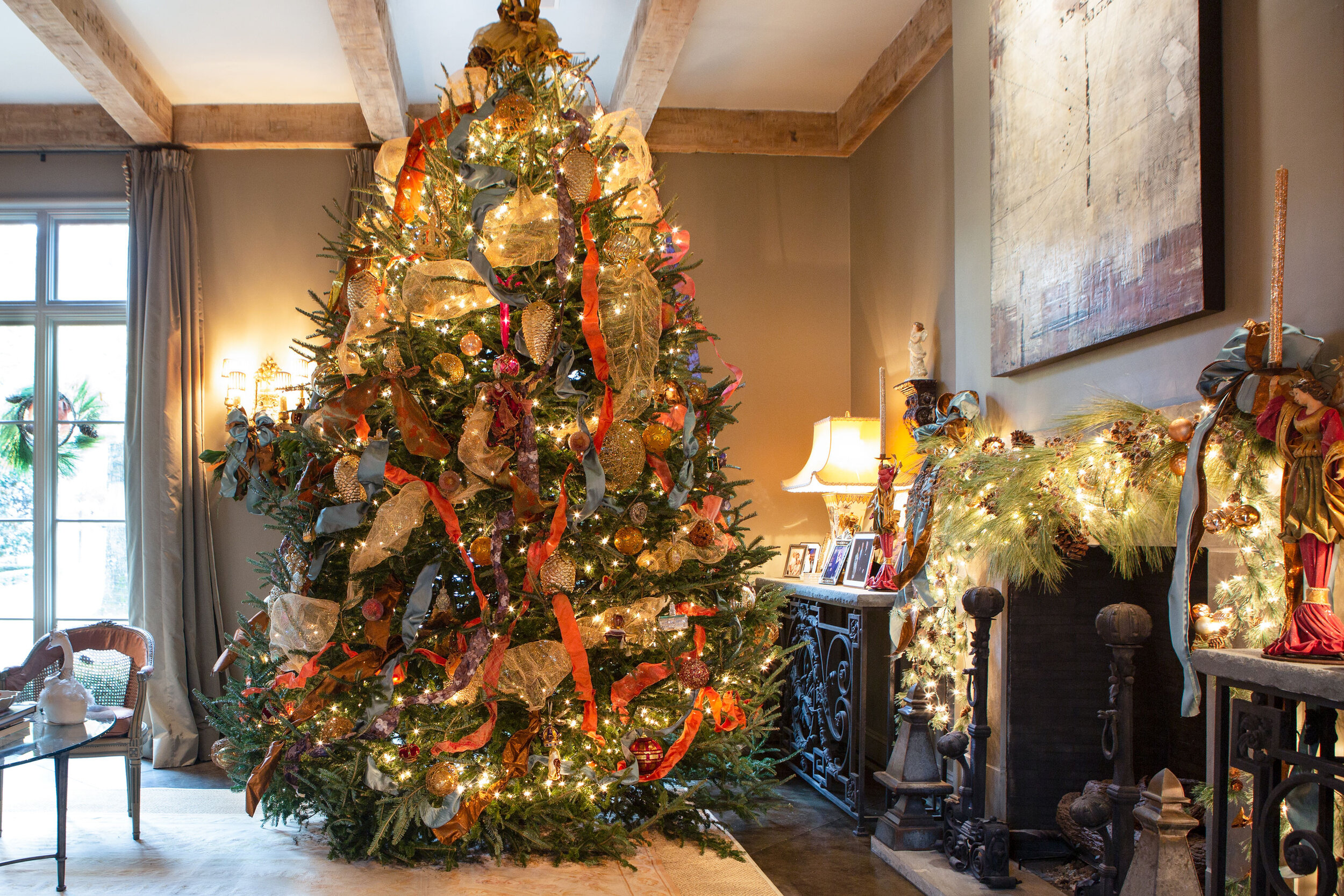
The holiday decor in the Pitts home reflects all the best of the season, with a decidedly European flair. Designer Angela Mazanti decks these halls, keeping in mind the French chateau style of the architecture and the house’s year round color palette. Rather than traditional red and green, Mazanti opts for tones of persimmon and gold. Those hues play perfectly off the Turkish rug in the foyer, artwork in the dining room and upholstered antique French chairs.

The home’s exterior gets the holiday treatment from Tennessee Christmas Lights. The company illuminates the front yard for the season, including the jasmine espalier around the entry turret, welcoming guests to the front door.

AngelaMazanti-Grandview-Selaviephoto-4.jpg

Once inside, visitors are immediately wowed by a tree filled with ornaments that have special meaning for Kim. “Her maiden name is Swann, and friends love to give her swan ornaments because of that,” Mazanti explains. 

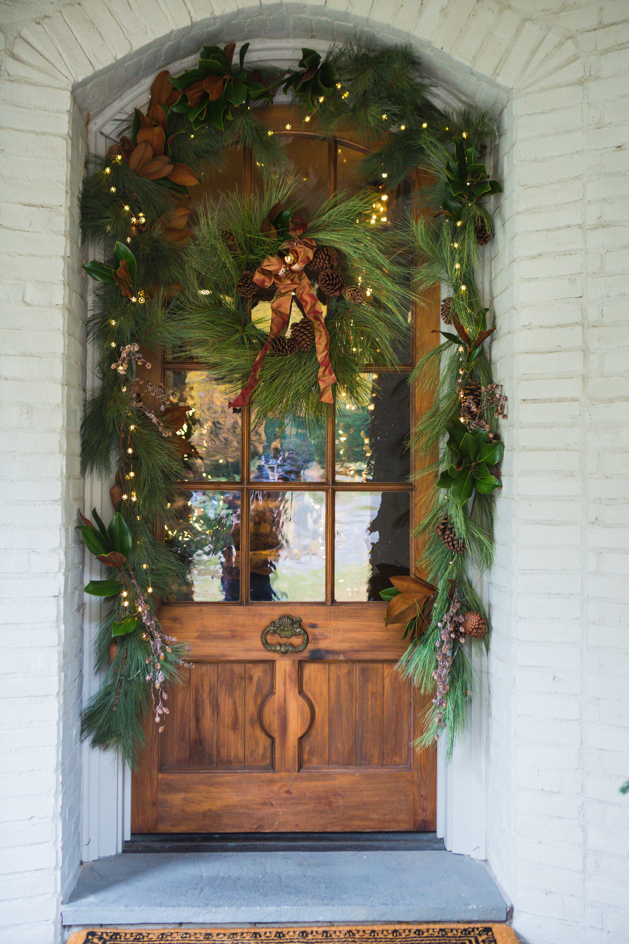
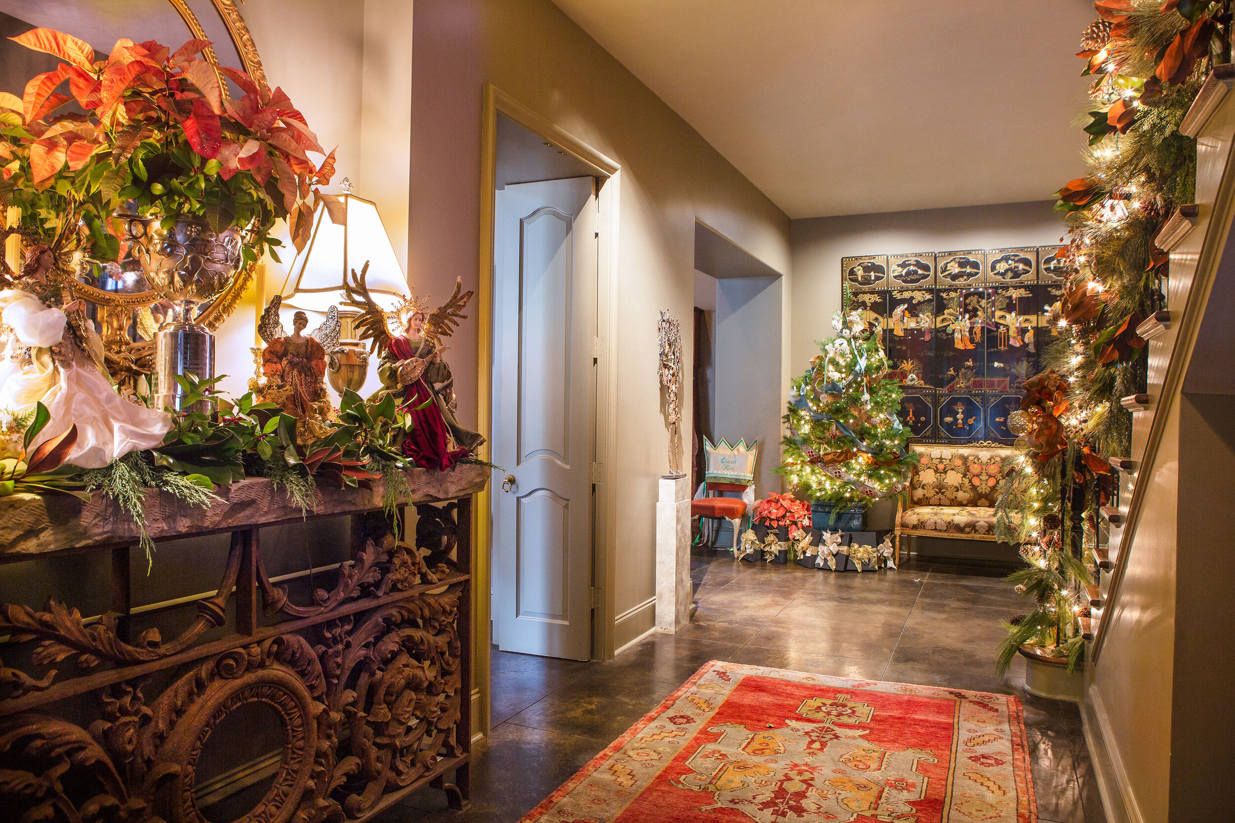
Fresh pine and magnolia combine with lights and silk, velvet and taffeta ribbons to drape the front stair railing, the orange-brown of the underside of the magnolia leaves adding a natural element to the unique color scheme. 

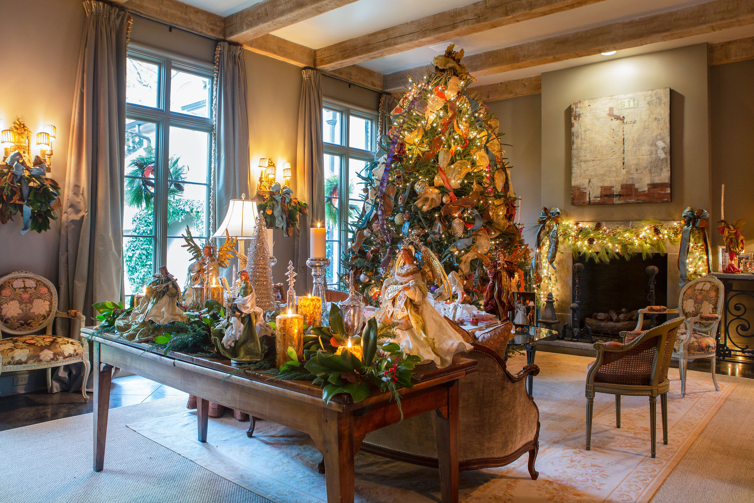
The centerpiece of the Pitts’ holiday decor is the enormous fresh Christmas tree. Reaching to the family room’s 12-foot ceiling, it fills the home with holiday spirit and the aroma of evergreen. Mazanti says decorating the massive Douglas fir is no small feat, but luckily, Kim has amassed a large collection of beautiful ornaments over the years. Mazanti combines the keepsakes with thousands of twinkling lights and lush ribbons to create a spectacle worthy of European royalty.

AngelaMazanti-Grandview-Selaviephoto-5.jpg
AngelaMazanti-Grandview-Selaviephoto-8.jpg
AngelaMazanti-Grandview-Selaviephoto-1.jpg

The home isn’t fully ready for the holidays until Kim’s treasured angels are on display. Her collection of exquisite Old World-style angels, many of which she found in a shop in The Greenbrier resort in West Virginia, is large enough that Mazanti places them throughout the home to add an element of elegance.

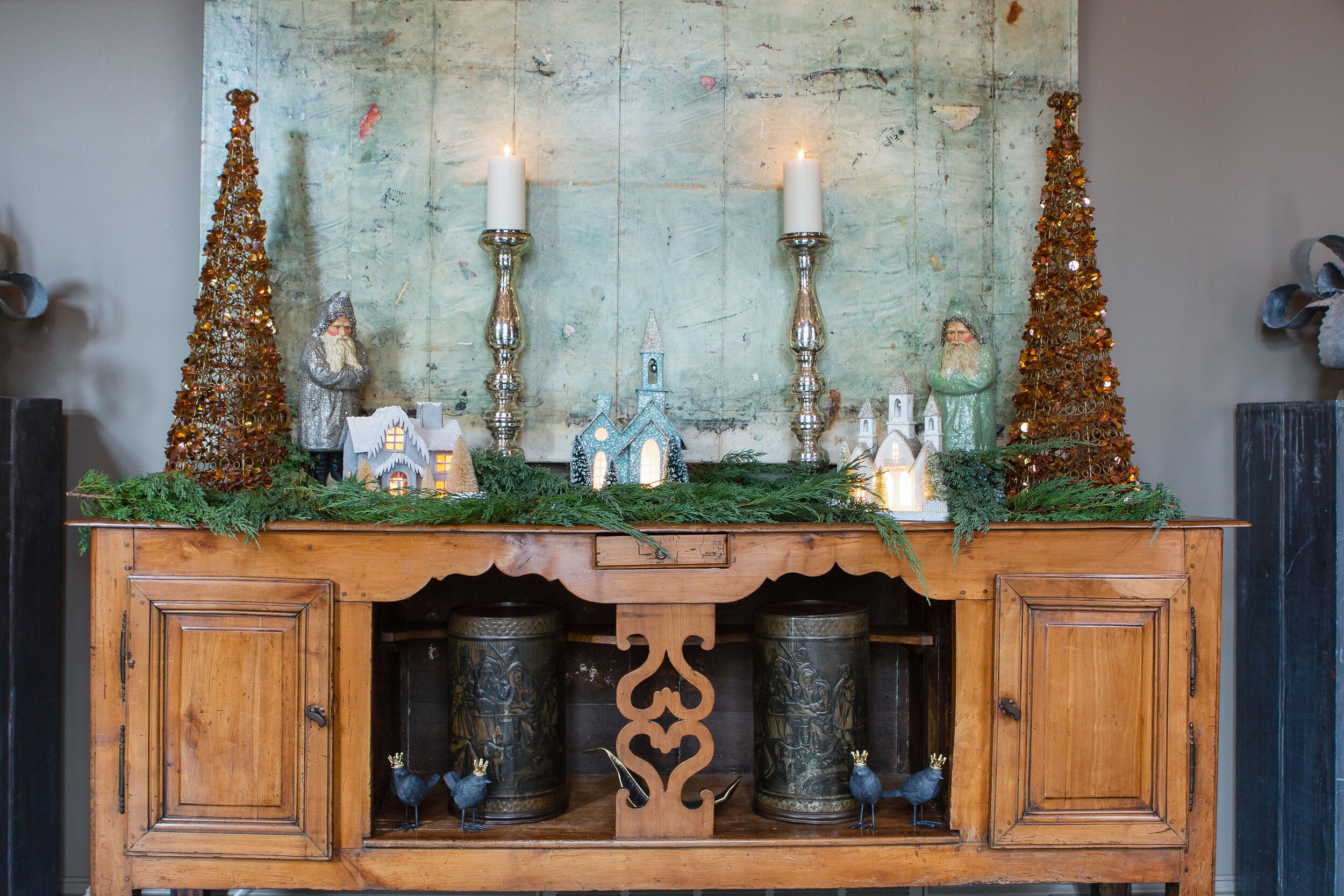
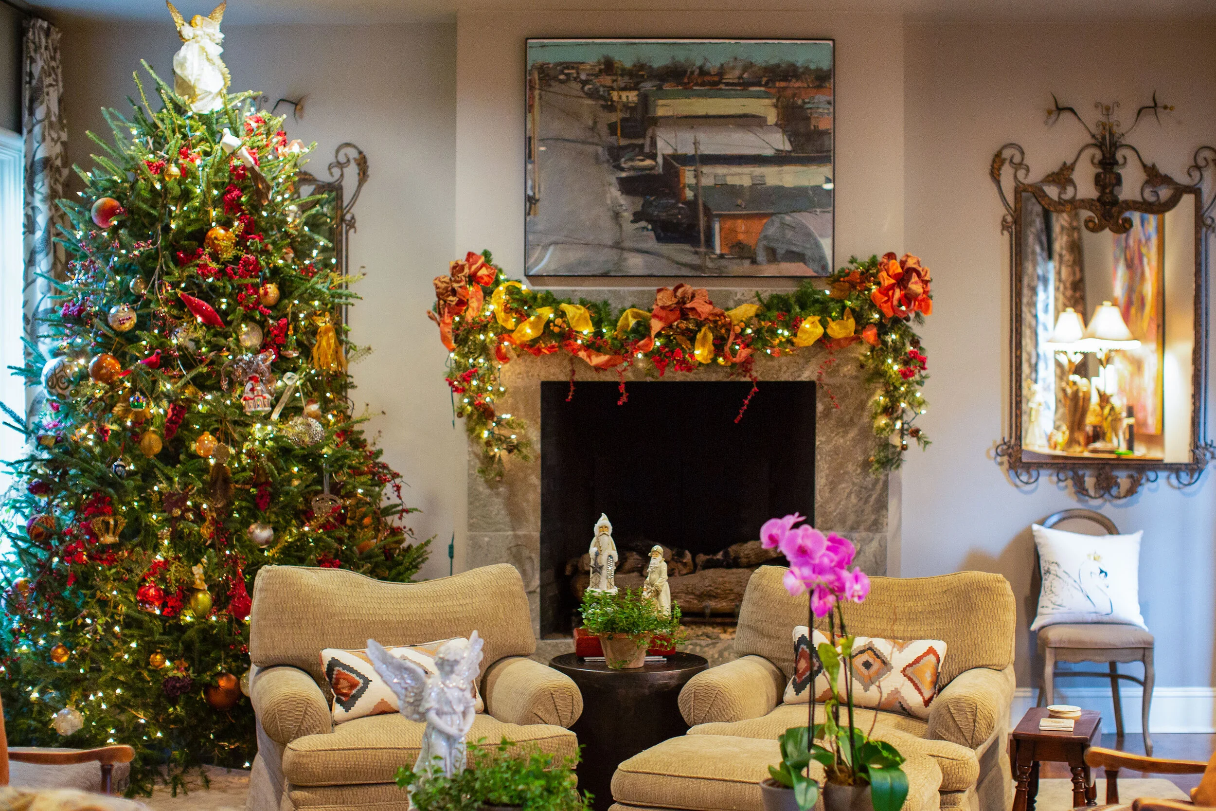
Sets of sparkling snow-covered houses and glittering vintage Santas nestled in more fresh greenery dress up the dining room buffet.

Many of Kim’s beloved Christmas pieces are also sentimental, as they have been gifts from the family’s large circle of friends over the years. Bringing them out every year to trim her home is like gathering again to share memories with the people who mean so much to her. It’s that emotional connection that truly mirrors the spirit of the holiday season.

A Gem in the Heart of Germantown

Interior Design by Warehouse 67 Design | Story by Terri Glazer | Photography by Annabella Charles

WEBHome-144.jpg

“A home is just like a painting; you have some elements that play the background and some that are focal points. It’s knowing how to layer those so that the end result is harmonious and you get that beautiful, cohesive, finished look that’s indescribable. You don’t know why you like it, but you like it.” 

Interior designer Kim Loudenbeck uses this artistic analogy to describe a renovation project she recently completed. The collaboration between Loudenbeck, home builder John Duke and Elizabeth Wilson Duke, realtor, was a labor of love. 

“We’ve been pouring our hearts into it because we love that it’s such a gem,” says Loudenbeck. The beauty of the house is that it is a sizable home on a sizable lot, and in the heart of Germantown. “You don’t see these properties in Germantown very much. With the space limitations now the lots are getting smaller but there are still people who want more land, and those lots are few and far between,” the designer adds.

When the house went on the market Elizabeth recognized a golden opportunity. She bought the property and convinced her husband, who usually builds new-construction homes, to tackle a large-scale renovation. Rounding out the team were architect Jeff Bramlett and Loudenbeck. 

The designer says that for this reno, as with every project she takes on, the vision of the ultimate personality of the home was key from day one. “Laying that out and having a clear definition of where you’re going is so important,” she emphasizes. However, a renovation always involves twists and turns. “There are so many things that come about in the process. You don’t know what’s behind the walls; you don’t know what you’re going to run into,” she cautions. Loudenbeck’s goal was to keep the project focused amid the changes that inevitably came. “It can be like a roller coaster with a reno, and you just have to be prepared that there are going to be changes. As long as you know where you’re going, it’s easy to stay on track. People often get stuck in the weeds; they get overwhelmed with renovations. It’s so important to have the right team or someone to partner with to keep you focused on getting what you want out of the home.”

Although the Dukes bought it with the intention to remodel for resale the term “flip” seems an inadequate description of this jewel of a house. “It’s the features that really set this home apart. The attention to detail is phenomenal, says Loudenbeck. The master bath has a heated floor, the kitchen has an Aga Elise induction range and a custom vent hood. The original kitchen was transformed into a large, fully equipped scullery for entertaining, and the study has an eye-catching wood-paneled ceiling. 

That focus on detail sometimes led to more work, but the results justify the effort. Loudenbeck says, “We didn’t really stick with what was easy; we made choices based on what was best. In the office we used pecky cypress on the ceiling as a decorative element. The front and back doors are solid alder. We used smooth cypress on the beams. It was a lot of using the right elements in the right place, but when it came to paint and stain, we had to use a different combination of stain on each of these to make sure that it all looks the same in the end. Every wood stains differently. So many details and to get the end result that you want you have to focus on each and every one of them. The end result will be affected if you don’t take everything seriously.”

Loudenbeck’s vision for the design was to retain the character of the original home while pushing the envelope to take the design from traditional more toward transitional. While she had Duke keep what she calls “little jewels” from the original construction like arched openings and a curved staircase, she admits she went a little edgier on the lighting selections, the finishes and the modern waterfall island in the kitchen. “Adding unique and different elements that are more transitional creates a great balance between what was here and what was done. It’s a beautiful marriage of the two,” she says.

WEBHome-18.jpg

Two of the areas that received full do-overs were the home’s bathrooms and kitchen—rooms Loudenbeck says a discerning buyer would most definitely want to see equipped with up-to-the-moment features. Along with the show-stopping range, vent hood from Lipford Sheet Metal and waterfall counter in quartzite with just the right blend of warm and cool tones, the kitchen boasts a large commercial-style refrigerator/freezer and a bar area embellished with antique mirror-front doors. Open, natural wood shelving in both the kitchen and the scullery bring an earthy element that Loudenbeck loves to incorporate in all her designs and pair with stone and mixed metals. “I feel like it creates a real sense of warmth, especially when the walls are lighter,” she says. 

While Bramlett was able to work with the rooms in the front of the house, the ones on the back weren’t compatible with a modern, open floor plan, so they had to be completely redone. You’d never know it, though. “In a renovation, the ultimate goal is that you don’t want it to feel like the newly done part is disjointed from the rest of the home,” says Loudenbeck. The renovation team achieved that goal perfectly. The floor plan flows seamlessly from the front entry with its majestic, yet clean-lined curved stair, to the large dining room, to the newly built family room and kitchen. “We took the traditional elements and gave them a little different spin—a bit cleaner, different finishes to make it look new and fresh versus feeling like we had to go back with what was expected.” 

WEBHome-84.jpg

The master suite was created with relaxation and luxury in mind. While it feels private and secluded, the bedroom is also soaked in natural light. The vaulted ceiling repeats the natural element of wooden beams found in the family room. The bath is full of all the latest bells and whistles, from the heated floor to the freestanding soaking tub to the his-and-hers vanities to the deluxe shower with multiple sprays. “We knew that someone in this home on this land in the heart of Germantown would want a really special home. When you have a chance to put all the fun stuff in, why not?” laughs Loudenbeck. 

Asked about the effort she and her Warehouse 67 team put into fully staging the home Loudenbeck had this to say. “In our area, homes don’t usually sell furnished, but in other parts of the country that’s more typical. We are seeing that change a little, though. We’ve furnished it tastefully and so that it blends perfectly with the house. A buyer might like the fact that they could walk right in and only need to bring sentimental pieces that they want with them.”

WEBHome-96.jpg

In addition, the team felt that with the scope of this renovation, it was only fitting to dress the revitalized home in style. “We wanted to show the sentence finished, with the exclamation mark. What the potential of this house could be,” the designer says. 

It’s clear from Loudenbeck’s enthusiasm that the architect, builder and designer achieved the full potential on this collaboration. “I think it’s fun to sit back and take in the beautiful vignettes created in the home,” she says. “When you’re walking through the house it reads well. There’s something pretty in every view and at every different angle.”

Thanksgiving with Spruce Shop

Event Design and Written by Selena McAdams of Spruce Shop | Photography by Annabella Charles Photography

Spruce Shop | 632 South Perkins Rd. Memphis, TN 38117 | Instagram @spruceshop

Spruce-22.jpg

Thanksgiving is one of my favorite holidays...the air is cool and the pressure of deadlines or finding the perfect gift doesn’t exist. It’s simply a gathering with your tribe, whether that consists of family or friends you call family. So when At Home mentioned styling a Thanksgiving table, especially after a year of quarantining and social distancing, I was ready and willing. To create the style I tried to stick with the concept of using what I had on hand first—a little hunting and gathering in my own home—and only filling in as needed. I always say if you only buy things you love, you can pull it all together when the time comes. That concept plays out beautifully when setting a table. I hope you enjoy this grouping of mostly vintage finds collected over a lifetime to tell a story in our home this Thanksgiving.

WEBSpruce-39.jpg

New Years with Babcock Gifts

Event Design by Babcock Gifts | Photography by Annabella Charles Photography

Babcock Gifts | 4538 Poplar Avenue Memphis, TN 38117 | babcockgifts.com

crystal vase: Jasmine 7" Tumbler Vase by William Yeoward | Double Champagne Bucket: Match

crystal vase: Jasmine 7" Tumbler Vase by William Yeoward | Double Champagne Bucket: Match

We have all spent more nights at home this year, but that doesn't mean we have been lacking in elegance. Whether you are hosting a multi-course meal or a champagne toast, let's ring in a New Year with golden sophistication and a perfect table for family and friends. Cheers to 2021!

Dinnerware: Auratus OB by Porcel | Crystal: Mille Nuits by Baccarat | Flatware: Osiris by Christofle | Ruffle Gold Wine Coaster by Annieglass

Dinnerware: Auratus OB by Porcel | Crystal: Mille Nuits by Baccarat | Flatware: Osiris by Christofle | Ruffle Gold Wine Coaster by Annieglass

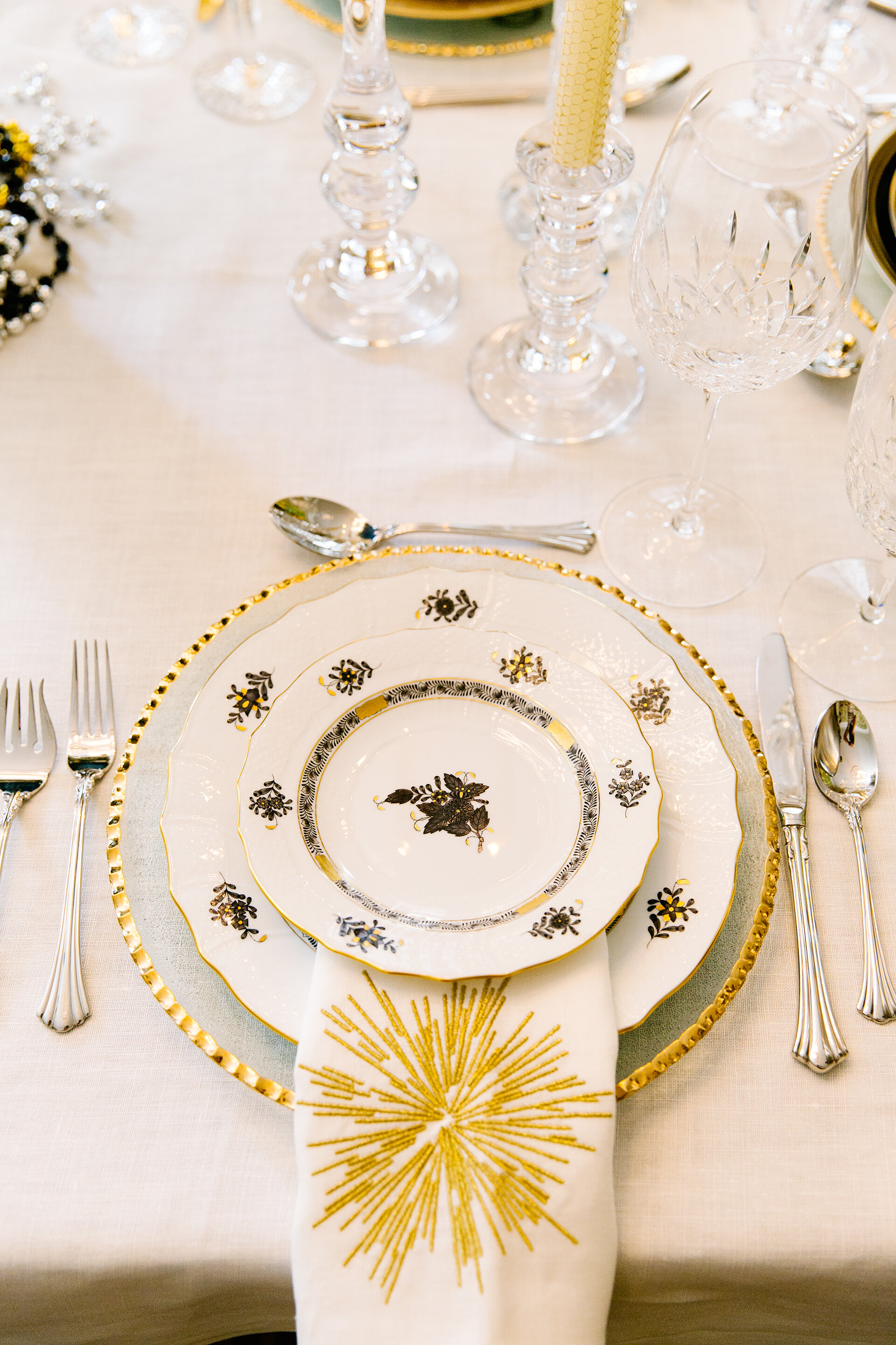
Dinnerware: Chinese Bouquet Black by Herend | Crystal: Lismore Essence by Waterford | Flatware: 1800 by Reed & Barton | Weston Candlesticks by Reed & Barton

Dinnerware: Chinese Bouquet Black by Herend | Crystal: Lismore Essence by Waterford | Flatware: 1800 by Reed & Barton | Weston Candlesticks by Reed & Barton

Dinnerware: Latitudes Black and Gold by Royal Limoges | Glassware: Hartland by Simon Pearce | Flatware: Le Perle by Couzon

Dinnerware: Latitudes Black and Gold by Royal Limoges | Glassware: Hartland by Simon Pearce | Flatware: Le Perle by Couzon

Dinnerware: Oasis Black and Gold by Royal Limoges | Crystal: Araglin by Waterford | Flatware: Albi by Christofle

Dinnerware: Oasis Black and Gold by Royal Limoges | Crystal: Araglin by Waterford | Flatware: Albi by Christofle

Dinnerware: Chinese Bouquet Garland Black by Herend | Crystal: Elizabeth by William Yeoward | Flatware: Roma by Mepra

Dinnerware: Chinese Bouquet Garland Black by Herend | Crystal: Elizabeth by William Yeoward | Flatware: Roma by Mepra

Dinnerware: Zen by L'Objet | Crystal: Helena by William Yeoward | Flatware: Allora by Reed & Barton

Dinnerware: Zen by L'Objet | Crystal: Helena by William Yeoward | Flatware: Allora by Reed & Barton

WEBbabcock-41.jpg


Christmas with Social

Event Design by Social | Photography by Annabella Charles Photography

Social | 600 S. Perkins Rd. Memphis, TN 38117 | social-memphis.com

WEBSocial-13.jpg

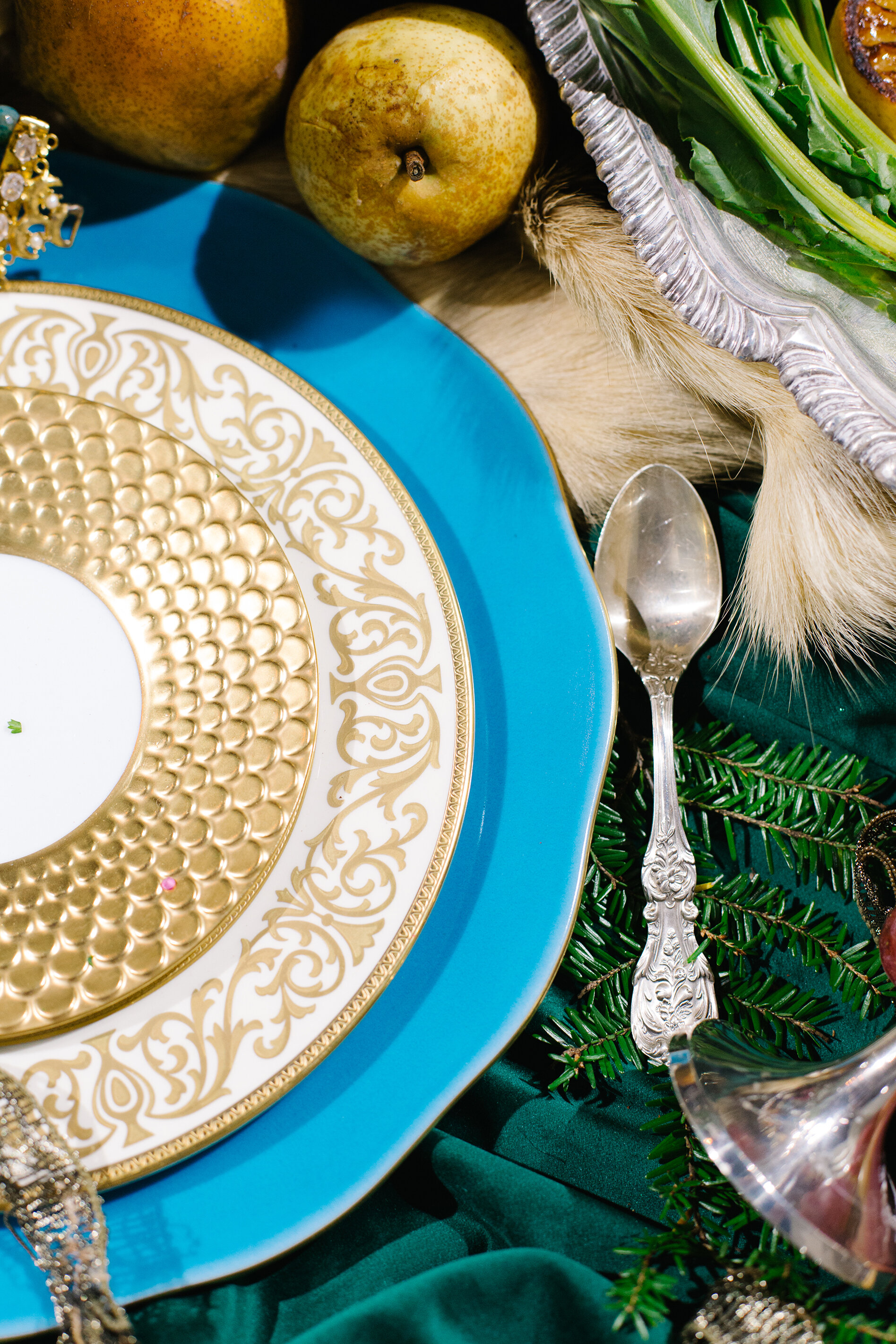
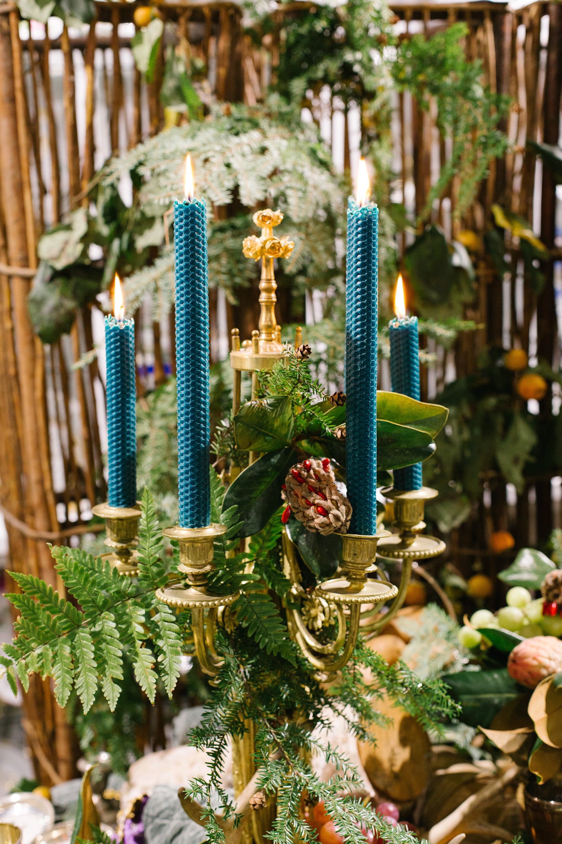
In the deep, deep woods where Russian Romanov meets Gypsy... a setting of opulent surroundings, fine china, luxurious textiles and indulgent cuisine. A jubilee in honor of the imperial court celebrating Christmas. Just imagine... a Christmas tree for each family member, relative and court staff, all decorated with burning candles, gilded and silvered fruit and toys. Dripping candles in gold candelabras, fruit and flowers that add natural decor to the setting.

The tabletop team at Social is at it again, with Carmen Bond taking the reins to create this lavish Christmas table fit for royalty. A wide range of china, crystal and silver give inspiration for your very own Thanksgiving or Christmas tablescape. While this elaborate display may not be in reach for some, the tabletop team at Social is at your disposal to create your perfect holiday table. 

WEBSocial-30.jpg

Dinner in the Greenhouse

Text & Event Design by Ginni Jones | Photography by Annabella Charles

Fall is here & what better way to celebrate than enjoying the crisp, cool air with dinner al fresco!  

WEBAugust-90.jpg
WEBAugust-24.jpg

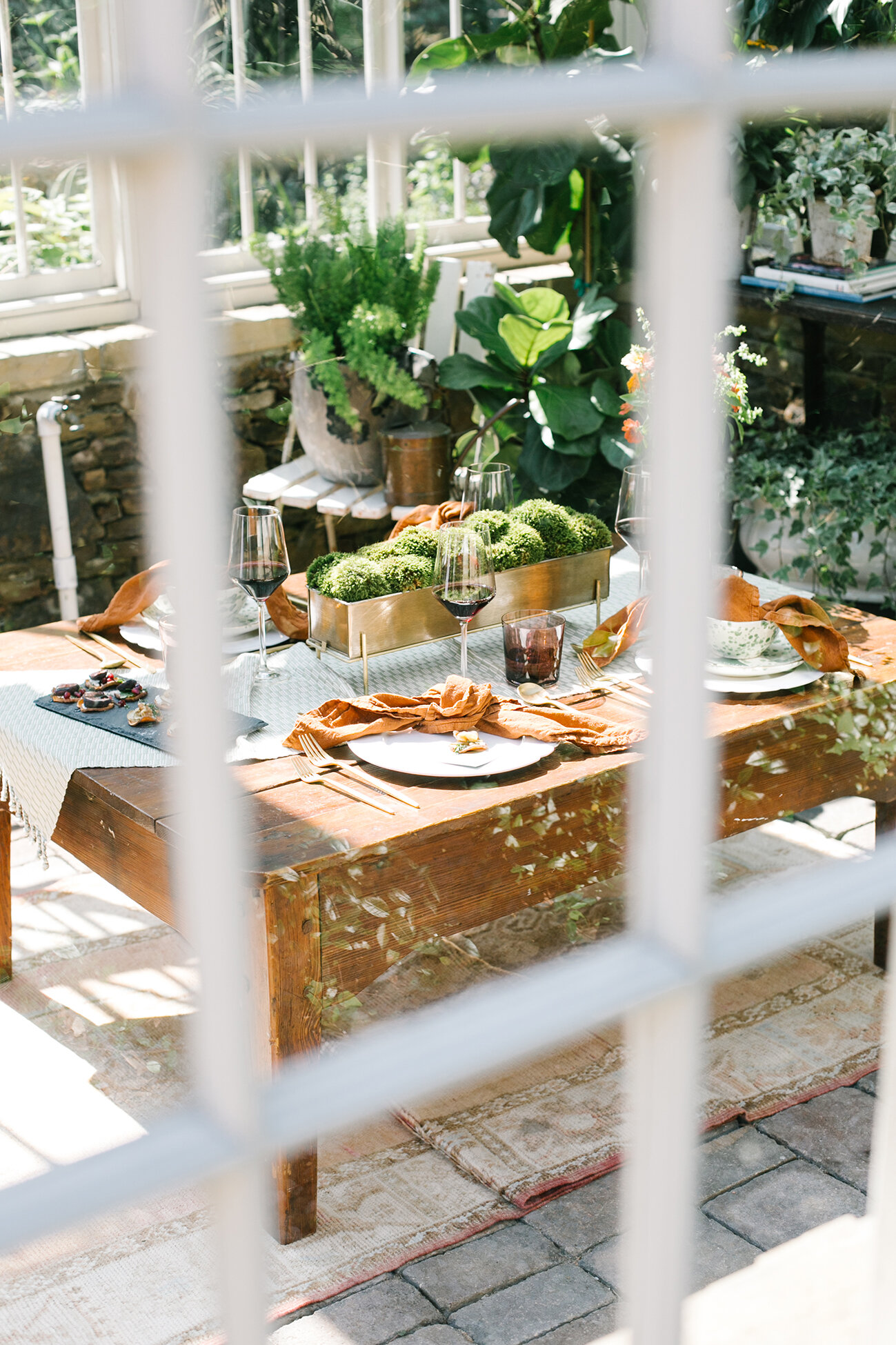
Since gathering in small groups has become the new norm, we decided to embrace the cooler temperatures and head outdoors for a small, intimate dinner party for four! This fall, I am loving all the earth tones. When I saw these stunning sage green splatter plates at The Avenue, I knew they would be the star of the table. Paired with terrcotta linen napkins, dark rose tumblers and a pale green textured runner, the colors blended together beautifully.

The Table

THE AVENUE | Headquartered in Houston, TX & online, this store is always my first stop! Lyndsey Zorich, the owner, has curated the most unique and special products that take any tablescape or outfit to the next level. 

THE DETAILS

STONE SCALLOP DINNER PLATE THE AVENUE | TERRACOTTA LINEN NAPKINS THE AVENUE | TINTED ROSE TUMBLER THE AVENUE | PANALITO RUNNER THE AVENUE | GINGHAM DELFINA DRESS THE AVENUE | SAGE SPLATTER SALAD PLATE & BOWL THE AVENUE | VINTAGE RUG ELLE WOVEN | CALLIGRAPHY MARY ELIZABETH LETTERING  

WEBAugust-29.jpg

The Menu

appetizer | sweet potato rounds two ways

1 ) herbed goat cheese, pear, walnut, thyme                                  

2) arugula, fig, goat cheese, pomegranate, basalmic

appetizer | autumn cheese board

starter | roasted butternut squash soup

entree | cider-brined pork lion in a mustard glaze  fresh herb polenta with parsnip chips & maple butter

dessert | apple crumble & homemade ice cream

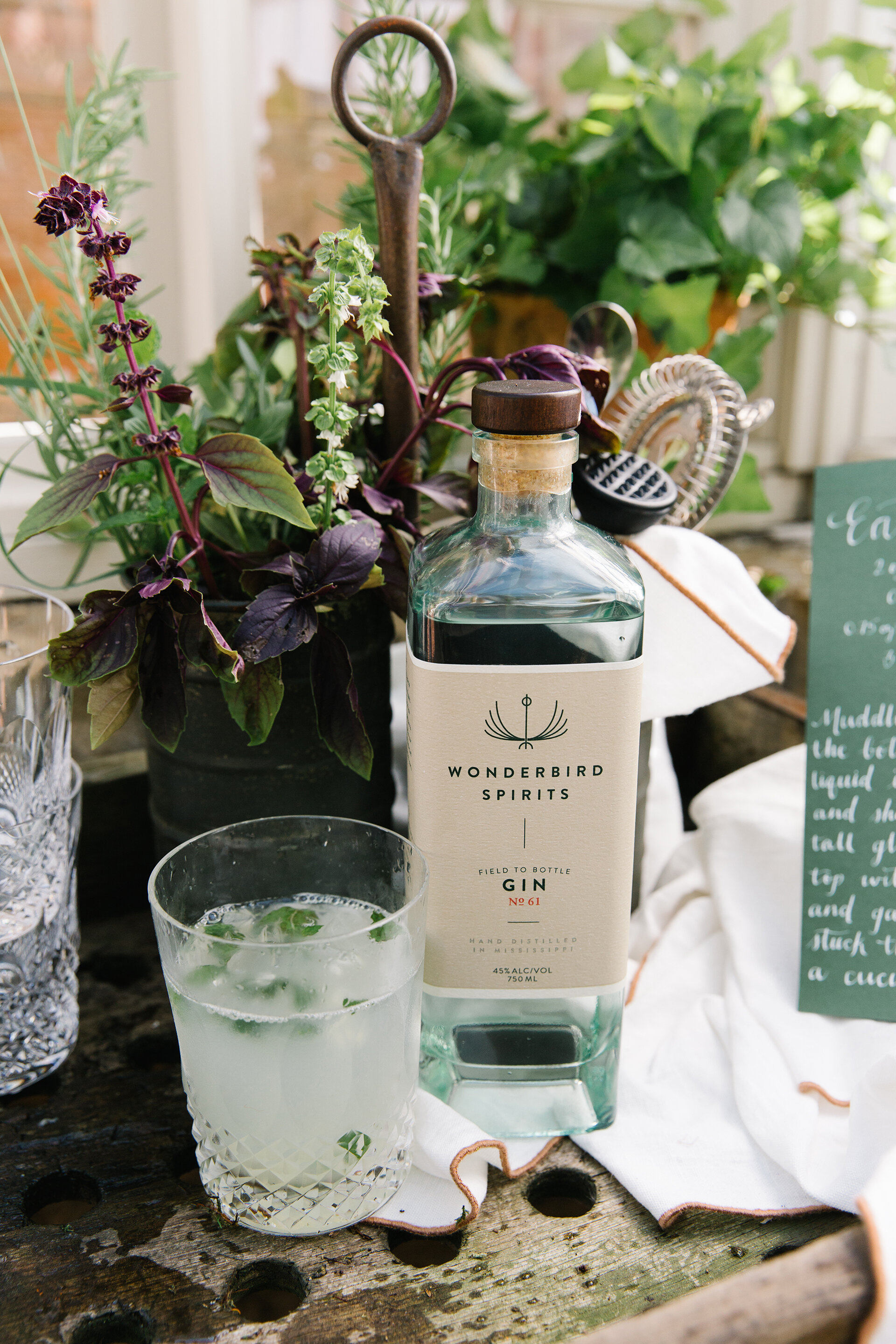
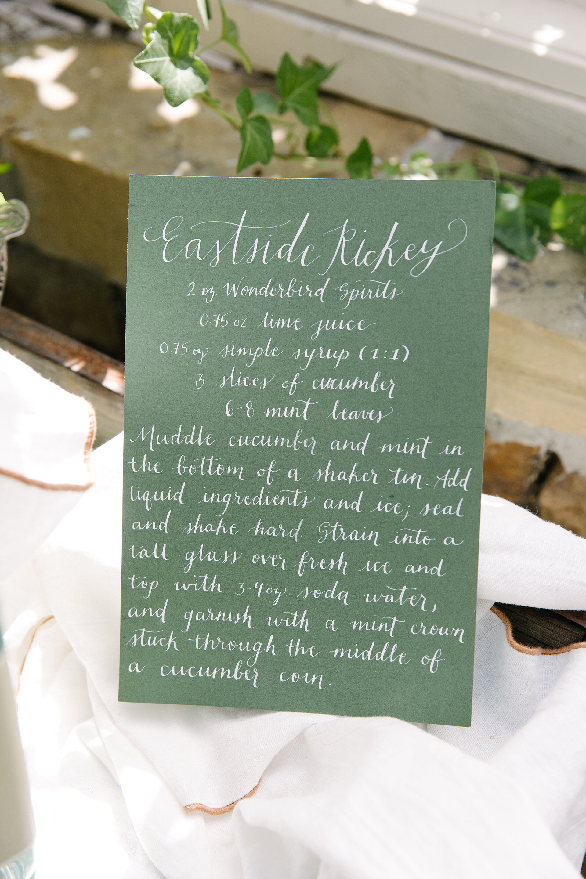
cocktail | eastside rickey

The Greens

JUNE WREN FLOWERS |  There's no better pair to call than this mother-daughter duo that's making Memphis beautiful with all things green!  These fabulous ladies do it all-help you grow your seasonal garden, container gardening around your home and more. Check out their happy hour plant speak series on Instagram (@junewrenflowers) for all their tips & tricks! 

WEBAugust-128.jpg

The House

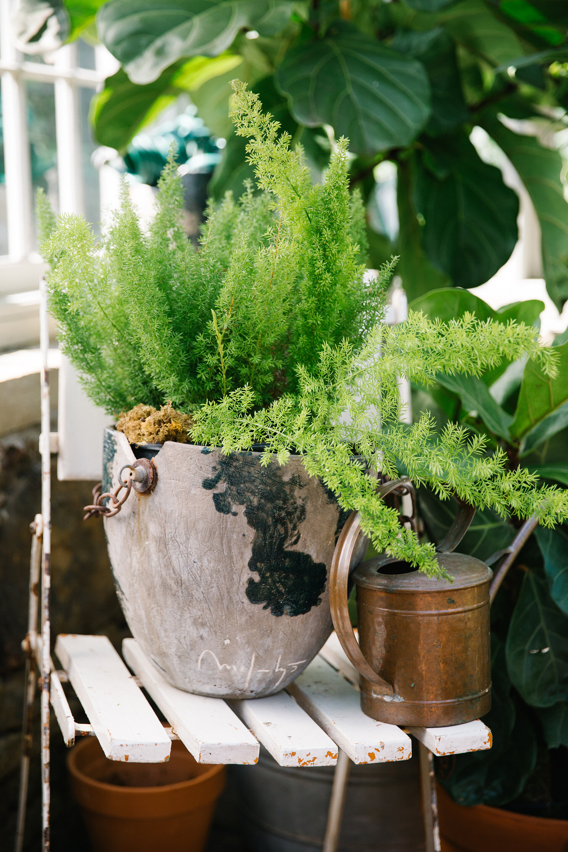
My family is blessed to have been surrounded by amazing friends, or as we like to call them, "our chosen family." The Kakaleses are just that & we have shared countless memories in their greenhouse. Whether it's Cinco de Mayo, celebrating a birthday or friend's recent engagement, or just a wednesday happy hour, I have cherished every memory made with our "chosen" family in this charming greenhouse. 

The Cocktail

The Eastside Rickey was found at the Wonderbird Spirits Distillery in Taylor, MS. Featuring their world-class gin, just add lime, cucumber & mint-it's a crisp & refresing beverage we will be sipping on all year round! Not only is Wonderbird's gin award winning, but it's fermented from Mississippi Delta rice-straight from grain to glass. 


Creating a Classic

Interior Design by M.Steffens Interiors | Story by Terri Glazer | Photography by Ross Group Creative

missy-steffens-montrose-01-1o6a0788 flat-web.jpg

When a couple sold their house in Germantown in 2016 they weren’t planning to build a new house. In fact, the wish list for their new home was quite the opposite. The two neighborhoods they had their eyes on were both long established. 

They purchased a house in Belle Meade, an East Memphis area known for its stately older homes on tree-lined streets, with the intention of remodeling it. As plans progressed, however, they realized a redo wouldn’t be feasible. The only option that made sense was to start from scratch. 

Disappointed but undeterred, the pair brought in experts to create a new-construction home with an older, classic ambiance. “I wanted it to feel like a home that belonged here and had been a part of the neighborhood for some time.  In terms of interior features and finishes, we wanted pieces that would be timeless and lasting,” the homeowner recalls. Missy Steffens, owner of M. Steffens Interiors, was on board from the beginning, along with architect Doug Enoch. “That was a great thing to be able to have the architect and designer sit down with us at the same table when we were walking through how we wanted the house to feel.” 

The finished product, built by Walker Uhlhorn and Uhlhorn Brothers Construction, is an updated classic designed in a courtyard style to maximize views of the parklike backyard. The peaceful vista includes large trees, lush green spaces created by landscape designer Harry Schuh, and the home’s original pool, with a fresh structural and cosmetic facelift.

missy-steffens-montrose-44-1o6a0775 flat crop-web.jpg

In keeping with the owners’ desire to respect and fit in to the neighborhood, Enoch set the structure as far back from the street as possible. In addition to the goal of not overbuilding the lot, the owners again emphasized the desire for the home to feel as if it had been on the street for years. “So many homes in the neighborhood have grown and expanded over the years with tasteful additions. Doug provided a design that gave the far left and right wings a different treatment which subtly felt as if they had been additions to the original house,” says the homeowner.

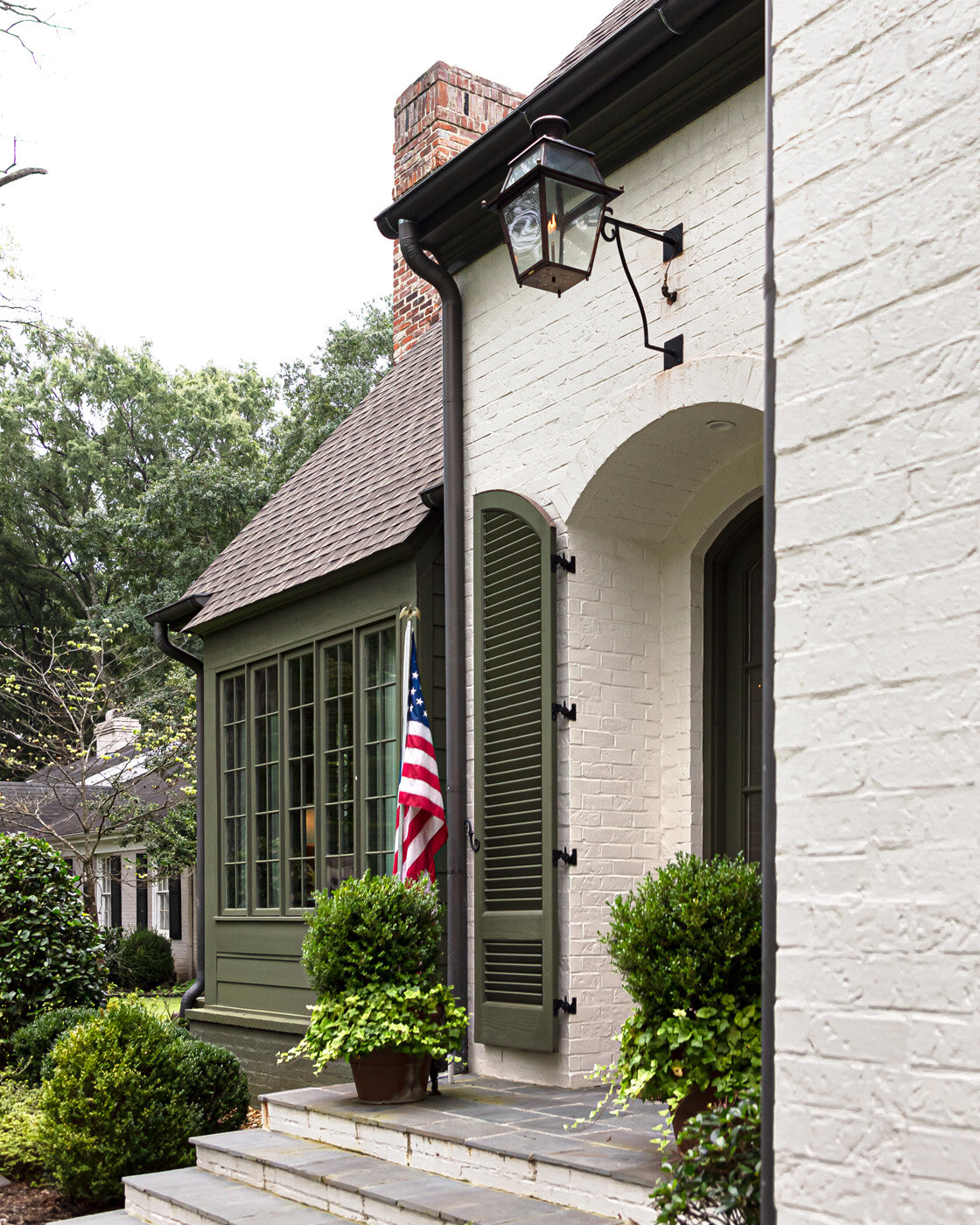
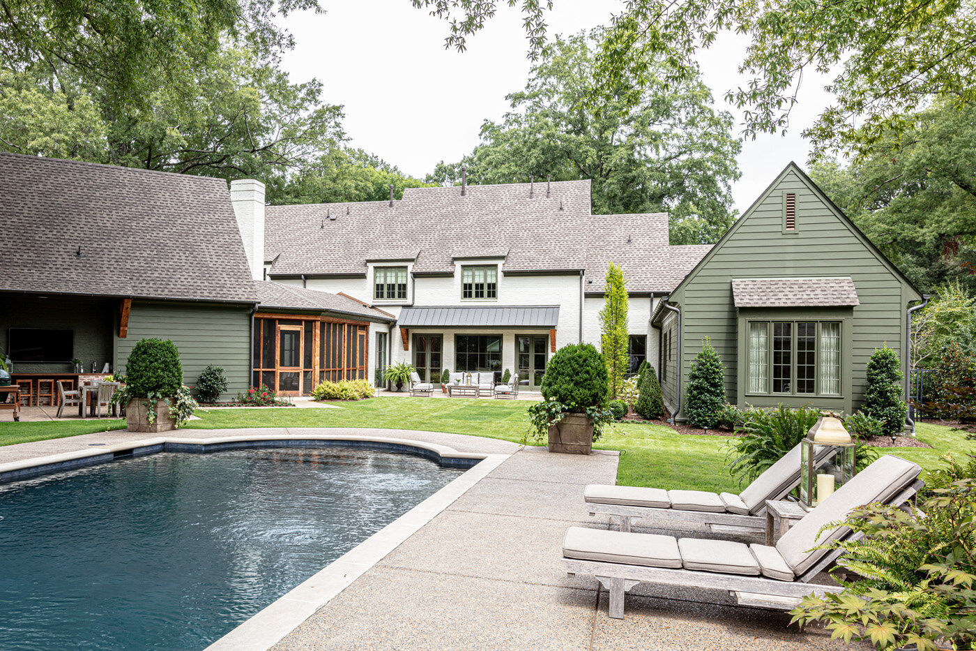
The exterior’s green and white color scheme is the end result of a collaboration between Steffens and the homeowner. “We thought we wanted antique brick, and that’s what we did the chimney and the outdoor space in. Missy and I spent hours driving around town looking at houses, and we think we landed on the right look.” 

Adds Steffens, “The green creates that cozy, cottagey look, but it blends in well and makes you focus more on the rest of the home.” As for the white painted brick that covers most of the house, the designer says that also had to be precisely the right shade. “We wanted it to be white, but really soft.” 

Moving to the interior plans, the clients asked the architect to keep in mind their family’s casual lifestyle. “We wanted a lot of open space that would be nice but comfortable,” says the homeowner. The parents to a blended family of three older children knew they would be empty nesters before long, so they envisioned their new house as one that would meet their needs long-term. 

Enoch came through with a floor plan that has all the kids’ bedrooms upstairs; the downstairs and outdoor area are a custom fit for the couple. “We love being outside so the pool and the outdoor area and the porch...especially in fall and spring, that’s where we are,” says the homeowner. “We have my husband’s den and then our bedroom and bathroom downstairs. We really enjoy it in the evenings. He likes to stay up and watch sports and I like to go to bed, so we tried to make it space that we could enjoy, just the two of us.” 

From the first step into the bright, welcoming entryway, it’s clear that green is an overarching theme in the home’s design, evidenced in the showcased views of the verdant outdoor space. The rear of the foyer was originally intended to be an art wall, but, at the homeowners’ request, Enoch inserted an oversized floor-to-ceiling window that floods the area with light and shows off the beauty of the backyard. 

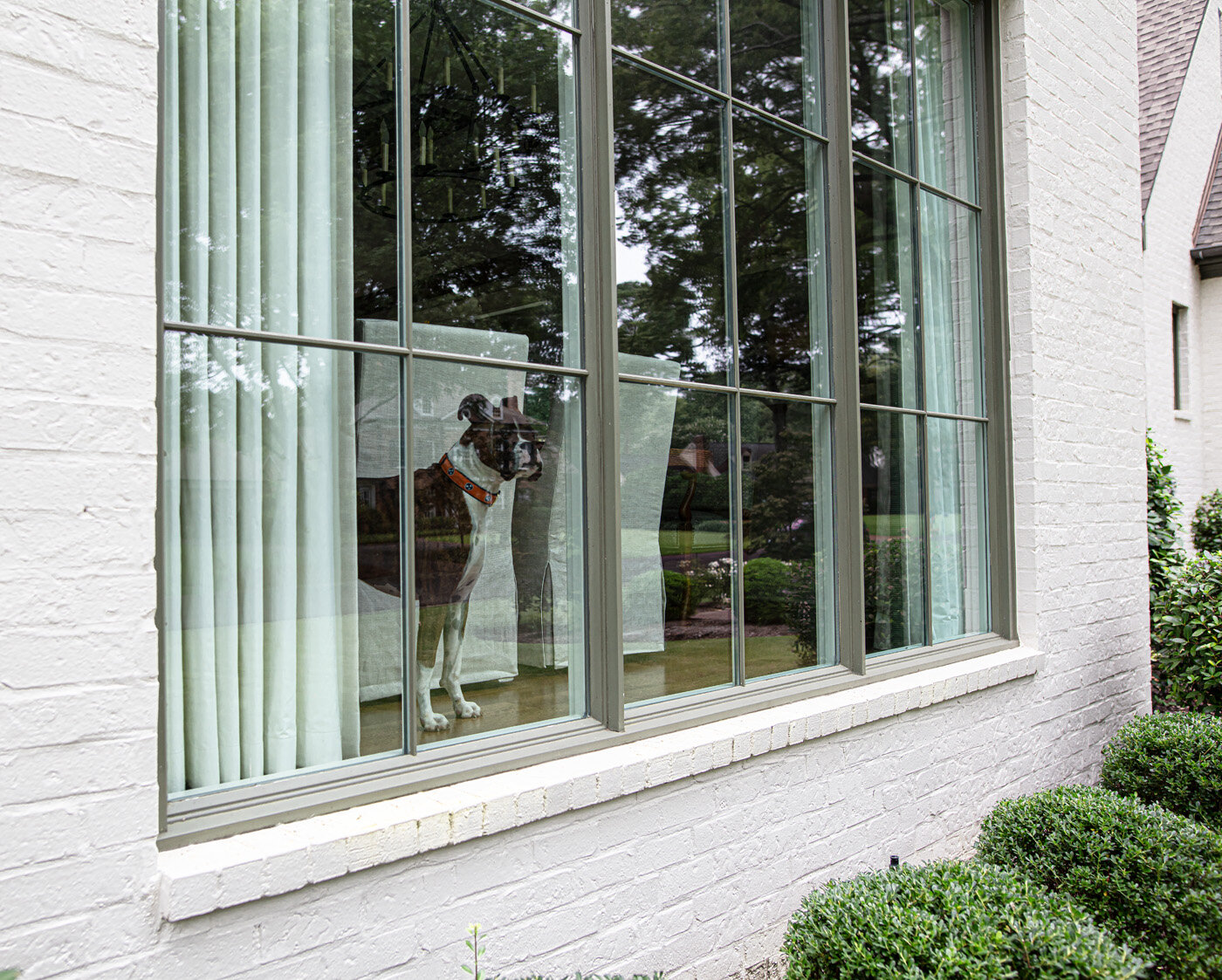
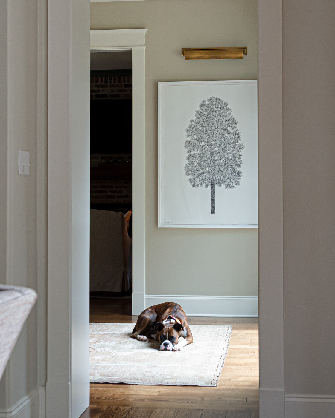
The wall of windows continues in the open combined family room and dining area, and although the couple is thrilled with the expansive views they enjoy, they admit it took a bit of getting used to when they moved in. “We felt like we lived in a fishbowl for a while,” she says with a laugh, “but I think we’ve adjusted. It’s funny how much I love the openness now.” Even the family pet is a fan of the large windows. Otis the boxer “posts up” daily at the front window and watches the world go by from his favorite vantage point. 

missy-steffens-montrose-11-1o6a0641 flat crop-web.jpg
missy-steffens-montrose-06-1o6a0661 flat-web.jpg
missy-steffens-montrose-09-1e4a1001-web.jpg

The family room’s furnishings reflect Steffens’ signature design style. “I love something old in each room. But I like to keep things fresh, so we also introduce current materials. I like to try to mix, and different textures are always interesting,” she explains. The room features comfortable seating for the whole family, but is missing an item often included in a home’s main gathering area—a TV. 

The omission was a request from the homeowner, and one she says garnered plenty of questions. “Everybody asked me when we did that, ‘Are you sure you don’t want a TV?’” She couldn’t be happier with the result, though. “What I’ve really enjoyed about it is when our kids are over for dinner we all end up sitting in here after we’ve eaten and we actually talk. We have conversations and we share things about the week. Maybe we turn music on. We laugh. So I have loved not having a TV in here.” 

Over the mantel Steffens placed an original piece by Oxford, MS, artist Carlyle Wolfe Lee, who paints en plein air then finishes her works with a stencil layering process. The homeowner says she loves the way its green hues bring the outside in. “The view through all the windows, and the beautiful green siding...it just enhances!” 

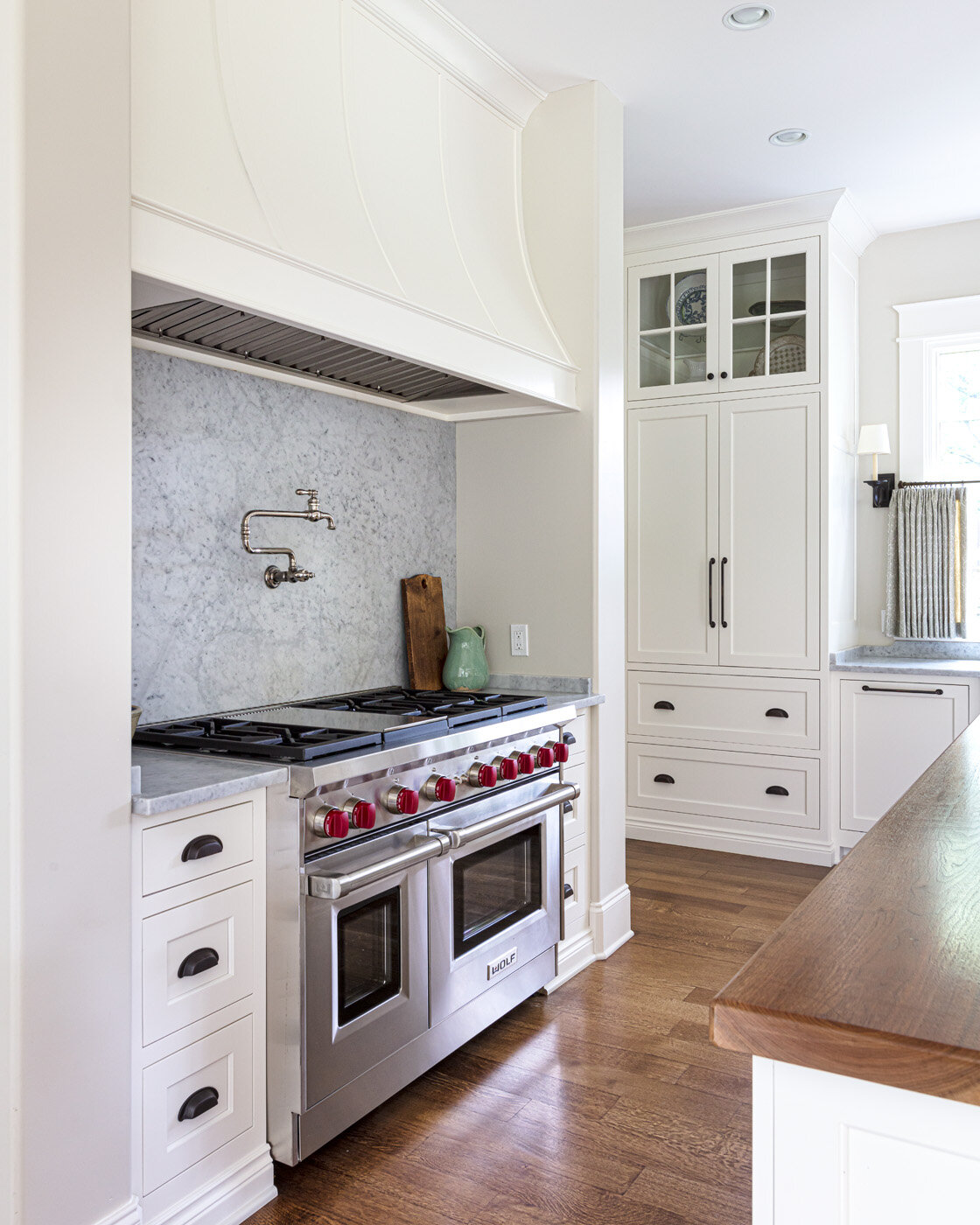
The open kitchen’s simple design reflects casual elegance. Classic white cabinets in a symmetrical layout are topped with Carrera marble in a honed finish for a softer look. Steffens repeated the same marble on the full-height backsplash behind the range in the name of design simplicity. She likes the idea of having only a few different materials in a kitchen, and the large island opposite the range has a walnut countertop. 

The island anchors the space as well as giving guests a gathering spot. “I wanted a big island because we entertain a good bit. We have friends over and this is where everybody ends up,” says the homeowner. 

missy-steffens-montrose-14-1o6a0684 flat-web.jpg
missy-steffens-montrose-24-1o6a0735 flat-web.jpg

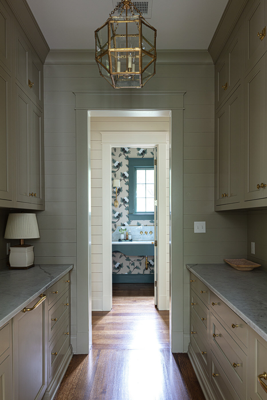
Behind the range wall lies the scullery, a feature that the family loves having and uses constantly. From the abundance of storage space in its cabinets to the extra dishwasher and sink to the pair of refrigerator drawers, everything about it gets high marks from the homeowner. 

Near the rear entrance, a pantry and utility closet disappear into a shiplap wall, giving convenient room for even more storage as well as small appliances like a coffee maker and a microwave. Steffens calls the area the clients’ “grown-up mudroom.” In place of lockers or cubbies needed for a family with young children, she designed the spot to hold a treasured bench and a painting by local artist Beth Edwards that the homeowner says is her favorite one in the house. “As much as I love the outdoors, when Missy sent me this piece of art I knew it was the one.” 

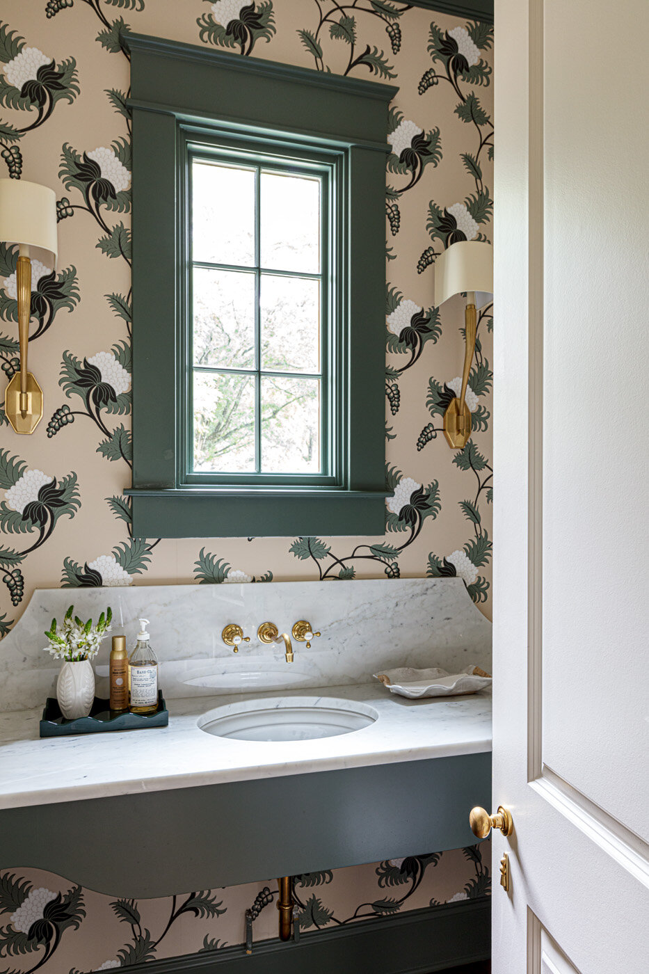
Bathed in stunning floral wallpaper from British designer Neisha Crosland, the powder room is a showstopper. Steffens is pleased with the way the paper fits into the home’s overall design. “I love the movement in it and the range of greens that flow through the house. The deep, deep greens of the leaves and the bright white background. This just really worked with the whole house. The house flows through different saturations of green—some are more blue green and some are more yellow green.” The room’s only window is high on the wall, so Steffens didn’t have to cover it to allow for privacy. She did, however, have to come up with a way to fill the space between the vanity and the window. A tall backsplash and wall faucets provide the perfect balance, and do so with loads of panache. 

missy-steffens-montrose-32-1e4a1012-web.jpg

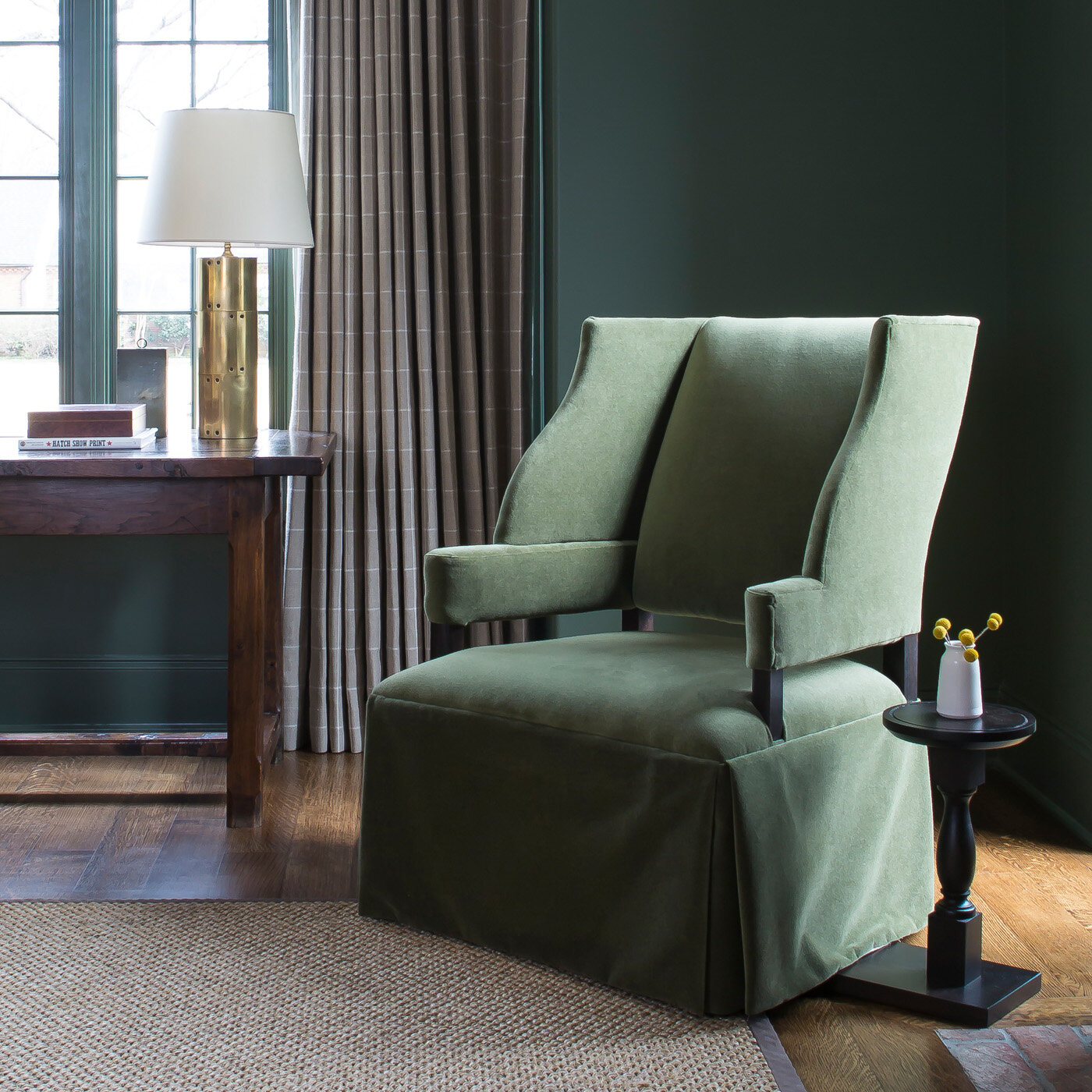
The saturation of green color reaches a peak in the office, where the walls and all the trim sport the same deep, lush shade. Steffens says going all in when using a bold color creates a refined look. “If this room had white trim or even white mullions on the windows it wouldn’t quite have the same sophistication. But it’s a commitment and it can be scary for people.” 

An antique brick fireplace not only gives the room a cozy feel, it also gets regular use in all but the hottest months of the year. “My husband loves a fire, so sometimes when I get home from work he will have one burning in here and in the fireplace on the porch,” says the homeowner. 

If the office is a man cave, albeit a sophisticated one, the master suite has a decidedly feminine flair. The bedroom is simple and roomy, but not grandiose. The homeowner instructed Steffens to design the space with minimal furniture and no television. She says, “I wanted it to be a place where we can rest.” The sanctuary feel comes from a custom upholstered Hickory Chair bed with simple bedding and an original Catherine Erb work of art. All Erb’s creations have a different moodiness to them, says Steffens, who chose the depiction of sky and clouds for its serene nature. 

missy-steffens-montrose-37-1o6a0714 flat crop-web.jpg

The artwork is dreamy, but the homeowner says the view out the large window opposite the bed is the most picturesque scene in the room. “I love that I can see our home out this window, especially at night when the porch is all lit up out back with a fire in the fireplace. Doug said more people should be able to see their home from inside their home and we agree.”

The elegant master bath gets an ethereal feel from natural light spilling in through a window above the large soaking tub and from the soaring vaulted ceiling. A full wall of built-in cabinets and drawers eliminates the need for a lot of furniture and keeps the space clean and simple. “Simple is calming to me,” says the homeowner. “Running a business can be stressful, and to come home and have things simple and pretty and comfortable...it makes a big difference in your life.” 

Even though it has been over two years since they moved in, the homeowner admits that the house is still a bit of a work in progress. Steffens has no problem with the extended nature of the project. She says, “That never bothers me because once you’re in a space you can really think through how the family lives and provide an even a stronger design. It takes more time in some ways but at the end, the product’s always fantastic.” 

Adds the homeowner, “We’re still working on layering those last items. I didn’t want to rush out and buy things just to fill the house. I want it to take time and have meaning. To nest over years.”

Turning a house into a home. Nesting over years with time and meaning...carefully creating a sense of place and belonging.

Classic Combination

Kitchen Design by Kitchens Unlimited | Story by Terri Glazer | Photos by Annabella Charles

The look of this recently renovated Collierville kitchen suggests a collection of found furniture pieces, but the effort it took to achieve the final result was anything but hodgepodge. Careful planning with a talented professional produced the flawless blend of beauty and practicality. Since the homeowners bought the house in 2002, little had been done to update the original 1996 kitchen. Its Formica countertops, Mexican tile floors and pickled cabinets were past their prime and its layout was cramped. 

july-28.jpg

After a false start with an unreliable contractor in September of 2019, the couple connected with Jacquelyn Cummins, a kitchen and bath designer at Kitchens Unlimited. They were frustrated, but ready to trust Cummins to make their dream kitchen a reality. They were also prepared. “I had been collecting pictures of kitchens that I loved, and I took them with me when I met with Jacquelyn for the first time,” recalls the homeowner. “One of the pictures had cabinets that had more of a furniture-style look, with the covered refrigerator. It looked so pretty.”

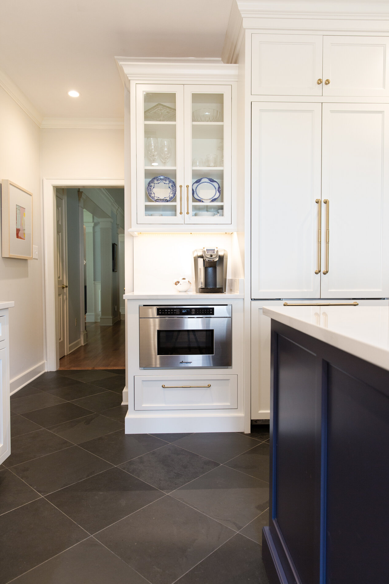
The homeowners knew they wanted to remove a peninsula that cut the kitchen off from the adjacent keeping room. Cummins concurred, and went a step further to improve the flow. “There was only one way through the [old] kitchen. Originally, their refrigerator was all the way at the end and it stuck out. There were cabinets on the other wall, so the passthrough was really crowded,” says Cummins. “The goal was to open the space up and allow for people to move around more easily. Centering the refrigerator on the wall helped get rid of the bottleneck and allowed me to play with the cabinetry and make it look like a piece of furniture the client could use to display her china. Also, with that wall being the first thing that you see when you come in the back friends entrance, it was important to make it really pretty and not just have a big refrigerator there.”

In fact, Cummins’ entire design focused on highlighting aesthetic details and drawing the eye away from the more utilitarian elements necessary in any kitchen. The same wall that holds the refrigerator also has an undercounter drawer microwave. The designer says she purposely placed it below counter level, out of the line of sight, so it appears integrated and fades from focus, allowing the more graceful features to shine. Glass-front cabinets on either side of the new cabinet-depth covered refrigerator display the homeowner’s collection of flow blue china.

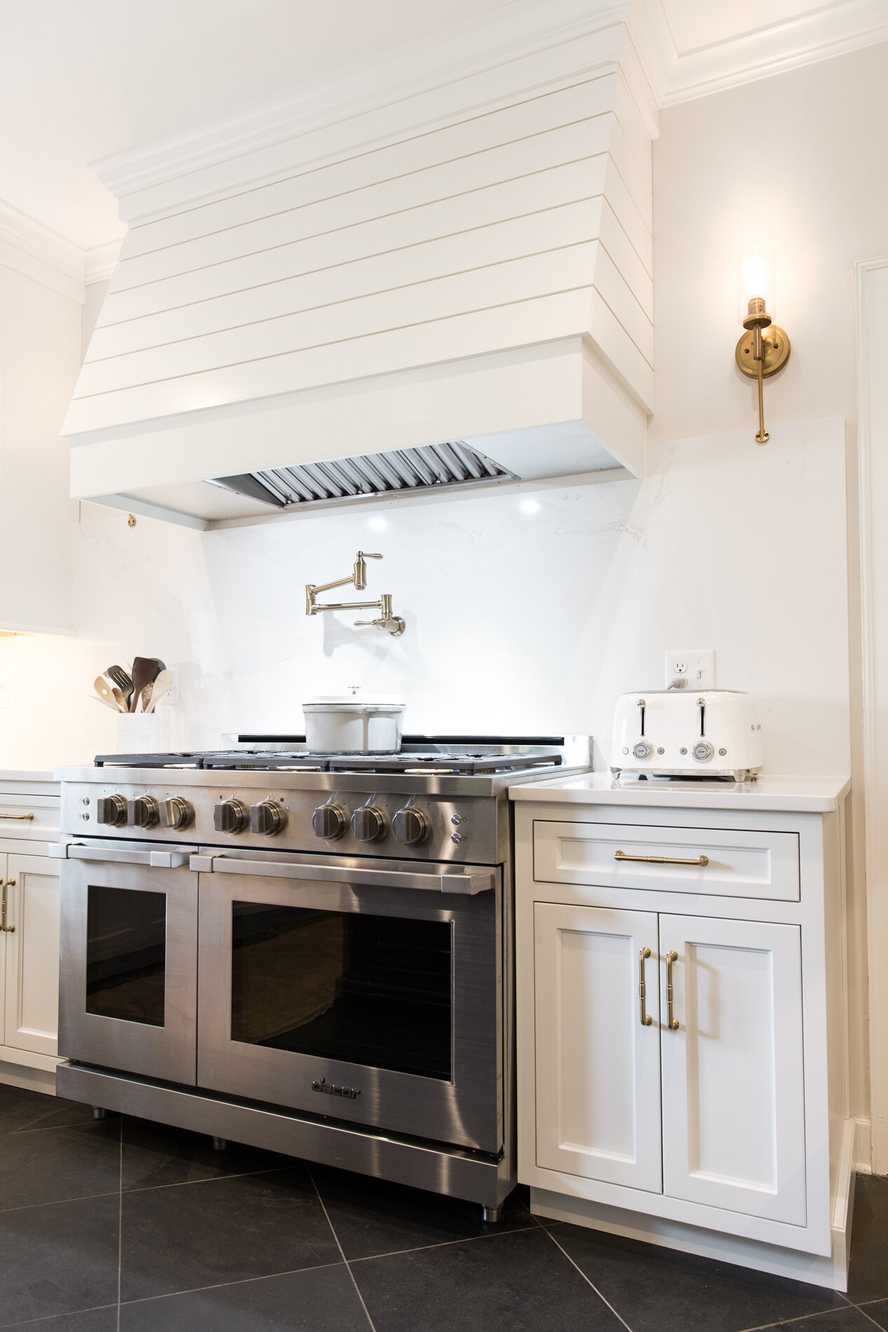
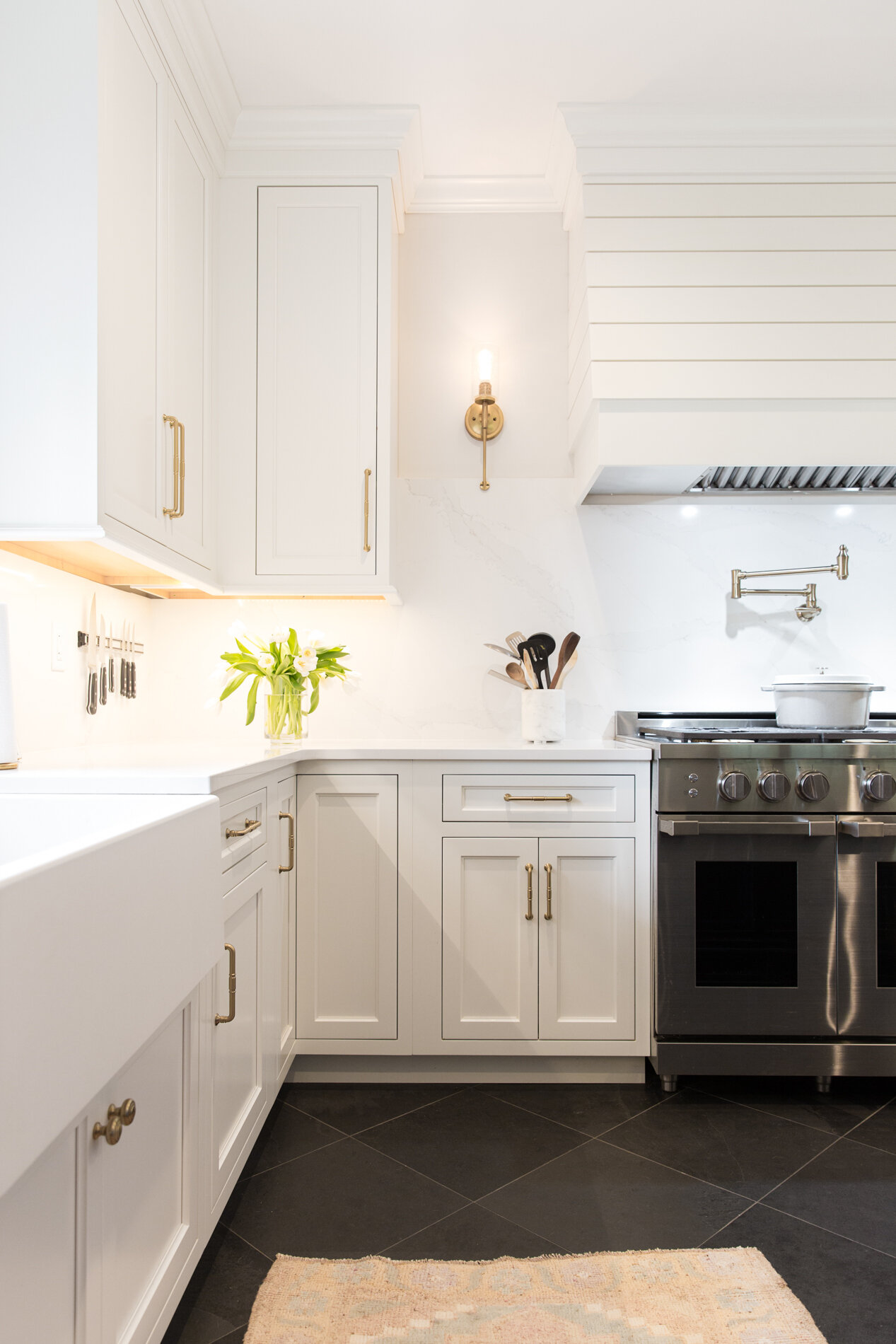
Cummins created a secondary focal point with the placement of a custom hood on the range wall. Styled in shiplap wood and painted the same linen white as the surrounding cabinetry, the hood’s design is fresh and timeless. “We didn’t do any of the ornate details that you often see in big, grand hoods like that, but it needed to be big enough to capture all the heat and smoke from the 48-inch gas range below it. It has a really nice presence on that wall,” she says. 

july-39.jpg

The only ornamental lighting in the kitchen, Hinkley sconces on either side of the hood add a touch of warmth through their brass finish and the soft light they emit. According to Cummins, the decision to forgo lighting over the island goes against the trend in a lot of new homes, but she omitted the feature for a good reason. “I felt like it might take away from the back wall,” she explains. “This was a different approach to adding decorative lighting, and I think it turned out really nicely.”

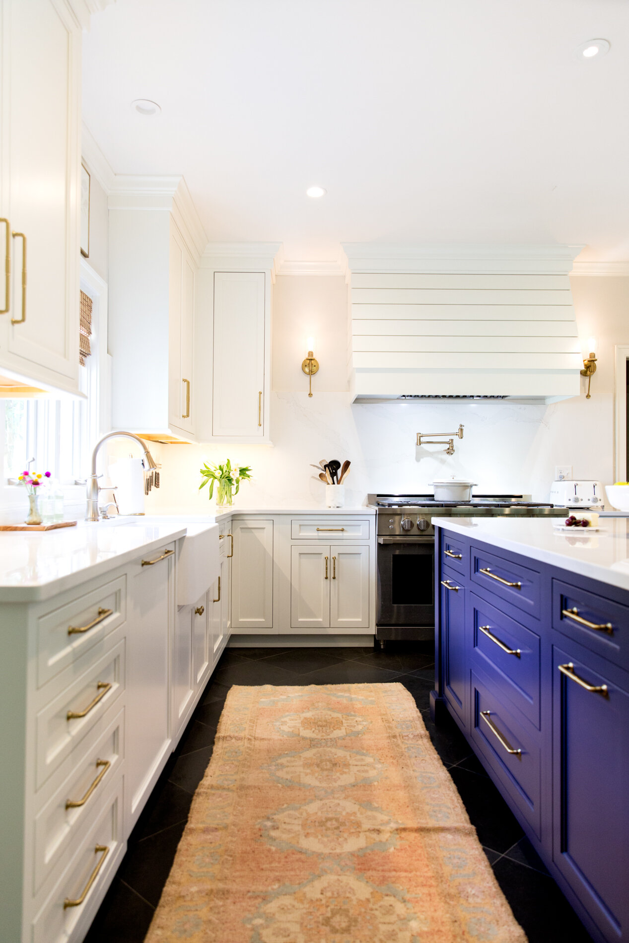
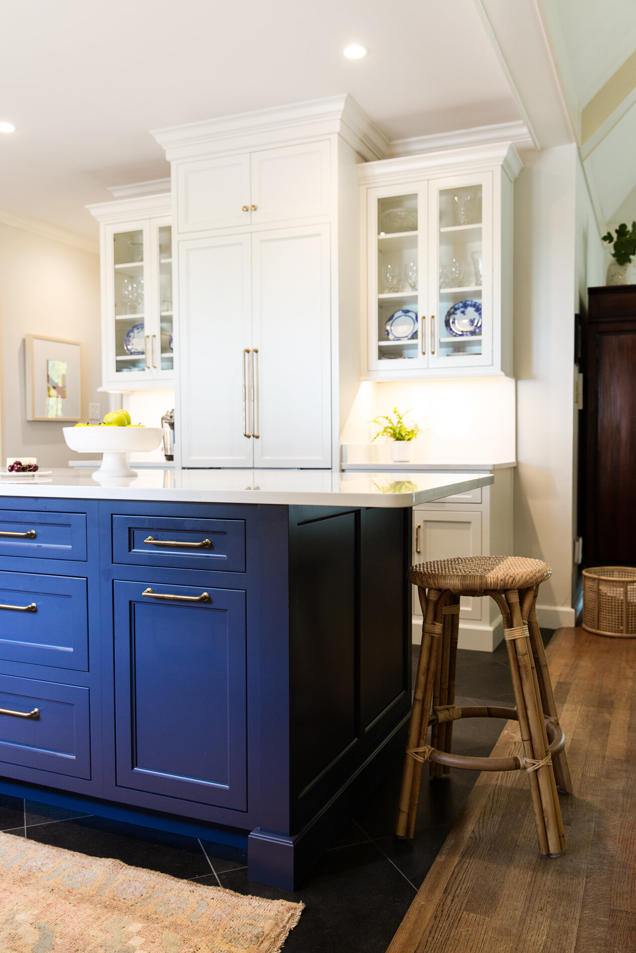
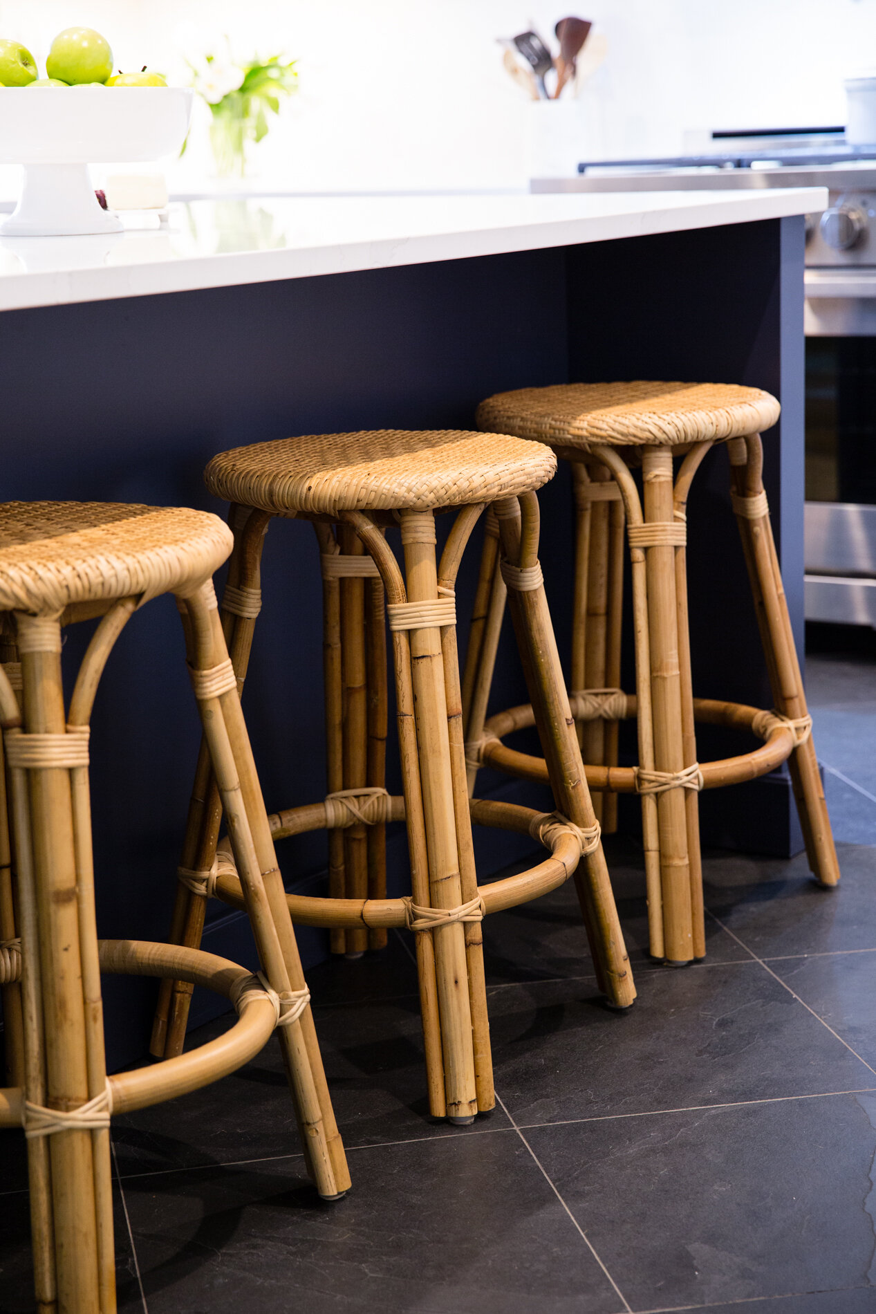
The homeowner wanted color somewhere in her new kitchen, and Cummins knew just which shade to pick and where to put it. She chose indigo blue, playing off the classic color combination in her client’s china collection. “The island was the perfect place to introduce that color,” she says, adding that the contrasting shade gives the impression that the island is “a furniture piece that we happened to find.”

Color also comes in the dark hues of the natural slate floors. Oversized 18-inch square tiles set on the diagonal anchor Cummins’s clean and classic overall design aesthetic.

Silestone quartz in Eternal Calacatta Gold tops the base cabinets and the island and also serves as the full-height backsplash behind the range. The homeowner couldn’t be happier with the material, sourced from American Granite and Marble in Oakland, TN. She loves that it’s  durable and easy to clean, perfect for a kitchen which gets constant use. “My husband is the cook in the family, and I am the cleaner,” she laughs.

july-17.jpg

Having enjoyed cooking since his college days, the homeowner couldn’t be happier with his new gourmet kitchen, filled with Dacor Heritage collection appliances. One of his favorite features, and one that came as a happy surprise he discovered after the refrigerator was installed, is that its freezer makes two different types of ice—large cubes perfect for use in cocktails as well as standard sized crescent cubes.

The family chef’s other favorite feature is the new pot filler faucet installed over the range. His wife recalls that he wasn’t sure he needed the “splurge item” during the planning stage, but she convinced him that they should include it in their kitchen redo. “I knew he would love it and I’m so glad he got it,” she says. 

Cummins often urges clients not to pass on optional additions when remodeling. “My advice would be to think about how many times you have thought to yourself that it would be really nice to have something like a pot filler. Since you’re taking the time to improve your kitchen and make it more functional for your needs, choosing something that you think might be an extra really will make a huge difference to you once the project is complete.”

Now that her dream renovation has received its finishing touches, the homeowner refers to the project, started in early February, as the quarantine kitchen. “We were home so we were here every step of the way and we really got to see it come together. I took pictures of every phase. It’s everything we wanted and we love it!” 

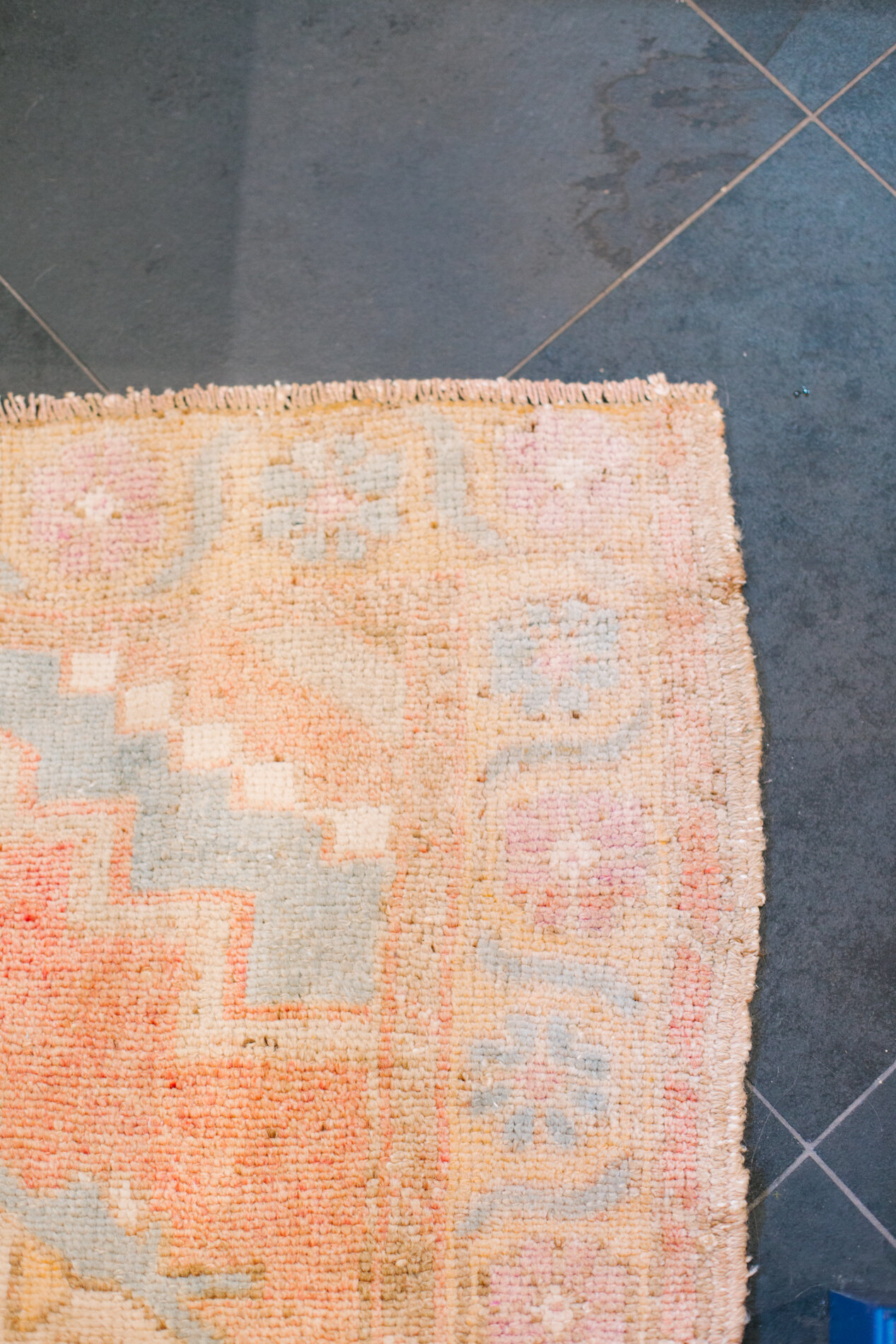
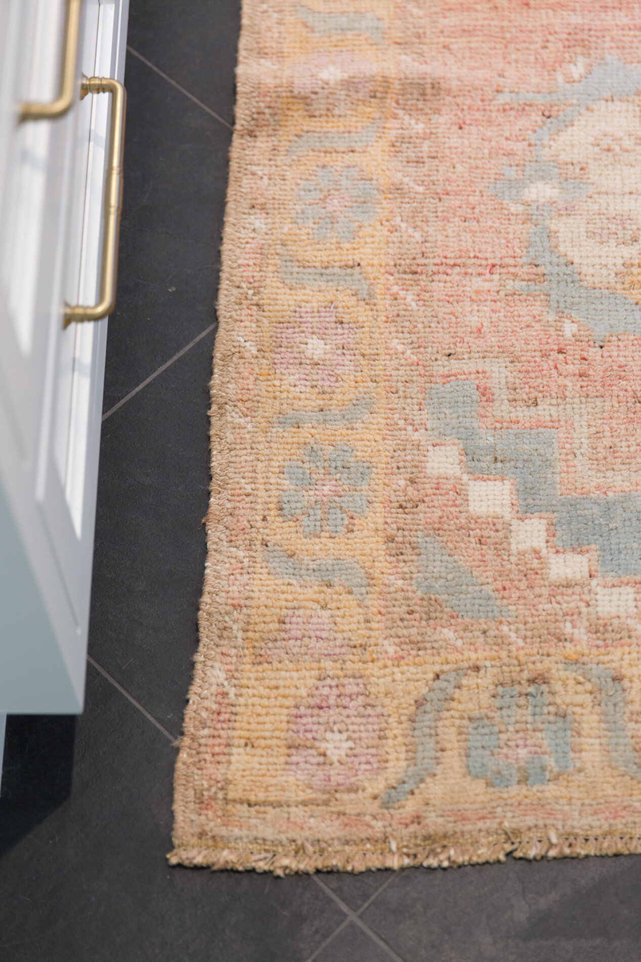
A hand-woven Turkish runner from local dealer Elle Woven adds texture and color to the kitchen floor. Elle owner Julie Reardon personally selects each textile in the collection with beauty and individuality in mind.

A hand-woven Turkish runner from local dealer Elle Woven adds texture and color to the kitchen floor. Elle owner Julie Reardon personally selects each textile in the collection with beauty and individuality in mind.

Sources:

Cabinets – Mouser Cabinetry, inset construction, perimeter in “Linen” paint and island in “Indigo” paint

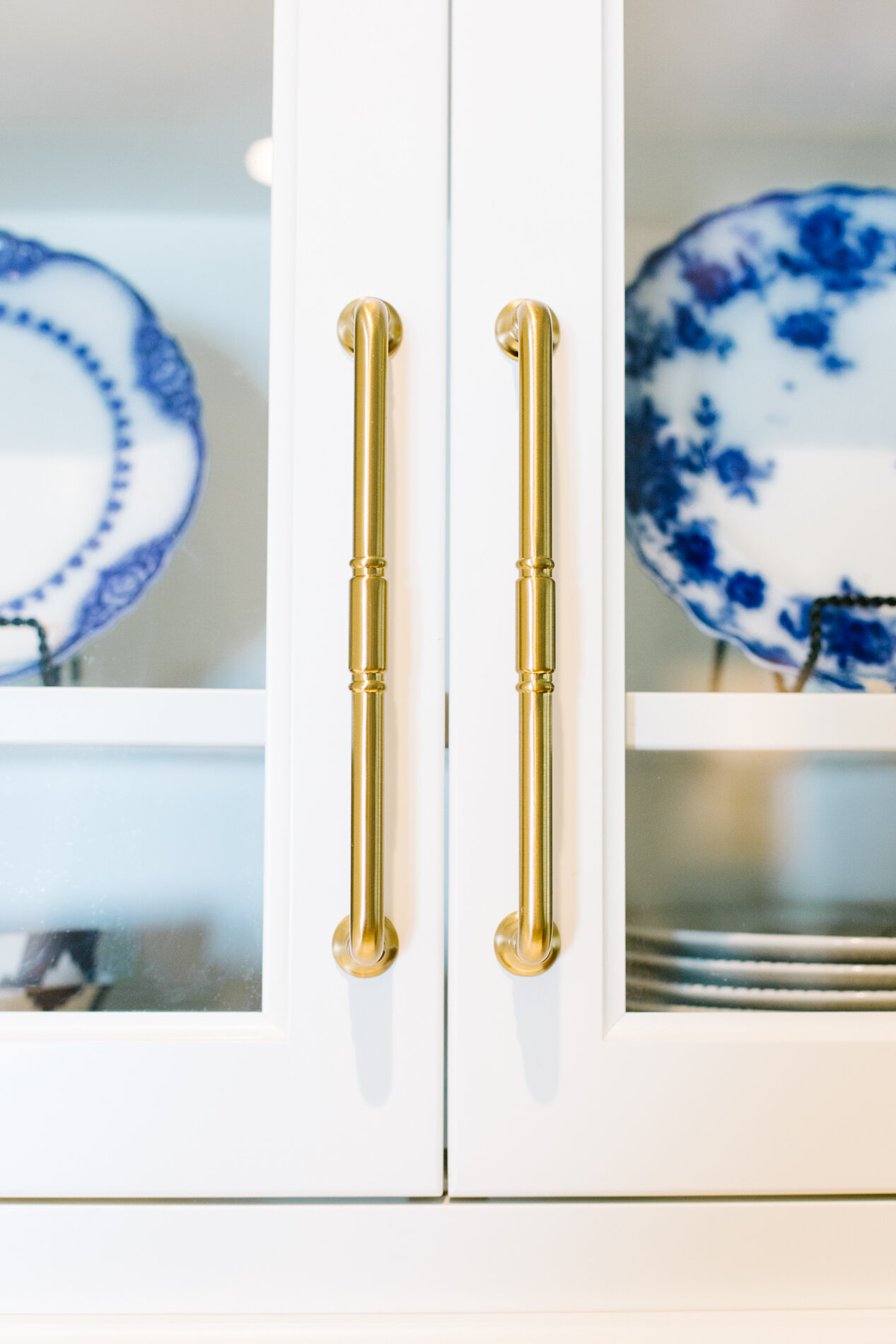
Hardware – Top Knobs Grace collection in Honey Bronze finish

Countertops & splash – Silestone “Eternal Calacatta Gold” quartz

Plumbing Fixtures – Delta Cassidy collection in Champagne Bronze

Floor – 16” x 16” Black Blizzard Slate

Appliances – Dacor Heritage collection

A Group Effort

Interior Design by Cindy McCord | Story by Terri Glazer | Photos by Ross Group Creative

Teamwork made the dream work for a Germantown couple’s new home construction project.

03-cindy-mccord-1o6a0170.jpg

With their two grown children out of the house and on their own, a pair of Germantown empty-nesters decided it was time to trade their home of 27 years for a new, slightly downsized abode that would better fit their current lifestyle.

To achieve their goal they brought together what the homeowner describes as a “dream team” of professionals: architect Jeff Bramlett, home builder Thomas Wirth and designer Cindy McCord. They also provided their pros with plenty of ideas, pictures and inspiration which McCord says laid the groundwork for her design choices. “It helps so much when your client is very organized and has a lot of pictures showing the direction that they want to go. We took it step by step and worked in the beginning on details for all the architectural features and the mantels and all. She had great ideas to get us started.”

12-cindy-mccord-1o6a9900.jpg

Although the homeowner came into the process prepared, she was also willing to take expert advice. “I wasn’t even sure I wanted a dining room in the house when we were working on the plans, but Jeff kept saying, ‘You want a dining room!’” she recalls. “I’m so glad he talked me into it because I already had all the furniture and we enjoy entertaining, typically more casually, but there are times when you want to be in a dining room. It’s really fun to be able to use the crystal and the dishes that we’ve had for all these years to do a beautiful tablescape.

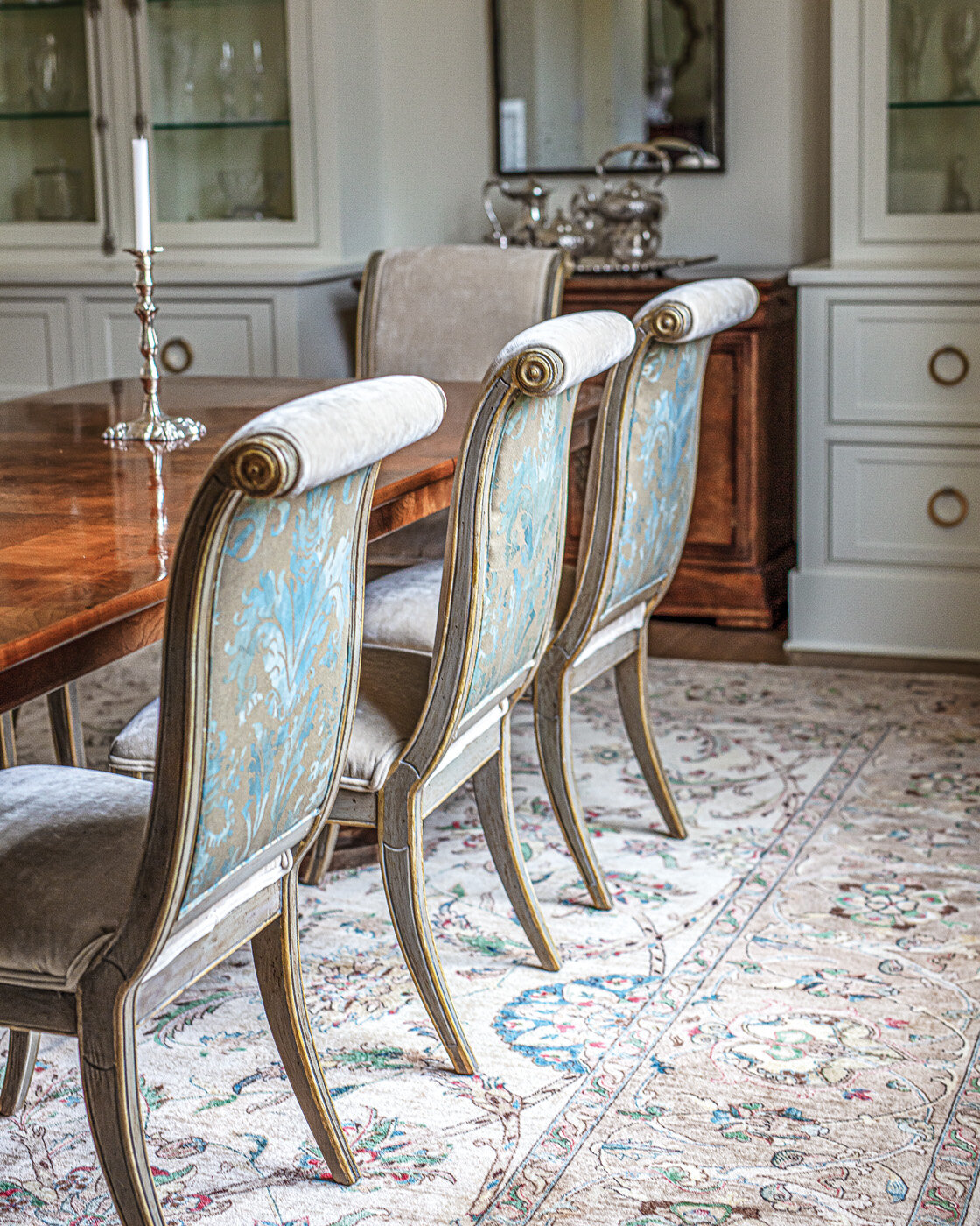
McCord helped the homeowners fill the dining room, and most of the house, with beloved pieces they had collected over time. “We redid the dining room chairs, but we worked around her things because they were so pretty,” she explains. Local faux finisher Richard Martin transformed the chair frames, and McCord paired a neutral velvet upholstery with a knockout hand-painted accent fabric on the backs for maximum impact. Peaceful green tones in the custom silk drapes and a landscape painting that hung in the entry of the previous home work together to create a pastoral feel.

Wirth’s skilled craftsmen created the built-ins in the dining room and throughout the house, and the homeowner couldn’t be more pleased with the result. “[Wirth] took ideas that Cindy and I had and pulled them together. I think the built-ins are what made the house special, more of a truly custom home.” 

11-cindy-mccord-1o6a0419.jpg

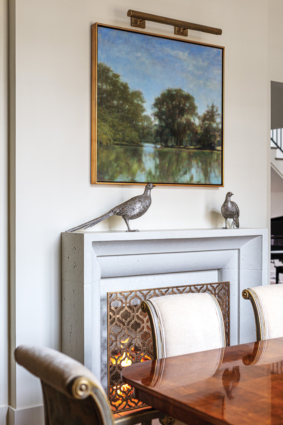
In a room full of stunning features, the limestone fireplace is a standout. Simple and beautiful in its own right, the fireplace is even more remarkable in that it is part of a double-sided unit. The half that warms the adjacent family room has a completely different character, as planned by the homeowner and McCord. Its grander scale fits the larger room’s proportions to a T. 

The home’s open plan was created with entertaining in mind and includes a beverage station McCord says is unlike any other she has seen. “Our previous house had a bar, and it always seemed crowded, so we wanted an area that you could walk up to but not have to go behind,” explains the homeowner. The spot includes an ice machine, refrigerator drawers and a wine tower, surrounded by handsome cabinetry in a stain color that is repeated on the nearby kitchen island. McCord suggested the antiqued mirror backsplash that extends to the ceiling around a generous window.

22-cindy-mccord-1o6a0153.jpg

The homeowner had a few well-thought-out requests for the open kitchen, one of which was a “mega” island with uninterrupted space. “In our other home, so often people would end up standing around the island. In this one, we actually have six seats (four across and two tucked into the ends) so you have better conversation than with everyone facing one direction,” she says.

Other must-haves for the kitchen included appliance garages in the corners to keep small electrics handy, but out of sight, and the deep sill on the large window behind the sink. McCord dressed that area up with a pair of lamps and a window treatment in Madeaux by Richard Smith fabric that adds the perfect amount of color to the mostly white kitchen.

26-cindy-mccord-1o6a0109.jpg
33-cindy-mccord-1o6a9947.jpg

The pantry/office space is one of the homeowner’s favorite spots in the house, thanks in part to its charming Dutch door, a nod to her midwest upbringing. “I’m from a small Dutch community in Wisconsin, so I had to have a little bit of Dutch coming through in the design,” she laughs. “I love this room! To have a desk in the front of the house with so much natural light and really close to the kitchen is great. It doesn’t feel like it’s stuck away in a closet.” McCord didn’t neglect the details in an area that designers sometimes skim over. The desk’s vivid blue is mirrored in the wallcovering treatment on the ceiling. Lucite accents in the desk chair, cabinet hardware and curtain rod provide a light feel, while Galbraith & Paul drapes add a hint of whimsy.

Beyond the kitchen and a jewel of a powder room is one of the home’s most exceptional features, the product of Bramlett’s creative genius. The idea for a floating back staircase was born during one of the couple’s early conversations with the architect. She recalls, “When we first sat down Jeff was asking us about our wishes and needs for the house. He asked how many staircases we wanted and at the same time I said, ‘One’ and my husband said, ‘Two.’”

37-cindy-mccord-1o6a0037.jpg

Adds the homeowner, “Jeff had the idea to do this staircase and we absolutely love how it turned out and just having a back staircase, as well. Not only the architectural value—it’s beautiful, but to have the access to the upstairs from the garage is great. You can pull in the garage to this private entry and go right up to the guest rooms upstairs without having commotion at the front door.”

The staircase even provided an unexpected bonus during quarantine time: the area underneath the steps proved to be an ideal spot for the homeowner to practice yoga when going to class wasn’t an option.

Wirth encountered challenges creating both the back and front staircases, but rose to the test like a true team player. In place of balusters on the back stair, the homeowner requested clear acrylic, a material with which Wirth had little experience. And on the front stair rail, a combination of iron with gold accents, also took time and effort to achieve. The homeowner recalls, “Gold melts so quickly compared to iron; it kept dripping and it took so much work to get it right. At the end of the day, there are some imperfections to it, but that’s the creation of an artist at work. It’s not manufactured, it’s handmade.”

The main-floor master bedroom is a light-filled retreat, complete with a soaring ceiling and picturesque views of the lush backyard. Two comfy armchairs and show-stopping furry ottomans in front of a pair of French doors give the couple room to work or relax. Furniture and a rug brought from the family’s previous residence look right at home, thanks to expert placement and added accents from McCord. 

The master bath is both a study in luxury and a tribute to the homeowner’s heritage. She explains, “The town where I grew up is only 10 minutes from Kohler, WI, and almost all the homes there have Kohler fixtures because the factory is within minutes from home. I purposely wanted to have Kohler throughout this house for that reason. I made a trip to Wisconsin to their design center to pick out all the plumbing products. I had our plans and I worked with one of the designers there at Kohler. When I came back, Cindy and Ferguson’s pulled it all together.”

McCord raves about her client’s chosen brand. “The finishes on so many of the Kohler pieces are so different and unusual!” She also loves the Calcutta Gold marble the couple chose for the master bath floor. “It has a little gold and a little gray. It doesn’t date a design or box you into using a certain color palette.”

Another win for the designer/homeowner team, the natural stone selections for the house were a group effort over the course of time. “Cindy said that was one of the first things we should pick out and I wondered why we were doing that so early,” the homeowner remembers. “Well, we didn’t pick it right away, but we started looking and looking. It took time to find the treasure of the right countertops that we wanted.” Adds McCord, “If you don’t start early, then you have to settle for what they happen to have in stock at the time.”

It’s clear these homeowners didn’t settle when it came to any detail. Their careful planning and partnership with top professionals assured the stunning results they dreamed of for their long-awaited custom home.

Oxford Oasis

Interior Design by Tara Felice Interiors | Story by Terri Glazer | Photos by Sélavie Photography

“Every room should have something exciting in it.”

These words form one of Tara Engelberg’s interior design mantras; a tenet that rings true in every room of the Oxford, MS, home she recently completed for a family of five. 

WEB_TaraFeliceInteriors-Oxford-SelaviePhotography-2.jpg

Engelberg, owner and creative director of Tara Felice Interiors, set out to update the classic residence right off the town’s square while respecting its traditional architecture and cottage-like vibe. She points to the project to illustrate the fact that a home doesn’t have to be large to be well appointed. “I loved working with a house with character and great bones. I think it goes to show that you don’t need to have a massive house to have an amazing, warm and inviting space. In a smaller home, the decorating budget can go further, making it possible to have more quality pieces, since you need fewer of them. It allows me to focus on furnishing the house really well and to really hone in on the details.”

WEB_TaraFeliceInteriors-Oxford-SelaviePhotography-5.jpg

Previous owners had remodeled the home a number of years ago, but the drab colors and Tuscan-style materials didn’t keep in the character of the house or seem appropriate for a vibrant family with three school-age children. “The house has amazing windows and was getting beautiful light, but between the heavy curtains and the paint colors, you couldn’t see it,” says Engelberg. “When someone tried to ‘modernize’ the house before, what they did just didn’t add anything.” 

The transformation starts from the front door. Engelberg convinced the new homeowners to rearrange the living room’s layout to make up for the lack of an entryway. “The old layout wasn’t bad, but I wanted to create some definition because the front door opens straight into the living room. I like having a little foyer feel, so I wanted to put the sofa facing the fireplace. I like it when you come in and you have a moment to feel like you’re in the entrance to the home,” she says. 

She freshened up the fireplace by painting its dark wood white and replacing travertine with tumbled marble. Then came the aforementioned excitement: black-and-white resin nesting coffee tables, a colorful Michael Barringer original painting from L Ross Gallery, and a chrome armchair upholstered in a cheerful orange that echoes the tones in the art. 

The pop of orange in the living room is but a foreshadowing of what’s in store in the adjacent dining room. Formerly painted blue and nondescript, the walls now sport a vibrant orange grasscloth wallpaper, set off by bright white trim. Asked if the bold color was a hard sell to her clients, Engelberg says they happily agreed to her suggestion. “They were into it!,” she recalls. “They gave me a lot of creative freedom and listened to my ideas and reasoning, and they love the room.” The bright grasscloth wallpaper was a perfect option, she adds, because it provides both warm color and texture. 

While every room should have excitement, not everything in the room can be a focal point, Engelberg explains. There needs to be balance. “Whenever I do bright colors, I try to temper it, like in cooking when you mix eggs into hot ingredients slowly so they don’t ruin. Most everything else should be calm. The dining room rug is solid white wool and the chairs have a very simple ticking stripe that looks like vintage French napkins.”

In the kitchen, Engelberg decided to take the wall color in the opposite direction. Previously painted dark blue, the now-white walls set a clean, bright backdrop for the reimagined room. The homeowners opted to paint the existing wall and base cabinets white, but the designer urged them to tear out the existing kitchen island in favor of a larger one that would provide storage as well as a seating area large enough to accommodate the whole family. Bathed in blue with a butcher block countertop, it’s the perfect spot for a quick breakfast before school or work. The kitchen’s new flooring, oversized black and white hex tiles, provides vintage character, and the open baker’s rack is an attractive storage solution. An abstract painting by Melissa Dunn, also from L Ross Gallery, is a true standout against the crisp white of the wall.

TaraFeliceInteriors-Oxford-SelaviePhotography-9-2.jpg
TaraFeliceInteriors-Oxford-SelaviePhotography-10.jpg

Engelberg says the master bedroom underwent one of the biggest transformations of any space in the home. She took the wall color from dreary to inviting and rethought the window treatments to bring more light in and improve the view. “This room has an amazing view and beautiful trees and greenery, so we took out plantation shutters to open it up,” she says, explaining that she prefers simpler window coverings to the often-used shutters. “[Shutters] look busy for no reason.” Her designs tend to feature simpler window treatments like panels and Roman shades in neutral colors. “I love their casual, relaxed feel,” she adds. 

Because the room isn’t perfectly symmetrical, Engelberg decided not to pair nightstands by the bed. Instead, she opted for a different low chest on either side, a choice that provided needed storage in the older home with limited closet space. The fact that both chests are similar in height allowed the pair of angular bedside lamps placed on them to work beautifully.

The room’s overall feel is serene, thanks to the simple white bedding and neutral rug. Pops of color come from the lamps as well as accent pillows in a geometric print, orange and blue. “I’m obsessed with blue right now,” Engelberg admits. “I think it’s a great neutral that goes with just about anything.”

And then there’s the art. Two pieces grace the room: a Lisa Weiss painting hangs over the bed, and a large, square work by Nashville native Kit Reuther graces the opposing wall. According to Engelberg, the Reuther work from David Lusk Gallery was a must-have. “I told the homeowner, ‘If you only buy one piece of art for your home, it has to be this one. It is so beyond perfect in the bedroom—the shape, the colors, the serenity.” 

Next to the master suite is the den, the family’s hangout area. Here, Engelberg again removed blinds to open up the view of the home’s treed yard and repeated the blue, orange and white color theme. She equipped the space with a game table so the kids have a place to do homework or work a puzzle. The family can relax in deep armchairs covered in soft corduroy or on the comfortable sectional.

TaraFeliceInteriors-Oxford-SelaviePhotography-14.jpg

It’s that kind of comfort that drives Engelberg’s design. Having battled and beaten cancer a few years ago, she says she now knows the true importance of environment. “Where you live, what your space looks like, feels like, completely impacts your mental health, your physical health, your relationships with people around you. There’s such a strong connection. So I always look at that when I’m looking at someone’s house. It’s not just that we have to make it look pretty; it’s how can we make it live well for you...The rooms you spend the most time in have to feel good.”

Tara’s Tips | More thoughts from designer Tara Engelberg

On light fixtures: “I love lighting. Lighting, to me, is like the jewelry of the room. You can get bold with it. You can get creative with it. You can get delicate with it because chances are, kids and dogs aren’t going to knock it over.”

On window treatments: “I don’t like big, fussy window treatments. I don’t think they should be the focal point; the window and the view and the furniture in the room should be the focal points.”  

On accessories: “I love going to estate sales and the one thing I always look for at estate sales is brass candlesticks. You can have a super modern room with everything new and you add a little patina in a brass candlestick and it changes the feel of a room instantly. Most of my design is for families, so I feel like adding a little touch of vintage or antique because it gives a comfortable feel.” 

On mixing vs. matching: “My favorite way to create a personal space with layers and depth is by mixing textures and elements. A room shouldn’t look like you purchased everything from a page of a catalog, or from the same store even.”

A Warm Welcome

Event Design by Arden Sanders Events | Story by Terri Glazer | Photos by Dear Wesleyann Photography

Since guests were traveling from far and wide to attend their daughter Mary Margaret’s Rosemary Beach, FL, wedding to Davis Horton, Beth and David Skudder wanted to make sure family and friends were welcomed in style. They called on 30A wedding expert Arden Sanders and her team at Arden Sanders Events to make the welcome party a bright, colorful soiree that would set the tone for the weekend of celebrations to come.

The Setting

The family has owned a vacation home at Rosemary Beach for years, so bride Mary Margaret knew for a long time she wanted to be married there. Sanders says her goal was to showcase Rosemary’s various venues during the wedding weekend, starting with the welcome party at the charming Homeowners’ Pavilion. With the help of Myrtie Blue Event Design, Sanders and ASE lead planner Coleman Crye transformed the poolside area into a party paradise filled with color, pattern, flowers and fun.

The Theme

“Coastal chic” was the theme for the evening. The mother of the bride asked that the welcome dinner decor have a warm color palette to give it a look all its own, since the wedding was to be a formal affair with black, white and champagne tones. The ASE team ran with the bright, joyful look, punching up the pavilion with color everywhere. From the plethora of flowers to the festive patterned linens to the fun and funky furniture, guests were surrounded by saturated tones. Every little detail played into the look; the paper goods included bright colored napkins printed with fun facts about the bride and groom, and the koozies displayed a watercolor image of the family’s beach home.

The Flowers

“We had ALL the flowers!” says Sanders. Myrtie Blue worked magic with a huge variety of vivid blooms to create arches, swags, centerpieces and more. Peonies, anemones, ranunculus and roses were the stars of the show. 

The Menu

Coordinated by Townsend Catering, the menu kept the coastal and colorful theme in play. Guests enjoyed an extensive charcuterie selection, a raw bar—kept cool by custom monogrammed ice sculptures from Ice Dragon—classic Southern food and build-your-own pasta. Mini desserts were just right to satisfy after-dinner sweet cravings. A vodka bar stocked with a variety of fresh fruit-infused spirits was the hub for the evening’s beverages.

The Entertainment

Local acoustic guitarist Jamah Terry provided music for the event. The Skudders wanted to give their guests an idea of the beach experience they love, so they included an element that has been essential to their family fun over the years in Rosemary—games. From bocce to jumbo versions of Jenga and Connect Four, attendees could test their skills for weekend bragging rights.

Pool Perfection

Design by Cindy McCord | Story by Terri Glazer | Photography by Ross Group Creative

When adding a pool, bigger isn’t always better and waiting pays off.

cindy-mccord-design-1o6a1661crop-web.jpg

On a hot July day, a Mid Southerner’s thoughts can easily turn to daydreams of floating in a peaceful backyard pool. If you’re considering adding a pool to your property, pay attention to these tips from a local design pro who recently took the plunge and transformed her backyard into an enviable oasis.

Interior designer Cindy McCord and her husband Fred McCord built their Collierville home with Thomas Wirth of Germantown Homebuilders in 2015. During the initial construction Cindy designed a pool, but the couple decided not to build it at the time. She now says she’s happy they hesitated, having waited until last summer to put it in. “I’m glad we didn’t build the pool when we moved in, even though it would have been less expensive and less hassle,” Cindy admits. With time, she realized the pool would be better placed in a completely different spot than she initially thought, and she was able to fine tune its design.

cindy-mccord-design-1o6a1663crop3-web.jpg

“Some people ask why we put it so close to the house,” Cindy says. “I really wanted it to be right here because this [adjacent outdoor living area] is where we spend a lot of time. We can be on the porch and talk to someone in the pool. And we were able to keep the pretty back area untouched.” 

The McCords had prior experience with a backyard pool. “We bought a house and lived in it for about five years that had a really big older pool,” she explains. This time, she knew a smaller version would better suit her family’s lifestyle. “We just wanted something to jump into when it gets really hot or to float in.”

She was also certain about what she didn’t want—a lot of hardscape surrounding the pool. “I wanted no concrete around it except a couple of little pads; I liked the look of it butting up to grass and having the limestone coping. When there’s more green around it, it’s not so sterile,” she says. 

What were the McCords’ other must-haves for her new pool? A sundeck that could accommodate lounging chairs, and a water feature of some kind. She credits Johnny Deniston of AgriScapes Landscape and Irrigation with bringing her vision to life, and Jim Phillips of Pools Unlimited, who did the construction, for making it a reality. “Johnny came out one day and we drew [the design] on a napkin. He knew I wanted something simple; nothing too big. In two minutes we decided what we were doing. He even drew in the little pads: it was almost exactly like what you see now.” 

With a graceful curve, the shallow sundeck Deniston conceived holds a pair of Ledge Lounger chaises. With a sleek, one-piece design they are eye-catching and practical—ideal for relaxing in the sun or shade, thanks to detachable shades. Around the pool, an inviting outdoor daybed and more chaises from the Kolo Collection provide room for all the McCords to relax together poolside.  

Ann-Prince-Lombardy-RossGroupCreative-03-003A3857-2500x2500px.jpg
cindy-mccord-design-1o6a1860b-web.jpg

For the pool’s focal-point wall with water feature, Phillips called on the services of Christie Cut Stone to create and place the large limestone spheres. Cindy had seen a similar design in a magazine and was adamant that hers would be every bit as striking. “They tried to talk me into using smaller balls, but I really wanted the big ones,” she laughs. “It was crazy getting them in place. They had to build a ramp and roll them up!”

Once the pool itself was completed, the AgriScapes crew handled the landscape plan and installation. Deniston and McCord have worked together in the past, so she trusted him to complete the project in keeping with her design aesthetic. “I told him to landscape it however he thought it would be best and he did a great job,” she says. “He knows my style so I was able to say, ‘Surprise me!’” Deniston’s design scheme includes classic elements like a formal hedgerow, a diamond-patterned vine trellis on the exterior wall opposite the pool, a topiary feature and a garden bench flanked by matching boxwoods in decorative urns.

cindy-mccord-design-1o6a1739flat-web.jpg
cindy-mccord-design-1o6a1711flat-web.jpg
cindy-mccord-design-1o6a1805flat2-web.jpg


To complete the backyard renovation project Cindy called on Jeff Bramlett, the architect who designed the house, to reimagine the outdoor kitchen. She says she couldn’t be happier with his vision for the grill area, as well as the adjacent porch he included in the original home plan. “We really live on our porch. We’ve had it set up like this since we moved in,” says Cindy. “We were limited on size for the porch, but we love the coziness of it. We also love that you can see it from just about every room in our house and access it from several doors. When we have people over we just open all the doors and we have great circulation.”

The timing for adding the pool couldn’t have been better. Since the project was finished in early September of 2019, this is the first full summer the McCords have had full use of their new outdoor oasis. And with their two young adult daughters home from school early due to COVID-19 closures, the whole family has really enjoyed it. Of all the McCords, it may be Cindy who uses the pool the most on the weekends. The hard-working designer, who has owned her own business for over 26 years, admits, “Part of the reason we added it was to keep me from being upstairs in my home office working every weekend, and it has worked! I love being out there!”