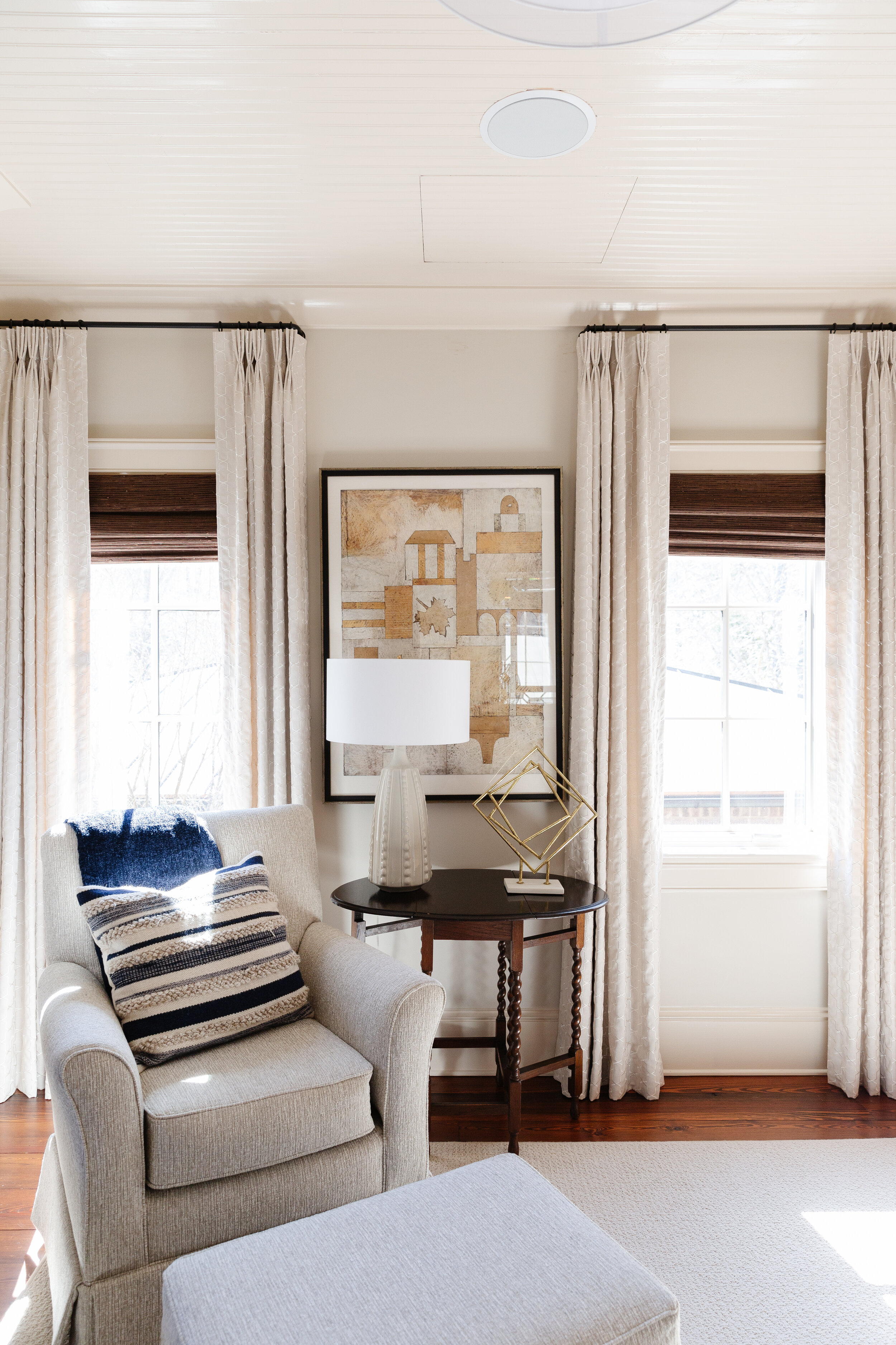
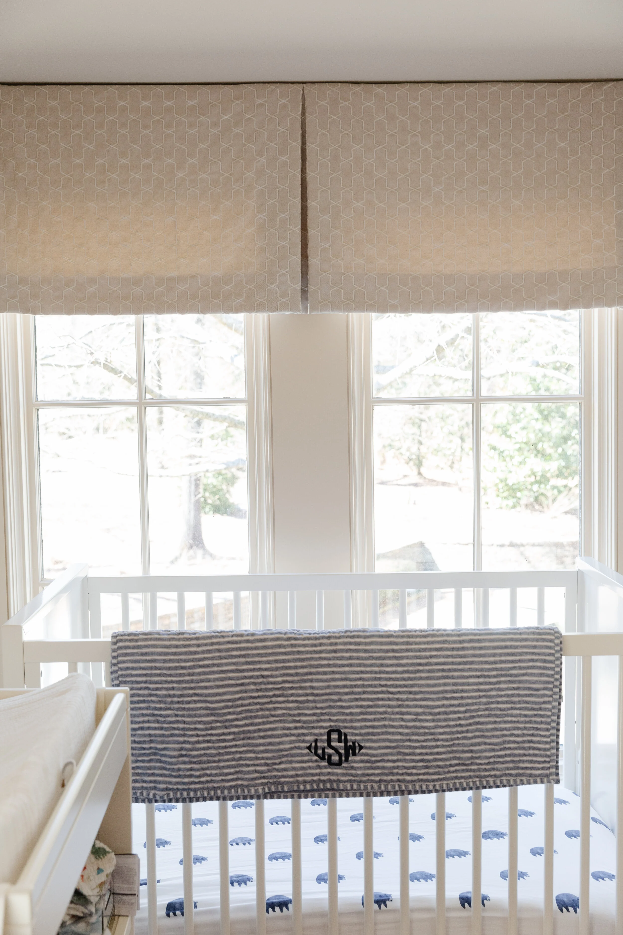
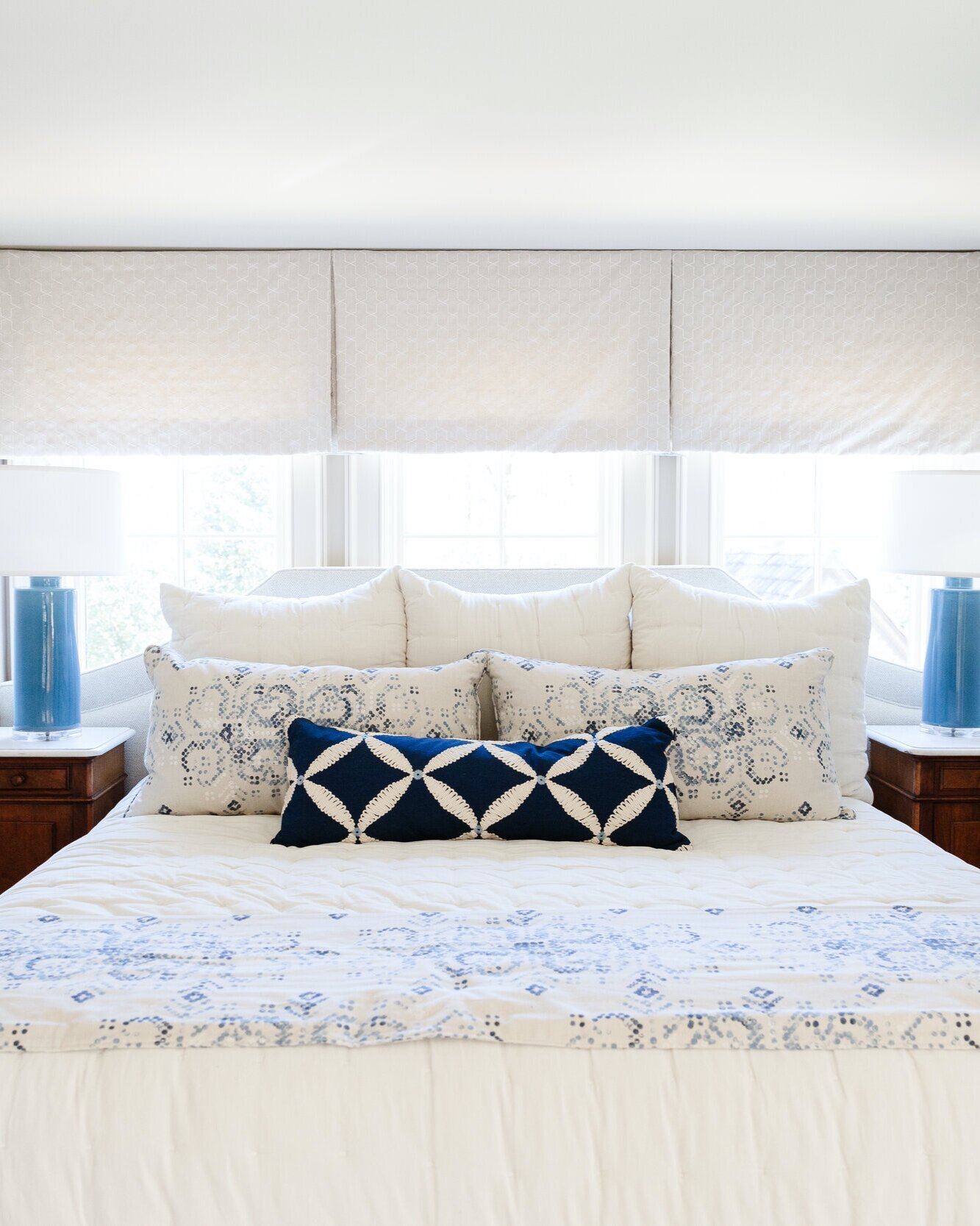
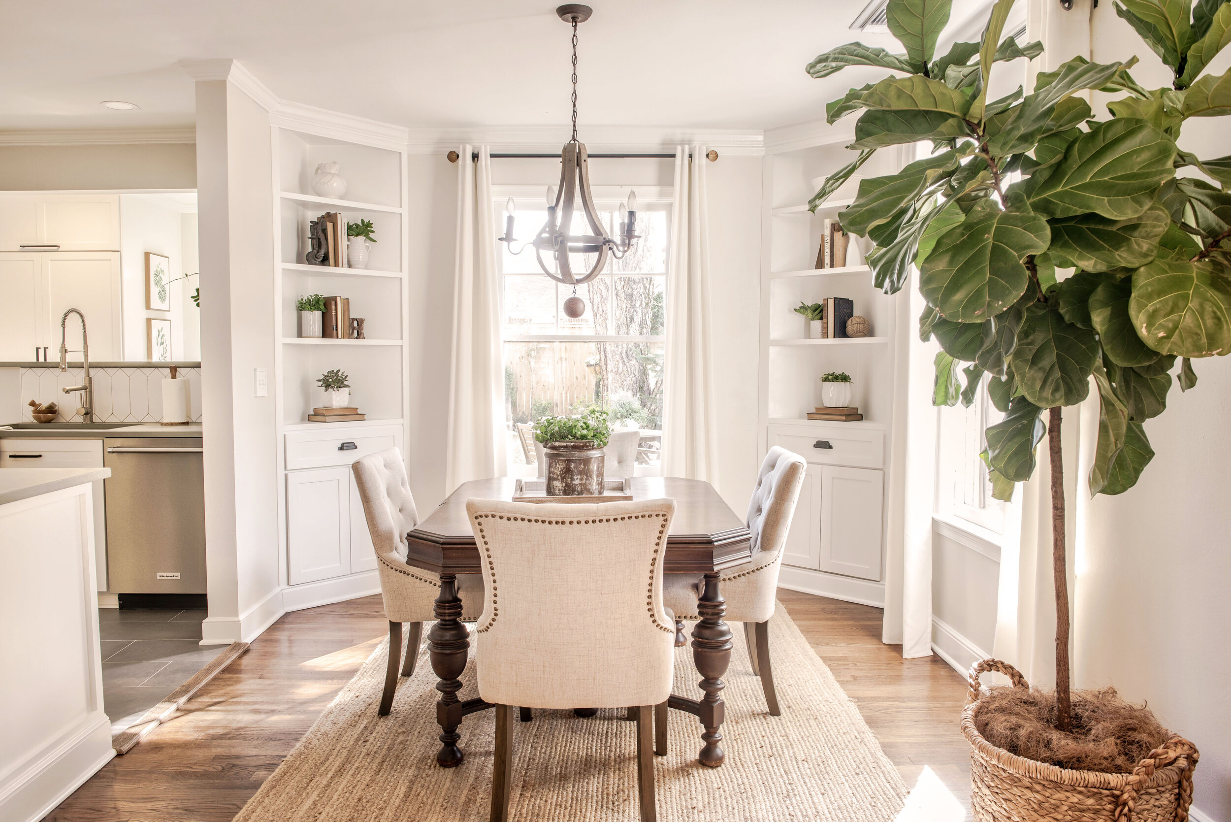
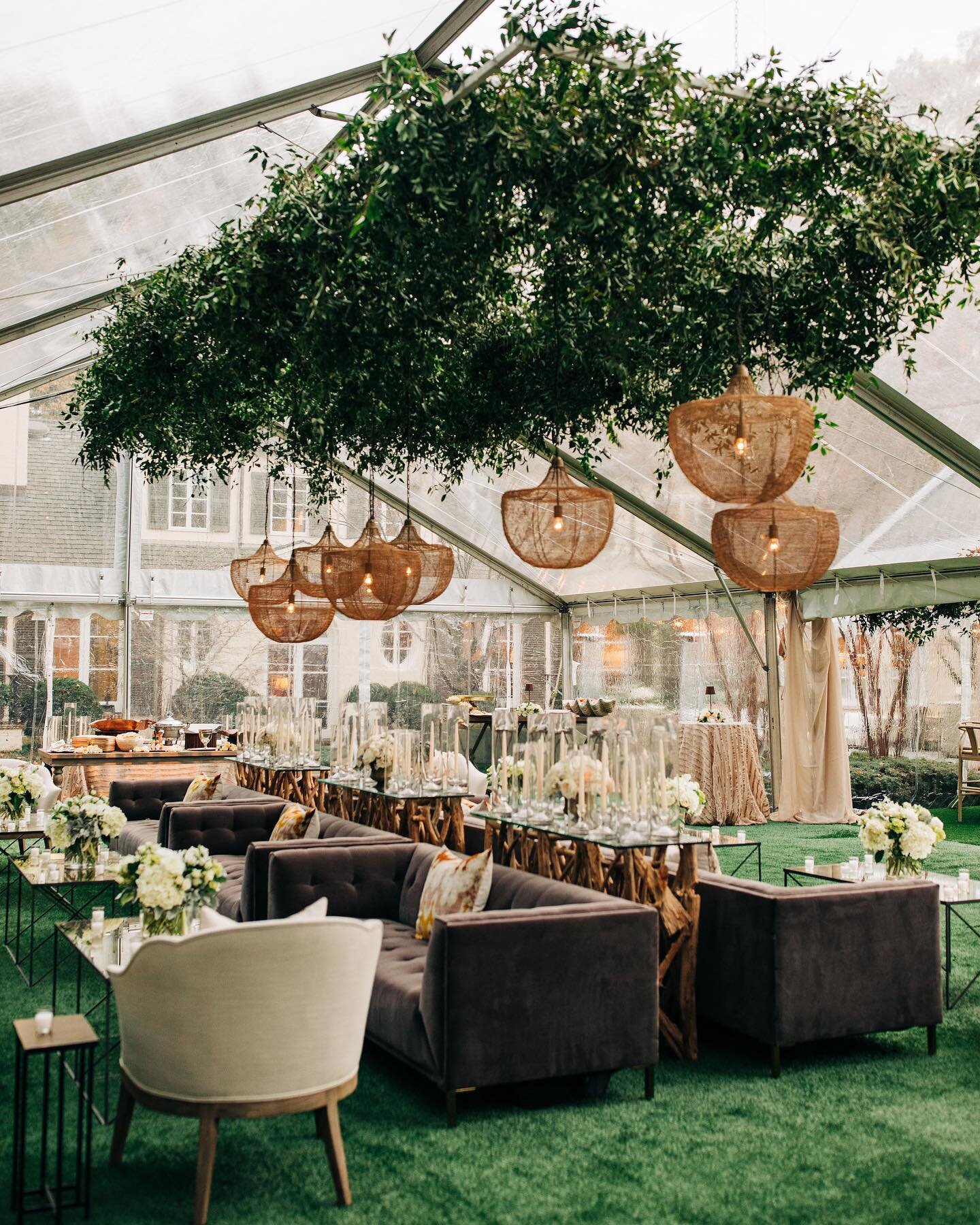
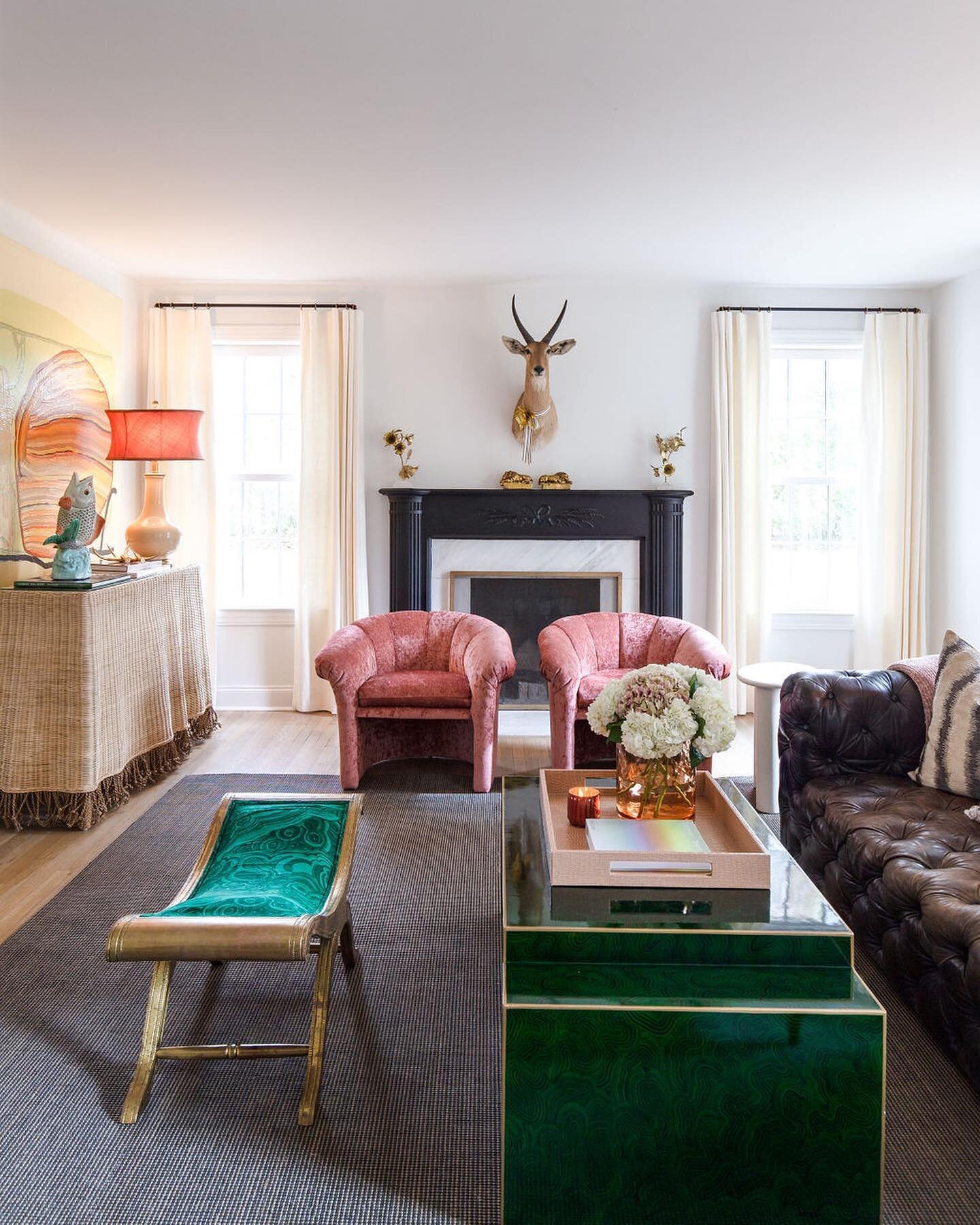
Home as a Solace

Interior Design by Alexandra Lauren Interiors | Story by Terri Glazer | Photography by Kristen Elizabeth Photography

For the past two years everyone has spent more time at home, leading many homeowners to renovate or redecorate. The project designer Alexandra Lauren recently undertook for a Jackson, TN, family was more than freshening up, though. Both health care providers who have experienced heightened stress from the pandemic, the couple now think of their home as a haven from the storm.

The family moved into the house in 2019 and engaged Lauren to begin the renovation shortly after settling in. The designer describes it as “a rare property.” Surrounded by forest, yet conveniently located in town, its architectural style and the lush gardens painstakingly cultivated by the previous owner exude a French country feel. The designer’s task was to update the interior to more accurately reflect her clients’ modern taste in a way that highlights the unique beauty of the home’s breathtaking natural setting.

General Contractors Larry and Ricky Cupples of Cupples Construction oversaw the renovation work. Lauren says they were the perfect choice for the job since they originally built the home. “When time came to gut and remodel it, they knew where the internal ‘bones’ of the house were.”

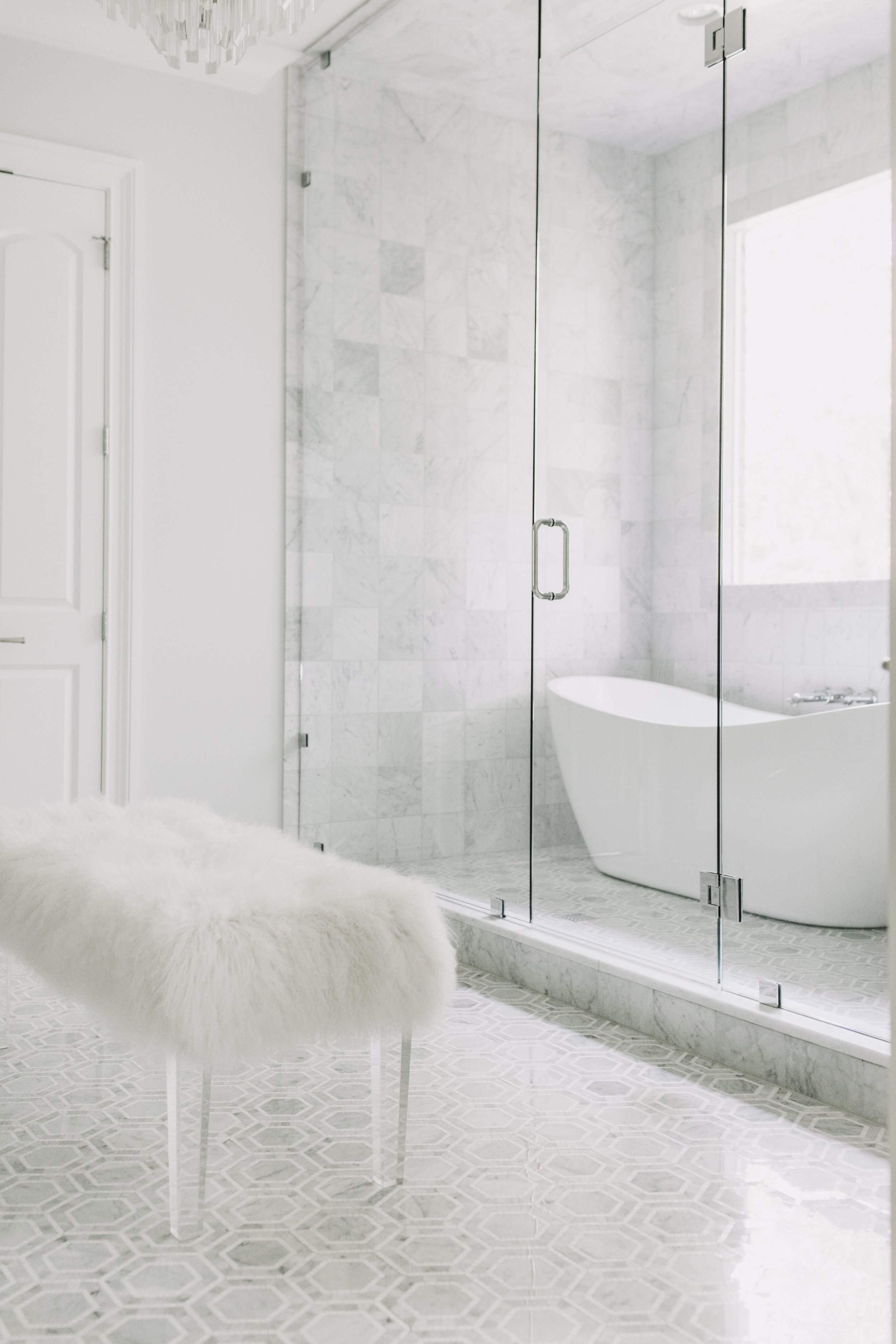
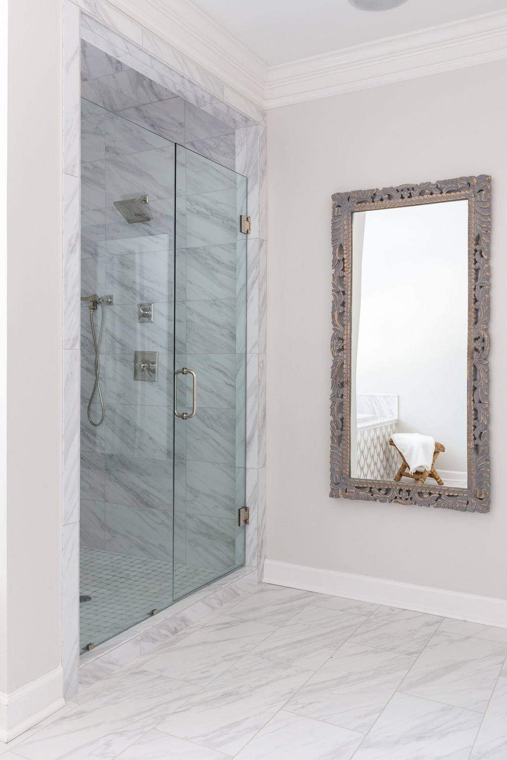
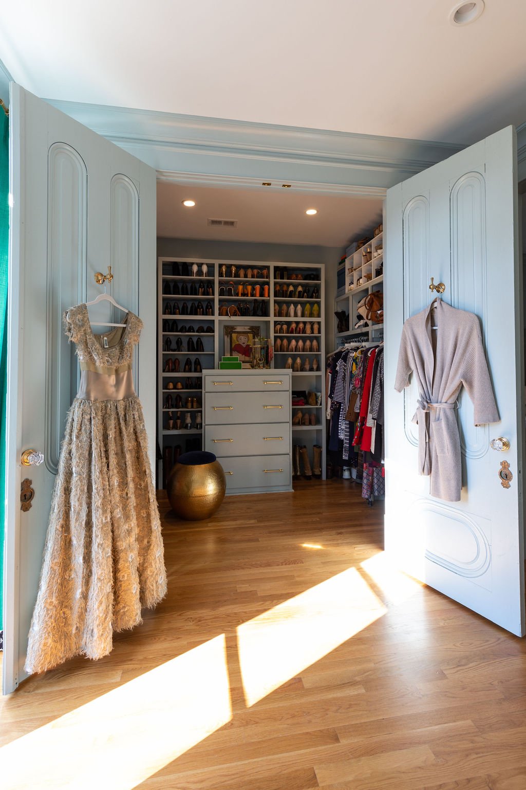
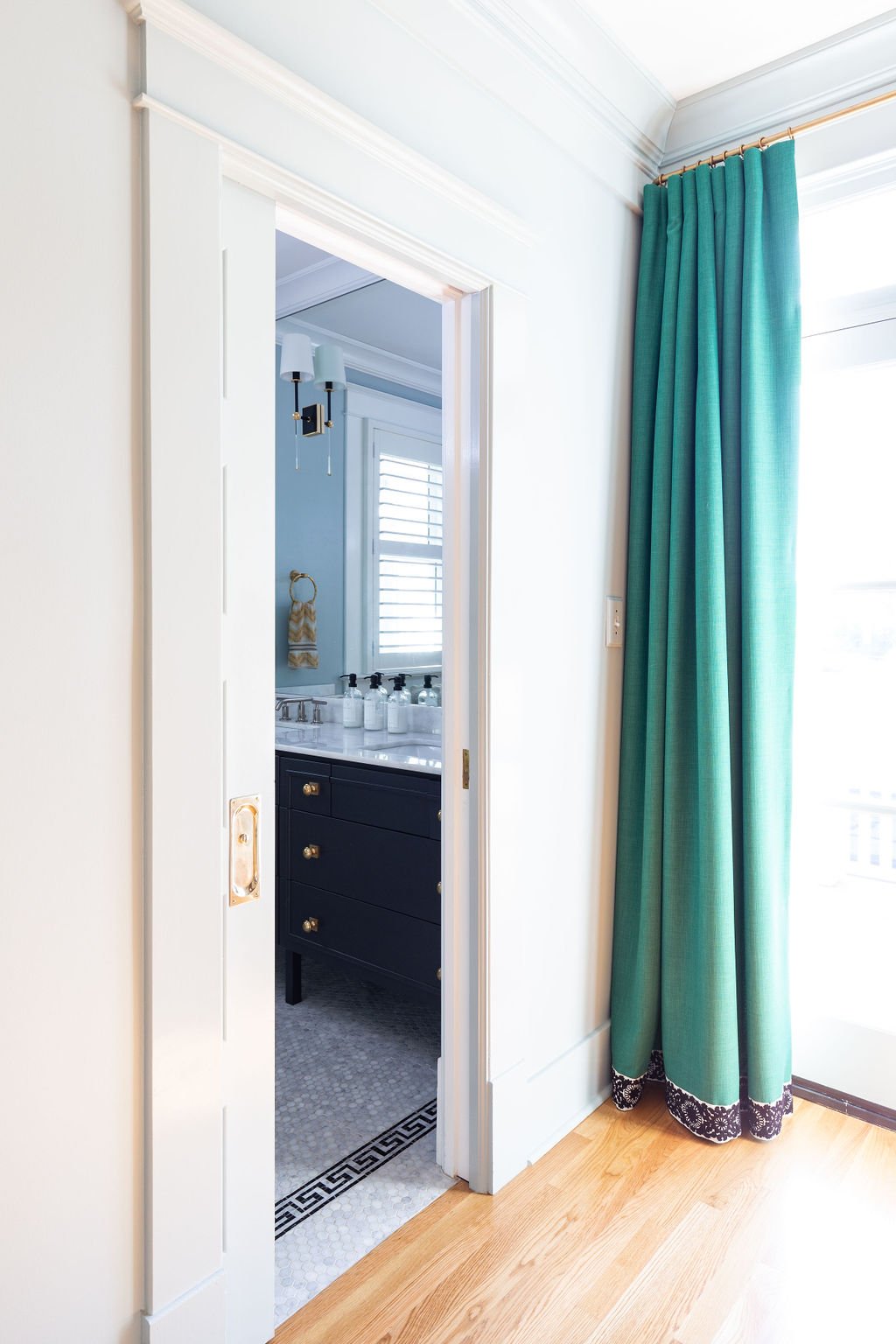
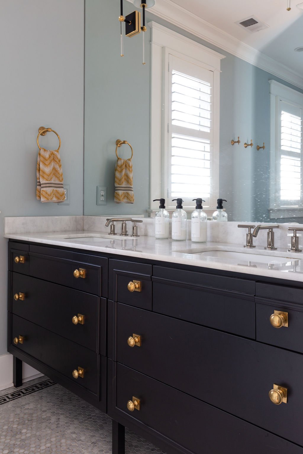
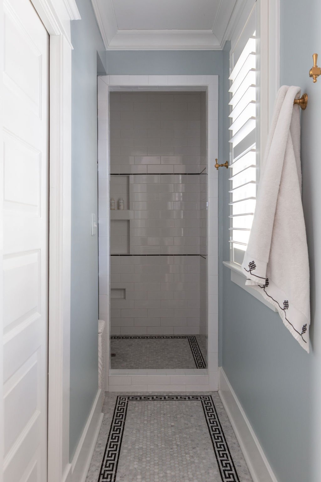
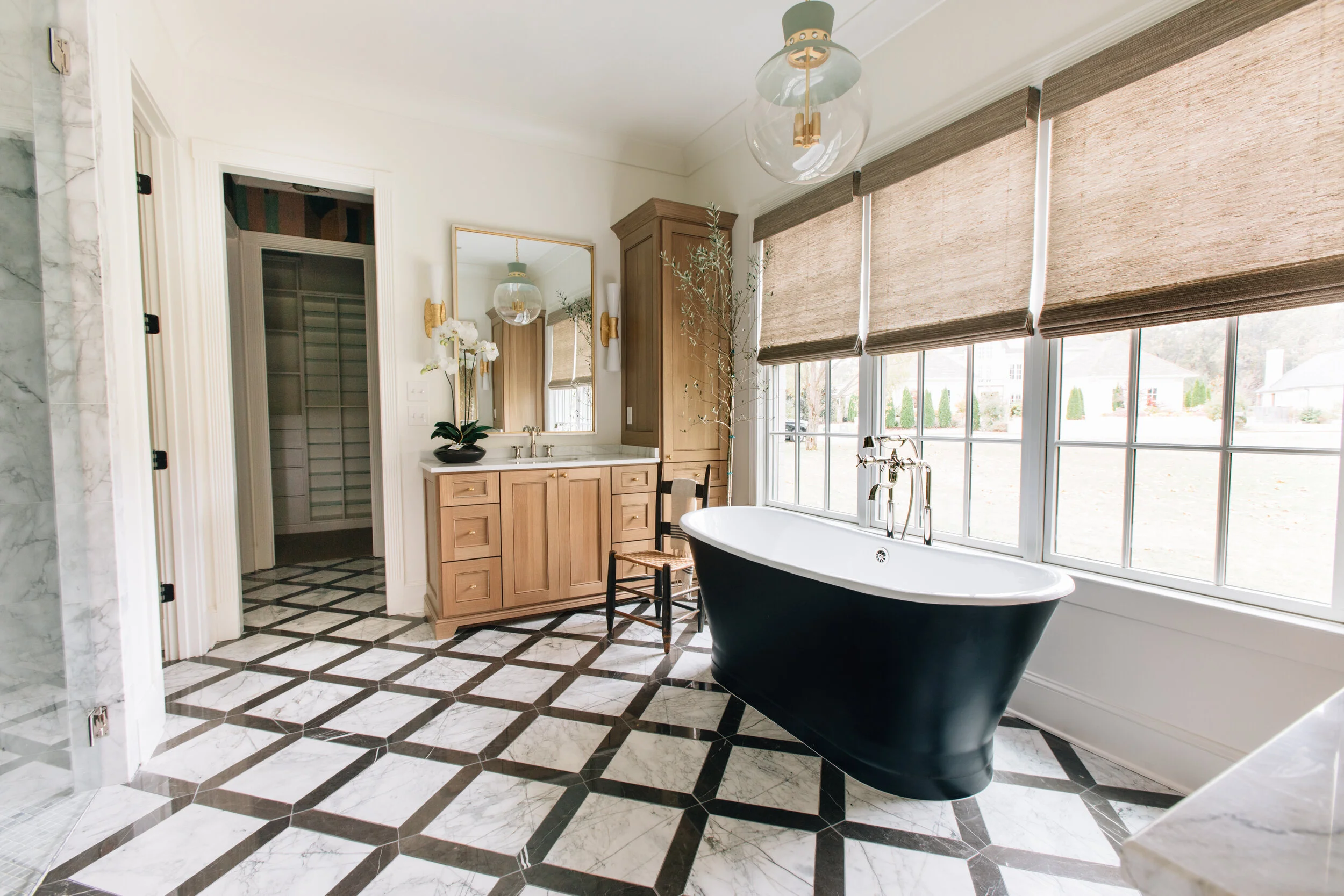
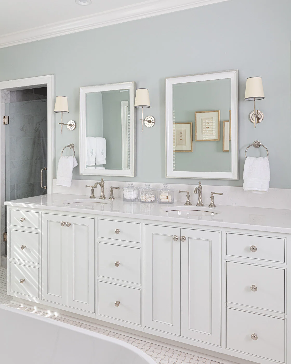
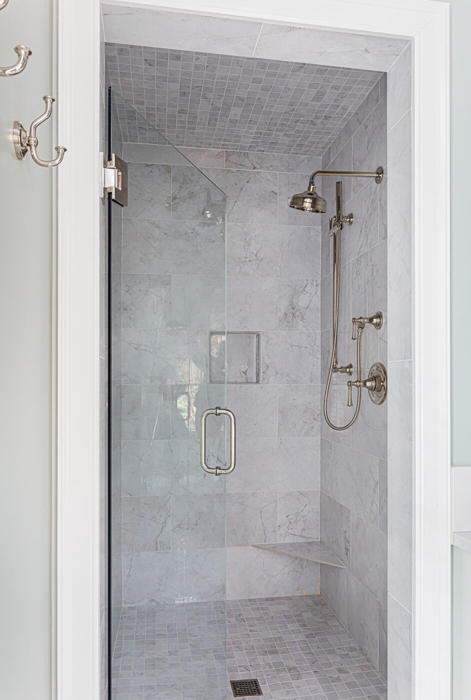
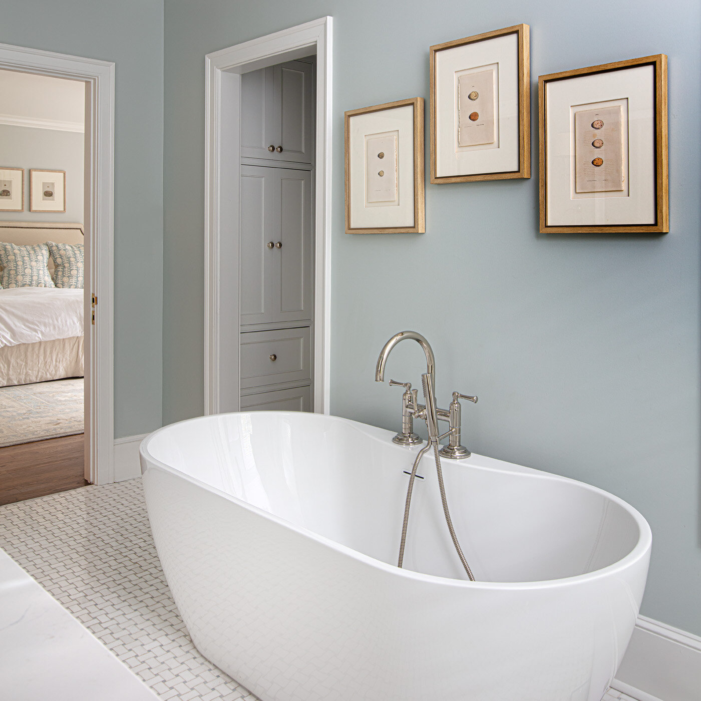
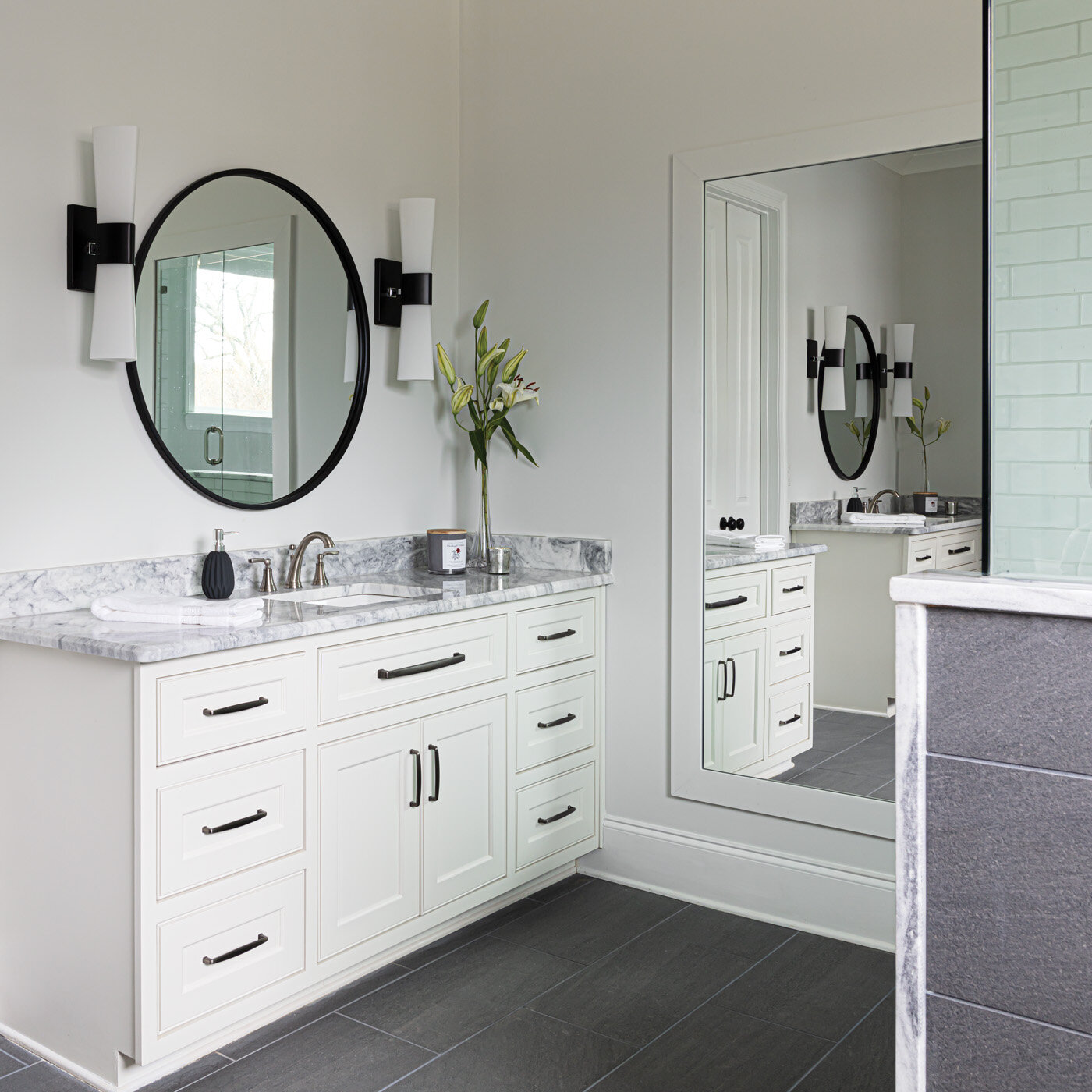
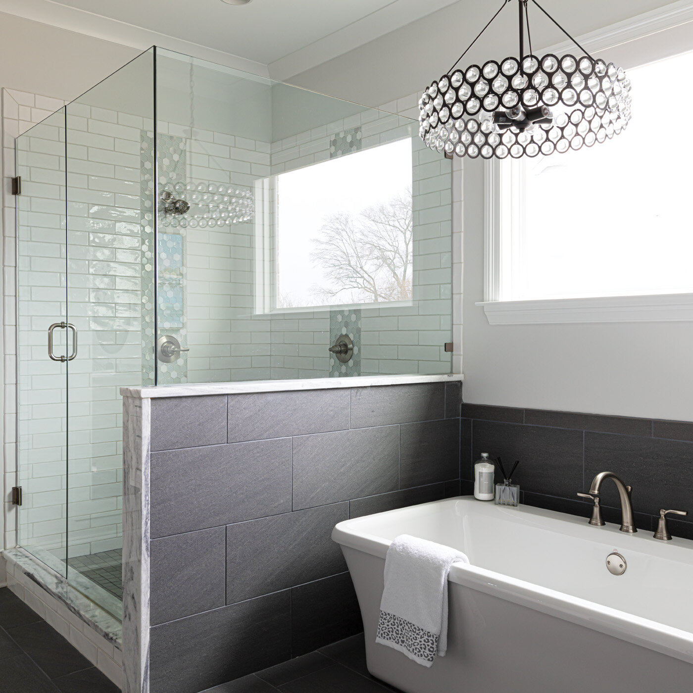
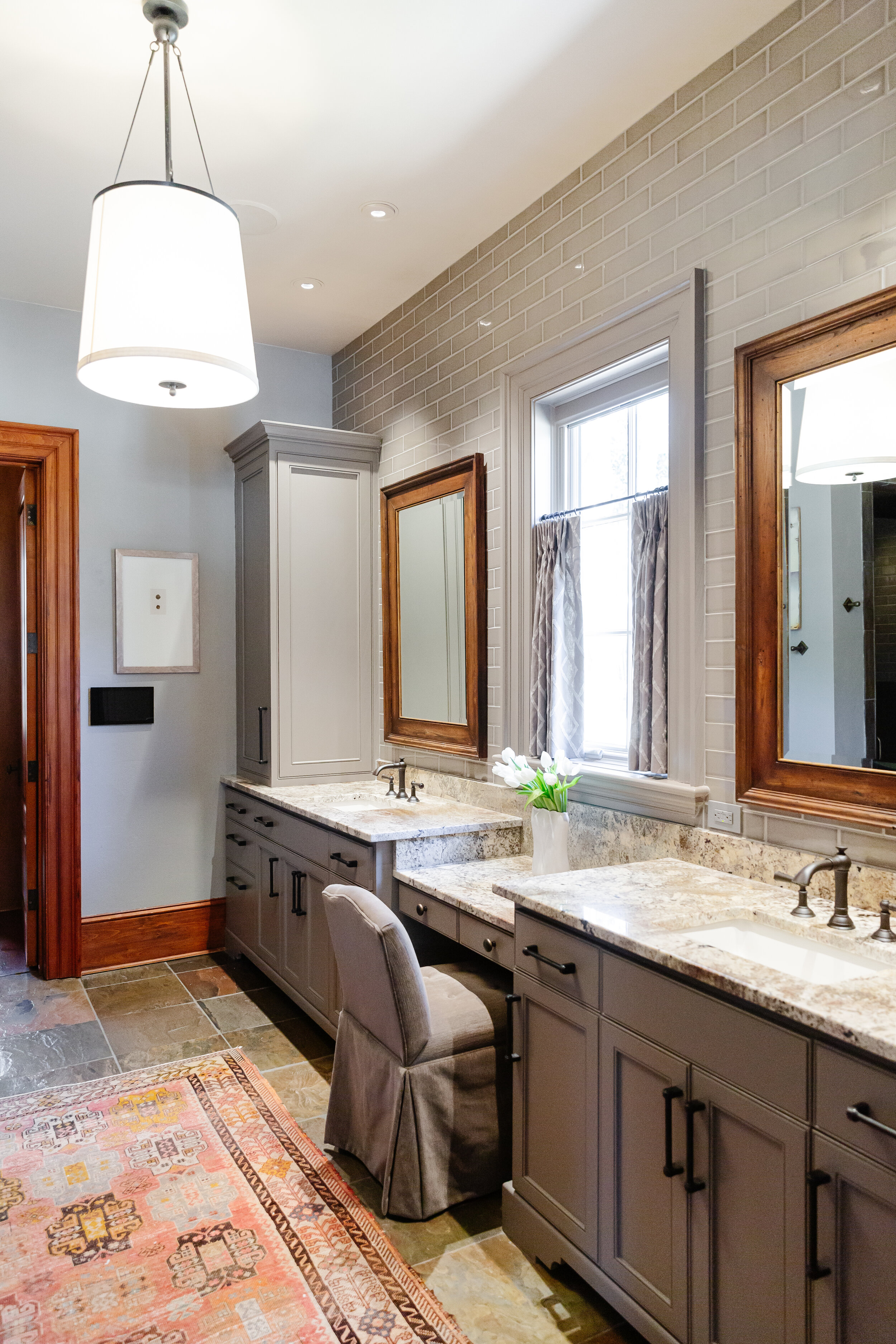
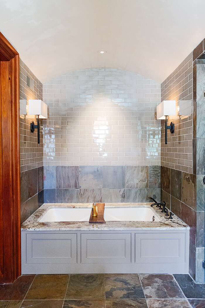
First on the agenda was the primary bathroom. In order to “bring the outdoors in,” Lauren enlarged a small window and situated a freestanding soaking tub under it. “We played on the concept of shinrin-yoku, which means forest bathing in Japanese,” she explains. “I am a huge fan of free sunshine. By enlarging the window we not only flooded the main bath with natural light, but also opened up beautiful views of the forest outside which weren’t previously visible.” The reworked floor plan allowed for a marble enclosed tub and shower, fulfilling the clients’ only request for their primary bathroom. 

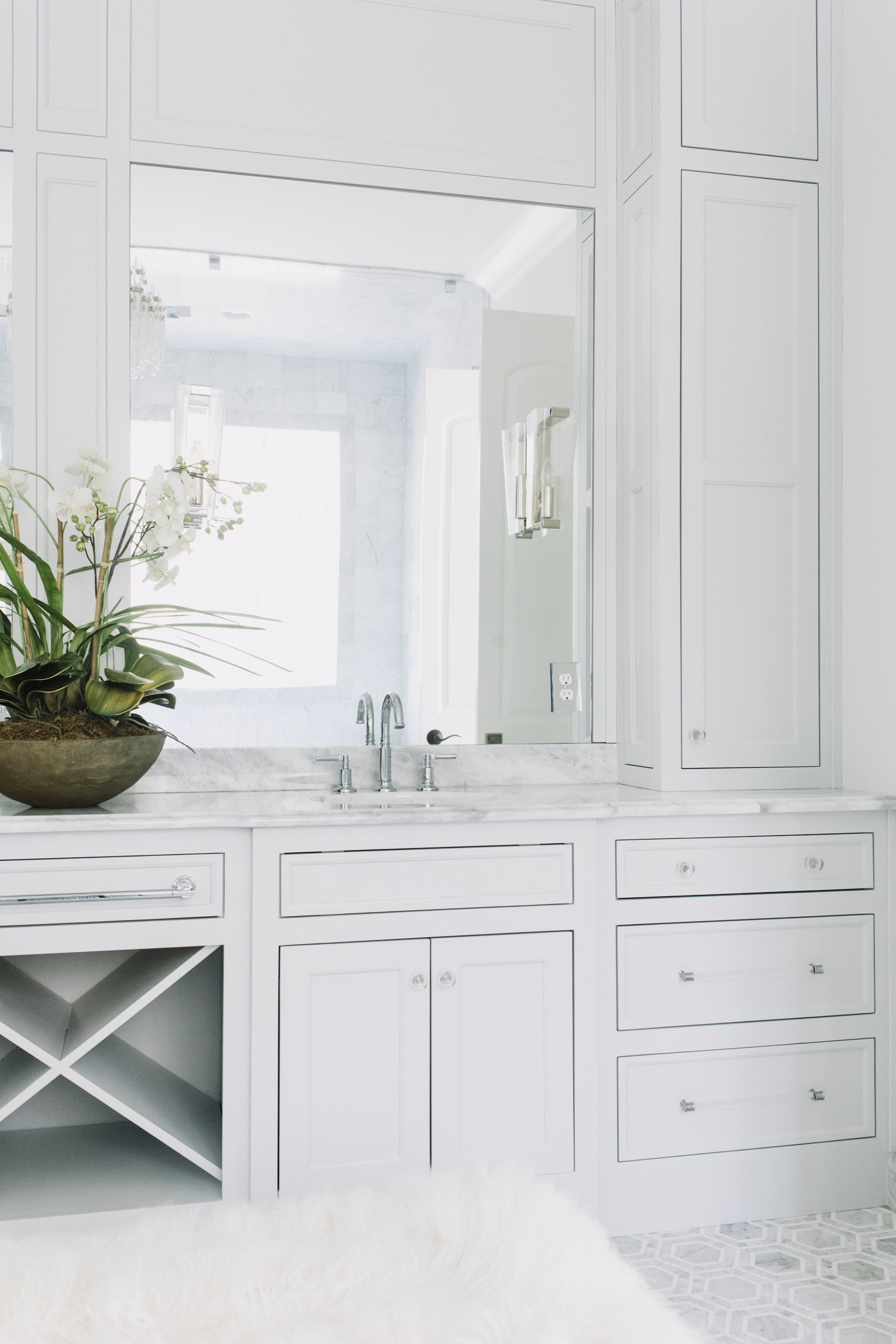
Mirrored French doors do double duty, adding light and interest to the space and cleverly covering the entrances to the water closet and the owners’ closet. 


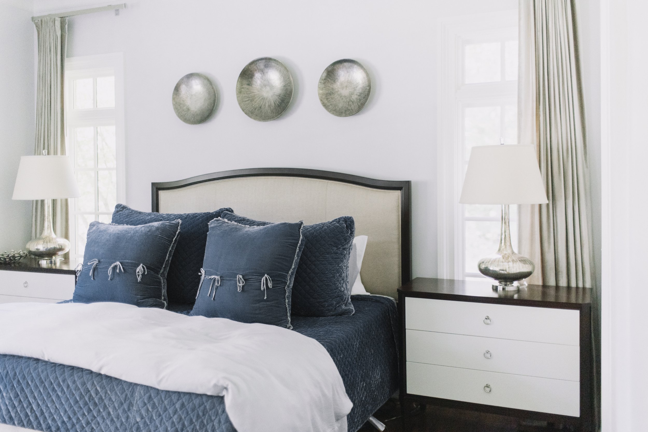
Next up on the renovation schedule were the son’s and daughter’s suites. The homeowners wanted to give their teenage children grown-up spaces with enough sophistication to serve as guest rooms once the kids are grown and gone. 


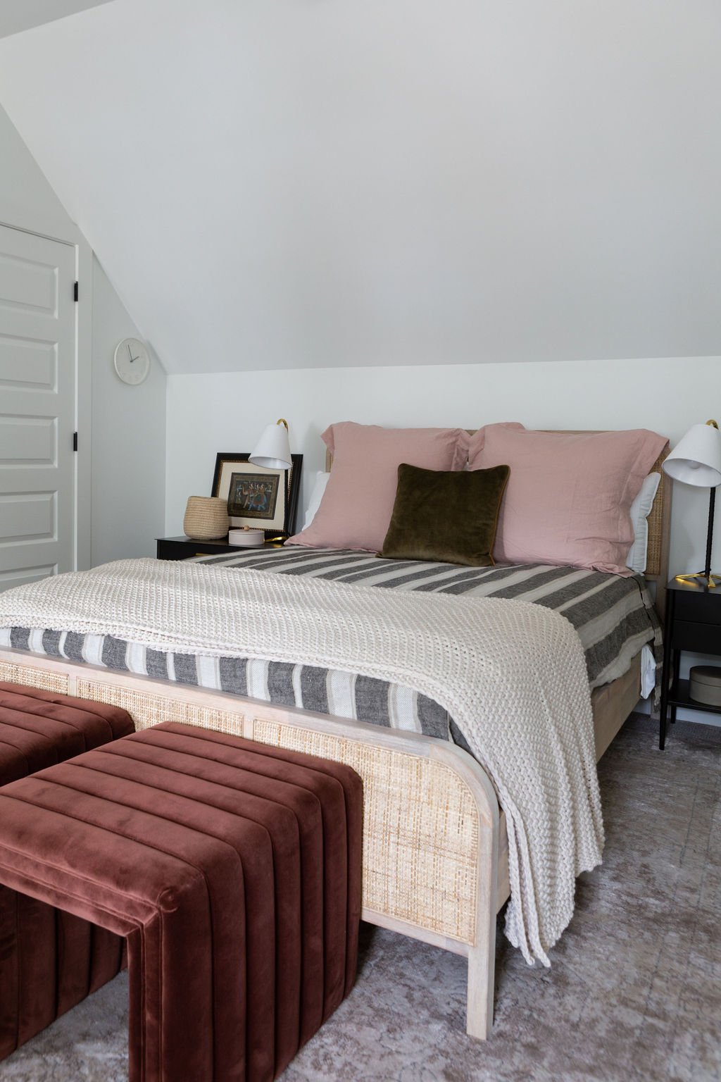
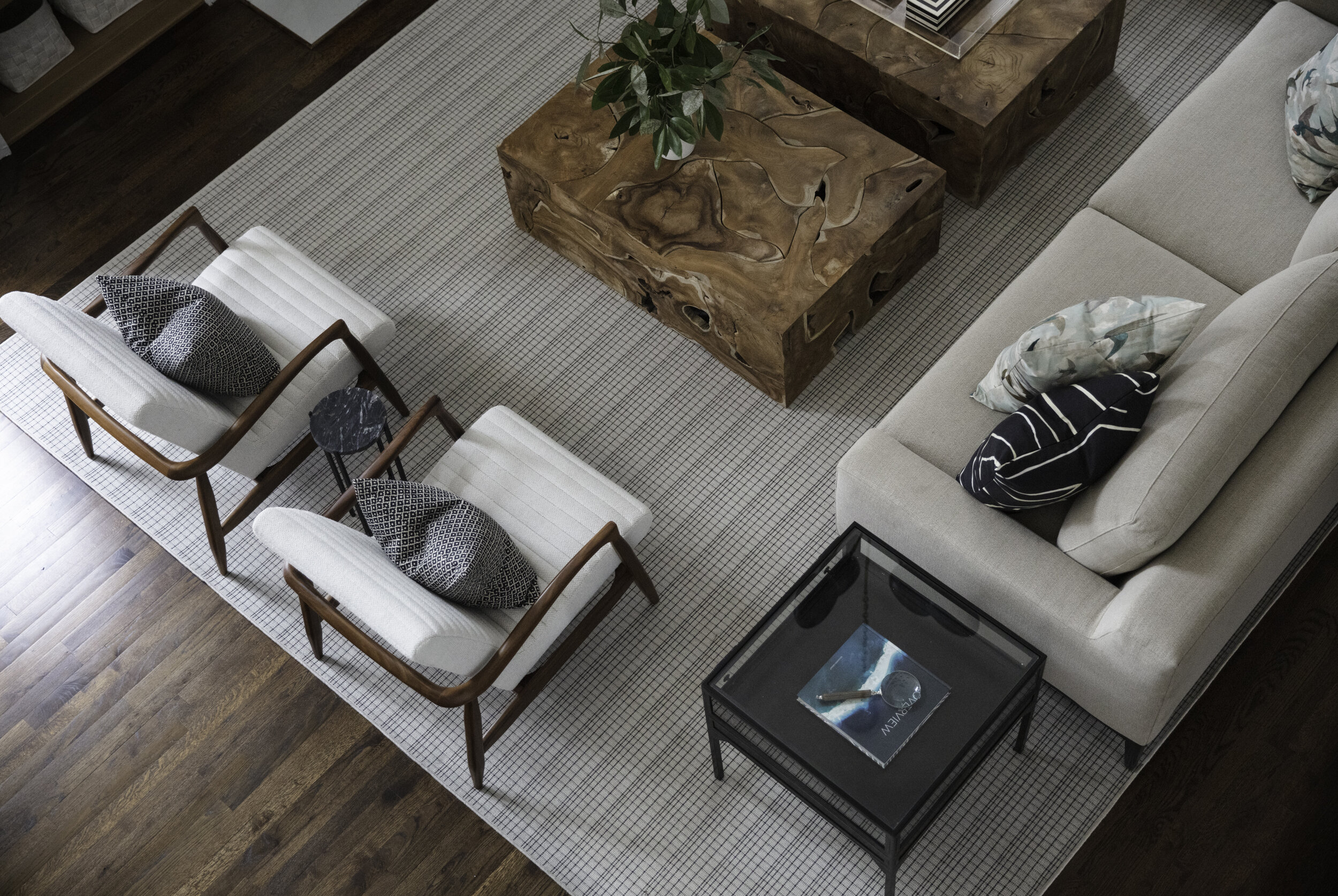
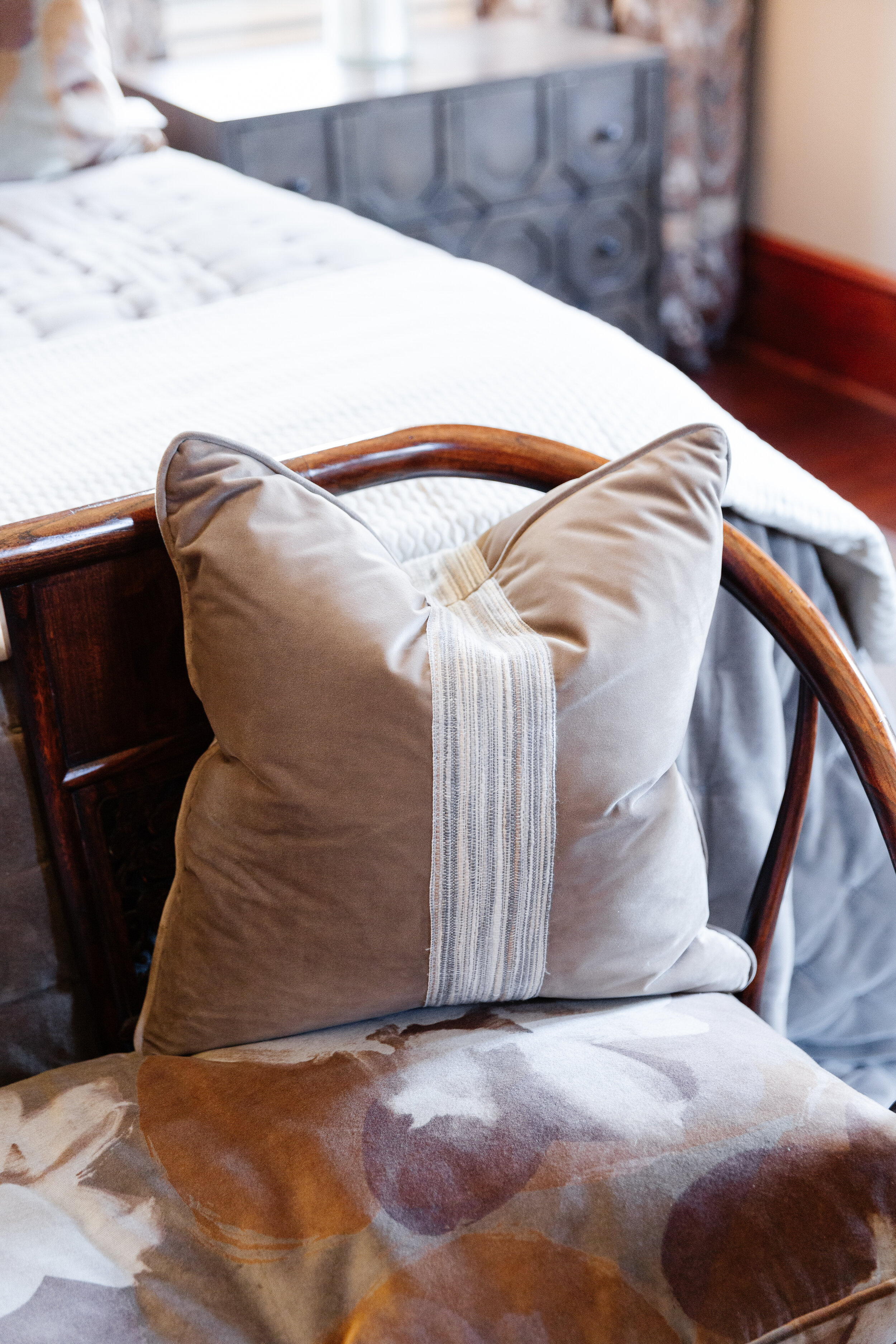
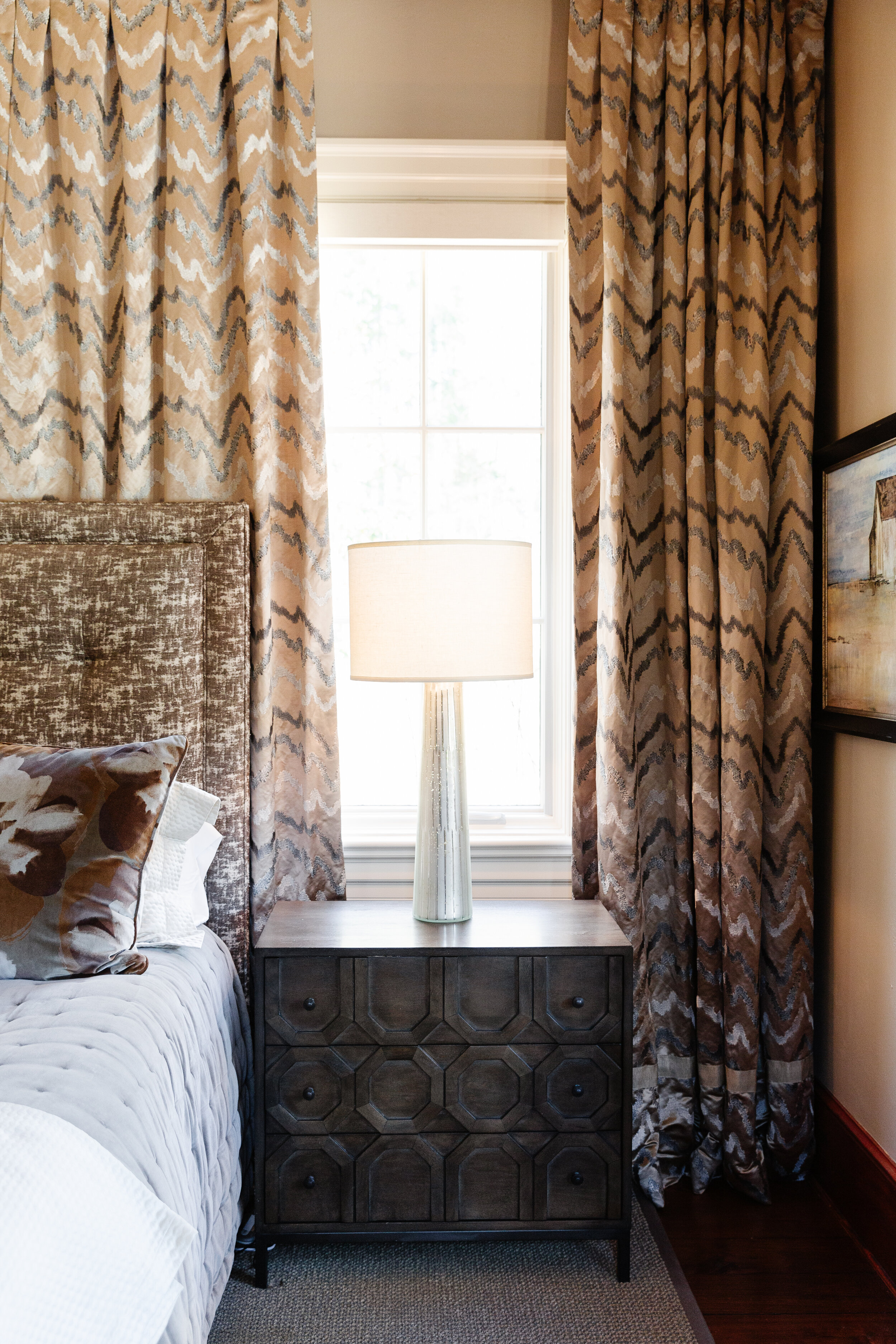
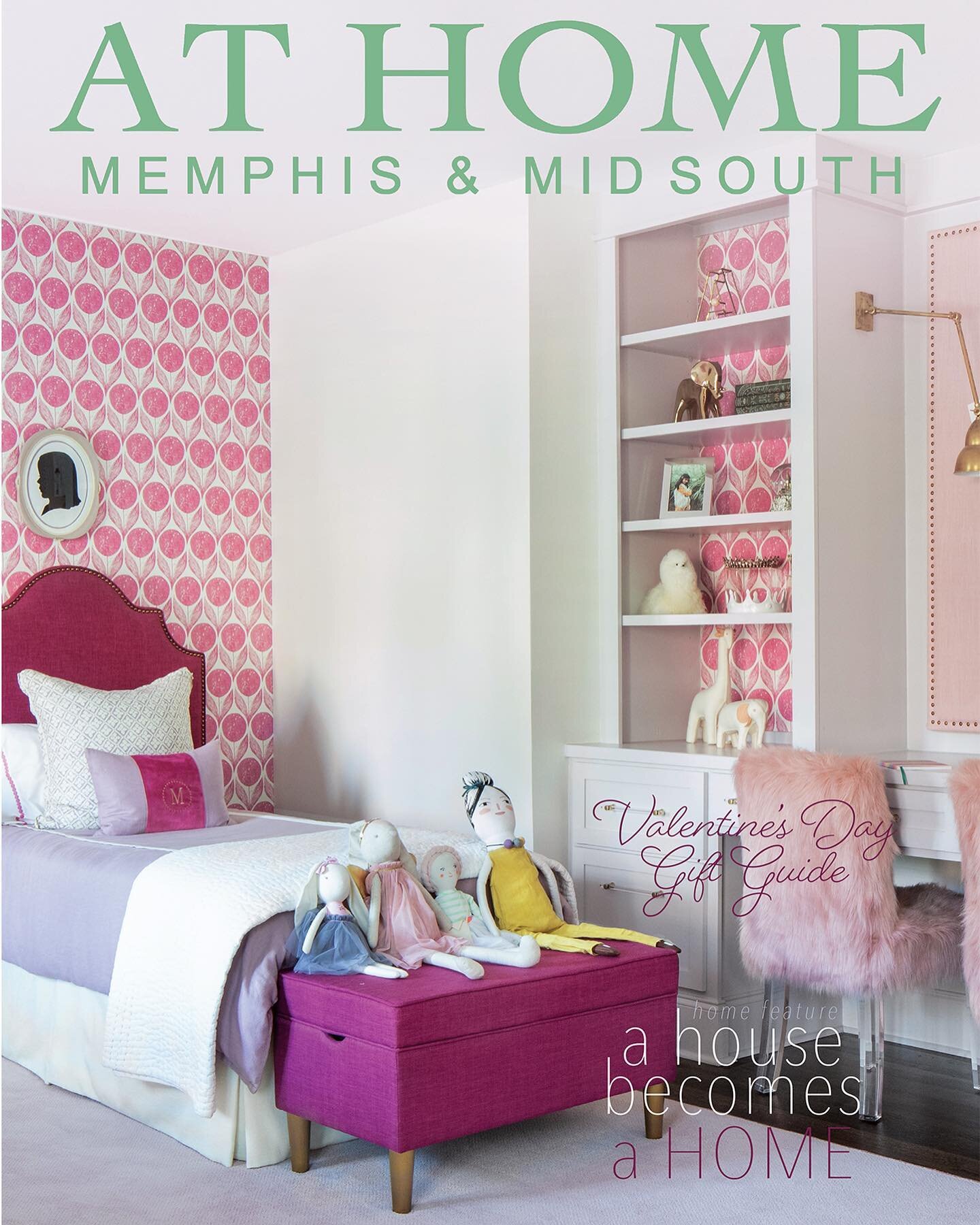
Lauren achieved this goal beautifully. The daughter’s bedroom is fresh and feminine without being “little girly.” Rose quartz is the overarching theme, from the wall color and bedding to the lamps and drawer pulls on the bedside chests. Contrast and interest come from the art above the bed—a framed panel of Ellie Cashman wallpaper— and a throw pillow in the corresponding fabric. The whimsical light fixture, fashioned from wire embellished with hundreds of mini bulbs, brings to mind a dandelion puff ball. The room’s furnishings, along with many of the elements used throughout the home, are available at Lauren’s Jackson design studio, Alexandra Lauren Home Collection, and on her website, alexandralauren.com.


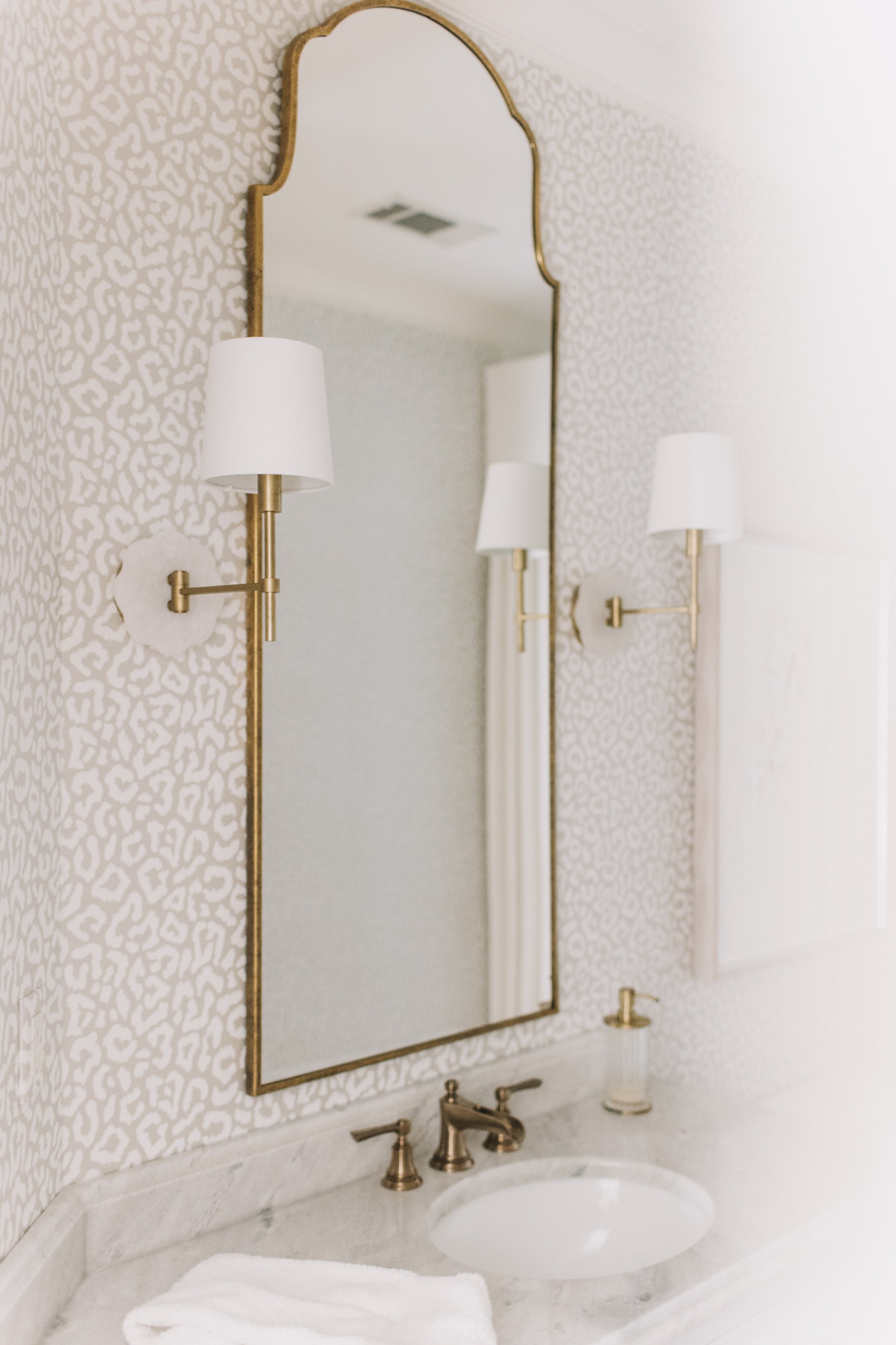
“La vie en rose” continues in the adjoining bathroom in a subtle-yet-fun leopard wallpaper and in the cabinet hardware.

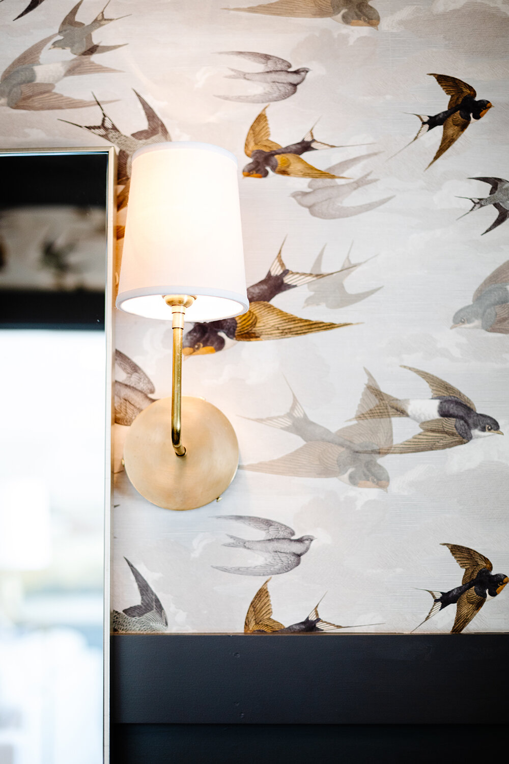
 “Wallpaper is back in a big way! But it’s not your grandma’s wallpaper. We’ve been using it a lot. It’s much easier to remove and I always go for VOC-free papers. We even have a wallpaper bar in our studio with a huge library of new wallpapers.”

—Designer Alexandra Lauren

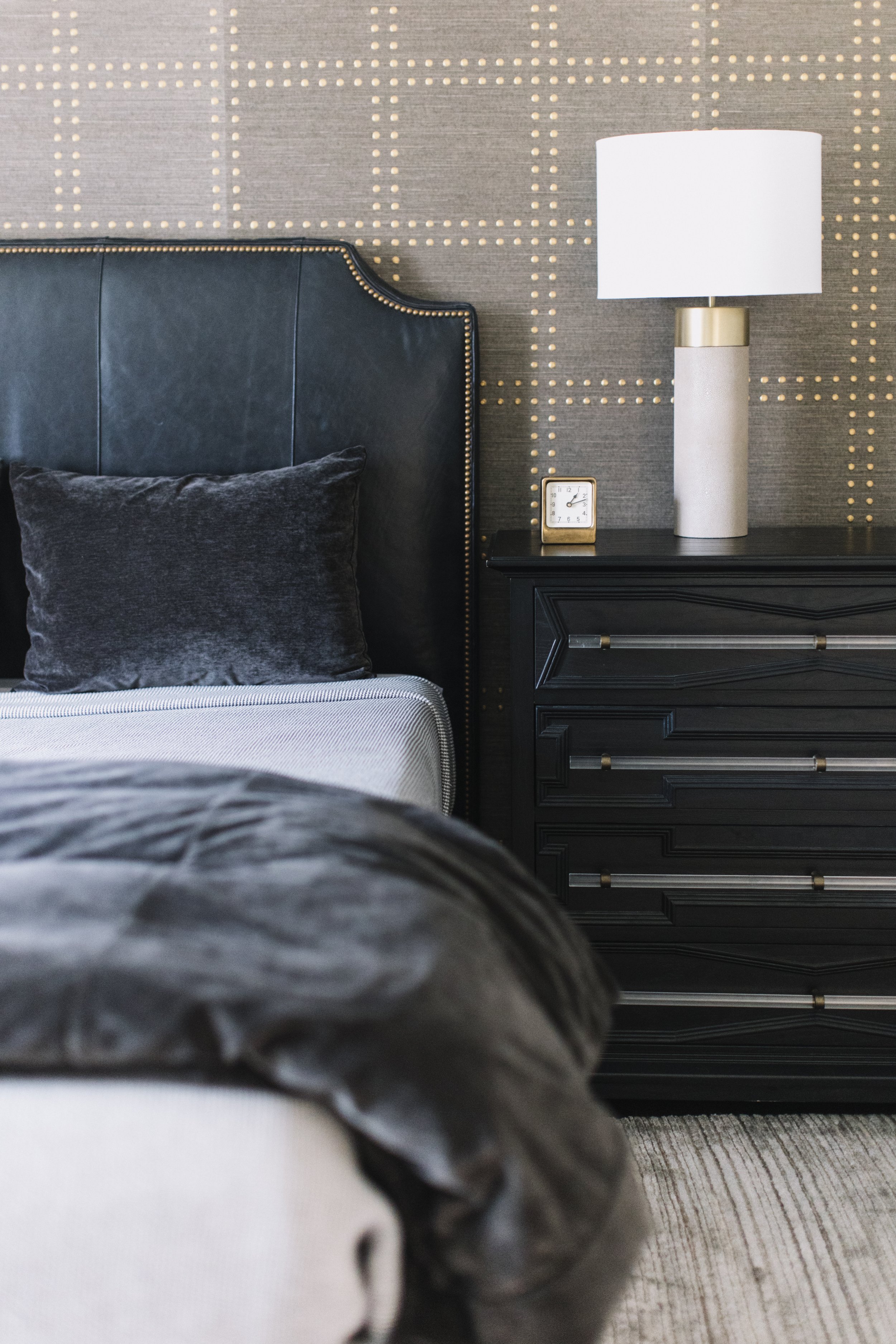
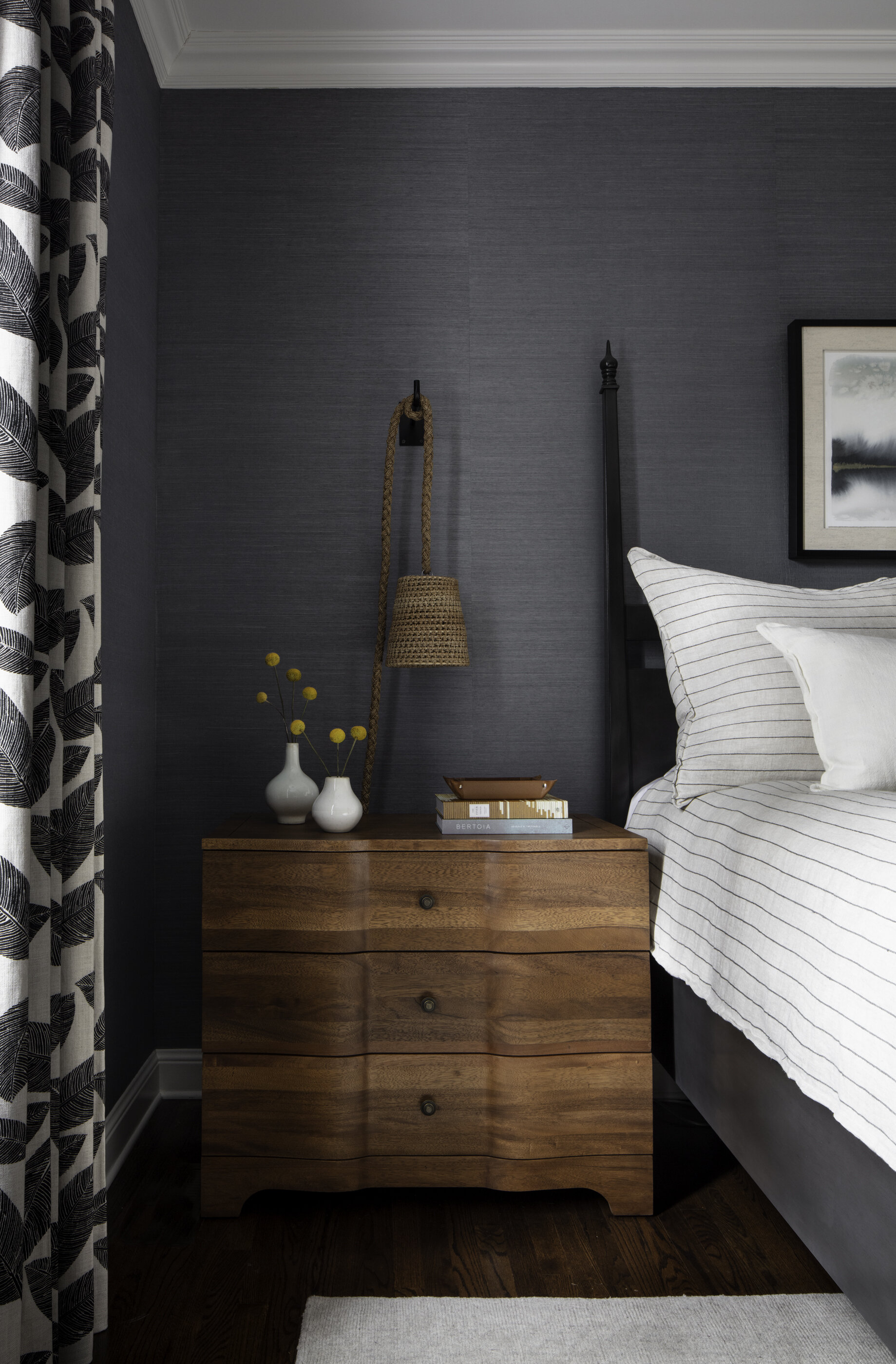
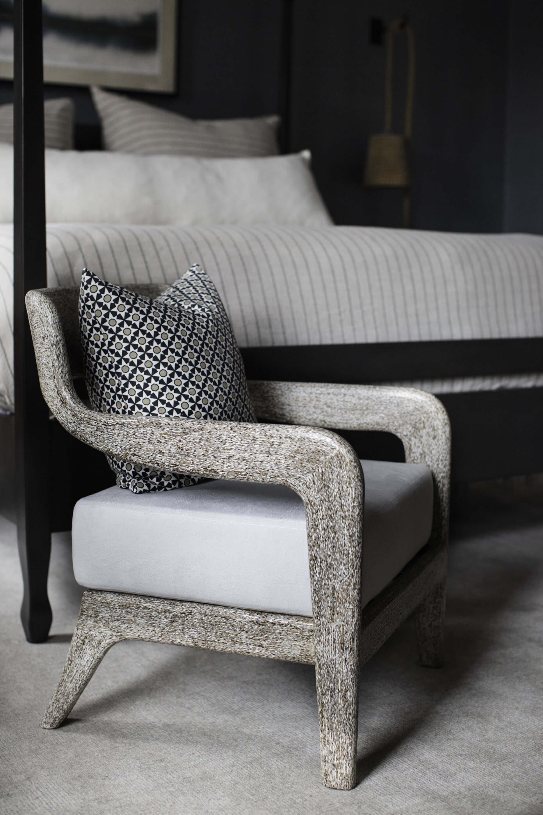
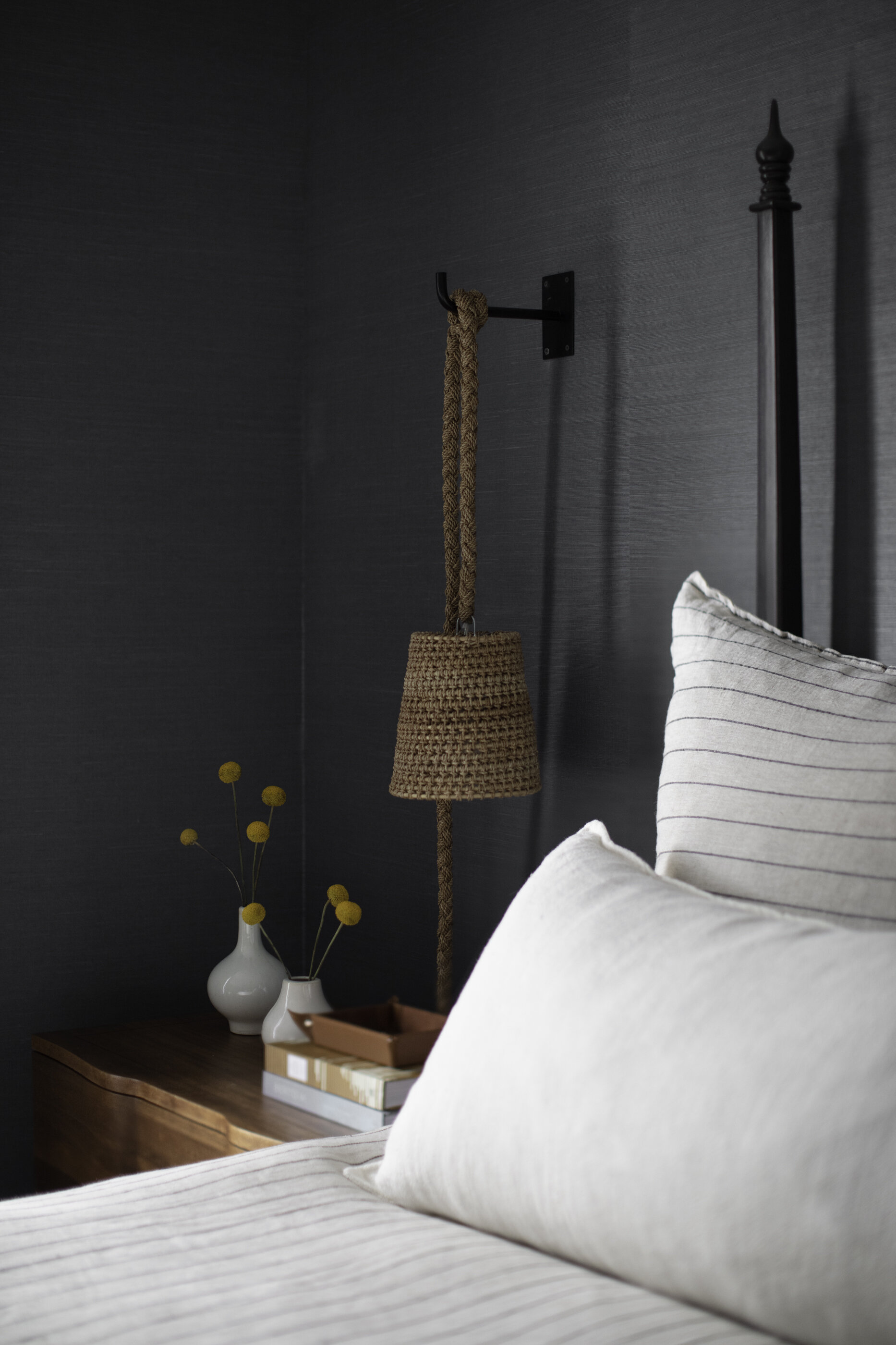
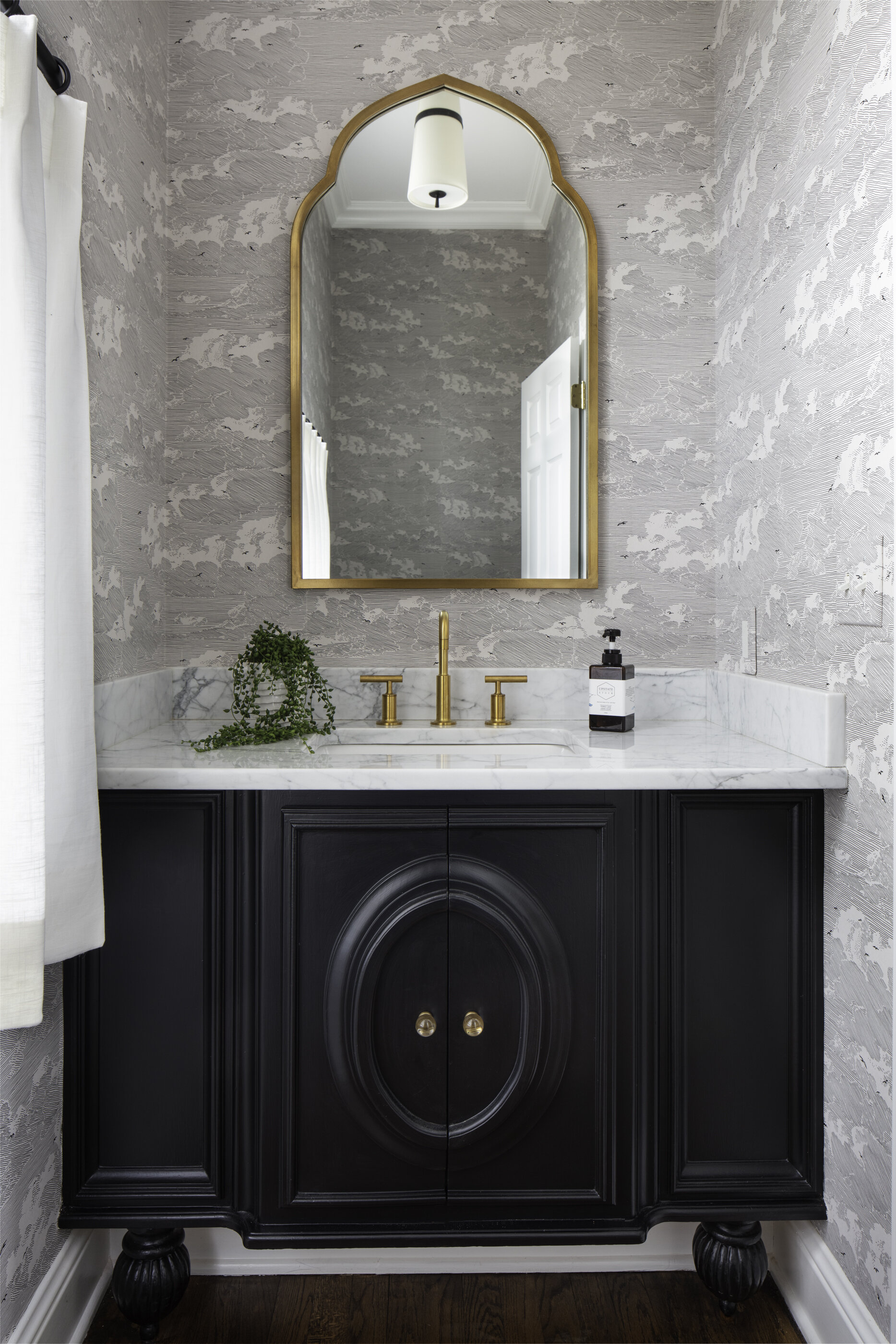
A Phillip Jeffries wallpaper was the inspiration for the boy’s room design. The nailhead-patterned grasscloth appears on a feature wall in the bedroom, setting a handsome and decidedly masculine vibe. Lauren played up the nailhead motif in an upholstered headboard and again in the adjacent bath in an ingenious way. Flanking the brass mirror, a pair of nontraditional sconces with black metal shades filter light in a reverse dot pattern. 

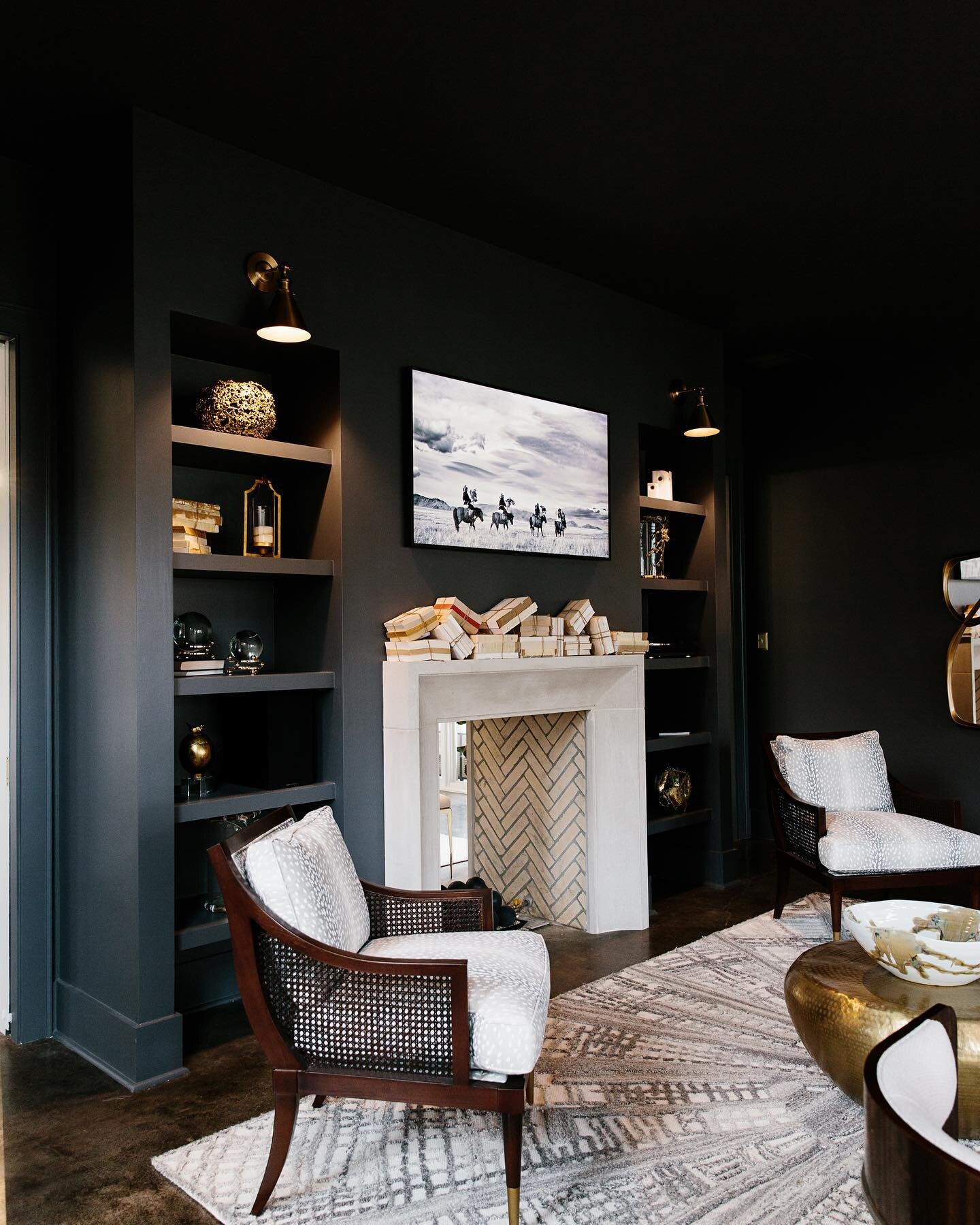
For the upstairs game room Lauren opted for drama in a big way. The walls, the trim and even the ceiling are bathed in Benjamin Moore Black Pepper, a bold, saturated blue gray that makes a big statement. 

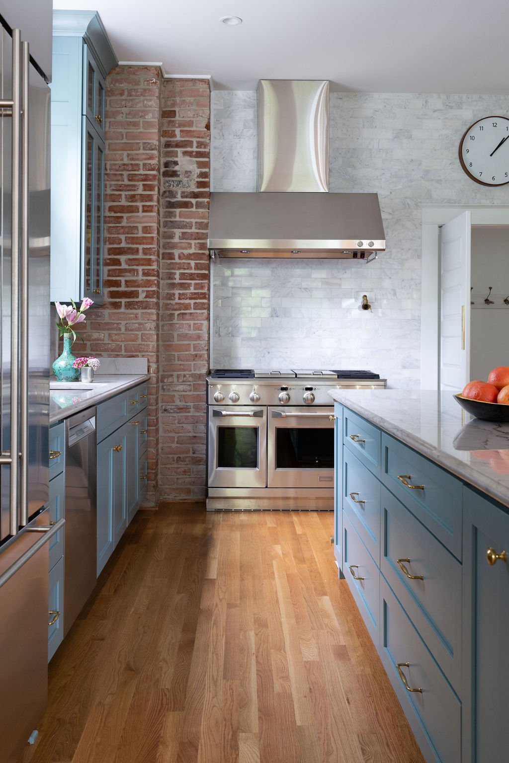
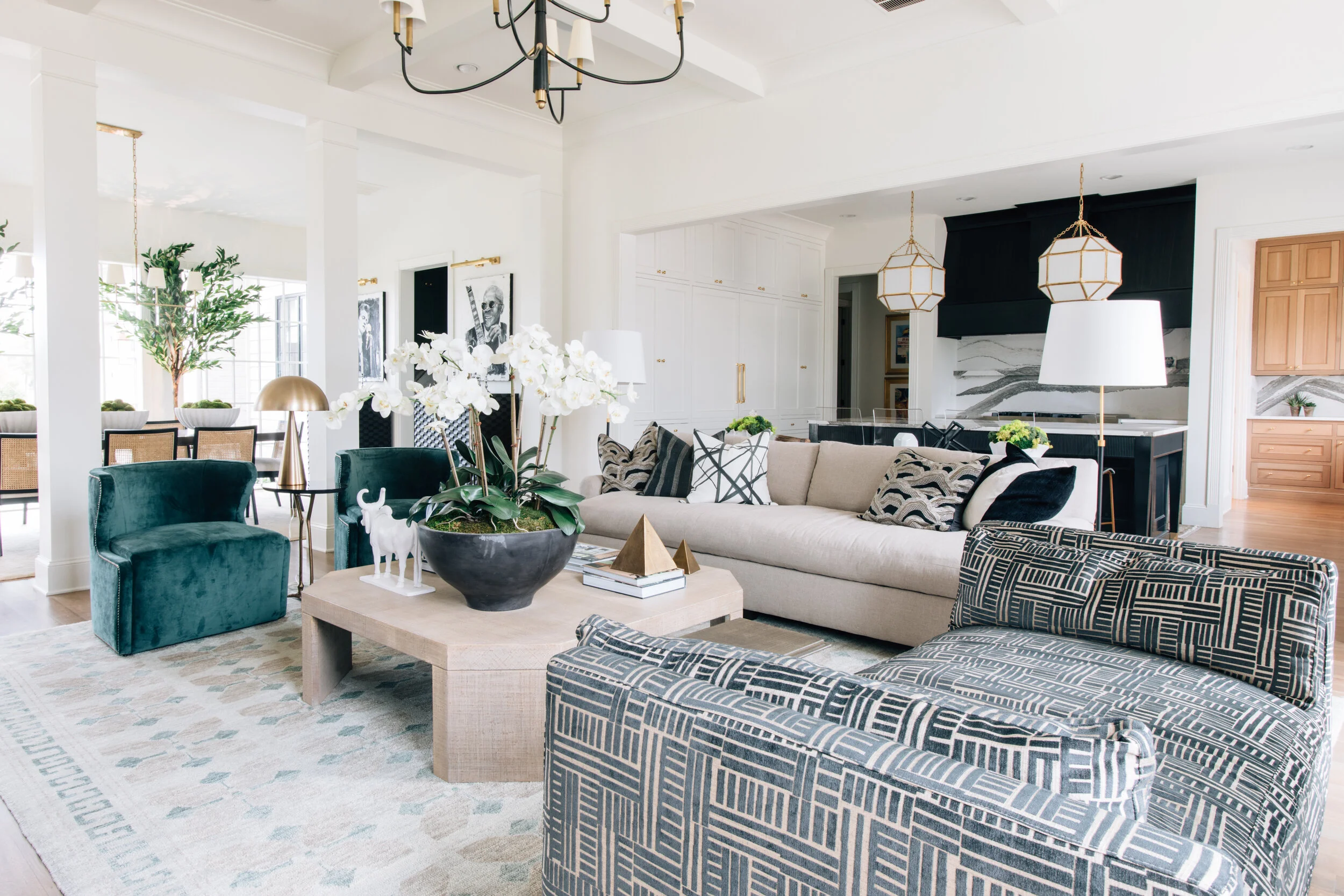
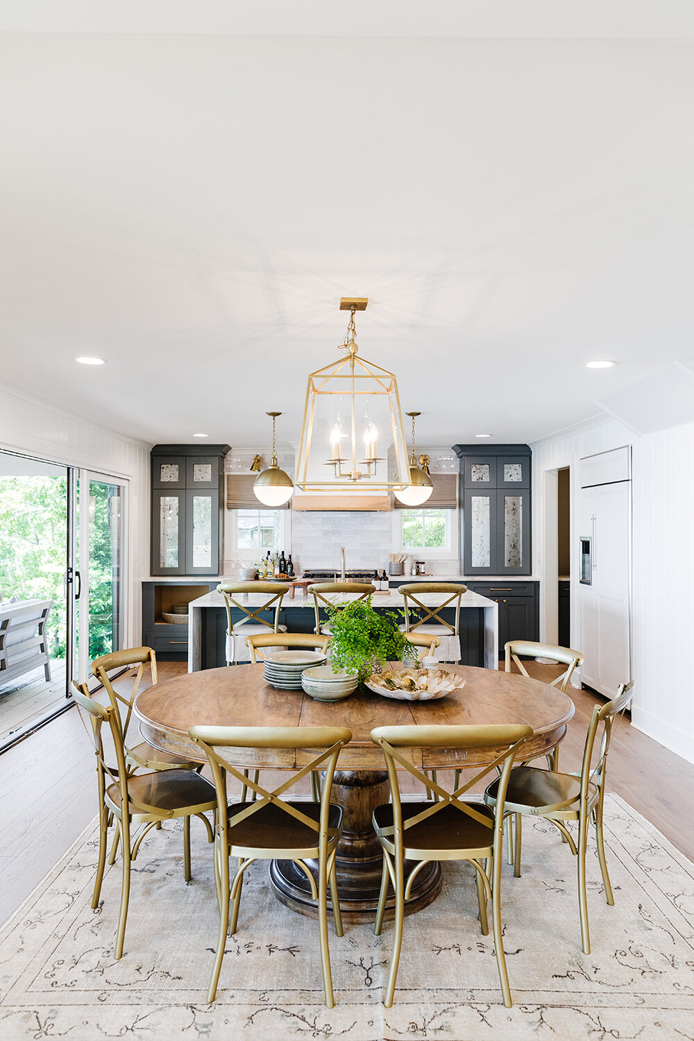
Moving back downstairs, Lauren gave the kitchen and two living areas a major facelift, removing walls and reconfiguring space. The end product is a chef’s kitchen that is at once gorgeous and useful, complete with a family dining area, with a separate chic and comfortable living room on either side.

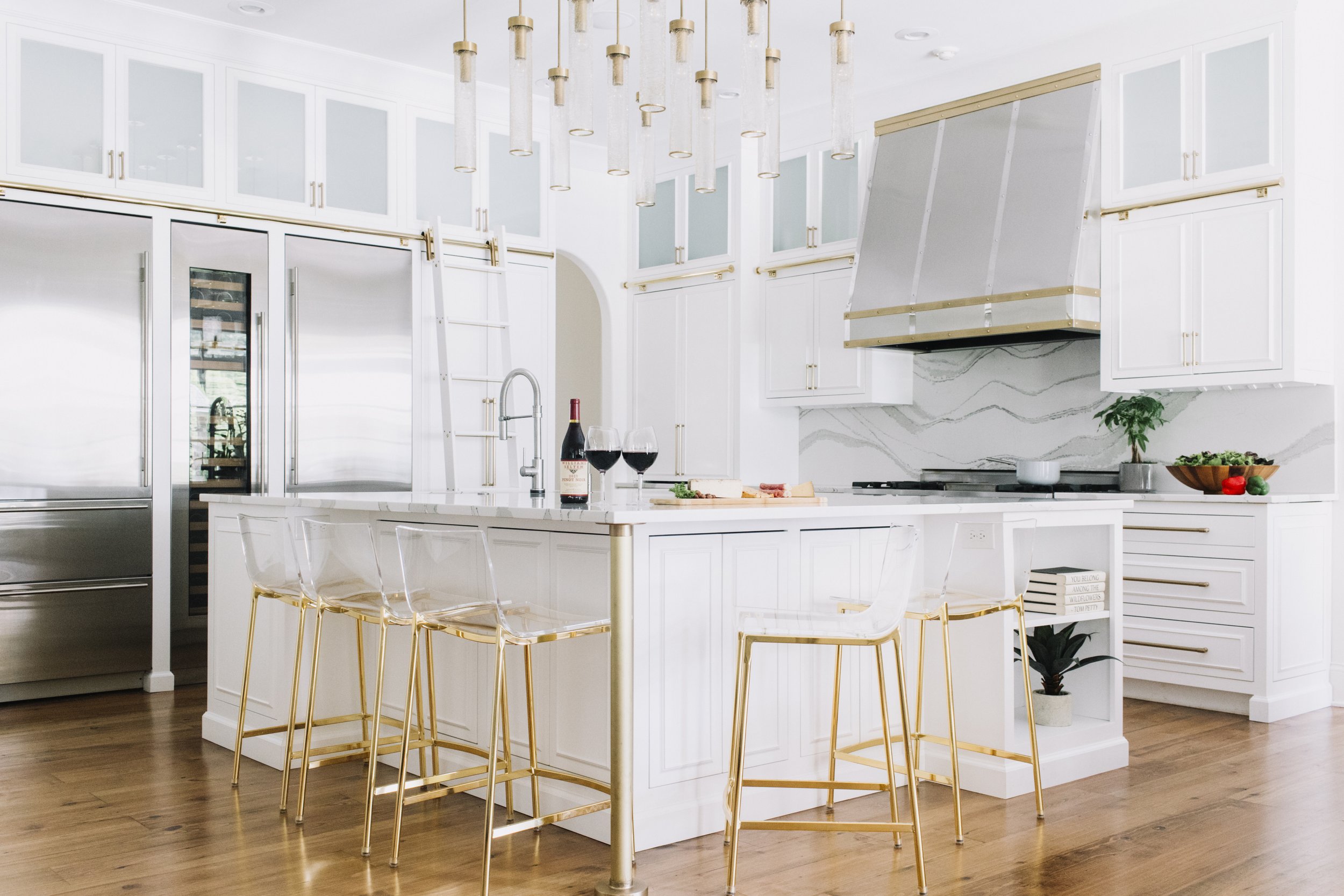
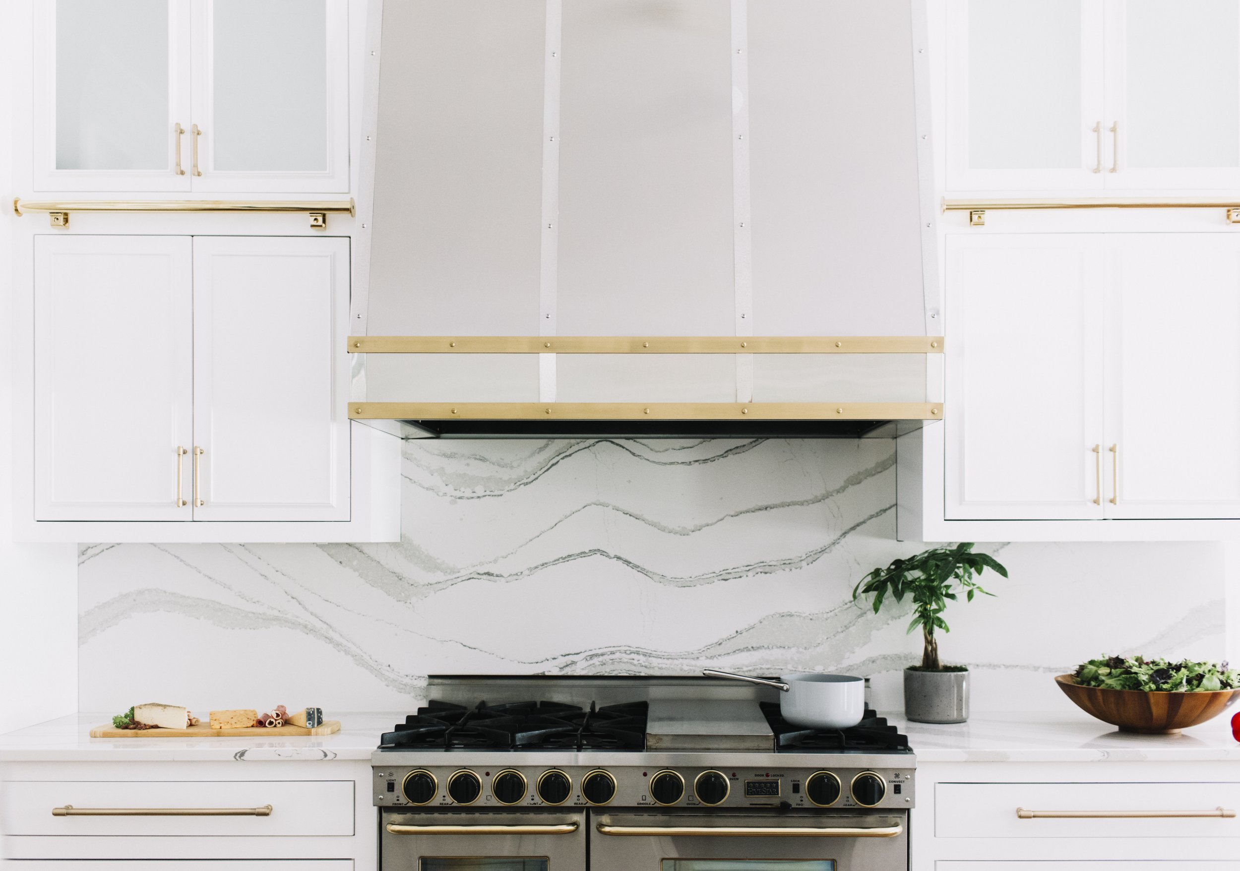
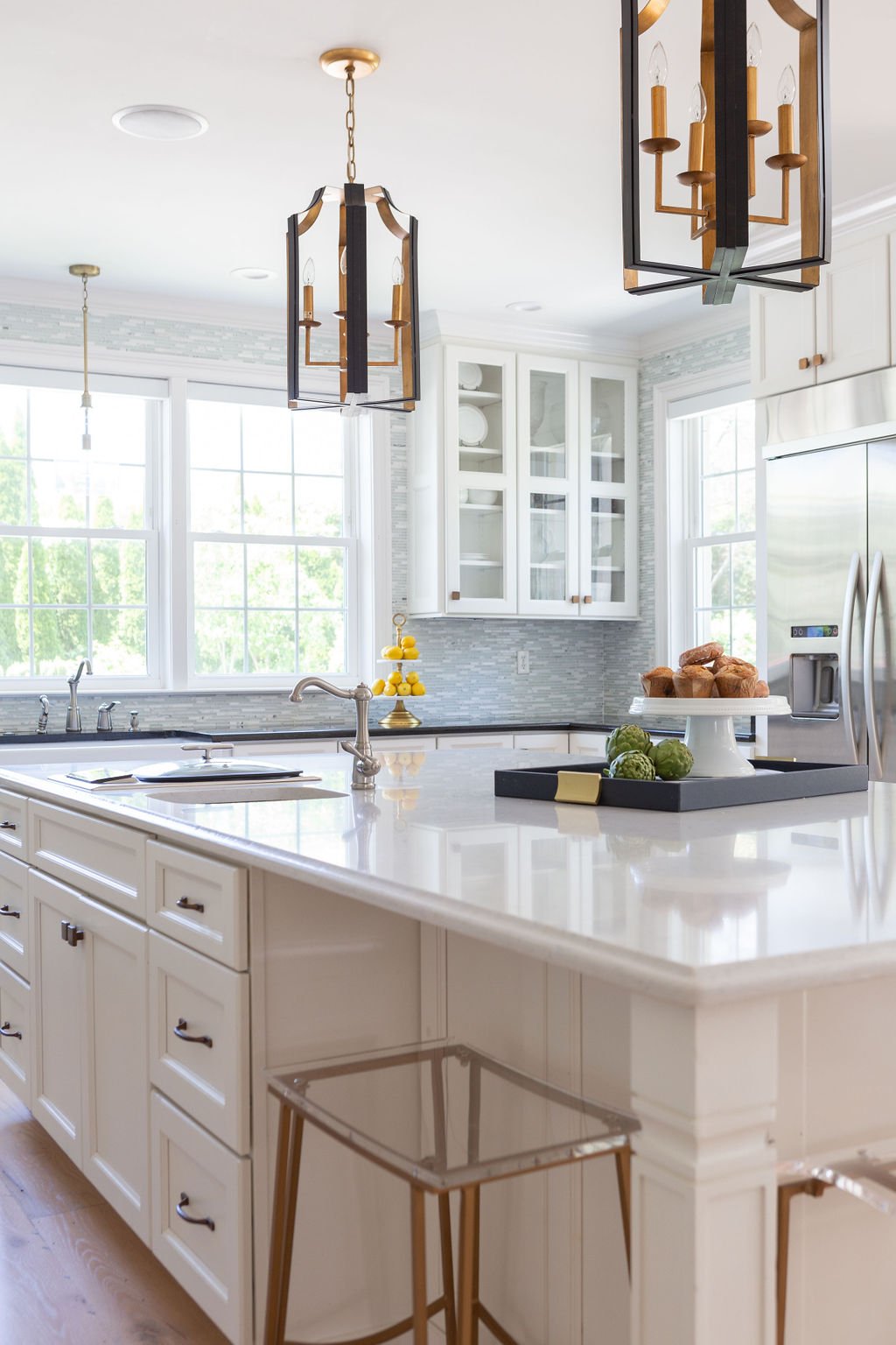
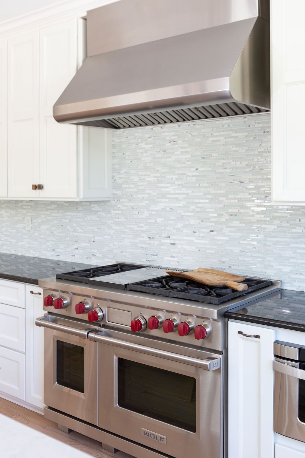
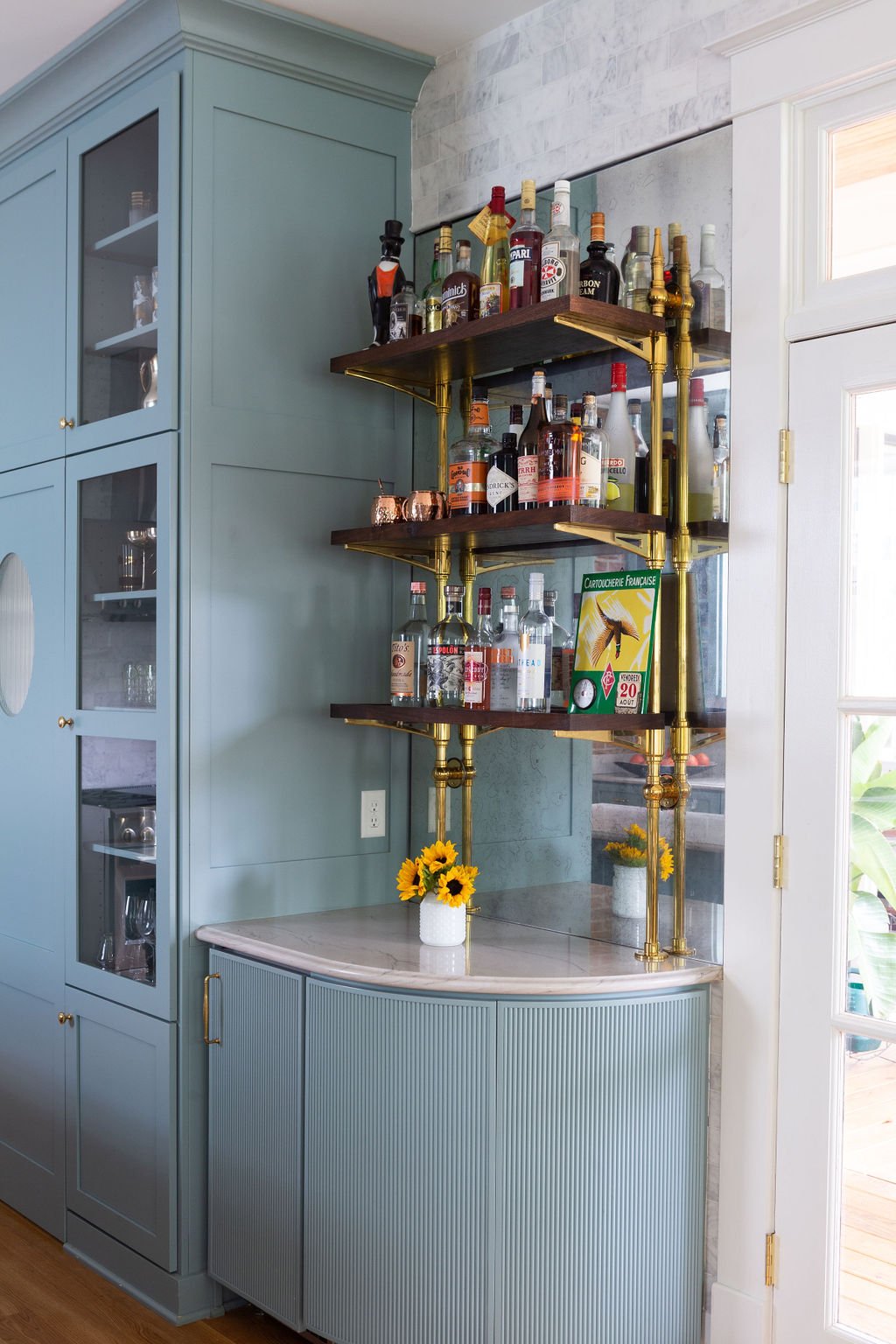
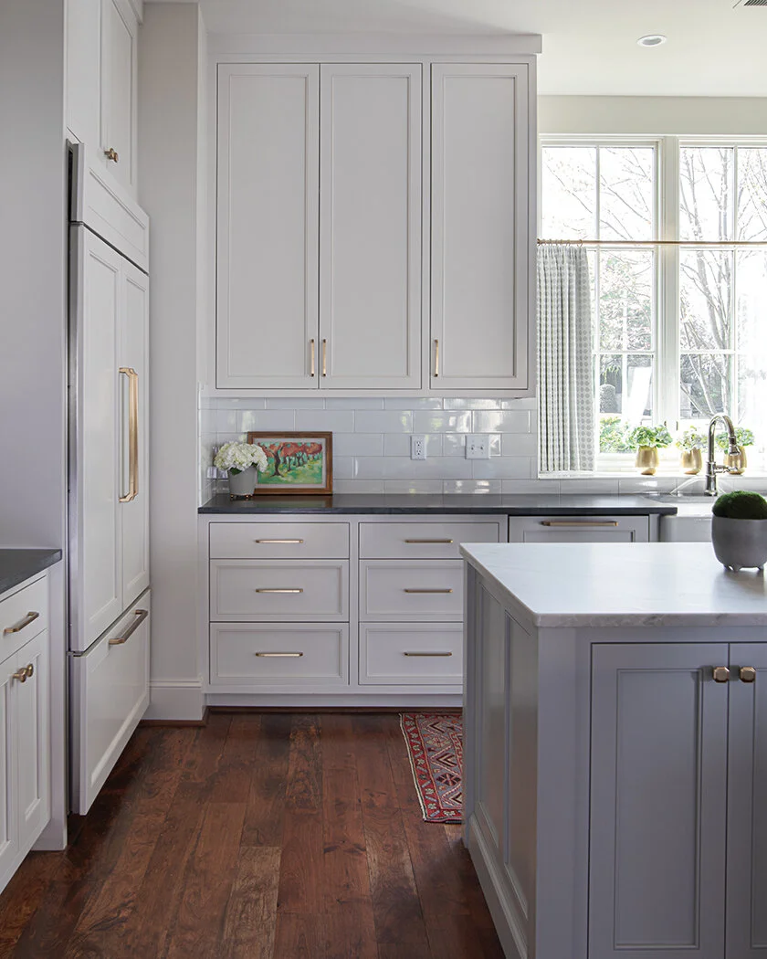
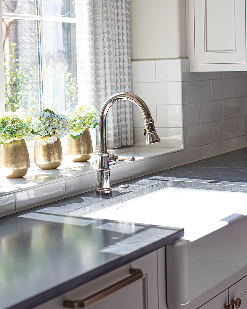
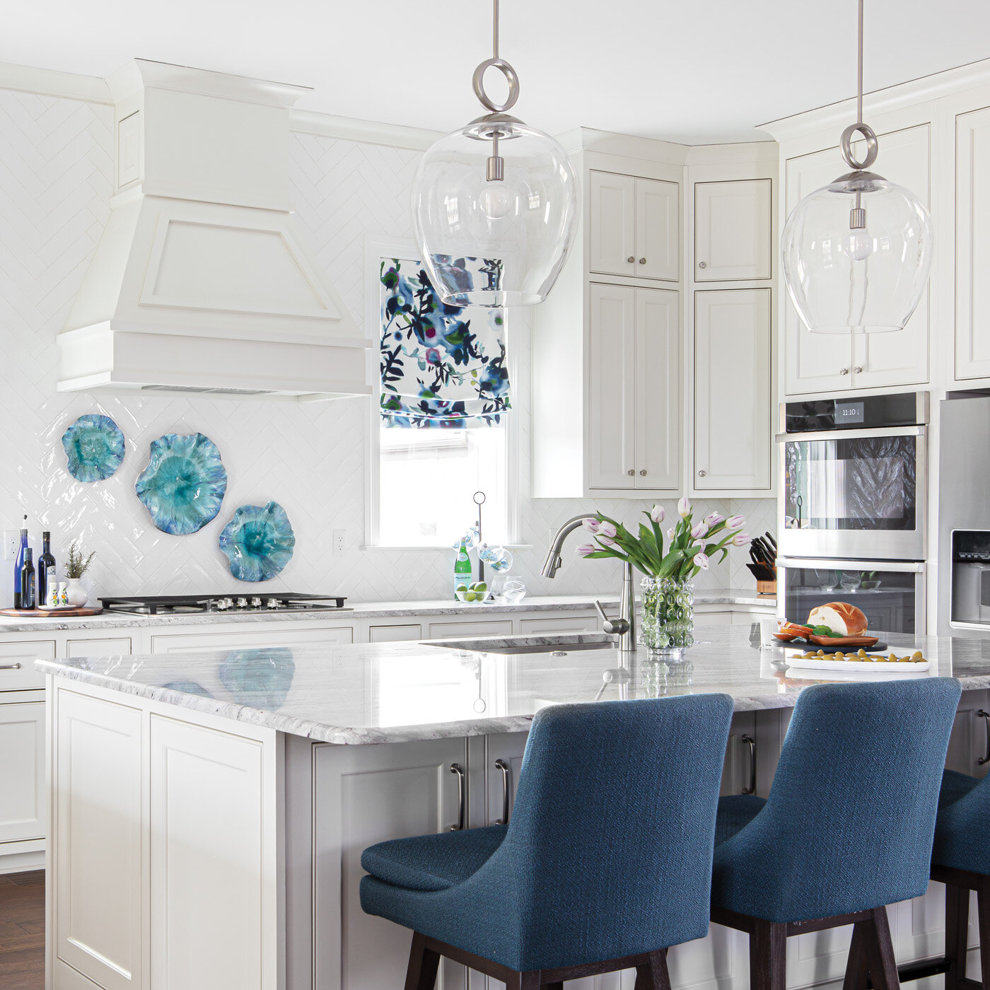
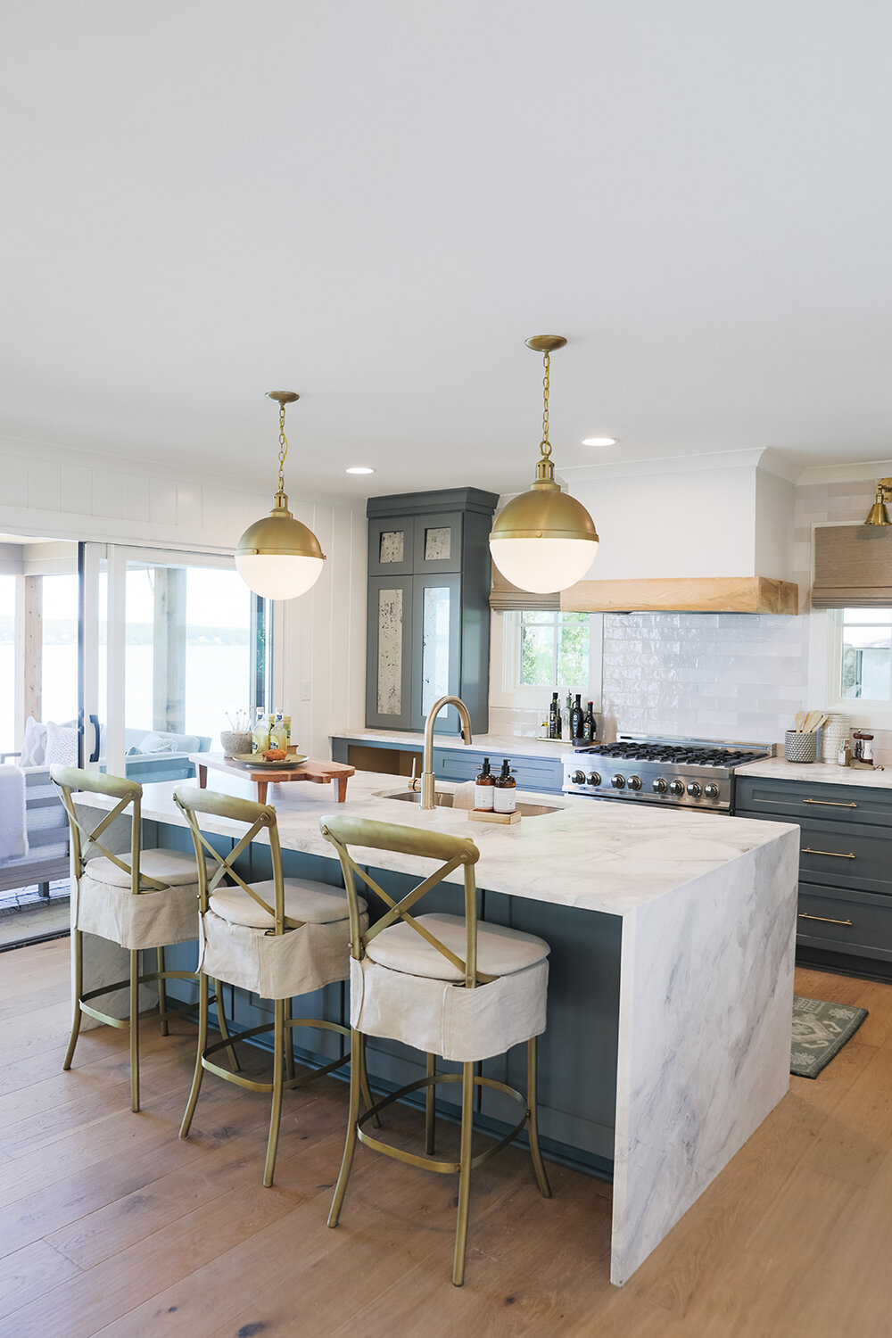
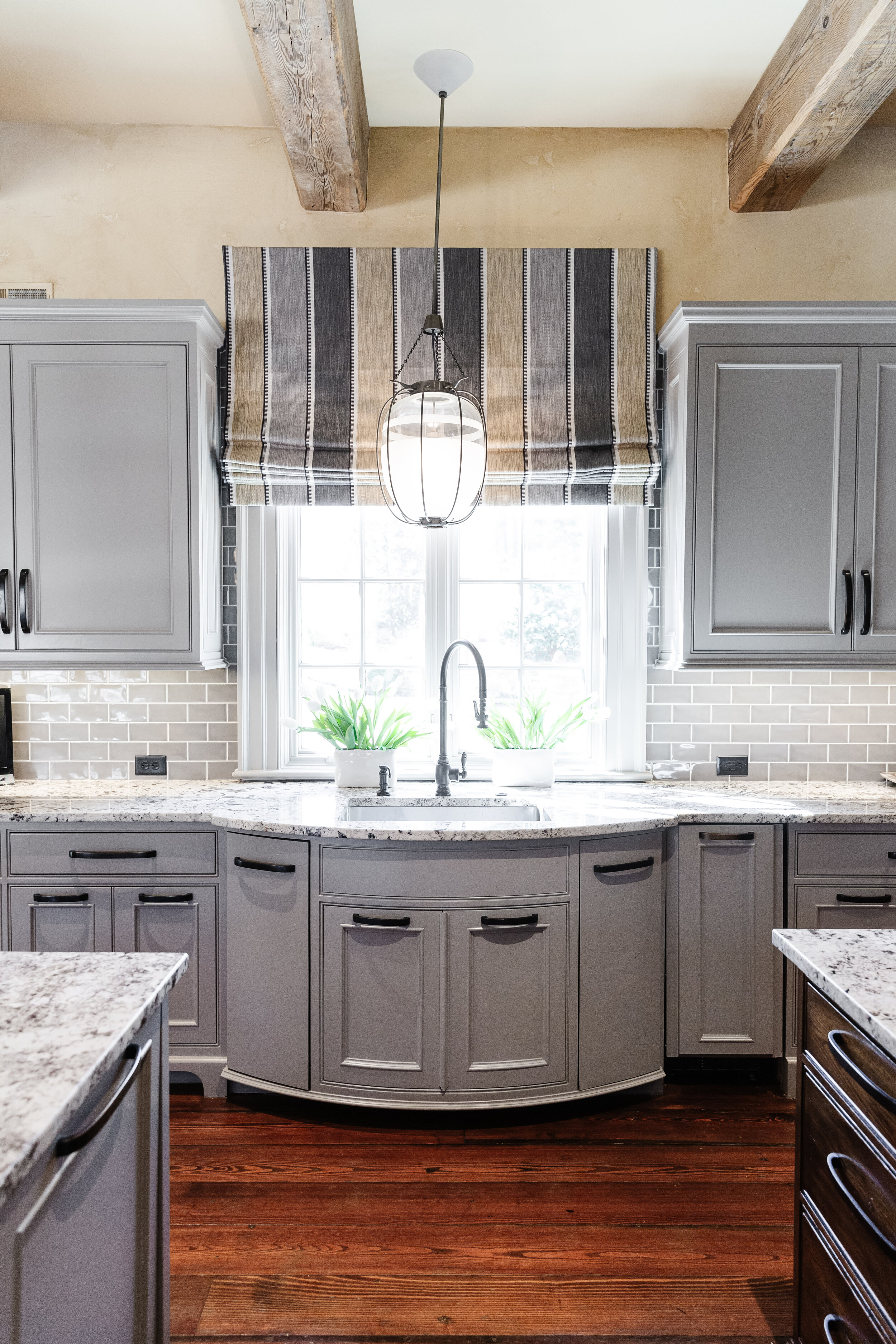
The gleaming kitchen features white cabinetry and countertops, dressed up with brass hardware and accents. The design brought new life to the existing Sub Zero refrigerator. Formerly covered in wood panels painted with a French country scene, the two separate units now shine in stainless steel. Lauren separated them and installed a wine tower between. She also added a rolling library ladder in the kitchen to provide easy access to items stored in the upper cabinets. Punching up the glam factor are the brass ladder rail and a custom range hood that mixes stainless and brass. The real showstopper is the lighting over the grand, new kitchen island. Lauren grouped several Kelly Wearstler crackled glass pendants to achieve the effect of a massive chandelier proportionate to the island’s generous size. 

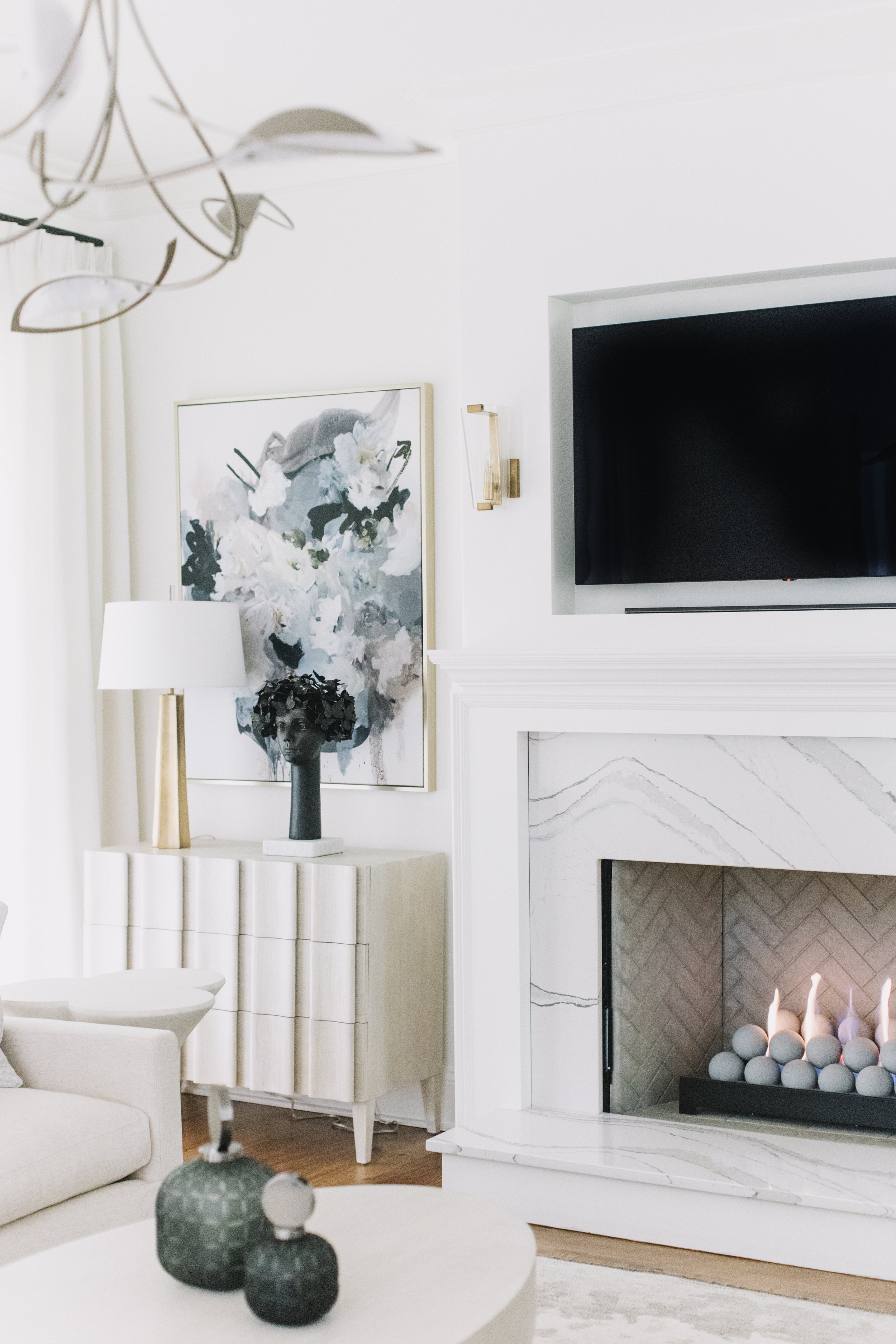
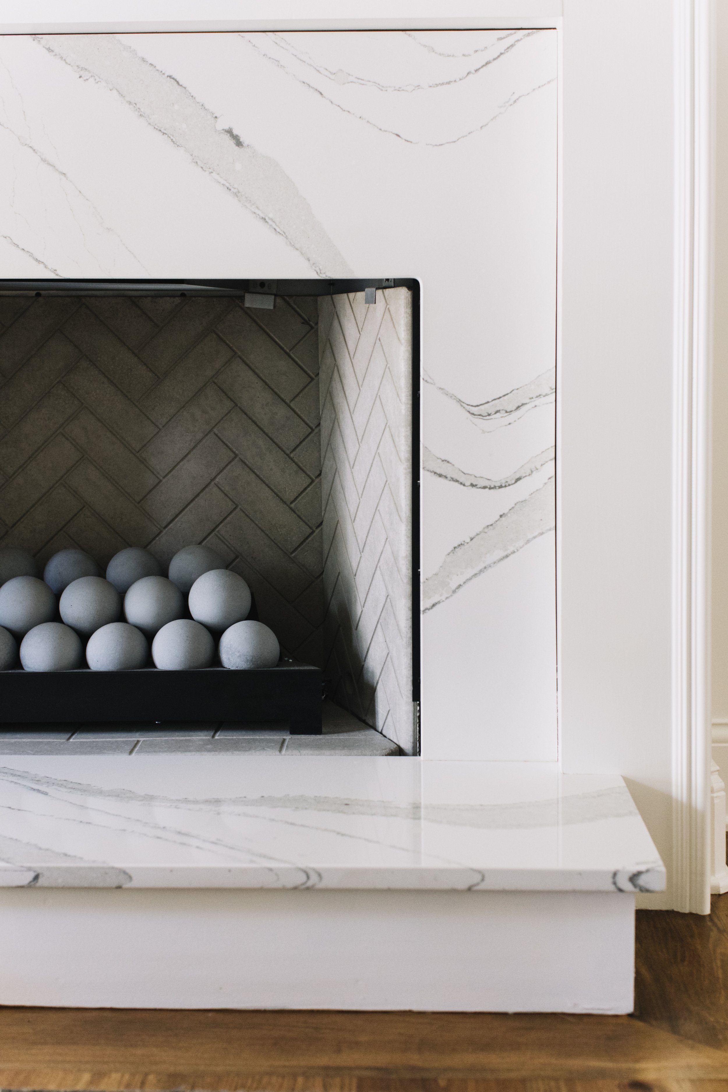
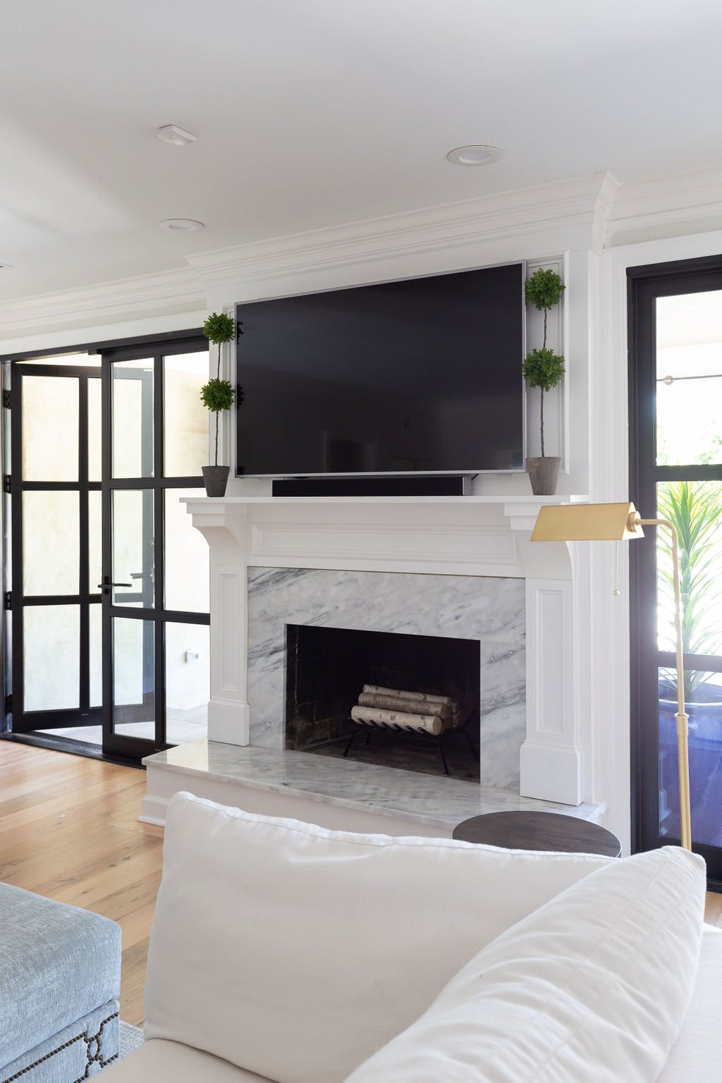
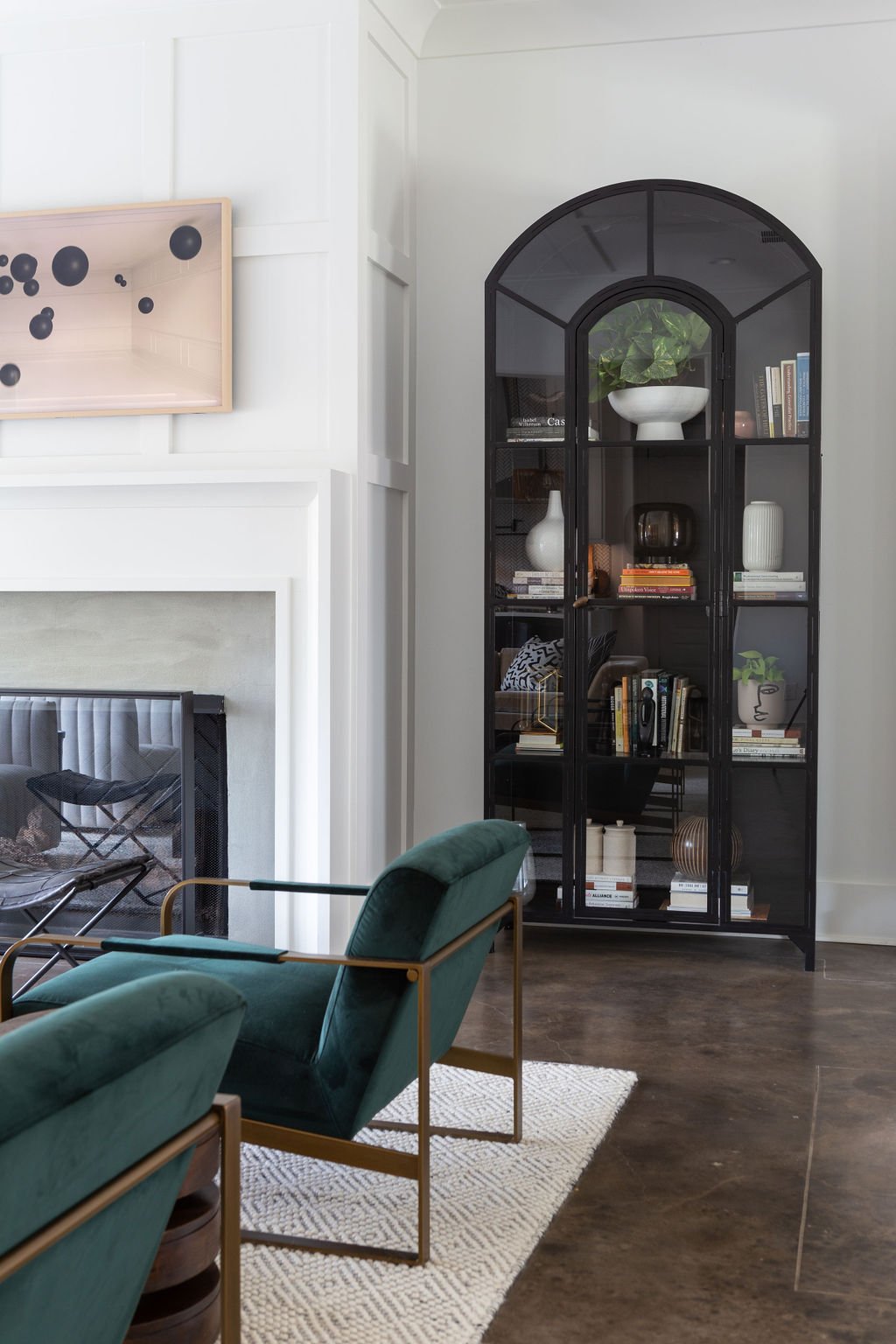
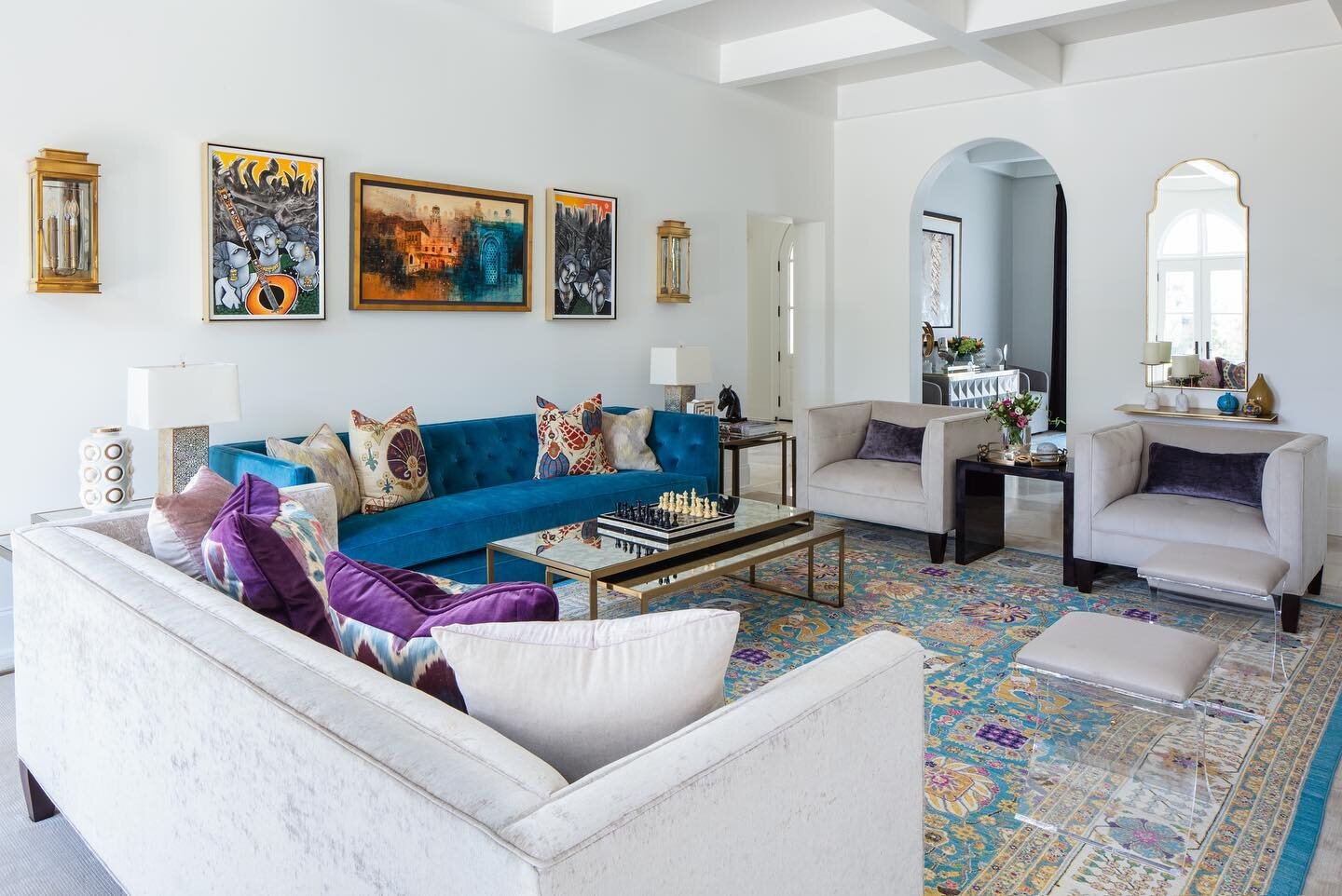
Filled with light, living room one is elegant and ultra modern, but still cozy enough for the family to gather for a TV night. The designer chose Simply White by Benjamin Moore for the walls and trim and furnished the space in whites and cool tones. She brought the fireplace style up to date with the same Cambria Britannica stone she used on the kitchen countertops, fabricated by Counter Solutions in Jackson. “I love its dramatic veining lines,” she says. “Traditional Carrara marble has finer lines, but these clients weren’t afraid to go bold.”

Lauren’s design aesthetic paid special attention to standout lighting, which she calls “the jewelry of the home.” The chandelier in living room one is a perfect example. Striking and graceful, the Hubbardton Forge piece is an artistic creation that blends form and function flawlessly. Hand forged to order in the USA, the piece is available at alexandralauren.com.

“We’re seeing a modern influence on lighting as the next big thing in design. Even more vintage or austere historical vendors have tipped their hat to modernity. Lighting is getting ultra futuristic and fun.”

—Designer Alexandra Lauren

In the second living area a completely different but equally striking light fixture takes center stage. The John Richard Hans chandelier features a cascade of 23 brass drop lights set at varying heights to form one stunning effect. 

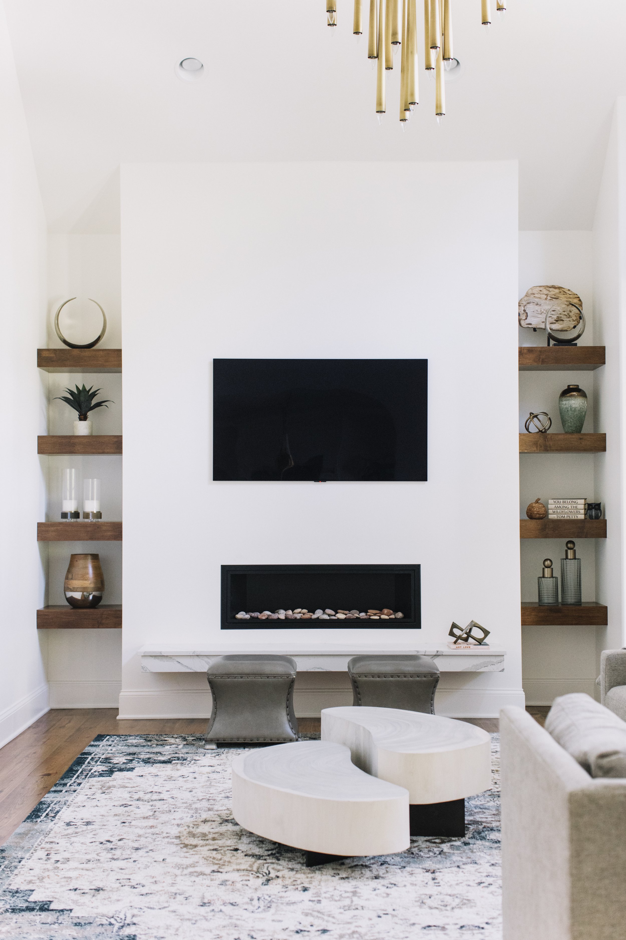
This room’s renovation included removing a corner fireplace on the back wall and building a long, low one in the center, bordered by warm wood shelving on either side. Lauren repeated the Cambria in a low floating hearth beneath the fireplace and furnished the space in neutral and cool tones to provide continuity with the kitchen and the other living area. All three rooms have views of the backyard pool area; the designer says she especially loves the “fire and water” effect when both the fireplaces are lit.

Although Lauren’s design talent is evident in every room, she says the home is really a reflection of the family that lives there. “My approach is that life is going to take precedence over the design layer in a home. It’s my job to amplify that lifestyle for my clients. They need to be the star of the show. Your home should be as representative of you as the clothes you wear. More importantly, it’s about how you want to feel in your own private space. 

“Colors affect your senses and textures engage your moods. All these design elements combined affect your life and how you feel. My goal was to create a sanctuary for these front-line workers and their family in the midst of the stress of the pandemic.”

The Right Place for the Right Family

Design by M. Cate Interiors | Story by Terri Glazer | Photography by Stefanie Rawlinson

When the right family finds the right place and the right designer, everything comes together perfectly to create a true dream home. Designer Jessie Cate’s Germantown clients and their new-to-them house are proof.

The family’s previous residence was great—a brand-new build with all the latest bells and whistles. While it had all the trendiest details, it didn’t have enough bedrooms to accommodate their five children or a yard large enough for the young siblings. The couple knew they needed to move, and realized they’d probably need to buy an existing home to get the large lot they wanted, but busy schedules wouldn’t allow them to take on a total redo. 

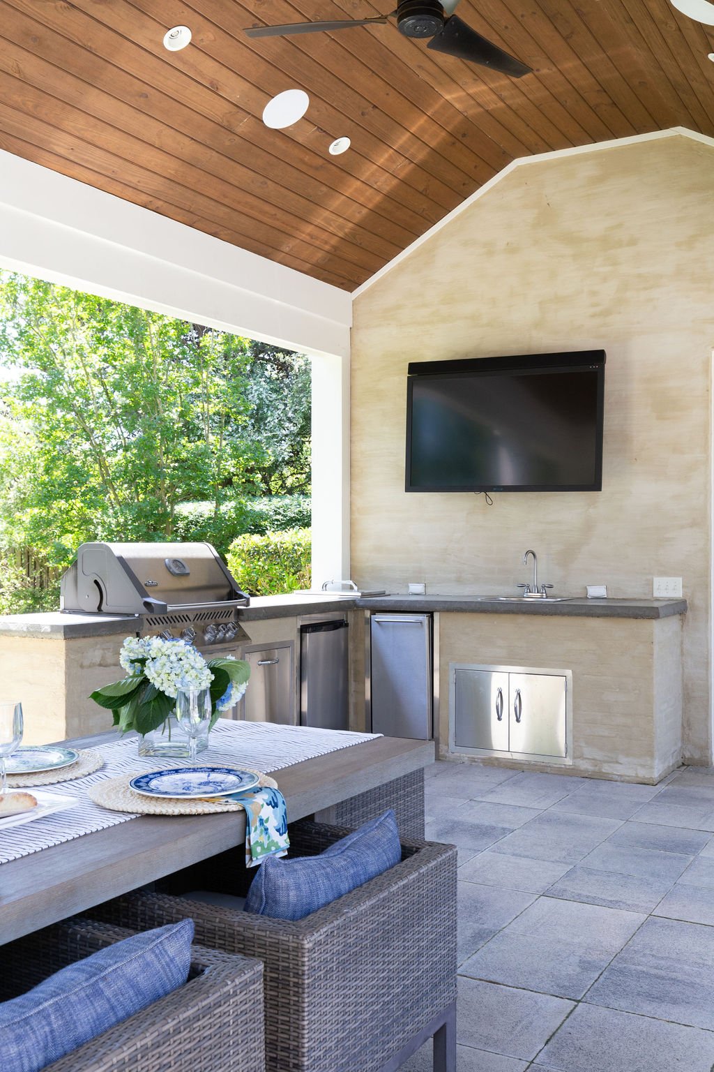
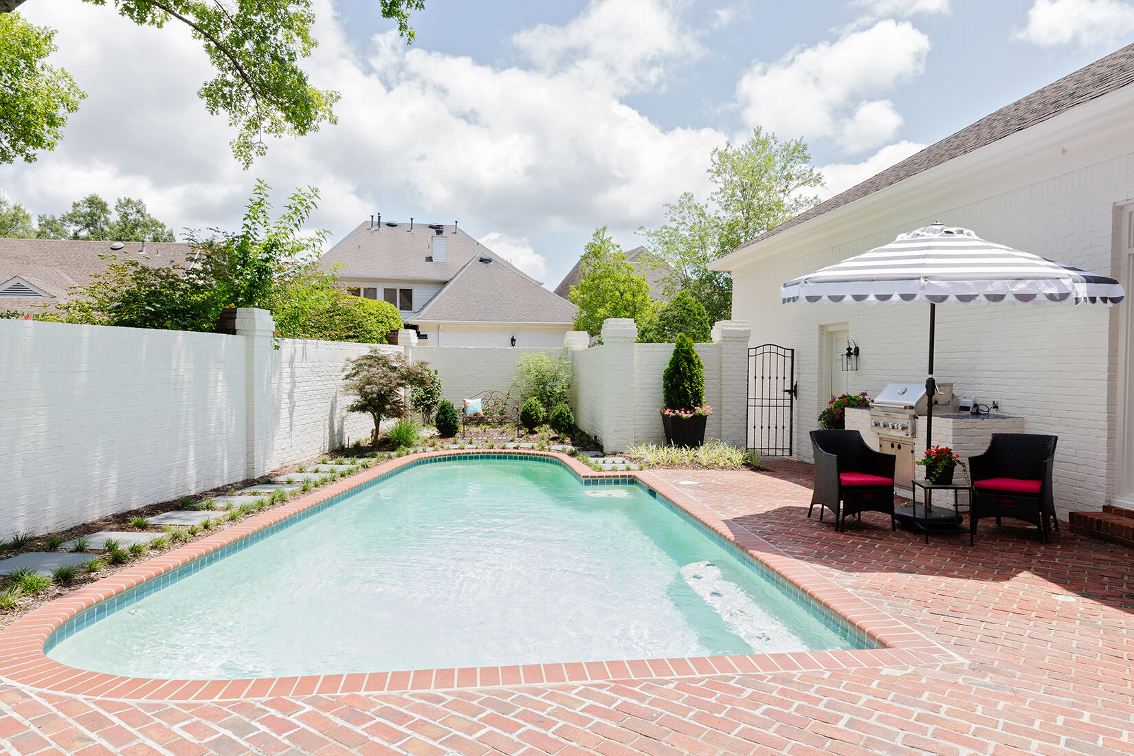
When they found the place they now call home, it was just what they were looking for; a “unicorn” as Cate describes it. Built in 1991, the house was in great condition and had already received a major facelift from Salvaggio Group, thanks to the previous owners. In fact, it was the gorgeous backyard with outdoor living room, kitchen, lounge area and resort-style pool, as well as plenty of green space, that drew them to make the purchase.   

The couple called on Cate in May 2020 to help make this great house their home. She recalls having discussions to make sure their expectations would be realistic for a 30-year-old home, since they were coming from a tricked-out new house. When they shared that they had hardly even used some of the luxury features of their previous place, she knew they were on board. 


“There was a bit of a disconnect between the exterior and the interior of this house. It felt a little dark and heavy inside with stone accents and dark floors,” the designer recalls. “My clients love the beach; it’s their happy place. I wanted to give them that same feel of relaxed comfort so I played on blue shades and the feel of the exterior rooms and tried to keep it with the traditional fit of the architecture.”

Cate goes on to explain that for this project, as she does with all her clients at M. Cate Interiors, she adopted a save/splurge policy that involves prioritizing the areas most important to the homeowners, then saving in other aspects of the plan.

To that end, she decided that instead of replacing the existing hardwood flooring throughout the home, it would stay, stripped of its ebony finish. Now covered in clear-coat, the floors show only remnants of their former color, left intentionally to evoke a casual, coastal feel.

My goal is to give clients the best version of them in their house so that they love coming home. They love having friends over because of their house; they’re happy to invite people into their space. I want their friends to come in and say, “Oh, this feels so you” and to feel comfortable. It’s not about my look, it’s about the clients and what the clients want. 

—Designer Jessie Cate

Interior walls that were once a variety of colors including dark navy and gray now wear the same shade of white, a Sherwin Williams stock color. Cate says, “It changes with the lighting, so even though it's all the same paint color, you don't necessarily feel it. It’ll keep their touch ups easier as they need to; they won’t have to try to remember which color paint went where.” She also updated lighting throughout the house, sourcing many of them from Gabby, a line with a variety of related fixtures to provide continuity of style from room to room.

The home’s two-story entry is compact yet impressive. A striking floral arrangement by John Mark Sharpe draws the focus upward to the staircase landing, where a custom commissioned beach scene by local artist Whitney Winkler speaks to the family’s love of the ocean.

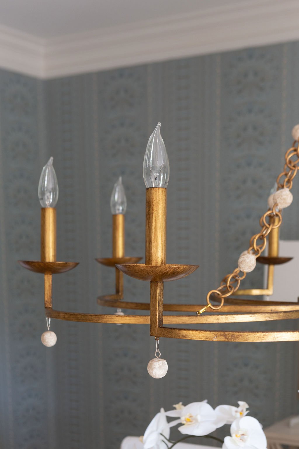
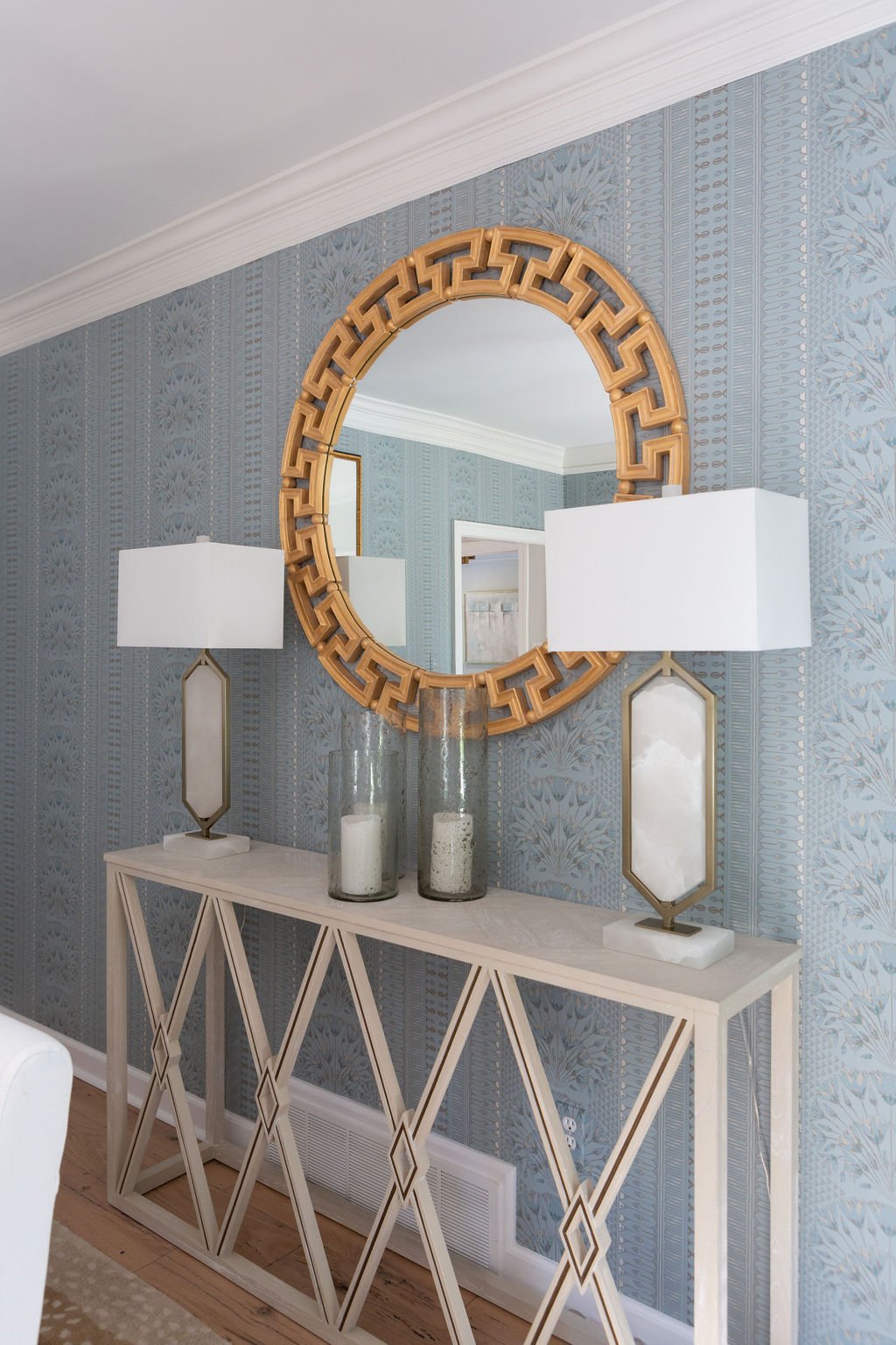
Elegant Thibaut wallpaper and custom drapes with a subtle herringbone pattern give the dining room a grand and elegant aura, while washed linen slipcovers on the dining chairs keep the mood from going too fancy. A simple gold chandelier and Greek key mirror add to the timeless feel.


The gem of a kitchen was already in place, thanks to the previous renovation. Generous proportions give the room and the light-filled breakfast area adjacent to it a gracious feel. Cate only had to paint the walls, change the lighting and update the cabinet hardware. Handsome Ashley Norton pulls and knobs were a splurge item important to the homeowner and the designer wholeheartedly agrees with the choice. “Nothing else was going to complement the flow of the rest of the house,” she says, noting that the client’s ability to come to decisions easily made her a dream collaborator. “She knew what she did and didn’t want to splurge on and she made choices quickly to keep the project rolling.”

The centerpiece of the den is a comfy sectional big enough for the whole gang. It encases an equally inviting oversized ottoman upholstered in cloud blue chenille. Nailhead trim gives a nod to formality in this family-friendly space. The room’s fireplace received a complete makeover, Once covered in dark, heavy fieldstone, it now has a fresh and  traditional look with classic marble and clean, white trim. Pairs of stately iron-and-glass doors flank the fireplace, providing full-length views of the beautiful outdoor oasis.

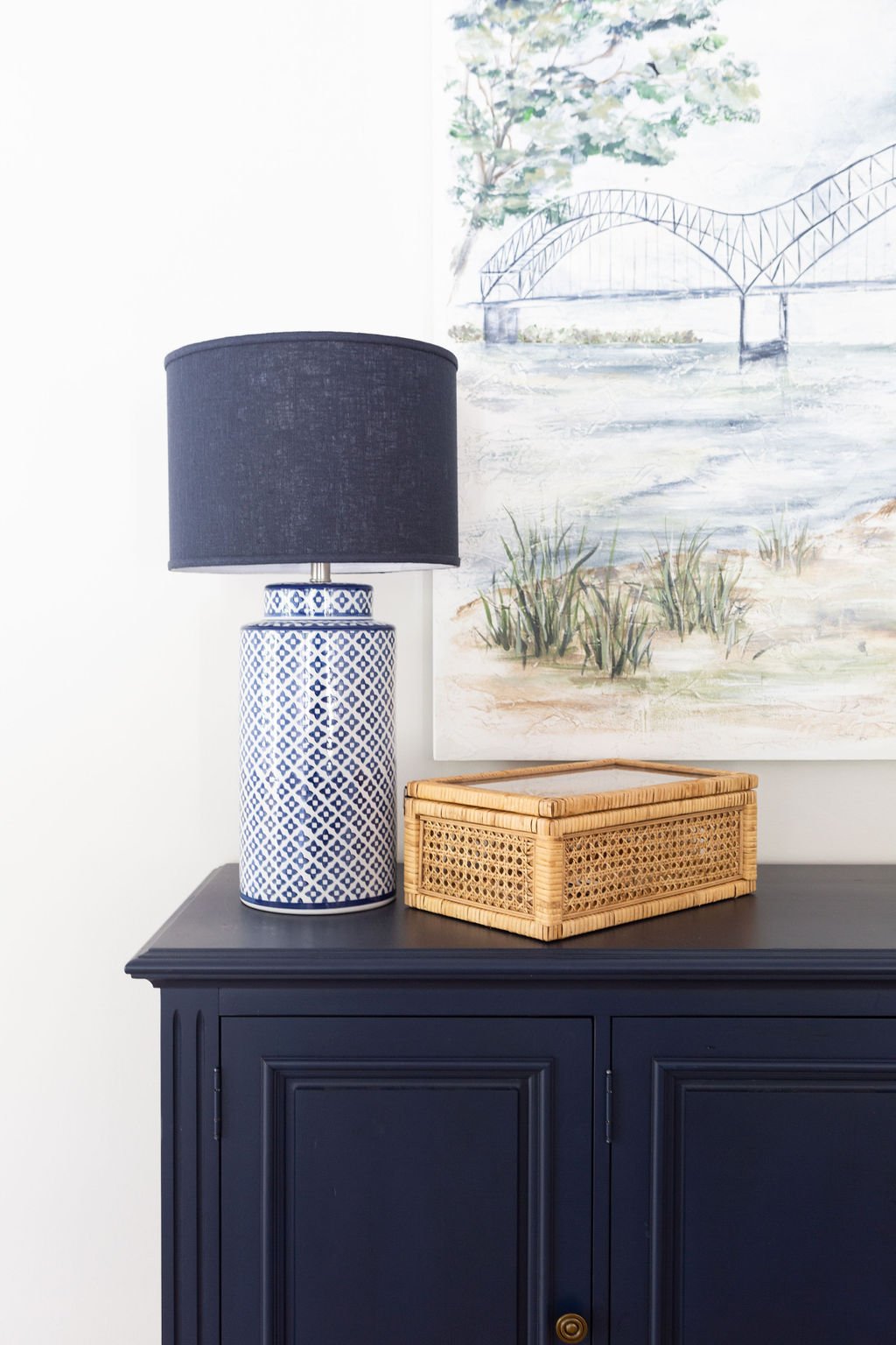
On the den’s rear wall a rich navy blue chest creates a smart focal point. Hanging above it, an original painting by local artist Georgia Jane of the iconic M bridge is a testament to the couple’s love of their adopted home town. 

The primary bedroom was another area Cate was able to transform while staying on the “save” side of the save/splurge mentality. She used the clients’ existing bedroom furniture, fluffed up with new linens, and filled in with a new reading chair, simple art and black-and-white photo portraits of the children. “This is a place where Mom can come and have a moment of quiet to relax or work,” says the designer.

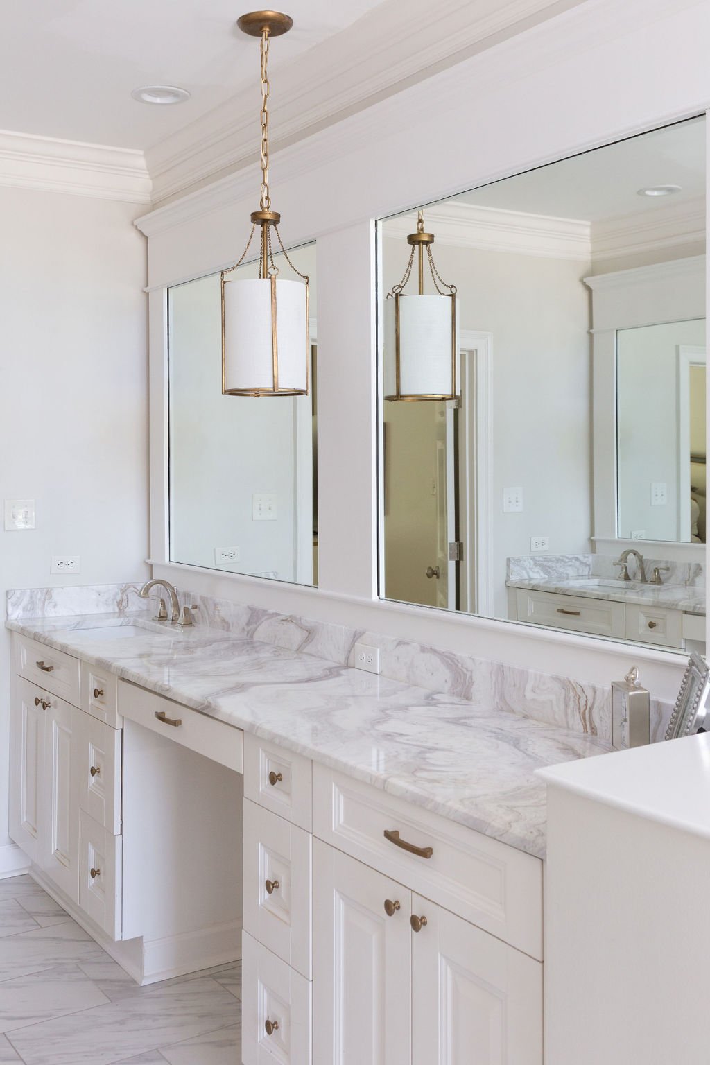
If the bedroom is the homeowner’s retreat, the adjoining bathroom is nothing short of a resort-style spa. Wide vanities with white cabinetry topped in Onda Bianco marble line both walls. The countertops were a must-have for Cate. She explains, “I try to give my clients the best version of them and there are very few things that I say we have to have, but this countertop was one of them. When I saw it I sent the client a picture and I said, ‘We are doing this.’ She loved it too without even having seen it in person. It’s like dreamy clouds.”

The brown and gray tones in the stone reflect perfectly the colors in the dramatic marble and gold accented mosaic on the tub surround. That tile was a definite splurge, but delivers plenty of bang for the buck as it makes a big impact in a small space. Savings in the room came from keeping a traditional soaking tub with decking rather than opting for a freestanding model and from forgoing extra features such as body sprays in the shower. The homeowners felt that a spacious shower stall with one spray head and a handheld would suit their needs fine. Cate’s design also called for budget friendly marble-look tile on the bathroom floor. The large-scale porcelain blends seamlessly both with the countertops and the marble on the shower floor.

New lighting in the bathroom includes a graceful gold chandelier above the tub and matching pendants over the counters. Cate opted for the pendants in the place of cans to layer the lighting without the hassle or expense of tearing out mirrors and walls to install sconces. 

General Contractor Kenny Cook oversaw the renovations throughout the home, including the transformation of an upstairs foyer area that once led to the home’s playroom into the extra bedroom the clients needed to give each of the children his or her own space. Now, the homeowner says the family is staying for the long haul. The designer says, “She told me she feels like she can see them here longer; this was more their home than it was when they had the previous brand-new house. When you get to incorporate your own thoughts and ideas you create something more cozy and welcoming. It’s just homey.” 

Celebrating Baby Hensley

Story & Event Design by Ginni Jones | Photography by Annabella Charles

the table

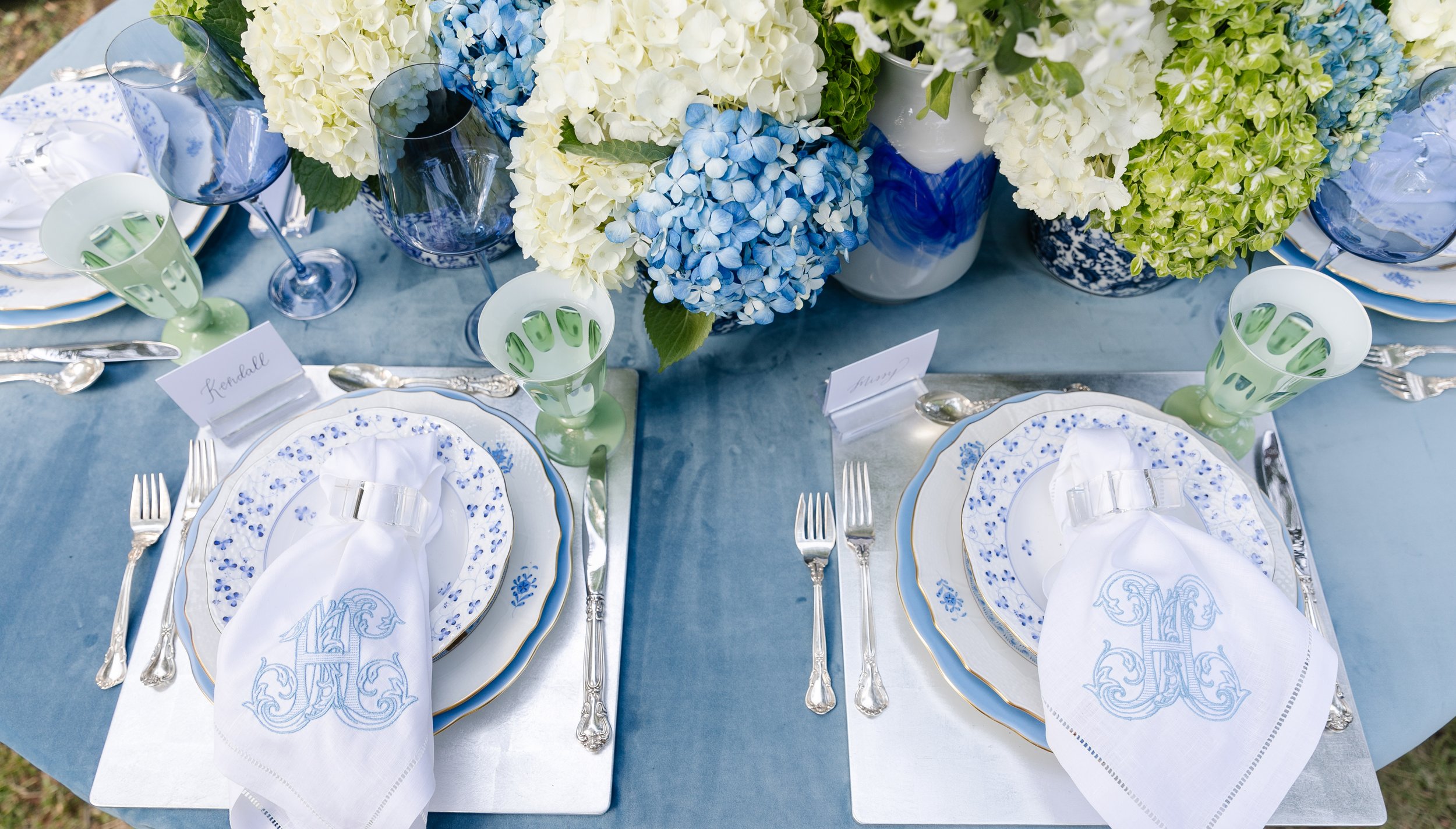
The head table, for family of baby Hensley, was decked with all things white, blue and green. The mother- to- be LOVES hydrangeas and chinoiserie jars, so decorating the table to celebrate her was a breeze! Starting with the base of the table, we picked a slate- blue velvet linen from White Door Events. The texture and weight of the velvet was perfect to keep the fall season apparent with the decor. Fresh white, blue and shamrock hydrangeas were tukced into various vintage ginger jars. Setting the table, these silver- leaf square placemats were the perfect base for the dinnerware--— found from our favorite local store, Lisa Mallory Interior Design. We also love Lisa Mallory for her vast collection of Estelle Colored Glasses, the perfect cobalt blue glasses for the table. A mixture of blue and white Herend china created the perfect combination of delicate and sophisticated for the table. Placecards calligraphied by ME Lettering were set in acrylic holders for each woman in baby Hensley's life. And, of course, the showstoppers, the custom hemstich linen embriodered napkins for the new mom! Embellished with an "H" for Hensley, we wanted to make sure the mom had something sweet to take home with her to remember her first baby shower, besides all the gifts for the baby boy! The napkins were designed and created by the incredibly talented Spyglass Lane Linens, a local embrioderer. And to break up all the blue and white on the table, I used sage tulip flutes from Sir Madam. All the colors worked together perfectly and flowed with the rest of the shower details.

the menu

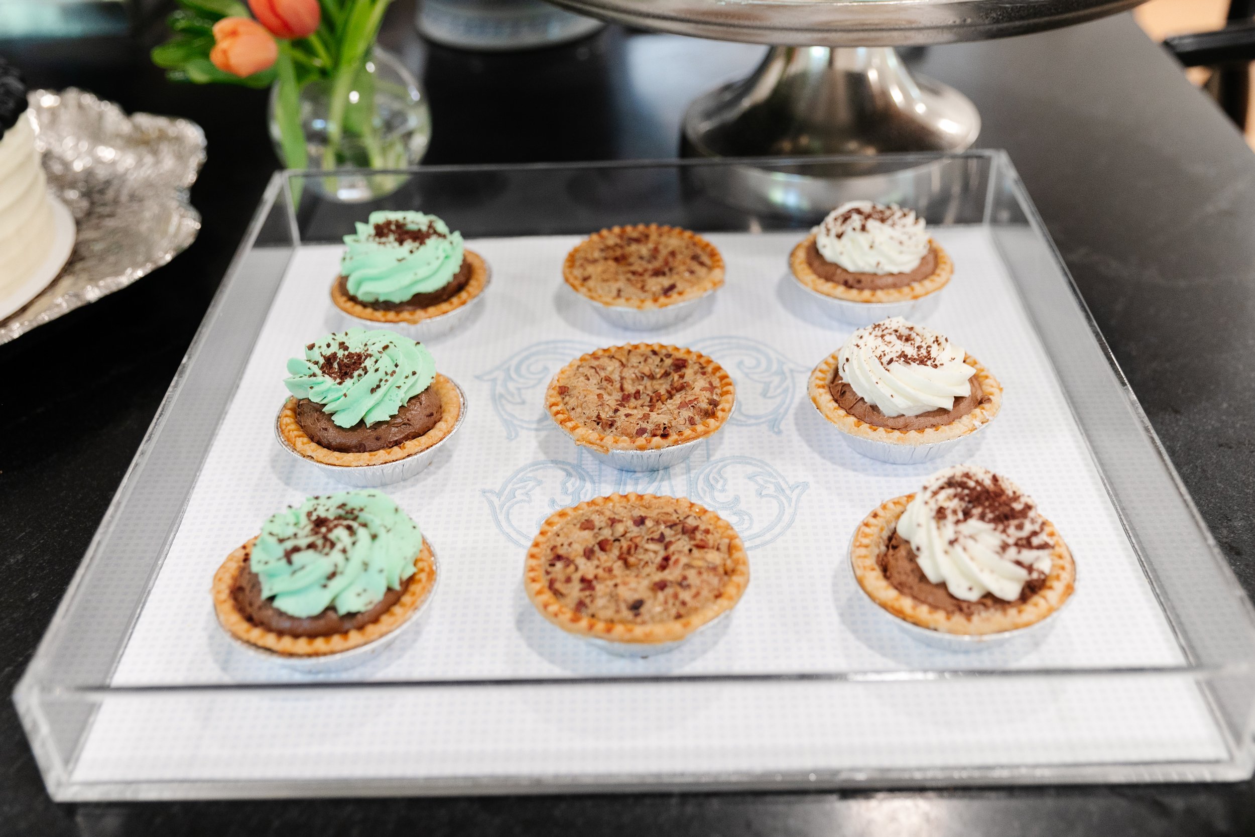
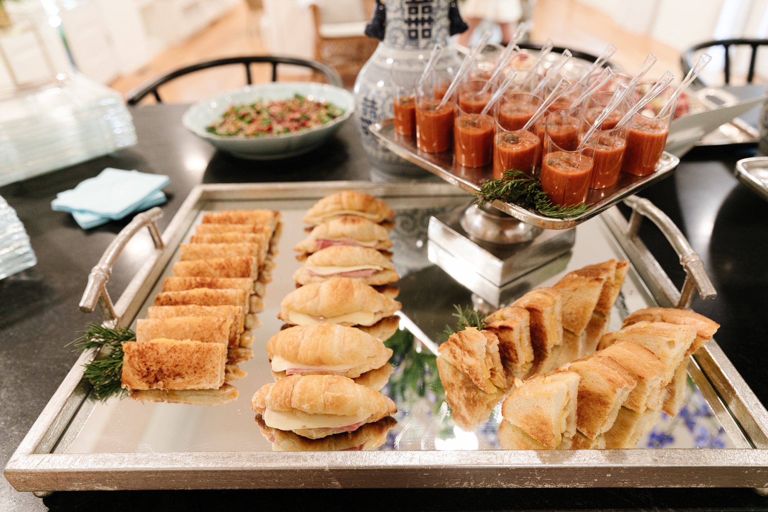
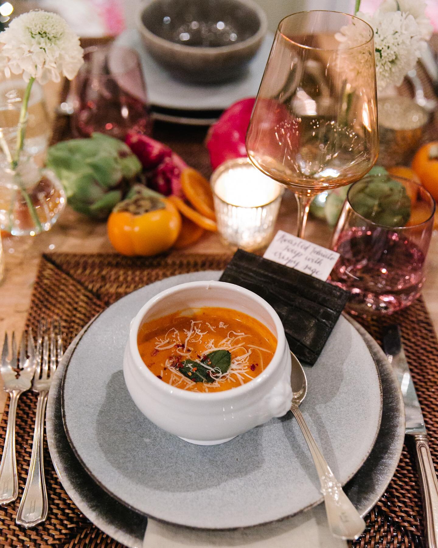
the baby shower took place on a fall Sunday afternoon so we wanted to keep the food light, but still seasonal. Tomato soup paired with a grilled cheese bar, an apple, kale and pomegranate salad, fig and honey baked brie were just a few things our talented Aubrey Ann Monger made for the shower. For dessert, a divine white cake and an assortment of adorable mini pies were brought in from the wonderful Frost Bakery. An assortment of custom cookies made by Taylor Cookie Co. were also a hit— not only were they cute on the island, but they were a delicious treat! 

the decor

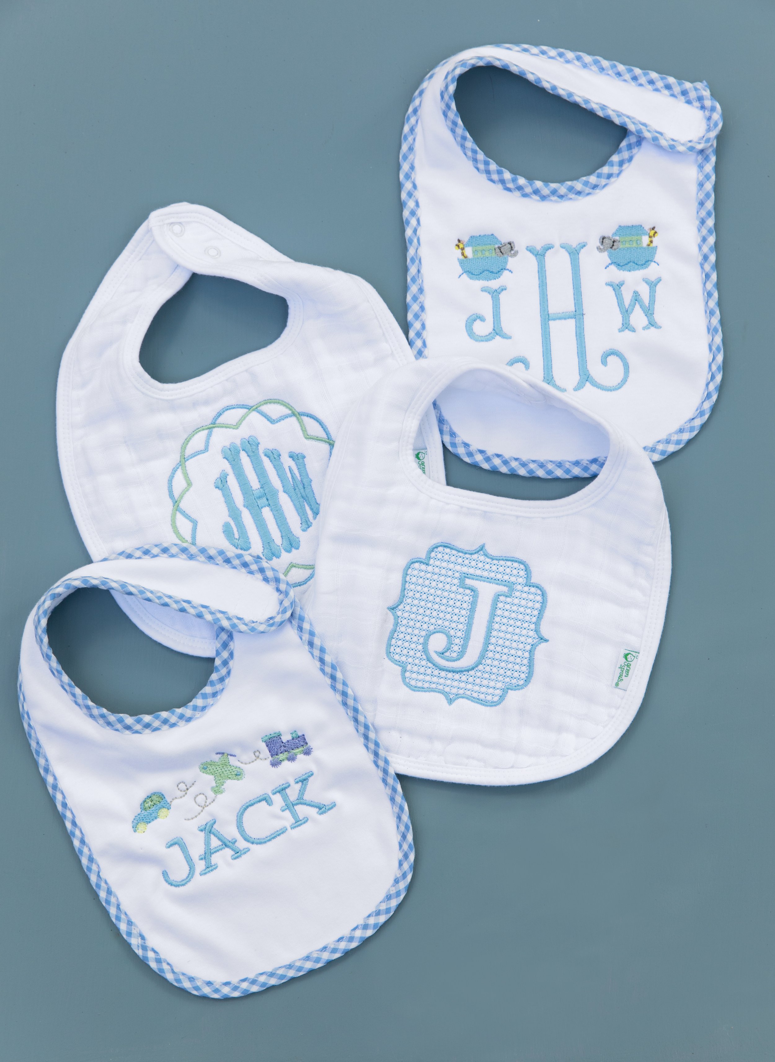
With about 10 close friends as hosts for the shower we had the best time picking out all the decor for the event. Inside the house, a vintage bassinet was filled with ferns and ivy, and light blue pansies for the baby boy. Clear acrylic trays from White Door Events held glasses of prosecco and the assortment of mini trays. We lined the trays with the monogram from the linen napkins copied onto a sheet of paper to make them look even more special for the event. Spyglass Lane Linens also made sweet bibs for baby Jack which were sprinkled around the house in decor. The bibs were tucked into the bassinet and on the table to be part of the decor but also a gift for the baby! 

thanks for popping by!

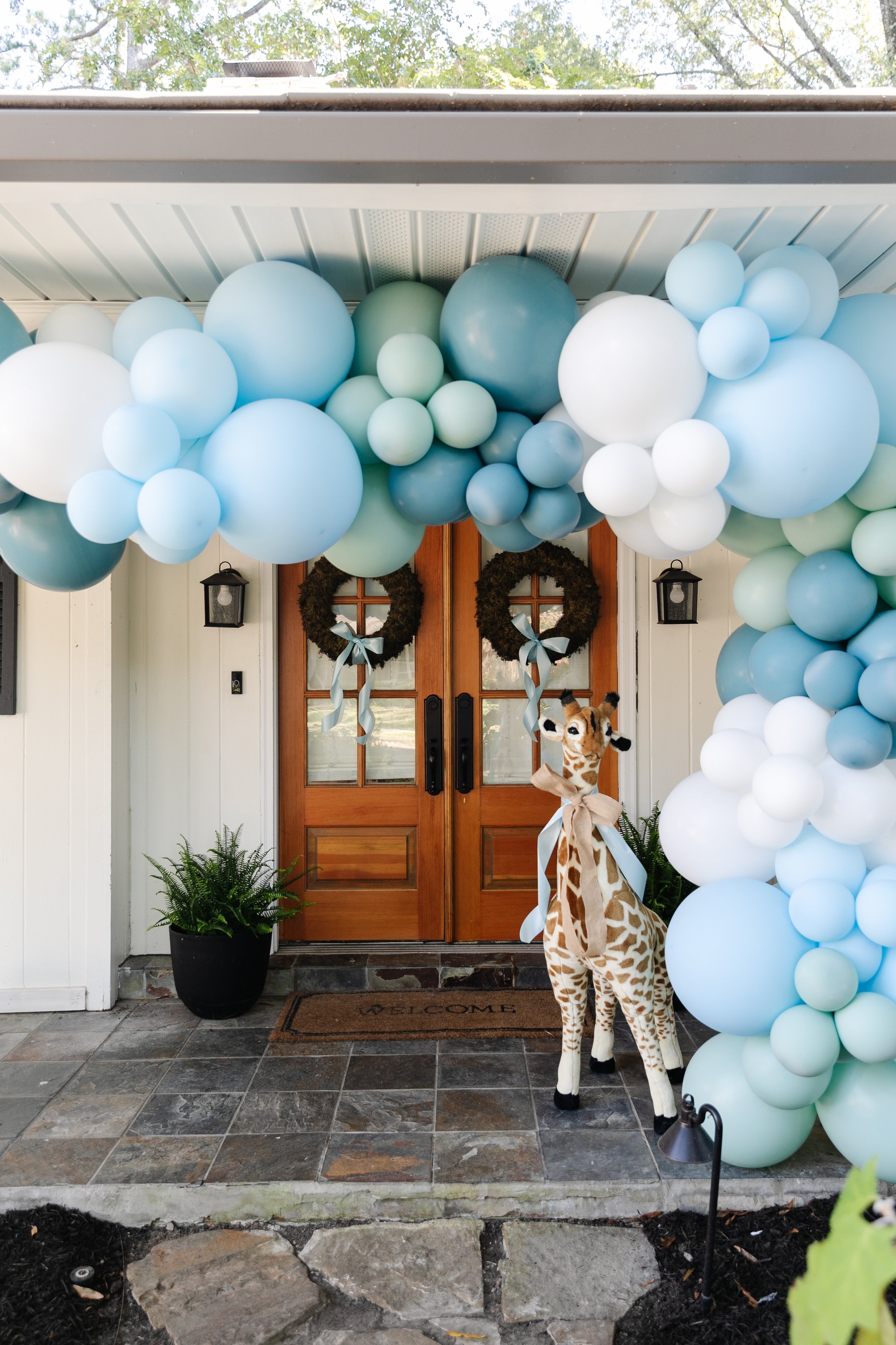
Guests were greeted with a fun and pastel colored balloon arch by the Pop of the Party, a local balloon stylist. The colors were based off wrapping paper and custom gift tags made by Fresh Ink in Oxford, MS. Upon leaving, guests could take baskets of popcorn with custom gift tags matching the invitation that said "thanks for popping by." 

Patience Pays Off

Design by Spruce | Story by Terri Glazer | Photography by Stefanie Rawlinson


To say that it took a while to bring this home to completion would be an understatement. Designer Selena McAdams began working with the owners shortly after they moved into the Midtown Foursquare in 2007. The fact that not one item she selected for them has been discarded in almost 15 years is a testament to her guiding philosophy. “You have to have an end game you are always working towards,” she says. “You can always be true to being classic and not have to get rid of anything along the way. I think that’s probably the biggest thing.”

The owners knew they wanted to make the 1912 classic home in the Evergreen Historic district their own, while staying true to the house’s original character. McAdams laughs when she recalls that their initial meetings, in the “pre-Pinterest era,” centered around the client's binder full of pictures cut from magazines. Those clippings inspired a series of smaller design collaborations over the years, and when the couple prepared for the home’s recent major redo, out came the binder again. Says McAdams, “Design elements that she and I liked 15 years ago were still some of the inspiration now that they were finally doing everything.”

She attributes that fact to the timelessness of the owners’ taste. “I think this is an example of how a home can feel updated and honor the true classic elements of its architecture without being trendy.” 

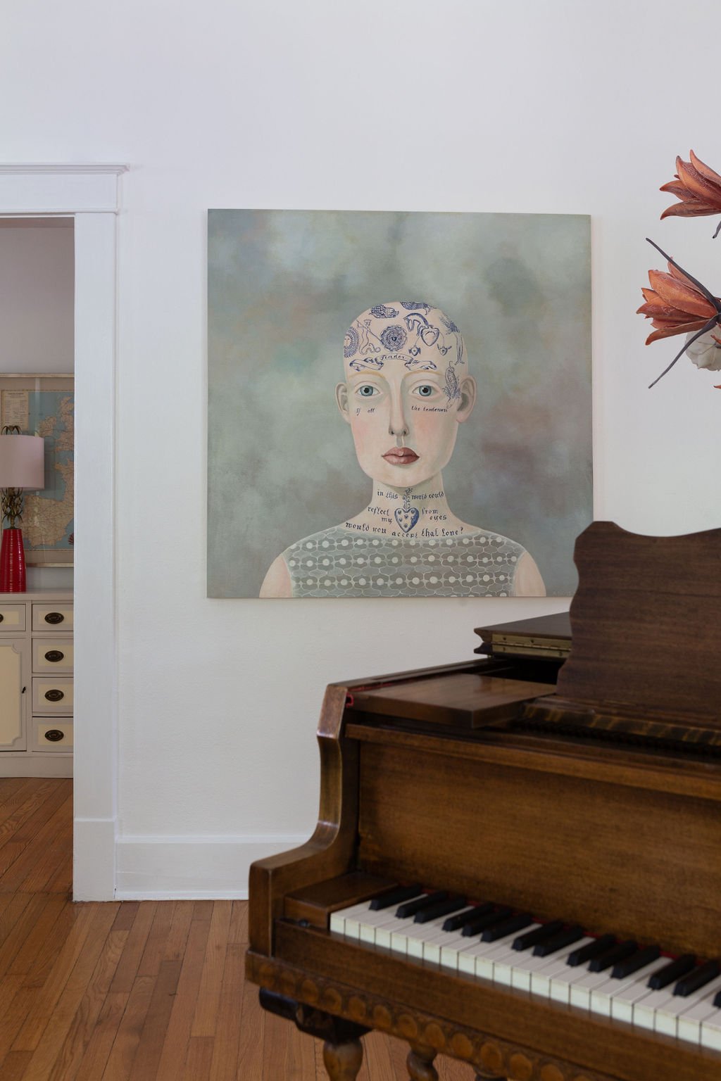
Classic, yes, but with bold statements that reflect the personalities of the people who live there. In the front room a baby grand piano and a large acrylic painting on panel, “Tender” by Seattle artist Anne Siems, share center stage. Overhead, the home’s original chandelier has a new life, thanks to the client, who polished a century of tarnish off it and added oversized modern bulbs to bring it into the 21st century. The room is home to two of the first pieces McAdams selected for this family in 2007: a dramatic black vase on the piano and a set of resin antlers over the fireplace worked then and continue to wow today.

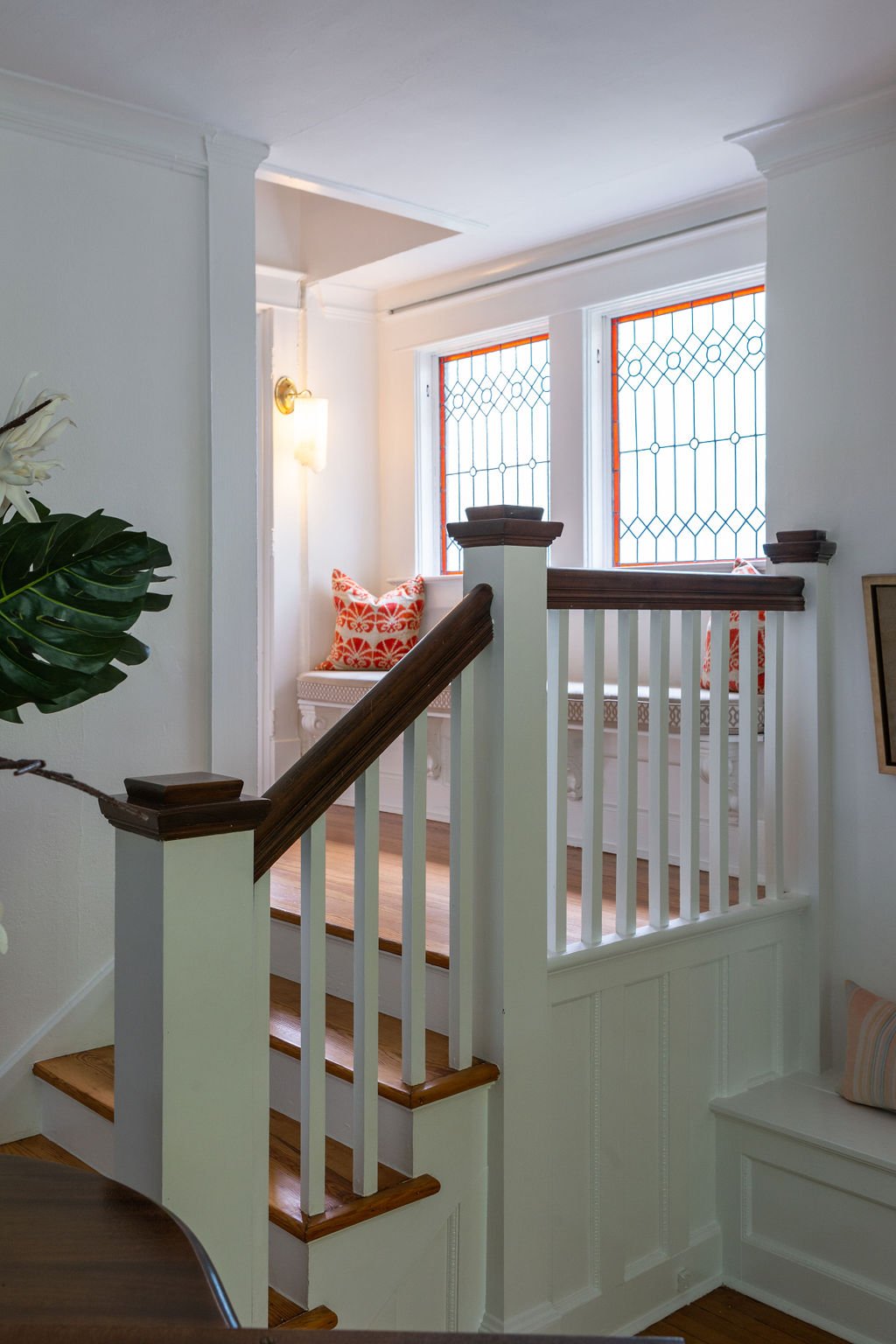
The homeowners commissioned local artist Suzy Hendrix to create a pair of stained glass windows that would bring a bright, fresh approach to the design element often seen in architecture of the period. Hendrix delivered leaded glass beauties with a pop of a tomato red hue that reappears elsewhere in the home.

The family loves to entertain, and their newly completed dining room is the perfect place for a dinner party. McAdams says the homeowners wanted a wall of built-ins with a formal, fancy feel. Finished in deep green lacquered paint and topped with neutral-toned quartzite, the Bylercraft custom cabinets showcase a collection of china, silver and glassware. A Megan Hurdle painting, commissioned by the homeowners from a personal photo depicting a sunset in Rosh Hanikra, Israel, fits beautifully under a small, high window, but the “jewelry” of the room is a custom Wunderwurks chandelier. 

The dining room is a shining example of how select high-end elements can pair with more modest items to create a stunning final product. The banquet-sized dining table came from a friend of the owners, a home stager who found the piece too large to be practical in her work. Refinished, it anchors the decor perfectly. The dining chairs were early acquisitions from Pottery Barn and Pier One. McAdams worked her redo magic on them, covering them with practical yet handsome leather-look vinyl dressed up with contrasting piping.

“Working with Selena consistently was so helpful because I didn’t feel like I was throwing away money left and right on small, quick fixes and making decisions with no eye as to what would come next. With Selena’s eye on the big picture, we just kept building on what was there,” says the client.

The family room’s loungey, sunroom vibe is a product of a masterful mix of factors. The original pie rail, coupled with faux wainscoting that cleverly mimics an expected historic detail, is painted fresh white and topped with wallpaper that calls to mind the iconic Beverly Hills Hotel palms pattern in a fresh iteration. Says the client, “I had been looking at the Beverly Hills palms and a lot of different patterns,  but I felt like I’d been looking at it for 10 years. I’d seen it in so many magazines and it felt like I was about to do something I’d been waiting so long to do and that I’d get it on my walls and be tired of it already—it wouldn’t feel new to me.” 

McAdams echoes her client’s opinion. “I’m hesitant to lead people down those paths, because they are so iconic. And I think that because you see them so frequently, you tend to tire of them more quickly. I was so on board with this pattern because yes, it’s a palm, but it’s also more understated, less likely to be seen over and over. I think that the motion of this palm is energetic; it sets the mood for this family’s main living area.”

Vintage lamps and accessories provide a subtle mid-century chic mood, while a console in geometric wood parquetry and a sleek aquarium bring in natural elements. Vibrant color comes from a rust ottoman, a pair of navy velvet chairs, and family favorite pillows McAdams sourced years ago that have been used in various rooms over time.

While McAdams steered the homeowners away from a vintage wallpaper pattern in the family room, she fully embraced the idea in the nearby powder room. The client loved the Josef Frank Citrus Garden pattern from Schumacher so much that she had upholstered a bench in the fabric. Created in 1947 and recently reissued, the vibrant pattern is familiar, but not overexposed, says the designer. Tomato red trim ups the wow factor, along with a period-appropriate wall sink and an artistic light fixture.

Stepping into the kitchen is like taking a trip to a super stylish Parisian cafe, so fitting for this family, who are local restaurant owners. The Bylercraft cabinetry is painted in Benjamin Moore Atmospheric, a saturated blue green off which neutral quartzite countertops play perfectly. Marble subway tiles line the walls. Although the room has a narrow footprint, the homeowners wanted to make sure there was room for an island. The result is fabulous, complete with mini tile accents, a brass footrail and French bistro style barstools. The traditional brass and graceful curve of the island are mimicked in the reeded cabinet bar area on the opposite wall. By its side, full height, glass-front cabinets flank the swinging door that leads into the hidden pantry. 

At the kitchen’s rear a casual dining area features a banquette, an idea that came from the client’s folder of clippings. McAdams encouraged its bold yellow, faux leather upholstery to warm up the space, and despite some initial nervousness, the homeowner trusted the designer’s choice and couldn’t be happier with its look or its kid-friendly durability. A pair of cheetah king pillows from Spruce, McAdams’s Memphis design shop, and a vintage overhead light fixture give the breakfast nook an extra helping of verve.

McAdams supported her client’s ambitious ideas, and multiple affairs with paint colors, by giving her room to dream and plan, and then stepping in when the rubber met the road and significant purchases had to be made. The result is a favorite space that incorporates the client’s vision polished with the sophistication of a professional designer.

Compromise is often the name of the game in old home renovation and this house was no exception. The project, overseen by Tom Hamilton of Hamilton Builders, included demolition of an earlier kitchen addition, a large-scale expansion of the upper levels and the rear of the house. The client initially wanted to add a mudroom for her busy family, but once she realized that changing the footprint wouldn’t be practical, a compromise came. Hamilton constructed a six-foot extension at the rear of the kitchen with a bank of cubbies so each family member has a place to stow their things upon entering the house.

The dimensions of the new primary bedroom made closet design a challenge. McAdams remedied that situation by building in separate closets for husband and wife. The result looks like a smart fix to the common dilemma of old-house living and creates a space that appears original to the home, rather than a new addition popped onto the back. Covering the “hers” closet is a pair of elaborately carved wooden doors. “I found these in a shop downtown. I initially didn’t know how we’d incorporate them, but I called the homeowners and said, ‘These feel like you,’” recalls McAdams. “They were on board, though, and now they’re beautiful on her closet.”

While the design in the rest of the house went on for an extended period, the choices for the bedroom were made in a matter of a few minutes—a fact the client attributes solely to the relationship built over time with a trusted designer. “She knew where I wanted to go. She knew the colors I liked. I was tired of making decisions by that point. The bedroom was really important, but I was just getting to an overwhelmed stage.” McAdams hit the mark with a custom, locally made bed and new nightstands, as well as pillows and luxury bedding from Spruce. 

An important advantage of this long-standing designer/client relationship was the husband’s recognition and appreciation of McAdams’s taste and guidance. Her professional seal of approval on design decisions reduced the stress that a large renovation can create and allowed the clients to realize years of home design dreams.

Through many years of getting to know their style and taste, from starting small and working up to a total home renovation, McAdams says these clients absolutely love living in their home. “They’re giddy about it because they were patient and waited to fully execute their home renovation dreams, just the way they wanted it.”

A Story To Tell

Design by Warehouse 67 Design | Builder John Duke Homes | Story by Terri Glazer | Photography by Annabella Charles | Christmas Decor by John Mark Enterprises

That description is perfectly fitting for a classic English manor. One with timeless style, distinctive details and a sense of warmth. While it might be an unexpected characterization for a brand-new Vesta showhouse, it depicts perfectly the ambiance of this home, and it’s exactly what the designer had in mind from day one of the project.

“We always love English. It never goes out of style; it’s a classic design and architectural style that feels warm and inviting,” says Kim Loudenbeck, owner of Warehouse 67 and designer of the home. Along with builders John and Elizabeth Duke, Loudenbeck set out to create a modern English manner that would feel warm and cozy, “as if it has a personality and a heart”, traits that sometimes elude large homes. To achieve that goal she paid careful attention to detail in every design element. Her focus paid off—the result is a seamless blend of timeless beauty, updated clean lines and features for the way families live today.

With its decorative brick work, timber accents and stone chimney, the exterior is vintage British. Modern flair appears in the iron and glass front door. The designer says the departure from a more traditional wooden door allows natural light to flood the entryway and also creates a sight line all the way through the house to the stunning pool area out back.

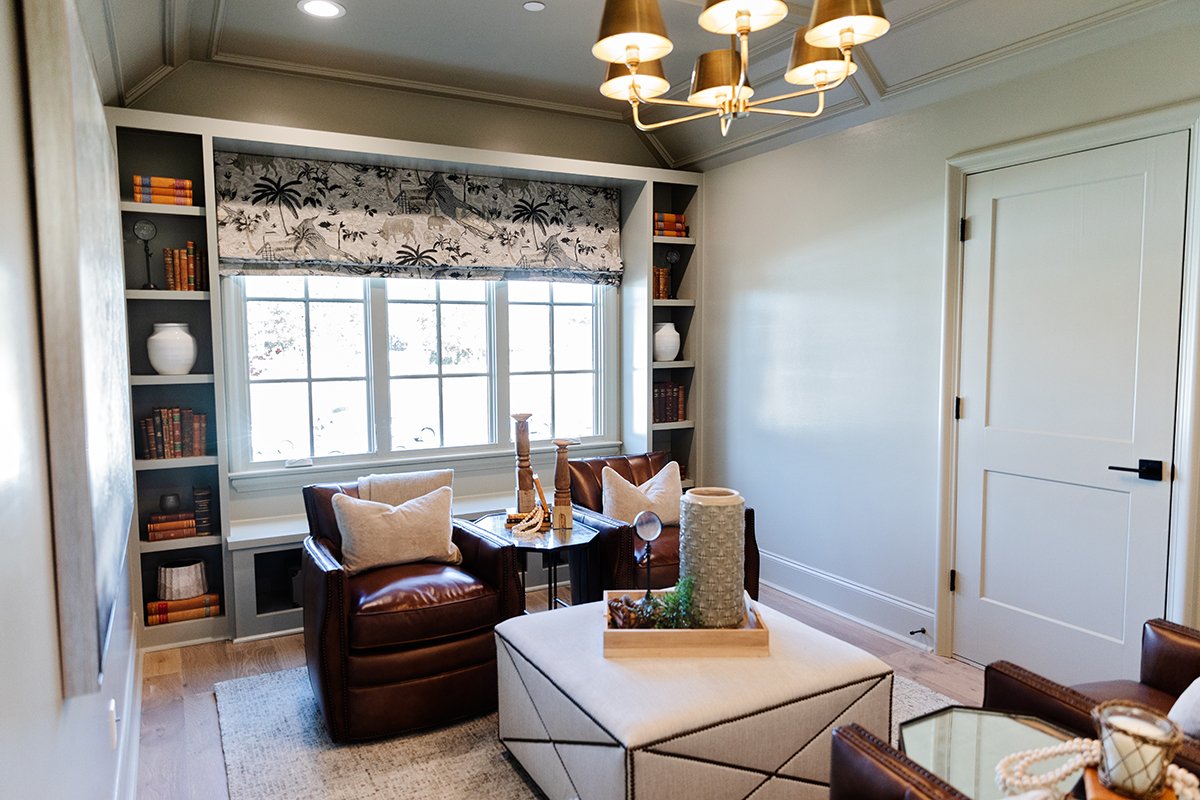
Loudenbeck says one of her favorite aspects of the house is the way the spaces flow from grand and open to cozy and intimate. The study off the foyer is decidedly one of the more tucked up spots. The limestone fireplace and coffered ceiling set the mood, which the designer further played up by painting all the trim in an atmospheric gray/green.

Across the entry, the formal dining room is light-filled, thanks to a large window. Tall wainscoting topped by wallpaper harkens back to a different time without being fussy. As Loudenbeck explains, “The architectural elements we created are tied to the historical, but the way we’ve done it is with clean lines and the colors give it more of today’s styling.”

The family room leans to the grand and gorgeous side. Its vaulted ceiling draws the eye up to handsome wood beams, the handiwork of local craftsman Wade Burrus. “In a historical home you would have post-and-beam construction with beautiful beams and timbers,” says Loudenbeck. “And the hearth in an English home is what the whole room centers around. We did a classic limestone fireplace and added custom paneling on the wall, but we chose a color that would make it dramatic.” On the back wall three large sliding doors allow traffic to flow effortlessly onto the bluestone patio, through an inviting outdoor room, to the pool with a trio of waterfall features and landscaping that brings an orderly English garden to mind.
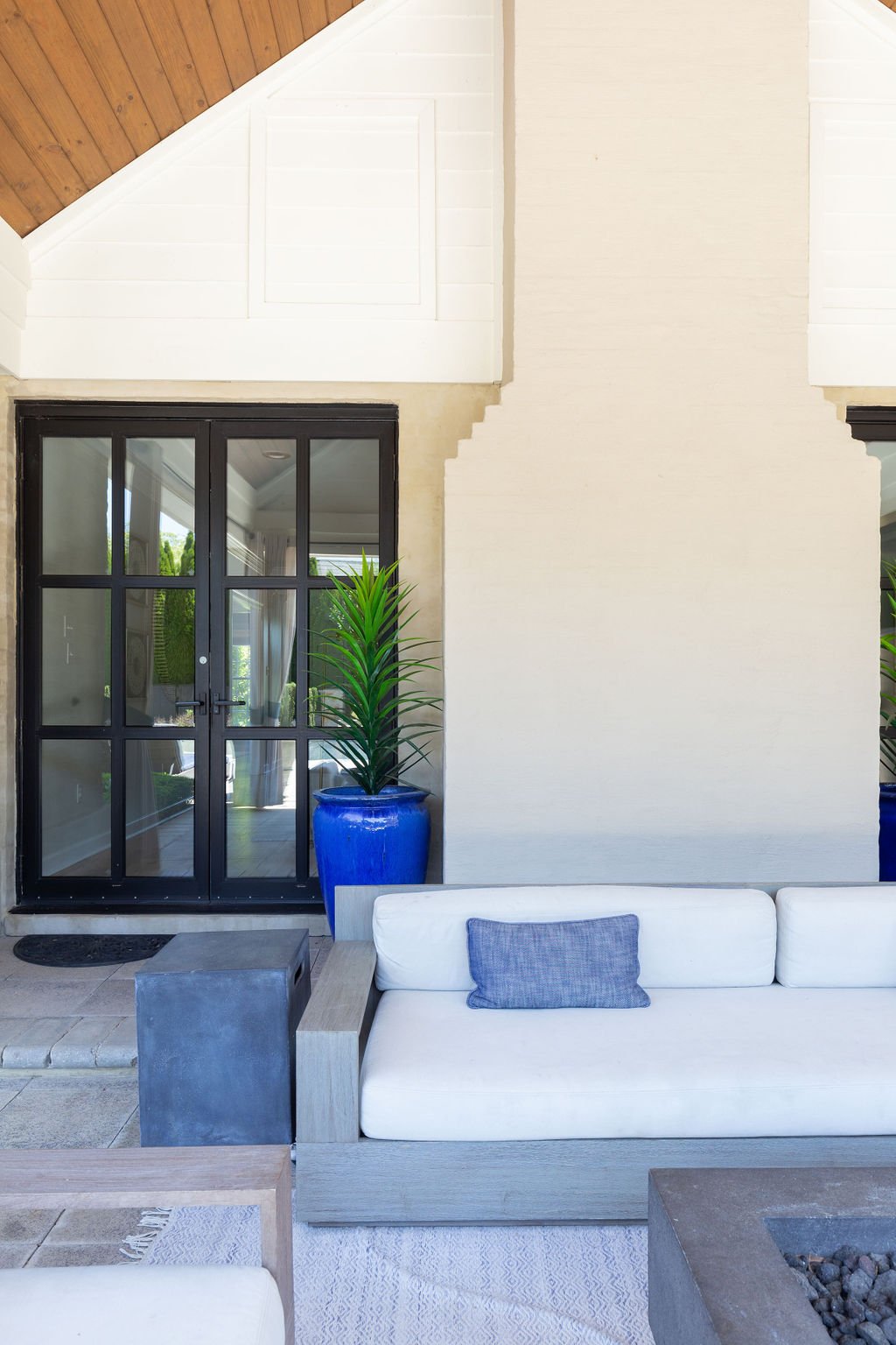
The adjacent kitchen is a study in understated beauty. Loudenbeck partnered with Lisa Russell of LM.Designs to create a unique and functional space in the heart of the home. “Sometimes less is more and this is one of those kitchens where the elements in it are done so well that it doesn’t need a lot of fluff,” says the Loudenbeck. Those elements include more timber accents from Burrus, paired with an of-the-moment waterfall quartzite countertop. They do not, however, include wall cabinets on the range wall. Loudenbeck instead opted for a pair of floating shelves and room to display artwork. “Negative space can be really good. It lets you focus on the areas that you want to be the focal points and highlight the pretty spots,” she says. 

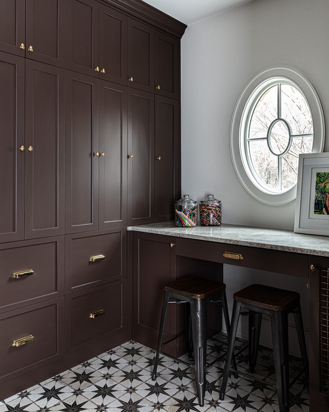
Nestled behind the kitchen is the scullery, an area fast becoming a must-have in well appointed new homes. With more cabinet space, a coffee bar and a second set of appliances, the room is all about function. To that end, the design includes a built-in “hub,” a desk area from which family schedules, meal planning and more can be easily managed. 

“Half baths are fun to design because you can kind of be moody,” Loudenbeck says, and the main floor powder room in this home is a perfect example. Loaded with millwork and painted dark, the walls are topped off with a wallpaper that is historical and current at the same time. “Classic traditional, but in an updated way, is trending right now. We are seeing a lot of the high-end design companies doing throwbacks on fabrics and wallpapers. I think people like having cleaner and more modern elements but there is something comforting about remembering the past,” Loudenbeck says.

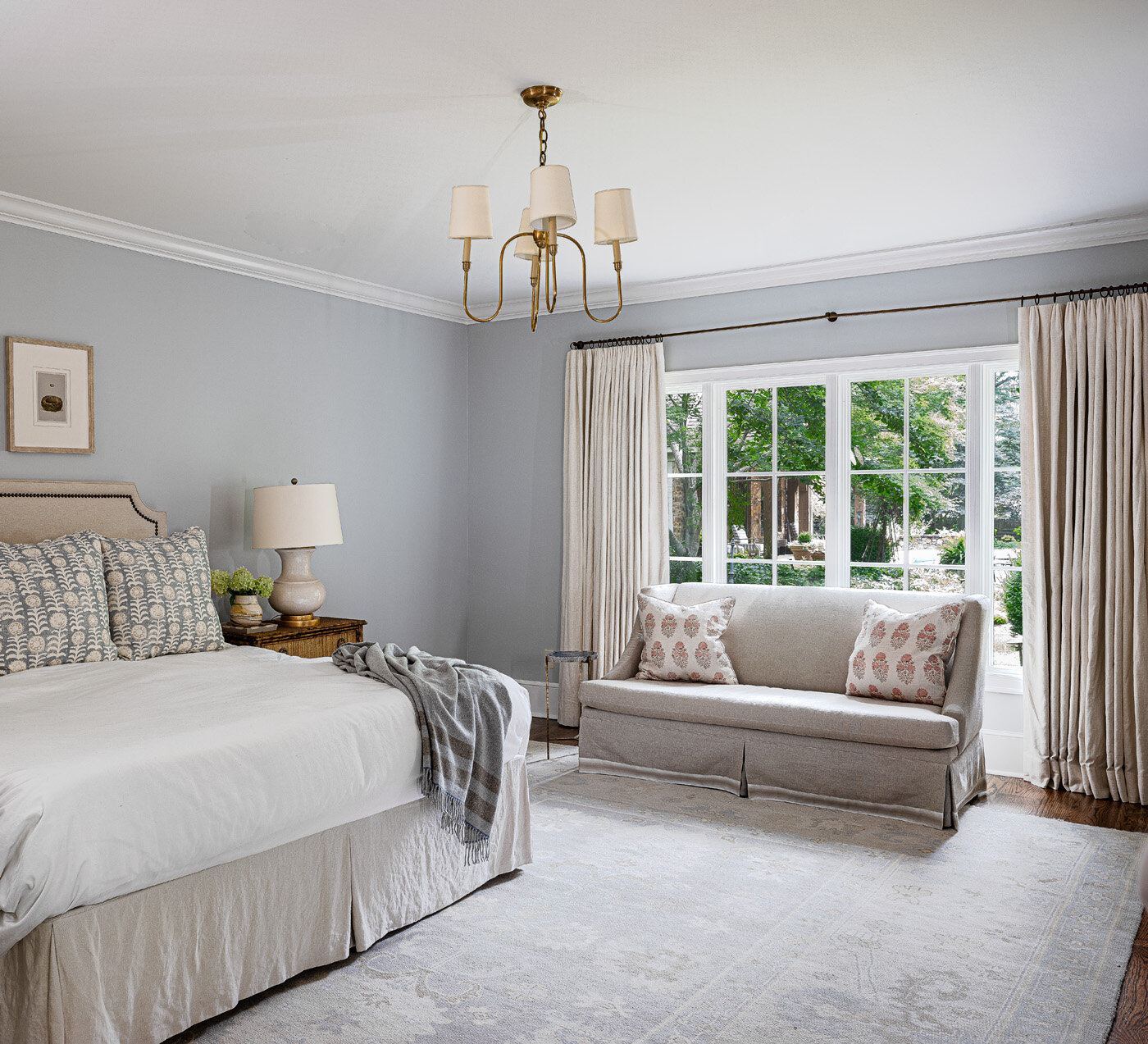
The designer’s philosophy on primary bedroom design is simple: because homeowners spend more time there than any other place in the house, it should be especially beautiful and comfortable. “When you wake up surrounded by things you love, it sets a good tone for the day,” she believes. This home’s primary suite is a beautiful example of that theory. Under a vaulted ceiling embellished with timber beams, a fabulous gold and beaded chandelier lights up the spacious bedroom. A bay window adds architectural interest and makes a perfect spot to relax with a good book.  

The window treatments in the primary bedroom and throughout the house are functional curtains that can close for privacy and open to maximize natural light. Loudenbeck says she intentionally shied away from using interior shutters or other treatments that would permanently cover the windows. “The lines of the house are so pretty that to cover up those windows would be a shame,” she says. “We wanted to accentuate them and frame them out instead of taking away from them.” 

The primary bath design hinged on the room’s centerpiece, a double cast iron tub in relaxing blue hues. A pair of freestanding vanities in natural wood tones topped with quartz countertops hold their own due to thoughtful details like high backsplashes and gold tone fixtures, while still allowing the star of the show to shine.

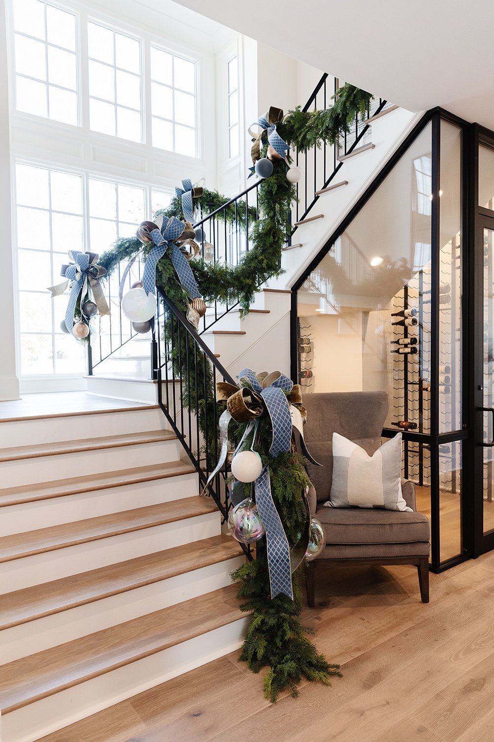
The home’s main staircase, illuminated by tall windows, was inspired by Thomas Jefferson’s design philosophy, which Loudenbeck learned as a college student. “Jefferson thought a grand staircase was a grand waste of space,” she recalls. “So our challenge was to create the grandeur but also make it usable.” Compact and beautiful, the space is definitely not wasted. Even the space under the staircase was put to use. It holds a 200-bottle climate-controlled wine room fit for a connoisseur.

Atop the stairs a pretty vestibule, framed by more of the molding that gives the house so much character, leads to the spacious game room. Furnished with an inviting sectional sofa, leather chairs and large ottomans, the room exudes comfort and relaxation. Loudenbeck describes the distinctive brass and glass chandelier as the room’s “jewelry,” emphasizing that even a home with the essence of English style can accommodate modern accents successfully.
Three additional bedrooms and baths, along with a charming wood paneled flex space that could serve as a nursery as easily as a home office, round out the second floor.

Building a strong team from day one, John Duke was able to masterfully execute the vision of timeless beauty. With a stunning palette as a backdrop, the team of designers at Warehouse 67 created a comfortable yet elegant space that harmonizes with the home’s architecture. Custom furnishings and designer details from Warehouse 67 were planned early in the process to enhance the home’s character and charm. And just in time for Christmas, floral designer John Mark Sharpe added the final touches to this picture-perfect holiday home. 

Loudenbeck summed up her affection for the home during a walkthrough on the eve of the Vesta Homeshow’s opening. “This is what we wanted—when you walk through the space you can connect to it and it almost speaks to you. This house already has a story to tell.”

Old Neighborhood, New Vibe

Design by Maggie Clarke Interiors | Story by Terri Glazer | Photography by Stefanie Rawlinson

The heart of Cooper Young, a Memphis neighborhood known for its classic cottages and bungalows, might not seem like the expected setting for a new subdivision, but this home in developer Griffin Elkington’s Cooper Station proves that old and new, traditional and contemporary can coexist beautifully.

As with all 15 homes built by Elkington on the former industrial site, architect David Anderson designed the house’s exterior elevation to include traditional features fans of quintessential Midtown architecture love—clean lines, large windows, a welcoming front entry. The inside, however, takes a much more modern tone, thanks to the work of designer Maggie Clarke, owner of Maggie Clarke Interiors.

Dr. Chenobia Webster-Hill hired Clarke to guide the decor in December 2020, while the home she shares with husband Corey Hill and their two young children was still under construction. Clarke attributes much of the finished product to ideas the homeowners brought to the table. 

“Chenobia and Corey did a wonderful job!” says Clarke. “They picked out all the paint colors, all the tile for the kitchen and bathrooms, and the woodwork in the entryway was her idea. I came in just for furnishing and styling, so that was interesting because usually on new builds I do everything. On this project the clients gave me a springboard.”


Clarke asked the couple to send her inspiration pictures. In them she found a definite trend toward contemporary spaces in neutral tones, punched up with pops of bold color. She carried that aesthetic throughout the home, starting from the first step inside the front door. Accented with custom woodwork in a stylized chevron pattern designed by the homeowners and painted a tranquil gray/green, the entry wall is the perfect home for a pair of vibrant Jean-Michel Basquiat art prints. Webster-Hill selected them, along with all the art in her home. Clarke explains that although she occasionally makes broad suggestions, it’s her policy to have clients choose their own works of art. “It’s such a personal thing. Art has to speak to you.”

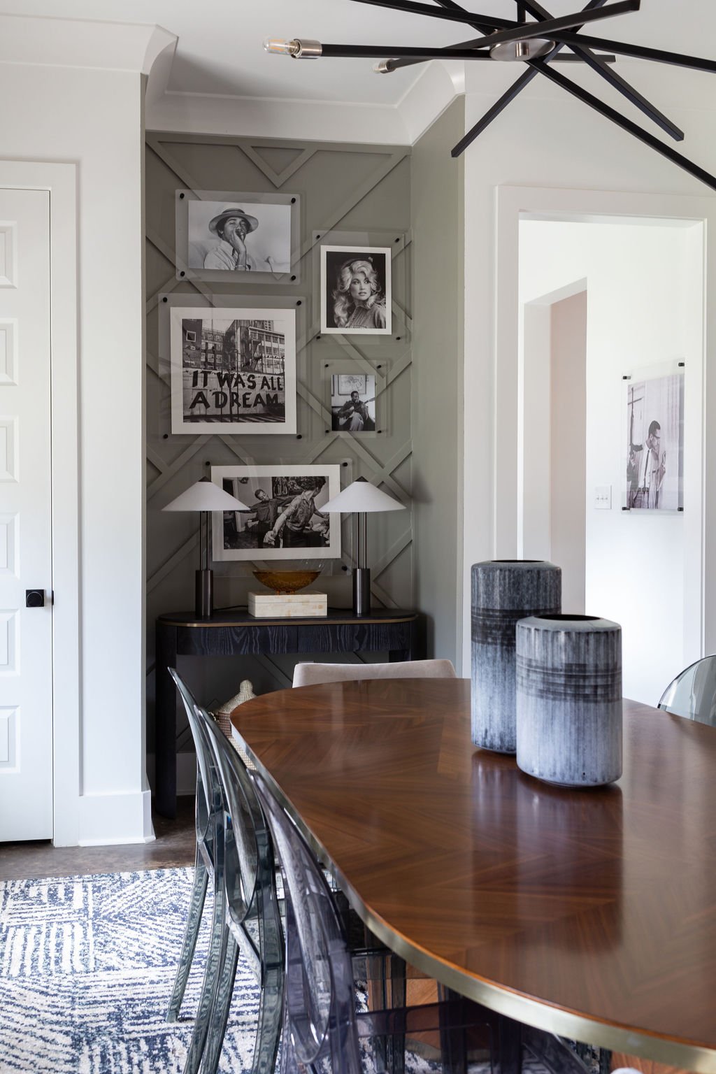
That said, she is thrilled with the Basquiat pieces in the foyer. “They set the tone and foreshadow what’s to happen in the rest of the house.” In the dining room a gallery wall features the same distinctive woodwork, topped by equally striking black and white photography.

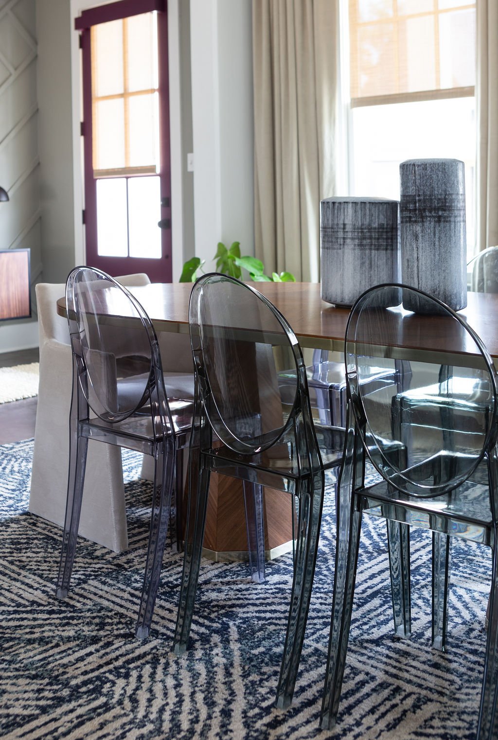
The ultra modern dining table from Four Hands is surrounded by smoky lucite side chairs. A pair of eye-catching end chairs upholstered in creamy velvet creates the perfect juxtaposition of hard and soft. 

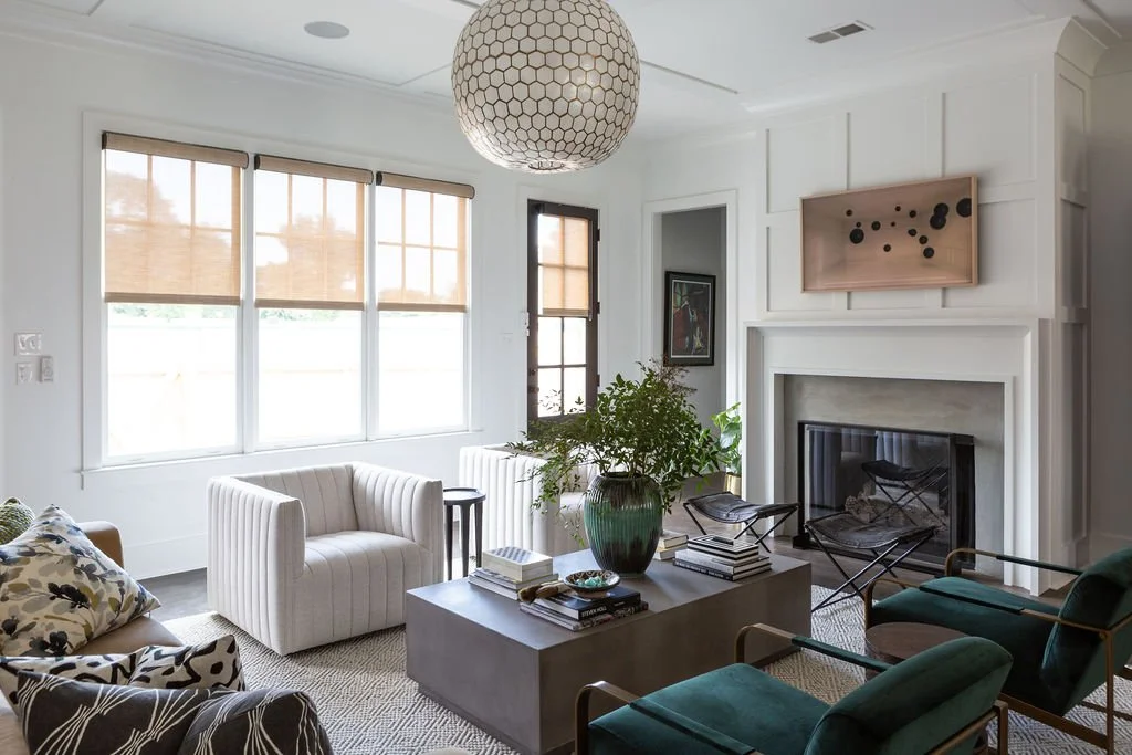
The adjacent living room exudes modern sophistication through an eclectic blend of lush fabrics, dark wood accents and natural elements, all set against the backdrop of crisp white walls and dramatic stained concrete floors. A globe-shaped light pendant from Serena & Lily is like the cherry on top of the space, says Clarke. “I love the scale of it; it’s like a focal point. I love a capiz light fixture! The softness of capiz adds balance and a little feminine touch to the lines of the room.”

The showstopper sofa is a perfect example of the synergy between client and designer that produced such a successful end result. “She called me and said, ‘I have a sofa for you.’ And I said, ‘Oh really, because I have a sofa I want you to see. Exactly the same sofa,” recalls Webster-Hill. The CB2 piece sets the room’s cocktail lounge vibe, while the rest of the furnishings, from a pair of swanky white swivel chairs to Chairish cocktail stools, beckons guests to sit and relax.

Due to the home’s open floor plan the kitchen and the living room are technically one space, but the kitchen has a personality all its own. Vivid green paint chosen by the homeowners with Clarke’s stamp of approval, wooden light pendants, white cabinets and carrara quartz countertops play out the neutral-with-bold theme here, and Webster-Hill couldn’t be happier with the heart of her home. “This is my favorite spot in the house,” she says, standing at the kitchen island. I love to stand right here and eat. I love the view.”

And who wouldn’t love that vista? From her kitchen island vantage spot, she can look out not only at her sophisticated living room—large windows across the home’s back wall provide a view of the spot the homeowner calls her family’s outside oasis. The back courtyard proves that a small space can make a large impact. Brandon Malone of Malone Construction Enterprise built a compact yet elegant pool that packs a big punch, complete with a waterfall feature and lighting. The patio also has a cozy nook where the man of the house can enjoy a good cigar in style and comfort. 

The downstairs powder room makes a nod to the neighborhood’s classic history. Clarke recalls, “When she hired me, Chenobia said, ‘I want this to look like a speakeasy.’ So we went really dramatic, from the wallpaper to the art. There’s even a black potty!”

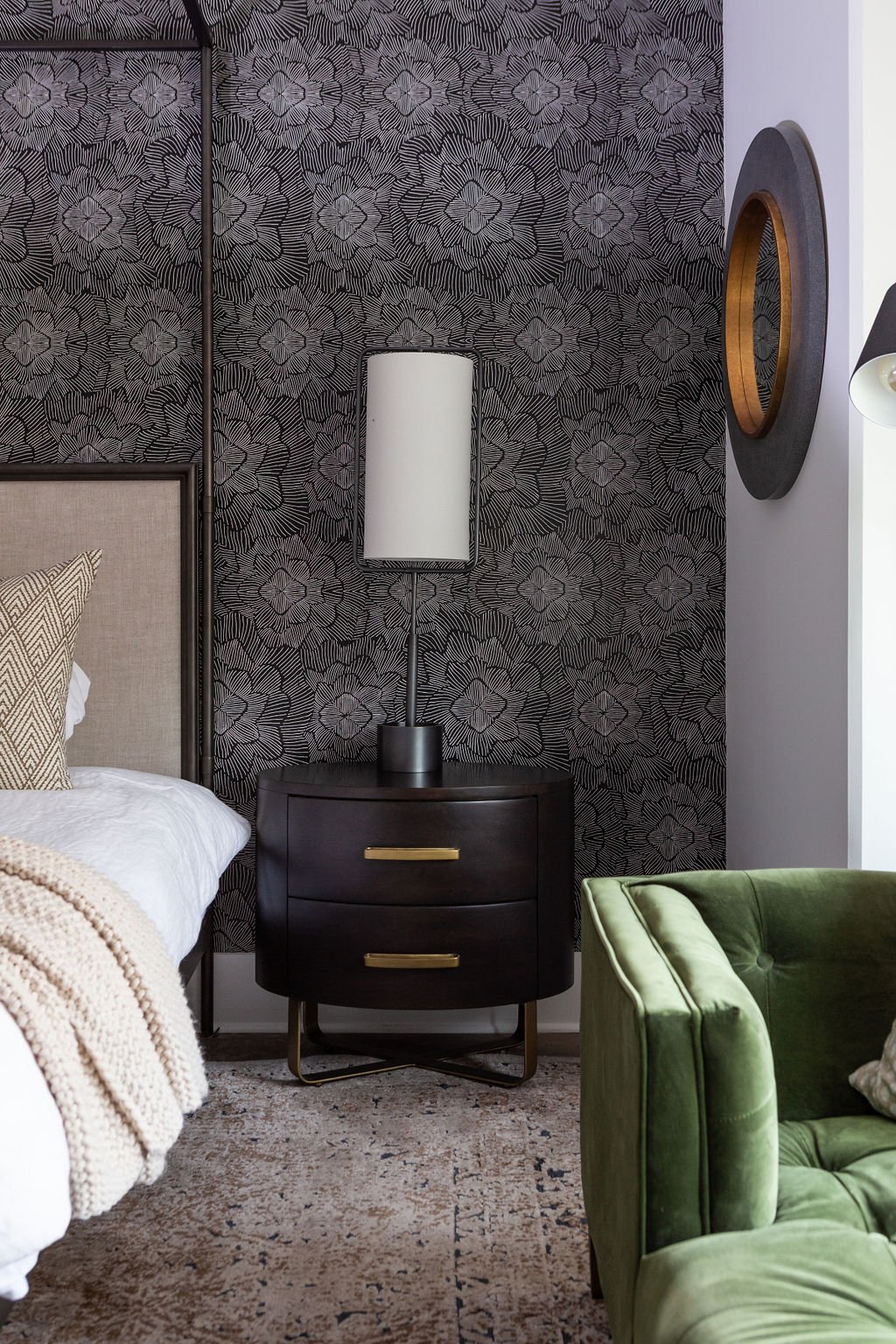
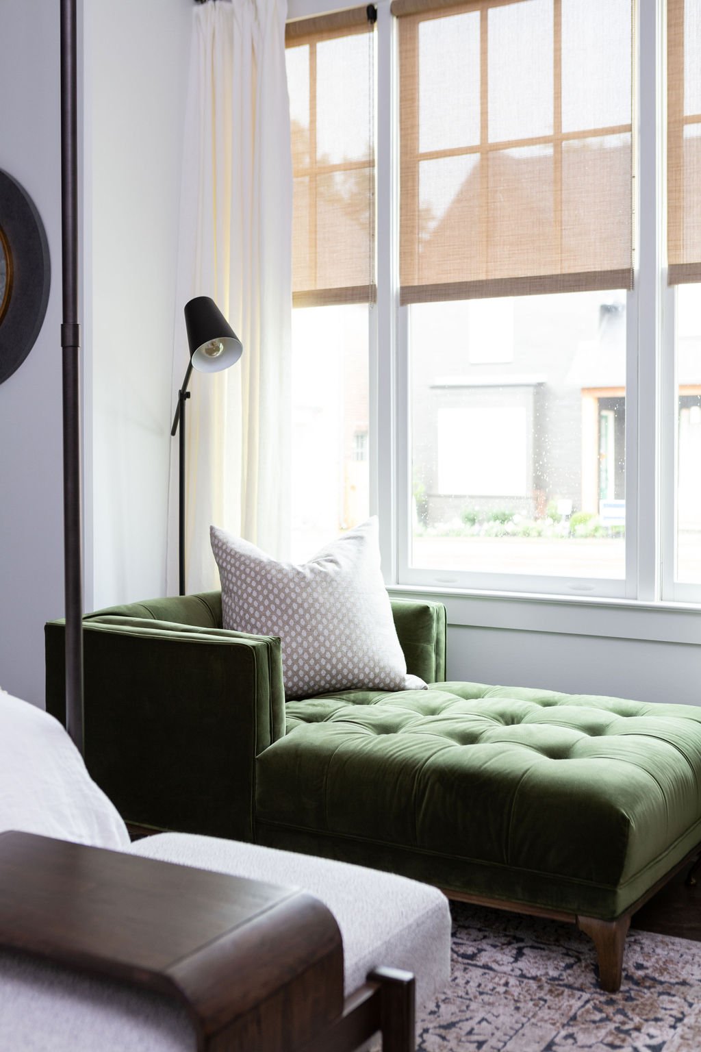
An accent wall bathed in bold black-and-white wallpaper makes a standout feature in the primary bedroom. The room still has a quiet feel, despite the party on the wall behind the bed, however, thanks to a clean-lined canopy bed, neutral bedding and a simple wood console. The green velvet chaise next to the window is a favorite reading spot for the children. A tall, lanky Regina Andrew lamp stands alone on each of the nightstands, providing simplicity and drama at once. 

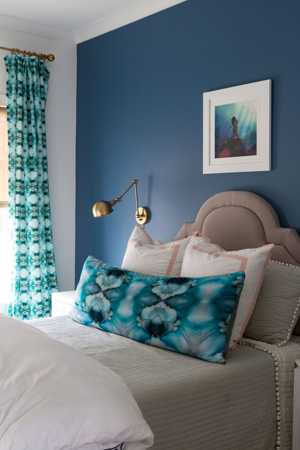
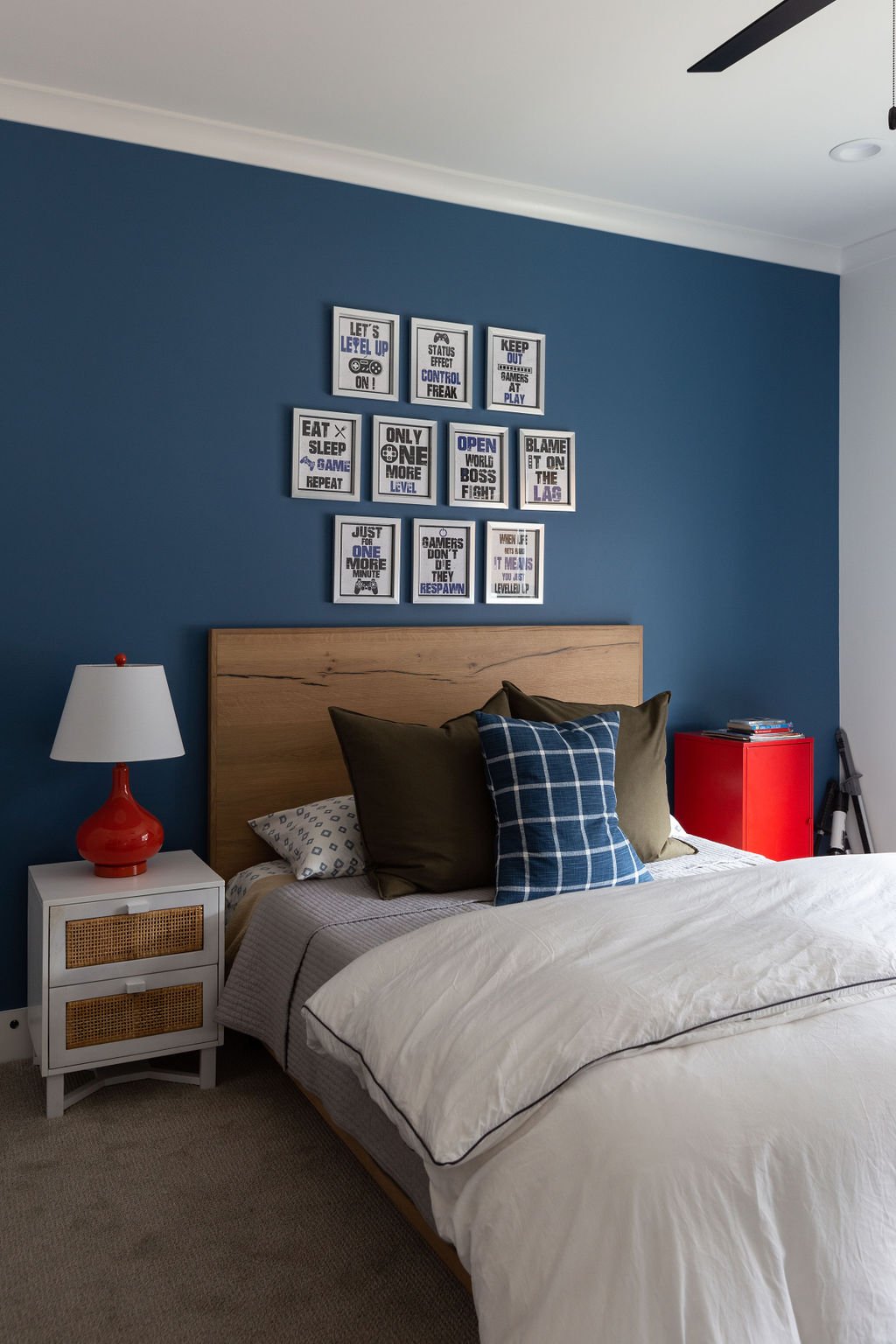
Upstairs, Clarke’s clever design will allow the two children’s bedrooms to grow with them as they transition to teenage years. She called on local artist and personal friend Whitney Winkler to design aquatic-themed textiles for the mermaid-loving daughter’s room, while the boy’s abode is handsome in deep blue and white, completed in natural wood with red accents.

The second-floor TV lounge is a study in comfort with a cushy sofa in serene blue velvet, a pair of inviting chairs, and a button-tufted leather ottoman large enough for the whole group to prop feet up. The undisputed star of this room, though, is Corey’s prized collection of vintage album covers displayed as wall art. Grouped tightly in three rows, the vinyl jackets make a stunning visual impression and call to mind memories of the giants of soul, R&B and funk.

Although they’ve only lived in their Cooper Station home for a few months, Webster-Hill says her family has found that the new development has quickly come to have the front-yard hospitality for which older neighborhoods are known. “It’s been a great experience. The people are friendly and welcoming,” she says.

A great neighborhood and a great house, she adds, thanks to a great designer. “We built a house. She created a home.”

A Love Letter to Memphis

Design by City Hill Design | Story by Terri Glazer | Photography by Javen Photography

When the 2021 Vesta Home Show opens next month, Mid Southerners will have the chance to tour five spectacular new homes. In the spirit of anticipation, we’re taking a look back at Tiger Hall, one of our favorites from last year’s Vesta show. 

“Go with what you know” is always a good idea. Tiger Hall, one of the homes featured in the 2020 Vesta Home Show is proof. Sisters Amy Mobley and Katie Norrid, owners of City Hill Design, found inspiration for the project’s guiding concept from the city they know and love.

Says Mobley, “If you're from here, you love all things Memphis. I don't care if you're in Collierville, Germantown, you're proud of your city. So we decided Memphis was going to be our theme. What does Memphis entail? It's got art, music, a ton of history and classic design. And so that's where we kept everything, in those parameters.”

CityHill_Vesta2020_TopEdit_017.JPG

The team of sisters and lifelong Memphians sent David Anderson and all the collaborators who would contribute to Tiger Hall that concept and a vision packet. “We gave them color tones, the vibe that we were going for and the keywords that we were looking for,” Mobley says. Their other guiding concept was to create a show home from which guests could take bits and pieces to incorporate into their everyday life. “Kind of like fashion runway shows in New York, how it's outlandish, and just kind of over the top and fun. We wanted people to walk through and be inspired to take parts of it and go with it.”

Mobley was excited to work in tandem with Tiger Hall’s builder, City Hill Homes, owned by her husband Zach Mobley and Jonathan Draper. “People think that because our companies have the same name, we always work together,” she says, “but this was our first full crossover project. It helped that I’m married to the contractor—we could talk him into a lot more. He was a good sport.”

Norrid explains that the design team, which also included Rachel Welch, relished the chance to step outside familiar parameters. “We were like, ‘What can we do, what has Memphis not seen? Can we mix it up and shake up what you normally see at a home show—give people some things they haven’t seen before without being too wild or weird?’” 

DSCF2122-comb-Edit crop v2-web.jpg

Their concepts hit both marks. The house has innovations galore and nods to the Bluff City everywhere, starting with the exterior elevation. In an homage to Graceland, Memphis’ most iconic home, Anderson gave Tiger Hall two symmetrical rows of windows across the front. He also situated a balcony above the front door, a perfect fit for its Spring Creek neighborhood, where families often visit in front yards. Both Mobley and Norrid live in Spring Creek, so they know firsthand how neighbors spend lots of time out in the common spaces and chatting with each other. 

Tuscan Iron Entries fabricated the home’s iron and glass front door, the matching rear door and all the iron work. Light spills into the entryway, illuminating a show-stopping floor that marries wood and marble in a custom pattern that Mobley says was a study in collaboration between the home’s flooring and stone artisans. The open stairway also provided a challenge for contractors, but the result is unparalleled. Anderson designed the staircase facing the home’s rear side, and with open treads, again to maximize light.

CityHill_Vesta_Oct26_006.JPG

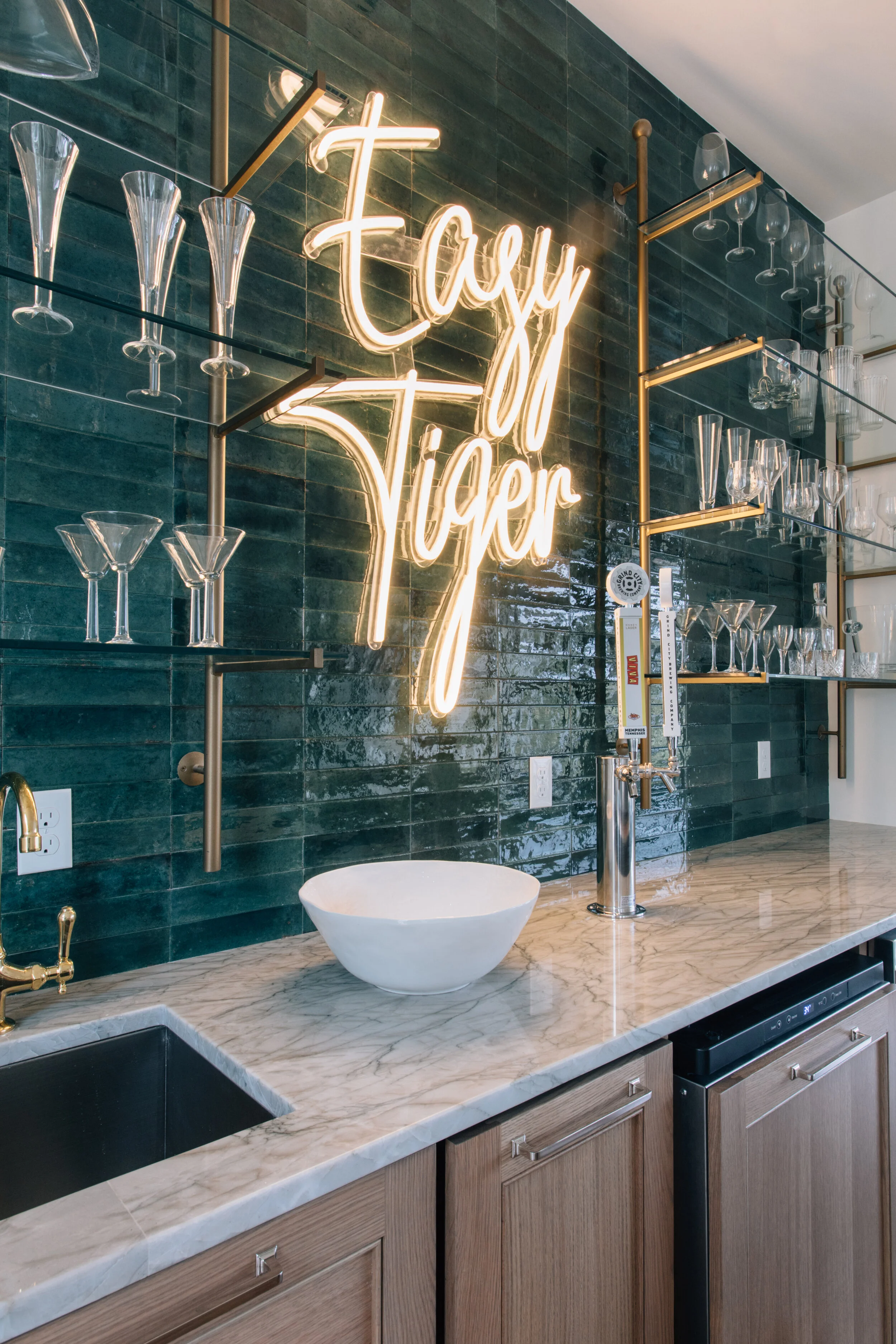
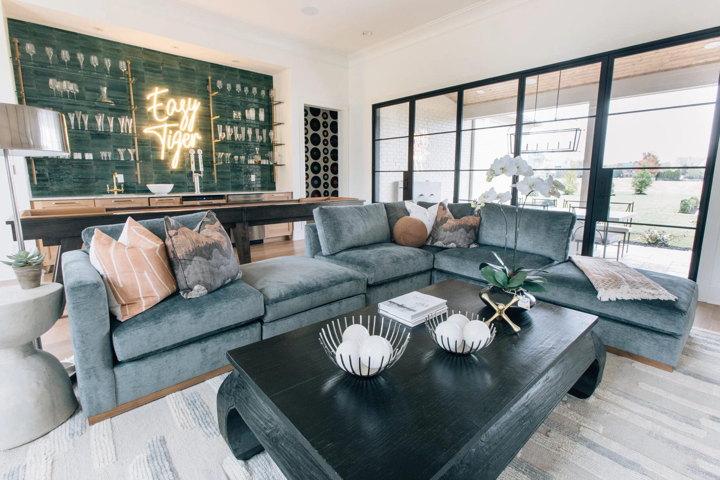
Having a game room directly off the front entry is decidedly outside-the-box architecture, but it works beautifully in Tiger Hall. Separated from the foyer by a wall of frosted, ribbed glass, the area features a pull-down projection screen, a full bar and a comfy sectional upholstered in, of course, blue suede. City Hill designed the piece with open sections to accommodate viewing the action both on the TV screen and at the custom shuffleboard table behind it. The “Easy Tiger” neon sign above the bar was a huge hit with Vesta attendees. “We could have sold 20 of those!” laughs Norrid.

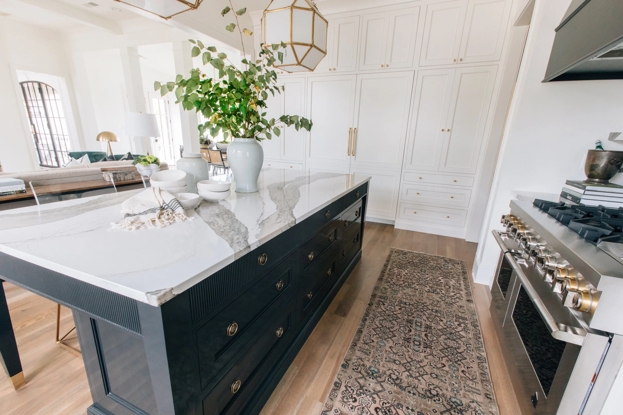
Across the entry the formal living room opens to the kitchen to the right and the dining area at the rear, where light floods in through a wall of windows. In the kitchen, handmade cabinetry from BylerCraft in Whiteville, TN, is the star of the show. Norrid calls the kitchen island a labor of love from the craftsmen. “It has reeded detail all along the sides with hidden drawers built in. It’s high-lacquer black and it looks like an antique chest. The top was almost like a table overlay and the legs are all on little brass casters.”

CityHill_Vesta_Oct26_011.JPG
CityHill_Vesta2020_TopEdit_011.JPG
DSCF2212-Edit crop-web.jpg

Adds Mobley, “One thing we found is unless you work with somebody who really custom makes everything, it's hard to create a vision—something that's not your normal or typical piece. They literally made every detail come alive.” 

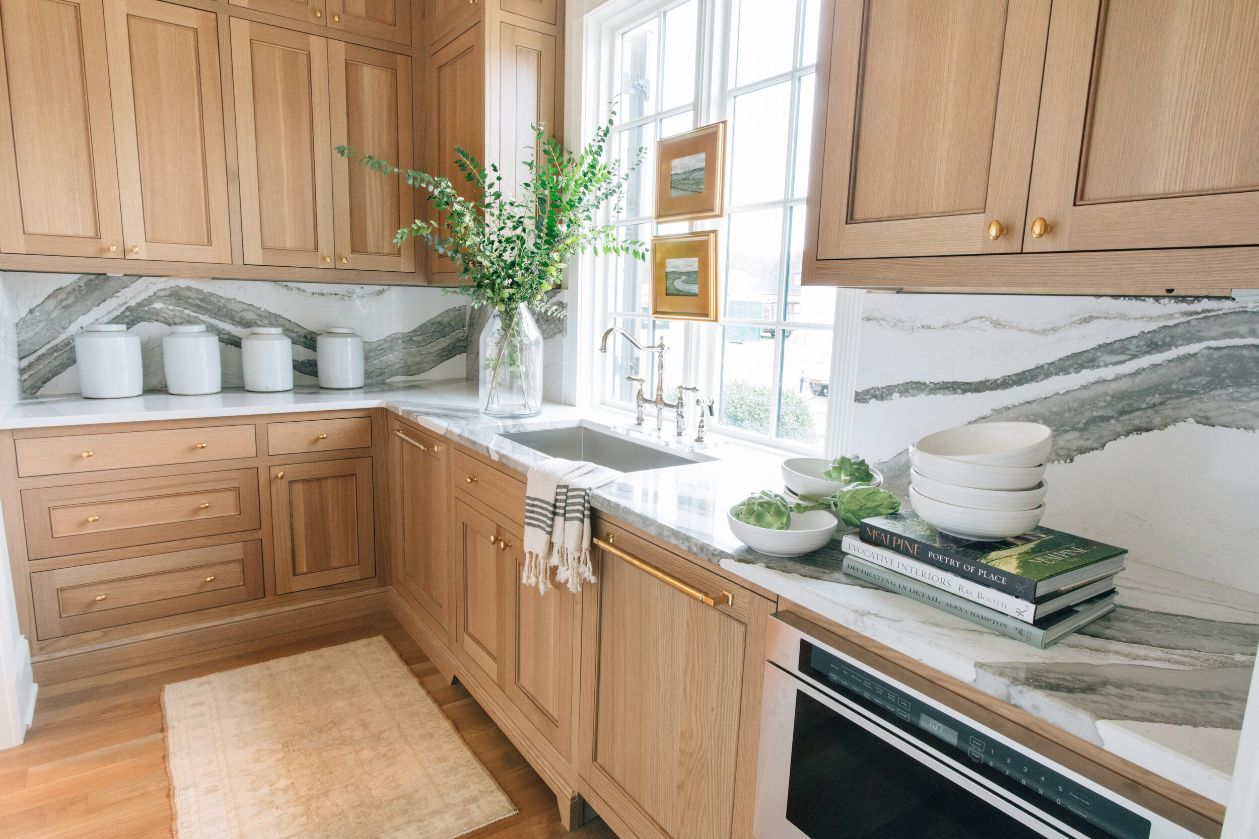
Adjacent to the kitchen, a scullery and butler’s pantry make entertaining a breeze. So much prep space, as well as the home’s effortless flow from room to room and to patio areas both in front and behind create a perfect setup for entertaining. 

Two bedroom/bath suites, the primary and a guest, complete the downstairs.

CityHill_Vesta_Oct26_027.JPG
CityHill_Vesta_Oct26_026.JPG

On the second floor, much of the space is the domain of the homeowners’ teenage daughter. Mobley says she and Norrid had a blast designing the area and took inspiration from decor superstar Kelly Wearstler. The custom upholstered bed and funky light fixture provide a subtle 80’s vibe and the gallery wall is anything but standard. Layered over picture-frame molding, art is attached to chains suspended from the ceiling.

CityHill_Vesta_Oct26_188.JPG

The homeowners requested a home gym and City Hill delivered masterfully. From the mirrored wall to the combination wood/rubberized floor, to the locker-room style closet, the space is the perfect setting for working out, topped off by a custom mural of a stylized Bluff City skyline by Sam Reeves.

That mural is just one of a gallery’s worth of local art pieces Norrid and Mobley placed in the house as a love letter to their hometown. The designers approached a long list of local artists, explaining their all-things-Memphis concept for the show home, and they were amazed by the response. “So many people painted specific pieces just for the Vesta. I was blown away!” says Norrid. 

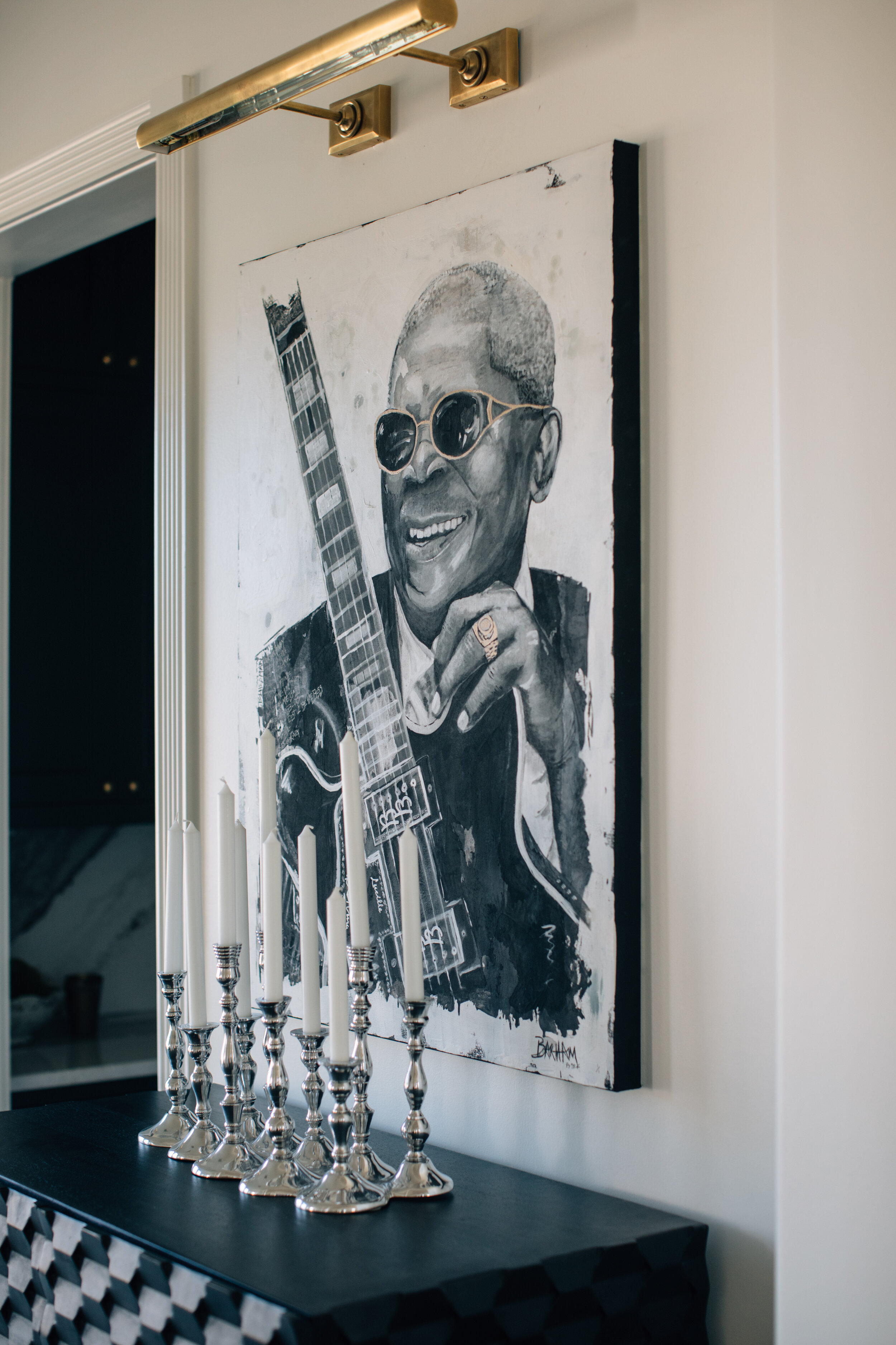
Tiger Hall is home to art from Leslie Barron, Meghan Hurdle, David Butler, Erika Roberts, Katie Toombs, Pam McDonnell, Maggie Russell, Chelsea Fly, Candace Boatright and Drew Barham, who just happens to be the brother of Mobley and Norrid. Not just local artists, the subject matter is also pure Memphis. It spans the landscape from Skateland to Shelby Farms to downtown trolleys. And there’s a who’s who of local music legends: Elvis, Johnny Cash, BB King and Justin Timberlake. The music itself became art in a downstairs hallway where classic albums and singles line the walls in a fun geometric pattern. 

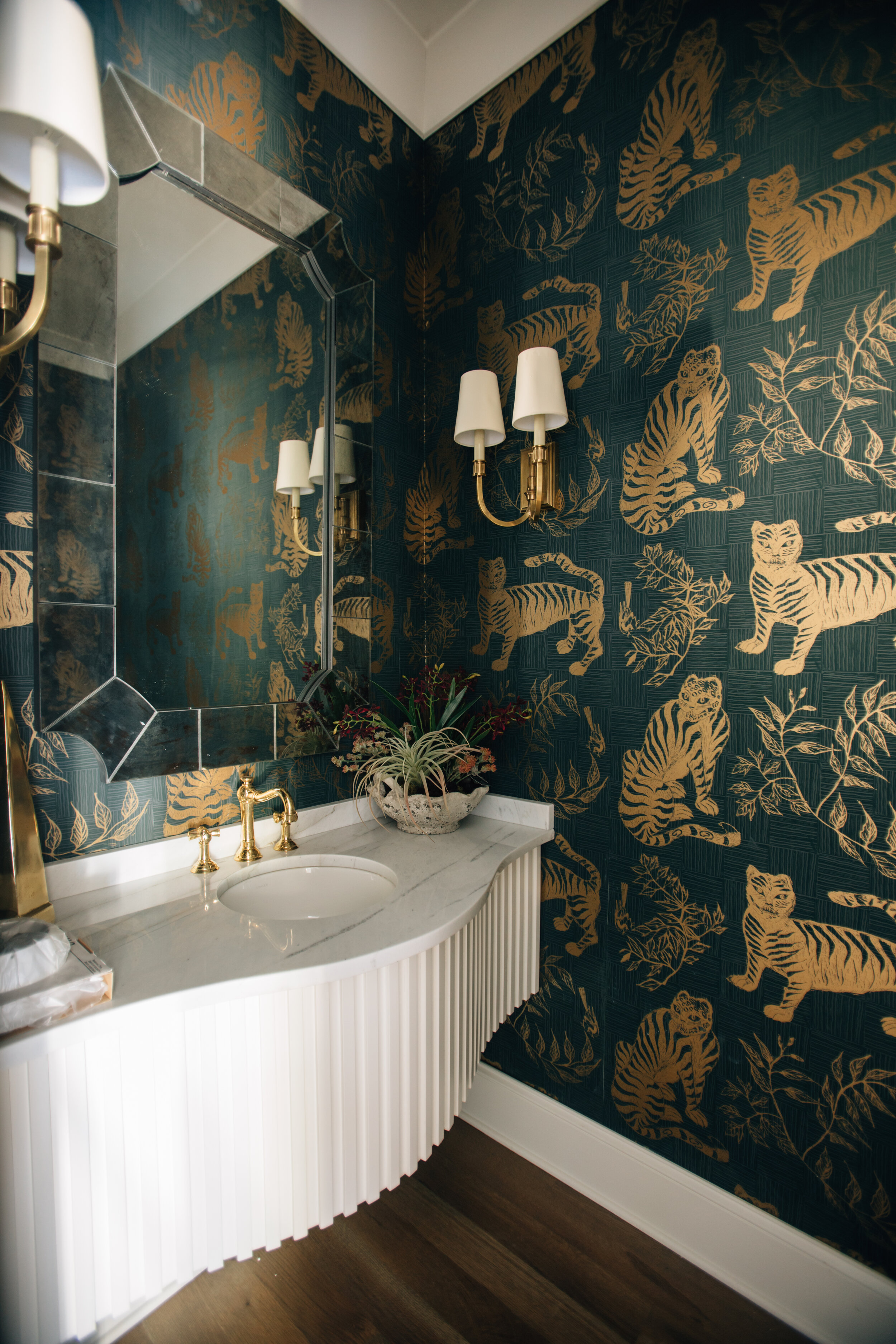
Winks to the Mid South keep coming, but in subtle ways. The built-in kegerator in the bar sports a tap from Grind City Brewing and crushed velvet on the headboard in the downstairs guest bedroom is a modern take on decor from the home of the King himself. Tigers roam on the dramatic wallpaper in the powder room. Local vendors like Elle Woven rugs and Blue Pencil home organization also put their mark on Tiger Hall to create a true showplace with the best of Memphis.

In fact, Norrid says her young daughter proclaimed City Hill’s Vesta masterpiece so recently. “We were out riding in the neighborhood in the golf cart and we went past the house. My little girl stood up and said, ‘Look, Mama, it’s the best stuffs house!’”

Truer words were never spoken.

The Best of Everything

Design by Ann Prince Interiors | Story by Terri Glazer | Photography by Ross Group Creative

When a designer partners with homeowners to outfit a new residence, the task is often to select all new furnishings. That wasn’t the case with this East Memphis house, however. Ann Prince, owner of Ann Prince Interiors, became a specialist in “mergers and acquisitions” for the project, crafting a stunning design aesthetic that blends newly purchased pieces, favorite items from their former house and treasured family antiques with furniture, art and more acquired from the previous owner’s estate sale. The finished product fits the home and family perfectly.

The owners, a family with three school-age children, came to own the house through circumstances so serendipitous that they knew it was meant to be. When they mentioned to a family member who is a realtor that they were planning an addition to their former house, she suggested they look at properties instead.

It wasn’t long before she showed them the house they now call home, and although they weren’t initially planning to move, the homeowner says they love their new place. 

The previous owner had raised her family there and was ready for a new chapter. She was ready to part with some of the beautiful furnishings and extensive art collection she had amassed over the years. The new residents were the fortunate recipients of several pieces of furniture and works of art she placed in an estate sale. Prince used her design expertise to incorporate them, along with the family’s existing furnishings and some new pieces, to create an elegant ambiance that is also tough enough to hold up to family life.

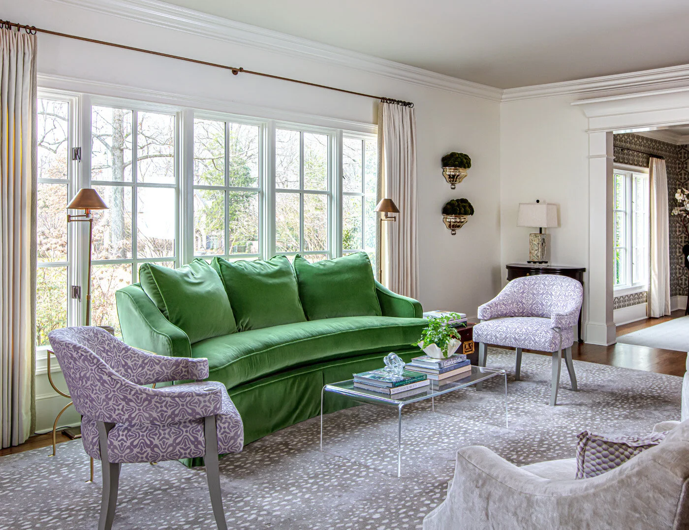
Case in point is the green sofa in the living room. The homeowner fell in love with its graceful curved shape when she saw it at the estate sale. Prince had it covered in the striking upholstery that’s as durable as it is beautiful. “It’s Schumacher Performance Velvet and it’s amazing,” she says. “I accidentally left the fabric sample out in the rain and it looked just as good after!”

LindseyBlack-CrossCreek-SelaviePhotography-19.jpg

The living room is a study in contrasts as family antiques in dark wood blend with glass and lucite tables. Prince mixed neutral prints in the rug and upholstered chairs to add interest in the background.

She continued the theme of old and new, bright, dark and neutral in the adjacent dining room, where an original painting by New Orleans artist Ashley Longshore is the focal point. The antique dining table is an heirloom from the homeowner’s grandmother, but the side chairs are all new. Although their light, neutral look is elegant, the chairs are ready for action; Prince upholstered them in faux leather she describes as “indestructible.” Nailhead detail on the end chairs mirrors the table’s oval shape. Scalamandre printed grasscloth wallpaper once again proves that neutral doesn’t mean boring.

Prince worked her blending magic again in the family room, and set it all off by painting the built-ins in Benjamin Moore’s Galapagos Green—a saturated yet sedate hue. The previous homeowner had the pair of abstracts now above the sofa in a different spot, but they look so perfect in their current placement, it seems as though they were meant to be there all along. The size and scale of comfy armchairs from the family’s former home also work well in their new setting.

Cindy-McCord-Windstone-Outdoor-Living-04.jpg
DSCF2122-comb-Edit crop v2-web.jpg

Just off the family room, a casual dining area seems to bring the outdoors in, taking advantage of the home’s lush, green setting. The gallery-style area is light filled thanks to a full wall of windows that counteracts the weighty design of the rough-hewn wood ceiling. Further down the gallery hall, Prince continued to play up natural elements; she papered the friends’ entry in green Clarence House wallpaper with stylized leaves for just a touch of whimsy.

The kitchen received a facelift, as did several other areas of the home, thanks to Architect David Anderson and RKA Construction. Storage was the homeowner’s top priority and Anderson delivered in spades. From the wall of cabinets and drawers in the kitchen to the “secret” wine closet near the bar area to the mud room with a locker and drawers for each child, there’s a place for everything—even a built-in dog kennel and a Chippendale-style pocket doggie gate to corral Olive the pup. Midtown Cabinetry & Millwork crafted all the custom cabinetry.

The renovation of the master wing included reworking the laundry room and upping its design quotient. A cheerful blue palette that includes eye-catching cement floor tiles makes the thought of doing the wash downright appealing.

The mood is more serene, though, in the revamped master suite. Anderson’s plan reimagined the layout, and the current floor plan is simple and restful. Large windows in the bedroom afford full views of the parklike backyard and pool. The master bath is an elegant blend of marble, white and chrome with soft, blue-gray walls.

DSCF2212-Edit crop-web.jpg

Part of the remodel included adding a downstairs bedroom and bath for the family’s youngest child. Her suite is roomy and comfortable, perfect to “age up” with her as she grows.

Although the beautifully blended house is the star of the show, the home’s backyard is another example of how the current residents have meshed with the former ones. The previous owner was an avid gardener and her labor of love is evident throughout the backyard. Winding paths reveal adorable fairy gardens and surprises, all conceived and created throughout the years by the past owner. The current homeowner admits she isn’t an accomplished gardener, however, her mother-in-law is an expert who often lends her talents to preserving and improving the scenery.

The family enjoys the pool, firepit and back house constructed by the last owner, but have put their own stamp on the backyard with the addition of a hidden batting cage and putting green perfect for boys who love sports.

From the front door to the backyard, the house and grounds are truly a haven. The best of everything, whether newly acquired, from the family’s past, or through the home’s heritage, blends so perfectly it feels that it was destined to become the place this family would call home.

DSCF2256-comb-Edit crop-web.jpg

Colors, Textures, Layers

Design by LaQuita Tate | Story by Terri Glazer | Photography by Annabella Charles

Designer and influencer LaQuita Tate incorporated all her decor go-to’s and transformed her home—without a major remodel.

“Must have art. Must have greenery, texture and layers,” says LaQuita Tate, owner of LaQuita Tate Interior Styling and Design. She has incorporated her mantra into her own home of over 15 years, taking the house from “all beige and boring” to a bold showplace for the items and looks she loves.

Cindy-McCord-Windstone-Outdoor-Living-09.jpg

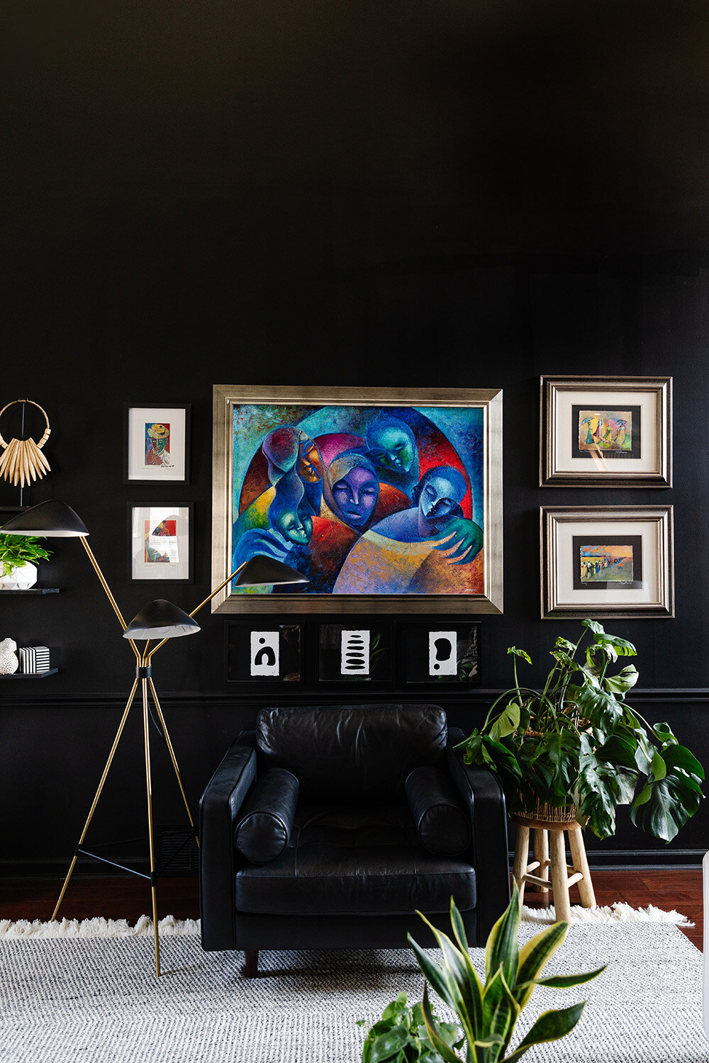
Tate’s signature style is evident from the first step inside the front door. In fact, the door itself foreshadows the home’s interior; it’s painted Sherwin Williams Tricorn Black, Tate’s favorite bold hue. The color appears throughout the house on walls, trim, even a floor, and sets the stage beautifully. The designer says she considers black a neutral, albeit a strong one. “It makes everything you put against it stand out. You can’t go wrong with black,” she explains.

The numerous houseplants Tate nurtures, her large collection of modern art, and the plethora of colorful accessories she has curated all pop against the dramatic yet monochromatic background. Wall shelves seem to disappear, allowing items placed on them to take center stage.

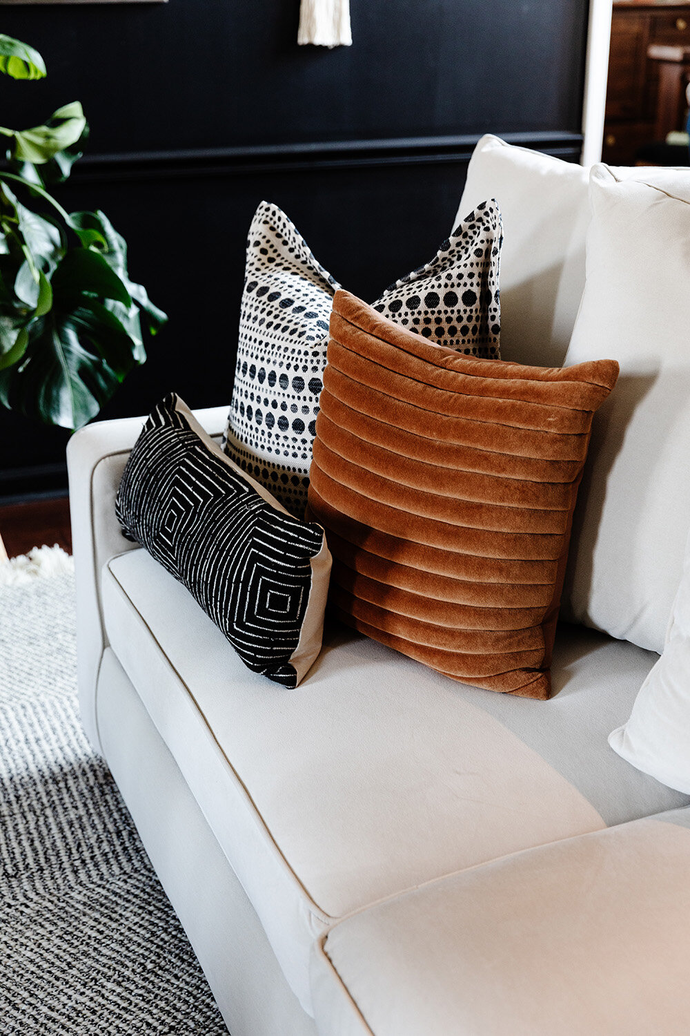
Tate recalls that when she initially took the plunge to paint the room black, she had the painters leave the trim white for contrast. It didn’t take long for her to realize, however, that the look would make a much stronger impact carried throughout. Back came the painters to add Tricorn Black to the woodwork and the fireplace. Contrast now comes through the room’s white sofa, light rug and blonde wood cane chairs.

She carried the theme into the home’s primary bedroom just off the living room with precisely the right amount of black. An accent wall behind the bed is the perfect backdrop for an original painting by Quelly Rue, and a wide strip highlighting the room’s tray ceiling draws the eye up and creates the illusion of height. To finish off the room Tate created several vignettes layering art, plants, coffee table books and even jewelry. She says she loves the original pieces local designer David Quarles, a personal friend, made for her too much to hide them away in a box. “Even when I’m not wearing them, I can still enjoy his beautiful artwork.”

The adjoining bathroom’s bold beauty came to be last year during the COVID lockdown. She took on the redo in June 2020 as part of the popular online series One Room Challenge. Stunning black wallpaper with prowling leopards and jungle flora makes a definitive statement, punctuated by a mid-century style chandelier from West Elm. Tate went out on a limb and painted the bathroom floor, tile and grout alike, with her beloved Tricorn Black. She recalls, “At the time it was going to just be too much to take the tile out, so I thought I’d try paint. I just took a chance; I love it and it’s held up so well!”

The real jewel of the bathroom renovation is the water closet. Tate enlisted the help of her friend and design mentor Carmeon Hamilton to embellish the tiny space, and Hamilton, recent winner of HGTV’s Design Star: Next Gen, hit the mark painting black-on-white geometric patterns from floor to ceiling.

WEBhome-102.jpg
Cindy-McCord-Windstone-Outdoor-Living-04.jpg
Cindy-McCord-Windstone-Outdoor-Living-13.jpg

Tate’s kitchen remodel also supports the notion that a space can gain a whole new life without being torn out and replaced. The floorplan stayed the same, the cabinets got a fresh coat of white paint and new hardware, and Tate brought in a natural element with the addition of butcher block countertops in dark walnut. “I love how the wood warms up the white in this space and adds texture,” she says.

Gray and white hex tiles on the backsplash bring artistic flair to the room, and the new deep, black sink from Elkay is one of Tate’s favorite additions. The open plan leads to a breakfast area that also received a pop of color recently, but here the designer/homeowner veered away from the black that graces so much of her home. The nook’s ceiling is encircled by a unique round molding that she fell in love with the moment she toured the house as a potential homebuyer years ago. That molding now stands out in a bright green tone that mirrors the green of the backyard view out the windows that line the nook’s rear wall.

WEBhome-106.jpg

Tate, who holds a Ph.D. in education and serves as an elementary school principal, makes time for her design business in the early mornings, evenings and on weekends. What started as an interest in beautifying her own space has blossomed into a growing phenomenon with a sizable client list and over 11,000 social media followers who look forward to her frequent posts, including Field Trip Sundays, during which she introduces fans to local design oases like Stock&Belle, Mbabazi, City & State and others.

WEBhome-43.jpg
Cindy-McCord-Windstone-Outdoor-Living-18.jpg
WEBhome-143.jpg

Celebrating the End of Summer

Story & Event Design by Ginni Jones | Photography by Annabella Charles

Summer is quickly coming to an end, and there’s no better way to celebrate the last bit of the season than with a fun lobster boil outside! We set the table with all of my favorites—Estelle Colored Glass stemware, Carthage.Co dinnerware and fun tortoise-shell flatware from Anthropologie—all set on the Provence table from White Door Events. This 10-foot white farm table paired with folding bamboo chairs beautifully and allowed all our guests to be seated together at the same table. And once the sun set, Dina lamps provided the warmest after-dinner glow.

Spring-140.jpg

THE DETAILS FLORALS Wildflowers by Camille | DINNERWARE CARTHAGE.CO | GLASSWARE Estelle Colored Glass| LINENS & FURNISHINGS WHITE DOOR EVENTS | FLATWARE ANTHROPOLOGIE | WARDROBE OAK HALL & J LOWERY

Spring-44-2.jpg
Spring-48.jpg


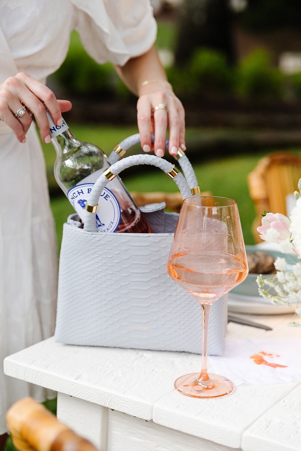
Coming up with the menu was such a fun part of planning the dinner party! Inspired by Nantucket and a classic summer soiree in New England, I knew I had to have a lobster boil. Lobster, shrimp, potatoes, corn and lemons took center stage on the table. For sides and appetizers I turned to Mary Alexander Satterfield. I knew her genius recipes would complete the menu. She prepared prosciutto cantaloupe bites, dill cucumber sandwiches with smoked salmon, cheesy garlic smashed potatoes and summer pasta salad. I knew I wanted oysters on the half shell somewhere on the table, and one important component of dinner was still missing: dessert! So I called on my talented best friend, Caroline Robinson, to make hand-painted cookies that looked EXACTLY like raw oysters. To pair with all the delicious food, my summer go-to, French Blue Rose, as well as the label’s new sauvignon blanc, were crisp and refreshing.


Well Loved, Once Again

Interior Design by M.Steffens Interiors | Story by Terri Glazer | Photography by Ross Group Creative

1O6A5679 edit layers-web.jpg
1O6A5689 edit-web.jpg

When a young couple with four small children was house shopping 33 years ago, the kitchen was one of the main selling points that drew them to the East Memphis house they’ve called home ever since. It was all brand new and spiffed up.

Years go by, though, needs and styles change, and the kitchen that originally wowed the homeowners was in need of a refresh after constant use by a busy family. Local designer Missy Steffens stepped in, along with architect Charles Shipp, to give the couple an updated space without the hassle or expense of a major addition.

The couple couldn’t be happier with their new kitchen. Both Steffens’ design and Shipp’s guidance score high marks with the homeowner. “Charles is wise and he believes in not overdoing where it’s not necessary. We trusted him; everything he does is always in proportion,” she says, adding that Shipp dissuaded them from the idea to do away with their breakfast room in favor of a major kitchen expansion. Instead Steffens spruced it up, adding both flair and practicality.

We sat down with Steffens, owner of M. Steffens Interiors, to hear her thoughts about the key elements she employed in this stunning kitchen transformation. 

1. Efficient Floor Plan: “They have an efficient layout, so we kept the appliances in their current locations. Smaller kitchens can be a challenge to design, though.” she says, “to find a place for everything. For me it's always about fine tuning and getting the cabinetry really symmetrical. Getting those lines of sight and vignettes right makes the day-to-day feel nice and buttoned up.”

2. Moved Microwave: Formerly placed over the range, the microwave is now undercounter, making way for a custom vent hood built by Posey Hedges of Old City Millwork, who also constructed the custom cabinets.

3. Tall Cabinets: Steffens removed soffits and opted for full-height upper cabinets to increase storage and create a more streamlined visual effect. To further simplify the lines, she chose integrated panels that match the cabinets to cover the dishwasher and built-in refrigerator.

01-missy-steffens-greenbriar-revised-athome_01 crop2-web.jpg

4. Classical Color: “We went with a really soft color of paint for the cabinets; we tried to move into almost a putty color to match the countertops, not crisp white. I wanted a hint of gray in it to keep it fresh.”

28-Mike-Murphy-Selberg-1O6A9489-web.jpg

5. Window that Wows: The new plan removed a wooden valance over the top of the window and replaced the original 16-pane window with an updated six-pane model. Although Steffens would have liked to increase the size of the window, a roof gable above prevented that. Instead she cleverly placed a Roman shade to give the illusion of a taller window. Decorative sconces mounted on the cabinets’ side faces give the work station symmetry and style.

6. Farmhouse Sink: Steffens replaced the double-bowl stainless sink with a porcelain farmhouse model. The homeowner loves how large and deep it is.

7. Mixed Metals: The decorator chose unlacquered brass cabinet knobs and handles. “I love the patina of them,” she says, noting that they were bright and shiny when they were installed, but with use they’ve aged to a mellow finish. Alongside, polished nickel sink fixtures blend perfectly, adding interest to the palette.

8. Minimized Materials: Taj Mahal quartzite countertops have movement without busyness. Steffens opted for the same stone for the backsplash and carried it to full height for simplicity’s sake. “Since it’s a smaller kitchen I used fewer materials to keep the look clean,” she explains.

9. Without Worry: While some kitchen renovators shy away from hardwood, Steffens encourages her clients to use the classic floor covering, with a condition. The finish must be polyurethaned to protect from spills and scratches.

08-Mike-Murphy-Selberg-1O6A8824-web.jpg


10. Form and Function: In the space that formerly housed the laundry closet Steffens designed a breakfast server that’s as practical as it is beautiful. “I felt like that area really takes the pressure off her kitchen. It gives her more storage and it’s great to set up a bar or serve there, too,” Steffens says. 

11. New Heights: Homes built in this era usually don’t have ceilings as high as those often found in newer residences, but Shipp suggested a way to give this house the illusion of height. He raised all the cased openings as high as possible and replaced a window in the breakfast area with French doors that extend to the full height of the wall.

12, Wallpaper for the Win: Steffens warmed up the breakfast room walls with wallpaper in a just-right color. “I wanted a pattern, but also wanted it to be saturated enough to come off the family room, where the walls are paneled in original dark wood. I also wanted it to kind of seem like it had texture. The scale of this pattern and how it’s printed feel a little bit Old World and I thought it fit in nicely.”

13. Appealing Art: “The homeowner collects portraits,” says Steffens. She saw this piece at David Lusk Gallery and she loved it. It’s by Anne Siems, an artist from Seattle. I love it, too. With portraits, you always have to be drawn to the faces. This one is anonymous, yet with a soft, inviting expression.” 

Timeless with a Twist

Staging & Redesign by House of Chic | Story by Terri Glazer | Photography by Annabella Charles

East Memphis newlyweds tackle a total renovation to combine their lives and their favorite furnishings in perfect harmony.

Jennifer Jones Landrum says that when she and her now-husband Mike Landrum were introduced a year and a half ago, they were “instant soulmates.” They married within a year of meeting, and why not? They knew they were meant to be together.

Cindy-McCord-Windstone-Outdoor-Living-09.jpg

Eager to find a new home to start their life as a married couple, the pair purchased a 30+-year-old house in an East Memphis gated community in January 2020. Jennifer wasted no time in coming up with a total renovation plan to wake up the property she describes as “sleepy, but with great bones.” Despite delays brought on when the COVID pandemic hit two months later, the Landrums moved into their home in November, and they couldn’t be happier. Jennifer’s design aesthetic produced a fresh setting, the ideal backdrop for all things newly married. She and Mike both brought favorite furniture, art and accessories into their combined home, completed by a few special pieces they acquired together to make the place truly theirs.

Having been somewhat neglected for the past few years, the house needed a head-to-toe update, and no one was better prepared to take on a project of that scale. The owner of Staging & Redesign by House of Chic, Jennifer is an Accredited Staging Professional and a member of the International Association of Home Staging Professionals. “I always tell my clients ‘fresh is in,’” she says, and she heeded her own advice in her personal project. To revitalize the facade, she reworked the front porch, changed the front door, and painted the brick. All new landscaping completed the transformation.

LindseyBlack-CrossCreek-SelaviePhotography-19.jpg

The interior, once dark and multi-colored, has new life thanks to fresh white paint throughout. Says Jennifer, “I wanted an all-white house because we have quite a bit of art, and white really makes artwork pop.” To achieve a more open feel, the reno plan also included raising every door header to 10 feet high, and replacing all the light fixtures.


Taking furnishings from two mature people who have spent years acquiring their own pieces and meshing those into one cohesive design could present a real challenge, but Jennifer says that was not the case when it came to marrying her things with Mike’s. She points out pieces in the home’s entryway as a perfect example. “The chest was his, but the mirrors above it were mine,” she says, adding that the ease with which their items blended affirms that fact that they were meant to be together.

Expert Tip: Jennifer’s rule of thumb when working with an all-white paint palette is to use the same color, in different finishes, on the walls and the trim. “White oxidizes over time, so if you choose different colors the trim and the walls will eventually change differently. For a clean, sleek look I use one color so everything oxidizes the same.” She chose Decorator’s White by Benjamin Moore for her home.

The dining table is new, purchased from The Back Room by Bella Vita to fit their current lifestyle. “Our whole key with this house and this time in our lives was to make everything user friendly. We use this dining room all the time for everything from parties to pizza night,” Jennifer says. Much-loved upright hutches from the couple’s previous homes play well with the pedestal table’s washed finish. The room gets a punch of pizzazz from the ceiling, papered in a metallic geometric pattern from Thibaut. She explains, “I love accent walls. I often suggest them for my clients, so I decided this ceiling was the perfect place for some interest.”

webhome-44.jpg
webhome-35.jpg
webhome-35.jpg

The kitchen that was dark and closed in is now light-filled and inviting. New white cabinets, a massive white quartz island and a couple of show-stopping light pendants in champagne gold are the stars of the show. The island’s acrylic barstools are the perfect perches for morning coffee thanks to their placement across from a large picture window. Once closed off by shutters, the window now opens to a lovely garden vignette.

Jennifer designed the keeping room adjacent to the kitchen with a rather unconventional furniture layout, but she says it’s a big hit. She grouped an assortment of swivel chairs in what she calls a “conversation circle” so family and guests seated there can easily turn to face one another, focus toward the kitchen, or view the pool and the new open-air porch outside the room’s back window. Jennifer designed the cozy veranda, repurposing plantation shutters removed from the kitchen to provide privacy.

.Past the keeping room sits the home’s comfortable family room, a large space with an inviting sectional sofa, a hammered-steel top dining table that Mike brought, and an original diptych by local painter Katie Toombs. “It’s of Shelby Farms,” Jennifer says, “Mike and I love to walk out there so it was fun to find those two paintings.”

“Marrying” the two gathering areas is a wine bar area Jennifer conceived to provide a segue as well as easy beverage access from the pool. The granite countertop came as a happy surprise, a perfect fit repurposed from the master bathroom vanity, and the wallpapered panel on the wall gives the spot depth and dimension.

The downstairs master bedroom is a tranquil retreat, but the adjoining bathroom is the part of the home which underwent perhaps the most major transformation. Its unusual “his and hers” layout and long, narrow configuration had turned away previous would-be buyers, but Jennifer, aided by architect S Berry Jones, reimagined the area and created a luxurious spot that suits her needs and Mike’s to a T. Gone are the two tiny shower stalls and two separate water closets. A stunning oversized shower area and a soaker tub across from it now anchor the room. Jennifer repeated marble rectangles accented with coordinating penny tile trim to create visual flow between the fixtures. To-the-ceiling mirrors with lighting embedded over two vanity areas give the room a soaring feel. And Jennifer says separate vanities, as well as closets, are a godsend, given her and her husband’s opposite organizational styles. “He’s neat. Everything is perfect in his area. The first time I saw Mike’s closet [in his previous home] I laughed and said ‘If we ever get together, we’re going to need separate bathrooms.’ Fast forward and here we are!”

WEBMurphy-Mont-Alban-16.jpg
webhome-93.jpg
webhome-2.jpg
wwebhome-82.jpg

As a seasoned home stager, Jennifer knows well that taking things that have been in separate places for years and throwing them together could result in a design disaster, so she called on all her professional skills to create a cohesive look in her own house. “We both agreed to take our best things, our favorite things, blend them, and still try to get a fresh look.” Asked if it was hard for either of them to let go of anything, she replies, “Both of us were in a place where we were ready and we really wanted this to be our home.” Art is important to the Landrums and holds a place of pride in their house. In addition to the paintings by Katie Toombs, their collection includes pieces by artist Rana Rochat and others. In the home’s main hall a large commissioned work by Florida collage master Debo Groover is yet another example of the effort the couple made to knit their decor together. Through countless photos and multiple Zoom meetings, Groover was able to incorporate the exact colors of beloved pieces in their home into the work. 


It’s clear that Jennifer loves her house and the happy new phase of life it represents for her and Mike. “This is our story. The way I look at it is, it’s timeless with a twist. It was fun to take it through renovation to what it could be,” she says. “It had great bones; it just had to be rediscovered and given a fresh feel.”

webhome-95.jpg

A Home Reimagined

Interior Design by Robin Selberg | Story by Terri Glazer | Photography by Ross Group Creative

 It may have started with a small idea, as home renovations often do, but as the recently completed project at this Germantown home grew in size, it also gained approval from the homeowners, the designer and the contractor. “One thing we all agree on is that all the things we did we would do again,” says Michael Murphy of Murphy Custom Homes, who conceptualized and oversaw the job. “It became a bigger project as it went along, but it all turned out well.”

Cindy-McCord-Windstone-Outdoor-Living-09.jpg

Interior designer Robin Selberg recalls, “It all began with the homeowner telling me she thought she would need a new refrigerator before long and maybe she wanted to paint the kitchen cabinets.” Selberg had worked with the couple when they built the house in 2006 and on subsequent projects, so she was happy to help her long-time clients and friends with another update.

LindseyBlack-CrossCreek-SelaviePhotography-19.jpg

As the family had lived in their home for almost 15 years, their needs had changed. Says the homeowner, “We originally built the house to raise kids in. We wanted everything comfortable and I didn’t want to have to worry about people breaking things.” Now, with the children older and transitioning to adult life away from home, the time had come to make some adjustments in the house. Although those plans started small, Selberg and Murphy steered the homeowners to a major rework of their dining room, kitchen and laundry room, and they couldn’t be more pleased with the finished product. 

Selberg knew the client had wanted to change the layout of her kitchen for a while, and this seemed the perfect time for a redesign. Murphy’s vision included a complete reimagining of the kitchen, as well as an adjacent bar area/butler’s pantry which led into the dining room. On the other side of the kitchen, Murphy took out an oddly-shaped and seldom used home office to create a larger laundry room with all the bells and whistles, including an entire wall of storage space.

“When the house was built, having a desk area around the kitchen was much more popular, but not anymore. People don’t work from desktop computers as much, so taking the office out made sense to get this amazing laundry room. This was one of the biggest ‘trust me’ moments we had with the clients in this project, but it worked out great.”

— Michael Murphy

The homeowner agrees that while it was initially a little difficult to give up existing storage space in the office, the original bar area and the butler’s pantry, the new layout has more storage than she could have imagined. Thanks to organizational help in the laundry room, kitchen and pantry from Trazo Design, there’s a place for everything, with room to spare.

Cindy-McCord-Windstone-Outdoor-Living-04.jpg
WEBMurphy-Mont-Alban-02.jpg

As the scope of the project expanded, it became clear that new cabinetry was a must-have. Murphy turned to Old City Millworks for the kitchen cabinets, storage wall and cabinets in the laundry room, and a unique piece for the dining area that became a game changer for that room, which is long and a bit narrow. The homeowner previously had a buffet for storage on the wall closest to the kitchen, but the placement caused a tight squeeze when guests were seated on that side of the dining table. The elimination of the six-foot wide butler’s pantry on the other side of the dining room wall opened up a perfect alcove for a custom built-in cabinet that is as beautiful as it is practical. “You wouldn’t see that in a design for a new home,” Murphy points out. “But sometimes when you undo walls in a renovation opportunities come up and this is a great example of that. It’s a special touch.”

The cabinet is completed by custom monogrammed door knobs sourced from Graham’s Lighting, as is all the new hardware and lighting in the house. Selberg added new sconces, wallpaper, drapes and upholstery for the dining room chairs to complete the design.

The rest of the space gained from the elimination of the butler’s pantry went into the reworked kitchen. Murphy’s plan recessed the refrigerator into the area to create more floor space in the center of the room. That enabled the addition of two center islands to open the kitchen more to the family room, a goal the client had had for some time. The new, more compact bar space pays homage to a feature of the original design that the homeowner always loved. Small square tiles in a glamorous mother-of-pearl tone cover the counter and backsplash. An original painting by local artist Pamela Hassler, set off by a handsome brass picture light, tops the area and plays well with a pair of modern brass-toned barrel pendants over the island that serves as the home’s casual dining spot.

Selberg incorporated the family’s collection of works by Mid South artists including Paul Edelstein, Shelley Bolton, Leslie Perry and Hillary Butler and added a pair of contemporary abstracts on Tibetan paper by Lisa Weiss, sourced from L Ross Gallery, to the home’s newly designed entryway. 


WEBMurphy-Mont-Alban-16.jpg
webhome-2.jpg
webhome-48.jpg

Although she’s pleased with every part of the project that began with the need for a new refrigerator, the homeowner is thrilled with the cedar beams Murphy was able to restore to the family room. The home’s initial design included similar beams, but they had been reworked as part of another project a few years ago, and the second version had never measured up to the originals. To achieve the more open floor plan, Murphy needed to install steel beams to replace load-bearing walls. He called on master woodworker Wade Burrus to cover them with wood and to recreate the square pattern the client so missed. The handsome, rough-hewn cedar brings a cozy, lodge-style feel to the area where the family spends most of their time.

Similar skilled work shows throughout the project, literally from ceiling to floor. The renovation included changes in areas that were floored in antique brick. Fortunately, Selberg was able to locate matching pavers and have them laced in so seamlessly that they appear to be original to the house.

That level of expert workmanship, the vision of the general contractor and the creativity of the designer combined to take this renovation from a small change in the kitchen to a whole new version of the home that is the ultimate blend of beauty and practicality. 

Timeless Design

Interior Design by Kimberly Bacon Interiors | Story and Photography by Ross Group Creative

It was time for a change. After raising their family in their home of 15 years, Mike and Bobbi Landreth considered their next steps. With children now grown and out of the house, the Landreths considered the cost of renovating and updating their over 4,500-square-foot home to give it the more open and timeless quality that they desired. However, as homebuilders, they knew their own dilemma well and realized that such a renovation would cost more than they were willing to invest. After further consideration, they concluded that they wanted a smaller home with less maintenance. They decided that it was time to sell and move. 

1O6A5679 edit layers-web.jpg

Realizing that they needed to make a few cosmetic changes to their house before listing it, Mike and Bobbi sought the help of interior designer Kimberly Bacon to assist in changing some paint colors and in staging their home for sale. This new relationship clicked; Bobbi recalls how well they connected with Kimberly and trusted her to make the necessary changes to put their home on the market. With the update complete, they got an offer the first day.

The couple had drawn up preliminary plans for their new house and engaged a long-time associate, architect Mike Trexler, to assist them. And after seeing the success of Kimberly’s design work in staging their prior home, they brought her in to lead the design process for the new house. Bobbi notes that Kimberly chose everything from “driveway to door knobs.” “We put our trust in her and turned her loose,” she recalls.

1O6A5715 crop color-web.jpg

The Landreths chose Derek Eller of Eller Construction to build their new home in the Piperton Preserve neighborhood just east of Collierville. This development offered a relaxed, country feel only seven minutes away from their previous neighborhood, and still near to the city of Collierville. The location was also convenient for them to travel to Pickwick Lake where they like to spend time. Another attraction was the modern farmhouse feel of the homes; their previous house had a French country influence, and they were ready for a change. Also, Piperton Preserve has plans for integrating walkable retail and restaurants into future development, and the couple really liked the idea of having these amenities.

At the top of Mike and Bobbi’s wishlist for the new house was an open floor plan with traditional, timeless design and finishes. They wanted a home that could change with them and that could be updated easily over time at little cost as trends change. Bacon suggested a classic backdrop with neutral finishes; colors and textures would be introduced through fabrics and furnishings. And for the open plan, the hub of the house became a U-shaped kitchen with a freestanding island overlooking the main living area. These rooms are also open to the dining area and overlook the patio and backyard. 

In the kitchen, white Shaker cabinets and stainless steel appliances provide the timeless backdrop. Trimmed with a cove molding, the cabinets rise to the ceiling and are stacked back-to-back in the island to provide ample storage. Adding to the neutral hard surfaces are a white and gray stone countertop and a white ceramic tile backsplash laid in a herringbone pattern running to the ceiling on the kitchen walls. Even the pendant lights over the island are neutral—their clear glass construction and stainless steel trim coordinates perfectly with the appliances and the cabinet hardware.

In contrast to this backdrop, a pair of windows flanks the vent hood and provides an opportunity to introduce Roman shades in a bold blue, green and purple fabric with a floral watercolor pattern. This fabric, along with the colors in the new living area rug, provided the color inspiration for the rest of the design. Since the rooms are open to each other, Bacon used the same watercolor fabric in the dining area drapery and on accent pillows in the adjacent family room, lending to her cohesive design plan. The blue upholstery on the island barstools and the blue-green watery tones of three ceramic platters mounted above the cooktop complete the colorful accents in the kitchen.

28-Mike-Murphy-Selberg-1O6A9489-web.jpg

In adjacent rooms, the walls are painted an off-white, buff color one shade darker than the white of the trim and the built-in bookcases of the main living area. As in the kitchen, the floors are a medium-dark wood tone with a contoured, scraped finish. In the dining area, the table, chairs and buffet came from the family’s previous home. Bacon added color with the watercolor drapery as well as a rug and artwork in blue tones. In the living area, the neutral tones of the sectional sofa and the hard surfaces contrast with colorful accent pillows, newly upholstered chairs from the old house, and new blue and white drapery. In this room Bacon also implemented a fireplace accent wall in a blue tone. This is a colorful design element that could be changed easily in the future at little cost checked off another item on the homeowners’ wishlist. Bacon’s focus on future design flexibility is also evident in the items on display in the wall of bookcases in the main living area. These include sentimental family heirlooms like Bobbi’s grandfather’s binoculars as well as mementos from the couple’s travels.

08-Mike-Murphy-Selberg-1O6A8824-web.jpg


In the primary bedroom, Bacon maintained the neutral color palette by using browns, beiges, blacks and grays. Incorporating the sofa from the previous house, she brought in new pillow fabric to tie the sofa and new custom-made bed together, and she used another easily changeable accent wall in the bedroom to highlight the bed. In the primary bathroom, the same neutral tones are on display. White Shaker vanity cabinetry topped with white and gray stone sits on a dark gray tile floor. This same tile lines the wall surrounding the soaking tub for more interest. The room is calming, clean-lined and transitional in feel.


In describing Bacon’s style, Bobbi observes that there is an “elegance about her work” but it is “still down to earth.” It’s clear that the designer/client relationship on this new project has been a success. The couple has built a timeless home that can change with them into the future and has gained a good friend in the process. Bobbi describes how much she trusts her work and her style and mentions she’s looking forward to another project. Turning the conversation for a moment to her Pickwick house, she wonders, “When can I get Kimberly here?”

Lake Life Redefined

Design by Warehouse 67 | Story by Terri Glazer | Photography by Annabella Charles

 Kim Loudenbeck’s latest project, her recently renovated home on Pickwick Lake, brings a new definition to lake life. Asked to tell the story, she begins this way: “We've been in our [Eads] home almost three years now and we had the urge to tackle a new project.” 

Cindy-McCord-Windstone-Outdoor-Living-09.jpg

The interior designer and owner of Warehouse 67, a self-confessed “project addict,” attributes her desire to create beautiful spaces to her childhood spent drawing and painting. “To me, renovating a house is like creating a three-dimensional work of art. I get to envision what’s in my head and make it a reality.” And she continues with a laugh, “I’ve never met a house I didn’t like! Every house I go into, I see what it could be and it just makes me so excited and gives me so much encouragement to transform it into a space that people can live in and enjoy.” 

Not wanting to move her family again, Kim and her husband Jeremy initially considered flipping a home in the Memphis area, but low inventory in the Mid South real estate market made that challenging. They broadened their geographic range, considering the possibility of operating an AirBnb in coastal Florida, and even as far away as Scotland, but ran into a series of roadblocks that eventually led them in a different direction. 

LindseyBlack-CrossCreek-SelaviePhotography-19.jpg

After helping several clients with houses at Pickwick, Kim started to consider a home on the lake. “What I was hearing was that everyone has either a place that’s been passed down in their family for years, or a custom-built new home on the lake. You rarely ever see a beautiful turnkey house that's been renovated to become the best version of a lake home,” she says.

After about a year of looking, the couple came across what they saw as the perfect opportunity in the Riverton, AL, area. The 1984 ranch home checked off all the boxes they wanted for a renovation: a large lot, waterfront access and a panoramic view of the water. “I can always change a house,” says Kim, but you can’t change the location.” 

Once they completed the purchase of the house in July 2020, the family spent the summer enjoying Pickwick Lake, as well as the hiking trails and waterfalls in the Riverton area. They fell in love with the historic area and neighborhood. Over the summer she reached out to other local homeowners to learn what they loved most about their lake houses. She found out that some of the most popular features are a large gathering room, lots of places for people to sleep, a well-appointed kitchen, a covered porch and outdoor living areas, so she set about making plans to reimagine their 1,500-square-foot place into the perfect getaway spot for the family.

 “I love taking spaces and transforming them into something that people can enjoy and that fits with the setting. I’m so grateful that I was able to realize the vision that I had in my mind for what this home could be. It is now as beautiful as the view and the location where it sits.”

 —Designer and homeowner Kim Loudenbeck 

Cindy-McCord-Windstone-Outdoor-Living-04.jpg
“Our big three must-haves were function—something we could live in—a nice dining room we could entertain in, and a place for the bourbon to live and be celebrated.”—Homeowner Kayla Arcuri

By October the plans were finalized to double the square footage of the home. Demo began the week of Thanksgiving, overseen by the Loudenbecks. Kim explains that they wanted the project moved along so it would be finished by this summer. “It’s harder when it’s far away. Once you start, you want to get to the end result and just be able to enjoy it. By doing it ourselves we were able to meet that deadline.” They called on subcontractors with whom they had existing relationships in Memphis for part of the work, and also used local workers from the nearby area. 

As was the case with most everything in 2020, the renovation had special complications brought on by the pandemic. “Trying to rebuild during Covid with all the product shortages and challenges, to say it was hard is an understatement,” says Kim. She admits, “We've had to be way more hands on with this project than on any other we've ever done. Even though it's been stressful it's been good because I've learned new things. We even hauled loads of building materials up there ourselves to keep the job on track! I don't know how many miles we put on our vehicles, but now that it's done in record time, six months from start to finish, it's so worth it.” 

Kim says she loves the fact that the home isn’t a typical “cookie-cutter” new construction. “We kept the beautiful characteristics that were there and we added to it in a way that was harmonious with the original structure. It makes for a very unique home that is intriguing and interesting visually. You never know what's around the corner, and I think that's part of the charm of this property.” 

“It had a natural stone exterior, very typical of the area,” says Kim. “On the new addition we added stone to complete that feel and to make it seem like it's been there all along.” The project included a complete gut of the two-story section of the home along with rebuilding the single-story side to make it two-story as well. 

Maximizing the waterfront location was the Loudenbecks’ first priority. To that end, they replaced walls in the living room and kitchen with 16-foot sliding glass doors to provide expansive water views. Two of the three bedrooms upstairs have a pair of full glass window walls for panoramic views. “You almost feel like you’re floating on the water,” says Kim. 

She describes the biggest challenge in any renovation project as the limitations involved in working around a footprint that is already established. “We've done a lot of new construction and with that the sky's the limit—you can put walls where you want them. But when you're married to a footprint you have to get much more creative on how you utilize that space.” Despite the constraints, she feels like they were able to pack a lot of features into the lake redo.

Designwise, the location of the home gave Kim a sense of freedom to push the limits a bit more than usual. “Here in Memphis you kind of have to keep in certain parameters when you're designing. At the lake I felt like I was a little bit more free to do things that I normally wouldn't do for a main home,” she explains. 

In her planning of the space, Kim wanted to use a mixture of more modern pieces with traditional elements to redefine lake living. “So many of the lake homes I have been in have either been older homes with a reflection of past generations or newly built homes with a mountain lodge vibe. I wanted to create a space that incorporated all of the natural elements of its surroundings with a fresh approach that is current and relaxed.”

LindseyBlack-CrossCreek-SelaviePhotography-13.jpg
webhome-2.jpg
webhome-48.jpg

Kim used textural details and natural colors to achieve this. One bedroom has the shiplap look, painted in deep navy to give it a pop of color. In another she added green wainscoting. The bonus room is designed in a relaxing natural palette with an unexpected colorful focal point—the American flag that once flew on the original home. 

In the kitchen, blue-gray cabinets with antique mirror panels, waterfall-edge countertops and gold hardware elevate the design but stop short of making it formal or fussy. Kim even extended the design into the pantry, an often neglected area of nondescript shelving. “The pantry is so cute and cozy,” she says. “We put in cabinets and a countertop. We increased the depth of the wall cabinets and brought them all the way down to the countertop, making it an extension of the kitchen; it doesn't feel utilitarian at all!” 

At just under 3,000 square feet, the renovated lake house is a bit smaller than most of the projects Kim undertakes, but that presented a distinct advantage when it came to design and furnishings. “Because there aren't as many pieces, it allowed me to hand pick every one for its character and charm. The home is beautiful in itself, but I was able to layer on even more interest with the furnishings and the fixtures,” says the designer. 

Kim’s affection for her pandemic project is evident in the way she describes it. Although the Pickwick home is dear to her heart, she can’t neglect her passion for projects, so it’s probable that she’ll take on another challenge before too long. She says, “We're looking forward to enjoying it this summer, but we never know what the future holds. I know myself and I know that I'm going to want to do another project. I always tell people, ‘It's not if I do another project, but when." 

Celebrating Spring

Story & Event Design by Ginni Jones | Photography by Annabella Charles

Spring-140.jpg

The Scene:  Since outdoor festivities are just now starting to happen again—how about lunch in the nursery at Millstone? Everyone needs a little fresh air these days so the nursery and greenhouse were the perfect location for this luncheon. Overflowing with green and blooming plants, it was a stunning backdrop to set the scene. 

Spring-44-2.jpg
Spring-48.jpg

The Setting: The table was set with all the best. From a beautiful mix of hand-painted Herend china to pastel mint and blush martini glasses by Estelle Colored Glass, the table was nothing short of spring soiree ready! But the real star of the show was the centerpiece, the silver Milan three-tier display from White Door Events, filled with lush green and blooming plants in aged terra cotta pots from the nursery. Tricia Hunt, owner of Millstone Marketplace, even provided some of her fresh-cut tulips to top off the lush spring look. Above the centerpiece, Patra and Hera Pendants chandeliers from White Door brought the vignette to full scale, completing the feast for the eyes to go along with the delicious meal. The pendants added a beautiful mix of natural woven and aged metal materials. Not to be missed from the tablescape were White Door’s adorable Dina mini lamps—cordless yet powerful, providing enough light to highlight the table. Table linens and chairs were also sourced from White Door. The Faux Bois chairs provided the perfect touch of garden chic to sit in while being surrounded by the greenhouse plants.

In addition to the gorgeous table, a lovely lounge section gave guests a spot to relax while enjoying desserts. The light blue and corals of the Tristan sofa and Persimmon dot pillows were the perfect addition to all the green around the venue. White and ivory velvet Neely chairs, paired with teal dot pillows, gave the perfect vibrant pop, balancing out all the colors involved. And last, but certainly not least, the power of accent tables: no lounge section is complete without them. The gold Bali side tables and Berlin coffee table brought a much-needed metallic shine to the scene.

The Sweets: 17 Berkshire’s new spring menu was perfect for the lunch. The mix of all the springtime flavors owner Nuha Abuduhair creates is magic! To-die-for desserts included Lemon Lavender Entremet, layers of soft lemon cake with lavender creme, topped with a candied lemon wedge and a lavender macaron; Hummingbird Cake, sweet spice cake layered with cream cheese mousse with white chocolate ganache; the Grapefruit Rose Tart, a delicate grapefruit curd infused with a touch of rose water; the Rosie, rose water mousse with a tart raspberry center; Opera Cake, joconde soaked in espresso and layered with chocolate ganache and espresso buttercream; and finally, the Bavarian Eclair, a vanilla bean cream stuffed eclair, simple and delicious. For the dessert table, Laura Park Designs paper plates and cocktail napkins the brightest patterns added a fun accent. These new designer paper plates and matching napkins make any picnic more extravagant and beautiful. 


The Style: After over a year without events & dressing to the nines, now every occasion calls for a fresh, new outfit - and this luncheon was no exception! Oak Hall was the perfect stop for all things Spring. Whether it was a flirty maxi dress or bright spring top, their women’s department was overflowing with an array of bright colorful options to start off Spring on the right foot. Also available at Oak Hall is the local handbag line J LOWERY, their new spring collection has just hit the shelves and is sure to be a sell out! All your favorite bags, in fresh pastel colors and textures - feathers were even spotted, how fun!  


Trusting the Vision

Design by Lindsey Black Interiors | Story by Terri Glazer | Photography by Sélavie Photography

When Kayla and Nick Arcuri bought their Jackson, TN, home they knew they’d need to do some major decorating. Being cultured, educated people, they set out to find the perfect furnishings for their new abode on their own. 

After a series of missteps and a lot of stress, the couple found themselves completely frustrated. “I was having difficulty picking things that made sense,” Kayla recalls. “We brought home several items and none of them worked for the house. It was driving us up the wall!” With a baby, a toddler and two careers, the busy couple decided it was time to call in a professional.

Cindy-McCord-Windstone-Outdoor-Living-09.jpg

So they started their search for help using social media, a resource that might seem a bit unconventional to some. But, as interior designer Lindsey Black puts it, “I’m not your mother’s decorator.” The owner of Memphis-based Lindsey Black Interiors says many of her clients find her through her Instagram, Pinterest and Facebook posts.

Once the clients and designer connected, plans began to make the home beautiful and functional and to customize it to fit the Arcuris’ unique needs. Built in the mid 90s, the brick Georgian received a major modernization from its previous owners. The result is an open-concept living area that includes the entryway, living room, dining room and kitchen. Black says her task was to bring color and interest into the wide-open spaces and make them feel polished yet still homey and practical for a family with children and dogs. She describes her design aesthetic for the project as “modern mix.” 

To achieve the look Black started in the living room, a cavernous area with soaring ceilings with clerestory windows flanking a fireplace. She cozied up the space by removing oversized white built-in cabinets, the kind used to house large stereo equipment in the era in which the home was built, and adding scaled-down natural wood shelves in their place. A custom painting by New Orleans artist Sarah Ella Cole tops the mantel, helping to define boundaries.  After visually reducing the area to a more manageable size, Black filled it with comfortable upholstered pieces in neutral tones. Performance fabrics prevent worries over spills and other child-related mishaps. A pair of armchairs brought from the Arcuris’ previous home blends in seamlessly and two Noir Furniture coffee tables echo the natural wood look of the shelves. “Because the room is so big, I wanted to use two coffee tables. That way every seat in the room has access to a spot,” she explains. Their separated placement keeps the tables from looking too heavy and their natural construction makes them match, but not match,” she explains.

Two nondescript ceiling fans that formerly hung in the living room didn’t do the space justice. In their place Black chose a Visual Comfort modern chandelier that is part light fixture, part work of art. Says the designer, “I knew that whatever we put there had to be large in scale—that’s a huge vertical space—and really unique and impactful. I love how sculptural it is and also that it’s uplighting so it’s not harsh when it’s turned on.

Cindy-McCord-Windstone-Outdoor-Living-04.jpg
“Our big three must-haves were function—something we could live in—a nice dining room we could entertain in, and a place for the bourbon to live and be celebrated.”—Homeowner Kayla Arcuri

The adjacent dining room also packs a visual punch thanks to one starring piece and several supporting design elements curated by Black. A huge custom cabinet built by Byler Craft in Whiteville, TN, lines one wall, anchoring the space beautifully and providing a worthy home for Nick’s extensive bourbon collection. Coordinating heron prints on the room’s back wall bring a dramatic element. Black and her project manager Mary Katherine Harris sourced the prints from market in High Point, NC, on one of their semi-annual buying trips. The art was so striking they knew they’d find the perfect spot for it in a client’s home eventually, and the Arcuris are the happy recipients. Kayla says they are among her favorite parts of Black’s design. “They just fill me with joy when I look at them.”

Entertaining will be a priority for the homeowners in the post-pandemic era, so they told Black they wanted a dining table that would comfortably seat 10. She delivered with a simple double-pedestal design surrounded by eight neutral side chairs and a pair of end chairs upholstered in fabrics that add interest and a nod to mid-century modern. To provide ample lighting over the expansive table Black chose two black and white chandeliers. They fit the bill perfectly, shedding plenty of light without overpowering the room’s other features.

“Our big three must-haves were function—something we could live in—a nice dining room we could entertain in, and a place for the bourbon to live and be celebrated.”

—Homeowner Kayla Arcuri

The Arcuris were happy with the clean, white-on-white look of their kitchen, but a seemingly small design element Black added makes a big splash. The large kitchen window looked a bit bare so the designer brought in a Roman shade in a John Derian Designers Guild fabric that adds a pop of color to the kitchen. The textile also inspired Black’s accessory choices for the living room. She repeated the stunning bird print on throw pillows and pulled from its tones for other accents. 

“Function is very important to me. I try to weigh form and function equally. If you put enough thought into it, you can always find something that checks both those boxes.”

—Designer Lindsey Black

While bright white walls make the rest of the house feel light and airy, the master bedroom is a soothing cocoon of saturated color. Black selected grasscloth wallpaper in a deep slate blue to bring texture and tone to the space. “The clients like color, but because every other room is essentially connected and was white, the bedroom was the logical spot to bring it in, to have a really bold moment on the walls,” she explains. 

Custom drapes in a Thibaut leaf print set a light/dark palette that’s repeated in the furniture, bedding and rug. Palacek rattan and rope sconces, another treasure sourced from High Point, bring an additional natural material into play. Black says she’s a big fan of the lights for more than just their good looks: not only do the wall-mounted sconces free up space on nightstands, their height is infinitely adjustable thanks to the knotted rope design.

LindseyBlack-CrossCreek-SelaviePhotography-4.jpg

“I love a moody master bedroom. Given a choice I’m always going to go darker.”

—Designer Lindsey Black

LindseyBlack-CrossCreek-SelaviePhotography-6.jpg

Kayla couldn’t be happier with the dramatic tone of her master bedroom. “I feel like when I get into bed at night I am so cozy and relaxed. It’s just such a nice place to be.”

As much as she loves the bedroom, the homeowner is also thrilled with the way the whole project turned out. Black agrees that the project was a rousing success and attributes that to the fact that the clients were willing to totally hand the design reins over to a professional. She says, “They really trusted my vision. Even when they were initially a little on the fence about something they made the decision to trust me. I think the projects that turn out the best are always the ones where the client isn’t over analyzing every little detail. They have to remember that’s why they hired me, to know how it’s going to work together, and trust that the end result is going to be amazing. They did an excellent job of that.”

LindseyBlack-CrossCreek-SelaviePhotography-2.jpg

Outdoor Oasis

Design by Cindy McCord | Story by Terri Glazer | Photography by Ross Group Creative

Outdoor living is a trend that has steadily gained popularity recently, but the unique situation of the past year, with its stay-at-home mandates and the lower risk of disease transmission outdoors, has placed more emphasis than ever on the importance of beautiful, practical alfresco areas.

We sat down with Cindy McCord, owner of Cindy McCord Design, and her client, a Germantown homeowner whose backyard has been her family’s haven, to talk about what takes an outdoor space from routine to remarkable.

Cindy-McCord-Windstone-Outdoor-Living-09.jpg

At Home Memphis & Mid South: When you built this house in 2018 did you have a plan for the backyard?

Homeowner: Yes! The architecture of the house is U-shaped around the courtyard so lots of windows face the backyard. We wanted to take advantage of the views of what we thought was a beautiful lot with lots of trees. 

Cindy McCord: The backdrop is fabulous with all those trees!

Homeowner: We wanted different areas to gather—sunny areas by the pool and also more shaded areas for dining. And we loved the concept of a screen porch that we could use three or even four seasons of the year, depending on the weather. Our thought was that we wanted to be able to get together with family and friends in different areas at different times of year, and during COVID we really did. We moved furniture out of the screened area and we moved our outdoor dining table into the porch at different times so we could accommodate larger groups safely. We’ll do that beyond COVID because it’s a fun way to use that space; we’re able to adapt it easily by just moving some things around.

Cindy-McCord-Windstone-Outdoor-Living-20.jpg

AHMMS: What features maximize the screened-in porch’s flexibility of use?

Cindy McCord: We installed heaters and fans on the screen porch ceiling and gave the outdoor room a beautiful fireplace covered in the same stone we used on the fireplace inside the house. We also had retractable screens put in so the homeowners can raise or lower them as the weather dictates.

AHMMS: What drove your design choices for the outdoor room?

Cindy McCord: Definitely nature. We went more neutral to enhance the green of the surroundings. We didn’t want to put a lot of color in the room; we kept everything natural to keep the emphasis on the beauty of the landscape. We chose a light fixture with a fabric drum shade to make the room warm and inviting. The big square coffee table is actually two rectangular table grouped together. It’s practical because if you need to separate them and use them in other ways you have that option. 

Cindy-McCord-Windstone-Outdoor-Living-04.jpg
Cindy-McCord-Windstone-Outdoor-Living-13.jpg

AHMMS: Was the pool on your original list of backyard must-haves?

Homeowner: We definitely wanted the pool and a water feature as part of the pool. Jay R. West Pools did the pool. While the house was under construction Jay and I walked the lot many times to get an idea of exactly where the pool should be placed. Jay also had great ideas about the finishes. We chose ice blue flagstone for the decking so it wouldn’t get too hot in the summer, but the water feature has sandstone, so it’s a nice blend of cool and warm tone

AHMMS: Was a firepit a feature you knew you wanted from the start?

Homeowner: Absolutely. The idea of having a natural wood pit with a gas starter really appealed to us. And we knew we wanted it in a position where it was further back so smoke wouldn’t be coming towards the house. We ended up putting it in a back corner area, which I think is fun. Our homebuilder, Thomas Wirth, gave us the idea to build benches around it, which made it a fun conversation area to have fires by.

“I love the outdoors. I grew up camping; that’s how we vacationed. The outdoors was our playground and I feel the same way about our home. It’s God’s beautiful playground and we get to enjoy and take in the beauty of His creation. To be outside to me is just the biggest blessing.” —Homeowner

Cindy-McCord-Windstone-Outdoor-Living-02.jpg
Cindy-McCord-Windstone-Outdoor-Living-07.jpg

 AHMMS: What part of the backyard do you and your family use the most?

Homeowner: We congregate according to the number we have and shade or sun or temperature. If it’s just the two of us having a glass of wine we may be seated in the two chairs that face the pool. If there’s four of us we might be around the round table having a meal. Thanksgiving evening we sat in the screen porch and watched a movie with the fireplace going

AHMMS: Who else had a hand in making your backyard such a showplace?

Homeowner: Johnny Deniston and his company, Agriscapes, designed and installed the landscaping. They did such a great job. I especially love the area between the back door and the pool, where he placed stone pads surrounded by grass borders. It combines two elements, organic and stone, and keeps the area from being just a huge expanse of concrete. 

Audio Video Artistry (AVA) installed speakers in the screen porch and all around the yard. It’s so relaxing to be able to sit anywhere and enjoy music.

Michelle Bolton and Margaux Bartosch of June Wren Flowers are responsible for the beautiful color that we have in the backyard and also in the front of our home. Michelle has a great eye for color and flowers. She loves to walk the property with me and talk about colors. I look to her for inspiration; she just has such a knack for bringing out beauty in flowers and plants.

Cindy-McCord-Windstone-Outdoor-Living-18.jpg

AHMMS: If you had to sum up the appeal of this backyard in a sentence what would you say?

Cindy McCord: They have so many conversation areas—it’s great for entertaining.

Homeowner: It’s nice to have a spot for everything.

The Evolution of a Home

Design by Parker Design Studio | Story by Terri Glazer | Photography by Annabella Charles

Designer Ann Parker helps an Eads couple adapt their beloved family home to suit their new stage of life.

home-18.2.jpg


When Beth and David Skudder built their home in Eads in 2003, they customized it to perfectly fill the needs of a family with three school-age children. The Skudders loved to entertain, and they had plenty of room for large-scale events. Beth recalls, “I had luaus, I had prom parties, I had homecoming parties. I had game dinners. I had school functions. It was great—lots of life in the house.” As the years went by, the children grew up and flew the nest, leaving their parents to figure out how the two of them could best use the house on their own. 

home-1.jpg

David recently suggested that master bath needed an update, and Beth jumped right on the idea. She enlisted the help of Ann Parker, owner of Parker Design Studio, to brighten up the space.

And, as is so often the case with home renovations, a small project snowballed into a redo that encompassed almost every room in the home, along with a screened porch. The Skudders had worked with Parker on several previous design projects, so Beth trusted her implicitly. “There were two things I wanted in this house from the beginning and again in the renovation. Every space had to be useful and the design had to be timeless. Ann helped me so much with that. There’s not one room in the house we don’t use. And I feel like the design will definitely hold up over time

Parker says one of the main goals of the renovation was to freshen the home while still respecting its original design. “It was really important to stay true to the architecture of the house and not turn it into an alien just to update it,” she recalls. “It was about being very sensitive to what was already here while adding updated features.”

What was already there was a houseful of custom features with materials and furnishings both made by local artisans and brought in from far and wide. The original design team, architect Carson Looney of LRK and designer Julie Nicholson, helped the Skudders source distinctive elements including salvaged barn wood from Canada, antique light fixtures from New Orleans, French antique furnishings and large steel windows. Memphis metal sculptor Brian Russell created a stair rail that features balusters shaped like stalks of wheat and a stunning bronze head of wheat for a newel post, a nod to David’s career as a commodities trader. 

home-54.jpg
home-14.jpg

Parker embraced the opportunity to incorporate some of the Skudders’ existing pieces into her redesign. She says, “We reassembled the details without going too far.” She and Beth went from room to room assessing which of the pieces Beth most loved. Those favorites stayed, often with new upholstery or in a different location. The designer notes that often all it takes to revitalize a space is a new light fixture, a fresh coat of paint, a little wallpaper or some cabinet hardware. A small “tweak” can make a big difference.

Beth was ready for a change in her kitchen. She loves to cook and was happy with the flow of the space, but wanted to update the original green furniture-style cabinets and rework the island. She wasn’t interested in buying into the popular trend of having white walls, cabinets and countertops, however. “This house has been too custom from the beginning to all of the sudden make the kitchen generic,” she says. Parker agreed. The new look seamlessly blends the kitchen’s brick wall and wood beams with a handsome island, painted cabinets that are sleek and sophisticated, and pendant-style lantern lights with a decidedly modern flair. 

The adjacent family room went from European traditional, completely furnished in antiques, to a more contemporary blend of classic pieces with new additions and reworked favorites. Parker continued with that aesthetic into the home’s central hall, where a pair of antique needlepoint chairs flank a modern painting by local artist Hamlett Dobbins. The Skudders added several pieces from David Lusk Gallery to their art collection as part of the renovation, including a commission by Tad Lauritzen Wright. The artful anagram contains 29 words related to commodities.

Parker brought in art consultant Anna Wunderlich to maximize the impact of the family’s art collection. Beth remembers, “We literally took every piece of art off the walls and repurposed every single piece throughout the house. It gave everything a new life. I felt like I had new art because it was all in new places.”

The designer’s “keep-what-you-love, change-the-rest” plan applied to the dining room, as well. The homeowners have always enjoyed entertaining around the large round table in their square-shaped dining room. They no longer loved the gold-leafed ceiling or the upholstery on the dining chairs, though. Parker had the ceiling painted in a quieter tone, reupholstered the chairs, brought in an oversized mirror antiqued by local framer Chris Garner, placed art over the mirror for drama, and added gorgeous silk drapes to give the room a feel that’s altogether different from before, but still in keeping with the home’s character.

home-78.jpg
home-63.jpg
home-72.jpg

The master bedroom’s original faux finished walls received a new look thanks to several coats of paint. Parker freshened up the decor in the room with a new upholstered headboard, bedside tables, window treatments and art, giving it perhaps the most major facelift of any area of the home. In the master bath, “where it all started,” according to Beth, there’s the new shower tile David suggested, along with newly painted cabinets, new hardware, countertops, sinks and faucets. The family eschewed trends here, too: Beth had a freestanding tub, so popular in bathroom remodels at the moment, removed. “It just wasn’t functional,” she explains. In its place Parker installed a built-in tub with a granite deck.

With Parker’s help, the Skudders now have a home that’s evolved to fit their current needs—the upstairs renovations even included reworking part of the guest room into a nursery nook for their year-old grandson. But even though the house is now much more suited to the couple’s current lifestyle, their relationship with the designer isn’t winding down. “We love a project,” Beth says. “We truly enjoy the whole process and I’m looking forward to working on more projects with Ann in the future.” 

Well Thought Out

Design by Hyde Design & Renovation | Story by Terri Glazer | Photography by Steve Roberts

When it came to renovating their High Point Terrace home, Catherine and Ian Hyde were as focused on the process as much as the end result. The couple undertook the project as a personal journey that was to be relished.

ReKSLM5A.jpg

To say that the classic 1940s-era cottage was neglected when they bought it would be an understatement. The front yard was so overgrown that the house was barely visible from the street, and the structure itself was “borderline uninhabitable,” as Catherine recalls. The young husband and wife went to work immediately to restore the home and add their personal stamp. While some might find such a large-scale restoration daunting, it was right in Catherine’s wheelhouse as the owner of Hyde Design & Renovation, a design-and-build company that delivers turnkey projects.

REVISED KENWOOD KITCHEN SHOT.jpg
BEFORE

BEFORE

The order in which they renovated was a bit unconventional, but, like every aspect of the journey, it was intentional. Soon after they closed on the property Catherine decided to paint the exterior shutters, a task most contractors would wait to do until much later. It was important to her, though, to have a cheerful element to see in the midst of the disarray of demolition/construction, a preview of the finished product. She applies this concept to Hyde Design projects regularly now. “You need something that gives you that immediate satisfaction, that feeling that it’s all going to be okay,” she says, recalling how, when she felt bogged down during the remodel, all it took to reassure her was a look at the freshly painted shutters.

The couple wanted to bring the house into the modern era while retaining its vintage character. To that end, they decided to leave the wall between the kitchen and living room intact rather than completely opening the floor plan. “I like the journey when you come in and you have a surprise,” Catherine says. And the completely reimagined kitchen is a lovely surprise. Changing the layout was a must-do, explains Ian, as the floor plan before necessitated moving the refrigerator before the dishwasher door could fully open. Every inch of the space is functional now, with clean, simple style and plenty of space for work and storage—much sought-after features in the small-scale kitchens found in older homes.

sr1_7190-2.jpg
pnJsqfQw.jpeg
PqK27CFg.jpeg

Part of the redo involved relocating the washer and dryer out of the kitchen, and the space the Hydes added to accommodate laundry is a perfect fit for their lifestyle. Both Catherine and Ian are marathon runners, and when they come home from a run, they can access both laundry and a shower directly inside the back door. The roomy walk-in shower also comes in handy when their best friend, a goldendoodle named Addie, needs a quick bath. 

Just off the kitchen and back entrance, Catherine’s office is an efficient and personal workspace. She replaced two awkward closet doors with sliding barn-style closures to maximize usable area and furnished the room with a mix of locally sourced furniture, refinished pieces from family, and items she and Ian made themselves. Ian is an accomplished woodworker whose creations grace the entire house, from the headboard in the master bedroom to the custom bench and sofa table in the living room to the handsome built-in corner cabinets in the dining room.

While the Hydes’ decor includes a variety of natural wooden elements, their love for organic materials in design goes beyond the use of wood. The house is filled with plants that function not only as decorative accents; the greenery serves a practical purpose, as well. Catherine has placed huge fiddle-leaf figs, many of which she grew from seedlings, strategically near windows to provide privacy. Outside a guest bedroom a window box is planted with jasmine trained to grow straight up. The natural green screen still allows light to fill the room and eliminates the need for heavy curtains. 

 The home’s dated bathroom received a major facelift. Catherine achieved that by taking out impractical storage bins and replacing them with custom built-in cabinets. Classic white subway tile walls pair perfectly with gray hex tiles on the floor and fixtures that are modern with a nod to the home’s original era. She even specified the location of the mix valves for the showers after careful thought. Because she wanted the shower or bath experience to be an enjoyable way to start or wind down a day, she specified that the controls be put on the wall away from the shower head so they can be adjusted without having to step into cold spray. 

SR1_6863.jpg

That level of thought goes into every project Catherine undertakes in her business, as well. She starts the design process by trying to understand each client’s personal taste and lifestyle. “We need to know how our clients function day to day,” she says, noting that this sometimes surprises customers who are anxious to get right down to the business of selecting paint colors and furnishings. Taking a slower, more thoughtful approach pays off ultimately, though, with a uniquely personalized finished product. “The more I get to know a client and what they need and their spaces, that will bring the finishes naturally.”

IMG_3601.jpg

“We really do strive to create holistic, natural spaces and make it less about what you see on Pinterest or Instagram, because that can be discouraging, overwhelming,” she says. “It’s more about how your space is going to make you feel as opposed to what somebody else is doing. Well-designed spaces don’t rely on things or brands to make them beautiful or complete.”

Catherine adds that she not only tries to create homes that will lift clients up, she also seeks to make the actual construction process a positive experience. “It's easy [for clients] to get bogged down, so we have a very particular way that we construct and it's different from a lot of other contractors in the area,” she says. “We try to make it a calm and easily understandable process so that when it's done they don’t feel like they've just been worn out, worn down, and that their bank account has been worn down. We want them to look back on the journey as a positive experience and to feel that the end result is the space they desired.”

Well thought out, indeed.