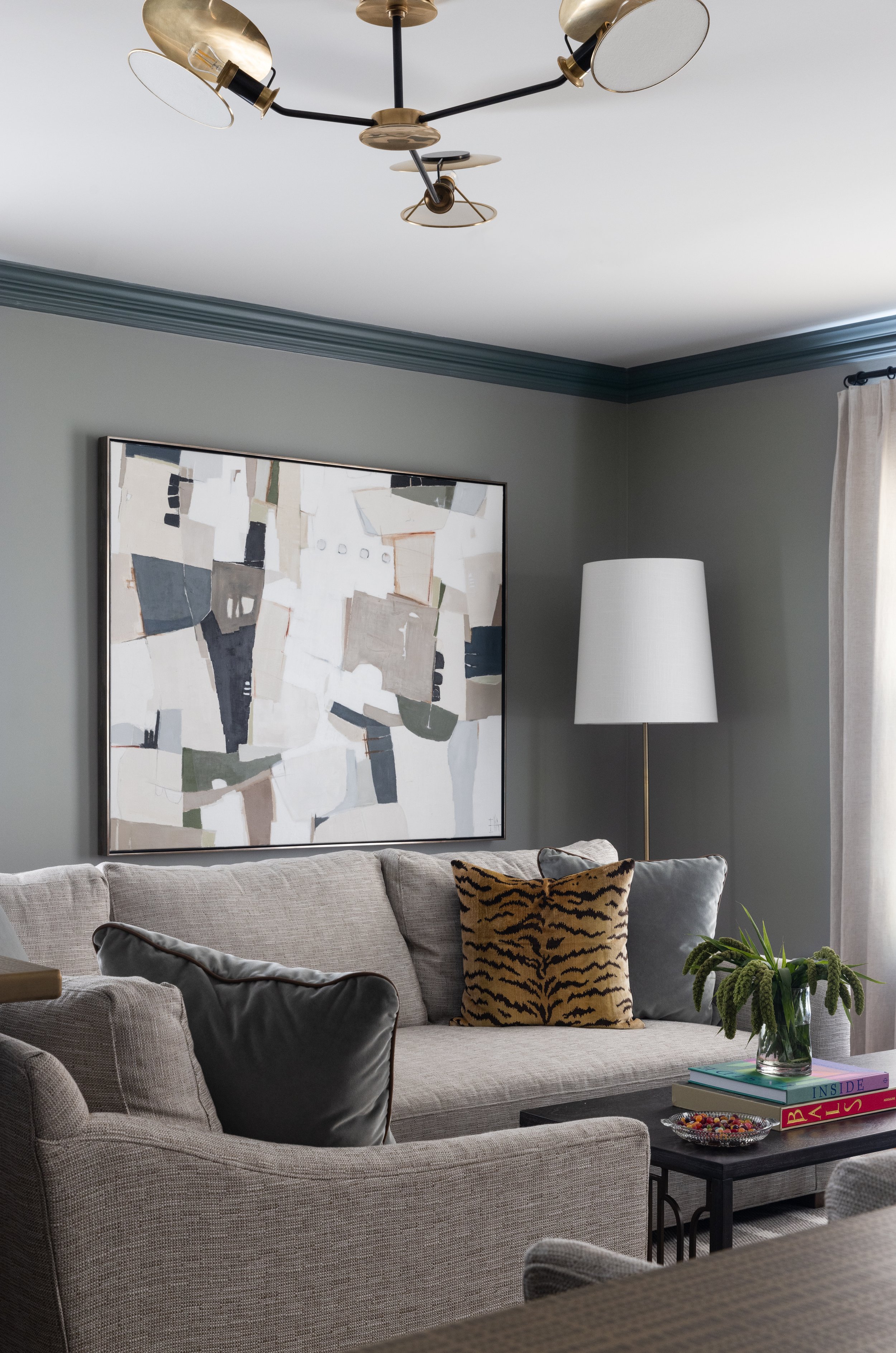
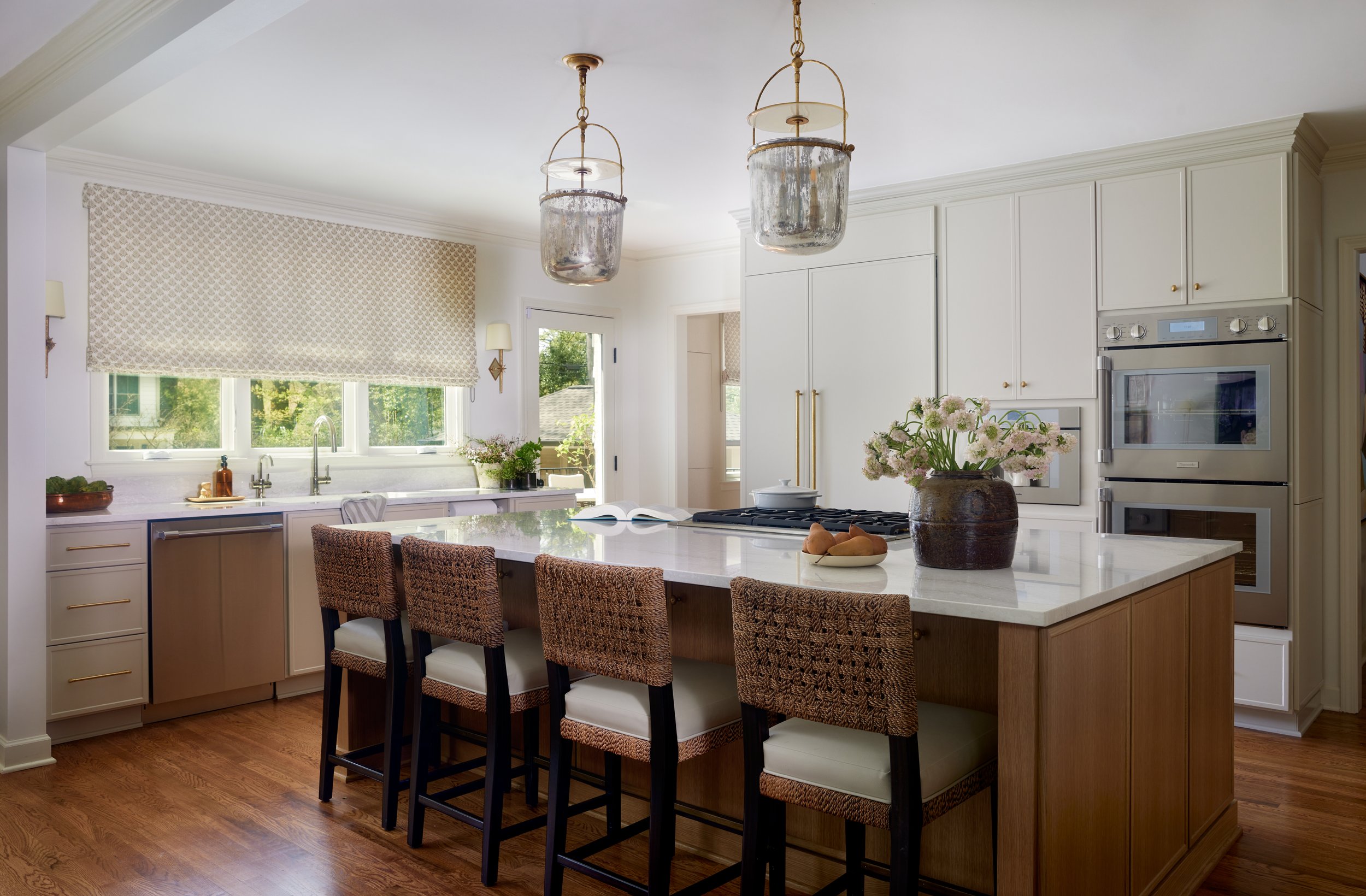
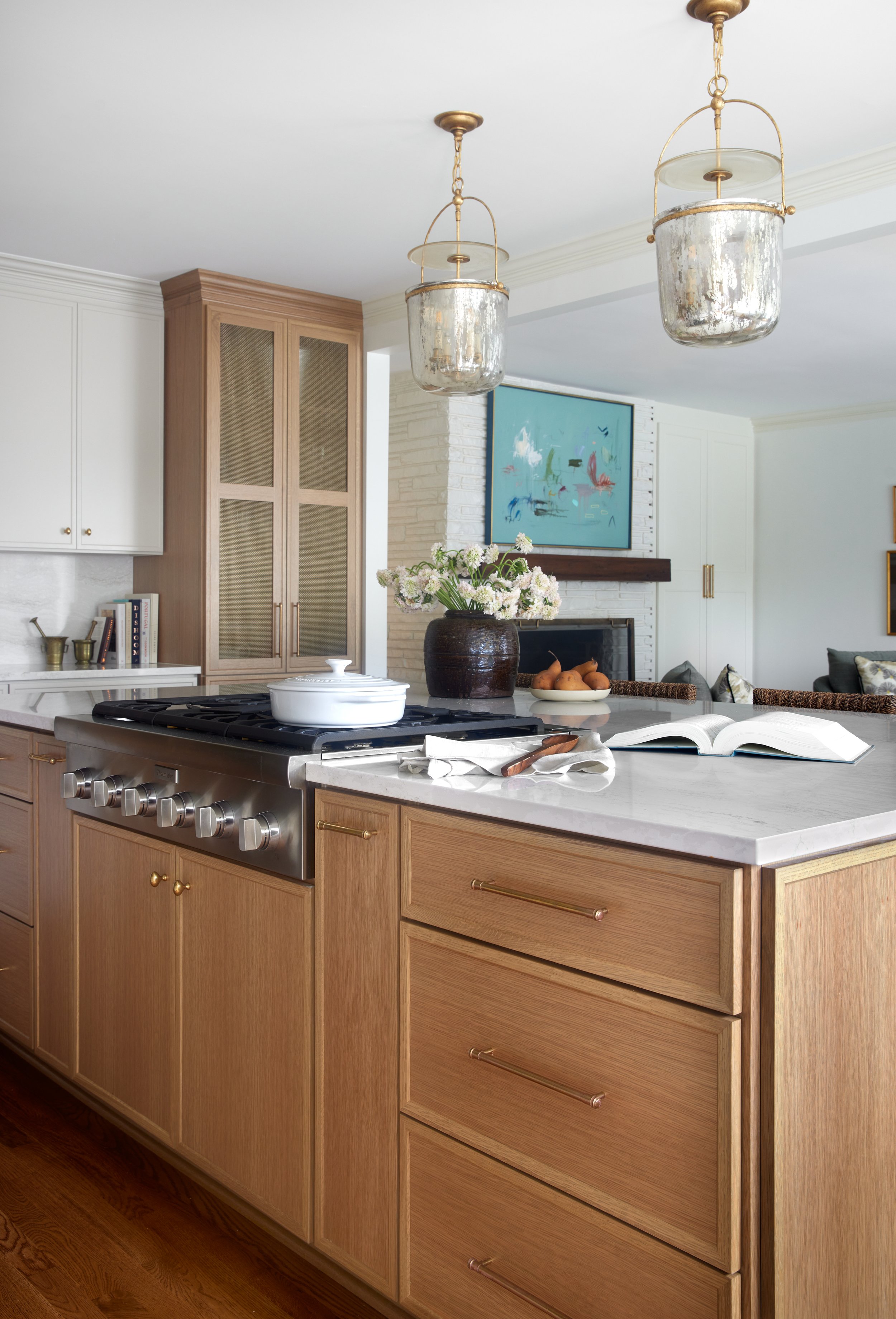
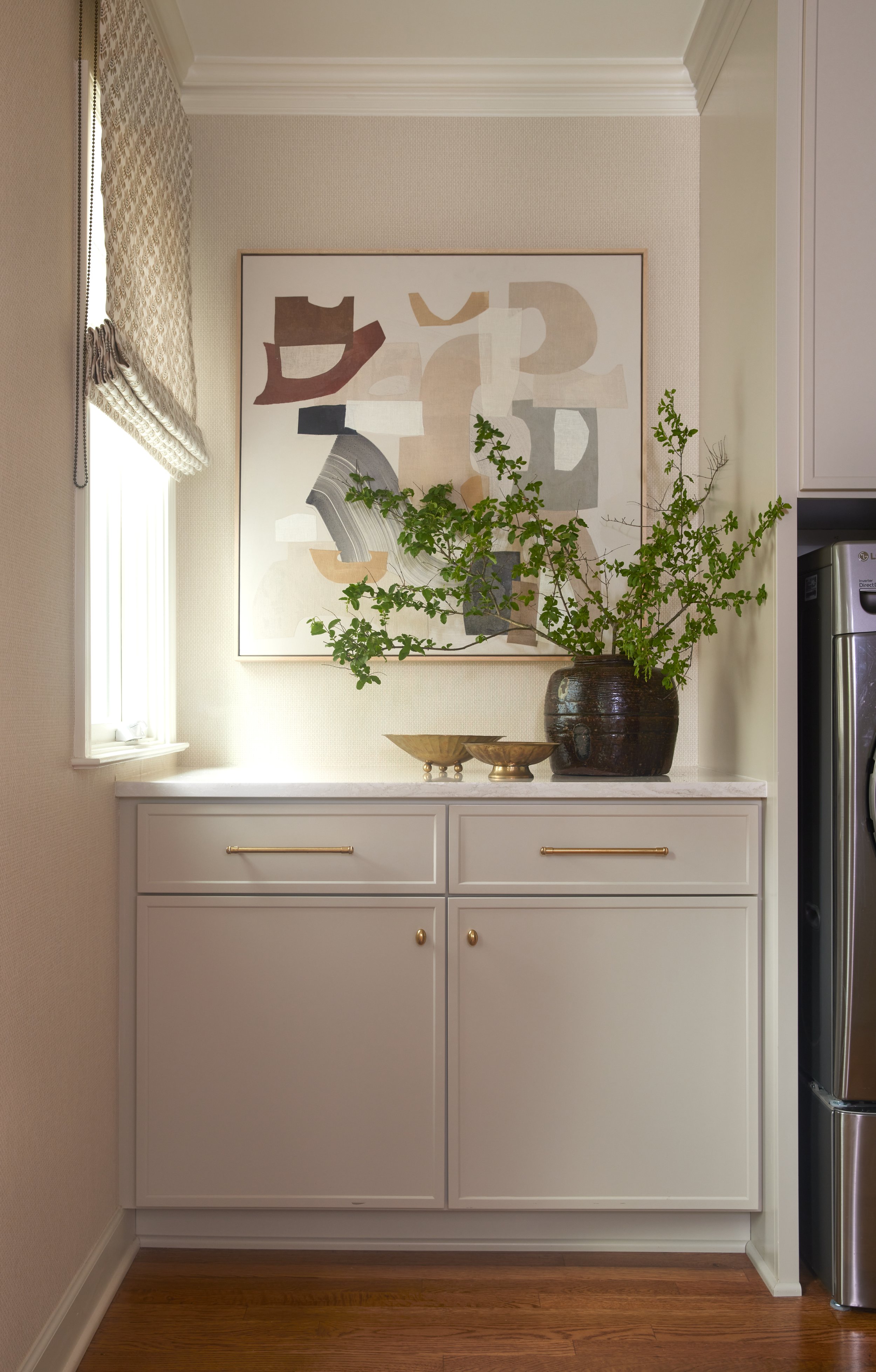
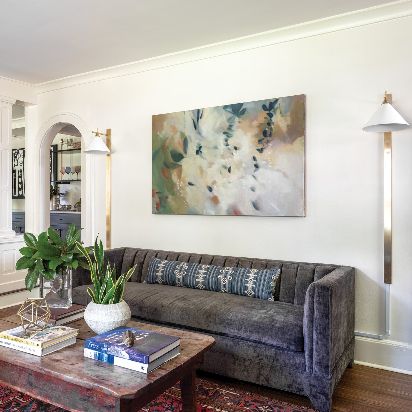
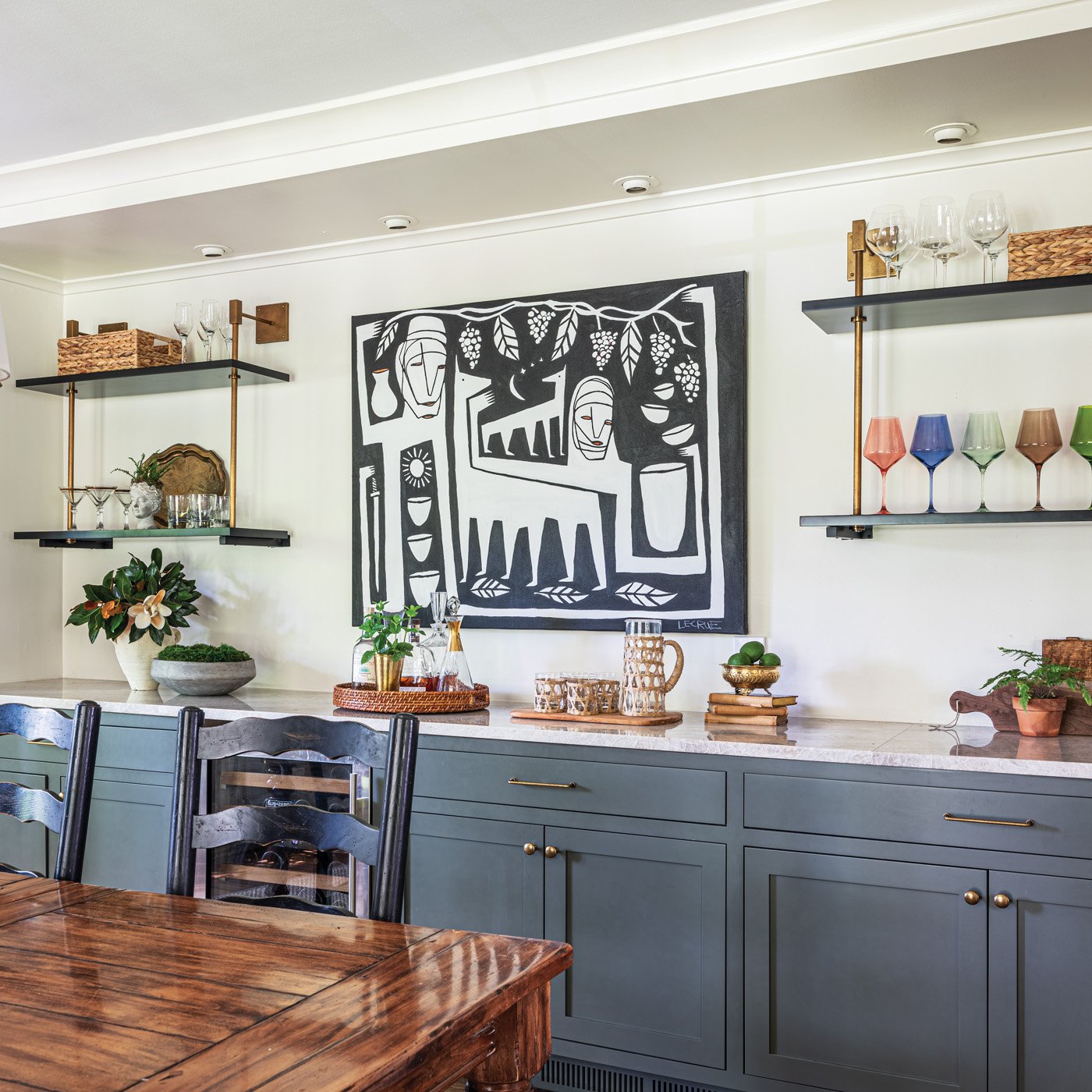
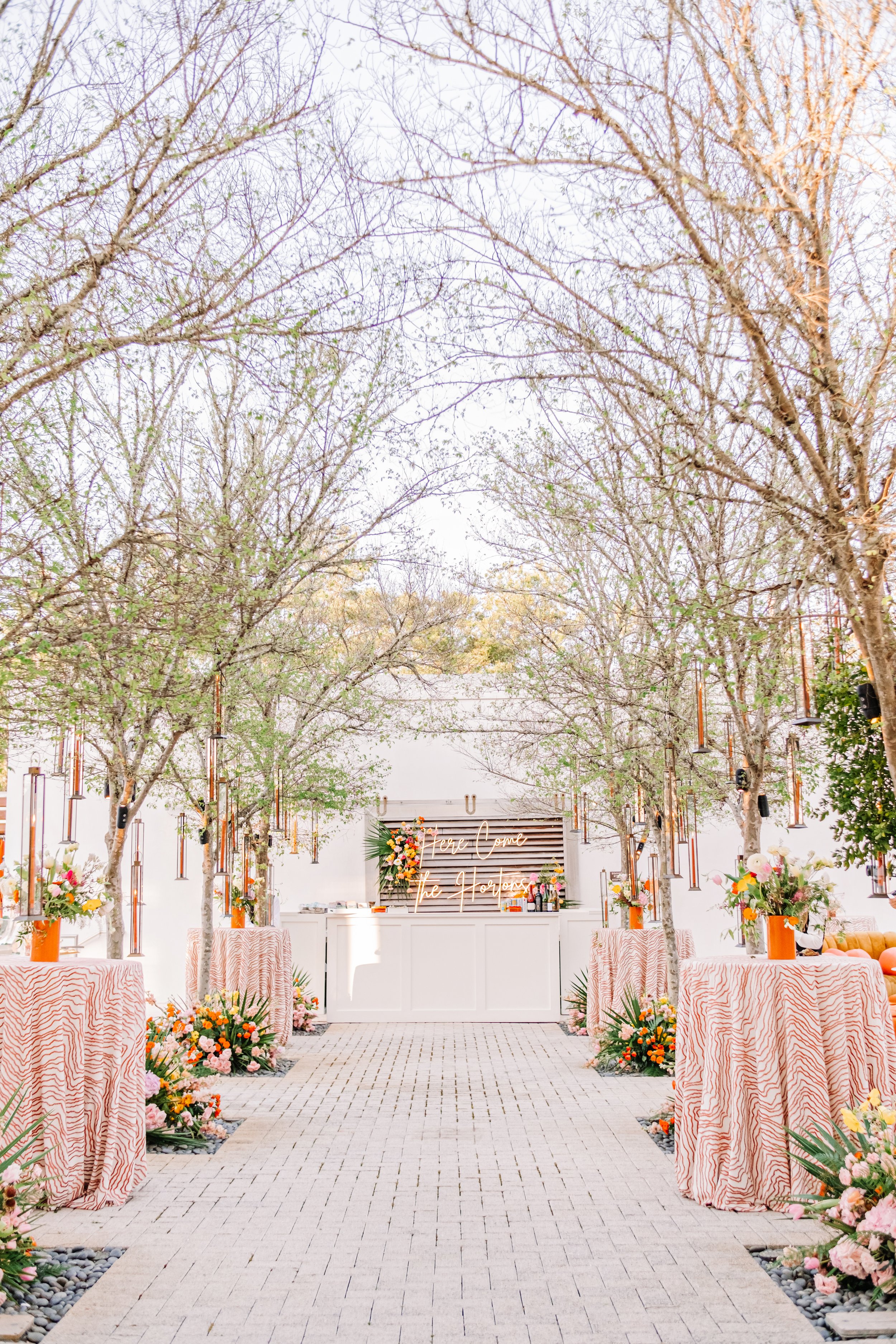
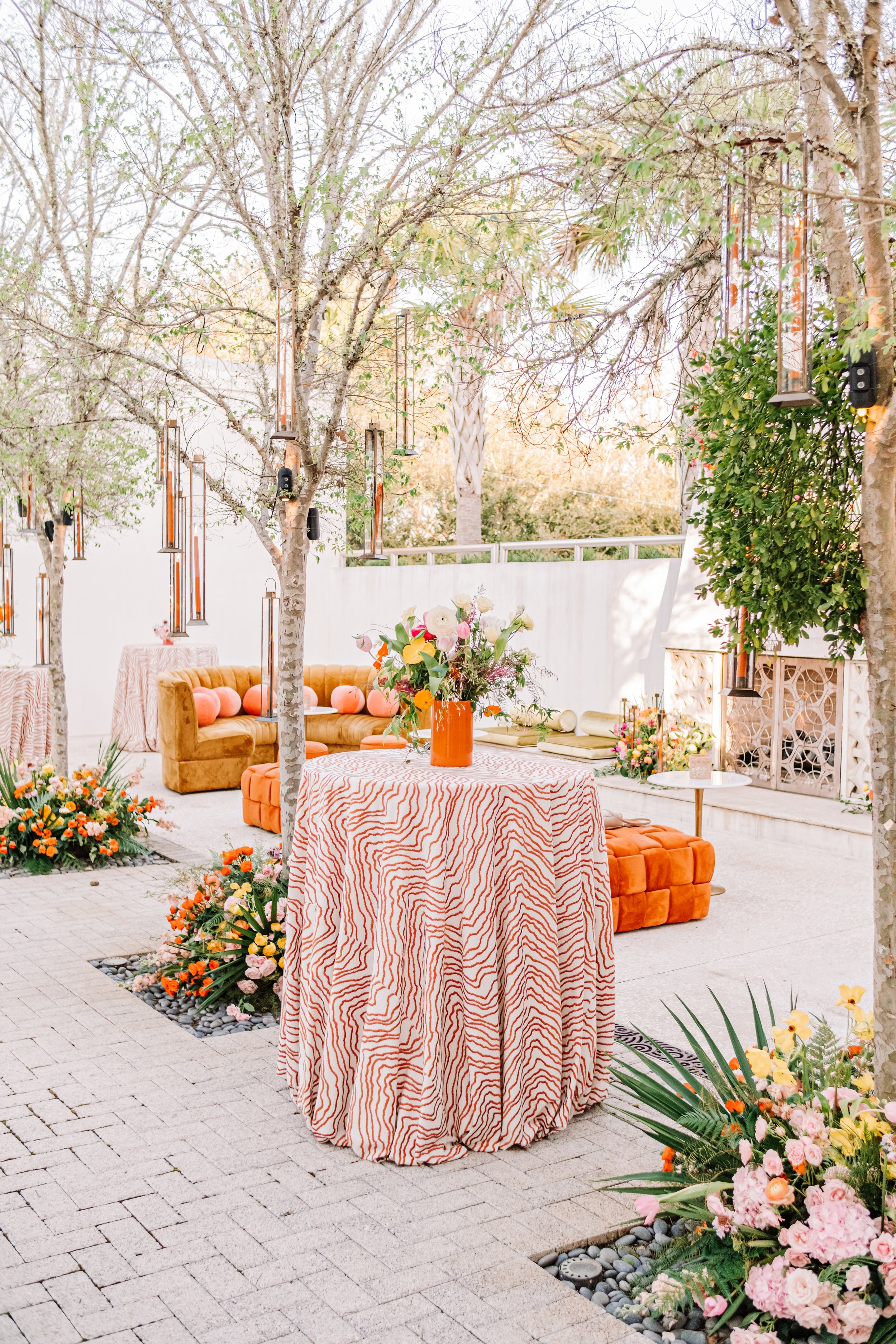
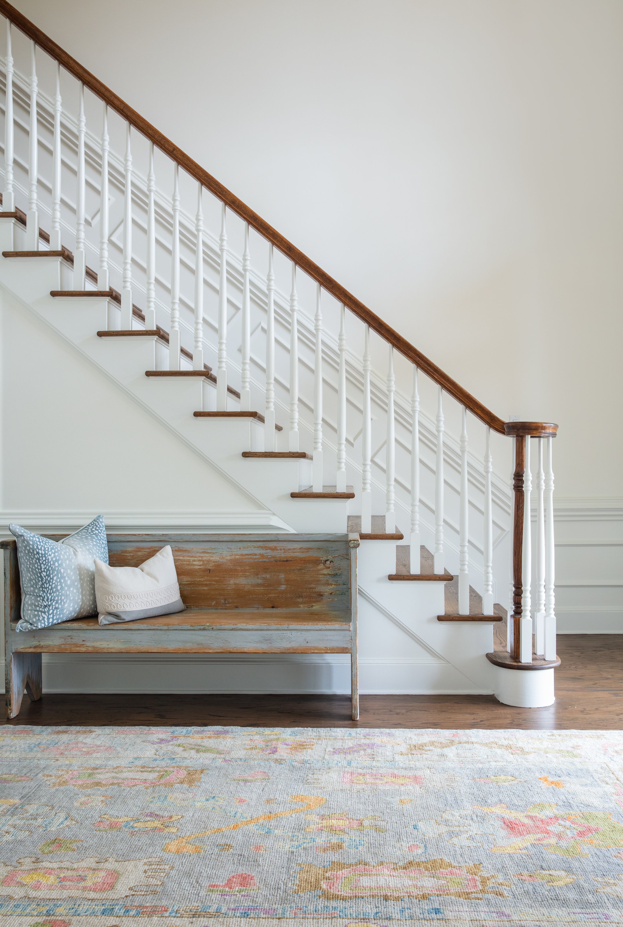
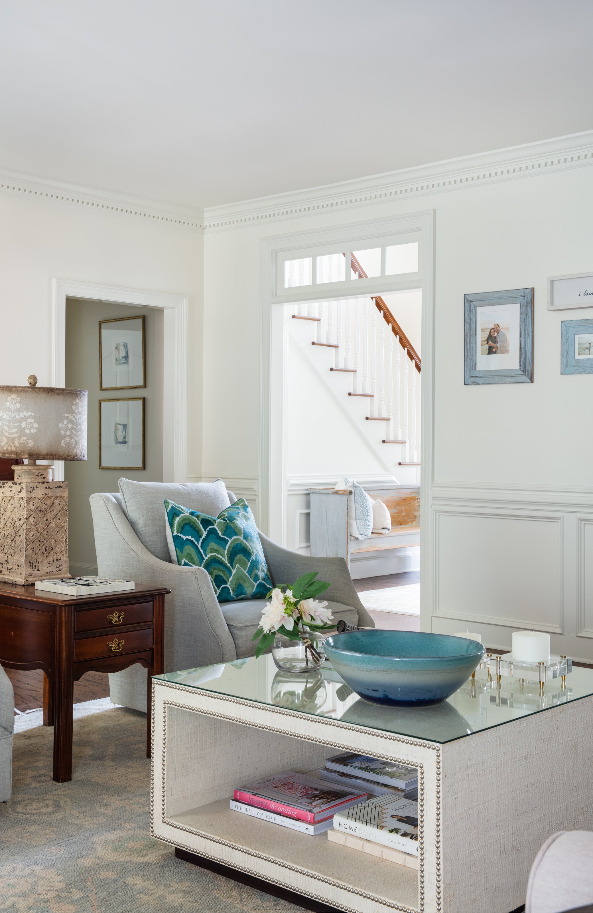
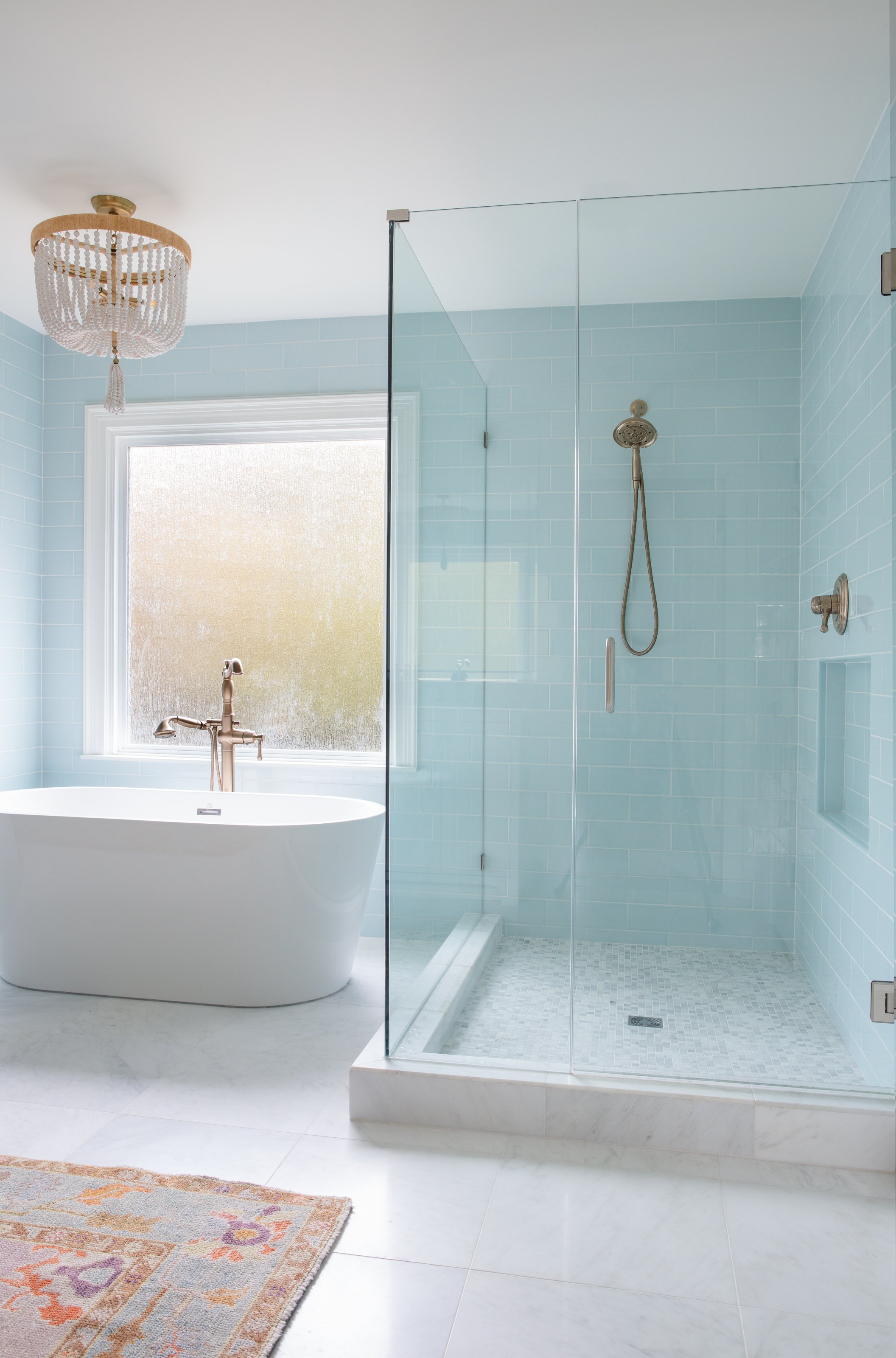
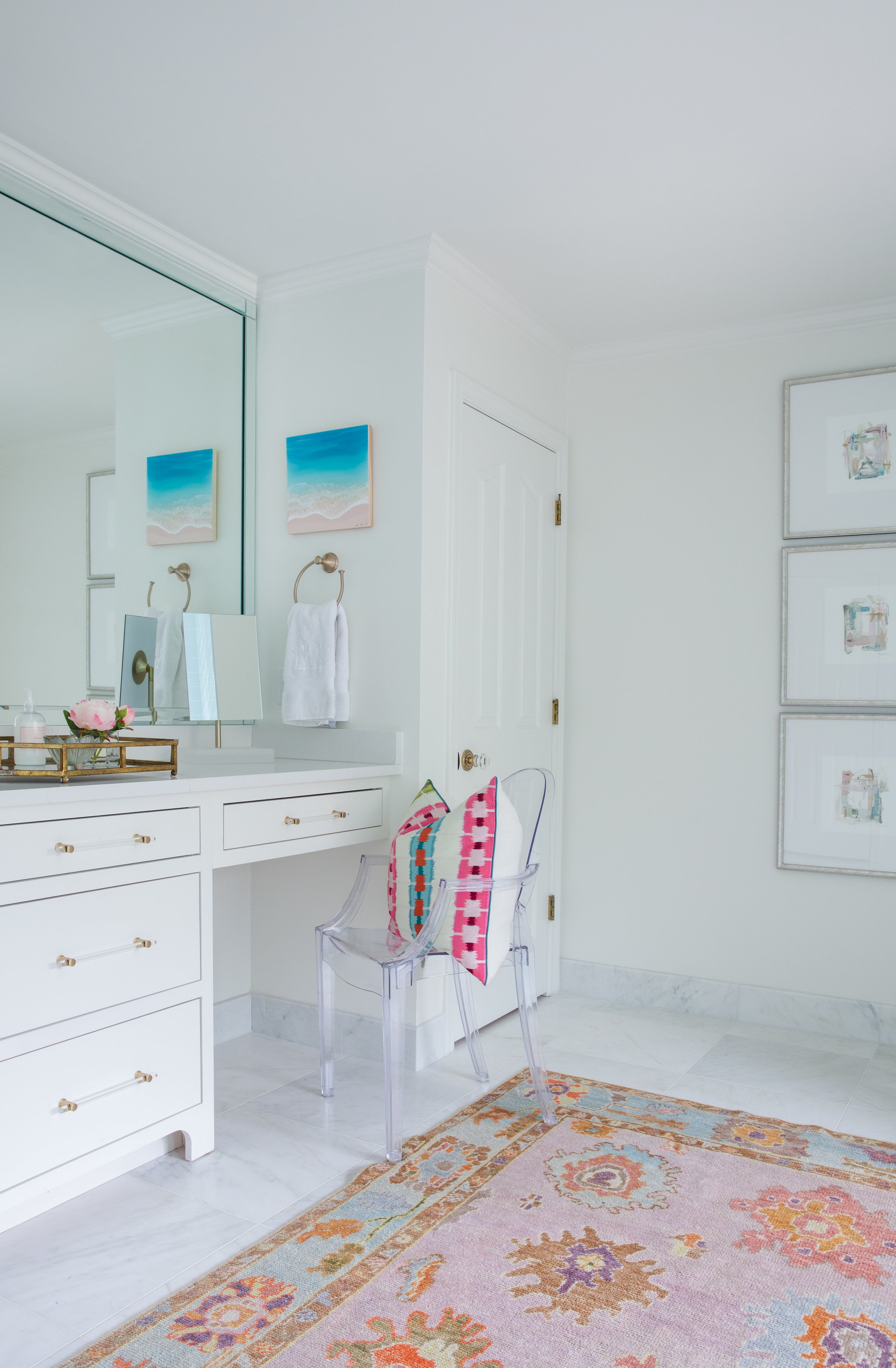
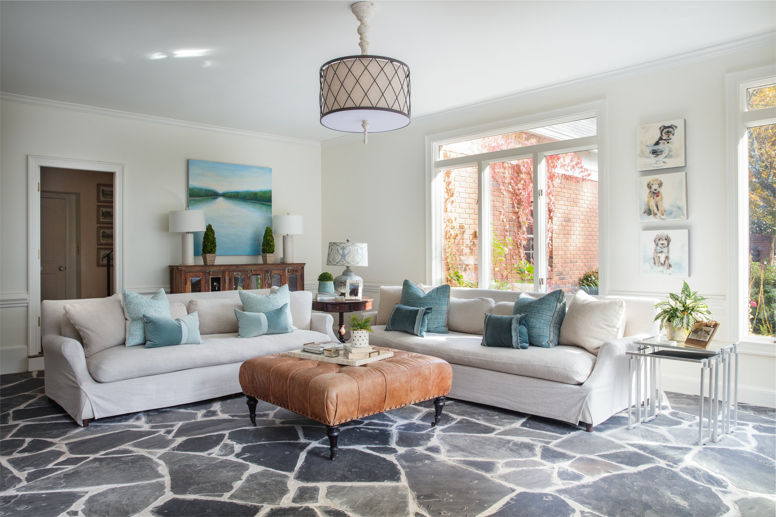
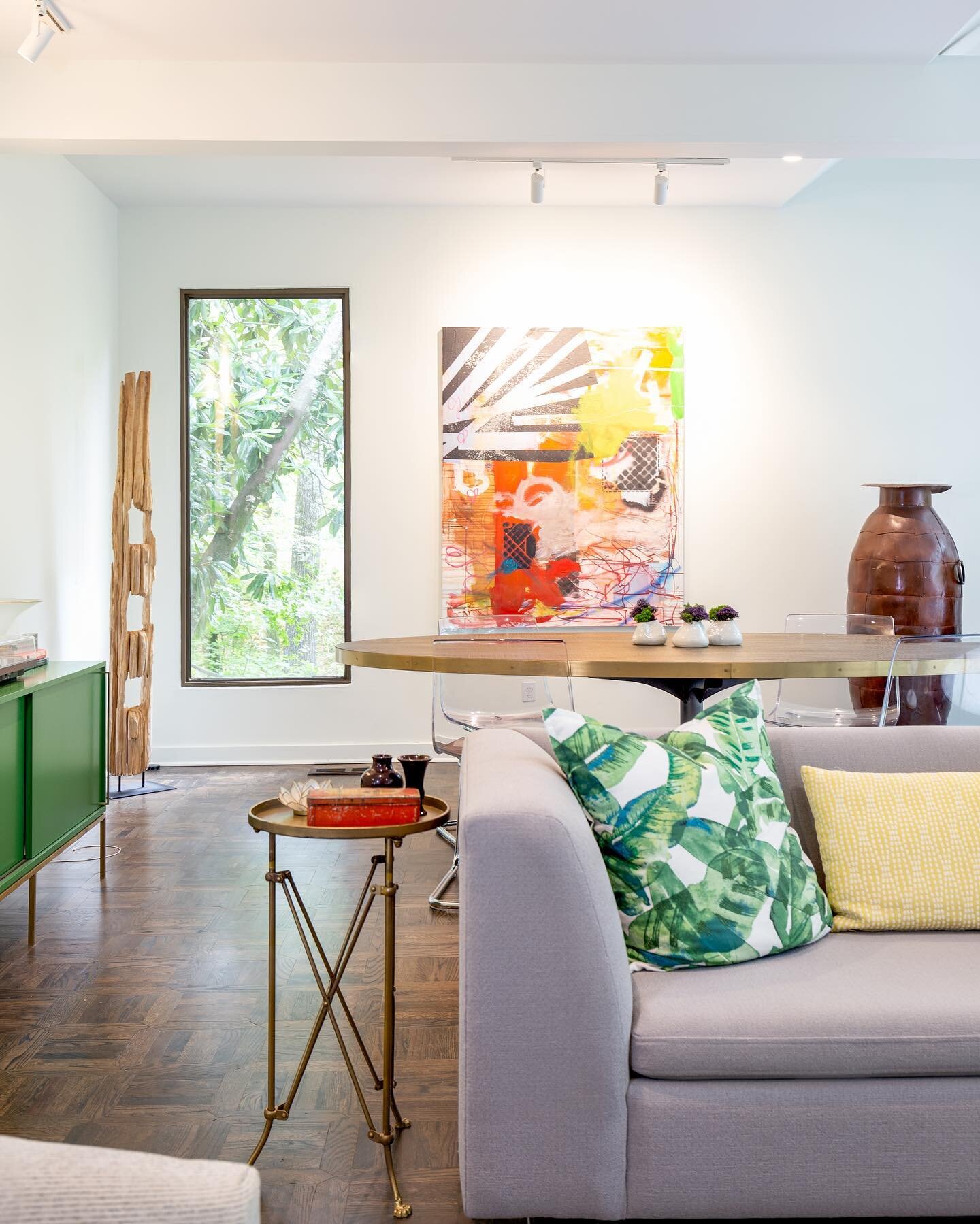
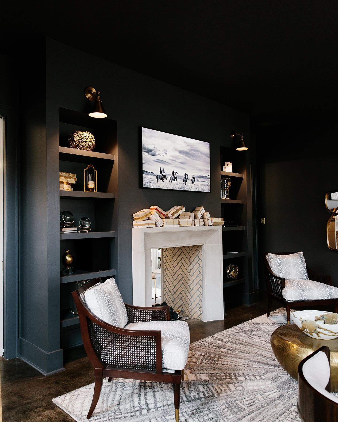
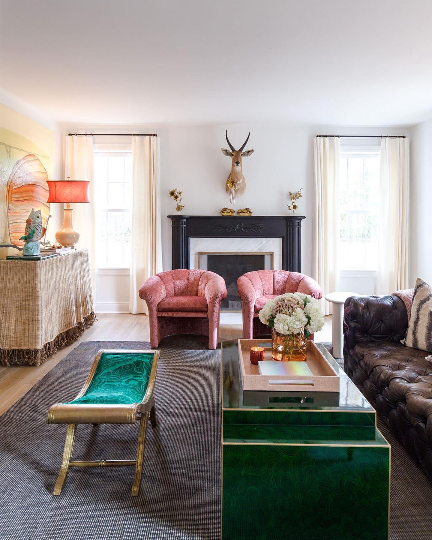
From Crash Pad to Dream Home

Design by Lindsey Black Interiors | Story by Terri Glazer | Photography by Sélavie Photography

After many years of making the daily trek from their home in Crittenden County, AR, to the parochial school their children attended in East Memphis, a travel-weary mom and dad decided things needed to change. They decided to get a weekday place near the school, just to cut down on commuting time.

The couple bought a house off Shady Grove Road and quickly found they were falling in love with not only the convenient location, but also the neighborhood. Recalls the husband, “There are 15 or 16 kids in the 10 houses right around us and they’re all similar in age. And we really like this house, so we made the commitment that we were going to stay here. But we needed it to function the way we want to live.”

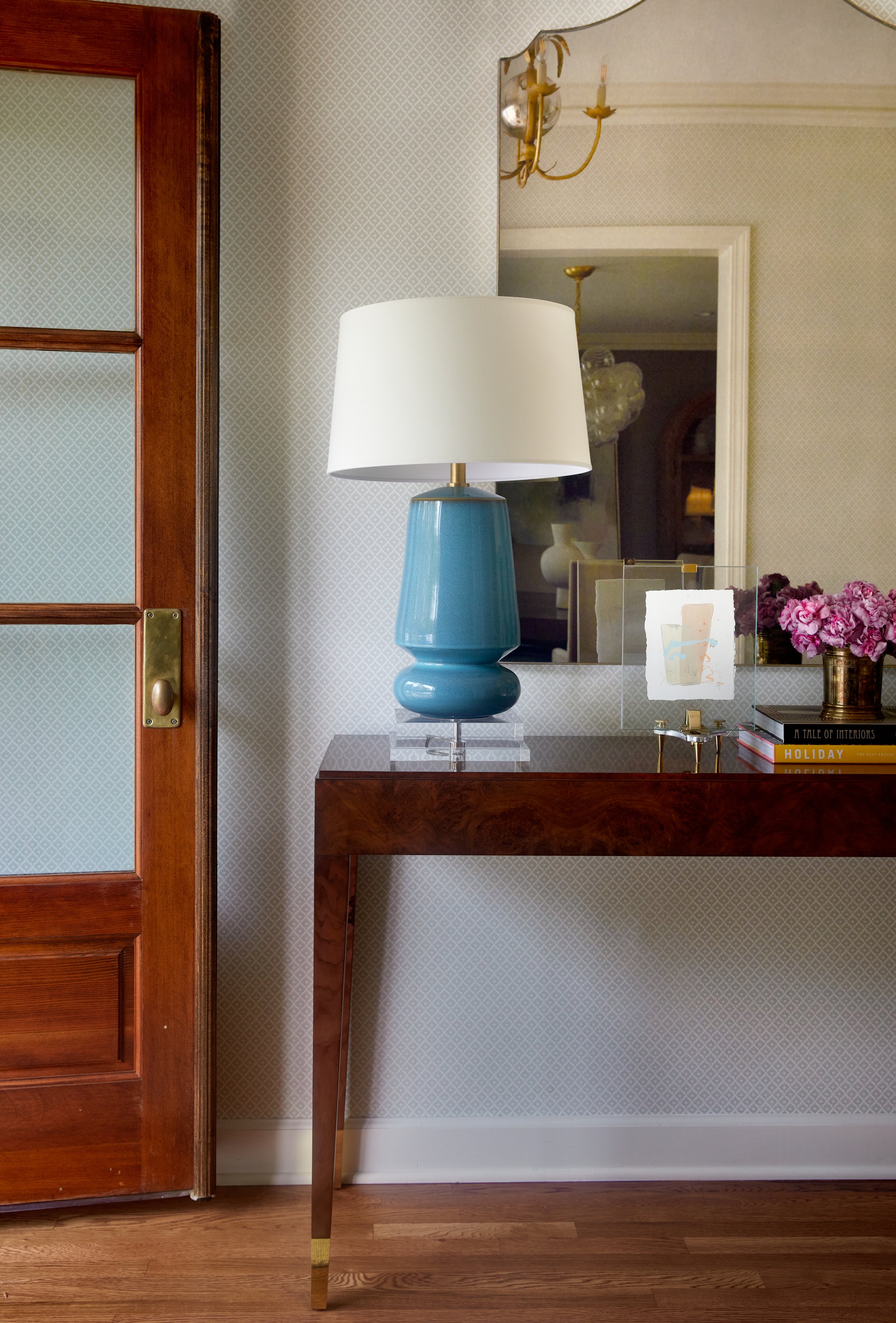
The homeowners brought in a team of experts, architect Colin McDoneil, general contractor RKA Construction, and designer Lindsey Black, to handle the transformation. Formerly home to two adults, the reimagined house needed to be fit for a family of four. It also had to have room for their wide circle of friends and family. “We want to be plugged in with our kids. I know the kids’ homes that I wanted to go to when I was their age, and we want to have that place for our kids. Kids are in and out of here all the time. Our oldest son is in high school and we had a 24-person homecoming party here last fall,” the husband says. Mom and Dad enjoy entertaining too, often hosting events ranging from extended family holiday celebrations to neighborhood get-togethers.

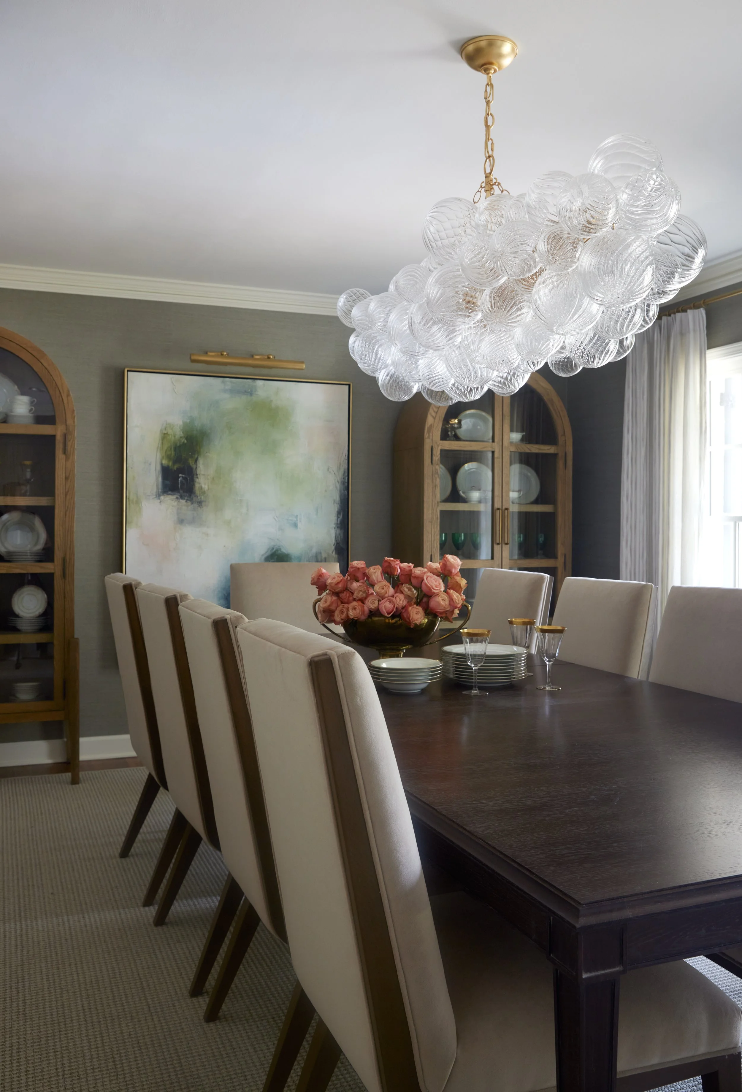
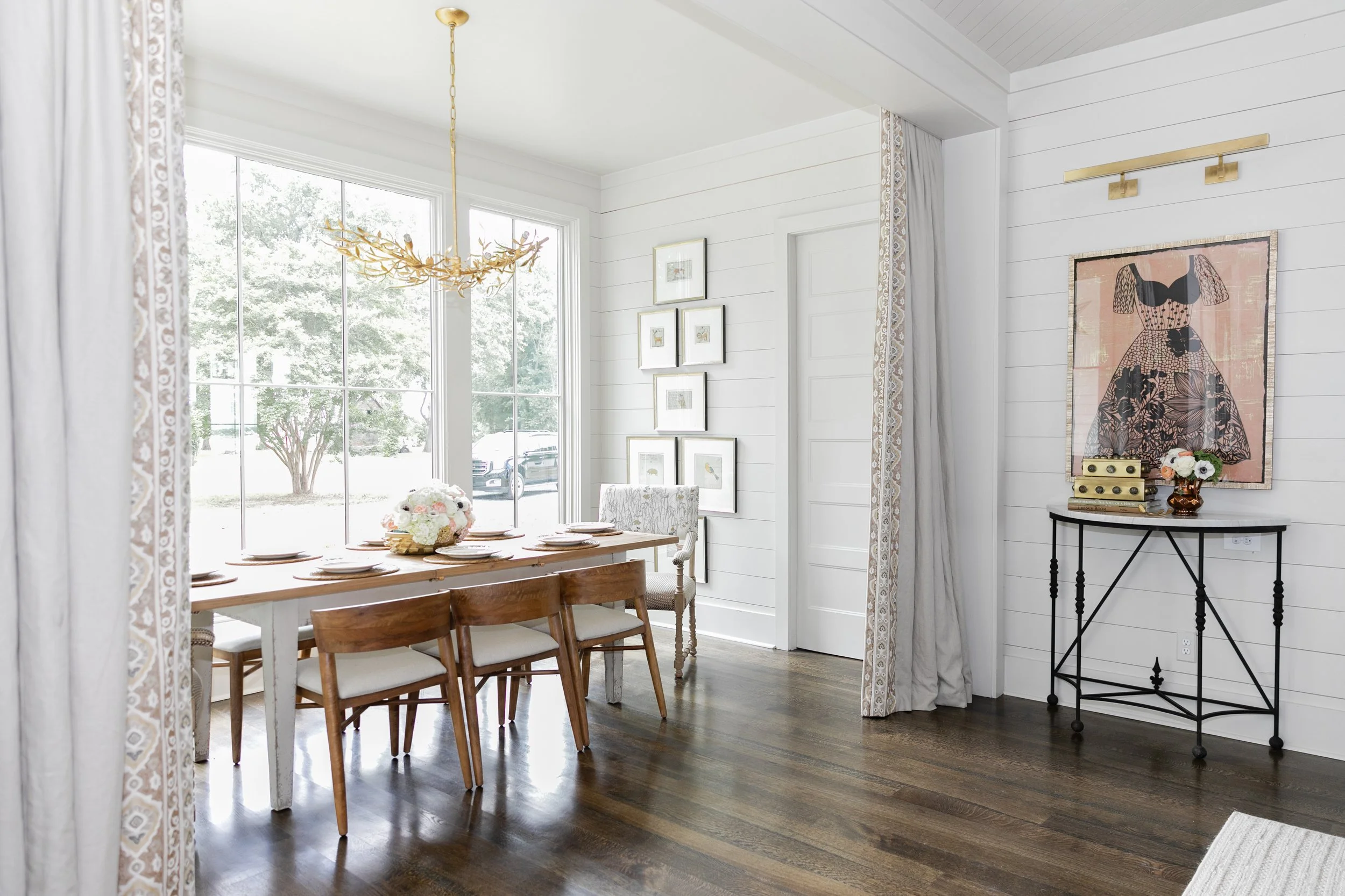
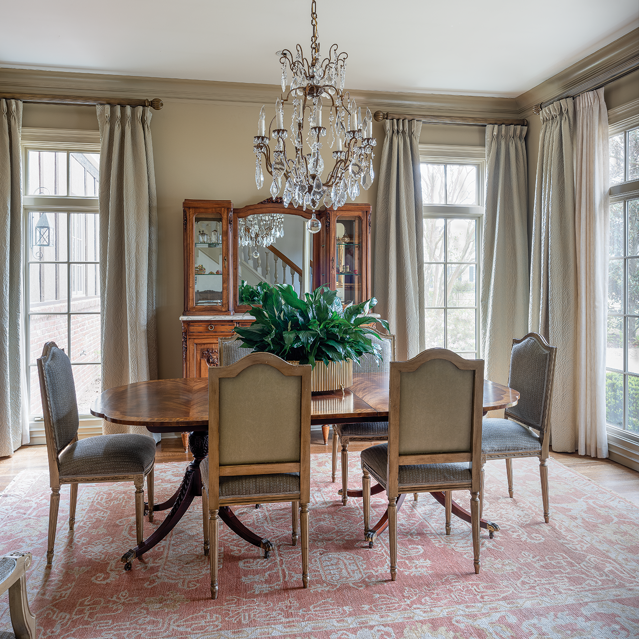
The project reworked the home’s layout, changing the function of several spaces, but the new design flows so smoothly it seems as if it’s always had the current configuration. The dining room makes perfect sense in its location on the front of the house. Its rectangular shape is just right for the large table and ten surrounding chairs. “I told Lindsey we wanted as big a table as we could fit in here,” says the wife. The homeowners also asked for wallpaper in the space. Black obliged with a sophisticated gray-green grasscloth. “It’s a big room, but it has a lot of openings, so patterned wallpaper would have looked choppy,” she says. “The grasscloth provides interest and works well in a room that has a lot of openings and windows.”

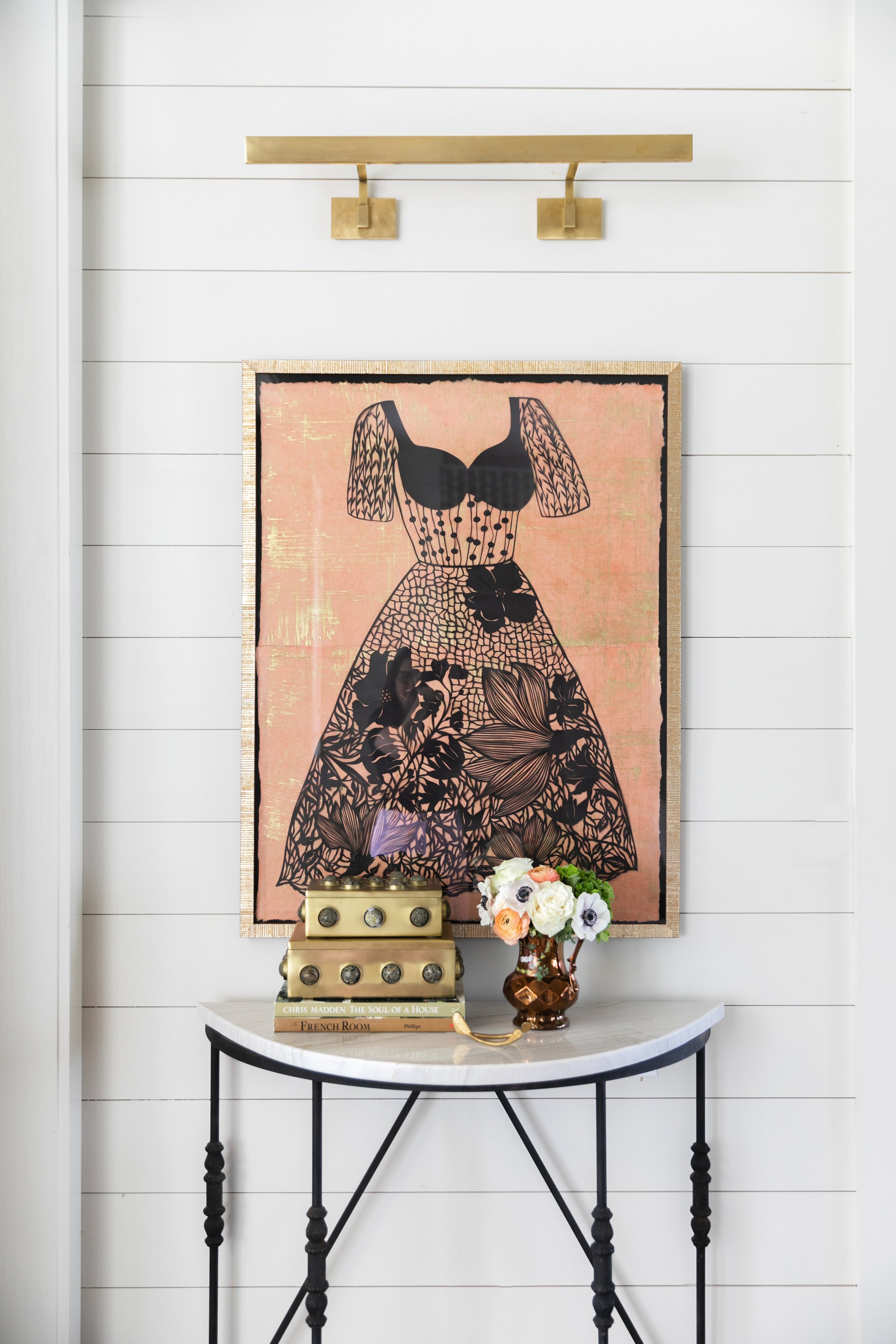
Twin, arched-top china cabinets frame an original painting by Melissa Payne Baker, while an oval-shaped bar cart repeats the curved lines. Black found the vintage piece years ago and patiently waited to place it with just the right clients. “I didn’t know if I was ever going to be able to part with it because it’s so special and unique!” she laughs.

The true star of the room, however, is the Visual Comfort light fixture above the dining table. The cluster of swirly glass spheres creates a cloud-like appearance that sets off the room and also adds visual interest to the home from the street view. Black says its size and shape made it the ideal choice. “When you’re dealing with eight-foot ceilings like this house has, you can’t have some of the grand fixtures. I went with this linear one that makes a big impact. It fills the large room but still accommodates the low ceiling well.”

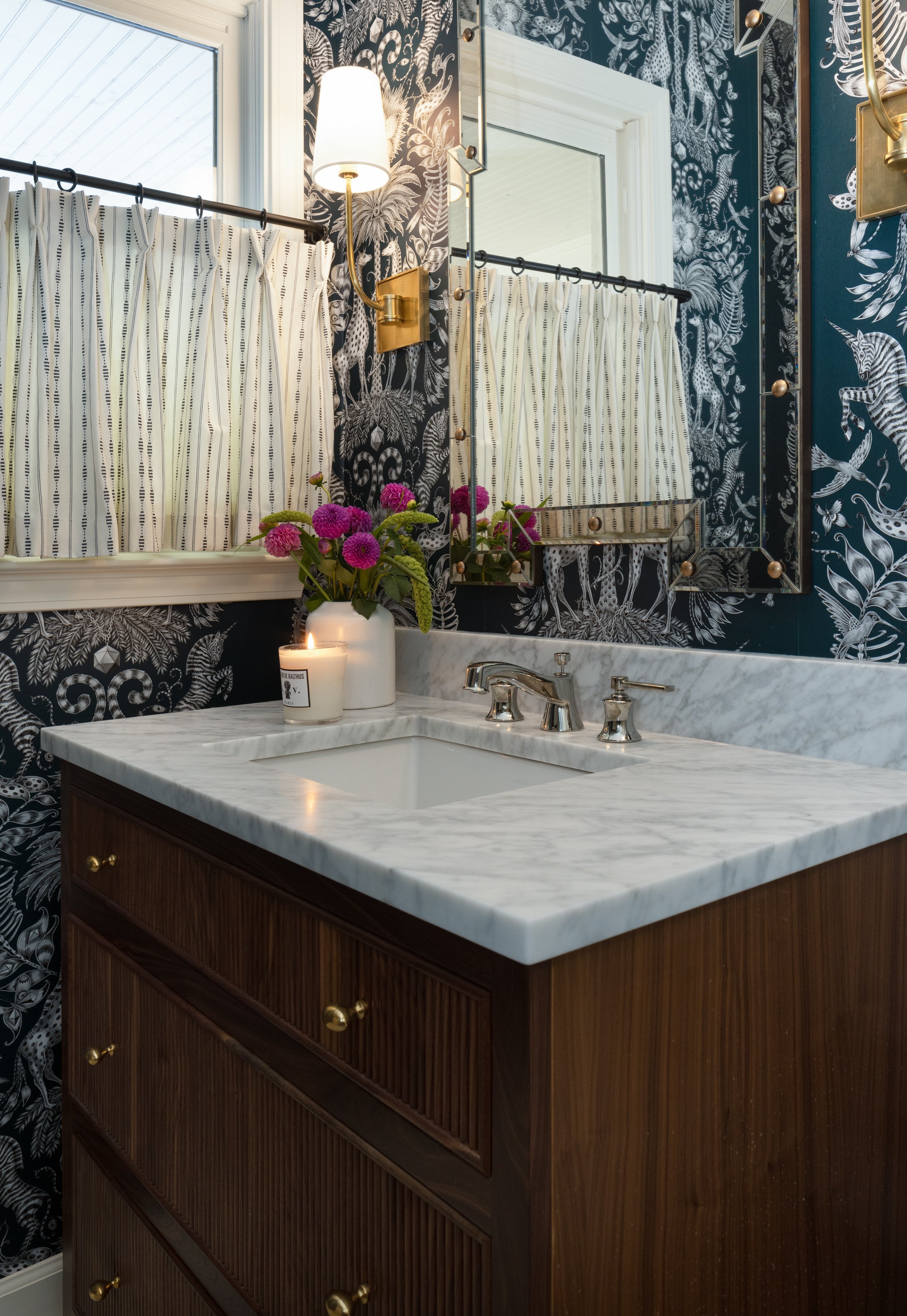
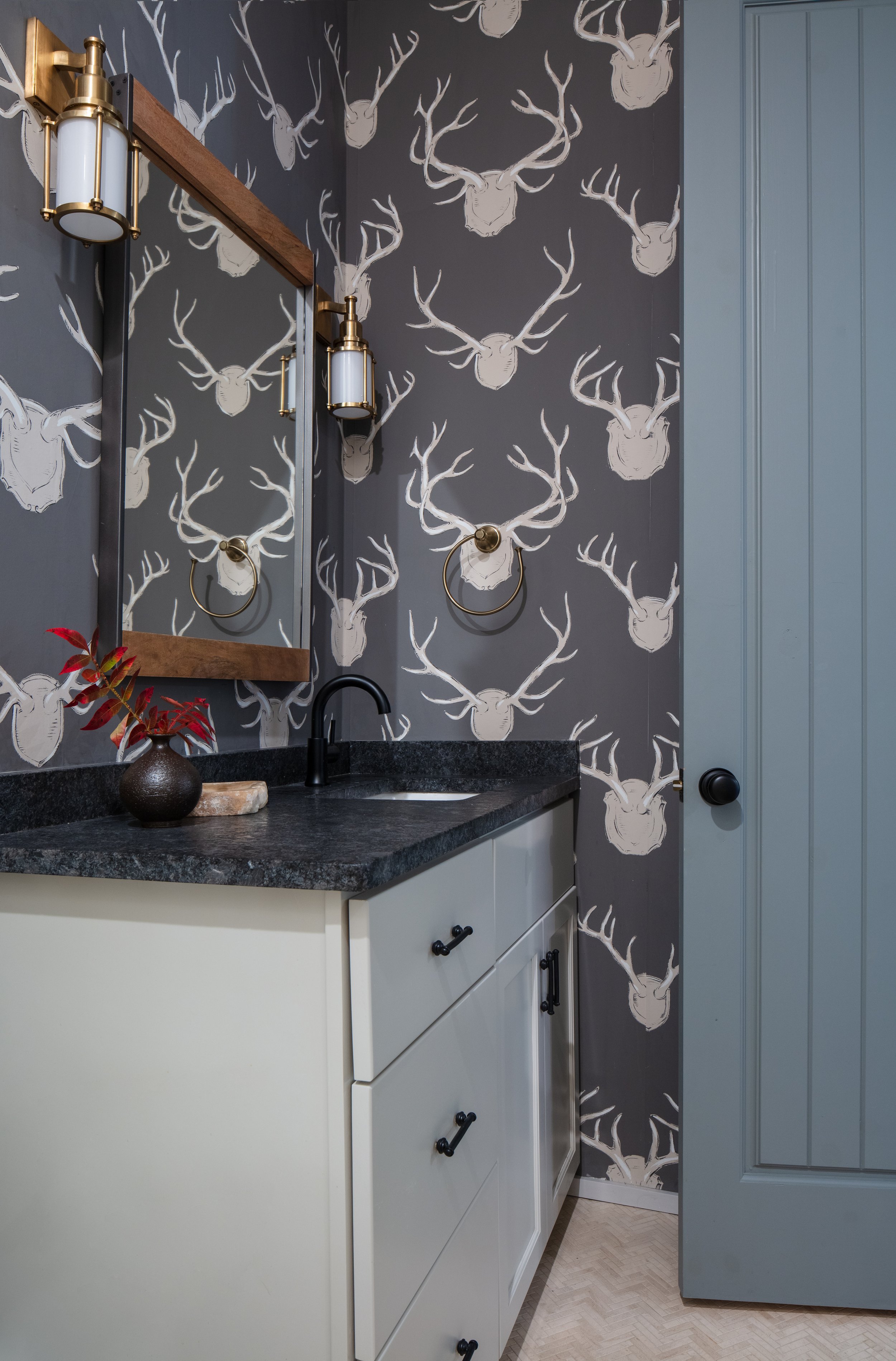
Inspired by the dynamic decor they had seen at several local bars and restaurants, the couple knew they wanted dramatic wallpaper somewhere in their new home, and Black was thrilled to serve up a powder bath with a wild and whimsical pattern by British designer Emma J. Shipley. Black describes the paper as a longtime favorite that had been on her radar for a while, again, just waiting for the perfect placement.

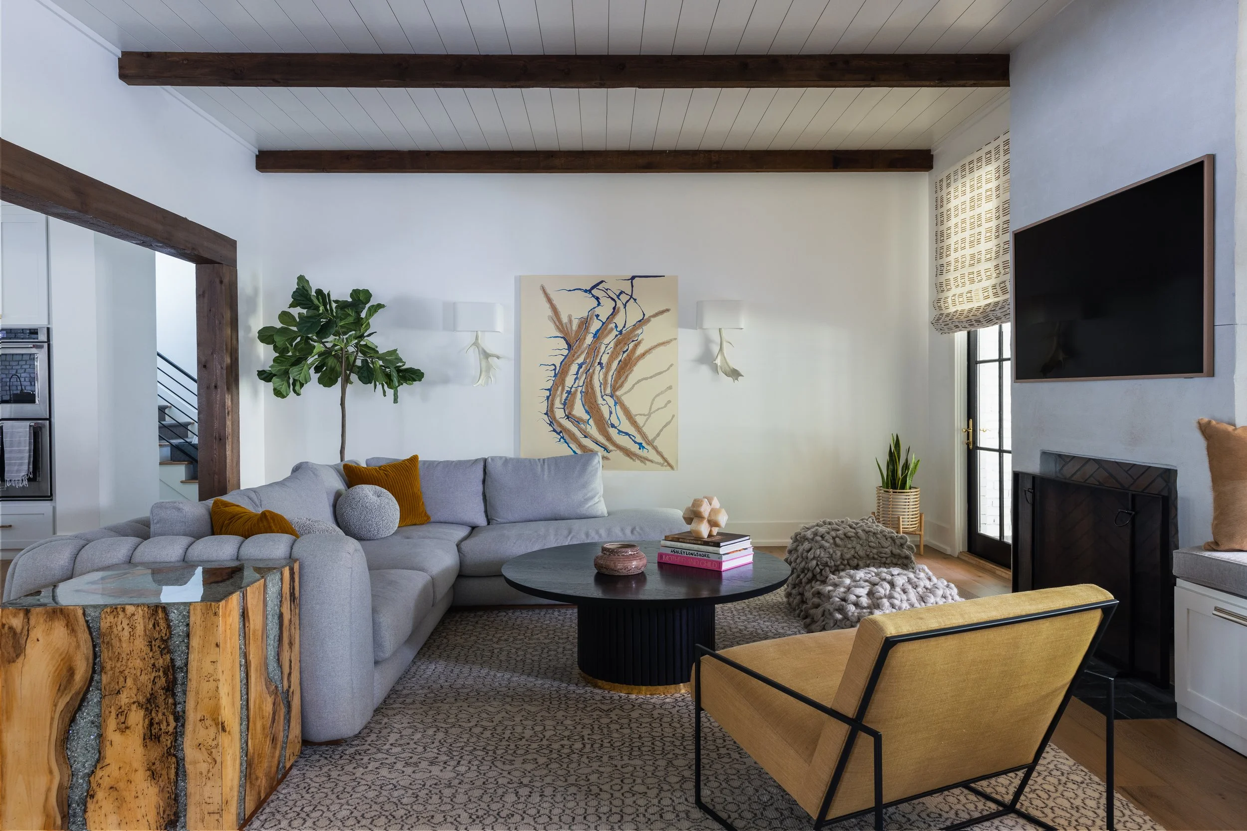
The comfortable family room shows no sign of having originally been the home’s garage. Tasked with creating a spot where adults or teenagers would be equally comfortable spending time, Black came up with a design that’s elevated, comfortable and practically indestructible. Her biggest challenge came from the room’s shape; broad and a bit shallow, as is typical of a garage. Because of its width, the space didn’t lend itself to a traditional furniture placement. The designer’s clever solution came in the form of a pair of L-shaped sectional sofas. The arrangement minimized wasted space and kept clear pathways. Matching modern light fixtures hang over each seating area, and behind both sofas she placed a counter-height table and stools, a super spot to have a snack while watching a game or favorite show.


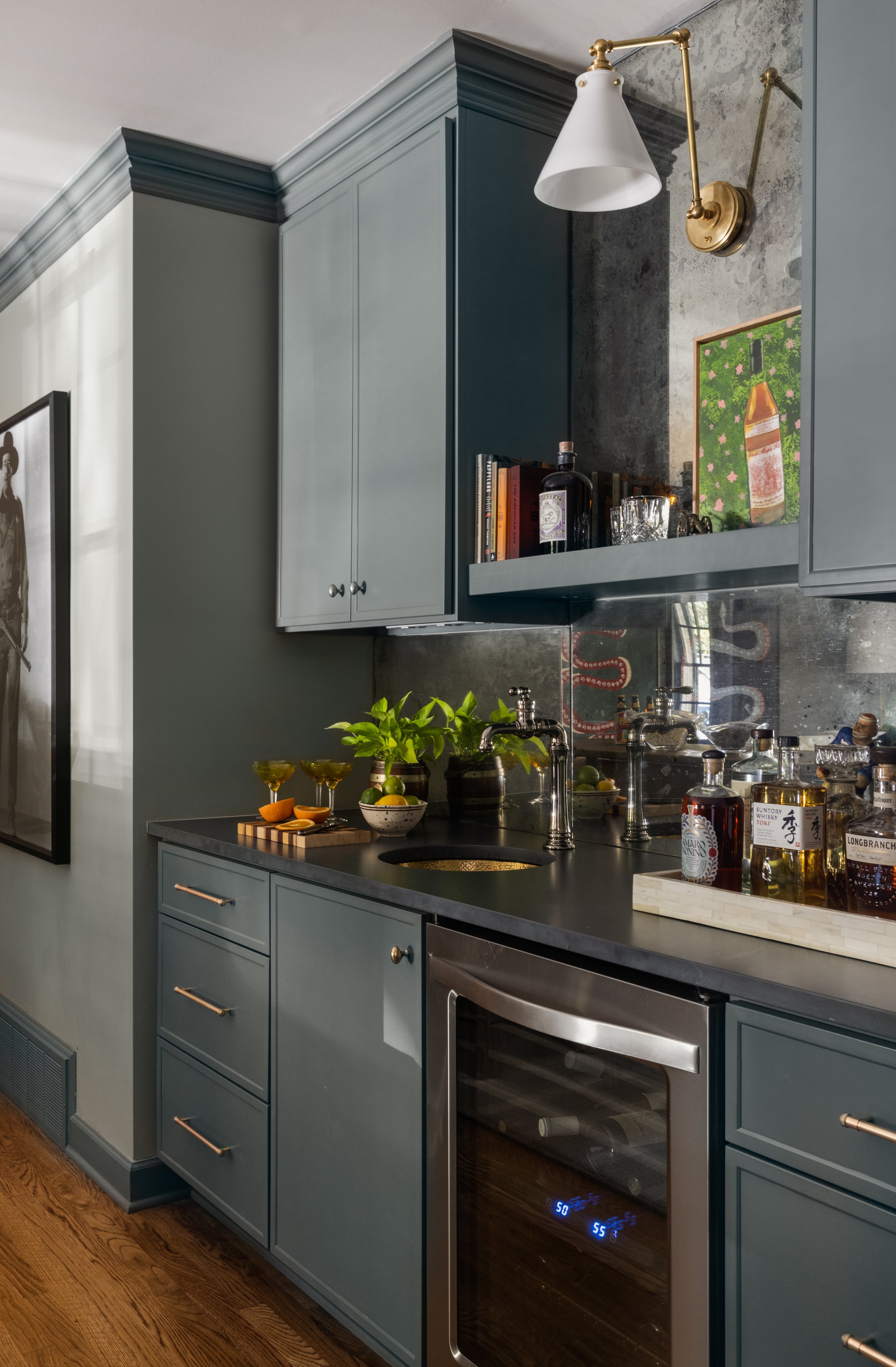
The room’s rear wall is home to a built-in bar that holds the homeowner’s favorite spirits as well as a whiskey bottle painting commissioned from local artist Nate Renner. More original art from Sara Ella Cole and a trio of vibrant serpent prints bring interest and drama, as does a full-length photo of John Wayne. The designer knew she wanted a large black-and-white photo, and the homeowners suggested “The Duke,” as the classic star bears a striking resemblance to the husband’s grandfather.


Black’s design choices for the room ensure that it looks as good today as it did when the project was completed a year ago, even though the room sees constant use. “The fabrics are very high performance, the rug is stain treated and the bar tables are metal. They can be wiped clean easily,” she explains.

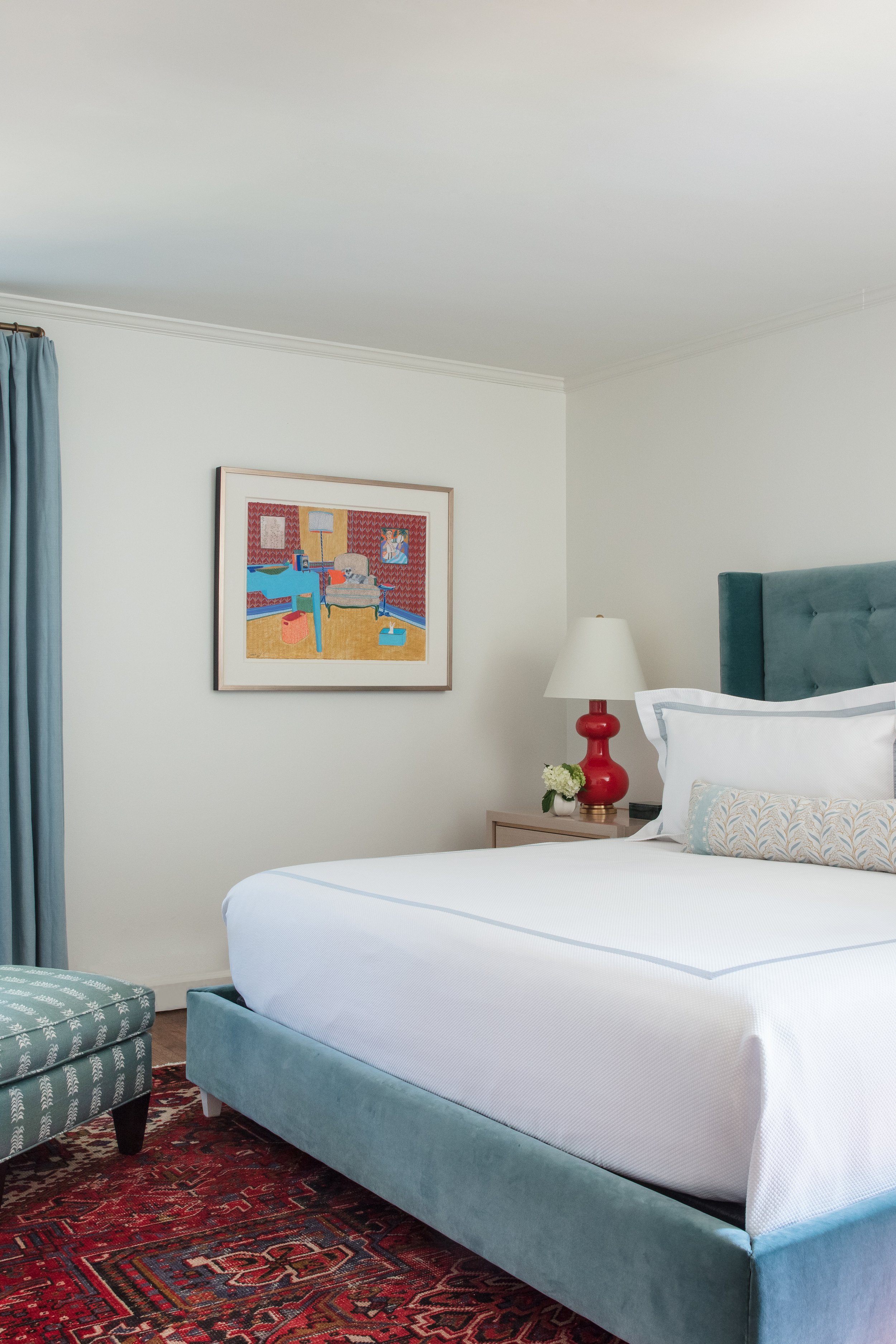
“We told Lindsey we wanted our bedroom to feel like a luxury hotel room,” says the husband. Black delivered beautifully; her creation is at once sumptuous and cozy. A full wall of plush wool drapes looks impressive, and it also masks the room’s single, awkwardly placed window. “Usually when house plans are drawn, the primary bedroom has two grand windows and really feels like an owners’ suite,” says Black. “When you just have one little window it kind of makes it feel more like a spare bedroom. So we thought we ought to make it super dramatic; give them that hotel feel with a whole wall of draperies. They can open the drapes to expose the window, but when they’re closed it just feels like a little cocoon. Cozy. And the wall color—it feels very comfortable but not dark. It’s moody.”

A custom-made bed upholstered in velvet adds to the ambiance. “We paid a lot of attention and were really careful in selecting the art for this house,” says Black, pointing out a large botanical monoprint by Celeste Pfau and four sketches by Rachel Payne. The designer float-mounted the figure drawings in simple frames, allowing the atmospheric wall color to function as a “mat.”

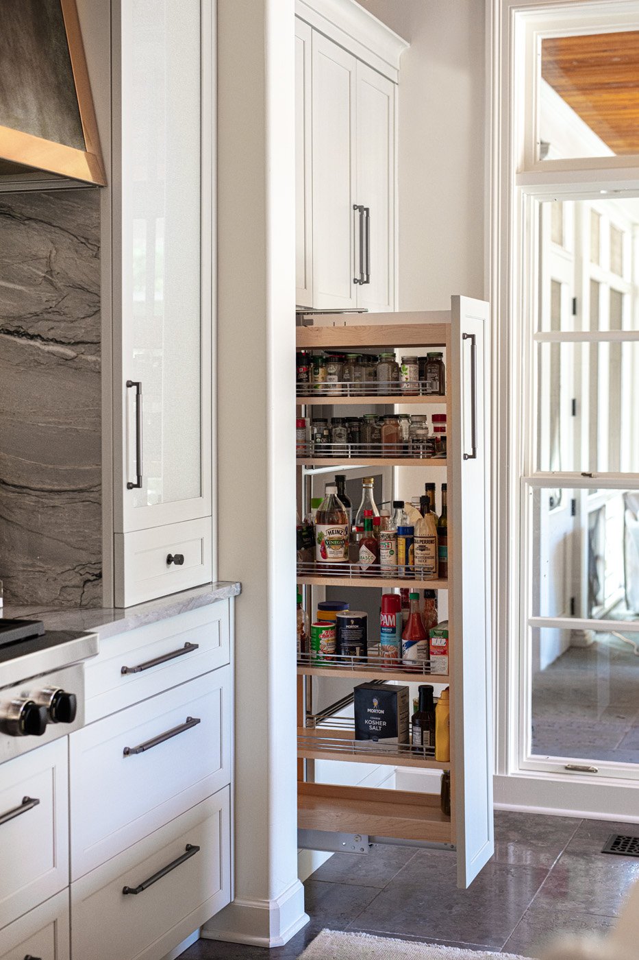
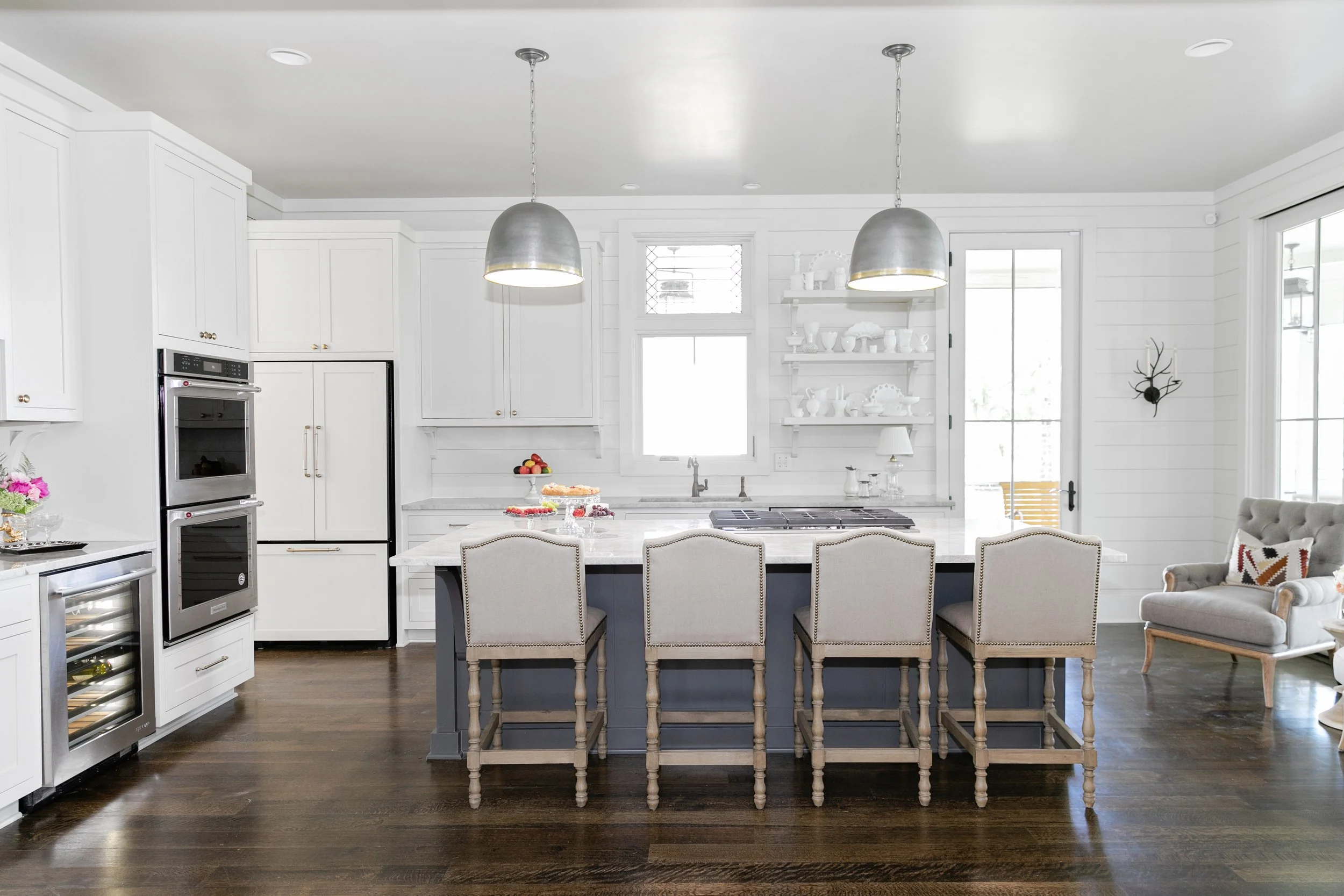
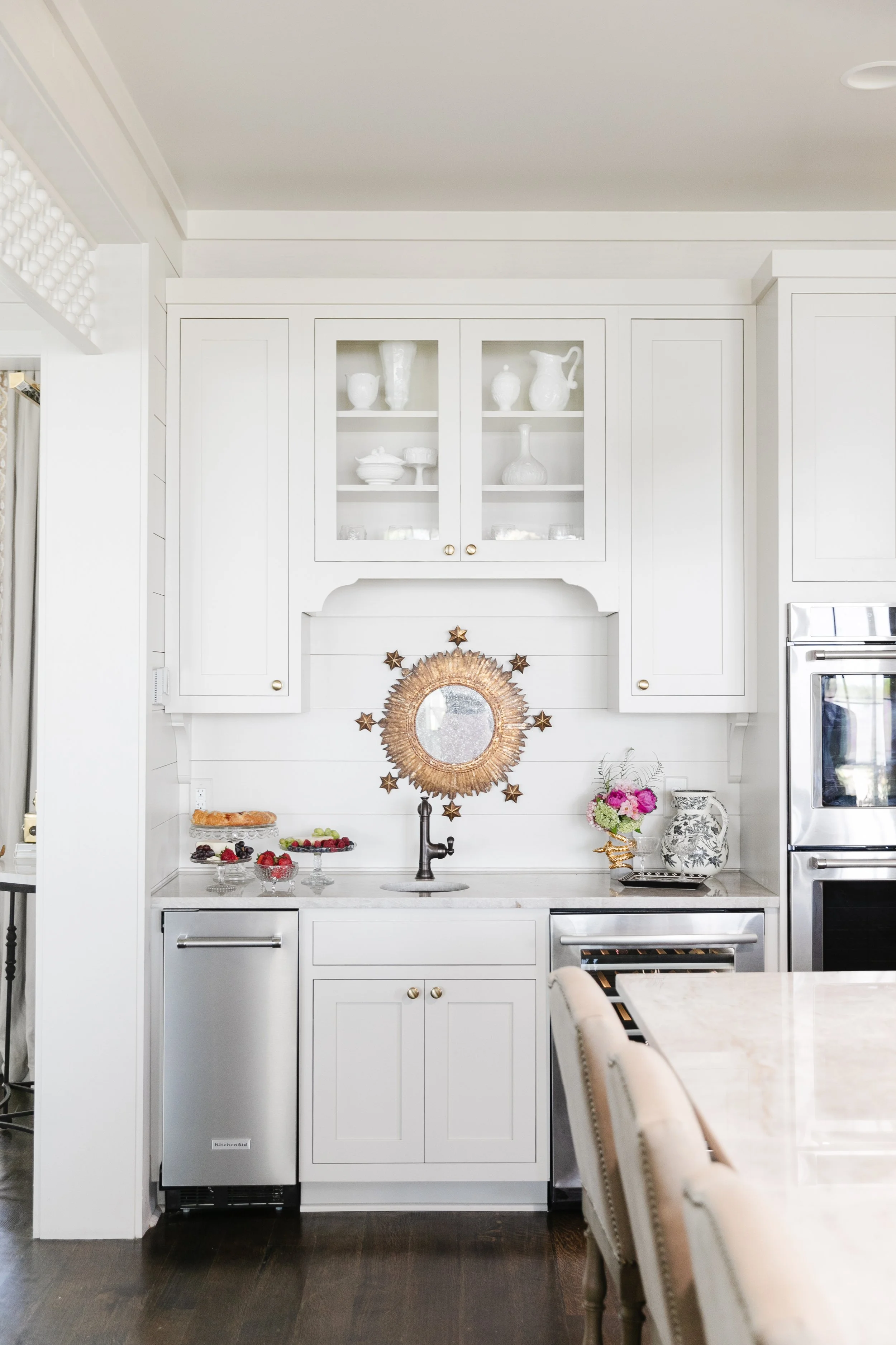
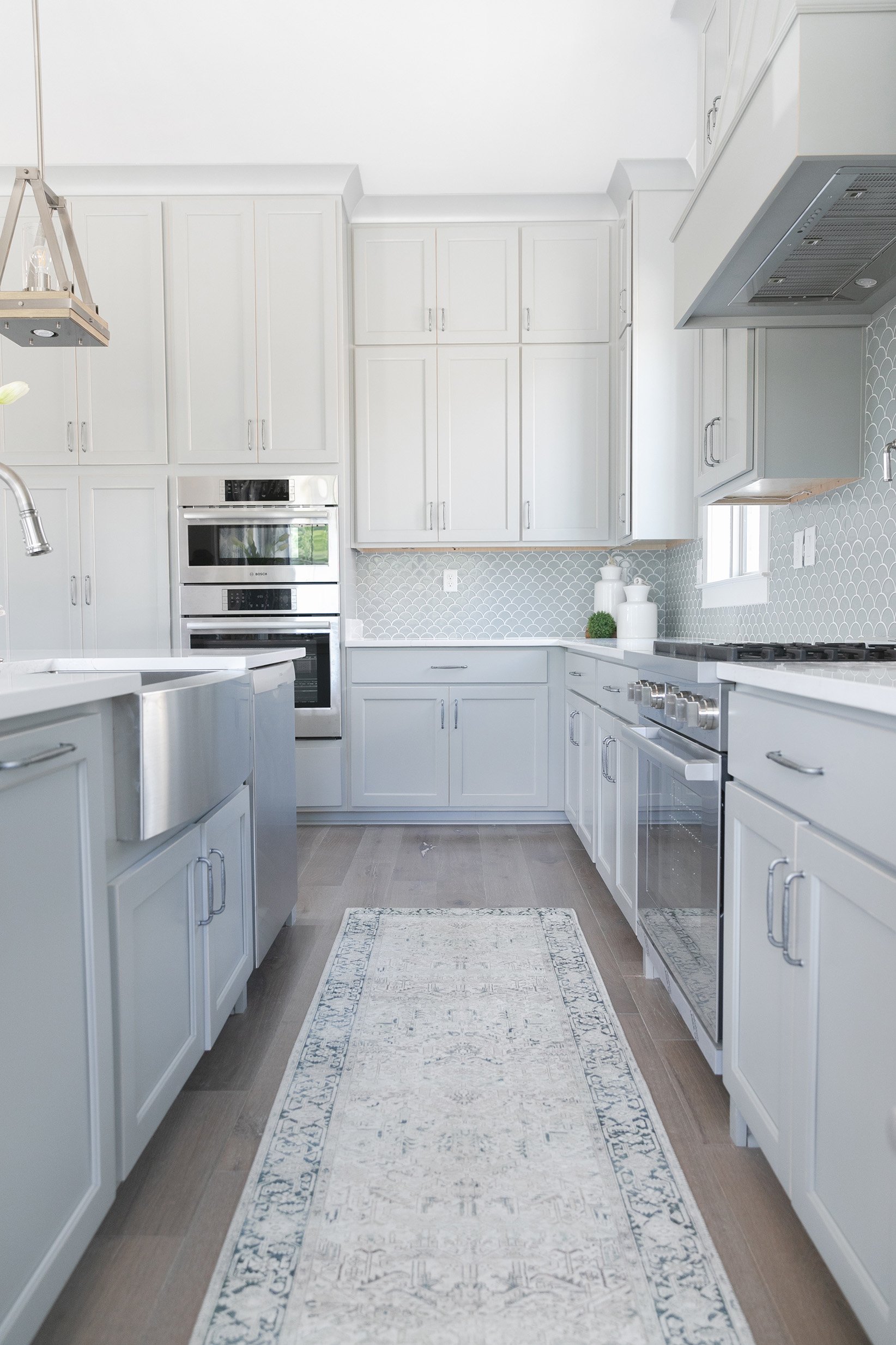
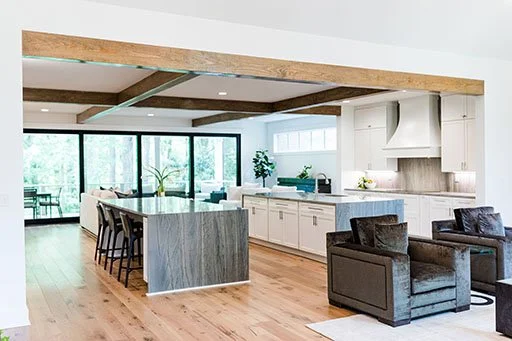
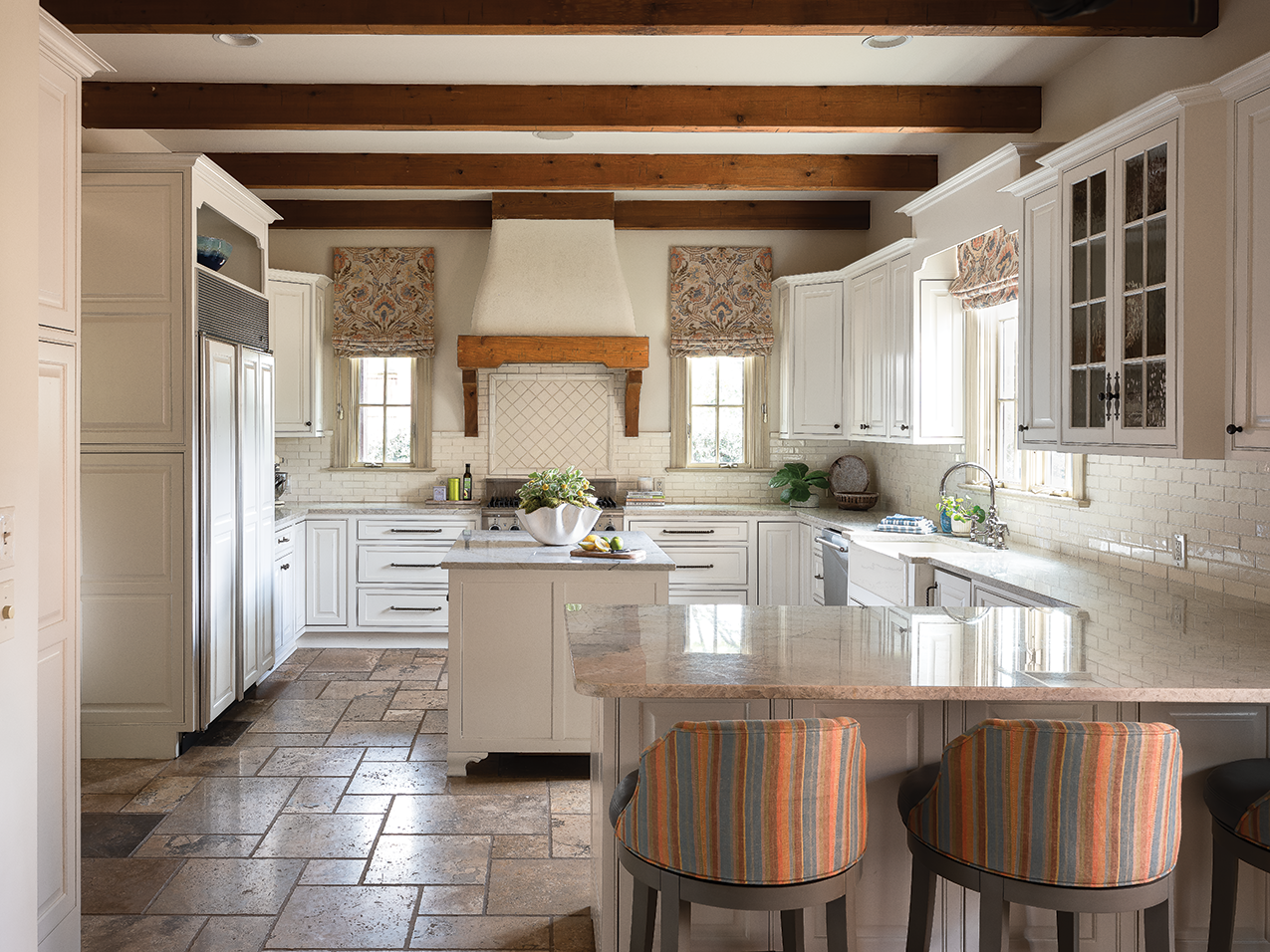
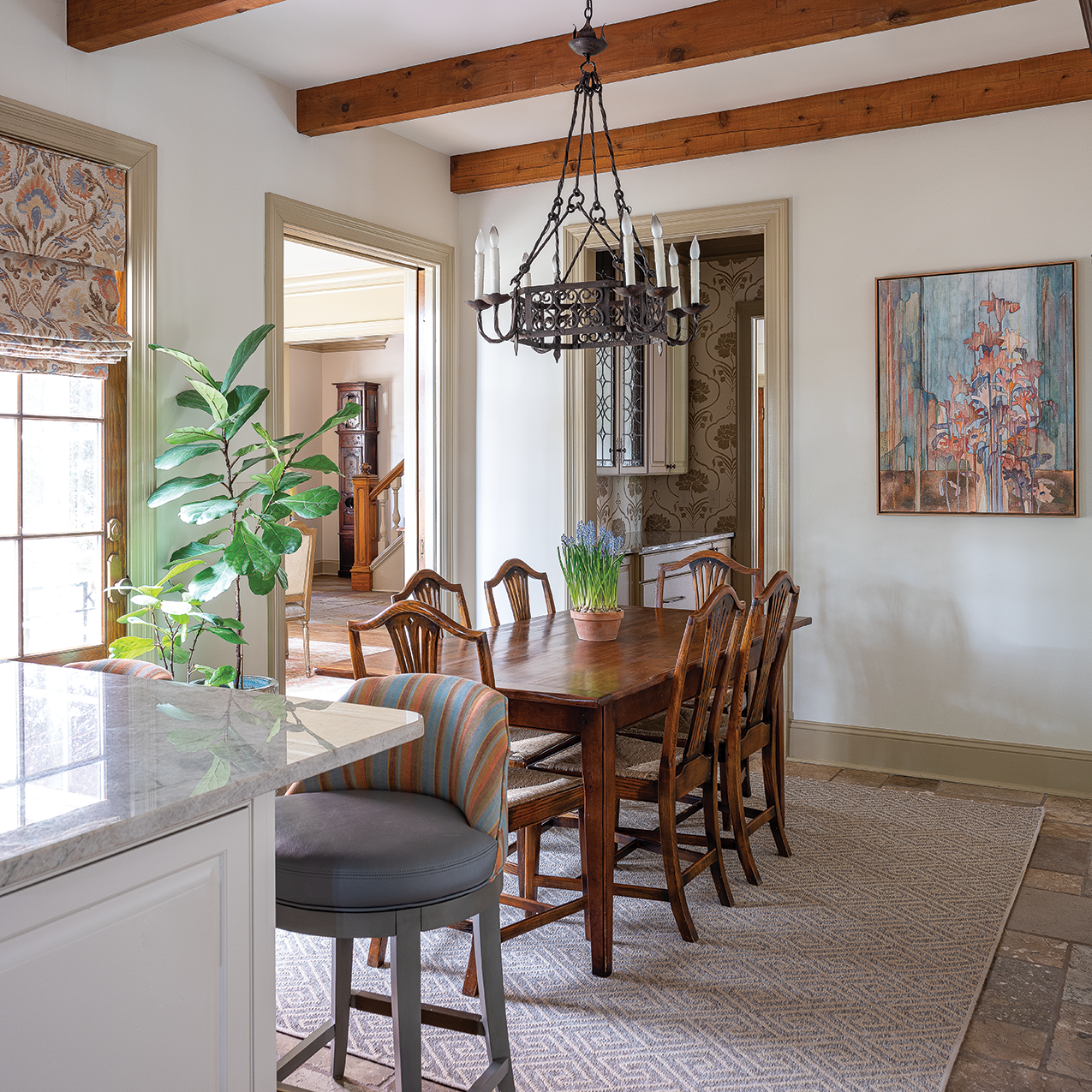
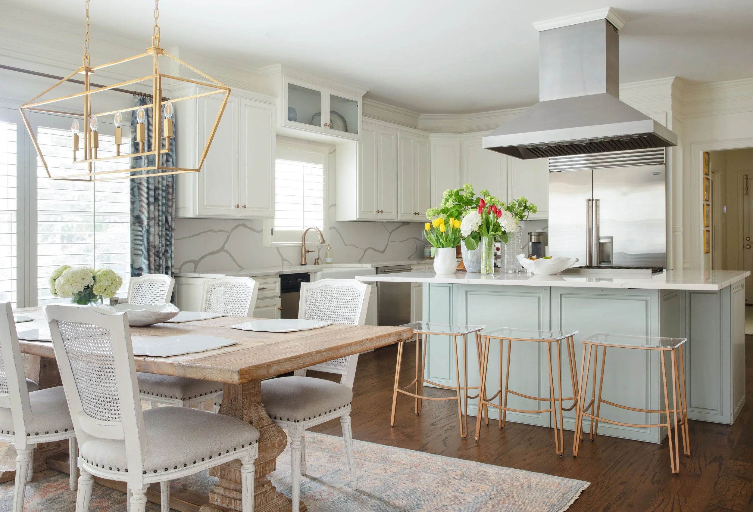
The initial renovation plan involved only a few small changes to the kitchen, and the team was hesitant to suggest otherwise at first, as it was basically in good shape. As plans progressed it became clear that the walled-off kitchen wasn’t suited to the family’s needs, so a larger-scale redo got underway. Walls came out to open the space to the adjacent keeping room. Plenty of windows and crisp white walls give the room a light and airy feel. Black designed a simple door style for the cabinets and painted most of them in a warm neutral tone. Stained white oak on the island and two wall units gives the pieces the look of fine furniture. Cambria quartz counters and backsplash in a subtle pattern complete the kitchen’s updated traditional character. The project went on to revamp the rear entry and laundry room and add storage. Black made sure the new pantry had room for all the family’s small appliances, a favorite feature for the couple, who love both the easy access to often-used electrics and the clean, uncluttered look it allows on the kitchen counters. 

“Little things mean a lot” may be an old adage, but it rings true with these homeowners. While they love everything about their remodeled place, it may be the small details that they appreciate the most. “The outlets hidden under the cabinets, the USB ports in certain places, the phone app that controls the thermostats, lights, the TVs, the gate. The pop-up downdraft vent so we didn’t have to have a hood over the island. The fact that we took out a whole wall to move the windows over three inches so they’d be centered. The thought Lindsey and her team put into the custom details of all the finishes, the furnishings and upholstery, the art and the accessories took the project from good to great,” says the husband.

It’s clear this couple made the right choice for their family when they decided to go “all in” on the in-town house they initially envisioned as a temporary fix to reduce commuting. Even though their East Memphis residence lacks the massive square footage of their Arkansas place, they could not be happier. “What we gave up in space we were able to gain in flexibility with the kids and friends. It’s a quality of life thing. You couldn’t drag us off this street!” admits the husband.

More than just location, though, they are delighted with the reimagining of their former “crash pad.” The wife sums it up with one brief thought: “It was a house when we moved in. Lindsey and her team turned it into a home.”

Becoming Home

Design by Parker Design Studio | Story by Terri Glazer | Photography by Annabella Charles

When a well-known local blogger and her husband moved from a compact downtown condo to a spacious East Memphis residence, they teamed up with designer Ann Parker to “course out” their new home’s renovation. The young couple wanted to turn the house into a home for their growing family a room at a time.

Potential design options were limitless, as they brought only a few pieces with them in the move. “It was a really fun opportunity to start fresh; we could be intentional about it,” says homeowner Cara Greenstein. With Parker’s help, Greenstein and her husband Alex Shindler made a plan for the entire house and prioritized the order in which they’d focus on each space. 

First on the redo menu was the kitchen, naturally. More than just a place to prepare family meals, the space is essential to the operation of “Caramelized,” the award-winning food and lifestyle blog Greenstein began about a decade ago. Plans for the kitchen remodel were finalized as soon as the house went under contract and work was completed before the couple moved in just before Thanksgiving 2021.

With the kitchen checked off the list, Greenstein and Parker turned their attention to the areas of next highest priority, the living room and dining room. And since the couple’s first baby was on the way, a nursery came into the picture, as well.

Asked about the initial design vision she shared with Parker, Greenstein says, “I tend to go for a clean, somewhat minimalist palette. My townhome was very neutral. Ann pushed me to think bigger.”

Parker started nudging her client a bit past her comfort zone with the first items they selected for the living room, a pair of modern chairs in a deep merlot velvet. Although she loves them, Greenstein admits that, left to her own devices, she would have opted for neutral upholstery. 

“The two chairs were our catapult in the living room design,” Parker adds. “Then pieces evolved, like the rug. We worked through what would look good—it's very collected. We didn’t just sit down and figure it out all at once, it was over a period of time.” 
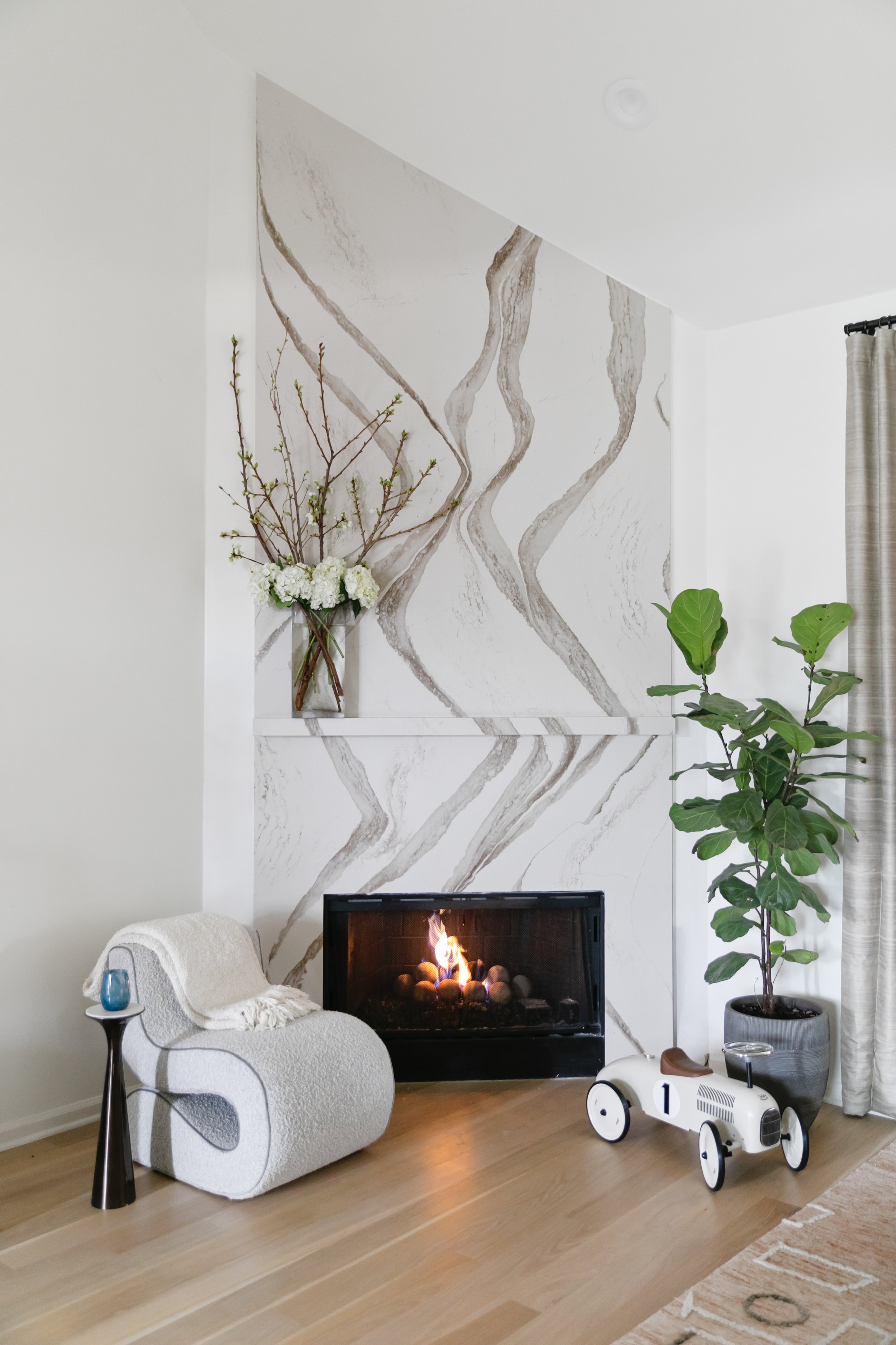
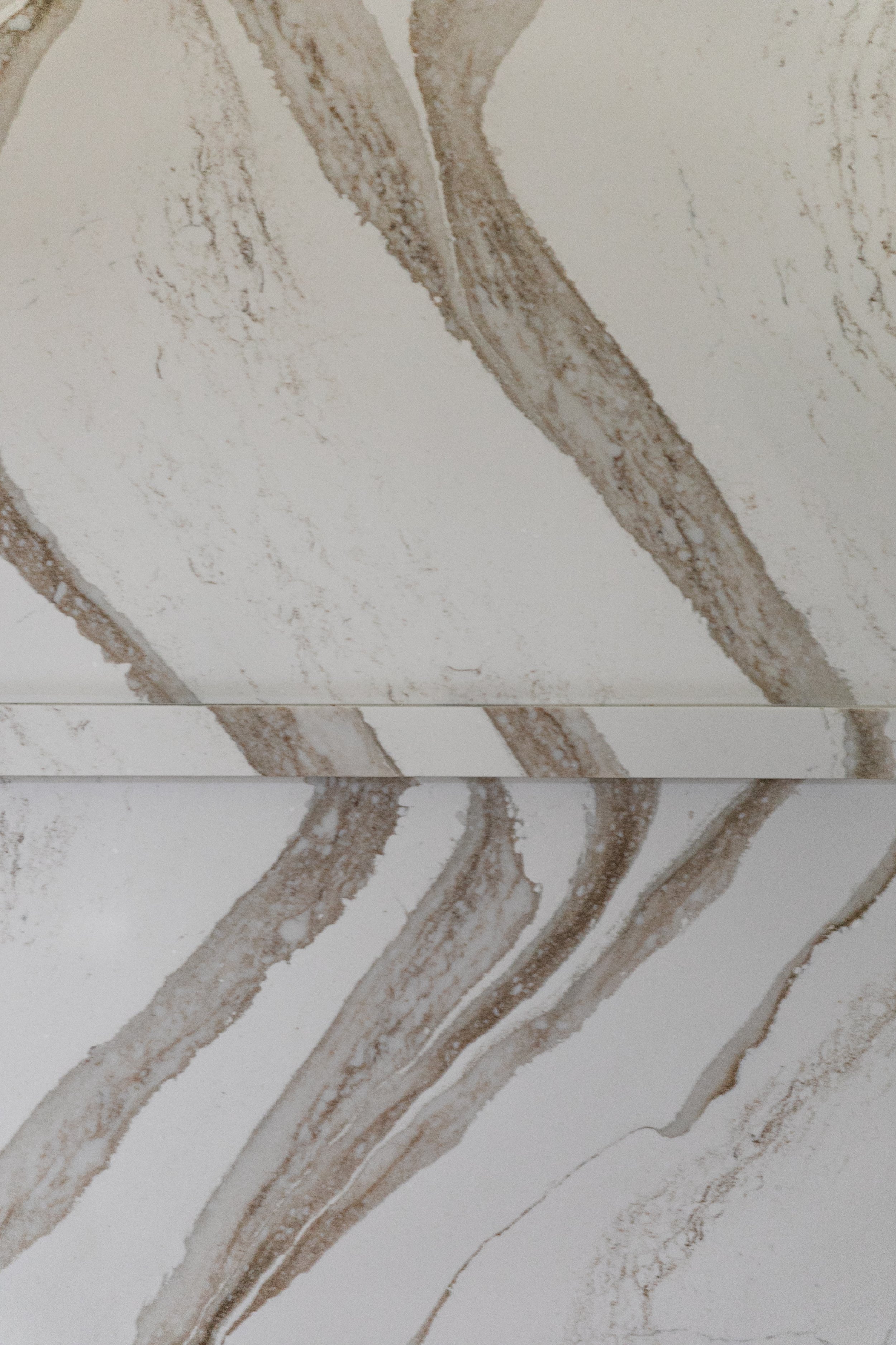
Greenstein was excited to have a fireplace in her new living room, and Parker viewed its redesign as “an opportunity to have some dramatic moments but still in Cara’s DNA.” She opted for a Cambria stone treatment from floor to ceiling. The bold veining in the stone makes a statement, and the subtle matching ledge mantel blends without breaking up the movement. 


Situated in the center of the home, the living room has few windows, so a large mirror on the wall opposite the fireplace was the logical choice to add luminosity. But not just any mirror. Leading her client to something out of the ordinary, Parker enlisted Chris Garner of Garner Framing Co. to create a piece that’s more work of art than looking glass. “It really just evolved with Chris and his skill and his thought process,” says Parker. Garner’s creation, a series of  wide antiqued glass strips in varying tones, creates impact with its clean lines.

Visual interest in the dining room comes from striking navy blue wallpaper with gold accents that covers the walls and the ceiling. “That’s something I would have never done on my own, but I just love these subtle examples that really make a difference,” says Greenstein.

The room is a prime illustration of the collected ambiance the homeowners and designer sought. The new dining table is surrounded by eight vintage chairs sourced from online consigner New to Me TN. An original oil painting dated 1965 that graces the wall came from the home of Greenstein’s grandparents. 


“It's such a mood in here. I love it with the gold accents. I've hosted some dinner parties so far and I'm really excited to do it more often. It's exciting to have really dedicated spaces for doing what I love.”
—Homeowner Cara Greenstein

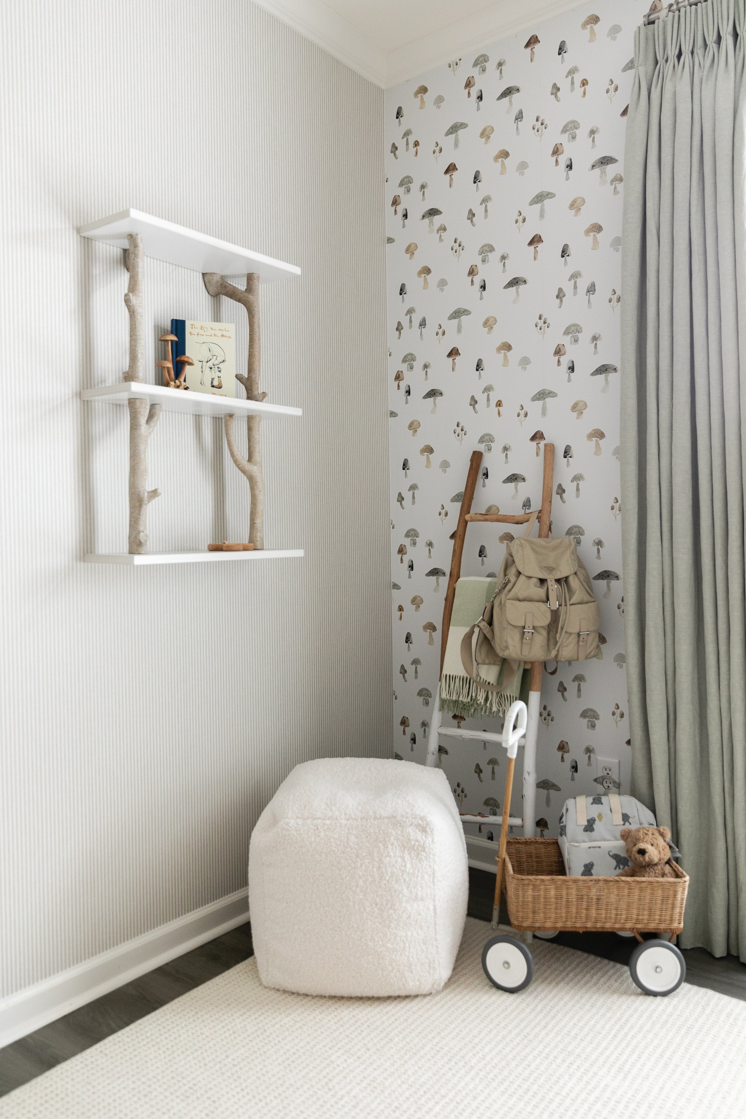
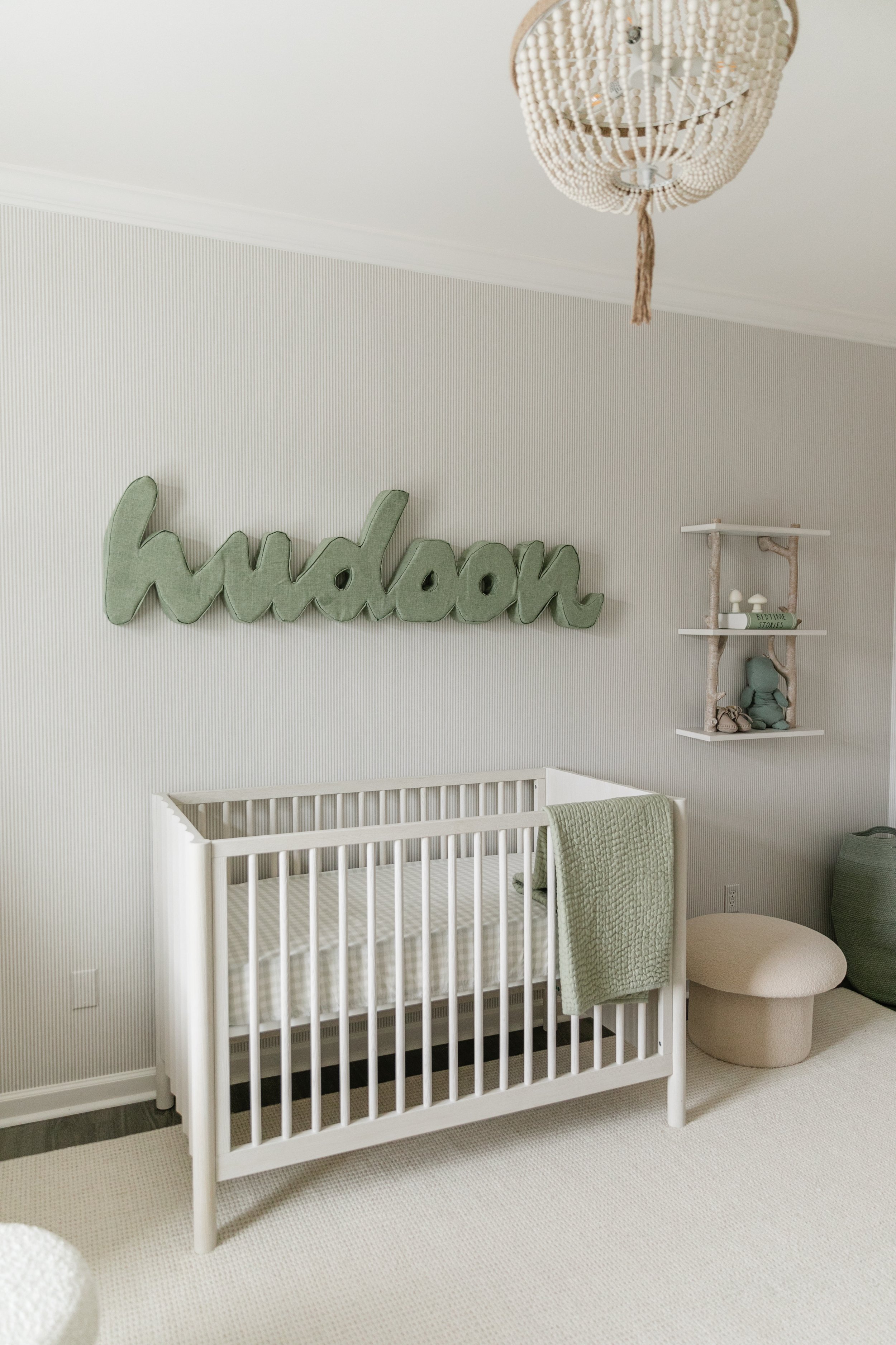
“This is one of the rooms where Cara was definitely the design leader,” says Parker of the nursery. “I was her touch base.” Incorporating her love of all things edible into every aspect of her life, Greenstein chose mushrooms as the inspiration for her new baby boy’s room. “They’re one of my favorite foods!” she admits.
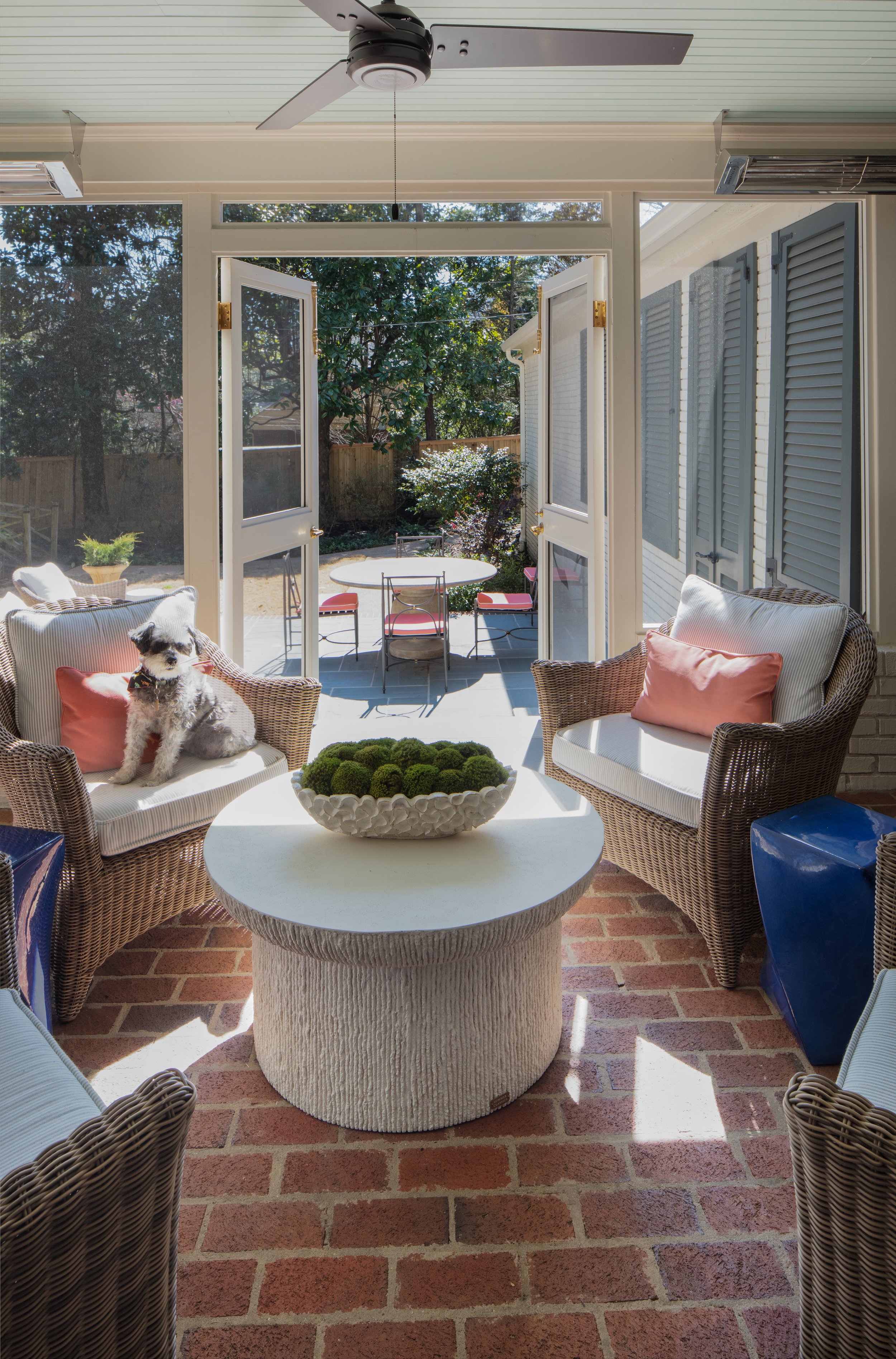
Adorable mushroom wallpaper found on Etsy lines one wall; Parker chose a coordinating stripe for the other three. With a nod to a woodland theme, the room’s palette leans to neutrals with sage and eucalyptus accents. Washed woods keep the look light and airy, and a white boucle glider and ottoman make a comfy spot for quality time with baby Hudson. Faux taxidermy heads of a longhorn and a razorback are a clever and cute nod to the alma maters of Greenstein and Shindler.

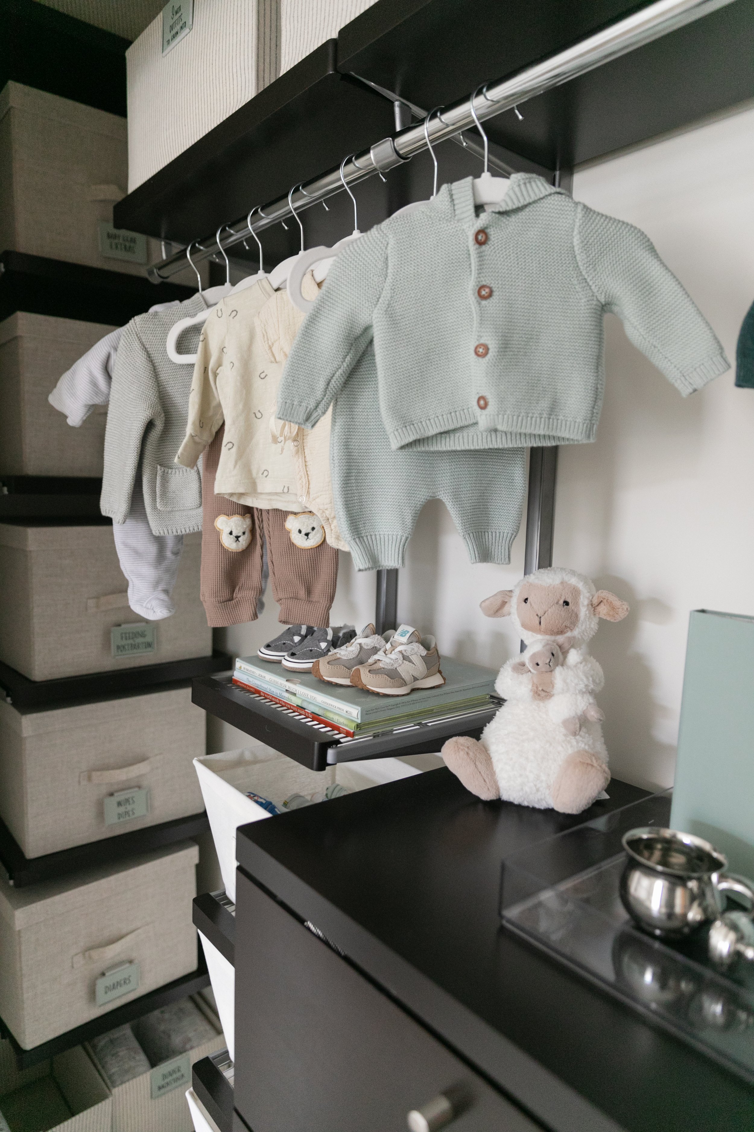
The new mom gushes over the nursery closet remake, done by local organization firm Trazo Design in collaboration with The Container Store. The pros at Trazo transformed every inch of the long, shallow closet into practical and accessible storage space with plenty of small containers just right for tiny baby items. 


Greenstein says it’s been a pleasure working with Parker on the master plan, and that she and Shindler are looking forward to adding their style to every part of the house. Parker echoes those sentiments, saying she enjoys helping the young family establish their home. That is the icing on the cake.

New Color for a New Season

Design by Elizabeth Malmo Interior Design | Story by Terri Glazer | Photography by Sélavie Photography
“Coming from Atlanta in 2020, where the trend was still very much the neutrals, I wanted this house to be an explosion of colors—my favorite colors. And I wanted it to reflect how we live in retirement now.”

Those two principles guided the reshaping of a classic ‘60s-era home in an established East Memphis neighborhood. 

Designer Elizabeth Malmo oversaw the project with RKA Construction as the contractor. Says Malmo “Everything just needed to be touched. We didn’t knock down a lot of walls, though. The layout as you see it is almost as it was originally.” Short of taking out walls, however, the home’s renovation was all-encompassing. “There’s not a hinge, not a doorknob, not a light fixture that hasn’t been changed,” says the homeowner.

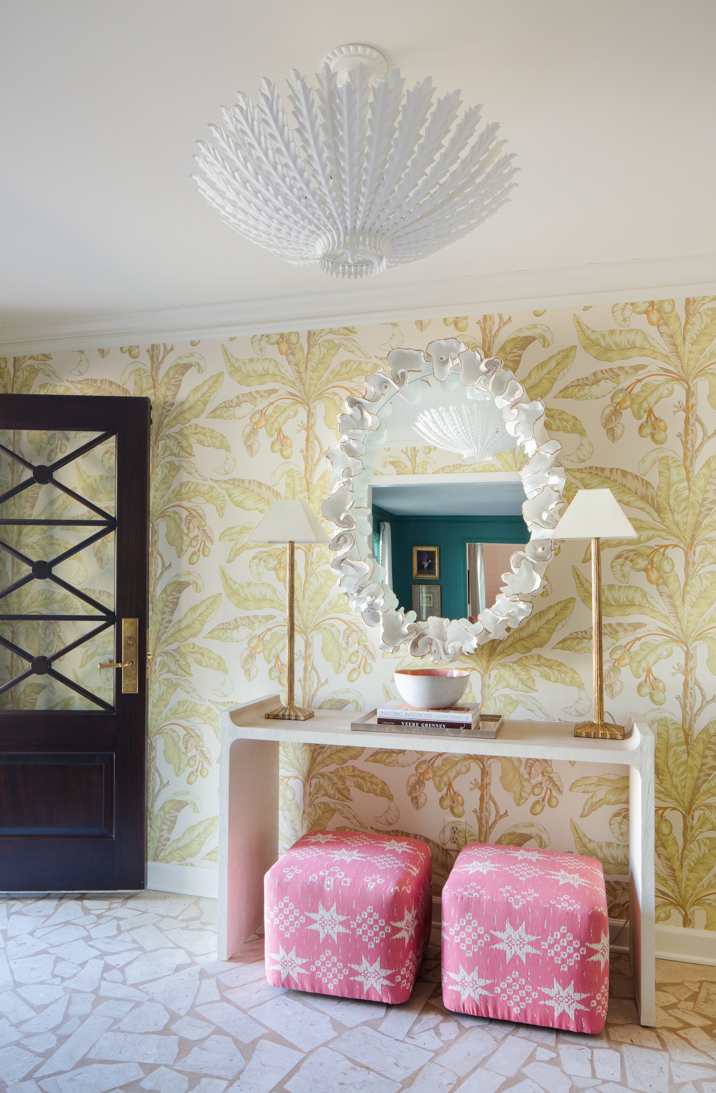
Malmo, owner and lead designer of Elizabeth Malmo Interior Design, says she wanted the entryway to have a big impact and “why not have fun,” she adds, referring to the statement wallpaper and crisp white light fixture. Twin poufs under a console table give a hint of the coral hues that reappear throughout the home. The only surface in the area that remains as it was is the floor. Malmo and the homeowners agreed that the white marble terrazzo is classic and should remain as a nod to the home’s heritage.

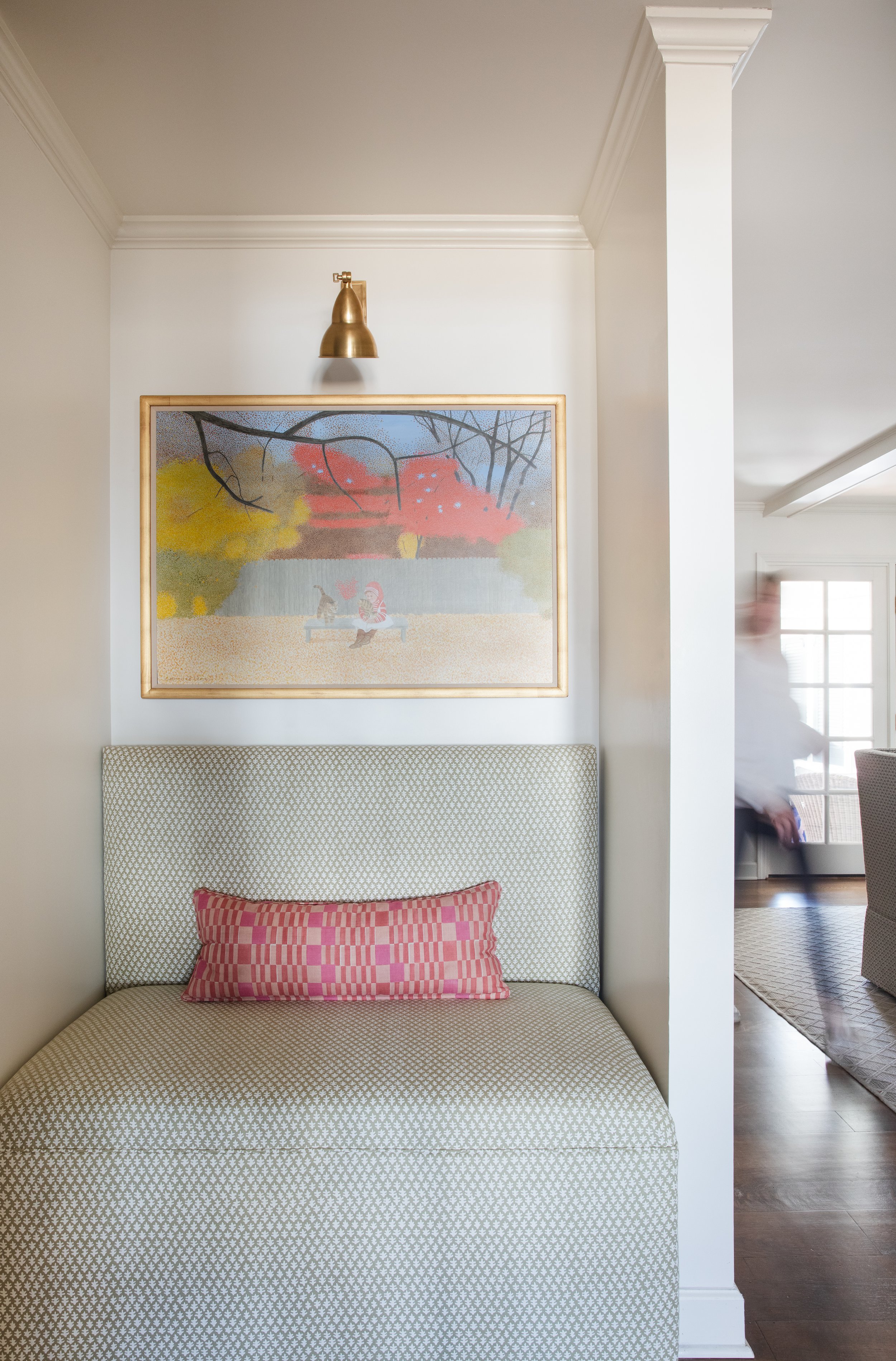
Just through the foyer is a little niche that the owner calls “pure Elizabeth.” A former coat closet now is home to a charming banquette, over which hangs a vintage Carroll Cloar painting. The couple’s art collection is large and varied, from paintings created by family members to works by local and regional artists.

“Having the walls and the sofa the same color gives you a story throughout the space. You have this rich color in the living room and then it’s a little bit lighter beyond. It makes you wonder, ‘What’s back here?”

—Designer Elizabeth Malmo

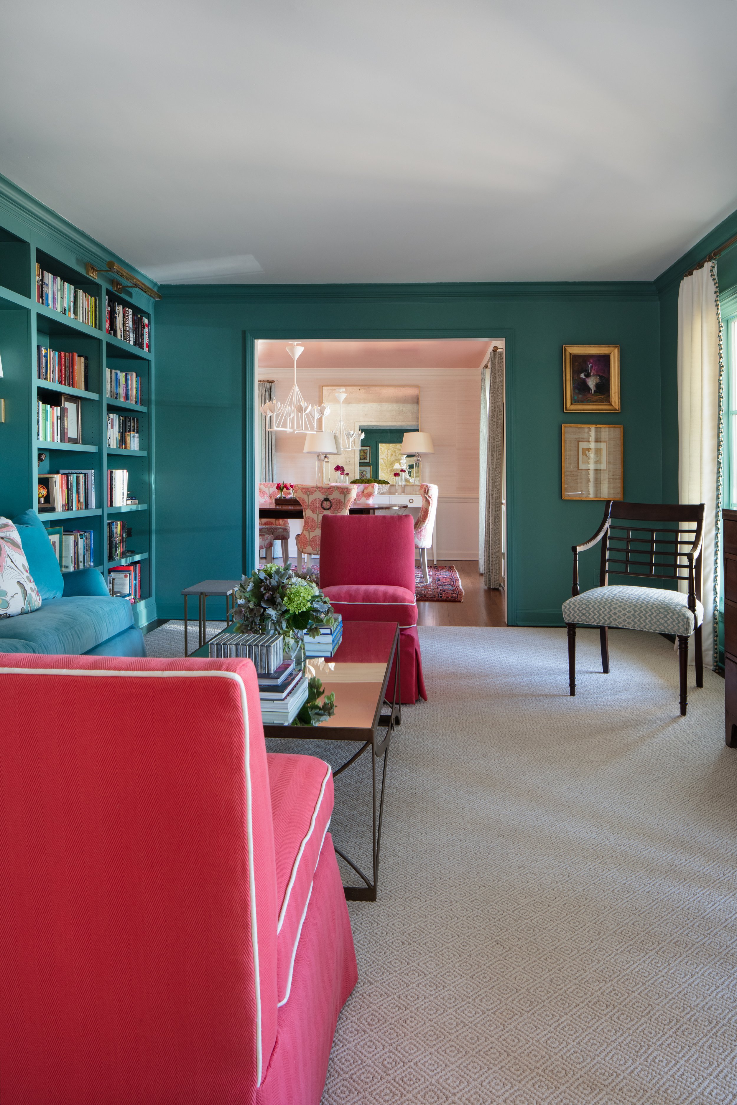
In the living room Malmo incorporated the homeowner’s request for “a teal velvet couch inset into bookshelves,” then took the concept to a more intense level by painting the shelves, the walls and all the trim in Benjamin Moore Woodbury Green, a supersaturated teal. She added a pair of slipper chairs in a mouth-watering shade of coral. The punchy colors blend perfectly with traditional and antique pieces the family brought from their previous home in Atlanta.

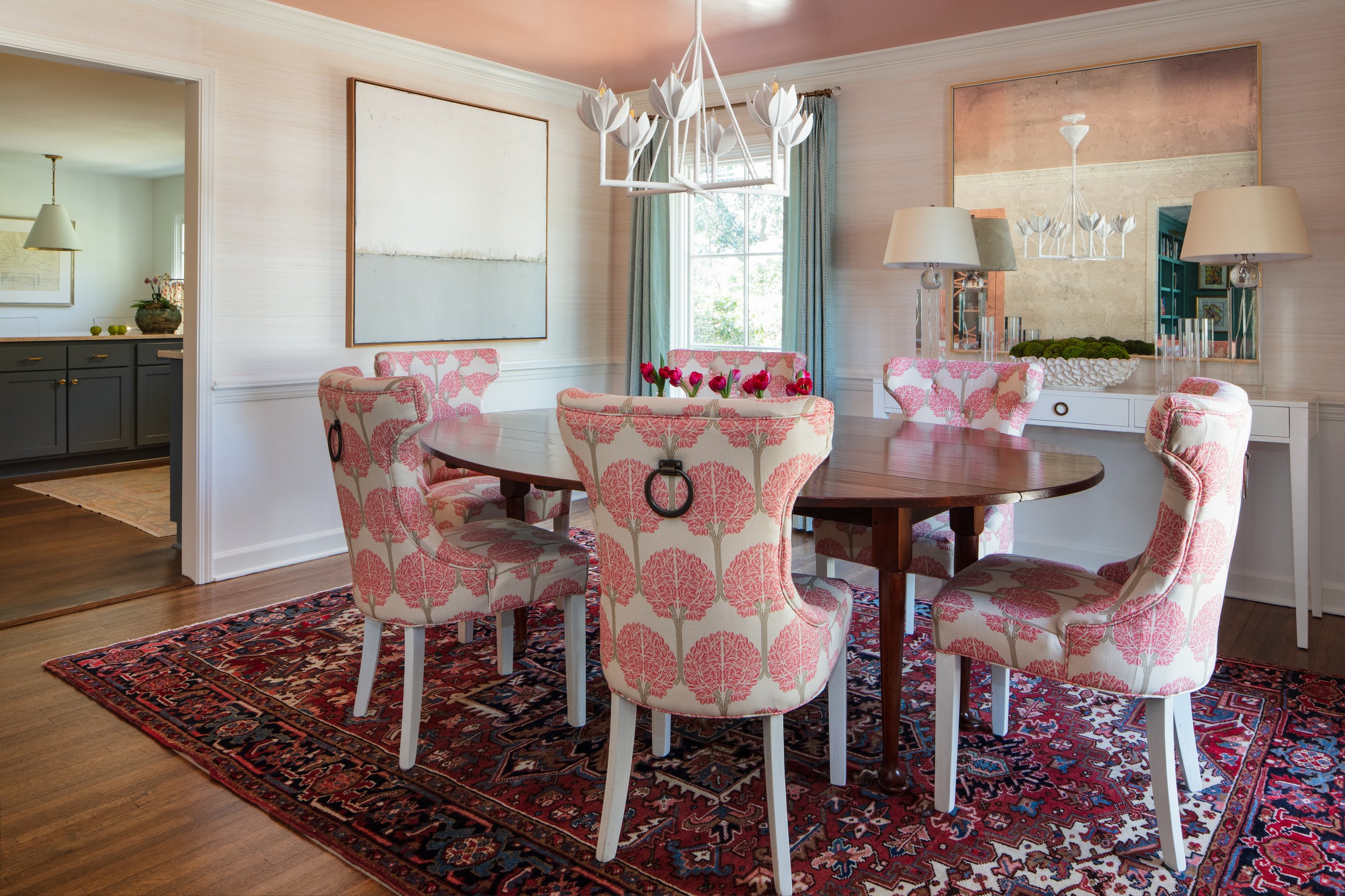
Just past the living room, the dining room almost seems to glow, thanks to another design feature requested by the homeowner. “I knew I wanted a coral, lacquered ceiling in that room,” she says. Paired with subtle white grasscloth on the walls, a vintage Oushak rug in traditional reds and blues, an antique oval table and freshly reupholstered chairs, the effect is stunning. 

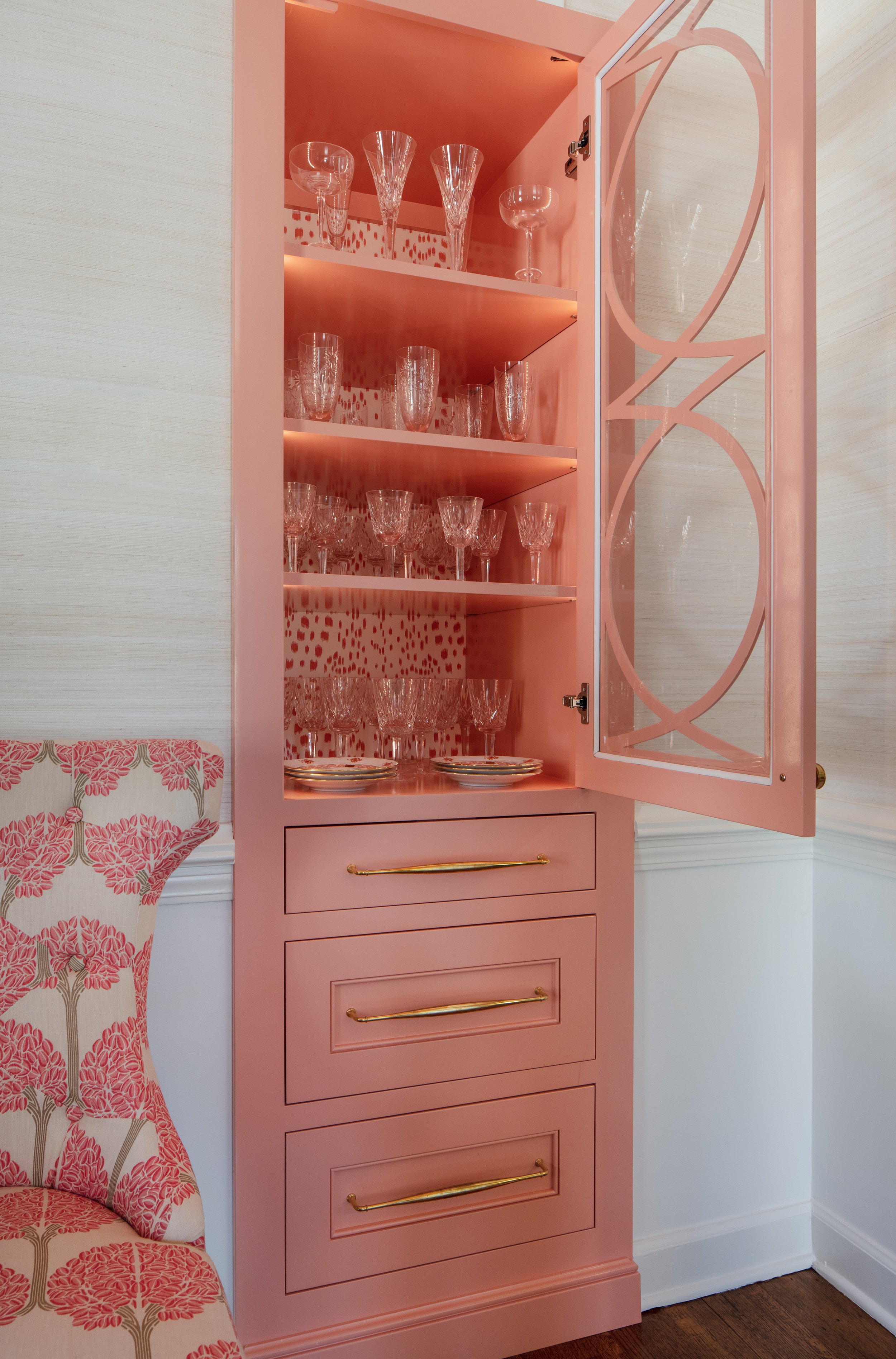
Perhaps the most unique feature of the space is the creative reimagining of a former closet. “We had the idea to make it into a china cabinet. It was narrow and deep before and we both thought it could be something better,” explains the designer. Better indeed is the eye-catching little built-in covered in coral paint and accented with the cutest Brunschwig and Fils dotted wallpaper lining its back face. “RKA did an exceptional job of taking our vision and creating this little moment,” she adds.

The kitchen’s original layout made sense and the appliances had been updated recently, so a complete redo was unnecessary. Malmo freshened up the cabinet hardware and fixtures, added new window treatments and replaced the countertops with quartzite in a subtle pattern. The homeowner loves the stone, but the details that Malmo paid attention to have her singing the designer’s praises. “When they were measuring for the backsplash she said ‘Wait a minute.’ She got out a piece of paper, drew the shape out and asked them, ‘Can you make it like this?’ The result is a combination of right angles and curves that adds a graceful touch to not only the kitchen, but is repeated in several of the bathroom stone treatments.

Malmo freshened up the laundry area and powder bath behind the kitchen with more of the homeowner’s beloved teal in both the paint and the wallpaper, glammed up with shiny gold accents. Classic penny tile on the floor will withstand the wear and tear that’s inevitable in a rear entry area. RKA hit another home run with the custom vanity in the half bath, proving that even a small space can exude elegance.

The spacious family room overlooks the home’s scenic backyard. Off to the side, the garage was originally open and could be seen from the den. Now it’s buttoned up handsomely with louvered shutter panels painted in a time-honored Charleston green, thanks to Malmo’s creative suggestion to improve the view from the spot where the couple often spends time relaxing and watching TV.

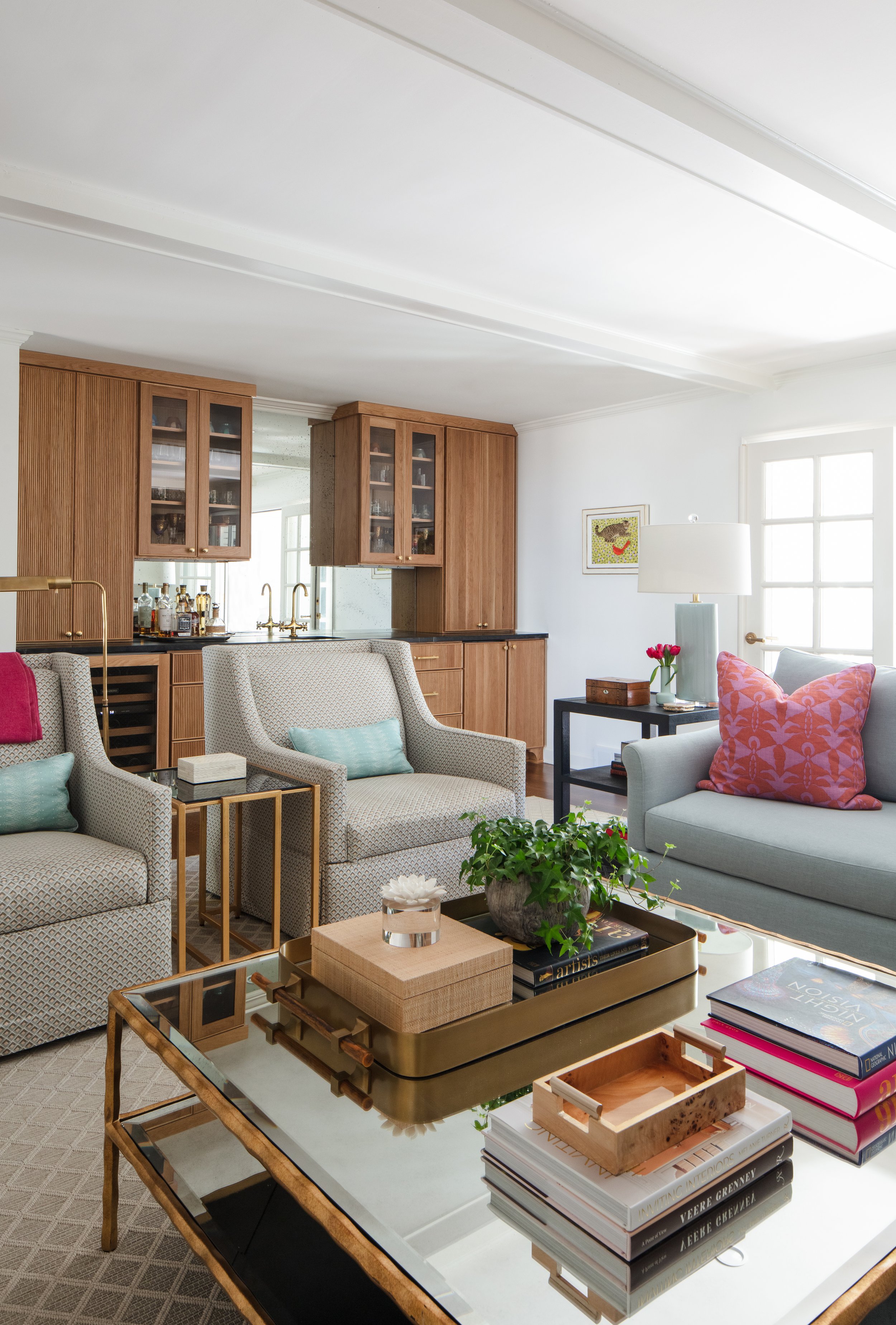
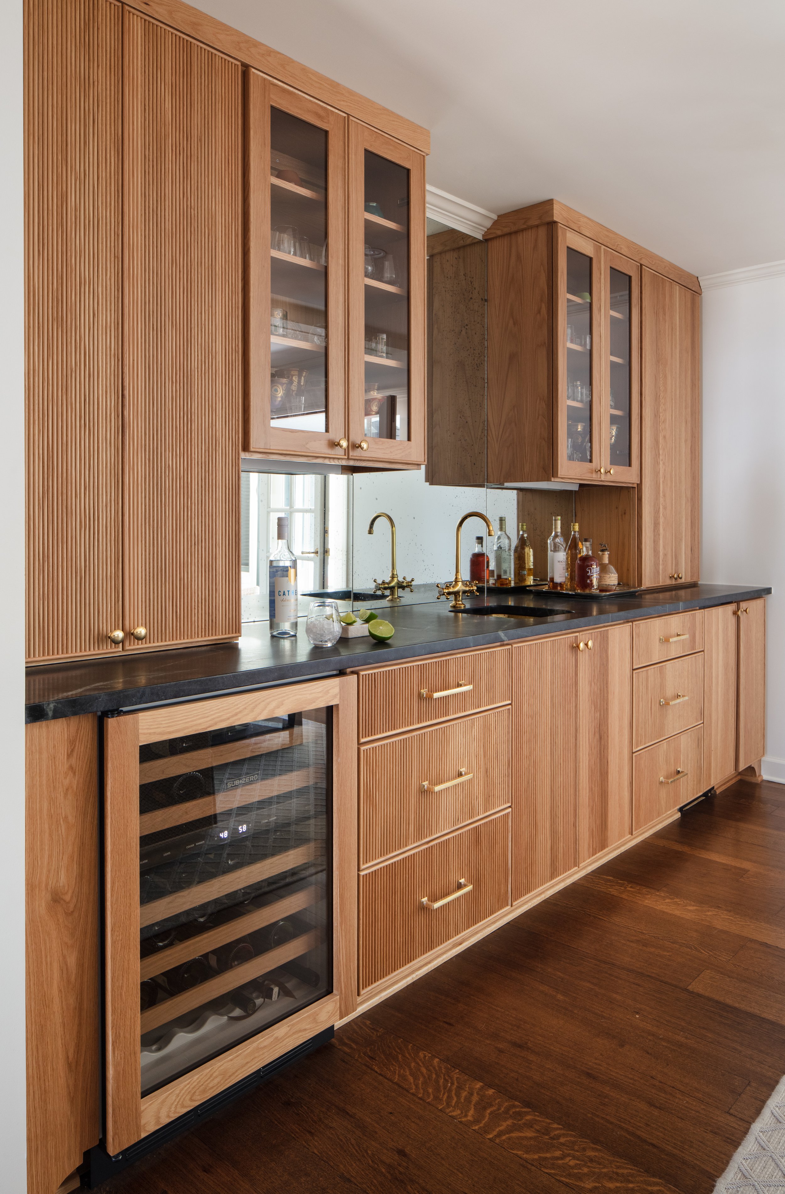
The room’s focal point is a custom wet bar, another must have for the homeowners. Reeded wood cabinet fronts in a beautiful honey-colored finish, black countertops and brass accents define the generously sized space. By design, there’s plenty of room for the hosts to entertain, and they frequently do.

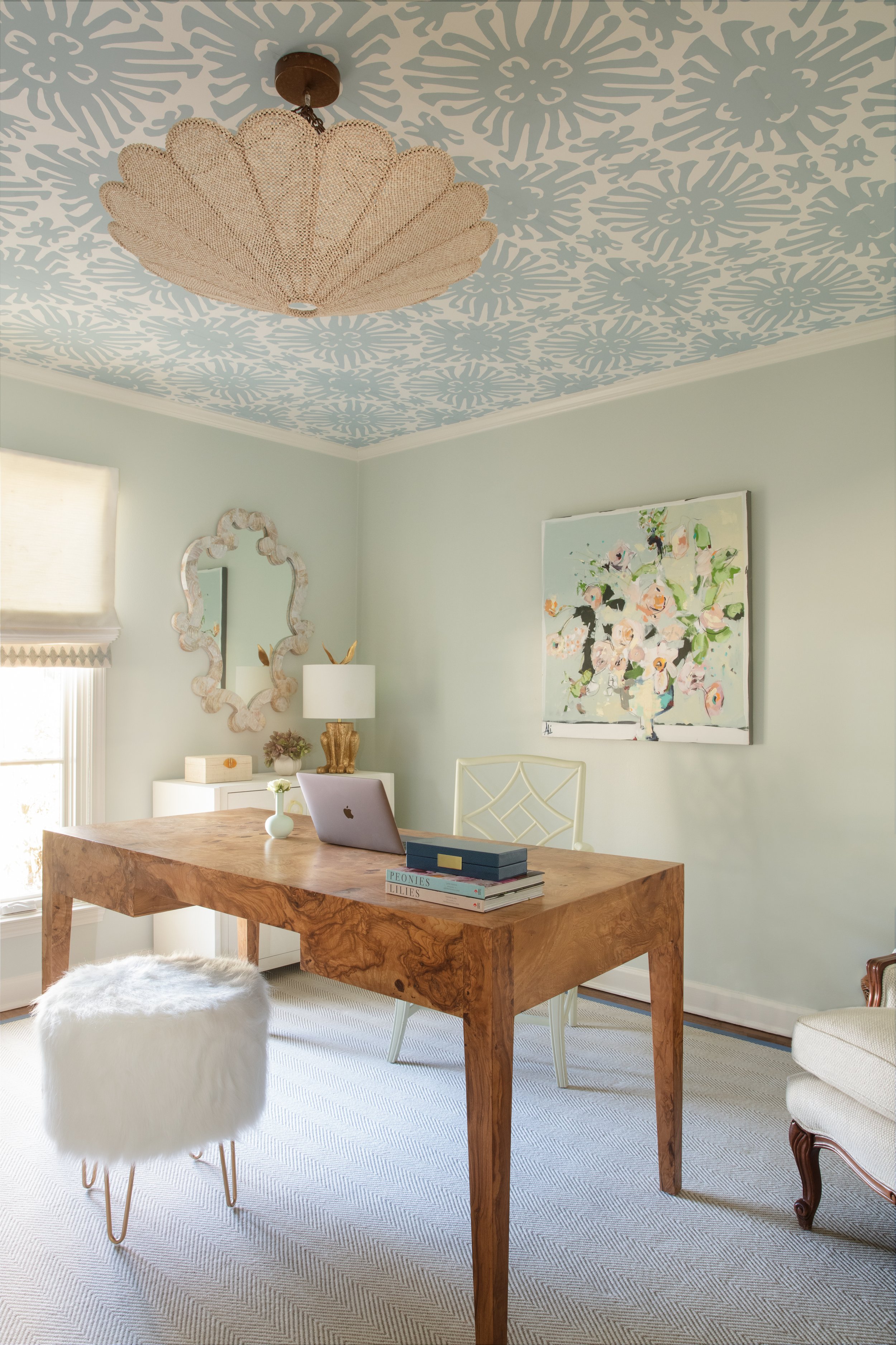
Along with the primary suite, the home’s main floor includes two extra bedrooms, set up as personal spaces for the couple; an office for him and a “retreat” for her. The office is handsome and masculine with walls bathed in a deep blue and covered with mementoes of a successful career. All work and no play would not do, though so keepsakes from his long-held hobby of golf are also on display. Her retreat is the perfect blend of glamor and whimsy with a burl wood desk, a white fun fur footstool and a fanciful Quadrille wallpaper on the ceiling.

The upstairs is dedicated to making guests feel at home, an important concept since the homeowners have out-of-town friends and family over often. Two comfortable bedrooms give visitors privacy. Malmo redesigned the upstairs bath intelligently, taking out two unneeded closets and replacing them with a freestanding vanity and stool. She also raised the height of the original cabinets to a more comfortable 35 inches, and replaced the countertops, floors and lighting. 

Also upstairs is a small room, too large to be a closet, but not really a full-sized bedroom. After discussing several possible uses for the space, Malmo and the homeowner settled on making it multi-purpose. It’s furnished beautifully, with an inviting loveseat that makes a cozy spot for guests to relax with a morning cup of coffee. The loveseat is a sleeper, though, allowing the nook to function as a private sleeping space when needed. “Our oldest granddaughter is 14 and she loves it. Of course, this is where she sleeps when she comes to visit,” says the homeowner.

The renovated home now suits its owners to a tee, tastefully decked out in their ideal color palette, their treasured art and furniture blended seamlessly with thoughtfully chosen new pieces and perfectly suited to the way they live in retirement.

Evolving With the Family

Design by Tara Felice Interiors | Story by Terri Glazer | Photography by Sélavie Photography
As most homeowners would agree, the term “finished project” hardly ever applies when it comes to a house. This East Memphis residence is a shining example of that concept.

When the current owners bought the house about six years ago, they knew a major renovation was in its immediate future. Not only was the red brick exterior, embellished with New Orleans-style wrought iron, not to their taste, the interior bore the scars of its past several residents: a hoarder, some squatters and thousands of honey bees that were found in the walls. Despite the place’s sad state, the young couple envisioned that it could be salvaged. They also loved the location and the large backyard, perfect for their growing family.

With the help of a long-established architectural expert and an interior designer whose company was just getting off the ground, the family transformed the home from top to bottom, inside and out. Architectural designer Tom Sullivan drew the new plans, which involved a drastic change in the floor plan to accommodate the family, which included two children at the time. Tara Engelberg was friendly with the couple, as her husband and the homeowner are related. As she was just starting to test the waters with her newly formed design firm, Tara Felice Interiors, she reached out to them and they soon became clients. 

“They may as well have taken it down to the ground basically and started from scratch,” Engelberg says. “It has a completely different facade. On the interior they took down walls and really opened everything up. This looks nothing at all like what it looked like before.”

As extensive as the project was, however, it was not the final product. The ensuing years saw the addition of two more children, along with the need to expand and repurpose parts of the house to better suit a family of six. Completed in late 2021, phase II of the home’s evolution added a new living area, an outdoor patio, a bedroom and a couple of bathrooms, and reimagined a former keeping room off the kitchen. Engelberg was at the design helm again, this time with Tim DiSalvo & Co leading the construction effort.

The two additions blend seamlessly, as all good renovations should, resulting in a showplace of a home that is hip, sophisticated but casual, and above all, able to withstand the wear and tear inevitable in a household with four kids and a very large dog.

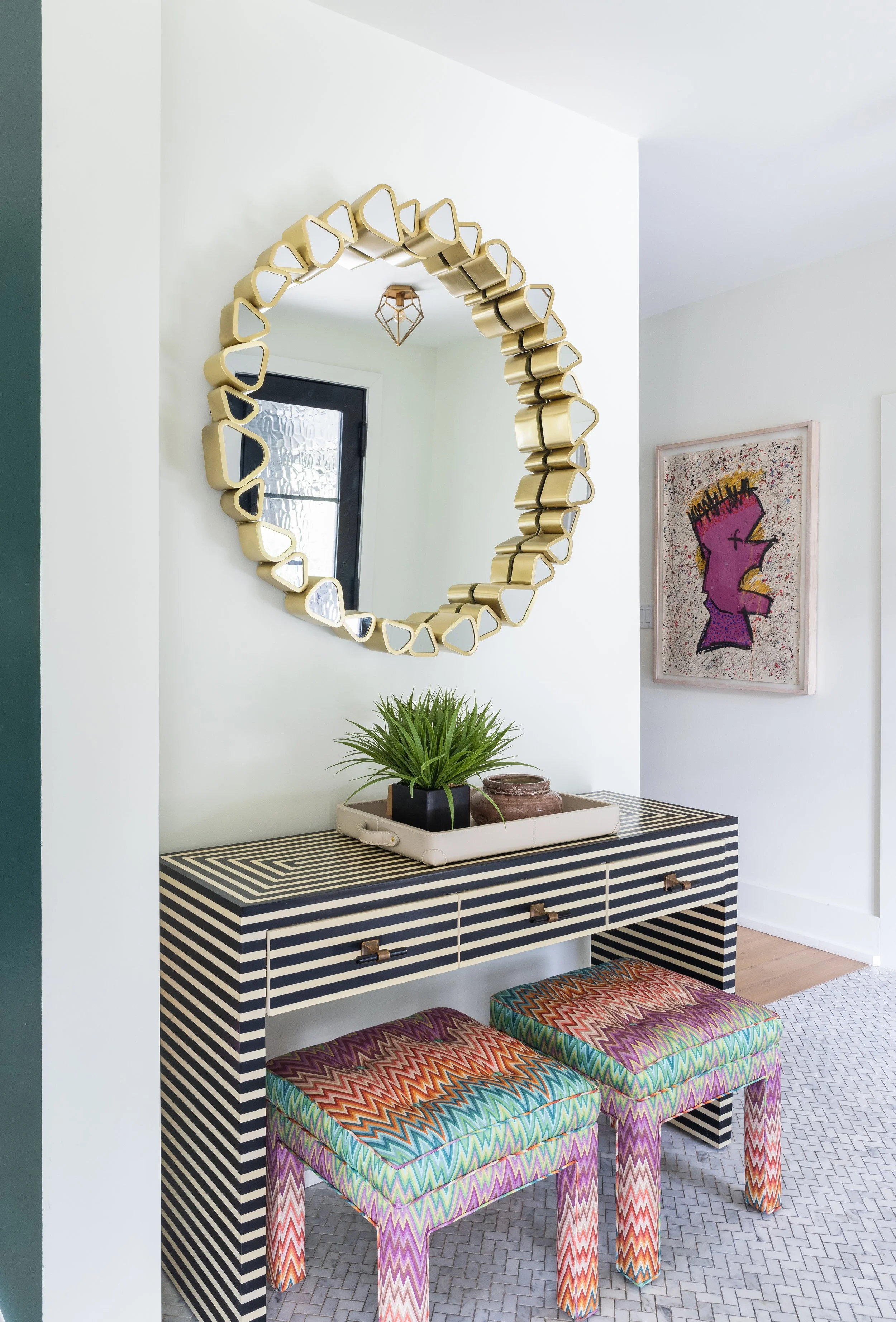
The home’s visual appeal begins with its new exterior, white wood with black trim. “The white is just so crisp and appealing and the black beams are refreshing,” says Engelberg. She extended the black and white contrast into the entryway, where an ebony- and ivory-toned parquet console greets guests. Above it, a round mirror embellished with stylized triangles breaks up the straight lines, as do twin vintage stools tucked underneath. The designer found the stools at one of the estate sales she loves to frequent, always on the hunt for vintage treasures to add an eclectic touch to a room. Now covered in a fabulous Missoni flame stitch fabric, they bring color and another geometric shape to the vignette. The herringbone pattern of the marble tile floor repeats the pattern. “I always love to use different flooring in a foyer to set it apart from what you’re about to enter in the rest of the home,” explains Engelberg.

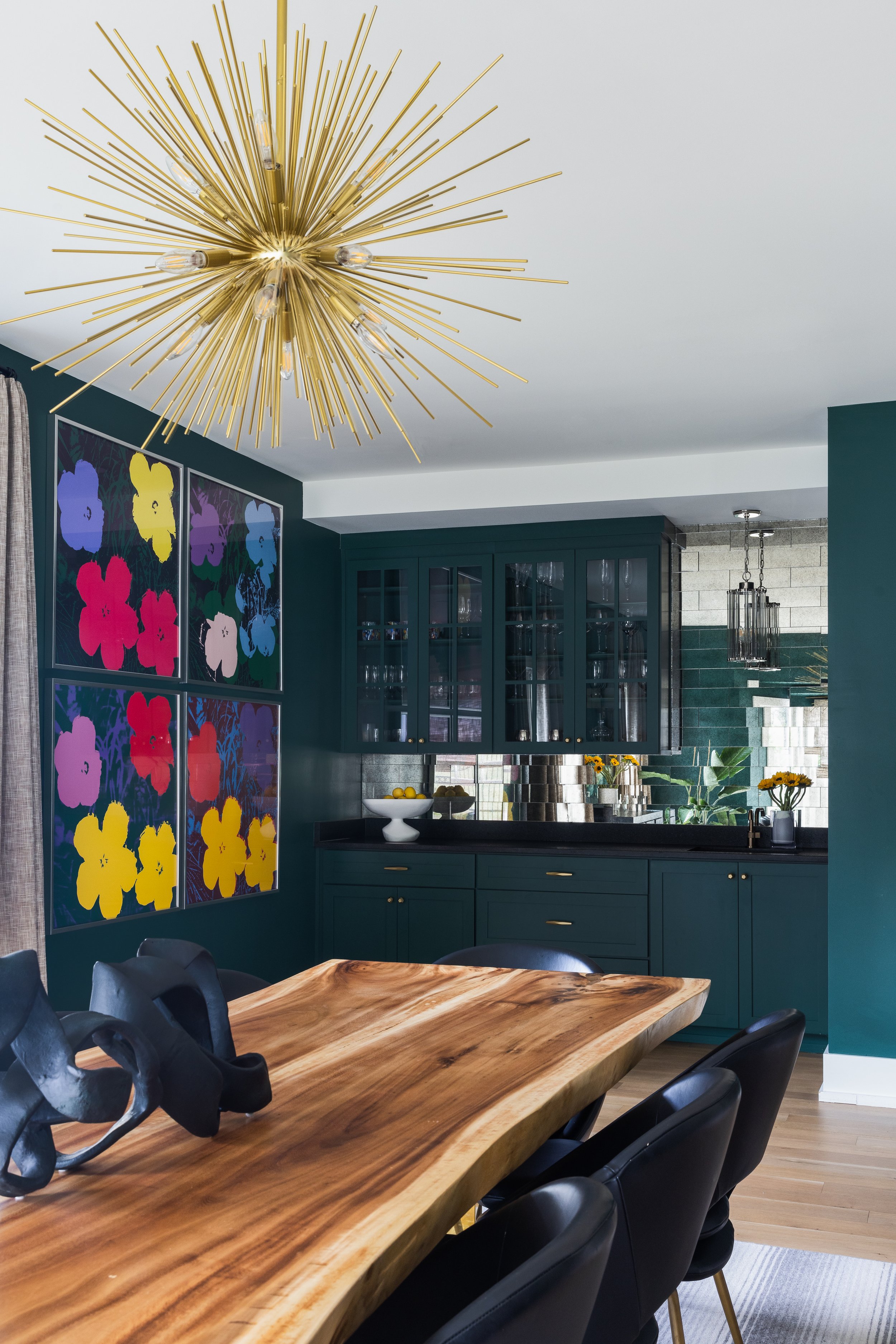
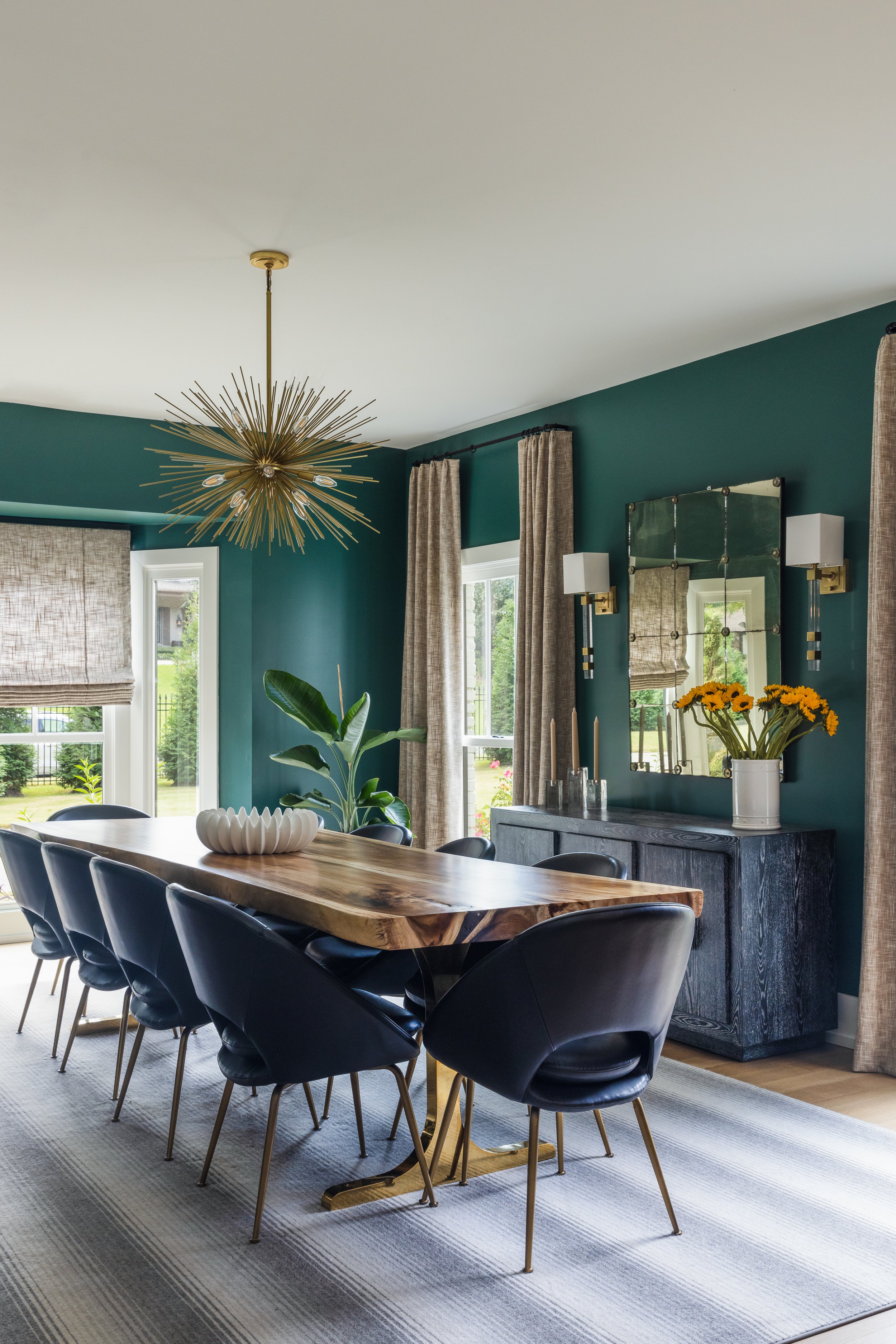
“Bold and eclectic” sum up the vibe in the dining room. Inspired by the colors in the artwork the couple selected for the space, the designer chose a deep, moody green for the walls. A bright white ceiling and trim, along with a mirrored backsplash in the built-in bar area, keep the look from going gloomy. The room’s centerpiece, a spectacular live-edge dining table that seats 10, is perfect for entertaining large groups. 

Overhead, a gold burst chandelier gives a glam nod to mid-century style. Dramatic lighting accents most rooms in the home, as it does in many Tara Felice projects. Engelberg feels that statement light fixtures are a worthy place to splurge, as they are unlikely to endure wear or damage during daily living. “Lighting is like the jewelry in a room to me,” she says.

Just off the dining room sits the airy and bright kitchen. Although the basic concept from the initial renovation remains, the most recent work included a few tweaks here. The large center island received a second sink, a new wrap-around maple butcher block, and additional cabinets underneath. 

The kitchen opens into a space that was totally reworked in phase II. Set up as a combination breakfast and keeping room in the first remodel, the area is now dedicated to casual dining. The large natural wood table has plenty of room for the couple and their extended family, and the woven leather seats and backs on the chairs exude a rugged beauty that will stand the test of time and children. New built-in cabinets on the far wall combine beauty with practicality, too. A large family can never have too much storage.

A major component in the latest round of work was the creation of two new indoor living areas. To accomplish this, the homeowners transformed a former sun porch into a den and added a TV room on the rear of the house. The two spaces sit next to one another, and although each has its own distinctive mood, they coexist perfectly.

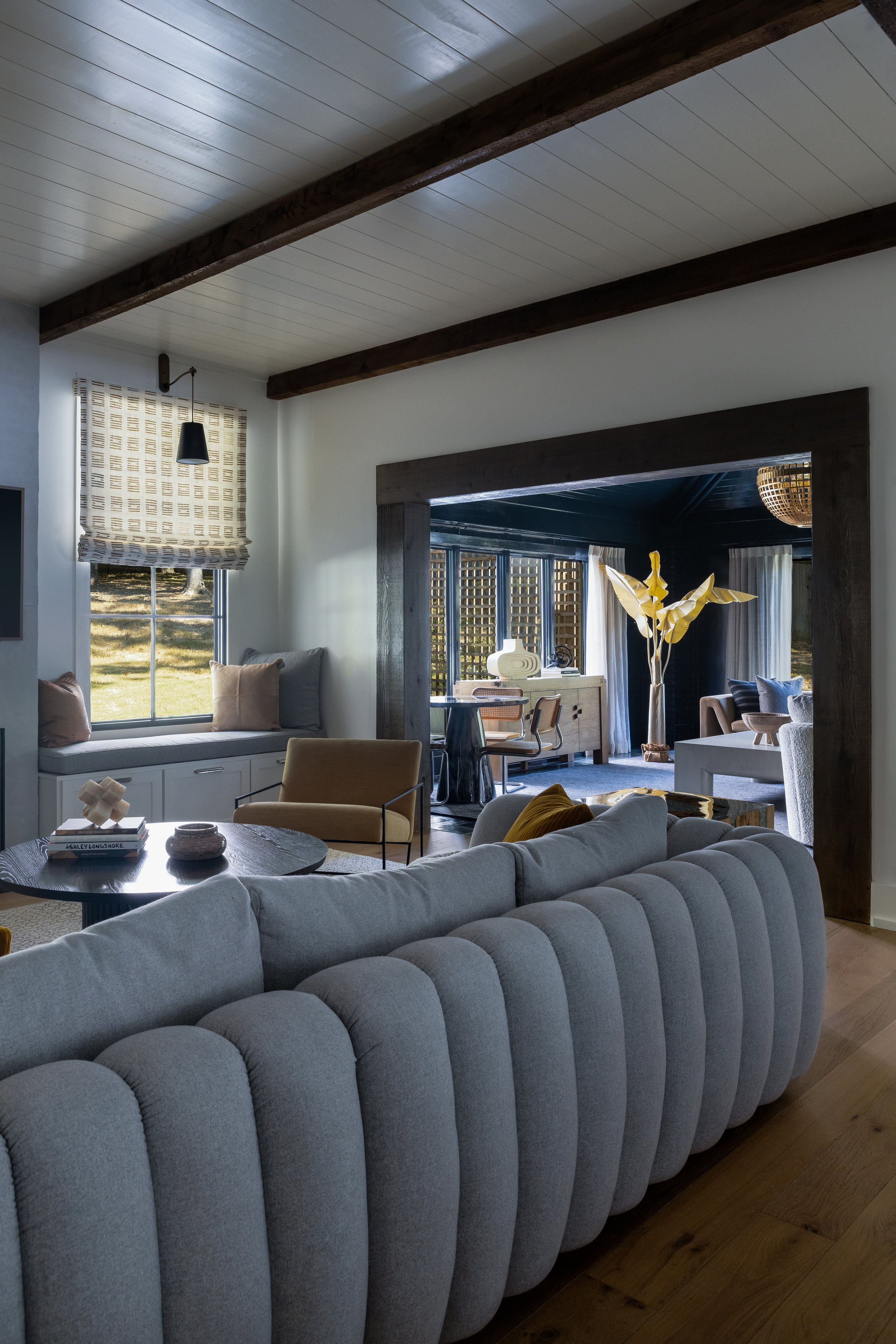
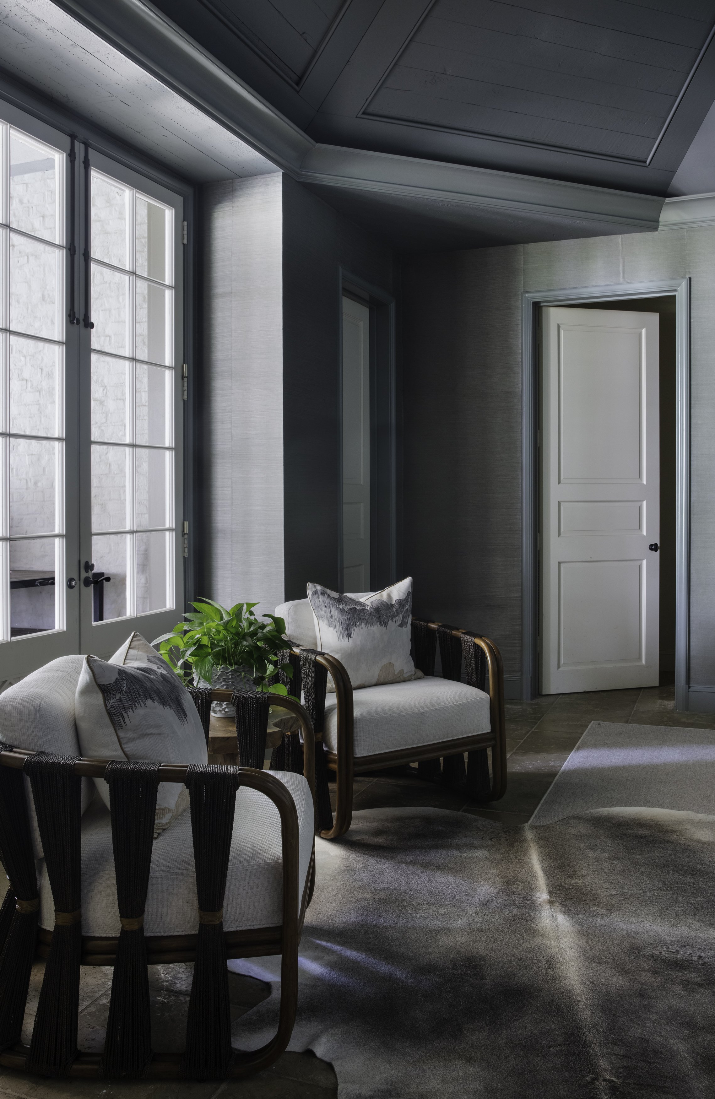
Drama makes a reprise in the new den, where glossy black paint covers the walls, trim and tongue-and-groove vaulted ceiling. Comfortable furnishings in lighter tones and natural woods pop off the striking backdrop. Engelberg again paid attention to geometry in this space, balancing the straight lines of the paneling and the oversized square coffee table with the curves of the globe-shaped light fixture, the white boucle barrel chairs and the eye-catching round stone game table.

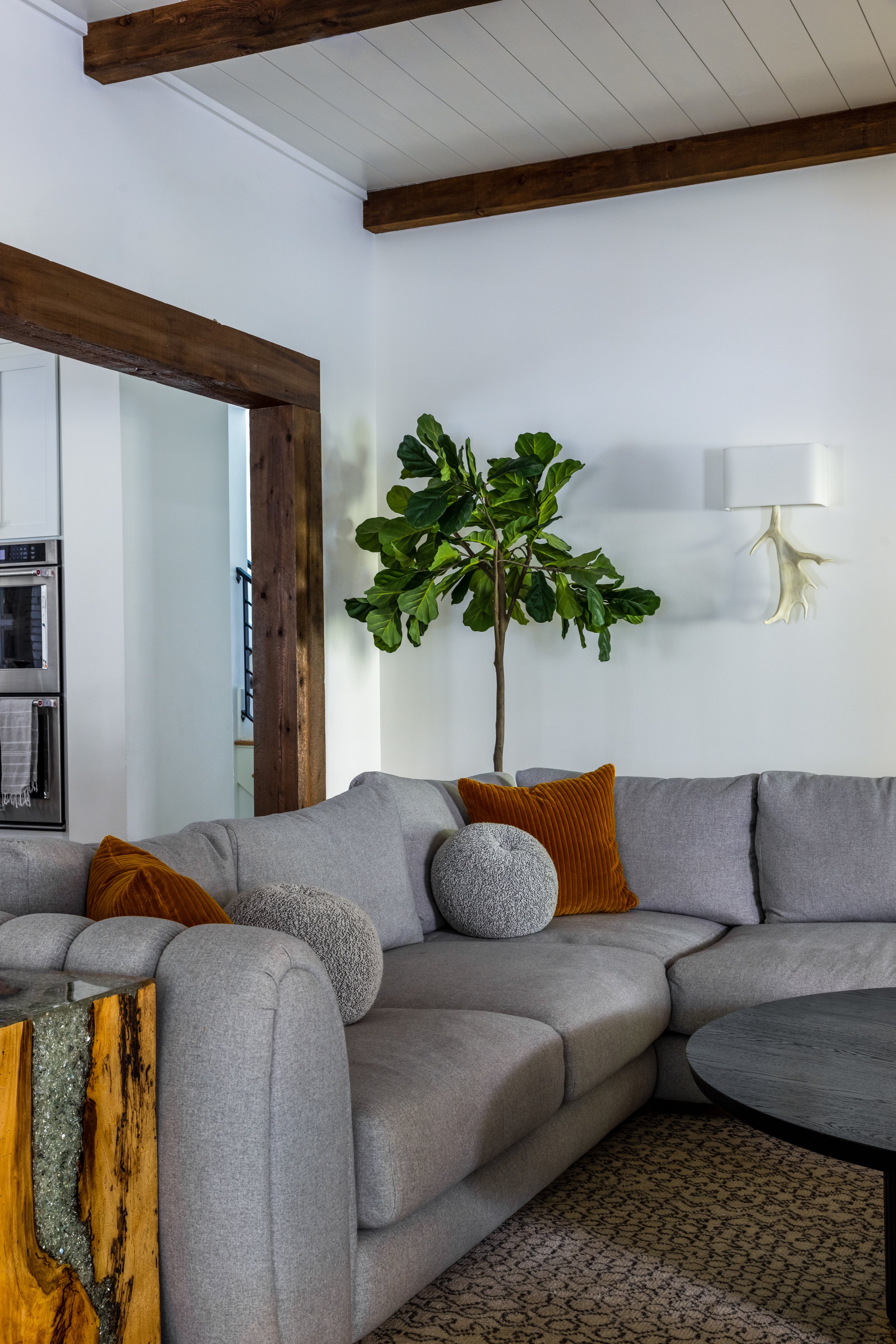
“We knew we were going to have to do something amazing in here,” says Engelberg of the new TV room. “Because you can see the back of the sofa we wanted something that was a show stopper.” Mission accomplished. The channeled-back sectional is both a statement piece and the perfect spot to binge watch favorite shows.

Also part of phase II is a new upstairs bedroom and bath for one of the daughters. Since the space was new construction, essentially a blank slate for Engelberg, she used the colorful floral wallpaper as a jumping-off point for the design. Here again, she combined traditional, vintage and modern elements, topped off with a big scoop of whimsy from the feather globe light fixture, to create a room that will grow with its occupant. Small details like the flower knobs on the attached bathroom’s vanity, lotus sconces in the bedroom and bath, and fancy lucite legs on the custom upholstered bed add to the charm.

During the most recent renovation the homeowners had a bathroom built attached to the downstairs nursery. Engelberg’s design delivered a serene, California-inspired ambiance that the family will love long after all the babies are grown. “I wanted it to have a super organic feel,” she says. The fusion of slim vertical tiles with the look of natural wood, a black floating vanity, bold geometric tile floor and, of course, extraordinary light fixtures produces a classic West Coast vibe.

After two extensive projects, the home’s transformation continues to evolve. Plans are in the works to redo the primary bedroom, add art in several rooms, etc. There’s always an “etc.” when it comes to design, and Engelberg can’t wait to see what’s next. 

Traditionally Contemporary

Design by Maggie Clarke Interiors | Story by Terri Glazer | Photography by Ross Group Creative

“I love color. I know a lot of people are into whites, but I love the colors,” homeowner Julie Upchurch told Maggie Clarke very early on in the process of redesigning the East Memphis home Upchurch and her family had just purchased in late 2021.

Clarke, owner of a self-named local design firm, paired that idea with another concept she discovered early on in her professional relationship with her new client. “I always ask my clients to send me photos of their Pinterest boards or their Instagram saves. Looking at them I noticed Julie loves traditional spaces but with pops of contemporary, like through lighting and pieces of accent furniture. So that's really what we did here.”

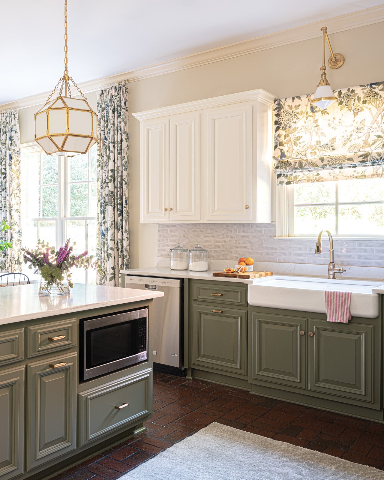
The result breathed new life into the house, built in 2005, and gave it a personality that more closely reflects the young family that lives there. First on the agenda was a major kitchen refresh. Not a total gut job, but a rework of the original room. “I think people underestimate the power of paint, says Clarke, referring to the dramatic new look she achieved by painting the existing cabinets. She chose a bold green for the base cabinets and the island, offset by fresh white on the upper cabinets. A porcelain apron sink and a new backsplash of dimensional subway tile glazed in soft white, and new gold-tone hardware and fixtures provide a fresh take on traditional kitchen design elements. 

The original lighting scheme in the kitchen included only recessed can lights. Clarke replaced some of those utilitarian fixtures with pretty pendant lights over the sink and island to dress up the space and provide warmth as well as illumination. 


While the lighting and hardware can be considered the “jewelry” of the room, the window treatments may just steal the show here. The flora-and-fauna pattern fabric by Lee Jofa incorporates the saturated green of the cabinets along with a stunning peacock blue on a light background. It appears in a Roman shade covering the window over the main sink as well as on full-length panels flanking a double window.

The flooring in the kitchen and the adjacent keeping room proves that not every element has to be replaced for a project to be successful. The dark brick tile has a classic, tried-and-true feel and adds warmth to the space. It also provides the perfect backdrop for the traditional Oushak rug that anchors the room’s design. Handed down from her grandmother, the rug was a must-have for her new home, Upchurch says. 

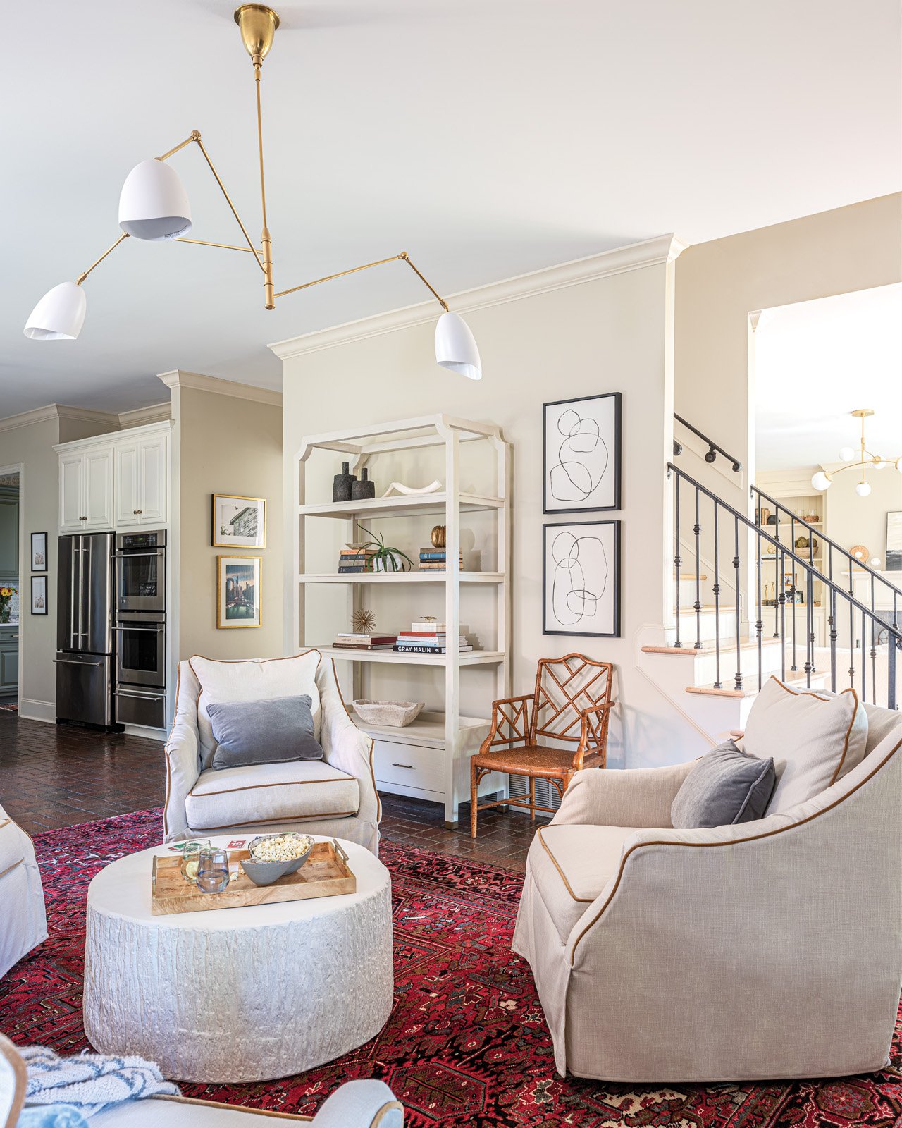
The rug may be antique, but there isn’t a trace of stodginess in the room, thanks to the furnishings Clarke selected to pair with it. Four swivel chairs from Rowe Fine Furniture create an easy, relaxed vibe. She says, “Julie wanted this setup and I think it's great. It's so conversational. It's great for when you have the girls over for a glass of wine, but it's also good for family time and games.” To make sure the seating was comfortable and practical Clarke chose Rowe’s down fill option and performance upholstery. 

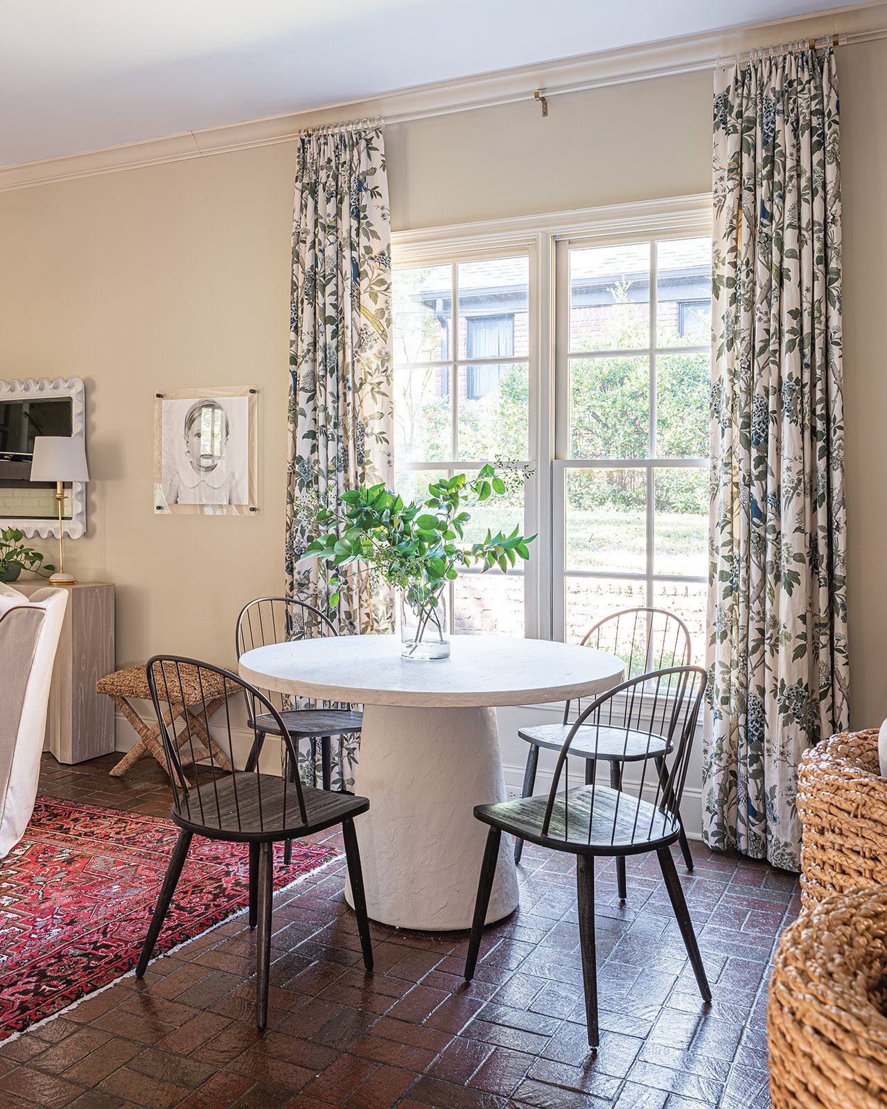
The chairs center around a round Noir Furniture coffee table—decidedly contemporary in its style and bright white color. It plays perfectly off the plaster look of the breakfast table the Upchurches already had, now nestled near a large window and surrounded by four simple Windsor-style chairs.

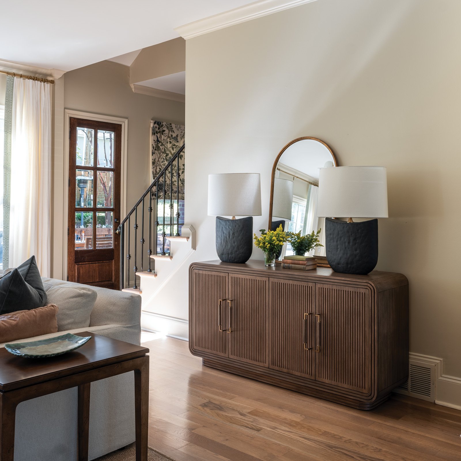
Casual portraits of the family’s two children grace the single full wall in the area. Upchurch says local photographer Rachel Scoggin perfectly captured each child’s personality in the black-and-white works. Clarke placed the photos on the wall on either side of a striking console from Gabby Home, topped by a scalloped Carvers’ Guild mirror. The wall still has plenty of open space, though, intentionally left in the design plan. “I like to leave space in a room for things that are yet to be collected. If Julie wants to find two stools or antique chairs to add, that would be awesome. I think that’s what creates a curated feel. I don’t want to pick out every single thing; this provides them with an opportunity to put the finishing touches on,” Clarke explains.

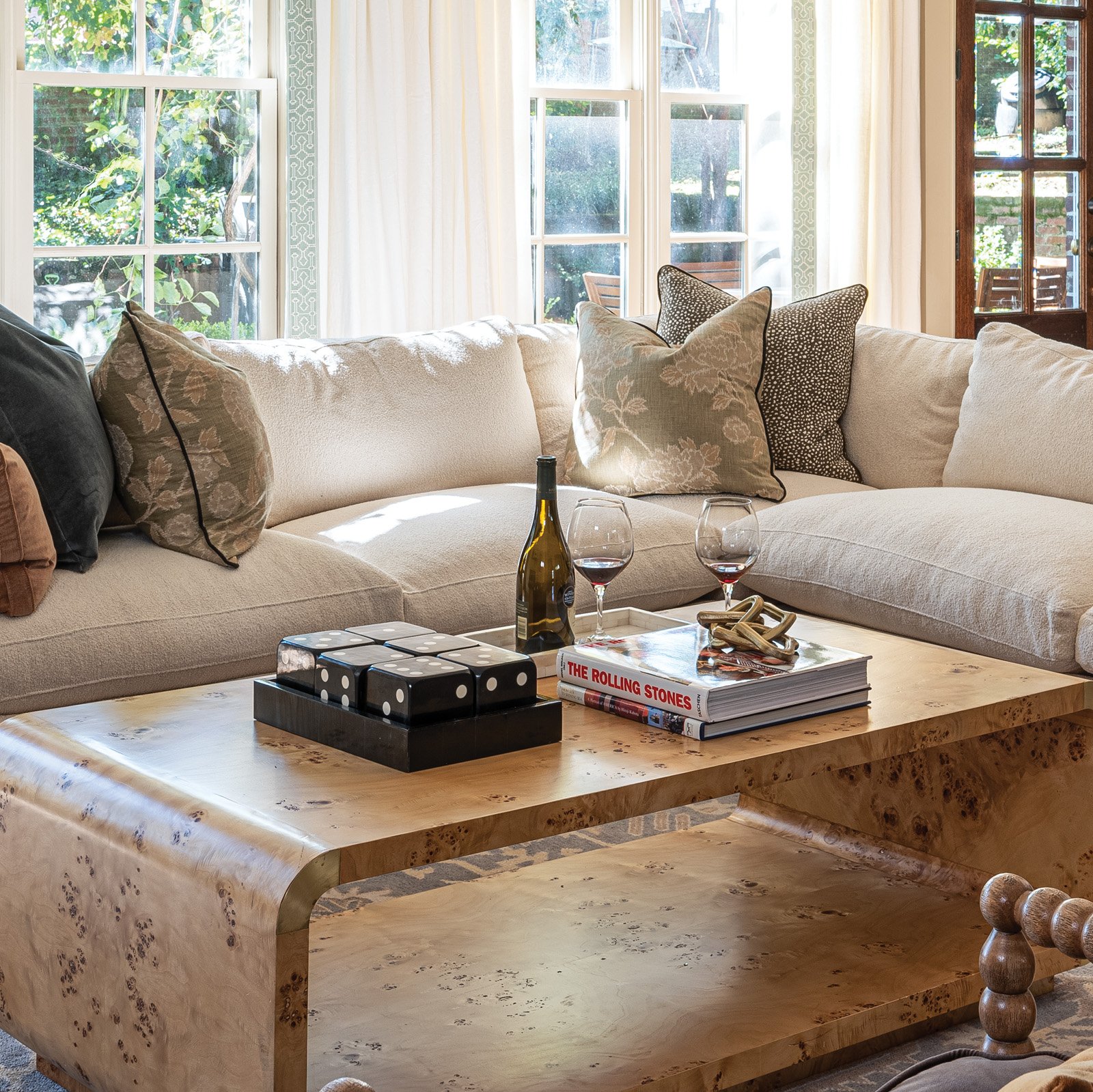
The living room also received major attention in the process. Unlike similar areas in many other homes, the Upchurches spend a lot of time in their living room, so it had to be comfortable and kid friendly. Mission accomplished with an inviting Rowe sectional covered in a white, almost boucle fabric that no one would ever guess is performance rated. Even the Schumacher velvet throw pillows are wear- and stain-resistant. A pair of spindle chairs in handsome charcoal complete the living room seating, along with a couple of stools from Serena & Lily. “I love stools in front of a fireplace,” says Clarke. “It feels so cozy, plus they’re extra seating when you need it.”

Another of the client’s oriental rugs had the right look for the living room, but not the right size. Clarke solved the dilemma by layering it over a jute rug, custom cut to size locally by Kiser’s Floor Fashions. Another design challenge came in the form of 20 linear feet of full-length windows in the living room. To dress them up without breaking the bank, Clarke sourced fabric from Tonic Living for custom drapes and had each panel’s leading edge embellished with beautiful Schumacher trim. 

Although Clarke and Upchurch, a local realtor with McWaters & Associates, were acquainted before this project, they hadn’t ever worked together. The process went so well, though, that the two plan to collaborate again on other areas of the home. Says Clarke, “People like Julie are my target clientele. Working moms with full-time jobs and kids. They know they have good taste, they just don’t have time to pull it all together.”

Designed to be Durable

Design by M. Cate Interiors | Story by Terri Glazer | Photography by Stefanie Rawlinson

There was a time when a home could either be beautiful or kid friendly, but not both at once. That time is in the past. The home Jessie Cate, owner of M. Cate Interiors, has created for her own family proves that elevated design and durability can now go hand-in-hand.

Nestled into a wooded, lakefront lot in a quiet Eads neighborhood, the exterior has the feel of an upscale vacation property. Cate and her husband Joey purchased the home almost five years ago after having sold the Germantown house they had completely renovated. “After that one sold faster than we anticipated we kind of stumbled across this home. We knew we wanted space and we didn’t want to go through another flip. We also wanted a pool. That’s how we ended up here,” she recalls.

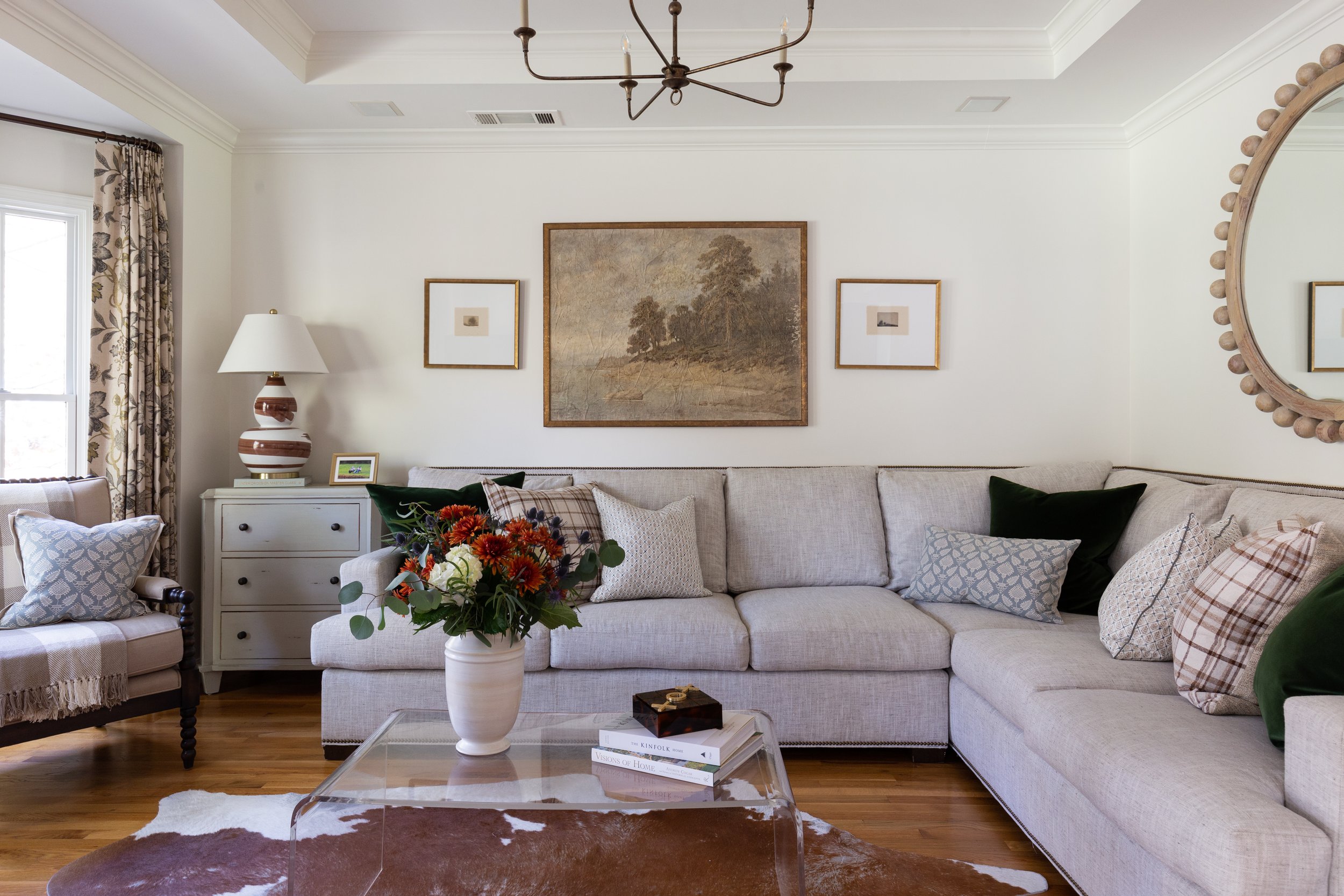
While a complete redo wasn’t called for, Cate set about putting her personal stamp on the house right away, with an emphasis on beauty and practicality in every space. The front room is filled with light thanks to a graceful bay window. The coffered ceiling draws the eye up to the simple six-arm chandelier Cate added—replacing light fixtures was a key part of her overall plan to refresh the entire house. The crisp appearance of the Wesley Hall sectional belies the facts that it has been in the room several years and that two young children jump on it regularly. Their clever mother attributes that to the piece’s sturdy construction. “With to-the-trade or higher-end furniture you get longevity that comes from good craftsmanship,” she says. Down-wrapped cushions and down pillows are a must, Cate adds. Just a quick fluff and they look good as new.

Cate selected performance fabrics for the sectional’s upholstery as well as the throw pillow covers. Today’s wear- and stain-resistant textiles come in a myriad of patterns and textures, making them a perfect choice for worry-free living. “Visually, the acrylic coffee table doesn’t impede on the space,” she points out. And as a bonus, it’s indestructible (Cate says the kids sit on it) and aesthetically pleasing. Ditto for the cowhide rug. “[The children] can spill on it. It doesn’t matter. It’s easy to clean.”

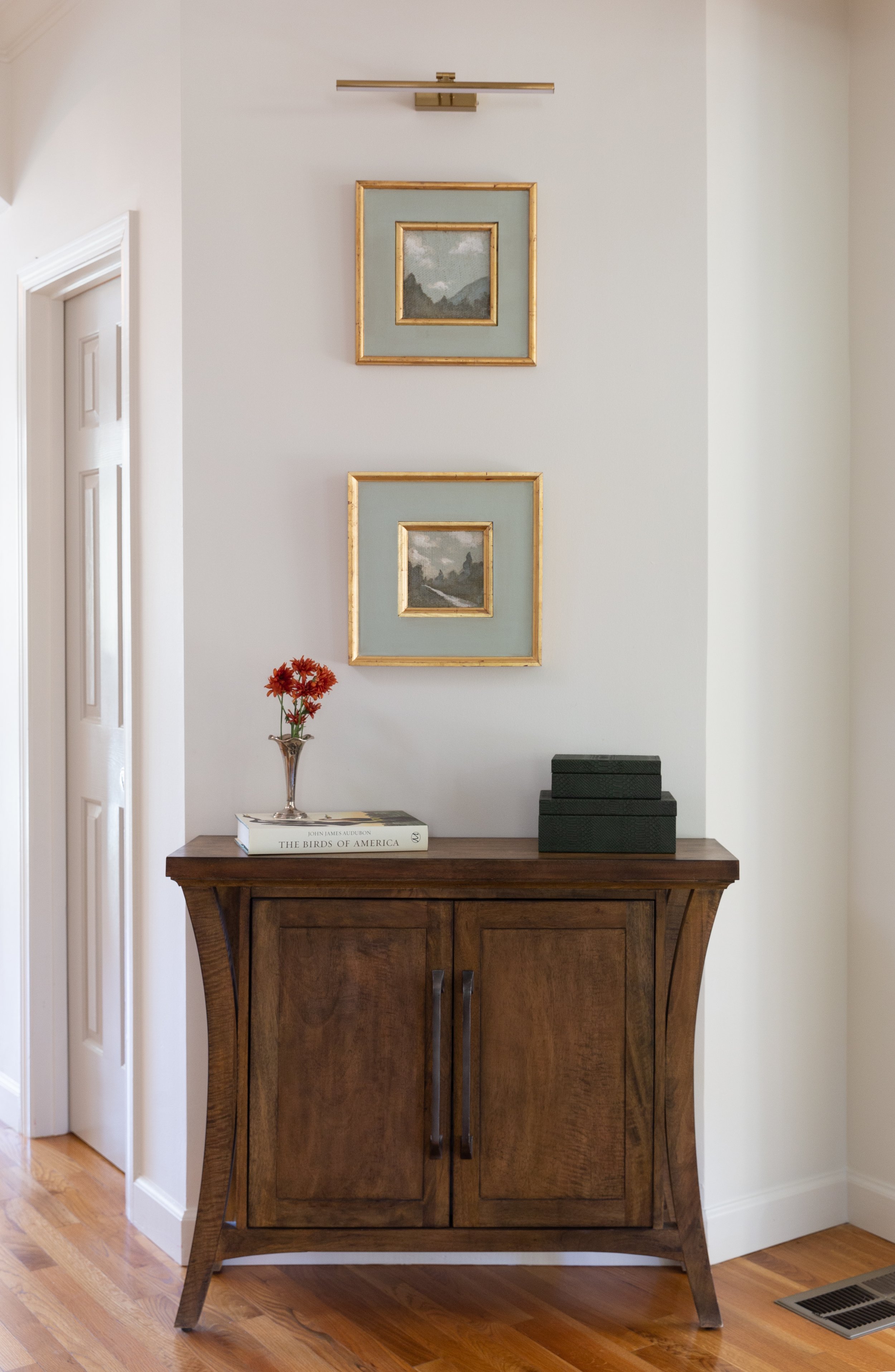
Just as she curates for her clients, Cate selected a lovely variety of works by local and regional artists for her own residence. Over the living room sofa she placed a pair of drawings by Memphian Chelsea Fly alongside a landscape with a bit of an unusual origin. “It was actually part of a wallpaper mural that I loved so much I had it custom framed,” says Cate. Two small landscapes by Atlanta artist Fred Cox make a big impact over a console in the entry area attached to the living room.

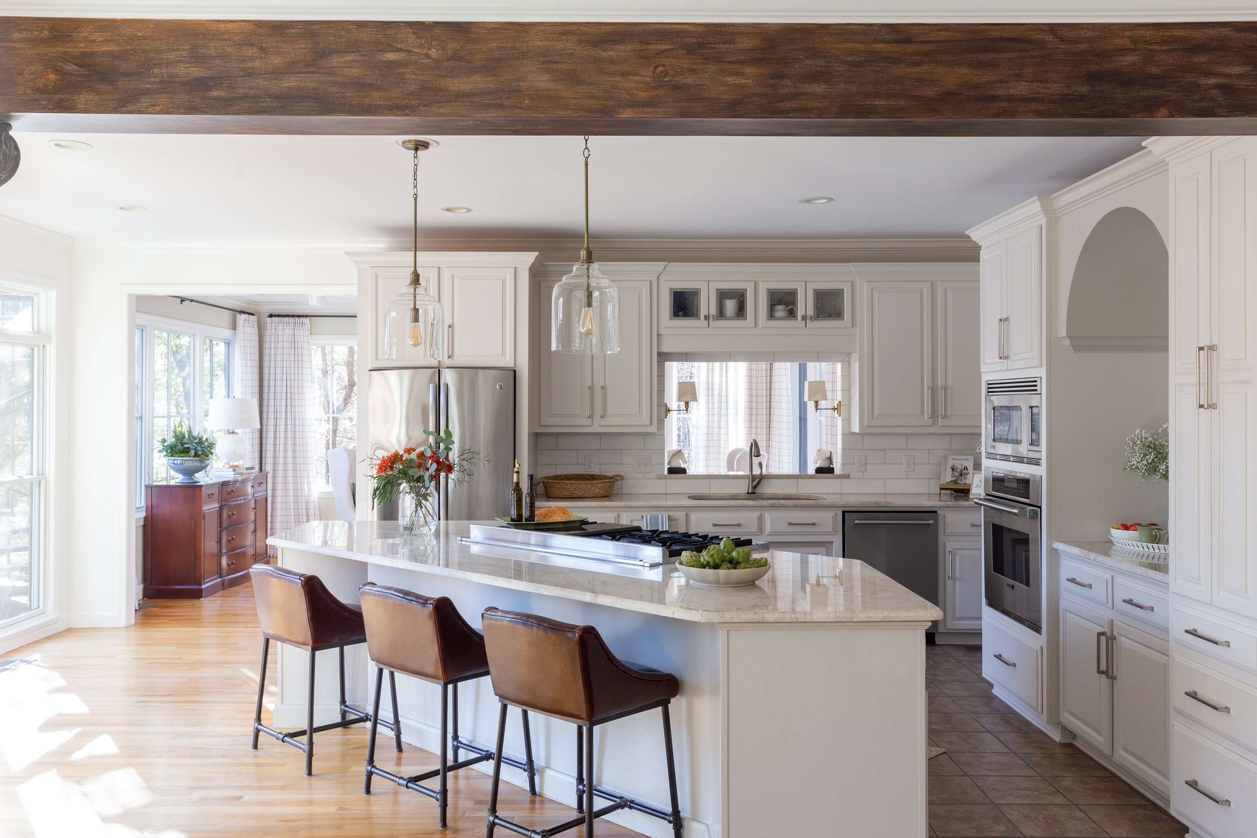
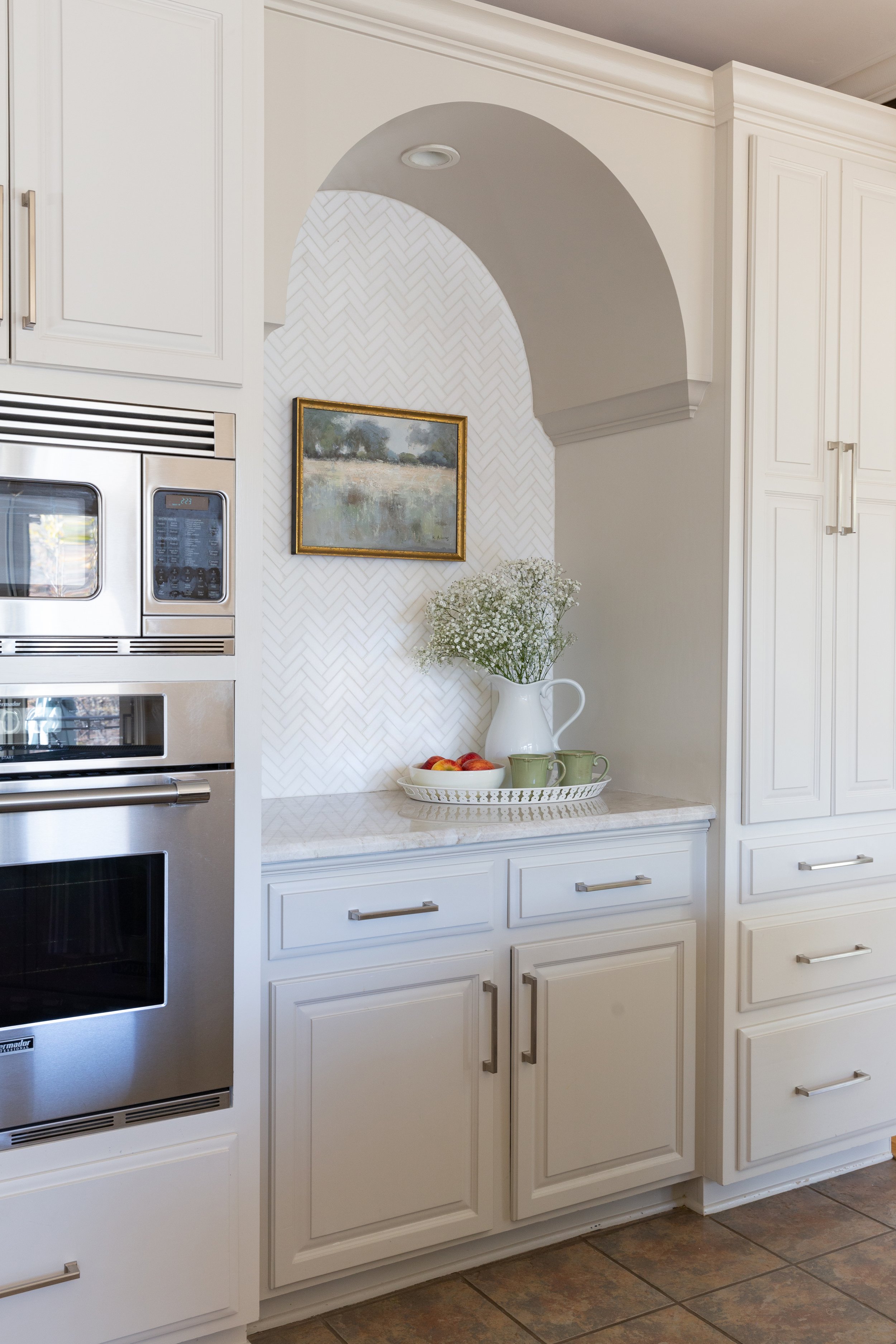
Without changing the footprint, Cate transformed the kitchen, giving it a sophisticated look that will stand the test of time. The scope of the work included painting the existing cabinets in Pale Oak by Benjamin Moore, a soft, creamy white, and updating the hardware. To add subtle depth, she chose a slightly darker paint color, Benjamin Moore Revere Pewter, to go on the kitchen island and on a pretty arch feature on one wall. In place of the original stainless steel backsplash she installed oversized marble subway tiles. The Taj Mahal quartzite Cate selected for her countertops is not only beautiful, it can stand up to anything her two little ones dish out, including Sharpie marks. Her secret to keeping its off-the-showroom-floor looks? “You have to maintain it. We seal it once a year. It’s not a big deal.”

And, of course, she changed the kitchen light fixtures. Cate recalls with a laugh that when they were looking at homes her husband told their realtor, “It doesn’t matter what the lighting looks like or the paint color. We’ll be changing all of that!” And they did. Her choices for the kitchen: clear glass jug-style pendants that add substance without obstructing the backyard view, and a pair of shaded brass sconces that up the classic style factor of the pass through above the kitchen sink. 


That classic style carries into the keeping room, a space with a feel that’s a bit dressier, but still totally livable and family friendly. The fact that the upholstery is Sunbrella erases all the worry that might come along with having a light-colored sofa in a home with two- and six-year-old children. While Cate stayed with a mostly blue and green color palette in this room and throughout the home to mirror the lush landscape and the beauty of the backyard swimming pool and lake, she brings in snippets of other hues through throw pillows that she changes seasonally. The art pieces over the sofa, two vintage Audubon bird prints partnered with a pair of small landscapes, blend beautifully and speak to the home’s natural surroundings.


It’s no surprise that the light-filled dining room originally functioned as a solarium. With three full walls of large windows it is a charming spot for a casual meal or a family gathering. Privacy is possible, however, via functional full-length drapes in a cheerful window-pane check.

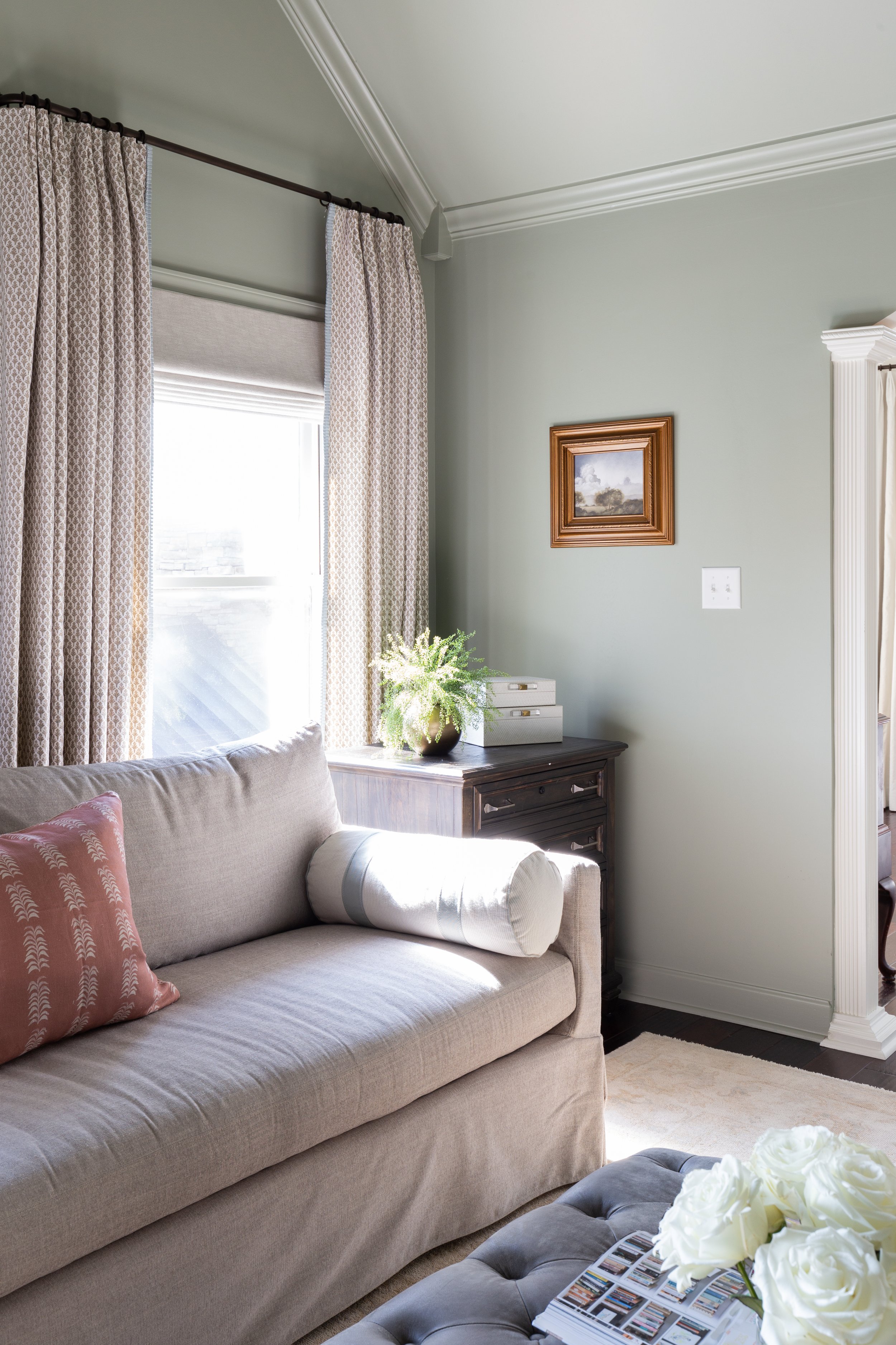
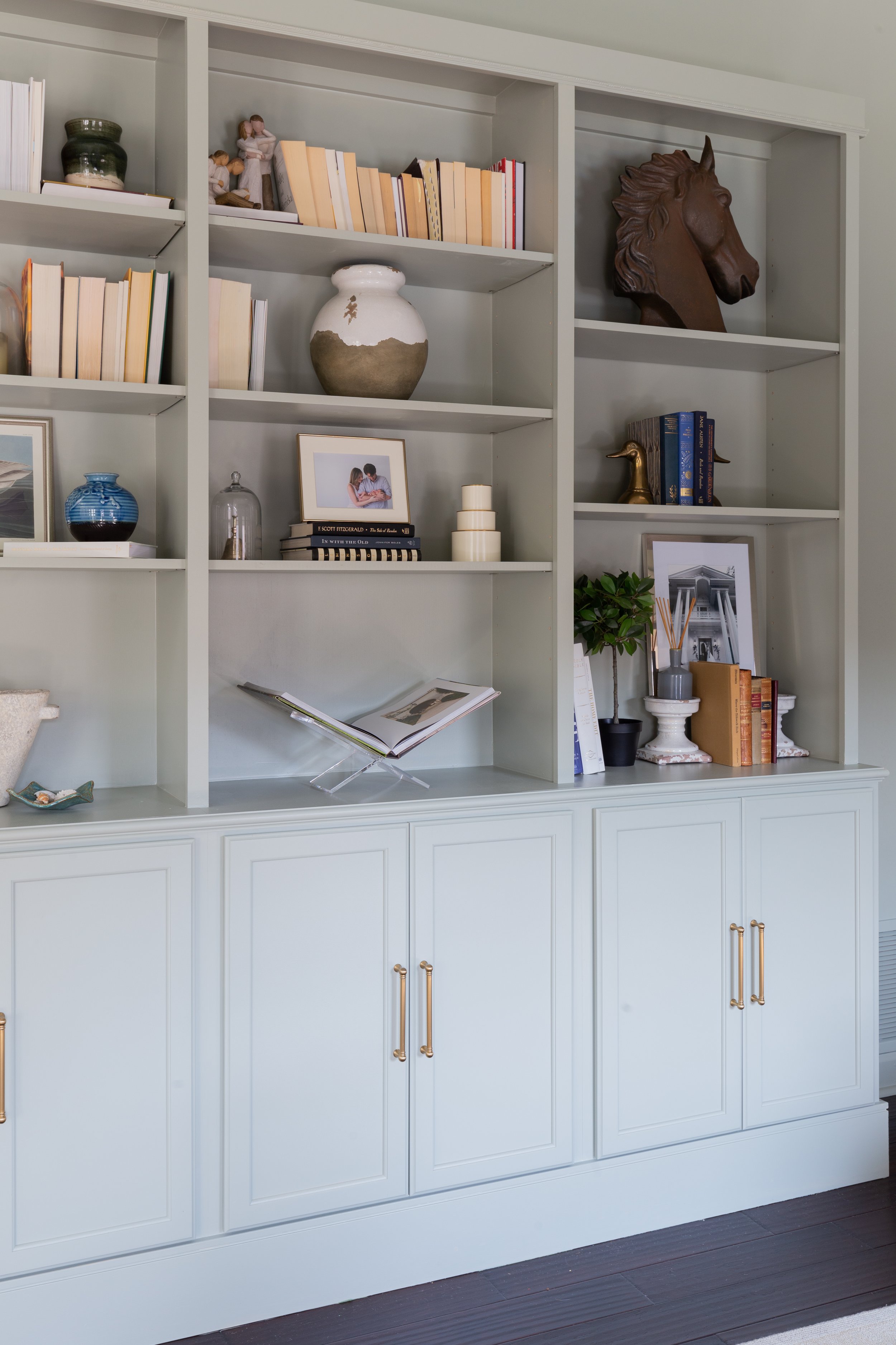
The upstairs primary suite includes a sitting room that’s an ideal locale for everything from late-night reading to family workouts. The vaulted ceiling makes the space seem ethereal and the soft green paint color, Blue Grey by Farrow and Ball, adds to the feel. Says Cate, “It is a chameleon color; it changes with the light. It can look really green and then sometimes it has blue to it. In rooms like this that have odd angles, I like to paint everything the same color. That way the odd angles are softened and then you can highlight what you want to highlight.” A built-in bookcase/cabinet unit built by Joey anchors the room and provides extra storage for the toys that always seem to end up there.

“I knew I wanted a more cozy feeling even though the room has high ceilings and great light, but then I didn't want everything to feel dark,” says Cate. “So we kept the bedroom area, the sleeping area, lighter, because that has a really tall vaulted ceiling with upper windows.” A whitewashed wood and gold chandelier hangs from the apex of the ceiling like a crown over the room, accenting the simple elegance of its furnishings. Chic details like embellished drapes and pleated fabric lampshades evidence the homeowner’s professional touch.

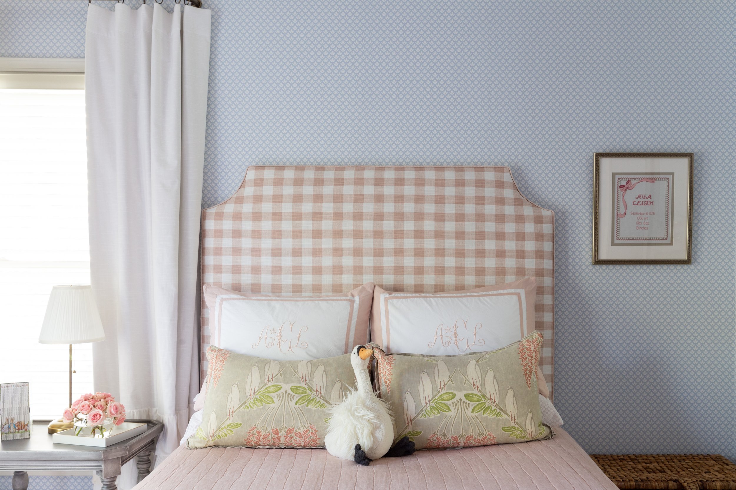
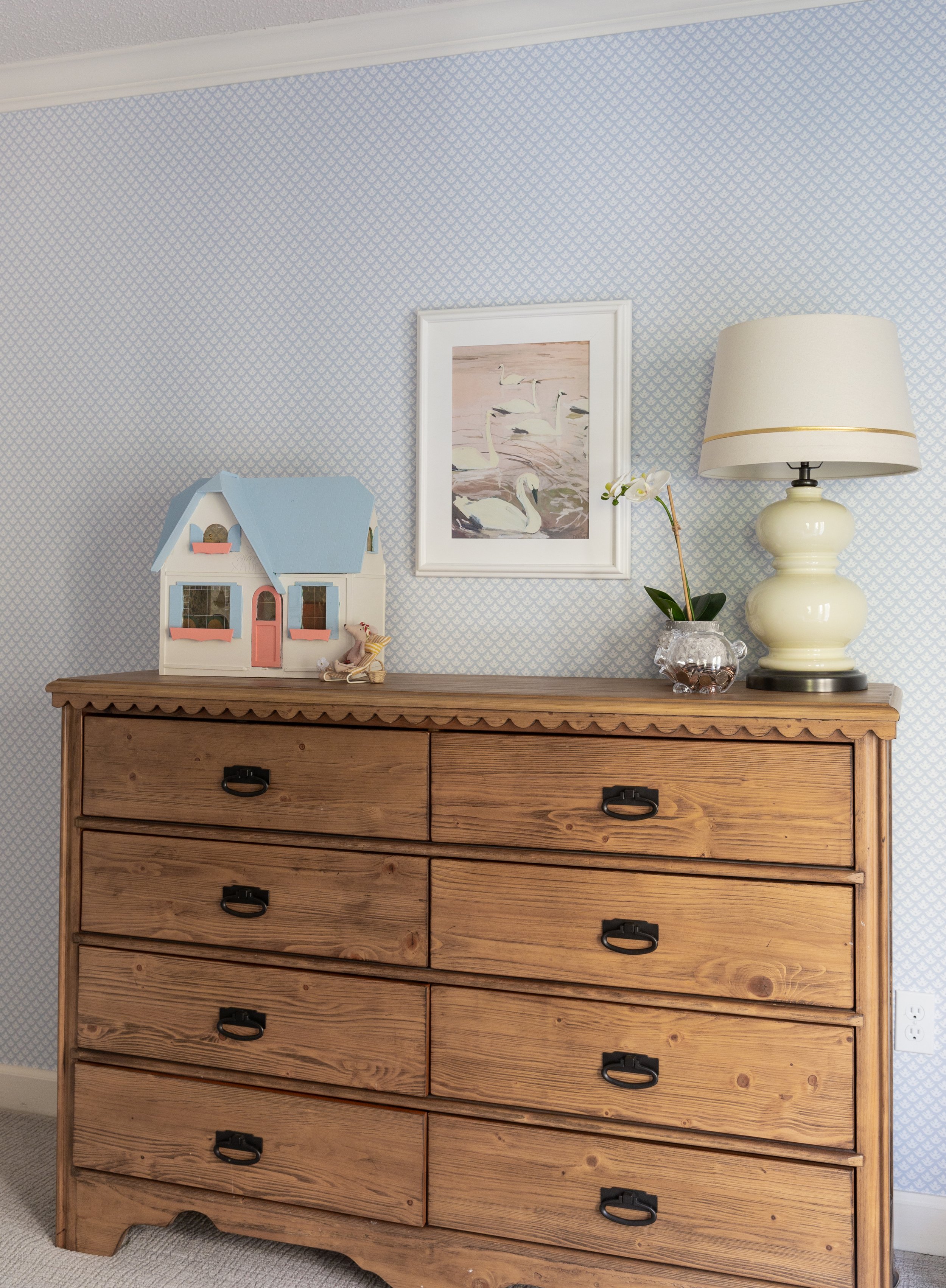
Cate says she loved designing her daughter’s room, allowing her to be involved in a few decisions and then surprising her with the finished product. The result is a sweet, but not babyish, space that will grow with its occupant through the years. The soft pink bedding, timeless blue wallpaper and white ruffled curtains create a cozy spot for sleep and play. 

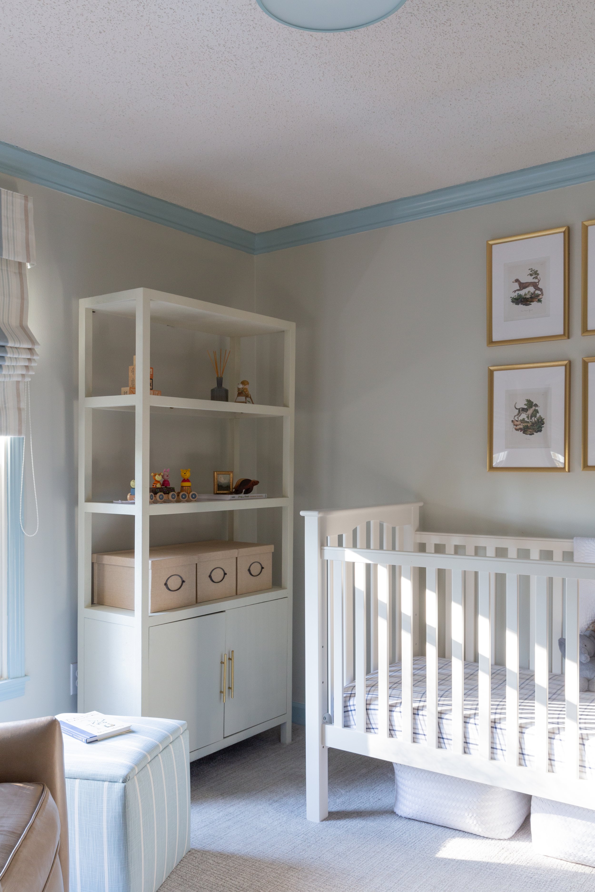
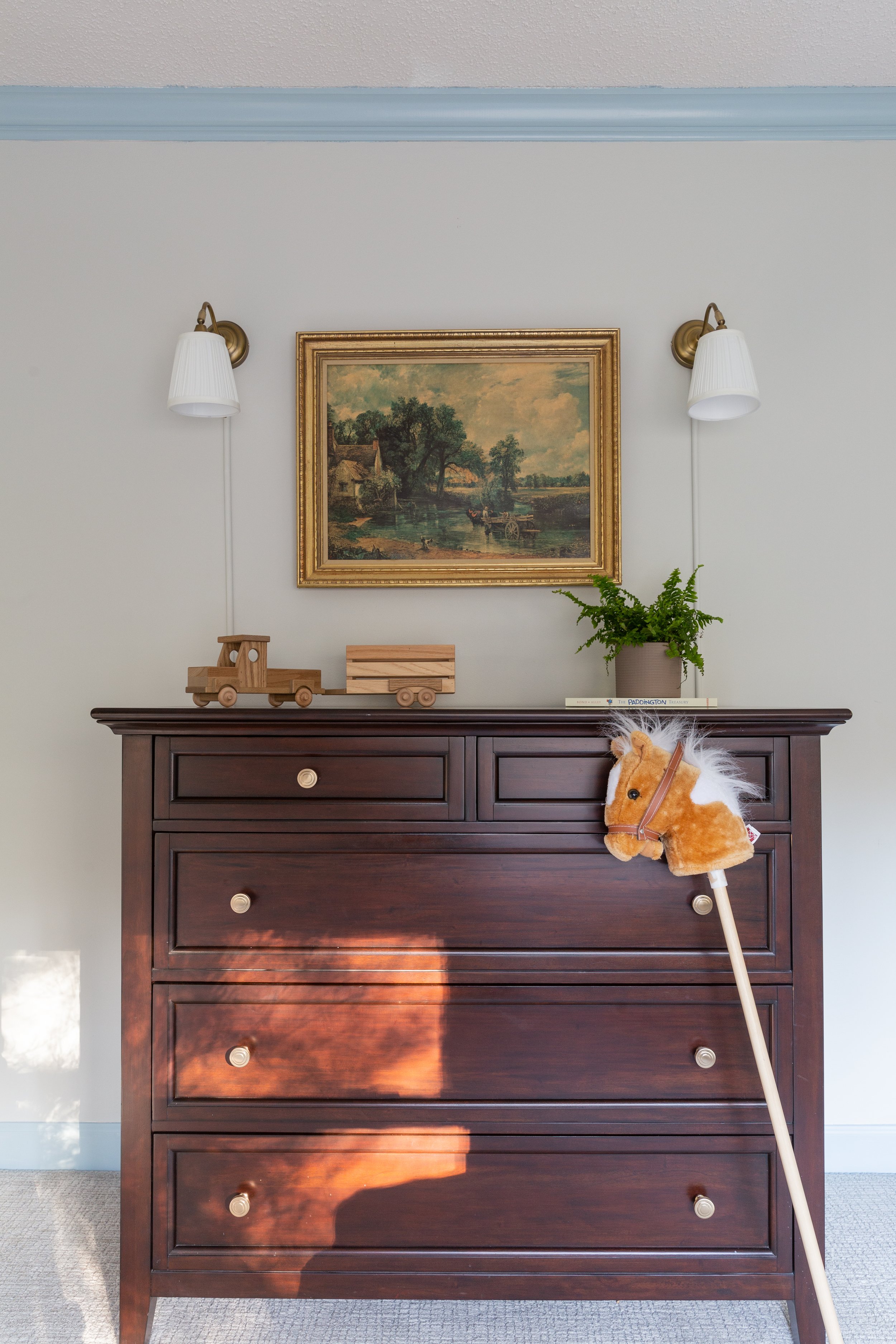
Her son’s nursery “came together in a really sweet way,” says Cate. Neutral walls and blue trim set the stage and allow the white crib and faux shagreen shelving unit to pop. Always thinking of safety, Cate framed four vintage dog prints sourced from Etsy in simple frames with no glass, then double secured them to the wall above the crib with 3M Command strips. She also opted for a Roman shade to cover the window rather than long curtain panels. His handsome dresser was once part of his parents’ bedroom suite, now updated with new drawer knobs, and the antique print that hangs above it came from his great grandmother’s home.

The entire project speaks to Cate’s talent and to her dedication to the concept that it is possible to combine custom design and practicality. “I’ve had people tell me, ‘I’d love to work with you, but I have to wait for my children to get older,’” she says. “I just want people to know that you can have pretty things and kids at the same time.”

A Work of Art

Design by Murphy Maude Interiors | Story by Terri Glazer | Photography by Annabella Charles

“It was important to us to show that design can be accessible; it's not just for the very rich or very few.” These words were Leslie Murphy’s guiding principle as she furnished the Art Haus in the recent Vesta Home Show. 

The house represented a departure from those in previous shows; the John Duke Homes entry came in at just over 3,600 square feet. The size of all five houses built for this year’s installment of the annual Vesta Home Show was more modest than in the past, when floor plans often doubled that number.

Murphy, the owner and creative director of Murphy Maude Interiors, says the name Art Haus came about at the start of the design process as she made a commitment to include a creative work in each room. She says, “There’s something either from a collaborative artist who we work with or a piece from our new textiles line that is based on original and local art; there’s a little bit of art or something through the lens of art in every room.”

Built around collaborating with partners in the Memphis art community, Mable Originals is named for her grandmother, Murphy says. “Mable taught me that everything should have a heart and a soul. Don't just throw a picture on the wall, allow it to have some meaning and give the layers to the space that give it a personality and show some history.”

Simple, unadorned lines and a black-and-white palette with natural wood accents set the mood on the home’s exterior, creating a clean and bright backdrop for artistic design. The gallery-like feel surrounds visitors from the first step inside the iron-and-glass front door, where a marble tile floor inlay dresses up the scene. Murphy says the contemporary take on a classic design element adds a bit of elegance. “The house has a more casual, open plan, but we wanted to give this entryway something special and a unique little pop.” 

Drama comes from the ceiling, lined with a custom wallpaper in atmospheric white, gray and black shades. The mural began as a watercolor created by one of Murphy Maude’s in-house artists. The firm’s art department enlarged the painting and turned it into a repeat, giving birth to a product that can now be recreated for other clients in custom colors. The pattern, along with other wall coverings, murals and giclee prints of some of the original paintings found in Art Haus are available through Mable Originals, the newly launched sister company to Murphy Maude.

The entryway blends into the dining room, where more interest comes from an arched alcove on the far wall. The niche is painted in Iron Ore by Sherwin Williams, one of a group of saturated colors that reappears throughout the decor. “We worked to pull the deep, dark blues and grays across the whole home,” says Murphy, pointing out that the blues in this palette are not the same ones that have been used time and again in recent design. “We’ve seen blue cabinets for a while, but not this dark, almost gray navy tone. It feels a little bit more warm— deeper and richer. It was important for us to show how it pairs really well with natural hues, organic elements like the raw woods, and the grays.”

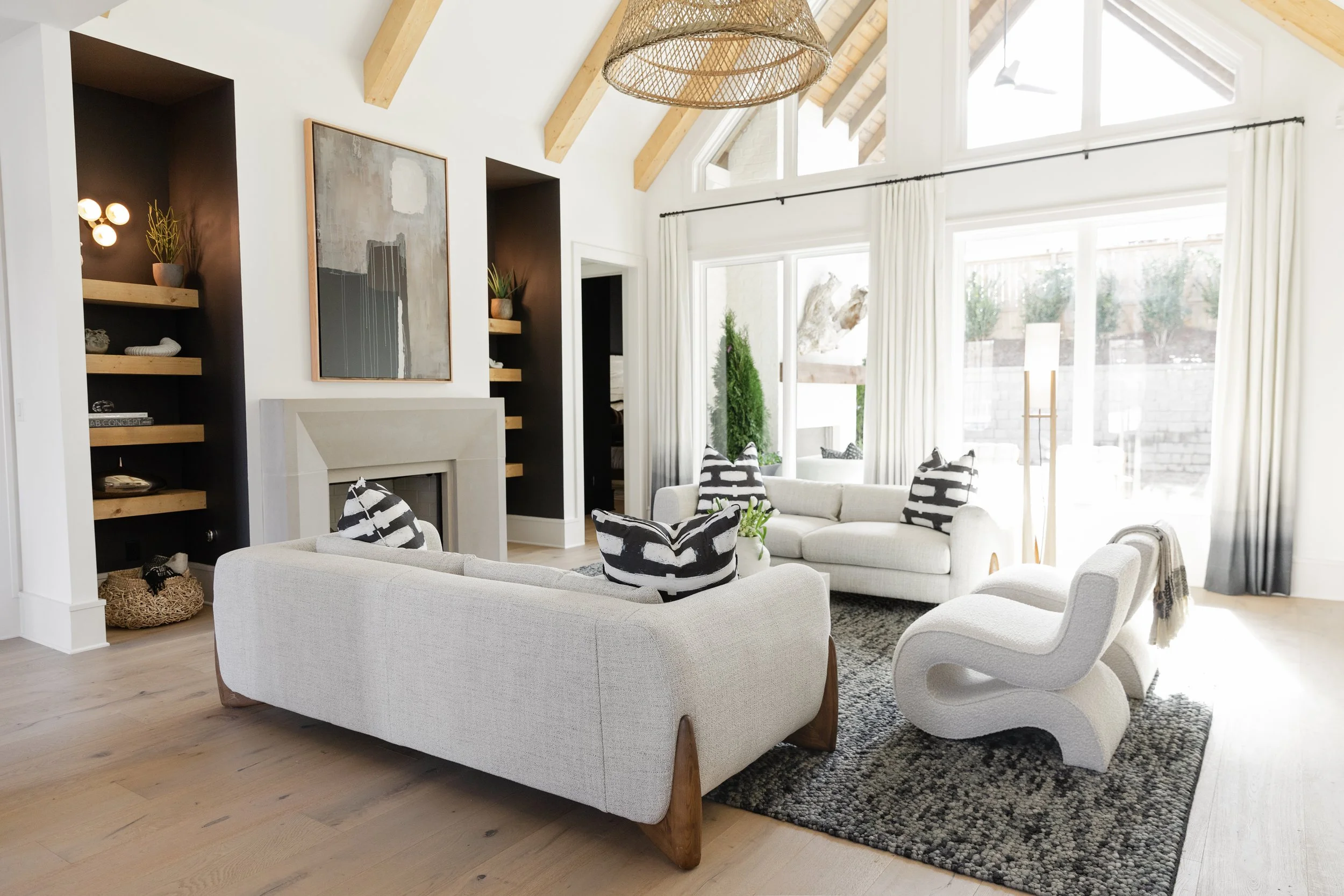
The dining room opens into the home’s main living area. While the space isn’t huge in size, it has an airy feel thanks to a vaulted ceiling and a mostly white palette. A contemporary limestone fireplace leaves plenty of room above for a striking piece of original art by Lisa Mack. On either side, recessed natural wood shelves pop against an almost black background, punctuated by modern three-light sconces.

Project manager Caroline Harris, with help from members of the MMI design team, outfitted the room with pieces from the Owl’s Nest, Murphy Maude’s new express furniture program. Both budget friendly and quickly accessible, the line also remains true to the firm’s design aesthetic. A pair of white sofas face one another, supported by wooden legs with a hint of mid-century panache. The low-slung marble coffee table between them plays off the whites of the sofa upholstery as well as the dark grays of the rug beneath it. Side-by-side white boucle S chairs add to the artistic flair.


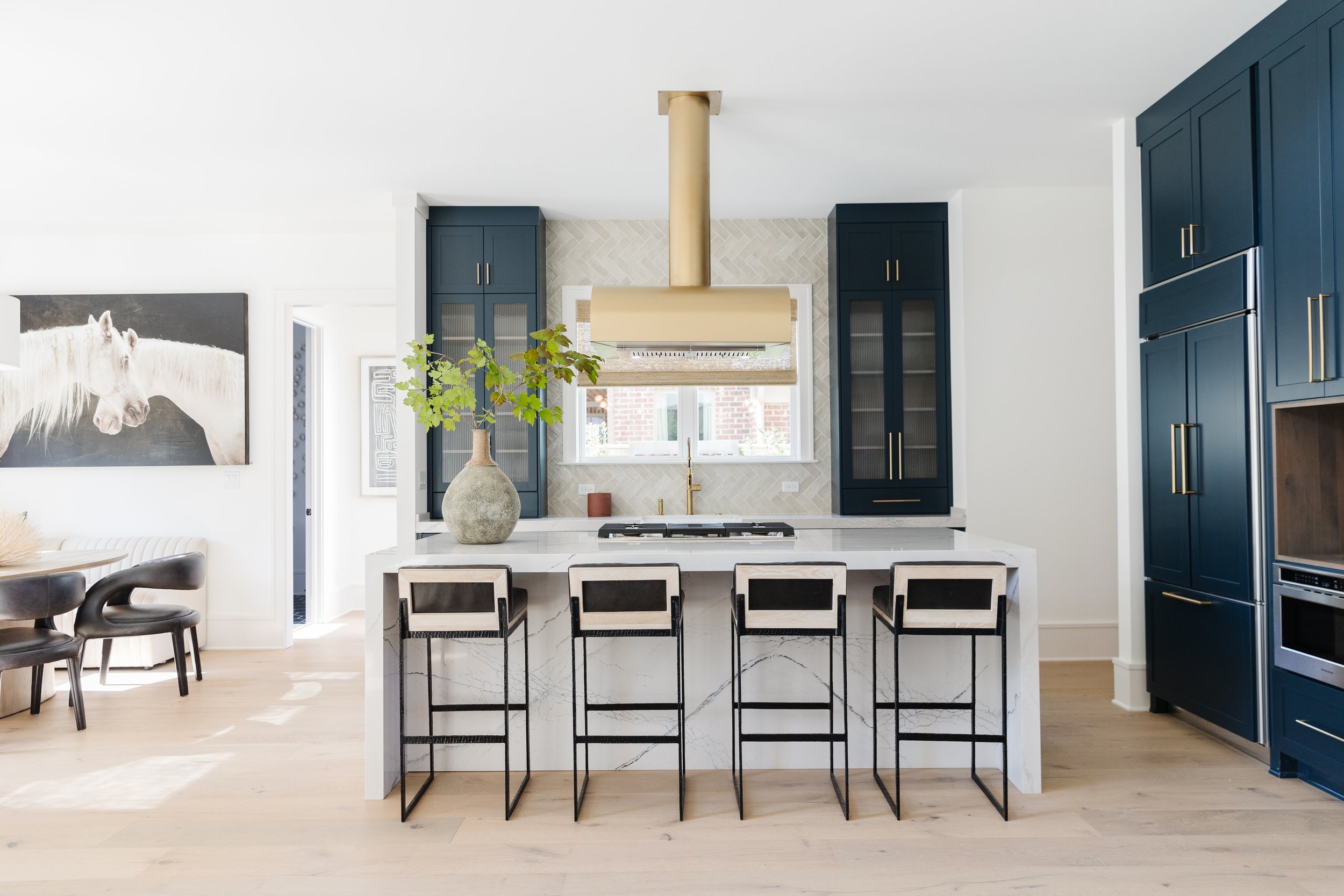
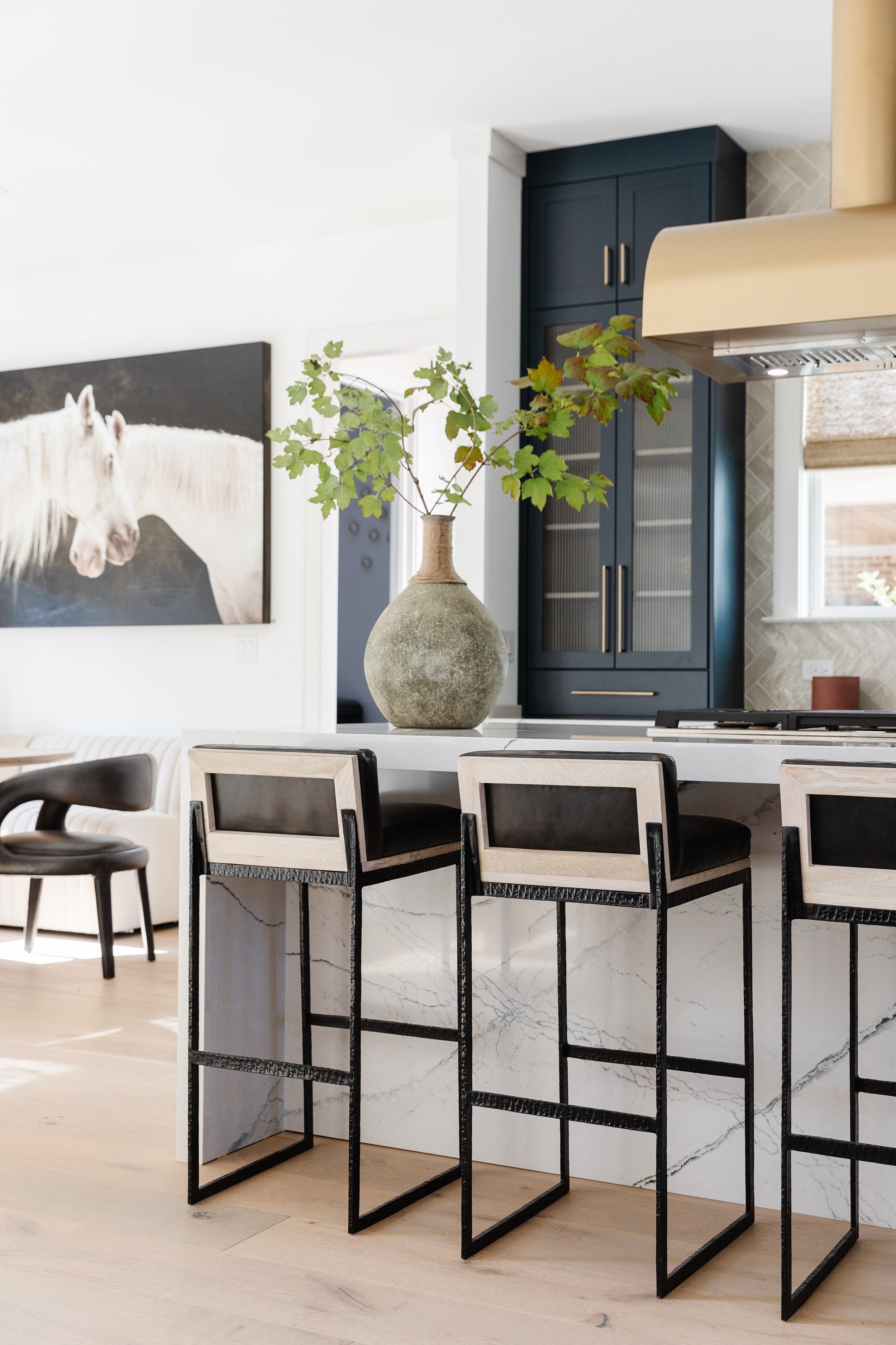
Rich, dark color reappears in a big way in the kitchen, where the cabinets are bathed in a tone that appears sometimes blue/sometimes gray. Offset by white Cambria quartz countertops and a waterfall island, as well as an abundance of natural light from the double window over the sink, the dark cabinets bring just the right degree of bold color to the space. Brushed brass blends beautifully in the hardware as well as the over-island vent hood. “Since we were going to have a hood in the middle of the room we thought why not make it such a beautiful focal point that it deserves to be there? That's how this concept was born,” Murphy recalls.

Black, white and natural wood marry perfectly in the adjoining breakfast area. A chic oval dining table is surrounded by an L-shaped white leather banquette. A pair of mod black-on-black chairs completes the seating. The nook’s one solid wall is the perfect home for an oversized equine photograph by Georgia artist Brandon Luther.

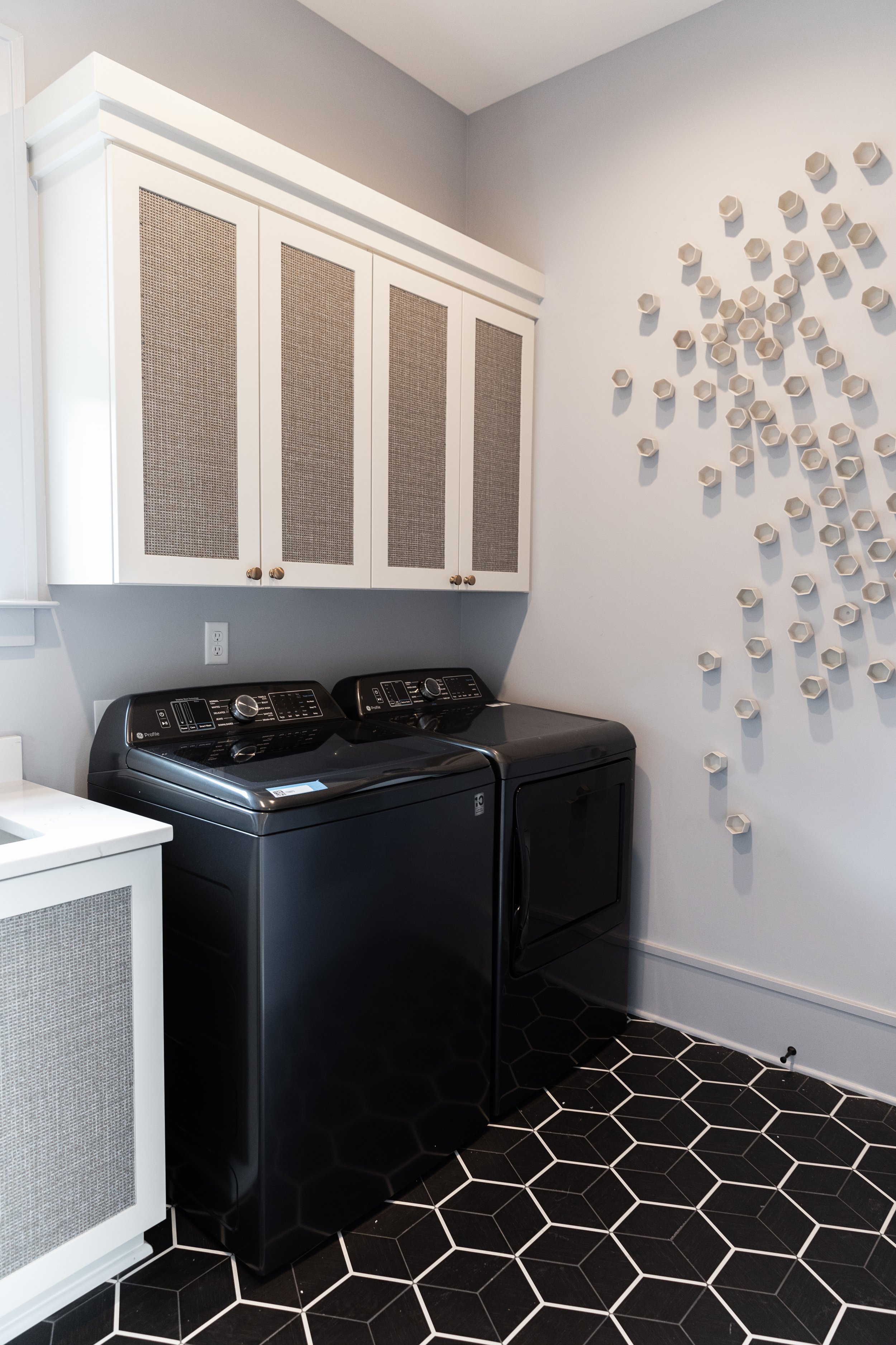
Murphy extended the concept of design into the laundry room, where large black hex tiles accentuated with white grout set a stylish mood. Plain white cabinet door faces are zhuzhed up with handsome wallpaper. Even the most utilitarian space in the house has art. A group of Wall Play mini sculptures brings to mind a beehive on the laundry room wall—perhaps a reminder to be busy bees while doing housework?

The home office may be small in scale, but it is huge on design. The star of the show is the Mable Originals wall mural. Says Murphy, “It shows that regardless of the size of a wall you can use a framed mural. It’s a great way to add interesting drama. If you don’t have the budget to do a full gallery wall of art, put up a mural and frame it. Approachable and attainable.”

A global vibe permeates the downstairs guest room. “We like to incorporate texture and a feeling that maybe you’re not in Memphis, you’re somewhere on vacation,” Murphy explains. Stylized birds take wing on the accent wall, proving that a small amount of wallpaper can make a big impact. Art appears not only in the form of a painting opposite the striking black platform bed, but also through the craftsmanship of the set of shell and rope necklaces grouped above the headboard. Ceiling mounted pendant lights illuminate the bedside, as do lamps that bring to mind the look of tribal drums set on side tables.  

The attached guest bath is a study in the use of classic, reasonably priced elements to achieve a custom, high-design effect. On the floating vanity Murphy added metal fretwork on the standard shaker-style door fronts to create a modern focal point. Combined with penny tile, one of the designer’s favorite products to maximize bang for the buck, and tumbled stone in a herringbone pattern, the space makes a statement without breaking the bank. 

The primary suite is part museum piece/part relaxing retreat. Here, Murphy once again turned to a supersaturated paint color, Benjamin Moore’s Raccoon Fur. It sets off the custom piece of art by Memphian Kyle Taylor that serves as the headboard. “It really is about making art into everyday things that you can live with—not just something that you look at but something you experience. This was a great example of that,” says Murphy. Simple furnishings allow the piece to take center stage, rivaled only by the overhead light fixture. A grouping of three sets of brass rods at random lengths accentuated by lighted crystals is a work of art in its own right. Set against the backdrop of the dark gray ceiling, the lights produce a stunning effect.

More oohs and aahs are in order in the primary bath, where natural elements appear in a luxurious environment. Black stone and unstained maple pair with gold accents and, of course, original art. “It’s a great way to bring the outdoors in and make nature a part of your everyday experience so that you feel calm and soothed,” Murphy says.  

The entire house has the feel of a work of art, but its real beauty lies in the fact that its design and furnishings are not out-of-reach show house concepts to which most homeowners can only aspire. “This whole project was about design being approachable and attainable, yet in a really elegant way,” Murphy says. “You don’t have to have a mansion and an unlimited design budget to have a look that’s cohesive and beautiful.” 


Functional and Fabulous

Story by Terri Glazer | Photography by Ross Group Creative

The “before” kitchen wasn’t bad. In fact, the homeowners used it as it was for several years after they bought their East Memphis home. Its layout, however, didn’t make the best use of the space, and it certainly didn’t reflect the lifestyle of the family of five. They wanted a functional and beautiful place where they could all gather for food preparation and cooking. A previous renovation by former owners had created a large dining area at one end of the kitchen, with the appliances and work space cramped on the other end of the room.

Enter Karen Kassen, owner and principal designer of Kitchens Unlimited, and a long-time friend of the homeowners. Her vision blended form and function in stunning fashion to transform the space to meet the wants and needs of her clients. 

The original floor plan had a wall with a standard-sized door between the family room and the kitchen, typical architecture for 1960s-era homes. Kassen removed a large portion of the wall, opening the kitchen to the light-filled den, and providing a more contemporary feel and better flow between the spaces. She also rearranged the entire footprint of the kitchen to make the most practical use of every part of the roomy space. 

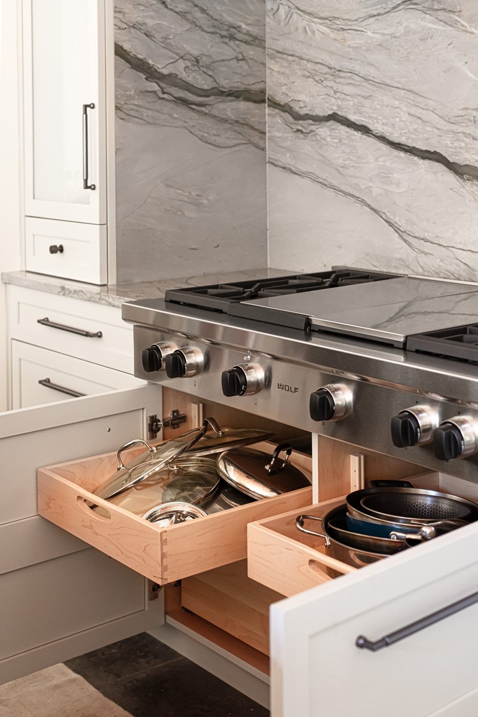
Out came a built-in cabinet/shelf unit next to the dining area on the south side of the kitchen. In its place now are the main work spaces. The east wall is dressed up with cabinets in a very light blue gray. Kassen explains that their luxe look is due to the fact that they have a subtle glaze applied on top of the paint. The extra step adds depth to the finish. The alcove that houses the range top is the room’s most elegant focal point, thanks to several elements. The homeowner describes the stunning quartzite backsplash as her favorite choice from the renovation. The designer adds, “Because she loved it so much I wanted to use it more, but I felt like if we used it in other places it wouldn't be quite so spectacular. So I decided to take it up and wrap it around the sides.” The show-stopper custom vent hood cover was fabricated locally from antiqued zinc with brass edging. The large Wolf range top was a special request from the husband, who enjoys cooking and grilling. Kassen chose textured glass inserts for the cabinet doors on either side of the alcove. Not only does the back-painted glass add a touch of sparkle, it ensures easy clean up. A pair of wall ovens and additional cabinetry complete the wall.

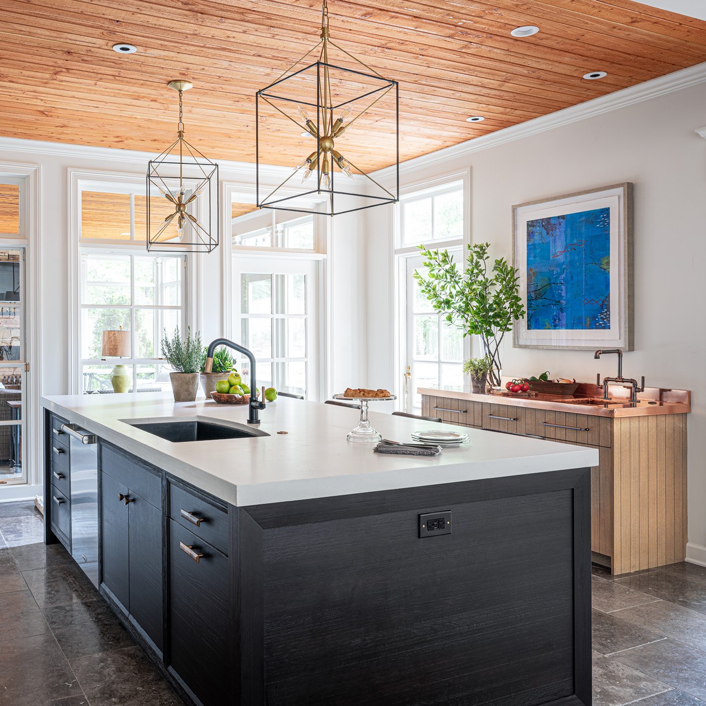
Across the room, a dedicated grilling station is an homage to the man of the house. Its position by the back door makes it the most logical storage spot for the utensils he uses while grilling on the patio. The copper countertop speaks to his profession as an executive for a copper plumbing and fittings manufacturer and the custom faucet makes the perfect accompaniment. Its industrial feel and materials are another nod to his occupation.

Anchoring the room’s center, the striking island made of wire-brushed alder wood has seating for four and plenty of storage. Kassen’s plan cleverly placed storage space beneath the seating ledge of the countertop, the ideal spot for items that are necessary but not used on a daily basis. The island also holds a dishwasher and the main sink. For the faucet and the pair of pendant lights that hang above, the designer chose mixed metals—matte black and brass. 

On the other side of the room, previously the cramped location of the ovens, microwave, refrigerator and pantry, a cozy corner is now the home’s “beverage central.” Whether family members are thirsty for a canned drink from one of the two refrigerator drawers, craving an espresso from the built-in machine, or ready to choose a bottle from the full-height wine cooler, it’s all right at their fingertips. Metal mesh front wall cabinets with interior lighting show off elegant glassware.

Across the room Kassen placed a wall completely dedicated to food storage. Having the refrigerator, freezer and a lighted pantry cabinet all together makes sense and simplifies the chore of putting away groceries. The appliances and pantry are concealed beautifully with cabinet panels, giving the space an elegant flow. The family’s round breakfast table and upholstered Parsons chairs occupy the center of the area. A graceful chandelier overhead repeats the brass and black motif from the faucet and pendants.

To appreciate two of the project’s most stunning features it’s necessary to look up and down. Overhead, tongue-and-groove slats in warm wood bring a natural element into the design and mirror the ceiling in the screen porch just off the kitchen. As the rooms are separated only by a wall of windows, the look creates a sense of continuity.

Underfoot, tiles of tumbled blue limestone with an antiqued finish line the floor. More practical than hardwood in a kitchen that sees daily use, the flooring also provides a segue to the bluestone patio just outside the door. “The movement in the natural stone flooring is a beautiful foundation for every area of the kitchen. It’s also forgiving for any dirt that could be tracked in from the patio and for the family’s two large dogs who love to hang out there,” says Kassen.

The project was completed late in 2021, so the homeowner has had plenty of time to reflect on her new kitchen. She still gives it two solid thumbs up thanks to the expertise of designer Kassen and general contractor Jimmy Wittenberg. She says, “Even after a year I wouldn’t change a thing!”

A Home Transformed

Design by Selena McAdams of Spruce | Story by Terri Glazer | Photography by Stefanie Rawlinson

The term “home renovation” can be relative. It can cover a spectrum of projects, from freshening paint to adding new furniture to reworking the floor plan. The job designer Selena McAdams took on recently, however, reached much farther. Her clients tasked McAdams with transforming a 1980s-era Germantown house to give it the cool minimalist ambience they love.

It wasn’t just that the couple liked the idea of mid-century design. They wanted to replicate the feel of the home they’d moved from—a mid-century-style house in Eads with a wall of windows and a streamlined design that suited their aesthetic to a tee.

They loved everything about it, except the rural location. With two elementary-age children, the family sought to simplify their lifestyle by moving a little farther “in,” closer to activities and extended family. They landed in a quiet cove in Germantown where the kids now walk or ride bikes to school, accompanied by a group of neighborhood friends.

Shortly before moving in, the homeowners decided to update the small primary bathroom. It wasn’t long before the plan had grown to include a kitchen renovation. Once the scope of the project had grown that large it made sense to go ahead and rework the entire downstairs of the 1.5-story house at once. That plan gave McAdams, who had also collaborated with the couple on their previous home, the ideal opportunity to create a design that flows effortlessly throughout the entire space. 

She came on board early in the process, along with architect David Anderson, who transformed the downstairs floor plan, opening up walls here and adding walls there to better suit the family’s lifestyle. 

One of the homeowners’ favorite features of the house’s layout was that the front door didn’t open directly to a stairway, as is the style of many suburban houses from the same era. Anderson took the idea a step further, adding a textured wall to the entryway that blocks the line of sight into the rest of the home and provides an element of privacy. McAdams styled the space with a striking contemporary portrait by local artist Leslie Barron hanging over a sleek and simple black lucite console. An ottoman upholstered in green geometric velvet adds texture and verve.

Just alongside, the home’s original living room is now a convenient homework/reading spot for the children. Well lit thanks to a full-length window as well as the striking Suzanne Kasler light fixture, the space holds the essentials: a round pedestal table and a pair of curved leather armchairs with a mod silhouette. 

McAdams continued the curved lines in her choices for the adjacent dining room, where she paired an oval table with a set of Danish modern Panton-style chairs in vibrant orange. She credits her long-standing relationship with the clients for helping them agree to her bold seating idea. “I had to ask them, ‘Will you trust me on this?’ And they did.” Completing the dining room design is a striking deer painting by Oxford, MS, artist Bradley Gordon.

The juxtaposition of styles is a design concept McAdams says she loves to incorporate in her work. “That’s where I like to have the most fun: playing with traditional versus contemporary and masculine versus feminine elements in a space. That intentional play can really pull a room together and make it a space that everyone loves”.

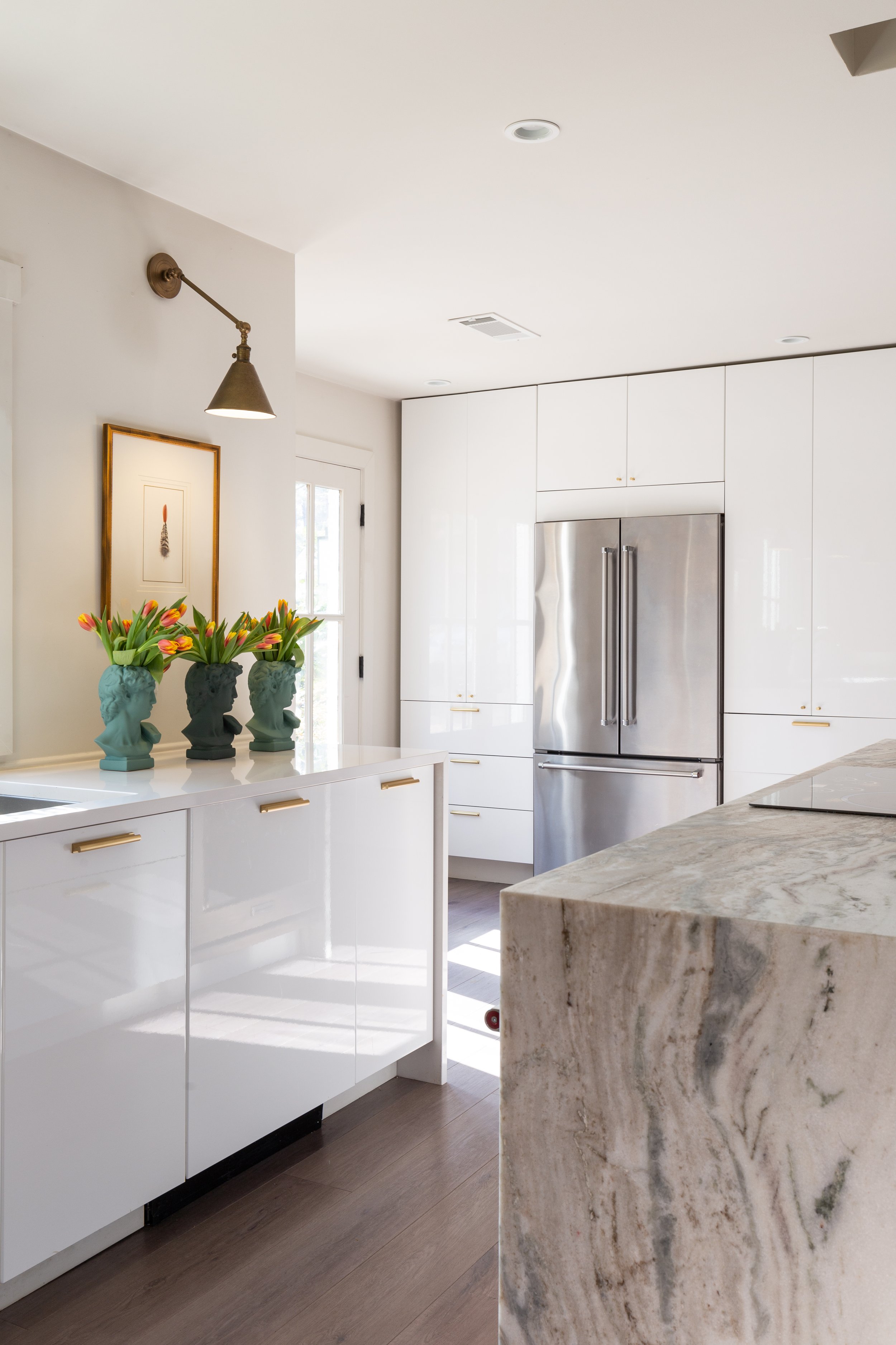
The kitchen’s sleek nature proves that modern elegance doesn’t preclude practicality. Anderson provided a roomy, open footprint as the blank slate for McAdams to work. High-gloss white IKEA base cabinets line one wall, topped with simple white quartz countertops. The designer encouraged the client to forgo upper cabinets and the result is stunning. Brass sconces illuminate the wall, highlighting framed art. A nearby wall of floor-to-ceiling cabinets provides plenty of storage. The large island is a show stopper with its waterfall-edge in leathered fantasy brown marble. To keep the look streamlined, the homeowner opted for a smooth induction cooktop and a pair of single ovens nestled in the island.

The kitchen opens to the family room, another area where Anderson worked renovation magic to transform the look and feel. Says the homeowner, “When you’re looking at what you see now, if there was a wall, there’s not a wall. If there’s not a wall, there used to be one.” While Anderson’s plan opened substantially the flow into the room, it also added a wall over the formerly exposed staircase. The alteration served two purposes, according to McAdams: to hide the stairs, creating a cleaner design, and to establish a media wall. The family brought the root-and-glass coffee table and the pair of woven chairs from their previous home, while the rest of the furnishings were sourced from spruce, McAdams’s East Memphis shop.

A sliding door can close to allow the solarium behind the living room to become a cozy and private haven. The comfy sectional decked out in plaid wool and the padded leather ottoman give the space a manly aesthetic, punched up by the mid-century influenced wooden floor lamp and chair. The designer added her signature contrast in an understated antelope print rug and an olive upholstered chair that gives a stylistic nod to the iconic mid-century Eames lounger.

The owners’ suite, a guest bedroom and a hall bath complete the downstairs, and McAdams says she was thrilled to design all those areas in addition to the public spaces of the home. “They did everything at once which was so fantastic from a design standpoint. We were able to layer all the rooms’ design concepts in relation to each other and make the design connect in one moment versus over years. Ultimately, the finish line was extremely rewarding.”

In the interest of design continuity and simplicity, both bathrooms are fairly similar, with custom walnut vanities, classic white tile and unlacquered brass hardware. The primary bedroom exudes the glamor of old Hollywood. “It all started with the bed,” says McAdams, and while its style is pure sophistication, the process of acquiring it was anything but smooth. The company that manufactured the upholstered frame was bought out. “I think this was the last order they took,” she recalls with a laugh. When the bed arrived, there were the headboard and footboard, but the matching side rails were missing. “We had to go back to a company that had been bought out and ask them to find the rails in their warehouse. They had been produced, they just hadn’t shipped them.” The stray pieces finally came, and the finished product now forms the base for the room’s luxe vibe. Classic symmetry makes an appearance in the matching bedside chests, crystal lamps and round mirrors. A low sofa in dusty pink completes the design and gives the couple a soft and stylish spot to watch TV, read or relax.

“We just wanted to have fun with the guest room,” says McAdams. She and her client were able to finalize the choices for the room in a single, quick meeting, thanks to their great working relationship. “Besides the wall covering in the dining room we hadn’t done wallpaper anywhere. This Kelly Wearstler pattern was a perfect starting point. And I knew we had to do this large lumbar pillow as an accent. I love how it feels organic, a little edgy and still retains a mid century feel.”

Now that the transformation is complete, McAdams says the relationship she and these clients have developed over time made all the difference. “Having worked with them before, they’ve trusted the whole process. I’m very lucky to have clients who trust me with a vision and allow me the flexibility of taking them down that design path.” 

A Southern Classic

Design by M. Steffens Interiors | Story by Terri Glazer | Photography by Stefanie Rawlinson Photography

“Lale always wanted to live in this neighborhood, so we bought the house on the corner at the end of the street by the railroad tracks.” So begins the story Oscar Adams tells about the East Memphis home he and his wife, Dr. Lale Adams, purchased in 2005.

Oscar also had a goal in mind—to instill in their children an appreciation for their surroundings and for tradition, beauty and Southern culture. He recalls of his childhood in Mississippi, “In some parts of the Delta, it didn’t matter whether people were wealthy or not, their home would be so pretty. Done in such good taste. I wanted my children to grow up in a house that they could learn to appreciate and one day pass that love down. I think most people have an appreciation for what we like in homes that begins further into our youth than we realize, and I didn’t want that fact to be overlooked.”

Despite having been told they would be crazy to renovate the house and hearing suggestions that they should just move instead, the Adamses loved the location and the acre lot. So they stayed, remodeled and added on. The finished product is an homage to classic Southern architecture and design.

A family member in Greenville, MS, owned a home designed by A. Hays Town, the famed 20th century Louisiana architect. Oscar says he was always drawn to the classic elements embodied in Town’s work, like Bevolo lamps, heart pine flooring and reclaimed brick. He and Lale shared their vision with Memphis architect Wilson Hunt, who understood immediately. Hunt’s family history included a home in the historic Gamwyn Park neighborhood, an early 20th century planned community in Greenville, MS, known for charming homes, so he was on board when Oscar requested features like board and batten walls and natural brick. 

Designer Missy Steffens collaborated from the start, working in tandem with Hunt. Builder Rick Collins came on board to handle the construction and round out the “dream team” Oscar says he trusted implicitly. “When you’re building a house, there’s a decision around every corner. Hire the right people and then let them do their job.”

Hunt’s plan included changing the front of the home from south- to east-facing, removing the garage, and adding a large, two-story section. The architect reimagined the exterior of the remaining original structure, revamping the former front porch with brick and wooden beams. The reclaimed brick chimney rising above it gives the outside of the original part of the house the feel of an old Southern smokehouse, a look intentionally worked into the plan, says Oscar.

Selecting paint colors for a home’s exterior can be a daunting task—one which, in this case, led the homeowners and the designer down an unexpected path, but one with a perfect ending. Oscar recalls that as the brick in the new section of the home was being prepped, the painters had applied a primer. “We painted swaths of all these different shades of white and out of all of them, we liked the primer the best, so we just went with that.” As it turns out, primer white made the ideal base to show off the home’s creamy trim, green shutters and garage doors, and the antique front door sourced from Front Street Antiques in Downtown Memphis.

As construction progressed, Steffens turned her efforts toward design-related decisions, guided by the clients’ preferences. “Lale likes brighter colors, but she also wanted a clean backdrop,” she explains. The juxtaposition of white and bright begins in the home’s front entry, where Quadrille climbing hydrangea wallpaper in salmon shades dresses up the white-trimmed walls. The pattern is a time-honored Southern favorite—a similar style appears in the home of Scarlett and Rhett in Gone with the Wind. Antique brick floors provide the quintessential Delta home feel the couple sought. 

Steffens carried the bright white of the entry millwork on the walls through most of the house, interspersing color sparingly, but effectively. In the kitchen, it comes in the mellow blue-gray shade on the cabinetry. “It made for a great mix of soft and clear colors,” she explains. 

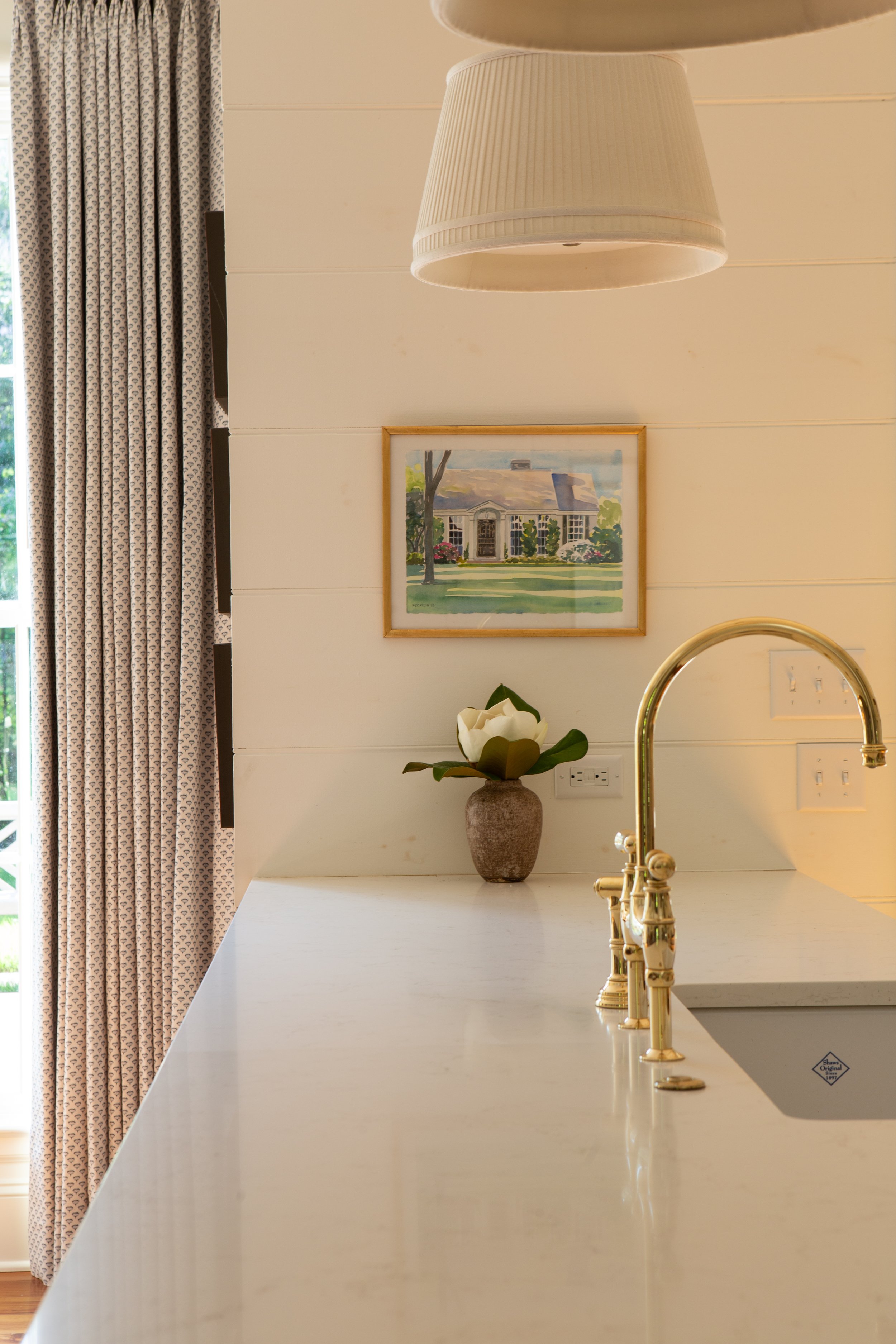
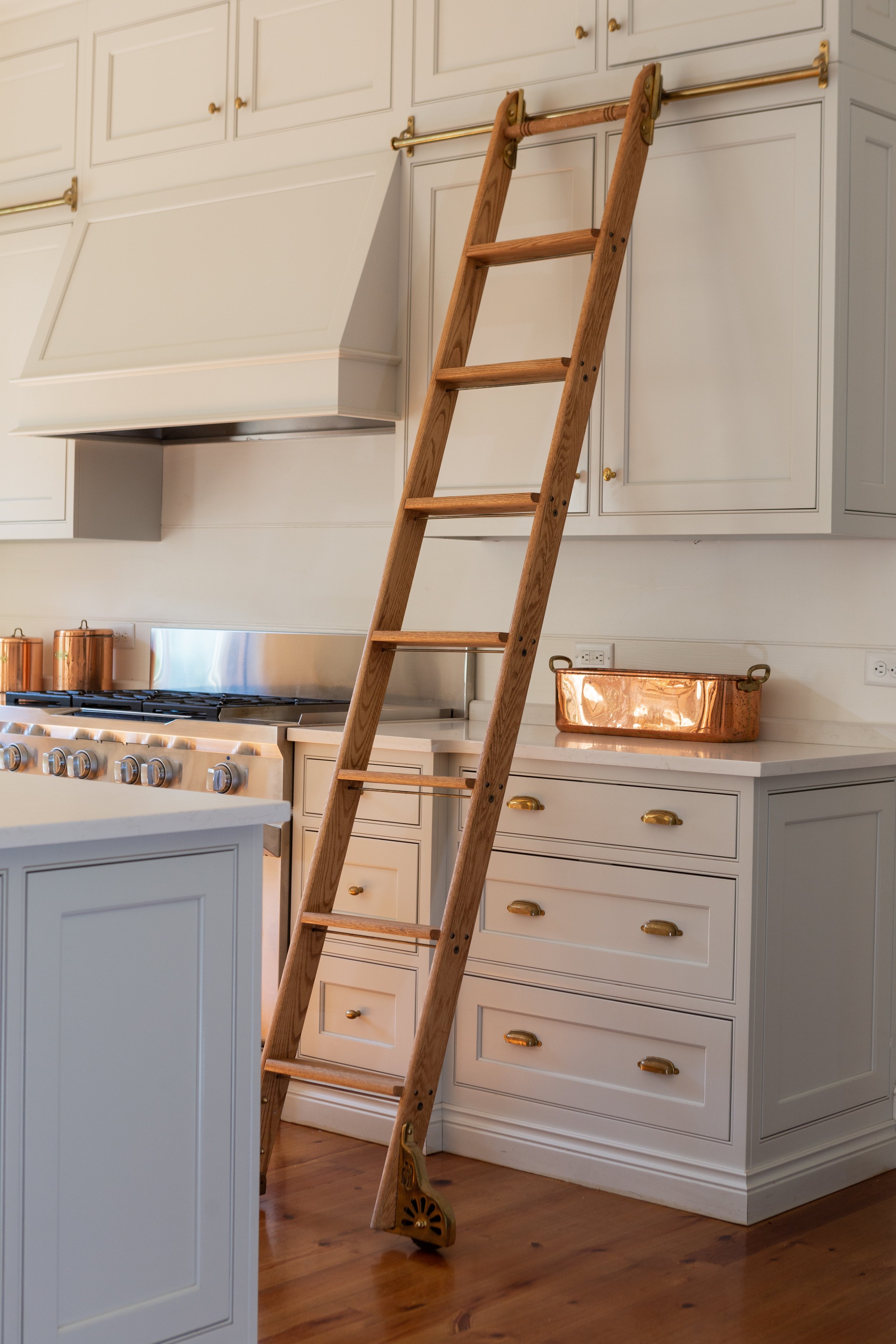
Those custom cabinets extend to the ceiling for maximum storage. A handsome brass and wood rolling ladder system from Putnam Ladders facilitates access to the upper cabinets and adds extra sophistication to the space. Steffens chose unlacquered brass in the cabinet hardware, and says she is pleased with the way its finish has aged to a soft patina over time. She is particularly fond of the Perrin and Rowe faucet on the kitchen sink. “I love seeing it there. Especially when it’s on an island, I like to think of the faucet like a piece of jewelry,” she says. Beadboard walls, inset cabinet doors and drawers, white quartz countertops and simple, shaded pendant lights selected by Steffens complete the kitchen’s elegant ambiance.

One of the benefits of building a custom home is the ability to make changes during the construction process, notes Oscar as he points to the kitchen door. Although the blueprints called for a window in the spot, an on-the-fly decision substituted a door. The homeowner couldn’t be happier with the alteration; he says it’s now the most-used door in the house.

The remodel afforded a generous amount of space for a bar and it has become a favorite gathering spot when the Adamses host friends and family. Glass-front cabinets show off a sizable collection of barware. Steffens chose a saturated green for the walls, trim and cabinets. The stained wood countertop was another adjustment made during construction. Says Oscar, “We were going to put quartz countertops in here, but we ran out of time and so they took the same wood as the flooring and put it there. It has held up great.” The room’s decidedly masculine vibe makes the perfect backdrop for the many family photos and documents that grace the walls.

The gentlemanly feel carries into Oscar’s home office, a space he and Steffens designed collaboratively and one that he says is the perfect spot for working from home. The room is filled with built-ins, including a desk area, well lit thanks to a large window above it. An oval window on an adjacent wall brings more light into the green/gray painted room, along with an element of architectural interest. A simple wooden desk doubles the amount of workspace in the room, while plenty of cabinets and shelves accommodate the homeowner’s collection of books and mementos.

The oval window motif is reprised in the laundry room. Although it’s one of the smaller rooms in the house, the laundry is jam packed with appeal, starting with its door. The charming half door allows the window all the visibility it deserves. Steffens repeated the same cabinetry and counters as in the kitchen here, highlighted by a porcelain farm sink that blends form and function. White shiplap walls and the reclaimed brick floor in a herringbone pattern complete the classic Southern setting.

The home’s primary bedroom and bath remain in the original portion of the structure. While the bedroom and closet had been modernized in a previous renovation, Steffens set out to bring the bathroom up to date and make the most of every square inch of the area’s somewhat narrow footprint. Using her expertise and a few tricks of the trade like slightly decreasing the depth of the double vanity, she created a space that is tidy, practical and beautiful.

While the majority of the renovation is finished, Steffens is still collaborating with the Adamses on small details and additions to help complete the home’s metamorphosis.

What started as a post-war, three-bedroom, single-bath, starter house with a small living room and kitchen has transformed into a shining example of Deep South style, one that has given the family that lives there a place to cherish and to pass down the love for its beauty for generations to come.

Built for Comfort

Design by GCD Interiors | Story by Terri Glazer | Photography by Selavie Photography

There’s nothing better than a long-standing relationship with clients, says local designer Glennys Cowles Bryant. The Pickwick Lake house she recently completed for Memphians Kay and Gary Stavrum, her fourth project with the couple, proves her point. “It is a great experience to work multiple times with one family. You learn what they like and you really get to fine tune each one as you move forward,” she says.

Having previously done a beach house for the couple that more reflected Kay’s taste, the design team at Bryant’s GCD Interiors set out to give the lake place a feel that spoke to Gary’s love of the outdoors. Family, comfort and relaxation were the other guiding principles behind the design. Bryant recalls, “Our inspiration was nature and the home’s surroundings. We wanted the house to blend in with the lake and feel a part of the landscape. This place is their retreat from the business of life, work and the city; a place to go hang out with friends and family. The interior is comfortable but elevated, homey and very outdoorsy.”

Bryant modified the structure’s floor plan to maximize its prime location on a pristine, secluded Pickwick cove. “I wanted to open the house up to give it unobstructed lake views from every vantage point,” she explains. The layout also accommodates the family’s needs, both present and future. The Stavrums have children in their 20s, so they wanted a lake home that would grow with them as their girls marry and the number of family members increases. An upstairs/downstairs setup with two living spaces, plenty of bedrooms and a massive deck ensures there will be room for all ages.

“When you think about a lake house, the family has to be away from it for so long that when they come in they just want it to be a respite. Easy.”

—Designer Glennys Cowles Bryant

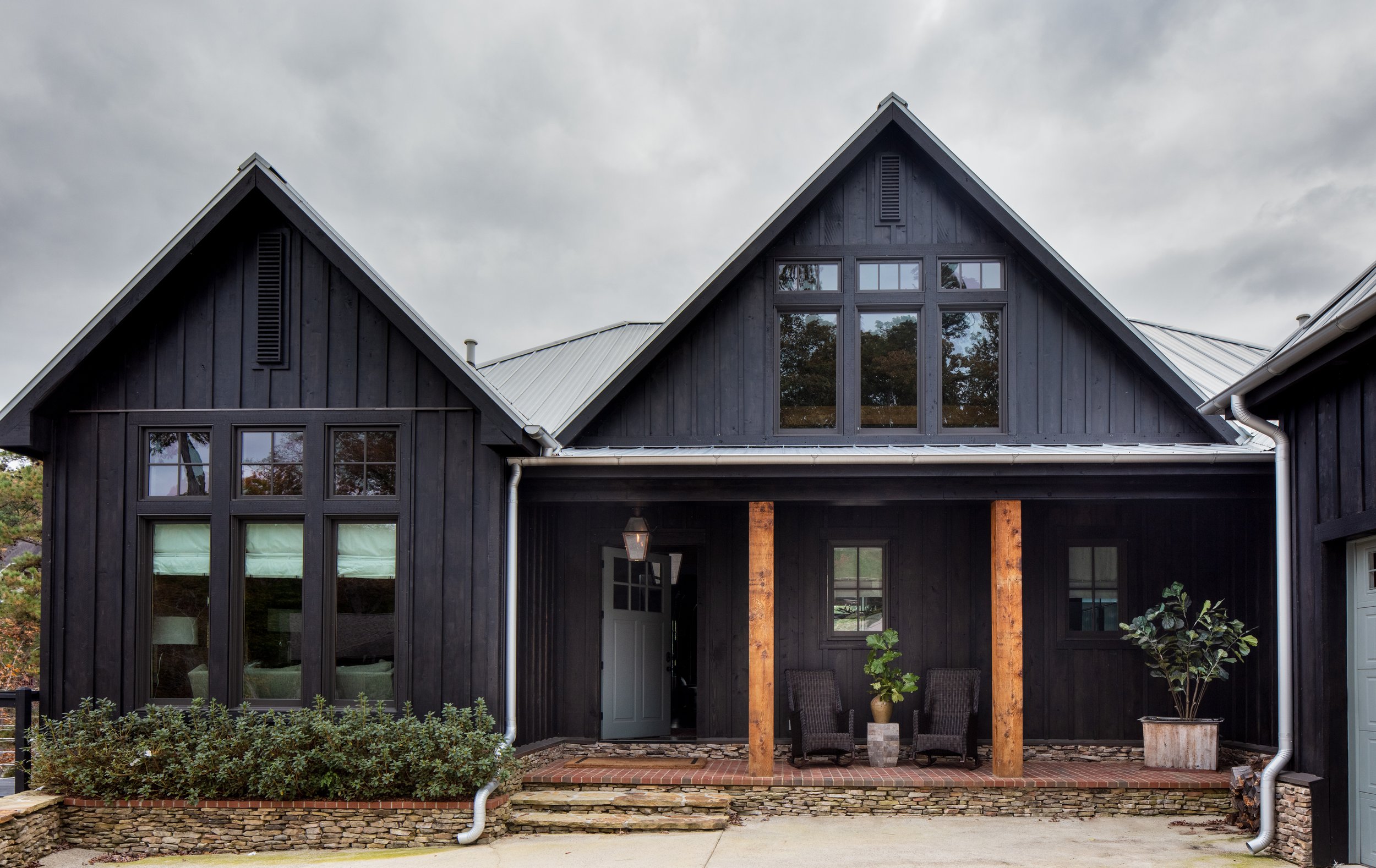
Another of the designer’s alterations to the original house plan had to do with the exterior color. Bryant wanted to stain the siding black, a bold move that might not have happened had she not had a rock-solid relationship with her clients. “It was kind of a big ask, but they trust us and that’s amazing,” she recalls. “We’ve earned that trust through all the past projects and they’re so glad they did it.” 

Although the home is freshly built and the furnishings are new, it feels as though it’s been around forever. Bryant achieved this goal by utilizing surface treatments that provide instant character and by incorporating custom millwork and furniture. The entryway brings to mind a long-established hunting lodge, with a substantial front door, a classic lantern light fixture and an antique-style bench. Fieldstone walls with a heavy slurry treatment feel time-weathered and welcoming.

The stone wall continues through the home, appearing in the primary and upstairs guest bedrooms, providing what Bryant calls “instant age”. Shiplap walls, some painted and some pine washed with a subtle gray stain, continue the effect.

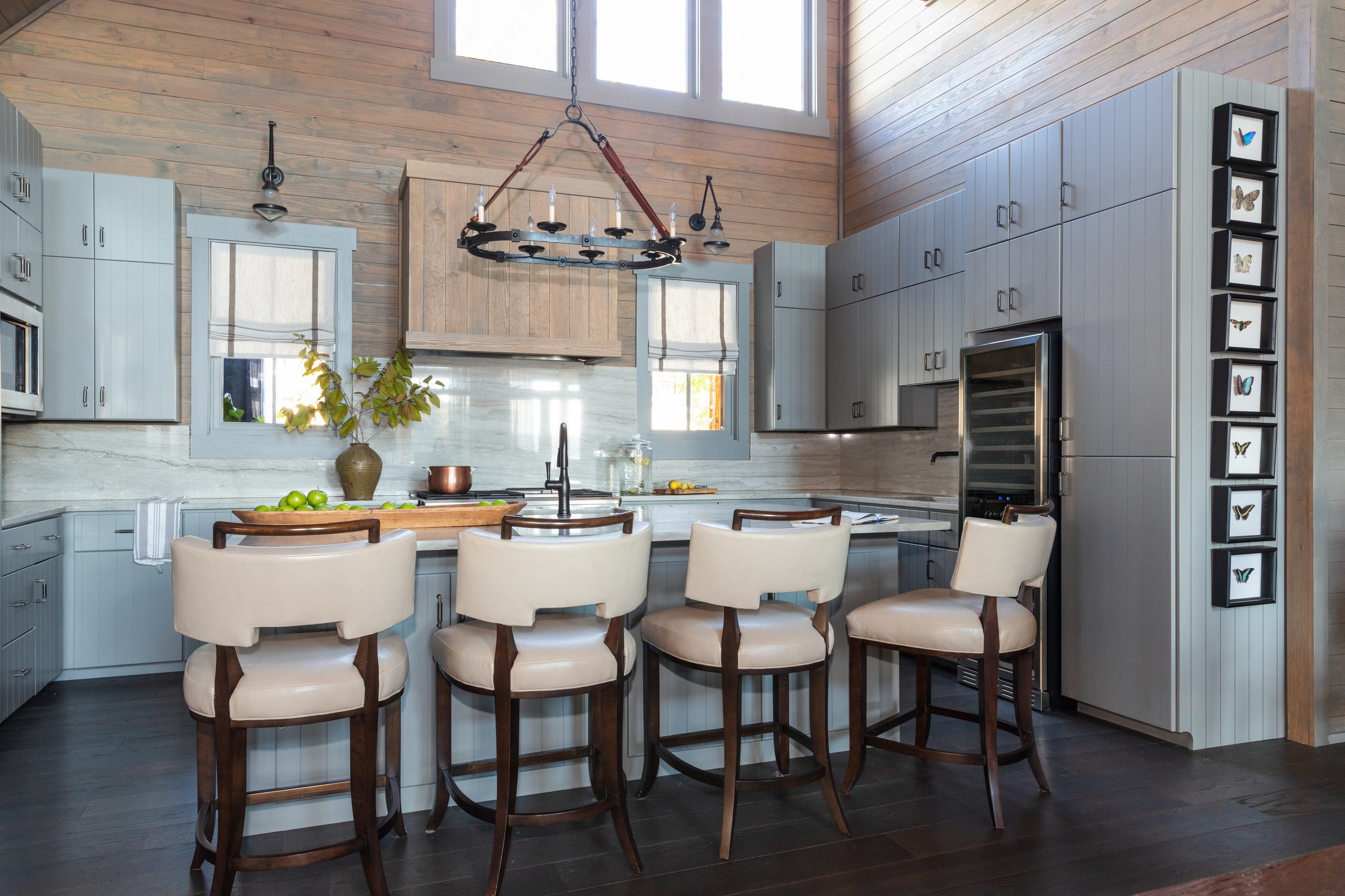
In the living room, soaring ceilings accented with stout wooden beams rise above, while a stacked stone fireplace anchors the space. Light floods in through a wall of lake-facing windows creating beautiful contrast to the darker tones of the wood floors, leather sofa and custom-made accent tables. The room opens into the kitchen, where Bryant repeated on the cabinets the soft blue color from the front door. For the countertops and backsplash she chose marble with a flowing pattern to mimic water ripples in the lake. White leather barstools from Hickory Chair surround the island, adding a touch of sophistication.

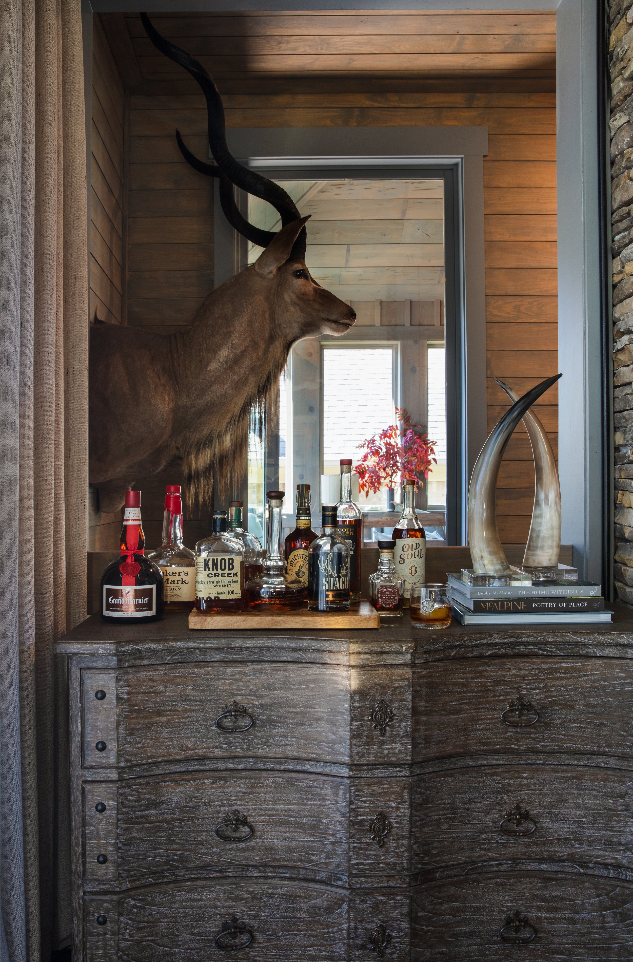
Also on the main floor, the study is a showcase for Gary’s trophies. An avid conservationist and hunter, he loves to give respect to the animals he hunts. Bryant incorporated his large collection of taxidermy animals and artifacts into the home’s design, especially here and in the downstairs living area. Artistically placed above the stairwell, a stunning kudu head creates a dramatic focal point.

The framed butterflies, created by Memphis artist Stacey Argroves’ shop Insectsy, are the only pieces the homeowners kept from their previous vacation home to place in their new Pickwick house.

The owners’ bedroom design is a study in contrasts. Crisp white walls play off the dark stained floors. The straight lines and traditional style of the canopy bed marry perfectly with the modern curves of the lamps and the fabric pattern of the window treatments—roman shades in Schumacher Darya Ikat, part of the Martyn Lawrence Bullard Collection. The adjoining bathroom exudes rustic charm with its warm wood walls, copper bathtub and dimensional wall art that reprises the feel of the home’s stonework.

The spacious downstairs is a comfortable retreat for family or guests. With a living area, a kitchenette, three bedrooms and three baths, the space offers privacy with plenty of room to spread out. Bryant kept the mood light here with white walls, cool-toned accents and mostly neutral furnishings. More of Gary’s big game trophies, a zebra rug and a teak root coffee table amp up the natural element quota in the living area.

A favorite gathering place for the Stavrums and the guests they often entertain is the home’s outdoor room and deck. The room was originally planned as a screen porch, but the couple decided to enclose its cypress walls and installed fully operational windows that open to welcome a spring breeze and close to keep winter chill at bay, allowing them to enjoy the space year round. Bryant covered the floor in antique stamped Chicago brick to add warmth, texture and age. The room leads out onto the giant deck that surrounds the waterfront side of the house. Large enough to hold multiple conversation areas, the deck features covered and open sections with enough comfortable seating for a large group. If anyone happens to be lulled by gentle lake breezes, the outdoor bed swing would be the perfect spot for a leisurely afternoon nap.

Bryant raves about the al fresco part of the home. “Not every house has that kind of view. You see hardly anything besides the lake from that porch; it kind of feels like you’re alone there. And the view is just breathtaking. All the conversational areas are designed to make people just want to stay out there and enjoy it.” 

Again, comfort as the driving force. The designer reiterates, “That’s the whole premise behind this house—comfort and making sure that the family feels they want to stay there. Everything is comfortable, inside and out. You can lie on the furniture, you can lounge around outside and you can connect with everybody.”

Completed just before the lockdown in spring 2020, this project was a refuge for the clients during the Covid pandemic and a place to spend quality time with family in a changing world, says Bryant. “Reconnecting with nature, comfortable living and beauty for your eyes to behold daily are all important, even more so now.”

Perfectly Placed with Goetze Art & Design

Story by Terri Glazer | Photography by Ross Group Creative

The right art, placed in the right spot, is an essential element of good design. Size, scale and color all must be considered to highlight the beauty of the art and to enhance the setting. Memphian Amanda Goetze, owner of Goetze Art and Design, is a master at connecting her clients with local, regional and global artists, helping them start or expand a collection of pieces that integrate with each other, and placing those works perfectly in their homes.

At Home sat down with Goetze recently to talk about the “art” of art placement and the importance of having art in a home.

After operating from the owner’s home and as a “gallery to go” since February 2019, Goetze Art & Design is going brick-and-mortar. A pop-up shop at 632 S. Perkins Rd. will be its home starting Sept. 8. Open by appointment and for special events, the shop will host New Orleans artist Ida Floreak for its first show. “The thought of having art shouldn't be intimidating,” says Amanda Goetze. “I want to create a space and an environment that makes art feel accessible and makes people feel comfortable to explore art.” For more information visit goetzeartanddesign.com.

“I love educating people about collecting art and realizing that it is a worthy investment—and one that you can enjoy in your home every day,” says Goetze. “I encourage clients to think about collecting art for the long term, that can be passed on to the next generation or sold if you want to go in a different direction. It will have value.”

One of Goetze’s favorite aspects of her work is introducing clients to artists she represents from outside the Mid South and sharing their background. “That’s a lot of fun for me, to educate the client about the artist, and why they’re looking at the product in front of them. How it came to be. There’s always a great story.”

Goetze placed these two very different paintings in adjacent rooms in the home of a young couple just starting their collection. Over the sofa an almost-abstract natural work by California-based painter Elise Morris evokes a soft, serene feel. Next door, however, a piece titled “Times Vines” by Queens, NY, street artist LeCrue Eyebrows sets a party tone. Says Goetze, “We thought that piece would be a lot of fun in their bar area because it depicts food and gathering, community, celebration. It’s a really interesting piece and certainly a talking point.”

An innovative solution for a family with an extensive art collection. Homes with open floor plans and fewer walls can present a challenge when it comes to art placement. Goetze hung this Kurt Meer oil and silver leaf work on a glass wall in a sunroom. “The lighting in the room changes throughout the day and it makes the cranes really glow. And I love the movement they have across that space.”

“Art doesn’t always have to be on a wall,” says Goetze. “It can be a great way to add layers and texture to other places in a home, as well. This Ida Floreak piece creates a pretty vignette and a cozy little place to be with your art.”

Also by Memphis native Kurt Meer, this piece speaks to the versatility of the artist. Goetze placed the atmospheric oil on canvas work, inspired by the Mississippi River,  in a room with a masculine vibe and black accents. “The size and scale are perfect for the spot and the softness adds contrast to the room,” she points out.

“It has great energy, it works with her fun style and it’s sophisticated at the same time,” says Goetze of the painting by New Orleans artist Mary Singleton that she placed in the home of Memphis designer Lana Zepponi Meyers. “It’s perfect with the blue and red geometrics of the pillows.”

Goetze often collaborates with other professionals. For this dining room, interior designer Caroline Smith selected a pair of Elise Morris acrylics provided by Goetze. “Works on paper, like these, are often a good entry point for a beginning art collector, and they look fabulous in this well-appointed room!” says Goetze.

A Warm Welcome

Event Design by Arden Sanders Events | Story by Terri Glazer | Photos by Dear Wesleyann Photography

Since guests were traveling from far and wide to attend their daughter Mary Margaret’s Rosemary Beach, FL, wedding to Davis Horton, Beth and David Skudder wanted to make sure family and friends were welcomed in style. They called on 30A wedding expert Arden Sanders and her team at Arden Sanders Events to make the welcome party a bright, colorful soiree that would set the tone for the weekend of celebrations to come.

The Setting

The family has owned a vacation home at Rosemary Beach for years, so bride Mary Margaret knew for a long time she wanted to be married there. Sanders says her goal was to showcase Rosemary’s various venues during the wedding weekend, starting with the welcome party at the charming Homeowners’ Pavilion. With the help of Myrtie Blue Event Design, Sanders and ASE lead planner Coleman Crye transformed the poolside area into a party paradise filled with color, pattern, flowers and fun.

The Theme

“Coastal chic” was the theme for the evening. The mother of the bride asked that the welcome dinner decor have a warm color palette to give it a look all its own, since the wedding was to be a formal affair with black, white and champagne tones. The ASE team ran with the bright, joyful look, punching up the pavilion with color everywhere. From the plethora of flowers to the festive patterned linens to the fun and funky furniture, guests were surrounded by saturated tones. Every little detail played into the look; the paper goods included bright colored napkins printed with fun facts about the bride and groom, and the koozies displayed a watercolor image of the family’s beach home.

The Flowers

“We had ALL the flowers!” says Sanders. Myrtie Blue worked magic with a huge variety of vivid blooms to create arches, swags, centerpieces and more. Peonies, anemones, ranunculus and roses were the stars of the show.

The Menu

Coordinated by Townsend Catering, the menu kept the coastal and colorful theme in play. Guests enjoyed an extensive charcuterie selection, a raw bar—kept cool by custom monogrammed ice sculptures from Ice Dragon—classic Southern food and build-your-own pasta. Mini desserts were just right to satisfy after-dinner sweet cravings. A vodka bar stocked with a variety of fresh fruit-infused spirits was the hub for the evening’s beverages.

The Entertainment

Local acoustic guitarist Jamah Terry provided music for the event. The Skudders wanted to give their guests an idea of the beach experience they love, so they included an element that has been essential to their family fun over the years in Rosemary—games. From bocce to jumbo versions of Jenga and Connect Four, attendees could test their skills for weekend bragging rights.

Modern Meets Farmhouse at Horseshoe Lake

Design by Jennifer Estes Interior Design | Story by Terri Glazer | Photography by Annabella Charles

“I wanted to build a house that felt like I’d inherited my grandparents’ Victorian farmhouse, but I’d updated it.” That was the homeowner’s vision for the weekend place she and her husband were planning at Horseshoe Lake in northeast Arkansas.

She shared the idea with her good friend Jennifer Estes, owner of Jennifer Estes Interior Design, who couldn’t resist the chance to work with her pal on a home style not often seen in the Mid South. “The two of us are alike in a lot of ways, but we’re also very different and very good friends. We travel together and do a lot together, but when she told me what she wanted I didn’t really see it at first,” recalls Estes. “I loved the idea of a modern farmhouse, but the ‘Victorian’ part took me a few days to process. The more we talked about it, though, the more excited we both got. I love a challenge and the chance to work outside the box!” 

The two women talked and planned together until they had a clear vision of the home’s look and layout, then Estes brought in architectural designer Kelly Kirk of FIVE ONE to translate that concept into reality. He put onto paper a home that has the nostalgia of a century-old farmhouse from an L-shaped gable roof design, dual chimneys, metal roof, whitewashed exterior and wrap-around rear screen porch. The floor plan, however, is a perfect fit for the way families live today. The open living room, kitchen and dining area form a large, comfortable space with views of the lake from an expanse of windows across the rear wall. Each of the four bedrooms has an attached bath, a feature not commonly found in older homes but popular in new construction.

The front door itself is a testament to the house’s classic-meets-modern story. After a long search for just the right antique door came up empty, Estes and her client designed a perfect substitute from a current fabricator. The same goes for the stick and ball trim that brings Victorian charm to the kitchen and living room doorways. 

Wherever possible, though, the designer and homeowner collectively sourced true vintage pieces, from the fireplace found at Palladio, with its penciled-in measurements left intact from long ago, to the assortment of antique interior door knobs throughout the house. “We had so much fun finding those! Sometimes they match, sometimes they don’t. And some of them are a little wonky, like they would be in your grandmother’s house,” the designer says.

The treasure hunt that yielded most of the decor came during a week-long trip Estes made to Atlanta with the homeowner along. She explains, “That’s one way I work with clients now, if they prefer and it’s a good fit for their project. It’s a little more transparent.”

From fabric vendors to Scott’s Antique Market to quirky little “treasures and finds” places, the two friends scoured the city, bringing home textiles, furniture and accent pieces. Perhaps their most memorable purchase was an Appalachian memory jug. Originally crafted in the mountains to memorialize a lost loved one, this vessel encrusted with everything from ceramic shards to coins to a pocket knife now sports a round wooden top and serves as a side table in the living room. The piece is emblematic of the entire home’s design, curated rather than coordinated and with a touch of the unexpected. The look is the product of the collaboration of two people who know each other well, trust one another and sometimes nudge each other creatively. 

A small butler’s pantry off the dining area is a shining example of the way Estes delivered the homeowner’s request to mix elements from different design periods in an understated way. White painted built-in cabinets with glass doors on the uppers look as though they could have been there for generations. Estes played up the vintage appeal with jewelry-style drawer pulls embellished with mother-of-pearl accents, then added contemporary panache with a sophisticated marble and gold parquet backsplash. “They marry so well and the tile updates the old-fashioned look. They’re fun together!” says the homeowner. The wall covering, a Phillip Jeffries wood veneer pattern, adds another bit of modern flair, echoing the geometric design of the living room ceiling. 

The couple wanted their lake house kitchen to mimic the layout of the one in their Memphis home, but its aesthetic had to blend the eclectic style of retro-meets-today. Estes achieved that goal by adding corbels to the wall cabinets and the island and lining the walls with white shiplap. An antique leaded-glass window found by the client looks right at home over the sink. Light gray quartz countertops and traditional fixtures keep the look timeless, while a trio of wall shelves hold the owner’s collection of vintage milk glass. Says Estes of the vignette, “Those are all [the owner’s] pieces that she’s collected and bought. I think the collection says a lot about her—elegant, interesting, understated, lots of good taste.”


A large bay window fills the primary bedroom with light, playing up the interesting melange of furnishings in the room. Dark and terra cotta accents bring a well-traveled feel to the space, but blend easily with the heirloom style headboard, night stands and chairs. Estes even chose the rug with nostalgia in mind; it looks as though it could have been made by hand, maybe by Grandma on the back porch, in days gone by. Estes sourced the rug, along with all the others for this project, from Kiser’s Floor Fashions.

The attached bathroom takes heritage chic to an elevated level with time-honored elements like hex and subway tiles. Elegantly patterned marble mosaic in the shower stall punches the style up, while the vanity, fashioned from a pair of antique chests of drawers, roots the room firmly in vintage.


The owner’s study is the ultimate in masculine sophistication. More of the Phillip Jeffries wood veneer wallpaper appears here; a herringbone pattern on the walls and a 3D coffered effect on the ceiling. Inviting leather furniture exudes comfort and a bar area holds a varied and interesting collection of glassware and decanters. Estes’s goal for the room was to accurately reflect the personality of the man of the house, an aviator and an avid hunter. “This gentleman’s study could be for a man like that from today, from 1960, or even from 1880,” she says.

The three upstairs bedrooms have uniquely different styles. The first is a feminine dream with a pair of graceful twin beds covered in colorful antique quilts. A huge window seat makes the perfect spot to sit with a good book. Again, the team of designer and owner covered every little detail in the room. The rose-colored drapes have the prettiest felted trim and the throw pillows covered in Christian LaCroix for Designers Guild fabric raise the color palette to a vibrant peak. The room’s art ranges from original drawings done by the family’s children to period butterfly prints. Even the doorknobs are girly, vintage porcelain and painted with sweet rosebuds. The wallpaper in the adjoining bath is a show-stopper; oversized cabbage roses with green foliage. Designed by New York artist John Derian for Designers Guild, the pattern is a throwback to the decoupage technique popular in Victorian times, yet perfect for this modern farmhouse. “We wanted this room to look kind of grandma hodge-podge. Colorful,” says Estes. Mission accomplished in a cheerful and whimsical way.

Upstairs bedroom number two has a more masculine vibe. White shiplap meets with rich blue on the walls for a dramatic, yet not too serious look. Twin poster beds chalk painted dark navy and decked out in bedding with blue and grass green hues continue the mood, as do denim drapes and a blue area rug from Kaiser’s Floor Fashions. The floors in this room and throughout the upstairs are painted in Benjamin Moore Classic Gray, a light shade that reads more soft white. Says the homeowner, “I love painted floors, and we thought they would be in keeping with the period.”

Estes reprised the wood veneer wallpaper in the attached bath, this time in a stylized hexagon pattern. Its geometry and scale are a perfect companion for the classically updated hex tiles on the floor. Another repurposed antique chest serves as the vanity in this bath, topped by a simple wood-framed mirror and a pair of shaded wall sconces with handsome vintage flair.

The upstairs guest room is a comfortable retreat for weekend guests. Estes kept the furnishings and textiles to a tranquil palette here, with shades ranging from clean white to peaceful grays. A custom beaded chandelier adds a fun focal point in ombre blues.

As inviting as the house is, the main attraction at a lake house is, of course, the lake. This home was designed to take full advantage of its shoreside setting. A classic screen porch stretches almost the full length of the house in the back, facing Horseshoe Lake, and wraps around the side, affording panoramic views of the backyard, dock and lake. Anchored by a hexagonal, gazebo-style conversation and tv area in the corner, the porch also includes a large built-in grill and a slew of farmhouse-back-porch essentials: wicker rocking chairs, a porch swing, and a screen door. 

More than a design project, this house is the product of a great friendship between Estes and her client. The home was under construction during the height of the COVID pandemic, providing the women a respite from lockdown. “It gave us a chance to get out of the city, to come out to the country and work on it,” Estes recalls. 

The homeowner agrees that taking this home from idea to completion with Estes at her side has been like living out a childhood dream. She says, “We’ve joked that it’s been like a grown-up version of doing the backyard playhouse with your best friend!”

A Dream of a Home

Story by Terri Glazer | Photography by Annabella Charles

2022 Memphis St. Jude Dream Home

The winner of the 2022 Memphis St. Jude Dream Home Giveaway will truly receive a dream of a home—a charming cottage with a lake view and all the character of a classic home, newly built with today’s best amenities.

At Home Memphis & Mid South, a sponsor of the annual fundraiser for St. Jude Children’s Research Hospital, recently toured the home, set to be given away on June 26. Now in its 23rd year, the project has raised over $ 26 million to assist St. Jude in its mission to eradicate childhood cancer.

The 2,100-square-foot house may be moderate in size, but it packs a big design punch with its smart use of space and loads of extra features often found only in larger custom homes. Kim Loudenbeck, whose design firm Warehouse 67 is staging the Dream Home, says that’s what sets it apart. “Trends are to give the spaces that you do have character no matter what size the home is. What working with a home this size allows you to do is upgrade the finishes. I was impressed with the amount and level of trim work, the beautiful detail. The barrel vault in the living room with the brick, I honestly have never seen this application in the Mid South before and it's just beautiful.” 

Katie Yokie has been associated with the construction of the St. Jude Dream Home for 12 years and has steered its design for the past four. She says her job is easy, thanks to the wide array of product choices available from the many national and local sponsors. From the General Shale brick to the Shaw floors to the Kichler lighting fixtures, the materials are high-quality and in today’s most up-to-date styles and finishes.

The home’s front entry faces a serene lake, creating a peaceful ambiance. The front door welcomes guests into a stunning living room with a brick-lined, barrel-vaulted ceiling. Anchoring the room is a natural stone fireplace with a cedar mantel. Built-in cabinets on both sides play up the cottage charm and echo the style of the cabinetry in the adjoining open kitchen. Every square inch of that kitchen is well-thought-out, including room for a stainless steel gas range, a separate oven/microwave combo and plenty of storage. The island, topped with Silestone quartz counters, holds the sink and dishwasher, in addition to well-lit prep room and seating space.

Yokie chose Sherwin Williams Breakwater for the color of the custom cabinetry from Southern Cabinets, with a slightly distressed finish and furniture-style trim to up the cottage kitchen style.

Wide plank engineered hardwood flooring from Shaw has plenty of traditional appeal, but with both warm and cool tones in its stain it’s neutral enough to work with whatever style of furnishings the future owner chooses.

The downstairs primary suite includes features usually found in grand homes. The trayed ceiling in the bedroom immediately draws the eye up to the elegant Kichler chandelier and on to a unique wood trim detail. Shiplap lines one wall for an extra dose of architectural interest and large windows allow natural light to bathe the room.

The attached bath, separated by the cutest paneled French doors, is a study in effective use of space. An elegant double vanity with plenty of drawer space is opposite a freestanding soaking tub. Just past the oversized shower, a fully fitted owner’s closet from Inspired Closets would be the envy of any fashionista.

An adorable second bedroom, another full bath and a separate laundry room complete the downstairs, and no detail was left out in any of these spaces. Yokie is especially fond of the three-quarter board and batten paneling that surrounds the guest bedroom. “I love the height. It reminds me of a house with age and character. We’re trying to bring that into every room.”

Loudenbeck echoes her fondness for the trimwork. “When you think ultimate cottage style, this is it. Because they did such a great job adding those special details that make a traditional cottage home, we went the extra mile with the antique-look iron bed layered with beautiful textiles—prints and patterns. The trim work is the perfect backdrop.” 

Yokie says she tries to include a new or unique product or material, “something that people haven’t seen before to dress up a space,” when she makes selections for the Dream Home each year. For 2022 that highlight comes from Shaw Tile. The hall bath features wall tile in a graceful arabesque pattern with further interest coming in its variety of textures, including smooth, linear and slightly rocky quartz. 

Even the laundry room got special design attention through the addition of a gray and marble-look basketweave tile floor that Loudenbeck says is squarely on trend. “The small-scale stone mosaics are so popular for bathrooms or laundry rooms now. People are tending to go with those more unique patterns because they provide texture and allow an area to have a little pop.”

The home’s upstairs holds a third bedroom or multipurpose room and another full bath. The generous bedroom, dressed up with decorative trim and a large window, could serve a multitude of purposes. Loudenbeck envisions it as “a place for the family to have down time to hang out and watch TV. But it’s large enough to hold a pullout sleeper sofa, so guests could have a separate wing with their own bath, living area and a place to sleep.”

Loudenbeck says she was thrilled to come on board to stage her first St. Jude Dream Home. While the mission of the hospital holds a special place in the native Memphian’s heart, the project gives her a chance to explore a design style not commonly found in the Mid South. She hopes those who tour the house will enjoy the change of pace. “We don't get to do cottage style very much here in Memphis. If we were more in a coastal area, the Carolinas or Florida or the Hamptons, you would see more cottage but I think that people will enjoy something different, something unique and a little bit out of the box. We hope they will come in and see how they could see themselves in a space like this.”

To achieve that goal Warehouse 67 is staging the home completely, from furniture to linens, drapes and rugs, plus accessories and artwork. Yokie says the significance of that is tremendous. “It's important when someone walks in here that they feel at home and it’s impossible to do that without great furnishings.”

Although the furnishings are the ultimate finishing touch, Loudenbeck admits that the house is the true star of the show. “What's great is that no matter what we add, the home itself is absolutely stunning. We're not having to make the home have character or charm; it's already there.”

A Place in Oxford

Story by Terri Glazer | Design by Jennifer Russell Interiors | Photography by Lindsey Meisenheimer Photography

A lifelong connection to a place can be a powerful thing. Powerful enough to draw a person back after years away and a career that has included travels far and wide. It was that type of connection that brought artist Ariel Baron-Robbins home to Oxford, Mississippi, and prompted the renovation of a house there into the perfect backdrop for her work.

Baron-Robbins grew up outside Oxford, the daughter of Paula Temple, an art professor at Ole Miss and a renowned Mid South artist, and Adrian Baron-Robbins, an architect and musician. When her parents moved away several years ago she and her husband, Isaac Lapciuc, bought the house where Ariel grew up, looking forward to having it as a second home in addition to their primary residence in Miami. The home’s seven-acre setting eventually proved to be more than they wanted to keep up, and its rural location was far from the amenities for which the quaint college town is known. She recalls, “We really wanted a weekend house we could drive to from the Memphis airport, and then walk around the square and do all Oxford has to do.”

They soon sold the childhood home and went on the hunt for a weekend place that would better suit their needs. “So we set out to buy another house in town and walking distance from the square. We wanted something that we didn't have to do a ton of maintenance on since we weren't going to spend a majority of our time there. But we also wanted something that had a little bit of that country feel that we really enjoyed about my parents’ house. And so this property was just perfect. We fell completely in love with it.”

At that point in the conversation Ariel pauses, then admits, “We fell more in love with the backyard than we did the actual house.” The location was exactly what they wanted; squarely in town yet with a secluded feel in the back thanks to its location adjacent to the wooded grounds of the L. Q. C. Lamar House Museum. 

“We always kind of felt like the house really didn’t suit us, so right at the start of the pandemic we took on a project to completely gut the house and renovate it,” she says. Citing what she calls her “bohemian” background as the child of an artist/art professor and an architect/musician, Baron-Robbins admits that her criteria for finding a team to steer the project may have been different than most potential clients. “I wanted to find people who would try to give us something that was fresh and contemporary while also not being so fresh and contemporary that it wouldn’t fit or it would be uncomfortable or just too out there. We wanted something that was going to push the boundary, but not not go beyond it.”

She signed on with Oxford-based designer Jennifer Russell, who brought contractor Bruce Massey on board to oversee the ambitious construction project..

Russell can attest to her clients’ outside-the-box aesthetic. “One of the things that Ariel and I discussed was not using the color palette of blues, gold and white, which is such a popular design trend in our area. As a designer my main goal is to listen to my clients’ needs within their home and learn their style.

The project encompassed almost every part of the house, starting with a complete redo of the downstairs. One of the main reasons the couple wanted a place in Oxford was so they could host Baron-Robbins’ many lifelong friends who still live in the area, so an open entertaining space was a must. To achieve that goal, the new floor plan includes two sitting rooms; one in front of and one behind an enormous open kitchen. Another important objective of the renovation was to showcase works created by the mother and daughter artists in the family. Along with many of her own creations, Baron-Robbins specifically selected pieces from Temple’s large body of work to match the renovated design and had them shipped from France to her Oxford home.

Russell kept the new color palette light and neutral to give the family’s art a place to shine. Neutral, but with plenty of interest. Just inside the front door, the living room is a bold, geometrical statement. The vaulted ceiling soars, punctuated by a light fixture with an imaginative design well suited to an artist’s home. Russell spotted the Hubbardton Forge chandelier in a High Point, North Carolina, showroom and knew it would be perfect. The fixture’s grouping of orbs balances the straight lines and right angles of the dramatic black stone fireplace and the contemporary furnishings in the room.

The kitchen blends form and function seamlessly. Anchoring the space is a pair of twin islands: one has seating for six in handsome black barstools by Holly Hunt, and the other houses storage, a sink, dishwasher and microwave. Both are topped with spectacular quartzite in a waterfall treatment that extends from the floor, across the top and all the way down the other side. The same stone is repeated on the backsplashes behind the cooktop and in the beverage area. White custom cabinetry keeps the mood light and airy, while dark wood ceiling beams bring an element of warmth.

Those beams extend into the second seating area in the rear of the home, a comfortable spot for the couple to sit and watch TV. Designed in keeping with the rest of the house, this is no ordinary media room. Because the owners didn’t want the TV to be visible when not in use, Russell had to come up with a creative way for it to be there without being there. She engaged Allen Jones, owner of The Wood Shed by JJ in Oxford, who crafted a custom cabinet that raises and lowers the TV via remote control. 

At the rear of the sitting room a wall of glass doors can slide completely open. They allow access to the home’s newly enlarged back porch and facilitate the kind of indoor/outdoor gatherings the couple is unable to host in Miami due to year-round hot temperatures. “They enjoy being outside here when the weather is nice—really experiencing the seasons you don’t get in south Florida,” says Russell. 

Baron-Robbins loves the secluded feel of the porch. “When you’re out there, it's like you're in the country. It's not like you're in the middle of downtown Oxford. And you are! It's just glorious.”

To accommodate the revised layout of the downstairs, the primary bedroom, bath and closets were relocated to the second floor. Formerly a bonus room with a vaulted ceiling and an Ole Miss mural, the new suite exudes calm elegance, in keeping with the couple’s minimalist lifestyle. A wall of windows opposite the bed offers a stunning view of the mature trees behind the property. 

An artistic home calls for artistic surroundings and this is no exception. The redesigned pool and landscaping were inspired by Lapciuc’s travels to Lake Como, Italy. Bluestone squares with green borders give the area a luxury feel; water features in the revamped pool maximize the wow factor.

The allure of a charming and beloved town may be what initially drew this couple to have a weekend place in Oxford, but a house that is completely renovated to reflect their life and to be a home for the family’s art will keep them returning there for years to come.

Out of the Blue

Design by Lindsey Black Interiors | Story by Terri Glazer | Photography by Sélavie Photography

With a unique, cocktail lounge vibe, this retro chic pool house is ready for fun.

The phrase “pool house” might not usually evoke images of a space described as “lounge-y” or “cool,” but those words kept popping up on a recent visit to this East Memphis pool/guest house. Renovated by Lindsey Black of Lindsey Black Interiors, the structure has a style that’s a bit unexpected, but a perfect fit for the homeowners and their young teenage children.

The owners renovated the main residence when they moved in a few years ago, but they had yet to give the pool house the same attention. They brought Black on board in early 2020 to put their stamp on the space. Before she and her team started the creative work, she met with the couple, as she does with every client at the outset of one of the large-scale projects in which her firm specializes, to get to know them and understand their needs. During the session she learned a few things. The wife wanted to use the pool house for year-round entertaining and for overnight guests. She wanted it to be a spot where kids could hang out, and one that adults could also enjoy. And it had to be cool, with a cocktail lounge vibe. 

The designer recalls that the initial meeting happened just before one of her semi-annual buying trips; fortunate timing because it allowed her to select items at market specifically with the pool house in mind. Every project starts with a jumping off point. For this one, Black says, it was the large color photograph of a swimming tiger that now hangs in the living area. “The water tied into the pool nicely,” she says, and the animal’s deep orange color influenced other design choices. Next came the fabric for pillows on the sofa and the dining banquette. The retro print in bold colors has just the right degree of old Havana flair.

Pillow fabric might seem a minor detail in a full-scale redesign project, but Black says each feature is important to making a room, and a whole house, come together with a cohesive look. “We really do put thought into every little detail we choose in a room and how it all works together,” she says. “Even though a pillow is a small element, it inspired most of the color choices in the room.”

And, thanks to the introduction of a wealth of new high-performance textiles and fabric treatments, Black had plenty of choices when selecting upholstery. Gone are the days when pool houses had to be furnished in vinyl and hard plastic. Today’s advanced materials come in a myriad of options and can stand up to catastrophes from wet swimsuits to spilled drinks, no worse for the wear. Everything from the clean-lined living area sofa to the dramatic tete-a-tete chaise by Ray Booth for Hickory Chair to the stunning blue/green velvet banquette is covered in fabric that is as durable as it is beautiful.

In the dining area Black removed a large round dining table at the homeowners’ request. The family tends to entertain more informally, however, if a larger group wants to gather, the new game table, with an extra leaf installed, can accommodate.

Nestled under a handsome work by West African artist Kader Boly, the banquette, paired with a trio of small round cocktail tables and wood/woven leather chairs makes a perfect spot for a group conversation, an intimate drink—or for kids’ post-swim snacks and sodas.

Black enlisted Greg Hampton of Hampton Fine Finishes to paint the kitchen cabinets in the same saturated gray/green as the living area. The existing copper vent hood is perfectly warm, juxtaposed against the cool-toned cabinetry. Poster-sized photos of iconic Memphis neon signs jazz up the kitchen and provide a funky home-town touch when the space is used as a guest house for out-of-town visitors. “It’s fun to put things like that in here that you might not place in the main house,” says Black.

It’s a toss-up as to who loves the new game room more, the teenagers or their father. During the initial conversation, Black learned that the man of the house is a huge Marvel Comics fan, so she turned to local artist Daniel Tacker to create a custom multimedia work featuring the superheroes. The art seems to fly off the wall, with Wolverine, dad’s favorite character, leading the way. The designer commissioned the painting and chose all the art for the project with deliberate care and with local talent in mind. A figure painting by Memphis artist Heather Howle hangs in the dining area.

The pool house has a lot of wall space, so Black was tasked with finding multiple pieces. She explains, “You have to be careful about how you mix artwork. I think it can make or break a space so you have to consider the style of the art, who the artist is, color versus black and white, media, but also scale is so important. These are all statement pieces. They stand on their own, but they complement instead of competing with one another.”

It’s clear that Black loves the way her concept came to completion for these clients, but she stresses that it’s not all about appearances. “As important as it is that a space looks good, for me it is critical that it works for the client, that it meets all their needs and it checks all the boxes they give us.” This chic backyard cocktail lounge/teen hangout with the unexpected ambiance checks those boxes perfectly for the homeowners, their children and their guests.

A Perfect Blend

Interior Design by Cindy McCord Design | Story by Terri Glazer | Photography by Ross Group Creative

Cindy McCord gives an East Memphis home a look that is fresh and new—but not entirely new. McCord’s vision resulted in a design plan that kept many of the homeowners’ most loved pieces, some left as is and some rethought, mixed with new finishes and pieces.

When they built their family’s dream home in East Memphis 19 years ago, this couple loved everything in the house. Fast forward to early 2020, and the same family, a married couple with three now-grown children, still lived in the home and still loved a lot about the brick Tudor. However, they were ready to refresh the decor. 

Enter designer Cindy McCord, owner of Cindy McCord Design in Collierville, who gave the home a look that is fresh and new—but not entirely new. McCord’s vision resulted in a design plan that kept many of the homeowners’ most loved pieces, some left as is and some rethought, mixed with new finishes and pieces.

Thanks to the original architecture conceived by Charles Shipp, the renovation was almost entirely cosmetic. “It was just a facelift, because the bones were so good,” says McCord.

Ditto with the design elements. Rather than reimagining the decor from floor to ceiling, McCord’s work highlighted many of the original features. 

Color was the main focus for the homeowner. She says, “The whole house was kind of a creamy yellow, and I’d had yellow in my previous home too, so it had been around much longer than 19 years. I was tired of yellow! I wanted to lighten things up a lot and I told Cindy I like blues.” McCord brought the new palette to life by bathing the walls in a coat of white that is fresh yet not stark, the perfect counterpart to the home’s original dark khaki painted trim, which she opted to leave intact in many rooms.

Once the lighter backdrop was established, the designer turned to the business of making everything else feel new—without necessarily having to be new. The family room is a perfect example. New drapes, sofa, chairs and tables blend seamlessly with the original fireplace and hardwood floors, as well as the homeowner’s treasured pieces, including an antique armoire. A favorite chair from her former office as a buyer for Helen of Memphis, now restuffed and reupholstered, holds place of pride.

The living room is decidedly newer, but still anchored by the family’s much-loved grand piano. McCord added a new sofa and easy chair plus accent tables in metal, glass and marble, to bring an “of-the-moment” touch to beautiful Martha Washington chairs and dark wood pieces from the previous decor. A portrait of the couple’s three children gives the room the most personal feel.

Shipp’s traditional plan still shines in the kitchen. The natural brown tones of original stone floors that the homeowner has always loved blend perfectly with the stained wood exposed beams and trim around the eye-catching plaster vent hood. The existing layout, appliances, tile backsplash, even the cabinet hardware, are still in place, proving that a kitchen refresh doesn’t always have to involve a to-the-studs gutting. Newly painted white cabinets, topped with gracefully patterned quartz countertops, give the space an all-new feel.

The adjacent breakfast room is still home to the family’s original table, chairs and plate rack. Also remaining in place is the light fixture sourced from the now-closed Frankum Antiques in Germantown. When the home was under construction the couple purchased the piece, along with the dining room chandelier, from Linda Frankum, who imported antiques from Europe. A watercolor and graphite pencil work by local artist Hailey Roaten reflects both the black of the iron chandelier and the blue tones of the home’s new color palette. Bold wallpaper gives the adjacent butler’s pantry a punch of excitement, the perfect marriage of the existing khaki trim color, newly painted cabinets and countertops in the same stone as in the kitchen.

In the formal dining room, McCord’s work retained the timeless elegance while continuing the keep/replace/repurpose theme she carried throughout the home. Gone are the dark, heavy drapes with elaborate valances. The designer instead opted for lighter panels that are still functional, but allow more light in through the full-length windows. The furniture is the same, perked up with new upholstery on the dining chairs. The salmon-toned oriental rug remains, as well, and looks as though it were always meant to be in the newly imagined room. The same can be said for a painting formerly hung elsewhere in the home. It now sets off the dining room decor thanks to its new placement and a new frame made by Chris Garner of Garner Framing Co.

A pair of lamps once in the dining room now provide light in the primary bedroom. Reshading them created a new look style for the freshened space. “It’s amazing how different they look with new shades,” says the homeowner. “We reshaded several lamps and it was fun to use them again.” Those renewed lamps sit atop new nightstands that flank the owners’ bed, a holdover from the previous decor. New bedding, drapes and rug give the room a fresh feel. McCord continued the spruce up into the attached bath, where botanical wallpaper, light fixtures and goldtone hardware lend a warm, modern touch to the original cabinets, counters and flooring.

Thanks for Hopping by! An Easter Luncheon

Story & Event Design by Ginni Jones | Photography by Annabella Charles

the table

This table was a dream to create; from the bright and colorful flowers to the sweet spring china, it came together perfectly to celebrate the season! For the flower arrangements I layered baby blue delphinium, white snapdragons and lilac stock to create wonderful height at the center of the table. The dining room has tall, vaulted ceilings, so I wanted the flowers to match the grand scale of the room. To fill in the rest of the arrangement, I chose all my favorite spring flowers. Purple anemones, Menton French tulips, Dutch tulips, Queen Anne’s lace, craspedia, blush roses and baby blue and green hydrangeas were all intertwined to help create the backdrop of spring flowers. 

On the table, I paired Herend China in my new favorite pattern, Queen Victoria in green, with a matching Herend Silk Ribbon charger. To add a bit more texture, I layed the plates on a fun woven placemat. Vintage linen napkins held my grandmother’s beautiful silver flatware. To brighten up the wood dining table I chose Estelle Colored Glasses—their newest champagne flutes come in some amazing colors. I went with the purple and paired them with the Aerin x Williams Sonoma white confetti glasses for water. I placed the menu for the luncheon on top of the china, wrapped in a slate blue silk ribbon. My talented friend Caroline Hughes wrote the menu on the same Dogwood Hill cards I used for the invitations. I wanted something fun and fresh, and Caroline’s handwriting was perfect for the menu!

Finishing the look were my go-to favorites, Dina lamps from White Door Events. The new taller lamps are perfect for long tables, so I scattered a few down the tablescape. The sage color was just right for the theme and the lamps gave off the perfect amount of light. 

OUTFITS Styled by Amy Golden, Pearl by Lela Rose

the menu

I know I say this every time, but the menu was so much fun to create! I wanted to include typical luncheon items punched up with seasonal goodies like deviled eggs, radishes and little gem lettuce, so we served Pimento Cheese and Cucumber Dill Tea Sandwiches, Chicken Salad Croissants, Beet Stained Deviled Eggs (so pretty and unique!), Little Gem Wedges with Avocado and Radishes, Green Goddess Potato Salad with Green Beans and Cucumbers, Bogie’s Pasta Salad (always a favorite), and a Seasonal Fruit Salad with a Honey Lime Glaze.  We put dessert in the very talented hands of Nuha Abuduhair at 17 Berkshire. She and I briefly discussed the theme for the luncheon and she immediately suggested her new petit fours adorned with buttercream radishes, carrots and flowers. They were adorable and delicious! As was the carrot cake decorated to match the petit fours—definitely a must try!  

the decor

White Door Events had everything we wanted and more! From precious, new wicker chairs to a white market cart, it all fit the theme of the event to a T. In the dining room, we picked their new Weezy chairs for the head chairs and the Louis natural chairs for the sides of the table. Since the dining room is such a large space, I set White Door’s sage Felicia sofa on the other side of the table with a pair of Ramsey woven chairs with the lattice garden stool in between. The real show stoppers were the white dogwood trees in stunning aged iron planters. Outside in the atrium, the adorable white market cart held the drinks for the day in style. Next to the cart, a Weezy chair and a lattice garden stool paired with some sweet blue hydrangeas made the cutest vignette. Overhead, we hung White Door’s new Cambridge pendant. The linen drum shade was perfect for the event’s aesthetic and worked nicely with the chair and cart. 


Good Bones

Design by First Fruit Collection | Story by Terri Glazer | Photography by Sélavie Photography

A house with good bones, enthusiastic owners, and designers with vision added up to produce a stunning renovation in this 90s-era home in Germantown. Stunning, but approachable, says designer Patty Michaelis, and that’s just the way it’s supposed to be.

“What I love about this house is that it absolutely feels like somebody lives here. It feels so comfortable versus a show house. We always want our clients to feel like their home is totally livable,” says Michaelis, store manager and designer at First Fruit Collection in Collierville. She spearheaded the project along with Ashley Toney, First Fruit’s owner.

The pair of designers and the homeowners, Angela and Jon Straub, have developed a longstanding relationship; this is the third house Toney and Michaelis have outfitted for the family that includes the couple and their two teenage children. This project had a decidedly different slant than the others, however. Says the homeowner, “The other homes we had weren’t like this one. They were more rustic, but I like the term Ashley uses for this house and the design—dressy.”


Toney says the description fits perfectly. Nothing about the home is formal or stuffy. The design is fresh yet timeless with a gracious, inviting appeal.

Though the home’s colors and decor needed a fresh look, the classic architecture had stood the test of time and was well suited to the casual elegance Toney envisioned for the decor. “The builders of this house constructed a very traditional plantation-style house. I feel like when you create something more traditional it’s timeless. Yes, the colors and the cabinets were dated, but the layout and the flow weren’t because they are traditional and that never goes out of style,” says Toney.

The owner agrees, adding that the fact that the home needed cosmetic work rather than a total redo played heavily into the decision to purchase it in 2019. After a couple of months while the entire house was painted and the floors were redone, the family settled into the five-bedroom home set on a picturesque two-acre lot.

“I like light, bright and happy—welcoming,” says the homeowner. The design team delivered with a clean white wall paint throughout the house, a perfect palette to show off new lighting in dressed-up gold tones, as well as pops of color provided by furnishings and rugs. 

The more dramatic elements weren’t always an easy sell, says Michaelis, recalling the decision to place two leather and cowhide chairs in the homeowner’s office, directly off the front entryway. Although the designer describes the pair as her “most favorite chairs of all time,” she recalls that the client might not have shared her vision at first. “We really had to talk her into them, but she loves them now. They’re fun to see when you walk in the front door.”

Michaelis credits years of successful collaboration on multiple projects for the fact that this homeowner is a “perfect” design client. “She listens to us. She knows what she likes, but she’s always willing to listen to our vision.”

One design element that Toney and Michaelis helped ease the homeowner into was wallpaper. Michaelis remembers, “We started with just putting wallpaper inside the built-in shelves in the living room. After we did that she liked it so much that we’re about to add it in the dining room and she wants it all over now!” 

The beautiful Turkish rugs that grace the home also took a bit of convincing on the designers’ part. The family owns Flooring Solutions of Memphis, so carpet, tile and hard wood are in their realm of expertise. They were a bit reluctant, however, to invest in oriental rugs. According to Michaelis, “A lot of people hesitate on rugs, so I say, ‘Just let me bring a few rugs over…’ Once she saw these she had to have them.” Heavenly Rugs in Germantown provided all the rugs in the home, including the one the designers say is “the rock star of the room” in the entryway.

Just as jewelry adds interest to an outfit, the homeowner has found, after living in the house for two years, that a few perfectly placed, bold-colored pieces make all the difference in decor that’s otherwise mostly neutral. Toney likes to bring in the accents in the form of art, accessories, draperies and throw pillows, items that are easily altered as time passes and styles evolve. “We try to steer our clients toward traditional. They might get tired of grasscloth in time, they might not, but wallpaper is something that’s fairly easy to take down. We’re not saying don’t ever have anything trendy in your home, because you always want the newest and the best, but if the bones are traditional and timeless, then it’s easier to change and flow with what’s popular,” says the designer.

Many of the accents throughout the home are in cool blues, ranging from peaceful light hues in the primary bedroom to beachy blue glass tile in the daughter’s bathroom to bold batik-look wallpaper in the son’s bath. 

The kitchen island boasts an ethereal blue green, Oyster Bay by Sherwin Williams. Previously dark stained wood, as was the rest of the kitchen cabinetry and trim, the lightened up wood, along with new countertops, lighting and fixtures, brought the kitchen beautifully up to date without a complete remodel. The large kitchen features a generous eating area that the homeowner loves as it offers plenty of overflow seating from the nearby dining room when she hosts large family gatherings. 

The family room that overlooks the backyard received a facelift that started with help from Flooring Solutions: the addition of an eye-catching bluestone floor. A brick fireplace was limewashed to tone down the color. A new mantel completed the overhaul in the comfortable, but not too casual space.

The First Fruit team paid attention to even the smallest details during the renovation, like replacing door hardware throughout the house with crystal knobs for a timeless look, and bringing in The House of Order to assist in organizing the closets, kitchen and pantry.

Although Toney and Michaelis have helped the homeowner transform almost every area of their house, the designers still refer to the project as a work in progress. Toney says, “We’re constantly dropping by all the time. Sometimes we’ll get something in at First Fruit that I just know would be perfect here. I shoot her a picture and she says, ‘Bring it by!’” It’s clear they love working on the “house with the good bones” and enjoy their “perfect” client.